High dynamic range photography, also known as HDR photography, is a growing sector that many photographers are very excited about. This type of photography can create stunning photographs that are hyper-realistic; but sometimes overly so. There are ways to create realistic HDR images, though, and we’re here to help.
In our age of high-definition everything, HDR photography is a great trend, and one that you should really look into working with. The great thing is that while there are ways to do this all yourself in Lightroom, you can use presets and brushes like Sleeklens HDR presets. These will take out a lot of the work that you have to deal with to streamline the entire process for you.
What is HDR?
High Dynamic Range photography (HDR) is a combination of multiple exposures captured photographs combined into one single image, this process is used to fill in the lack of capability of the camera to capture different intensities of light. For example, when you photograph a subject under a bright sky, either the background comes out great and the subject underexposed or vice-versa.
HDR was used in the past quite heavily, but it is popping up more and more in digital cameras as well as smartphones. When you use HDR, the camera will take three photos, at different exposures. Then you use software like Adobe Lightroom to take those three photos and put them together to create an HDR photo for you. The result is what your eyes see, and a more realistic photo that will be very pleasing to the eye of anyone who sees it.
Where to HDR Photography?
Why would you want to do HDR photography and what situations should you do HDR? Typically, HDR is not done for portraits or anything like street photography. It is primarily used in landscape photography, as well as architecture photography, real estate photography, and interior photography.
Landscapes: In landscapes, HDR is used to create the proper contrast between the sky and the land, which is something a camera can’t do without editing for realistic HDR.
Sunlight Photos: Whether you are taking a portrait in the sun or getting a picture of a building, the sun has a habit of washing things out. HDR will give a more balanced look to the picture, and keep the light from the sun from consuming everything on the screen.
Low-Light: If you are dealing with low-light scenes, then an HDR picture will balance out the light, and bring more light into the picture. This is often used instead of a flash because it creates a more natural look for the picture instead of a washed-out flash look.
What is Dynamic Range?
If you are dealing with HDR, you need to know more about the dynamic range. The dynamic range is essentially the difference between the darkest point on the image and the brightest point on the image. Our eyes are pretty amazing, and we can see more than a camera can. The estimate is that we can see 11 stops of difference between brightness and darkness, while a camera only sees five. For this reason, the landscape outside a window from inside is not always captured properly by a camera, even though we can see it fine. This is where HDR comes in, it balances all that out.
How to Create HDR Photos
HDR has been around for decades but it only became widespread in recent years. There are numerous ways to create an HDR photo. We will go through four HDR processing methods that suit any HDR photographer—no matter their skill level.
Beginner Method: HDR Mode on Cameras
This method is quite straightforward. You can actually shoot HDR photos on most of the today’s cameras and smartphones. You may simply switch to HDR mode on your device and start shooting right away. It is recommended to shoot with your camera mounted on a tripod, since the camera will capture at least three consecutive shots while shooting in HDR mode. They will be shot with three different exposure value (EV), which will give you an underexposed, normally exposed, and overexposed photo respectively. It is important to stabilize your camera so as to ensure your camera merge the three images into one single HDR image successfully.
In spite of the relative ease of this method, it offers the least flexibility among the three methods. Basically, you will have no control over the blending and merging of the three exposures. Your camera will do all the work for you. In my opinion, this method is for beginners and those who aim at instant sharing on social media. On the other hand, if you are serious about photography, you should always avoid the HDR mode on your DSLR and go for the following two other methods.
Intermediate Methods: Take Multiple Exposure Shots with Your Camera
In order to do the next HDR photography tutorial, you’ll need to take multiple photos and merge them into one. Here are a few photography tips to ensure you capture the best photos possible:
Shoot RAW images, you will have more data to work with.
With your digital camera, take multiple exposure photographs, ideally shooting a range of 3 to 7 photos.
Make sure to alter only the shutter speed from each shot, with increments of 1, 2 or 3 stops. For example, if you were taking a single photograph and you use a shutter speed of 1/30.
1 stop increments using 1/30 as a base for shooting 5 images – you will end up with 1/8 1/15 1/30 1/60 1/125.
2 stops increments using 1/30 as a base for shooting 5 images – you will end up with 1/2 1/8 1/30 1/125 1/500.
Do not change the aperture of the camera, for example, if you use an aperture opening of F11, make sure you use it in every single shot.
It is highly recommended that you use a tripod, unless it’s not possible, you can use the bracketing function on your camera, the one that takes a multiple bursts of images with different exposure.
HDR Pro of Adobe Photoshop
This is an ideal HDR tutorial for those who want to have some controls over their merged HDR images and need to get the job done quickly. HDR Pro offers you a certain degree of controls. The parameters that you can play around with include Gamma, Highlights, Shadows, Edge Glow, etc. The workflow is quite simple for this one. I will go through the steps of using HDR Pro with you in the following paragraphs.
First, navigate to File > Automate > Merge to HDR Pro. A window will pop up. You may browse the photos you need and import them to Adobe Photoshop here—or if you have already opened the required files in Adobe Photoshop beforehand, you may simply click Add Open Files. All the opened files will be listed in the pop-up window. Click OK once you have finished importing.
This window will appear once you import the photos. You may edit settings of your merged photo here. There are numerous presets available on the top right-hand corner. You may stick to one preset if you want an instant result. You will probably want to look into the settings of Edge Glow. It determines the strength of the HDR effect. If there are unwanted glows on the edges, you may check the option “Remove ghosts”, which is located above the panel of Edge Glow. When you finished editing, you may simply proceed by clicking OK on the bottom right-hand corner. That’s all.
Realistic HDR in Adobe Lightroom
Camera setting calibration is very important. Every camera has its own settings, and you can choose any of these within Lightroom to get the HDR effect you want, including Camera Faithful, Camera Portrait and Camera Landscape.
Now we get to the meat and potatoes of this, and how to create the realistic images that show everything clear, without focusing on only one thing in the picture or darkening something that shouldn’t be.
The first setting to understand is Chromatic Abberation. This is the color fringing around the image, and it can be dealt with by going to Lens Corrections-Basic and then Remove Chromatic Aberrations.
Import and Select Images in Adobe Lightroom
Import the images that you have photographed.
File/Import Photos and Video
Select all the images that will be used.
Shift+click the first image and click on the last image in order to select all the images.
If your images are not in sequence, (cmd+click on the Mac or ctrl+click on the PC) on each image to select them.
There is no need to adjust your images on the Develop Module at this stage. We will do it afterwards, on the final image.
Merge the images to HDR
After selecting the multiple photos, go ahead and merge them together.
Photo / Photo Merge / HDR (cmd+H on the Mac or ctrl+H on the PC)
Auto Align – Will be selected by default and will align automatically the multiple exposures that were captured with your camera and also crops uneven edges of the images.
Auto Tone – Nondestructively tries to enhance based on the dynamic range automatically the combined images.
Deghost amount – Will try to fill in parts of the image that had changed between exposure, like birds flying over or leaves in the wind.
Low: Minor changes of movement between images
Medium: Considerable changes of movement between images
High: Cures high changes of movements between images
Show de-ghost overlay – shows what areas of de-ghosting that has been changed.
After you click Merge Lightroom will process the images in the background. Depending on your machine, it may take some time to process the multiple images.
The neat thing is that, Lightroom will create a brand new RAW file and renames it with -HDR at the end, that means that you will end up with the maximum capability for editing your image.
Adjust the Final HDR image
If needed, make any adjustments regarding Lens Correction at this stage, since you are doing it to one image, it will save you time.
In the Basic tab, when we mess up with the exposure, you can see that we have a much broader dynamic range going from -10 stops to +10 stops, whereas in a regular image it ranges from -4 stops to +4 stops.
Now we can enhance the merged image with the develop module, as we would do to any other image. In the end, you can get a beautiful High Dynamic Range image.
Advanced Method: Luminosity Masks
This is the most advanced way to create HDR photos among the methods in this article. It offers you the greatest flexibility but it takes quite a lot of effort to master the skills. If you are serious enough, this approach is for you.
Here is the workflow. You will need to import the base photo, which is the one exposed to normal EV. Then, you may use the Photoshop actions created by professional photographers to create luminosity masks. Basically, the action divides the base photo into multiple channels, according to the brightness of different areas in the photo. You will get something like Highlight, Midtone and Shadow channels after it is done. Then, you can create a mask with these channels and put your underexposed or overexposed shots under these masks. I am not going through the steps in detail. You may head to Jimmy McIntyre’s website for more information.
HDR Photography to Create Hyper-Realistic Photos
High dynamic range photography is the process of using multiple images to create one high-quality image that is closer to what the human eye sees in real life. We hope you found this HDR photography tutorial useful. If you’re looking to improve your HDR technique, be sure to check out our Sleeklens HDR presets and brushes. It’s a simple way to create some really amazing HDR imagery.
Let’s take a look at split toning in Lightroom to help you on your freelancing journey or just to groom your Photoshop skills and see how other photographers get the best out of their images.
Our range of Lightroom presets have split toning incorporated into them, so definitely check those out if you want to see a wide variety.
For this tutorial, we’ll be looking at how to do split toning manually. While presets do this with the click of a button, Lightroom split toning will require just a little bit more patience and trial and error to achieve the look you are happy with.
What is Split Toning?
Split toning is a color grading technique that involves applying a different colour tone to the shadows and highlights of an image. This can be used to create a split tone effect, where the shadow area is tinted one color and the highlight is tinted another. Split toning can also be used to add a creative touch to an image, or to correct colors that have been inadvertently shifted during the editing process.
Split Toning in Lightroom
Let’s start with a Lightroom tutorial on how to add a split tone to a photo.
Adding a different color to the shadows and highlights of a photo is known as split toning. It is a variation on toning where only one or two colors are added to the image.
We’ll start off with an image that hasn’t yet been edited. It’s a little dull and saturated. Thankfully, split toning in Lightroom will add some great colors to it.
Open the Develop module and on the right side, you can choose to use split toning—fourth down on the list below HSL/Color/B&W.
Open Basic Panel
First, we’re just going to tidy our image up a little and see how the Basic Panel can improve your image from the start. This step may not be all that necessary, because you might have already taken a pretty good image, but just in case, here are a few ways you can make some simple improvements.
These are the settings I would use for a landscape photo. I add a little contrast first, anywhere from +20 to +30 should be enough. Then, I put my highlights down and my shadows up.
With blacks and whites, I hold the Alt key, and then select or choose the hue slider. You will see the screen turn all white for the black slider, and all black for the white slider. What you do is slide the black to minus until you start to see Black dots appear on the white balance screen. Don’t go too far—you just want them to start to appear. Then, do the exact same for the white balance slider, only this time you slide right toward plus instead of minus. Choose sliders wisely, and remember that there are various colors that aren’t used more often, such as blue, yellow, sepia, etc. Now, add a little vibrance and clarity—anywhere round +30 should be fine.
Remember these setting are not set in stone, so whatever you feel is good for you is good. You can always go back later and adjust.
Adjust Highlights and Shadows
You will see Highlights and Shadows split tone or tones. This means that the Split Toner adjusts those colors separately.
To the right of where it says shadows and highlights, you will see a rectangle. When you click on that, your color picker will pop up. That will allow you to directly select a color with the Eye Dropper tool from the color wheel, which will affect all the Highlights/Shadows in the image. At the bottom of that pop-up, you will see a saturation slider with ”S” and a percentage. That indicates your saturation (how grayed out color can become, or how strong the color can become). You can use that to get precise colors, or you can just hit the button and move around inside the pop-up. It is on the Lightroom split toning panel as well.
Do you love this section of ours, tell us in the comments
Shadows work in the exact same way. I’m going to use my Shadows to intensify the grass and Highlights to intensify the colors in the sky. Try to work a balance here so you don’t get too much of one colour—the balance slider will assist you with that. The cool thing about the Balance Slider is you can make your color image look more winter-like by cooling everything towards the blue side, or more summery by going the opposite way. Then, you can go to your Basic Panel and lighten or darken the photo with the Highlights and Shadows. I would also give the vibrance a small tweak to intensify the colors just a little more.
Have a look at the before and after of the color image and the difference that it has made.
Before.After.
If you want to get great looking photos like these without having to go through this whole process, remember, we have lots of great presets that will do this in a split second. All the photographers reading our post, remember, imagination is key.
Split Toning in Photoshop
As photographers, we need to have trained eyes to capture the right moment, light, and composition in order to create a piece of art. An image that will express a certain look or mood, conveying the photographer’s message/idea or current mood. But the creative process of photography doesn’t always finish just with capturing the images, in fact, this is where it just begins.
As soon as photography was invented, photographers started to use various editing techniques as a way of extending the artistic merits of their craft. One such technique was the so-called “split tone.” In the analog days, this was achieved in a dark room. Luckily, nowadays, we don’t need a whole room filled with chemicals to emulate this effect—all we need is a PC, calibrated monitor, and Adobe Photoshop.
We’ve already shown you how to add a split tone effect to your photos using Adoble Lightroom. Now, let’s talk about how to achieve the same effect using Adobe Photoshop. In this example, we will be using an image of a flapper girl and give it a moody, sepia look.
Convert to Gray Scale
The very first thing we need to do to the image is to convert it to a gray scale. In this instance, I will use the “Channel Mixer” tool to quickly convert my image. In case you need to speed up this process, and you have the perfect formula for your B&W conversion, a good option will be is to use Photoshop Actions. On the example image bellow, I have marked, with red checks, the sliders I used in the process.
Open Gradient Editor
In the next step will be adding a Gradient Map Adjustment Layer. Once you have it open, in the properties box, click on the gradient strip in order to access Gradient Editor window. This is where all the magic will be happening.
At this stage, our image is still B&W. You may get a different gradient preset by default. If this is the case, select b&w gradient. Now, you need to pick the colors for the shadows and highlights—as shown in the images below.
On the last image, you can see that I have also added a color variation to the midtones too. Another thing to notice (and it’s quite helpful to know), is the small dot on the slider. Moving it left or right helps you control the balance between the colors you have picked within the range. On the next image, you can see that as soon as I added midtones to the slider, it created two two dots. These control the balance in the range of the colors we’ve picked so far.
Now it is time to hit the Ok button, and you will get a result similar to the image below. The effect is quite strong, but for our purposes, it is a good example of how the image is split into different tones.
Now, all we need to do is reduce the opacity of the Gradient Map Layer, and voila—you now have a beautifully split toned image.
This technique can be applied to any image, including landscapes, portraits, etc.
The image I’m using feels a little too red, in my opinion. I want to bring more of green out in the image, and perhaps add a little blue and yellow in there too.
Create Adjustment Layer
For this Photoshop tutorial, we’re going to be using an adjustment layer. This is a separate layer for the actual adjustment.
Adjustment layers let you go back at a later date and adjust the edit instead of going to ‘image – adjustments’ and working directly on the image.
Open Levels Panel
First, go to Layer-New Adjustment Layer – Levels
When you go through the ‘OK confirmation’ etc., you will now see the new layer on the right-hand side in the layers panel.
If at any time the actual levels panel disappears, double click on the black and white circle icon.
So just a quick brief on levels, in the first histogram you will see three sliders:
Left = Darks
Middle = Mid-tones
Right = Lights
This time, when you slide the slider on the right towards the center it will make the darks areas of your photo lighter. Sliding the slider on the right-hand side towards the center will make the light areas darker. You can also use a combination of the two slider sections once you start to get a real feel for what they do. Take a minute and play around with the sliders to get a feel for what they do, and then slide them back into place when you’re done.
Adjust RBG Levels
Now let’s start color toning.
The way to do this is to use the channels option that’s available. Look for the ‘Auto’ button in the levels panel that we have open. Beside that, you will then see RGB. When you click on that you will then see the color channels.RGB stands for Red, Green, Blue. When you move the sliders in RGB, you adjust the colors individually.
Now, we are going to go through each channel and see what we can come up with. As stated, my goal here is to remove the reds and give the image a more green/blue tone. The way that I do this is by clicking on the red channel first.
Now I will try the bottom sliders first to see what happens. When I slide the left-hand slider, you will see that it actually adds more reds to the image. Therefore, the opposite slider must do the opposite and instead of red, it will now add more green.
Now you see that the sliders to add the complementary color. If you look at a colour wheel, you will see that the complementary colors are:
Red – Green
Blue – Yellow
I’ll do my Red channel first to see what happens using the bottom sliders. I’m not going to bother with the Green channel, as it is the same as the red—though in saying that you can try the middle three sliders on that if you wish. Then, I’ll finish off with the Blue channel and see if I can add a little bit of Blue.
That is pretty much it. Just a very quick way to adjust Color Tone that takes a matter of seconds.
For the adjustments I don’t want to give you a set formula on the colors because the knowledge of the complementary colors should be enough. Instead, I would rather play around with your image until you reach a point where YOU are happy.Doing this over time will help you develop an eye for what looks good and what doesn’t, which is where we all want to be when learning photography.
Split Toning Adds Depth, Drama to Your Photography
All of the steps we cover above were very good exercise, which will help you understand how the tools work, which in turn, will help you become a better artist—one who is in control of the entire creative process. But there is one little trick I like to reveal…
As we all know, programs such as Adobe Photoshop or Adobe Lightroom are well packed with different sorts of presets, and it turns out that we offer a variety of toning Lightroom presets and Photoshop Actions to achieve the same effects with just a few clicks. These create a very balanced split toning effect, and can be a good starting point for your photo editing work.
Have you ever desired to take a panoramic photograph and your camera doesn’t have the panorama feature? Do you want to do panoramas without switching to Photoshop or other specialized software? Have you forgotten to take your wide angle lens with you on your vacation? Do not give up on the amazing scenery that is in front of you. Following this tutorial, all you will have to do is photograph some parts of the scene and the software will process your images to produce a panoramic image within Lightroom CC (2015).For those who are not familiar with Panoramic Photography, it is a technique of photography that captures a series of images using a photographic camera and aligns them all together, to make a single photograph with a wider aspect ratio than a commonly used photograph.
Before Lightroom CC (2015) came out, in order to stitch together multiple images, you needed to switch between Photoshop or use other specialized software. Even though there are some cameras that have the panorama feature built into them, but most professional DSLR cameras do not.
Recently, after the latest update, you can create your panorama images inside Lightroom CC itself. The best part is that after the software process all the images, it will create a brand new seamlessly stitched RAW file from the images without rendering the images in pixels, with this new raw file, you will be able to retouch the panorama preset in Lightroom as you would any other image. So, you have to know first how to install Lightroom preset and once it has been installed, you can now create your panorama images inside the Lightroom CC.
Panorama is a feature that has been missing for a long time in the software. In order to create breathtaking panoramas, just follow the simple steps below.
Step 1 – Take multiple shots with your camera
With your digital camera take multiple pictures from left to right or from bottom to top, depending on the scenery you have chosen.
After the first shot is taken, while shooting the subsequent photos, make sure to get a little bit of the scene of the previous image so that Lightroom has data to render them together.
If you are using a DSLR or a camera that can manually change its settings, do not change the aperture of the camera. For example, if you use an aperture opening of F11 make sure you use it in every single shot.
I did not use a tripod to shot the images used in this tutorial, although it is not crucial, the use of a tripod is recommended.
Step 2- Import your images into Lightroom
Import the images that you have photographed.
File/Import Photos and Video
Step 3 – Select the images
Select all the images that will be used. Shift+click the first image and click on the last image in order to select all the images.
If your images are not in sequence, (cmd+click on the mac or ctrl+click on the PC) on each image to select them.
There is no need to adjust your images on the Develop Module at this stage. We will do it afterward, on the final image.
Step 4 – Merge the images
After selecting the images, go ahead and merge them together.
Photo / Photo Merge / Panorama (cmd+M on the Mac or ctrl+M on the PC)
Panorama Merge Preview box will appear.
Auto Select Projection: Lightroom will choose automatically which projection fits better.
Spherical: The images will be aligned and transformed as they were inside a sphere. Best for wider or multi row panoramas.
Perspective: The images will be aligned and transformed as they were mapped to a flat dimension. Best for architectural photography.
Cylindrical: The images will be aligned and transformed as they were inside a cylinder. Best for wide panoramas, but with straight lines.
Auto Crop: The white edges will automatically be cropped. You can also crop it later on even crop it inside Photoshop, that way you can recover these white areas.
click Merge after the best settings are chosen.
After that, Lightroom will render all the images together. Depending on your machine it may take some time to do the renderings.
Step 5 – Adjust the final stitched image
The neat thing is that Lightroom creates a brand new RAW file, that means that you will end up with the maximum capability to edit your image.
Select the new file and adjust it on the Develop Module as you would normally do in any other image.
In the end, you will end up with a nice panoramic picture. So, did you enjoy our tutorial? You may want to check on other tutorials such as How to Correct White Balance in Photoshop and let me know if you find it helpful.
You can watch this helpful video to learn how to make a panorama photo in Adobe Lightroom. This feature has been there for quite a while much like the HDR feature and they were kind of added at the same time. The feature is super easy and does a very good job of stitching together all the images no matter how many you have.
As we begin, you can see that we have eight images at the bottom which I took. These are almost 180 panorama and this was handheld since I did not have a tripod with me. As such, it’ll take a little bit more work for the program to go ahead and stitch them together. This is also a very tricky scene since as I was taking the image, the waves were constantly moving so it’ll also stitch those as well.
To get the panorama, I will highlight on all the images, right click on them, and then choose “Photo Merge” and then Panorama. This gives us a final rendering for the preview and it is clear that this is a little bit low quality and this is just to give Lightroom a little bit easier time to mess with it since it has many pixels to play with especially with eight photos.
We have several projection options to work with including spherical, cylindrical and perspective. The spherical was great for a wide panorama especially that transitions into objects that are kind of in the frame and so it’ll be the best one for the image we have because of the sphere that we have on the bridge. Cylindrical is kind of has the same effects as spherical but does a better job in making vertical line stay straight. However, we are interested more in the horizontal lines than in the horizon of the image, as this makes spherical much better. On the other hand, perspective is mainly suitable for real estate and architectural stuff as it seeks to do a lot of distortion.
We will, therefore, stick with the spherical projection. We have a couple of features such as auto crop which takes away the white space and kind of automatically crops it in so you don’t have to do it later. We also have boundary warp which is a new feature in Lightroom and kinds of take all the white features and stretches the image to try and fill out spaces in the image. We will use the boundary warp and increase the cover size to 100 and this fills in space very easily thus giving us an image that is perfectly fitting in the available space. We can opt to reduce the numbers and then do some cropping but this will mean going back into Photoshop to try and fill in the spaces.
With all the white spaces filled, we will click “Merge” and wait for the program to put all the images together. Once done, we will have an extra image on top of our initial eight. This is the panorama image which looks great and everything is stitched together perfectly.
The next step will be to fix some of the distortions which arise when we shoot panorama images especially if you have them handheld. To fix some of these distortions we will go to Lens Collection and enable for Profile Collection and then go to Transform and try auto to see whether it’ll collect things for us. However, this only does some minimal collections and therefore we will need to play around with the distortion. We will, therefore, go back to Lens Collection and try playing around with the distortion so as to get some straight line. We will need to change things such as scale, aspect, and the rest until we get the best results possible.
This done, we can go ahead and do the fun bit of changing the effects including the shadows, highlights, vibrancy, clarity and temperature to make it look like a sunrise. Once this is done, we will have our panorama image which includes all the eight images combined into a single image. If we want a large image, we will have a lot of data to play with. We can even crop this image to make it narrow one or crop parts of it to make different size photo print if we want to. All these will come out looking perfect since we have all the data to play with which is a combination of the eight images we had. This is the beauty of making panorama images since you have different cropping aspects and know that your image will come out very clear because of the data you have.
You can check more of our Lightroom tutorials as well as Lightroom Presets and Photoshop Actions to help you do your post-processing edits in an easy and remarkable way.
We’ve all been there: attempting to capture the heart of a photo shoot in a limited amount of time, coming home with a heart full of wild excitement, and being disappointed with the results. Maybe you shot on a sunny day, creating bright photographs that somehow managed to conceal your subject completely. Perhaps you shot during the golden hour, resulting in beautifully warm – yet unbearably bright – images.
Photographer friend, I have some good news for you: fixing these lighting errors is possible using a number of editing programs. The program we’ll be focusing on today is Lightroom. After installing the Lightroom presets, you will see that Lightroom presets is filled with a plethora of handy little tools like exposure, highlights, shadows, clarity, and more. These tools – which can be altered by using sliders – can fix both dramatic and minor issues. If you’re refusing to share one of your favorite shots due to overexposure, the tutorial below will help you fix your dilemma. In no time, you’ll be able to find potential in photographs that, at first glance, seem impossible to fix. This will give you more opportunities to add great photos to your portfolio and make your shots less stressful.
Before you begin, it’s very important to remember the power of shooting in RAW mode. The value of RAW lies in the amount of image data it collects; JPEG stores less image data, resulting in photographs whose quality isn’t the best it can be. Thus, editing RAW files enables the photographer to alter things dramatically without instantly ruining the overall quality. When it comes to images that are too bright or too dark, this is especially valuable.
Preset-loving folks, please keep this in mind: In Photoshop, it’s possible to use an action after editing your image and not lose any of the minor details you fixed. In Lightroom, however, this is possible but not easy to achieve. When presets are applied, any changes you made before the application are completely altered to fit the preset’s inbuilt adjustments. To avoid losing precious work, apply your desired preset first and then work with the sliders. This will save you a lot of time and frustration.
Now that you’re aware of these points, let’s begin!
The Basic panel contains the most important sliders – if you were to use only those during the editing process, you’d get an abundance of great images. Imagine how wonderful your work can be if you master the basics, apply stunning presets, and understand how to use Lightroom’s other panels (such as Tone Curve and Split Toning). It would be great also if you could master how to remove blue cast photos in Lightroom.
Exposure: dragging the slider to the left will darken your image significantly. Use this tool carefully as it will affect every part of your image. Of all the sliders, exposure is the most sensitive to changes. Keep this in mind as you experiment with it. Since the eye isn’t always sensitive to small changes, use the before & after tool as often as you can.
Contrast: this is as important as exposure, though playing around with it won’t result in overly exaggerated shots (especially if your photograph is very flat). Even a contrast of +100 could work! Drag the Contrast slider to the right until you’re satisfied with the results.
Highlights and Whites: the brightest parts of your photo can be fixed using these sliders. Blown out highlights in photos can be softened by dragging the highlights slider to the left. To help your shot reclaim its beautiful contrast, increase the whites by dragging the slider to the right. This will help maintain a balance and prevent any clipping from happening. (Clipping is the loss of image data – this is common when working with photos that require much editing.)
Shadows and blacks: to recover the strength of shadows in an overexposed image, drag the shadows slider to the right and the blacks slider to the left. Similarly to the previous point, this balance will get rid of unnecessary clipping and let your image naturally stand out.
Clarity: if you feel that your image has the potential to look even better, increase its clarity. Too much clarity will result in very unnatural looking photos, so be careful as you drag the slider to the right.
Once you’re done with the basics, feel free to experiment with other panels. Now you’re ready to make the most of any shoot, no matter how bright it may be outdoors. Be proud of yourself for learning something new!
Happy shooting, and don’t forget to never stop learning.
Post-production is the defining factor that separates professional quality images from casual snapshots. Just as writers need editing, photographers need post-production. You don’t have to be a professional, though, to benefit from editing tools. Even if you don’t plan on selling or showcasing your photos, you still want your photos to represent what you meant to capture. Although photography techniques and equipment continue to improve, its methods are still primitive compared to the mechanics of the human eye. Post-production gives photographers the opportunity to fix errors and enhance an image’s features so the image lives up to the photographer’s vision.
Post-production is half of the art behind photography. It’s the photographer’s chance to engage with their photos in a hands-on fashion, making improvements and alterations to the RAW image. The photographer’s artistic vision is not complete until after the finishing touches they add using photo editing software like Photoshop or Lightroom.
Flaws
Reality isn’t perfect. Your camera isn’t perfect, either. Sometimes the weather doesn’t cooperate and you’re left with images that appear too dull, too dark, or even overexposed. Accidents happen, too, and you may discover your perfect shot was actually taken with the wrong settings. Portraits may need retouching, and you may discover your photos are off-center or in need of cropping. No photographer, and no camera is perfect.
Photos Aren’t Always True to Life
No matter how advanced your equipment may be, it can’t capture the exact same shades and lighting you perceive with your naked eye. Every photographer is familiar with the frustration of trying to capture a beautiful sky without turning the foreground into a black mass. On the other hand, if you have a clear, well-illuminated foreground, the sky will almost inevitably become a blank, gray or white field. The secret to linking illuminated foreground with fascinating clouds and blue skies is post-production.
Light is essential for photography, but it can still cause problems. Although you can control your light sources very well in an indoor studio, you may still have issues with color. Light causes more problems when you shoot on location, however. You will deal with backlit subjects, side lighting, and frustrating shadows. Your eyes compensate for various light levels, but your camera records all of those levels at the same time, which means even slightly brighter areas will appear overexposed in your image. Post-production allows you to adjust the image the camera captured to match what you saw with your eyes.
Your Vision May Not Be True to Life
Photography is an art form. In order to bring your vision to life, however, you will often have to manipulate the contents of your photo. Post-production allows you to bend reality to suit fantastical shots or to add various effects to your work. It’s common for photographers to blend black and white techniques with color features, or for light sources included in an image to be exaggerated for dramatic effect.
Post-production also gives you tools to manage the quality and focus of light and color. This is essential for composites and single images alike since these qualities set the tone and mood of your photo. The same qualities also determine the focus of an image. Many of today’s most popular photographers use regular post-production techniques to transform simple images into fantastic glimpses into the photographer’s imagination.
Benjamin Von Wong takes incredible underwater photography, for instance, and relies on post-production to translate flat, gray shots into images full of bright contrasts and dazzling colors. Von Wong routinely overexposes his images in order to have the most range for post-production. While it’s easy to enhance shadows, it’s harder to recover details buried in darkness. Without the edits he makes in post, his images wouldn’t quite be the breathtaking masterpieces that have gone viral.
Even Good Photos Could Be Better
Even a little time in post can turn an average photo into something worth sharing. The second look gives photographers the chance to see their image as a viewer rather than as the photographer. They can assess angles, light, and subject. Cropping, one of the easiest and most common post-production tools, can dramatically change the entire focus and balance of an image.
More advanced techniques can reveal details lost to overexposure and restore a realistic color balance to the image. Whether you are improving professional portraits or trying to recapture the memories in your vacation pictures, post-production can make the difference between giving your image a frame or sending it on a trip to the trash can.
Everything you do in post is just as important as the initial shoot. Collecting RAW images is probably more fun than editing them, but a RAW image is an unfinished product. Photographers often display some of their greatest artistic talents in post-production, and photography is one of today’s most popular art forms. It doesn’t matter if you take photographs for yourself or others. You owe it to your craft to spend at least a little time in post-production.
An exquisite day beckons to you, asking you to leave your house and shoot outside. You gather your equipment, find a location that catches your eye, and photograph for as long as your free day allows. Confidently shooting in RAW mode, you aim to make use of every precious pixel. Contentment eventually fills your creative mind and you return home, eager to view your new works of art, your potential magnum opus. However, when you import your images into Lightroom, you notice flaws that weren’t noticeable in your camera. The tingles of excitement you had initially felt somewhere in the pit of your stomach no longer exist. Certain colors don’t stand out as dramatically as they did in your camera’s LCD screen and to make it worse, Lightroom reveals your desired effect for a few seconds before teasingly neutralizing the colors and dulling your images.
This sudden transition is due to your camera company’s default settings. Chances are that Lightroom’s default settings don’t match that. As a result, any RAW file is slightly adjusted during the rendering process because of Lightroom’s different interpretation of the image data. Is Lightroom, then, attempting to sabotage your work or hinder your artistic progress? No – this matter is easily fixable. One of the benefits of shooting RAW is that the resulting images can be rendered in many ways without being destroyed. Thus, altering photos is easy.
Manually adjusting the contrast and temperature of your image can prove to be effective. However, there’s an easier and far more creative method to get the best results possible. Dreary photos can be fixed easily with a handy tool called a Lightroom preset, a color enhancer which automatically makes an image pop. In most cases, such presets can be adjusted to fit the photographer’s taste and needs (i.e. fixing clarity, saturation, temperature, etc.). Once you obtain a preset, you can use it on several images at once, making the editing process quick and straightforward. If finding the perfect colour combination isn’t within your skill set, you can work with presets to make the most of your images.
Edited with “All In One – Sunset Portrait 3”
Sleeklens offers a variety of mesmerizing Lightroom presets for any kind of shoot. The Strike A Pose Lightroom presets are a diverse collection of instant, adjustable portrait enhancers. From richly golden tones to cooler shades, this collection will suit any artist’s taste. Here are a few previews and tips to make the best of these resources.
1. All In One Presets
Strike A Poses’ All In One Presets are instant photo boosters. If you wish to transform your image into something you’ll be proud to share with others, then experiment with these. Hovering over them will allow you to see a preview of what your image will look like. Allow yourself to fearlessly experiment with each one. You never know when a new color combination will lead you to a more experienced version of your artistic self. Remember that presets are instant photo enhancers, not instant photo “perfectors.” Consider them the foundation of your image. One that has the intention of being adjusted and used based on your taste. The more adjustments you make, the closer you’ll get to discovering your own style.
(If, however, the all in one presets don’t strike your fancy, check out the next section for an alternative editing method.)
Edited with “All In One – Golden Shadow”You can do almost anything with your image – presets just act as helpful color guides. Don’t limit yourself to the “Basic” section. Play with color tones, hues, and sharpness. Make the most of Lightroom’s practical features.
The color section is ideal for playing with hues and saturation.Edited with “All In One – Beach Glow”
2. Base Presets
The All In One presets are quick fixes, but the second part of the collection has a far more controlled environment for photographers to enjoy.You can neatly place base layers on top of each other to create a noteworthy image. Just imagine the many layers of a cake. The chance to adjust each section as you move from one step to another creates a more open environment for you as a photographer. There are 6 bases in total, all of which contain assorted subcategories; combining these in any way or order will result in outstanding photographs.
The editing process for this was: 1: Glow Baby Glow 2: Brighten 3: Reduce yellows 4: Golden Glow 5: High contrast 6: Black dreamy
When an exquisite day calls you to leave your house and shoot again, you don’t have to worry about the editing process. Having confidence in your photos will give you more room to create and grow. This will result in a happier, freer, and more developed photography life.
A good family portrait will hang in a house for years. Everyone who comes through that house will see that picture. So it’s important that the best family picture looks the best that it can. If you’re trying to create the perfect portrait, the Sleeklens Chasing Light Lightroom Bundle can help. The bundle is also useful for perking up any pictures your family has, but that weren’t edited properly. Here, we’ll give you an in-depth guide for turning your family portrait into a perfect memory. Follow along as we transform this picture.
The All in One
The all in one section of your Sleeklens Chasing Light bundle is perfect for a quick fix. If you’re a beginner in Lightroom this section is a great place to start. The all in one section will combine the best of the rest of the bundles. Try out the different presets until you find one that works best for you and your picture. For our example photo, we used the preset Matte Glow to darken the background and bring out the natural shape of the outfits.
Base
The base section of the Sleeklens Chasing Light bundle is the most important bundle. This will be your building ground for creating the perfect photo. For the example picture, we want to tone down the bright background and create more of a focus on the family members. To achieve this, we used the base preset in the shadows. This does create more of a highlight on the family’s skin and clothes. However, it darkens the background, and draws the attention to the family. The problems created by the highlight will be fixed in later presets.
Exposure
In order to adjust the brightness of a photo you’ll want to play with the exposure. Normally this is done when taking the photo. However, the Chasing Light workflow can help you adjust this in the editing section. To help darken the example picture we used the preset Brighten Shadows. This toned down the light of the family’s skin, and brought out their outfits.
Color Correct and Tone
For the color correct, not much needs to be done in this picture. Mostly color correct is used to tone down reds, yellows, blues, and greens. However, since the color of the family’s outfits is a focus of the picture, it’s important to leave them bright. We used the preset Fix Red Skin to bring out the family’s natural skin tone a bit.
Chasing Light’s tint/tone presets can help the colors of your photo pop rather than get toned down. However, be careful when using the preset color pop. As you can see in the picture below (on the right) bringing out the bright colors of the red tops actually drowned out the patterns on the outfits. Instead, we used Warm It Up (on the left) to bring out the colors.
Polish and Portrait
In the Chasing Light bundle Polish, you can fix errors that occurred in the editing process. This includes fixing colors and highlights. For this example, we used Base Cool. This toned down the red that’s been appearing in the background of the picture. The action also washed out the color of the outfits. However, this was fixed in the next bundle of presets.
The portrait bundles are ones that are used to specifically edit portrait shots. These are groups of settings that are made to match people’s skin tones and outfits. To help bring back the family’s clothing, we used the red/green preset to help pull out the brightness of those colors.
Vignette
Normally vignettes are used to surround the family and pull the attention to the people. For this picture, we used the Medium White preset. Sometimes a white vignette looks better than a black vignette. In this case, with the sweaters, the white vignette made the picture feel more like a winter setting.
As you can see, using the Chasing Light bundle is an excellent way to edit family portraits. You can help make a perfect picture for your clients or touch up an old family memory. Either way, this bundle is perfect to help create natural looking family portraits that will decorate your home for years.
If you like nature and landscape photography you probably take photos of forests, your local wood or even parks. I can teach you how to install presets if you want. In Mark Jones’ article you will find nice tips for forest photography. I take a lot of forest photos in autumn, so in winter I usually find myself with a bunch of photos to post-process. In today’s article, I am going to give you some tips that will help you on the post-processing in Lightroom of all the forest images you already collected. This is a lot different from editing a macro photography in Lightroom.
Decrease shadows and increase blacks
When you take photos of trees, with the light coming from up and going through leaves you usually get the upper part of the image with a nice exposure but the soil remains in the shadow.
This is the non edited photo. As you can see, the leaves are well exposed, but the earth is way too dark.
You can improve your photo by opening the shadows (moving Lightroom preset Shadows slider to the right). Maybe this will make you lose a bit of contrast, but you can fix it easily by darkening the Blacks (moving the Blacks slider slides to the left). With these two adjustments you will make appear the details in the shadows without losing contrast in the blacks.
If you want to open the shadows a bit more, you can do it using the brush tool. Select a brush with the shadows slider towards the right and “paint” the area you want to work with.
You can “paint” areas of your image with a brush that will brighten the shadows even more (Shadow slider towards the right side). If you check the box that says “Show Selected Mask Overlay” you will see in red the area you are painting in.
With these adjustments you can improve a lot a photo with a combination of light and shadow
On the left, the non-edited photo. On the right the image after brightening the shadows and darkening the blacks. I will probably work a bit more in this image (color, highlights…), but as you can see, just with these simple adjustments you can improve a photo a lot.
Adjust the highlights
When you take photos of forests you will end up with images that are well exposed in some areas, but others are quite overexposed. It happens for example when you take photos of a tree from its base.
This is the non edited photo. The sky and some of the higher branches are clearly overexposed.
The tree is well exposed, but some branches and the sky can get quite overexposed. In these cases, adjusting the highlights might help you. You can do it in the whole image.
As you can see, in the non edited photo the Highlights have a value=0.Once you slide the Highlights to 100, you will see that you recover detail form the overexposed area.
Or you can do it in just some areas by using the brush tool.
As before, you can “paint” areas of your image with a brush. This time its setting will affect the Highlights (slider towards the left side).This is the final edited image.
Adjust colors
Colors are an important element in forest photography. The way you adjust the colors will depend on what you want to communicate with your photo, so it is quite subjective. With forest photography, increasing the intensity of the colors might work quite well. To do that, you can increase the vibrance and/or the saturation by moving its sliders to the right.
Here the non edited photo. The values of both vibrance and saturation are 0.You can increase both vibrance and saturation, but take care because too much color might look unnatural. Try to find a balance.
You can be more selective by adjusting individual colors in the HSL/Color/B & W section. You can see that each color has its own slide of hue, saturation and luminance. I usually modify just the saturation.
In autumn forest photos, increasing the saturation of just red and orange might be enough.
Highlight the main subject of your photo
You can highlight the main subject of your image by making it a bit lighter or a bit sharper. This is easily achieved by adding a circular filter.
This is the original photo. I would like to highlight a bit more some of the leaves in the foreground.If you add a circular filter, to make adjustments inside the circle you need to check the box “Invert Mask. A Feather value of 100 makes changes in exposure and sharpness (in our particular case) look smooth.
Add a dreamy look
If you are looking for a dreamy mood, you can achieve it by blurring some parts of the photo and adding a matte effect.
I made some little adjustments in this image (exposure, highlights…). Now I would like to add a more dreamy look.
To blurry some parts of the photo you can either use the brush tool or the circular filter tool. In both cases, you need to decrease the sharpness and/or clarity.
Here I applied a brush to decrease both the clarity and the sharpness of just the leaves.You can see like the blurriness achieved by the brush give to the trees a more dreamy effect than when they are sharp.
To achieve a matte effect you will need to make some changes in the Tone curve.
This is the Tune curve adjustment panel. When you move the cursor on top of the curve it might appear as a little cross. If it does not, click on the little box mark here with a blue arrow.
You can select a point in the curve that it is around 30%-40% to anchor it. When you select it, you see a circle in the curve. This means that you can move any other part of the curve, but this particular spot will remain there.
Then you can drag up the left bottom of the Tone curve. You can try with 10% up and adjust it according to your taste.
Try some presets
If you need to post-process a lot of photos you might find useful to check some made presets as the Through the Woods Workflow. They will speed up your editing.
This original photo has potential, but it seems a bit dull right now.
The good thing of these particular presets is that they have been designed for landscape photography. You can stack several presets on one single image, giving you a lot of flexibility.
In the History panel you can see that I applied 5 presets and their effects stack on top of each other. The photo looks totally different now.
They also provide you with brushes.
Here you can see all the brushes provided for doing local adjustments In this case, I chose the one for Brighten the shadows and I applied in some of the trees.
Another thing I also like is that the names given to the presets and brushes are intuitive, so you can easily find the ones you need. And if they are not exactly fitting your needs, you can always adjust them a little. However, they already gave you a good starting point.
Final image. It took me to edit it just 2 minutes.
I hope you liked this tips for post-editing your forest photographs. Do you have any other tip? I would love to hear about it! Have a happy post-processing!!!
You went out one weekend and got a lot of great shots of street fashion for your blog or portfolio. Then you got home and realized that the sun was in the wrong position, or the streetlight cast odd shadows across the clothes, or the colors just don’t look as bright as they did in person. What do you do now?
This is a common problem with any kind of photography, and making sure the fashion looks good is important to look professional. There are a lot of great post-production things you can use, and the Sleeklens Runway Fashion presets are an excellent way to create the effects that you want.
All In One
Of the 11 different preset categories in the Sleeklens Runway Fashion bundle, the All In One category is the most effective for quick and easy edits. It’s also great to help give your photos a unitary work without having to take a bunch of extra spaces. The All in One category will add a combination of the remaining categories into one stunning looking picture.
Basic Correction
The basic correction category is useful for fixing common errors that occur with shooting outside. The different presets can help correct the issues caused by bad lighting or other uncooperative weather. Before messing around with any of the other settings, make sure to get your photograph to a good base setting using these corrections.
adding the Basic Corrections Auto Focus Adjustment to brighten the picture
Highlights and Shadows
If the corrections still couldn’t bring out the specific colors you wanted, or the shadows cast by the sun are still wreaking havoc on your picture, the highlights and shadows category can help liven up your picture. The various presets in the picture will allow you to choose certain colors and have the program find them in the picture and brighten them. This will help make the colors of your clothes really pop, drawing the attention to the street fashion.
Smart Contrast and Sharpening
These two categories work well to help define the lines of your picture. Using these in their various states (weak-strong) will allow you to make up for any hazy outcomes, produced by camera shake or cloudy days.
adding the Smart Contrast medium to help define the clothing
Hue/Color
The fifth category in the Sleeklens Runway Fashion bundle is excellent for bringing out and putting away color. Selecting a color in this category can either hide or brighten the color, depending on the preset. This is useful for bringing out the color of clothes that still shy away after the highlights and shadows. It also helps tone down the colors of the background to bring more attention to the fashion.
Matte, Vignette, and Film Grain
When all of your basic corrections are done, it’s time to have some fun. Now that your picture looks right, you can add your own unique style to it. This is where you can choose specific options to help make all of your photos look unique to you, and part of a collection. Whereas the other presets and dependent on the picture itself, you can generally choose any of the matte, vignette, or film grain options on any photo to help make it fit your style. Of course, some of the options may clash with your corrections, but generally they will fit to most pictures.
Black and White
There’s more to turning a picture black and white than just removing the color. Colors are shades of light, more or less depending on the spectrum. So when you turn your photo black and white, you’re depending on your computer to suss out what is what shade of black or gray. The different presets in the Sleeklens Runway Fashion bundle can help make sure that your picture looks the proper kind of black and white. This is a great option to choose if the color of your street fashion meshes with the style, and you want to draw attention to the clothes rather than the colors.
B&W – Deep Blacks preset creates a creates image the highlights the shape of the dress
Fashion and Vintage Fashion
The last two presets in the Sleeklens Runway Fashion bundle are specifically designed to work with fashion in mind. The categories are used almost like the all in ones, but with more of an option for you to influence them with the other categories. The vintage fashion category is especially perfect if your blog or project focuses on old and vintage clothing, while the fashion category works better with modern fashion.
using the Fashion Category, the Christina preset popped the color of the dress and model, while softening the background, bringing the fashion into the focus of attention
Photographing street fashion can be rewarding. It looks great in a portfolio when shot correctly. But for times when the weather and positioning just doesn’t work while on the streets, there is still hope to turn out a wonderful picture. The Runway Fashion Lightroom bundle is excellent to help turn a drab picture into a work of art.
The list of elements that have a role in the composition of your photography is quite long: lines, patterns, symmetry, texture, depth of field, color… yes! Color! Have you ever considered a color like a composition element? If your answer is not, keep reading because I will give you some information that might change the way you approach color in your photography.
Colors and emotions
Colors are generally associated with certain emotions.
Red: Passion, intensity, power, strength and attention
Red roses have always been synonyms of passion and love.
Orange: enthusiasm, joy, optimism, creativity
Yellow: energy, intellect, happiness
The 3 previous colors (red, orange and yellow) are also known as warm colors. They are exciting colors. They give a feeling of high energy.
This photo is from The International Airport of Korea. The blue tones give a feeling of peacefulness even when the place was quite busy at that time.
Purple: royalty, extravagance, luxury, mystery
You can find purple also in nature.
The 3 previous colors (green, blue and purple) are also known as cold colors. They are considered relaxing colors. They give a feeling of calmness.
Sydney’s Opera Building is completely white, giving a sense of perfection in its shapes.
Black: elegance, formality, power, sexy, mystery
Black cats are considered mysterious animals.
Brown: stability, structure, support
Brown can give to your composition an extra sense of security.
The 3 previous colors (white, black and brown) are also known as neutral colors and they are usually great as backgrounds.
Subjective interpretation of colors
Although there are general interpretations of colors, as individual with different social background and experiences, we perceive them in different ways. I mean, there is a subjective aspect in color interpretation. The feelings a color awakes in you might be different than mines. It is for that reason that we have personal preferences for certain colors. I can give you an example of a personal interpretation of colors. According to the list, purple symbolizes royalty, wisdom, and luxury. For my mom, this color means fear because when she was a little girl she was terrorized for some religious parade in which people was wearing purple clothes. She had a life experience that completely shaped her relation with the purple color to the point that nothing at home was in this color (or any of its shades). You can probably find examples like this one in your own life.
The strong negative connotation that my mom has with the purple colors makes her dislike even the flowers in this color.
Color in your photo composition
In the moment you are composing your photo, you can stop one moment and think if you can include colors that will contribute to your composition. What do you want to say with your photo? Do you want your image to have a general feeling of balance and calmness? Then you might consider to include mostly cold colors such as green and blues and avoid as much as possible elements in warm colors.
The green table and blue cup give a feeling of calm and even a bit of coolness to this coffee. If the cup would have been red and the table orange, things would have had quite a different feeling.
If you want something more energetic, you should consider to include warm colors.
Golden hour is a perfect time to get warm images.
You can also mix warm and cold colors to get a combined feeling of warm and freshness
Change the color mood of your images in Lightroom
You can also play with the color of your photos in post processing using for example Lightroom. To do that, it is better that you shoot your photos in RAW. This photo format will give you more flexibility in the editing for changing colors.
There are different ways you can change the colors of your images. Today I am going to focus on a really straightforward one: playing with the Temperature slider. This technique will help you to get familiar with colors and moods. Once you master this one, you can get into other ways to do it, such as adding color filters or by using the split tone sliders.
You will find the temperature slider in the Develop module, in the Basic adjustments. Moving the slide to the left you decrease the temperature of your colors, meaning that you make them cooler. If you move it to the right, you increase the temperature, adding warm to your photo.
The original color temperature of this image was 4650.
You can get warmer tones by moving the temperature slider to the right. In this particular image, a value of 7119 worked pretty well.
You can get cooler tones by moving the temperature slider to the left.
Deciding which is the right color for your photos is up to you because it depends on what you felt when you were taking the photo and the feelings you want to express.
From up to down: warm, neutral and cold versions.In this photo, I didn’t like the feeling I got with the cold tones because when I took the photo it was warm and I was on a hike with friends, a quite energetic situation. the warm color version of the image express the feelings I had at that moment much better that the cool color version of this image.
When blogging, writing or creating pages for the web finding good quality photographs that illustrate what you’re writing about, and aren’t restricted by copyright laws, can be difficult. However, if you’ve got a camera handy (even if it’s just a smartphone) there are plenty of ways to capture attractive images that you can use to your heart’s content without worrying about the legal implications.
Below are a few things to keep in mind that will help you if you find yourself stuck for a key image to insert into your copy.
Pictures of pictures
Sometimes just a picture of a picture can make an interesting image in a blog post. Think colourful and think bold lines. Simple designs can work well, especially on a white board (or even a chalkboard) which can lend images an academic look. Even if it’s just a hand-written message it can look artistic if you choose your medium carefully. And if you need to add a little extra something to make the image pop there are plenty of filters that can be quickly applied in Lightroom, often just a little bit of vignetting can make a big difference.
When taking pictures of pictures a good camera is not necessarily essential, depth of field won’t be an issue and with simple designs, you don’t have to worry about capturing a lot of fine detail. And even lower quality images from smartphone cameras can be brought to life in Lightroom.
Think outside the box
Light bulbs can represent good ideas, interesting light trails could be linked to anything vaguely futuristic, and computer screens can look if intriguing if you get in close and capture the pixels. Anything that’s colourful, clear, and simple can make great pictures and create interest. Post-it notes are always a good option, as are alphabet fridge magnets. Sometimes cliches are unavoidable but are still better when shot right than low-quality images in a blog post.
It’s worth remembering that some pictures will come out well with a basic camera, at least well enough to sit on a web page, if the lighting is good. Others will require a DSLR to capture or create really interesting effects like light trails, depth of field, or bokeh.
With a DSLR it’s possible to create all kinds of abstract images by experimenting with longer shutter speeds and different apertures. For example, longer exposures can be taken during the day, without ending up with a completely white image, by using a higher aperture value. This will create a smaller hole for the light to travel through, so you get a longer exposure but with less light.
The night is the perfect time to take light trails – head out to any busy road and set your camera up. The lower the shutter speed the longer the light trails. Use bulb mode to leave the shutter open until you press the shutter release again.
For any shots where you’re leaving the shutter open for longer than 1/30s, it’s worth getting a tripod to ensure you don’t get any camera shake.
Be obvious
Some things that can be photographed are simple and less abstract. A padlock with a key in it could be used in an article on security, while close-up shots of tech like a USB stick is a solid general image for a technology blog.
When taking images of everyday objects try to make things look a little more professional by creating a narrow depth of field. The above picture was taken against the screen of my laptop, displaying the following graphic:
The background becomes unrecognizable when out of focus and shows that sometimes all you need is a computer screen to create a more interesting image.
Don’t worry about resolution
Although the high-res imagery is important for banners which stretch across a website, most blog posts won’t feature images which are more than 500px wide, 1000px at most. Even a camera with a 1.2mp sensor will offer enough resolution for the web, the quality of the sensor and the way the camera processes the image will have just as much affect on the quality of the end result.
The above image was taken with a smartphone camera, and when displayed within a blog post at the same small scale it doesn’t look much different to the first image taken with a DSLR. The vignetting added in Lightroom also helps to make it look more professional and less like a smartphone shot.
Change what you can control
If you’re taking images on the fly, or are in a hurry, remember to focus on changing what you can control. You might not have a proper lighting set up but simply thinking about moving your subject to where the light is better can be a great help. Areas close to windows will allow you get better shutter speeds though if the light is too direct, or there are strong shadows, this can be just as dangerous for an image as too little light.
Learn to enjoy improvising interesting backgrounds. If shooting on a small scale it’s not hard to find everyday objects that can be used to make a backdrop more interesting. Colourful paper, fabrics like cushions, and anything with an interesting texture can work and lots of things can be disguised by taking advantage of a narrow depth of field and making sure they’re out of focus.
Next time you’re creating a blog post or article and don’t have an interesting image, or need to spice up a post on social media, don’t panic. Even if you’re writing about something that’s impossible to stage and recreate with your resources, thinking about how they can be represented in an abstract way can lead to some interesting and creative shots.
I don’t know how about you, but I always found it hard to understand every aspect related to image size. Image crop, pixel dimensions, aspect ratio, resolution… everything seemed difficult to me. I have even met a few people, including professional photographers who feel the same. However, I didn’t let myself get discouraged, and so my quest for knowledge began. I read a lot of articles, learned more about tools, including the crop tool and I watched quite a few tutorials on how to crop an image and took a few Lightroom Classic courses and presets, (click here). Today I want to share with you the useful things I’ve learned. Let’s start with some fundamental concepts of “how to crop photos” and then we would move on to more complicated things like how to crop or resize your landscape or portrait images from library module (present in the menu line) for both printing and web. And maybe next time, I could teach you how to achieve winter scenes with Lightroom. Let’s get started and know more about the best ways and the tips to crop!
Pixel dimensions in Lightroom
This is one of the most important concepts regarding photos. The pixel dimension of your photo is telling you how many pixels your photo has, like 1000, 2000 or 3000 pixels. With Lightroom classic, you can know the pixel dimensions of your image by clicking “I” on your keyboard (when you have your image in Loupe mode, see image below). Using a keyboard shortcut always helps as it allows you to access things easily. You will start a cycle of information overview in the photo. By clicking “I” once, you will be able to access the file name, the date and time you took the photo and the pixel dimensions. When you click ‘I” again, you will see the settings of your photo (aperture, shutter speed..) and if you click “I” one last time, all the information disappears automatically.
In this image, the pixel dimensions were 4928 pixels width and 3264 pixels height. This is the dimension of my photos straight from my camera (Nikon D7000).
Don’t forget to show your love by sharing this article on social media.
Aspect ratio in Lightroom Classic
My photos, when taken straight from the camera, have a ratio of 3:2, meaning that image is 1.5 times wider than higher. This ratio is determined by the sensor of my camera and is significant when it comes to composition. I have a Nikon D7000 and its sensor has a ratio 3:2, so my photos are 3:2 too. This ratio is common for sensors of both full-frame SLRs and crop sensor cameras.
This photo has its original aspect ratio of 3:2.
Other types of cameras have an aspect ratio of 4:3.
This photo has a 4:3 ratio. You can see the difference with the previous image with 3:2 ratio. This one is a bit more squarish.
The aspect ratio affects the composition of your photos because it determines the frame size that will contain the elements of the image. Different frames might need different placement of the elements results in a pleasant photo.
Angle Slider in Lightroom
It is one of the Lightroom classic Crop Tool Options. The angle slider will allow you to rotate the photo as per your choice with the help of a slider. The crop handles on the portrait image can also be used. Once you move the cursor outside the crop handles, a curved arrow is what you get automatically that allows you to directly rotate the photo on the photo.
Straighten tool in Lightroom
Straightening is easily done with the help of a straighten tool, you can do the following –
To rotate the image at the time of editing, all you need to do is place the pointer right outside the corner. Inside the crop box, you would be able to see a grid being displayed, meanwhile, the image rotating behind it.
Use the straighten tool from the toolbar for the straightening of the image.
The crop tool in Lightroom can be found after clicking on the Develop tab. The tab is located at the top section right next to the Library module tab available on the menu. There you can choose the Crop and Straighten tool as it easily crops photos and results in straightening.
QUICK TIP – To access the crop and straighten tool right, you can also use the keyboard shortcut, which is “R.”
Do you know any other way of straightening the image? Do tell us!
How can you Straighten an Image in Lightroom by using Straighten tool?
If you wish to straighten the image with the help of the Lightroom Crop Tool, all you have to do is click OUTSIDE the cropping frame as well as cropping handles. Once you do this, the tool to crop will turn into a “curved arrow,” thereby, allowing you to rotate the crop to straighten the image. It alters the image composition but that really doesn’t matter.
Did you like this quick tutorial and the tip?
Cropping in Lightroom Classic changes the aspect ratio of your image
When I first got the Lightroom, the one thing that I instantly noticed was the crop tool. Its working is very different than the crop tool I used in Photoshop. No, I never said that hated the tools in Lightroom, however, it took some editing and time for me to get used to it. I hope that every info that I share in this article helps you make friends with Lightroom’s Crop Tool.
Where can you search or find the tool to crop in Lightroom?
The tools to crop can be found on the toolbar right above the Basic Panel which is located in the Develop Module. You can identify it if you see the rectangle tool with a grid inside. The tools to crop can also be activated by using a Keyboard shortcut – “R” key.
You can click and drag as it changes the aspect ratio of your photos in adobe photoshop with the help of crop tool in the Develop module. Using the tools becomes very easy whenever you are trying to crop an image. Let’s get started to find out.
All those who are in the Library Module (present in the menu line) or something else, simply utilize the module menu present at top right. As an alternative, you may even click the D key.
Cropping tool in lightroom classic allows you to select from a variety of cropping ratios like 1:1 (square format), 4×5, 5×7 and more. It may affect the image composition. A crop tool in adobe photoshop helps you in removing the unwanted part of the image in one go. All you have to do is select the image from the Library module (present in the menu line).
The cropping tool in Lightroom has a section dedicated to the Aspect (ratio) of the photo. If you click on the little arrows next to the lock icon you will be able to choose from a selection of standard aspect ratios. To maintain the proportions of aspect ratios, make sure that the lock icon is closed (You can close and open the specific lock by clicking on the lock icon itself). When the lock is opened, you can get a custom made aspect ratio. A crop tool, thus, helps in saving your time as well. Isn’t using the tool to crop easy?
When you crop an image, you reduce its pixel dimension too.
After cropping my image with the help of a Lightroom crop tool to an aspect ratio of 1×1 (square), the pixel dimension changes from the original 4928 x 3264 pixels to 3264 x 3264 pixels. By cropping it, I kept the length of the image (3264 pixels), but I reduced its width (from 4928 to 3264 pixels).
The crop tool in adobe photoshop also allows you to select just one section of your photo by clicking on selected parts of the cropping area (image below) and dragging until you get the element you want to the frame and place it as you want. You can do editing or adjust the position of your photo by clicking inside the cropping area (a little hand will appear in your cursor) and dragging the photo around. If you are familiar with any keyboard shortcut, you may use it to open various tools such as a crop tool easily.
The blue arrows mark the points in the cropping frame where you can click and drag to changes the size. Make sure that the lock icon in the aspect section of the cropping tool is closed in order to maintain the aspect ration dimension (in this like 1 x 1) while you crop or resize the image and get it custom made.
Like the tutorial in this article? Share it on social media now and let your friends know!
Once you are happy with your cropping area, press enter or click the Done button in adobe photoshop and that’s all! Your photo is cropped! Notice again that after cropping an image its pixel dimension changes. What you will create by cropping in Lightroom classic in this way is resizing your image while keeping a particular aspect ratio.
The Lightroom Develop Module
First, go to the library module in order to get started. There, you should select the images that you wish to process or crop. Finally, click on the Develop module in the Module Picker. Also, you may press the D button on the keyboard if you wish to open a specific photo in the Develop module (present in the menu line).
Image resolution
Here is where things get complicated! The image resolution is the number of pixels you have in a certain space. It is usually measured in pixels per inch (PPI). So a 72ppi image will have 72 pixels in an inch, a 100ppi image will have 100 pixels in an inch and so on. In Lightroom Classic, you set the resolution of your photo in the Export dialog. You can get to the Export Dialog by pressing “Export” in the Library module. Alternatively, you can also use a keyboard shortcut in adobe photoshop.
Here is the Export dialog of lightroom classic. The section that interests us today is “Image sizing”.If you are a beginner and you don’t want to get into technicalities (I understand you because this can get confusing!!), I can give you a tip or a rule for picking a resolution for your image. The first thing you should do is decide whether you want to print your photo or you want it to be used as a digital image. This is where you also decide how much area of the image you want to crop.
Printed images
If you are going to print your image, a good resolution is 300ppi. If you are going to create or print canvas, a resolution of 150ppi is good enough. Take into account that the pixel dimension of your photo together with your resolution will determine the size in inches/cm of your final printed photo. I will explain more like this –
I have a photo that has 3000 x 3000pixels. If I print it at 300 pixels by inch, doing the math (3000pixels divided by 300 pixels by inch) I get that my final print will be 10 x 10 inches. What happens if you don’t like this size…then you will need to crop or resize it and get it custom made by using the right tool! I will tell you the same via a quick tutorial in the following section.
Digital image
It is more or less agreed that 72ppi is a good resolution for digital photos because this is the resolution of a screen. You can even get a screen with 100ppi and even 150ppi. But with a digital image, the important thing is how big your file will be (in MBs, that is). A higher resolution image weighs more Mb and this means that uploads and downloads to the web (social media, website or blog) will be slower. For that reason, it is usually accepted that a resolution of 72ppi is good for the web (a perfect balance between a screen with good enough resolution and small enough files to create things fast on the web). If you prefer to use a higher resolution image on the screen it will be at expenses of loading speed on your websites, so it is up to you to decide what is more important: higher resolution or faster loading speeds.
The resolution of this image is 72ppi. It should be a good resolution for the screen where your photo might be displayed.
Image sizing in Lightroom during export
You might need to crop or resize your image to a certain size of inches/cm (if you are printing them) or to certain pixel dimensions (if you are uploading your photos to social media or to your website, your image needs to have certain dimensions). No problem! You can also do it in Lightroom Classic (in the Export dialog).
Lightroom Classic offers you several options for resizing your images. To keep it simple, today I am going to explain to you the one that I use for resizing my image: crop or resize to fit the long edge.
When you mark the “Resize to fit”, you will be able to open specific options to crop or resize your image. The one I use the most is the “Long edge”. Sometimes I will use the “Short Edge” option. Alternatively, you may even use a keyboard shortcut in adobe photoshop.
Do you like the information given here? Tell us in the comment section!
Imagine that you want your final printed image to be 20 inches wide. So how do you do it and save time. In the case of my rose photo, the width corresponds to the long edge of my photo because it is in landscape orientation. I keep the resolution in 300ppi because it is a good one for printing. I write 20 inches for the long edge and I select the units to inches. That’s all!! Now my image will be 20 inches wide and it will keep the 300ppi resolution!
For digital images, its working is the same. Imagine that you want to post your photo in a Facebook album. In 2016, one of the sizes Facebook recommend is 2048pixels. In that case, you keep your resolution to 72ppi, the Long edge will be 2048 and the units should be “pixels”. Your photo is ready for Facebook!!
For resizing portrait images you might find the “Resize to fit the short edge” useful in Lightroom because the short edge will determine the width of your photo. And if you want to learn more, click here.
That’s all for today!! Resizing images can get really complicated, but I wanted to keep it simple. Tell me if you find this article useful! Is your search over now? Also, if you know or learn any keyboard shortcut that might make resizing or cropping easy in Lightroom, do tell us in the comment box or send us a mail on our email address. To all the professional photographers, have a happy resizing in adobe photoshop!!
How about achieving awesome winter scenes, are you interested? If you are, just click this link to know more.
Lately, I have been sharing with you several photographic journeys around Catalonia. I have shown you places as La Garrotxa, Sitges, and Barcelona. For me, nature and portrait photographer, it has been a nice challenge to take photos of streets and buildings. I discovered I like it a lot! Once back home, with the photos already in my Lightroom presets catalog, click here. I faced a new issue: how to improve some of the street photos I took? Some of them looked quite dull. My brain is used to think about softening images: I soften flowers to make them look more delicate, I soften wedding photos to make them look dreamy… but softening a street or a building?? It didn’t seem right to me. I did a bit of thinking and a bit of trying and I ended up finding a post-processing workflow that I like to use to improve dull photos. Are you interested in installing presets? See the details here.
I shot this photo in Olot. It might be familiar to you because I used to illustrate one of my last articles.
You agree that this photo looks pretty dull, don’t you? However, if you look at the histogram you can see that this image has a lot of potential because no pixels were either too bright or too dark. They were all inside the dynamic range of the photo (If you are not familiar with histograms I invite you to take a look at the article of Julian H about Lightroom Histograms. Before starting working in Lightroom, I recommend you to stop and think what you want to achieve. This will give you an indication of which slides you need to move. In this photo, I wanted to do 3 important things: increase the contrast, give a bit of color to the buildings and recover the sky.
General adjustments
I always start by doing general adjustments (they affect the whole photo). For the first steps processing this photo, I used some of the slides in the Develop Module, specifically in the Basic panel. I wanted to increase the contrast, so I moved the Contrast slider to the right (+19 in this case). To recover the sky of any photo, you can start by moving the Highlights slide to the left. In today’s photo I moved it to -100. And to gain a bit of color I increased the Vibrance by moving its slide to +43. Just these 3 adjustments can already improve a dull photo, a lot.
However, the buildings had too many shadows, so I moved the Shadows slider to +100 and I increased the exposure a little (+27).
It is quite common that when you reduce the shadows of a photo, the contrast gets weak. But it is ok because just by darkening the blacks a bit (-36) you can recover the contrast.
Local adjustments
The photo looks better already. However, it can be improved much more by doing adjustments to just some parts of the image (local adjustments). In this case, I wanted to recover the colors of both the sky and the buildings even more. There are several ways to add local adjustments to a photo using Lightroom. Today I used 2 brushes: one for the buildings and one for the sky. If you are not familiar with Lightroom brushes, don’t worry! There is a guide written by Mantas O. Ciuksys on how to use them that will help you a lot! The first brush I used all over the sky and as I wanted to recover the colors I moved the Highlight slider to -100 and I also gave a punch to the saturation (+13). More uses of brush in editing, see here.
In pink, the area I brushed for editing just the sky.Here is the sky after applying the local adjustments using a brush with the settings marked by the red square.
The second brush was used on the houses. BUT just on the houses that I wanted to emphasize (the 3 first houses from the left side). This time I increased the saturation quite a lot (+80).
In pink, the buildings I brushed in order to apply the local adjustments.
You can see how the 3 houses changed after applying the brush to increase the saturation.
Final sharpening
The last adjustment was to increase the sharpening of the whole photo to +64 (Sharpening is in the Detail panel).
Here you have the final photo. Much more colorful and vibrant than the dull original one!
If you want to save time in your editing like the one I just showed you, I have good news for you!! You can use the Brick and Mortar Workflow, that comes with 78 presets and 28 brushes. I have been trying it for editing urban photos from my last articles and I am really happy with the results I got with just a few clicks.
The thing I like the most about these presets is that you can stack them, meaning that you can use several of them in the same photo. I will give you an example of this workflow using the same photo from before. I started by applying the following presets:
0-All In One – Beautiful Daylight. This gave already a great improvement.
5-Polish- Make it Pop (to increase the colors of the image).
5-Polish-Sharpening.
6-Tone-Warm-Highlights.
For local adjustments I used 2 of the Brick and Mortar Brushes on the 3 first houses on the left:
Exposure-Brighter Shadows.
Color-Saturation.
And that’s all! It took me less than 2 minutes to edit the photo! Here is the final result!
I hope you enjoyed giving a bit of color to some dull photos. Feel free to contact me with any question or suggestions. What do you do with dull photos? Do you do something similar to what I do? Do you have a totally different workflow? Have a happy post processing!!!
Using Lightroom to fix up blemishes or other small mistakes can turn your good photo into a great one. No one likes to look at their photo and see a giant pimple they couldn’t cover with make-up. Or the spot of their beard they missed while shaving. But when it comes down to it, which is better to use, the heal tool or the clone tool in Lightroom?
Both of them have their own pros and cons. In the end, it’s really about what you’re trying to do, and where you’re trying to do it. Here are the things to keep in mind when trying to decide which works best for you.
Borrowed Source vs. Original Source
When using the clone and heal tools in Lightroom presets, you’re borrowing from one part of the picture to put into another. It’s important to keep in mind where you’re borrowing from, and where you’re sending it. Maybe you’re just using a nice, clear portion of the model’s skin. Maybe you’re using the smooth texture of a baby’s skin to soften the skin of the grandparent who’s holding them. No matter what you’re doing with it when you’re borrowing from one area and sending it to another, you’re bound to run into a problem or two. Be patient, and work with different size brushes and sources until you get what you want. These tools can be used if you install Lightroom presets.
Color and Texture
Both the heal and the clone tool will transfer the texture from your borrowed source to your original source. However, the color does not always go with it.
The clone tool does exactly what you’d expect of it, it will clone the exactly borrowed source and place it on the original source. This includes the shape, color, and texture. If you want to perfectly re-create something, the clone tool is right for you. This tool is good to use on people that have the same skin tone, or if you’re borrowing from one person’s side of the face to the other. You don’t have to add deep richness into the color.
The healing tool takes into account the colors and textures that are surrounding it and blends everything together. This tool will pull in the soft or hard texture of the borrowed source, but match it to the color and tone of the original source. This is useful to use on people who have different skin tones or if you’re pulling the texture from another object onto someone’s clothes or skin.
In the example above, I used the heal tool on the pimple on the right side of the face, and the clone tool on the left side, under the lip. The clone tool blends in more and the heal tool creates a noticeable bleed in the circle. When the borrowed source is the same model/object as the original source, it’s better to use the clone tool.
Noticeability
Both the clone tool and the heal tool can, at one point or another, be completely noticeable. If you’re borrowing from one person or object that has a different coloration than the person or object you’re fixing, using the clone tool will create an obvious circle of out-of-place. In this case, it’s best to use your heal tool that will fix the texture errors but will match the color of the original source. It’s like you want to give architecture a deep rich feel in lightroom.
Using the clone tool creates a noticeable dark circle on the left girl’s face
However, if the borrowed source is similar enough in color and tone, using the heal tool can sometimes be more noticeable than using the clone tool. Because the heal tool pulls in the pixels from the surrounding area, sometimes it can create a noticeable bleed effect that smudges the fixed spot and stands out. In this case, using the clone tool will eliminate that effect.
Using the heal tool creates a textured circle that matches the girl’s skin tone
Size
The heal and clone tools are used to fix up small spots on a subject, and shouldn’t be used to fix up any major problems or large areas. If you want to tone down someone’s entire face, or do something wacky like the place a tree texture on their shirt, you’re better off doing more major editing in Photoshop. If, however, you’re just getting ready to finalize the image and realize there’s an out of place freckle or slightly red cheek, you can use the clone and heal tools to fix small areas.
Using too large of a brush on the left girl’s cheek creates a noticeable change in texture
If you really do need to fix a huge area using only Lightroom’s clone and heal tools, it’s better to do it in smaller sections than to do it in just one giant circle. Smaller sections are harder to notice and you can move the borrowed source around to create something that looks more natural.
Problems
When you’re working with these two tools, you won’t always get the final product you were hoping for. The first thing you should do when your first attempt doesn’t go well is to switch from one mode to the other. If the clone is too noticeable, try switching over to heal, and vice versa. Find the one that looks the most like what you want.
If a simple switch doesn’t do it for you, then move the tool around to find a better-borrowed source. Maybe use the person’s arm or leg to get a better match in skin tone. If things still look a little off, reduce the size of your brush and create smaller fixes that are harder to notice, but that will still create a stunning finished product.
In a previous article I gave you some tips about flower photography. Today I want to talk about the editing of this type of photos. I always recommend doing your best in the moment of capturing the photo. Invest some time looking for the right perspective, work on the composition of your image, avoid cluttered backgrounds, focus on the right spot and aim for a good exposure. However, there are some simple things you can do in post-processing that can make your flower photo even better.
I will show you some of my general post editing tips in Lightroom. They are general, not universal. These tips will give you a good basis to start with, but they might not work in all the situations you might encounter. You will need to experiment with your flowers a little (this is part of the fun in photography, isn’t it?). The basic idea behind all my editings is to make my main flower/s pop out. So let’s jump to Lightroom Develop module and see how these tips goes!
Do some global adjustments first
This is a good tip for any kind of photography. First of all do the global adjustments, meaning the ones that affect the whole photo. For this tutorial I am going to use this straight of the camera photo:
Straight of the camera photo
The slides I like to work with are:
Exposure: You might need to adjust a bit the exposure (or a lot if you didn’t manage to adjust it at the moment of taking the photo). If your photo is overexposed, you need to move the slide to the right and if it is underexposed, to the left.
Highlights: I usually try to recover some highlights by moving the Highlight slide to the left. This is especially useful if you have to deal with a background which is too bright because it will bring a bit of detail to the photo. By default, our eyes are drawn to bright things so they tend to focus on the lighter areas of an image. If the background is too bright it will draw our eyes to it and make us ignore the flower, and this is exactly what we don’t what want!! So if you can make the background less bright, it will be better. This doesn’t mean that you always need a dark background. You can use white backgrounds too. What I mean is that they should not be extremely bright.
Shadows and blacks: If I see that my main subject has an interesting area too dark, I move the shadow slide to the right. You will see how details will appear in your image.
However, the contrast of the area can get a bit weak. Increase a bit the blacks (moving Blacks slide to the left) and your problem is solved! By decreasing shadows and increasing blacks you give a higher dynamic range to your image.
Add your personal touch with the clarity slide
I love the clarity slide! This is the point in the editing when you really need to decide which kind of final look you want for your flowers. Do you want to show all the little details of your flower? Then you should move the clarity slide to the right. This might darken your photo a little, so you might need to adjust the exposure again.
If you prefer a softer look, move the clarity slide to the left.
In this case too, you might need to adjust the exposure. In the example, by changing the clarity I also causes the colors to stand out a bit too much, to counter this side effect, I moved the vibrance slide to the left in order to get a more natural look.
When you decrease the clarity of a photo you get this blurry dreamy effect. However, you might like to keep the details in specific parts of the photos. For this, you can use a circular filter like in the image below.
You can add a circular filter to do local adjustments in your photos. In this case I checked the “Invert Mask” because I wanted the adjustments to be made inside the circle. I wanted the center of the flower to be more defined, so I increased the clarity and the sharpness of the area inside the circle. Note that I feathered the circular filter quite a lot to make the adjustments gradual from the center of the circle to the outside.
So here you have the 2 versions of the same photo.
This is the final sharper version of the imageThis is the final softer version of the image
Increase (or not) vibrance/saturation
By increasing the vibrance and/or saturation you can make the colors of your flower pop out. However… if you increase them too much your flower’s color can get to a point it looks unreal. If you are doing some creative post-processing, this might be a good thing. But if you are trying to achieve a natural-looking flower image, too much vibrance and saturation will not be good.
I did some general adjustments to this image, but I didn’t touch the vibrance and saturation slides yet.
I usually increase the vibrance little by little until I reach to a point that I like. Sometimes you won’t need to touch vibrance/saturation at all because your original picture has already beautiful colors.
I usually increase the vibrance little by little so I could find a point where the colors stand out, but the flower still looks real
In this image I increased both the vibrance and the saturation too much the so that you can see their effect on the photograph. You should be careful with these slides because you can reach an unnatural look pretty easily.
Highlight your subject
Imagine that you have a photo like the one below. The background is ok because it is quite dark, but your flower does not really stand out.
In this situation you can use a circular filter to highlight your flower and make it the focus of your image. I usually add the circle, then I check “Invert Mask” so that all the adjustments will affect the inner part of the circle and I feather it at 100 to make the adjustments look gradual. You might need to play a little with your adjustments, but usually you will need to increase the exposure. I also like to add a bit of sharpness and clarity, but this is up to you!
I use the circular filter to increase the exposure of my main subject/s and make them pop out from the darker background.
If you are using black backgrounds…make them really black!
If you are using black backgrounds for your flower photography, they might look a bit grey-ish in the original photo.
Straight out of the camera photo
Make them really black by using Lightroom brush tool. You just need to “paint” the background. I like to check the “Show Selected Mask overlay” because then I can see in red the places where I paint. Another tip: check “Auto Mask” and Lightroom will detect the edges and will help you to paint just the background (and not “stray” with the brush onto the flower).
When you have the “Show Selected Mask Overlay” checked, you can see in red the places where you “painted” with your brush. Check also “Auto Mask” to make Lightroom help with not painting outside of the borders.
Once you have painted the background, adjust the brush by decreasing the exposure, making the shadows darker (slide to the left) and make it smooth by moving the Clarity slide to the left too.
Last thing is doing general adjustments to the photo to make the flower really stand out!
Now it is your turn to practice with your own flower photos and Lightroom! Do you have a tip I have not included here? Tell me about how it goes with your editing! Have a happy post-processing!!
Sometimes, when we are taking portraits, especially candid wedding shots, we are more focused on the emotion of the person sitting in front of us, rather than our camera settings, lighting, etc. We get caught up in the moment and when we get home, the image or photo we upload doesn’t have quite the right feeling that we were hoping for.
Here are several easy steps to know how to whiten teeth in Adobe Lightroom classic or photoshop, editing portraits and touching up faces in Lightroom presets to get stunning, lively images. The goal is to show you some easy ways to make your photos pop and give some personality back to your subject! And each step explained can be applied to almost any portrait you take! And if you want to know more, just click here.
We have the image or photo of this outdoorsy, very friendly man. He looks a bit cold, but his smile and eyes are inviting. Let’s bring him into Lightroom presets, click this link, and edit him to ensure we capture the essence of who he is!
Basic Adjustments in Lightroom
In your Basic Adjustment Panel, let’s change the contrast, shadows and blacks. Each of these makes the subject pop a little bit more by giving the image or photo some deeper blacks overall.
Increasing contrast by +38 points eliminates some of the mid-tones of the image or photo making the image more contrasted.
Increasing shadows by +70 points ensure that we’re not losing key details in the darker areas of the image, like his beard.
Decreasing the blacks clipping by -82 points clips some of the blacks to help maintain some of the contrast going on.
We didn’t really change a lot, but he is already looking better.
Next, let’s focus on minor facial adjustments.
Blemish Removal in Lightroom
To begin touching up blemishes or other problem areas on the person’s face, click on the Spot Remover tool on the upper left side of your editing brush panel.Set your sizes, feather and opacity so that you can remove the portion you need in one click.
If you notice, ours is set at about the size of each blemish. It’s important to ensure we are in heal mode rather than clone mode, so there aren’t any noticeable circles where we are fixing things. Then click on the portion, acne, blemishes etc that we want to get rid of. For now, he just has two noticeable blemishes. Make sure the area that is replacing the blemish is close in color and texture to your blemish area. If your subject has many blemishes, also try using the soften skin brush.
With this portrait, we avoided the soften skin brush because he started to look very “photoshopped,” and he lost a bit of his rough, outdoorsy look. The soften skin brush can help with faces that have a lot of blemishes, oily skin and lots of pores.
How to whiten teeth in Lightroom?
There are times while clicking a picture when your teeth are shown dark due to lighting effects, therefore, it is always better to use teeth whitening tools. There are many professional ways you can learn on how to whiten teeth in Lightroom but we have picked the easiest one. But if you want to know how to whiten teeth for real, then you should click on the link.
In order to get the best teeth whitening results, you first have to choose the right brush size that would fit the teeth size. If you are using a brush with a smaller size, I will take much longer to apply the teeth whitening effect. Within the Whitening Teeth tool, you can adjust the brush size as per your need.
Among various other features, Adobe Lightroom has such as the blur tool, brush tool, spot removal, etc, there is one unique tool that helps in whitening teeth. It helps in tackling with one of the biggest challenges associated with whitening teeth and that is getting the correct balance of whitening teeth. All thanks to Preset Lightroom Portrait Brushes, Whitening teeth and eyes is now an easy task.
How to choose the teeth whitening effect in Lightroom?
The Teeth Whitening effect can be found in the Develop module of Adobe Lightroom.
Even if you know how to whiten teeth in Lightroom, you should read this one. Who knows, you may end up knowing something new.
For most individuals, the teeth whitening set using the standard adjustment brush works pretty well! For this guy, his teeth aren’t showing that much, but here’s how to do it.
Like this tutorial on teeth whitening? Share the article with your friends!
Basically, just set the brush to the right brush size with the help of a brush tool, and “paint” over his teeth! Then voila, whiter teeth! If the teeth start to look to white, play with the size, feather, flow and especially density setting to get it right.
Eye Adjustments in Lightroom
In the adjustment brush editor of lightroom, there is an option for photo editing irises; however, since his eyes are so dark, the custom setting worked just fine. The iris brush brightened his eyes too much and he started to look like an alien! Like with the teeth whitening, “paint” over the part you want to be adjusted, but then this time, move the blacks slider to -67 to make his eyes a bit deeper and darker in colour. And there you will see teeth whitening getting done easily.
The other adjustment you can make to someone’s eyes in lightroom is removing the dark circles underneath. Similarly to how we just edited his eyes, click on new underneath the adjustment brush icon and then set the brush to exposure. “Paint” in the dark areas underneath his eyes and move the exposure slider to +.83. We don’t want to bring the exposure up too much or it’ll be noticeable that only those portions were brightened!
And there you have it, the finished portrait. What we primarily did is increase the contrast in the original image. In the adjustments, we tweaked the blacks so that they stood out a bit more than the colors. Then we removed some blemishes, made the model’s teeth whiter and opened his eyes by darkening the irises and lightening the circles underneath.
For each portrait, this should only take you max five to 10 minutes if you know your way around Adobe Lightroom. We really strived to make the image or photo look great, but not too edited. This is a super-easy way to touch up faces in post-production for portraits that really grab the viewer’s attention. Do you like our method on how to whiten teeth in Lightroom and teeth whitening? How about our post about creating collages in Lightroom?
Have something different to say, send us a mail now.
Rainy days may put a damper on outdoor photography shoots but for those who decide to ditch a day out with their camera in favour of a day in there’s plenty of creative fun you can have indoors. From building a stock photography library to rediscovering forgotten photographs in Lightroom there are many ways to make the most of wet days. The limitations of working indoors and in poor lighting conditions offer an opportunity for inventive and original shots.
All you need is a camera and a bit of imagination to turn a light shower into a storm of creativity.
Stock photography
If you often find yourself searching for generic images when working on projects, only to be hindered by copyright laws, rainy days are great excuses to build up a library of stock images. The easiest kind of images to get will be everyday objects that could be used in multiple contexts. Hands on keyboards, photos of computer screens where you can see the pixels, and shots of colourful things like pencils and post-its are all great ideas that can have a range of uses.
A tripod is a useful thing to have for rainy day photography as if you don’t have a spare body you can set up your shots and then use the timer feature, or an infrared shutter control, and shoot your own hands.
Food photography
When you’re locked indoors, with nowhere to go, and a cupboard full of food there’s only one thing to do – photograph it (and then eat it). Whether you’ve got a project in mind or just want to experiment make yourself a snack or meal and find the most flattering way to frame it. If it’s a rainy day natural light probably won’t be your friend so get out the spotlight (or whatever lighting you have to hand) and have a go at setting something and frying something up.
One spotlight will usually suffice for food photography whatever you’re shooting. Bounce the light off a wall or ceiling to cast a bright but diffuse light on the subject. A prime lens will help to create a narrow depth of field and also offer better shutter speeds in darker lighting conditions.
Experiment with lighting
If you’re struggling to get sufficient light for your shots embrace the darkness and experiment with extra lighting. There are plenty of ways you can improve the situation with budget lighting ideas, or with things you already have around your home. If you don’t have a spotlight try using any source of light that can illuminate your compositions. Ceiling lights and standing lamps won’t make a huge difference, though every little helps, but brighter work lights are a more effective solution and fairly inexpensive to buy. Typical household light bulbs will cast a yellow glow but this can be improved in Lightroom by adjusting the colour temperature slider.
Even if these experiments don’t yield great results exercises like this can be great for learning what works and what doesn’t, and save you time on a future shoot.
Rediscover your home
It might not seem like the most obvious place for photographic inspiration but rainy days can be a great way to rediscover your home through the eye of a lens, and develop a photographer’s eye around the house. Whether it’s a small detail or a wider shot of a room try experimenting with lighting and subject matter to capture what’s special about where you live.
Your subject could be something as simple as a bookcase or an interesting piece of furniture. Or it could be a room in your house that has a strong character. If you’re shooting a room imagines you’re taking shots intended to help sell it – this will put you in the mindset of trying it make it look as attractive as possible and as an added bonus encourage you to do your household chores, like dusting bookshelves for example.
When photographing rooms keep in mind the field of view, and if you have multiple lenses or a telephoto lens with a wide range try taking images at different focal lengths to see how it affects your compositions.
Revisit old photographs
Finally, if the rain is too oppressive and you just want to curl up under a blanket with a laptop on your lap it’s a great time to boot up Lightroom and rediscover old photographs you’ve taken. Looking over old photos with new eyes may reveal shots that deserve a second chance, and help you to see how your eye has developed over the years. If you’ve built up a large collection of images before adopting Lightroom it’s also a good excuse to see how older images could be brought back to life with its range of filters and brushes.
It can also be fun to see what can be done with some of your earliest digital photos, in my case those taken with a Fuji @xia ix-100 in 2002 – the results might not be amazing but it will make you grateful for modern camera technology.
Next time it rains doesn’t despair, just use it as an excuse to get creative with your camera. Even if you live in a small and uninspiring apartment like this Sleeklens writer when you’re looking at things through a lens you can often find some interesting surprises.
When all else fails to inspire me while photographing a scene, I can sometimes depend on one optical phenomenon to save me: the sunburst. As you can see in my sample shots, the sun goes from a blah ball of brightness to a multi-pointed explosion of light rays. Not only does this add an extra bit of visual interest to the overall image, but it suggests movement—the sun is peeking above a distant or not-so-distant object and about to rise or set. It appears as if you’ve nailed a “decisive moment” with the sun at the peak of action. Sort of.
Kayak camp on the Green River, Colorado. This was two different exposures blended together in Photoshop. A tricky shot because I had just a few seconds to nail it before the sun rose above rocks.
The Importance of Camera Settings
In fact, a sunburst does take a bit of timing and forethought. First, the technical stuff. In order to get the flare effect, the lens needs to be stopped down to f/16 or f/22. As you might know, small apertures cause diffraction where light rays coming off a subject whack about as they travel through your lens and hit the sensor not quite as sharp as they could be with a wider aperture (obviously, this isn’t the most scientific way to describe it). Normally, people wring their hands over the image softening diffraction creates, but it’s also what causes the sun to flare out into a burst of light. Wide angle lenses also help to amplify the effect.
Buckskin Gulch, Utah. I had to move around a bit in order to follow the sun as it rose in order to get it smack dab in the center of the crook in the rock. Again, the timing was all important as I had just a few seconds to get it.
The other technical concern is exposure because you’re dealing with extremes in brightness, namely the sun versus everything else. Start with aperture priority so the f/22 setting is locked in. Select an ISO that either allows you to handhold the camera or if you have a fetish about noise, as low an ISO as possible. After that, I believe in covering my butt by setting the camera to auto-bracketing and knocking out five shots which are one stop apart in exposure, running from under- to over-exposed. I’m thus assured of having the right exposure. Plus, because scenes with the sun in them can really test a camera’s dynamic range, I have the potential for selecting the best exposure for the sun and sky, and the best for the foreground and then blend them later in Photoshop. My preference is to shoot with a tripod, but it’s not necessary unless your shutter speeds are slow.
The Window of Opportunity
Then there’s that timing thing. In the case of the golden hour (sunrise/sunset), you need to be in a spot just as the sun is about to rise above something—mountains, trees, buildings, whatever—or just as it’s about to disappear behind said objects. Or, if the sun is higher above the horizon, look for objects that will still block part of the sun ball. Trees or buildings work rather well here. The idea is to catch just a slice of the sun which adds to the fleeting feeling of the shot. Lastly, depending on where you are on the earth, you may only have a few seconds to get the right moment where the sun is barely left of the shot.
Climbing the final pitch to the summit of Thunderbolt Peak, Kings Canyon National Park. I was belaying my friend and only took my hands off the rope when he was in a secure position, just as the sun peaked above the rock. No climbers were hurt in getting the shot.
Now that we’ve got that out of the way, let’s talk about the arty part. I look for foreground elements that lead the viewer’s eye to the sunburst. I particularly like it when I can position the camera so the sunburst pops out of a V in, say, a ridgeline. Being a fan of the law of thirds, I don’t like to center the sunburst but, rather, place it off to the side a bit.
A word about positioning the camera. As the sun gets closer to the spot where you want to photograph it, you’ll probably have to tinker with your composition, moving left or right a little, especially if you want the sun rising/setting at a specific location in the image. There are apps that can help you plan for the sun’s path, but none of them know about that little tree on the top of the ridge behind which you want the sun to rise. Also, depending on the tightness of your composition, you might be able to lower or raise the camera in order to get a second or third chance at the sunburst. That is, if it’s sunrise, you shoot the sunburst, lower the camera until the sun is once again behind the object, and then wait for the sun to “rise again” for another try.
Processing
Look at your bracketed images and after choosing the best one, see if you can simply use the Lightroom highlights and shadow sliders to adjust the shot to your liking.
A five-exposure bracket taken on a fire road near La Canada-Flintridge, California.
If that doesn’t work, you can process two bracketed images. I typically select the shot where the sun and background sky have some tone to them (the rays jutting out from the sun will probably be still over-exposed). In the case of the five shots shown above, I chose the darkest sky shot and the middle, “correct” exposure because both would give me that feeling of the evening where the light is a little darker. In Lightroom, I’ll adjust the exposure/highlights/shadows of both to taste. In most cases, I want some detail in both images while maintaining a sense of place and time. I sometimes try Lightroom’s HDR program but it usually fails to get the right look.
After the above adjustments, I control-click on both frames, right-click to get the contextual menu and choose Edit In>Open as Layers in Photoshop. And then . . .
1) Once the two layers are loaded, align them by choosing both layers, go to Edit>Auto Align Layers. Make sure “Auto” is checked and then click OK.
2) Select the top layer. Then click the “add layer mask” icon at the bottom of the layers panel (third from the left).
Top: Select Align from the Edit menu Middle: Add a mask to the top layer and make a loose selection with the lasso tool of the foreground Bottom: With the foreground color black, click alt/option-Backspace.
3) If the layer with proper sky exposure is on top, make a loose selection around the foreground with the lasso tool. If the layer with the proper foreground exposure is on top, make a loose selection around the sky. Making sure the foreground color is black, tap alt/option-backspace which will fill your mask selection with black and reveal the layer below.
4) In the Properties panel, move the “feather” slider to the right to about 200 pixels which will soften the edges of the mask until they virtually disappear. While you may have to fiddle a little with the mask by additionally painting in black or white to get it right, this will usually blend the two exposures fairly closely.
The final image.
I’m not saying a sunburst will magically transform otherwise dull scenes, but it does add a kind of kinetic feel to sunrise/sunset pictures you won’t otherwise get.
[About the opening image: A different kind of sunburst taken in Vinegaroon Canyon, Death Valley National Park. It was hot as blazes that day and I wanted to illustrate that feeling with the sun blasting in the sky. I exposed for the foreground knowing the sun would completely over-expose, looking even more menacing.]
I was not the most organized person in the world. My mom was always kidding saying that I was able to find my head just because I have it attached to my neck. I was also a mess with my computer files, including my photos. When you are taking some photos here and there you might survive being a disorganized person. But when you get a bit serious into photography, either you develop a system to organize your photos or you won’t be able to find them between your tones of files. The day I discover the power of the Lightroom (LG) Library module for organizing photos was a turning point in my photography career. If you are like me and you struggle with making order on your images, keep reading! I will share with you some of the things I learnt along the way.
Include the organization of your photos an extremely important step on your post-processing workflow.
This might be obvious, but if you have a tendency to be disorganized, you need to keep reminding yourself that making order on your photos is crucial. I know… organizing is not the funniest thing to do. But when you are using the right tools, like the LG library, it is not so terrible. Think that investing a bit of time now on keeping your photos in place can save you a lot of time when you need to find your images. Organizing your photos is the first step in the post-processing workflow. Don’t jump ahead!
Decide on a system to name your files (and keep it along time)
There is not a unique system to name your files. You can organize them by date or by subjects for example. Which one is the right way to do it? I guess that it depends on your personality. Choose the one that talks more to you and keep it along time. Don’t change from one system to another because then you will be in a mess again. I can show you my system. I work well on dates. I have my folders named by year (20016. 2015, 2014…) and month (for example: 1605 for May 20016). Inside the month folder I have the daily folders, in which I include both the date and the name of the photo-session (example: 160522_Around_Tivon for walk that I did around the place I live (Tivon, Israel) on the 22nd May 2016). Some people think that working on dates is not practical because when you need to look for some photos, you need to remember when you shot them. For me it is not a problem because I also use a system of keywords (I will explain a bit later, don’t worry).You might prefer to have the folders by subjects: travel, portrait, landscape… Just pick a system that makes sense to you. This is the most important thing.
Name and work with your folders and files from inside LG
You can imagine LG like your control freak friend: if you create a folder, rename a file or change the location of something without telling, it won’t like it AT ALL. For that reason you have to make all the changes from inside LG. The good thing is that it is really easy to do it (LG is a control freak, but it is not so mean). I just got use to do everything from LG. I start by importing the photos from my SD card using LG. You can create the folder and place it wherever directly from LG.
At this point, I also like to rename the photos using a custom name. This is pretty easy to do and quite useful for finding files in the future. I use the Custom+sequence option. As custom name I put the photo session name or date+photo session name.
Once imported, you can navigate into your folders using the left bottom panel in the Library module.
Do you need to rename a folder or to delete it? You have to do it from inside LG (if not LG will lose track of the changes you made and and won’t be able to find your files). You do it from the Folders panel on the library module. To move a folder into another you just need to select it and drag it into the new destination folder.
To rename one or more files, you just need to select them and choose Library>Rename photo(s). To move it to another folder, you select it and drag it.
Delete the really bad photos
Once I have the photos in LG, the first thing I do is selecting the really bad photos. With really bad I mean the photos I am sure I won’t ever use because they are way too dark, extremely burnt or completely out of focus. First, I mark them by flagging the photos with a Black flag, that is the one that means: “Set as rejected”. This step can be done really fast. With the photo selected, you just click in the “set as rejected” flag icon (check the photos below to see where you can find the flag) or you press the letter X in your keyword. To remove the flag, you either press again the flag icon in the toolbar or you press the letter U.
If you don’t see the tool bar as I have it in this image, you can click in the little arrow in the right side of the toolbar and customize it to show the flags, colors, stars…
Once you have flagged all the photos you want to delete, you can get rid of them pretty fast by filtering them first. Right on top of the filmstrip you have a black toolbar and in the right you can see that it says “Filter”. If you click on this word, several filter options will appear: flags, stars and colors. If you click in the icon of the “set as rejected” flag, just the black flagged photos will be shown. At that point, you can select them all and press “delete” in your keyword. You have the option to remove the photo from LG or delete it from your disk. To clear the filter you can either press again in the same flag icon or select “Filters off” (see photo below)
You can see the filter options by clicking on the word “Filters”.
Use flags, stars and colors
Now you have all the good photos in your computer organized nicely in folders. This is a great starting point! But LG can help you even more in the organization of your photos. You can mark your images using flags, stars and colors. To learn how to do it, have a look to the great post by my Sleeklens colleague Navanee Viswa in which he explains Lightroom rating system in detail. I just want to tell you that there are as many rating/organizing systems as photographers. Each one of us has his own way of working. You need to find a system that talks to you and allow you to organize your photos in a consistent way. I will explain to you my system just a matter of example:
First I go over the photos fast and I flag as rejected the really bad ones. I delete them from the disk. I do a second round flagging with the white flag the photos I want to keep. You can make these 2 rounds in one by flagging with either rejected or Pick. I filter just the flagged “Pick” photos (or I make a collection. More about LG collections in next blogs). Once I have in front of me just the flagged photos, I start my color rounds.
Purple: I will work with this photo
Green: I finished editing this photo
Yellow: this photo is part of an HDR
Red: This photo is part of a panoramic
Then I filter by just the green photos (in the same way that we filtered the “set as rejected” photos before). Then I go over the images and I rate them by stars: 4 stars are the ones I want to share in my social media and 5 stars are the ones that are so good that will be part of my portfolio. Maybe you won’t see all the rating icons in the thumbnail cell of the grid view (for example you might not see the stars). You can change the display of the cells in the LG Library going to View>View Options> Grid View>Cell Icons and in the Top or Lower label you select “Rating and Label”. For more details and options, you can have a look to the article Customising cells in Lightroom’s Library module.
This is how my LG Library work space look like after using my flag, colors and stars system
My system might not be good for you. There is nothing wrong with that. I know there are photographers that start by rating their photos with stars and they never use colors. Any combination of flag, stars and colors that make sense to you and that help you in your workflow will be great. It takes some thinking though. But it is worth it.
Keywords can help you to describe your images and make them more searchable. Have you ever spend hours looking for a particular photo? You can avoid this situation organizing photos using keywords!! How cool this would be? I am using this feature since long time ago. However, I recently discovered that I am not doing it in the most efficient way. But this is going to change! I have a plan that will allow me to take much more advantages out of keywording. Check out what I learnt!
What are LG keywords and where can you find them?
Your photo files, besides containing the actual image, they also contain extra data, also known as metadata. Some metadata is added by the camera: lens aperture, shutter speed, ISO… Other metadata, as keywords, can be added later. Keywords are a way to describe your image. As part of the photo metadata, keywords show up in internet searches. For that reason they have a role in the exposure of your photos once you publish them. If somebody is doing a search for one of your keywords, your photo might appear in their results. In LG, keywords are found in the library module.
Try the keyword hierarchy structure
Until now I have been keywording my images following what it is called “Flat word” technique. This means that I was just adding keywords to my photos and all of them are on the same level of importance. For example, if I was adding keywords to a flower’s photo that I took next to my place I was using: flower, Tivon (my town), Israel, outdoors, summer….. As you can see this system is quite easy and fast. You can always see your keywords in the Keyword list option in the Library LG module. Great! However I ended up with an extremely long list of keywords. It didn’t have any structure and it was quite difficult to handle. Finding something using my keywords became insane. To find similar terms I needed to scroll down in the list and this became quite annoying when the list growth big. My keywords were complicating my life instead of simplifying it!
But there is another way to organize your keywords: Hierarchy system. This system will allow you to have a structured list of keywords nested inside categories. Searching for things is much easier than in a non-structured long list because relevant terms are grouped together. For example: I can find all my nature or landscape photos easily because I have a category for each one of them. Setting this system takes more time. However it is an investment because you will save this time (and more) in the searches.
Under the “Gender” category I have all the types of photos I take: landscape, nature, portrait and urban. Inside each one of them I have subcategories that can describe my photos in a deeper level. For landscape for example, I have beach, field, forest…
Plan your keywords
It is worth to spend some time thinking about how you want to organize your keywords. You can start with a 2 or 3 level keyword system. You can add the keywords in LG:
Click in the + icon in the left side of “Keyword list” and this dialog box will open. Here you can add one by one as many keywords as you need.
I wanted to create a subcategory inside the keyword “2015” (I wanted to add the months of the year). For this, I right-clicked in the keyword “2015” and selected “Create Keyword Tag inside 2015”. You can add as many keywords inside a previous one as you want. But in this way, you need to add them one by one. It can get a bit tedious.
An easier option is to create first your structured list outside LG and then import it. You can use any program you like, such as word or excel. However, keep in mind that you will need to save your planning lists into text format to be able to export them to LG later on.
To make things easier and faster, you can create your keyword list in an excel file. You need to keep the tabulations between the different categories of keywords (in the excel files this means that each category level is in a different column). Once you are done, save the file as text-tabulated to be able to import it to LG.
To import your keyword list, you need to go to select “Metadata”in the Library module and then Import keywords. You will see that your list appear in the Keyword list panel.
Keep the keywords inside a reasonable number and keep controlled vocabulary
Keywords can get very complicated if you have a lot of levels in your lists or if you don’t keep a controlled vocabulary. My recommendation is that you start with just a 3-level keywording system and add levels just when you get used to work with keywords. Use all the time the same keywords. It can be useful to have your keyword list next to you (printed or in a pdf version) when you are working. If you start changing the keywords along the way you will lose the whole organization of the system.
Use synonyms
There are times that your keyword might have synonyms. It can be good to add them to your image because then your photo will have more probabilities to be found both inside your catalog and in internet search. You don’t know which of the keyword synonyms people will look for, so have them all on the metadata is a good strategy to increase the chances that your photo will be found. However, adding all the synonyms to the keyword list might make things complicated. No worries! LG have a solution. You can add synonyms to your keyword by double-click on the keyword in the Library module. When a dialog box appears, you just need to add your synonyms in the box labelled as so. Click “Edit” to save change and exit the box.
I use the synonyms to add the Spanish translation of the word. Part of my audience is Spanish speaker, so for me it is important to have the keywords in both English and Spanish. Using synonyms is an excellent way to add languages to your keyword list without getting too complicated.
Do keyword maintenance from time to time
From time to time check that your keyword system is still OK. Do all your keywords match with your planned keyword list? Are any new keywords organized in your hierarchic list? Do you have any unused keyword that you can delete? Reviewing your keyword system will keep it tidy and nice to use.
Ways to add keywords to a photo
You can add keywords to your photos in different ways:
When you import the photos: On the import dialog you will find a section called “Apply during import”. There you will find a panel where you can type the keywords. Keep in mind that these keywords will be added to all the photos you are importing at that moment, so the keywords should be appropriate to all of them. They are usually general keywords.
Manually: You can find the Keyword panel in the right side of the in the library LG module. You can add keyboards by type them in the panel or by checking them in your keyword list. You can add more than one keyword by separating them by commas. You can select just one picture to add its keyword or you can select multiple photos (in the Grid view) and add the same keyword to all of them at once.
You need to add the keywords separated by a comma. When you have a keyword with a < sign means that it belongs to that category (in this example, yellow belongs to the category colors)
Using the painter tool
Have you ever seen the painting spray icon in the toolbar of your Library LG (In the Grid View!! Press T in your keyboard if you don’t see the toolbar)? You can use it to keyword your photos is a quick way. Select “Keyword” in the list right next to the spray icon. Write the keywords you want to add in the box next to the right and then click in the thumbnails of all the photos in which you want to add them. Easy!
In the Keyboard panel, you can select the way you want the keywords to be displayed. There are 3 options: enter keywords, keywords&containing keywords and Will export
In “Enter Keywords” you can see the keywords that you added. In the “Keywords & Containing Keywords” option you can see all the keywords you added and all the keyword categories above them. In “Will Export” you can see the keywords that will be in the metadata of your photo when you export it. You can see that in my case, “Genre” and”Colors” are not exported. This is because I don’t think they are adding anything to the description of my images (although they help me a lot in the keyword organization), so I decided not included them in the exported image. You can see in the image below how to do it.
You double click in the keyword that you don’t want to include in the metadata of your photo and you uncheck the “Include on Export” option.
Find your photos by keywords
One easy way to find the photos containing a keyword is using the Filter Bar of the Library module (press \ in your keyboard if you can’t see the Filter Bar). In the “Metadata” label, you can find a section with all your keywords. Select the one that interest you and LG will show you all the photos that were labelled with it. If in the left panel of the Library you have selected “All photographs”, LG will look for the keyword in the whole catalog. If you want to look for the keyword in a particular folder, just select it before starting the search.
In the keyword Library Filter you can access to all the photos you labelled. You can see that I can select photos I took in Germany for example. You can also see here one of the mistakes I made with my keywording. I have 199 photos tagged with the word “golde hours” instead of “goldeN hour”. This is because I was not consistent with the vocabulary i my keyword list. I need to fix that!
I hope you find all these information about keywords useful. If you are starting your LG catalog now, it is a good time to establish your keyword system. If you have already a pretty big catalog (like I do), take it easy. Don’t try to keyword all your images at once because it is a gigantic task. Better divide it in several working blocks. I saw that for me it is good to work on the keywords for half an hour or so and rest. Depending on the day, I do one or more working blocks. I am not in a hurry, so I don’t push myself. However, I think it is really useful to have a good system of keyboards, so I work on it whenever I have the chance.
What a LR collection is?
A collection is a way to group photos in one place. Collections allow organizing photos for easy viewing, improving your workflow or for performing other tasks. You can find the collections in the Collections panel of for example the Library module.
At first Collections might seem pretty similar to folders, but in fact, they are much more flexible. Collections can include just a selection of photos from a folder or a combination of photos coming from different folders. One photo belongs to just one folder, but it can be in different collections. For example, I can have a picture of a dog in its folder (I usually name the folders with the date+relevant name. This dog photo is in a folder called “150418_Max because I took it the 18th April 2015 and the dog is called Max”). The photo belongs to just ONE folder unless I copy paste it to several (but if I do so, things starts getting complicated here).
However, this dog can be in several collections. This image is in both my “Pets Collection” and my “4 star Collection”.
Here you can see Max inside my “4 star photos” collection. But you will see that Max is also in the “Pets” collections (marked in blue in the Collection panel).
Here you can see Max inside my “Pets” collection.
Collections also have another advantage over Folders. You can access to the latter just from the Library module. However, you can access to the Collection panel from any of the LG modules, including the Develop one. This is handy because you won’t need to leave the develop mode in order to move from one collection to the other.
LR collection types
The 2 types of collections that I use the most are Smart and Regular collections. Here I will explain to you the difference between them. In the next section of this article I will tell you how to create them.
Icons are different for regular and smart collections.
A smart collection is that one that uses a filter in order to group your photos. One smart collection can include for example all the photos that you have tagged with 4 stars. Smart collections are dynamic. If you change the definition of the filter, the photos inside the collection will change accordingly. If you change the description of the photo, it might appear or disappear from a smart collection. For example, if I change the stars of one photo from 4 to 5, this image will disappear from my “4-star Smart collection”.
A regular collection includes the photos you personally select, meaning that it requires more effort to build and maintain. However, regular collections have some advantages too. They allow you to reorder your photos by selecting them in the Grid view and drag them to the new position (you can’t do it in Smart collections). You can also choose one of your regular collection and make it the Target Collection. You can have just one target collection at a time. Then, when you select a photo and press “B” in your keyword, this image will be added to this collection.
How to create a LR collection
Now that you know what a collection is, you might be wondering how to create one. You can do it in 2 ways. In the Library module, you can select Library>New Collection for creating a regular collection or Library>New Smart Collection for the smart ones.
Another way is to click in the Plus icon in the Collection panel. You can access to this icon from any LG module.
In case of the regular collection, a dialog box will open and you will be able to name your collection.
You can create an empty collection and then drag your photos from the Grid View in the Library mode.
Here I created a new collection called “Cute dogs”. You can see it is empty because next to its name there is a 0 (number of photos inside the collection). To add our doggy Max to the collection we just need to drag the image into it.
You can previously select the photos you want to include in the collection and when you get to the dialog box check the option of “Include selected photos” creating it including the already selected photos.
In the dialog box you can make the regular collection your target one by checking the box “Set as target collection”.
The dialog box for creating a smart collection is different.
You can name the collection and determine the rules of the collection. You can also say if all the rules need to be matched, just any of the rules or none of the rules. You can add rules regarding rating (stars), flags, label color, label text (keywords) and more!
Clicking in the “+” icon you can add more criteria to your smart collection.
Once you create the collection the photos from your catalog that matches the criteria will automatically appear in the collection.
16 photos filled automatically my collection because all of them match the criteria of being labelled in red and having 4 stars. No other photos in my catalog matches both criteria.
Other things you should know about collections
You can delete a collection by just right-clicking on its name and selecting “Delete”.
You can delete a photo from a regular collection just by selecting it and clicking “DEL” in your keyword. The photo will disappear from that collection, but it will stay in its folder and in any other collections that it belongs to. You can’t delete photos from a smart collection. In that case, you will need to change the metadata of the photo in a way that it won’t match the criteria of the smart collection any more. Then it will disappear from the collection automatically.
You can organize your collections by sets. To create a set you can do it in the same way than to create a collection, but this time you select “New Collection set”. A dialog box will open and then you can name your set. Under a set you can have several collections.
Collection sets have their own icon: a box
You can both select a collection and drag it to the set you want or you can assign a set to the collection when you are creating it.
Here I am creating a collection called “Trip to Australia” and I am assigning it already to the Collection set “2014”.
Have a look at the smart collections that LR has already created for you
LG has already a set of smart collections that can actually be handy. LG called the set “Smart collections” and it includes 6 collections: Colored red, Five stars, Past Month, Recently modified, Video files and Without keywords.
In the colored red collection you will find all your images labeled this way. In my case, I use red to label the photos that I use to build panoramas. If I am looking for them I just need to go to this smart collection instead of looking through all my folders. You can use the red color to label other kind of photos: your family photos, the HDR raw images, your nature photos…
The Five stars collection works in the same way as the colored red collection. Any photo that you will label with five stars will automatically appear in this collection. If you are like me, you will give 5 stars only to your best photos. In that case, this collection is a pool of your best images and can be used to build your portfolio. Instead of looking through several folders to select your best images, you will find them all in this smart collection. Pretty handy, isn’t it?
The Recently modified folder includes photos that you modified in the last 2 days. It is good for finding the photos you have been working on lately. You have also one folder for the photos you transferred to LG in the last month and one for the videos. Finally, you have a Without keywords collections. If you have a keywording system, it is good to localize all the photos that don’t have keywords in order to add them. This folder exists for that reason.
As you can see, I have 5369 photos without any keyword. These are photos that I added to the catalog before I set my keywording system. This Without keyword” folder allows me to have them localized and I can go easily over them and add the keyword that they need.
Post- processing Collections system
I found this system genius. I read about it on Scott Kelby’s blog and I want to share it with you. This system uses collections to narrow down all the images you take in a photo session to the ones you want to edit. First of all you create a collection set with a relevant name for you and under this set you will create either three regular collections or three smart collections (Full shoot, Picks and Selects). I will explain to you the latter option in the following paragraphs.
First of all I added a unique keyword to all the photos of the folder I am working with. In the example I was working with a folder of photos I took on the 22nd of May, 2016, around Tivon (Tivon is the name of my town in Israel). I selected all the photos in the Grid mode and I just added in the keyword panel “Around_Tivon”.
Then I created a collection set with a relevant name for me. I used the date+relevant name format: “160522_Around_Tivon”. If you need a reminder of how to create a collection set have a look to the previous blog. After this I created inside the collection set a smart collection called “01-Full shoot_Around_Tivon” that includes all the photos with the unique keyword I just added to all the photos “Around_Tivon”. This collection will include all the photos I took that day.
From all the collection, I flagged the ones I wanted to work with. You can check how to flag a photo in the first blog of this series with Tips for organizing your photos with Lightroom. Next step was to create a new smart collection inside the same collection set called “02-Picks_Around_Tivon”. This collection includes the photos that have both the keyword “Around_Tivon” and the flag. Now you have in this collection just the selection of images you want to edit.
After editing, I rated the photos I like the most with 4 stars (these are the ones I will deliver to the client or publish in social media). I created a new smart collection called “03-Selects_Around_Tivon” that will include the photos that match the previous conditions and that are rated with 4 stars. Now you have a collection with the best photos of this session.
This system allows you to switch quickly between all the images you took, the ones you want to edit and to the best ones. It makes the post-processing workflow much easier because you avoid all the image searches and you don’t have to switch between collections or folders. You can add more folders to this system: Black & White photos, panoramas, HDR…
Build collections by Genre or subject
I also like to have collections by genre or subject. For example, I like to have a collection of landscapes, another of cats, and other with portraits and so on… You can create regular collections and add the photos manually or you can use smart collections that includes the photos that contain certain keywords (for example: landscape) or any other metadata that allows you to classify it.
Build a portfolio collection set
I have a portfolio collection set where I organize my best photos by subjects. I have been using regular collections and adding the photos myself but you can also create a smart collection that will collect automatically your best shots (5 star ones that include certain keyword for example)
Project collections
I build collections for each one of my photography projects. This allows me to have an easy access to them and to make the workflow much easier.
I am working in a project about Emotions. I created a collection set that includes one collection for each model that participated in the project. Organizing the images by collections, makes it really easy for me to find the photos and keep working on the project.
Social media and blog collection
It can be useful to have collections with the photos you want to publish in your social media (Facebook, Instagram) or in any photography community (500px for example). Same as before, you can create a regular collection and add the photos manually or you can create a smart collection. I also have collection sets with the images I use in my blogs. If I am not sure whether I already published a certain photo or not, I can have a quick look to my blog collections and make sure.
I have a collection for each one of the blogs that I wrote for you. 🙂
I hope you find this content useful and that I helped you to improve your photo organization and editing workflow. As always, feel free to tell me about your organization strategies or if you want me to talk about any other subject. I will be happy to hear from you! Have a happy LG organization!
If you are a digital artist who works on the system, saves it, used it once and left it where it was, then this article is for you.Nowadays I see the lot of them have started painting, sketch cartoons and do other digital work a lot. As time goes, all these works will be just scattered files on your computer’s hard drive or in your mobile tablets, or the usual facebook, twitter and other social media. Basically, everywhere! .But, not positioned or organised in a particular order, wherein if someone wants to look at it, say a magazine, you won’t be in the position to find where it is and locate the file properly. Lightroom is known as a workhorse for photographers, but you as a digital painter or artist can also use it to the fullest for managing all your artworks. While using it manage your artwork, you might want to know how to install Lightroom presets because you may find this useful. Let’s take a look at the possible restrictions that you may face when you use Lightroom presets to manage your work.
File formats
Exporting
Importing
File formats
Lightroom is capable of handling almost all types of RAW format files of a picture taken with any camera. Apart from that, Lightroom can handle DNG, TIFF, JPEG, PSD and PNG file formats too. This means that you can tweak these files up to what Lightroom is capable of, for example, basic adjustments such as, exposure, contrast, sharpness etc.,If you are a regular user of Corel Painter, you might be using RIF format which is Corel’s native format. Unfortunately, RIF files are not compatible with Lightroom. So, what you can do is convert your files into a PSD format and transfer them for processing in Lightroom. The trade-off is almost nil. Otherwise, if you are the artist who is comfortable with the Sketchbook from an Autodesk, you can work on PSD files as well, which keeps you away from almost any restrictions to using PSD files.
The first thing you should know about Lightroom import and export features is that it doesn’t control the files directly. It only acts as a storage space and manages your files in whichever location they are stored in. The trick to using Lightroom for long-term is to follow a consistent workflow. Do this and you’ll be thankful to lightroom for many years to come. If you take out or move around a file without Lr’s interface, you are only puzzling Lr. In such scenarios, if you try to access the same file via Lr later, Lr will simply raise its hands up.Lightroom has a feature called as the Catalog. The catalog is known as the heart of Lightroom, where all important information regarding a file such as a file location, file attributes, file adjustments and other information are stored.
Advantages of using Lightroom
It is a one place management software for all your digital works. The reason why you need to import to Lightroom is because it provides you centralised management of all your works, be it digital paintings or design works. The second most important purpose of having your files in Lightroom is you can export any size, anytime, you want from the original file. The original file is not altered at all.You may use Lightroom’s Develop module to adjust colours, increase sharpening, clarity, Exposure, all of this with a simple touch and adjustments of sliders in the module.You may also use Lightroom’s Print module to get your artwork printed. The Print module lets you print on your personal printer or exports it as a jpeg file so that you can send to a print service.Choose the type of print layout from the Layout style panel, adjust the print settings at the Print Job panel and you are good to print your work.Hope this article convinces you to use Lightroom for all your design & artworks. If you’re into nature, read our post about editing waterscape.
Nature provides us a never ending possibility for inspiration for pictures. Waterscape photography have their own charm, the same way, they have their own way to get edited in the Lightroom Presets software like adding sunflare effect. Let’s see how we can edit waterscape photography using Lightroom Presets. We have made a video on how to install Lightroom presets which you can see in our site.
Here is an image which was shot a few years back by me. Basic gears were used to shoot this image at 6:00 AM in a place called Rameshwaram.
Rameshwaram is a town and second-grade municipality in Ramanathapuram district in the south of India in Tamil Nadu. It is located in Pamban island separated from the mainland and connected through the Pamban Bridge. Needless to say, nature and sceneries here are pleasant to the human senses.
One such location was this place and the camera was set to take the picture. The camera settings are as below:
The shutter speed was set at 20 seconds, with the lens aperture as f/22, ISO of 100. The picture was shot using an 18-200mm f/3.5-5.6 IS lens.
I didn’t have a tripod, instead, I used a parapet near the wall for support.
Screenshot – As shot image (Straight out of camera)
The SOOC may not seem pleasing to eye right now, but remember, only a few things can be given importance while taking a photograph, that is – a. Composition, b. Exposure, c. Shooting in RAW format. All these are to be met to take any photograph and only these could be manipulated to give a good image as a final output. However, good composition and framing alone does not make a picture stand out as the best appealing one at times. To help the photographer show the beautiful imagery he saw to his viewers, usage of software for post processing is necessary. All the three mentioned above was taken care and given importance in the shot given.Let’s proceed further to the software, Lightroom to see how to process this image and make it look pleasing.Once the image has been imported to Lightroom, open the image in develop module and apply the lens profile corrections to the picture. Correct the horizon to get a perfect horizontal line using the crop tool(R). Applying Lens profile is a one click job in Lightroom. After this, go to Lens correction panel on the right side in the develop module and just click the checkbox “Enable Profile Corrections”. Lightroom automatically figures out from the image’s metadata and applies the right lens profile corrections. The image will look flat and straight if the horizon is corrected well.Now we fix the White balance of the image. By doing so, the image gets a better feel of life to it. The As shot, White Balance shows that the temperature is 4700 in the picture and I have changed it to 2800, this brings a huge difference to the image and the tint remains unchanged from -2.
Screenshot- After WB
Here on, we have to remove small blemishes, sensor dust, and to do all the fine adjustments to the picture. These basic fixes are of utmost importance to the picture and the final output looks better.Let’s look at it one by one. First, using the spot removal tool, I have removed the sensor dust across the frame and the purple patch on the rock. Next using the basic pane, I reduced the highlights to -100. To bring even more smoothness to the water surface, I have brought down the clarity to – 40.Now, the foreground portion is almost done. Now, to fix the sky area. The sky has a lot of details and even if not cloudy, it always has an appeal to give to the viewers.Editing of the sky is not really tricky, if done right, it gives you the best effect. In this picture, I applied a graduated filter from the top till the horizon. The changes in the settings of the graduated filter what I applied was that I have pulled down the highlights to -100 and have increased a little bit of sharpness to + 25 and the temperature to + 20 to give the sky a little bit of yellowish tone. Now, the colour is not enough. Colours bring out the life in any photograph. Hence I added a specific colour over the filter area by picking a light purple colour from the colour picker.This is the final processed output.
Whether you’re a greengrocer who wants to show off their wares or just wants to have fun with food photography fruit and vegetables offer many opportunities to create interesting and fun images. Unlike meat fruits and veggies don’t need cooking to look delicious and are generally more colourful and varied in their shape and form.
Before getting creative in the kitchen it’s worth taking a moment to consider how to get the best out of a bunch of carrots or a bowl of apples and making sure everything is set so you get your shots before your produce stops looking its best.
Pick your subjects carefully
The aim of any food photography should be to make the viewer’s stomach rumble and their taste buds salivate, which isn’t going to happen by shooting things that are less than fresh. When picking out produce keep an eye out for the best-looking pieces, avoiding anything that looks wilted or bruised. While the less perfect edibles can still be as tasty this real-life flavour won’t translate into a photo.
In addition to seeking out colourful and interesting-shaped goods think about what’s going on inside as well. There are many fruits that look interesting when sliced open, the obvious choice being an orange though citrus fruits, in general, are attractive when sliced with bright colours and a translucent flesh.
Organic lighting
Depending on the location of your kitchen it might be difficult to take advantage of organic lighting, but if shooting a movable feast try and find a spot where there’s some good natural lighting as this will help the food to look more appealing. Windows, in particular, are great spots to shoot fruit and beautify root vegetables.
Using a fast prime lens with organic lighting will produce bright and clean shots, and it’s worth using a higher f value so the depth of field isn’t too narrow and all the subject is in focus. However, a wider aperture is good for shots after the food has been prepared when you want the draw the viewer into the image.
For really detailed shots that reveal the inner beauty of the fruit or veg use a macro lens to capture all those delicious details.
Work fast, avoid wilting
Like any foodstuff fruit and veg has a finite shelf life, some longer the others. And while some things will stay good for a long time most things will stop looking fresh quite quickly, and may not even look fresh in the shop. If you really want to catch fruit at its freshest it might be worth finding out when your local greengrocer gets their deliveries, or even being there at the moment of harvesting (or if you’re feeling green-fingered try growing your own).
However, some root vegetables will keep their shape for weeks though any leaves, like carrot tops, will be a giveaway sign of something that is less than fresh. Trim off anything that gives the game away if your veggies have been hanging around for a while.
To add some fake freshness to your shots try spraying them with some water, to create droplets on the surface. This will make the subject look dewy fresh and add some interesting reflections to the image if lit correctly.
Perfect your presentation
From cleaning counter tops to adding garnish these little details are worth considering while shooting. It’s easy to remove an unwanted spec of dirt in Photoshop but it’s a lot less easy to convincingly add a sprig of parsley to a bowl of soup.
While earthier coloured surfaces make good backdrops for vegetables to get the freshest shots of fruit white surfaces work best, or bright colours. Shadowy areas will make images look dark and mysterious, rather than fresh and fun, though this could work well for seasonal produce such as a pumpkin.
Go bananas, go nuts
While crisp shots against a bright background may look funky and fun there’s a lot of opportunity for more creative shots with fruit and veg. Pumpkins aren’t the only fruit that can be carved and there are many types of fruit and vegetables that can become a canvas for a sharp knife or a block of marble for budding Michelangelos. If you’re looking for a material to experiment with fresh produce is cheap and plentiful, and can be eaten if things don’t work out as you were hoping.
Think about the varieties of colour and texture that are on offer and have some fun with your fruit, whether you want to create interesting textures or turn a potato into an asteroid.
Processing your produce
Sometimes a good composition and the best local organic produce isn’t enough to produce those magic shots that will make even die-hard meat eaters drool. If there’s still an ingredient missing after the shoot Lightroom can be indispensable for enhancing colours, removing blemishes and making meals worthy of the finest food magazines and menus.
The spot removal tool in Lightroom is ideal for removing small imperfections, while Photoshop’s heal and clone stamp tools are good for dealing with larger problems though will require more time and patience to get natural looking results.
If stuck shooting under fluorescent lighting uses Lightroom’s colour temperature slider to simulate a more natural kind of lighting. Another great way of finessing your food photography is to use the A la Carta workflow for Lightroom, where the various colour burst presets can really make your fruits pop.
When it comes to food photography, especially fruit and vegetables, it’s definitely OK to play with your food. Experiment, have fun and make sure you get your five a day – whether for nutritional purposes or to expand your Lightroom library.
So, remember all those times when you come back home from a shoot with a hundred shots with varied light set-ups? Remember, struggling and pushing to process all those beautiful shots one by one? Will I make your day better if I told you how to cleverly batch-process these images? Maybe, yes.
So, the easiest way to processes your images without consuming too much time would be to split them into batches. When you go for a wedding shoot, or some indoor event, you end up with over hundreds of images in varying light set-ups. So what you can do is split these images into batches of 5 or batches of 10 and apply a setting/edit common to all these selected photographs.
Ideally, a “shoot” indicates that you’ve used various lenses, applied different ISO speed settings, etc. And different images look different depending on the kind of light that got reflected in that moment or depending on the kind of colours that got captured in that particular moment. So how do you cleverly segregate these images into different batches? How do you figure out which ones to group together? The fundamental idea is to choose a set of photographs where you can apply a group of similar settings. Follow the steps below to make your work progress a lot faster, easier, and a lot more efficient.
Step – 01
Choose a set of photographs (it can range from a set of 4 photographs to almost 20 photographs), this is what we call a “Batch”. Start correcting the first photograph in that set – adjusting Exposure, White Balance, Tint, Tone curve, Sharpness, etc. Remember, you’re going to apply all these settings later to the rest of the batch, so make sure that your corrections will apply similarly for the remaining images as well.
The first three images are the ones I’ve combined into a batch for similar processing.
Tip: Do not make major adjustments with the local correction tools, as this might vary from one image to another. What you correct for one image might not apply to the next, even though you’ve grouped them all in the same batch.
Step – 02
The next step is to copy the develop settings from the first photograph, and paste them to the rest of the images in that particular batch. Or alternatively, select the first image, press and hold the ‘Shift’ key and select the remaining photographs. Then, click on the “Sync Settings” button that appears on the lower right bottom of the Library Module.
Batch Processing – Synchronize settings.
Tip: Shortcut to Sync settings is Command + Shift + S
Once you click the sync settings button, a dialog box will open asking about the settings which you would like to copy to the remaining photographs. Make sure that you deselect all the local corrections, and select everything else. Remember, local corrections vary from image to image. So it is advisable to work on the images individually for those changes.
Step – 03
Repeat the above steps 1 and 2, until you are done with all the photographs in the batch.
Step – 04
This is the stage that takes up considerable amount of time. True, it depends on the number of images we’re dealing with and the kind of correction it requires, but this stage also calls for some care and concentration so we don’t go wrong. All the local correction tools namely Crop tool, Adjustment brush tool and Spot removal tool shall be applied manually to each and every photograph in that particular batch. And there we go, you’ve now learned how to speed up your work process while cleverly using the batch process method.Just like how you copy paste the settings from one image to another, you can copy paste noise correction settings as well. The trick is to filter out your images based on a particular ISO setting. Use the filter tool, and filter out images with similar ISO settings. Let’s look at an example. Say, I’m looking for images with an ISO of 1600. Use the filter tool, and filter out all the images in my collection with similar ISO settings. Let’s say Lightroom provides me with a set of 80 images. What do I do no? Pick one image, apply noise-correction changes to this one image, and sync these settings to the remaining 79 images. Tada! So, use the batch process method effectively, and reduce stress, time-consumption and make your work a lot more fun. We hope this article helped you out, and if yes, let us know about our experience in the comments below.
Color correction is an art form that relies on your perception, experience, and interpretation of the image. We can do this correction if we have an installed Lightroom presets.The fundamental difference between Global & Local correction tools is simple:Global edits are the enhancements we make to the whole photograph.Global correction does apply the changes across all the pixels in the frame. Global editing shouldn’t be used to correct one part of an image, to the detriment of the remainder.Too often I’ve seen people adjust the white balance of an entire photo to try to achieve “perfect” skin tones. Not only is this quite difficult, it frequently makes the rest of the photo look strange. Good global edits are essential, but they don’t negate the need for local editing. Well-executed local edits are the difference between a nice photo and a great one.Whereas local correction tools apply the changes only based on the areas we choose to apply. Some of the Basic Lightroom tools and Photoshop’s Shadow/Highlight act locally and do not treat all pixels with the same brightness values as identical. Some of the Local correction tools in Lightroom Presets are: Crop tool(R) Spot removal tool(Q) Red eye removal tool Graduated filter(M) Radial filter(Shift+M) Adjustment brush(K)
Local Correction Tools – Toolbar
These tools are available only in develop module and are placed right below the histogram on the right side.
Crop tool ( R) Crop tool helps us to recompose the photograph that we have taken, to make it aesthetically better or to simply make it more pleasing to the eye. The kind of cropping we do, without a doubt, will vary from one photograph to another. Some might require minor corrections on the horizon while some others might require vertical alignments. Regardless, the crop tool provides the photographer with an opportunity to play around with the proportions, perspective, and the way a photograph looks ultimately. This tool plays a vital role in the post-processing of a photograph. Click the Develop tab at the top of your workspace. Locate and select the Crop & Straighten tool icon in the toolbar, which opens the options for the tool. Alternatively, press “R” on your keyboard to open the Crop & Straighten tool options. The Crop & Straighten tools are often the first step many photographers use when editing photos in Lightroom. Use these options to crop a photo for Instagram, straighten crooked photos, or prepare photos for printing.
Crop Tool features
Spot Removal (Q) In the Develop module, select the Spot Removal tool from the tool strip, or press Q. The Spot Removal tool in Lightroom lets you repair a selected area of an image by sampling from a different area of the same image. It helps us remove dust speckles, insignificant or unnecessary elements from the photograph, remove skin blemishes, etc. On an advanced level, the spot removal might also help to us to remove certain elements from the photograph, like a person, overhead electrical wiring, etc. The two spot removal techniques are Clone and Heal. Heal matches the texture, lighting, and shading of the sampled area to the selected area. Clone duplicatesthe sampled area of the image to the selected area.
Spot removal tool – features.
Red eye removal tool Red Eye will remove the red discoloration of a person or a pet’s eyes that can result from a camera flash going off. Unfortunately, there aren’t any shortcuts available for this particular Lightroom feature, but this is yet another vital tool when it comes to post-processing photographs. To remove a red eye from an eye on a photograph, you can use this tool to remove the red eye and to enhance the eye.
Red-Eye Removal Tool.
Graduated Filter Tool
Graduated filter (M) In the Develop module, select the Graduated Filter tool from the tool strip, or press M. The Lightroom Graduated Filter is a versatile tool for making local adjustments to your photos.This tool is a huge help for landscape photo retouch as it can be used to enhance the details from the foreground and the skies.
Radial Filter (Shift + M) The background or elements surrounding the primary object of your photograph can distract the viewer. To draw attention to the subject, you can create a vignette effect. The Radial Filter tool enables you to create multiple, off-center, vignetted areas to highlight specific portions of a photograph. In the Develop module, select the Radial Filter tool from the tool strip, or press “Shift + M”.
Radial Filter Tool
Adjustment Brush (K)
The Adjustment Brush tool, literally, works like a brush. The changes or corrections get applied to those regions that you select or brush over. This is one the major advantages of this particular tool – make changes to specific areas or regions of the photograph. The Adjustment Brush tool lets you selectively apply Exposure, Clarity, Brightness, and other adjustments to photos by “painting” them onto the photo. In the Develop module, select the Adjustment Brush tool from the tool strip, or press K.
Adjustment Brush Tool
The adjustment brush tool combined with the graduated filter tool are a deadly combination. These two tools together have the power to create/produce magical outputs even out of the most simple photographs.
Lightroom is great for processing your photos and understanding how its tools work will help you use it more effectively. Use these features, play around with the tools and tell us about your experience in the comments below. 🙂
We are living awesome times regarding to technical advances. Our digital cameras improve every year, the optical of our lenses is high quality, and our photos have better resolution than ever. Also the software for photo editing is in continuum evolution. Photoshop, Lightroom… their editing capacities seem endless. We can do easily some basic adjustments: hue, exposure, contrast, saturation, clarity or other similar features to improve the look of a photograph. It is what we call enhancement. But we can also clone out objects/persons from the frame; add interesting skies that were not there before, make eyes bigger, people slimmer… (manipulation). These software tools made us free to do as many things as we want. But the fact that we can do what we want means that we should do it? Is it ethical editing photos? Should be define our photo edit limits? The answer to this question is not as easy as it seems.
This is the Raw photo. Straight form the camera
This is the same photo after I did some enhancements in order to achieve the look I wanted (I darkened the background, I cropped and straightened the photo, adjust contrast, clarity and some other features). I also did some modifications because I deleted the two little bugs that were sitting on the flower and a lighter area next to the flower (lower right corner). I delete them because I found them distracting.
Do an internet search about ethics in photo editing or photo manipulation and you will find all sort of opinions about this subject. Some people think that photo editing is not right, especially when you are talking about photojournalism. Other people believe that photo editing is part of the photographic creative process. They say that photos have always being manipulated somehow. In the past photographers used the dark room to apply their manipulations. Now we do it in a computer. But there is has always been some kind of photo editing.
I enjoy editing my photos. In this one I played with Photoshop filters just to give a more painterly look to the photos.
The limits of how much photo edition is acceptable seem to be dependent on the photography field. In case of photojournalism, there are ethical codes. Although excessive manipulations are not accepted, minor ones usually do. Unfortunately there are no clear standards that define the differences between minor and excessive photo manipulations. Oxford’s university’s Reuters Institute for the Study of Journalism in association with World Press Photo published a report on “The State of News Photography”. The report contains the results of a survey done to the photographers that entered the World Press Photo Competition of 2015. 1549 photographers completed the survey. They answered 63 questions about diverse subjects, including ethics. Almost 73% of the photographers said that they never manipulate their photos (meaning adding or removing elements). So it seems that manipulation is avoided for most of the photographers (notice that I said “most of”. The other 27% manipulate photos at some level sometimes). The answer about photo enhancement was more diverse. Just 9.4% of the photographers admitted never enhancing their photos. All the rest (90.6%) enhanced their photos sometimes (32.7%), half of the time (7.1%), often (21.8%) or even always (28.9%). They also asked them if they follow ethical guidelines. The answer was interesting: 26% followed their company’s ethical codes and 58% their own standards. This means that more than half of the pictures are subjected to just individual ethical restrictions. Is this right? How do we know the type of editions that the photo we have in front has suffered? Just enhancement? A minor manipulation? What does minor manipulation means for the author of the photo? All these are difficult questions, aren’t they?
Did I edit this photo? Although it might seem a pretty simple photo (just a flower), it is also an edited photo. Here I enhanced the sky ad I increased the contrast and the saturation to make the photo more vibrant.
On the other side of the scale we have fine art photography. This field totally relies on photo editing. Fine art photographers use all the available tools to show their internal vision of reality. Fine art photographers are usually Photoshop masters too. However, things are not so clear in other fields. Fashion photography is not subjected to the photojournalism code of ethics. Does this mean that they can alter the image of a model to create an unrealistic view of beauty? How does this affect to the public? And what about nature photography? And landscape? Are the manipulations we do to enhance skies or to delete garbage acceptable?
Landscapes are also subjected to enhancements and modifications. I usually enhance the skies and I delete all the garbage I can.
After all this information, it is your turn: To edit, or not to edit: that is the question. You already saw how subjective this issue is. I will share with you my personal decisions about the subject.
My edition boundaries:
I do modify backgrounds in order to make them look cleaner: I delete garbage and objects that might distract from the main object of my photo.
I do enhance the general appearance of a background: I do basic adjustments and I apply presets if they can save me time or they can help me achieve my photographic vision.
I do enhance the look of my models: I keep my models natural and I just do light adjustments to add brightness to their eyes, skin and eyes. I delete pimples and red skin.
I do not change the body shape of my model or delete permanent marks (such as beauty marks). I do not change the color of their eyes or hair.
I do inform my clients of all the modifications and enhancements I will do to their pictures.
I do not hide the type of enhancements and modifications I do to my photos.
I do edit my portraits. I usually do basic enhancements and if I modify something, it is the background (to clean it) or some pimples or red skin. I do add brightness to the eyes, skin and hair. But I always keep my model as natural as possible.
Take into account that I am a portrait and nature photographer. I do not do photojournalism or fashion photography. I enjoy editing my photos and I consider it part of the creation of my photography. However, I try always to be respectful and think of the consequences of my editions. Might my editions be harmful to somebody? If the answer is yes, I won’t apply these editions. I hope my point of view will inspire you to define your own photo edition limits.
When you have hundreds, maybe even thousands of images you need a way to sort through them that’s both quick in practice and set-up. Lightroom gives the photographer several methods of tagging / attributing images ready to be put into collections and you may find you have a preferred method or actually find them all useful. Whatever the outcome, this Lightroom’s Rating System tutorial will talk you through the various tagging methods as well as give you tips on why rating your images is important.Lightroom offers three different rating systems – star ratings, flags and colors. Star ratings are usually used to record the quality or value of the photo, with 1-star photos being poor, and 5-star photos being the best you’ve ever taken. Grading the photos gives you more information to help you find the best photos again later. The downside is if you’re indecisive, you could spend ages trying to figure out whether a photo deserves 2 stars or 3, and as your photography improves, your older 3-star photos might only count as 2-star photos now. But, you can always change the rating on a photograph, so you don’t have to worry about it much, now. Flags are much simpler, having just 3 states – flagged, unflagged or rejected. It’s quicker to decide whether you like the photo or not, so if you find yourself dithering between 2 and 3 stars, flags might be the ideal system for you.Colors are kind of open to interpretation. This gives you a lot of flexibility, but it also means that in order to get the most out of color labels you will need to develop your own system. For example, when you are finished with a photo and it is ready to export you could mark it as green. When there is a photo that you know you want to print you could mark it as red. Photos that need more work could be set to yellow. The colors can mean whatever you want them to mean, you just need to decide on the system that will work for you.These three options are collectively referred to as “Image Attributes”.
Why would you need this feature?
The answer to this question is simple. You need to use these features too:
Keep your workspace organised.
Easily sort through your library.
Save a lot of time.
Make your work a lot more friendly, neat and easy.
Easily separate and tell the difference between specific shots in various ways.
Like I said before, an image can be given a star rating ranging from 0-5, with 0 being the worst and 5 being the best. It’s best to apply the theory that the more stars an image have the better you believe it is. This will speed up your work-flow and stop things becoming confusing when you’re looking back through your images. Rating stars can be set or displayed in any view of the Library module (Grid view, Loupe view or Survey view). There are multiple ways to provide star rating to your image(s):
Select the photo that you want to rate, then choose Photo > Set rating and select a number from the drop-down list.
Alternatively, select the image you wish to rate and press a number from 1 – 5 on your keyboard to rate the picture.
Hover your mouse cursor over a thumbnail and to the bottom left you will see 5 dots appear. Clicking on these allows you to apply a number of stars to the image. But please note that this method works only in the Grid View.
Tip 1: You can select photos and press ] to increase the rating or press [ to decrease the rating.Tip 2: You may find the Compare View useful when applying stars as this will allow you to compare two similar shots side-by-side so you can decide which one deserves the higher score.
How to Flag Photos in Lightroom
The main purpose of flagging photos is to help you know which ones to keep and which ones to reject. When it comes to flags each photo will be in one of three states: it can be marked to keep, marked to reject, or unmarked.
The quickest way to pick or reject an image is to use the keyboard shortcuts: P – to pick an image. X – to reject an image. U – to mark an image as unflagged.
Alternatively, you can select an image in Grid view or Loupe view, and mark it as any of the three ( Flagged, Rejected or Unflagged). Choose Photo > Set Flag > Choose any of the options from the drop-down list. This method works in any of the views (Grid, Loupe or Survey)
Note: Marking a photo as “Reject” will not remove it from the Library. They will simply be grouped as rejected photographs.
A flagged image.
A rejected image would have a flag icon with a cross over it. (top left of the cell)
Colour Labelling
Labeling photos with a certain color is a flexible way to quickly mark a large number of photos. Like I mentioned before, colours are open to interpretation. They can mean whatever you want them to mean, and you just have to identify a system that works best for you. Like the other two attributes, the colour rating can be done in a number of methods:
Select the photograph that you want to rate, choose Photo > Set colour rating and choose a colour from the drop-down menu.
Alternatively, you can also use the keys 6-9 to select a particular colour. the “6” key for red the “7” key for yellow the “8” key for green the “9” key for blue
Unfortunately, the colour purple does not have a keyboard shortcut. Press the same number key again to remove the colour rating. Once applied, the colours will be visible around the images.
An example of what a colour-rated cell would look like.
That covers three of Lightroom’s most powerful features for keeping your photos organized. The key is to decide on your own system and then actually use it by tagging your photos.
We hope this article is helpful in guiding you to maintain a clean and organized workspace. Leave a comment below and let us know about your experience. And if you’re interested about lightroom’s features, check our post about Lightroom Masterclass in Clarity.
Knowing some key shortcuts makes one’s job a lot easier and faster. It makes your work process faster and your job a lot more comfortable. In our previous article, we had discussed some key shortcuts to know while working in the Library module of Lightroom. So naturally, this article will focus on the next module- the one with a lot of action- the develop module of Lightroom. So, what is the Develop module? It is the part of Lightroom that lets you, literally, develop your image into one that looks magical and enticing. It is the part of Lightroom that allows you to process your image into something much better. So, knowing a few key shortcuts for this module will help you a lot in the long run.
View All Lightroom Develop Module Shortcuts
Like in the Library module, “Ctrl + Alt + /” on the Windows or “Command + Alt + /” on the Mac will take you to a window that shows all the shortcuts applicable for the Develop module only. This is helpful when you quickly want to refer the shortcut for a particular process.
Develop Module shortcuts.
Display Options
Some people don’t like the hindrance of a hundred panels on the left and right, while processing an image. So, is there a way to hide all those panels from view? Yes. TAB
: Press the Tab key on your keyboard to hide the side panels from view. Press the Tab key again to view the panels.
F : Press the F key to enter full-screen mode. Now, work without any disturbance!
L : While working on the image, press the L key to dim the lights surrounding the image. This highlights the image area and helps you to view your progress better. Press the L key again to remove light completely from the surrounding area. And press the L key again, to bring the lights back on.
Dim lights . These settings can also be changed in Preferences.
Adjustment shortcuts for Basic Panel
If you are in the habit of using your keyboard in Develop module, then you should know some of these keys to control the entire basic correction panel only. 1. Press period (.) or comma (,) for selecting a slider (e.g., Exposure) 2. Then press plus (+) to increase the value and press minus (-) to decrease the value of the same. 3. Now press period (.) to go to the next.
Basic Correction Panel
Tip:
You can save any of the local adjustment tool settings as a preset which can be used for any of the tools. For example, if you are a portrait retoucher, you may want to save your favorite skin-softening settings as a preset. You can do that by clicking “Save as a preset” at the bottom of the local correction tool set. Likewise you can save any kind of settings which you may use often.
Save settings as Preset shortcut.
Auto Tone & Auto White Balance
Most of the time, you start with and finish with the Auto Tone in Lightroom specially if the photos are family or friends photo or even vacation documentation collections. When you don’t want to spend a lot of time setting your WB and retouching:
To set Auto WB:”Ctrl + Shift + U” on Windows ; “Command + Shift + U “ on Mac
To set Auto Tone:”Ctrl + U” on Windows ; “Command + U “ on Mac
Cropping And Straightening
The Straighten Tool within Crop tool can be used to straighten out a photo by drawing a line across the horizon that should be a straight. The crop will automatically adjust itself so this line. This is useful if the horizon line is not leveled or you want to straighten against a pillar or vertical line. If you have many photos that need leveling or straightening, you can speed up the process by using this shortcut: Just press R to go to the crop tool. Now to straighten with the keyboard rather than accessing the Straighten Tool by clicking on the icon in the panel, just hold down the Command (Mac) / Control (Win) key and the straighten tool will appear. From there just draw the line and the crop will adjust. This is a quick way to straighten a photo without needing to click on the tool itself.
Cropping and straightening.
Tip:
O : Show Cycle Crop grid overlay.
Shift + O : Show Cycle Crop grid overlay orientation.
Create Virtual Copies
For those of you aren’t aware of what virtual copies are, read our previous article on the significance of virtual copies in Lightroom, to know more about their uses. Now, for those of you use virtual copies regularly, did you know that “Ctrl + ‘ “ on Windows or “ Command + ‘ “ on Mac will create a new virtual copy? Yup, it’s that easy. You don’t have to right click the image and select “Create Virtual Copy” every time. Make work faster, use the shortcut!
Create a new virtual copy.
Paste Settings from one image to another
Shortcut: “Ctrl + Alt + V” for Windows or “Command + Option + V” for Mac. Transfers all the adjustment settings from the selected photo onto the current photo. When you have images that require similar processing, this is the most valuable and time-saving shortcut!
Paste settings from one image to another.
Export your Image
So, the easiest way to export your image is to press “Ctrl + Shift + E” for Windows or “Command + Shift + E” for the Mac.You can export photos using the same settings from the most recent export session that was set manually, including modified presets. Use “Ctrl + Alt + Shift + E” or “Command + Option + Shift + E” and export the image with the previous settings saved. Easy! Now, need to mail the image to the client for approval? Need to show your boss before printing? What do you do? Use “Ctrl + Shift + M” or “Command + Shift + M” to email the image directly from Lightroom to the recipient.
Export settings.
We hope this article was helpful to you. Please share your comments below and let us know if we have missed out on any other interesting shortcut.
One of the simplest and most important ways to speed up your photo editing is by using shortcuts. Lightroom has hundreds of shortcuts, and it would be nearly impossible to memorize them all. But by learning a key few, you will be able to save hours over the course of your lifetime.We are going to focus on some key shortcuts that every photographer/image processor should know while working on the Library module in Lightroom.
View All Shortcuts
Lightroom provides us with a number of shortcuts to make our jobs a lot easier and less time-consuming. But what most people do not know is the pop-up window that gives you a list of all these existing shortcuts for your reference. Ctrl + / on the windows or Command + / on the mac will take you to the shortcut window. Not all of us can remember the keys and codes for all processes, so this one is handy for those of us who need to refer to the shortcuts guide once in a while to brush up our memory. More specifically, using the keys “Ctrl + Alt + /” or “Command + Alt + /” while in a particular module will show you the shortcuts window for that particular window that you’re operating on. For example, using the keys “Ctrl + Alt + /” or “Command + Alt + /” while in the Library module will show me the shortcuts applicable for the library module only.
While in the library module, use Ctrl+Alt+/ or Command+Alt+/ to view the shortcuts applicable for library module.
Rotating Images
Sometimes, we’d like to rotate images to view them from a different perspective – either portrait or landscape. But do we always have to open up the image in Loupe view to rotate it clockwise or anticlockwise, or do we have to press the little rotate icon every time? No. To rotate your images to the left, hit “Ctrl + [”. To rotate your images to the right, hit “Ctrl + ]” To rotate multiple images at once, go to the Grid View (“G”). Once you are in the Grid View, select your images by holding down “Ctrl” while clicking on your images and rotate by using the same shortcuts.
An image thumbnail showing the clockwise and anticlockwise rotate icons.
Flagging, Unflagging And Rating
P: For picking images to be flagged.
X: For rejecting images that are already flagged. U: For unflagging images. Numbers 1 – 5: For star rating Numbers 6 – 9: For color labelingTip: If you want to delete all the rejected images from Lightroom, use “Ctrl + backspace” or “Command + backspace”. A separate dialogue box will pop asking if you want to either delete it from Library or from harddisk itself. A dialogue box pops up upon deletion of a rejected image.
Caps Lock For Auto-Advance
Whether you use stars, flags, or colors, rating your photos is an important step in Lightroom workflow. Going through and rating every photo accounts for a significant amount of time. You can cut down on some of that time by using the Caps Lock Auto Advance. Within the Library Module, turn on the CAPS LOCK key (or go to Photo -> Auto Advance). After rating a photo, rather than using the arrow key to advance to the next photo, Lightroom will automatically do it for you. This trick works for stars, flags, and color labels.
Use the auto-advance feature to complete your flagging and rating process in a jiffy!
To Toggle Between Different Modules
There is a total of 7 Modules in Lightroom and each corresponds with numbers from 1 – 7. To switch to a Module, hit “Ctrl + Alt + 1-7” or “Command + Option + 1-7
“.“1” is the Library Module, “2” is the Develop Module, “3” is the Map Module, and so on. For example, if you want to go to the Develop Module, hit “Ctrl + Alt + 2.” Alternatively, press the key D on your keyboard while in the Library module to move to the Develop module quickly. Saves time and works best.
The different Lightroom modules.
Stacking
Stacking is an important tool that all photographers use to maintain an organised and neat workspace. If you don’t already know about stacking, read our article on the significance of stacking in lightroom.For those who already know about stacking, here are some shortcuts to help you out.
Group into stack :Ctrl + G / Command + G Unstack : Ctrl + Shift + G / Command + Shift + G Collapse / Expand Stack: S key Move to top of stack: Shift + S Move up in stack: Shift + [ Move down in stack: Shift + ]
Image stacking in Library Module
Import / Export Files
To import images into Lightroom, hit “Ctrl + Shift + I”. This will bring up the Import Dialogue Box. Hit “Ctrl + Shift + E” to bring up the Export Dialogue Box to export your images out of Lightroom
We hope these shortcuts prove helpful to you. Let us know in the comments below if we’ve missed you out on any other interesting shortcut, so we can make our jobs a lot easier too.
Let’s say you’re working on an image for a client, and you want to present them with an original color copy, a B&W copy and one with your creative effects on them. How do you go back to select the file that you finalize? Do you retrace your steps all the way back to reach the first version of the image? No. This is where virtual copies come in. Virtual copies literally mean creating copies of a particular image to choose from at a later stage. You get to make a copy of every new instruction that you create for the image without affecting the original file. Creating a virtual copy allows you to have fun experimenting and not worry that you won’t be able to find your way back to the image edit that you loved before. Didn’t you know virtual copies existed? And you want to create multiple versions of the same image to fuel your creative experiments? Well, what might keep you from doing that is having to duplicate a high-resolution file each time you wanted to try a different look because it would eat up most of your hard drive space and RAM. But, guess what? Virtual Copies don’t take up any disk space. Okay, maybe some space, but very, very, little. Far less than what an entirely new image would take up. The reason is that they are virtual. Technically speaking, all they really are is another preview of the image and some metadata determining the edit. They don’t really come to life until you export them. That’s when the file is actually created.
So, How do you create a Virtual Copy?
You create a virtual copy by just Right-clicking on the original photo and then choosing Create Virtual Copy from the pop-up menu, or using the keyboard shortcut Command + ‘ on the Mac and Ctrl + ‘ on a windows system. These virtual copies look and act the same as your original photo, and you can edit them just as you would your original, but here’s the difference: it’s not a real file, it’s just a set of instructions. A virtual copy doesn’t copy the original file rather only the instructions from the original file and displays the visual changes being made. Hence, it doesn’t occupy any hardware space. The instruction files are merely in Kilo Bytes. This way, you can have as many of these virtual copies as you want, and experiment to your heart’s content without filling up your hard disk.
How to create a virtual copy.
How do you Differentiate between the original file and a Virtual Copy?
That’s a good question. So you’ve created a number of virtual copies and you rearranged the order of your images on the filmstrip, and now you don’t know which one is the original file and which one is the virtual copy that you made? Here’s a tip – your virtual copies will have a little icon on the bottom left of the image. Something that looks like a folded page.
How do you delete a virtual copy?
So how do you get rid of them? Very easy. Right click (or hold the Control key on a Mac and click) on the Virtual Copy and select Remove Photo. This will bring up an option to remove the virtual copy. Select remove, and it’s gone. OR, Just select the photograph you don’t need and hit “Delete” on your keyboard. While you can remove Virtual Copies in basically any order, you can not remove Master photograph and keep the Copies. Master photograph refers to the original imported image. If you remove it, all associated Virtual Copies will be removed as well. But, you can change which Virtual Copy acts as the Master photograph. Go to your Library module, select the Virtual Copy you want to set as Master, choose “Set Copy as Master” from the “Photo” drop-down menu. Upon removal of Master photography, Lightroom will ask whether you want to remove it from Lightroom catalog only or delete it altogether from your hard drive.So there, you have now successfully deleted the image you didn’t like.
Can you compare the images that you’ve edited?/Can you compare the Virtual Copies?
Yes, you can. Lightroom allows you to compare various images in order for you to decide better. If you created a Virtual Copy using an already edited image as a starting point, and now you want to compare the two versions before finalising on one, simply press the key “Y” on your keyboard and it’ll take you to a Before/After window. The image on the left is the Before picture – either an image with the previous edit or the raw, unedited one- and the image on the right is your After image – the image with the latest edits and adjustments. Moreover, pressing “Y” with Master photograph selected will show how an image looked like upon Import in comparison to how it looks with current adjustments.Kindly note that these shortcuts work only when you’re in the Develop module.
Comparing two images.
But the above shortcut works only when you want to compare two images.
What if you have ten versions of the same image and you want to compare all them? Don’t worry. Lightroom has a feature for that as well. Go back to the Grid view, select your original photo and all the virtual copies, then press the letter “N” on your keyboard to enter Survey view. This allows you to view all your virtual copies at once, so now you can just pick the one you like the most and get rid of the rest.
Survey mode.
Virtual copies are an excellent way to create, edit, and crop an image without affecting what you have already done to the image. It is one of the most flexible and easy ways of comparing and/or exporting different image looks within Lightroom. They are also highly useful when working on new presets, because you get to see subtle changes to the image and compare them without having to cancel out any settings. It makes your job that much easier.
Stacking images in Library module in Lightroom is nothing but putting together similar photographs into a group. The images that you group are layered on top of one another with the most active image placed on top. You can expand the stack to view all the images when you need to. Image Stacks in Lightroom are great for organizing photos that are visually similar – to make your catalogs easier to browse.
An expanded image stack.
Stacking photographs is highly helpful to keep your library & filmstrip organized, stacking is especially helpful in organizing a portrait photo session photos, but you can use it for any kind of shoot you feel apt. When grouping photos in a stack, the photos are stacked according to their sort order in the Grid view, with the active photo at the top of the stack.
The stack images are shown to the user by displaying some symbols around the cells and over the images as well.
The number of photos in the stack is displayed in the upper-left corner of the thumbnail.
To see the images under the top image in the stack, use the command Photo > Stacking > Expand Stack, or press the S key. Clicking the vertical bar at the side of the top image will “expand” the stack so you can see the underlying images, and clicking it again “collapses” the stack. Stacking the photos lets you easily access them all in one place instead of having them scattered across rows of thumbnails.
Stacking features
Few features of stacking in Lightroom:
Now if you add a single photograph from a stack to a collection, that particular photo alone will be part of the collection and not the entire stack.
If you wish to remove one single photograph from a stack, just right click on that particular photograph; Right click → Stacking → Remove from Stack. This will remove that selected photograph from the stack. Removing photos from a stack keep them in the Lightroom catalog. Deleting photos from a stack removes them from both the stack and the catalog.
Split Stacking – This is when you want to split an existing stack into two separate stacks.
Note: The Split Stack command is not available if you select only the top photo in a stack.
Collapse All Stacks – This will collapse all stacks to show only the top-most pictures on the library grid.
Expand All Stacks – This will expand all the stacks in your library to show you detailed images in each stack.
You can change the order of images in a stack as well. Within the Photo > Stacking menu, there are menu options to move an image to the top of the stack or to move an image up or down in the stack. But you can also drag and drop the images to place them in the desired order.To move the image up the stack: Shift + Left Bracket To move the image down the stack: Shift + Right Bracket
Auto-Stack by Capture Time – you specify how closely together in time the photos have to have been captured. As you can imagine, the longer the time between photos allowed, the more stacks of unrelated photos you are likely to get.
Auto-Stack Capture Time dialog box
In the Auto-Stack By Capture Time dialog box, drag the Time Between Stacks slider to specify the minimum duration between capture times that creates a new stack. The timer can be set up to one hour. Once you select the capture time frame, Lightroom tells you the number of the images that will be included and the number of images that will not be included. It also shows you an immediate preview of the stack. The images that are included in that particular stack will be in a light gray cell. This preview updates immediately as you change the Timeframe.
I hope this article helped you declutter your library a bit. Let us know your feedback in the comments.
Did you know that the cells in Library module (thumbnails of your folder/collection) could be customized to suit your different needs?
Well, yes. You can. You can customize not only how much info is visible, but in some cases, exactly which type of info is displayed.
This is mostly for all those users who like to maintain an organized work-space.
First off, let me tell you about the basic features and what they’re called.
The Content window is where Lightroom displays thumbnails. Each thumbnail, plus the grey border around it, is called a cell. There are two types of displays: Compact cells and Expanded cells. The difference between the two is that you can view more information in the Expanded cells view. But that’s up to your likes and dislikes. Some people like it when all the information is displayed around the image while some others don’t like the distraction of too many icons and symbols surrounding their work-space.
If you’re not in Grid view, just press the ‘G’ key. It’s a keyboard shortcut that will take you to the Grid view from any part of Lightroom. The Grid View displays thumbnails of photos contained in the currently selected Folders, Collections or search results.
A screenshot of Library module in grid mode
Visually shows the changes that the user has made to the photograph. for instance the first symbol shows that the photograph contain keywords. The second symbol shows that the particular photograph is part of atleast one collection. The third symbol [ +/- ] indicates that the photograph’s exposure has been adjusted since it’s import.
Shows us that the metadata changes which were applied during import has not been written on to the file. Kindly note that if the picture is in RAW format, the metadata will be written on to the respective .xmp files. If the picture is in TIFF/DNG/Jpeg format, the metadata will be written to the file itself.
Shows us the Image name (which is the filename) and the collection to which the image belongs. Notice the “18” in the background? That indicates that image is the eighteenth in the sequence in the currently selected folders or Collections .
Shows us the file name as stored in the system.
Shows us the flip over symbol which means that file is a virtual copy, not the original one.
Tip: If you hover the mouse over an icon and keep it still, Lightroom will display a label telling you what the icon means. It appears after about two seconds.
Closer screenshot of the Expanded cells.
The first cell is the most selected cell and the next 4 cells are selected cells (1), the bottom 5 cells are not selected (2). This feature especially helps while duplicating instructions from one image to another.
Closer view of the expanded cells.
Let’s look at no.3 –
The top left no: Denotes the file index no,
The bottom left no: States the dimensions of the file in pixels.
The top right detail: Name of the file/image
The bottom right no: Focal length of the lens used. This all can be customized based on what you want to see.
Screenshot of customizing cell details.
Lightroom lets you customise the layout of the cells so the display shows as much or as little as you wish. To customise the details around the cell press “Command + J” or “Ctrl + J” and the above window will open, where you can customise as per your requirements.
Show Grid Extras. This is where you make a choice between Compact Cells and Expanded Cells. Unticking the “Show Grid Extras” box simplifies your cell display. Doing so removes the information displayed around the thumbnails in Grid View.
Show clickable items on mouseover only. If you untick this box every thumbnail is displayed with arrows in the bottom corners that you click to rotate the image. And if the image is unflagged, a grey flag icon appears. With this box ticked, these icons are only displayed when you move the mouse over the particular image/cell.
Tint grid cells with label colors. If you don’t like the colour labels, or you just don’t use them, untick this box to turn them off. Or if you prefer them to be subtle and in lighter shades, the menu on the right lets you adjust the intensity of the colour tint.
The rest of the View Options let you customise what icons and information are displayed alongside the thumbnails. Lightroom lets you pick specific details that you want on the display and you can choose from an array of option by clicking on the drop-down arrow next to the buttons.
Screenshot of customizing cell details in Loupe View.
The first information overlay displays the filename, the time and date the photo was taken, and the image size (in pixels).
The second overlay shows the filename, the exposure settings (shutter speed, aperture, and ISO) and the focal length and lens used. This is handy for checking the camera settings when you are viewing your images.
I hope this article was helpful. Leave a note in the comments if you have anything to share.
To my mind, there are three kinds of vignettes: First, there’s the optical flaw in many lenses where the corners of an image are darker. There are all sorts of software out there that easily fixes it. For example, with your photos in Lightroom, you can go to the Develop module and then the “Lens Corrections” tab where you’ll find a checkbox for “Enable Lens Corrections.” Click on that and I’ve found that pretty much deals with it. If you want to be really efficient, create an import preset so that all your files are corrected at once when you bring them from the camera card into Lightroom.
Secondly, there’s the kind of boorish, overweight vignette that’s applied to an image and screams, “I’m so insecure about my picture I’m going to pump up the drama to 11.” You’ve no doubt seen this vignette version. A heavy, dark cloud envelopes the image’s subject to such an overwhelming extent, it’s all you notice at first.
The vignette I prefer is much more subtle. I employ it to almost invisibly drawing the viewer’s eye inward so that whatever darkening around the edges I use complements the composition instead of competes with it. The principle is simple: when we look at an image, we almost always immediately zoom in to whatever is brightest in the frame. By toning down the edges, you’re essentially putting up a visual fence that corrals the viewer’s attention to the center of the image so it won’t stray to the less relevant corners. Done right, the vignette is never noticeable to the viewer.
The Post-Crop Vignette
True confession: I’m a sucker for ornate door knockers. I found this one in Riomaggiore, Italy. I applied a modest vignette to it with the Post-Crop Vignetting slider, just enough to darken the corners and keep the viewer’s attention on the knocker.
The simplest way to add a vignette is with “Post-Crop Vignetting” under the “Effects” tab in Lightroom’s Develop module. Trust me, I know the temptations this humble slider presents. Crank up the vignette—that is, slide the Amount to the left, way to the left—and at first it appears you’ve transformed the picture into something moody and almost gothic. Ah, but look again. If the first thing you see is the vignette, then you’ve pushed it too far. When I use this method, I restrict myself to somewhere in the 10-15 range. Never more. I just want to darken the corners a little bit so one’s eyes don’t get adventurous.
The Radial Filter
A little more involved, but not by much, is the more flexible Radial Filter. You can find this in the Develop module below the Histogram and above the tabs. It’s the circle icon second from the right not to be confused with the Spot Removal circle second from the left. Click on this or tap Shift-M. You’ll be presented with a long list of corrections you can make, but for a vignette, the Exposure slider is all you’ll usually need. First, double-click on the word Effect near the top which will zero out all the sliders. The next thing I usually do is lower the Exposure to 1.00. That’s usually too much, but I can judge the initial effect more clearly that way.
This was taken on an 112-mile kayaking trip down the Green River in Utah. In the morning, I would help my wife launch her loaded-down boat. After the shot had been processed in Lightroom, I applied the radial filter lightly so that the eye is drawn to the two of us first rather than, say, the canyon walls in the background. Notice how the oval has been stretched to only cover the kayak and a bit of the surrounding river.
Then move the cursor to the image and drag out to create an oval around the part of the picture you want the viewer to see first. In the case of my example, I wanted to darken the image around my wife and me as I help her launch into the Green River. Everything but what’s in the oval gets a bit darker. No need to get fussy with how exact you are with this first step because the oval is infinitely adjustable. You can move the oval by placing the cursor inside it—it turns into a hand—and then drag the oval to where you need it. Put the cursor outside the oval and you can rotate it. Hover the cursor over one of the four handles and you can stretch or shrink the oval. The Radial Filter gives you far more options in turns of molding the vignette’s shape to conform to your needs.
At this point, resist the urge to over-darken but instead lighten the effect until it’s more subtle, often around -.50 to -.75. How do you tell? Look at the image and ask yourself if you can even see the vignette you’ve created. If you can’t, then go to the little button at the bottom left of the Radial Filter tab which turns off the effect. Toggle the effect on and off. If you can see a difference between where you started and where you ended, then the effect is working but won’t be obvious to the viewer.
Custom Vignettes
My last method, which I use most often even though it takes a little more time, is sending the file to Photoshop for some quality time with layers. I’m especially persnickety when it comes to any image that has sky in it because there’s something ugly and distracting to me about dark corners on a sky. Just doesn’t look right. And the only way to avoid that is with a truly custom vignette. Just the same, this isn’t complicated.
The first thing I do is click on the curves adjustment, place the cursor in the middle of the line and drag down and to the right until the entire image is darker, maybe even darker than I’ll want for the final image. Then I tap Control/Command-I which inverts the curves mask to white and hides what I just did. Next, I grab the Paintbrush, make sure it’s set big and as soft as the slider permits, and after confirming I’m painting with black, I slap the Paintbrush around the edges of the image. But I do this with a plan. If, say, there’s a person in the picture, I avoid painting over her. I almost never paint anywhere in the sky. I conform the vignette to what the image gives me instead of forcing it on the picture. The mask, as you see in the example, is often irregular and nothing like what that simple Post-Crop Vignette function does.
If I go too far, I’ll switch the paint to white and erase whatever masking bothers me. Next, in the Curves adjustment properties box, you’ll notice two little icons at the upper left. One showing the curves graph and another with a big circle. Click on the circle which will bring up two adjustment sliders for the layer mask. Using the second slider labeled “Feather” crank it to the right until you hit somewhere in the 200 pixels range. This will soften the mask so that it’s nearly invisible, but, magically, the effect is still there. You can tell by turning the layer off and on by clicking on the eyeball to the left of the layer named “Curves 1”. If the custom vignette looks a little dark, you can lower the opacity a little.
This was the final rappel in a previously unexplored canyon near Death Valley. In the upper left, the curves adjustment has been used to darken the entire image. Upper right: the mask has been inverted and white has been painted over the portions I want to darken for the vignette. Lower left: I’ve feathered the mask to nearly 200 pixels. Lower right: The mask itself showing how irregular the vignette is and customized to avoid darkening the sky and the canyoneering.
Flatten the layers if you so desire (I always do but there are people who like to save the layers in case they need to return), and save the file.
Atlas Canyon, Nopah Range. The final image with a bit of contrast added.
As you can tell, I don’t like obvious vignettes. It’s part of my processing toolkit that stays out of sight to the viewer but nevertheless greatly improves the image. So, go lightly with the darkness and it will serve you well.
There’s a lot of things about chocolate that isn’t as simple as they seem, including photographing the delicious cocoa-based treat. A lot of science and art is involved in not only creating chocolate but preparing it as well, and capturing chocolate while making it look delicious can be an equally tricky task.
Like movie props that don’t look so impressive when seen in real-life chocolate can lose it’s magic if it isn’t shot correctly. A lot of chocolate’s voodoo comes from its smell, its taste, and the tactile sensation of holding it. Below is a guide to getting the most out of chocolate and creating images that will get mouths watering and queues forming at your local sweet shop.
Chocolate Photography Tips
Preparing to shoot
It can’t be said enough but chocolate is tricky. To get best results make sure it’s prepared right if making chocolates from scratch (that means tempering the chocolate) and don’t shoot in an environment that is too warm. An ideal room temperature for handling chocolate is 20-22°C if it’s any warmer the chocs will start to melt even before there’s a chance to position them. And remember that chocolate is a vampire – don’t ever, ever expose it to direct sunlight.
In terms of storing the chocolate always go for a cool dry place, and avoid using a fridge if possible. Properly tempered chocolate when kept in a cool place out of the sun will last indefinitely and retain its shine without any problems. Fridges are very moist areas and moisture and can be as deadly to chocolate as sunlight. Droplets may form on top of the chocolate which needs to be dried off before shooting and worse still it may start to turn white, a phenomenon is known as “blooming” – especially if it’s been put in the fridge to set.
Some people might recommend wearing gloves for handling the chocolates, but a lot of gloves will either be dusty (if they’re latex) or be covered in tiny fibres (if they’re cotton) which could come off on the chocs and need cleaning up in Photoshop or Lightroom later. So keep your room cool, handle the subject gingerly and not for too long, and you should be fine.
Selecting your chocolate
If we lived in a black and white world white chocolate would be white, dark chocolate would be black and milk chocolate would be grey. Keep this in mind when considering compositions as the objective is to make the chocolate stand out – use darker backgrounds for white chocolate, lighter ones for milk and dark, and if combining different kinds of choc go for neutral colours such as browns that are darker than white but lighter than milk chocolate.
Milk chocolate tends to work well in any situation whereas white might become washed out against lighter backgrounds, and dark chocolate might look too black if it’s not lit correctly.
Composition for Chocolate Photography
One of the problems photographing chocolate products is that they’re generally quite small. Unless you’re shooting something that’s Easter Egg-sized or larger it’s difficult to create compositions with people in them where the chocolate is the focus. So you’ll probably be shooting close up, meaning that any flaws on the chocolate will be magnified, but that’s an unavoidable part of shooting chocolate. Add boxes, bowls, and textured backdrops to make your images look more interesting and create a sense of scale (which can be lost if you’re shooting against a plain background).
Think about what colours you’re using as well. White and grey backgrounds will help milk and dark chocolate to stand out while the yellowy white chocolate might fare better against darker or more colourful backdrops. As it’s often connected to romantic occasions reds and purples can work well too.
A nice simple solution that can work for any kind of chocolate is to use two pieces of A4 copy paper, positioned at right angles to each other. Put the chocolate at the front of the paper on the flat surface and with a narrow depth of field get it in focus so a smooth light grey gradient is created.
Lenses for Chocolate Photography
Unless you’ve been lucky enough to discover a mountain of chocolate in your workspace, chances are you won’t need a wide lens. Something like a 35mm (on a cropped sensor) or 50mm prime lens will work nicely for photographing chocolate when you’re close to it.
A telephoto lens will also be fine if there’s enough light, the focus might be a bit softer but this can work in the chocolate’s favour. Use the lowest f-stop possible at 35 – 50mm to create a dreamy chocolate vision. If it needs to be a bit sharper just put it up a stop or two.
A narrow depth of field and an out-of-focus background will help draw the viewer’s eye into the picture. In many ways, photographing chocolate should be approached like taking a portrait, with the aim to beautify the subject without exposing the blemishes on its surface.
Lighting for Chocolate Photography
Although it’s true that chocolate shouldn’t be exposed to direct sunlight finding the right natural light can help to make chocolate look even more delicious. Photographing in the late afternoon, a few hours before sunset, in a spot that’s well lit but away from any strong rays can produce great results. Bright, diffuse and, most importantly, cool light is ideal.
If the lighting is too dark a lot of details will disappear, especially if shooting dark chocolate. Artificial lighting can help this problem, and increase the definition of details on more artful chocs, but make sure the chocolate isn’t left standing too long if it’s in front of a bulb that’s kicking off some serious heat.
LED lights are generally quite cool but if using something warm like a halogen lamp be careful that your magic doesn’t turn into a mess. And if the lighting is too bright it will wash out white chocolate. As mentioned above chocolate products are usually small in scale so a simple desk lamp can provide an adequate source of light.
Only use a flash as a last resort, especially a built-in one, as it will either glare off the glossy finish, over-expose the chocolate, or create too much contrast between the background and the chocolate if shooting against white. A flash is a sure-fire way to turn dark chocolate into milk chocolate in a photo.
Processing the shots
When it comes to processing chocolate photography there’s a very good chance some touching up will be needed. Any interaction with chocolate, whether picking it up or moving it in a box, is likely to cause some damage to the surface. These may only be minor nicks and scratches that are hard to see with the naked eye but which will become more visible in the final image.
Start with a simple curves adjustment in Lightroom, raising the lights and lowering the darks slightly, then correct the exposure remembering that dark chocolate should be closer to black, milk chocolate brown, and white chocolate yellow. If your dark chocolate is looking more like milk chocolate then it’s probably overexposed.
There’s a lot of orange in milk and dark chocolate so if you need to tweak their colour go to that channel in the Luminance panel in Lightroom, for white Chocolate use the yellow slider. Reduce the saturation of the orange channel if the dark chocolate is still looking too milky. The A La Carta workflow has a wide range of presets ready to automatically enhance your chocolate pics, such as 2-Color Correct Orange Burst and the Darken Shadow brush.
Dark chocolate can be the most difficult to process, and it’s always best to work on a bright screen. If editing on a screen with the brightness turned down it can be easy to think the chocolate is dark enough, only to find it turns to milk chocolate on a brighter monitor.
Repair any minor blemishes using the spot removal tool in Lightroom or the spot healing brush in Photoshop. The Clone Stamp tool can also be useful but whichever method you chose it can take a while to completely clear up all the imperfections.
If you keep the advice above in mind when working with chocolate photography you should be able to get the best out of your subject, and take some drool-worthy pics. Remember that chocolate should look creamy and dreamy, not crumbly and dull, and you’ll be well on the way to sweet success. And the best part is that after a hard day’s shooting, no matter how it’s gone, you can always snack at what you’ve been snapping.
Technique – Camera settings (HDR, depth of field etc) and composition etc
Post-processing
Publishing
Introduction
Four years ago my passion for photography started and the main reason for this was that I explored the beauty of landscape photography. I wanted to get some wonderful wallpapers for my desktop but found myself astounded by the art that is landscape photography instead, I could browse landscape wallpapers for hours. My interest in landscape photography grew and getting my first camera I started doing it myself, today my landscape photography have progressed a lot and I hope to share some tips that will help anyone getting started with landscape photography.
Before You Get Started
There are of course no definite rules of what you need before you get started but there are some things that I recommend you have and some basic knowledge of photography. In terms of equipment, I recommend that you at least have a camera, lens(es), tripod and a computer with photo editing software (preferably Lightroom and/or Photoshop). That you need a camera is obvious, but what kind of camera? First of all, it needs to take good photos, but there are some other capabilities that are more or less a must. This includes the capability for interchangeable lenses, manual settings, and RAW-format. I recommend having a DSLR from one of the bigger brands since this will give you a wide array of lenses to choose from and a greater possibility to upgrade your equipment within the brand (so that you don’t need to buy new lenses when/if you decide to get a camera upgrade). Any newer DSLR will do just fine, but if you can afford it a full frame camera that is great (don’t be afraid to buy used cameras and lenses), there are also mirrorless cameras that would be suitable, but unless size and weight are important issues I would stick to a DSLR. As with any type of photography the lenses are of great importance in landscape photography, and there are three types of lenses that will fill all your needs, these are the normal zoom lens (usually somewhere around 24-70mm equivalent to a full frame sensor, 18-55 on a cropped sensor), the ultra wide angle zoom lens (usually somewhere around 12-35mm equivalent) and the telephoto zoom lens (usually somewhere around 70-300mm). If you have all of these lenses you will be able to capture all types of landscape photography. I recommend that you buy lenses with a big aperture like f/2,8 if you can afford it, but there are cheaper alternatives that work great as well. Depending on your style of photography you will use different lenses more than others, personally, I use my normal zoom lens (24-70mm f/2,8) the most since I find it to be plenty wide for most situations and I also have the possibility to capture tighter images as well.I would also recommend that you use a tripod for landscape photography, and while it isn’t completely necessary I find that it makes you slow down and think more about the process, such as composition. A tripod will also help you eliminate blurry photos and is a must if you plan to take long exposures. Be sure to use a sturdy tripod that won’t wobble around too much. Another tip for when using a tripod is to also use a cable release so you won’t have to touch your camera, and in that way producing slightly blurred photos. You could also set a timer to eliminate this risk. There is various other equipment that you can use, primarily filters. If you want to achieve long exposures in the daytime you have to use a strong ND-filter, and a circular polarizer is great to have at hand to reduce glare and increase vibrance in photos.For post-processing, you can use whatever software you like, but for some more advanced features, Adobe Photoshop is the way to go. I really like working with Lightroom as well, as it is easy to manage and very powerful.This guide will not be going over how the technical aspects of your camera work, like shutter speed, aperture, and ISO, so if you are not yet comfortable with these aspects of photography I recommend that you read about it. I would say it is essential to know these things if you want to achieve great landscape photography.
Planning a Landscape Shoot
Before you head out to capture amazing landscape photos you need to make some sort of plan, it can be very detailed but it is often good enough to make a general plan. There are three basics in planning a landscape shoot, these are location, time of day and look at the photo/composition. Before you go you should, of course, know the location you are heading to, maybe you have scouted the location the day before or earlier the same day, or maybe you have just found a certain spot through other photographers photos on the internet. Often you will be taking photos in locations that you have never been to before and if you don’t have time to come back to a location several times it can be a good idea to research the place beforehand through sites like 500px. By doing this you will get some inspiration for what photos you want to capture when you arrive at the location. If you are staying in the same place for a longer period I would recommend that you spend a bit more time on scouting locations that you can go to when the time is right, for example during golden hour.Time of day is crucial when it comes to landscape photography since we are dependent on the weather and light gave to us by mother nature. We simply have to adapt to mother nature. As a rule of thumb, you should try to capture landscapes during golden hour. That is the hour (give and take) during sunset and sunrise. At this time the light cast by the sun is the most beautiful, and since we are usually trying to take beautiful photos this is the best time for landscape photographers. But of course, you can capture landscapes at different times as well, for example, long exposures during the night or on cloudy days. At least you want to avoid broad daylight since it makes everything very flat and boring. Lastly, you have to plan how you want the photo to look, this is, of course, dependent on the time of day and location but it is good to have an idea about composition and subjects among other things before you arrive at the location. When I took the photo you can see below I was staying with some acquaintances for two nights, in a beautiful small village at Österlen, Sweden. When I first arrived in the evening I went down to the sea to scout for a location (I didn’t bother taking the photos I wanted at this time since I knew it would be much better at sunrise the next day) and I found two spots that I really liked. I used an app to find out in what direction the sun would rise the next day and decided to try to capture an image where the lines formed by the rocks in the foreground were leading the eye of the viewer towards the rising sun. So the next morning I woke up at about 04.00 (4 AM) to capture the photo I had envisioned the previous day. The sun rose approximately 04.30, but the things you do for great photos… My plan worked out great and I got this photo that I am very happy about.
Technique
A big part of photography is technique since we must know how to use our cameras and how to compose a photo to get the best results. I won’t go over in detail how to set up you camera and how the technical aspects of your camera work but rather focusing on the specifics for landscape photography. Some keywords in landscape photography are sharpness and correct exposure. To achieve sharpness you have to use the appropriate aperture, make sure you have focused your lens at the right distance and that there is no risk for blur. Since we want the entire landscape in focus most of the time we should use a smaller aperture. This will also depend on your focal length since the depth of field is smaller on lenses with longer focal lengths. I usually never go below f/8 for my landscape photos, unless it is very dark or I’m using a super wide angle lens (like 16mm equivalent or below). The aim is to have as much of the scene in focus as possible, without having a too small aperture (since that might lead to softer photos). Somewhere around f/8 to F/16 is usually suitable for landscape photography. You also want to make sure that you focus your lens somewhere a third into the frame, which usually is the foreground. If you focus too far back the foreground will be out of focus, but if you focus on the foreground the background will most likely be in focus if you are using a fairly small aperture.It is also important that you eliminate any risks of camera shake, by using either a shorter shutter speed (the shutter speed should be no less than the focal length of your lens, so if you are using a 24mm lens the shutter speed should at least be 1/24th of a second) or a tripod. If you are shooting hand-held it is recommended that you use vibration reduction if your lens (or camera) has it (keep in mind that it is called different names depending on the brand). Additionally, It is very important that you have a correct exposure, no matter if you are shooting JPEG or RAW (recommended). Something that really can ruin landscape photos is overexposure, usually meaning that there is no possibility to recover blown highlights in the sky. It is also horrible to have such underexposure that the colors are destroyed by noise when you try to recover the shadows. You should aim for an exposure were highlights are bright (but not blown) and shadows bright enough to increase them a little bit in post-process (if needed). You should rather have a bit darker shadows than to bright highlights. Another option is to use the technique HDR (High Dynamic Range) where you take several photos with different exposures and combine in post-processing, leading to an image with both no blown highlights and bright shadows.Another very important technical aspect of landscape photography is composition. This is such an important part that is impossible to cover thoroughly but there are some basic tips for landscape composition that you need to know.One important part of composing landscape photos is the rule of thirds. According to this rule, the horizon should be placed either at the top or bottom third, but absolutely not in the middle. This is to create a balanced photo, but of course, there are some exceptions, for example when there is reflection, then it can be nice to place the middle of the reflection in the middle of the frame.
Another tip is to take advantage of leading lines. You can use lines in photos to lead the viewer to where you want them to look. Lines should be leading into the frame and not out from it since you want the viewer to look at the photo and not be distracted. For example, you can use a stream leading towards a mountain or a path leading the viewer from the foreground to the main subject as leading lines.
Post-Processing
When you are back after a landscape shoot the work is not done yet. What you do with the pictures after they have been taken is crucial to creating a fantastic image. I would almost say that it is in post-processing you turn the photograph from an image file to a piece of art. If you decide to shoot in RAW-format you will have much greater artistic freedom when you edit the photos, since RAW files have much more data in them, meaning you can change exposure and color to a greater extent. I use Lightroom for most of my editing and they use Photoshop for more advanced edits of my favorite photos.When I edit photos I usually try to enhance elements that are already in the picture. But first I create a base edit where I make sure that the exposure and contrast are what I want and then I go on to more in-depth editing, like modifying tones and details of the image. I highly recommend that you check out the different bundles for landscape photography that Sleeklens has to offer, they are a great and easy way to make your images look fantastic, and by combining different presets you can create completely unique looks.
I hope you have found this short guide useful and that you will be comfortable to start exploring the wonderful field of landscape photography. This guide has just scratched on the top of an extensive subject and I recommend that you continue reading other guides that can help you get a better understanding for each part of the process, like the composition. Good luck with your landscape photography!
Effectively capturing details is essential to communicating the atmosphere and emotions of your clients’ wedding day. Formal shots and group photos are essential, but often times it’s the little things that really bring back memories.
First, let’s clarify exactly what is meant by the word “detail.” In this case, “detail” refers to two things: smaller articles that are particularly valuable to the couple (wedding rings, especially), and things that do not necessarily carry any sentimentality, but aid in expressing the spirit of the celebration. Adequately documenting these particular elements requires that the photographer adheres to a few simple guidelines.
The Basics
Regardless of what you are shooting, it’s important to pay attention to angles and composition. When I’m working on details, I always shoot directly above or directly in front of my subject. Usually, any other angle detracts from the image and makes the photograph appear unbalanced.
If you’re shooting small details, using a macro lens is imperative. It’s impossible to photograph a multifaceted diamond without one. Again, I’m emphasizing wedding rings, but this applies to any tiny object that would otherwise lose detail without a lens that lacks the ability to focus closely.
Furthermore, lighting plays an extremely important role in sufficiently enhancing smaller features. Position your subjects next to a window or another source of natural light. Artificial light typically comes from above and casts harsh shadows (just as if you were shooting outdoors at high noon).
Photographing Sentimental and Essential Details
Valuable objects directly related to the wedding must be captured clearly and thoughtfully. Jewelry, clothing, decorations, the cake, etc. are the unique accessories that showcase the couple’s personalities and will thus be some of their most treasured photos. The goal here is to highlight each item without complicating the image and detracting from the subject. I like to add outside elements that complement the subject. This is really a great way to augment shots of jewelry or other accessories that are very small. If you have the opportunity to work outdoors, you can use sticks, leaves, rocks, and so forth to give the image a rustic, nature-inspired vibe.
If you can’t go outside, simply find ways to add eye-catching textures or patterns to the shot, or incorporate something else that is special to your clients to add interest.
The bride’s dress is equally important. The same rules apply, but it can sometimes be difficult to get a creative shot of the gown. Again, incorporate textures and patterns when you can.
Creating a unique dress shot requires a little artistry and sometimes, improvisation. At one of the weddings I worked last summer, we had been having a tough time finding a nice place to photograph the dress. The hotel was beautiful, but the circumstances just weren’t quite right. We ended up taking the dress down to the lobby and asked the concierge if we could hang it from their chandelier. Surprisingly, they agreed, and it looked perfect. Then, as I stepped back through the automatic doors to get a wider shot, I ended up with this:
The point is, you can always find creative ways to work around seemingly impractical or unappealing situations. Keep in mind, too, that when you’re shooting wedding dresses, it is important to get wide shots of the entire dress as well as close-ups of the fabric and details.
Photographing Non-essentials
After you’ve covered the necessities, you can really get creative with the more obscure details. These are particularly important, though, because they really help convey the feel of the entire day. Not to mention, this is really a lot of fun during the reception or whenever you have some downtime. I also take a lot of pride in images like these because they sincerely express my unique photography style.
I try to choose things that will evoke strong feelings in the couple long after the wedding. They may forget little things like what they were eating while getting ready, details in the room where the bride prepared, and so forth. When they look back at these photos in years to come, all of the emotions of the day will come flooding back, and that is really the fundamental goal of quality wedding photography.
Today we have a short tutorial on creating light leaks, using our “Forgotten Postcards” workflow.
In the old days of film cameras, sometimes you would have an issue with light leak where for one reason or another light would get in and expose the film when it wasn’t supposed to, but that can sometimes make a really neat effect. Since modern digital cameras don’t really have light leaks, so we are going to show you how to add them to your digital photos, using the “Forgotten Postcards” workflow.
With my photograph pulled up, we will get started by going into our “Forgotten Postcards” presets and applying Color Correct – Reduce Greens, which will help us with that washed out, desaturated vintage look.
Scrolling down we will find 15 light leaks preset to choose from, which recreate effects that would be seen with an old camera that would have had a light leak.
For this photograph We are going to use Light Leak 13, which adds a nice golden hue. However, for me, there is a little too much yellow. We can fix that by going over to the panel and making adjustments like turning the Saturation down, or you could do it by applying another preset, which is the way we will do it now.
So, going back over to the presets, we’ll apply the Tone/Tint – Less Saturation preset. Once applied, it toned down the gold color a bit.
The next thing that we’ll do is add a vignette. We will go with Subtle Black.
The effects that we have made to this photograph are pretty subtle with more muted tones. It does have some vintage attributes, but very subtly.
Let’s go to our next photograph now. With this photo we are going to use a more traditional light leak effect, but first we will start by applying a Matte preset. For this we will use Vintage –Matte Watermelon.
Then, we will go to the Light Leak presets and select Light Leak 3, which gives us the light leak effect all around the edges.
Once applied, I’m going to adjust this a little and change the colors through the panel. The color that I want to tone down is the red one, so I will click on that and turn the Saturation down just a bit, then actually change the red to more of an orange tone.
Now we want to bring a little more light to the subject, so for that we will open up our “Forgotten Postcards” brushes and scroll down to the Light – Brighten brush. Turning up the Exposure a little, we will run this brush over the little girl, who is the subject in this photograph.
Looking at our after effect, we didn’t really change too much. We did give the photo an analog feel with that light leak effect. We have also added a really rich tone to it as well.
Let’s move along to our third photograph.
We will start this one with one of our “Forgotten Postcards” NostalgicEffect presets, using Vintage 10, which will give the photo a muted sepia tone and wash the color out.
Next we will apply Light Leak 13, which adds a reddish tone. This isn’t exactly what we were going for, so we’ll click the filter button and adjust it by moving the effect back and rotating it a little. Also, we will change the color by moving it down to a lighter tone.
Now that we have that the way we want it, let’s go ahead and apply a vignette to give it more of an antique feel. Scrolling down through our “Forgotten Postcards” presets we are going to apply Vignette – Subtle Black.
That was a really quick edit, but we made quite a difference to this photograph. The effects that you’ll get from the Light Leaks aren’t necessarily realistic effects, but you will the aesthetic that you may be looking for in that old fashioned, vintage look. In certain situations, that may be exactly what you are looking for.
I hope you enjoyed this tutorial and found it helpful. Try our “Forgotten Postcards” workflow for yourself and see what you can create!
Hello, today we have a tutorial on applying vintage effects with our “Forgotten Postcards” workflow. This is a really great workflow since that vintage aesthetic is really popular right now, which “Forgotten Postcards” is great for, with all of the tools to add rich tints and hazy atmospheres to your photographs.
I have my photo pulled up, so let’s get right into it!
We will start with one of the “Forgotten Postcards” Vintage presets, Scroll down and we will go with Matte Autumn. Once applied, this preset doesn’t only darken the photo, but also adds a bit of a brown tone to it.
The next thing that we’ll do is polish this up a little by applying the Polish – Sharpen preset.
Then, we are going to stack a Base preset on top, let’s go with Base – What Dreams May Come to add a little more light.
Now that we have applied three preset to this photo, it has already made a big difference. Now it’s time to move over to our “Forgotten Postcards” brushes.
With the brushes open, scroll down and the first brush that we are going to use will be the Face – Sharpen Face brush. Although I want this photograph to have a hazy look, I don’t necessarily want that on the subject’s face. So, we will turn the Clarity up and apply this brush to her face to help keep her in focus.
Click New to start a fresh brush, then the next one that we are going to use is the Light – Brighten brush. Similar to what we did with the Sharpen brush, we will apply this brush to our subject, turning up the Exposure as we go. I will tweak this brush just a bit more by turning the Highlights down and the Contrast up a little.
A lot of times when applying this kind of vintage look to a photograph by using warm, rich tones, the eyes can often get washed out. So, the next thing that we’re going to do is basically color the eyes back in to make them a little less muted. Let’s go into our brushes and scroll down to the Color – Aqua brush. Before we apply this brush, let’s make the brush smaller and adjust the color a little, moving the blue down to a less bright tone. Then, just run the brush around the iris of each eye.
Once I have colored her eyes, I will turn the Saturation, Exposure and Contrast up a bit, adding more light and contrast.
We took a nice photograph and wanted to give it an old school, vintage look, so we have added a hazy atmosphere and a rich, warm tone to it. But, we kept the detail of the subject and the color in her eyes.
Let’s move along to our next photograph.
In this next photo, I am going to start with one of the “Forgotten Postcards” Base presets. Scrolling down through those, we will go with Base – Auto Tone to add more light to the photograph.
Another common effect that you will see with vintage photos is a matte effect, so for this one we will scroll down to the Matte presets and apply Vintage – Matte Watermelon, which has added a warmer tone to the photo.
Now we will move over to our “Forgotten Postcards” brushes. Let’s open them up and select the Light – Brighten brush. I am going to turn up the Exposure and Contrast, then apply this brush over the girl in the picture, since she is the subject, we want to add more light and pull her out a little.
We will click New and start a fresh brush.
Now we are going to go back into our brushes and select the Color – Mustard brush. This brush has a really nice yellow color, adding a nice tone to your photograph. Turning the Exposure down, we will run this brush all around the edges, adding a richer tone to the scene.
As we look at the before and after of this photograph, you’ll see that we started with a nicely exposed photograph. Then, we added a matte effect and a hazy atmosphere surrounding the subject. We also added a warmer, richer tone with that mustard colored brush. Finally, we added a bunch of light to the subject to bring the focus in on her.
Now, on to our third photograph. This clean and modern looking photo is kind of a less conventional photograph to give a vintage look to, but we are going to do it anyway, since I think it will work out nicely.
To get started we are going to apply the All in One – Yesteryear preset, which will add a matte effect with muted colors. The one thing that happens when applying this preset is the Clarity get raised way up, but we can tweak that by just going into the Basic tab and turning it back down some.
Now we are going to go down to the Nostalgic effects, for this we will go with the Nostalgic Effect – Vintage 1preset, which will brighten the photograph while adding a rich, warm tone.
I am going to tweak this a little by turning the Highlights down, as some of the highlights were kind of blown out and really bright around the windows and curtains in the background.
Even though we are going for the effect of muted colors, I do want to bring some of the blue back into the photograph because the blue details in the clothing will work really nicely.
So for that, we will go into the Color tab and under Saturation, we will turn the Blue and Aqua up a bit. Once turned up, it brings a lot of that color back to the clothing.
The last thing that we will do is add a vignette to this photograph which is traditionally seen in old or vintage photography. Going back to our “Forgotten Postcards” presets, let’s scroll down and select Vignette – Subtle Black which will add a subtly darker toned border around the outer edges.
Hope this guide helps you out and don’t forget to check our videoguides on how to edit photographs with “Forgotten Postcards Workflow” – you can ace vintage effects in only a couple of minutes!
Welcome back! Today we’ll be taking a look at how to work with the “Forever Thine” wedding themed workflow, more specifically, how to apply a vintage looking aesthetic to your photographs.
This is becoming more popular, especially with weddings that are outdoors, in the spring or fall. The effects give the photographs a nice homegrown, vintage wedding look.
Let’s go ahead and get started with my first photograph, which is of a bride and groom walking from their outdoor wedding ceremony.
To start this one off, we will use a “Forever Thine” Base preset. Let’s scroll through those and select Base – Camellia, which will lighten the photo up just a bit.
Next, we’ll move on to a Tone & Tint preset and to help create that vintage, faded matte effect, we will apply the Fading Dream preset.
Another nice aesthetic that is really popular is a matte effect. With several different matte effects included in the “Forever Thine” presets, there many choices. In this photo we are going to go with the Matte – Wanderlust preset. Once applied it has added some contrast, but also added some matte finish to the darker areas.
To adjust this preset a little we will go into the Tone Curve, by dragging the bottom of the lineup some we will add to the matte effect.
Other presets that add a nice vintage look are the Film presets, so let’s scroll down to those and go with Film – Sunset Boulevard, which will change the color and tone a bit.
Next, we’ll move over the “Forever Thine” brushes, starting off with the Light – Darken Shadows brush. Making the brush larger and lowering the exposure, we’ll apply this brush to the background to help darken the shadows some, making sure to get in close to the subjects so they aren’t outlined by a ring of light. The point of using this brush is really to bring the focus to the subjects of this photograph.
In the before and after, starting out with a nice wedding photograph, we added an old school or vintage effect which goes along nicely with the fall theme already in the photograph.
So now we’ll move on to another photograph, this time of a bride and groom on a shoreline with the bride’s veil blowing in front of them. Like the previous photograph, we will give a vintage effect to this one as well.
Getting started, we are going to go back to our “Forever Thine” Film presets and like the previous photo, we’ll apply Sunset Boulevard.
Next, we will scroll down to the Wedding Vintage presets and apply First Class.
The really nice thing about these presets is that they are completely stackable, so while applying one on top of another, you aren’t canceling out the effects of the one previously applied.
Now just to tweak this preset a little, we’ll go over and open the Basic tab, then move the Clarity up just a bit.
Those are the only two presets that I’m going to apply, now we’ll move over to our “Forever Thine” brushes.
Starting out, we will use the Light – Brighten Highlights brush. Let’s turn the Exposure up and apply this brush all around the bride’s veil as well as the groom’s suit.
Now let’s go back into the “Forever Thine” brushes, then scroll down to the Wedding – Clarity & Detail brush and apply this brush to the veil and dress, to help bring some more of the detail out.
Next, I am going to open up the Basic taband move the Exposure and Contrast up slightly.
Now when we applied one of the presets, we lost a lot of the blue in the sky. To fix that and bring it back we’ll open up the controls for the colors, then slide the Blue up some. I’ll push the Red down a tiny bit as well.
Finishing up with this photograph, we can see that we have given it an older looking sepia effect with a nice brown tone. The picture that we started with was a nice photograph, we just gave it more of a vintage look, which is really trending right now.
Now, on to our third photograph. In this photo the bride and groom are standing in front of a white fence, a little further back from the camera. This is a nice photograph, however above the subjects it looks like some of the highlights coming through the trees are a bit blown out, so we will have to fix that as we go.
Getting started, we are going to go into our presets and apply Wedding Vintage – Pine, which darkens the photo and gives it a warmer tone. Once applied, let’s open the Basic tab and slide the Highlights down quite a bit, so we can get some of that detail back in the background. It has really darkened the photograph, but we will bring some like back to the subjects as we go along.
This photograph is framed naturally by the trees in it, but we are going to enhance that by adding a vignette. In this photo we will use Vignette – Black Heavy. Since this is really dark, we will go over the Effects tab and Slide the Highlight Priority Amount up a little so it isn’t as dark around the edges.
Let’s now move over to the “Forever Thine” brushes and select Wedding – Fix Underexpose which will help bring some light back. So, we’ll make the brush a little bigger and run this all around the subjects and the center of the photo, turning up the Exposure, Contrast and Clarity while we go.
Now going back into the brushes, let’s use the Wedding – Clarity & Detail brush. Turning the Exposure up, we will run this brush right around the bride and groom to bring a bit more detail and light back to them.
That’s all that we will do with this photograph. By adding this vintage effect, we have focused a lot of light on the subjects while giving it a nice warm tone and color.
I hope that you enjoyed this tutorial and found it helpful. Hopefully you’ll be able to try our “Forever Thine Workflow” for yourself soon.
A single image can be great for most purposes, but what happens when you do not have any other software besides Lightroom to make a collage or multiple images in one file or even edit with amazing warm tones? Sometimes it’s great to use for displaying your work or even making a contact sheet for your customer. So today, we are going to learn how to take images you like and how to make a collage in Lightroom.
1 – Starting Point
I first start out by culling my photos down to the select few that I think I might want to put in a collage. The way I generally rate my favorites is by giving the images a 5-star rating, you can do this by simply hitting the #5 key on your keyboard. Once I have gone through and selected all of my favorites, I then go to the Filter section (right above your film strip and select “Filter based on rating” and click the 5th star. We have an article on how to select the different image using things such as keywords. You can see below on my film strip that I only have images and each one is rated with 5 stars.
2 – Print Module
The second step in our How To Make a Collage in Lightroom tutorial is to get to the next step we have to go into the Print Module, which is at the top. Once you click the module, you will see a screen similar to this. This is where the rest of the steps will take place.
3 – Layout Style
Under layout, style selects the Custom Package option. This will allow you to create your own layout and it will not be a single image. To get the images into the layout, start pulling the images from your film strip on the bottom into the canvas space.
4 – Exporting
Once you have the image in place how you want them, then it’s time to export. If you try going to File> Export, what will happen is the image selected in your filmstrip will the image exported and not your actual collage. To get around this problem, you have to go to the Print Job section and select “JPEG File” under the ‘Print to” section. This will enable you to export a JPEG anywhere on your computer.
5 – Saving
When you have made all of your selections in the Print Job section, then you can export your file. To export the collage all you have to do is “Print to File…”, which will open up a dialog box allowing you to select the location where you want to export your finished file. And this is the final step in our How To Make a Collage in Lightroom tutorial.
6 – Conclusion
As you can tell the module is mostly aimed at printing the image, but this is a nice little workaround to be able to make a collage without having to leave Lightroom. This article was aimed at making JPEG collages, but obviously, it can also be printed out. The steps are the same except for the settings needed to print the image. There are a lot of options to dig into when it comes printing and you can experiment to find what works best for you! – And if you want to add a stunning effect to these collages, don’t miss this guide on how to create an old 1800’s retro effect; the ideal companion for vintage layouts! Read here to know more about lightrooom and for presets, check this link.
Hello, today we are going to get into wedding photography, and how to make editing this complex subject easier, using the “Forever Thine Workflow” by Sleeklens.
The best part about this Forever Thine workflow is that it is specifically aimed towards wedding photography, which is extremely helpful for a photographer who has taken hundreds of shots, and then needs to make a ton of quality edits in a short amount of time. Our “Forever Thine Workflow” comes with 112 wedding specific presets which will give you plenty of options to edit with. This workflow also includes 23 brushes, allowing you to make any local or precise adjustments to your photograph.
I have my photo pulled up, so let’s go ahead and get right into it. The first thing that I am going to do is go into the “Forever Thine” presets. We’ll scroll down to the Base presets and click on Base – Warmer. Then we will scroll down some more until we get to the Tone/Tint presets, this time going to Fading Dream. Remember, even though presets are one click edits, you can still go over to the navigation to tweak and adjust as needed.
For my photo I am going into the Basic tab, then changing the Tint to +45 and the Clarity to +40.
Next, we will use a brush to make a small adjustment to the photo. Going into our “Forever Thine” brushes, we will use the Fix Underexpose brush. We’ll apply this brush right in the center, directly on the subjects to bring a bit more light to them.
As you can see, that edit took less than a minute to perform, improving the overall quality of the photograph and added a nice, warm dreamy feel to it.
Moving on to the next photograph. For this one, we will be using the “Forever Thine” Black & White presets. So,let’s scroll down and select the Black & White – Ivory preset.
Once applied, we will tweak this preset a bit by going over to the panel and moving the Whites up to +31.
Next, we’ll go back to the “Forever Thine” brushes to make a few small adjustments. Going into the Wedding brushes, we’ll go with Shiny & Bright. We will use this brush generally on the subjects, doing this three times, clicking New each time. This is just bringing up the shadows a little bit and adds a bit more light.
Now we’ll go back and choose another one of our “Forever Thine” brushes, this time we are going to use the Wedding – Clarity & Detail brush. As its title suggests, this brush is used in areas where you want to enhance the clarity and details. For the photo that I am using, We’ll run this brush mostly over the bride’s veil and dress, which will help bring out the detail of the lace a bit more.
Now that we are done with this one, the before and after shows that after only about a minute or so of work, we have taken a color photo and quickly created a nice black & white photograph with beautiful enhancements.
And now on to our third and final photograph. In this photo, we will start out by using one of the “Forever Thine” Wedding – Film presets, we’ll go with Breakfast at Tiffany’s. This preset adds some contrast and gives this photo a really nice brownish, sepia like tone.
Next, I will go over to the panel and use the Spot Removal Tool to clear up the street in the picture a little.
Now that we have done that, let’s go into our “Forever Thine” brushes. Once again, we are going to use the Wedding – Shiny & Bright brush. We will run that brush over the bride and her veil, then click New to start a fresh brush, this time going with Wedding – Fix Underexpose.
We will use the Fix Underexpose brush on the bride and her bridesmaids in the back, slightly turning up the Exposure as we go, just to add some more light to all of them.
So, now I am going to use one of the custom brushes that comes with Lightroom. We’ll go with the Tint brush, but make some minor adjustments before we apply it. I’m going to set the Tint to 36 and the Temperature at 29. We will use this brush on a couple of the bridesmaids who have a little paler skin, just to make them blend in a bit more.
We can tweak this photo a bit more by going to the Detail tab, then to Sharpening and raise the amount just a bit more.
In the end effect, we have really brought the bride out more and muted the colors some with a nice slight sepia tone. We have also enhanced the contrast and light, giving the photograph a more polished and professional look overall.
As you can see the “Forever Thine Workflow” not only helps make editing wedding photos much easier, but drastically cuts down on processing time as well, while allowing you to create breathtaking photographs, preserving those memories for a lifetime.
Hello all! Today we have another tutorial on how to work with the “Grayscale Essentials” workflow by Sleeklens. Specifically, We’ll be talking about creating vintage photographs using the Matte, Sepia and Film Grain presets that are included with this workflow.
So, let’s get right into it. For my first photograph, I have a picture up of a boy sitting in front of what appears to be a wood paneled building.
Getting started, the first thing that I’m going to do is go into the “Grayscale Essentials” Tone/Tint presets. We are going to use the Tone/Tint – Sepia preset.
Once that has been applied, we will go over to our Basic panel and make some adjustments to that preset, turning the Contrast and Exposure up just a little bit.
Now let’s go back over to the presets, this time we’ll go with the Effects – Film Grain 3 preset, to give the photo an even more vintage feel. This preset will give the photograph kind of a grainy texture.
The last thing that we’ll do to this photograph is use a vignette. Going back into our “Grayscale Essentials” presets, we will scroll down and select Film Grain Vignette 5. When applied, we will get a white vignette, however I want it to be black. We can change this by going over to the panel on the right and going into Effects, then Highlight Priority. From there we will move the AmountSlider back until the vignette is as dark as we want it to be.
What you may find with older photographs is that if they aren’t in black & white or not completely tone sepia, you’ll often find the colors more muted. For that, we can go into the Colors tab and make adjustments. In this photo we are going to turn down the saturation of the colors, to get more muted tones. Next in the Colors tab, we’ll go to Luminance and turn up the Yellow and Aqua.
So, that’s one way to do it. What we have done mutes the colors a bit and given its an old, used photograph feel.
Now let’s move on to our next photograph. We’ll start with this photo by converting it to black & white. To do this, we will scroll down through our “Grayscale Essentials” presets, until we get into Film – Black & White Contrast 3. Once we’ve applied that preset we will scroll back up through our presets and select Exposure – Matte Finish, giving the photograph that vintage matte finish that we often see with older pictures.
Next we will go ahead and tone it with the Tone/Tint – Sepia 3 preset.
Then, like the previous photo, we are going to use a vignette again, but instead of using the vignette preset, this time we are going to go into Effects and make our own.
So, go over to the panel on the right, then go into the Effects and move the Amount slider to lighten it up a bit.
Go back over to the “Grayscale Essentials” presets and find the Base preset. This time we’ll go with Base – Classic, just to add a little bit of a darker tone. After applied, I am going to open up the Basic tab and make adjustments by bringing the Contrast, Highlights and Shadows down just a bit.
Now we want to add that grain back in. To do that, we will go to our Effects presets and select FilmGrain4, really adding a grainy vintage feel to the picture.
That is all we are going to do with this one. We started with a highly saturated, modern photograph and gave it a really nice vintage feel.
Now we will move to our third photograph. For this one, I am going to start with an All in One preset.
Let’s go into our “Grayscale Essentials” presets and click on the All in One – Yogi Bear preset. I like this preset because it does convert the photo to a grayscale, but it also adds a sepia tone to it, which give this photo a nice dark brown tone.
Next we will go to the Base – Clean preset, to bring a little bit of light back into the picture. Then to get that grainy effect, we will use the Effects – Film Grain 3 preset.
Before we finish I want to also add a vignette, so for that I am going to use Film Grain Vignette 3, but like earlier, I would prefer it not to be white. So to fix that, like with the previous photo, we will go into our Effects, the Highlight Priority and move the Amount slider down to give the vignette a much darker tone.
Next, we will go into our “Grayscale Essentials” brushes, then scroll down and select Light – Brighten. I’m going to run this brush all over the subjects, increasing the Exposure some, just to add a little more light and help them stand out a bit.
In the after effect of this photo, you’ll see that we have added the matte effect, the grain and the sepia, all coming together nicely to give this photograph that old fashioned, vintage look.
I hope you all enjoyed this short tutorial and found it helpful. Hopefully you can try it for yourself and create some beautiful images soon !
Today we have a short tutorial about how to work with the “Grayscale Essentials” workflow from Sleeklens, specifically, adding tone and tint to your black & white photographs.
Now that I have my photo up that I will be working with, the first thing that we will do is is apply an All in One preset.
First, I’ll apply the All in One – Matted preset, then scroll down through the many other “Grayscale Essentials” presets and apply Tone/Tint – Violet.
Now let’s move over to the Split Toning, this is where I will be able to make the changes that I want. As I look down in the Shadows, it shows that I have a kind of blue tone. Here I can go in and change that, moving it up to a more of a dark purple tone by just dragging the little dropper around to where I want it, then I’ll turn the Saturation all the way up.
For the Highlights we have a light reddish pink color, so we will change that to an actual pink, but way down to the bottom for a pale tone. As we play with the Saturation, you’ll see that it gets really, really pink or back down to a very subtle color. I will also lower the Balance Slider, located in the middle, making the photograph turn more purple. To fix that, we will just decrease the Saturation a bit under Shadows, and slightly increase the Saturation under Highlights.
So, now we have gone through and changed the tone of this photograph. We started with color photographs and changed it to black & white, then we applied a violet tone to it. Remember that, you can use the settings to change your photo any way that you like. Sometimes it’s nice to have a slight color tone to your black & white photographs, they don’t always just have to be grey, black and white.
Now, we will move on the our next photograph of a little girl sitting on a rock, with what appears to be some farmland in the background.
For this one, we will start out by applying the All in One – White Castle preset to convert the photo to black & white.
Then we’ll scroll down and apply POLISH – Sharp as a Tack, then we will also apply the FILM – B&W Contrast 4.
With those presets applied, I have added a lot of contrast and kind of blown out the highlights just a little bit. To fix that, we will go over to our Basic tab and turn down the Highlights some.
Next we’ll go back over to our “Grayscale Essentials” presets, this time scrolling down through the many Tone and Tint presets. For this photo we are going to go with the Green/Red preset, which isn’t really my favorite, but as mentioned before, we can go into the Split Toning and change it to how we like it.
Green and red are opposite each other, but can sometimes be complimentary colors, however we will go ahead and change the Shadows to more of a blue color and lower the Saturation quite a bit.
For the Highlights, I will change the color to a brighter green and decrease the Saturation quite a bit here as well.
So, let’s now move on to our “Grayscale Essentials” brushes and select the Light – Darken brush. We’ll turn the Exposure down and apply this brush to the girl’s white shirt, because it is extremely white and kind of distracting from the rest of the photograph. While applying this brush, I will also turn the Contrast up a little, then the Shadows, Highlights and Whites down.
When it comes to the tone and tint, you can really use whatever color that you like, it’s up to you. For my photo I went with a greenish blue color and added a little detail. This just changes the picture a little and gives a bit more of an artistic feel to it.
So that’s it for this one. I hope this was helpful and that you can go try it for yourself soon.
Hello, welcome back! Today we are going to be working with the “Chasing Light” workflow from Sleeklens, this time we’re learning about how to use light and color on portraits, in order to make our subject stand out.
Now that I have the photo up that I want to work on, let’s start out by working with some of the “Chasing Light” presets. We’ll go with POLISH – Sharpen 2 for the first one.
The next preset that we will apply is a BASE preset, we’ll go with Fresh Color 2.
Now that we have applied a couple of presets, now we will go over to our “Chasing Light” brushes and use those to really enhance the detail in my Photo.
So, let’s open up the “Chasing Light brushes and scroll down to the LIGHT – Brighten brush. We will run this brush all around the subjects face and hair, just to add more light in general. Now I will click New, using the same brush once more, but this time I will turn the Exposure up a little bit. I will also make my brush a little smaller, you can also do this using the bracket keys([]) for the keyboard shortcut.
We will use the brush to kind of contour and add some more light to the face, going over the typical areas such as the forehead, cheeks, chin and bridge of the nose.
For this photo, I’m going to repeat the process with this brush again, but now I will make the brush even smaller and turning up the exposure some. I will use it to go over my subject’s eyes.
Now we will click New to start a fresh brush and go back into our “Chasing Light” brushes, now choosing Soften Skin. I am going to use that brush all around the face. Since we did apply the Sharpen preset at the beginning, it kind of sharpened the detail on the face a little too much, so we will just use this Soften Skin brush to soften it out some.
Moving on, let’s click New, and choose another “Chasing Light” brush, this time we’ll use the LIGHT – Darken brush. I will use this brush all around in the background. While applying this brush, I am going to turn the Exposure down just a little bit. By darkening the background and adding light to the subject, we are making the subject really stand out from the background in the photo.
The last brush that we are going to use for this photograph is the LIGHT – Brighten Highlights brush. We will apply this brush to the hair to add a tiny bit of definition, especially to the darker parts.
That’s all we’re going to do to my first photograph. In the before and after view, You will see that we have sharpened the photograph, added a lot of light to her eyes and face. We have also really made the subject stand out from the background more.
So, moving on to my next photograph. For this one we will also start out by applying some of the “Chasing Light” presets. The first one that I will apply is going to be the POLISH – Sharpen preset.
For the second preset we will go up to the COLOR CORRECT presets and click on Reduce Greens. However, I don’t want to reduce the greens too much, so I will go over the colors tab and move the Green Slider up just a little bit.
Next we will move on to our brushes. Let’s go into our “Chasing Light” brushes and scroll down to LIGHT – Add Golden Sun. We’ll click on this brush and run it around the brighter area, to add a more golden haze to the photo. You would add this to where the sun appears to be affecting the photo more.
Now, we will click New and get started on a new brush. We will go with the LIGHT – Brighten brush again, in this photo I will turn up the Exposure some and run this brush over the girl sitting on the scene, just to add some more light to her.
Next we will start a New brush and go back into the “Chasing Light” brushes, this time going down to the LIGHT – DarkenShadows brush. I am going to run this brush all around the areas behind and under the subject to add a little more depth and dimension.
Now let’s go back over to the presets and apply the TONE/TINT Warm It Up preset. Since we added that golden sun effect, I want to make it a warmer portrait.
Once that preset has been applied, we will go back into our brushes. We’ll go with the LIGHT – Darken brush and apply to the areas behind and under the subject, adjusting the Exposure as we go. We will also use this brush in the hair, just to darken some of the highlights a bit.
Let’s now go back over to the presets, this time we are going to use the Medium Black Vignette. Although, it is a little too much of a vignette, so what we can do is open our effects and look for something that say “Highlight Priority”, then move the Amount Slider up just a little.
That is all we will do with this photograph. If you watch the accompanying video, you will see that in the before and after, we have added a bunch of light directly on the subject and darkened the area surrounding her. We have also added a golden, sunny haze and really warmed up the photograph in general.
For our final Photograph, we have a photo of a girl holding an umbrella over her left shoulder.
To start out we are going to apply an Exposure preset, since the photograph seems to be a little underexposed. So, let’s go with the Brighten 2 preset, then we will go over, open up the Basic tab and turn the Exposure down just a bit, as the effect was just a little too bright for this photo.
Now we will go into our brushes and scroll down to the LIGHT – Brighten brush, just as we did in the previous photograph. We’ll go ahead and apply that all over the subject, we’ll also apply this brush to the umbrella that she is holding as well. You can click New and repeat the process as much as you need, adjusting things like Exposure as you go along, to get the look that you want.
Next, click New to start a fresh brush, then we will go back into our “Chasing Light” brushes, and this time we are going to choose the COLOR – High Saturation brush. We will use this brush to go over the dress that she is wearing, to bring out all of the colors. So for this, I will turn the Saturation up a lot, then the Exposure and Contrast up a little.
Similar to what we did with our last photo, we’ll go ahead and add a Vignette to this one as well, also going with the Medium Black.
Then, we will go back into our “Chasing Light” brushes and select the Darken Shadows brush. I will use this all throughout the background.
Before we finish, I am going to adjust the vignette slightly. Let’s go down and open up Effects and Highlight Priority, then pull up the amount just a little bit.
So, the before and after of this photo will show that we have added a lot of light to the girl and brought out a lot of color in her dress. We have also darkened the background a bit to the photograph a little more depth and make her stand out.
Hello! Today we will go over how to use our “Strike a Pose Workflow”, specifically, how to enhance your subject’s facial features and make up. I have already applied an all in one preset and a vignette to the photograph that I am using today. So, let’s jump right in and get started with her face.
Once you are in the “Strike a Pose Workflow“, and you have your image selected that you want to work with, start by focusing on the face. After you have zoomed in on the area that you want to enhance, go into the brushes, as our “Strike a Pose Workflow” comes with 69 Brushes, there is quite a bit to choose from.
For the image that I am working with today, I will first go to the Rosy Lips brush and I am going to use this brush to enhance the color around her lips. When I click on her lips, You will see a light pink in the color box, when it opens in the bottom right of the panel. I will just go ahead and paint that color around her lips. Then I will turn the saturation up just a little bit more color. Then, I will click New, because I want to go over her lips again, but I want to give it a darker color. We are still using the Rosy Lips brush, but now I will go down to the bottom and open up the colors, choose a color that is slightly darker and then, go over her lips one more time.
Once I have applied the color to her lips, I can then use the sliders to the right to make changes if necessary. For now, I am going to leave it a little darker and turn the contrast up a bit.
The next thing that I am going to do is to work on her eyes. Now, she has her eyes closed, but that doesn’t mean we can’t enhance the make up around them.
So, now we are going to open our brushes again. Going down to my “Strike a Pose” brushes, I am going to use the Add Eyeliner brush. We can use it and go along her eye line and eyelashes, to darken them and add a little more definition. Once I have applied the brush, I am going turn down the exposure a bit, so it will be just a little darker.
The next thing that I am going to do is go back into the “Strike a Pose” brushes and choose Darken, located in the Light brushes. Using this brush in a general “brushing” motion in the crease and around the bottom of her eyelid, just to add some more definition to her eyes. You can use the panel to make any extra adjustments such contrast, exposure and so on.
Next, I am going to add a little blush, we can do that with the Blush brush. So, we will go back to our brushes, for blush you will see that two choices, Add Blush and Add Blush 2. For the image that I’m working with, I will use Add Blush. I will make my brush a little bit bigger, apply it to the cheeks, then turn up the saturation just a bit. Then, I will click on New and apply the brush once more, I feel like there could be a little more color there.
Now we are going to add some contrast to the face, using the Light and Darken brushes. The first thing that I’ll start with, is the highlight, so I will go to the “Strike a Pose” Light – Brighten brush. Use this brush in all of the typical place where you would want to add highlights, such as the middle of the forehead, down the bridge of the nose, right under the eyes, the chin and the “cupids bow” between the nose and the lips. You can also add some highlight to the area between the cheekbone and the jaw line, if needed. Next, I will go back to my brushes and click on the Light – Darken brush, which I will use to add contour to the face. You would normally apply this to right under the cheek bone, around the temples near the eyes, the edges of the forehead and around the jaw line. Then, I will click on New, select the Light – Darken brush again, this time making your brush really small. I will use this to add a bit of contrast to the side of her nose, but not too much.
The last thing that I will do to enhance the facial features is to sharpen the face. Going back into my brushes, I will select the “Strike a Pose” Sharpen Face brush. I am going to apply this brush around the eyes and mouth. In my finished image, you can see that we have basically contoured her face and added a little color to it. The changes weren’t huge, but it does make a difference in the photo.
So, Now I am going to open another photograph to work with. Like above, we are just going to work with the face and enhancing the facial features, using the “Strike a Pose” brushes.
With this photograph, the first thing that I will work on is her lips. So again, I will open my brushes, selecting the Rosy Lips brush once more, but this time I will go into the color box and change the color, going for a really deep pink. I want to add a lot of color to her lips, applying to the lips as if I was changing her lip gloss or lipstick color. Once applied, I will turn the saturation down a little and make it a bit brighter by slightly increasing the exposure and contrast.
Now, I will move up and work on the eyes. I will start by going back to my brushes and choosing the “Strike a Pose” Whiten Eyes brush. Like the name of the brush suggests, it applied to the whites of the eyes to enhance and brighten. I am just going around, brushing over any of the dark or red areas. Once I’ve applied the brush, I will adjust it a bit by turning up the exposure, making it a little brighter.
Next, I will start with a new brush, this time the “Strike a Pose” Light – Brighten brush. I will apply this brush around the eyes, just to add a little bit of light. After I have brightened the eyes, I am going to click on New and start with a new brush. Now I want to enhance her eyes, so I will have two brush options. I can choose from Enhance Blue Eyes or Enhance Blue Eyes 2, for this one I will go with Enhance Blue Eyes 2. Now I will go into colors and move my color up, to make it a tiny bit darker. I will go ahead and use that color around the iris of the eyes, then turn the saturation up a bit and add a little more light to the exposure.
Alright, The next that I will do is enhance her eye makeup and to do that, all I will need is to start a new brush and use the “Strike a Pose” Darken brush. I am going to use this brush to go along the eyes and make her eye shadow just a bit darker.
Going back to my brushes, this time the next brush that I’m going to use, will be the Add Eyeliner brush. I am using this brush right along the eye line, just to darken it some. Darkening the eye line will actually make the iris stand out.
Now that I’ve gone ahead and changed her eye makeup, her lips and changed her eyes, now what I am going to do is add contours to her face. To do that, I am going to use the Light brushes again. The “Strike a Pose” work flow comes with Light – Darken and Light – Brighten brushes, which are going to be used a lot. So for now, I’m going to go for the Light – Brighten and add highlights to the face. Highlights can where they would naturally go, which would be around the middle of the forehead, down the bridge of the nose, under the eyes in an inverted triangle, the chin and last, the “cupids bow” between the nose and the upper lip. Occasionally, I add a little bit of highlight just to the bottom lip. Another optional place that you may want to highlight is right under the brow bone, between the eyebrow and the eyelid. It will really make the eyebrows and eye make up stand out.
Now I am going to go with a dark brush, so I will select the Light – Darken brush and add contours with this. Your contours will normally go on the cheek bones, around the sides of the face and temples, the sides of the forehead and along the jaw line. Then, click New to start a new one brush. I am still using the Light – Darken brush, but now I have made my brush really small. I am going to use it to run a line down the side of her nose, just because this helps thin out the nose a little bit. The line doesn’t need to be that dark, so I am going to use the exposure slider to turn it up a bit.
So far we have changed the skin color, the make up and the contours. This has made for an overall, more polished look to the image.
I hope you guys enjoyed this tutorial on how to enhance facial features and make up, Hopefully you will try it out for yourself!
It can be fun to shoot in the summer or when it is sunny outside. Capturing light flares and light leaks add a little extra to your photos, improve dull photos in Lightroom, and creating more interest.
In both situations it takes light hitting your camera to create the effect. So what happens when you do not the right light or you are not in the right position to create these effects, which are sometimes looked as mistakes. Well, what you do is you create your own effect on location or in post processing. Today we are going to create a light leak using the Forgotten Postcards Vintage preset and the brush from the Chasing Light Workflow bundle. Know more about Lightroom presets here.
1 – What is a light leak?
A light leak is when there is a gap or hole in the camera body where light can get in and expose the sensor to unintended light. This is often seen as a problem or unintended mistake that happens, but it can look great and be used as an artistic choice in certain images. Now that we know what a light leak is let’s look at the starting point of the image for this tutorial. And if you want to know more about presets, click here.
2 – Color Editing
I first start out with editing the colors of the image. I had a lot of the sky that was blown out because of the light I was facing. I was indoors where the subjects back were facing a dark area with not much light hitting it. In order to get a good exposure on the back of the hair and the subject, I have to expose enough which in turn gave me some blown out highlights. Losing the highlights was not that big of a concern for me as the subject is what I was really focusing on. You can see that I wanted the colors of the shorts to pop against the white shirt. I also cropped the image to get rid of some of the distracting elements and to get a little tighter crop.
3 – Adding the Preset
After I had the colors I wanted I then went into the Forgotten Postcards Bundle and used the Light Leak 9 Preset. What this did is add a preset of color on left and right sides of my image. You can achieve a similar and more customized leak using the Adjustment Brush panel which is in the next step.
4 – Using Adjustment Brush
To achieve a customized light leak you can use the Adjustment Brush to add your desired color, size and shape of the leak. After installing the brush set from the Chasing Light Workflow I chose the “Add Golden Sun” brush and brushed the bottom right corner of the image to fill in more of that light leak effect to the image that the preset did not cover.
5 – Conclusion
If you look on the bottom right you can see the area I used the brush to add more own desired light leak. You can use this technique for the whole image and create all of the light leaks or you can start with a preset and fine tune it using the Adjustment Brush. To mimic it better or to match the light in the image you can sample a color and use that color for your brush if the red/orange in the presets does not fit the color you want to achieve. If you need a refresher on how to import brushes and presets then check out our tutorial.
Holidays are a good chance to get great color and lights in your shots. Winter, in general, is a great time to go out and experiment with ways of shooting scenes that are not always at your disposal. With all of those lights and colors for the holidays, also comes the opportunity to create some awesome bokeh. Essentially, bokeh is the way the lens renders out of focus light. It is circles of light like in the above image or the creamy background in portraits if taken with the right settings. Aside from having a nice out of focus bokeh in portraits, there are tons of objects you can use to create some great bokeh by holding objects in front of your lens. Incorporating out of focus elements can enhance your images and give it a mood you otherwise would not have.
1 – Starting Point
So what do you need to know before taking photos, and how to achieve bokeh in your images? Well, the biggest things that go into creating bokeh are the lens choice and the aperture you shoot at. The shape of the bokeh, a lot of times, is determined by the aperture blade amount. Generally, the better the lens the more blades (around 9), while the lower end lenses have about 5. The higher amount of blades creates more of a circle which creates the bokeh, more creamy and soft, where the lower blade count will create something like a hexagon. I tend to prefer the more round bokeh, but that is not to say that the less circular ones are not good and should not be done. Everyone has a preference but it is good to know the difference of why the bokeh might look different from lens to lens.
2 – Prep
If we look at one of the images I started with, we can gain a lot of information by looking at the histogram below. I mentioned above that aperture also plays a role in creating bokeh. One of the things to keep in mind if you are trying to get nice bokeh, is shooting around f 2.0 or wider. Having the lens open wider allows for a smaller depth of focus, thus giving you the out of focus bokeh in your images. What you generally see in portraits is that the subject is in focus and the whole background is out of focus. In the images I shot, I used the foreground as a framing device and made that the out of focus part. So in my image, I made the foreground out of focus and used that as a nice way to introduce some interest in my image. Going, either way, works (either creating the foreground/background out of focus), just as long as there is enough difference in the field of focus to get one of the elements to go blurry. As an artist, that is up to you to decide on how you want to incorporate things being out of focus into your images.
3 – Shooting Bokeh
So, once you have in your head what you want the subject to be and how you want to incorporate bokeh into your shot, you then experiment! When shooting out of focus especially with the object almost touching your lens, it is often unpredictable and fun to see what slight movements will do with the light. In my case I kept adjusting, moving from angle to angle, making minute changes, to get something that looks like the image below. One thing to remember is that the color of the object out of focus can play a big role in helping you get a nice clean image. Before getting this shot I was using some more green light that did not look good against the color of the building, so I moved over to the more red holiday lights and that made all of the difference.
4 – Experiment! Experiment! Experiment!
Did I mention experiment?! Trying out new things and making slight changes with your camera will yield two great and unexpected results that you can learn from. Shooting at night is not something I do a lot of, so when I get a chance to do something I do not normally do, I play around, knowing that there is no consequence for failing. Below is a small sample of the different angles and changes I made along the way to getting the image above. If you notice, a lot of the images look the same in a row, but one move up or down changed it. When working with light bouncing around your lens and it is so close that it almost touched the lens, the smallest change can get you to a winning shot.
5 – Conclusion
Shooting bokeh can be a lot of fun and there are a lot of different ways to incorporate it into an image. Sometimes used just for fun, and other times to hide distracting objects. Whatever the case may be, it’s fun to take a time to try new things and play around. Below are some other images and uses of bokeh during the night.
With smartphones and tablets getting better by the day, it is crucial that software developers provide users with solutions that are suitable for the day-to-day activities of photographers, regardless of their skill levels.
Adobe has moved one step ahead of many of their competitors in this business by creating mobile versions of Adobe Photoshop and Adobe Lightroom, among many other mobile apps. However, what does this mean for us, when we can work with Lightroom Presets in mobile, rather than with Adobe Lightroom’s desktop version?
Fortunately, this is not a matter of “either or”, rather we get to use “both and” – Adobe Lightroom Mobile was created to help photographers be able to perform quick edits with their smartphones or even sync data to their desktop (or laptop) PCs without needing a USB connection. This only translates into better performance by photographers, who are now able to edit photos “on the go”.
Through this guide, we will review the main advantages and learn how dedicated photographers can get the most of Lightroom Mobile if we install Lightroom presets on our mobile.
Setting up user account
After downloading Lightroom Mobile on your device, it will ask you either to log into the system or to create an account.
You can enter and explore LR Mobile without having an account, but you won’t be able to discover the application’s full potential. After creating an account, LR Mobile will start a 30-day trial period, until you purchase one of the subscriptions packs by Adobe (Creative Cloud Photography being the cheapest one at about $10 a month.)
If you don’t purchase a valid license within the trial period, you will no longer be able to use Lightroom mobile, instead you will only be able to look at previously edited work (same criteria as with PC versions)
Importing pictures
LR Mobile will sync your files with your PC’s Lightroom Catalog, if you sync the accounts by logging in with your Adobe ID. This is an extremely handy feature, as it enables you to explore your catalog on the go, as well as sharing your pictures with other people.
If you want to import pictures from your mobile phone or tablet, all you need to do is click the folder “Lightroom Photos” and import them from the internal media storage on your device.
Then, just like the Desktop version, you open up the image you want to work with and it will display the whole image in full-screen with editing options.
Editing pictures
Just like Lightroom’s desktop version, the “Develop Module” will feature presets as well as tools and sliders for editing your images , although they will differ considerably form Desktop version.
First, you will notice that tools, such as Graduated Filter, Radial Filter, and Adjustment Brush, are gone – You can either crop, add presets, or manually fine tune your images to apply a “postproduction” process with your mobile device.
This new reality may put off some users, who thought they would do these kinds of adjustments organically and intuitively, just by using their fingers or a stylus.
The Presets panel provides the traditional presets featured in apps like Instagram, and unlike the desktop version, it is not possible to install extras in this app.
Adjustments can be achieved in a very similar way to the PC version, even with the lack of many of the tools or panels. There is no possibility for users who would like to tune in the files for getting ready to go, since you won’t be able to use tools like Split Toning, Lens Correction and much more.
Output format
After editing your images, LR Mobile provides you with several options intended to increase the reach of your performance. Depending on your smartphone/tablet operating system, LR Mobile will show sharing options like message, e-mail, Facebook, and many more. Not to mention, saving the processed file as an image, uploading it to the Adobe Creative Cloud service, or storing it inside Lightroom’s Catalog.
Another advantage of this app is the fact that we can take pictures while using the software, meaning they will be automatically stored inside Lightroom’s Catalog. Therefore, there is no need to export the files in any way, if you plan to edit them on the desktop version of Lightroom.
Interaction with other apps
Lightroom Mobile doesn’t just do minor tweaks and upload the photo to Cloud storage – you can create your own workflow by combining its use with other apps, especially Social Media apps like Facebook, Twitter, etc., or even community apps for Photographers, such as Instagram, 500px, VSCO, etc.
The advantage of this interactive process is the fact that your mobile device stops being merely a point-and-shoot camera and turns into a mobile workstation for uploading post-production work that can solidify your credentials, if you take photographs professionally instead of just as a hobby.
Another great thing, is the fact that Lightroom Mobile can import pictures from the media storage on your smart device and post-produce it. This means that pictures made by an app, such as one that cartoonizes images or creates special effects like selective toning, can also be post-produced in a matter of seconds.
Lightroom Mobile lends itself to a new kind of workflow that not only pleases the everyday user, but also is perfect for the travel photographer on the go. This is a lightweight app, which can be incorporated very easily into your everyday life.
As photographers, we have many different options of software to edit our images. The different tools we use are usually geared towards being great at specific tasks, so we end up having to use multiple tools to get the exact look we want. When I just want to lightly edit or keep it as a photo with no manipulation or heavy editing, I start and finish in Lightroom. If I am going to do anything more than the Lightroom options allow, I will start in Lightroom and move into Photoshop to finalize my image. In this tutorial, I am going to show you how I go from editing in LR to finishing in PS.
1 – Starting Point
Let’s say this is the photo I want to edit. I have done all of my edits in Lightroom and now I want to move into doing some more editing in Photoshop. I would do all of my color, lens correction and tone curve edits, but would stay away from doing sharpening and grain. I would do grain and sharpening as a final step, depending on the size and medium of how my final image will go out. In the next step, I will show you the actual settings I have set up for when I export images to Photoshop.
2 – Settings
There are many different options in this section, but this is what I go with because I want to have as much and as good of information in my file as I can. To get to this menu you go to Edit>Preferences. Once you do this step you may have to restart LR for the changes to occur.
3 – Exporting
After you have changed your settings for the kind of file you want to export, then go to your image> Right Click > Edit In> Edit in Adobe Photoshop (your version). You can also Open as Smart Object, in which if you make any changes in LR they should automatically update in PS. I won’t do this now because I have no need for it in this case. If you look at the options in gray, you have the ability to do HDR and Panorama export from here after selecting a group of photos that apply.
4 – Photoshop
Now, this is what I get when the file opens in PS. In this case, after I have done all the edits I want, I click File>Save and it will save the file in the same folder as the original, which will also show up in LR as you will see in the next step.
5 – Back to Lightroom
Once you have saved the image in PS you will go back to LR and possibly see the stack of photos icon on the original image. It means there is a photo stack of the related images and if you click on it, you will see the rest of images.
Once you click the photo stack, you will see 1, 2 or something similar, depending on which photo and out of how many. You now have the images with the PS adjustments back in LR for you to edit or make any further changes that you may need to. I generally would export straight from PS, but if you have any reason to come back into LR then this is how you end in itself. From here you can make your normal export from Lightroom.
6 – Conclusion
It’s good to know how to jump from one software to another and there are several ways of doing it. This is just my way and the settings I use. If you have other ways, share them with me.
As we are coming into that winter cold weather that many of us get around Christmas time, I thought I would go with a picture that suits the mood.
Today we’re going to turn our not so greatly exposed winter scene into an awesome one.
So, as you can see from this photo, I have dropped the exposure on it to simulate a photo taken on a dull day and not getting the exposure quite right.
The original photo was a gorgeous image from freebigpictures.com, so I’d like to give a shout out to them for the use of this photo. I’m going to try to recreate that or better using Lightroom. Maybe a guide to color management in Lightroom would help.
With winter scenes, you will find you will have challenges right off the bat with White Balance and Exposure.
The reason this happens is because of the amount of White reflecting light, causing you to end up with a very Grey tone to your image, looking very under Exposed.
We’ll start with exposure first.
You will find that in the Develop Module – Basic.
If your shot is under exposed you will want to move the slider to the right. (Under Exposed images will appear dull)
If the image is over exposed, move your slider to the left. (Over Exposed images will appear very bright, so much so that you will lose details in objects with lighter colours such as white)
The Key to this is to make it bright, but not to the point where you start to lose details. Play with it back and forth, so your eyes become adjusted to the subtle changes and go with what you think is best.
Click on the Eye Dropper shown below, or you can press (W) on your keyboard.
Move your cursor over to the sky and find and area that has some light gray and click on it. You will see a significantly warmer shift in the colour.
To improve this image further, take a deeper look into our Effects panel.
Go to Post Crop Vignetting and slide the amount just a little to the left until you are happy with the effect.
This will send the viewer’s focus more towards the center path and off into the vanishing point.
Now, click on your Basic Panel, where you were when you changed the Exposure.
Decrease your Highlights and increase your Shadows. You will have to use your own judgement with this, but that will be good training for your eye, so play around and find the right effect.
Then move to your Whites and Blacks just below the Highlights and Shadows.
Now with these, hold Alt and then slide. You will see with the whites, the Screen will turn black and with the blacks, the Screen will turn white.
Sounds complicated and maybe even confusing, but it really isn’t and after the first go, you’ll have it down.
So, for example, with the whites you will see a screen that has a lot of little pixels, once you move the slider to the right.
You want to adjust it to the point where it has a full black screen, right on the edge. That way you will have the perfect balance in your image.
You do the exact same thing for the blacks, but you are allowed a little bit more margin for error with that.
In the same panel at the bottom, below where you just worked to add a bit more life to your image you can adjust the clarity, vibrance and saturation until you are happy with the levels, don’t go too crazy with these, a rule of thumb I would use is, I’d think does that look like real life? if the colours are too strong then reduce.
Last but not least, click on your HSL Panel.
Increase Orange, Green and Yellow, as this will strengthen the colour in the Trees and Foliage. As an experiment you can also check out the other sliders to see if they make any positive changes also.
There are three options to pick from, Hue, Saturation and Luminance.
I did basically the same adjustments with all three, but you may not have to. Saturation may do the trick by it’s self, but no harm giving it a try.
And that’s it, by now you should have an image that has been massively changed from the one you started with. I hope you got something out of this, to help with your Winter shots.:)
But, what if you think that these adjustments are not enough to bring out the best of your images; is there another way to speed up this whole process? Fortunately for us, yes. With the help of Lightroom Presets and Brushes, read here. We can enhance our postproduction workflow by over 200%.
Imagine you want to capture a blizzard for your winter scene, but you have one of the following problems:
Your camera is not weather sealed
You don’t have as much skill as you wished you have
You can’t get out of your house in the middle of a snowstorm
Lightroom can make our daily job as photographers an easier task, while having fun in the process. If you’ve ever heard of Photoshop overlays, those are layers with special effects applied on them to enhance your photographs by adding elements that didn’t take part in the original scene. Most commonly, overlays are the ones labeled as “season overlays”, and could be a snow/rain/tone-tint overlay – Lightroom has its own way of creating these overlays, which can be managed with a combination of presets and brushes.
Our latest bundle “A Winter’s Tale” has everything you could ever dream of and more for enhancing winter photography. Do you want to post produce a winter photograph in only a few steps? No problem, you can manage it in a one-click fashion with “A Winter’s Tale” Workflow and its wide variety of presets.
The ‘Let it snow’ presets are able to create amazing effects such as this snow blizzard, that truly looks like it was of the real shot.
Or you can work your way through the stackable presets available in this bundle, While combining them with a variety of 27 brushes for applying local adjustments to your presets.
Hope you found this guide to be useful and see you next time! To know more about lightroom, tick this. You may also be interested in color management, see and know about it here.
Imagine that you have spent an awfully long amount of time editing a photograph for the cover of a magazine and as soon as you get the copy, the colors did not match what you had on your monitor. Trying to get accurate colors can be quite challenging and the process of getting an efficient color management in lightroom can be a nightmare at first.
From time to time, a client will have some doubts regarding color, saying that the color of a certain product that he sees on his computer is not right or even after printing an image and the color is not the same that you had on your monitor. As photographers, we want to make sure our photographs are printed or delivered to our clients with the correct color that we see on our monitor. Therefore, we have to be certain that the problem is not in our process. That’s why getting accurate colors is such an important factor that can’t be ignored in the photography workflow.
There are some products available on the market, like monitor calibrating devices from brands like X-rite or Datacolor and professional high-end monitors like Eizo and LaCie. Although, it can be quite expensive for someone starting out in photography, color charts can be an affordable way to get the colors right every time, and there are a lot of types and brands to choose from.
In this tutorial, I will show you how to manage colors using only a color chart, while not having to spend a lot of money.
Model: Jessica Waldow / Photo: Luiz Kim
I did a series of photographs for a fashion lookbook (images 3 to 6) using the same light setting and, on purpose, messed with the white balance on my camera, since I photographed in RAW I could tweak the white balance as much as I wanted, nondestructively.
As I mentioned in my last white balance tutorial, studio strobes are set up to 5000K – 5500K, therefore I should have photographed using the setting for the white balance to the flash icon or manually change the setting to 5000K on my camera. The bluish photographs were set up around 2000K and the one with a more yellowish color around 7000K. Even if you set up the white balance on your camera, you will never be a 100% sure if the colors are correct, either because the flash strobe is not giving 5000K – 5500K, or the tint of the photograph appears green or magenta.
Step 1: Photograph the subject with the color chart, position it accordingly to the main light source
After you have set up the lighting for the photo shoot, position the color chart near the main subject and face it toward the main light source.
Click on the White Balance Selector (W), which looks like an eyedropper tool.
Step 2: select the gray area of the color chart
With the White Balance, Selector tool selected, click on the gray box of the color chart. Each color chart may differ, depending on the manufacturer.
With the White Balance Selector, hover over the image. We can see the preview in the navigator window before we even click it.
As you can see, it will automatically correct the white balance of the image, even if your monitor is not calibrated, Using this method guarantees that the white balance is correct.
At this stage, you can edit your image as you would normally do, remembering not to tweak the white balance too much, since the whole purpose is to correct it.
After correcting one image, you can adjust the others as a batch. It doesn’t matter if there are a thousand images, you can match it with the steps below.
Step 3: batch correcting the white balance
Click on the image you have corrected and press shift+click on the last image of the series, that will select the images you want. If you want to select images that are not in order, Ctrl+click for PC, or Cmd+click for mac, selecting the images one by one. Just make sure that the highlighted image is the one with the adjustments.
Step 4: Synchronize the settings
Click on the ”sync” button, which is located in the bottom right corner.
The ”synchronize settings” panel will pop up, you can either check just the white balance to sync all the images with the same white balance, or check whatever you want to sync with the settings.
Hit the synchronize button and Lightroom will synchronize the settings.
As you can see, no matter how many photographs you have taken with the same light source, you will always get the correct white balance.
Selective colour is where you take a coloured image and remove most of the colour from that image, leaving just one colour behind that you want to focus on.
The photo we will be using today, provided by sleeklens.com, is a lovely shot of two little kids playing in some Autumn leaves.
For this, I’m going to have everything in the background black white, while focusing in on the leaves, the children and their colourful outfits.
First up, go to your HSL/B&W/Color panel, which is situated in the Develop module.
Click on the Saturation tab, and we are going to turn all the colours down, that we don’t need.
Ok, so you will notice that there are 8 colours. You will want to desaturate the colours that you think will not effect the targeted area too much.
So, I will turn down everything else, minus the Red’s and Oranges to start with. As we go through, we may return and re-edit as we see fit.
As you can see from the picture we have some other colours in the background, such as the leaves in the trees and the trunk of the tree that make it look a little messy and unfinished, so to get rid of those you want to click on the Brush Tool.
Click on the Brush or press (K) for the Shortcut.
Note: if your Brush has other previous settings, Press Alt, and where you see Effect written beside Custom, it will change to Reset. click on that and you will be in your default brush mode.
Click on the Custom Field and open up the dropdown box, click on Saturation.
The setting you will want for this is as follows.
Saturation at -100, Feather your brush a little and have Auto Mask Checked.
So, now we’re going to paint over the areas we want to Saturate, as you do this you can use the Bracket keys ([ ]) to resize your brush.
You should end up with something that looks like this.
While painting over you will come across areas that have fine detail, in those situations reduce the Feather on your Brush so you have a hard edge. That way, there won’t be much of a bleed over into the parts you want colourised.
Just a short one today, but straight to the point. If you play with this technique you can create some wonderful images. I find this technique is best used in this type of lifestyle shot, and also good for Weddings etc when you might want to focus in on flowers or something like that.
Well anyway, those are some ideas you may want to consider, so I hope you got something out of my tutorial. You may also consider looking at my tutorial about white balance in Lightroom.
Check out some of our Lightroom collections, where you will have exclusive access to our private Lightroom Help and Tutorial Facebook Group and get more great Tips and Tricks.
Working as a graphic designer I usually have to develop corporate identities, and an essential part of the branding process is to establish a visual style for the photography, illustration, and images used in the brochures and editorial design as well. Some important factors are subject in the photo, lighting, cropping style, colors, depth of field and so on.
Another important factor is the post-processing that must follow these visual style criteria. Thanks to the Lightroom Presets, today we’re able to do this with ease and speed, editing dozens of the picture at the same time by just clicking one button! You must be saying, how can I create a preset to use in my own branding visual style? Don´t worry, this is what we’ll learn in this tutorial, and is so simple that it can be done in 5 steps. Ready?
Step 1) Open Lightroom and import all the images that you want to apply the visual style too. In my case, I’ll be using this 4 stock pictures (found on Google) that imply the subject of my branding visual styles, such as sea, aquatic sports and dynamism.
So we can create our preset, we must first adjust the settings of our picture according to our branding visual style. In this case, select your first picture and go to develop mode.
The first thing we must do is to eliminate all the colors of the original image, by going into the basic panel and clicking “Black & White”. This step will convert your image to black and white automatically, but you may tweak the dials according to your style of editing.
Step 2) Now, we’re gonna open the “split toning” panel on the right and work with the main colors of the branding visual style. In my example, I’m using the hue and saturation values I’ve found, using the eyedropper tool in Photoshop (image below).
What I did was, match these two values of hue and saturation and use it in the highlights and shadows dials of my image. I’ve used the lighter color for the highlights, and the darker color for the shadows, but feel free to explore the possibilities. I’ve also tweaked the balance value in order to achieve a better balance between the two colors.
Step 3) Next step, we’re gonna create a graduated filter mask. Click the graduated filter tool, on the right panel and drag from the bottom edge of the image all the way to the top edge. You can leave the values default, but we’re gonna change the mask color with the same values of the previous step.
For the bottom of the image, I’ve used the darker color. Now we’re gonna do the same thing, but this time drags from the top edge of the image to the bottom and selects the lighter color on the color mask box:
Step 4) This is the final aspect of the visual style we want for all of the images. Hit “Done” and let’s proceed to create the preset, in order to apply it to the other images. Still in develop mode, go to the top menu in “Develop > New Preset…”
In the window that opens, we can choose a name for our preset. In the example below, I’ve also created a folder to eventually save other presets for this same branding project. You can see that I’ve only checked the boxes of the adjustments used for the preset, like split toning, graduated filter and also treatment (black & white). Click “Create” and our preset is now available in the Lightroom library.
Step 5) In order to apply this preset to your picture, select the picture you want to use, then go to quick develop on the right panel and click on “saved preset”. In the drop down menu, go all the way to the folder you’ve created (the Lightroom default folder for created presets is “User presets”), click on the name of the preset and you’ll notice that the picture will instantly change to the applied preset.
For this example, I’ve also created another preset with different toning and colors, and after I was satisfied with the result, I just clicked on “Develop> New preset…” and created another preset using a different name.
You can also apply the presets in several pictures at the same time, by selecting them and applying the preset the same way as before.
The final result is an image with the visual style of your branding project, and now you can apply the logo and graphic elements as you like. The best part is that it’s possible to create as many preset as you need for your project! One thing I’m sure of, you’ll never suffer again by having to apply the same visual style in your pictures one-by-one.
If you have any suggestions or doubts you can write a comment below or contact me directly. See you next time!
Creating images allows me to connect with people and make them feel like they are looking through my eyes and feeling what I feel. Like the title suggest we will be looking at how to get a film look with your images. The reason I like using the methods that I will show you below is because to me the images feel more tactile. I want people to be able to look at it and get a sense of everything I did when I shot it. So today, I want you to feel the atmosphere, the cold and the mood.
1 – Starting Point
I’m starting here in this tutorial, if you want to see the decisions and what the reasoning is behind some of the choices in the Basic panel then check out the rest of the Sleeklens Blog. We can see that it was very foggy, cold and somewhat wet when I took the photo. For me shooting in the fog is one of my favorite times to shoot. I get the moody atmosphere, great textures, and color that sets a somber tone. The color is part of getting certain film looks, so if you examine the film looks that you like it will be easier for you to choose your color. Think about the following steps to get even closer to a film look.
2 – Tone Curve
To get that film look, one of the first things that I do after thinking about the color is start by adjusting my Tone Curve. Bringing up the black point and lowering the white point will ensure that the white is slightly darkened and the black point brightens up a bit. Moving the points slightly is the key! Moving the points too far up or down can give you way too much clipping and may not result in the effect you are looking for. We are essentially crushing the color and if this is not what you want to go with, then skipping this and maybe using the next step, would be better for you. It is all a matter of taste and experimenting with what you would like your images to look like.
3 – Grain
It might be hard to see in these images because of the compression but look at the left side of the image where the white wall is. You will notice that there is grain added. To me, this step is something that makes the photo tactile, something on which you can reach out and touch the texture. It adds a certain personality and realness to images. Changing the amount, size and roughness will give you different looks. Try different combinations, because not every photo will look its best with the same settings. Flipping the Effects module on and off will help you see before and after, which will help you determine the amount of grain you may want to put on. Also, not all grain is created even. There are products and plugins out there that focus on creating effects like grain which might do a better job for your needs and desired looks.
4 – Conclusion
Here are a few other photos that were shot at the same time. They got slightly different edits, but what remained the same, was the fact that I did the same steps as above. I moved the black/white points in the Tone Curve module and I added grain to each image. As I mentioned earlier, experiment and try using these tools to help you achieve the look you want and need. Do not use something because others use it. You are an artist and you have taste, so use the tools that help you achieve your vision.
Do we need to give up on our images, just because the image came out a little bluish or reddish? The answer is no. Well, if you photograph in RAW, you can correct the colors later on inside Lightroom. So we have to download Lightroom presets to correct this. Not that you can’t do it in JPG, but doing it on a RAW image is a nondestructive way to correct any of your images, even if you did not correct it on your camera beforehand. So don’t give up on your image, we can make it work. It’s just like not giving up on your photographic negatives because we can .
For those who are just beginning in photography, white balance, color temperature, Kelvin, 5000k, etc. can seem difficult to understand, but with Lightroom, we can manage it quite intuitively.
Light temperature is measured in Kelvin and every type of light has a certain temperature, and each temperature has a certain color, like a candle light which is red or xenon car lights that have a more bluish color. When you are messing with your camera’s white balance, you will see an icon of a sun, shadow, flash or clouds. When you select any of them, what the camera is attempting to do is to compensate for the light you are photographing.
To illustrate the temperature, let’s separate them into 3 different categories: RED, NEUTRAL, and BLUE.
NEUTRAL: the Sun at its peak around 5500K, flashes and studio flash strobes are in that range as well.
BLUE: xenon 6200K and blue sky 10000K.
Our eyes adjust automatically to the color temperature either in the shade or in the sun, but the camera is not able to do that, therefore you will have to do it for your camera. There are a lot of hardware devices that will help you get the correct colors every time; monitors for photography, monitor calibrating devices, color checker cards, color booths, etc.
In this Lightroom presets tutorial, we will learn how to correct the white balance of photographs, either by using manual settings or automatic settings or by using the White Balance Selector.
In this particular image, the color temperature is way off. As we can see, the image is quite red, most people would delete the image and try to set the correct white balance in the camera, then take the shot again. But, since I have photographed in RAW, I can always change the white balance settings later inside Lightroom, in a nondestructive way.
For those shooting JPG, it is best that you choose the correct white balance in your camera. Lightroom can try to correct it later, but not as it would with a RAW image.
In the Develop Module, we have some presets to choose from, as we would have inside our camera settings.
Auto: the auto mode does a pretty decent job on outdoor photographs, but when indoors, we sometimes may have to adjust it a bit further.
The other preset settings will correct it as the names would suggest; daylight will assume that you have photographed outdoors in daylight, cloudy as on a cloudy day, or tungsten, as under a tungsten light bulb and so on.
If any of those presets won’t fit your needs, we can always correct it manually.
In order to manually correct the color temperature, we can change the temperature and tint sliders.
Temp: will correct the white balance from blue to yellow.
Tint: will correct the white balance from green to magenta.
In this particular image, the white balance is off too, tending to a more bluish feel.
We could correct it manually like we did on the image before, but if there is something in the scene that you remember that has a neutral color, we can use it in our favor to correct the color temperature automatically.
Click on the White Balance Selector (W), which looks like an eyedropper tool and click either on the white or the black part of Bart Simpson’s eye. That’s because the White Balance Selector tool will work on the neutral colors like whites, grays, and blacks.
Using the White Balance Selector, hover over the image. We can see the preview in the navigator window before we even click it.
After you click on a neutral color, Lightroom will try to correct it by assuming the color you clicked is neutral white, neutral gray or neutral black depending on the color you chose to click.
Sometimes you can see that is not 100% correct, so you can tweak the temperature to get the desired color, but at least it could be a starting point.
This way we can easily correct the colors of the images. If you need to get the perfect color, either for those clients that need the correct color of their product or if you are photographing a work of art, using a color checker card can be an effective way to do it, I will make a tutorial on that later.
In this tutorial, we find ourselves in a construction like an area! I know that as photographers we are always scouting locations, looking to add places to our repository for later use. I found myself wanting to take advantage of the amazing color I knew I would get using this old shipping container. I knew this was not going to stay here forever so I took my photos in many different ways to ensure I had something to work with later. We are going to start with a photo that has too much going on and by using the crop tool select a crop that tells our story better. Obviously being around a construction area there are a lot of things that get in the way and make the photo not as polished as it could be. I like to keep my photos minimal and eliminating everything that is distracting will keep the subject the focus of the photo. So, let’s look at how we can use the crop tool to our advantage.
1 – Starting Point
This is what I was staring at when I looked at this location. I knew that everything around the shipping container was things I did not want. It was all too distracting. I could not shoot on the side of the container because there were things preventing me from being able to back up far enough to get everything I wanted. I was not sure how long these containers were going to be there so I took a ton of different wide shots like this to give myself full-length options. I wanted full-length options, but later when I got into post-production I ended up liking this pose, but not in full length.
2 – Cropping
This is what I plan on using as the crop for my image. I am using the angle to even out the picture, as the original ground was uneven and giving me a weird horizon line. I kept my aspect ratio the same as the original but if you wanted a different ratio then this is the time and tool to achieve that. A nice thing to know is that with the crop tool you can set a crop, work on the image and then if you change your mind or need to make changes, you still will have the rest of the photo there with all of the edits on it.
(as you can see in the previous image) I placed my subject to one side, allowing all that empty space for her to look towards. I liked the white letters on the container so I included that in the frame. At this point, I did my color editing. This is not as important in this tutorial as we are looking at cropping. If you are interested in color editing then a great place would be to check out the rest of the Sleeklens blog to get more tutorials.
4 – Additional Tools Used
Now that I have my crop in place and the color editing I want to bring your attention to the Lens Corrections module. In this photo, it was pretty important that I made sure Enable Profile Corrections was on (I always keep it selected). I was shooting with a 50mm and was getting slight distortion on the lines of the container. Turning on the enabled profile helped me make those lines straight.
Tip: If you go into the profile section of the Lens Correction module, you will find the ability to further manipulate the amount of distortion correction that is applied.
5 – Telling your story
Here is a look at the whole scene and then an overlay of where I cropped the image. I obviously would have gotten a lot of distracting elements if I had kept the photo as I shot it. Its always great practice to frame your shot in the camera when you can. Using the crop tool should be used in situations where you must. Sometimes a great expression or movement comes at unexpected times and so we have to make a photo work for us. Framing or in this case cropping helps you focus on the story you want to tell by eliminating everything that is not essential.
6 – Conclusion
Checking how other photographers frame subjects or brushing up on things like the rule of thirds will help you start to think in a way that when you look at a scene your eye is already framing the essentials to your shots.
Do you want to master post-production software, for example Adobe Lightroom? In order to become truly proficient, you have to know it inside and out, which will happen only after working with the software. However, you might not think you can learn how to use Lightroom – especially if you are switching from Photoshop, knowing already, what is needed to create stunning post-production work. But if you want to help yourself, you should get started ASAP.
Image editing or background editing is like winning the first part of the war. After that, you have to import and export your images by choosing it.
Today, we are going to review the essential tips and tricks that every user must know if wanting to boost workflow performance. Say goodbye to those sessions lasting more than half an hour per picture, and take your post-production skills to the next level!
Lightroom and Catalog
Consider cataloging your pictures after importing them from folders of the hard drive of your computer. Lightroom offers various options, such as tags, flags and much more, for sorting your images in the perfect way possible.
You may ask: “how does this apply to me?” Well, let me tell you that when you import collections of more than 2k pictures into Lightroom, things can start to get a little messy, especially if you happen to want to locate a picture you took a years ago, having only a vague idea of how it looked.
By using metadata and keywords, you can save yourself an incredible amount of time for future post-production, while reviewing the job you did in the process.
Output Sharpening helps you add extra sharpening when you want it. While exporting for web, select lower quality and set standard or low but when you are exporting for printing or archival purposes, disable this setting. Sharpening can be done further, however, the removal of digital sharpening can be tricky.
Working with Virtual Copies
Ever heard of Virtual Copy mode in adobe photoshop Lightroom? No? You have been missing a marvellous feature offered by Lightroom for testing different possibilities of post-production work. With it and using Lightroom, some pretty amazing things can be done.
Imagine wanting to apply some lightroom presets to a picture, you took, but you’re not sure which effect appeals to you the most. On top of that, you also have to work with a combination of presets for each desired effect, so moving backwards with CTRL+Z doesn’t seem an efficient option… This is where Virtual Copies are a lifesaver!
Right-click on the preview (or even on the actual picture) while operating in Develop Module and apply the option “Create Virtual Copy”. Lightroom will then create an extra copy of the raw files, which you can tweak and edit as much as you want while keeping the original file intact after import (don’t confuse this with Lightroom’s non-destructive workflow, it operates the exact same way, but for testing several options on the same file).
Have a question? Ask in the comment box.
Master Batch Processing
In the life of photographers, there comes a time when you don’t go through every single photo you shoot for a job, especially if you tend to multitask, handling many jobs simultaneously, because of time constraints between deadlines.
Just like having your way with presets for applying effects in only a few seconds, you can process a large batch of photos while doing another task, if you use the Batch Processing mode within Lightroom.
In order to use this function, all you need to do is to select or choose a picture with the desired post-production work already completed and then select or choose all the photos you need to post-produce. Right-click, and in the displayed menu, go to ‘Develop Settings’ and then to ‘Sync Settings’. This will synchronize the options applied to the picture you have already post-produced with the images you need, regardless how many photos you have to process. It is very handy, and the excellent thing about it is that you can grab a cup of coffee, while Lightroom does all the work for you.
You don’t need to switch modules to export images
Unless you really need to work with printed images, or if you need to create books/slideshows with Lightroom, don’t switch modules just to save your work as an image file. Right click on one image and select ‘Export’. You will end up saving an amazing amount of time by not waiting for Lightroom to adjust the UI after each picture finished by you. Such adjustments at times are very slow.
Learn to work with Shortcuts
Just as you know from Photoshop, the Adobe guys thought of everything in order to make sure a quick, reliable work interface. Therefore, the best way to speed up your post-production process is by learning the essential shortcuts for the most commonly used commands.
Take a tour at Adobe site, locate the documentation with the shortcut list, and print it out with just one click. After using shortcuts for a couple of weeks, they will come naturally to you, and you will enhance your post-production speed by more than 100%.
If, against all odds, you don’t wind up learning most of the shortcuts, don’t worry, there are other ways to achieve this. Simply buy an overlay for your laptop keyboard, and you will have every single shortcut displayed – this option, as far as I know, works only for Mac users, so if you work with Windows like I do, then stick to the first method and start wondering why you haven’t switched to Mac yet 🙂
Show your support by sharing this article on social media!
Work with Presets and Brushes
Several designer companies work hard to provide quality products that can make our post-production sessions as short as possible, while getting professional results. Presets and brushes are must-have tools for every dedicated Lightroom user, so the sooner you get used to applying them, the better your job is going to turn out.
Another possibility is to get your very own preset with the parameters you use in your photo editing sessions, and the great thing is that they will stay there as long as you need to use them, as well as be available for use in the Library module for editing your pictures with the Quick Edit mode.
As you can see, there are various ways for you to boost your performance inside Lightroom – it takes some dedication to master this versatile software while having fun in the process. Good luck and keep editing!
Sometimes you take a picture, but the end result is not as you expected, leaving too many objects in focus and diverting attention from the main subject of the photo.
In this tutorial, we will learn how to use the adjustment brush to blur the background of a picture and highlight the main subject reducing the depth of field, a common effect in close-up photographs. You can see the result in this before and after comparison below. Let’s begin!
Step 1) Import or select an image from your library that has more than one object in focus so we can practice this effect. Go to develop mode and select adjustment brush from the panel on the right:
Step 2) When we select the adjustment brush, the adjustment panel will appear right above the basic panel. In this panel, we can work with various adjustments in our picture, but these settings will apply only to the adjustment mask. Click “New” and let’s start a new mask.
Step 3) You’ll notice that the cursor changes to a different format (a circle with a cross in the middle, similar to photoshop). In order to view the areas that will define the mask, select the “Show selected mask overlay” In the right panel you can see some options regarding the adjustment brush aspect:
Size – This is the brush size to be used, the higher the value, the bigger the image area that will be covered by the adjustment mask.
Feather – This option defines the hardness or softness of the brush, as an example of the brushstroke in the picture.
Flow – Defines the intensity of the stroke, the lower the value, the lower the intensity of the mask.
Just tweaking some of these parameters, we can already see the difference of the brush stroke. Let’s say, if we increase the hardness of the brush and decrease the size of the stroke, we will get the following result:
In case you cover an area of the image on which you do not want to apply the adjustment mask, you can trim and delete it by clicking on “erase”, so the brush can erase the mask off unwanted areas. You can notice that the right panel has the same adjustments for the normal brush, being able to control size, hardness and strength parameters.
After a couple minutes with the adjustment brush, the final mask will be like this:
(You can note some areas of my image are not trimmed perfectly, but I’ve made it like this because of the white background, which will end up not affecting the final effect)
Step 4) Now it is time to apply the blur effect, uncheck “show selected mask overlay”, so you can see the changes on the image as you change the parameters in the right panel. For the blur effect, we will move all the clarity and sharpness to the left, decreasing the contrast and highlight from the edges only in the areas selected by the mask. In the example image, I used the maximum values, but you can work with different values depending on the result you want or photo used.
Step 5) We can save this adjustment brush setting for future uses, this can be done by creating a preset. Click on the two small arrows located in the right panel and select “save current settings as new preset ..”.
Rename the preset with the desired name and click “create”.
Step 6) For the final result I want the picture edges to have a more pronounced effect, we can do this by creating another adjustment mask by clicking “new”
My second adjustment mask ended up like the image below. To finalize the editing, click “done”
The final result can be seen below. I’ve also removed some objects that were in the corner of the image with the “healing brush” using Photoshop. If you have any suggestions or doubts you can write a comment below or contact me directly. See you next time!
Shooting on a whim can be fun and produce awesome results, but you may not always have what you need in terms of lighting. You may often times shoot an image where you get a great moment but your lighting and exposure are not the best, so you have to do a lot in post production to fix the image. In the photo we are about to work on, I’m going to show you a nice way to bring attention to the face and make the eyes pop by using and installing the Lightroom presets.
1 – Starting Point
This is our starting point. We notice that in the histogram everything is pushed to the left thus giving us a very under exposed image. There is almost nothing in the highlights, so what we end up with is this flat exposure. If we look at my settings, we see that I have everything at optimal settings to be able to get as much light into my lens.. well everything but the ISO. I could have bumped the ISO up higher (my camera is very capable of handling it) but for whatever reason, that did not happen. So what todo? Well, I know that there is info in the RAW file and that all I need to do is bring it out the best I can. Our goal will be to expose the face and eyes to make the image more interesting.
2 – Global Exposure
To start things off you will notice that I have cropped and adjusted the angle of the photo. I also did some light retouching on some of the forehead to take out some of the hair and smudges that were on the lens. If you want more of an explanation on how to retouch portraits then check out our more in-depth article. Our main concern here is the histogram and all of our exposure settings. I turned down the temperature knowing that I want my end result to have a cooler feel to it. I bumped the exposure up quite a bit to get some detail back in the overall image. I then went into the Blacks/Shadows and boosted them so that I can get some of that information from the RAW file. The eyes and the hair are one of my main concerns. I can boost the black/shadows even more, but I do not want that on the whole image, I want a more precise way to target where I brighten up the image. In the next step, we do this specific thing.
3 – Adjustment Brush
These next few images will show you the exact changes I made on all of the individual sections of the image using the adjustment brush. The way it works is that wherever you paint (the red color), is where the changes you make will take place. In case you are not familiar: The circle with a smaller black circle inside of it is the current adjustment we are looking at. This first adjustment we see below is on the whole face, hands and part of the neck. It was important to me that the eyes, face, and sweater are the focus points and that they pop out at the viewer. So, all I did in this step was to boost the shadows on just the face and push up the exposure up just a hair.
Here I boosted the temperature on the hands up a bit. I warmed up the hands because later when I do color adjustments to the whole image, they become very blue and cold looking. So this is one of those things that I would have done later in the process originally, but it makes more sense to show it to you at this stage.
The way the light was hitting her face, she was not getting a lot of light in her eyes, especially under her eyes. To combat what appeared to be dark circles, I lightened up the shadows under her eyes only very slightly.
This step too is a move to brighten up the eyes and remove the shadows that were cast in her eyes. This adjustment is a little stronger than the previous one and effects the whole eye area.
If you notice in this part I focused on the iris of the eye. I boosted it and warmed it up quite a bit. In the image that follows, you will notice that I did almost the same adjustment. The reason that I did pretty much the same adjustment twice, is because I wanted the shadows to be boosted even more than I could achieve with one adjustment, so I stacked it.
Here is that adjustment, similar to the one above that I doubled up on mainly because of the shadows not going up as much as I wanted it to with one adjustment layer.
4 – Before the Color Adjustments
Here is where we stand after all of those precise and targeted edits we made to the eyes and face using the adjustment brush. It allowed us to warm up the hands, brighten the iris, lighten up the whole eye socket and turn up the brightness on the face as a whole. If we look at the histogram now it has come a long way, compared to the original settings we started with. We now have detail in the blacks/shadows which are ideal especially when printing for the look I’m going for. The other thing we can notice is that the eyes pop out a lot more and you can see color in them, as opposed us having black dots for eyes, like when we started. If you come to this point and wanted to pull back a little on the eyes then you can do that by going back into the guide on how to use adjustment brush and make changes as needed.
5 – Color Adjustments
I am not going into the specifics of the color adjustments I did, that will be covered in another Lightroom tutorial coming soon. I will say that I generally start out with an end feeling that I want the photo to have. If I am using presets, I then choose a preset that gets me started and make my adjustments as needed. If you do want some presets to get started with, check out some Lightroom presets from Sleeklens. At this point, we can look at the histogram and notice that there is information in most of the range. This does not always have to be the case especially for high key or low key images. I do have to say that if I was doing more retouching, I would go into Photoshop. In this image, I would maybe go in and remove some of the lines under the eyes but that is a different work flow and tutorial.
6 – Conclusion
It is not ideal to start off with an image which you have to fix a lot to get it to look great. Always keep in mind when shooting, that it’s better to get it right in camera than to say, “oh I’ll fix it later”. Remember though, that not all is lost. Always shoot RAW and if you run into liking a photo, but it isn’t perfect, you have options for makink it look better, using tools like Lightroom and Photoshop. If you enjoyed the tutorial be on the look out for more and check out my personal website and info below.
Fall can be a great time to capture many different looks, because of the constant change in weather and colors. On the day of the photo, I wanted to be able to move around quickly and did not want to lug around a bunch of equipment that would get wet and dirty, so all that I used was my camera and tripod. Only using natural light saved me from having to bring extra gear, but also presented a problem. On this day it was very rainy, misty and foggy which gives me the atmosphere I am looking for, but it often times looks washed out in the raw file. If you have ever shot in fog, you know that it can be hard to capture enough detail in the distance and keep your subject properly exposed. All of the moisture in the air catches the light and often times gives you blown out the part in the image.
In this tutorial I am going to walk you through what you need to know to be able to recover an image in Lightroom, that may be blown out.
1. Temperature
This is what the RAW file looks like straight from the camera. The only difference I made was turning down the temperature slightly, as I had my original at around 5500. Now you may be wondering, how do you know where to set the temperature and in reality I don’t. All of these adjustments are not in an exact order, there is a lot of jumping back and forth, from section to section and tweaking until you find what you like. I turned down the temperature knowing that I wanted a cooler and more moody feeling to the image. I wanted to bring out the cold and lonely feeling of someone in a world of their own.
Before we go to the next step take a look at the Histogram and notice the lack of detail in the sky portion of my image.
2. Exposure
This is where we are going to make the adjustments to be able to recover some of that sky. I mentioned earlier that shooting in this kind of weather becomes hard to expose properly because the dynamic range can be so vast. When I was shooting, my objective was to set my camera so that I could get as much information in one exposure as possible. There were other ways I could have set the camera (like boosting the ISO) to capture more info, but I kept getting the little island blown out, so I stuck with the settings you see (right under the histogram).
I boosted the shadows/blacks and brought down the highlights/whites. I normally would not do such harsh adjustments, but I needed to in this situation, to achieve my end result. If you compare the histogram of the 1st image with the one below, you will notice that not as much of the right side (white/highlights) of the histogram is clipping.
We can now see that there are some clouds in the sky (slight as they may be) and it is not all white, with no information. This is not enough, though, we have information in the sky, but the image looks bland and the color still does not fit the mood we set out to create originally. The next few steps will be more about editing the color.
3. Color
Steps 3,4 and 5 are a peek into some of the color editing decisions I made to pop the subject out at the same time as showing some of the background information we recovered, using the previous steps. I will be doing a color editing tutorial in the future, but in the meantime check out our tutorial for giving your photos a retro feel. In the previous step we recovered the highlight and shadow details, but in the process, we flattened out the image. To fix those adjustments one way to add contrast and color adjustments to your photos, is to use the Tone Curve.
4. Color
Next, I played around the HSL (Hue/Saturation/Luminance), again just a peek at your own photos will ask for different settings.
5. Split Tone
Then I added more of a cool color to my shadows, using the Split Toning.
6. Final Steps
After getting the color I was going for, I did some light spot removal and added some noise. I do have to mention that for the color work mentioned above, I did use a preset as a starting point and then tweaked it to fit my needs. If you want some presets to speed up your process or to just get you going in a direction, check out the presets available by Sleeklens.
7. Additional Tips
Like many things, when it comes to editing photos in Lightroom/Photoshop there are many ways to get to the final result. If you need to be more precise using tools like the adjustment brush or graduated filter, it will help you get results to specific areas and not have to worry about affecting the whole image.
8. Conclusion
Remember, the best way to set yourself up for success in your post processing is to have an idea of what you want your final image to look like. Shooting to capture all of the information in the raw file will help you later.
Hi Everyone, in this tutorial we’re going to be taking a look at how to retouch your portraits.
This one is for all you budding Fashionista Portraitists out there.
Normally I would use Photoshop for this task, but I’m going to show how to do it in Lightroom also, if you’re a lightroom purest.
So hopefully you’ll get a lot out of this tutorial 🙂
So, the first thing I would look for are any Moles, Spots or Wrinkles on my portraits face and make a list on a piece of paper of what I want to retouch, in the image below you will see examples circled.
Press (Q) and this will take you directly to your Spot Removal Tool.
Add a little feather, make sure your Opacity is up around 70-100% and remember you can click on [ or ] to change the size of your brush back and forth.
(Ctrl +) will Zoom in on your image and then we just start to remove the little Spots and Blemishes one by one.
You can move your image around by pressing SPACE BAR, then you will see a little hang, you use that to click and drag to different areas around your Portrait.
Clicking and dragging your Spot Healing Tool around will help you erase any wrinkles that the subject may have, make sure with that, you decrease the size of your brush more.
Lightroom samples a spot where it thinks it is similar, though sometimes the spot it chooses is not good to say the least, as in the image shown below.
So, you then click and drag the second circle indicated below to an area that suits much better.
Ok, so now we got that done and hopefully you are happy with your results. I would suggest taking your time and going over the face a few times until you are completely happy, though in saying that don’t go overboard, you still want your portrait to look realistic at the end.
I would say a 70-80% Retouch is better than a 100%, you still want some character to remain, but that’s my opinion.
Anyway…
Next up, let’s Soften the skin a little, so click on (K) to bring up your Brush Tool.
So just in case, reset your brush, where it says Effect you can double click on that or hold the Alt key and press Reset.
In the dropdown where it says Custom you will have some settings.
And we’re going to click on Soften Skin, you can also see other settings in there such as Teeth Whiteningall I can say is that they do exactly as they say. So, if your model is after a bit of Teeth Whitening, you use that tool, if you want to Enhance their eyes, you use Iris Enhance and so on.
Easy 🙂
Now you just paint onto the skin.
Pressing (O) will show an overlay as to where you have been painting, so that helps as a good guide. Make sure to leave areas that you want to remain sharp such as the Eyes and Mouth etc.
At any stage while painting, you can press Alt and it will open your brushes minus options, then you can paint back and erase any mistakes or overlaps.
Clicking this little icon shown below will change back and forth from your original to what you have been working on, make sure you disable the overlay by pressing (O) for a best view.
If it’s a little strong, you can work with your clarity slider to bring it back a little.
When you’re happy with your results press Done.
Now we will repeat the steps above, but this time instead of clicking on Smooth Skin, we’re going to be Enhancing her eyes.
So make sure you reset your brush (double clicking on effect)
Zoom in on her eyes and paint over her Iris.
Pressing (Y) will take you to a split view mode where you can look at the differences from the before and after, then you can zoom in and out as normal.
Other retouches that you may want to do is to sharpen up her eyes a little, for example. So for that, reset your brush, increase you Clarity and Sharpness and paint on to the areas you want, changing the size of your brush and pressing Ctrl Z to erase as you go along. If your settings are too strong, then decrease Clarity and Sharpness and try again until you reach the result you are most happy with.
And we’re done 🙂
This is a very basic introduction into retouching, my retouches are very subtle and my picture was pretty good to start with so I didn’t have to do a lot. Sometimes you may get pictures that need a lot of work to go into them, but this will give you a great start.
Some Presets that will really enhance and help your portraits are:
Hope you’re having a great day and with you here let’s make it better by learning a few things with our guides to Lightroom.
In this Tutorial I am going to be taking you through step by step, how easy it is to Import Presets.
You will most likely receive your Presets in Zip File format, open those as normal to which ever folder you use.
For this Tutorial I have mine saved onto my Desktop.
In Lightroom you will see the tab Develop, as shown in the picture below
Click on that and on the bottom left you can see the Presets section, this is what we are going to be working with today.
Once there, Right Click on one of your Presets as shown below.
We’re going to add some Presets that we want to work with.
Then, you will be given an option to click on New Folder.
I then name the Folder after the Preset that I am planning on adding, in this case Chasing Light Workflow will be my first.
Click Create.
Ok, so now Right Click on the Folder that you just created and Click on Import.
To find my file I had to Click on Desktop on the left hand side of the pop up, then I clicked on the Folder containing my Presets. I opened that Folder, then had to highlight all the files and click Import.
Easy enough…
Give it a couple of seconds to load and you will have all your new Presets loaded and ready to use, I have 5 more in total to add.
One major advantage is due to the Speed of which I can produce quality work, now I’m fast, very fast at editing but I can’t beat the speed of clicking through Presets.
More advantages that I like quite a bit… in fact this would probably be the main reason that I use presets.
And that being….
That I love scanning through Presets and finding the ones that I may never have thought of using on my image.
The styles are all there for you to use just by clicking through them in the Presets panel, so no real thought or energy is required.
You can get a really good fresh perspective on things, it’s really great I must say.
Some Great Advantages for beginners of using presets are that, some of you guys may not have a clue how to reach a certain look that you are going after in your head. I know that when I first started playing around with editing I would get some good results, come back at a later date on a new image wanting to achieve the same look and would have completely forgotten the settings that I had found through trial and error.
When using Presets you may stumble upon that exact result you want and then save it in your notes for future use.
Presetting eradicates this inconsistent trial and error way of working, to which I used to be somewhat of a victim.
For now I’m going to leave it there, I want you to take a few minutes and go over what you learned in this Tutorial
So enjoy using Presets while discovering all the great options that it offers.
As a part of our popular product “The Ultimate Lightroom Preset Bundle” we are going to go through the wonders that Landscape Vista presets can do for our pictures. In only a few clicks you can completely turn dull and inexpressive photos into beautiful works of art.
Start by opening Lightroom and selecting the picture you want to work with.
If you have to import the images from your camera, you can always do it by clicking the Import button on Lightroom’s Library Module and setting the destination for where you want to import your images.
As you can see, this set of presets offers us the chance of adding sunlight to the scene, like if the Sun was placed at a certain position of the scene, which can enhance the effect on this picture, as if it was inviting us to go into this forest.
Or you can boost the tints of your image by using one of the ClassicBright Preset adjustments, in order to tune the image for a better quality.
This package also offers some other really nice looking effects, like converting our picture to Black & White mode
But if we go back to the point where we were, all the image needs is a bit more detail, which I will add via Clarity Slider, and some good looking vignetting effect to get this appealing result.
Now, let’s compare with a Before/After how Landscape Vista helped this image to stand out, by enhancing its qualities.
The results speak for themselves, and now the image looks more pleasant and vivid for the public.
If you want to get really impressive results in only a few clicks, please take a look at our newest bundle “Through The Woods Workflow” – Meant for both amateurs and professionals, this bundle of presets and brushes can quickly turn your landscapes into professional pictures while conserving the intent of the photographer.
Correcting exposure, color balance, and contrast are likely how you begin editing the majority of images in Lightroom presets. Often, it might be all that is required to finish editing the image; however, to take your images a step further Lightroom has given its users a tool called the Adjustment Brush. It allows for photographers and retouchers to localize their editing by carefully selecting specific parts of the image to enhance, hide or correct. The Adjustment Brush is a fairly easy tool to master, but it comes with a few settings that need to be understood, to use this tool well. This is the complete guide to using the Adjustment Brush in Lightroom.
The Adjustment Brush tool is found in the Develop module of the Lightroom panel which can be found if you have an installed Lightroom presets. You can quickly access the Develop module by using the keyboard shortcut ‘D’. The Adjustment Brush tool is marked as a dotted circle with a brush coming out of it – make a habit of using keyboard shortcut ‘K’ to access the tool, to save time when retouching.
Once the tool is selected, you will see that the mouse pointer turns into a circle. It marks the area affected by the Adjustment Brush. Further, you will notice that it opens a number of options that change what affect the Adjustment Brush will have on the image.
The first two sliders control the temperature and color tint of the image. These, in short, control the white balance settings of the Adjustment Brush. For example, you could use this tool stylistically to add a complimentary color in the shadows of an image for a more saturated photo.
Moving forward, the next six sliders control the exposure and tone settings of the Adjustment Brush. Exposure will change the overall tone shift of the area affected by the Adjustment Brush. The contrast will control the ratio between the black and the white values of the image, which can be the further adjusted by the last two ‘Whites’ and ‘Blacks’ sliders. The Highlights slider will control the extent to which the Adjustment Brush affects the brightest sections of the adjusted area, while the Shadows slider will control the darker areas. Adjusting these settings can help you bring certain parts of the image forward or hide other areas in shadows.
The next section allows for changes in clarity (one of the features you have to consider for rating system in Lightroom), which controls the contrast of the lines in the image, and saturation, that affects the intensity of the colors in the area of the adjustment brush. Often clarity can be great in revealing the amount of detail present in the image; however, usually you want to avoid adding it to faces as it will accentuate lines and creases in the skin – to avoid that we can use the Adjustment Brush tool to only increase clarity outside those areas.
The next section is responsible for correcting the issues caused by the camera sensors. First, are the Sharpness and Noise sliders that can be used to make parts of the image stand out from the rest or used to reduce noise and grain caused by the camera sensor. The Moire slider is there to compensate for the Moire effect that occurs when a frequency of pattern in the image aligns with the pixels of the sensor, resulting in a distortion of that pattern. The Defringe slider reduces the chromatic aberration caused by lens shortcomings.
Further, the Color option of the Adjustment Brush allows you to select a color cast that the brush will add to the affected area of the image. Last part of the Adjustment Brush options controls the Size, Feather, Flow and Density of the Adjustment Brush. A quick way to adjust the size of the brush while retouching is to use the keyboard shortcut ‘[‘ to make it smaller and ‘]’ to increase its size. The Feather of the Adjustment Brush controls how quickly the Adjustment Brush will fade into the rest of the image. The larger the Feather level – the more gradual the fade will be.
Flow affects how quickly the Adjustment Brush is applied to the image. If it is set to 100%, it means the Adjustment Brush will affect the area to a maximum level. If it is set to 50%, only half of the effect of the Brush will be seen.
The Density slider is similar to Flow and controls the amount of change that can be applied by the Adjustment Brush; however, unlike Flow, it will limit the effect indefinitely, meaning that once it is set to a specific value that area will always remain affected at that percentage, unless the Adjustment Brush settings are changed.
Last, the Auto Mask options attempts to guess, which parts of the image you aim to be affected by
the Adjustment Brush. It does so by checking for contrast ratios between pixels, meaning that if you have a subject in the image that clearly stands out from the background, it should be able to easily identify that you only want the subject affected; however, if the background is very cluttered, likely, it will not be able to distinguish the subject well.
If you are finished with the first set of adjustments, you can create a new brush. Simply click the ‘New’ option in the Adjustment Brush settings panel, set the new settings for the Adjustment Brush and start applying it to the image. Note, that you will be painting on top of the first Adjustment Brush that you used. A quick way to undo the changes made by the Adjustment Brush is to hold the ‘Alt’ key while brushing the areas you want to be undone.
Many articles, books, and guides have covered the topic of professional post-production in digital photography. However, when the time comes to pinpoint the most appropriate software for this task, Adobe Lightroom stands out from the crowd.
Created almost a decade ago as an independent project by the creators of Adobe Photoshop, today it has reached the peak within the photography community, being a common topic in most digital photography courses being taught these days.
Lightroom surprises its potential users by featuring a friendly-looking interface without any hidden tools. Not only professionals can use it, but beginners as well, taking a step ahead of many other applications in the industry by not only post-producing professional looking pictures, but also teaching users where they failed through the shooting process and how to become better as time goes by.
Lightroom will fully adapt to your needs, enhancing your shots in quick succession. All you need to have is enough confidence in becoming a professional user. Your skills will start to improve without you even noticing.
Considering all of these factors, today we are going to learn what makes Adobe Lightroom such a versatile tool for photographers.
Thinking about Plugins? Not anymore: meet Lightroom Presets
Despite being related with Adobe Photoshop, Lightroom doesn’t share the same interface structure. Adobe Photoshop is meant to work with plugins, enhancing the capacity of performance, adjusting images with them, whereas Lightroom despite being able to work with plugins, is not really meant for that.
Presets are, in short words, sets of instructions defined on Lightroom native tools. These presets can be created either by professional designers such as Sleeklens or even by you (if you have enough knowledge about how the software works as well as a keen eye for photography), which can later on be exported/imported if needed (for example when we reinstall the software on our machine, or if we want to share a nice looking preset with our friends).
Step-by-step developing process with Lightroom
Now it’s time to start working with Lightroom. When we open Lightroom for the very first time we will find ourselves inside the Library module; Lightroom’s interface is meant to have a neat workflow split into modules, where each module contains all the tools needed for each specific task such as Importing Pictures (Library Module), Development (Develop Module), Printing (Print Module) and so on. Also each module is divided into panels, where each panel contains a set of tools for achieving the task needed by the user.
Access the Import window and browse from your media source to find the images you want to work with. Lightroom will recognize almost any format, even though it is best if you work with RAW files, since they don’t suffer compression adjustments the way JPEG files do.
In case you were in a hurry, Lightroom allows you to process great bulks of pictures in only a few seconds by using presets: the Quick Develop panel on the Library Module works with our installed presets, applying the adjustments set at the preset at all the pictures we select inside the Library Module. Such feature comes handy for example when processing party/wedding pictures that feature similar lighting conditions, speeding up the development process by over 200%.
Leaving behind the Library Module, select the picture you want to work with and switch to the Develop Module.
In here you will notice that Lightroom has very few features that can be labeled as tools, and which are meant for advanced adjustments that can’t be achieved only by working with sliders:
Spot removal: Pretty similar to the Healing Spot tool of Photoshop. All you need to do is to sample a certain area and then apply corrections where needed
Red Eye correction: For correcting Red-Eye effect in portraits
Graduated filter: Creates a gradient area where adjustments made by you are distributed according to their position in the gradient area
Radial filter: Works exactly the same way as Graduated Filter, but according to a radius rather than a gradient area
Adjustment brush: Works with exactly the same parameters as the previous tools, but allows you to apply the adjustments where needed
For this tutorial purpose, we are going to develop a picture fully inside Lightroom both with the traditional native tools from Lightroom and by using Sleeklens’ free bundle of presets.
Traditional method
First of all, start correcting the White Balance values, as this will alter the hue values of the whole image. For this task, we can either use the Dropper tool (trying to sample at a neutral grey area) or we can use the Sliders (which is what I will be doing in this case, as I don’t have a neutral grey) for Temp and Tint. Work on it until you are pleased with the result.
I am going to leave Exposure as it is and increase the Contrast for a more vivid look.
Since the sun is facing directly towards us, we need to reduce Highlights in order to avoid having such intense lighting conditions. Notice that by doing so, you are also gaining details in the sky (such as clouds) in the background plane.
Increase the Shadows by moving the Shadows slider towards the negative values.
Decrease the Whites by moving the Whites towards the negative values; this way we are also reducing annoying excessive light present in our scene.
Increase Blacks the very same way we did with Shadows, and the image will start looking quite pleasant to the eye.
By adding Clarity, we are increasing the amount of detail present at the scene as well as clarifying certain tints. Values over 60 should be kept only for HDR effects.
Increase Vibrance in order to give life to the softer hues available in the image.
Next, do the same with Saturation in order to determine how much tint is available at the scene. Apply this slider with extreme caution, otherwise it won’t look realistic.
Now, let’s do a Before/After shot to compare what we have done up until this point.
In my opinion, the result is very convincing on its own, and if we plan to increase the Contrast a bit more, the image will turn out like this.
The traditional method is always reliable, but takes time and the knowledge of Lightroom tools in order to get the most out of them.
Preset method
Return to the original image before changes (unless you were wise enough to create a Virtual Copy of it), and now we are going to emulate the effect we created with traditional tools, only we will be using our set of Sleeklens presets.
First, I am going to apply a ColorWarm preset for approximating the White Balance condition we created before.
Then apply a Contrast preset in order to bring life to the image.
Use the AddClarity preset to bring more detail to the picture. At this point, the image will look very similar to the image we were working on before, if not better, and this in just a few seconds.
Finally, add the AddVignette preset as this always look quite appealing.
With the Before/After shot we can compare the results.
As you can see, unlike Photoshop there are no secret tricks inside Lightroom. It just takes a lot of practice and a good library of Presets in order to be able to create fantastic effects. This also makes Lightroom such a stunning software, as it constantly encourages users to keep improving their skills in order to achieve advanced adjustments with their pictures.
So I will ask you: what are you waiting for? Now is the time to ace Lightroom and become a better photographer by taking your pictures to the next level.
Getting a sharp image is key in photography. If your image will be sharp, naturally, will have a lot to do with how the image was shot; however, even if the focus was perfect, amount of noise was low, and the equipment was top of the line, you will still find you need to sharpen your images occasionally for them to display perfectly and stand out from the thousands of images online. This tutorial will be your guide to sharpening images in Lightroom.
There are two distinct steps in sharpening an image. The first step is a creative one, it is a selective sharpening you will apply to your image to reveal the detail you want to stand out, for instance, sharpen a model’s eyes or the texture of a fabric. The second step is a technical side of sharpening required when sharpening images for a specific output, i.e., print or web.
Sharpening Settings
To begin, open the image you want sharpened in Lightroom and go the Develop module – a quick way to access the Develop module is to use the keyboard shortcut ‘D’. Inside the Develop module, scroll down through the options until you find the ‘Detail’ section of the module; to jump to this section use the keyboard shortcut ‘Cmd + 5’ (Ctrl + 5 for Windows).
You will notice that the ‘Detail’ section displays a part of your image zoomed into 100%. It is crucial when sharpening your image to always check how the image looks zoomed into 100%, you can quickly zoom in and out of the actual image using the keyboard shortcut ‘Cmd + ‘plus’’ (Ctrl + ‘plus’ for Windows). Sharpening strongly affects image noise – it is important that you check the noise levels in the image. Be sure to check the shadow areas compared to neutral areas. Checking for noise will give you an idea how much sharpening you can apply to the image, or if perhaps you need to first reduce noise or only use selective sharpening.
The Detail section of the develop module has four settings you can change to affect sharpness. Amount – controls the level of sharpening applied to the image. Radius – affects the size of the area surrounding the lines and edges in the image; increasing the contrast ratio of those edges is what creates a sharpening effect. Detail – affects the tolerance to which edges will be sharpened; the higher the slider the more individual edges in the image will be selected for sharpening. Masking – controls the area of the image around the subject that is sharpened. This feature can work extremely well by sharpening only subject and not the background if the two are well separated from each other.
A quick tip that can help you check what effect these sliders are having on your image is to hold the ‘Option’ key (Alt for Windows) while holding the slider. Lightroom will gray out, black out or desaturate the image depending on which adjustment you are changing and reveal the sections of the image being affected.
When sharpening, there are a few things to look out for. First, you want to avoid seeing jagged lines in the image. It becomes most visible with straight lines. Often, this is caused by the radius being set too high. Second, check the level of noise in the image, you are expected to get some increase in noise. Third, when sharpening, beware of areas that are out of focus, you want to avoid adding sharpening to the edges that are supposed to be blurred. Often times the ‘Masking’ slider can help minimize this issue.
Selective Sharpening
To add selective sharpening to your image you will have to use either the Graduated Filter tool, accessed by keyboard shortcut ‘M’, or the Radial Filter tool, accessed using the keyboard shortcut ‘Shift + M’. When it comes to selective sharpening, the best bet is to use the Radial Filter tool, simply because it allows for more precise area selection for sharpening. If you wish to use the Graduated Filter tool, have a look at our tutorial on how to use it; however, as an example for this tutorial, a Radial Filter will be used.
Select the Radial Filter tool, and drag it around the areas you wish to sharpen. In the case of the example image, those are the eyes of the model. Once you highlight the areas, go to the settings of the Radial Filter tool, find the Sharpening slider and adjust it to increase sharpness in that specific area.
Output Sharpening
If you are happy with how your image looks you are almost ready to export it; however, if you export the image as it is while lowering the resolution, you will notice that with the lower resolution the sharpness has decreased as well. That is because pixels contain detail – deleting them erases some of the fine detail of the image resulting in a softer appearance. You will need to sharpen the image to compensate for the down-scaling. In Lightroom, this step has been made extremely simple.
When you are ready to export your image, go the Export panel found through the Lightroom toolbar. A new dialog box will open where you will be able to set a number of parameters for the exported image. Find the ‘Image Sizing’ section and set the dimensions of the image. Afterward, right underneath you will find the ‘Output Sharpening’ section – it might have only a few options, but it does a fairly good job at calculating just how much sharpening you need depending on how much down-scaling has occurred. Usually the ‘Standard’ amount of sharpening will do the trick; however, if you find any of the over-sharpening signs mentioned earlier, go back and export your image again, using a lower setting.
Black&White photography despite being a common theme in both amateur and professional photography requires a good amount of skill in order to transform your pictures properly into Black&White. Even if some cameras can shoot in this mode, it is better if you shoot in normal tint mode and then use external software in order to create the Black&White effect. With the help of Sleeklens presets, we are going to create a stunning B&W picture inside Adobe Lightroom!
Open up Lightroom and import the picture you want to edit. In my case I’ll be working with this picture of a goat resting on what seems to be a chopped tree. Switch to the develop module.
For this workflow, we are only going to adjust the White Balance in the Basic Adjustment panel.
Now it’s time to work with the Black&White preset bundle from Sleeklens. One thing to consider is that this preset bundle makes a difference with images in RAW and images in JPEG, which is quite the advantage since color management doesn’t work the same way with unprocessed files such as RAW photos.
The bundle allows users to adjust the image with regards to the amount of Contrast managed with the Sliders. In my opinion, I usually work with Medium Contrast presets in most cases, since they apply to almost every kind of scene we have, but on certain occasions we may use either High or Low contrast settings.
First I am going to apply a MedCont2 preset for this image. Why didn’t I choose MedCont1? Because as you can see the result would have ended up being brighter than what I intended. Since I plan to add a black vignetting effect to reinforce the B&W feeling, the MedCont2 works better, whereas the MedCont1 works perfectly for a white vignetting effect.
Add an Ultrasharp preset to this composition in order to bring in more detail. Be careful if you previously added some extra adjustments with the Basic Panel, as the image might start looking like an HDR from the excessive detailing, rather than a stunning B&W.
Finally apply the AddVignetting preset for creating the vignetting effect and voilà!
If we do a Before/After shot now we can appreciate how, in only a very few clicks, we managed to make this common image into a beautiful Black&White picture.
Presets apply to all users, regardless of their skills or their experience inside Lightroom. Just try to “label” your work in order to make the decision easier of which preset bundle suits your needs, and let Sleeklens do the magic for you!
It is not always creativity and an eye for detail that photo retouching requires. Being a photographer or working in photo retouching requires you to know quite a number of technical details, and Lightroom color management is one of them. At first, color spaces, gamut and color profiles might sound off-putting and complicated, but in reality, they are not difficult to understand, and in practice, you will find that you mostly need to know just a few simple rules. This tutorial will be your guide to Lightroom color management. Click here to find out how to install Lightroom Presets.
Lightroom Color Profiles
Lightroom Color Profiles, in a nutshell, are a set of guidelines you provide your computer or software to help it display the image; it will include the information on the range of colors, depth of white and black tones and the color distribution between tones of the image. It sets boundaries as to how much color information in the image there is. Click here for more infos.
There are three important color profiles to consider. First one being ProPhoto RGB, Adobe RGB, and sRGB. Considering you are working with a RAW image, when you import it into Lightroom, the software will automatically assign it the ProPhoto RGB profile, the reason being, it can hold most of the information a camera sensor can capture, therefore, working in this color space will preserve most of the information in the image. Adobe RGB covers slightly less color space than ProPhoto RGB, but it still retains most of the color that an industrial CMYK printer will be able to print, meaning that if you plan to have your photos printed professionally, a magazine or a poster, it is usually the profile to go with. Last, the sRGB color profile, probably the one you will be converting your photos to the most – it limits the color space to that of the most monitors. Although more new monitors are trying to reach the Adobe RGB color space, still, the color profile used online is sRGB, and therefore, the most common one you will find. Underneath is a graph that shows how the three color spaces relate to each other in addition to a 2200 matt paper.
Converting Color Profiles
It is key to consider that converting the image’s color profile is irreversible. If you convert the profile from ProPhoto RGB to Adobe sRGB, you will not be able to regain the information lost through conversion, because a color profile that uses a narrower color gamut than the original compresses the image. Sometimes you might be asked to deliver the photos to a client in Adobe RGB profile, despite you only having the sRGB file. That is not a problem, you can still convert your sRGB file to Adobe RGB profile; however, you will not be regaining the extra color that Adobe RGB offers.
Before you convert your image to the required profile, make note that it is best practice to work on the image without applying a color profile for as long as you can – make it the last step in the editing process. Luckily, in Lightroom, your choice to select a color profile comes when you export the image. Last note, is that this primarily concerns RAW images, certainly, most files downloaded online will be in sRGB profile already. If the image is imported into Lightroom that does not have a color profile assigned, Lightroom will automatically treat it as an sRGB image.
To choose a color profile in Lightroom, go to ‘File’ and select ‘Export’. A new window will open asking you to set the Export settings for the image. Here you can set the output folder, size, sharpening, watermark and the color profile settings. Find the ‘File Settings’ section and open the ‘Color Space’ options, from the drop-down menu that appears, then select the color profile you need. Select the image format, and bit depth if applicable. Bit depth will be irrelevant if you are saving in the JPEG format as it uses 8 bits as standard. Bit memory will be more important if you are editing an image that will use the Adobe RGB color space. To fully utilize the extra color gamut available in Adobe RGB, the 16-bit image will open more available colors to be used – 65,536 shades of each color, Red, Green and Blue, as opposed to the 256 shades of 8-bit images.
If you are unsure what color profile you need to be using, your best bet is that it is the sRGB profile in 8-bit mode. It might sound like it is the most compromising option of all; however, it is the most compact and most commonly used. Unless you know you need to be using a different color profile, there is little need to convert to a profile other than sRGB, and if you always save the copy of the original file, you will be able to return to it if a different color profile is needed, without compromising image quality. Now that you know about color management, it might interest you to visit our post about tool overlay in Lightroom.
An essential part of the photography process is the treatment we apply to the images we took with our cameras. Old time methods for achieving this result ended up with the term “post-processing”, mostly because it was quite a complex process, involving chemicals as well as good equipment in order to bring to life the pictures we had in the camera. As some terms tend to stick, digital methods for developing pictures are also known as “post-processing”, with the difference of only requiring one element in order to complete the task: a computer.
Even if we can say we only need a computer for digital post-processing, that is partially true, as we also require specifically designed software in order to “process” the pictures taken; in short words: we need an image editor for processing the pictures but that image editor must be focused on photography, not vector graphics (which are the most common type of image editors). Then, by reducing the range of software to the ones capable of performing such tasks, we end up with two popular possible options: Adobe Photoshop and its half-brother, Adobe Lightroom.
There is way too much to speak about regarding Photoshop; even non-designers know about it since Photoshop became part of our daily life in almost everything we see: magazines, brochures, advertisement, visual effects on pictures, etc. But what about Lightroom?
Born in 2006 as a spin-off project from the Adobe Photoshop creators, this amazing software has pushed its way up until becoming the standard of photography post-production; only facing software like old Apple Apperture (now Apple Photos) as potential competitors. So, I would like to invite you into the journey of discovering the top ten reasons for using Adobe Lightroom as our main partner in digital photography.
Reason #1 – Is created by and for photographers
Unlike other software we may encounter through the process of finding a good one, Adobe Lightroom was created with the aim of helping photographers, not for any other task. Therefore, Lightroom has a good bunch of tools only meant for digital post-processing, so we don’t need to search all throughout the internet in order to check if the tools in the software we are testing fit our needs, Lightroom makes sure of that even before you install the software.
Reason #2 – Neat interface means no secrets
Everything is right there for you to try: split into modules, each module tells the functionality of the tools contained in it even before we try them. We all know now that Library module is meant for storing pictures as well as importing them into the software, that Develop module is where we manage the post-process of our images, the Print module is for printing our pictures and so on. Inside each module, you will find panels stacked as tabs, where sliders and tools make possible almost everything you can imagine that Lightroom is capable of.
Reason #3 – RAW compatibility
Say goodbye to the old days of shooting in JPEG. Adobe Lightroom, as well as Photoshop, both work as a RAW development application; a format that normally can’t be opened with most image editors, as is not processed. Get the most from your images by working with RAW: only your skills as a photographer will tell how stunning the picture is going to become while you process it.
Reason #4 – Friendly for the user
You will find yourself quickly knowing where to go as long as you practice your skills with Lightroom. The software will adapt to your needs, meaning you won’t need over 50 hours of training with video tutorials in order to learn how it works; Lightroom is intuitive, therefore you will love to work with it.
Reason #5 – Presets
We can spend a whole evening talking about presets and yet there would be plenty to talk about. Presets are everything in Lightroom: the only extra “tool” we need, the very core of Lightroom’s Develop module. Let yourself fall in love with such a wide offering of presets and be sure to check out our products.
Reason #6 – Non-destructive workflow
Even if we don’t have layers like Photoshop does, Lightroom works in a non-destructive way, meaning that after we import the picture and apply all the adjustments needed, you will have to export the file in order to access to the developed version of it; the original file will remain as such. When you are not sure about which adjustment you should apply to your image you can always work with Virtual Copies, creating as many as you need for the task you aim to complete. And if all else fails, don’t panic! With a right-click you can always reset the image to its default values.
Reason #7 – Export your job to almost every kind of media
Lightroom features several modules focused on post-development work. After you finished with the adjustments of your image you can either export it for digital use, print the photo, make it part of a slideshow, design a book with it or even submit the image as part of a media gallery for a website. As you can see, every single application of the processed image is available in only a few clicks.
Reason #8 – On-image editing
Do you want to apply the Selective Coloring effect to your image? And what if I tell you this can be achieved in Lightroom without extra software? This stunning application provides a feature called On-Image editing that can be found in the HSL/Color/B&W panel. A small circle on top of that panel switches Lightroom to targeting only selected areas of your image, where you will later on apply adjustments to it.
Reason #9 – Before/After live views
A client is not sure of the work you did with their image? No problem, Lightroom can save the day with Before/After view mode. With several display modes for these kind of views, Lightroom will display both the original file and the current version with all the adjustments applied. The good thing is that you can always use this mode, regardless of the stage of adjustment you’re working on.
Reason #10 – Because it makes you a better photographer
Lightroom not only works for editing pictures, but also for teaching users where they may need to improve. As you can quickly adjust Exposure, Highlights, Shadows, Whites and Blacks, that also reflects on the Exposure you apply to the camera, the Shutter Speed, Aperture and ISO values for the image. You’ll then find yourself not needing to develop your image that much regarding the Basic Adjustments, but doing it for further enhancements.
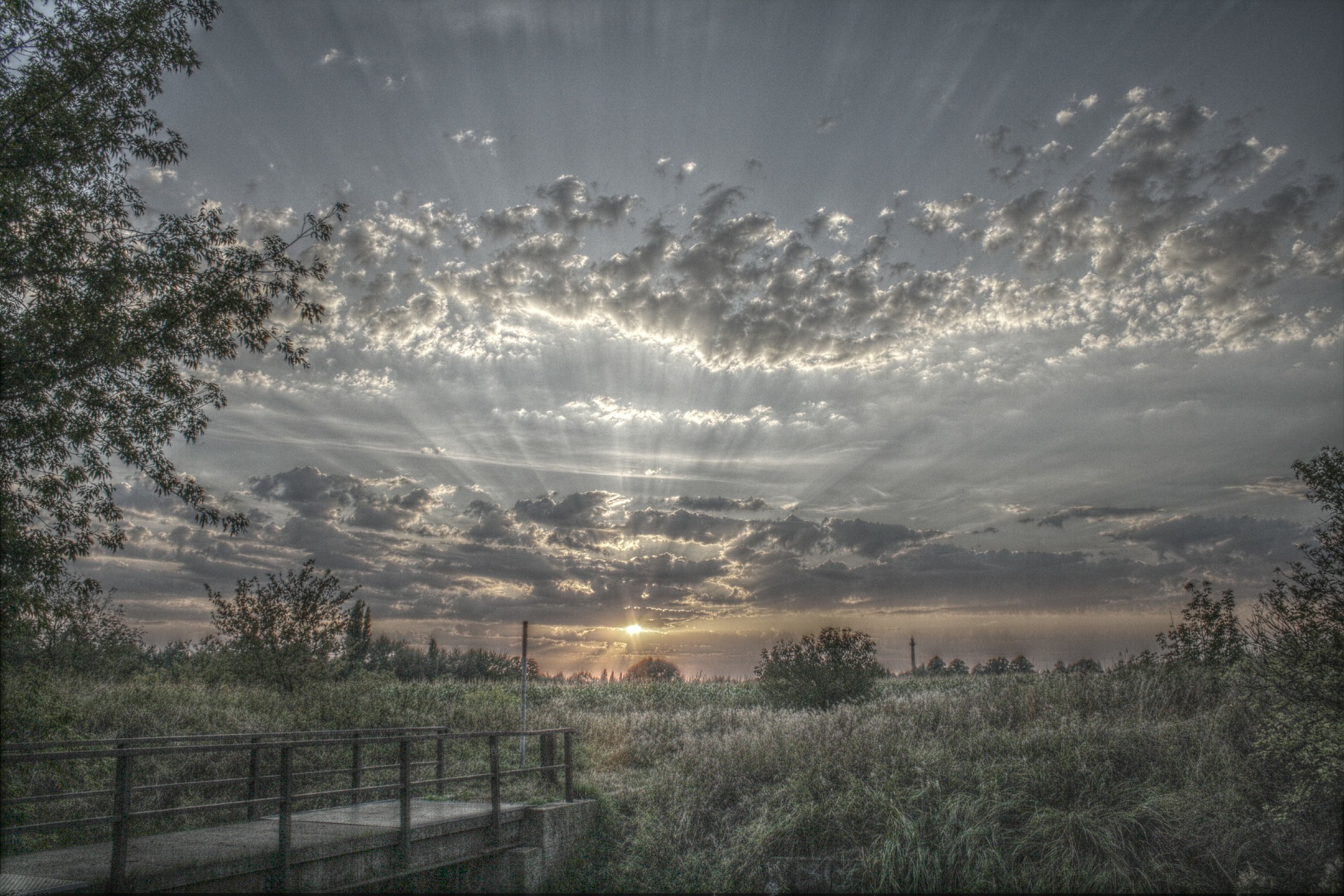
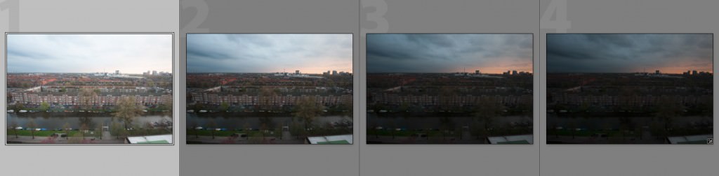
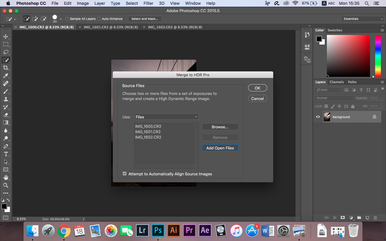

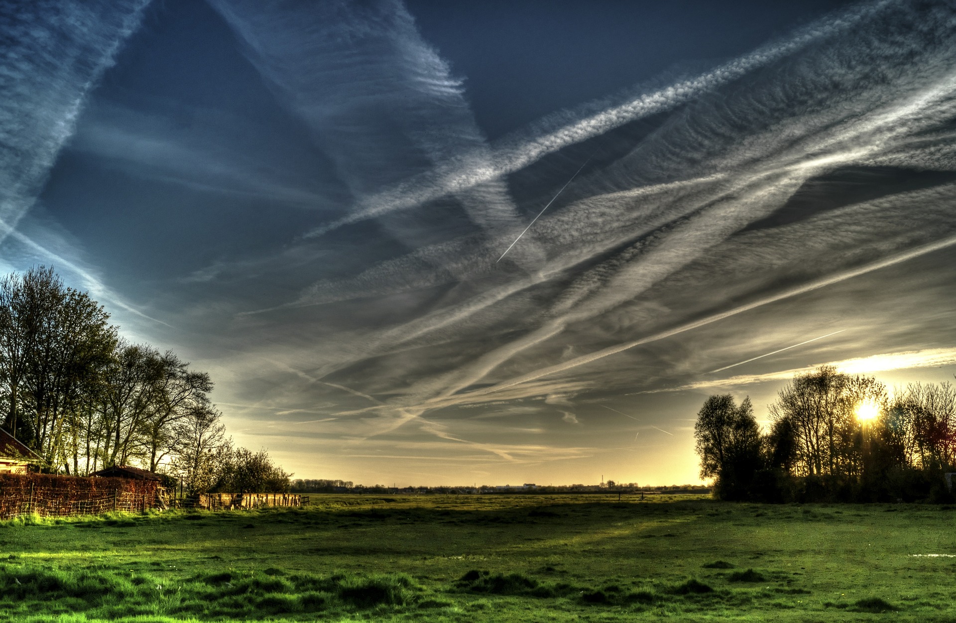
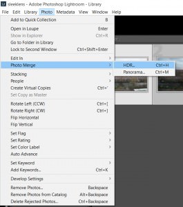
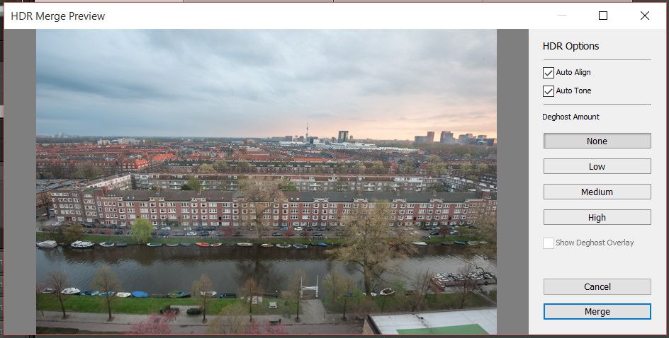
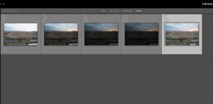
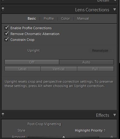
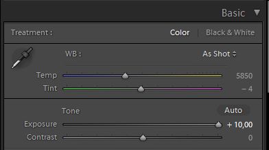
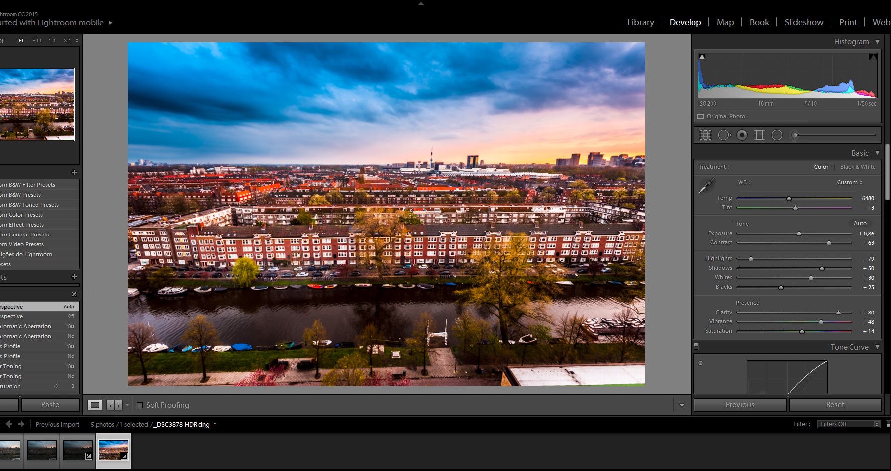
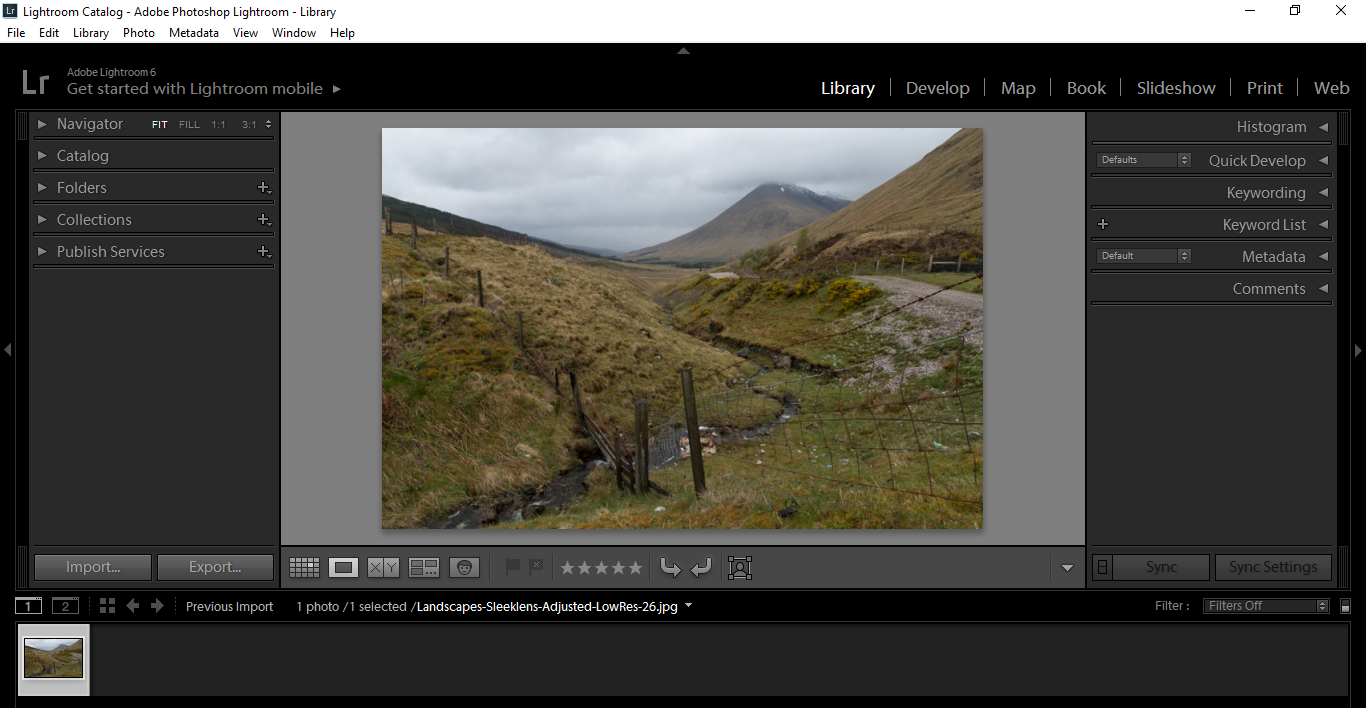
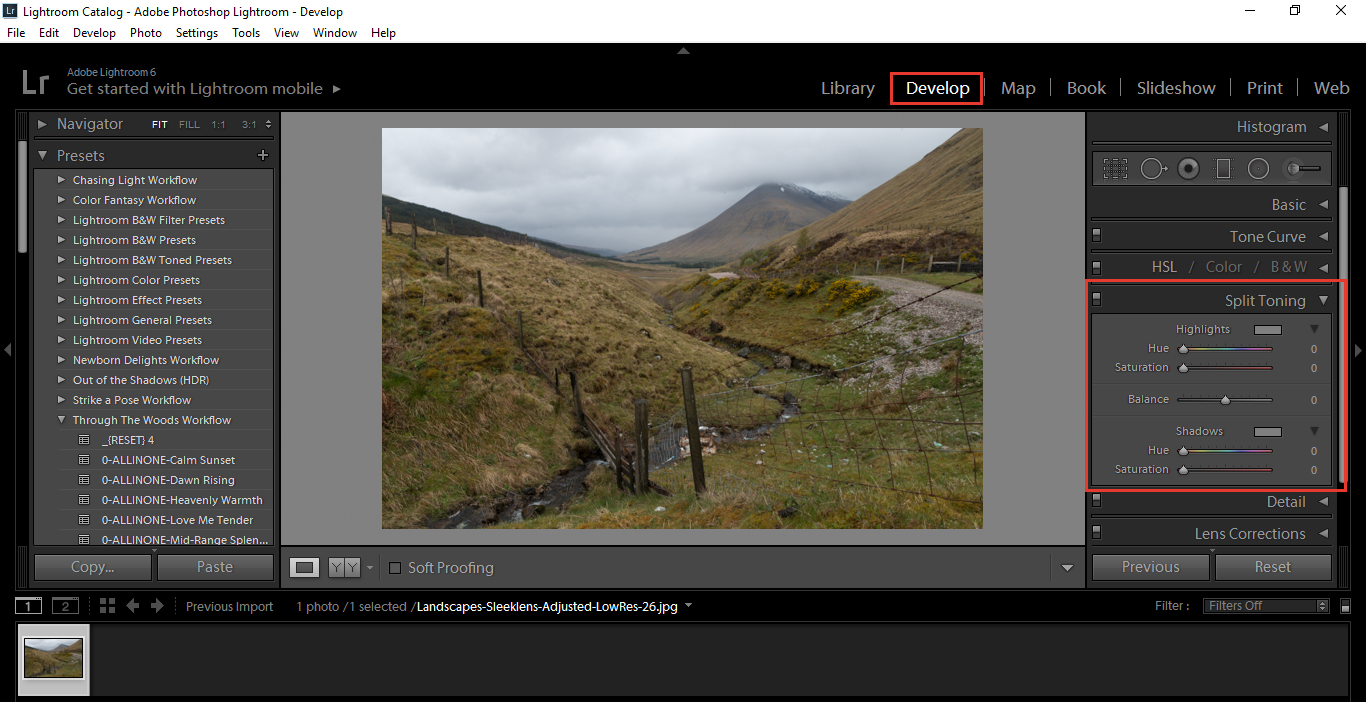
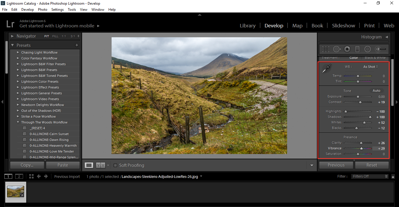
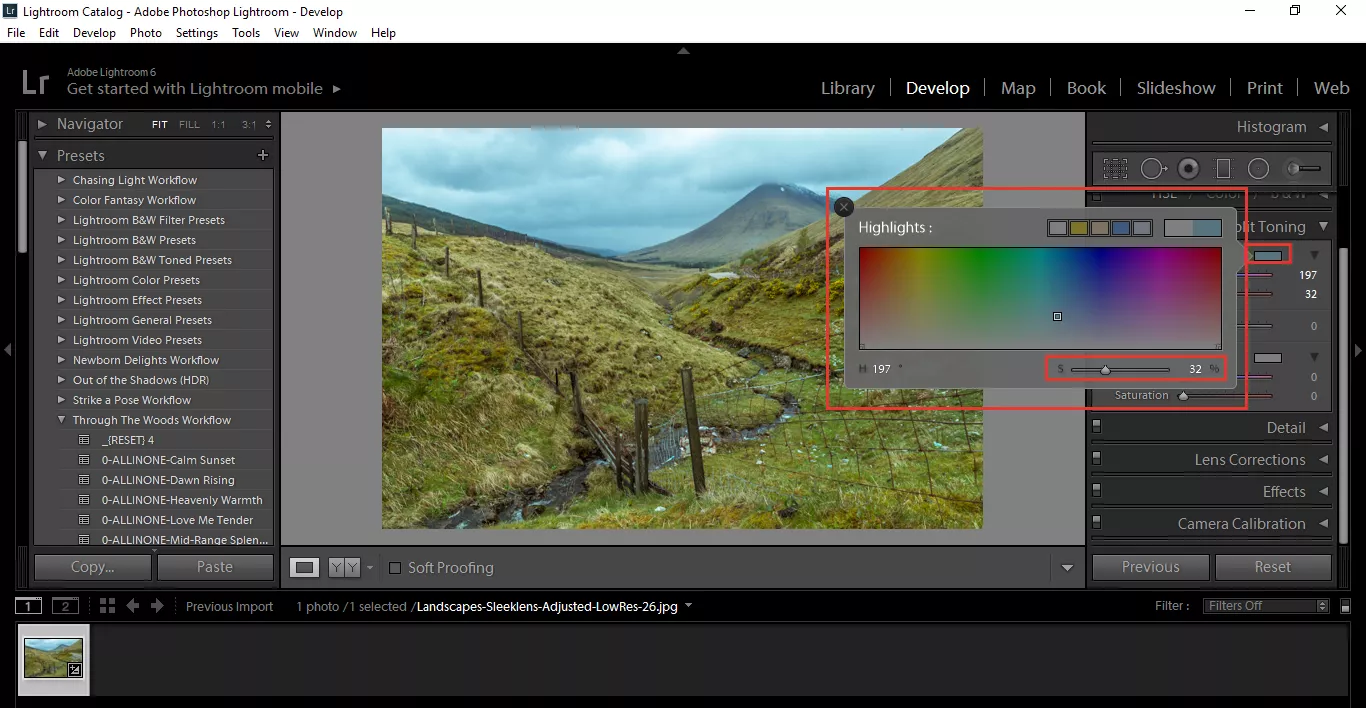
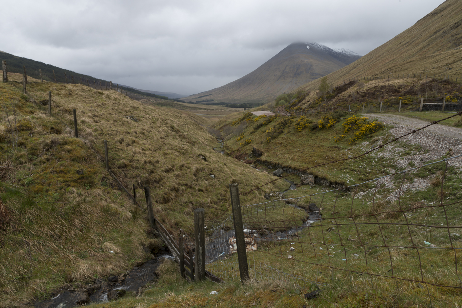
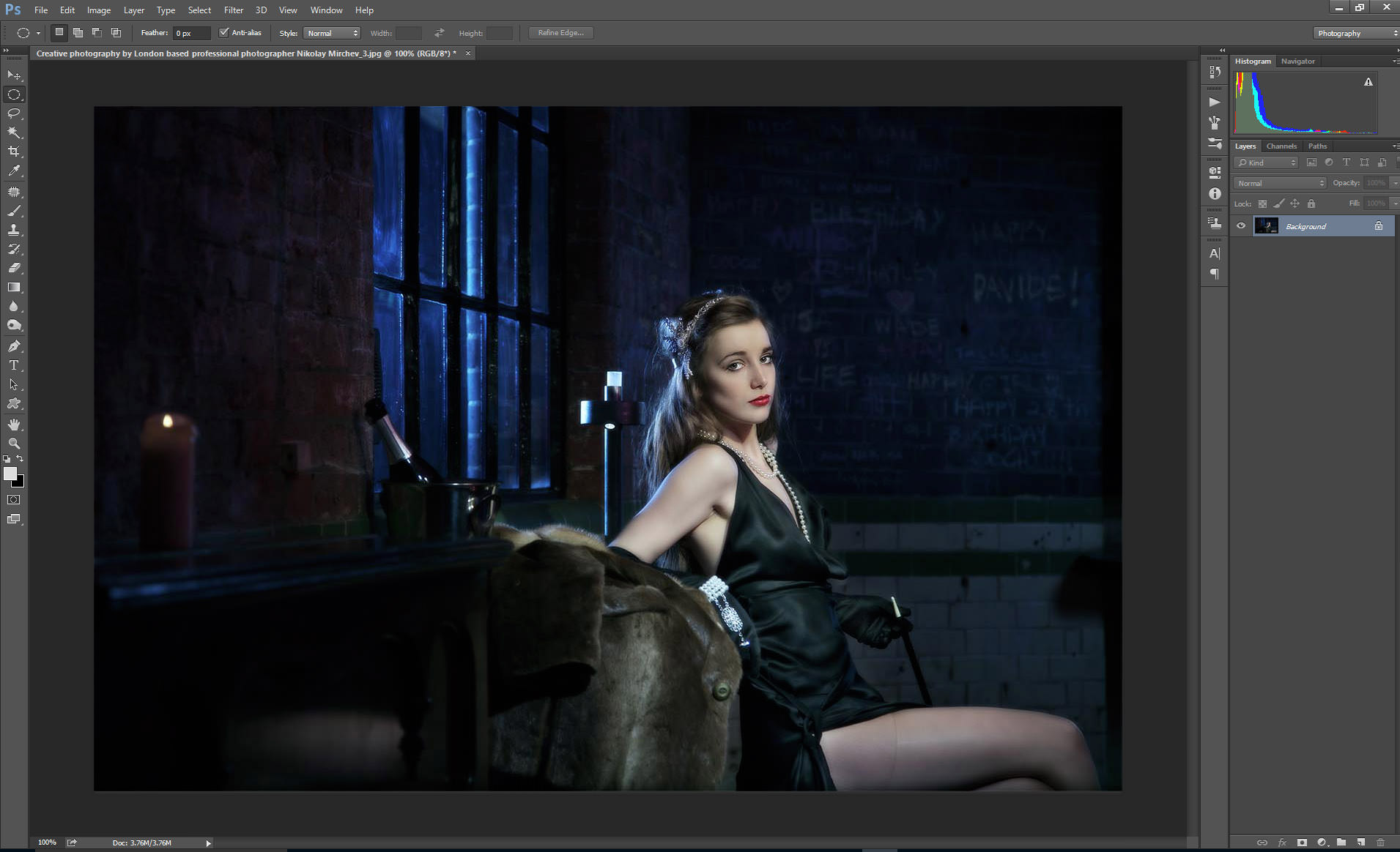
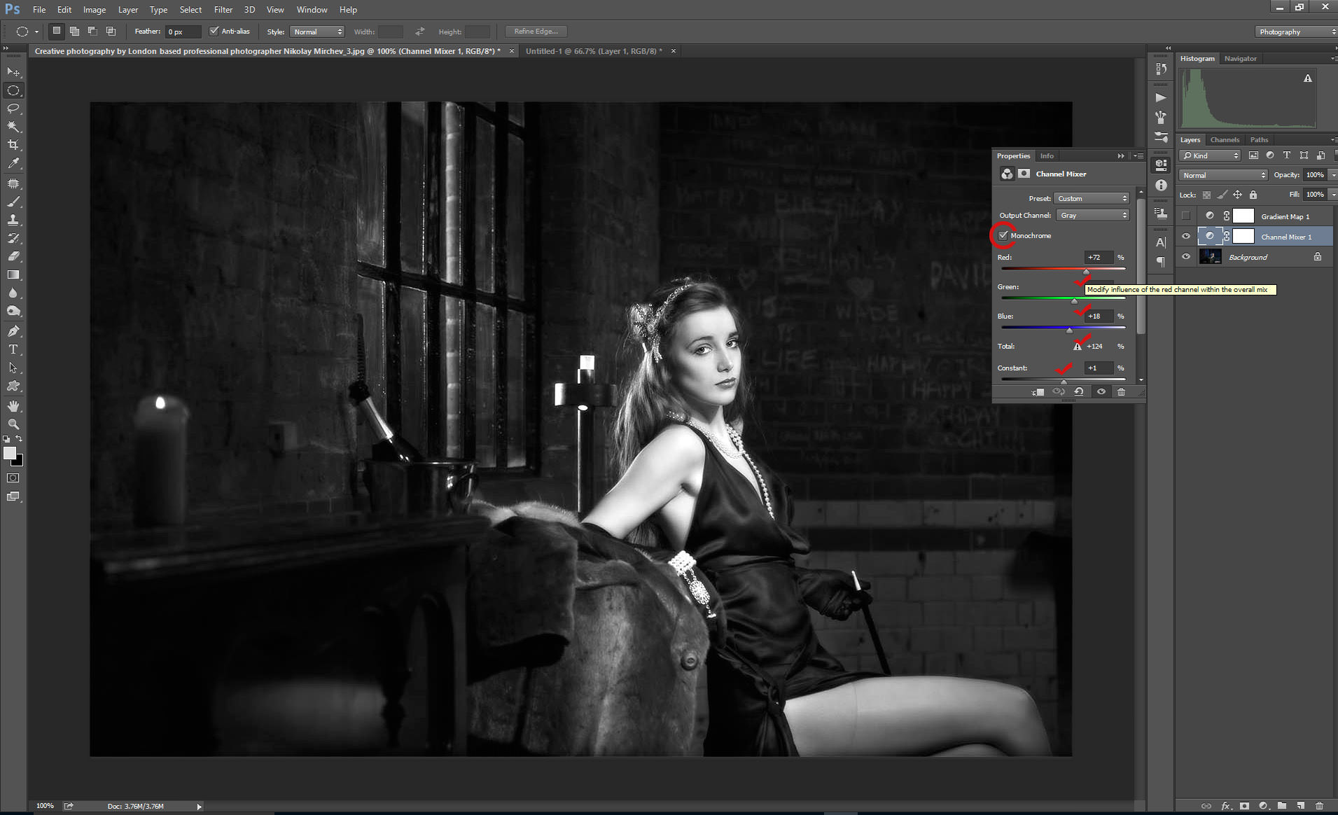
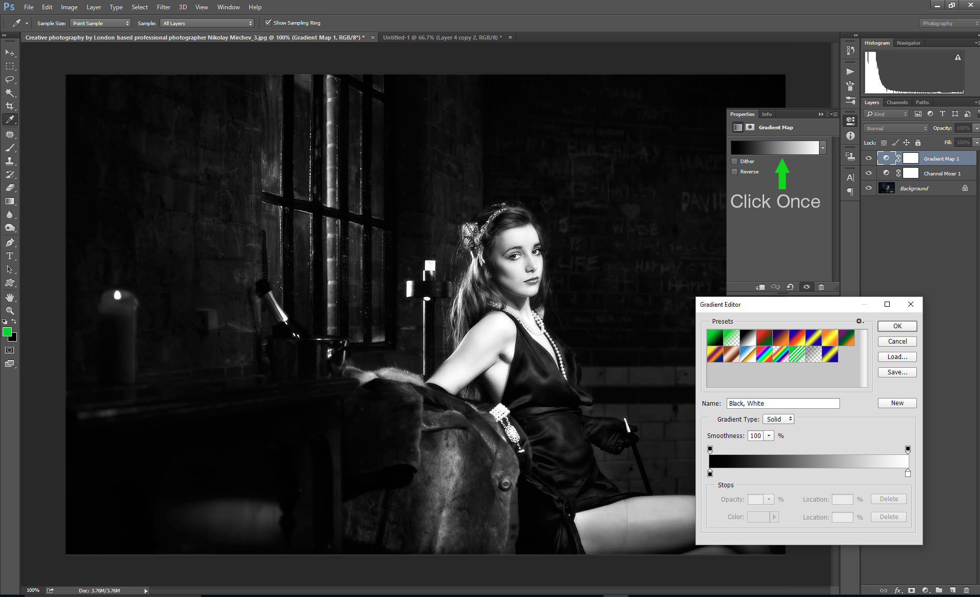
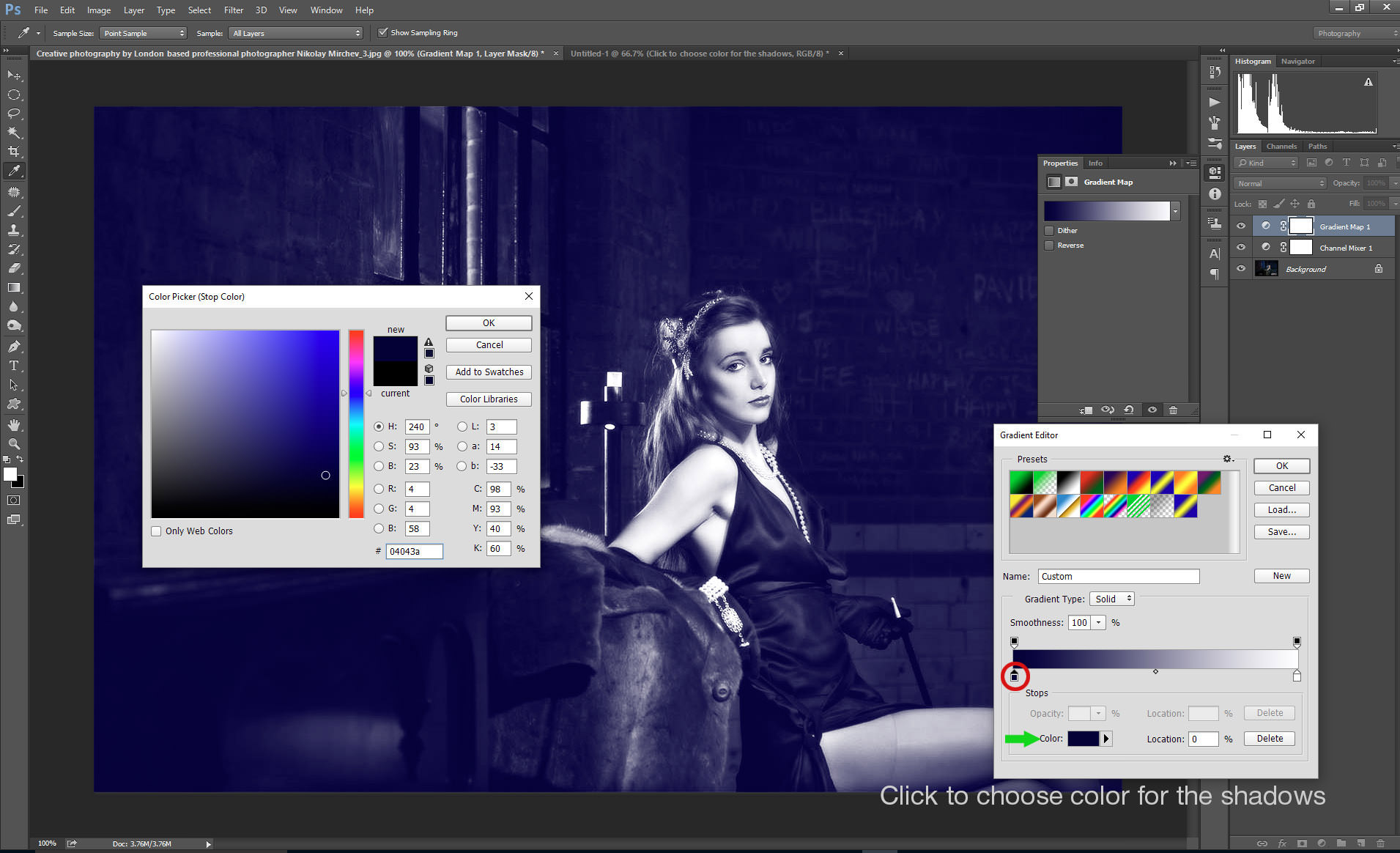
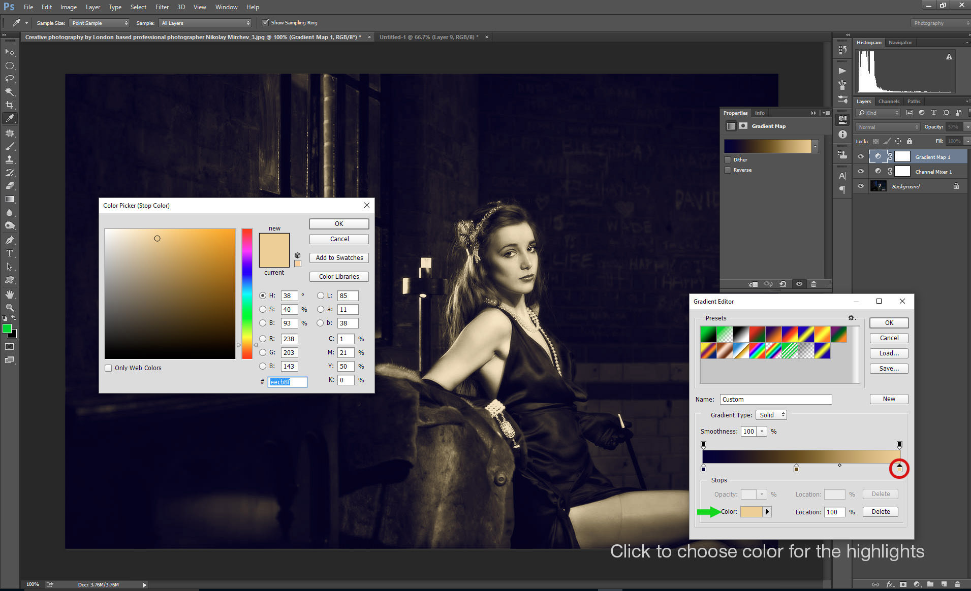


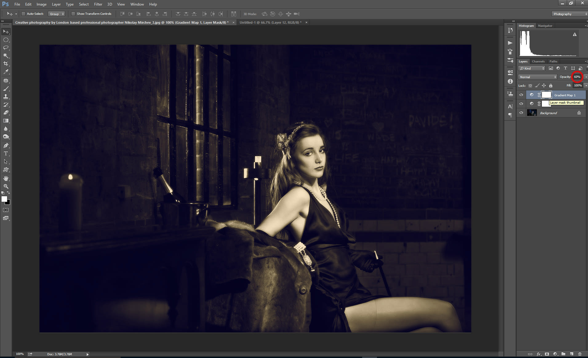

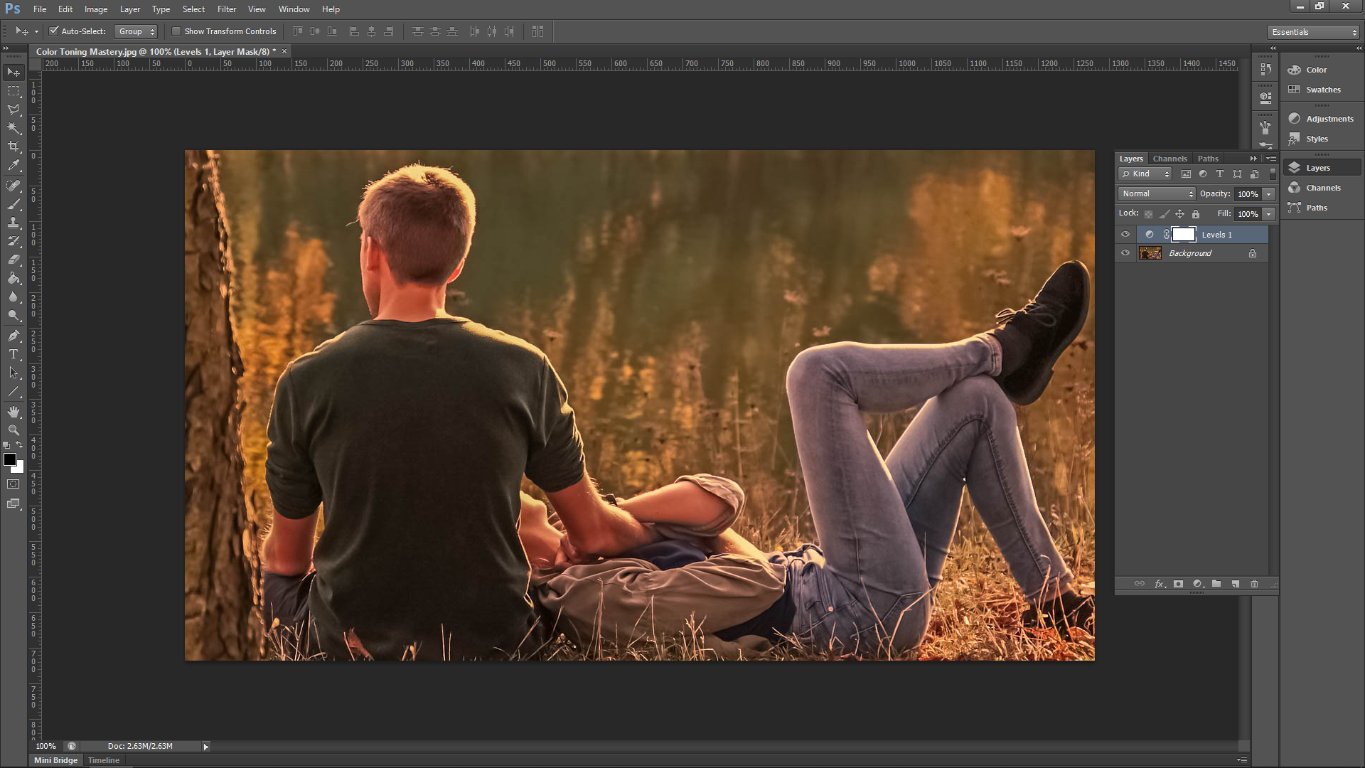
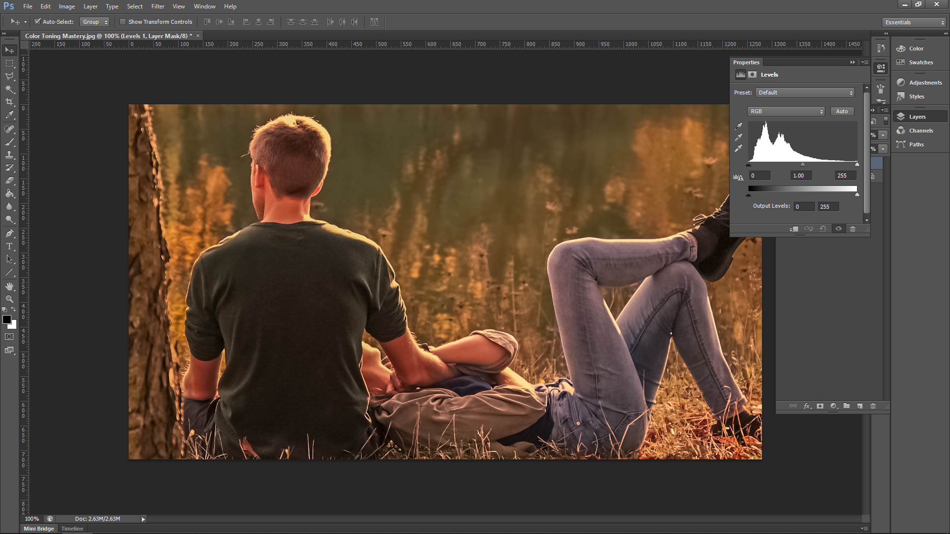

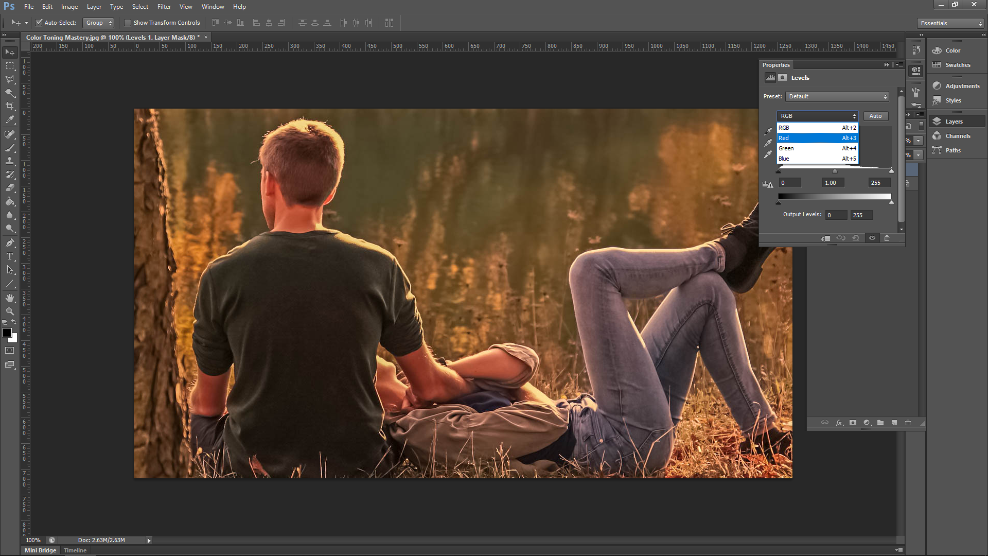
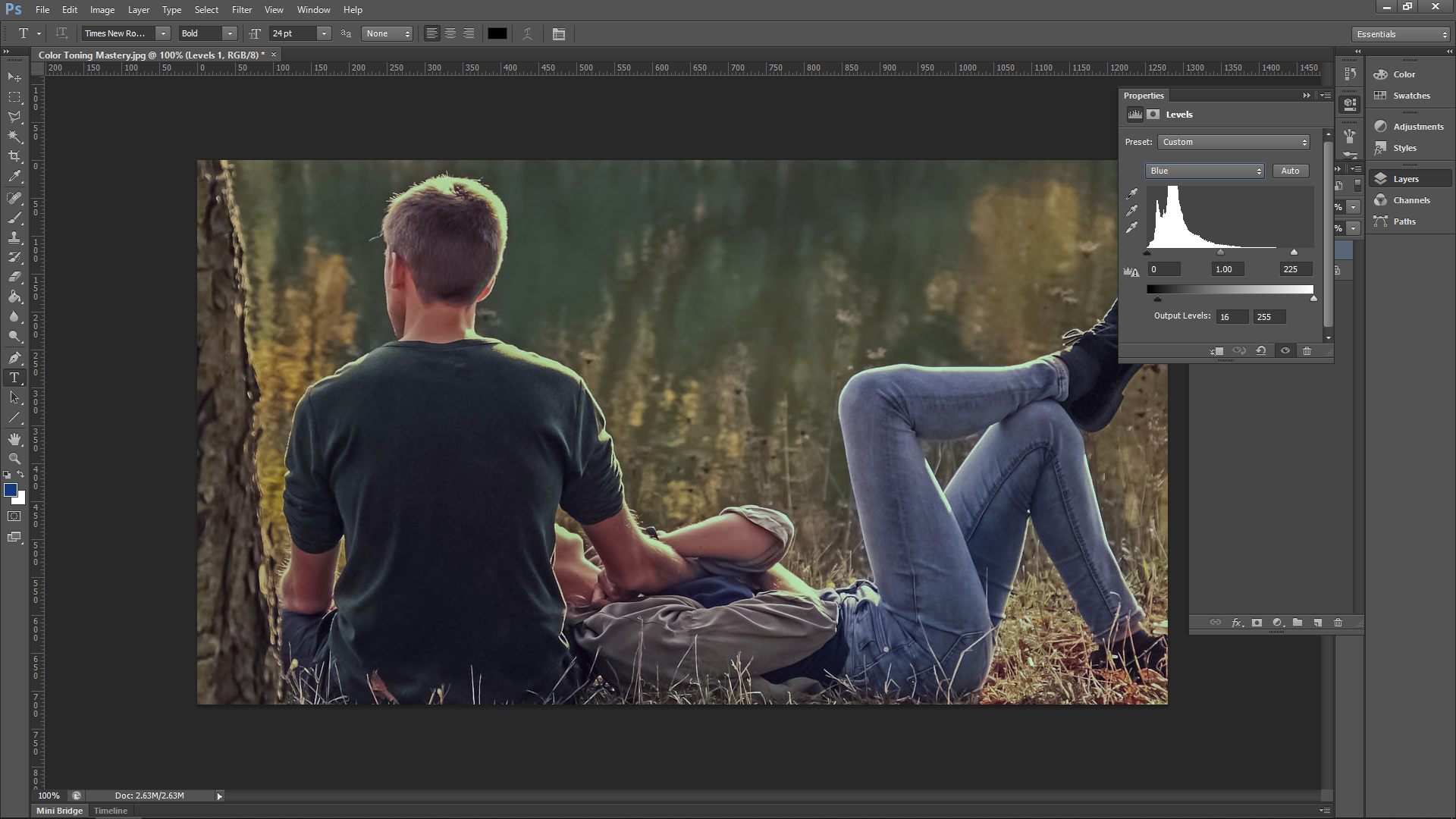
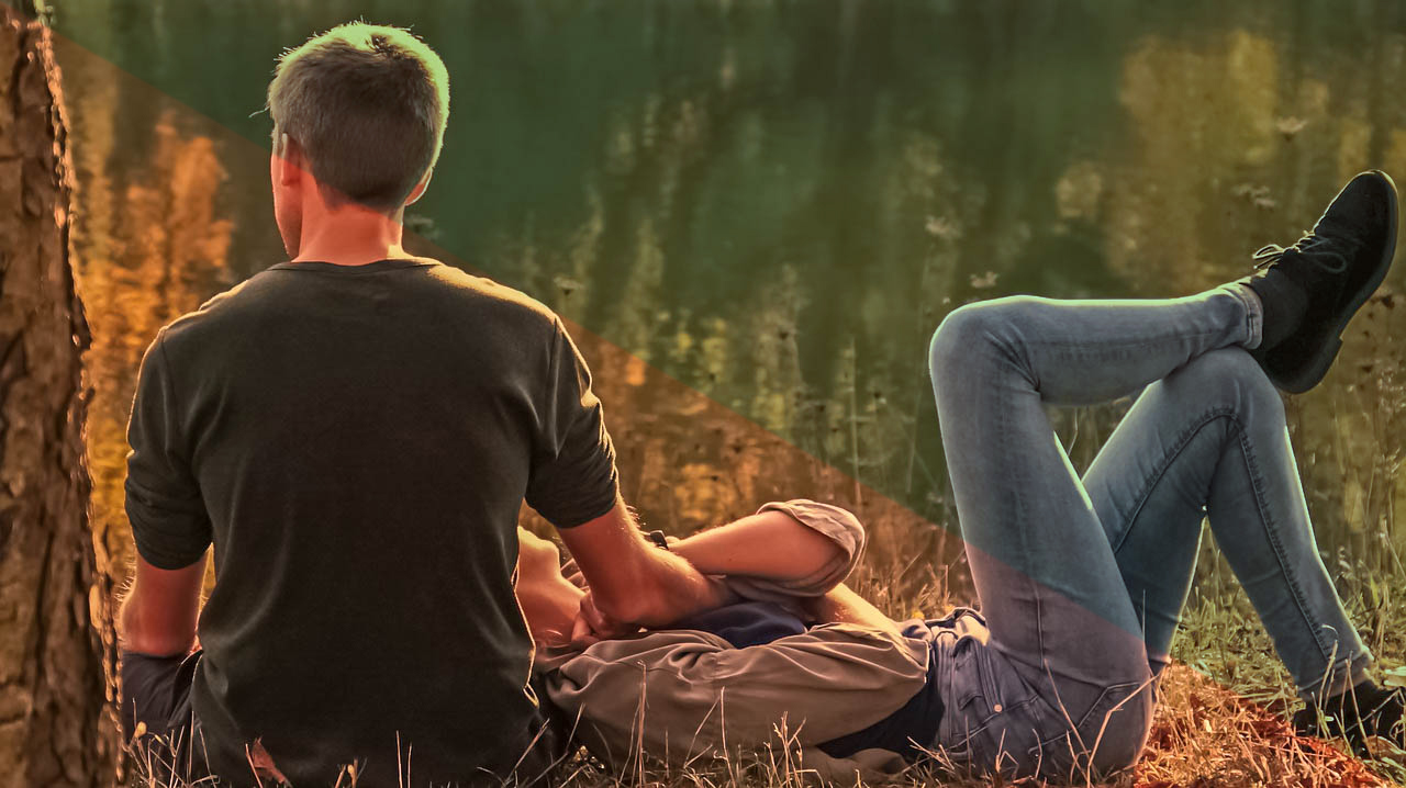
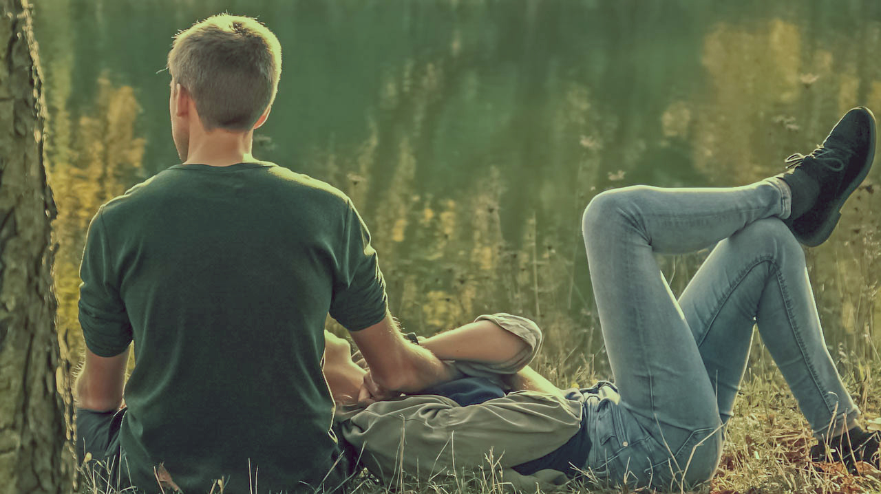
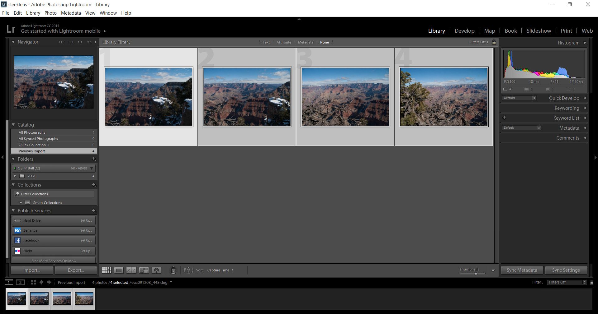
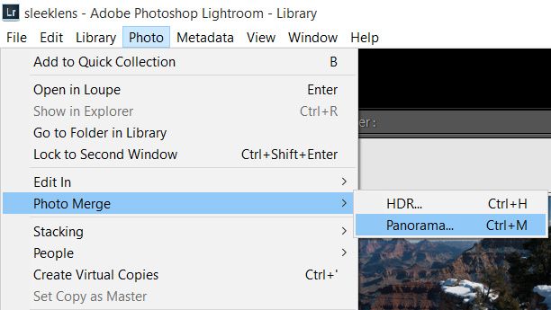
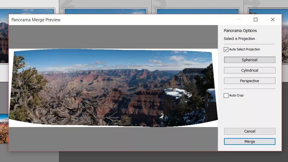
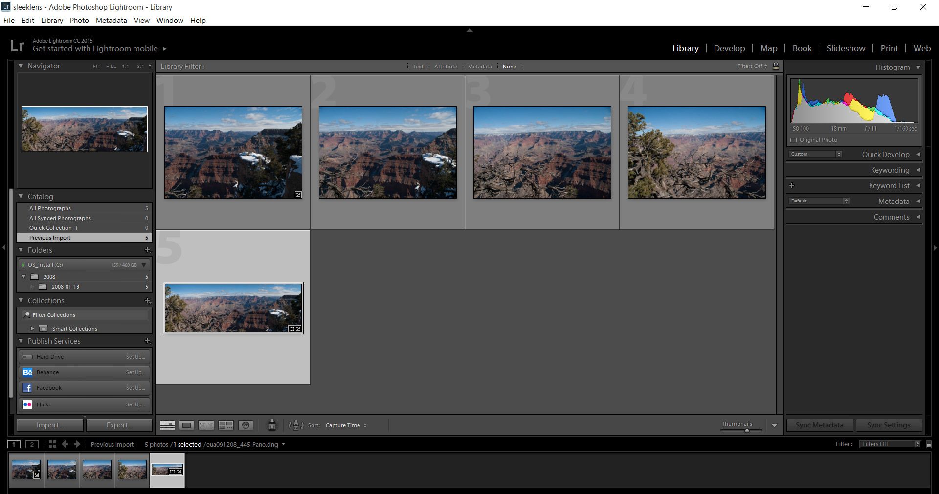

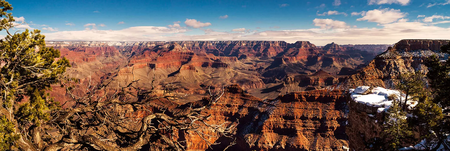
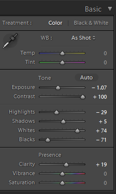
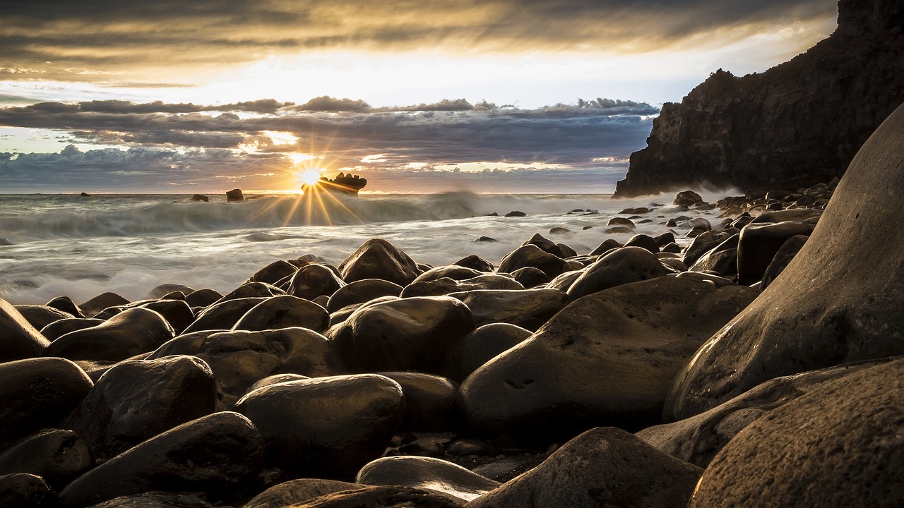
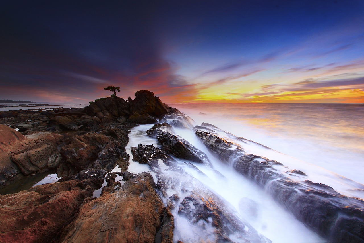

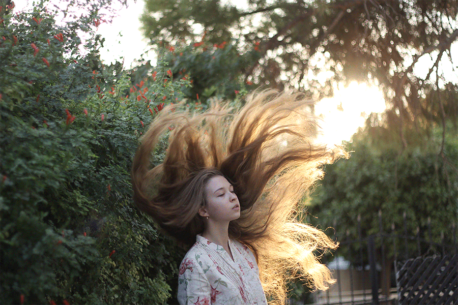
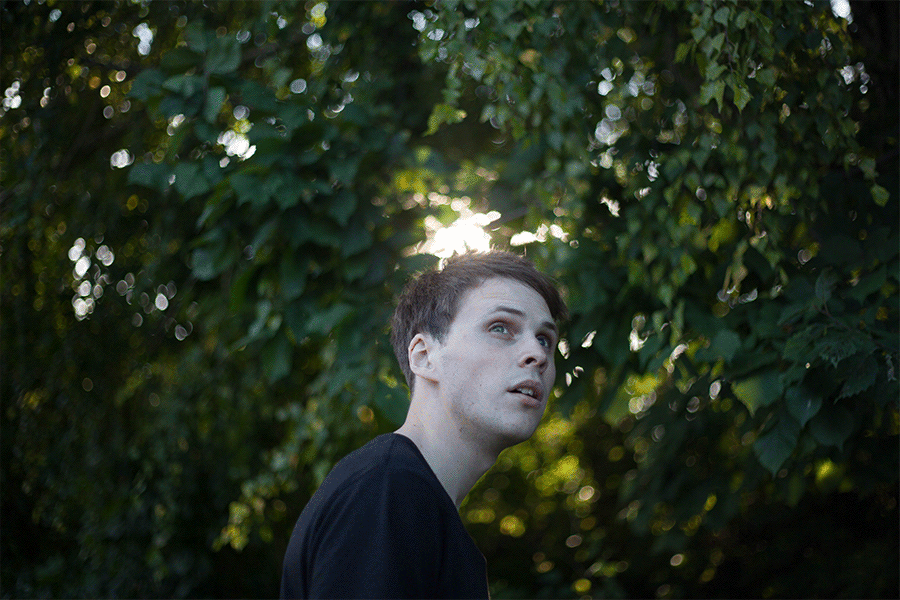
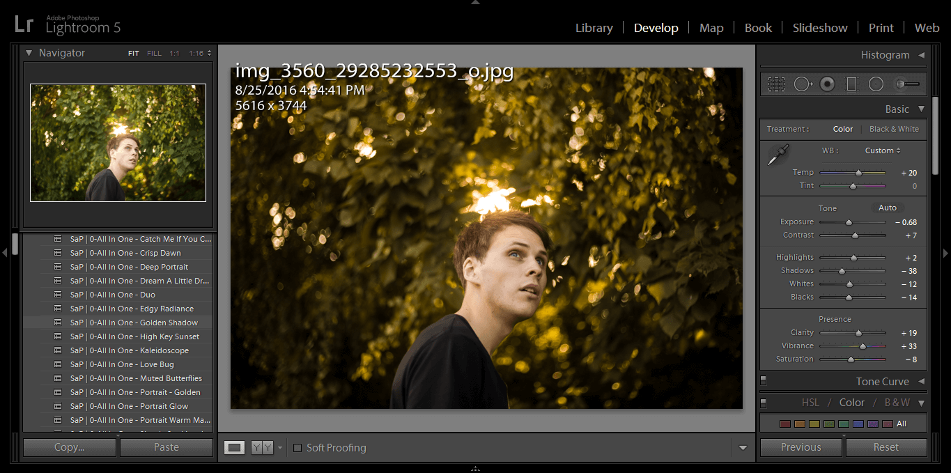
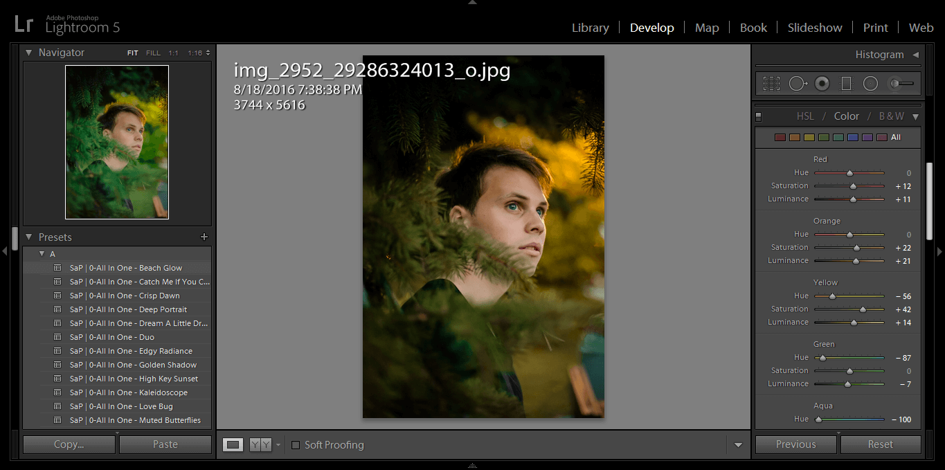
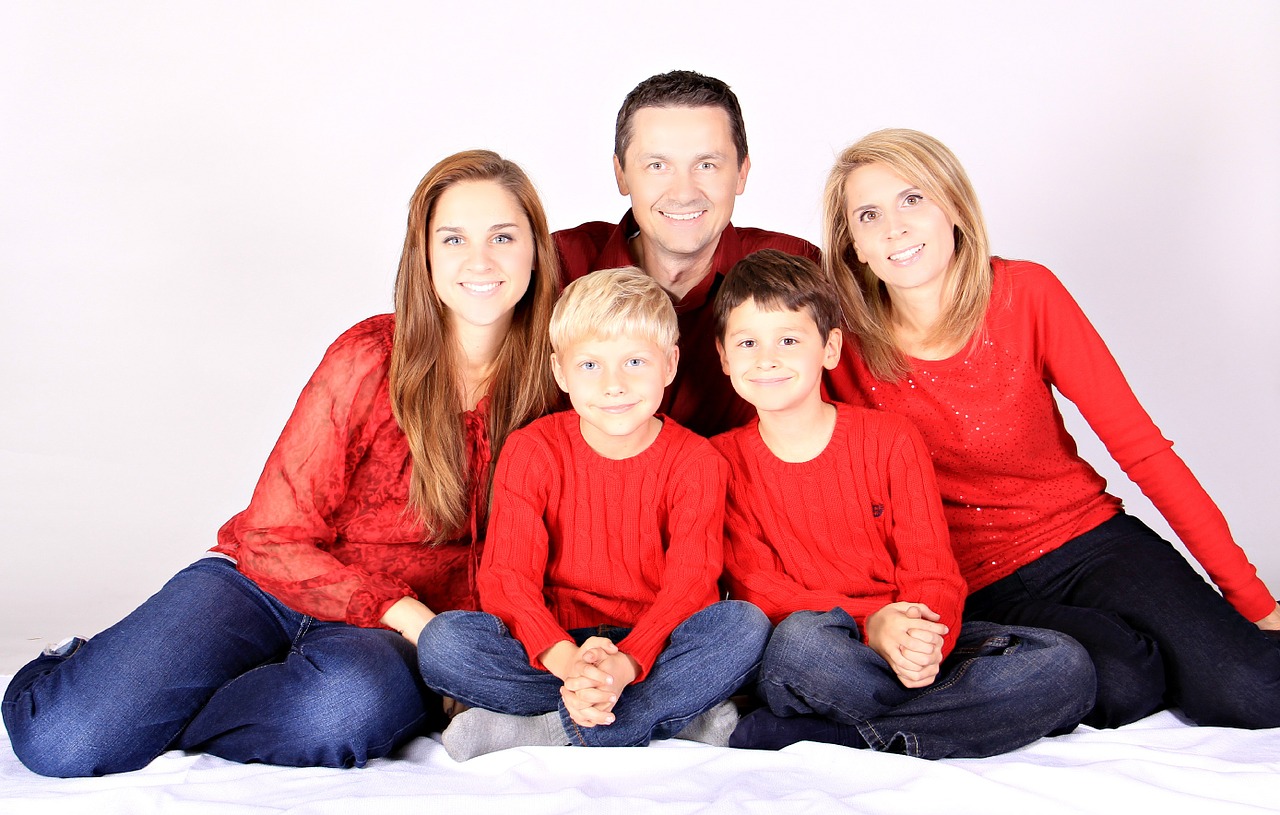
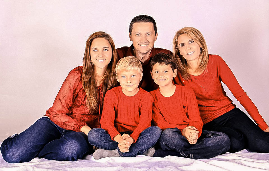
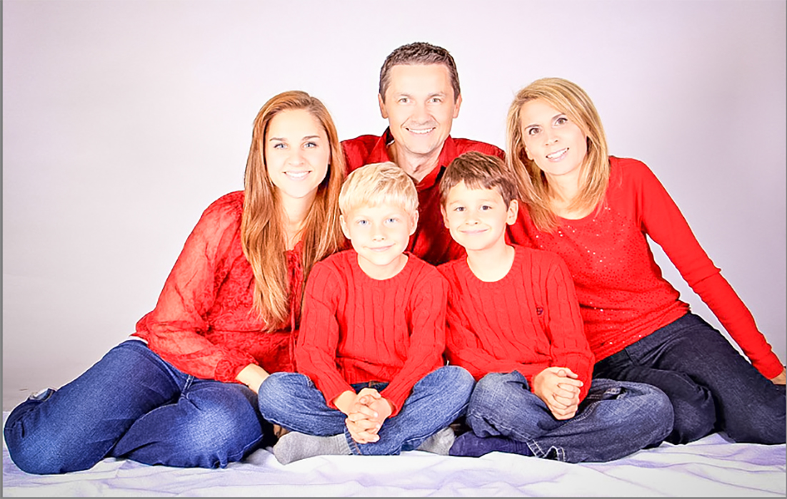
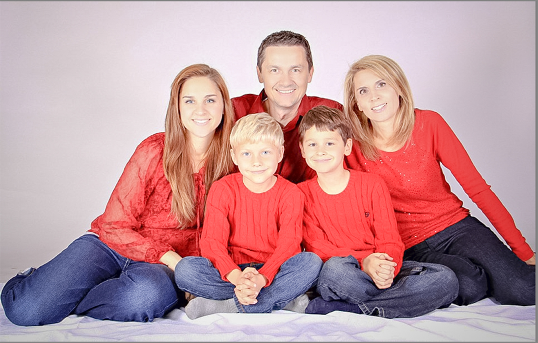
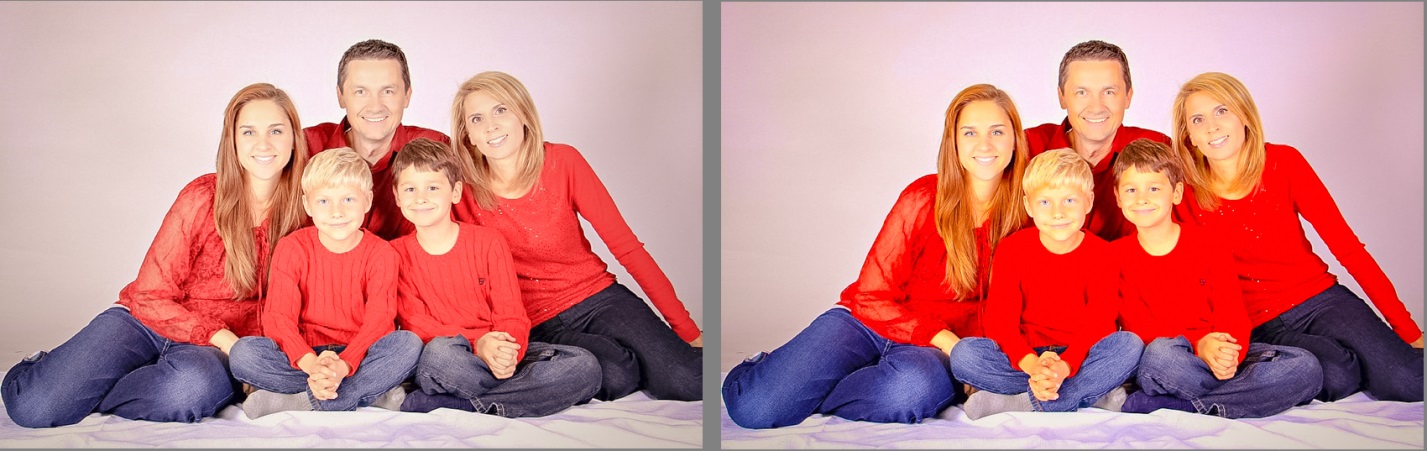
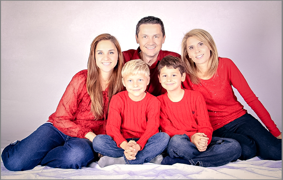
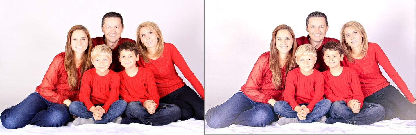
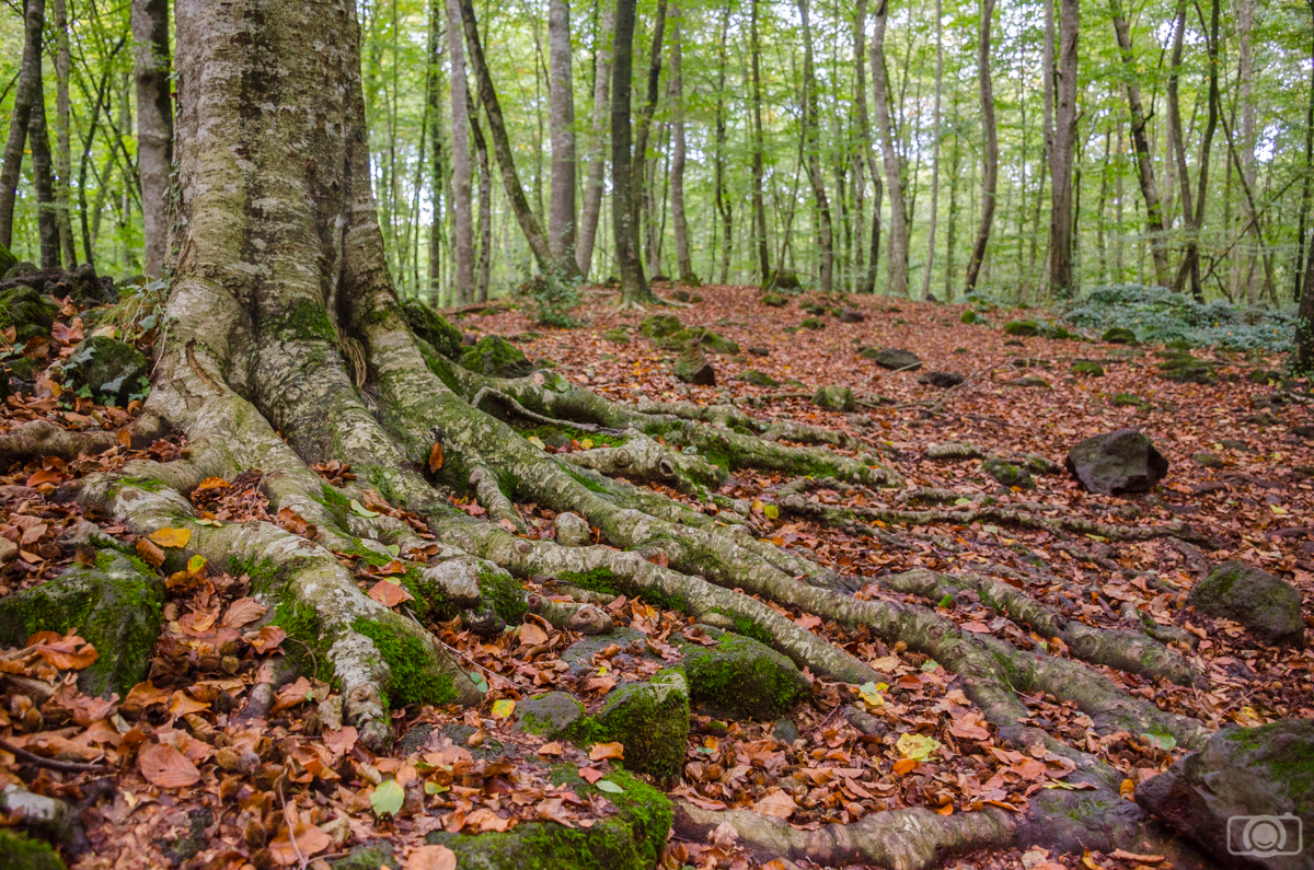
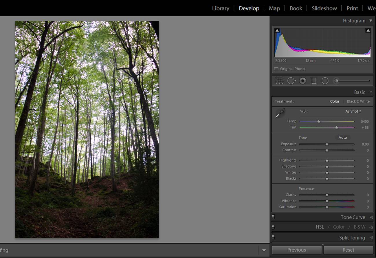
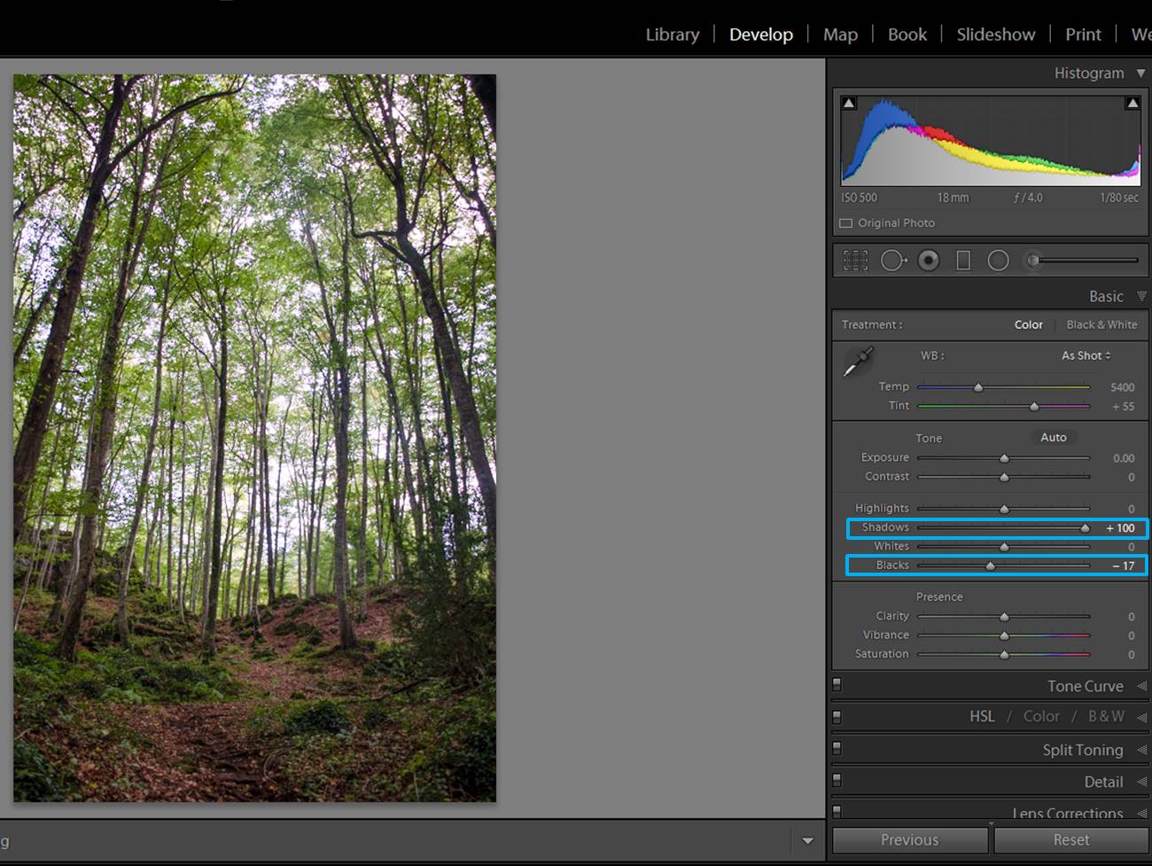
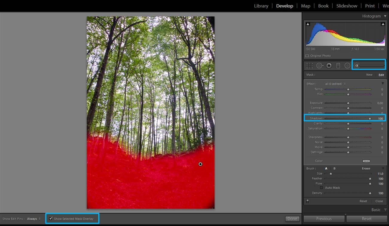
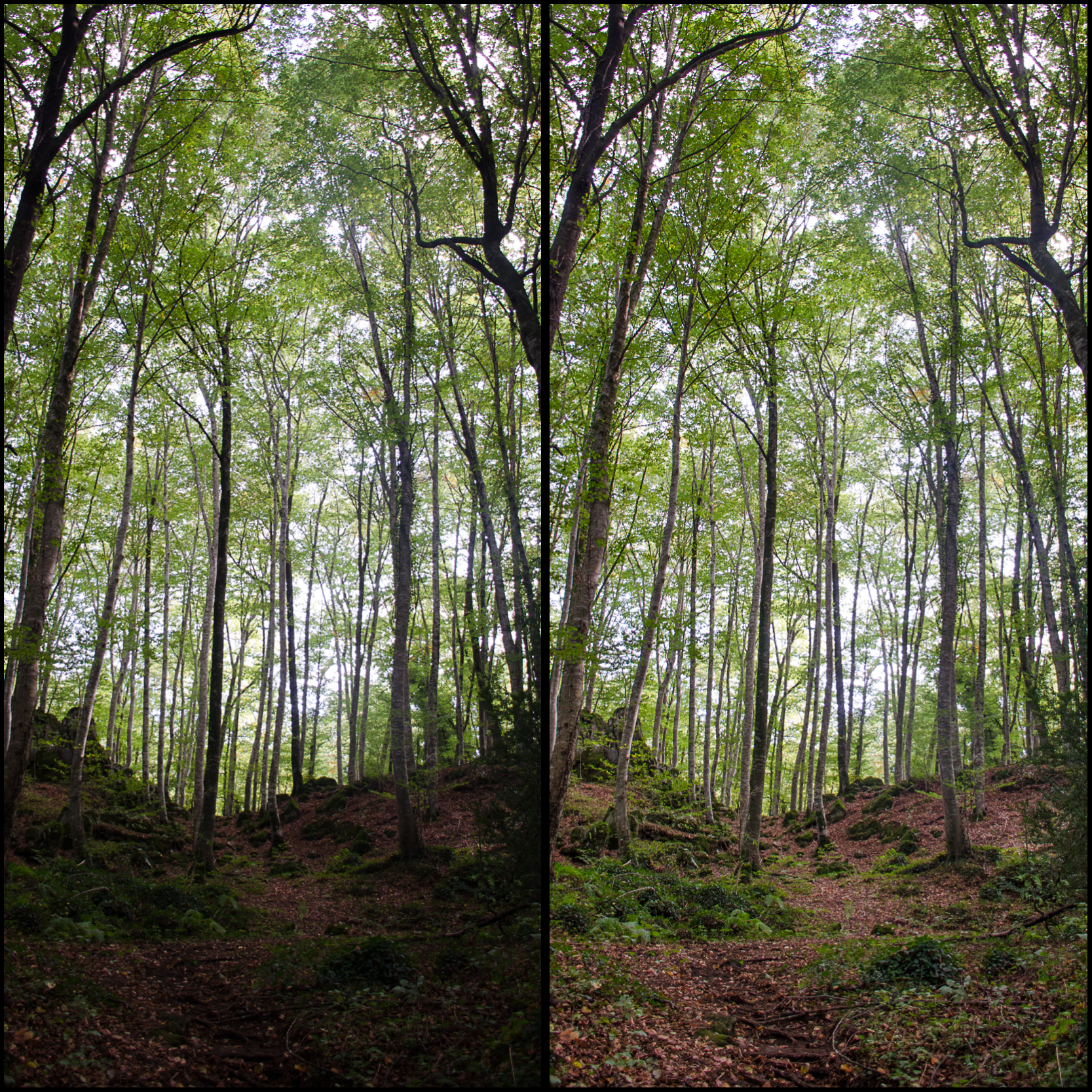
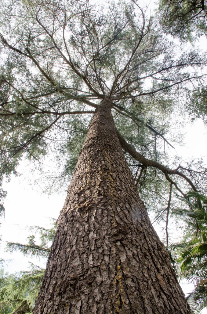
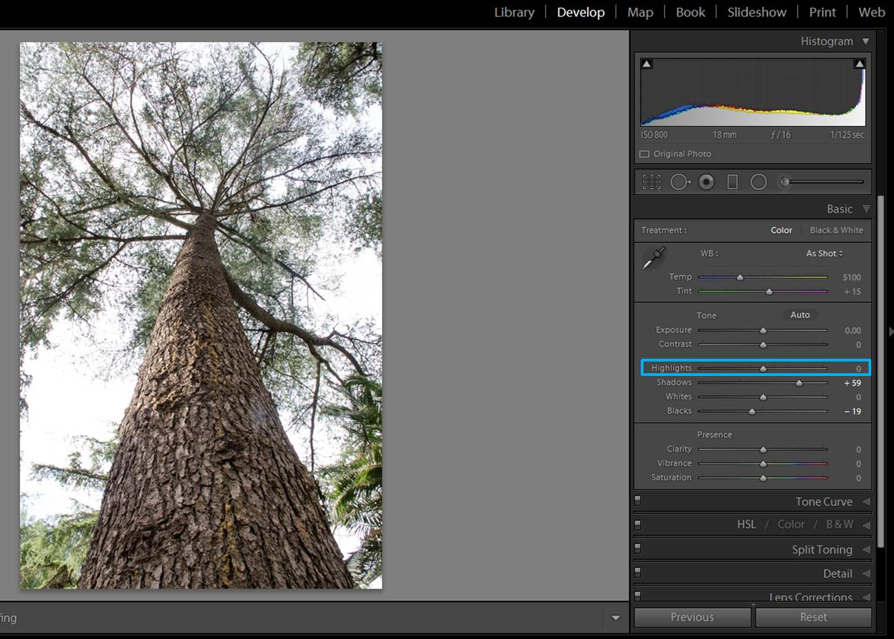
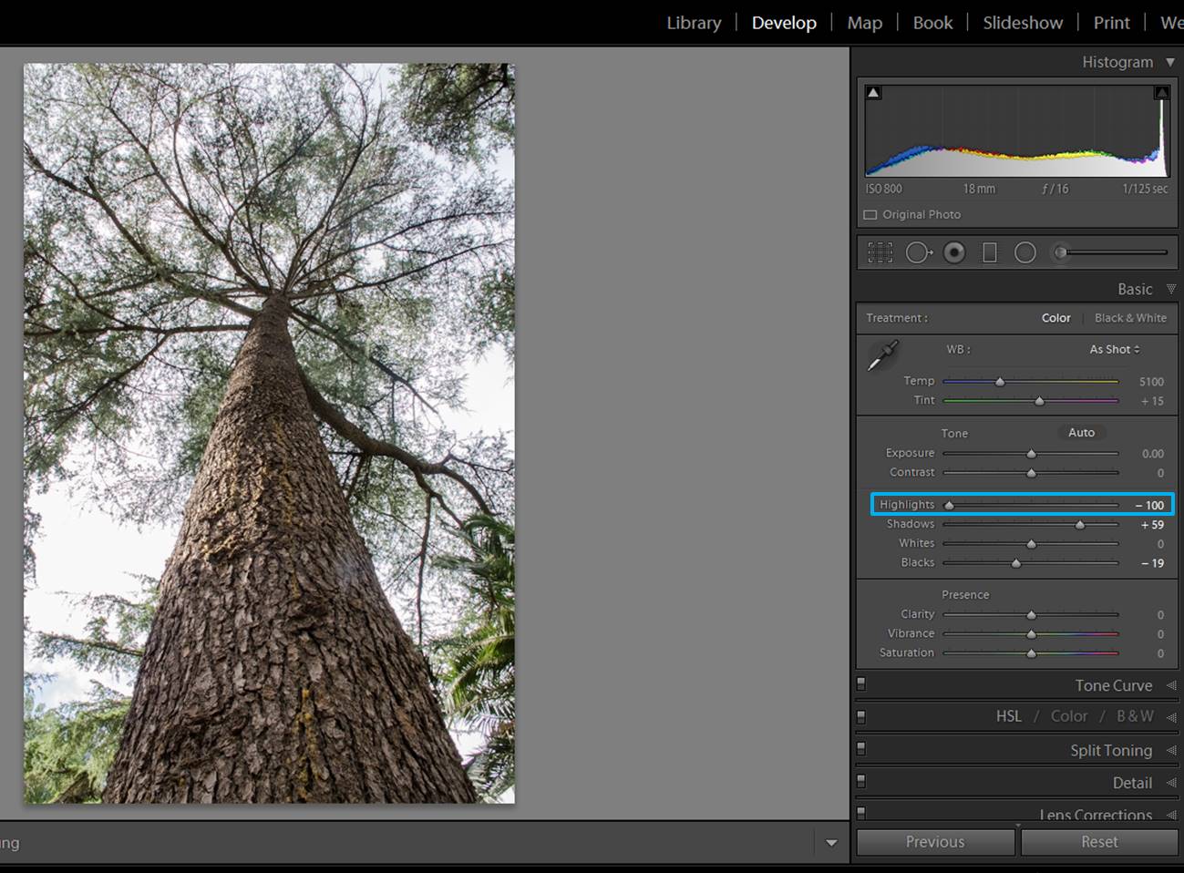
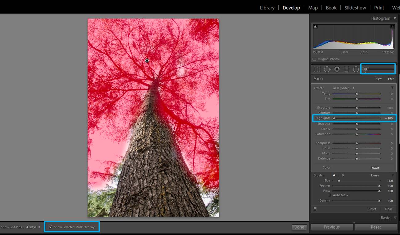
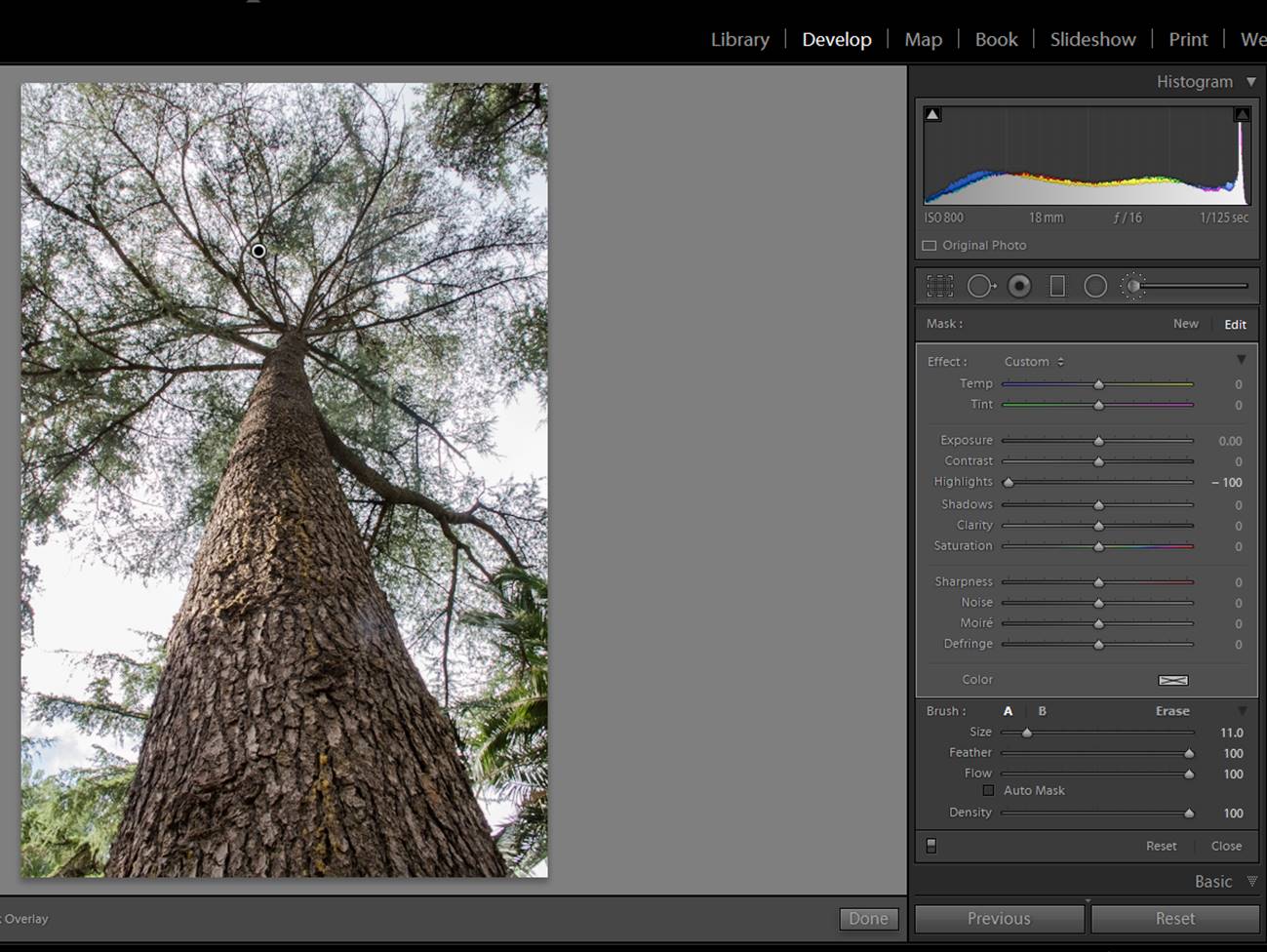
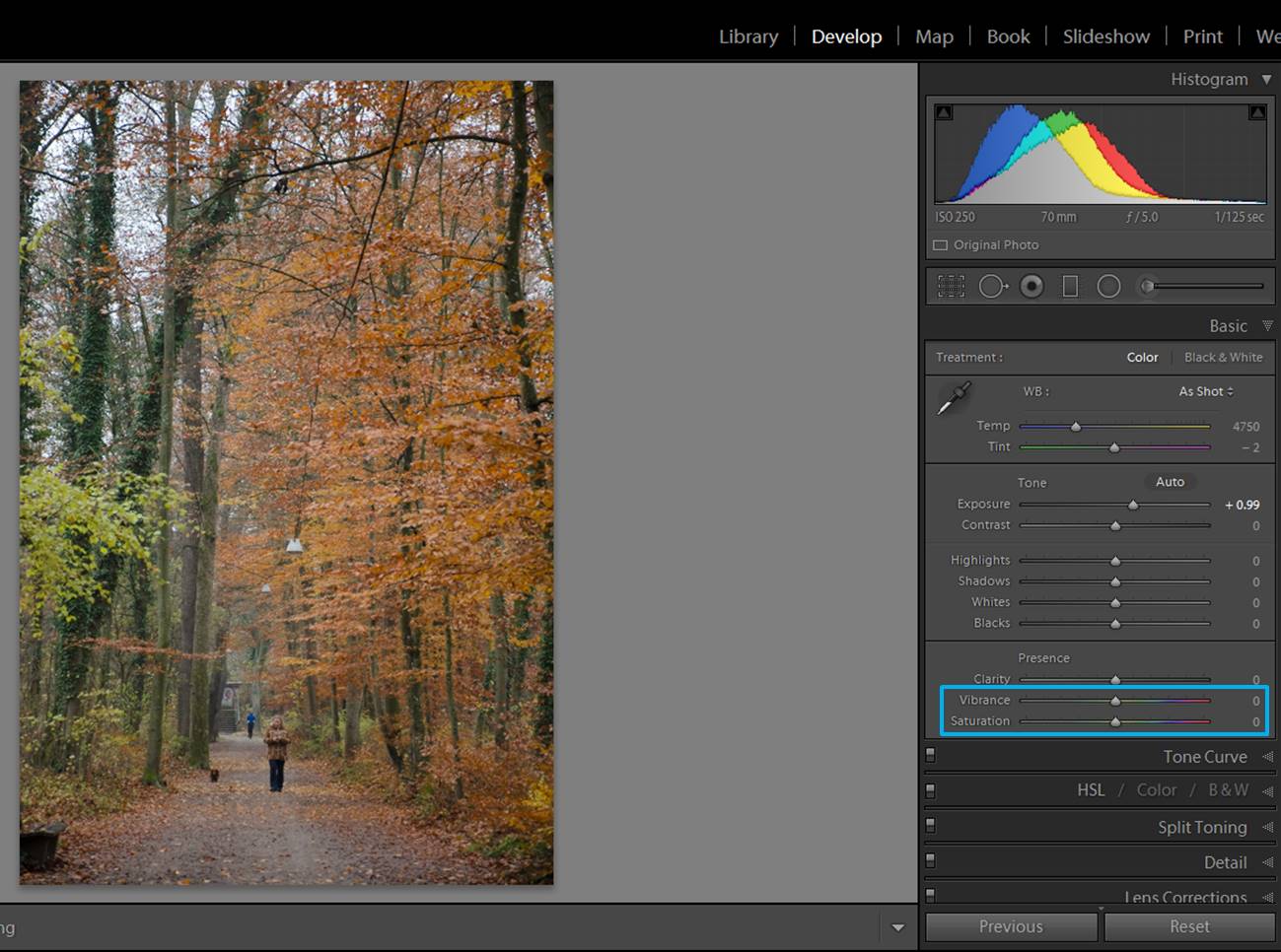
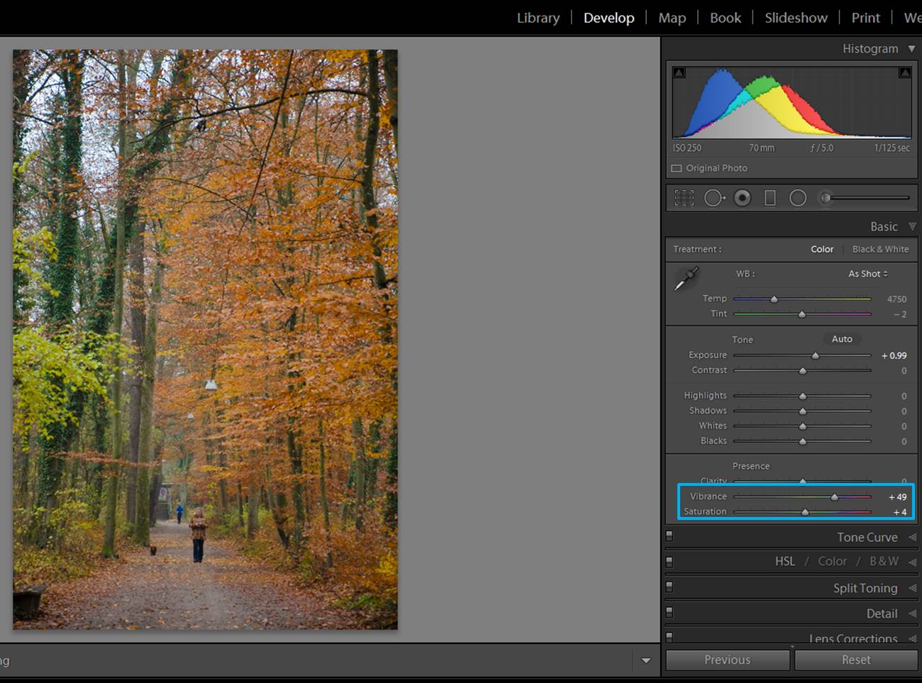
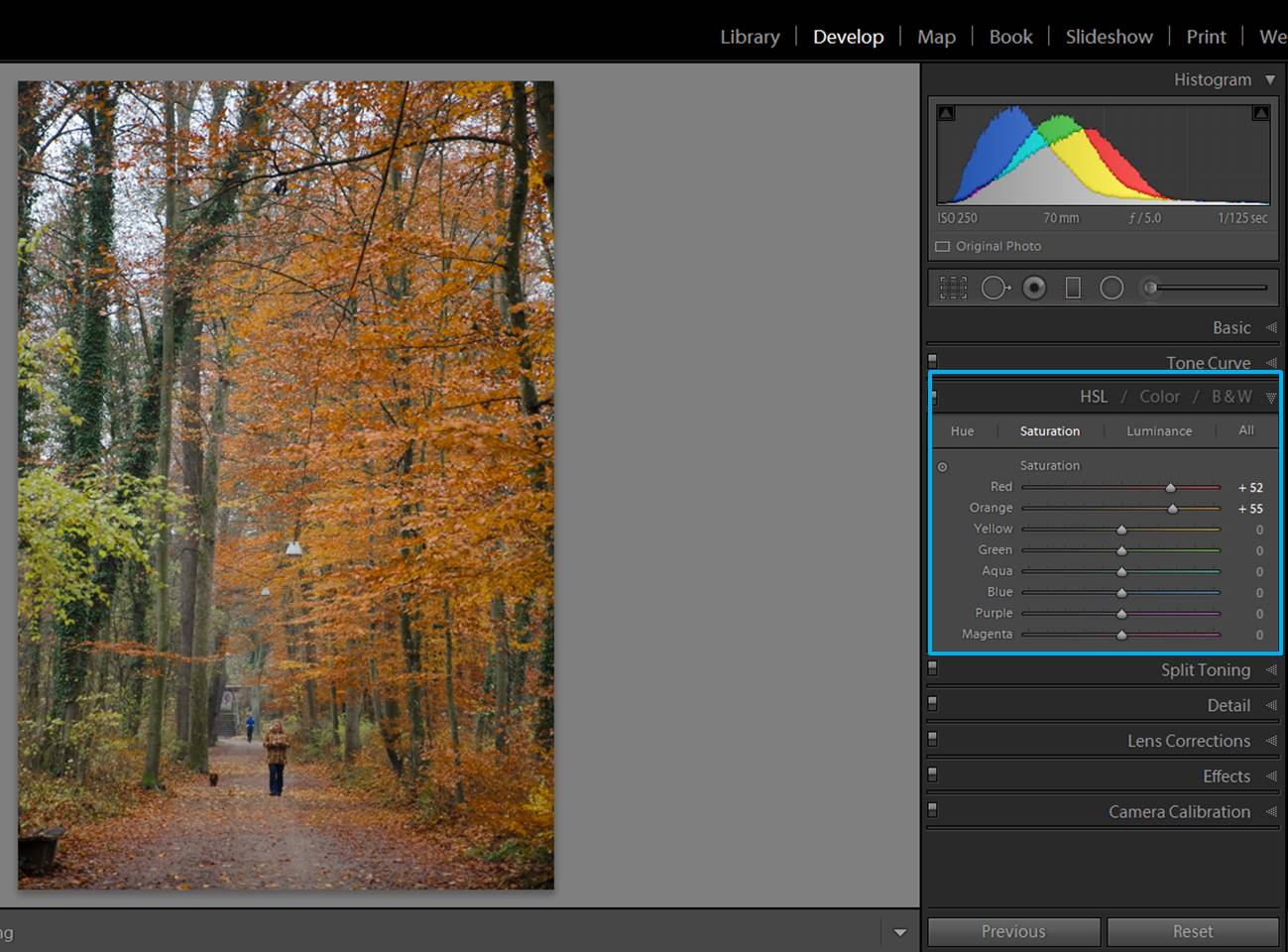
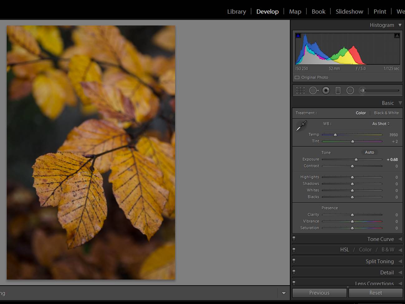
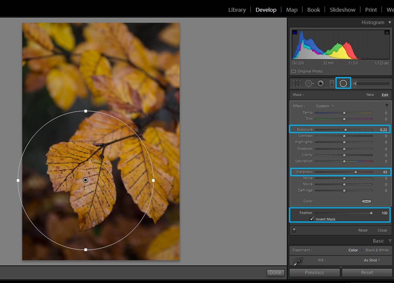
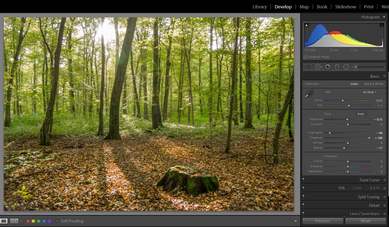
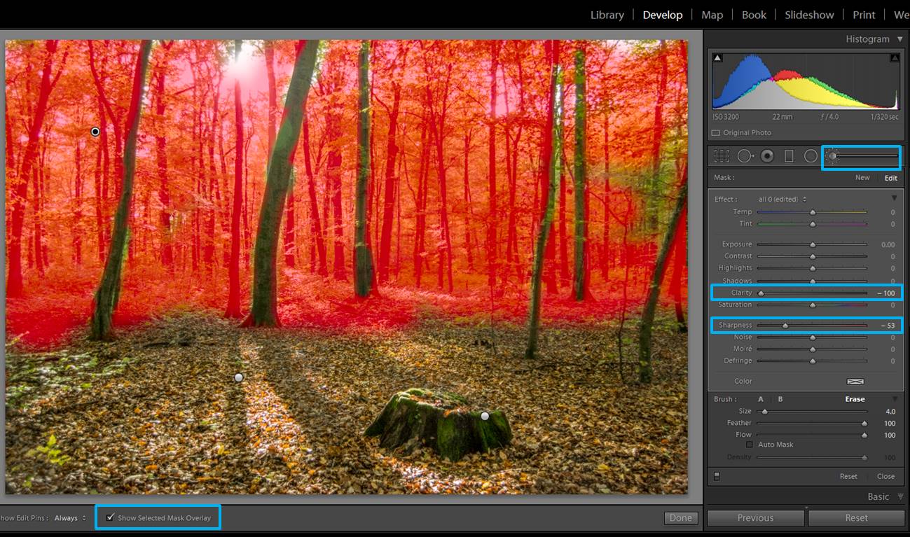
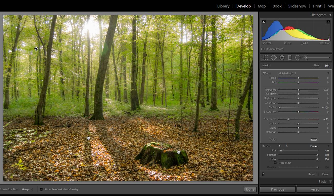
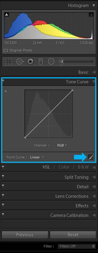
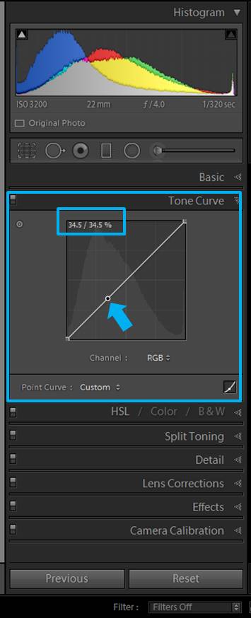
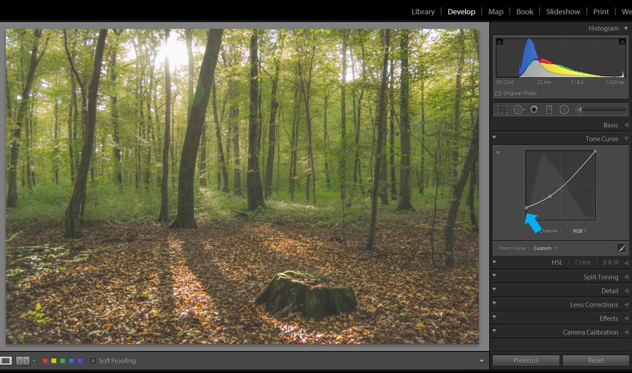
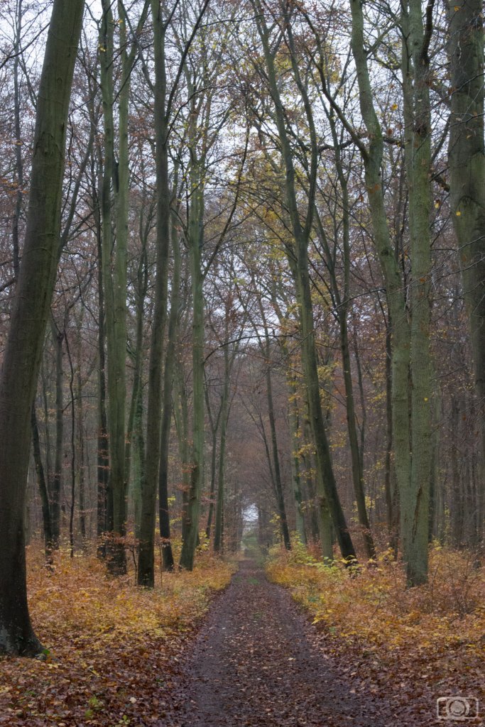
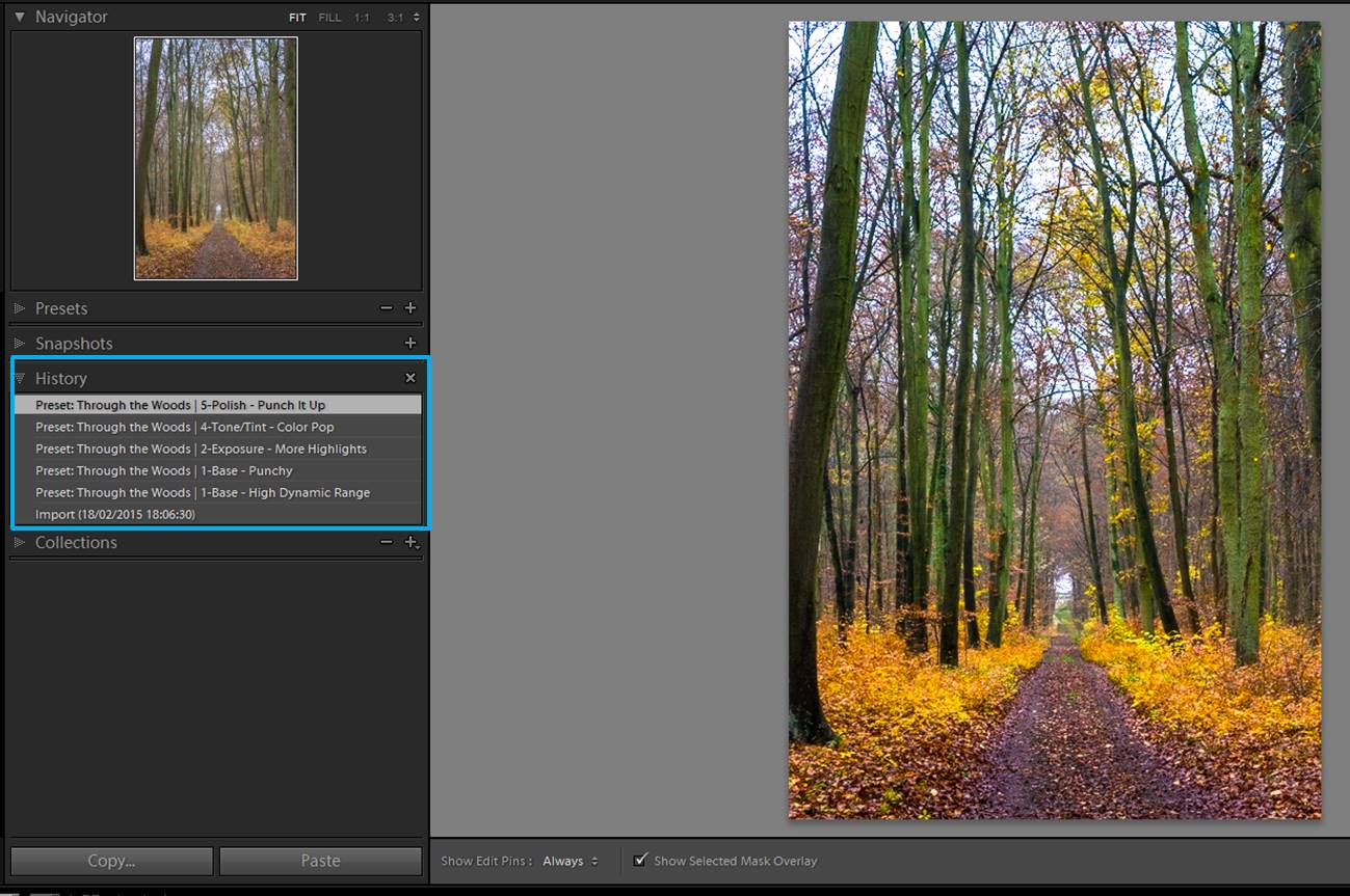
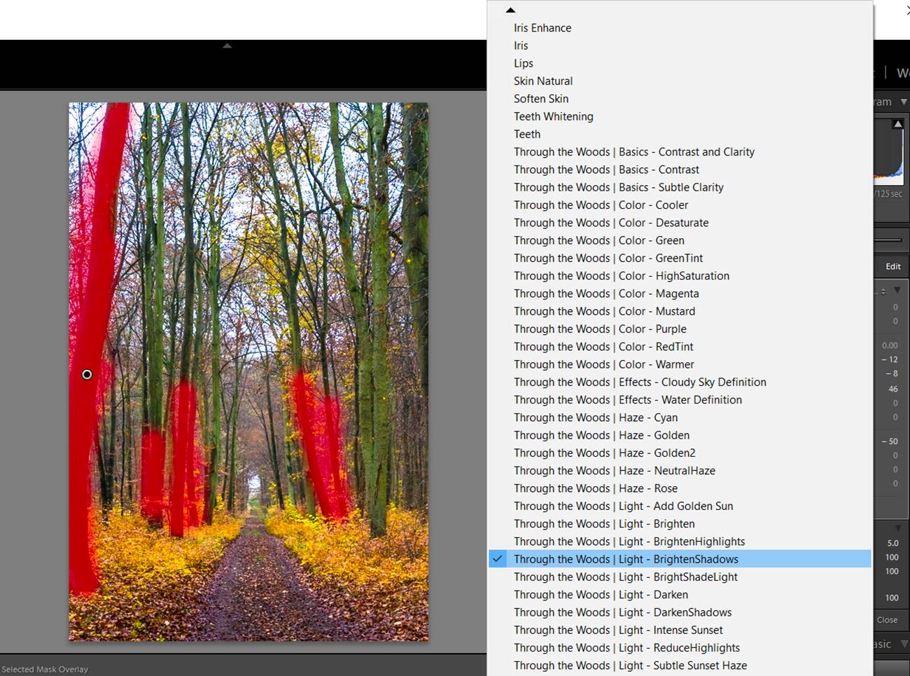
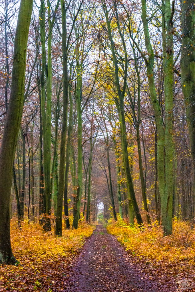
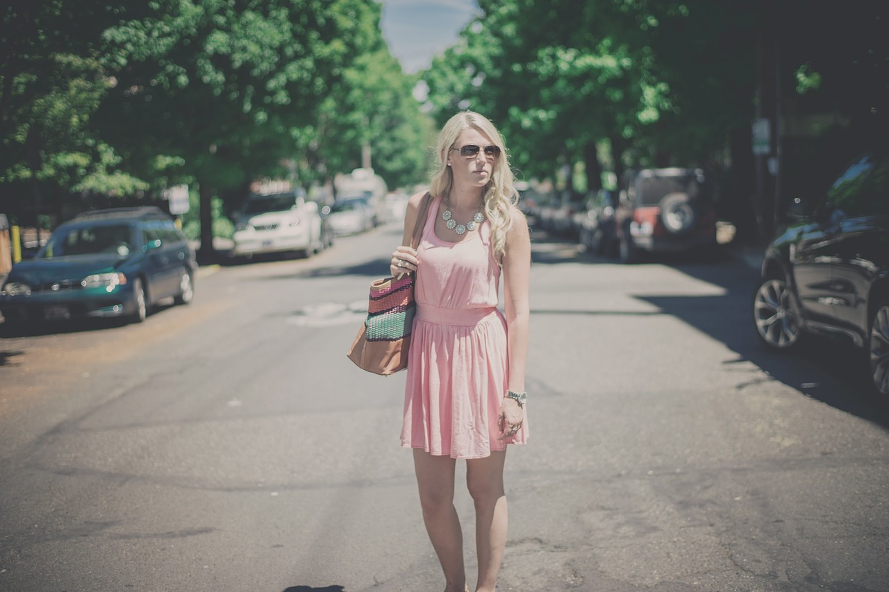
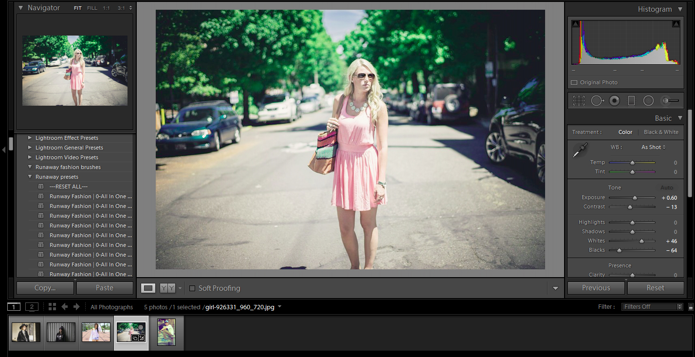
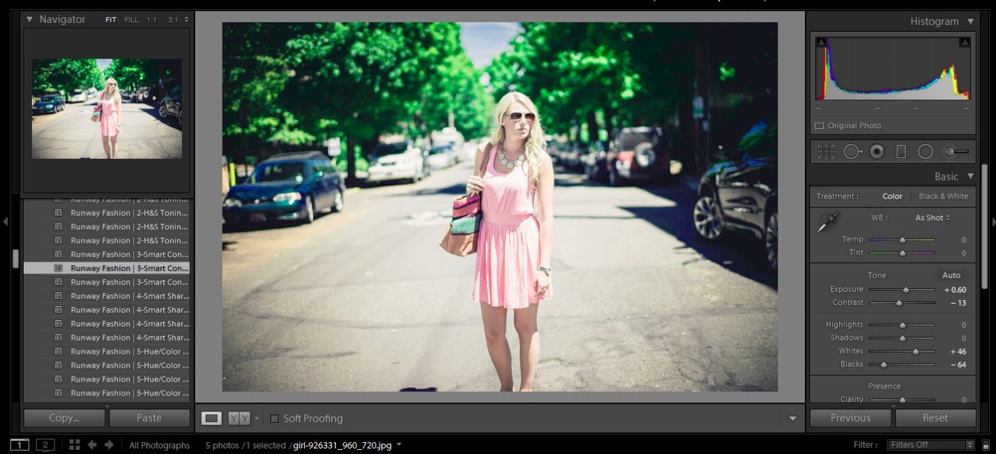
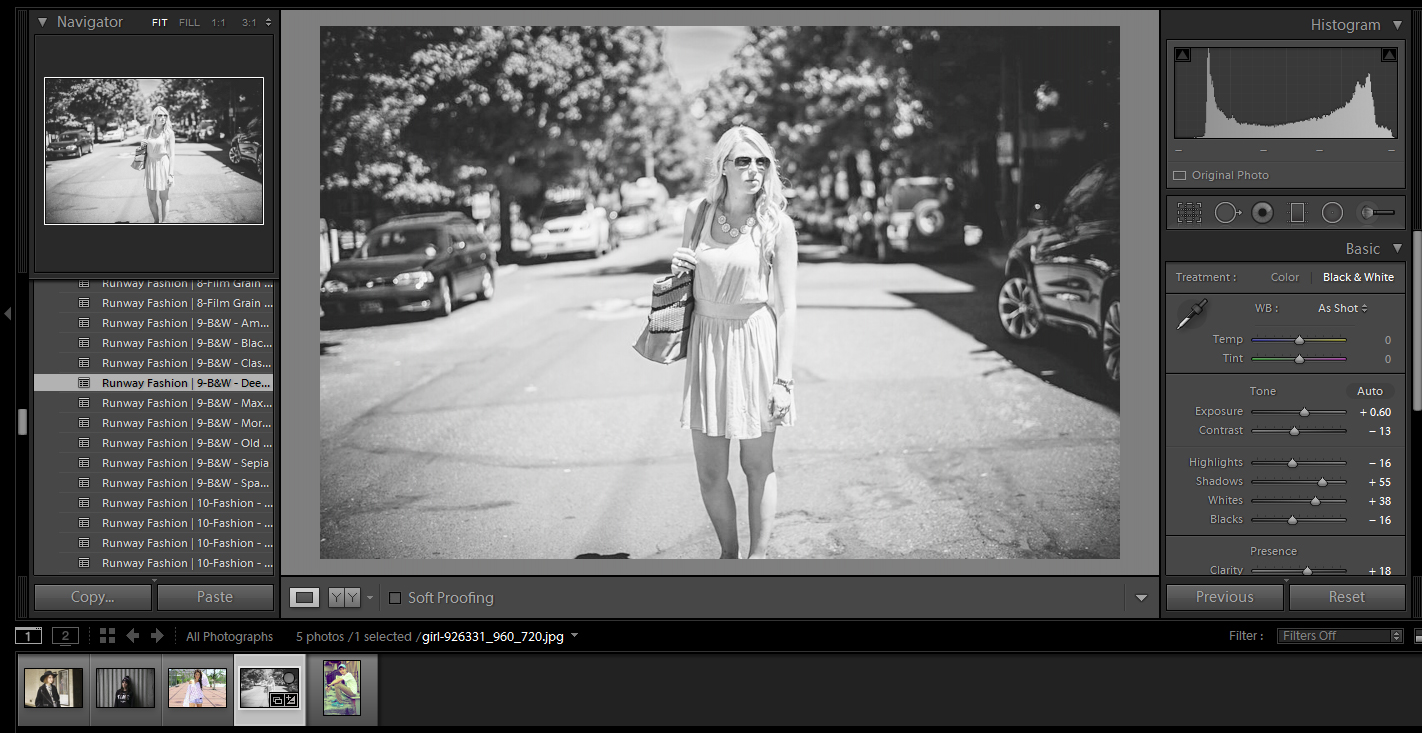
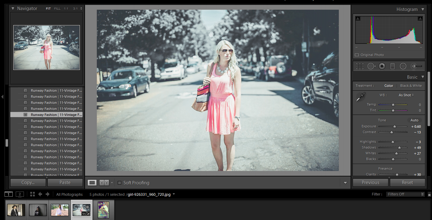
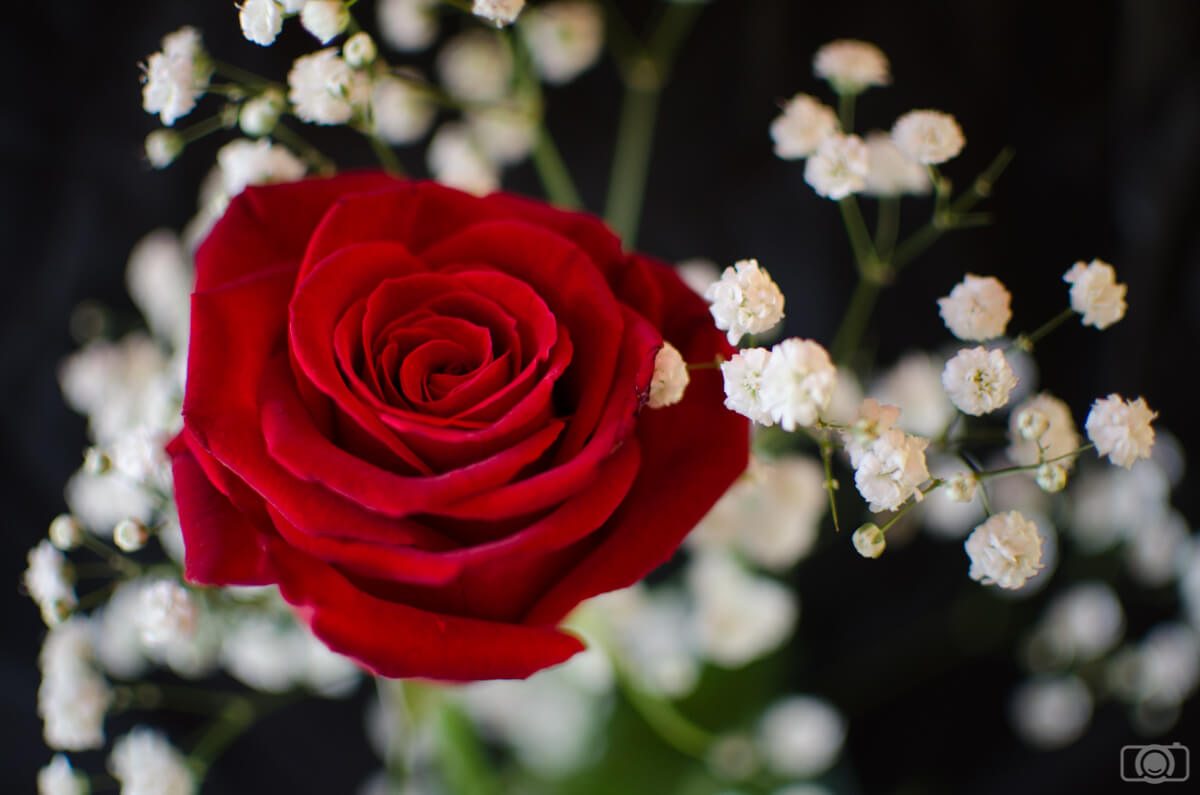
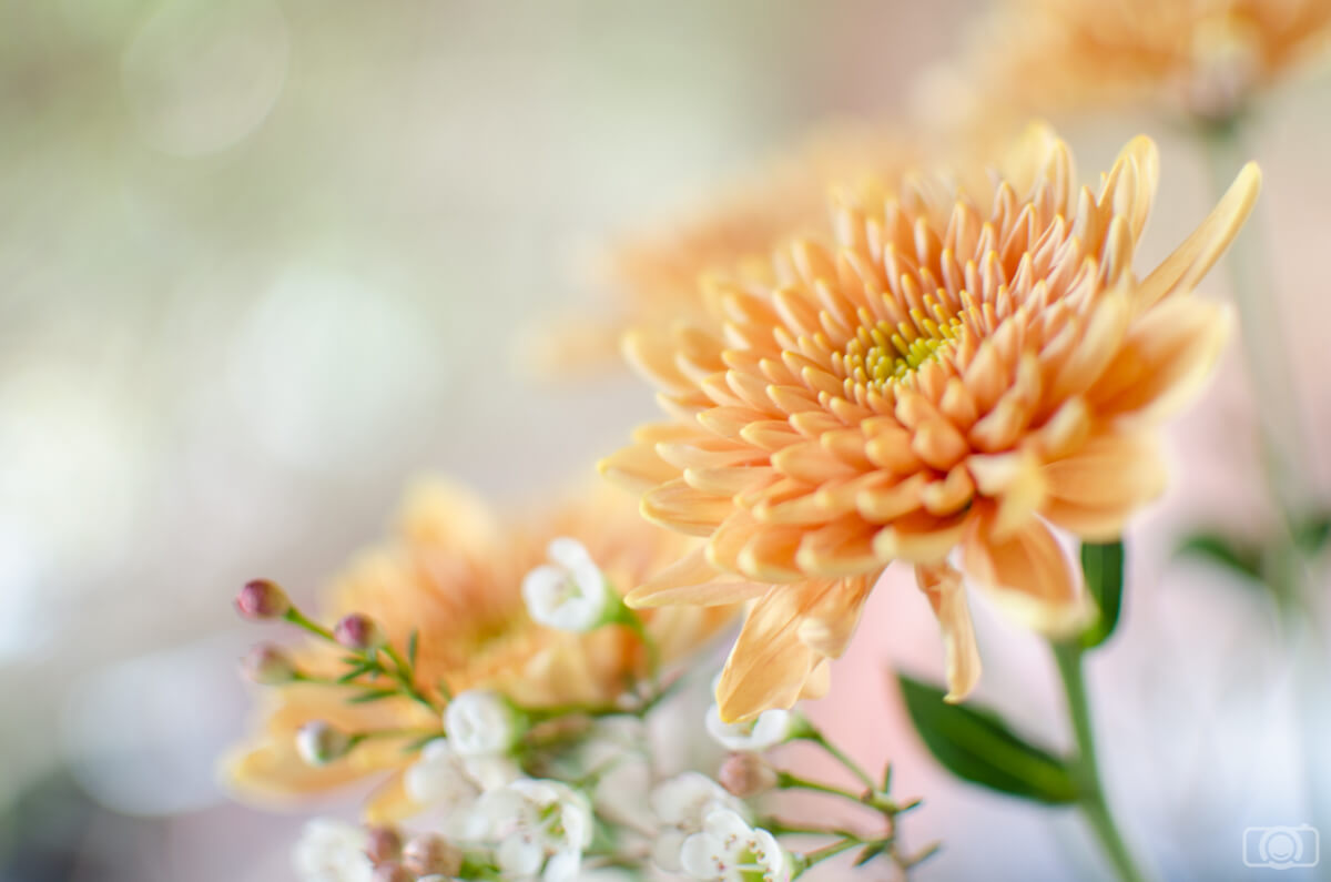
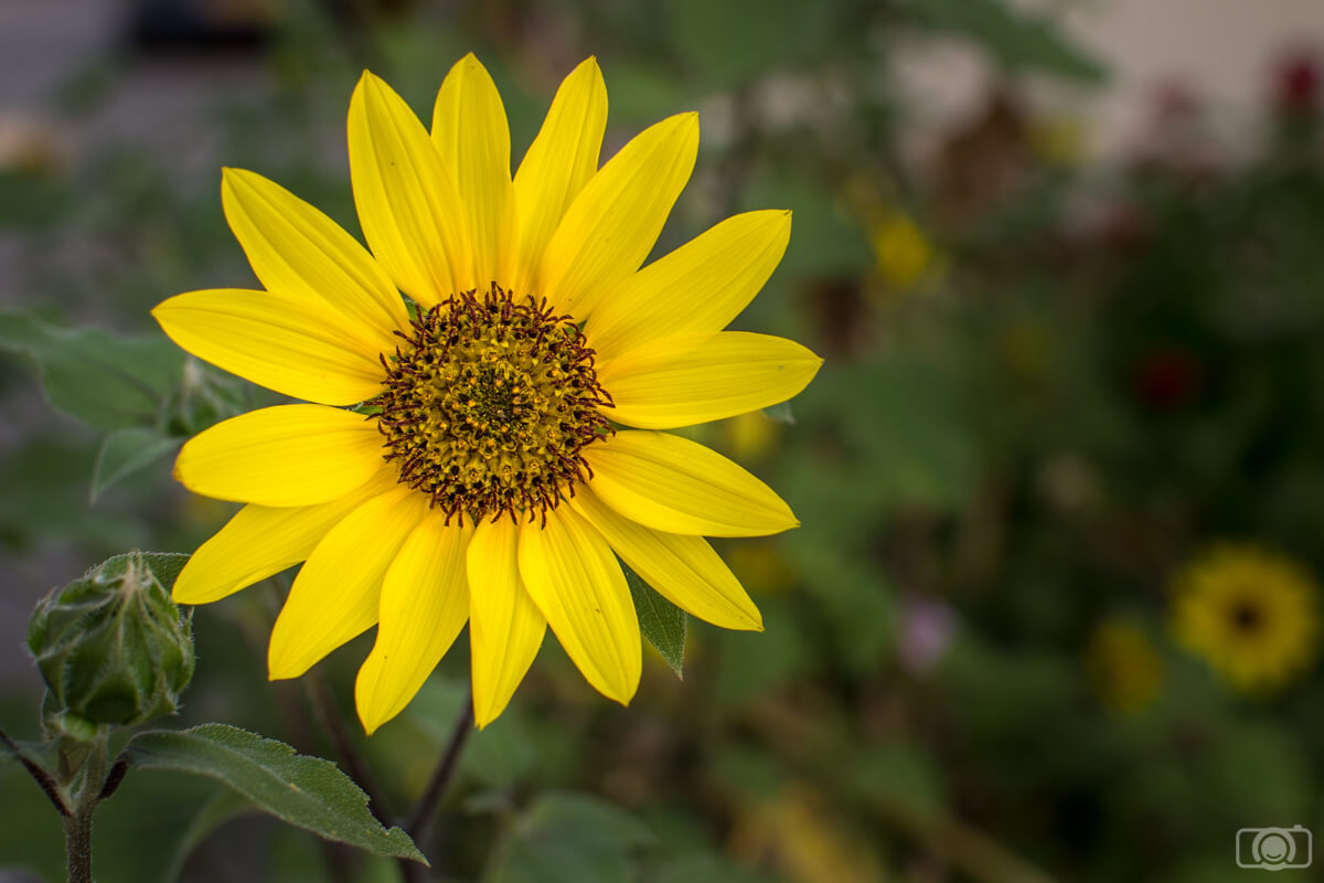
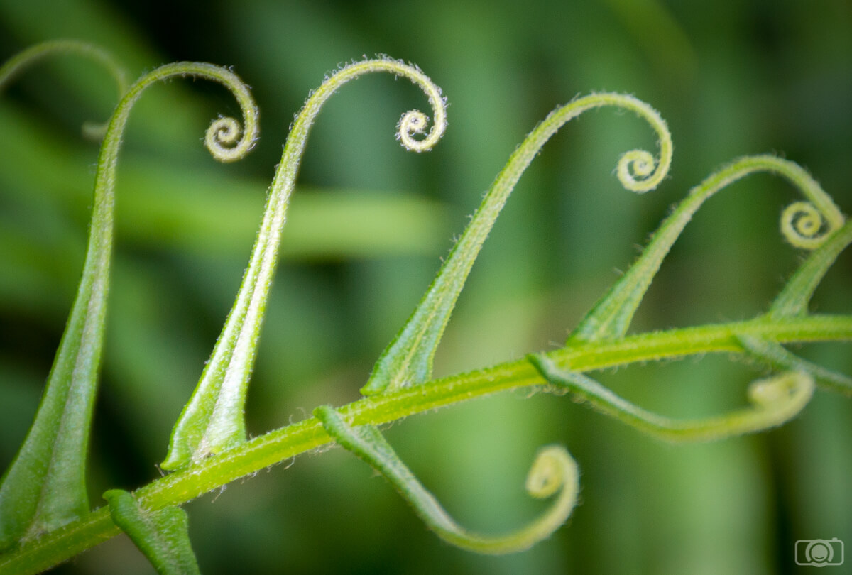
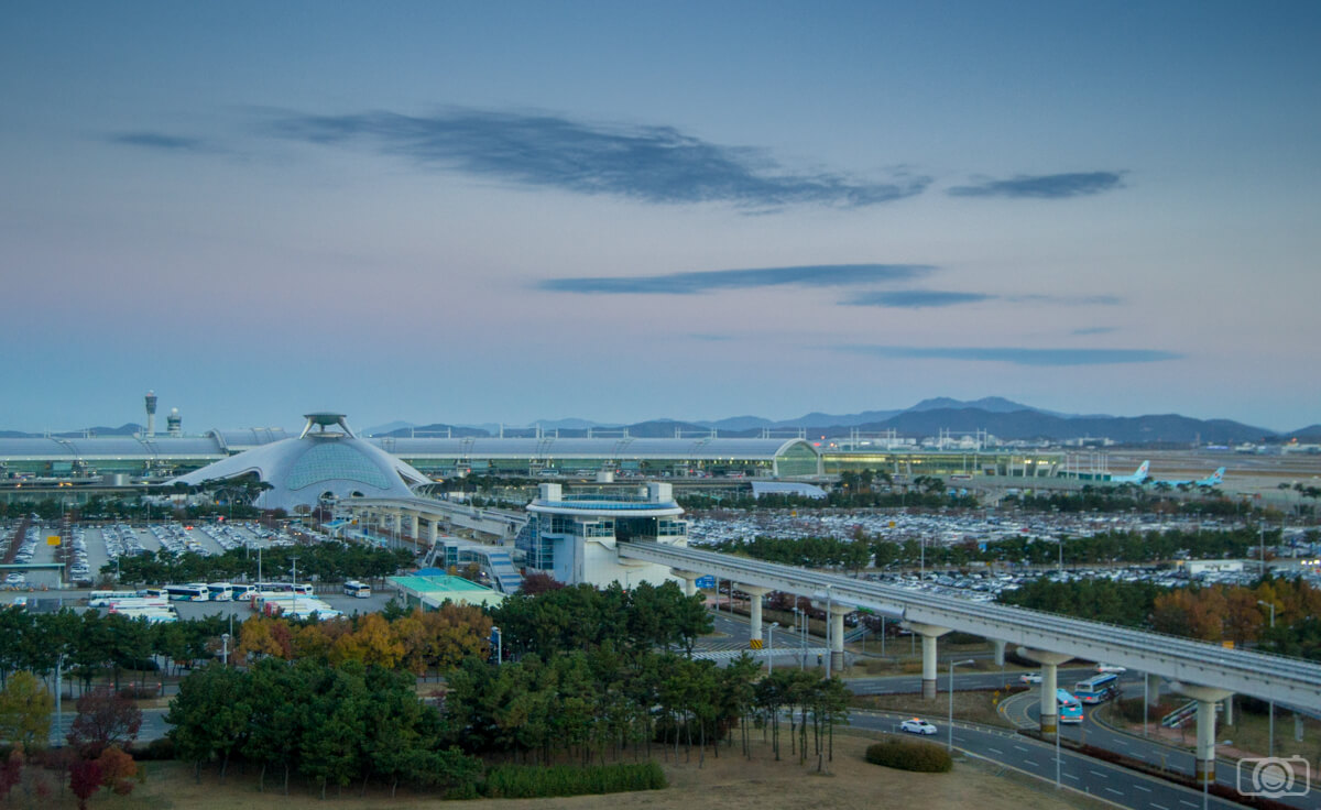
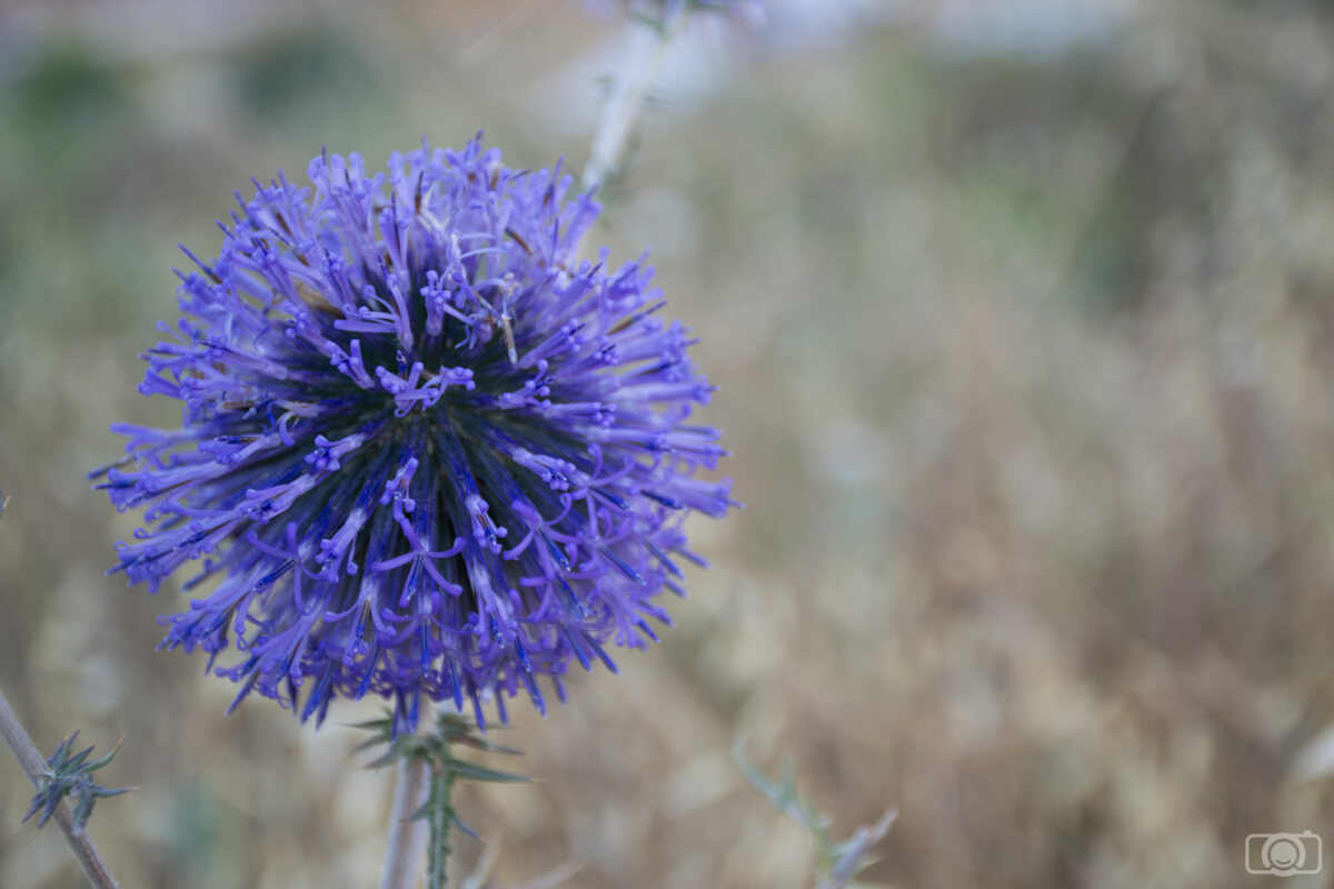
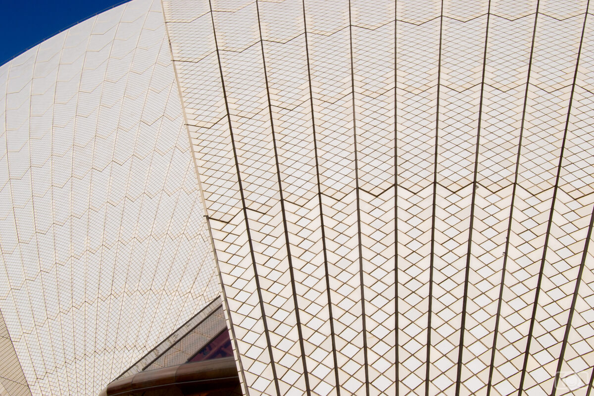


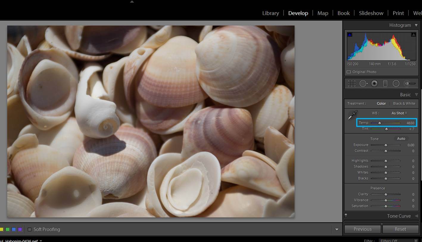
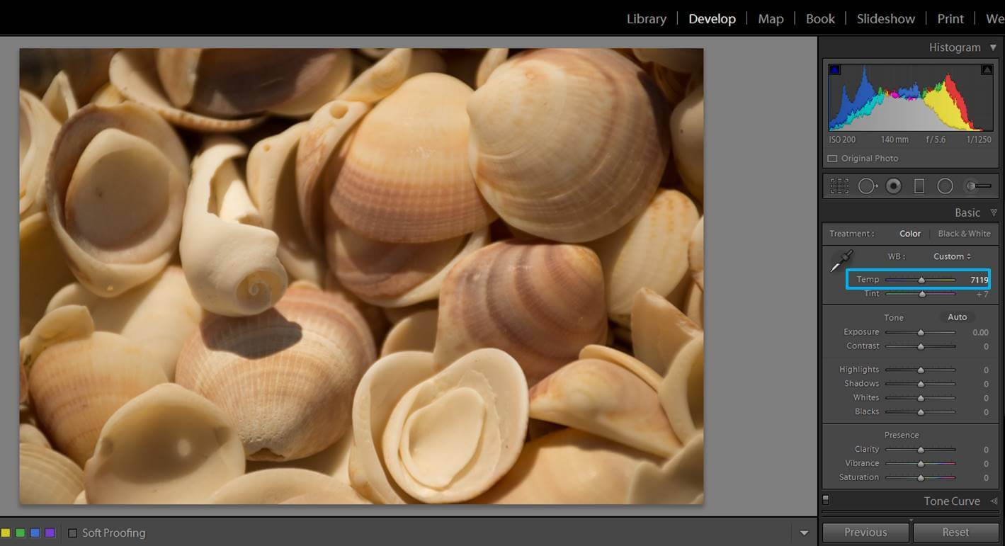
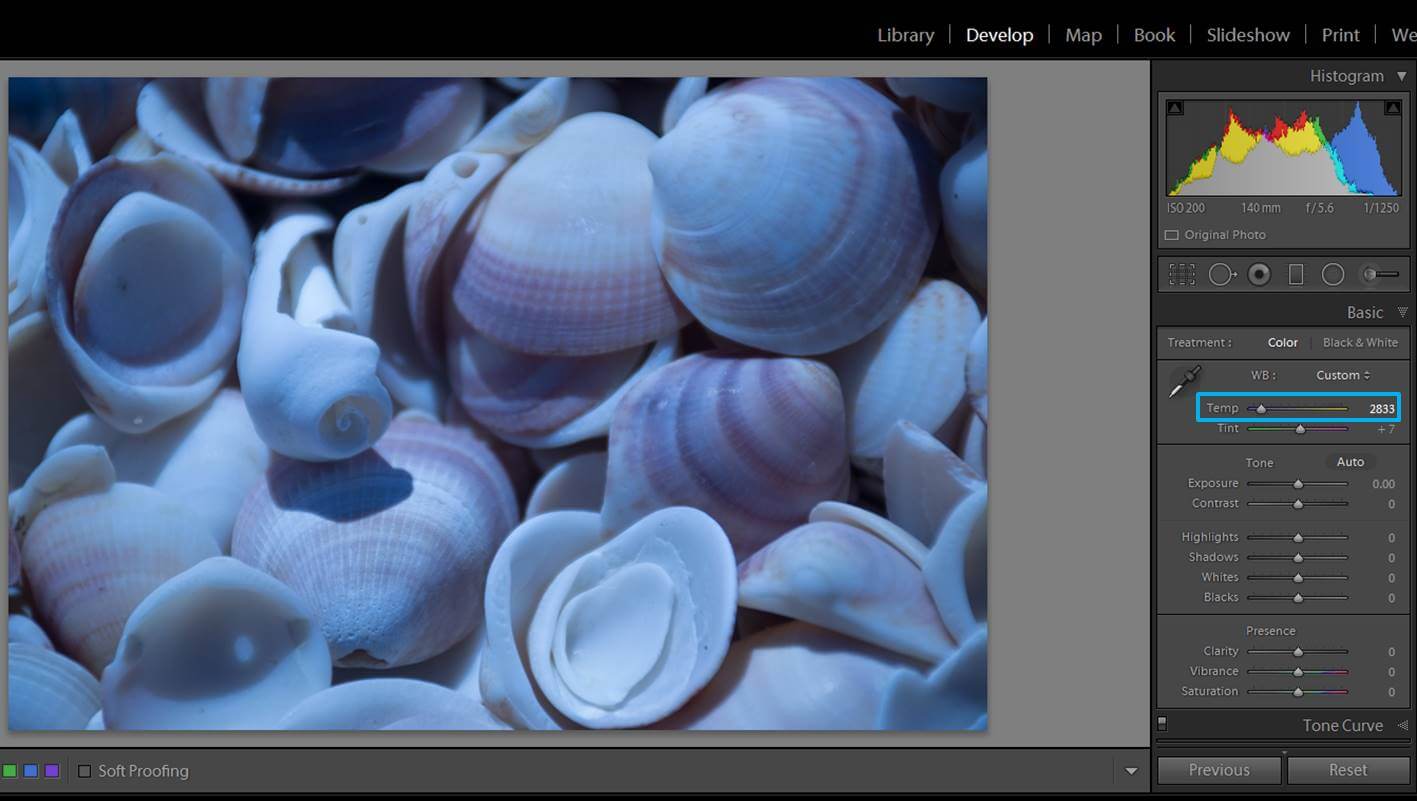
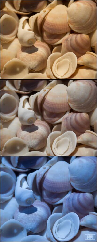


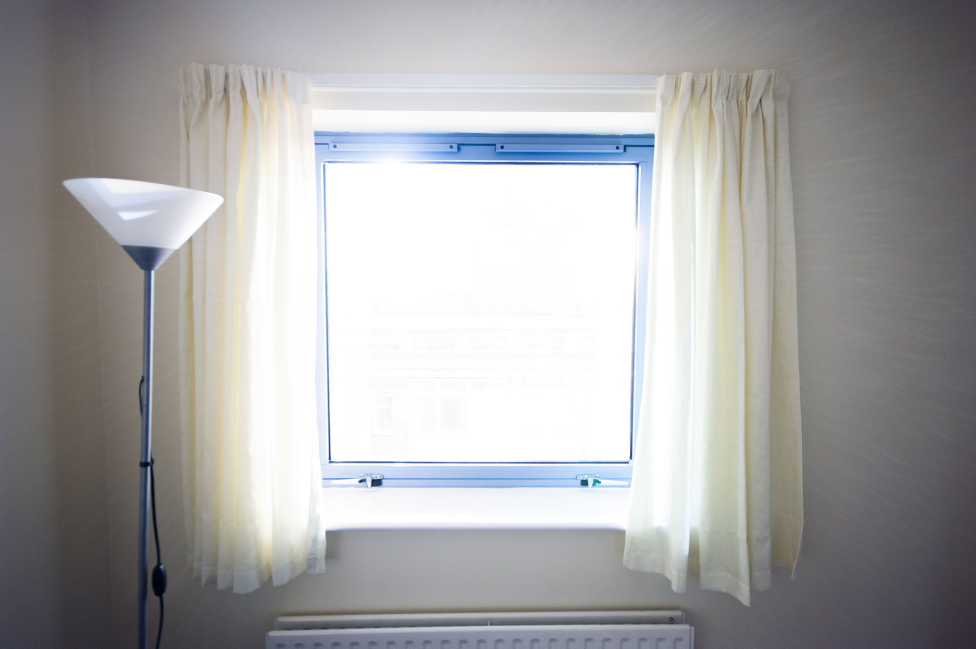
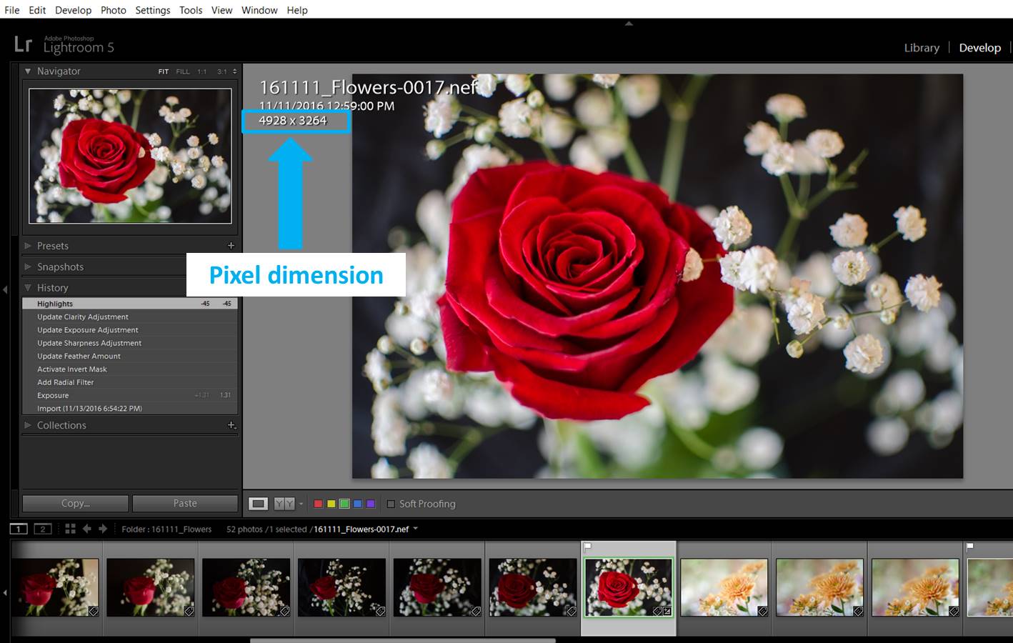
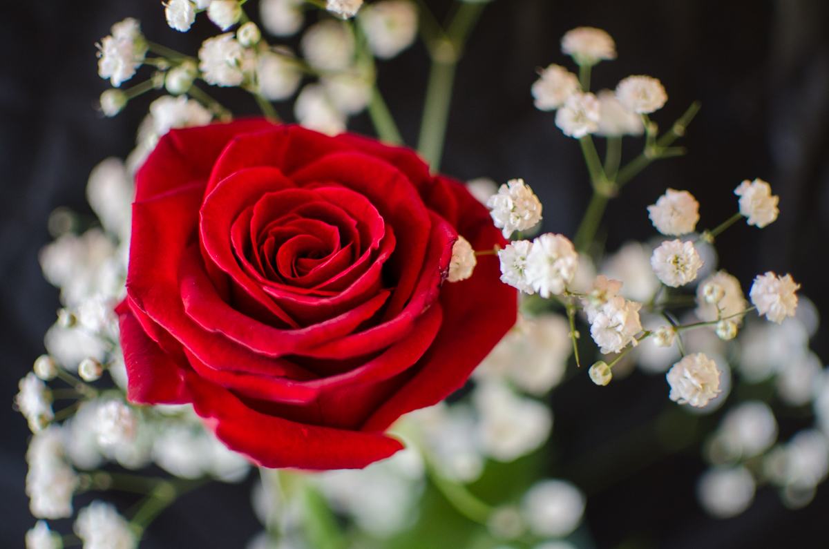
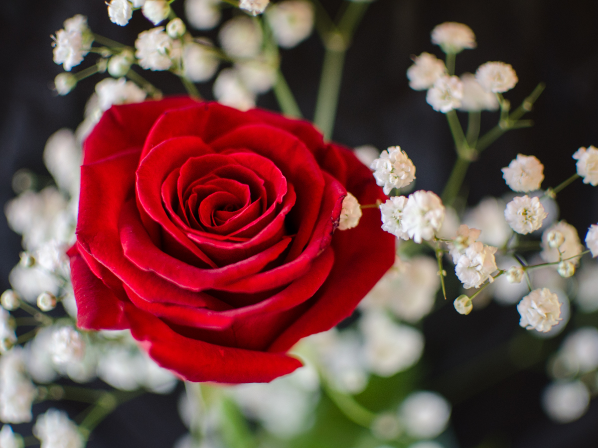
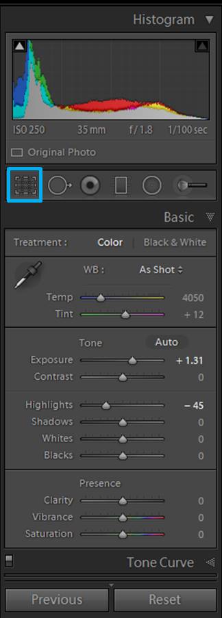
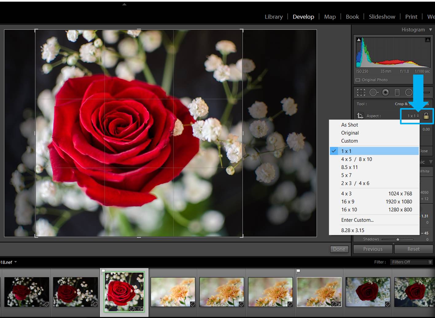
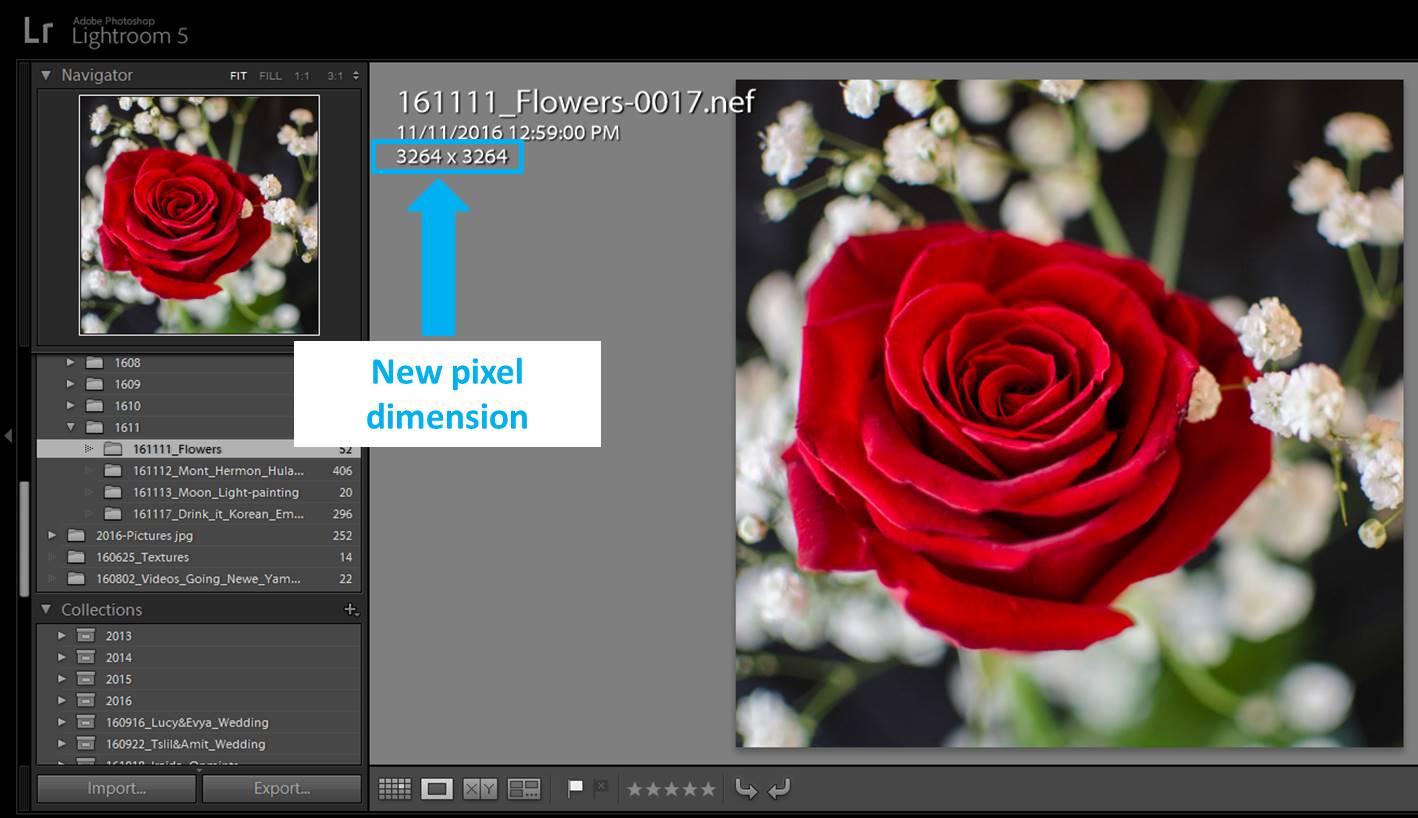
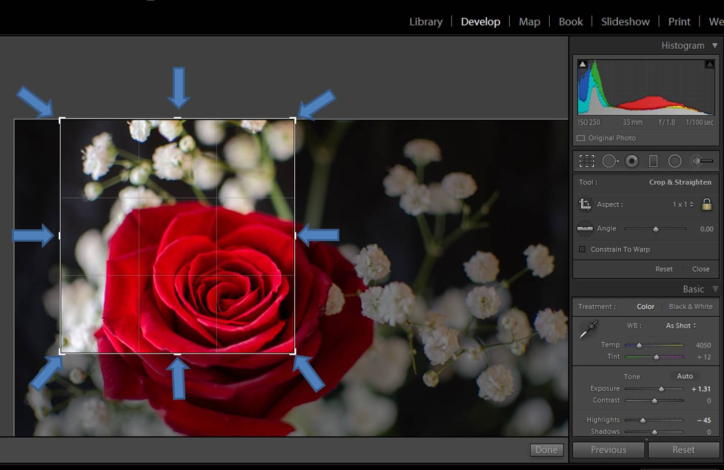
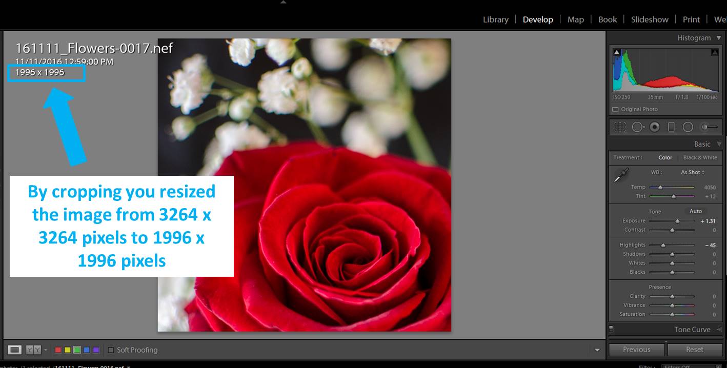
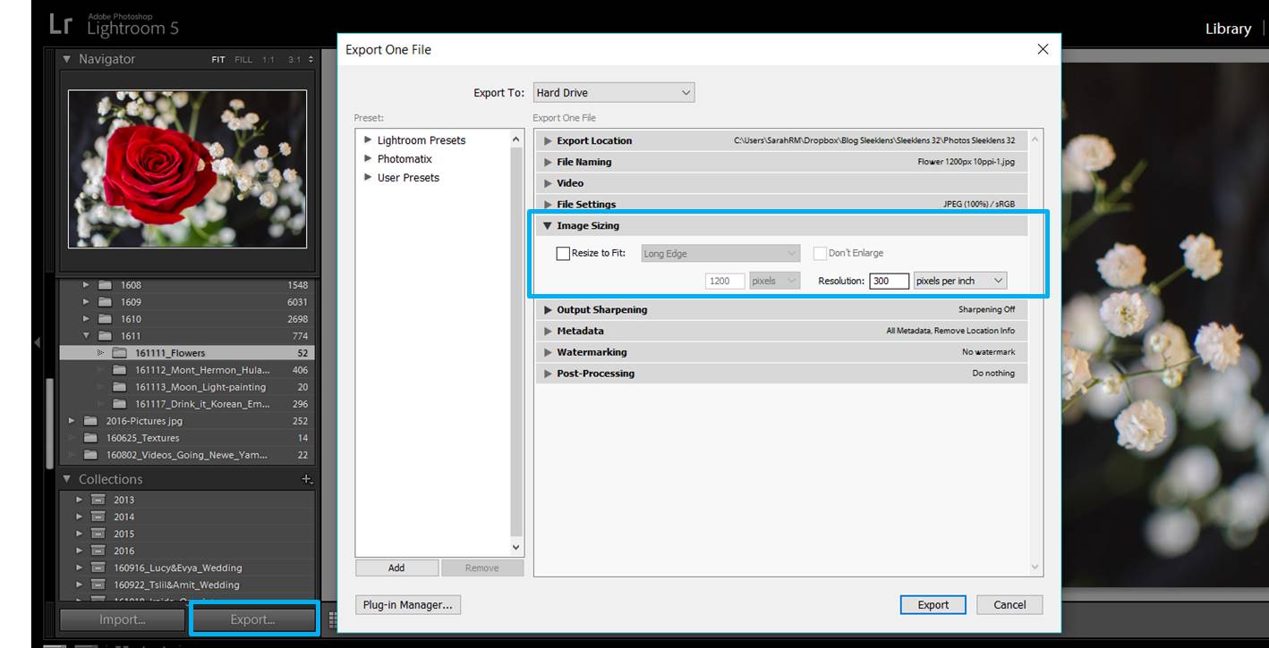
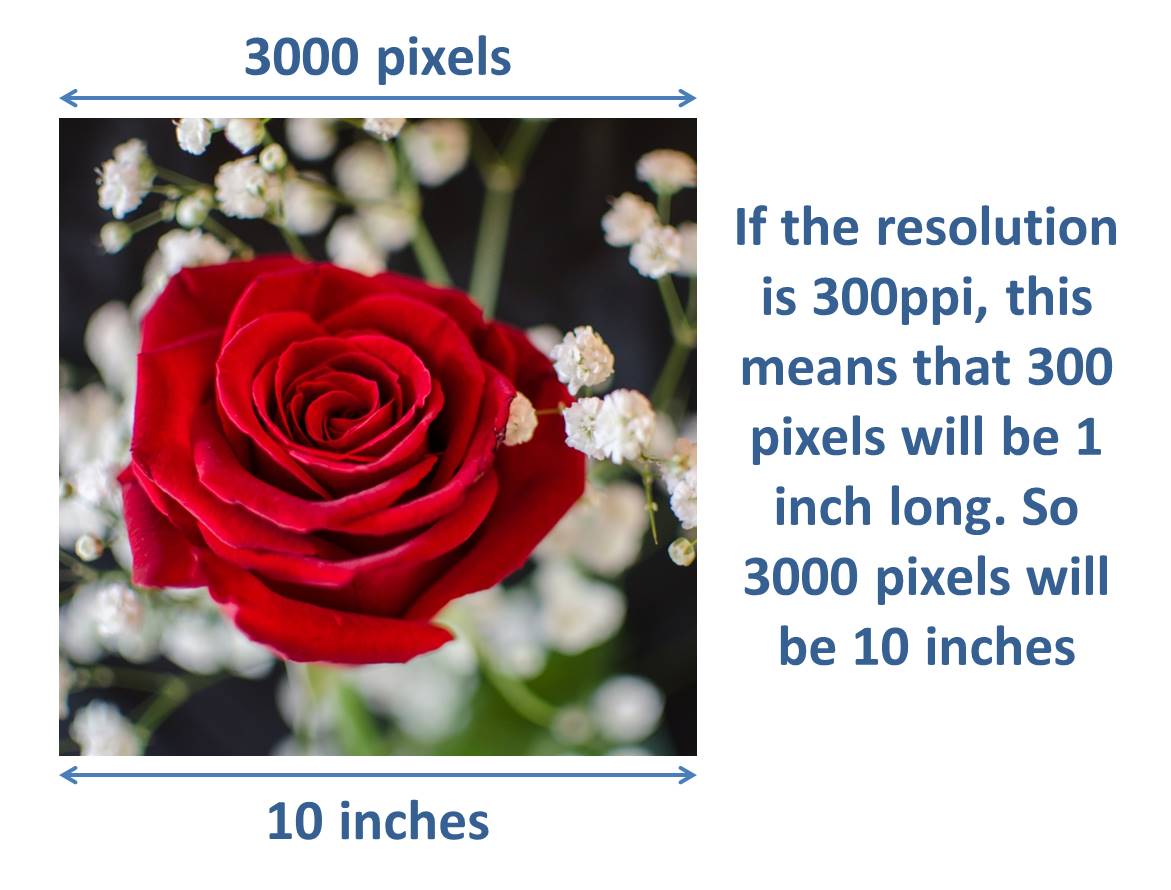

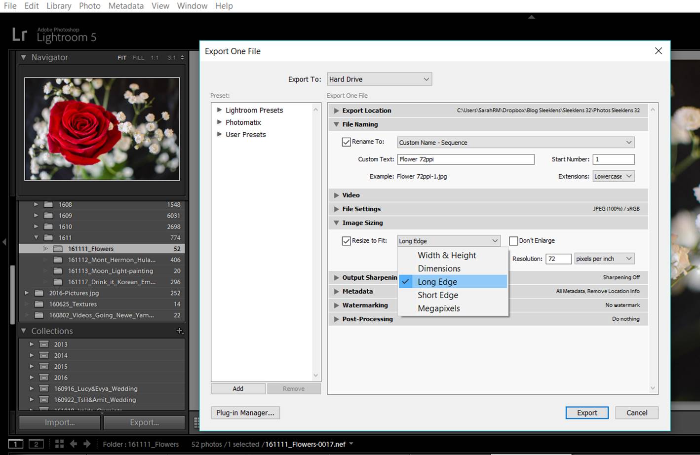 When you mark the “Resize to fit”, you will be able to open specific options to crop or resize your image. The one I use the most is the “Long edge”. Sometimes I will use the “Short Edge” option. Alternatively, you may even use a keyboard shortcut in adobe photoshop.
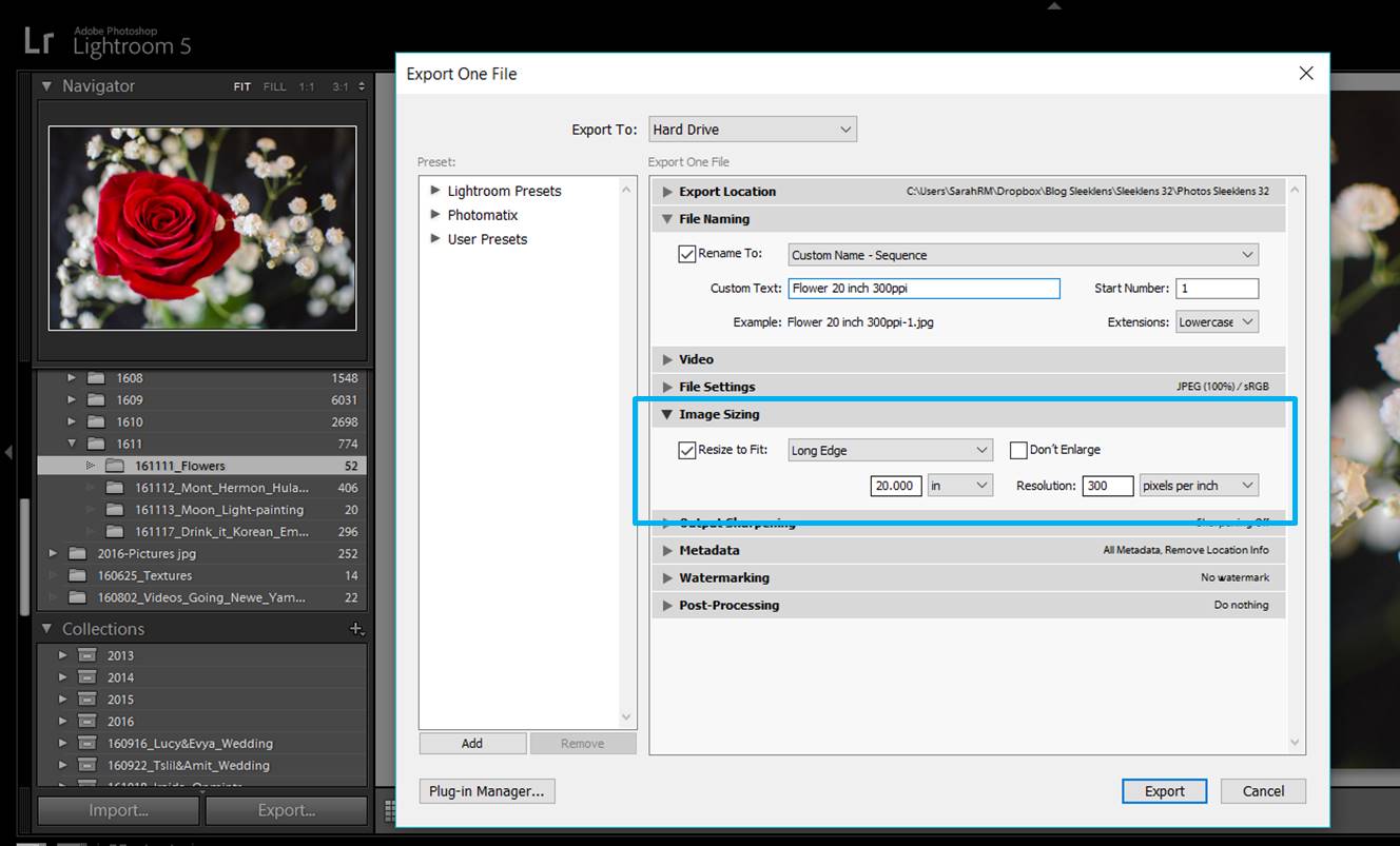
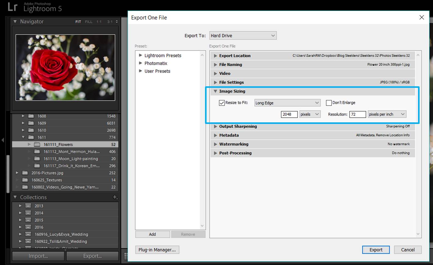
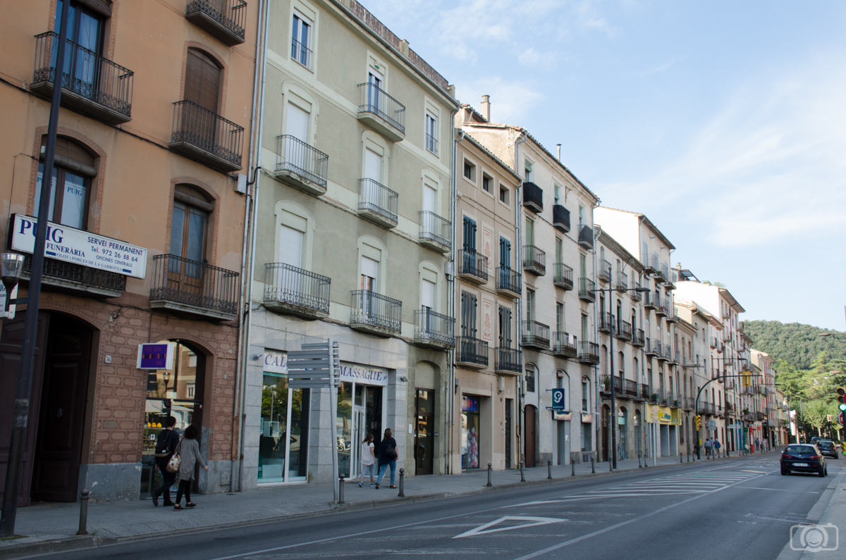
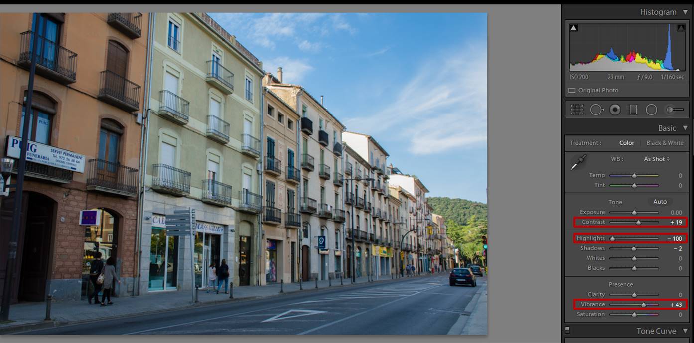
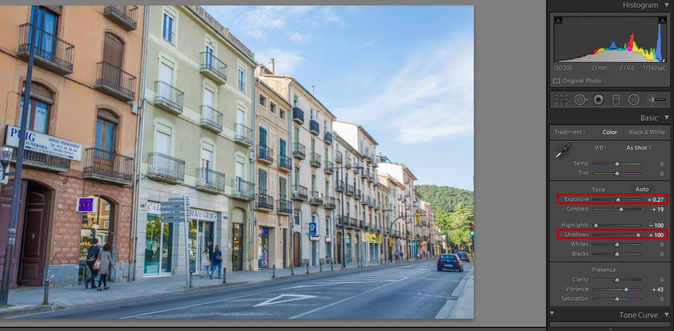
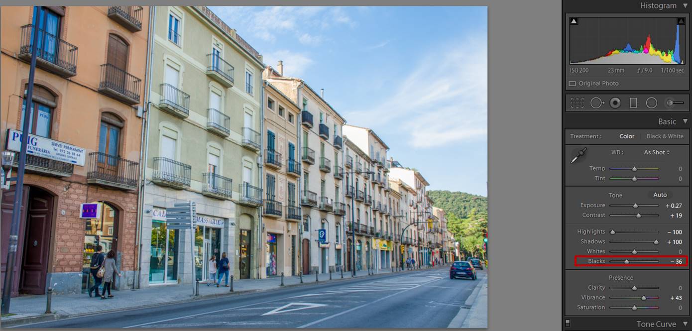
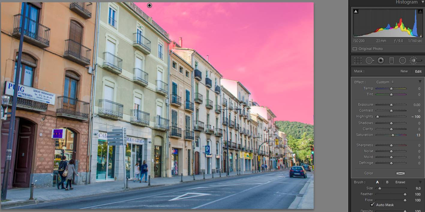
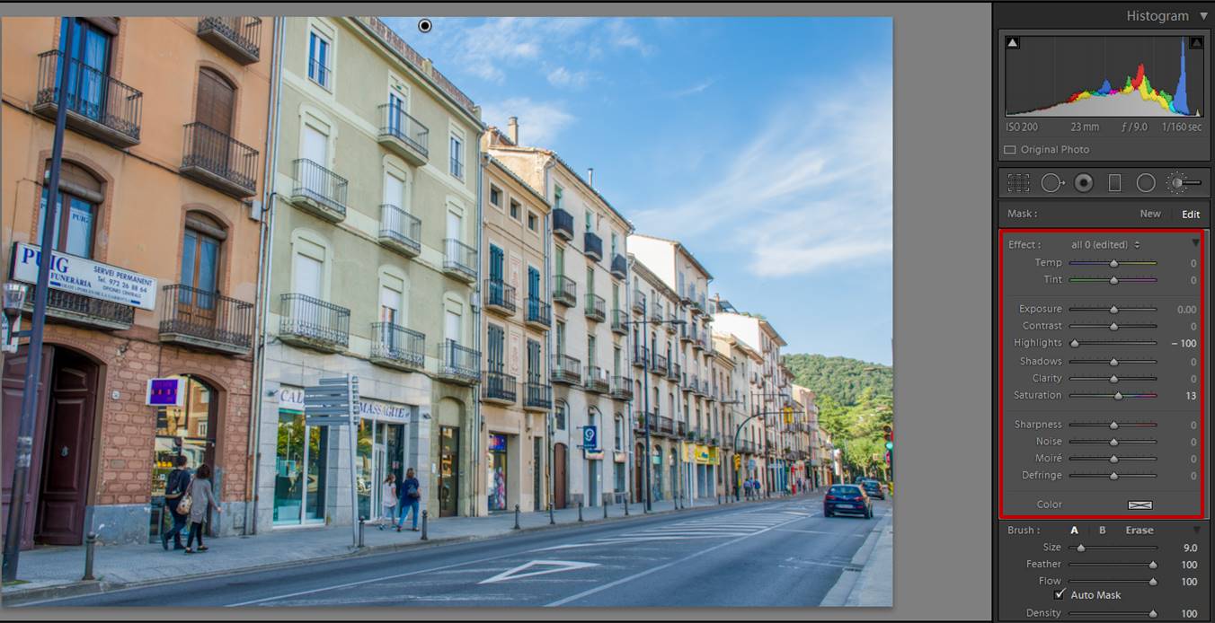
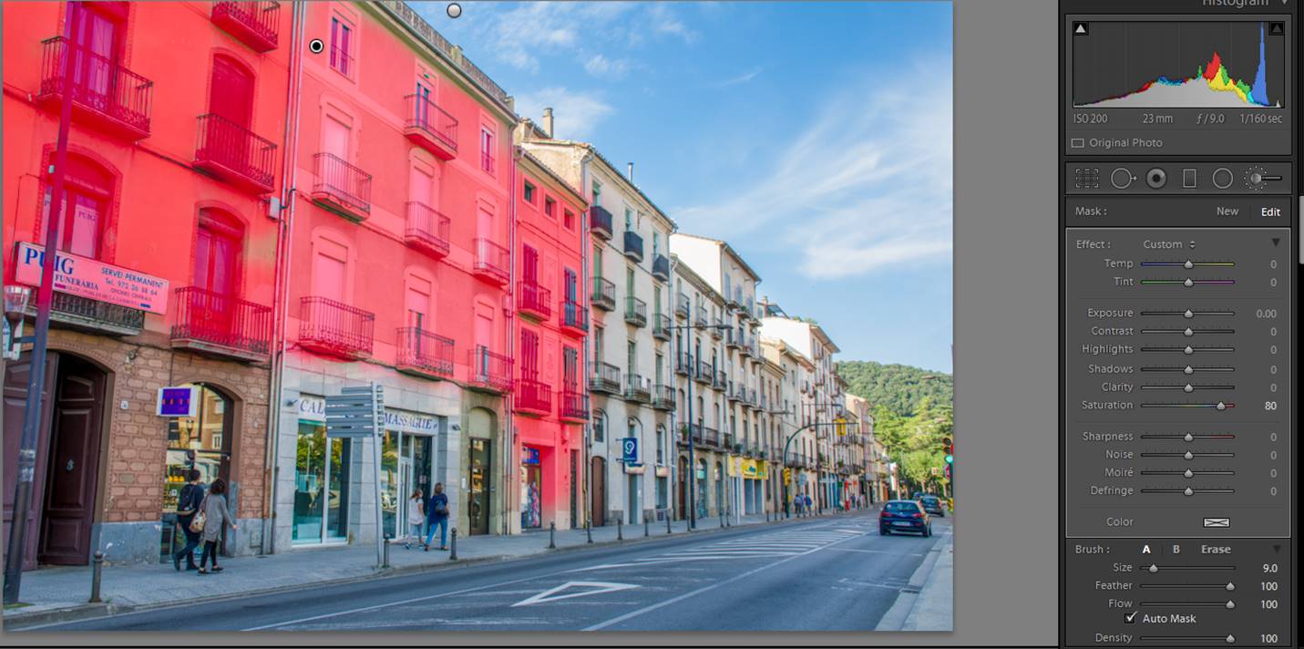
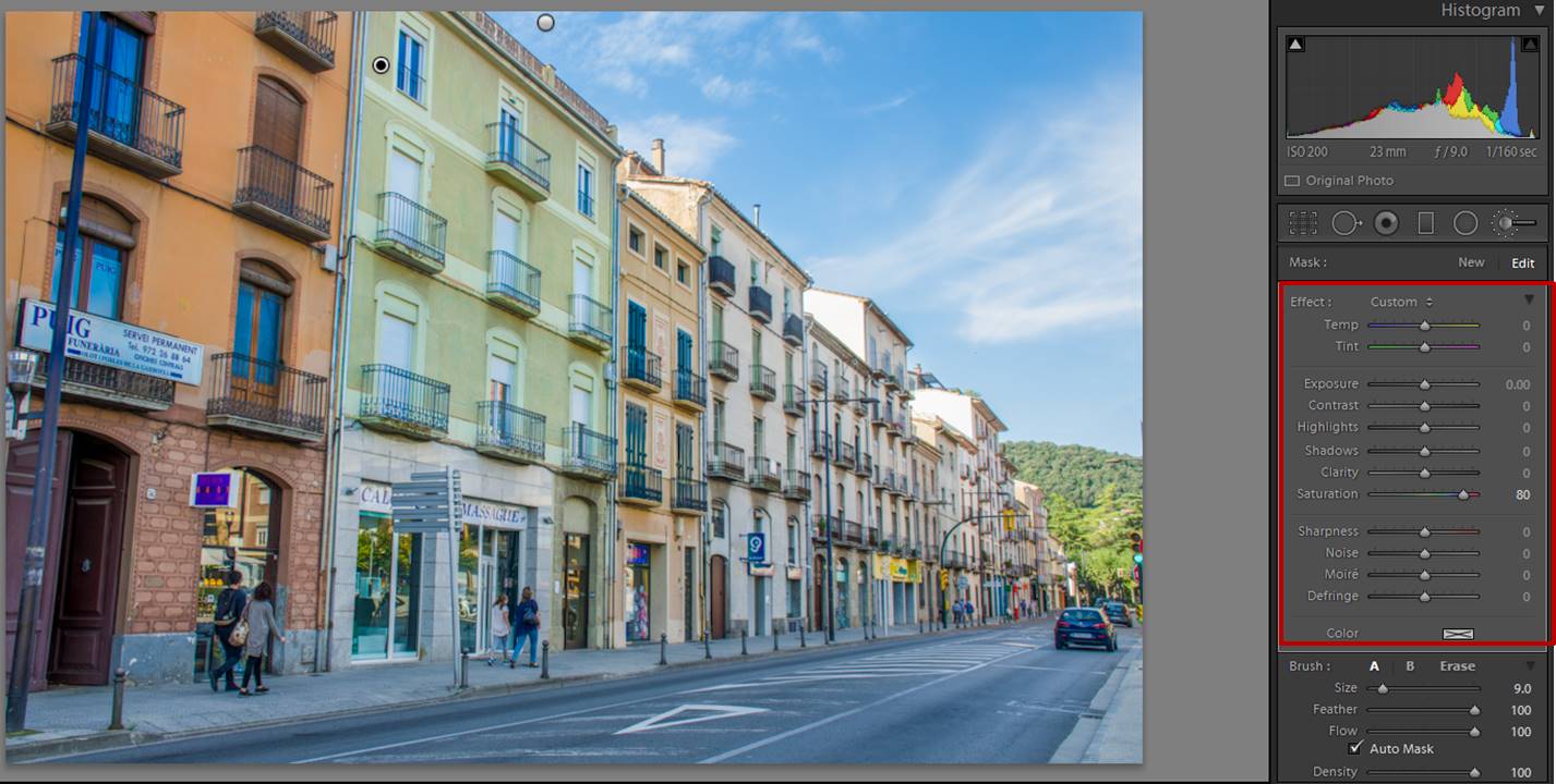
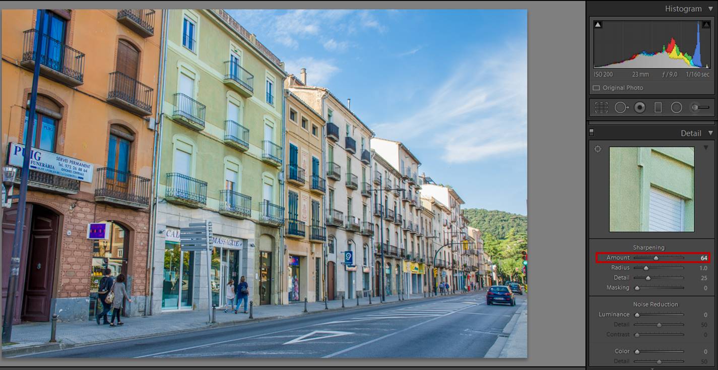
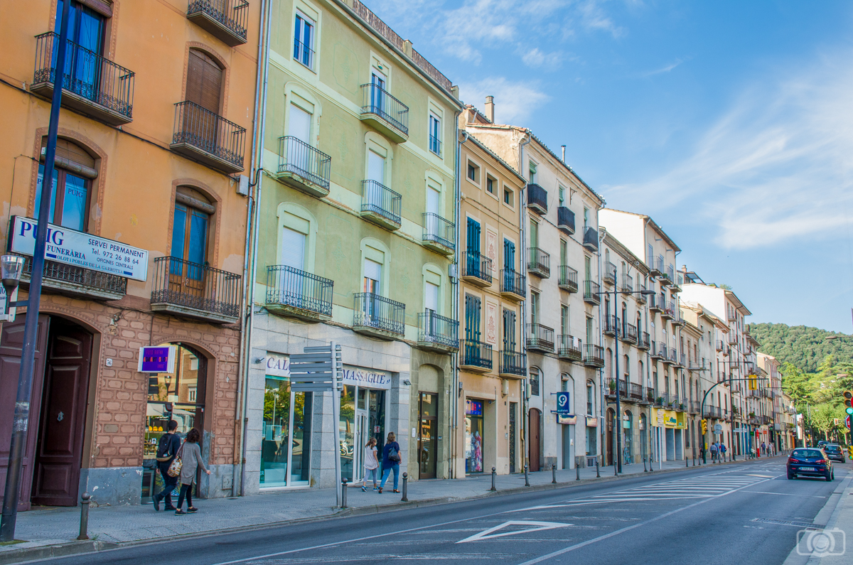
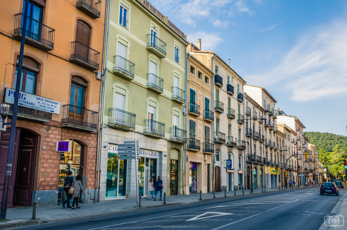
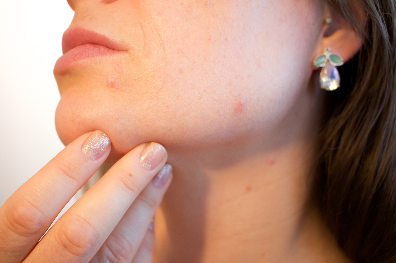
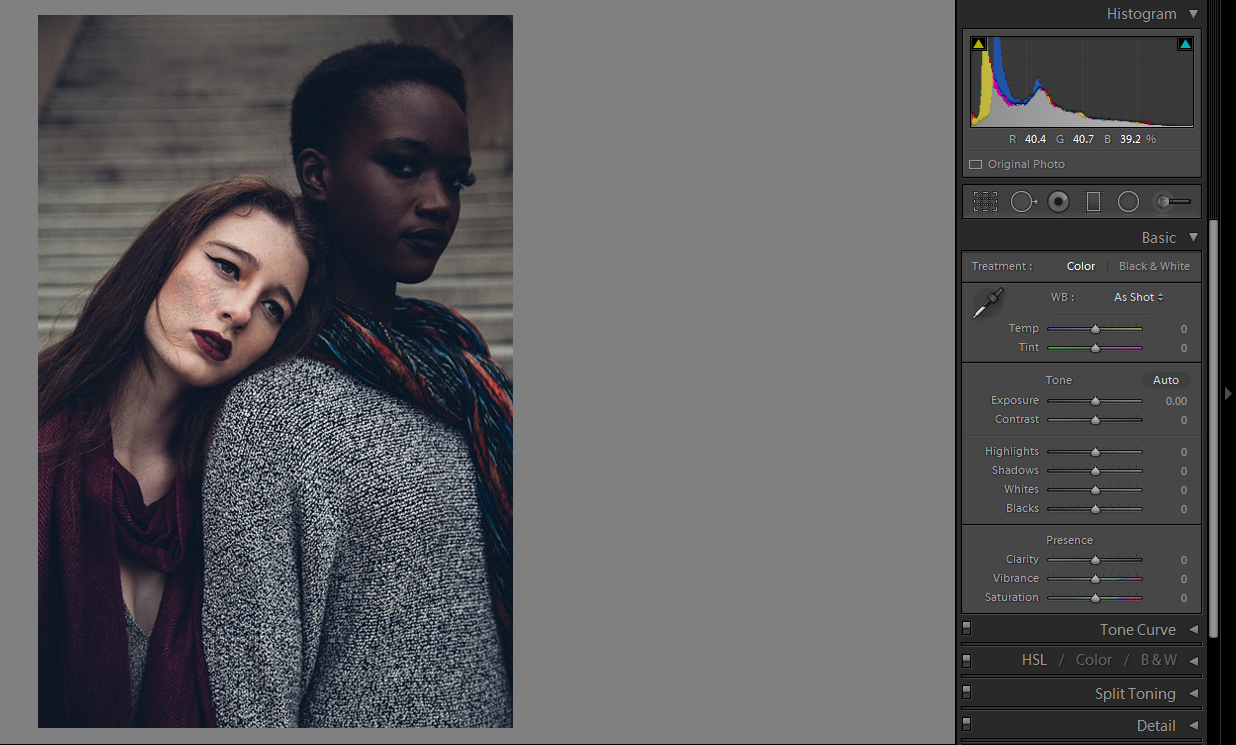
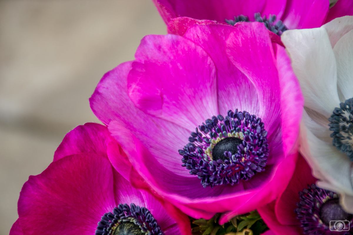
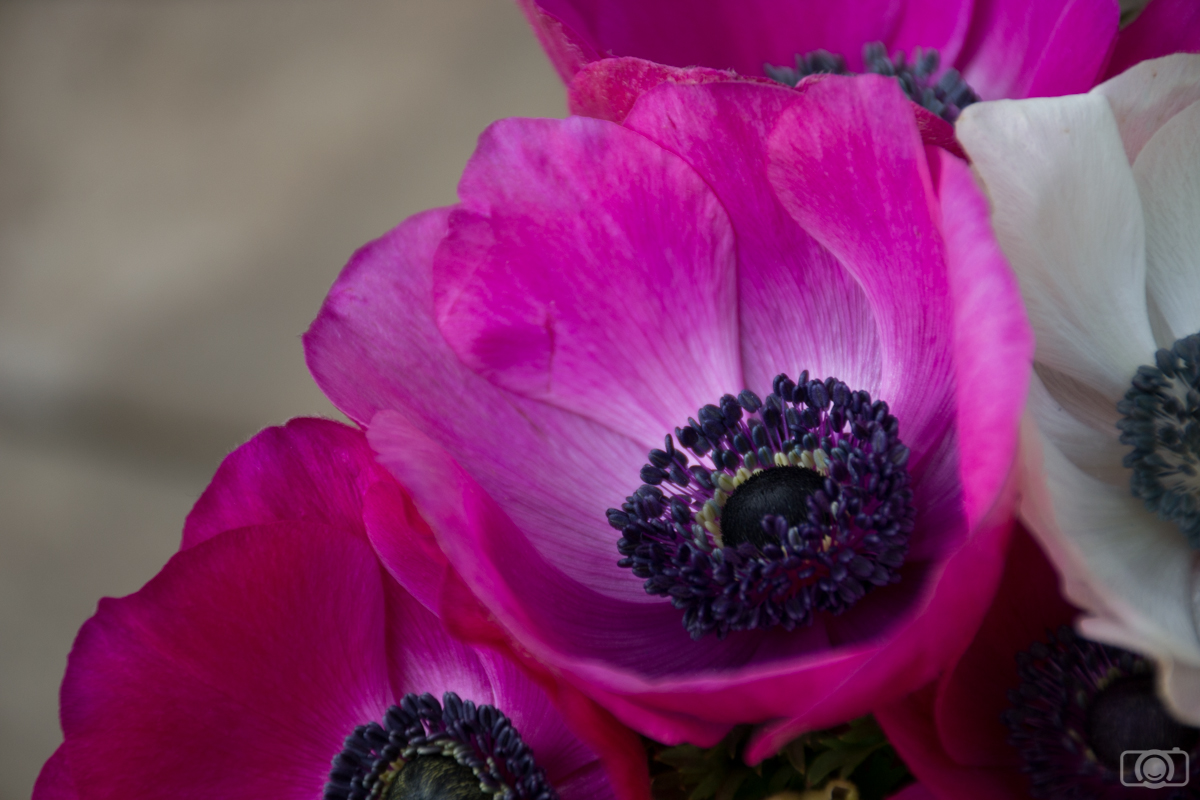
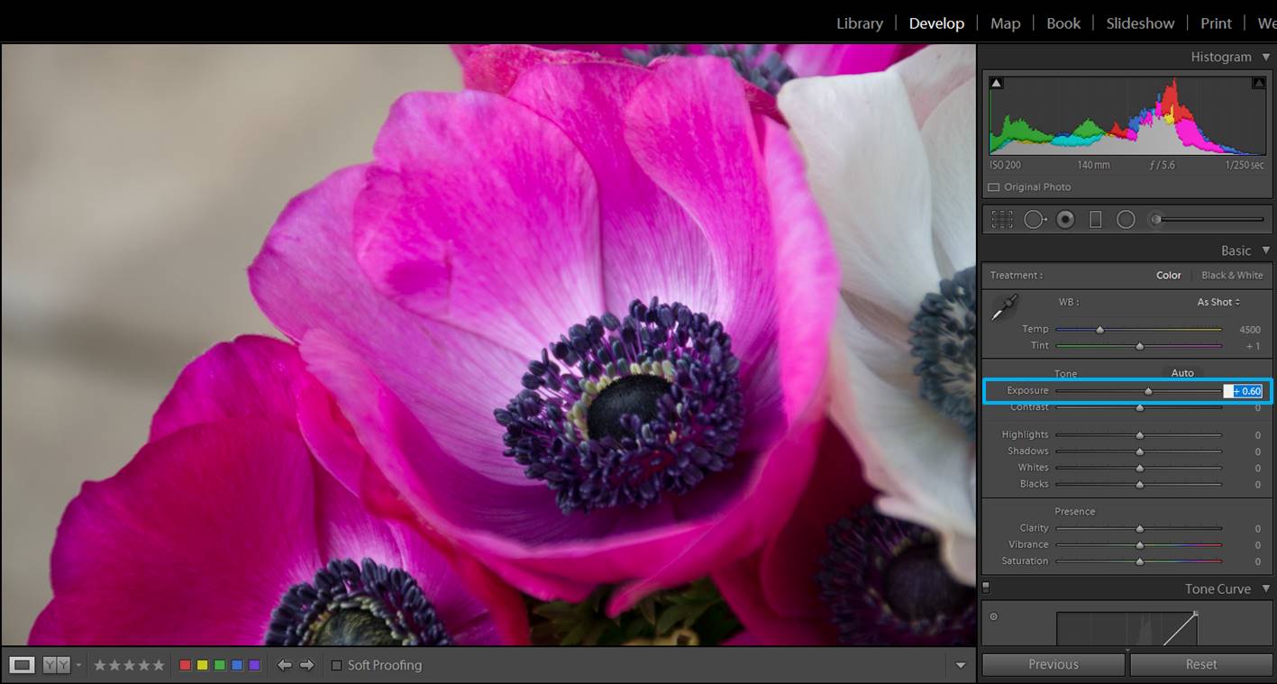
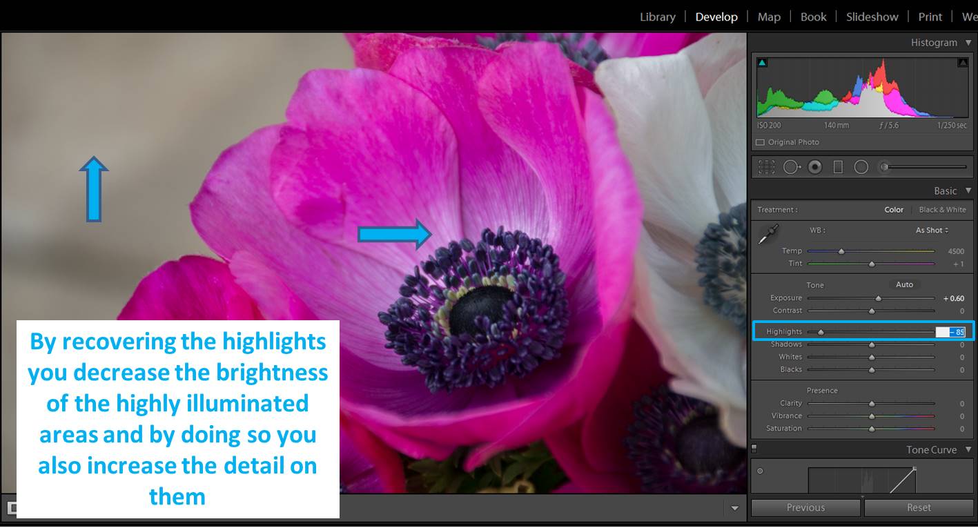
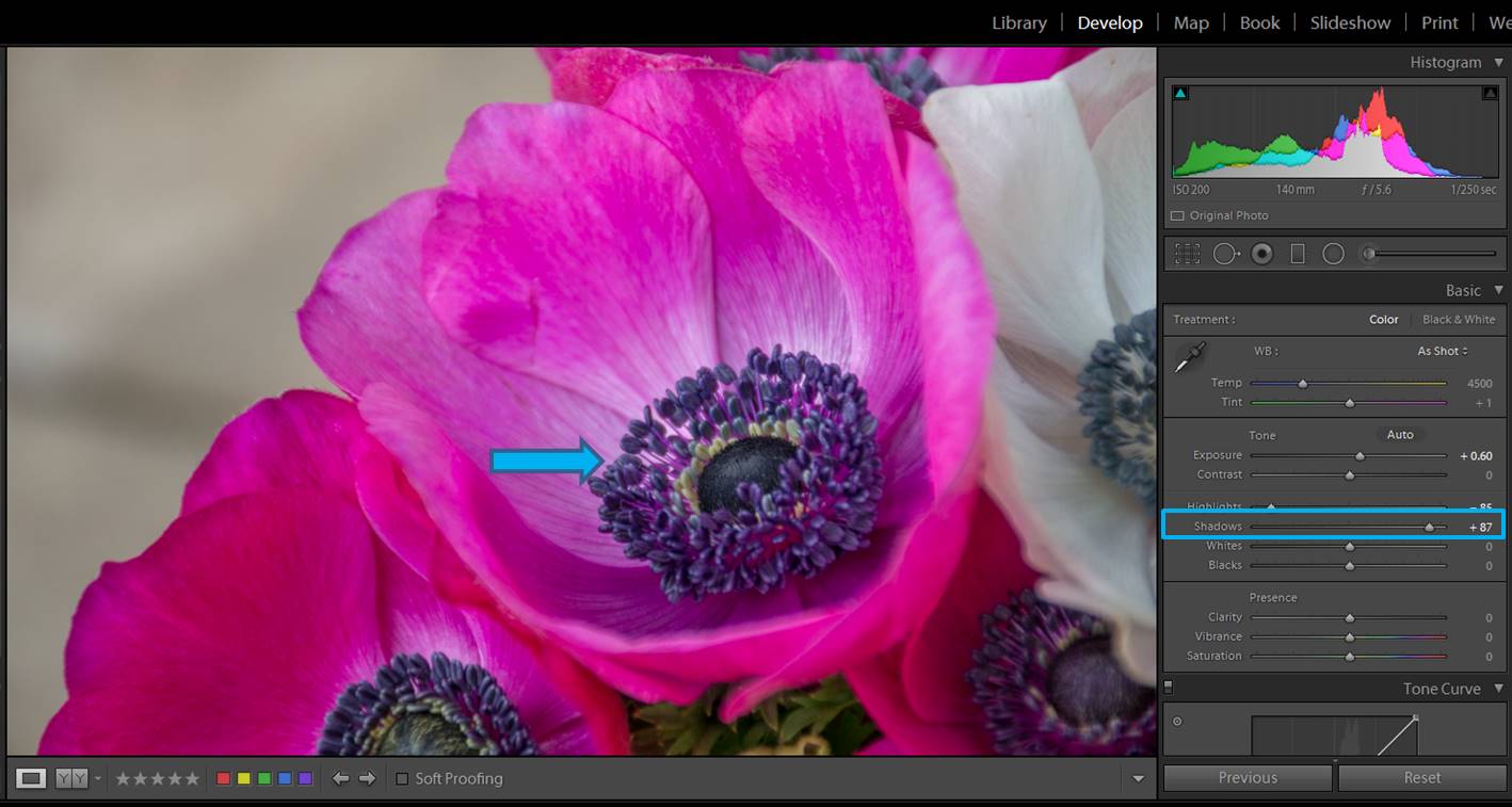
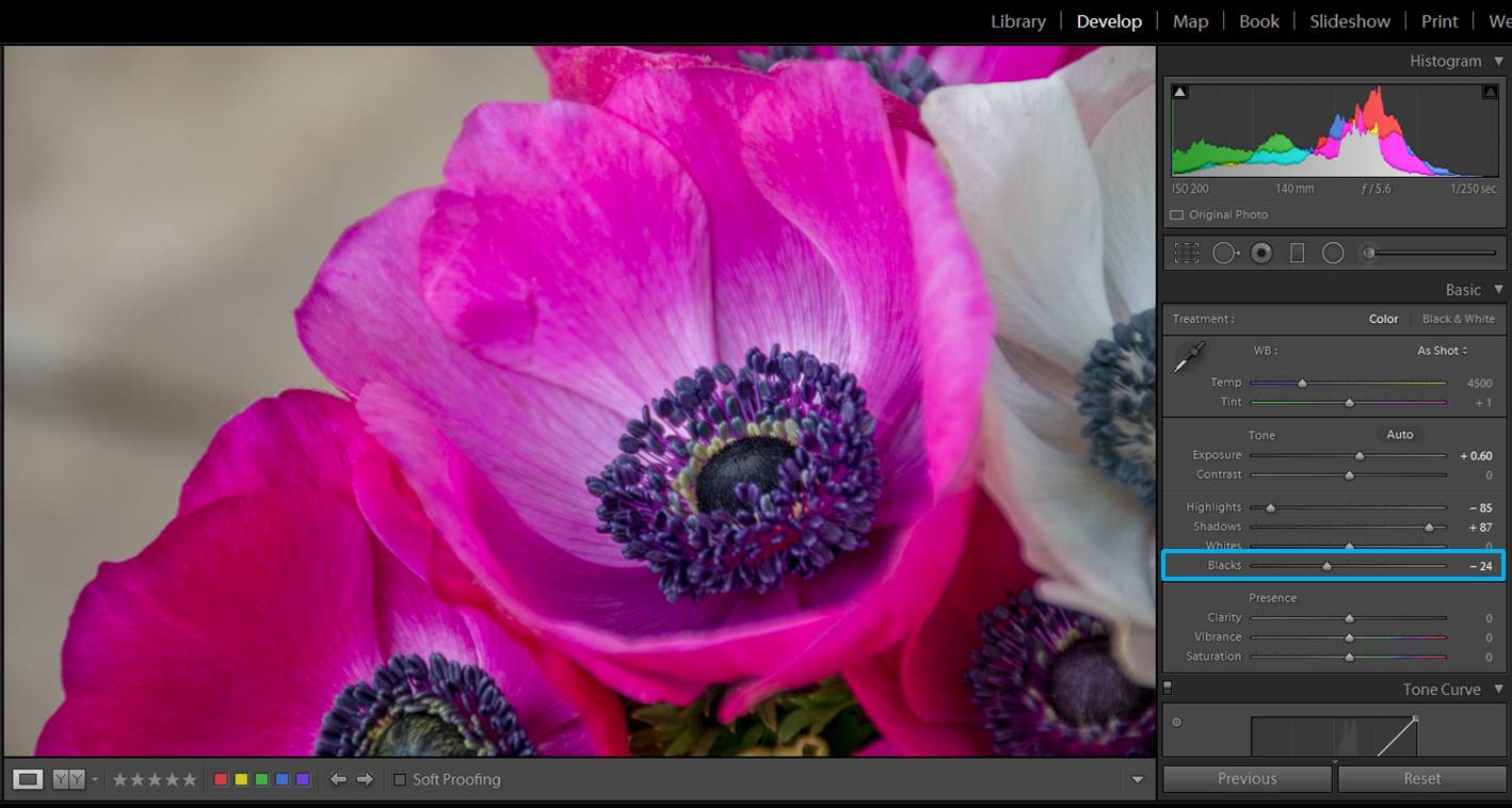
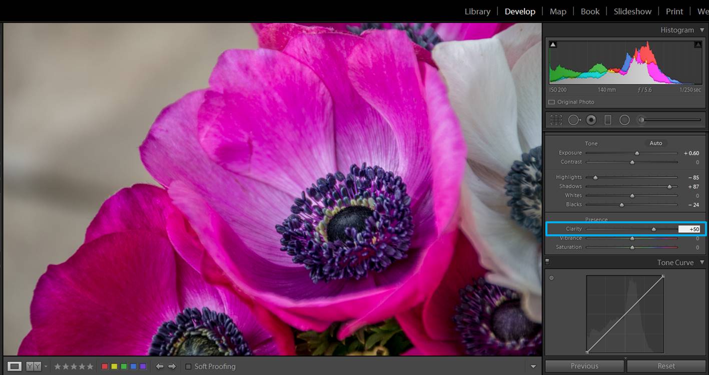
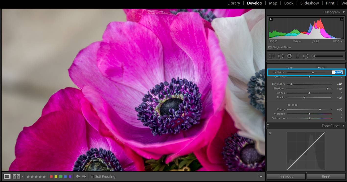
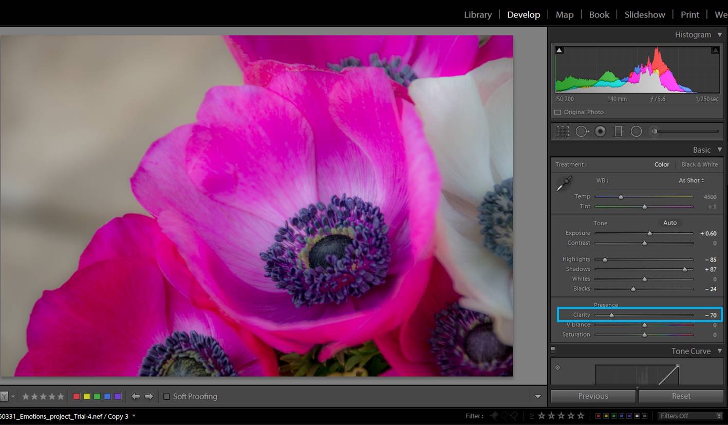
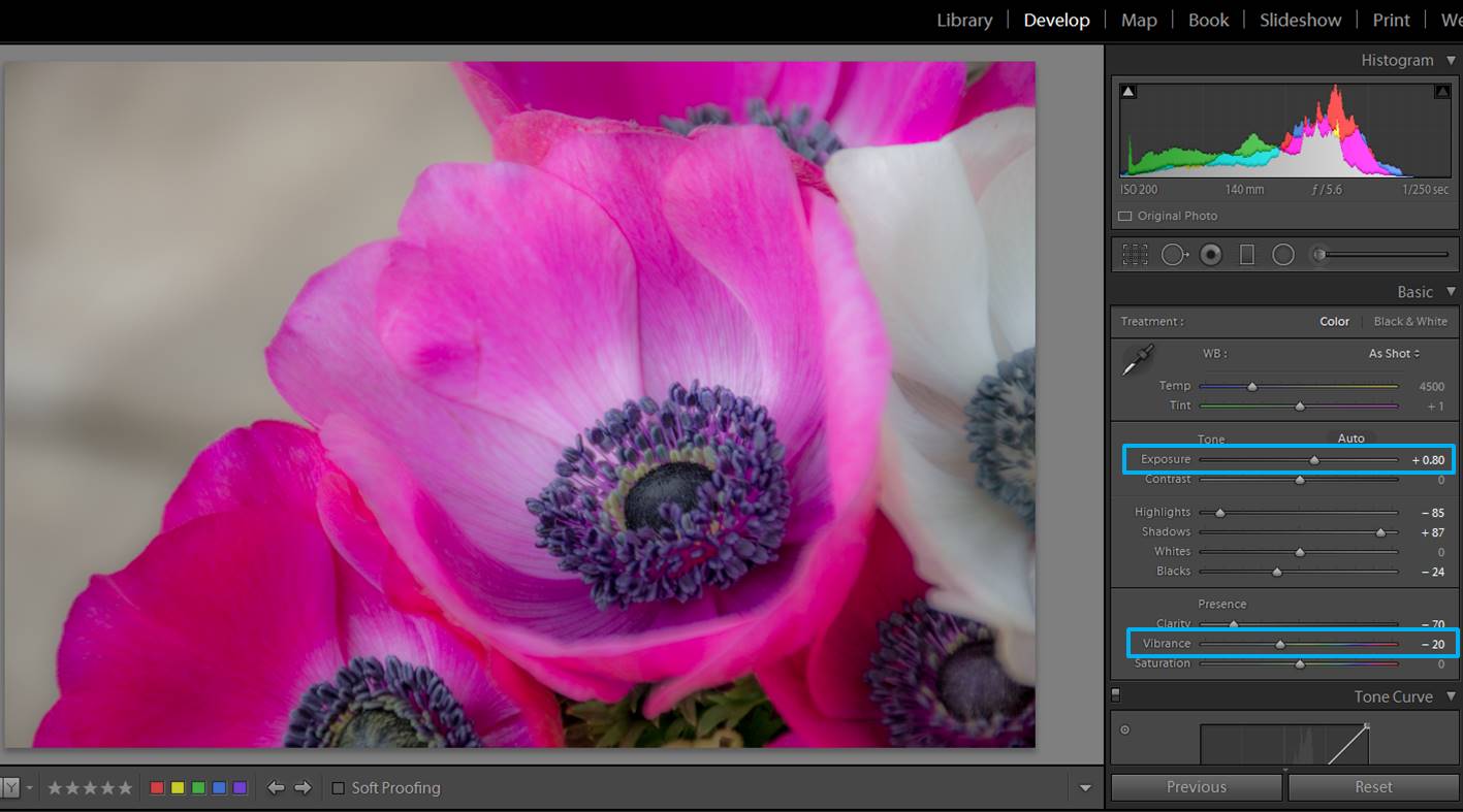
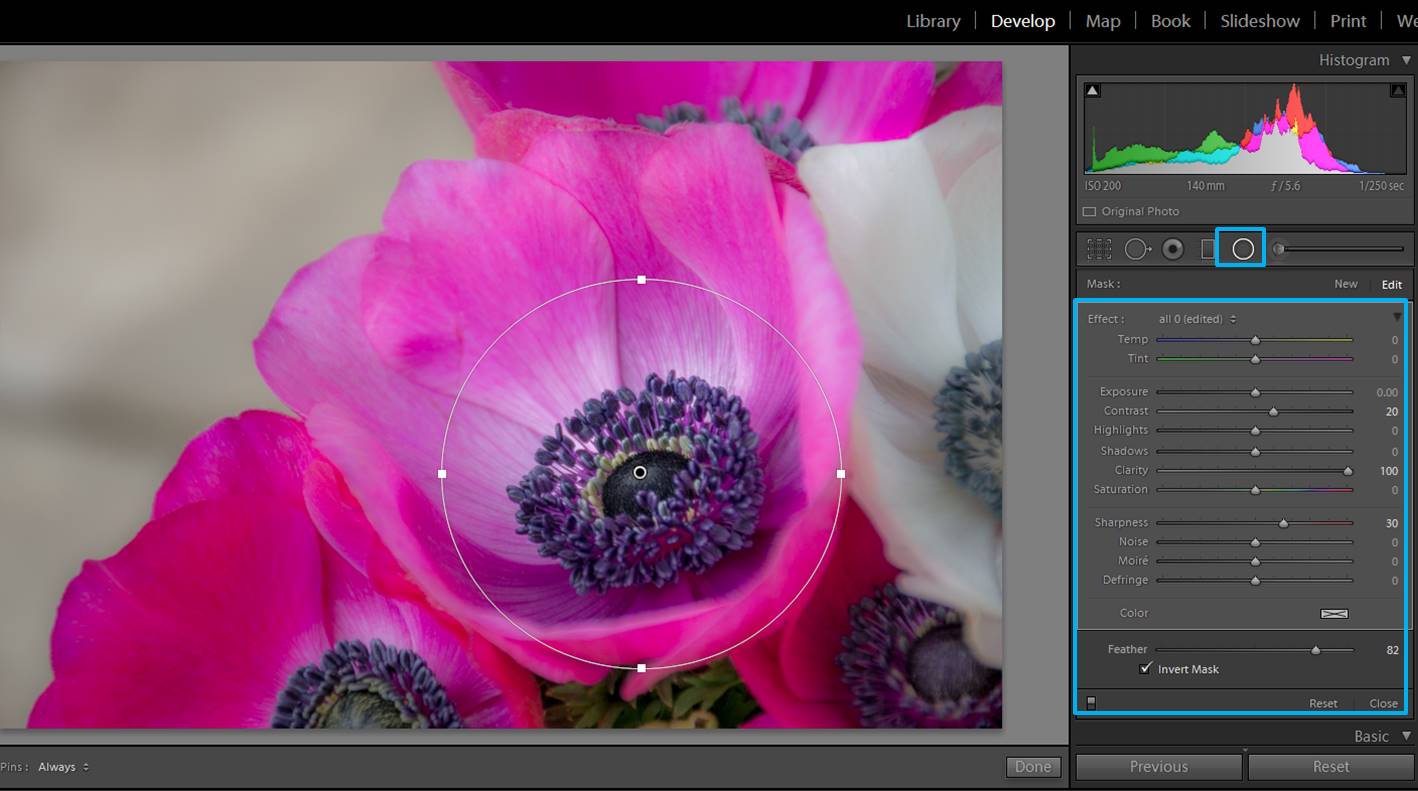
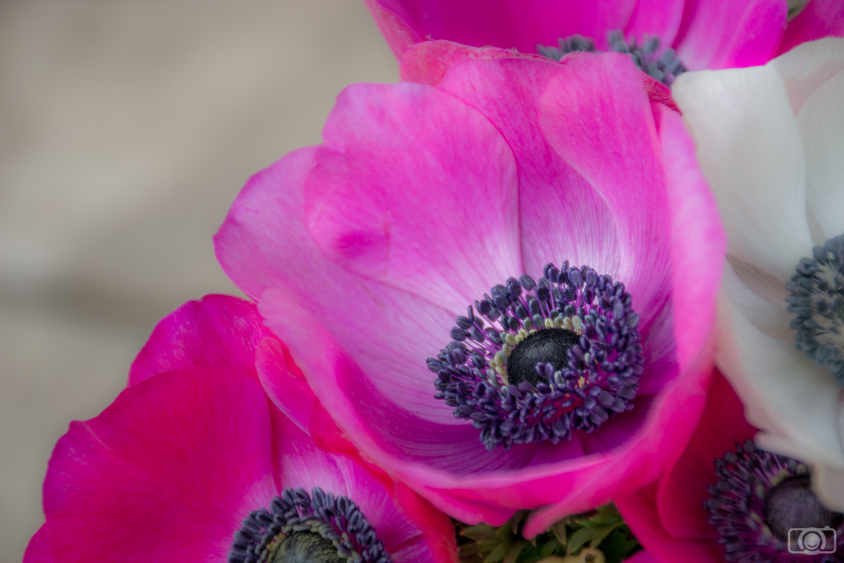
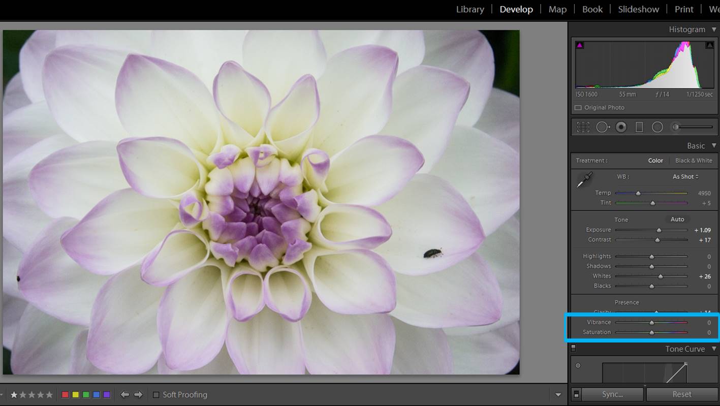
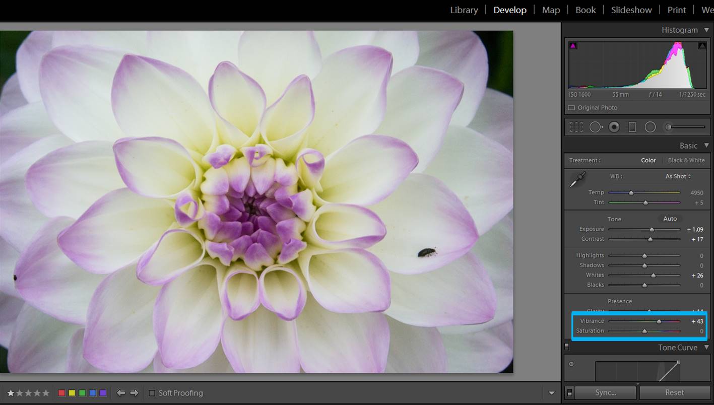
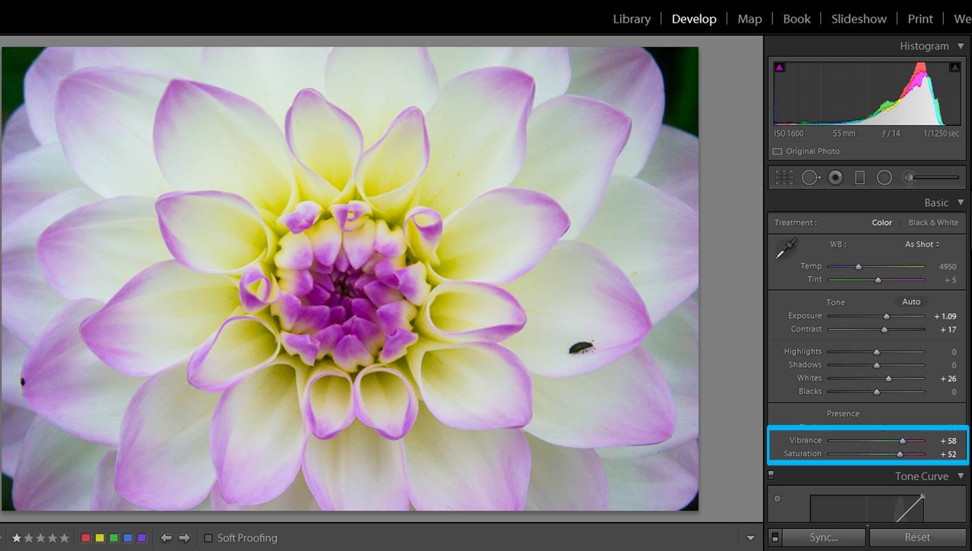
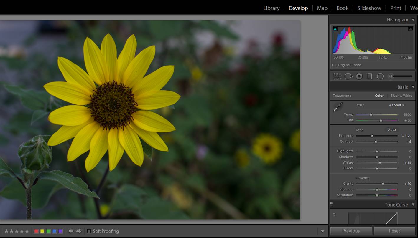
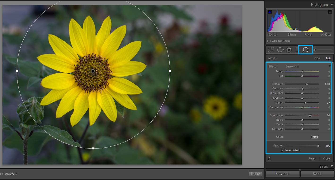
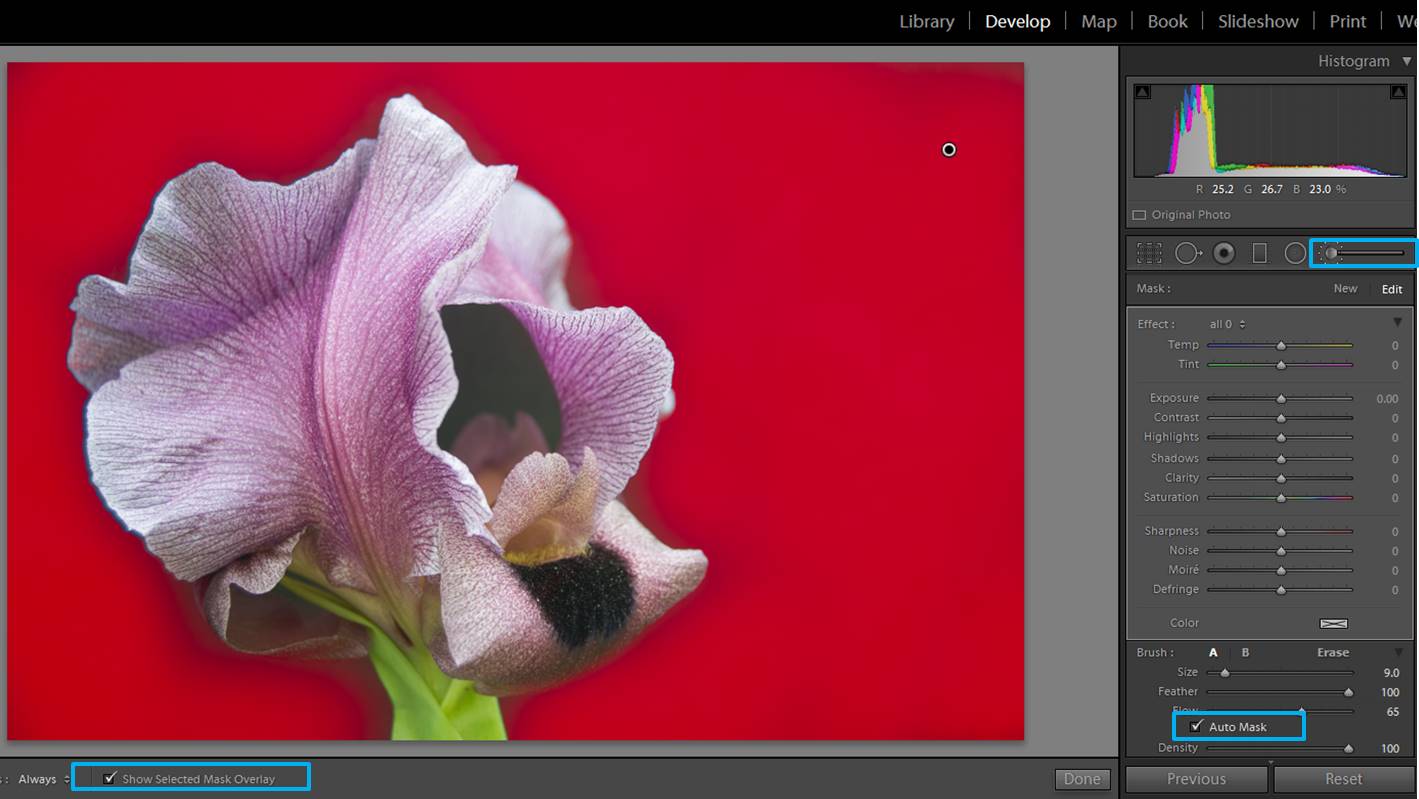
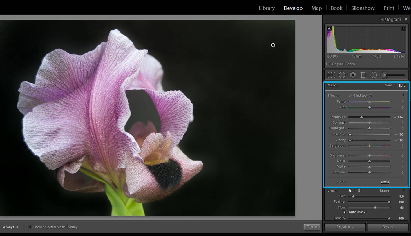
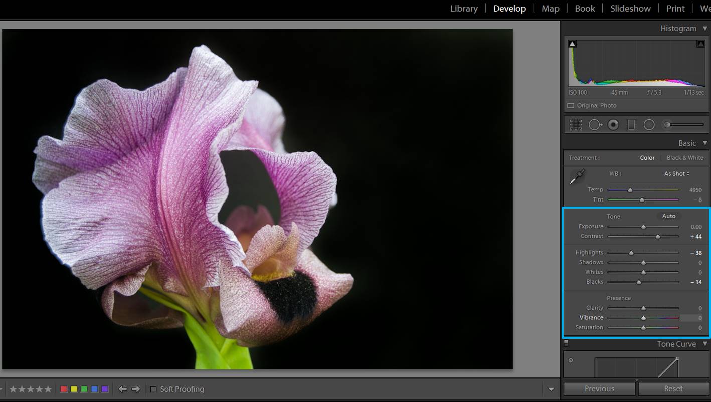
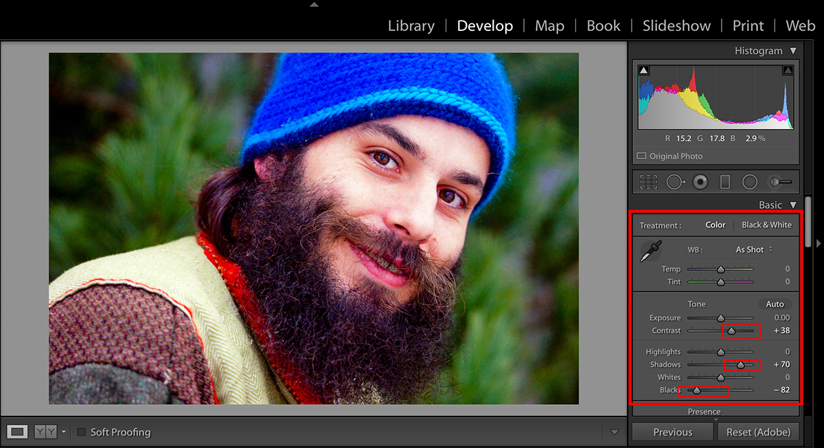
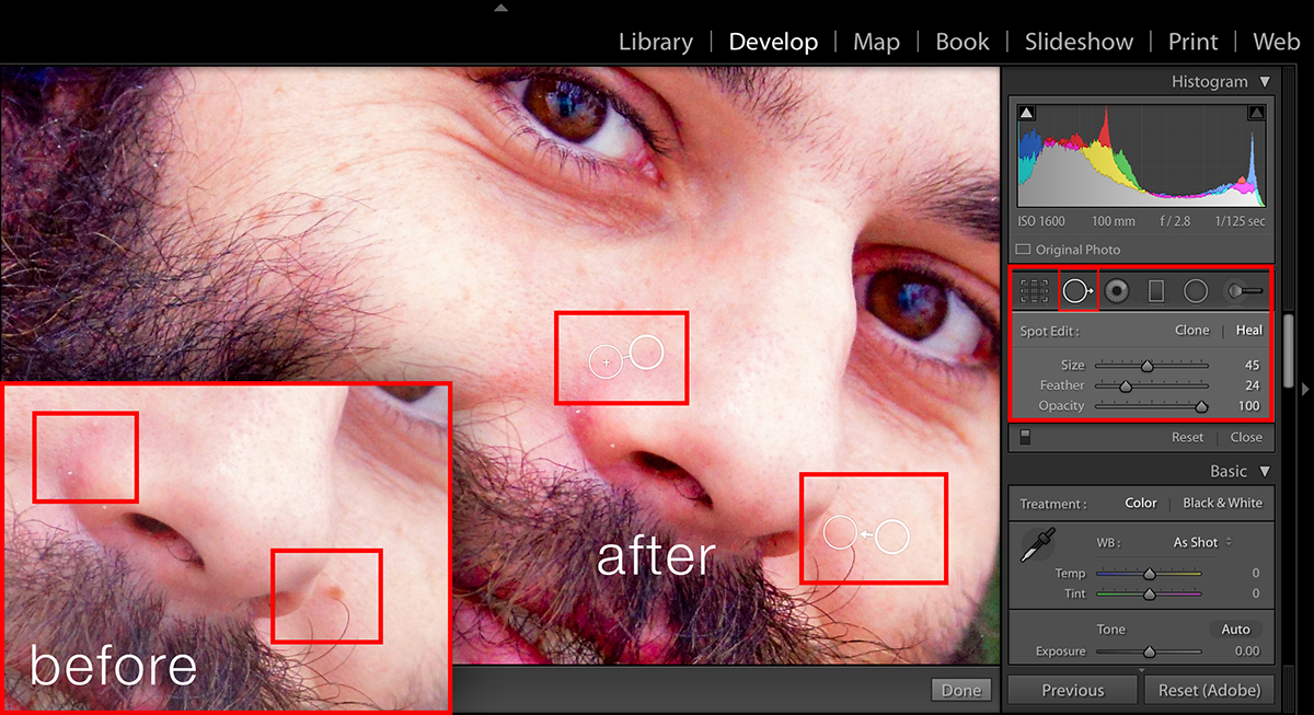
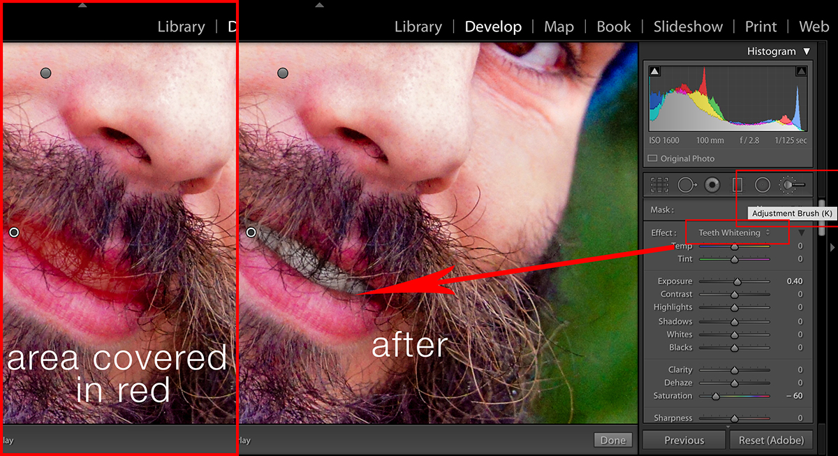
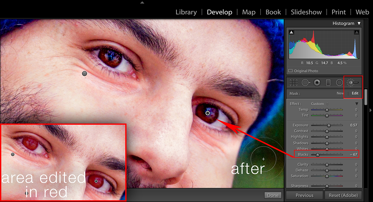
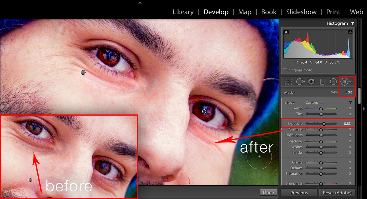
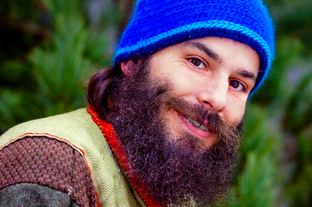

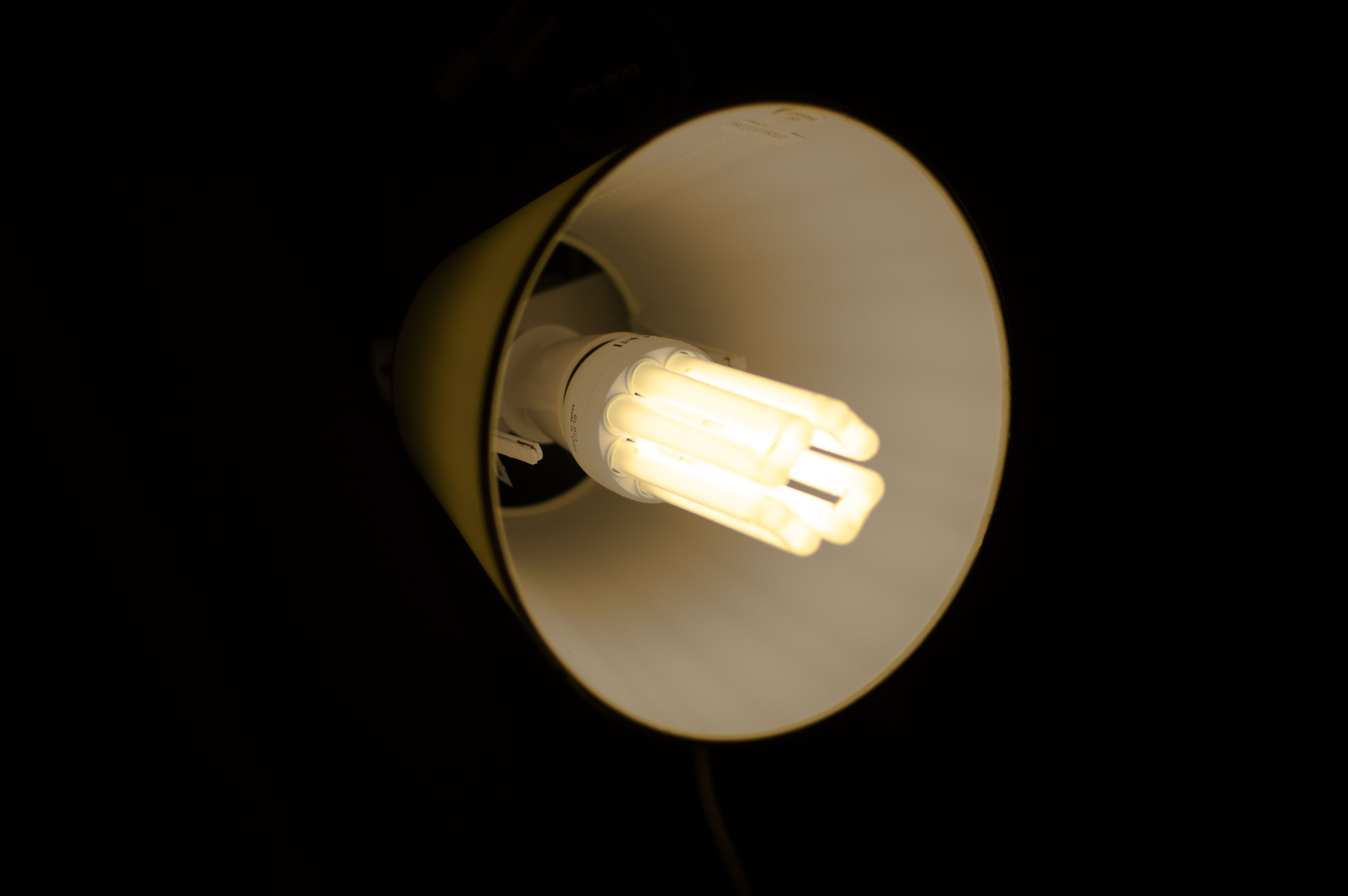

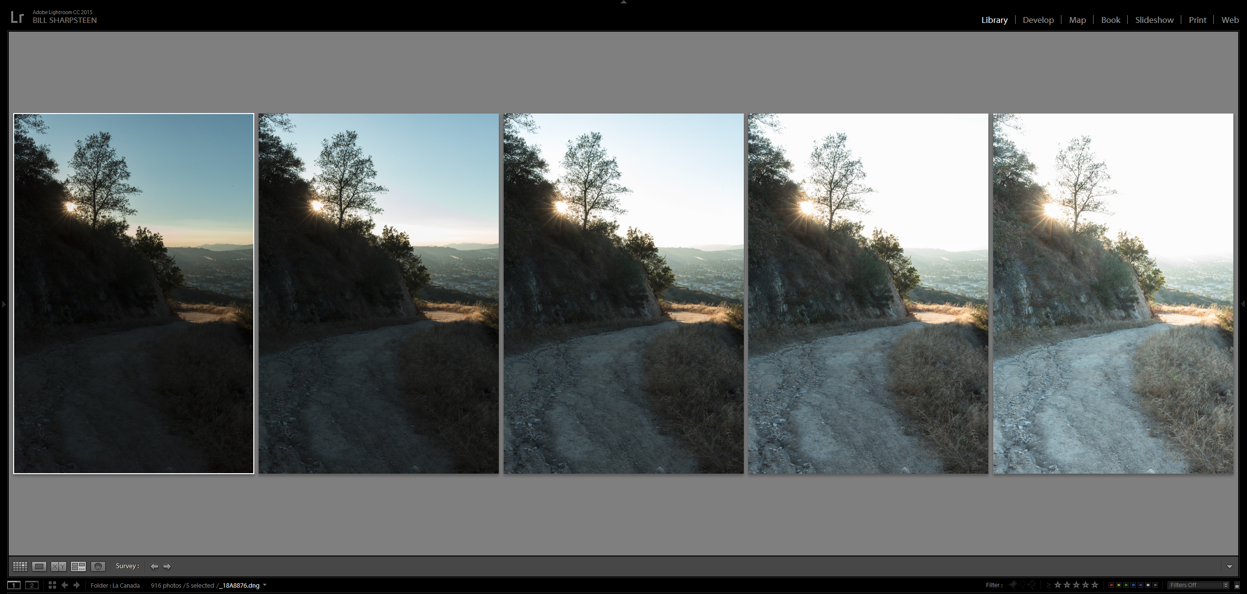
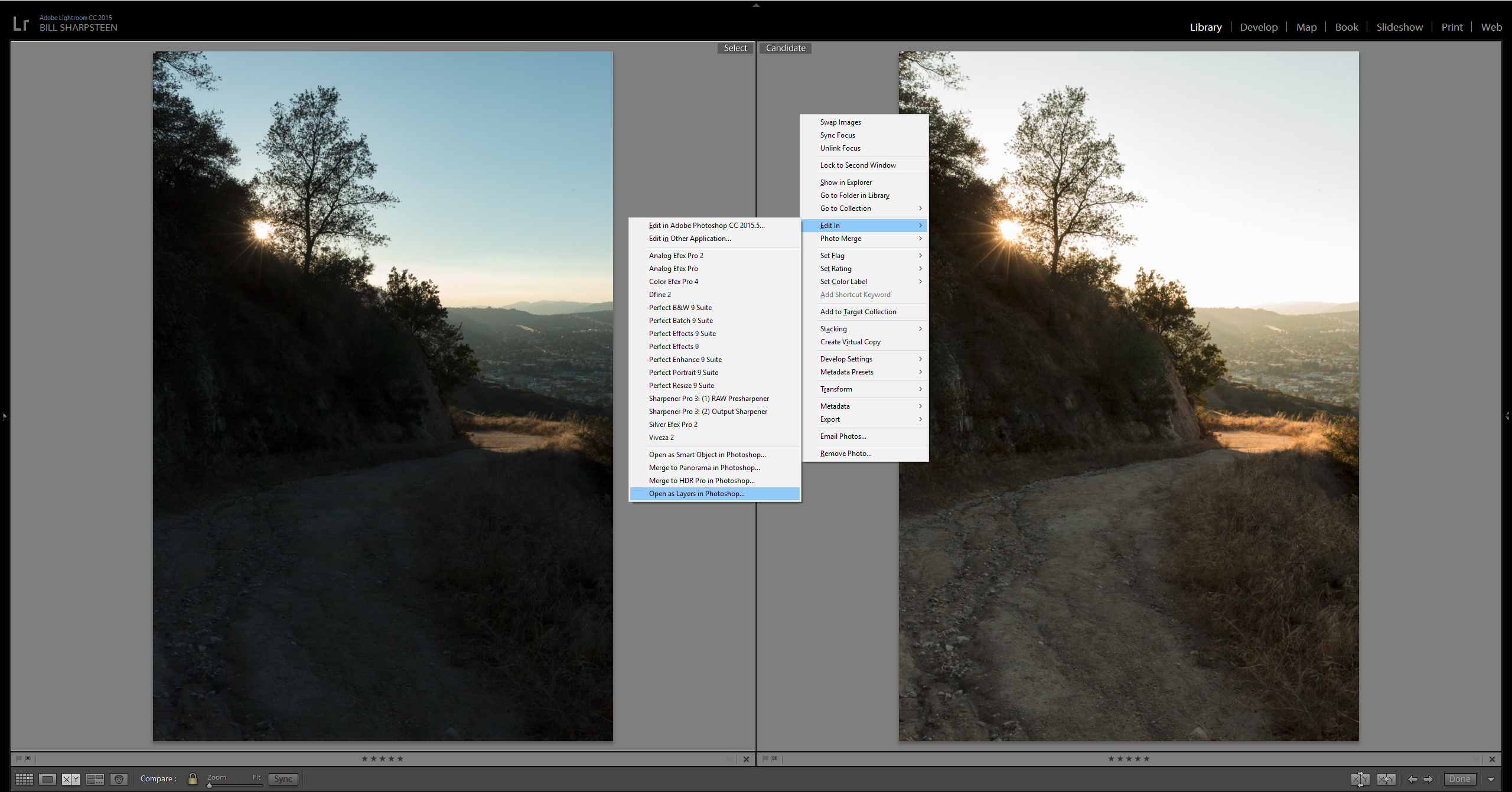
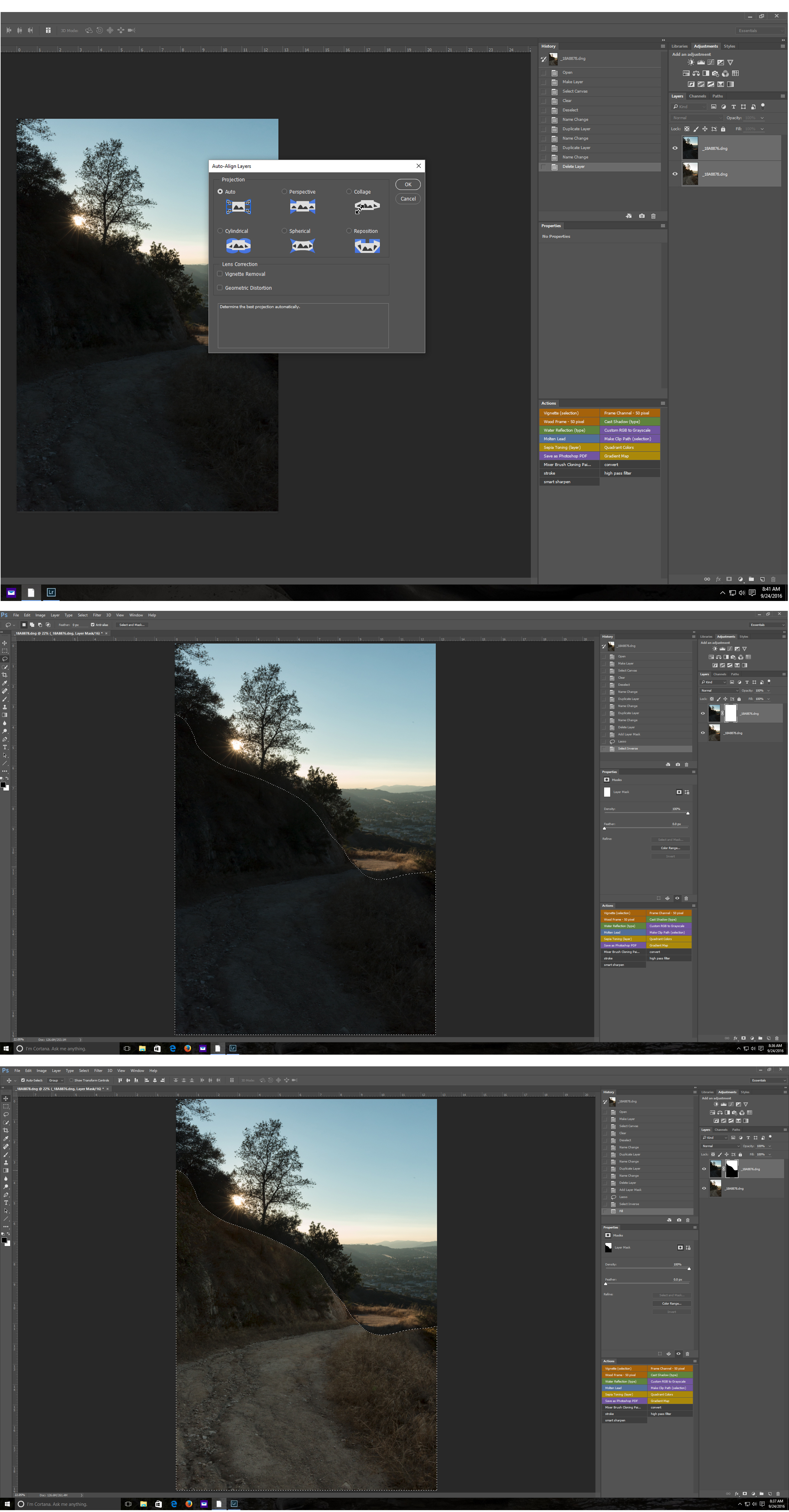
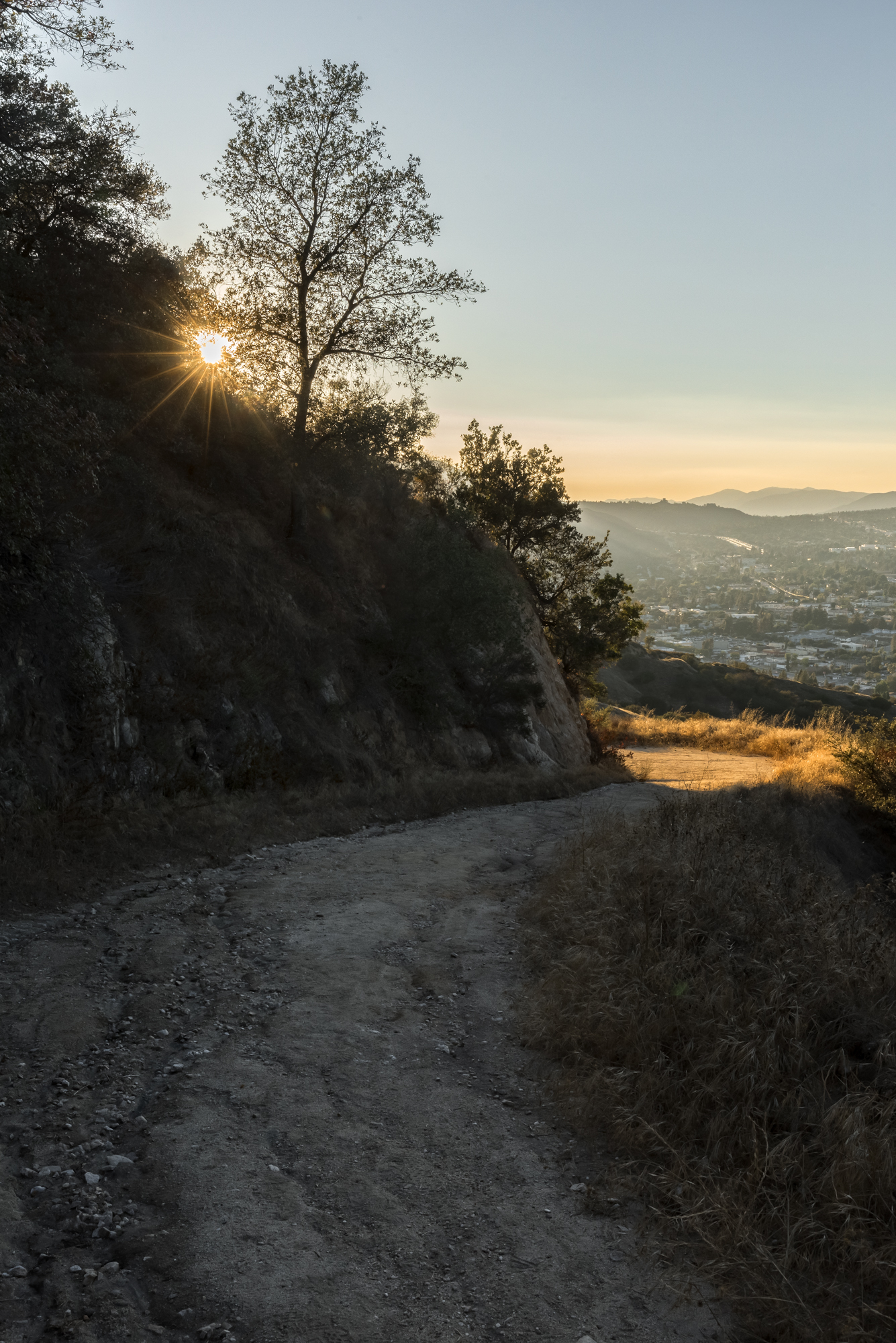
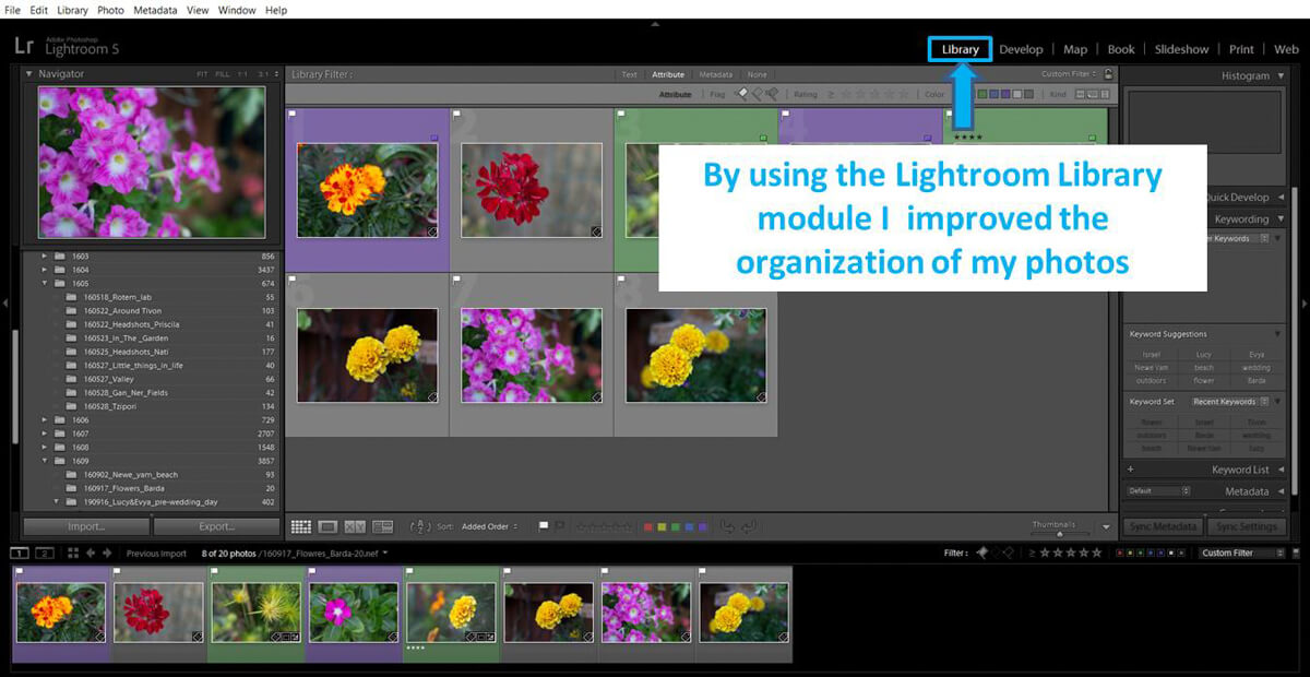
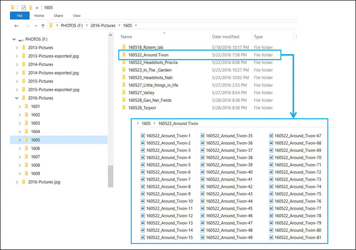
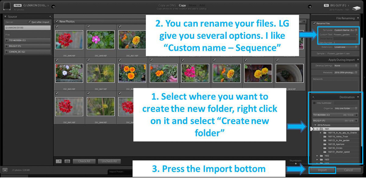
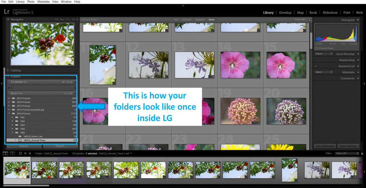
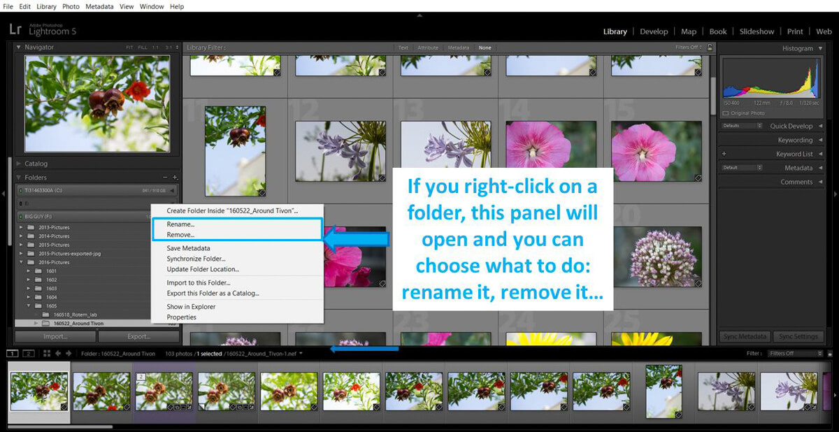
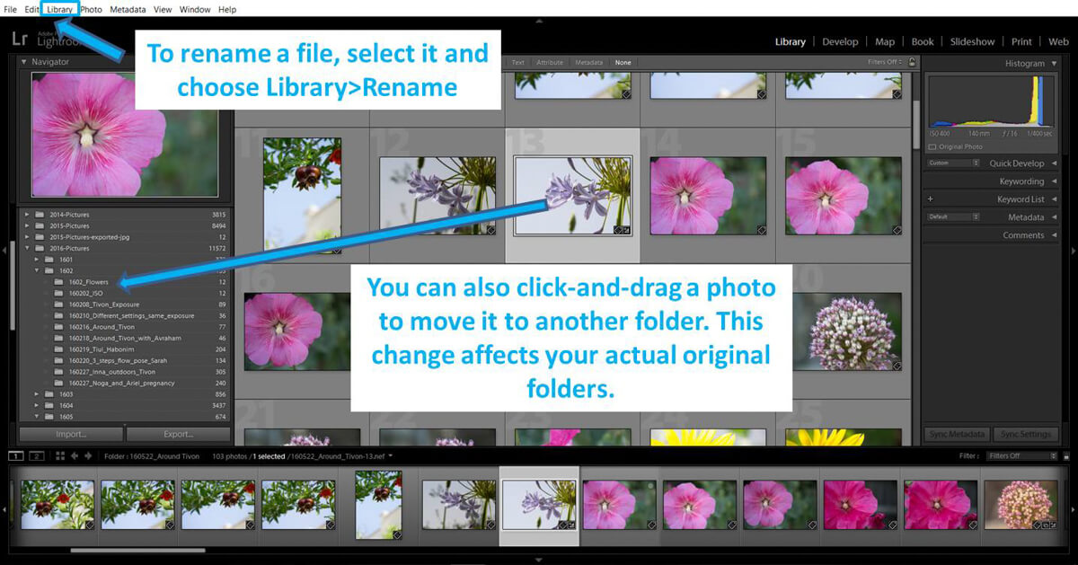
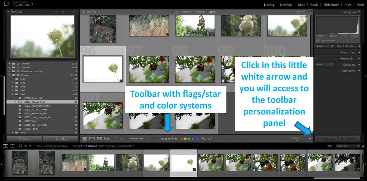
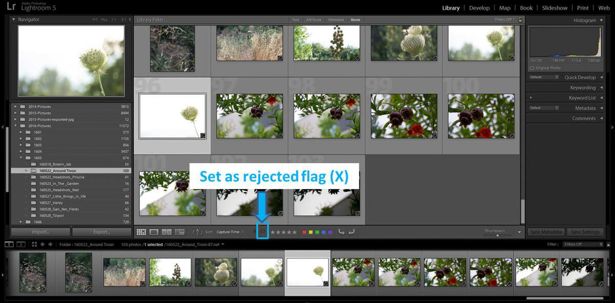
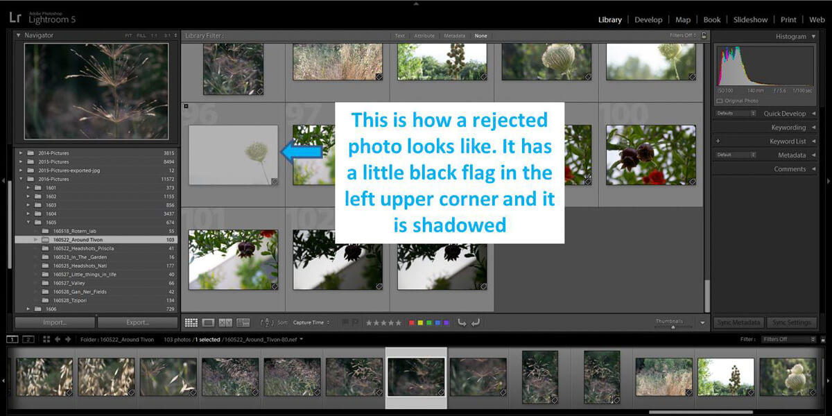
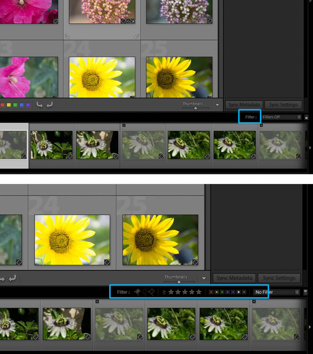
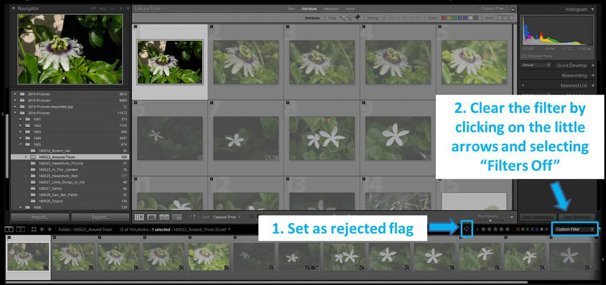
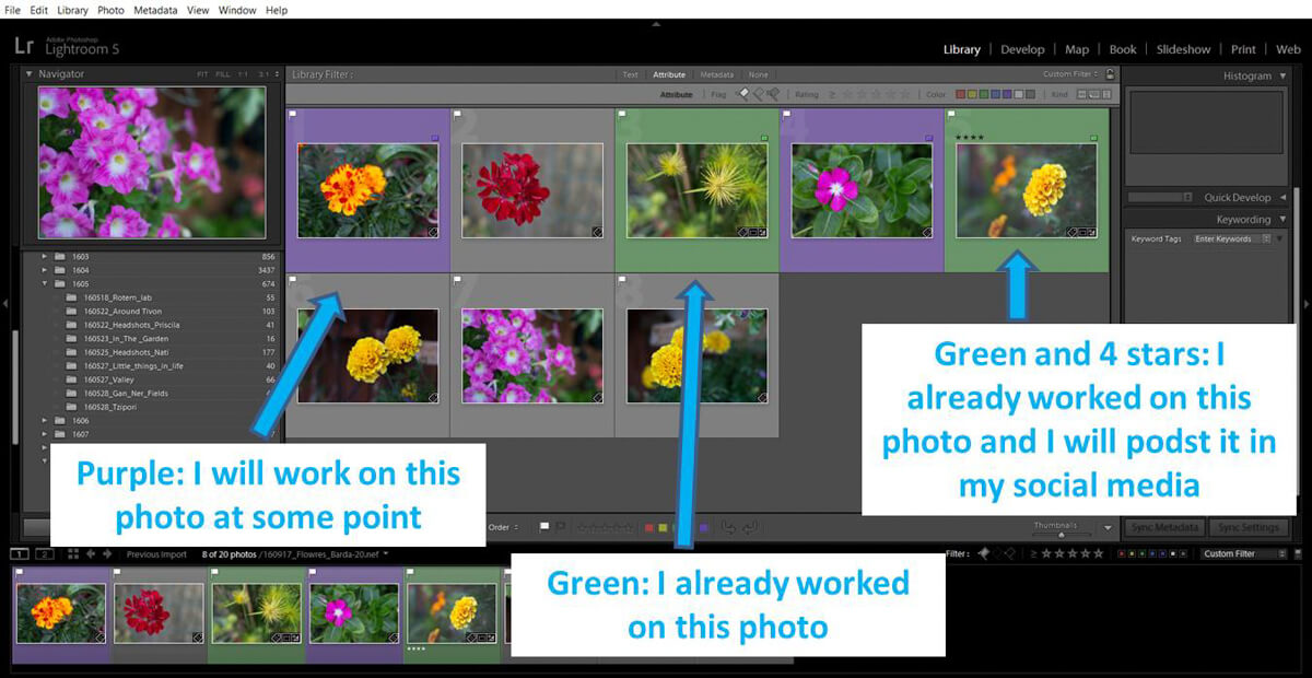
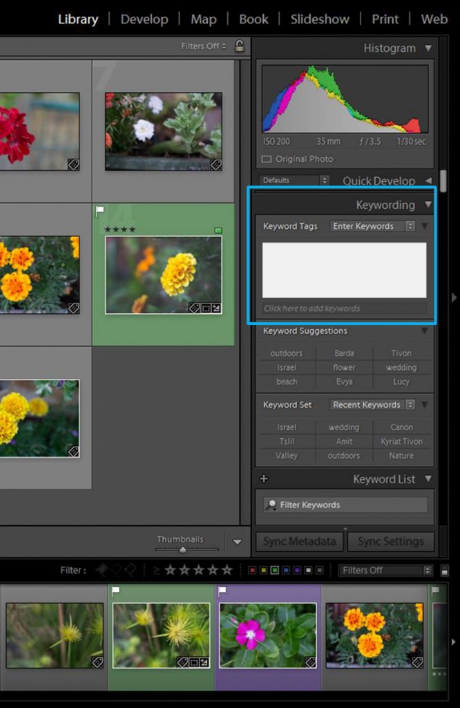
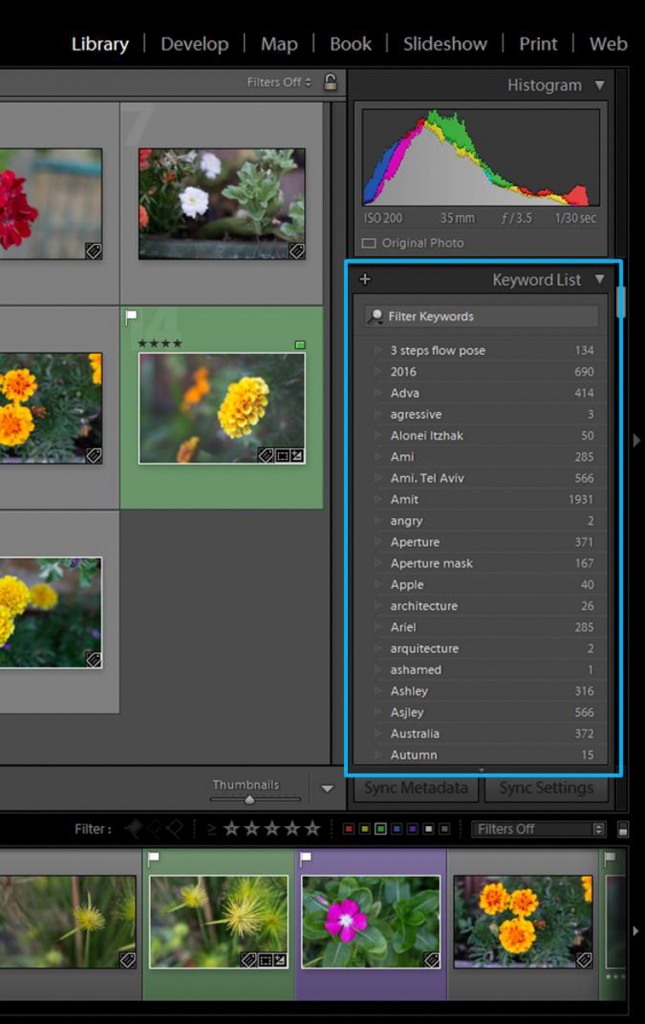
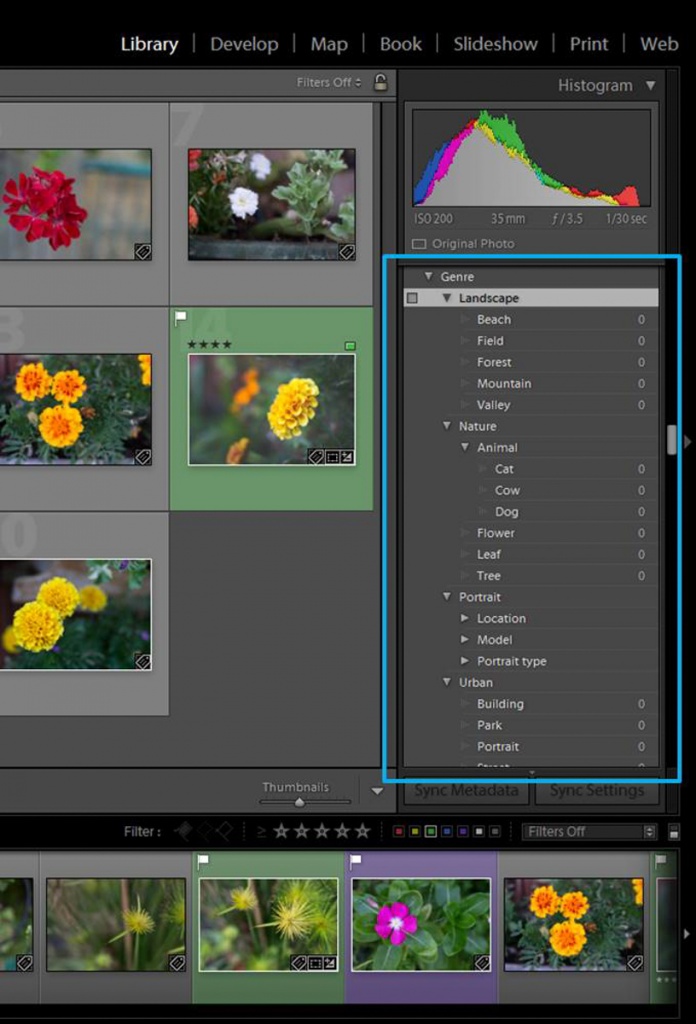
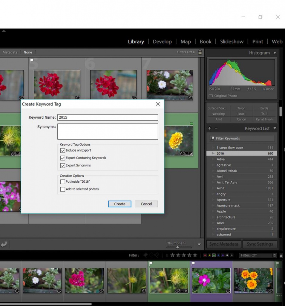
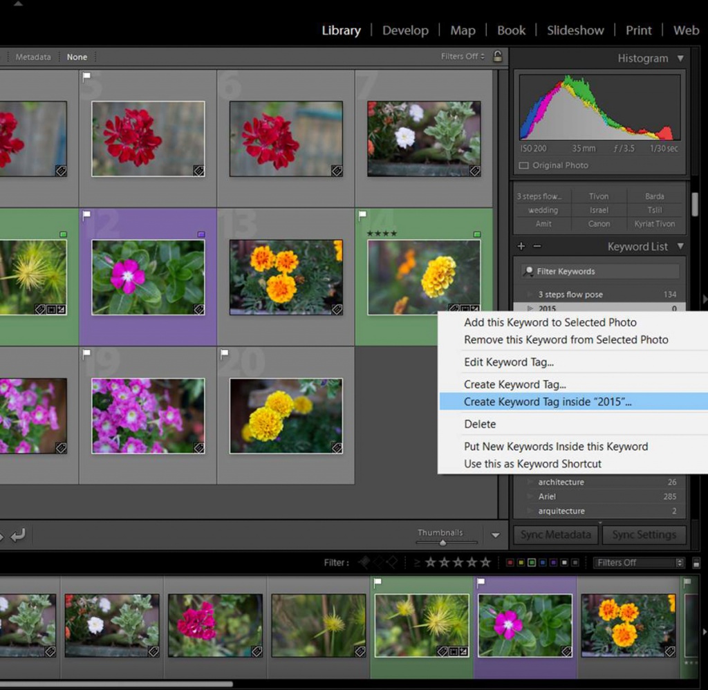
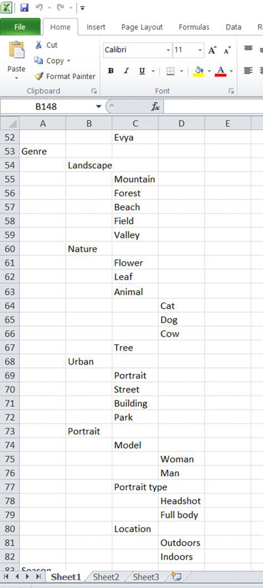
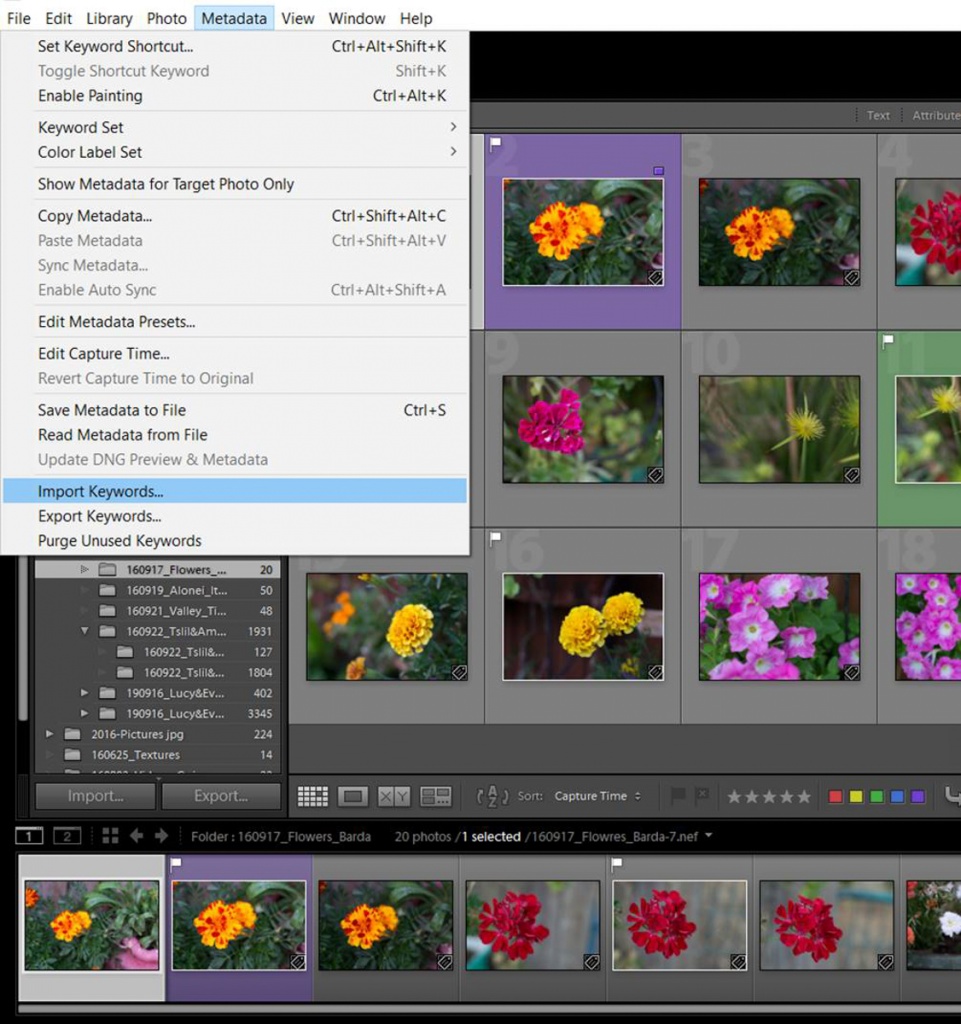
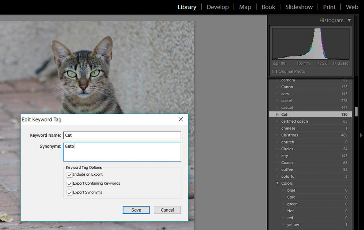
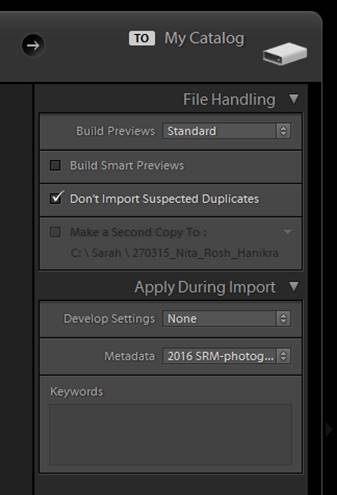
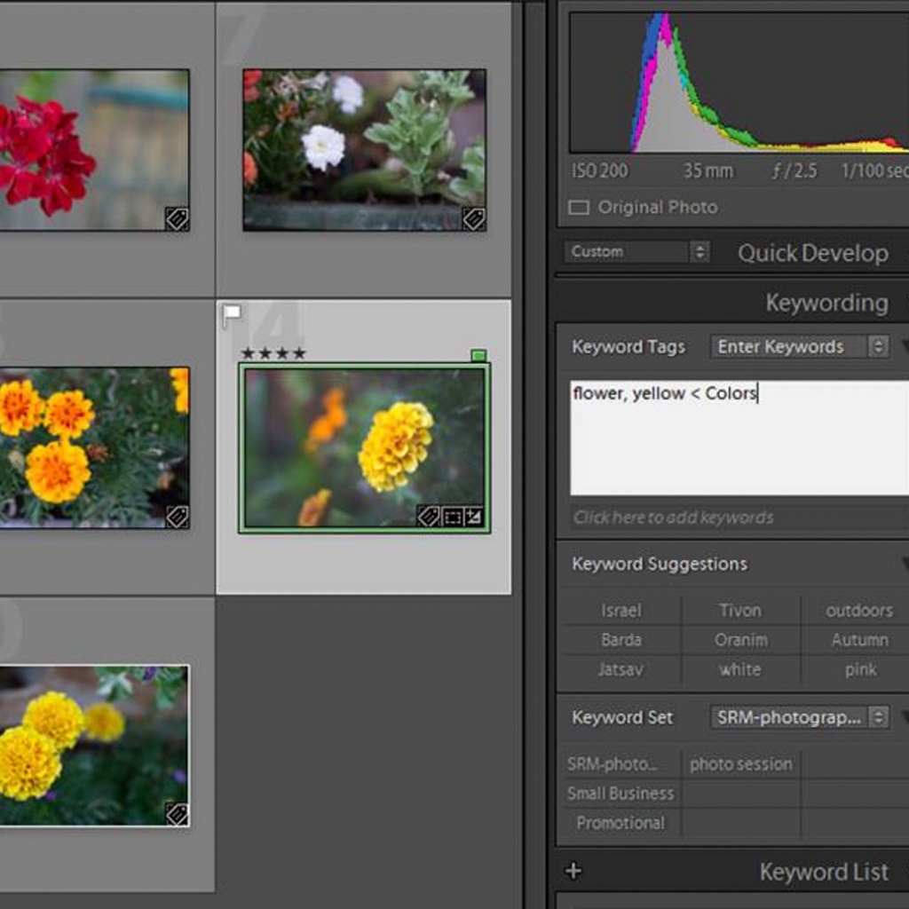
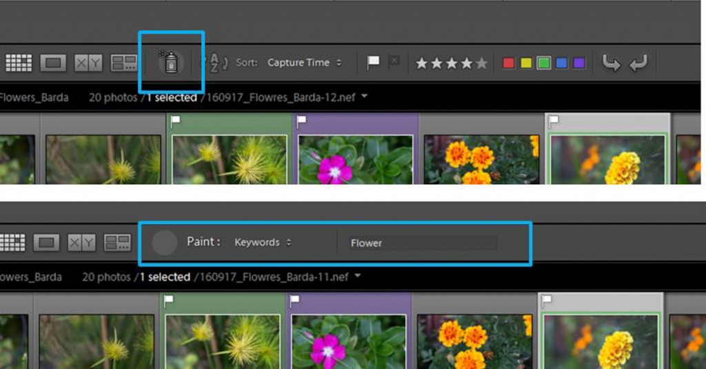
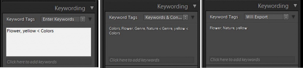
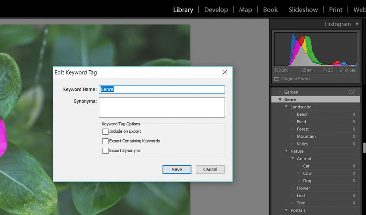
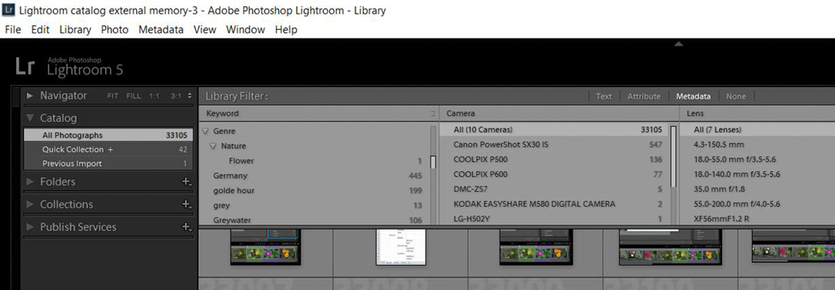
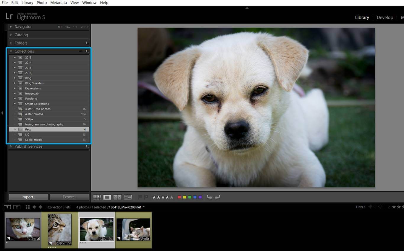
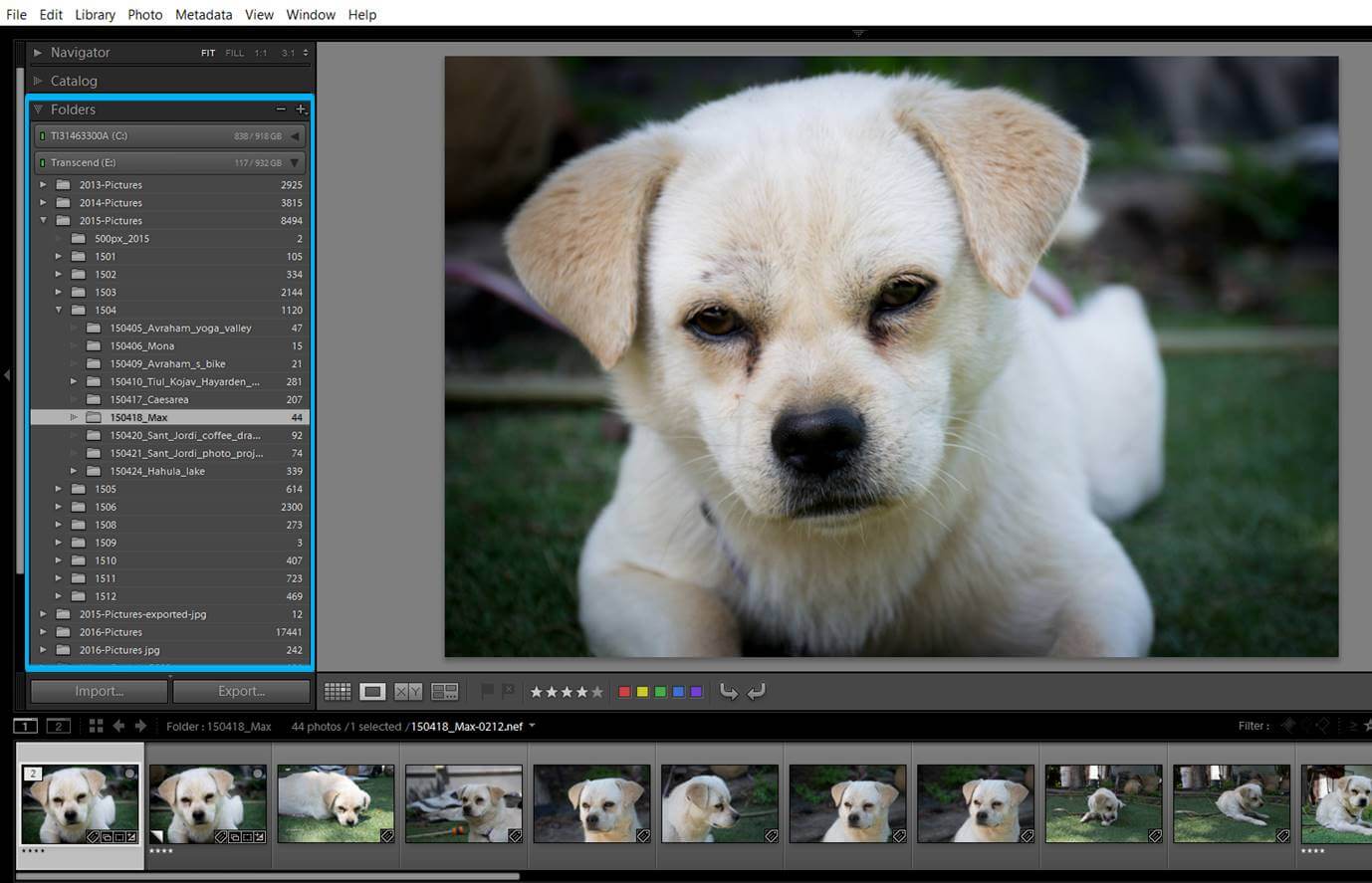
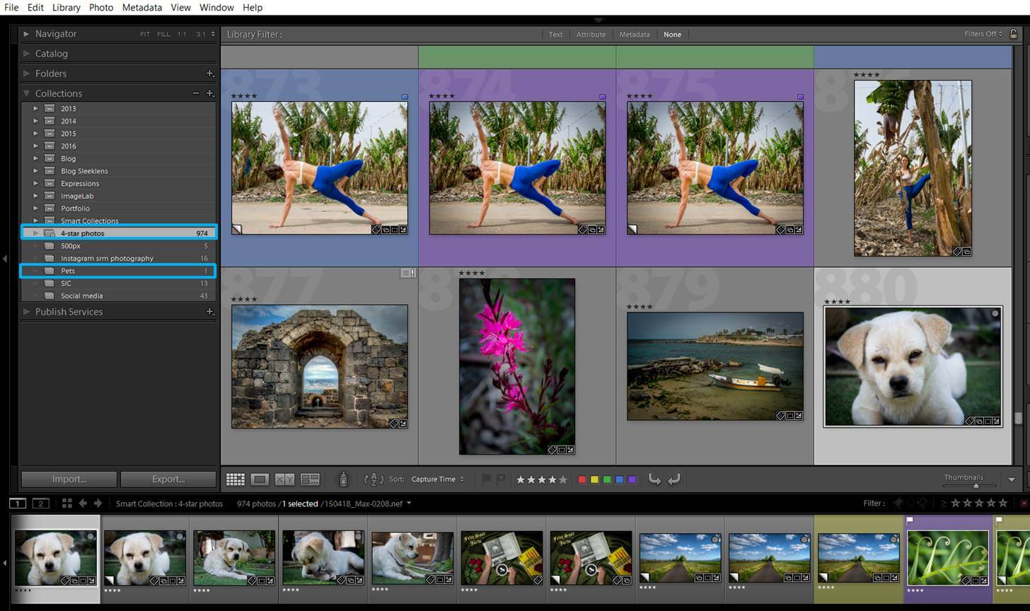
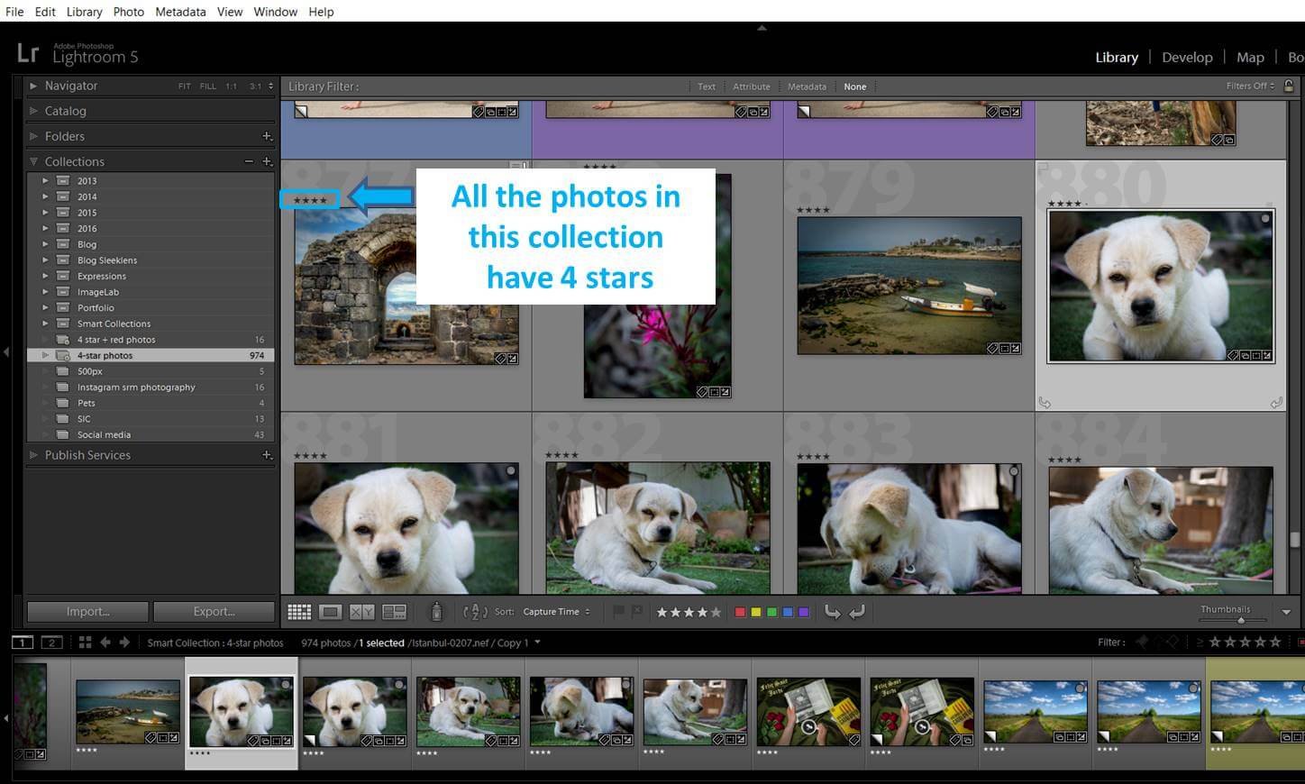
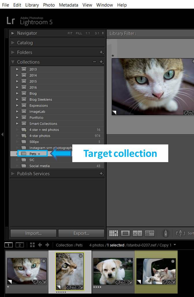
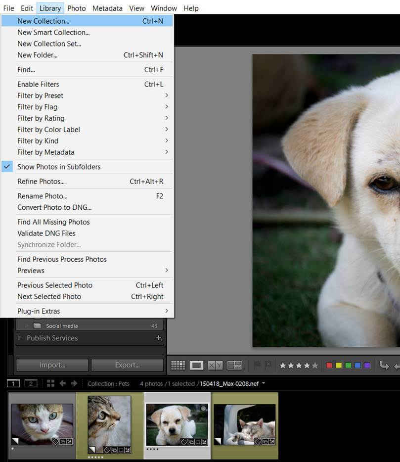
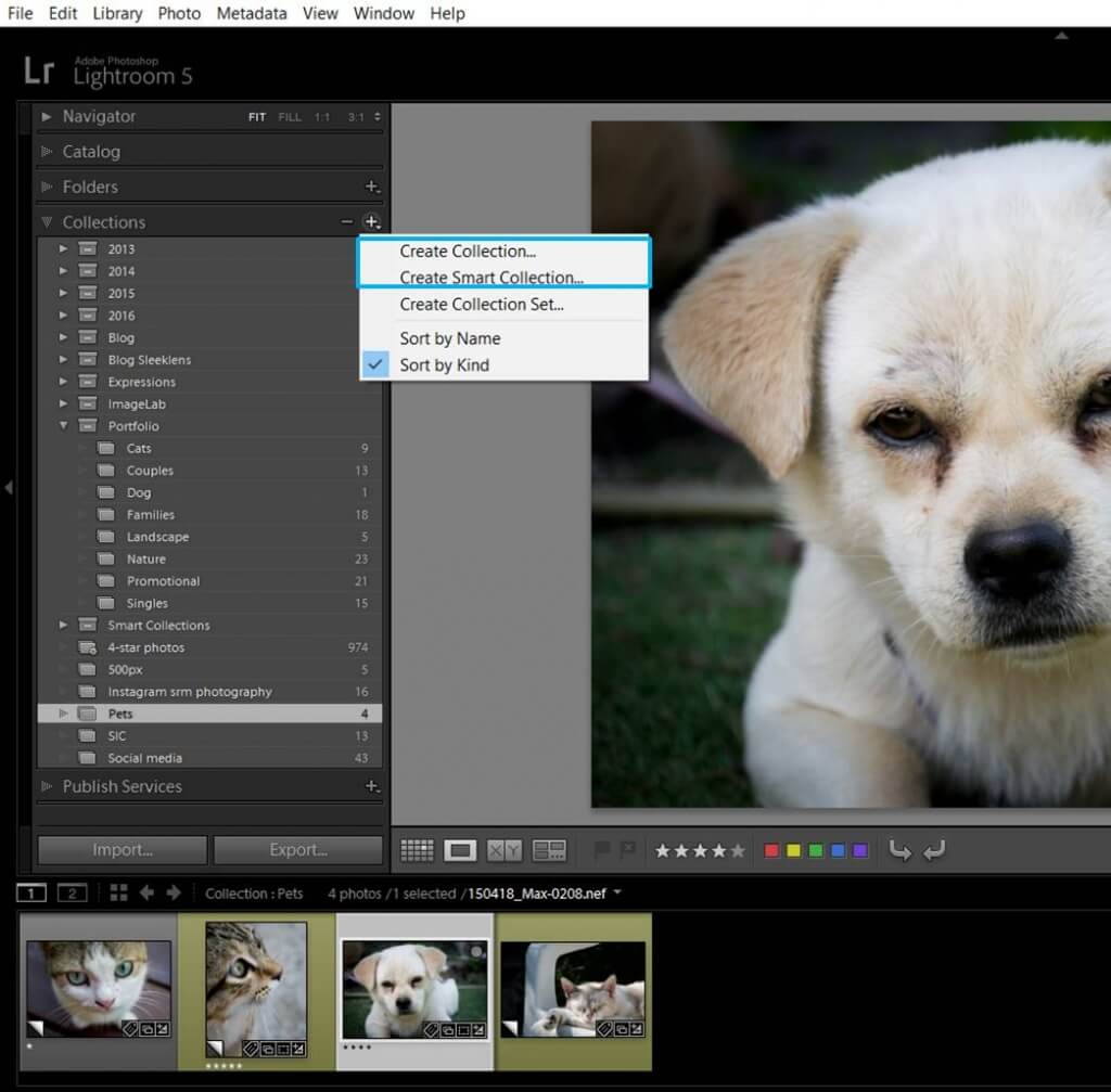
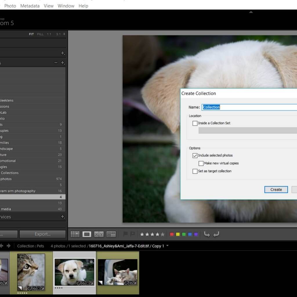
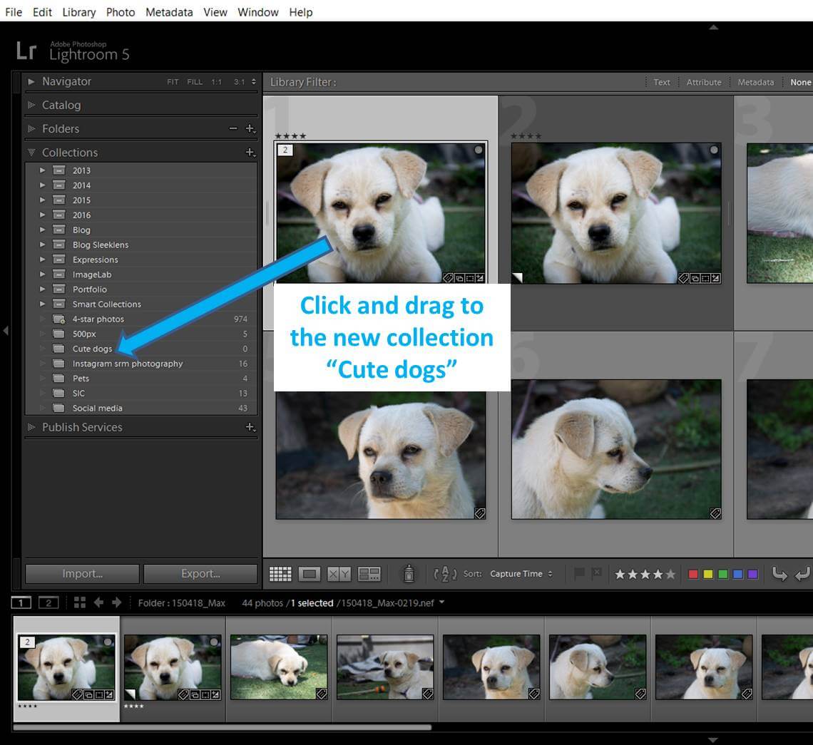
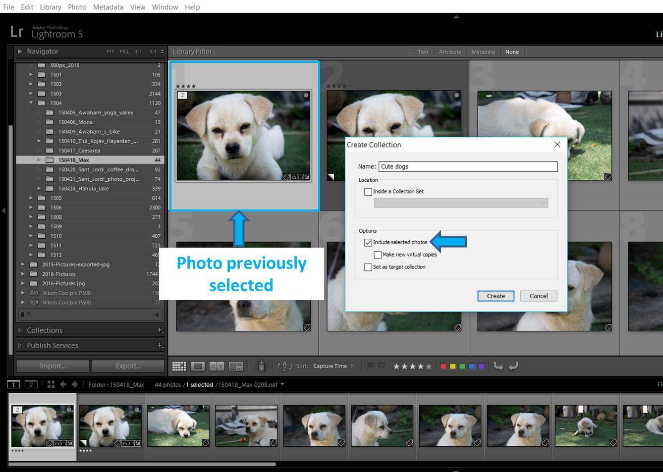
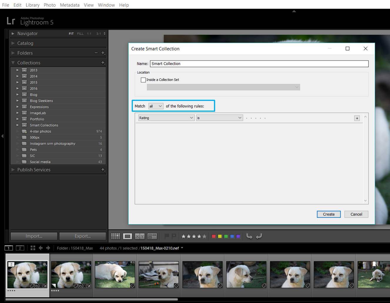
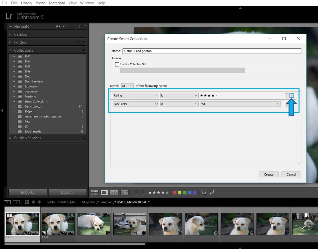
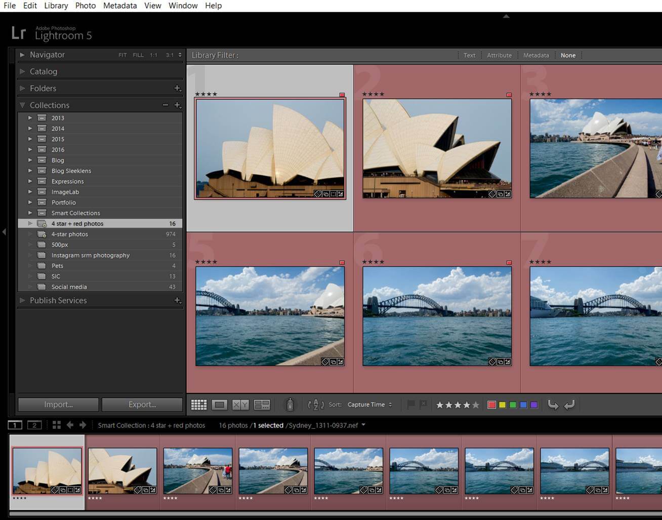
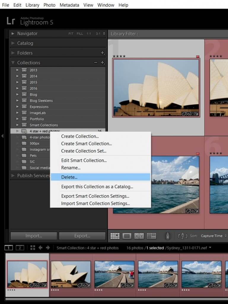
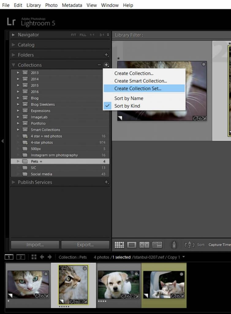
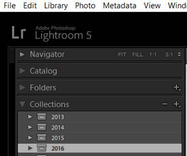
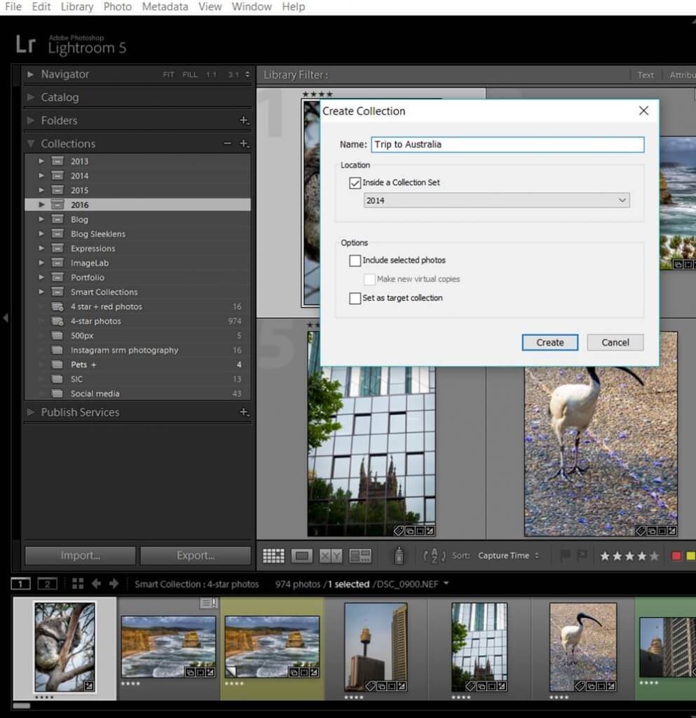
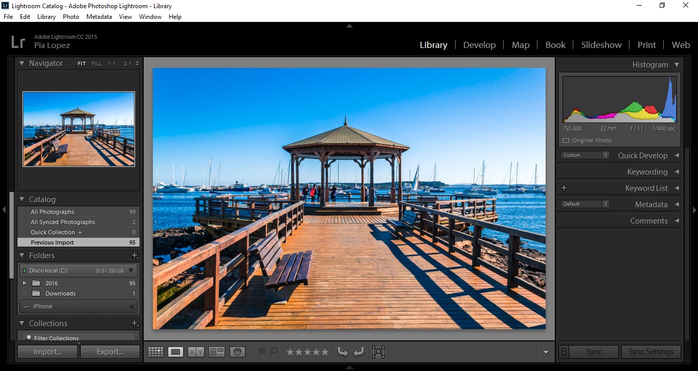
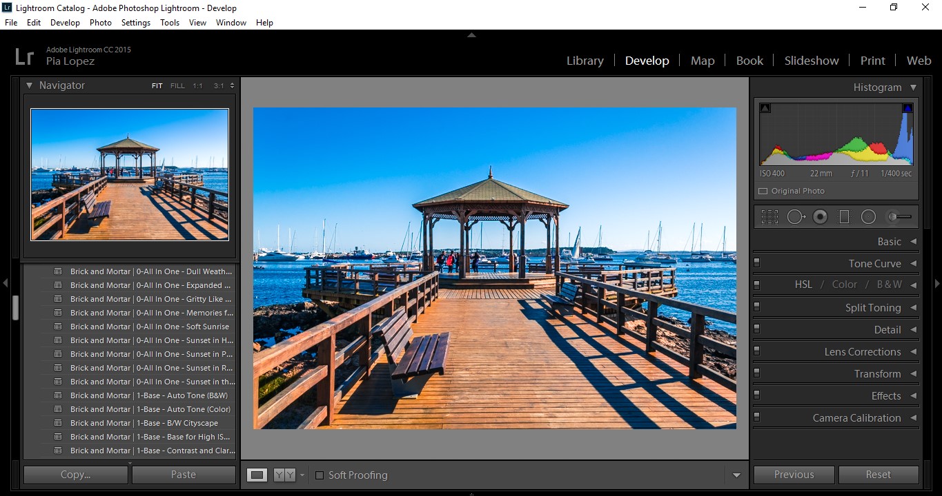
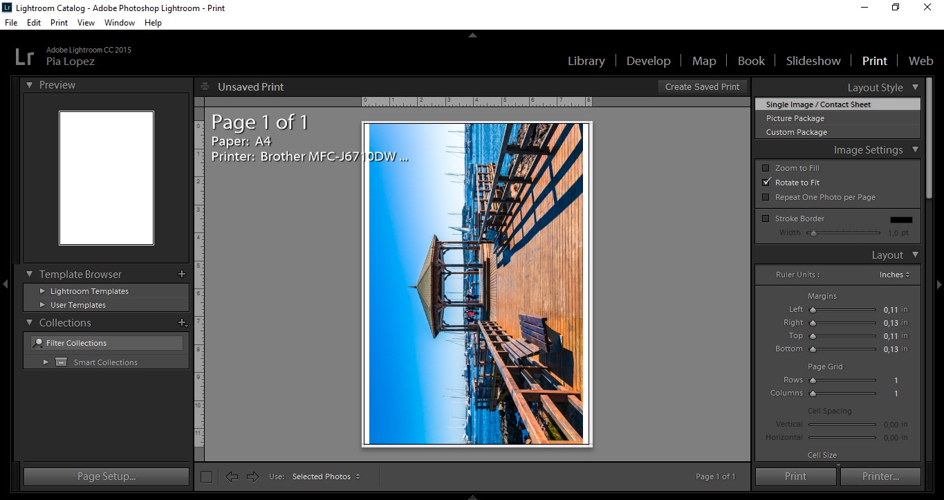
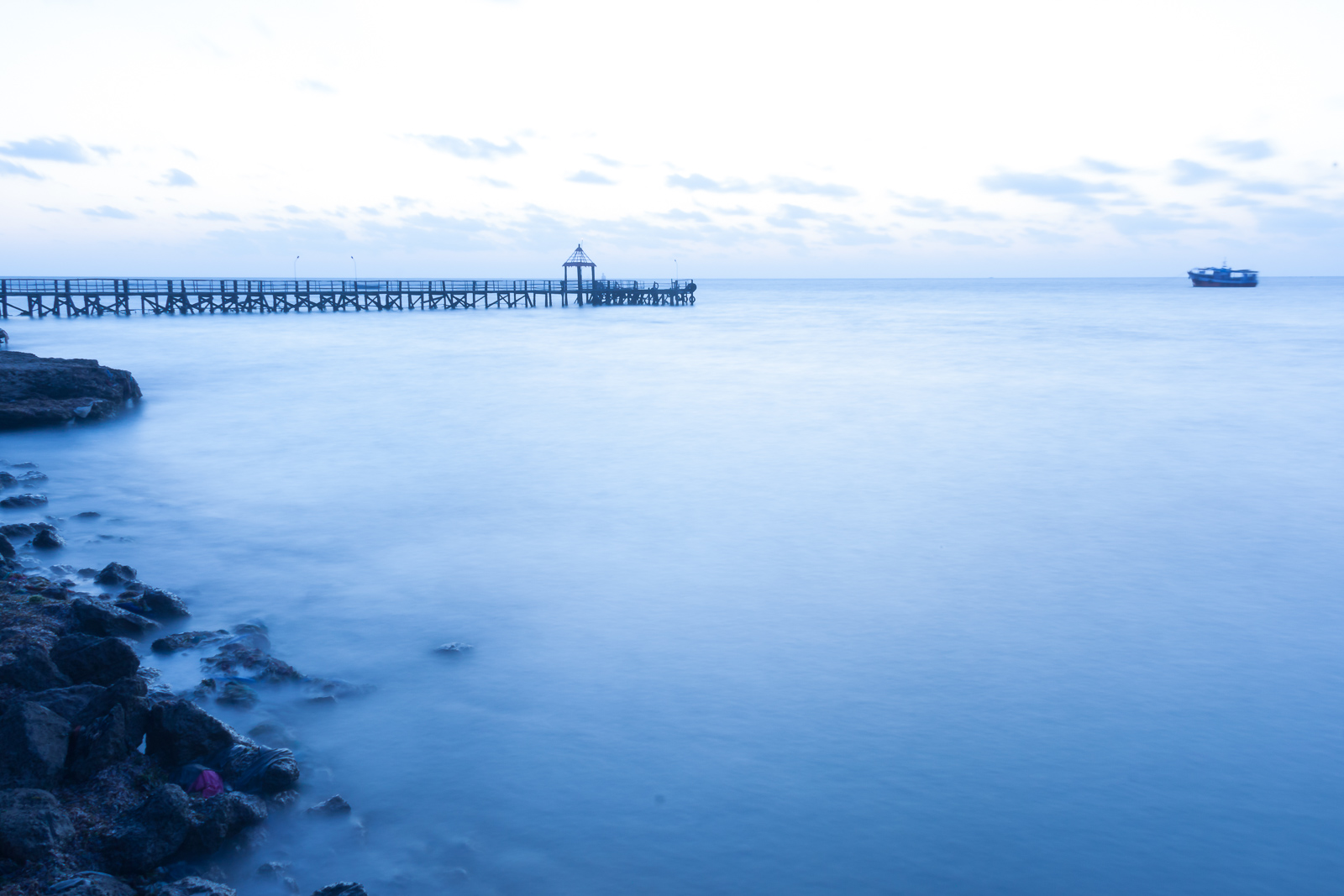
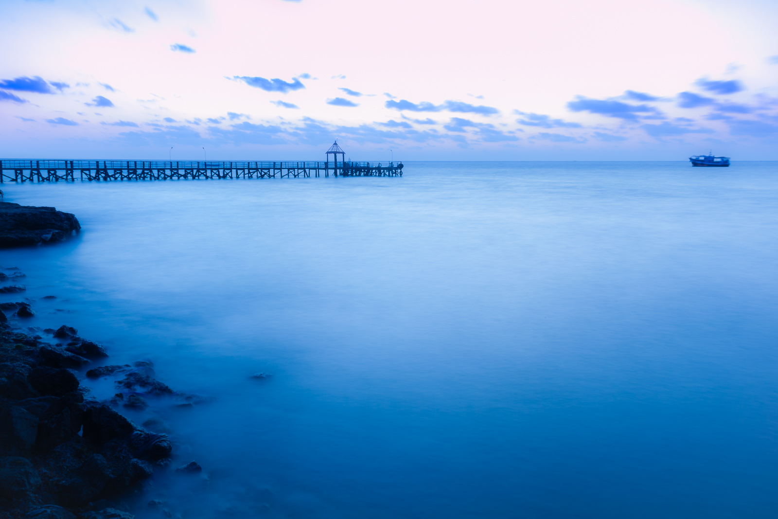

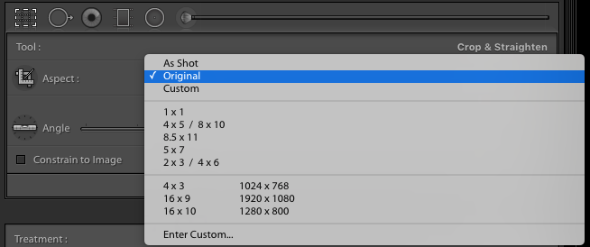
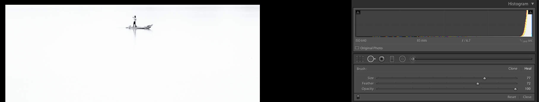
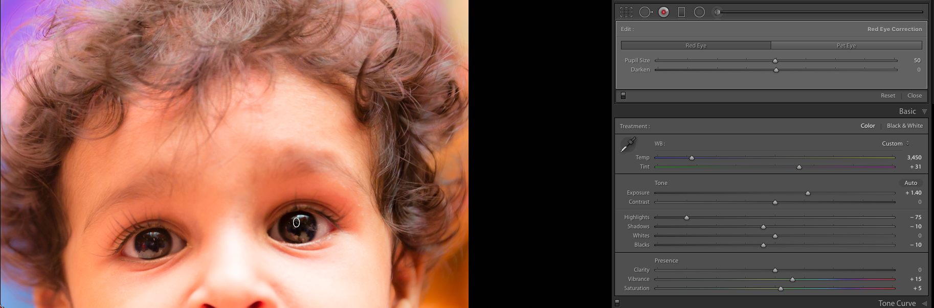

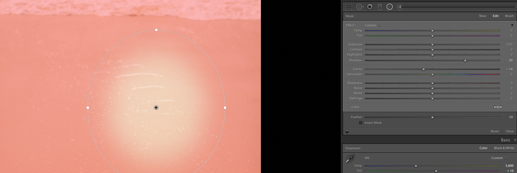
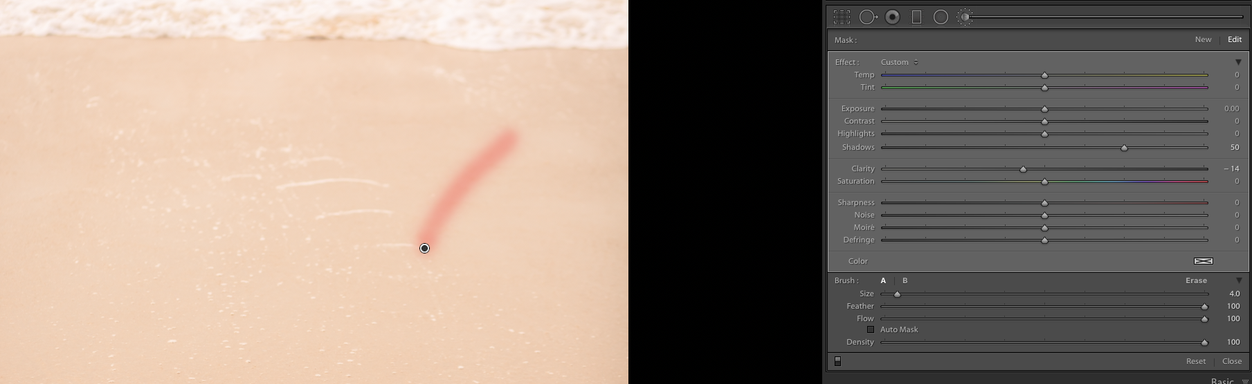
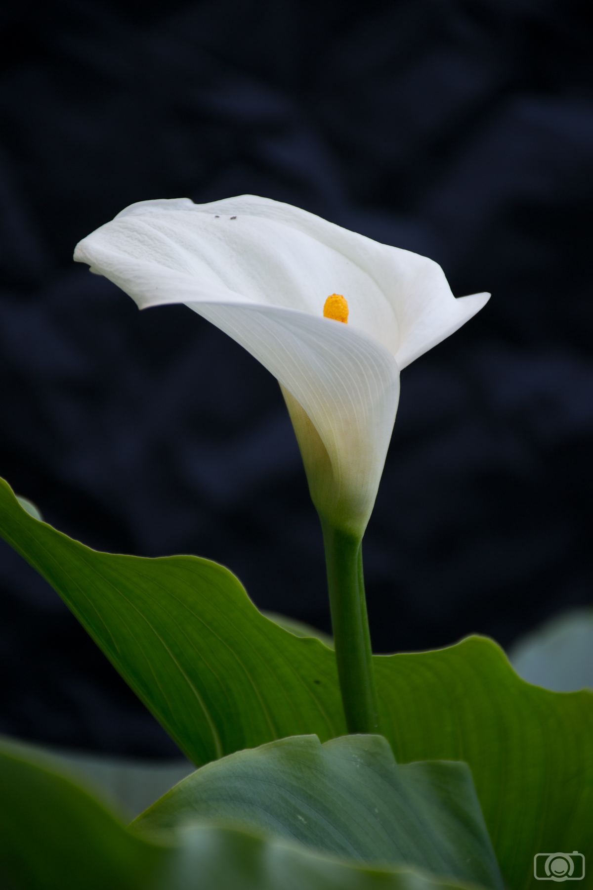
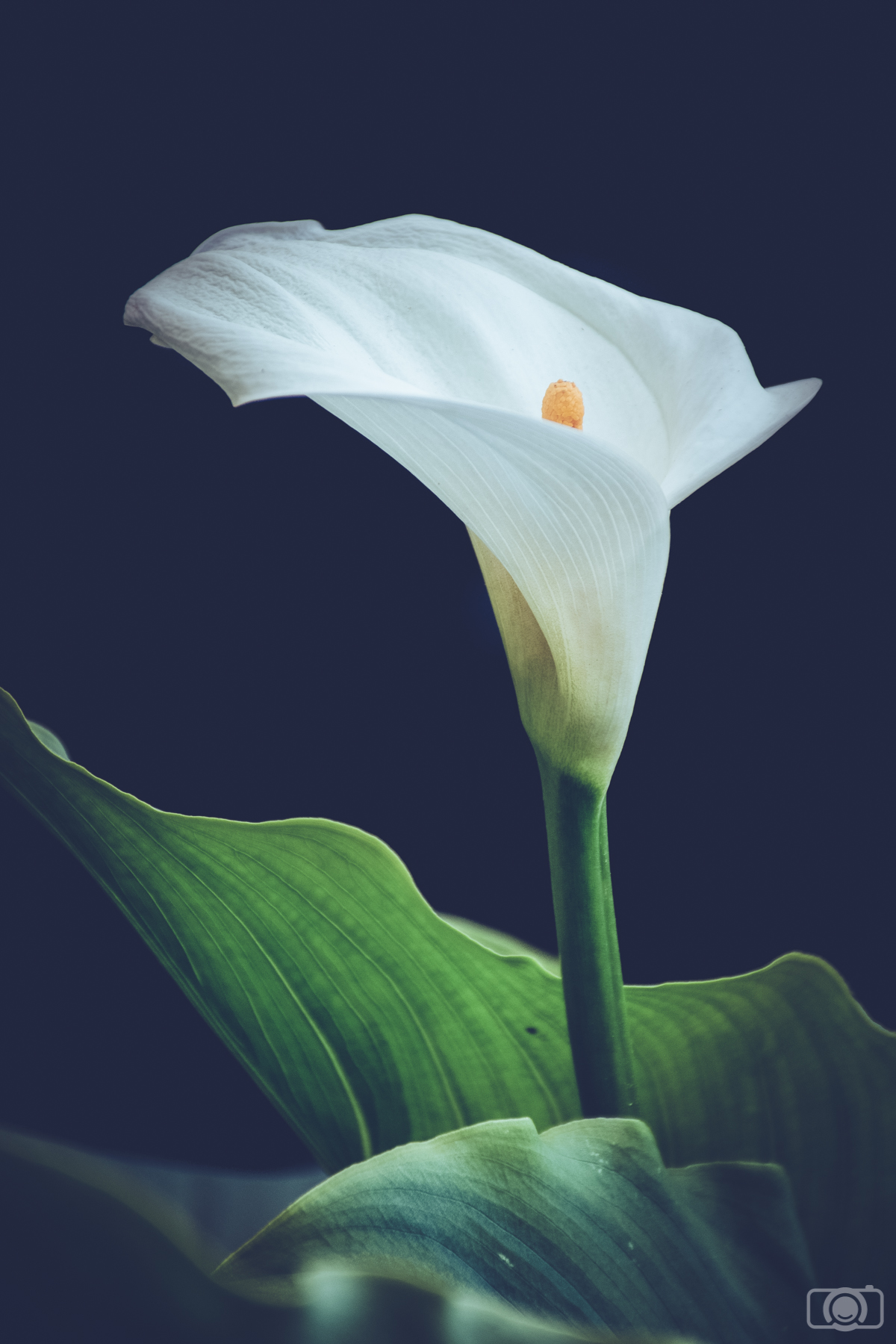
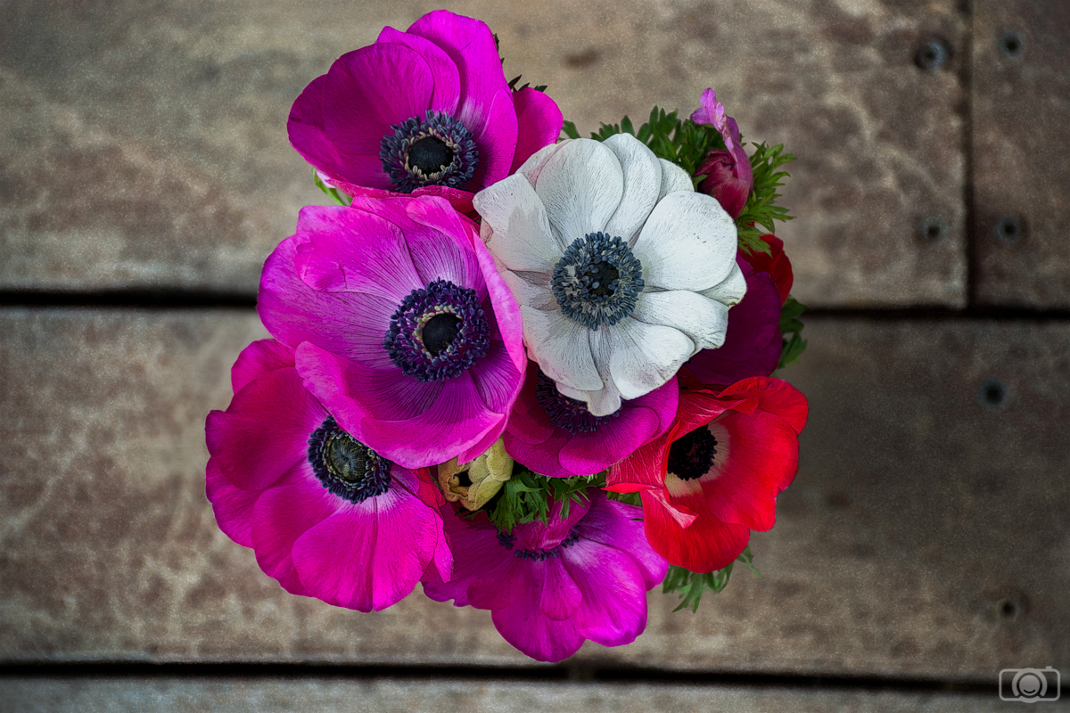


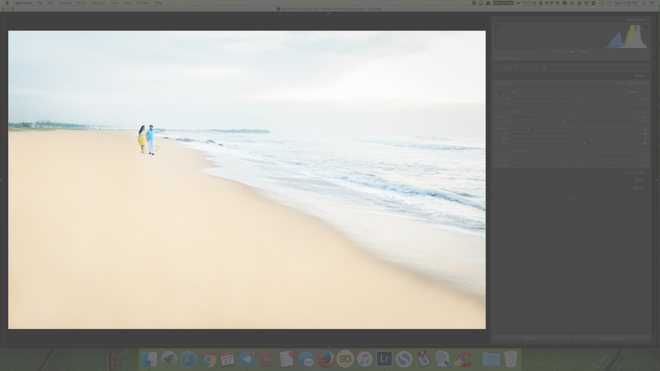
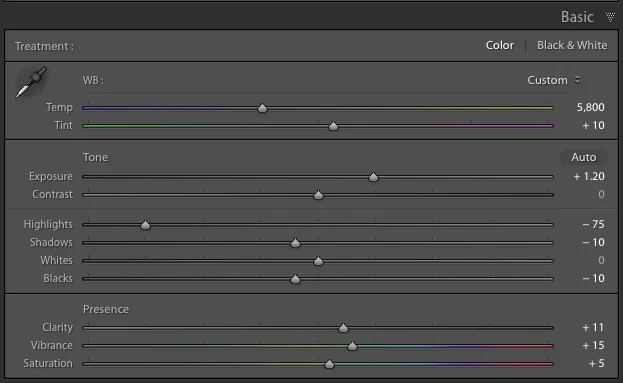
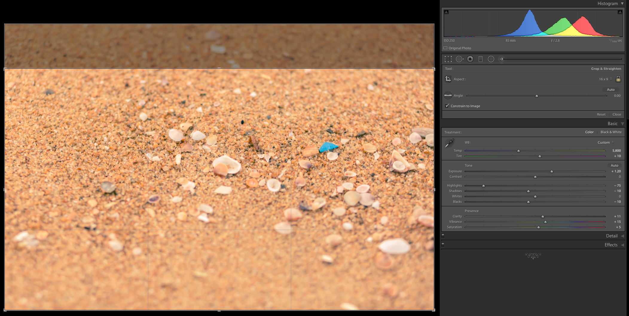

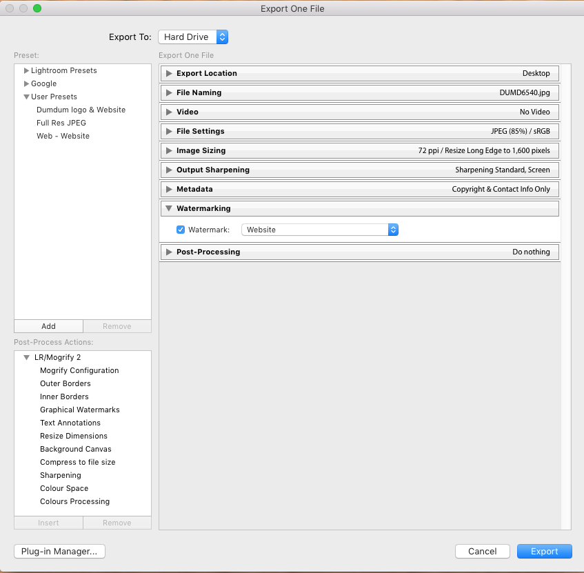
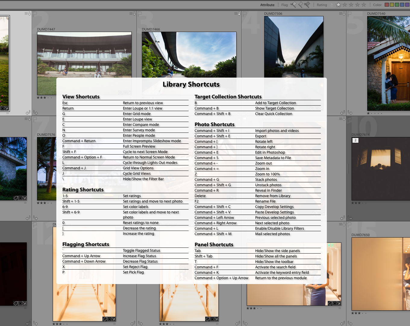
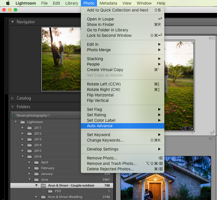

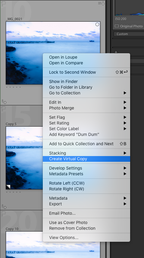
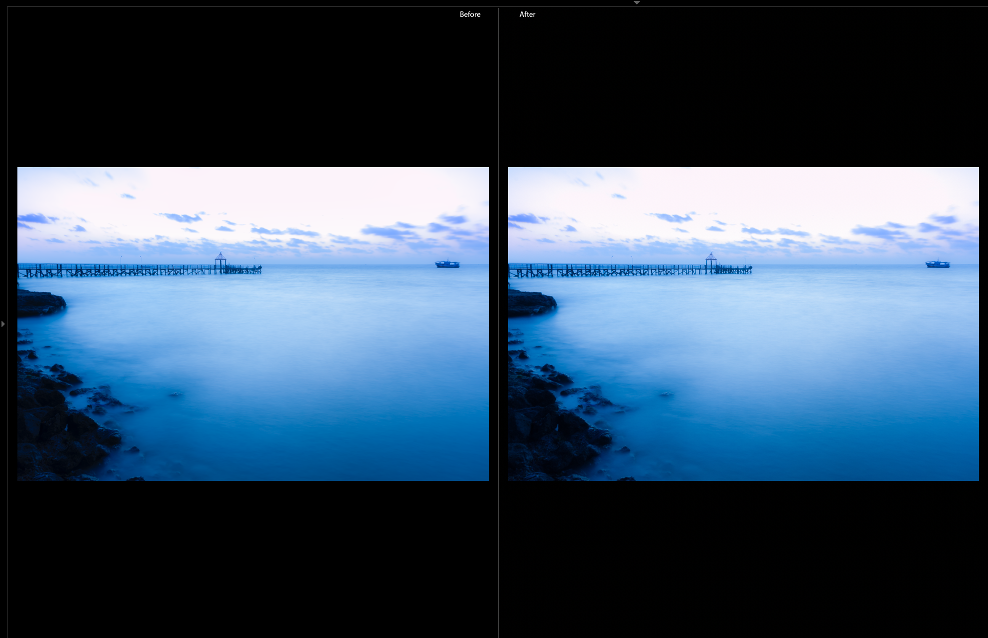

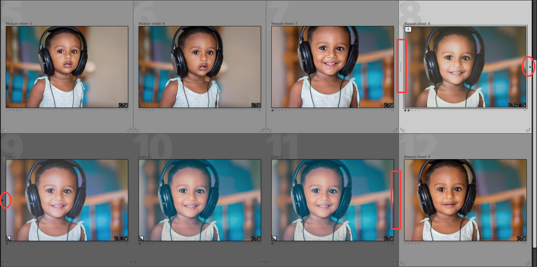

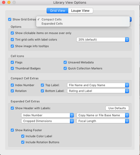
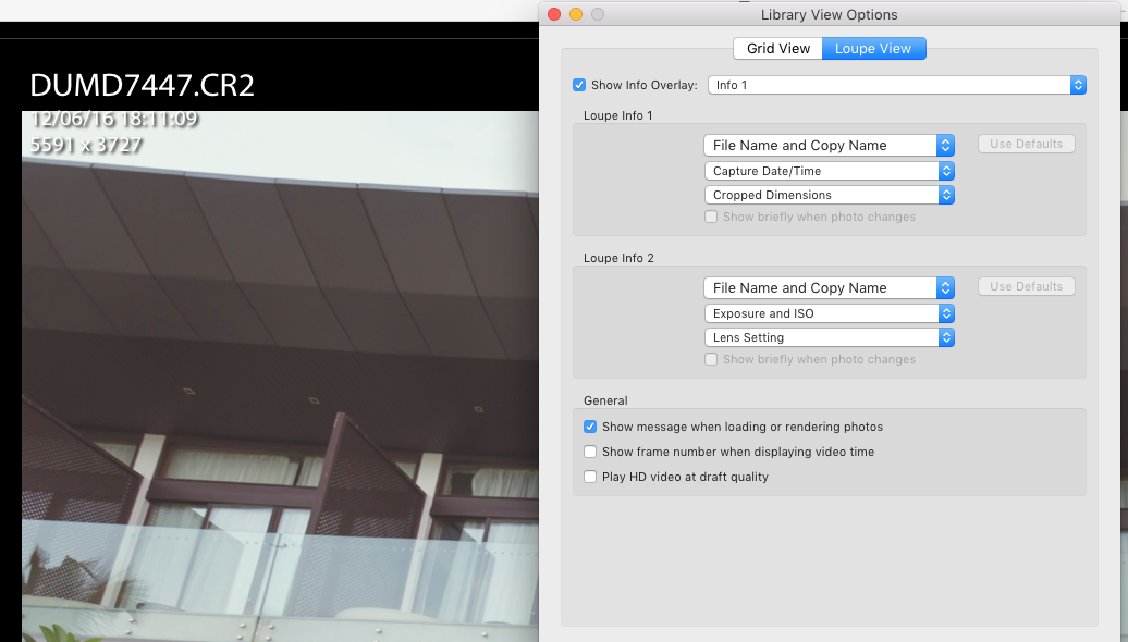
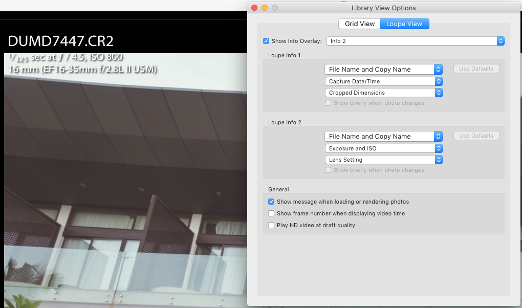
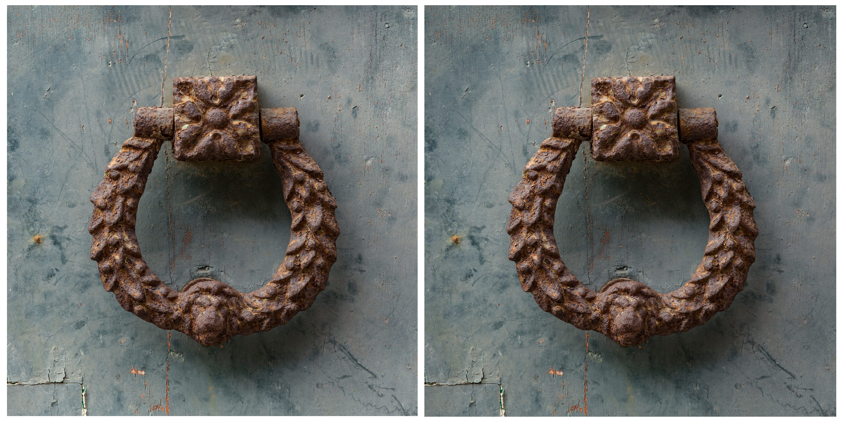
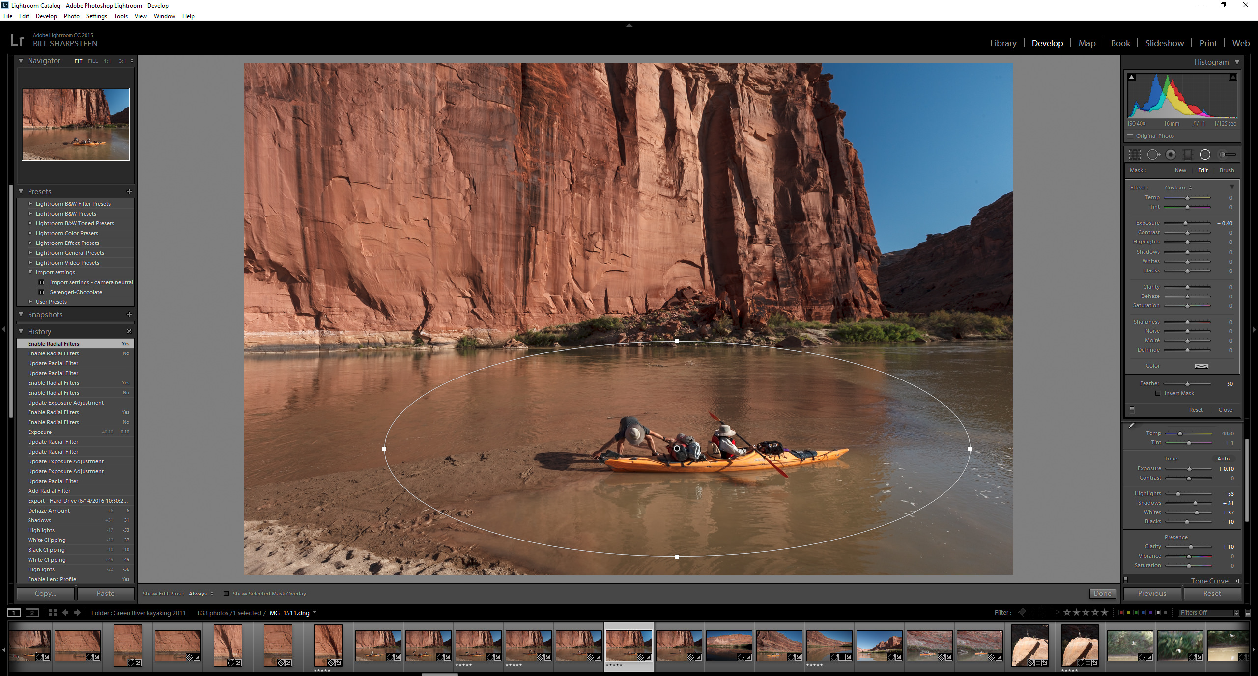
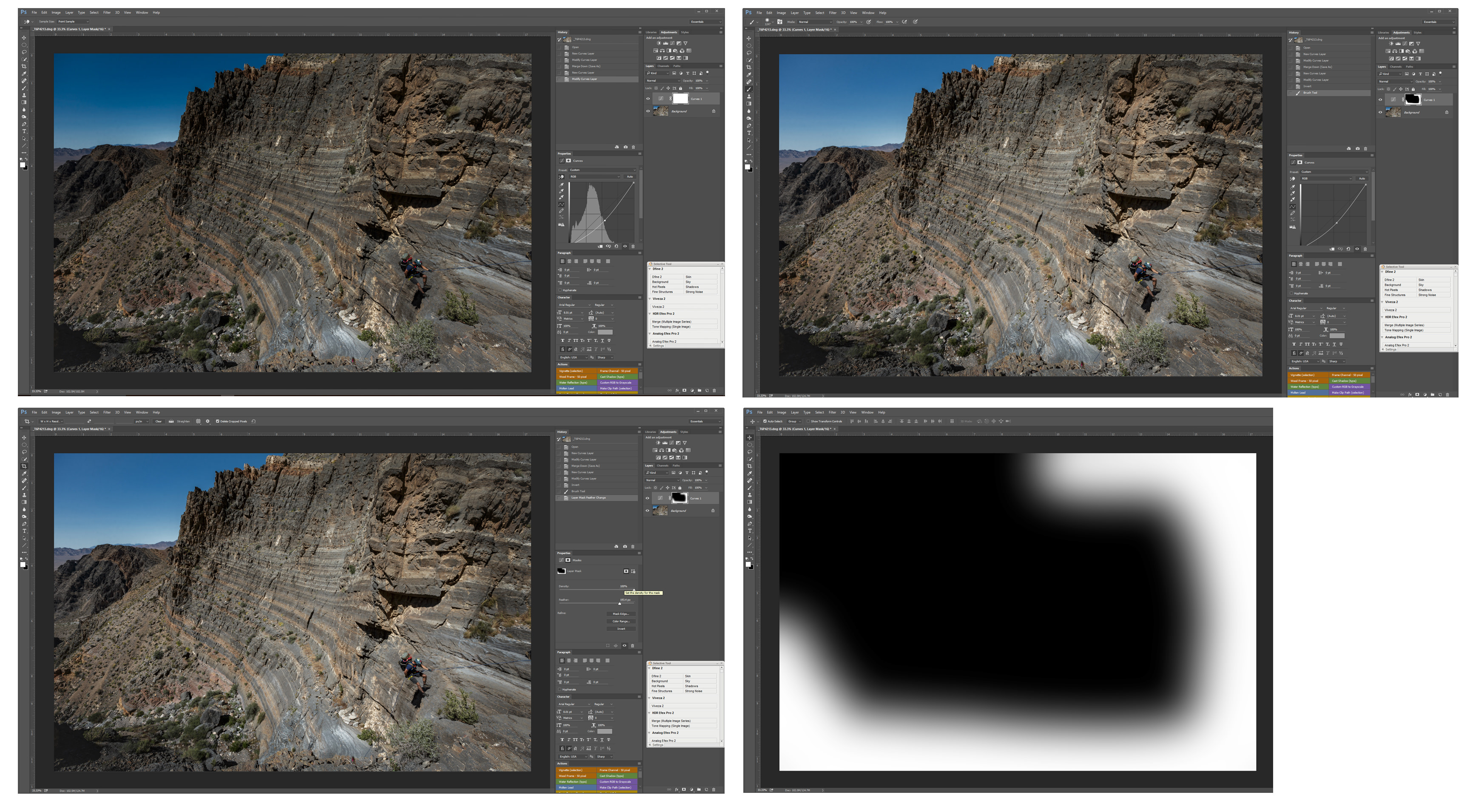
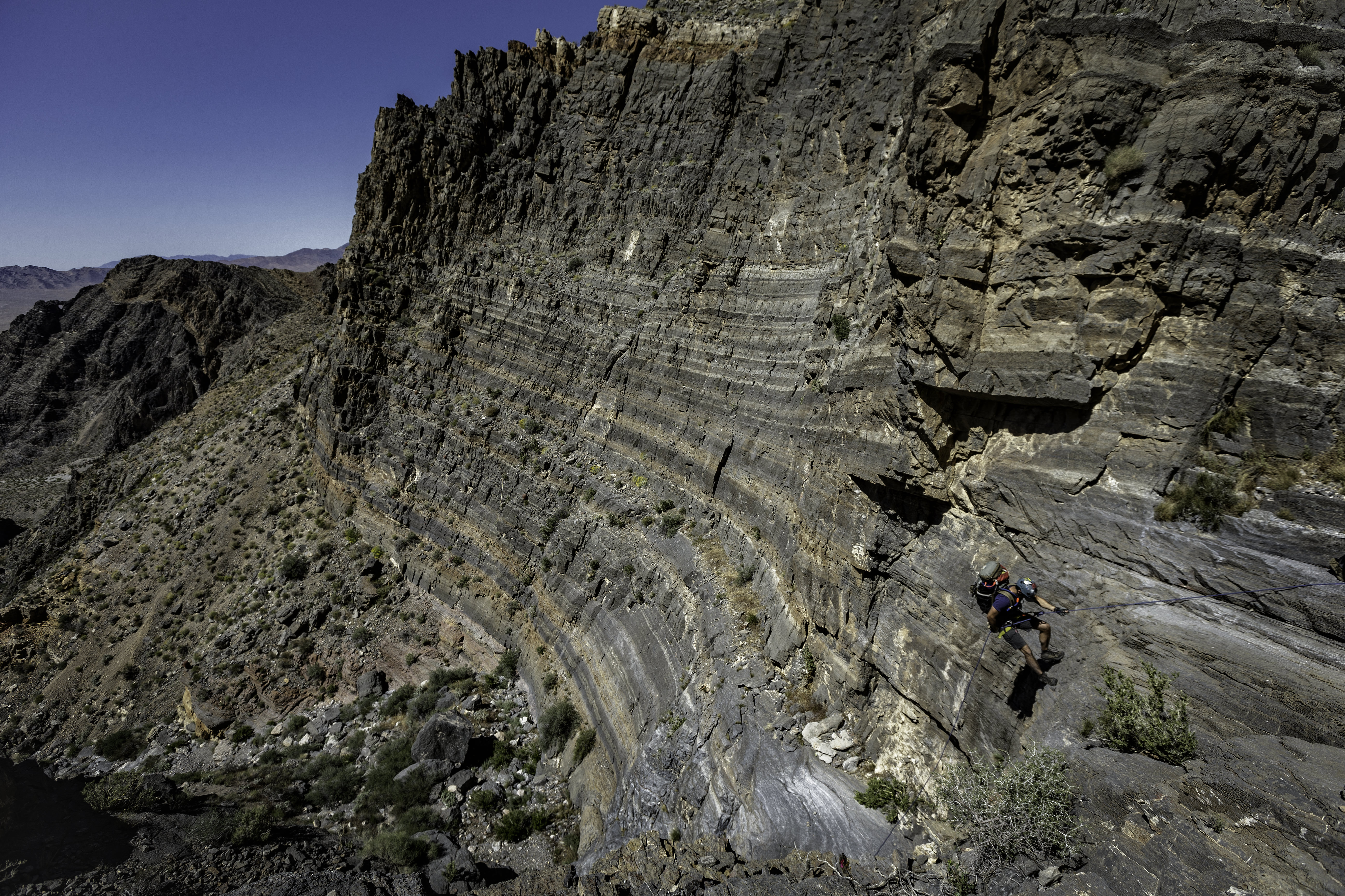
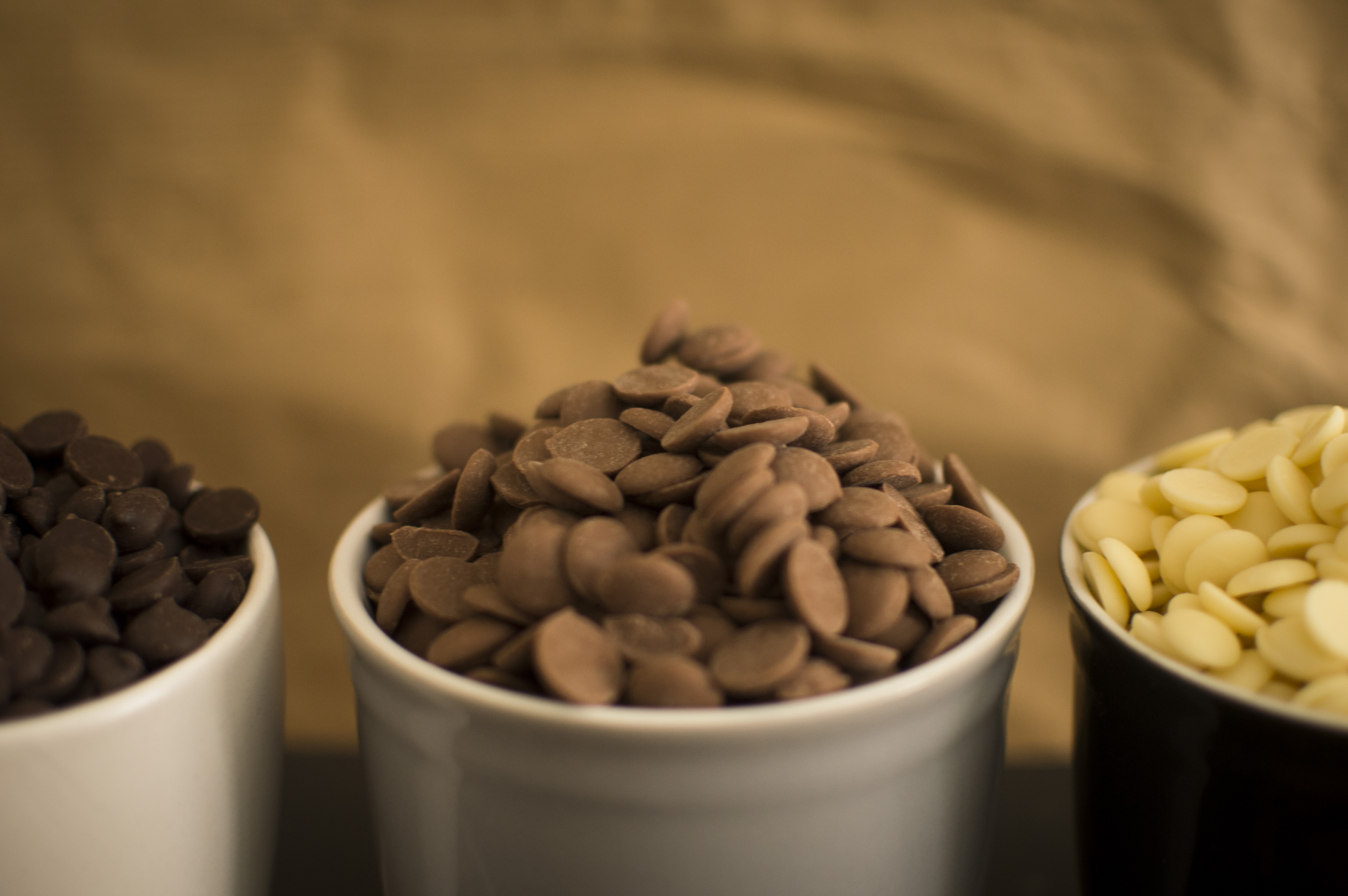
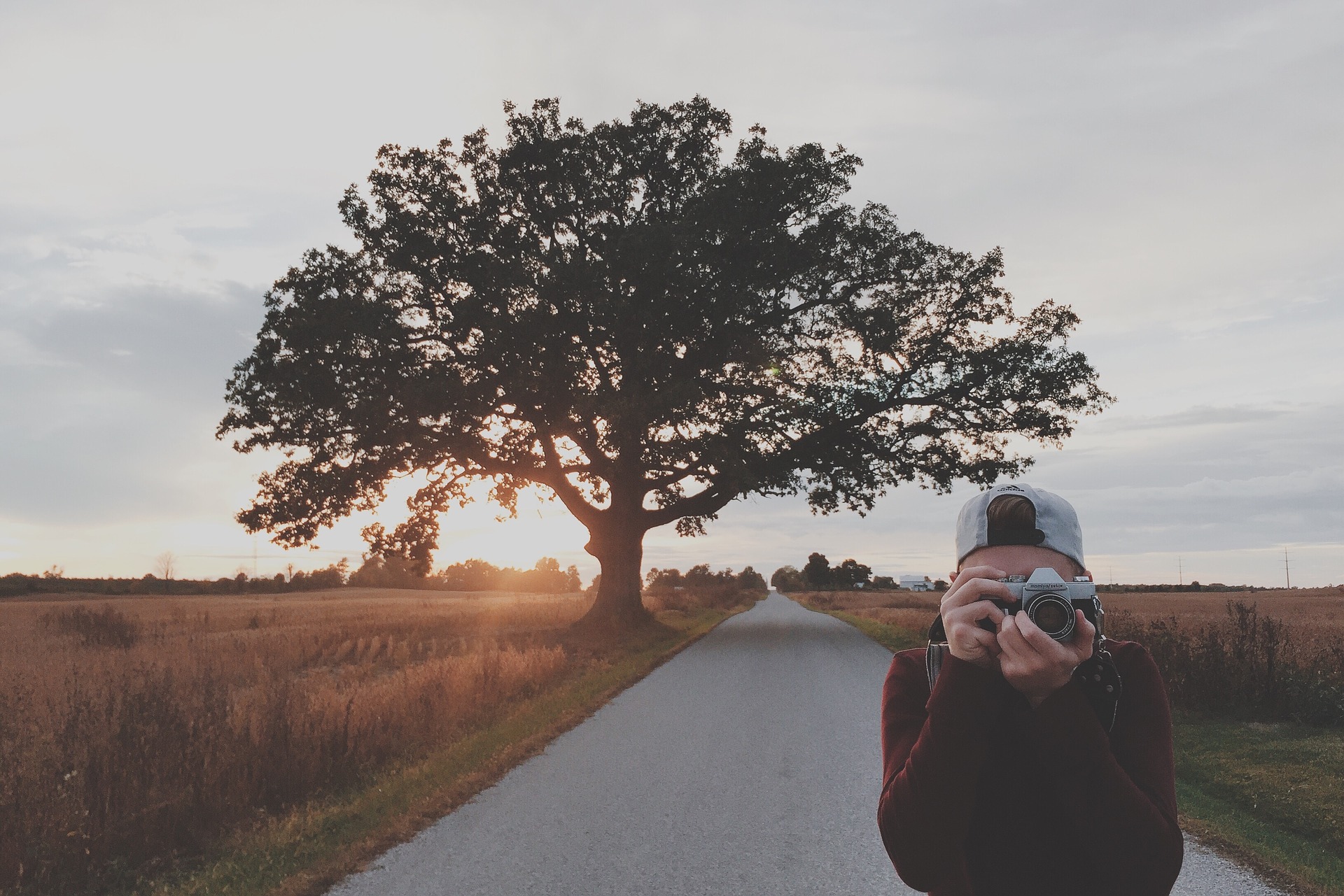
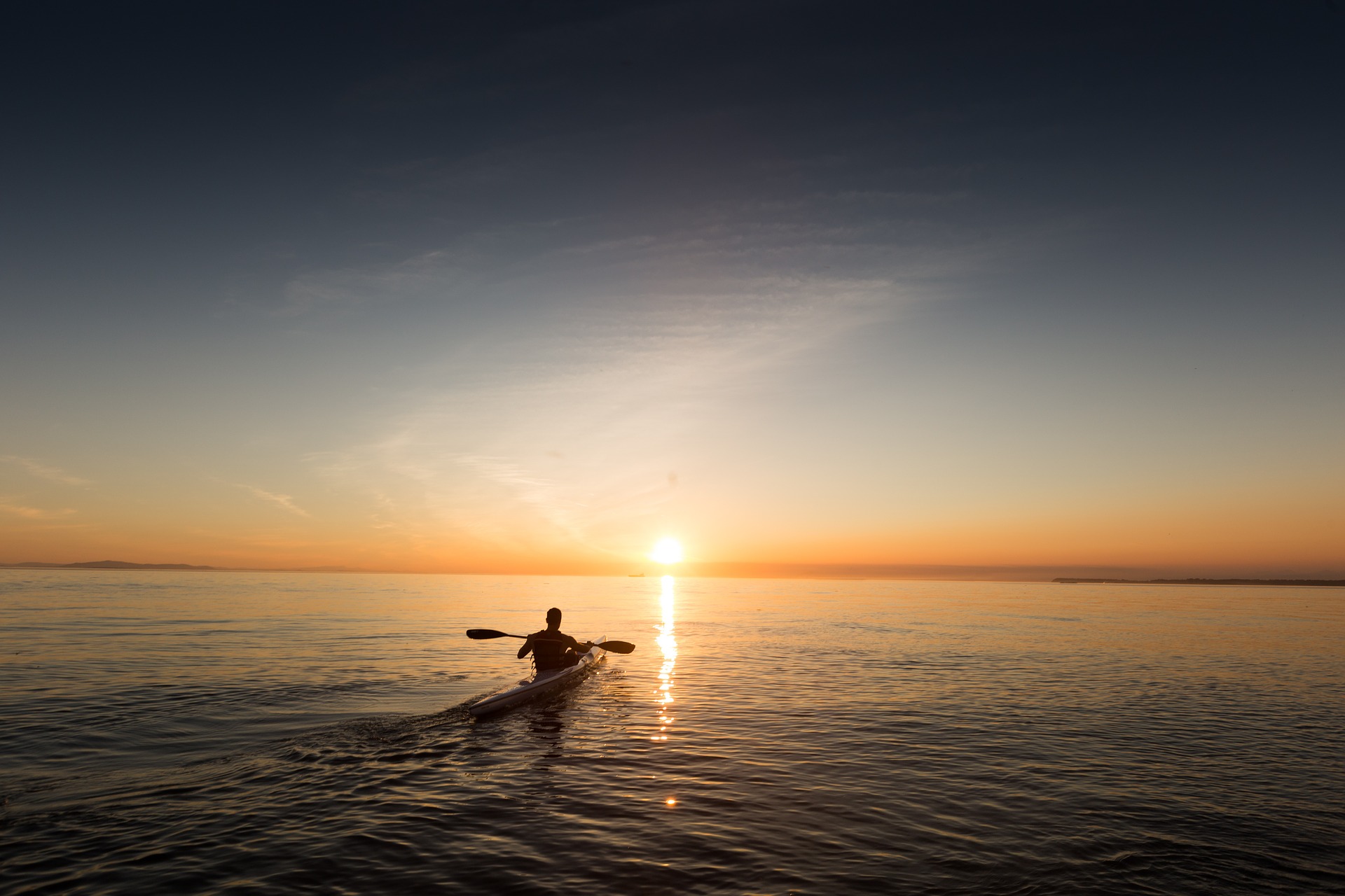
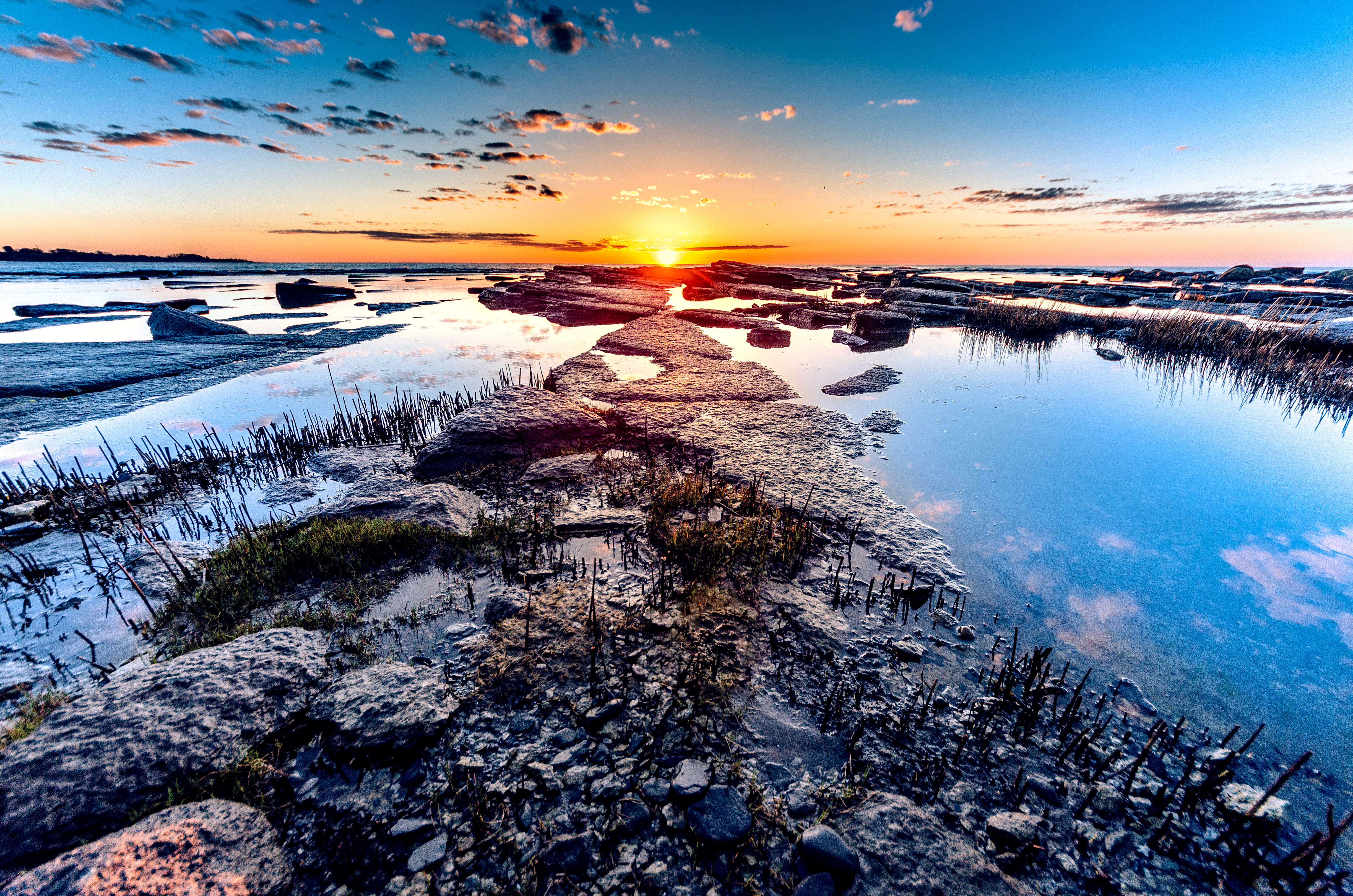

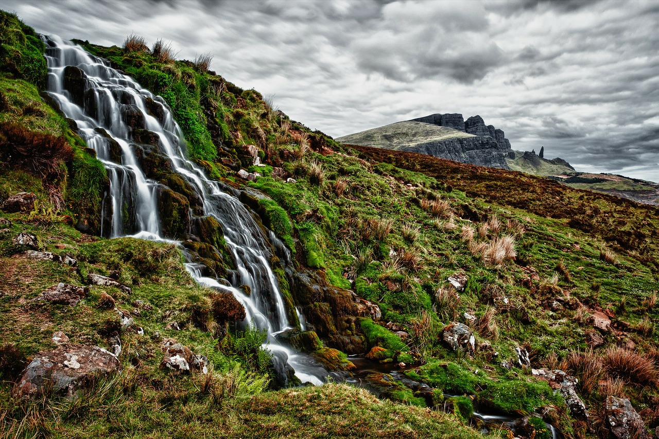
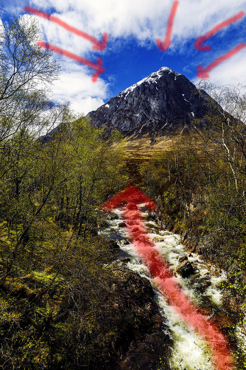
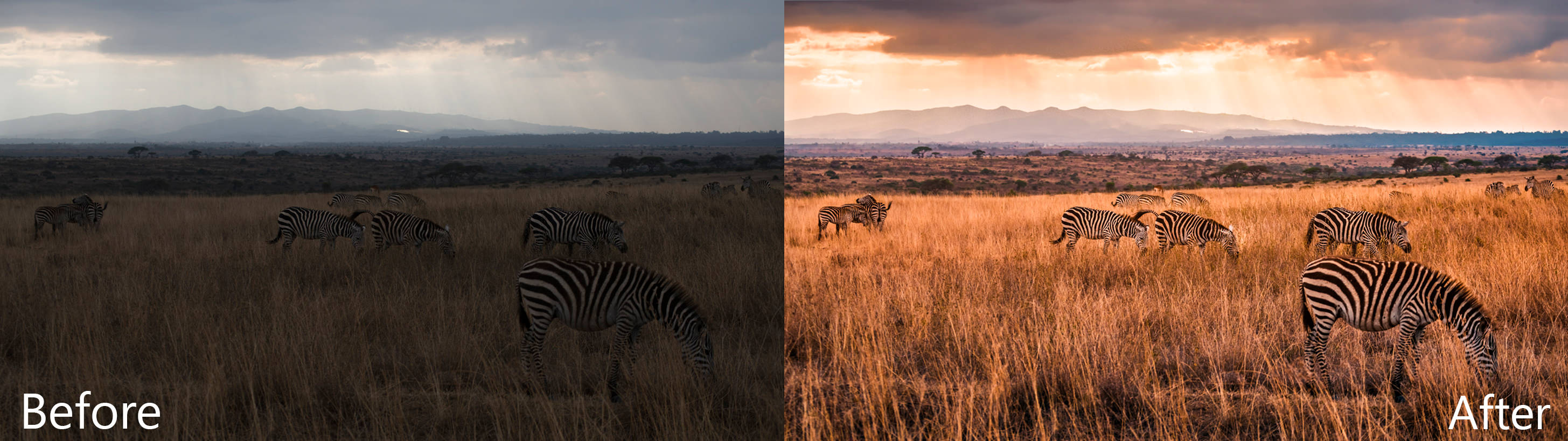


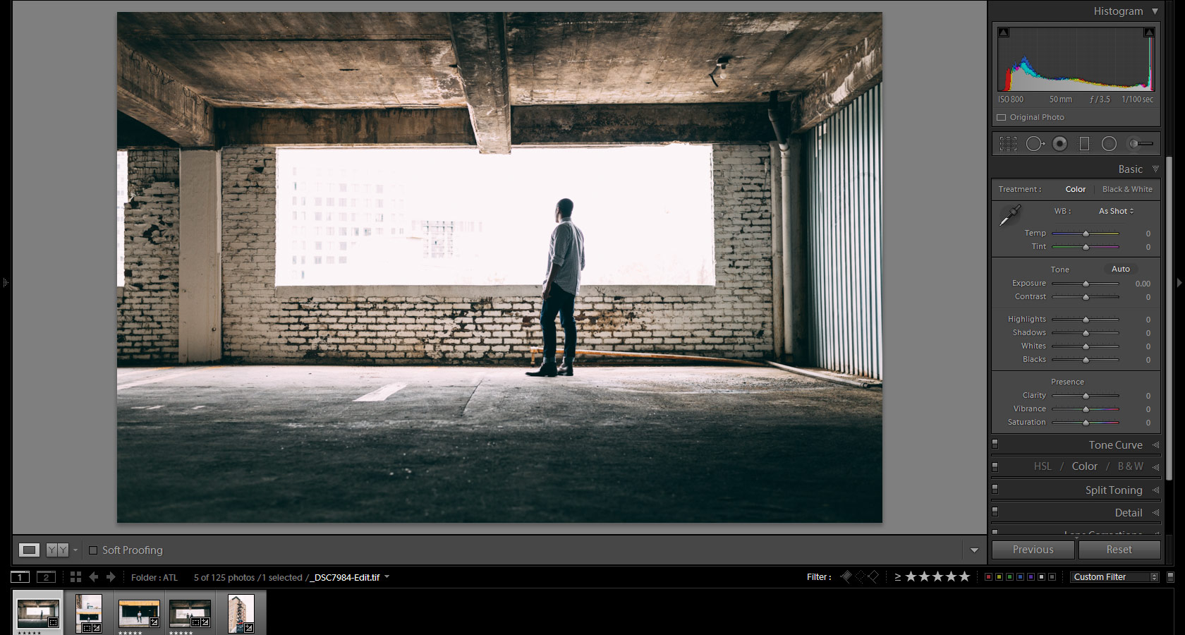
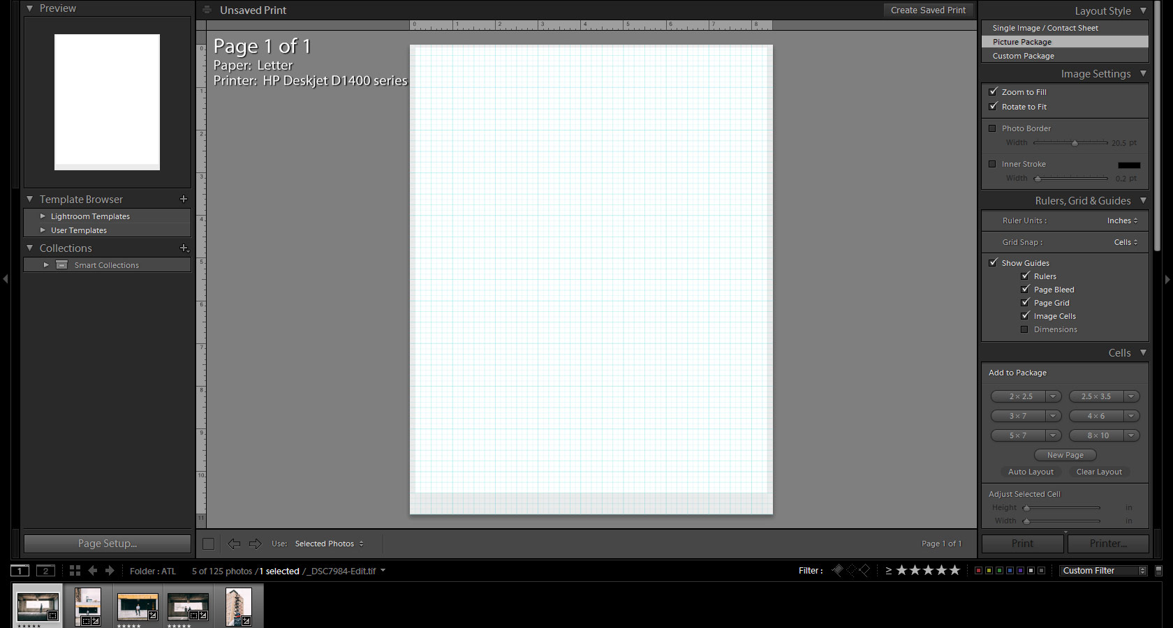
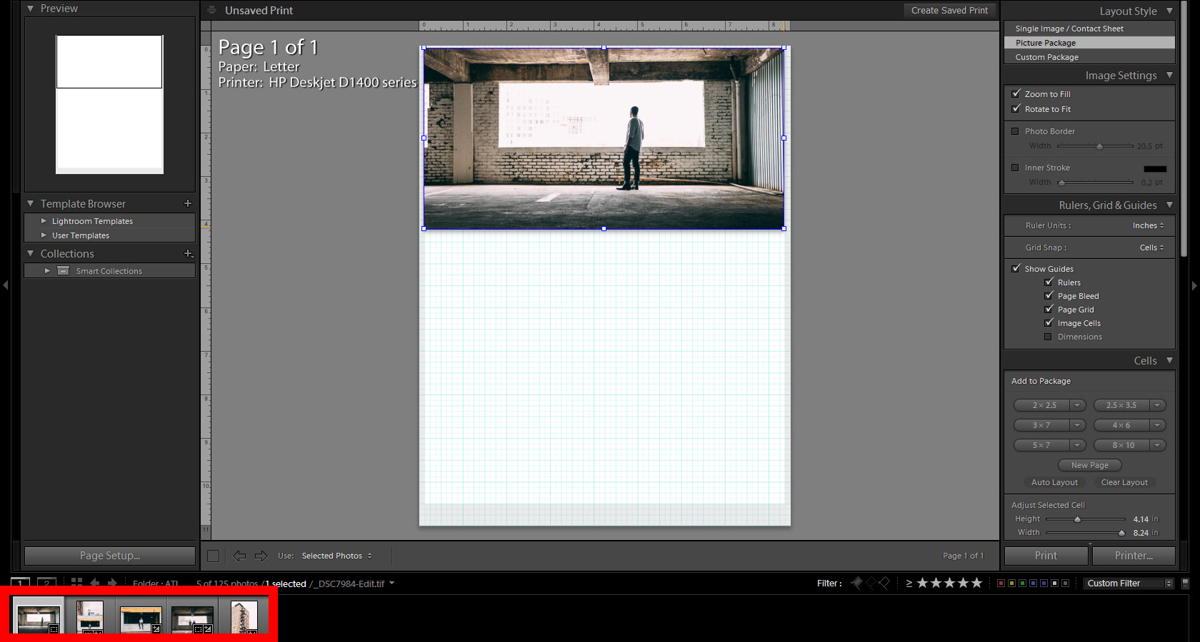
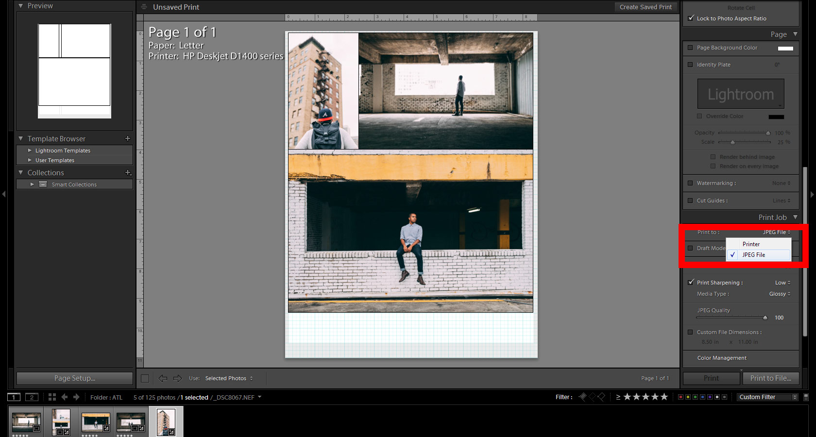
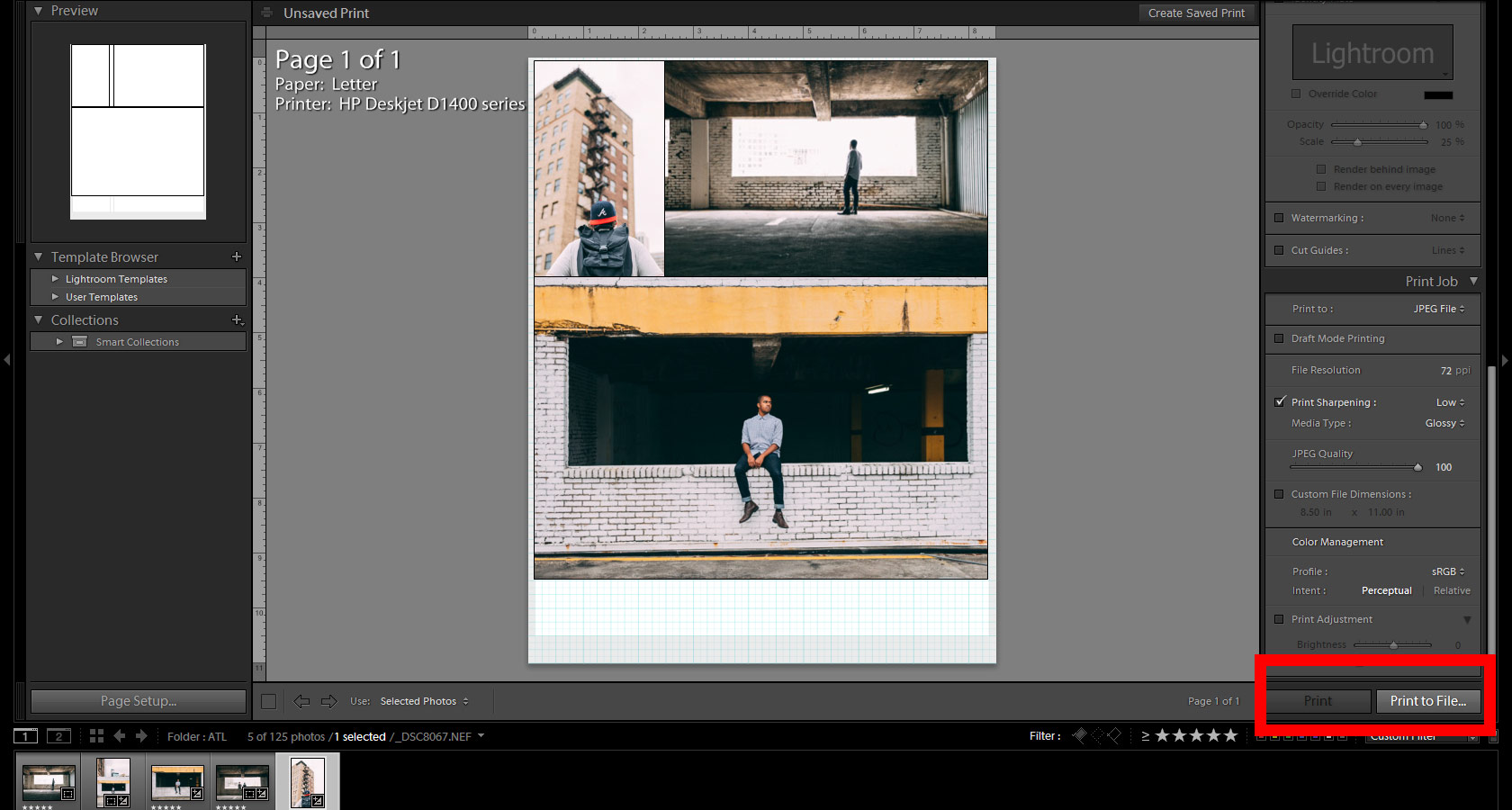
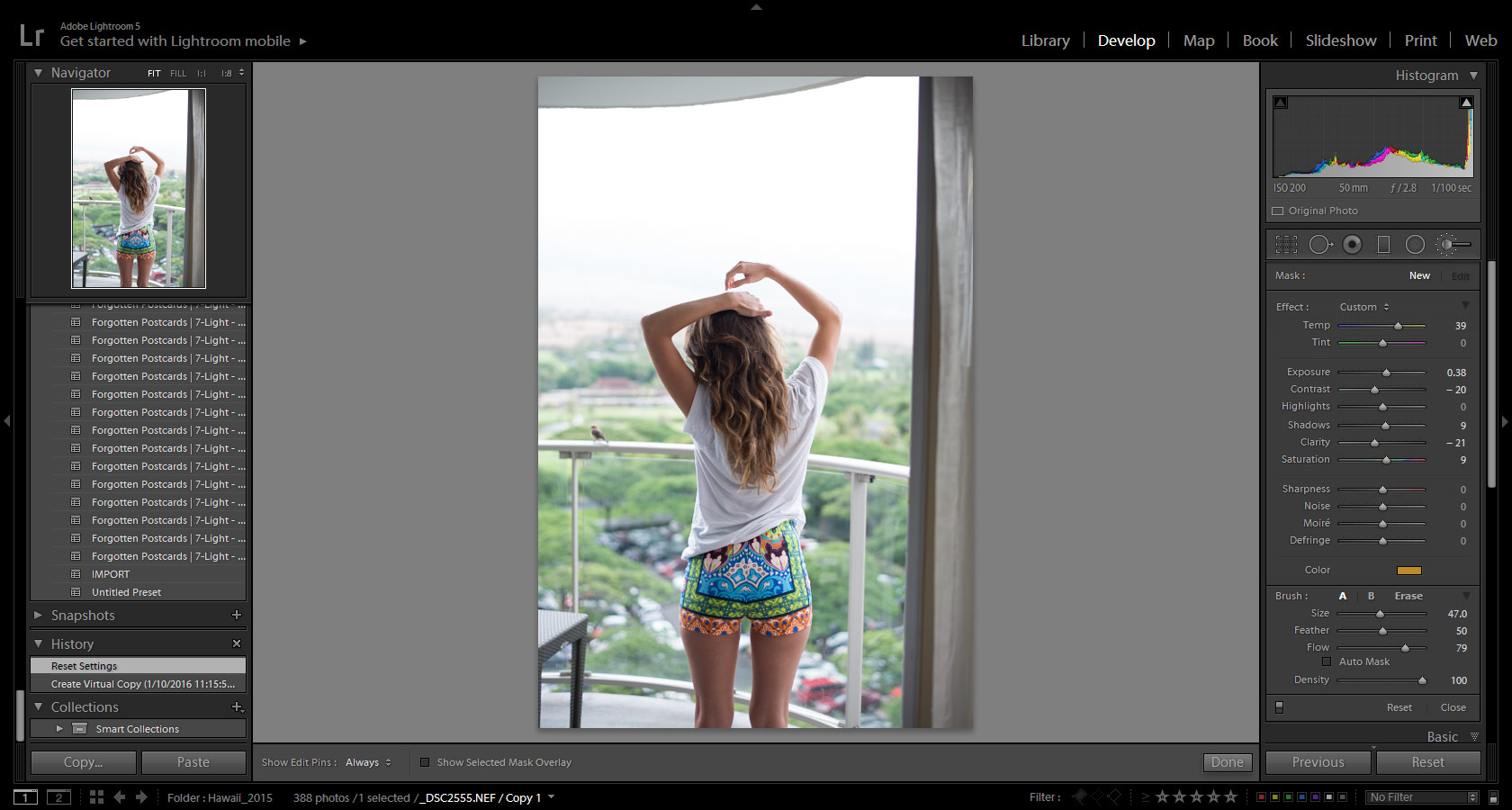
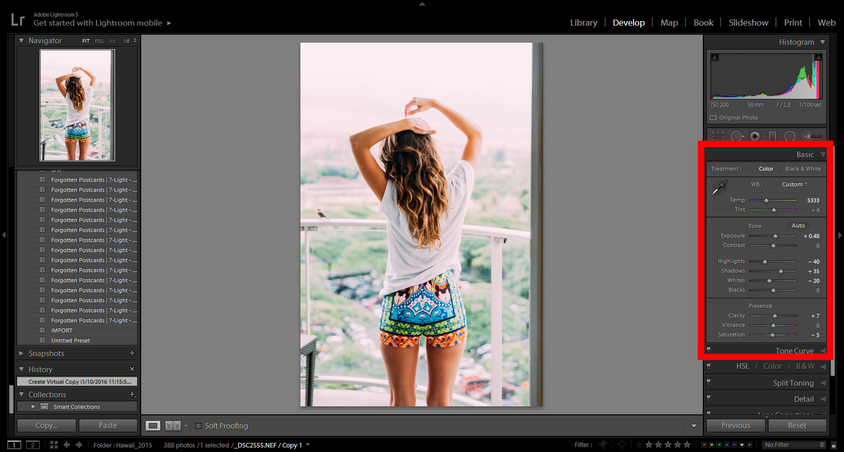
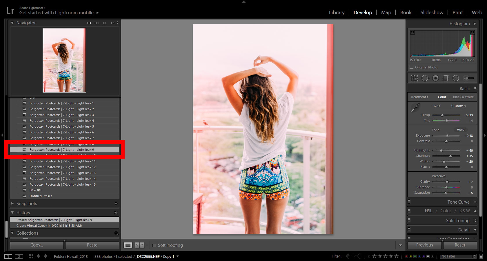
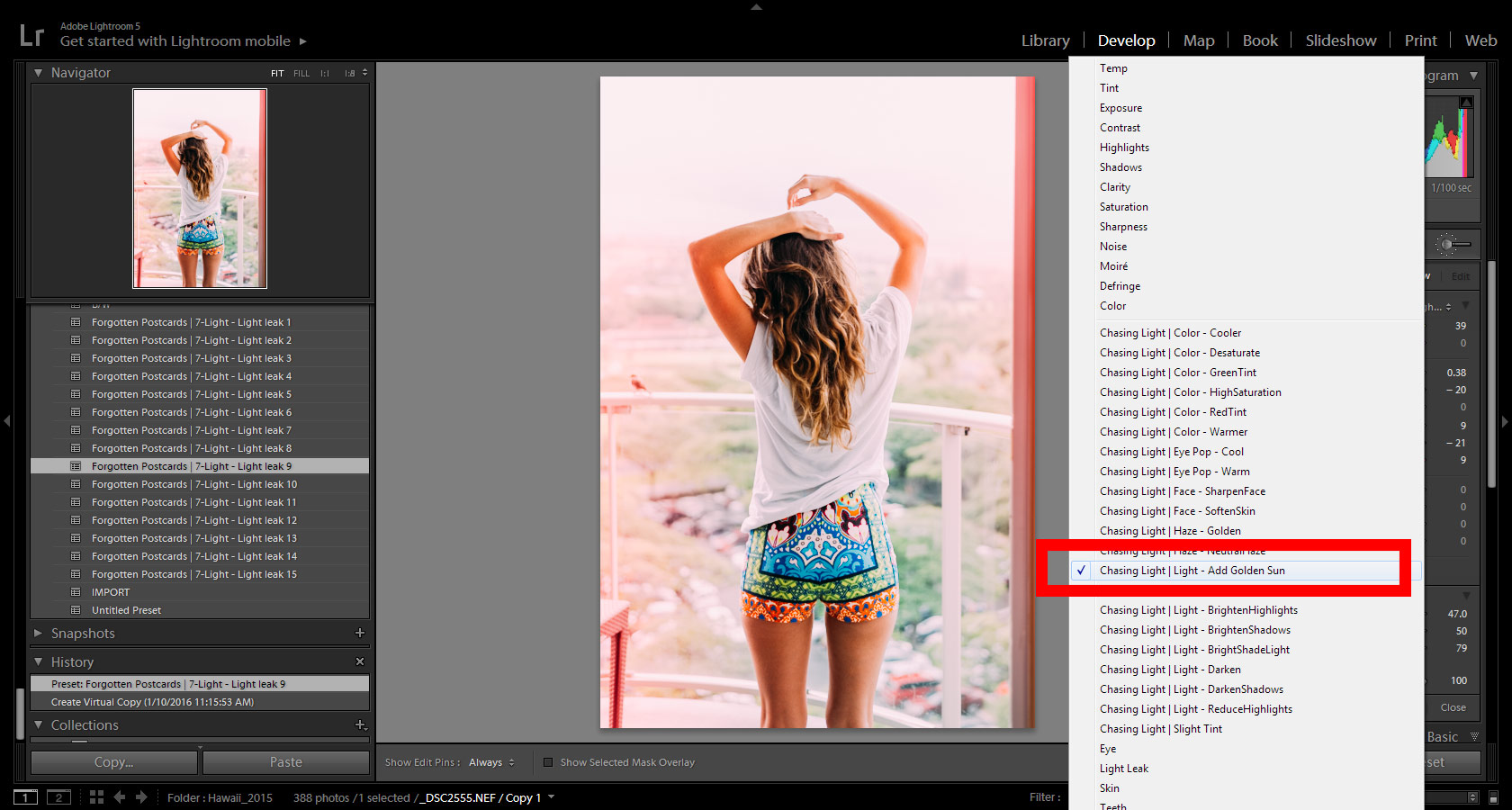
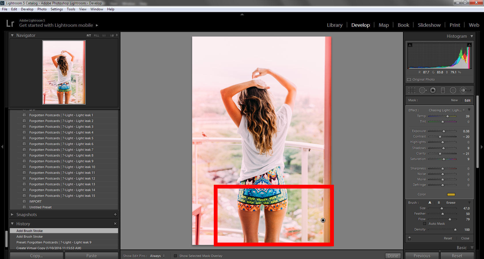
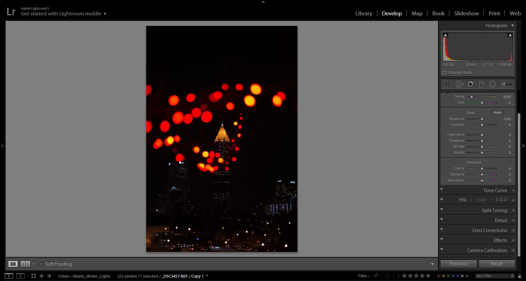
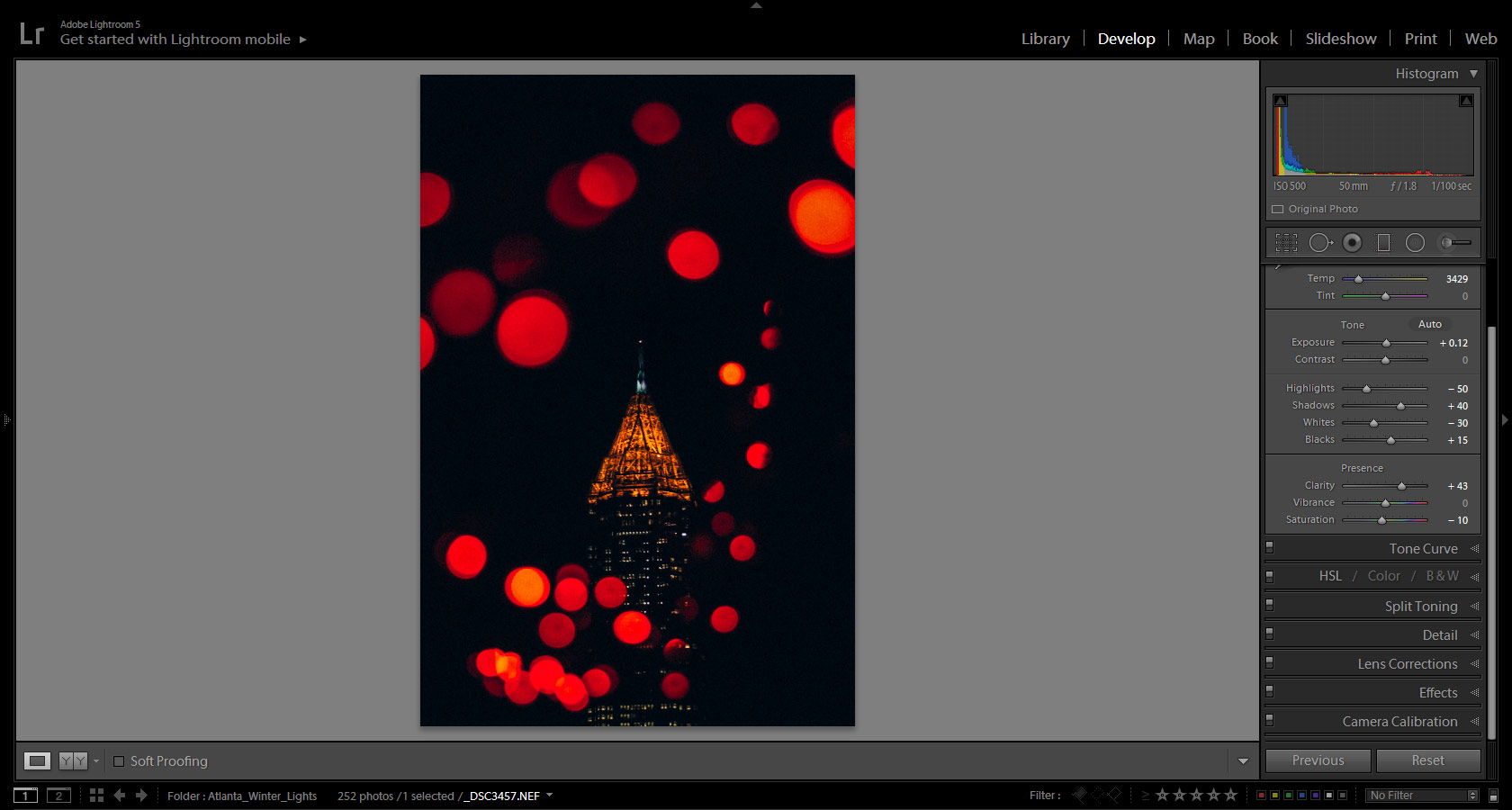
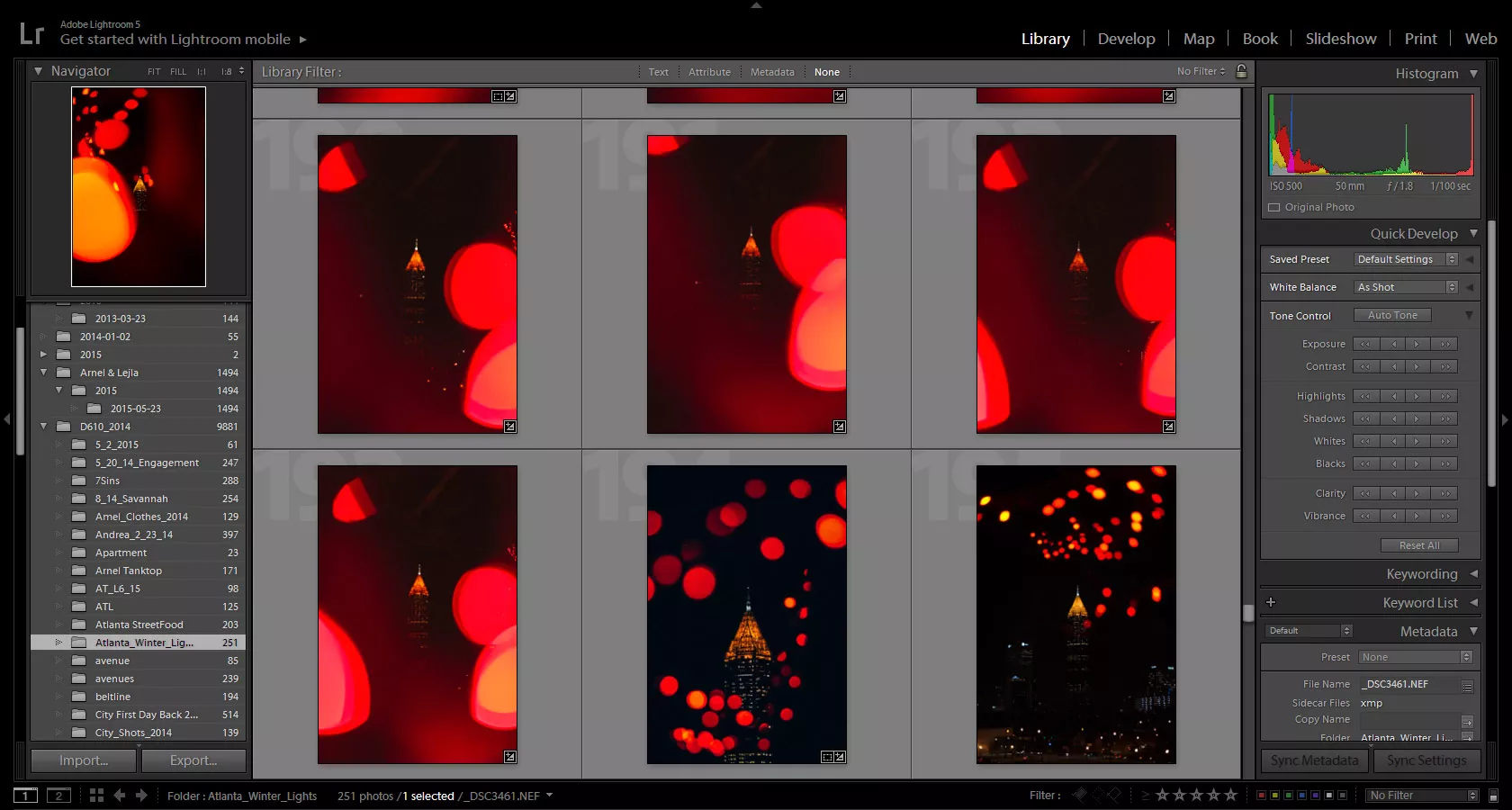
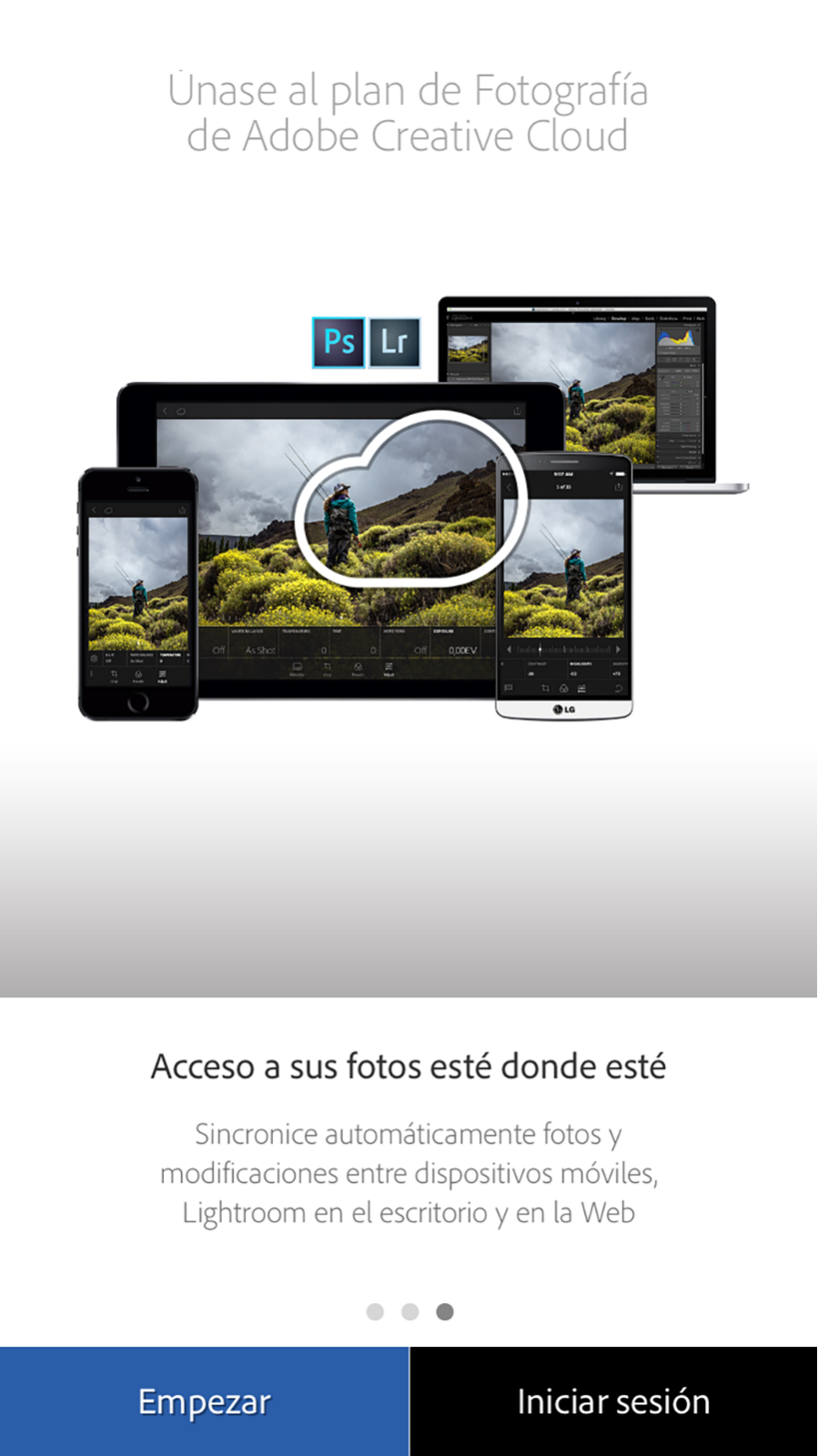

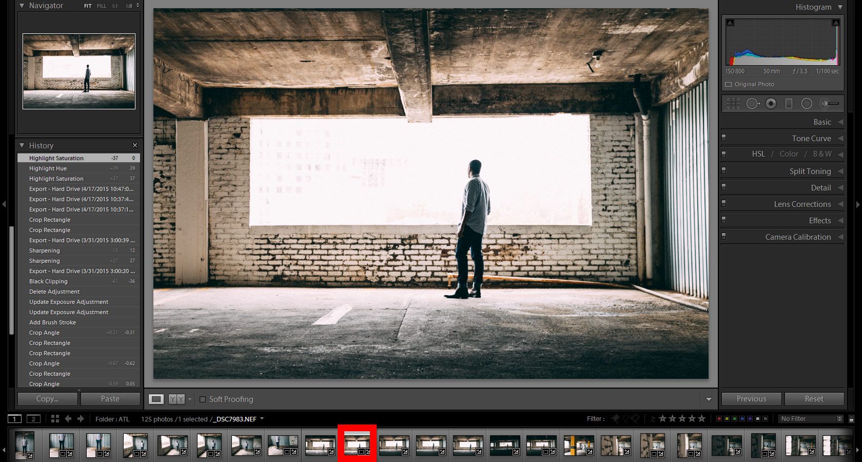

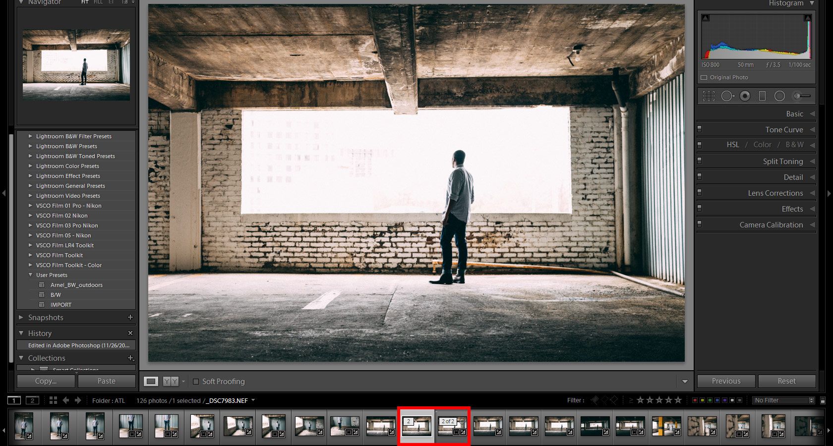
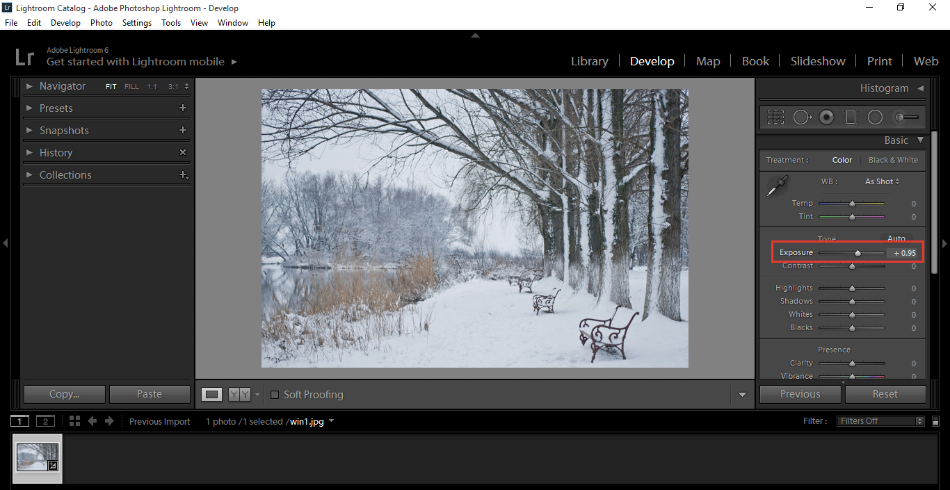
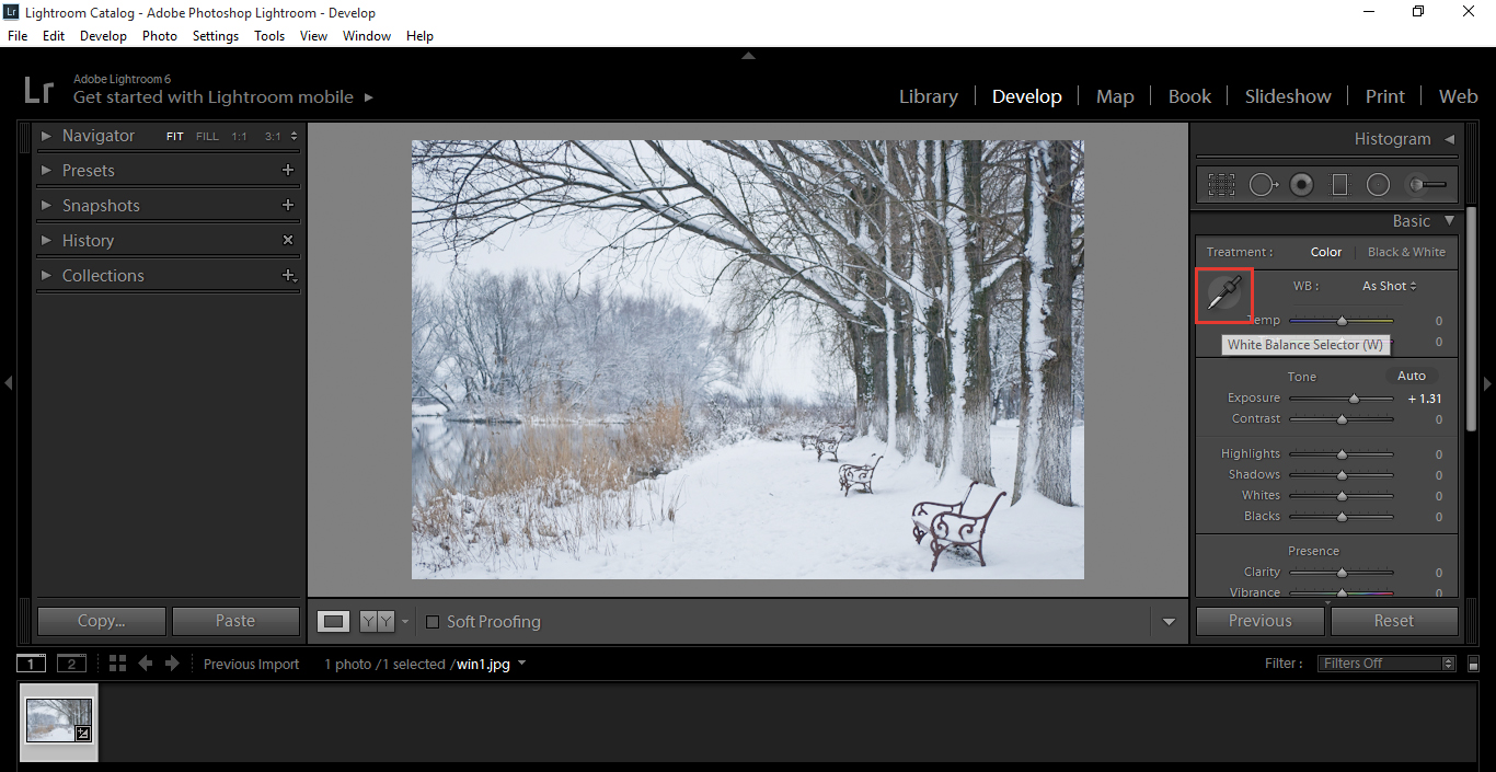
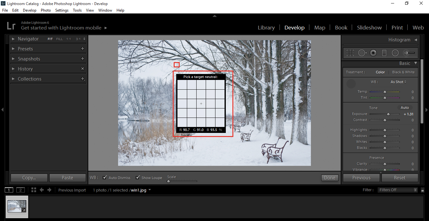
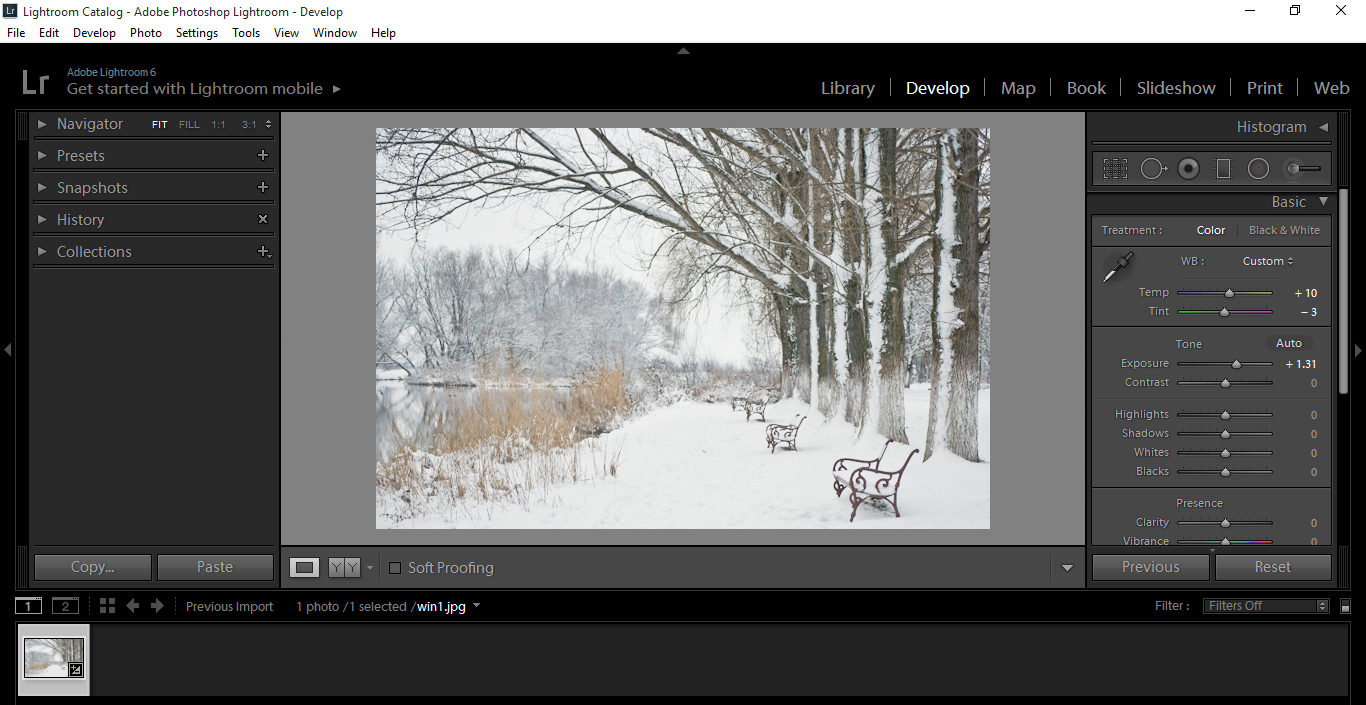
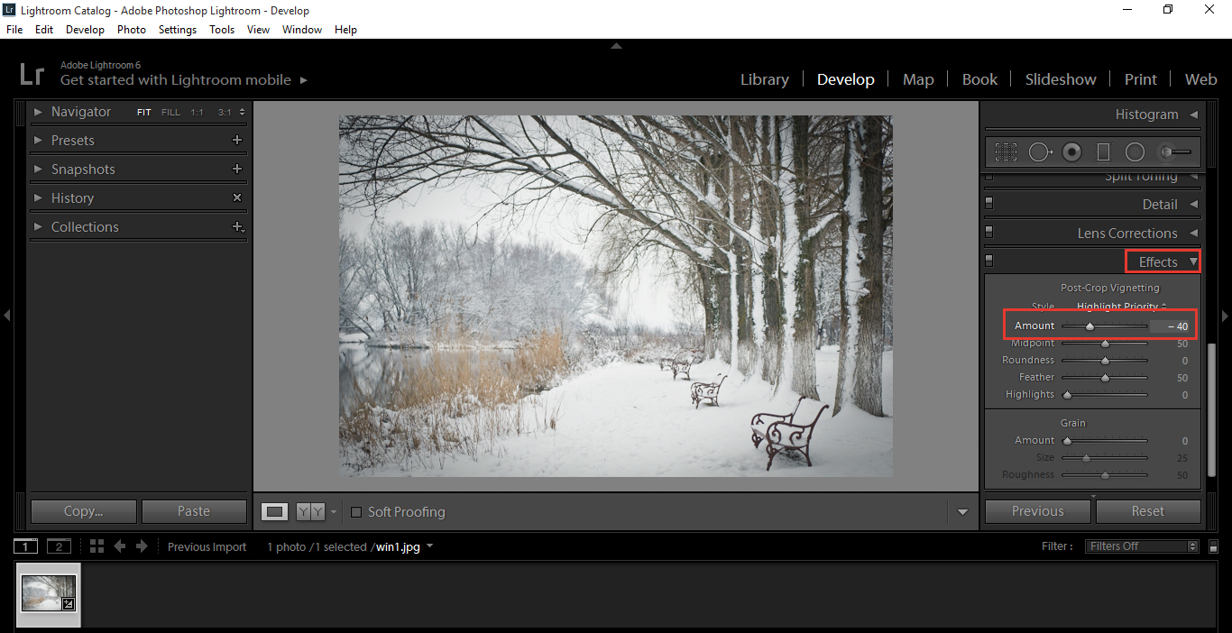

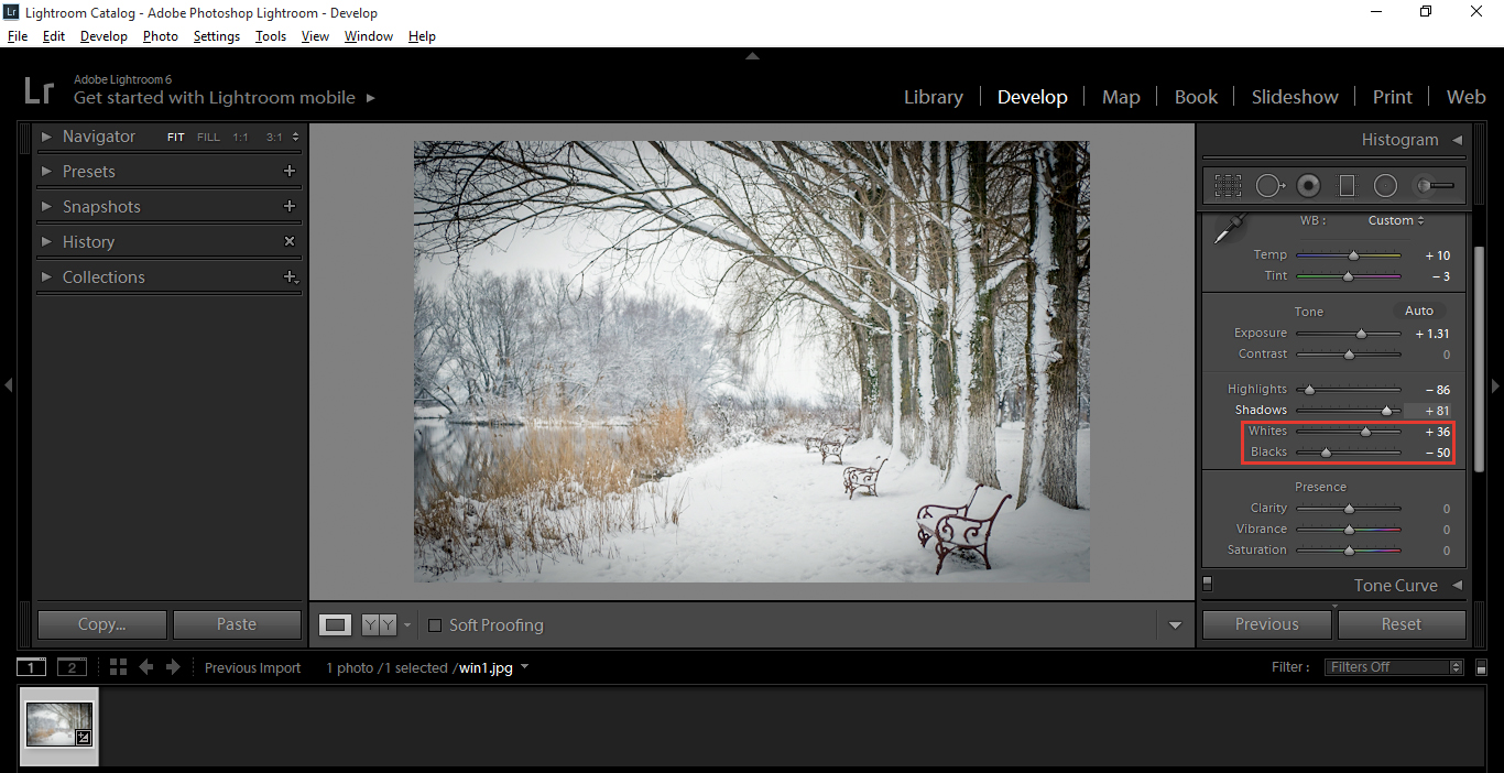
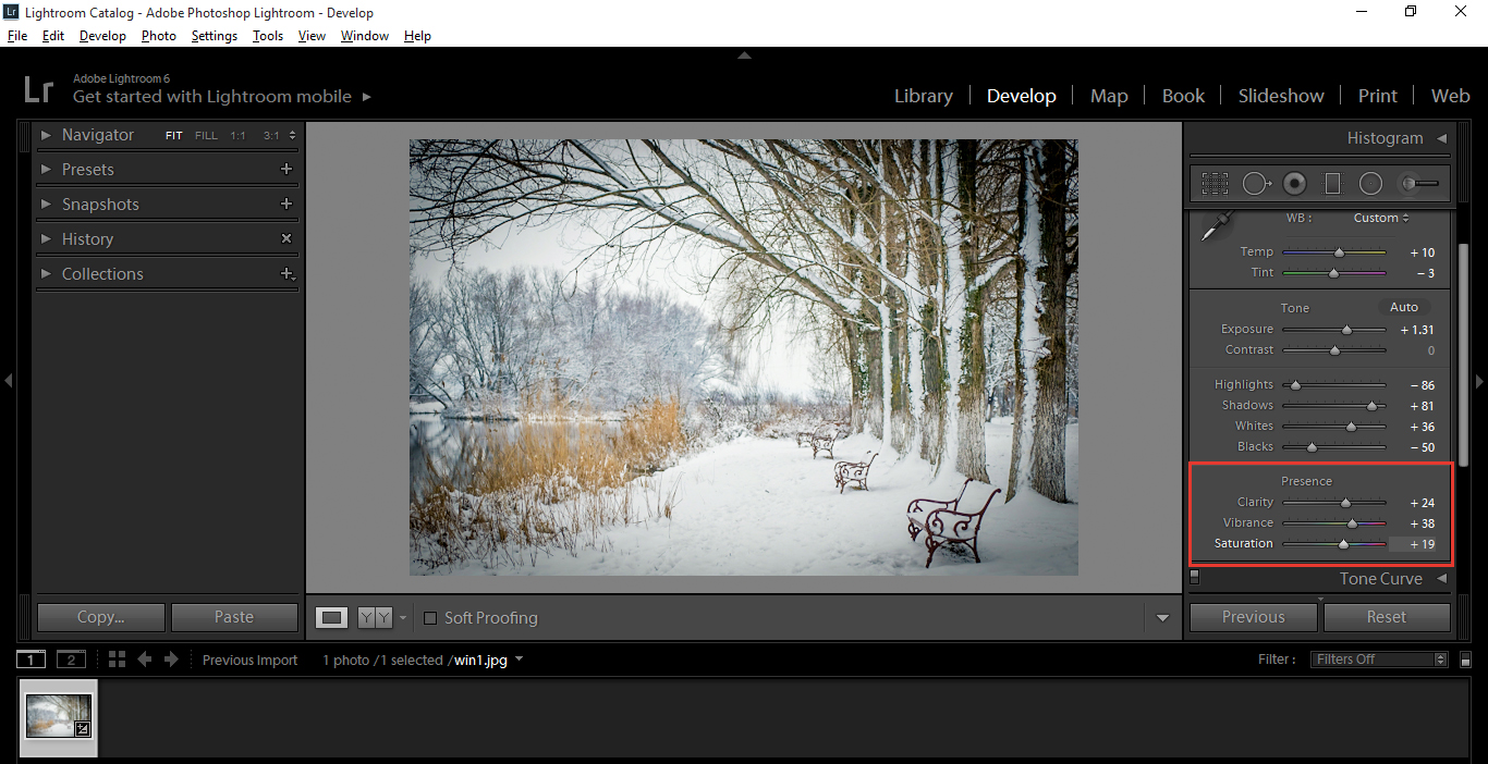
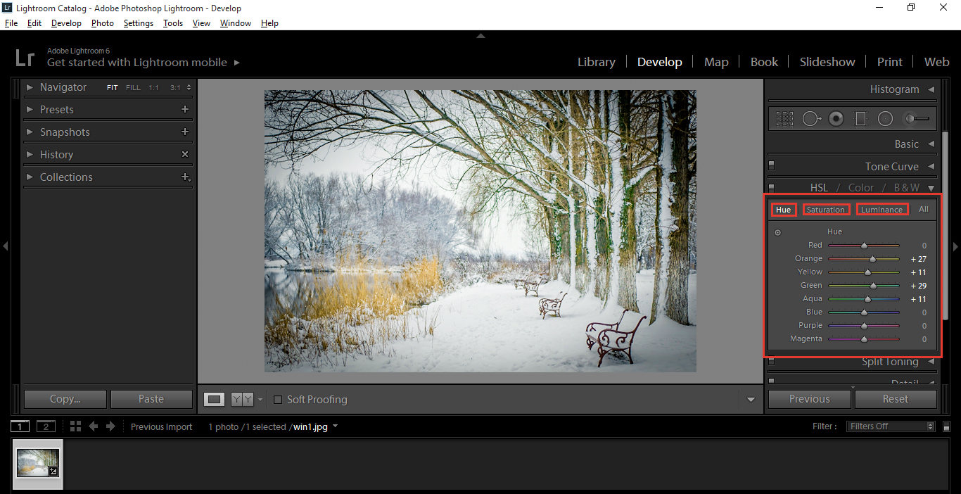
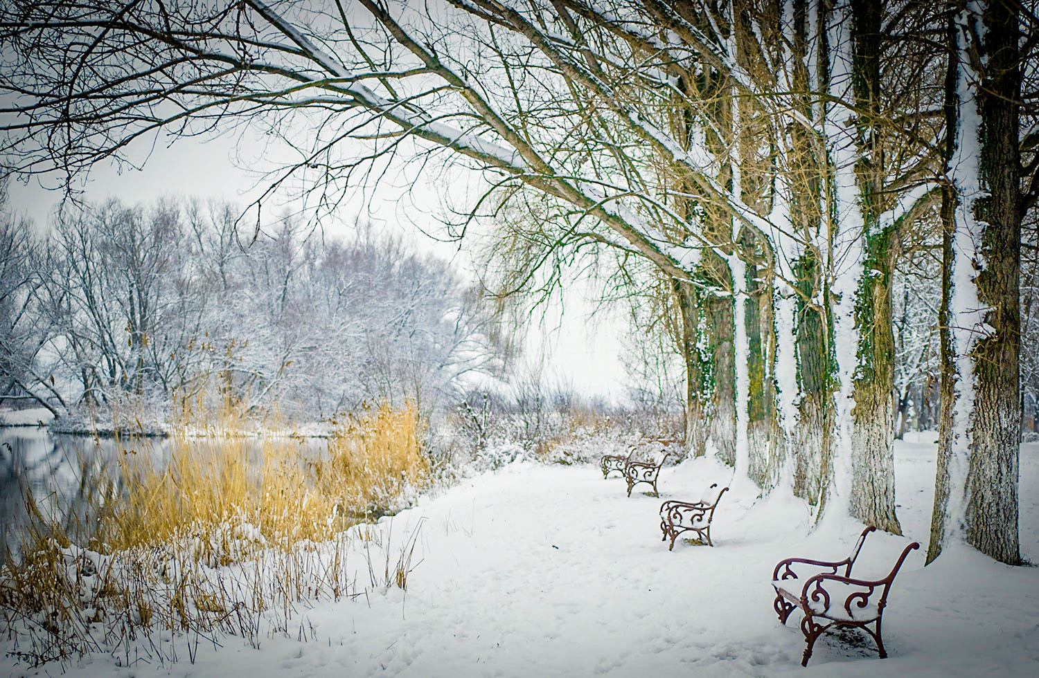
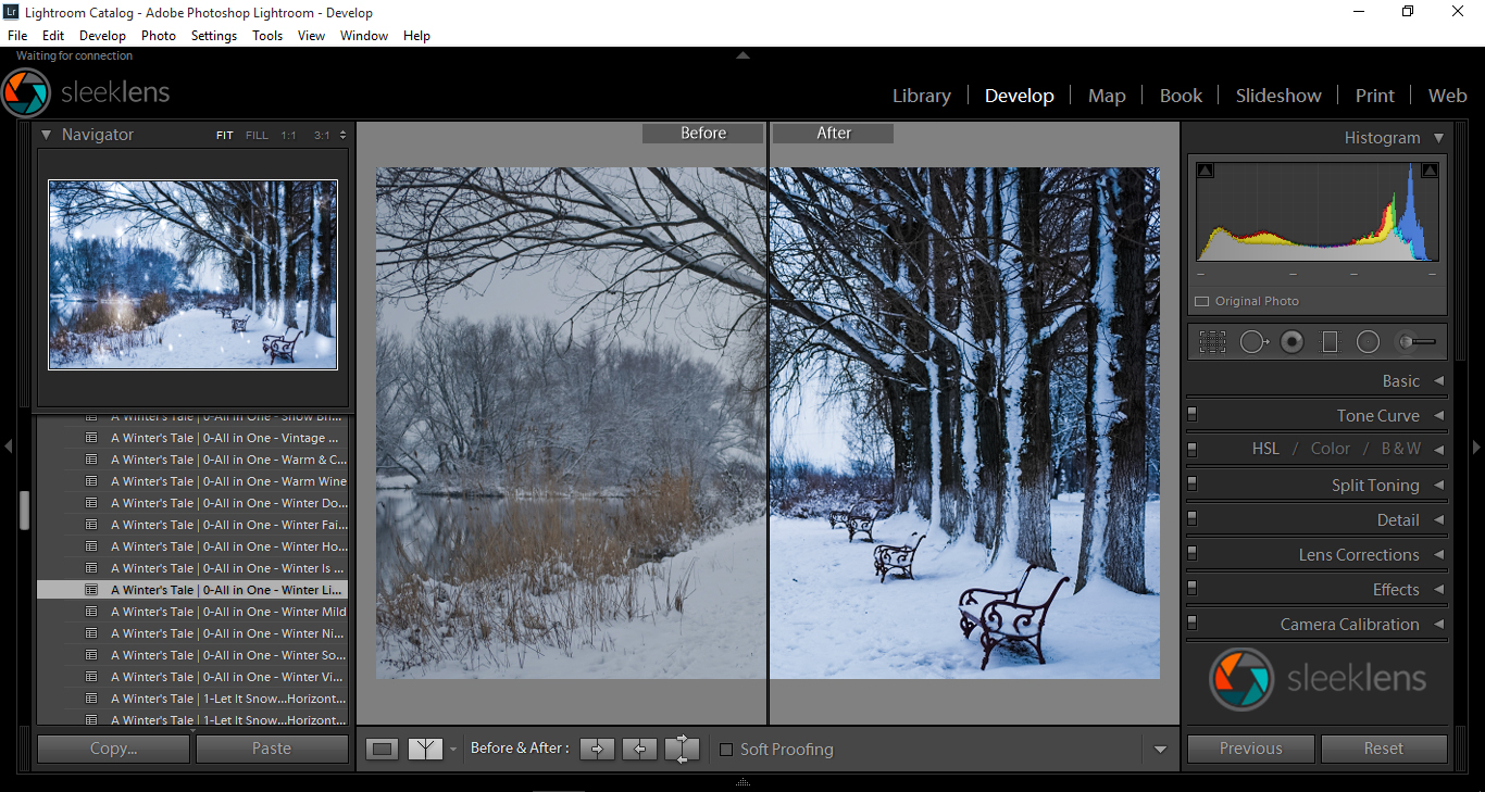

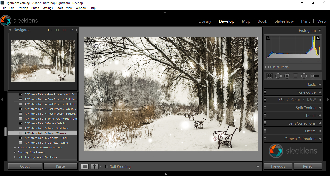
 Model: Jessica Waldow / Photo: Luiz Kim
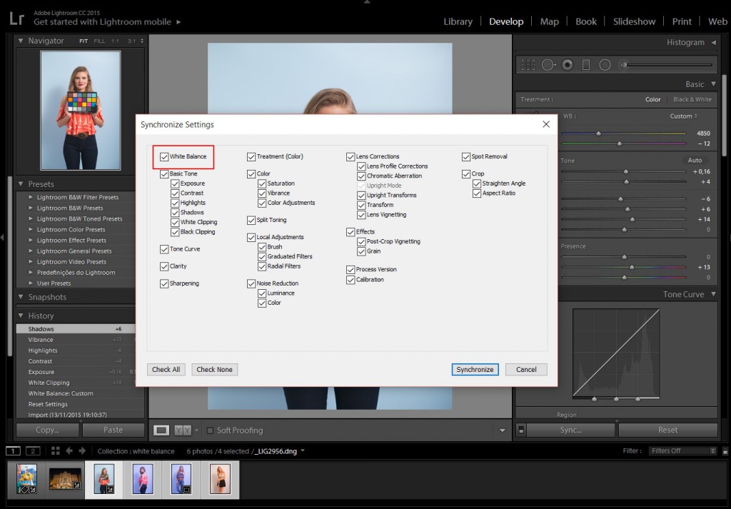
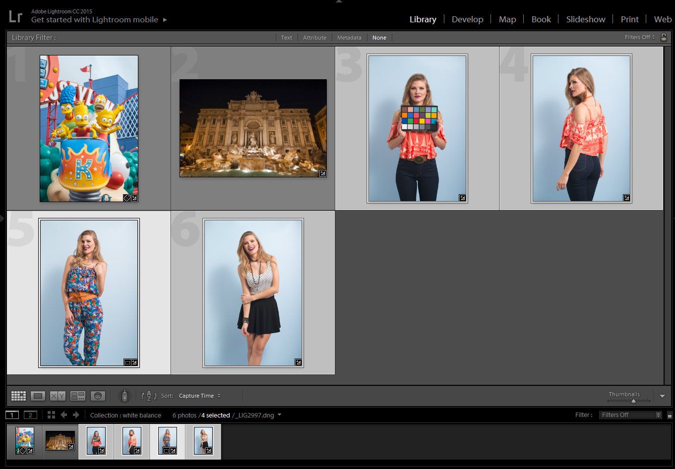
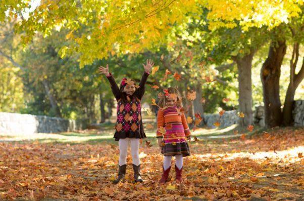
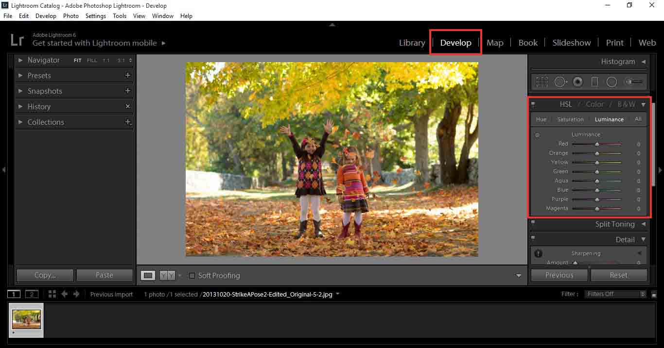
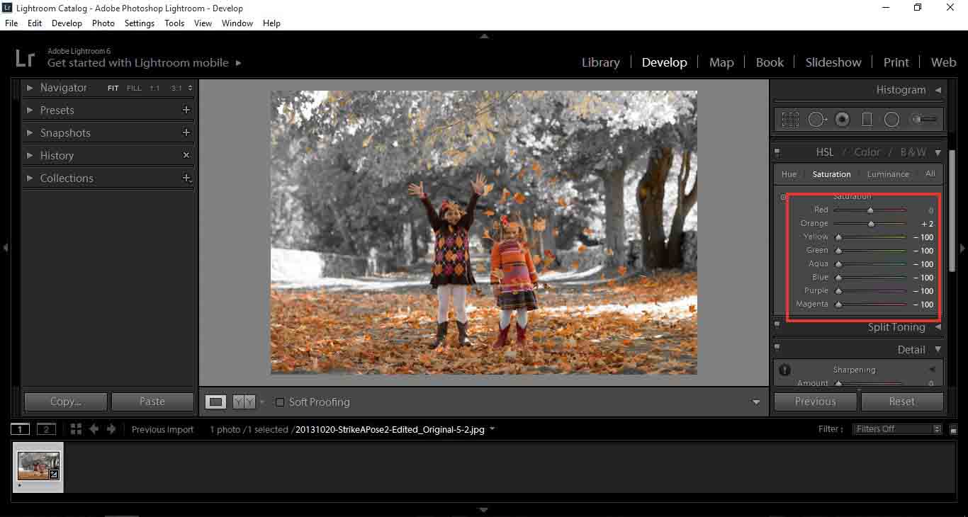
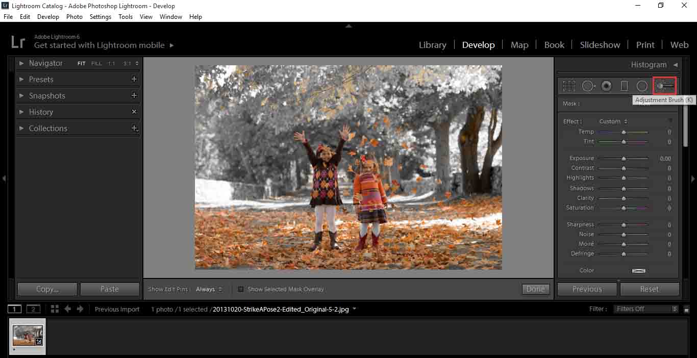
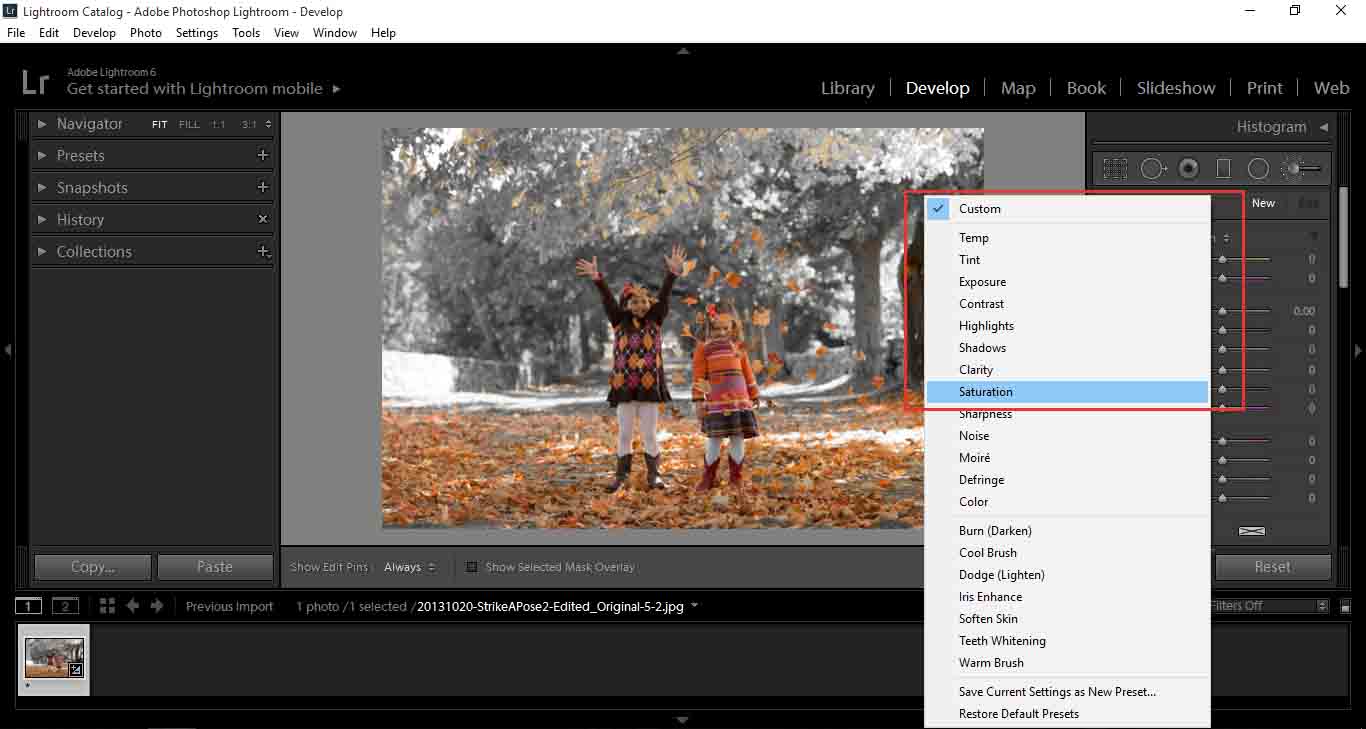
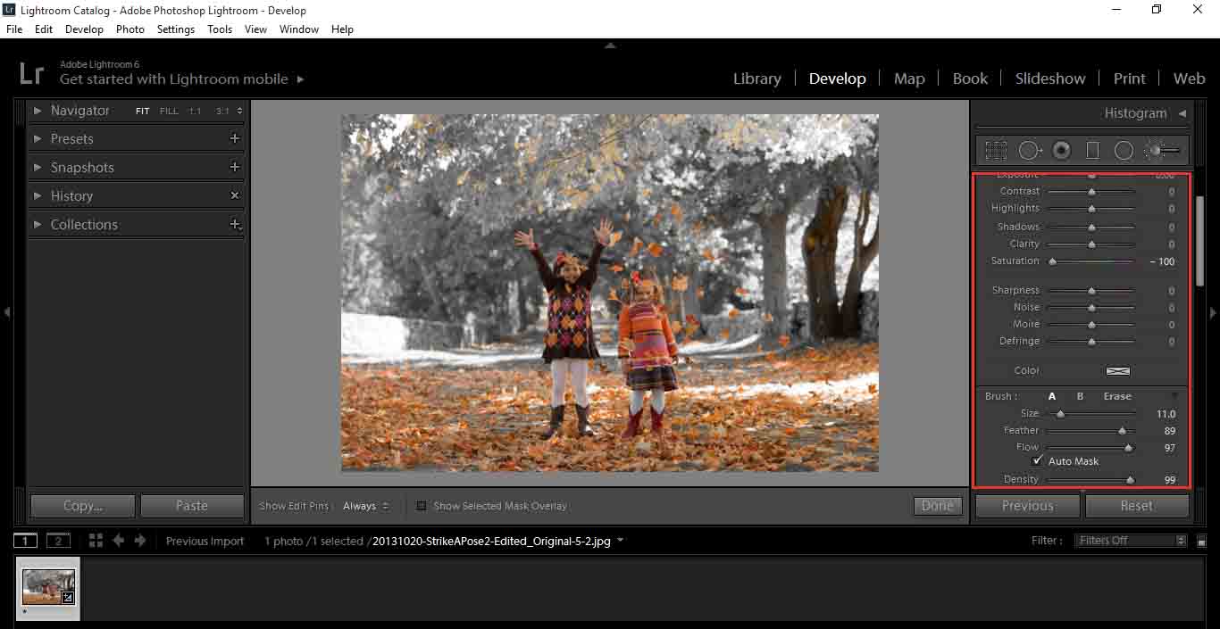
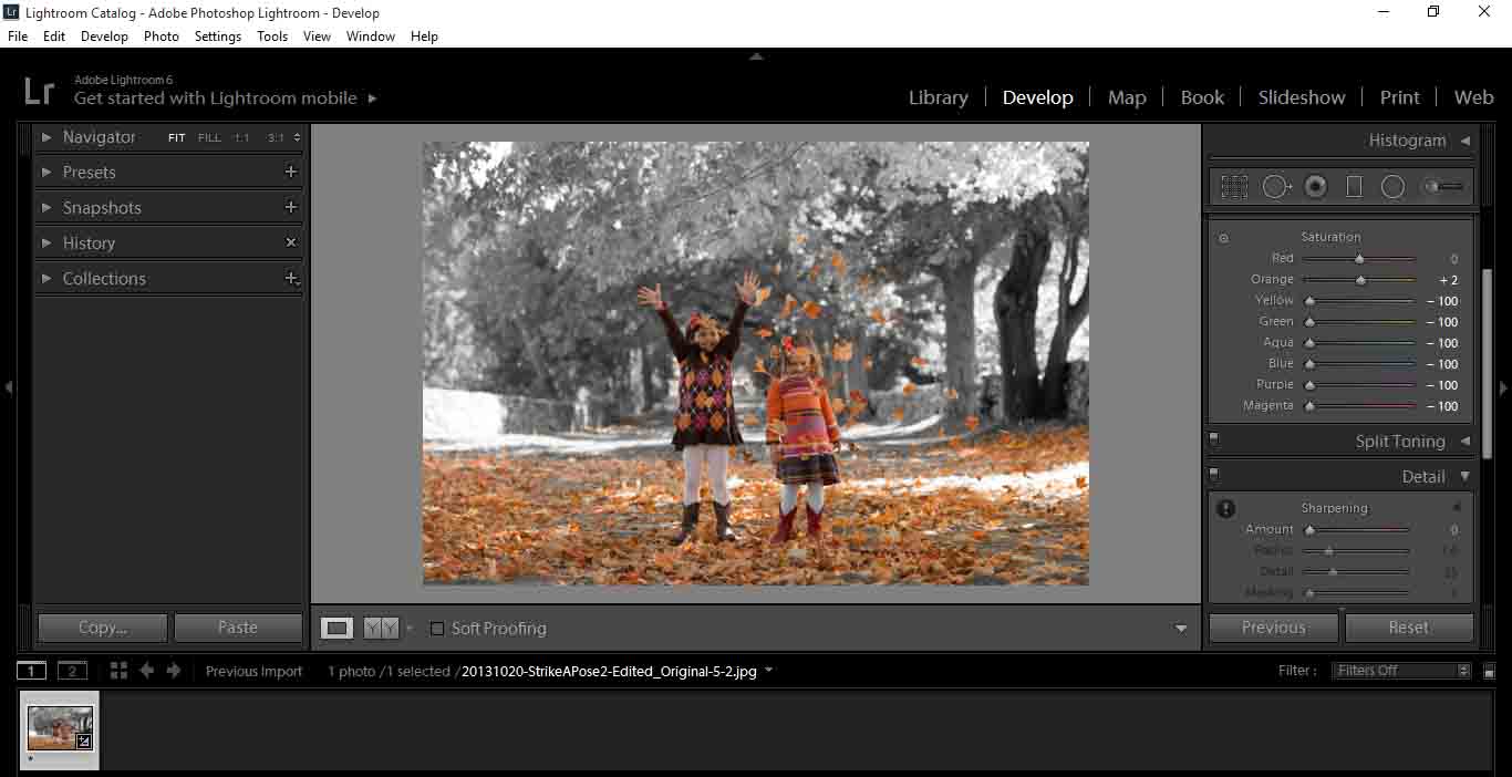
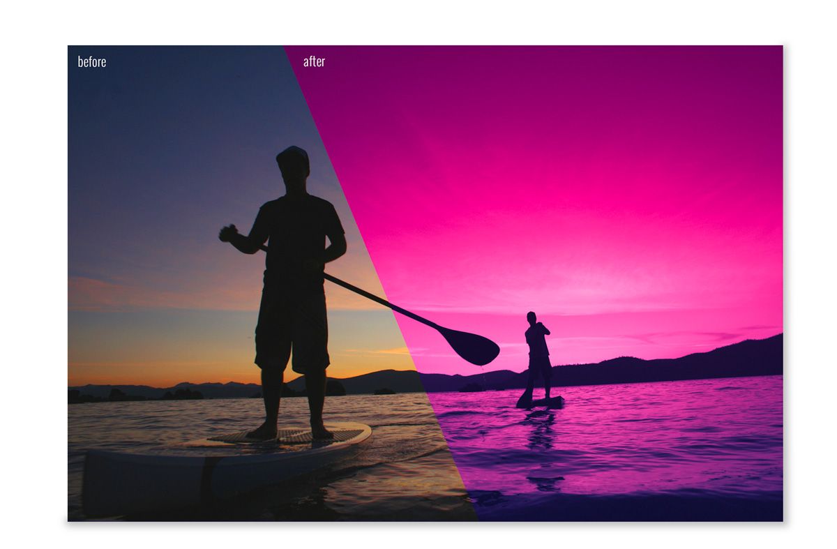
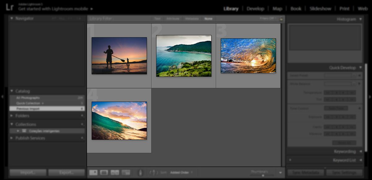
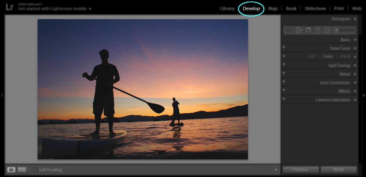
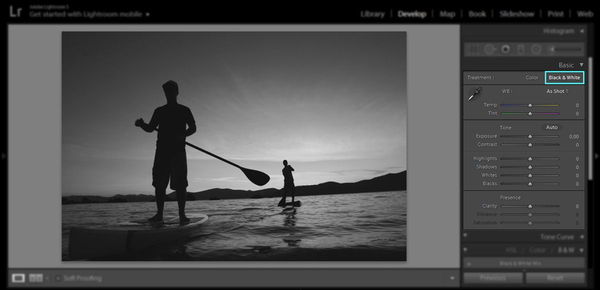
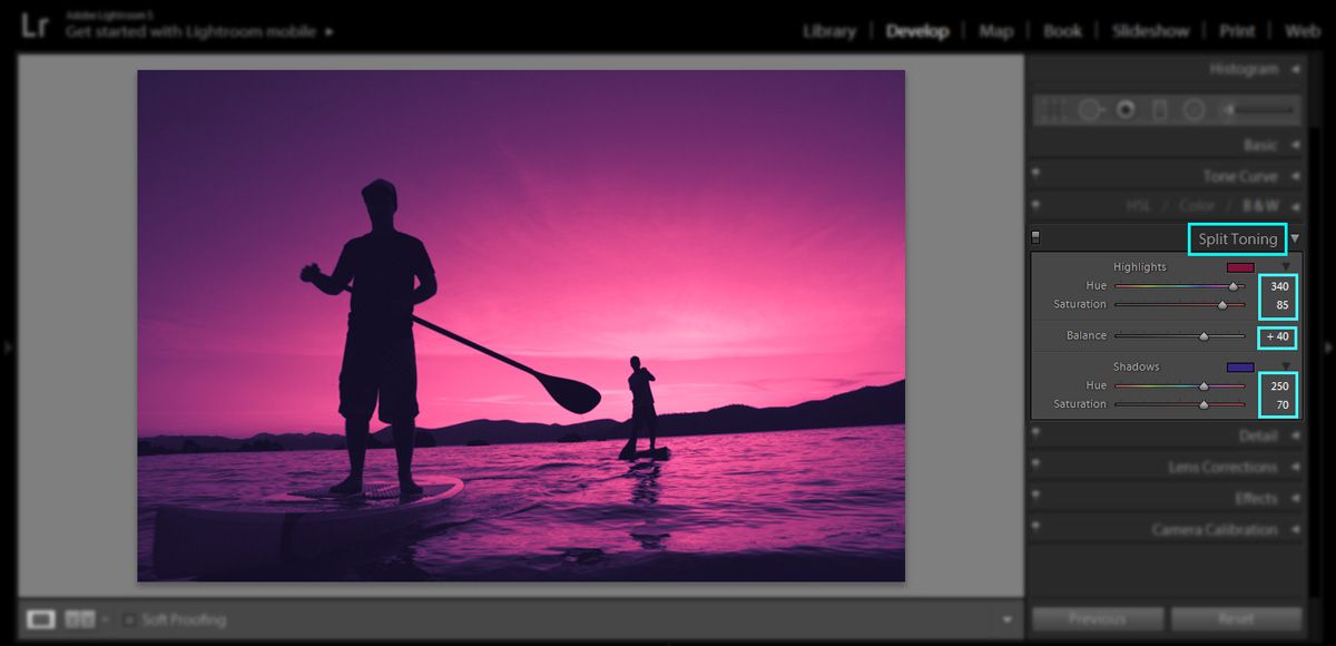
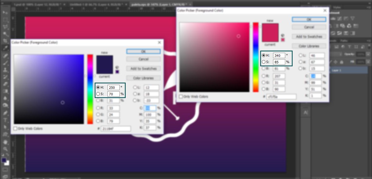

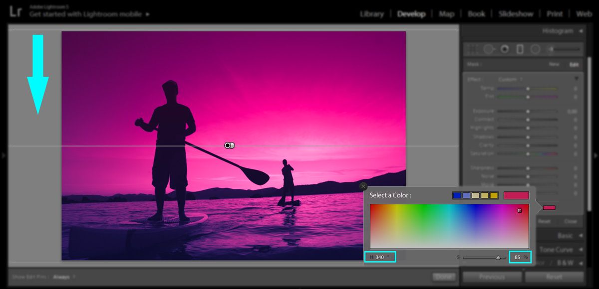
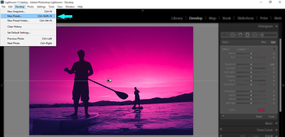
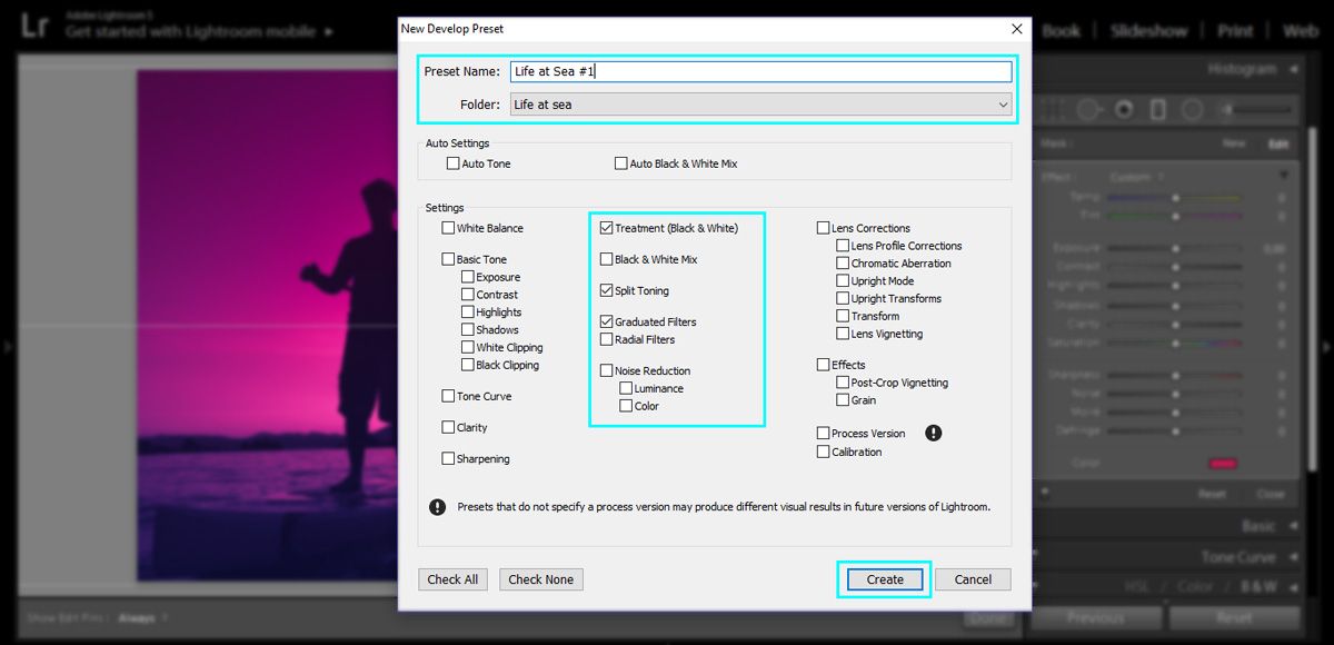
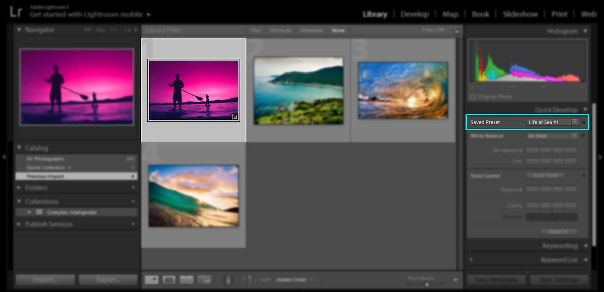
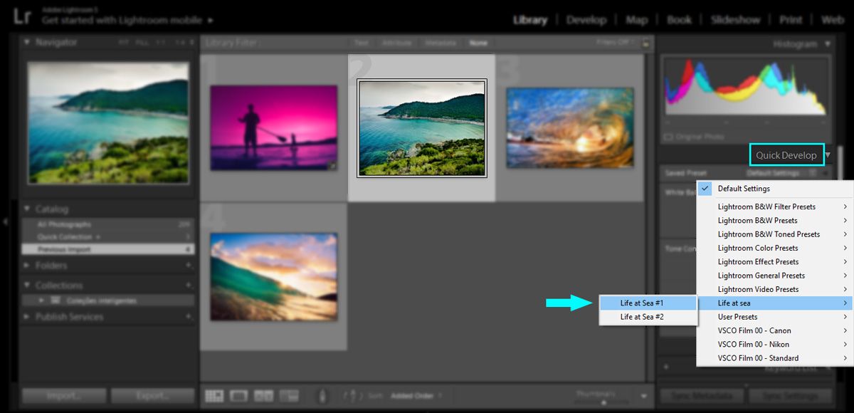
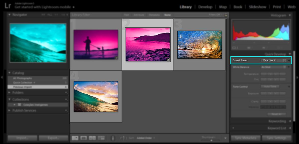
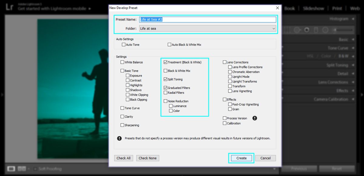
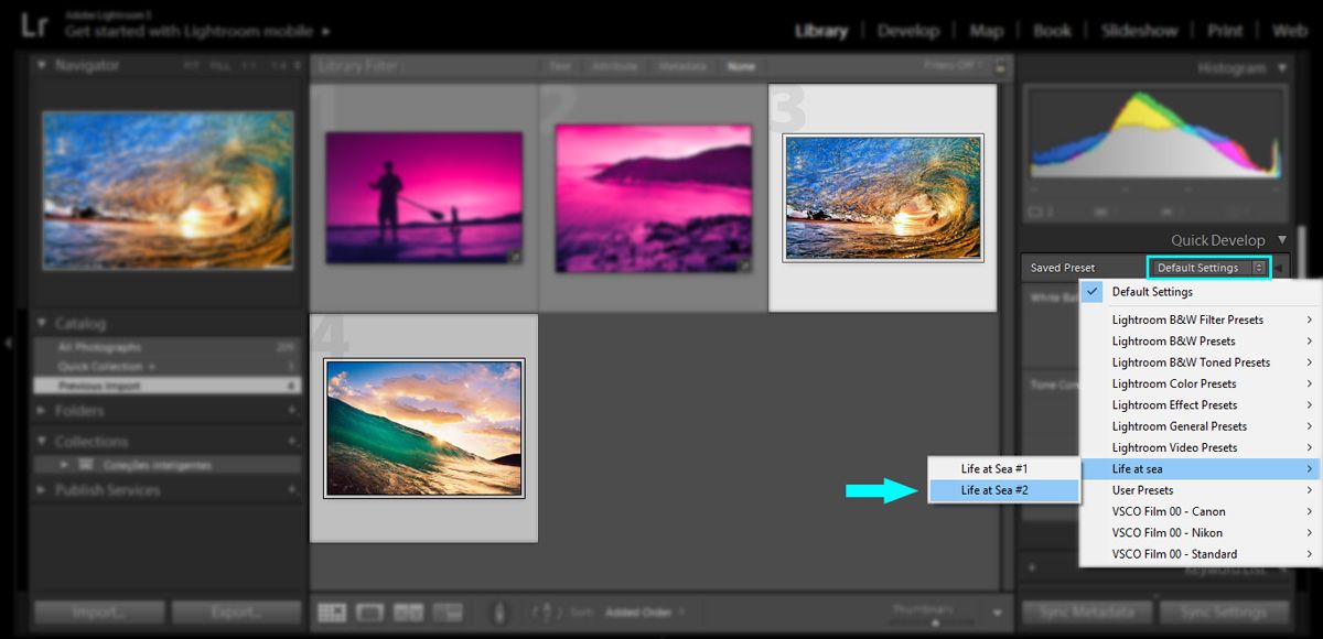
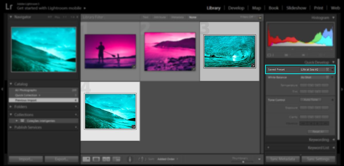
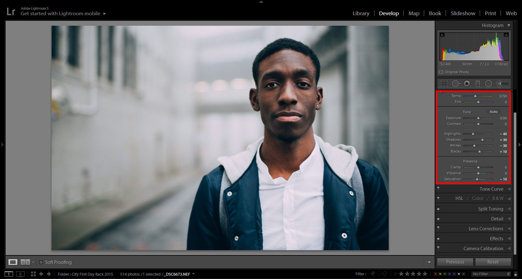
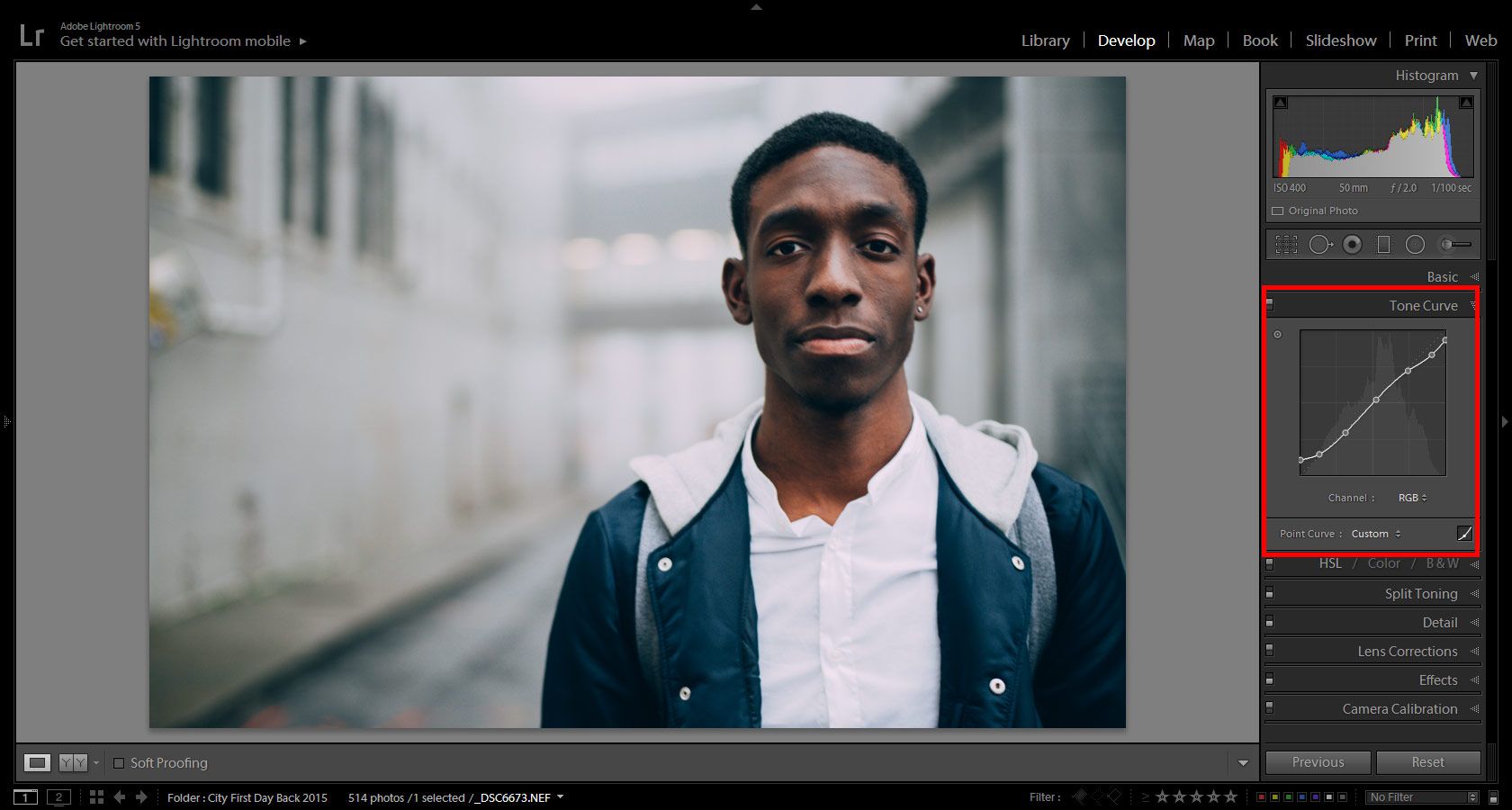
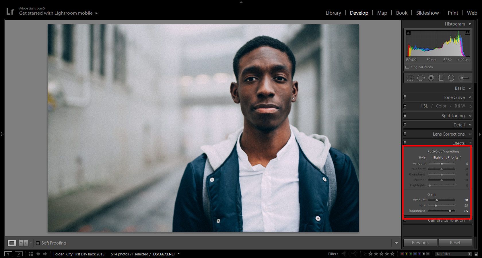
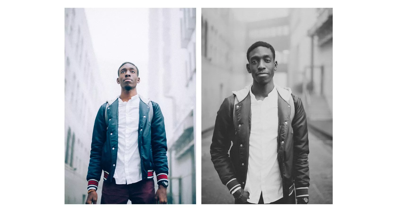
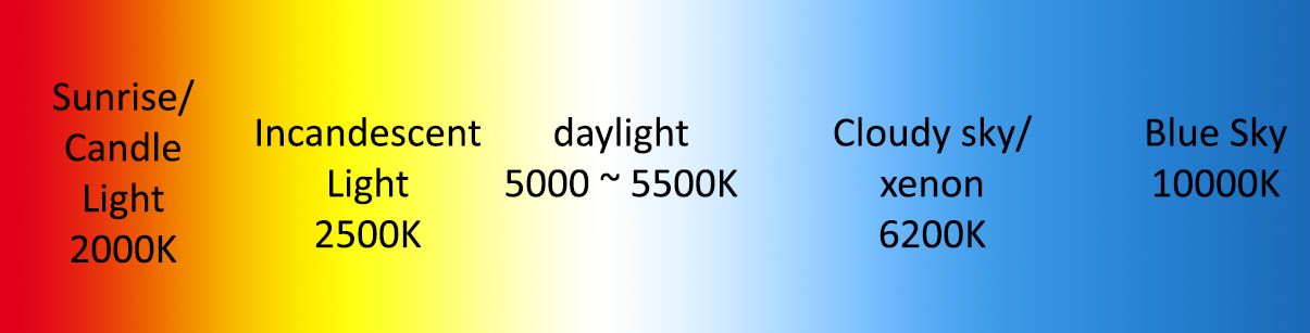

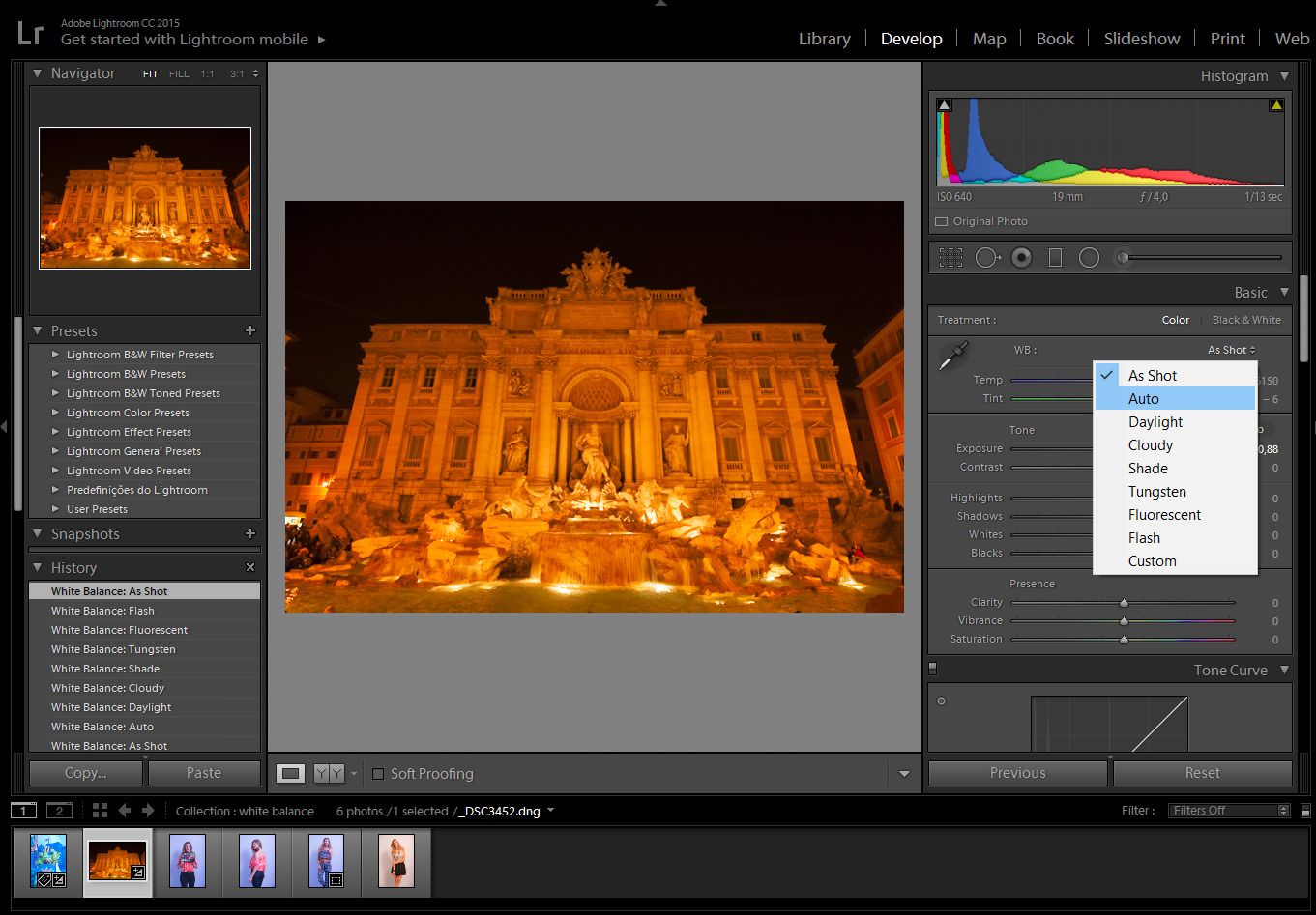
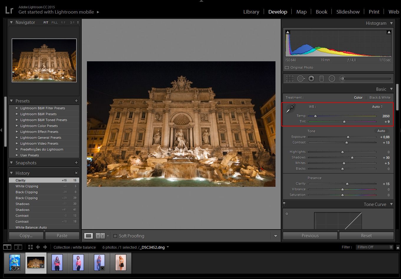
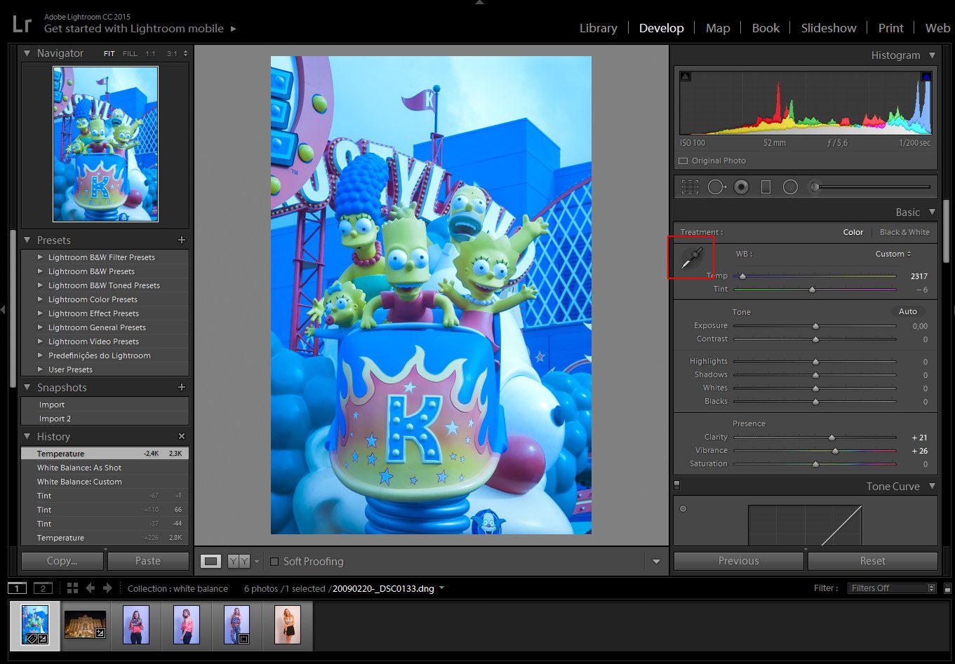
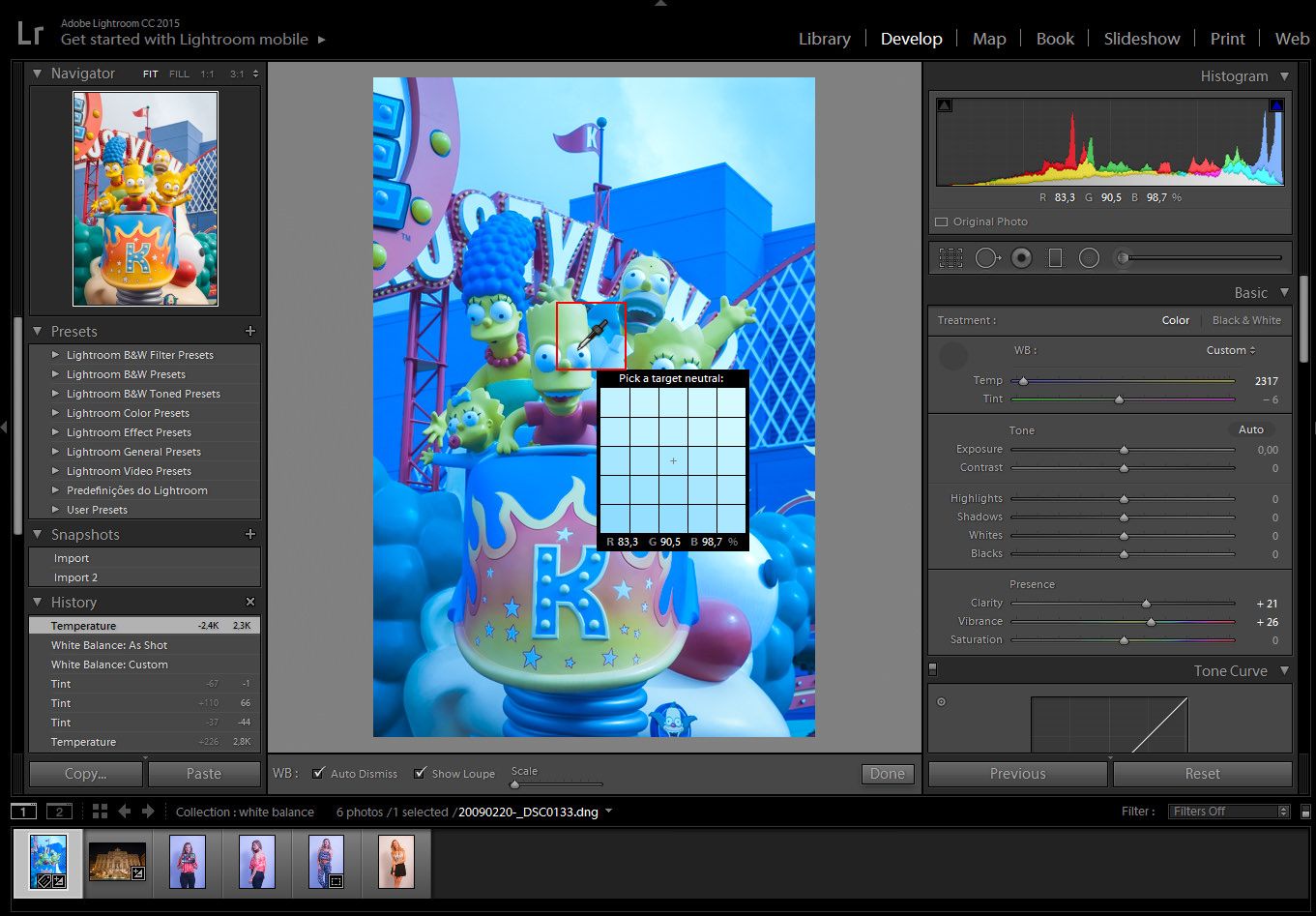
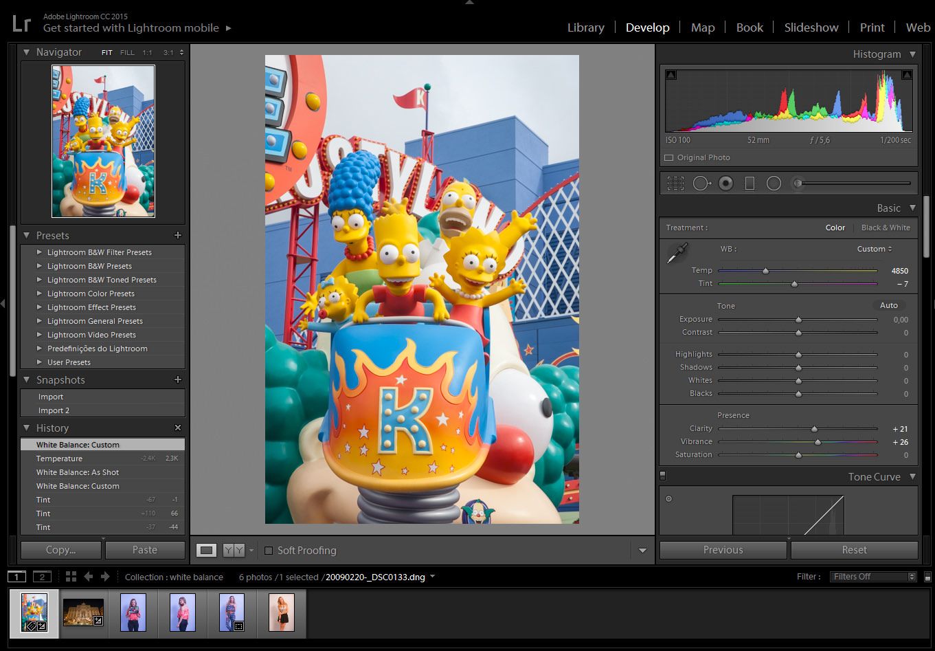
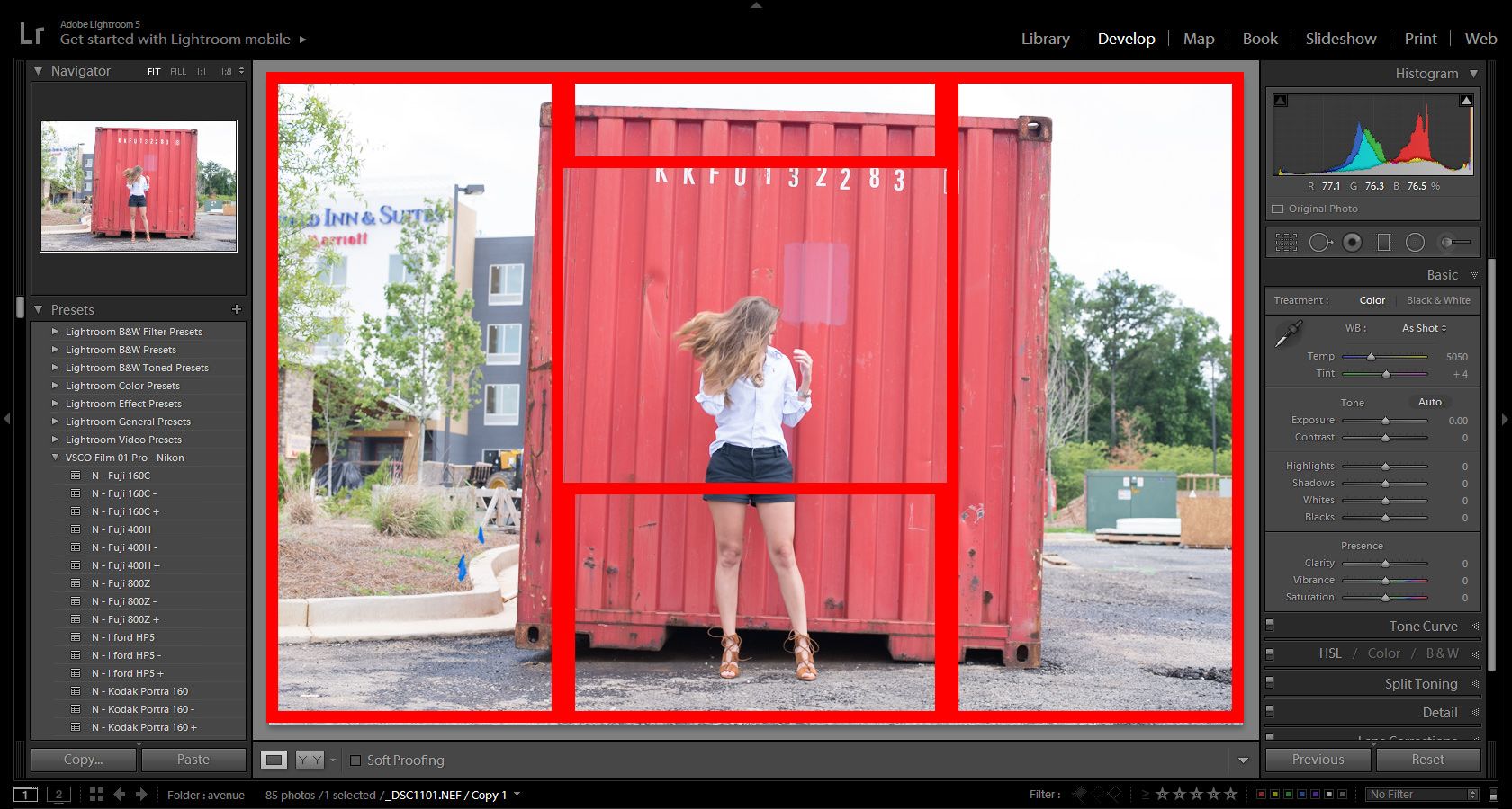
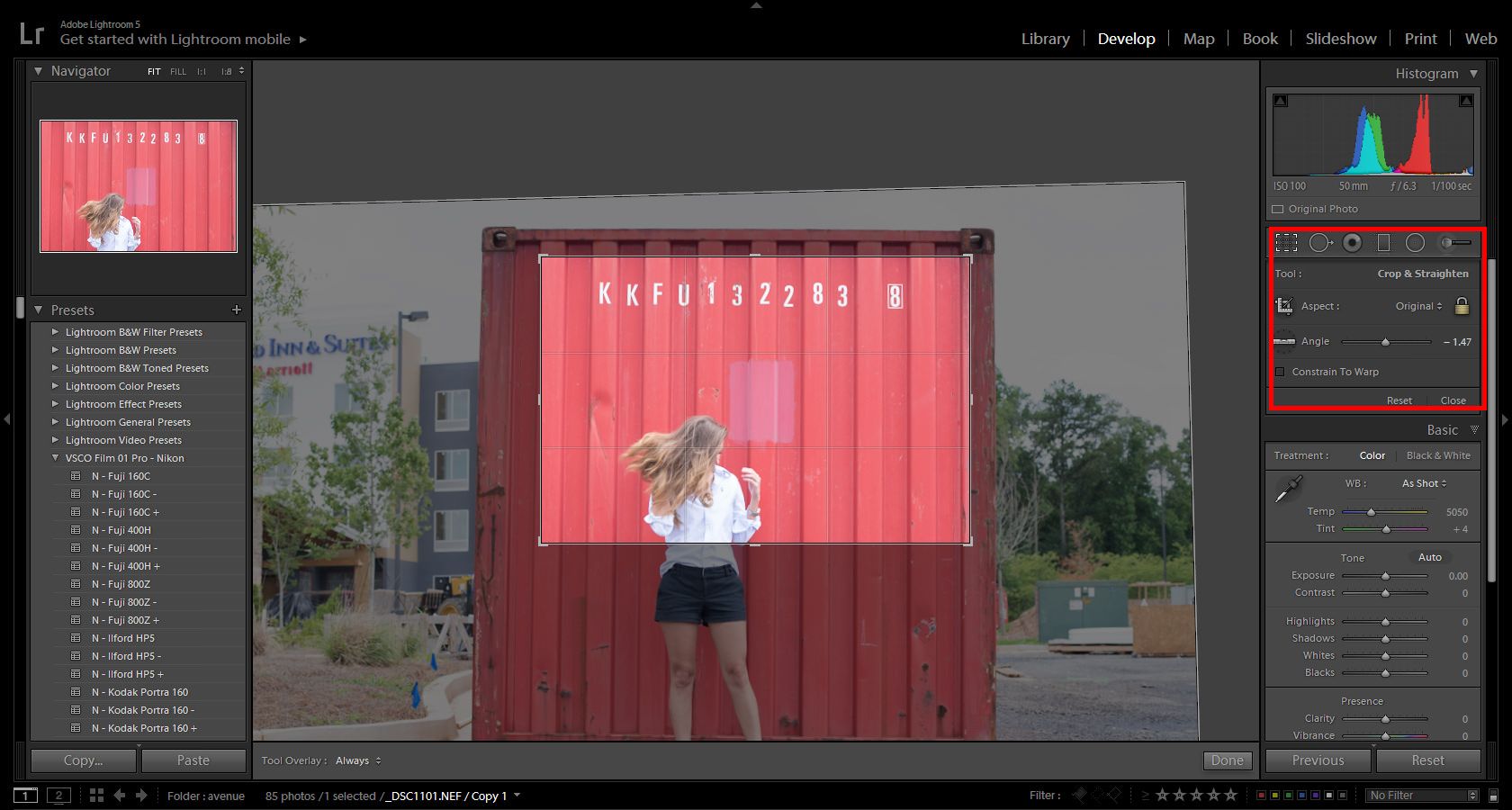
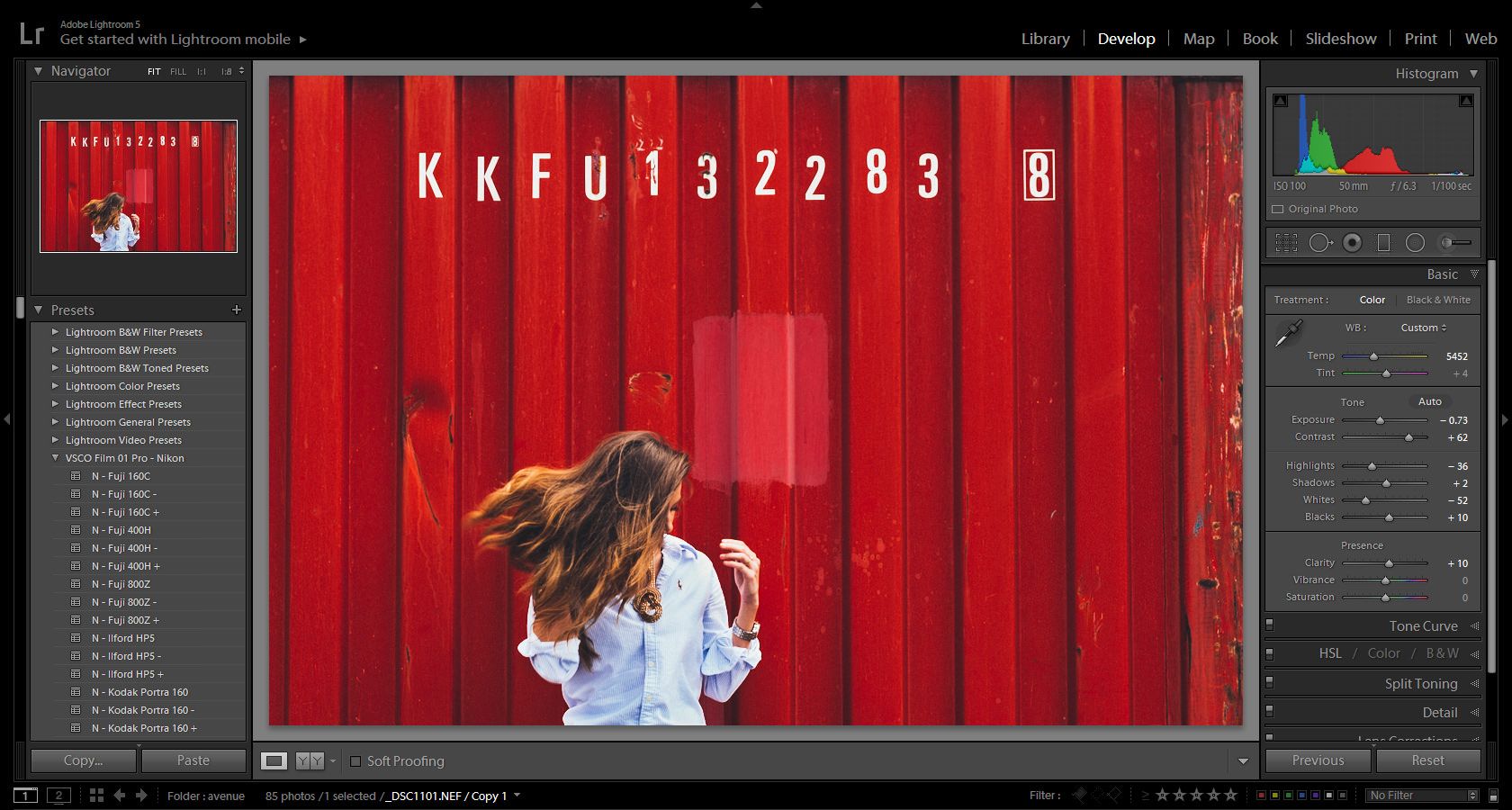
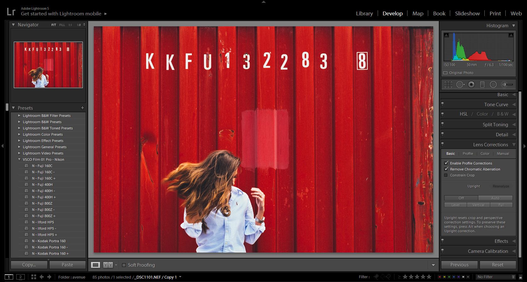
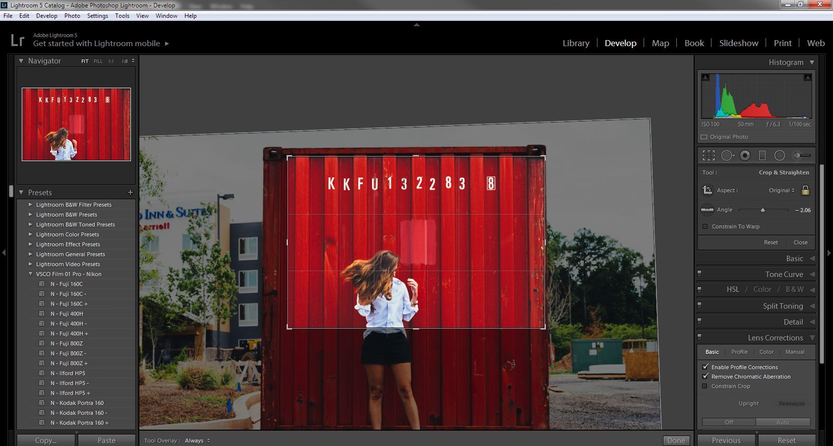
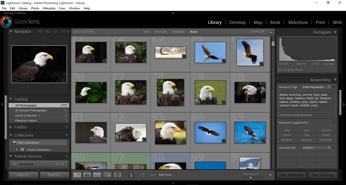


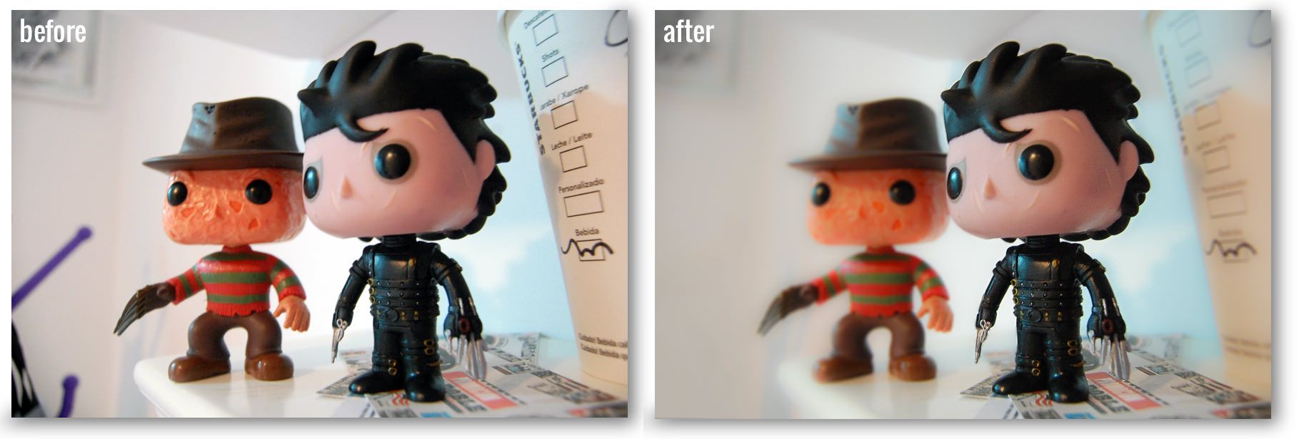
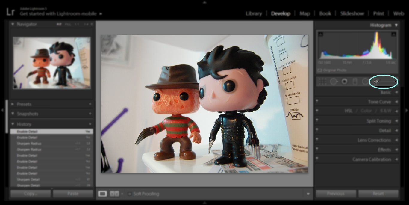
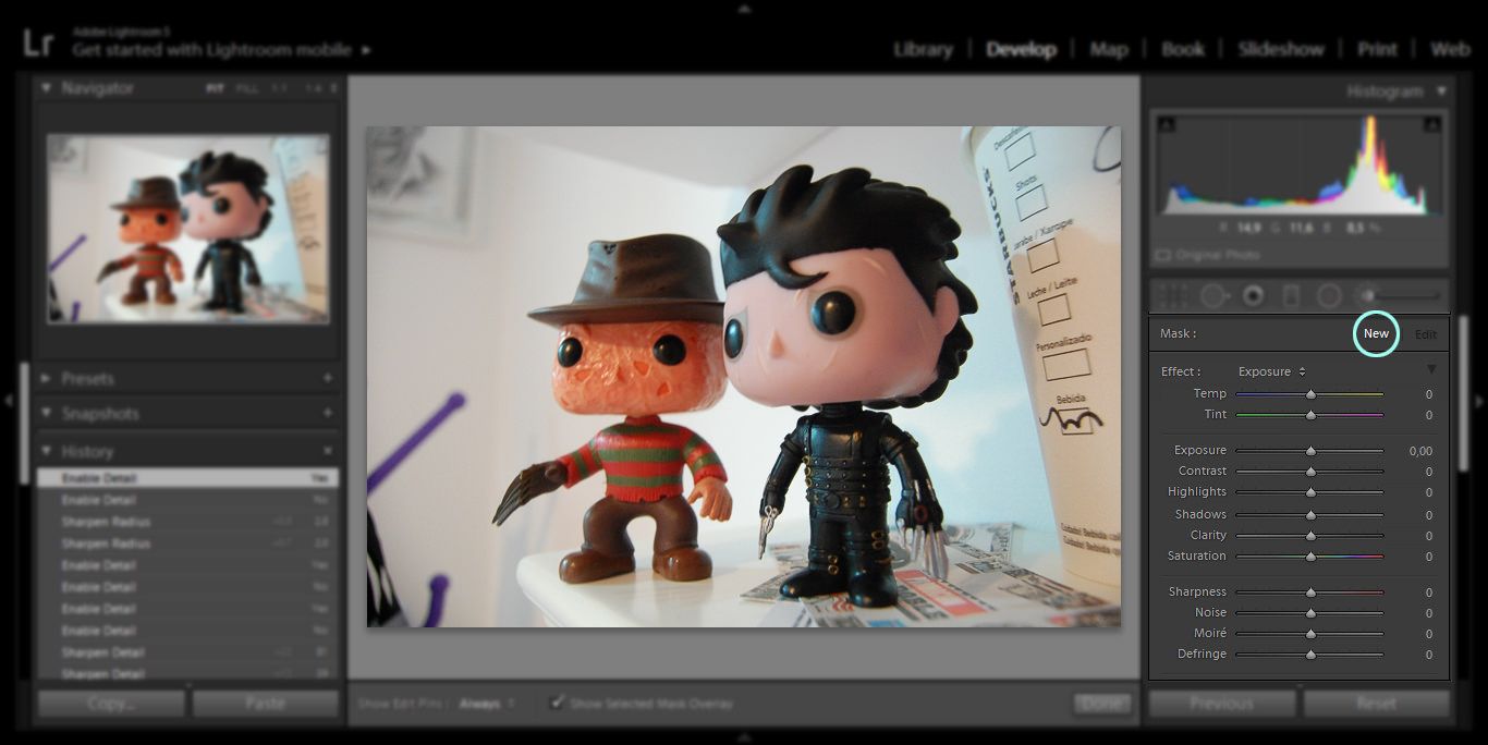
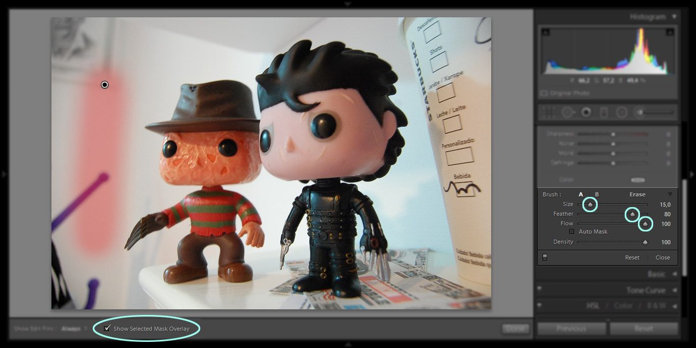
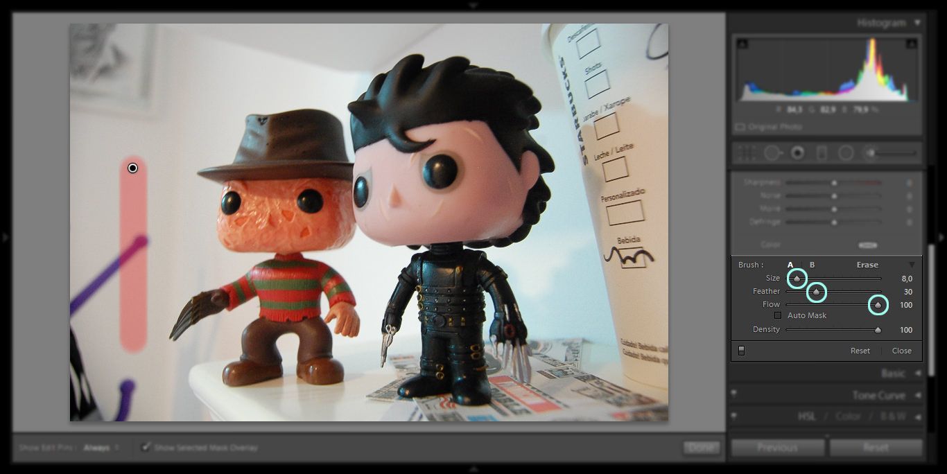
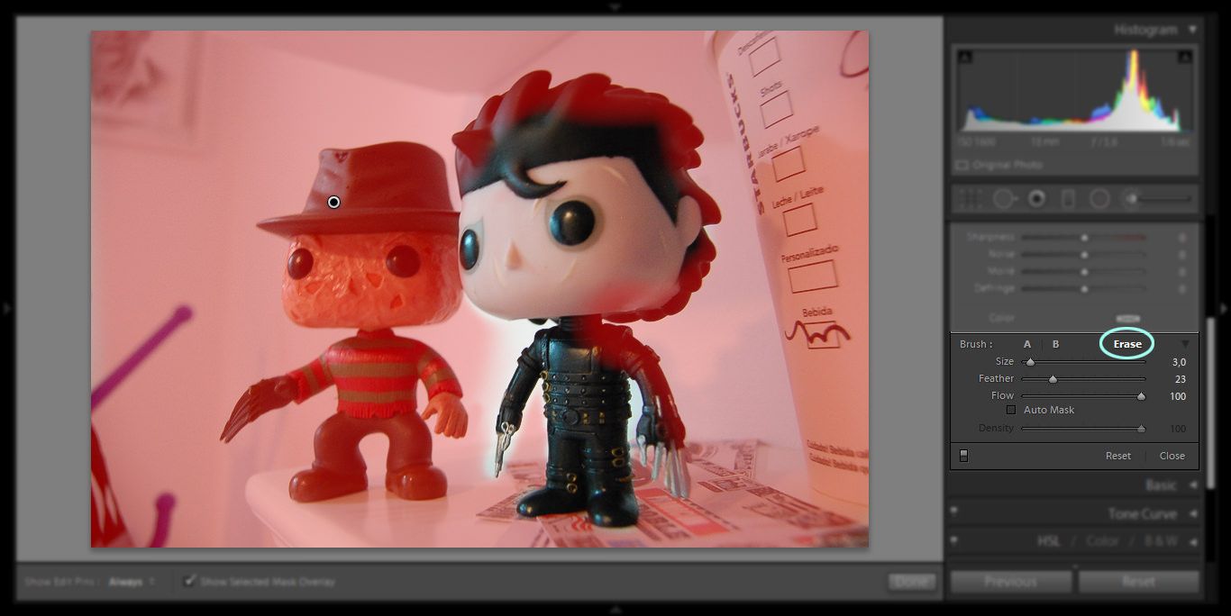
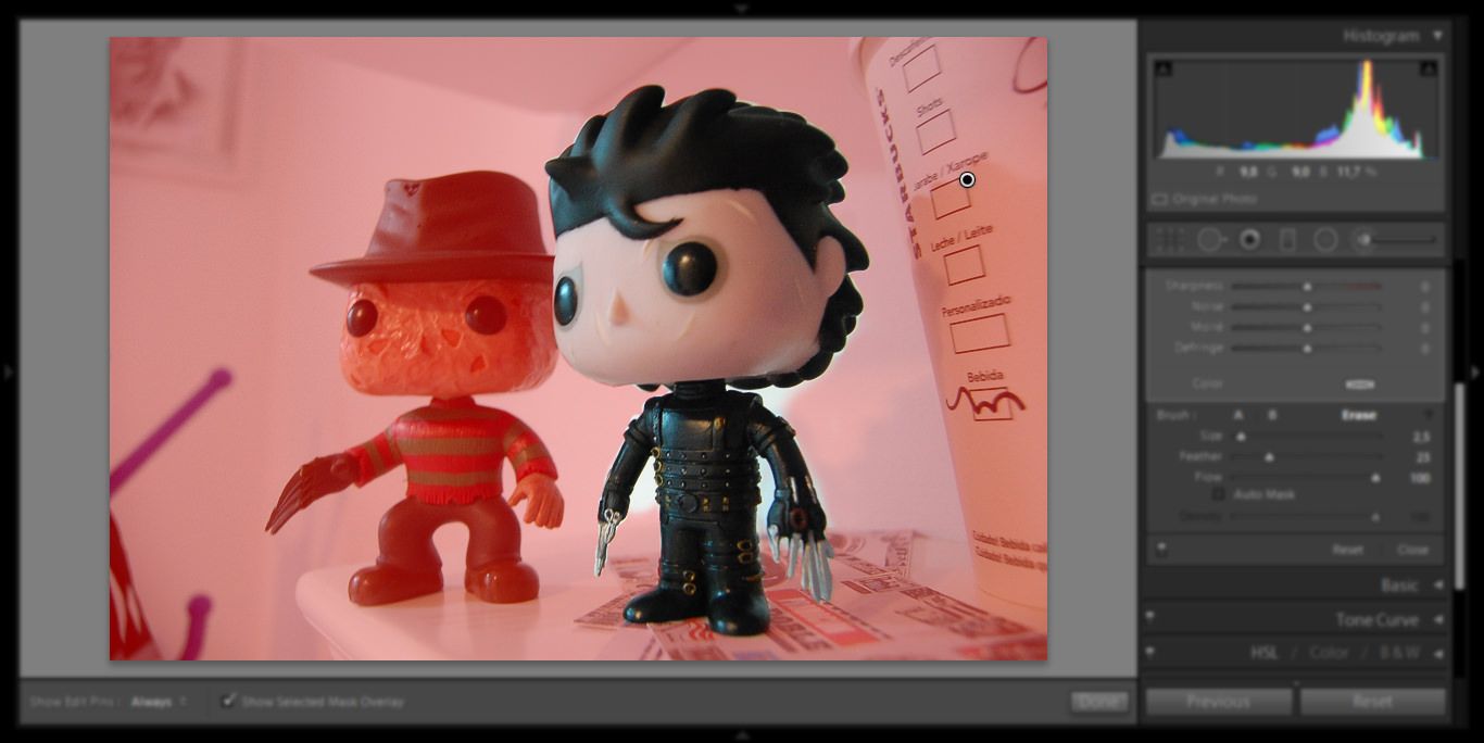
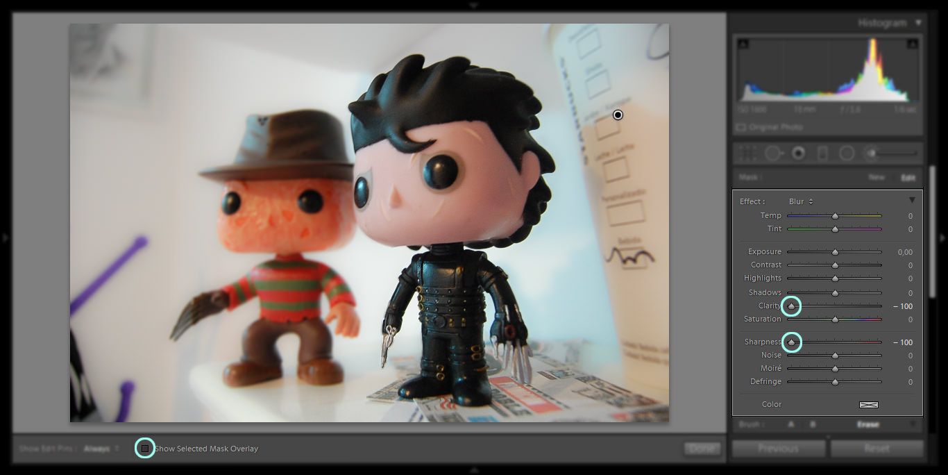
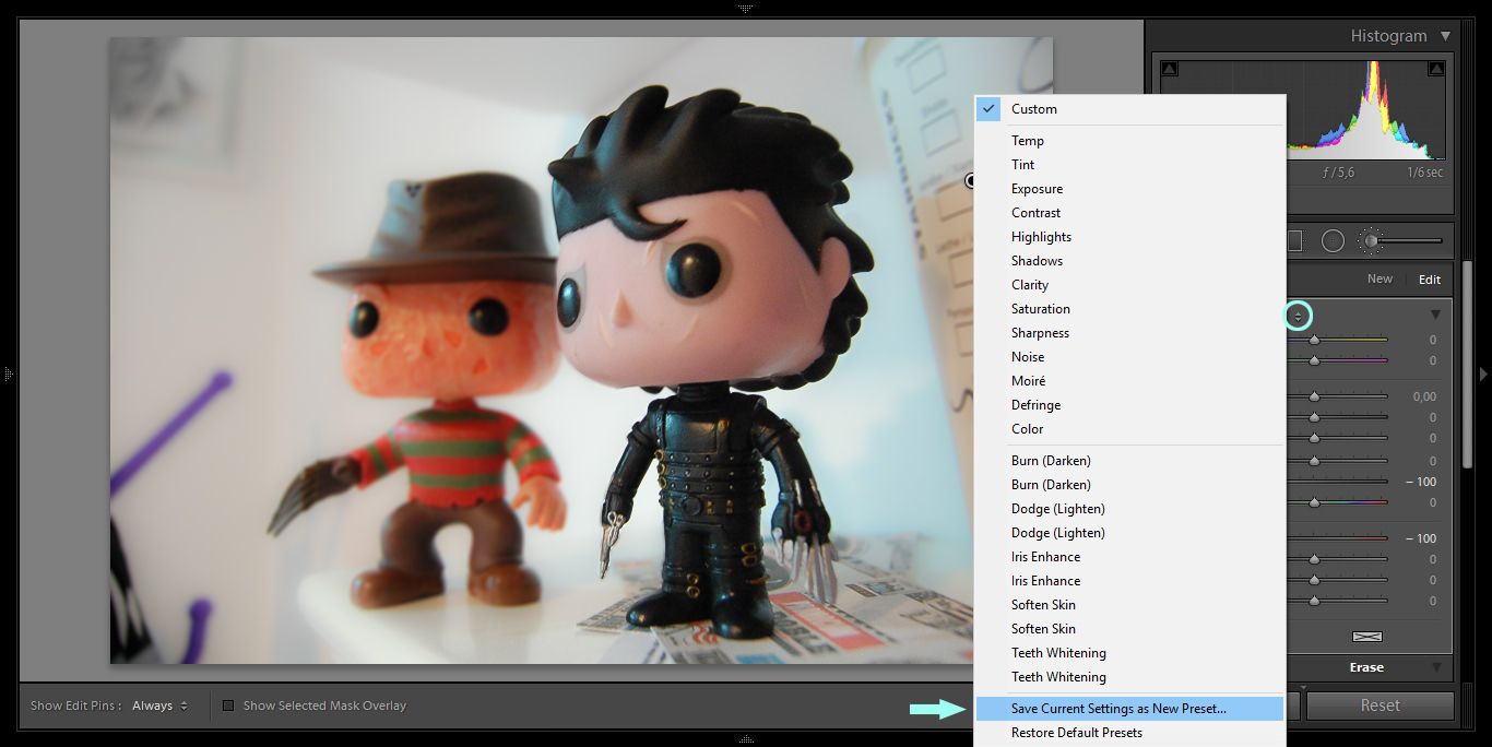
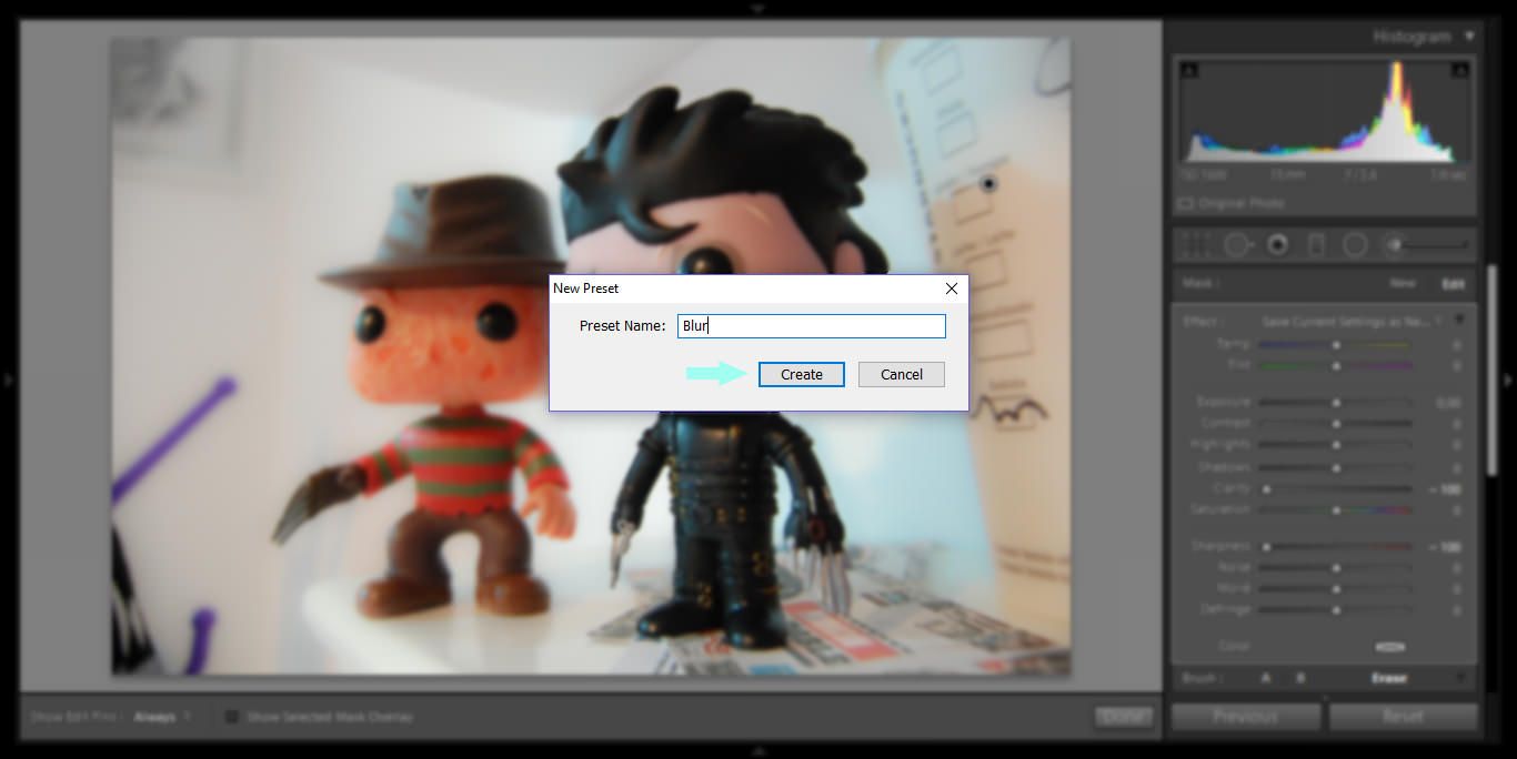
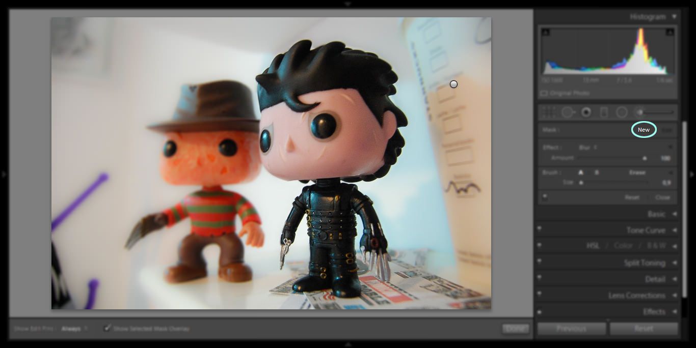
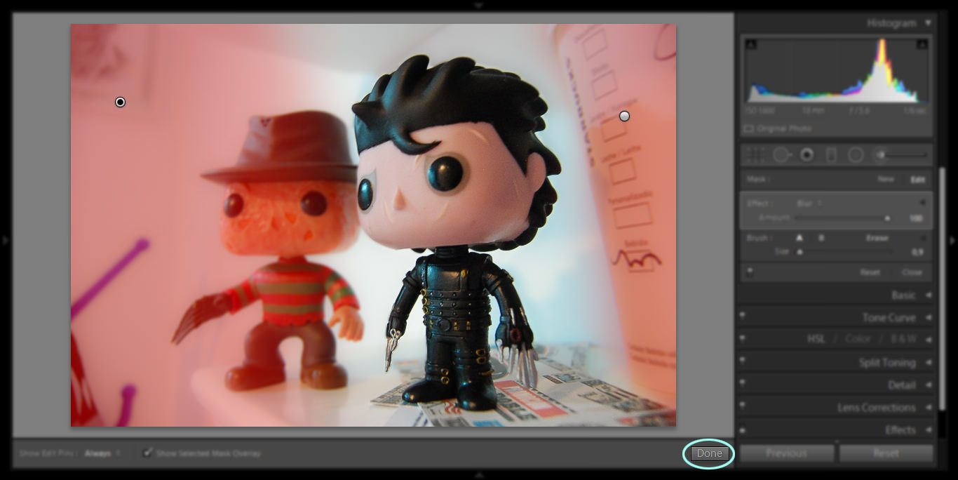


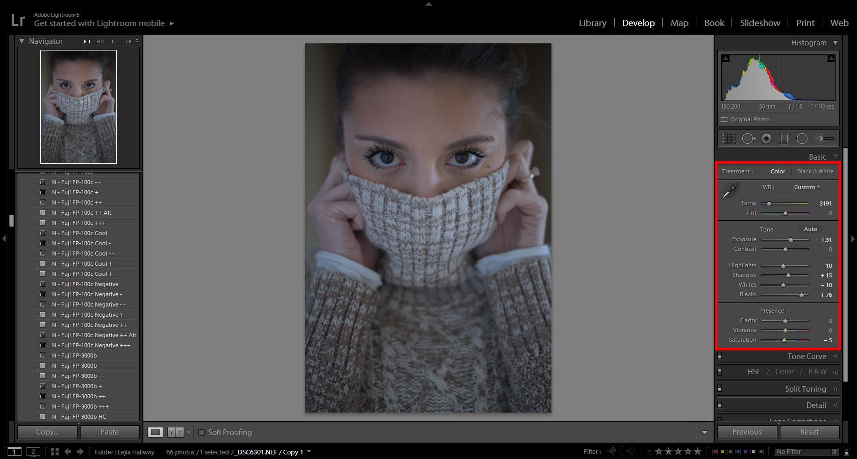
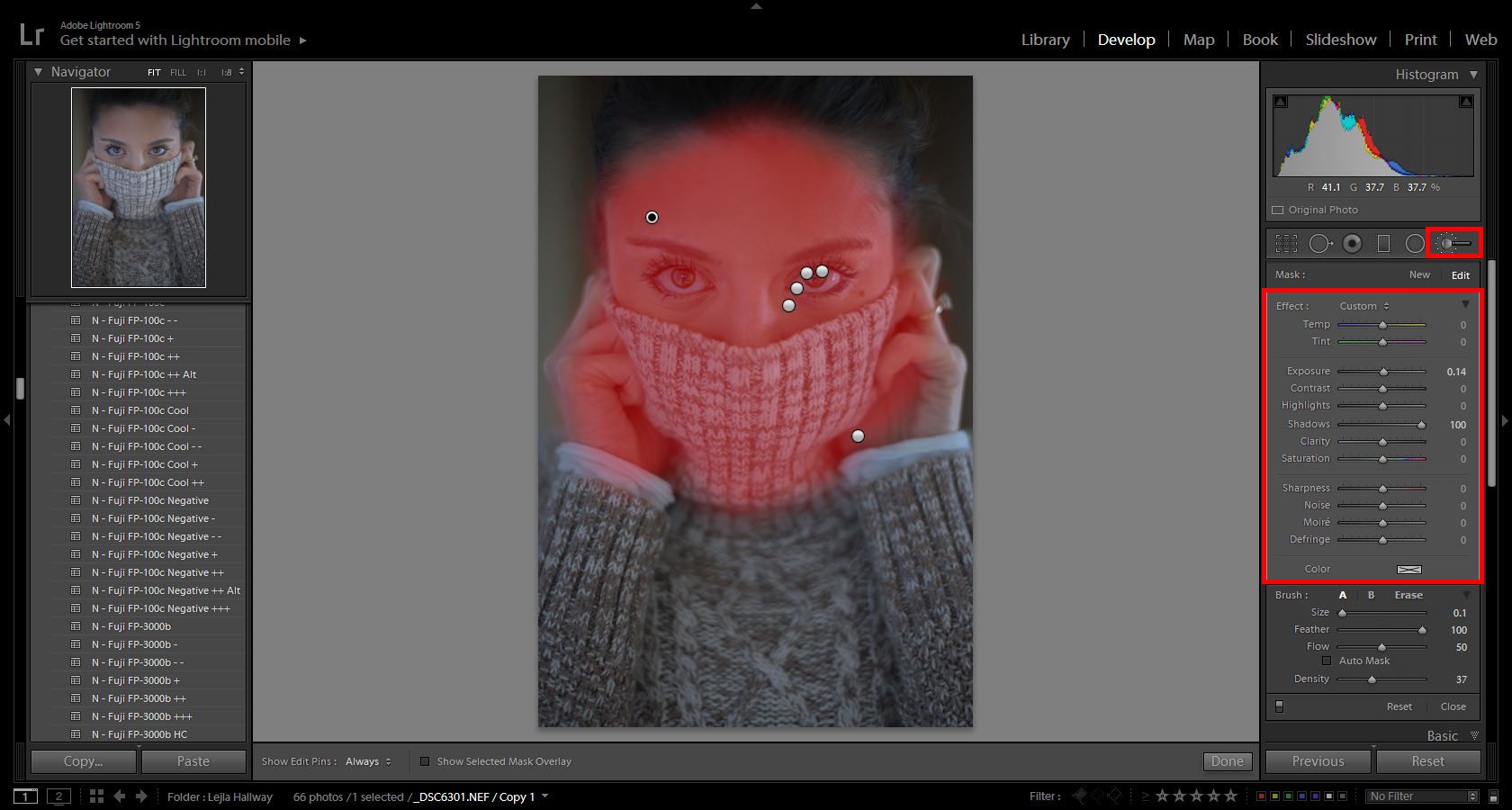

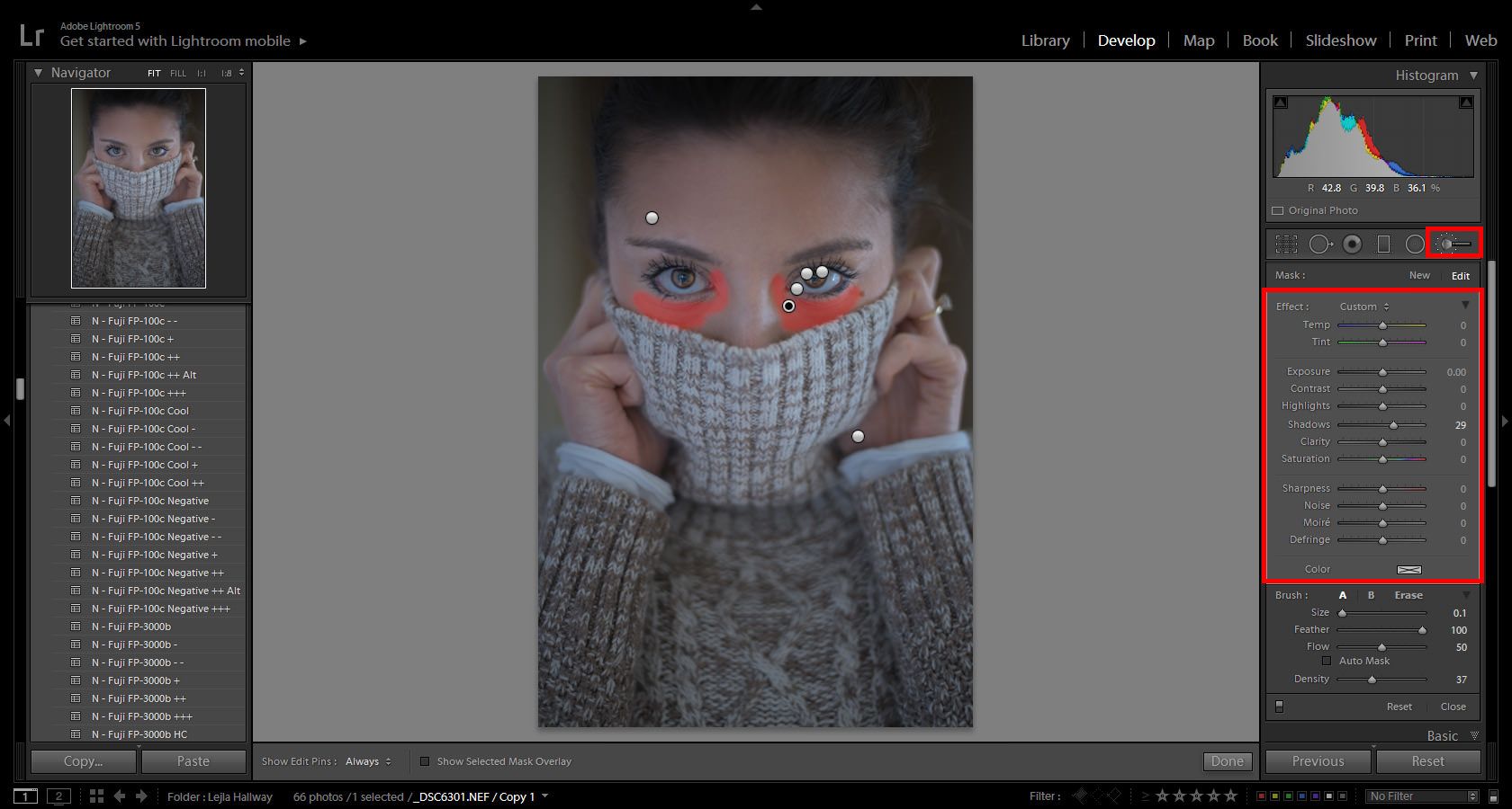
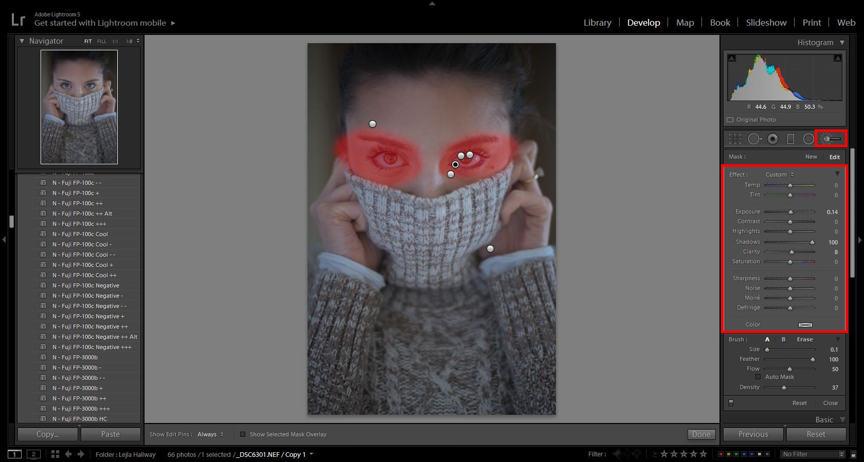
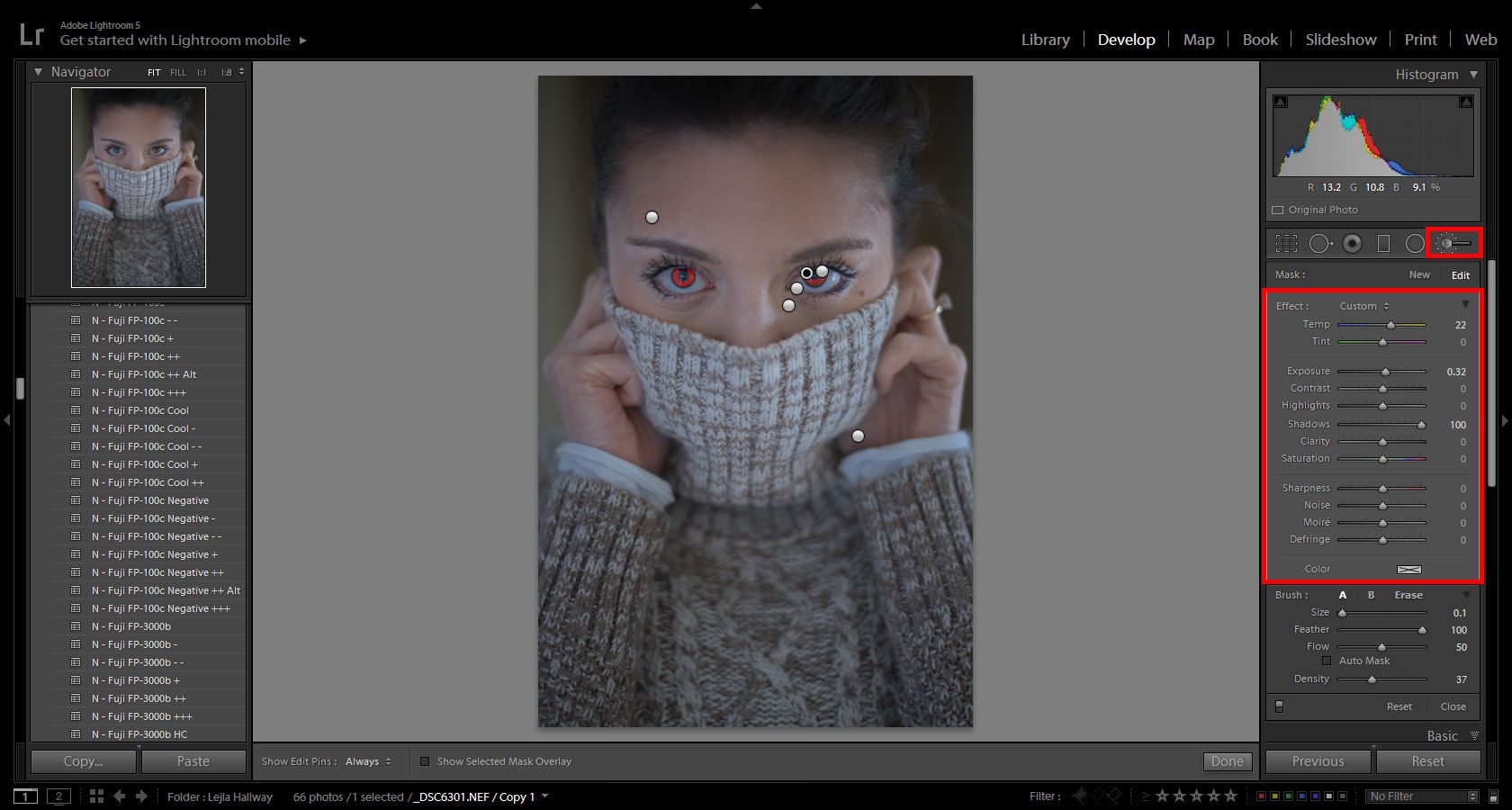
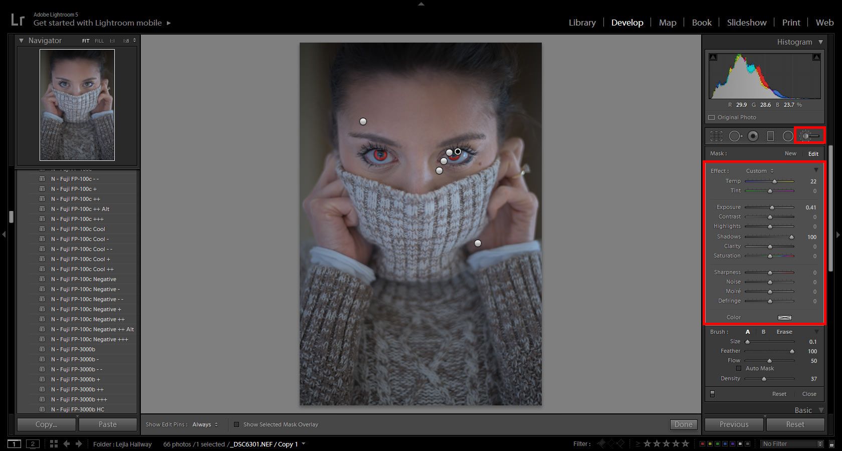
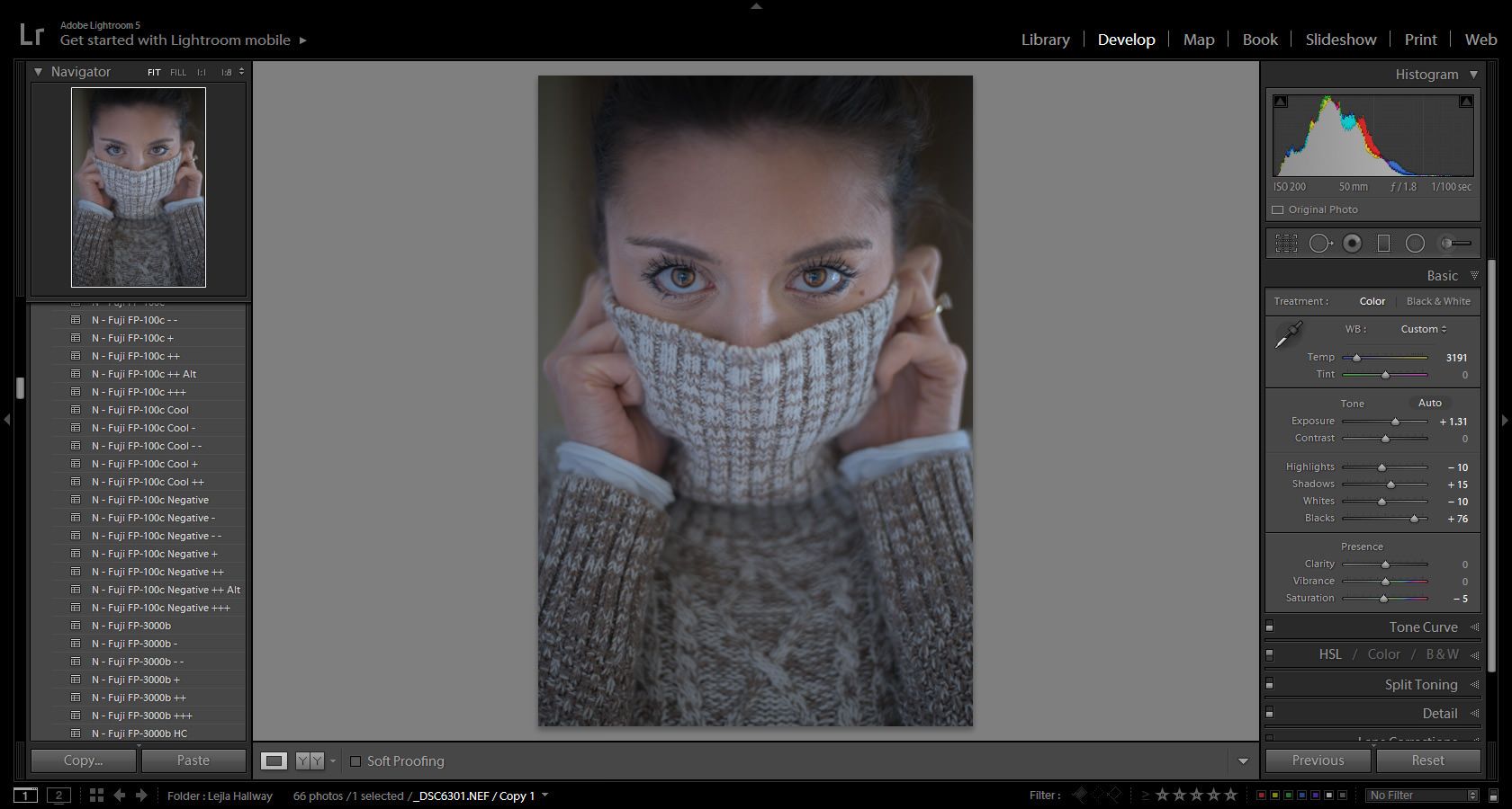
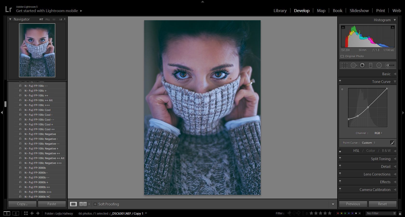
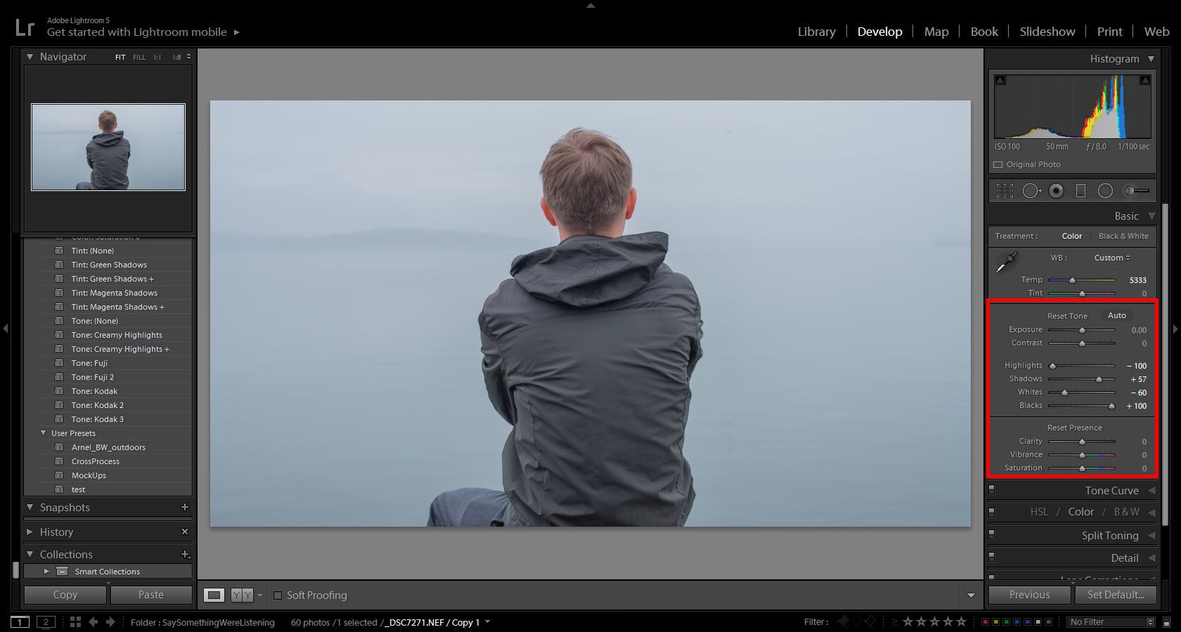
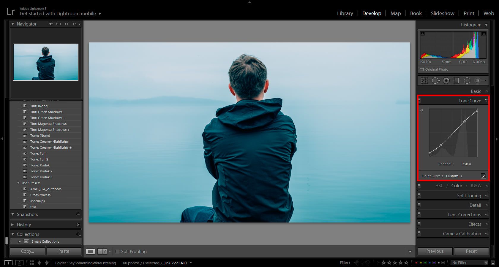
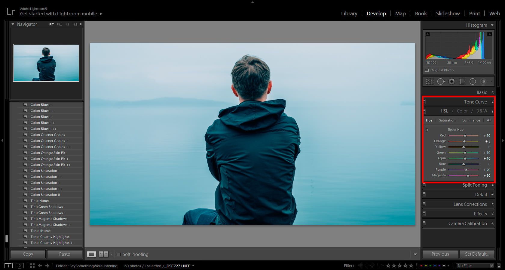

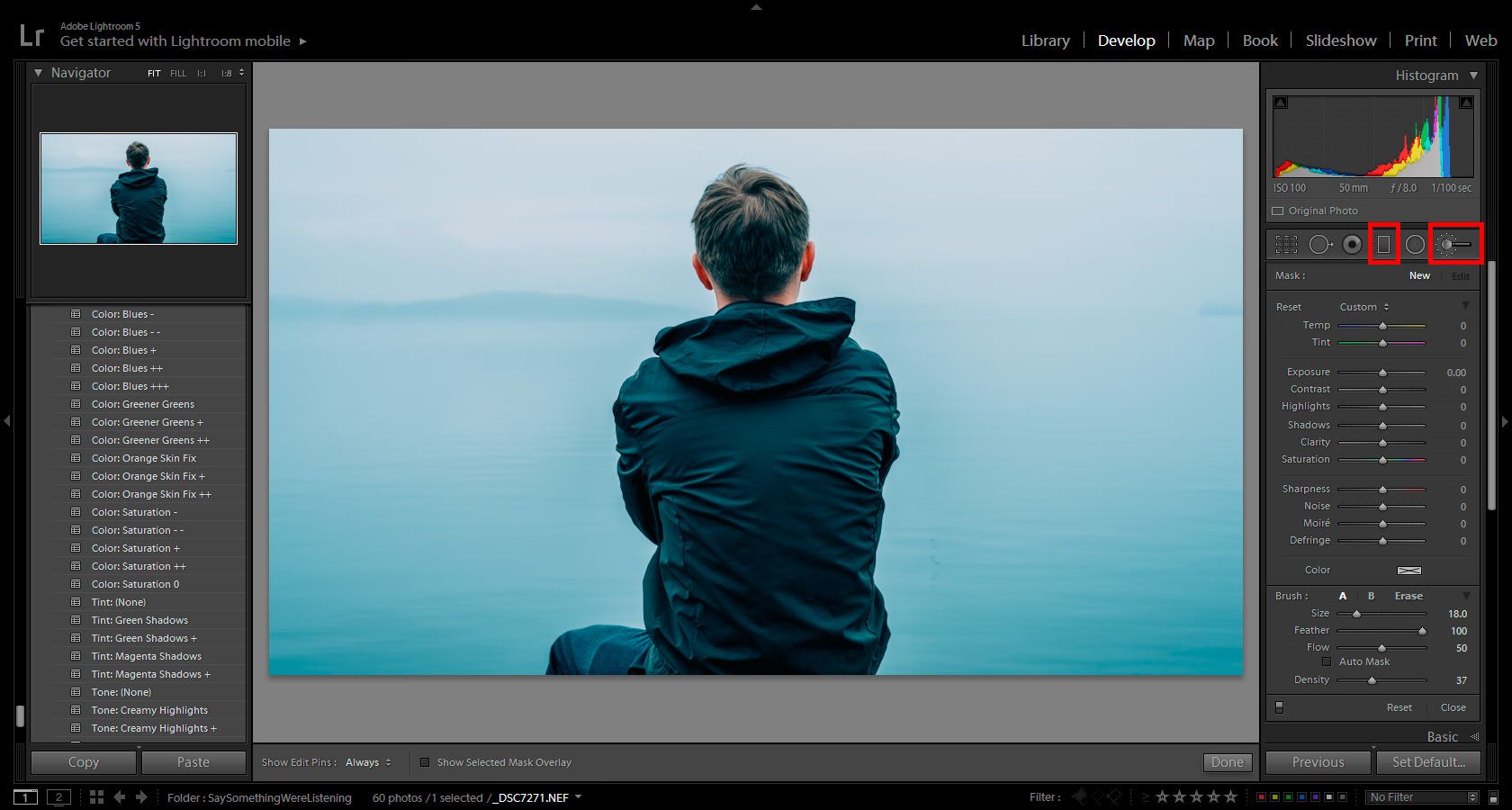
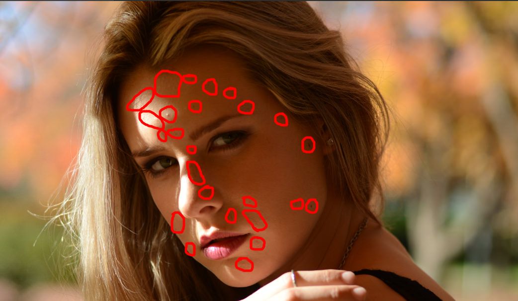
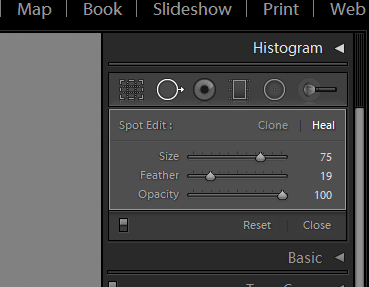
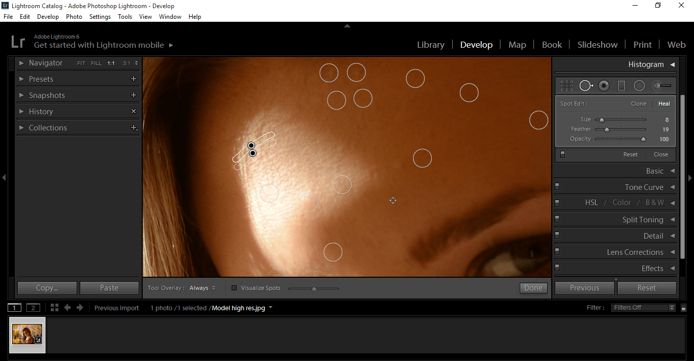
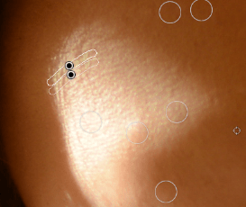
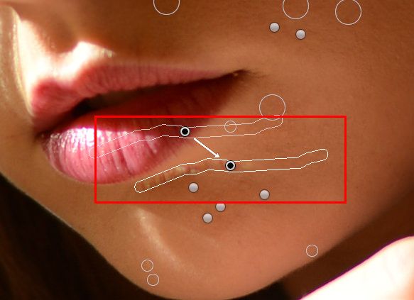
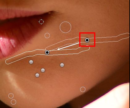
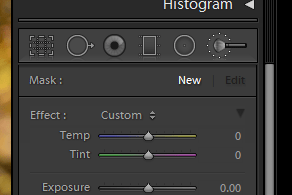
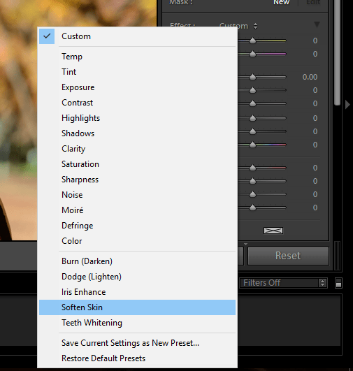
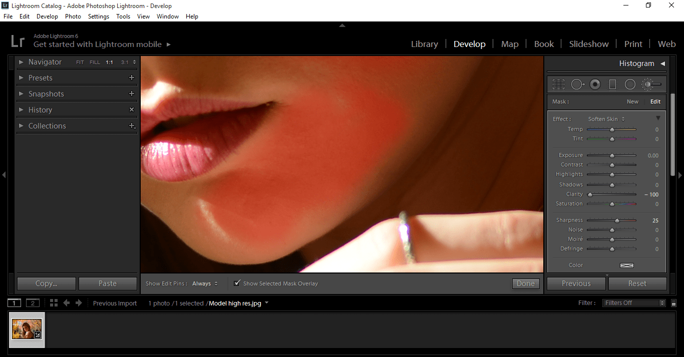
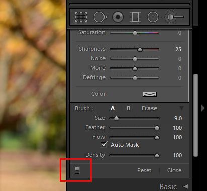
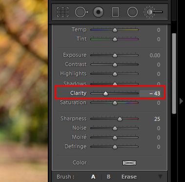
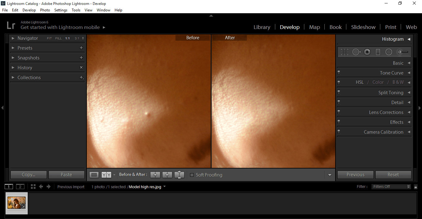
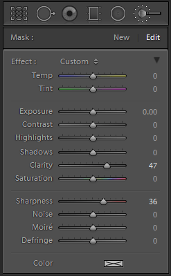
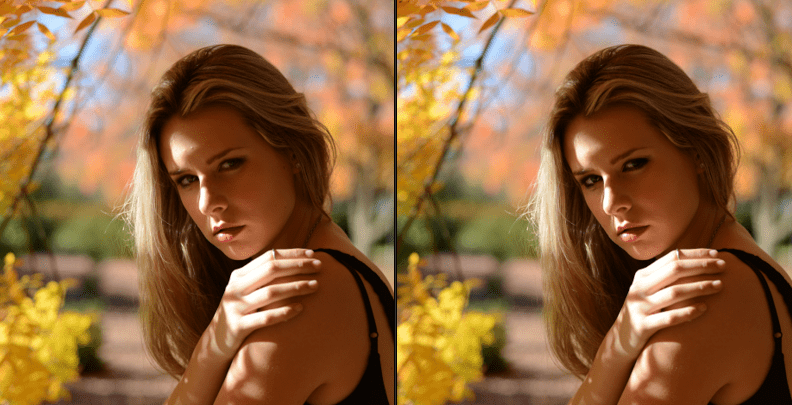
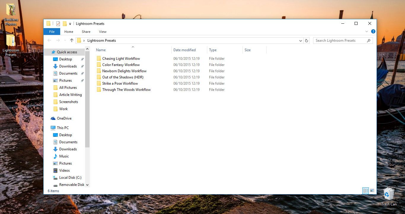
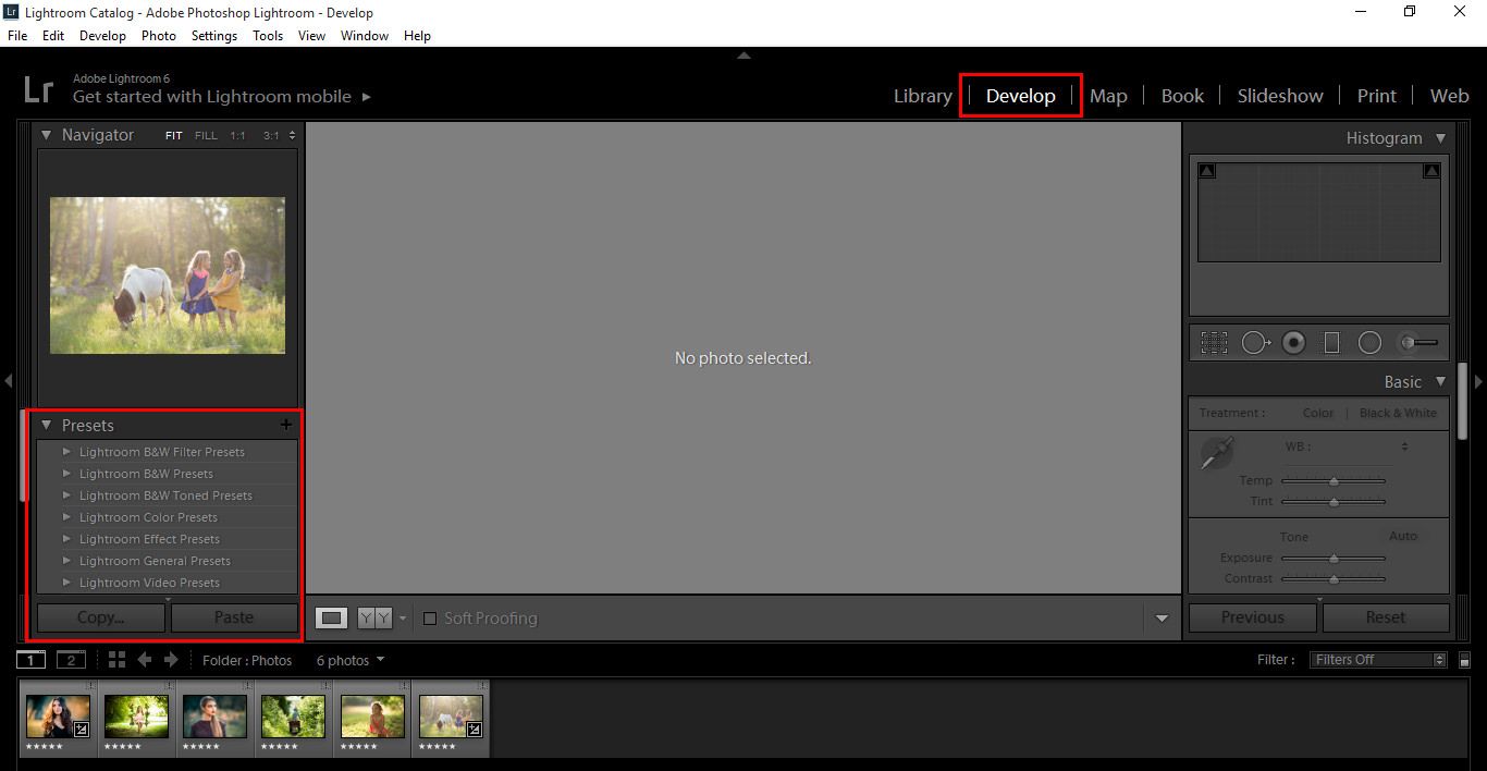
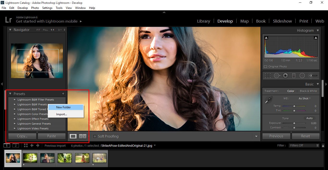
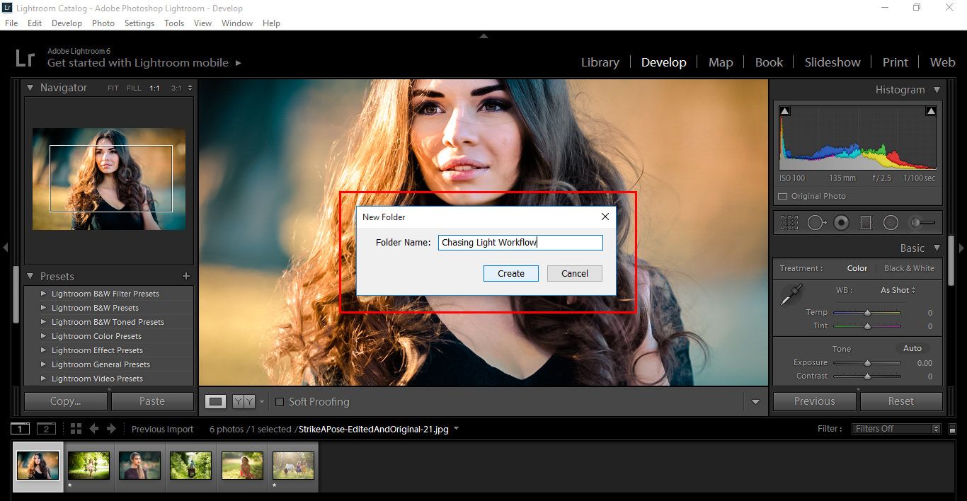
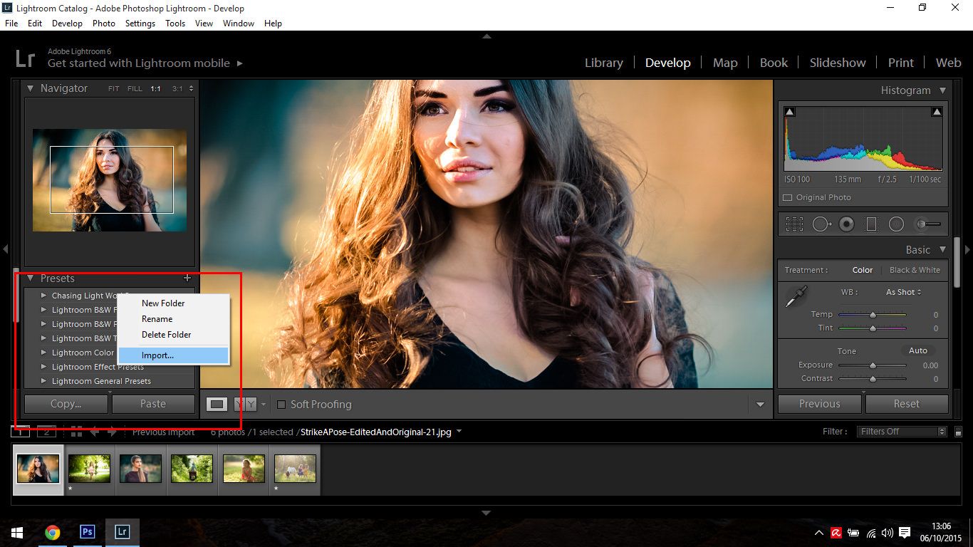
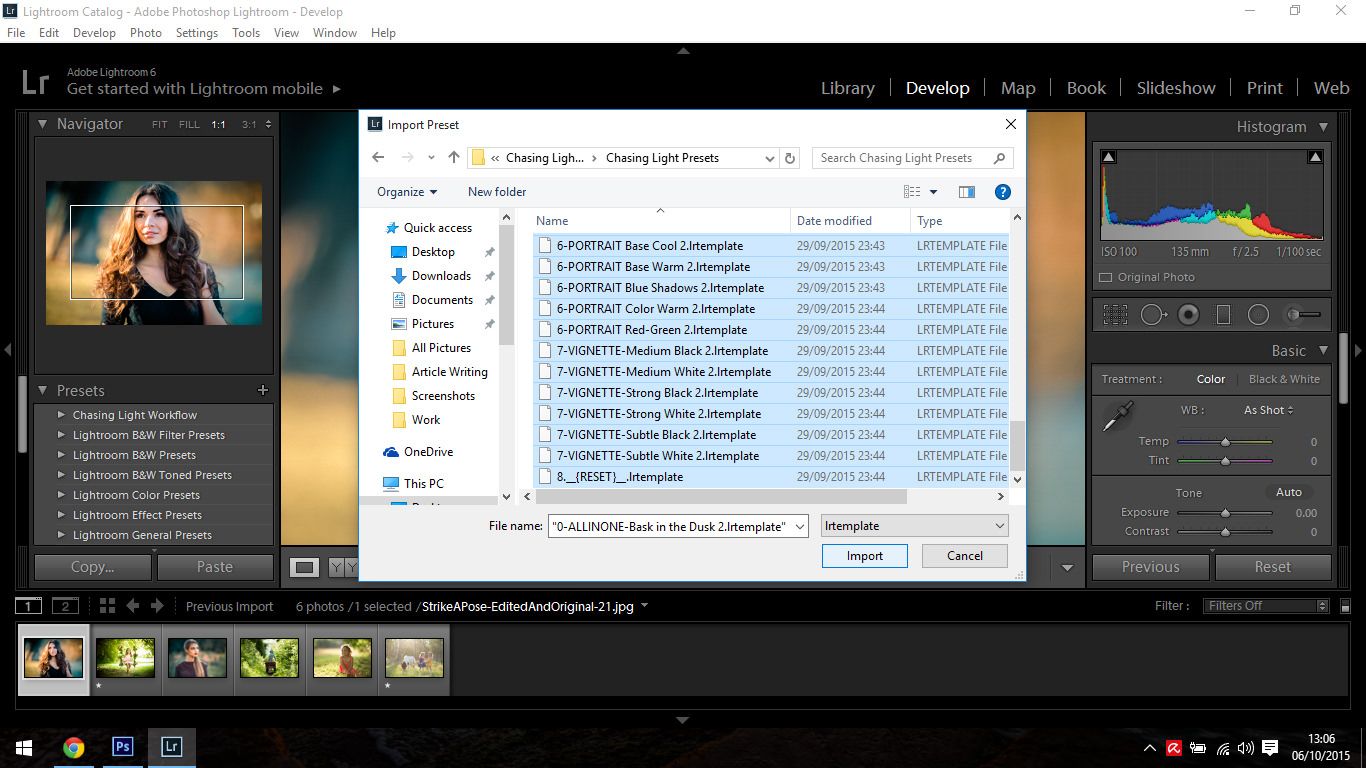
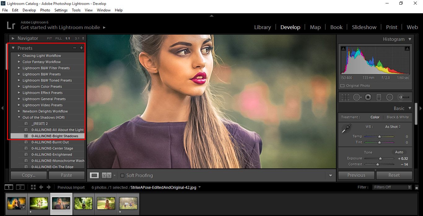
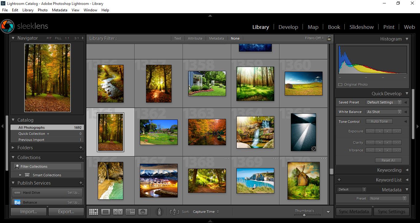
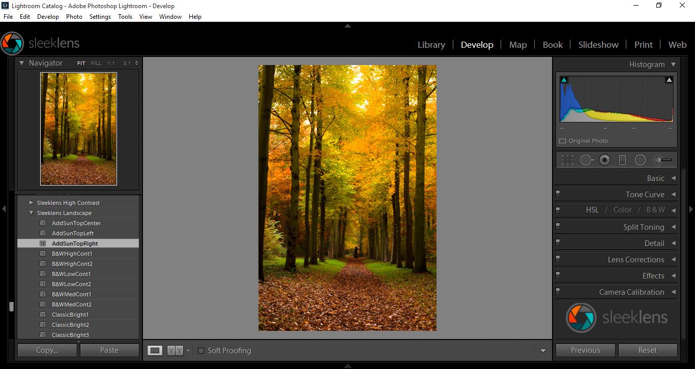
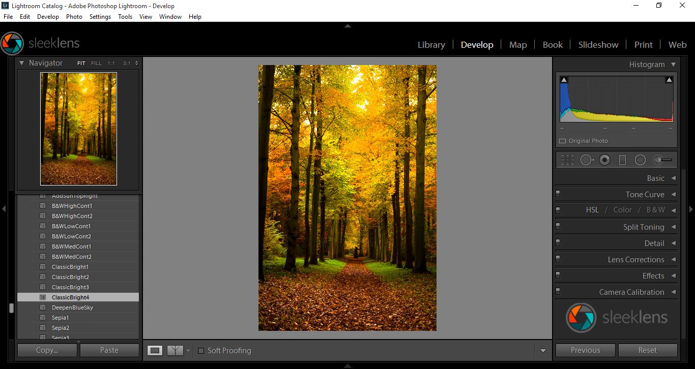
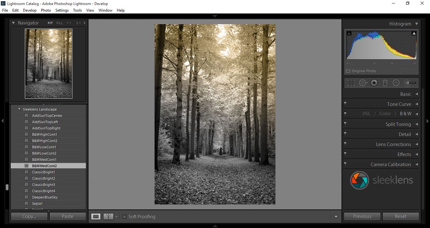
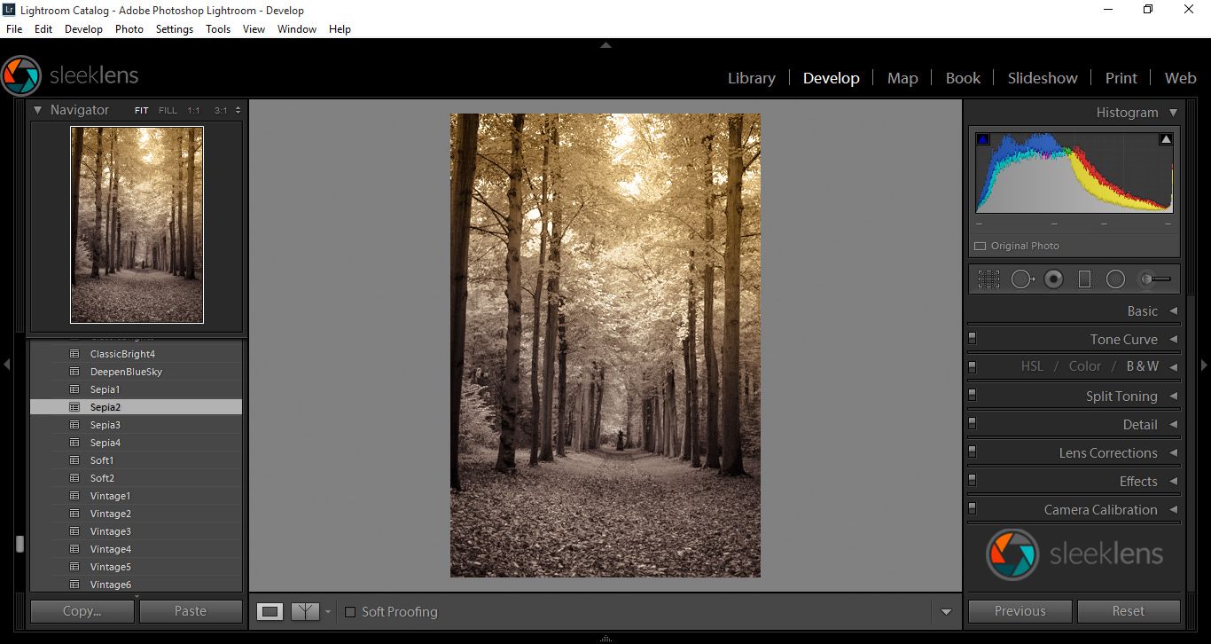
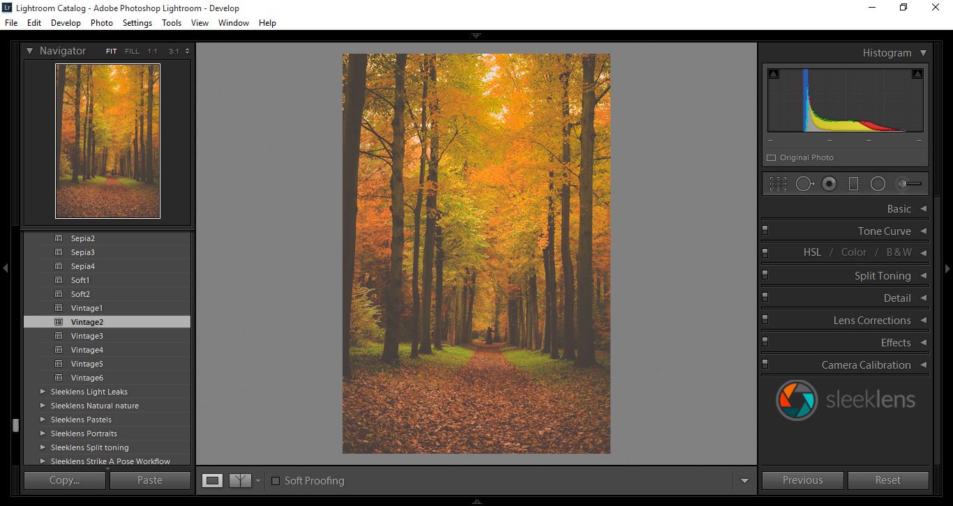
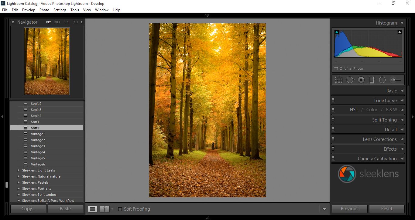
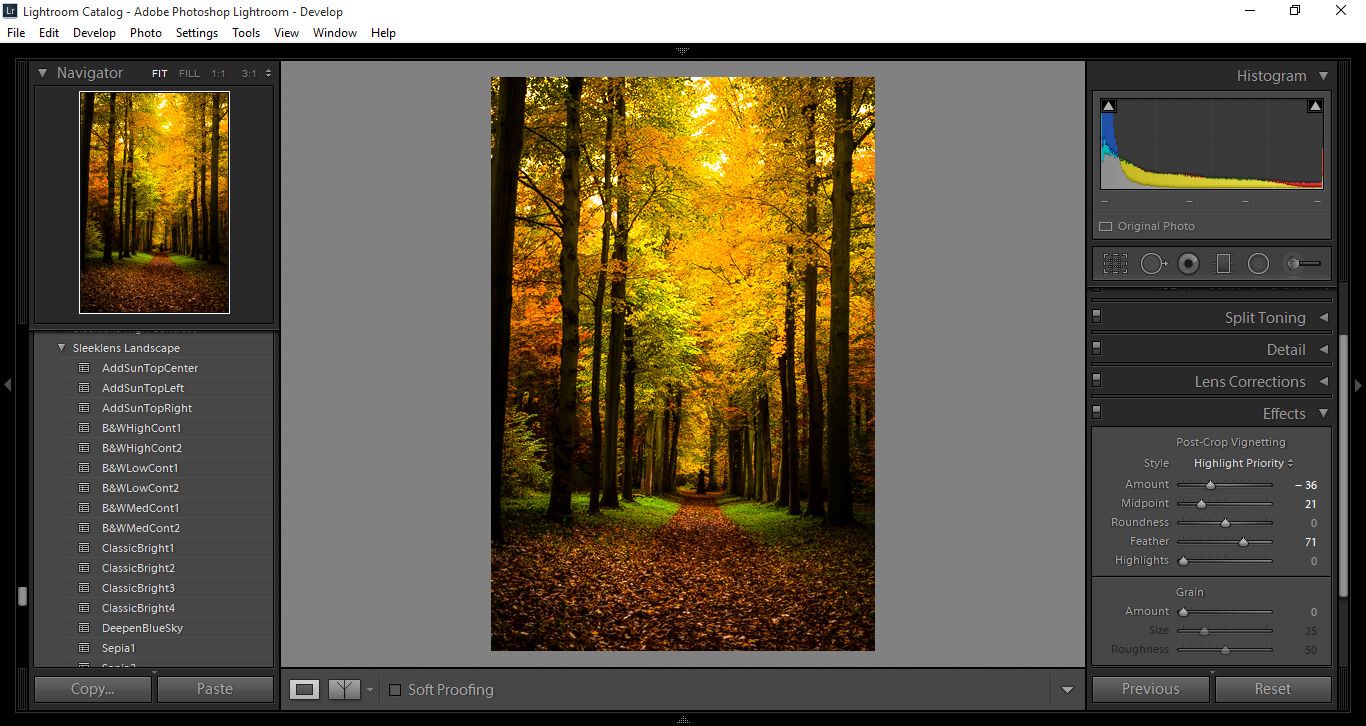


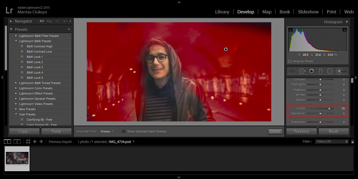
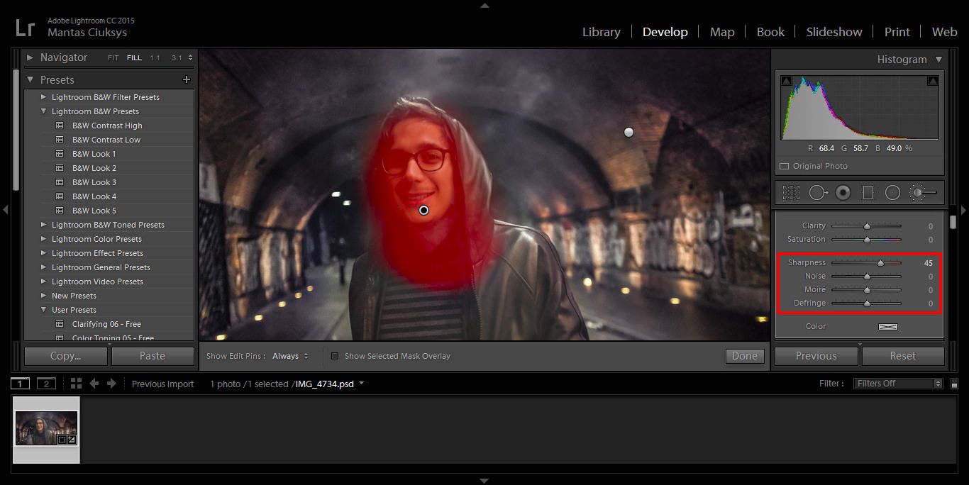
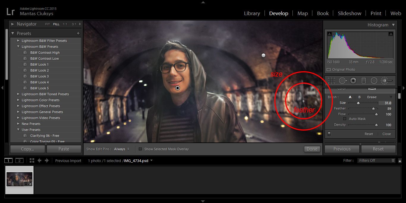
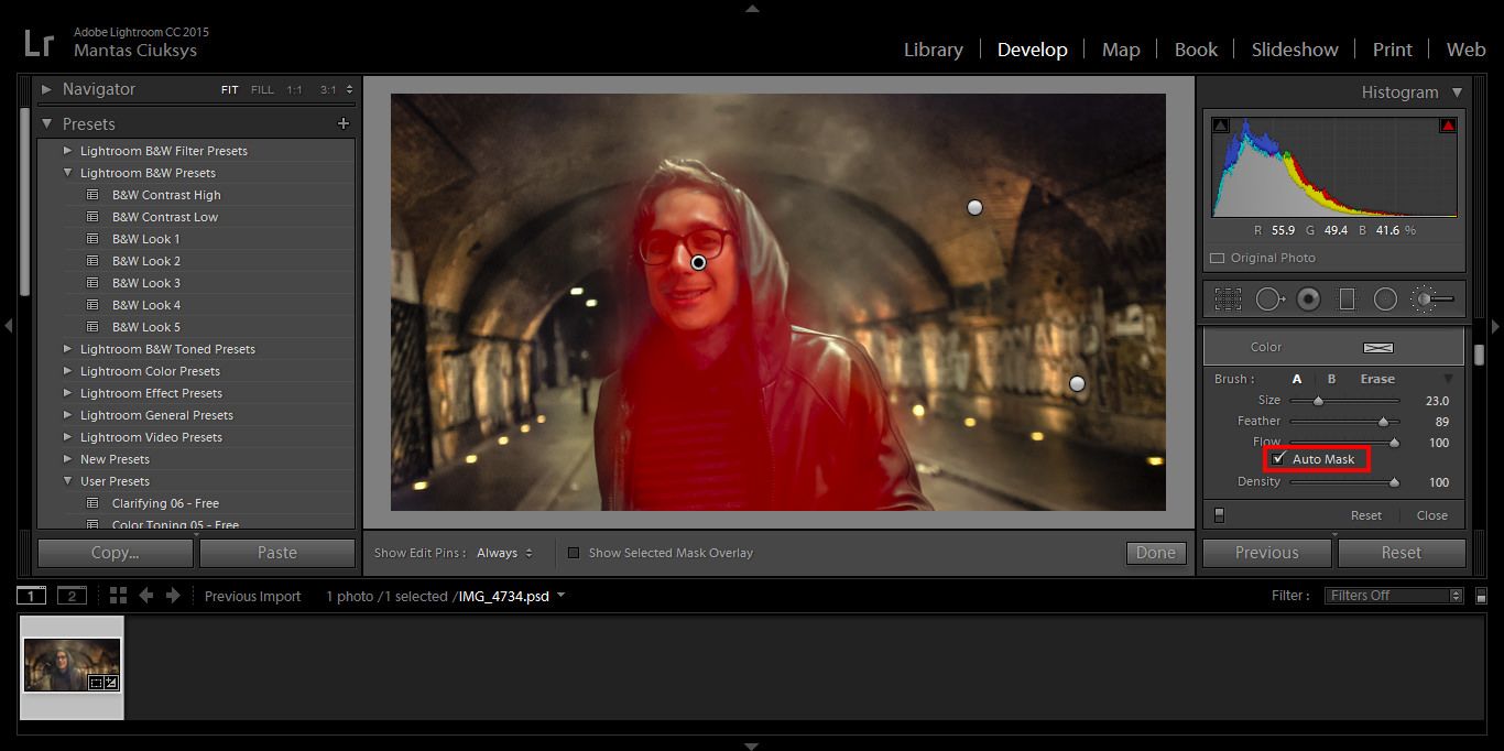
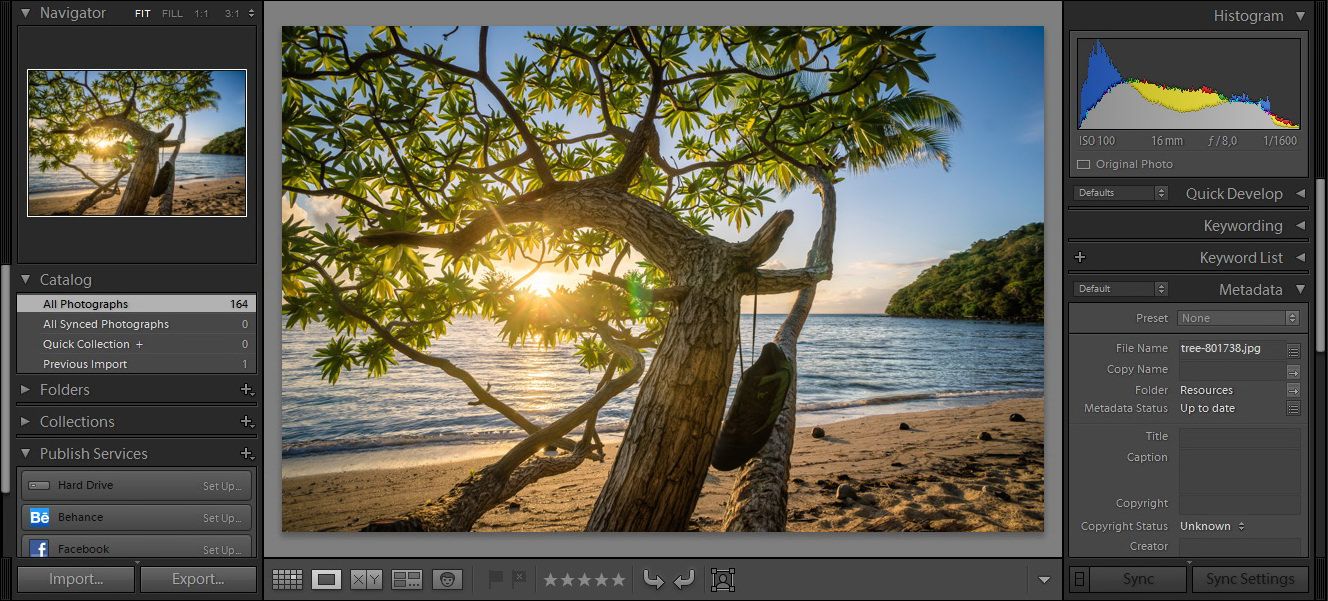
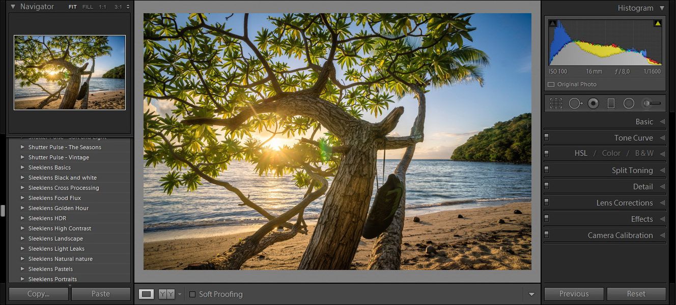


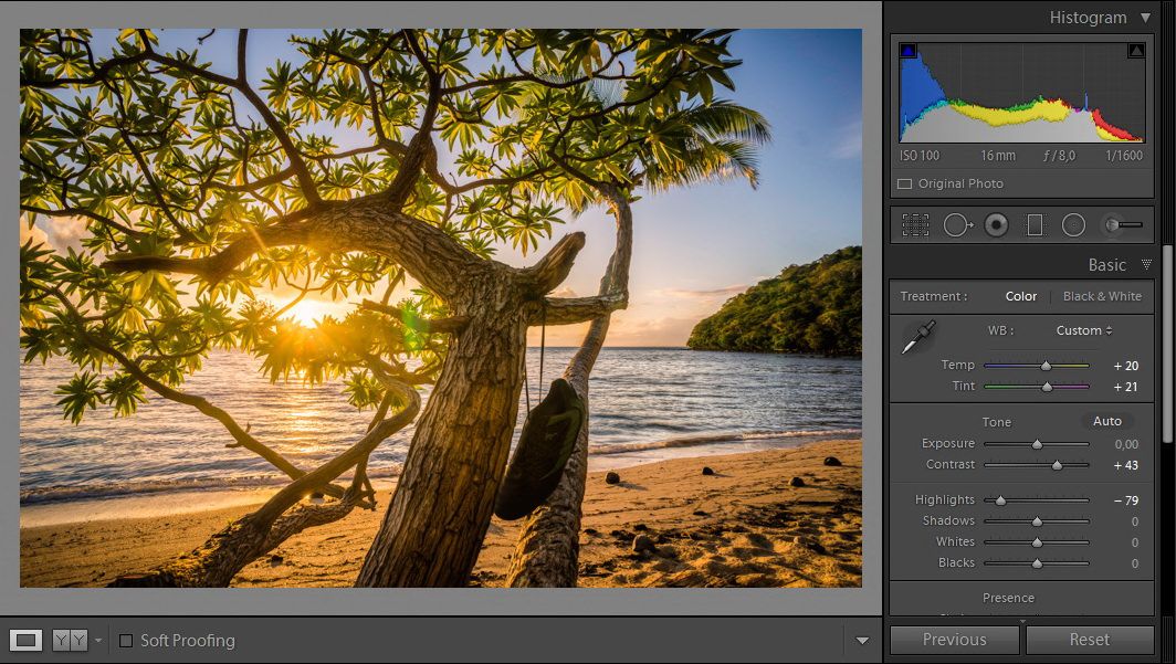
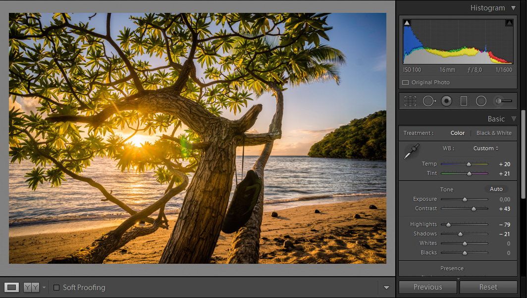
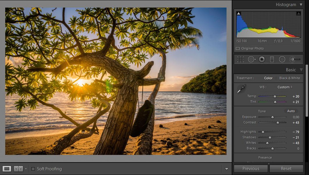
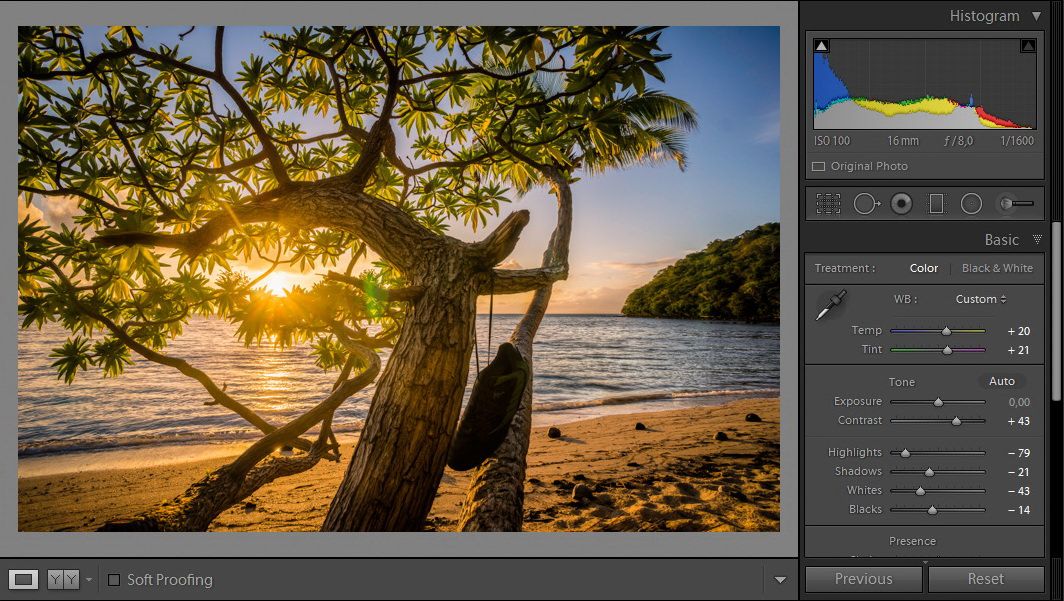
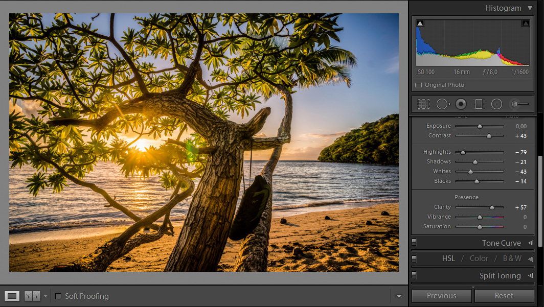

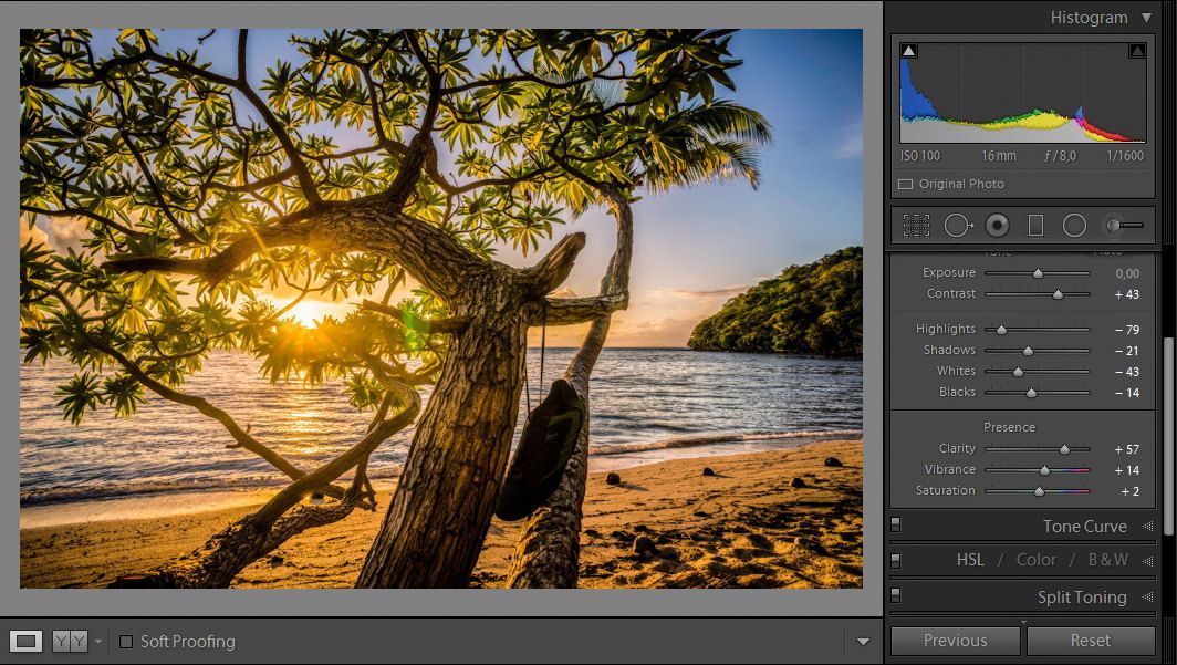
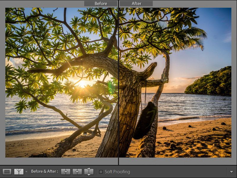
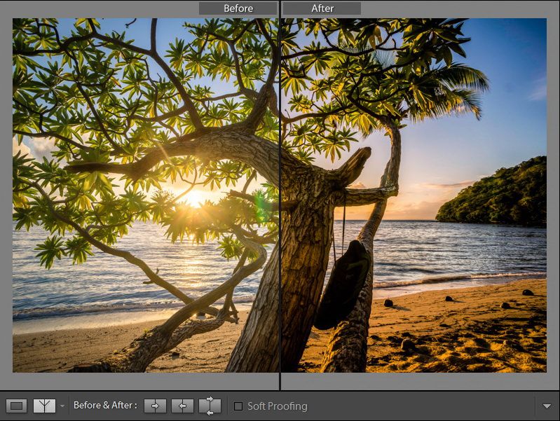
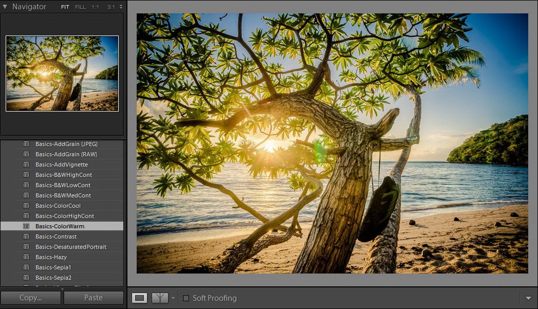
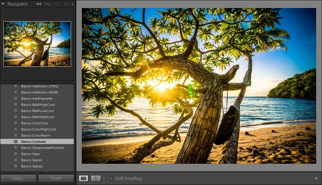
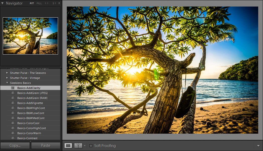
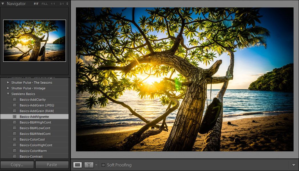
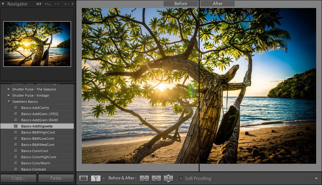

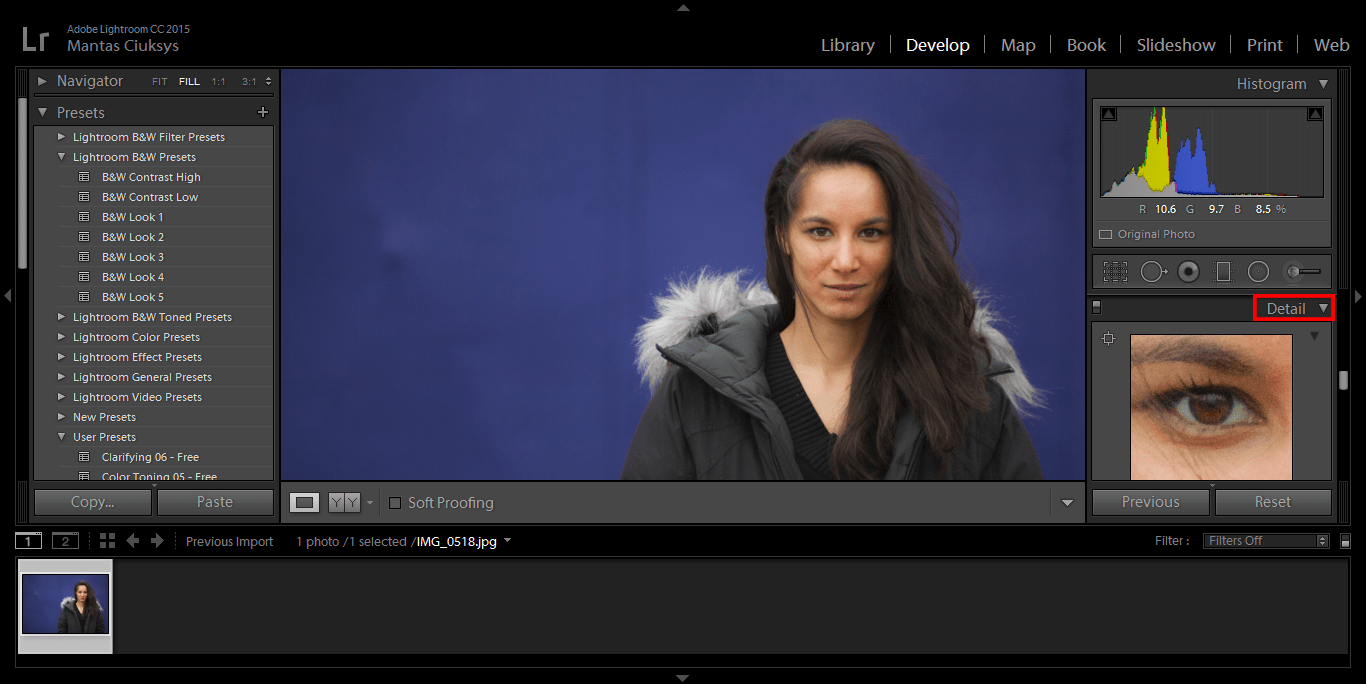
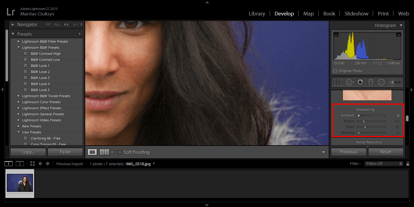
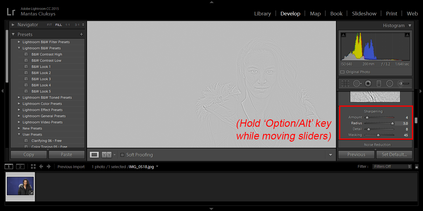
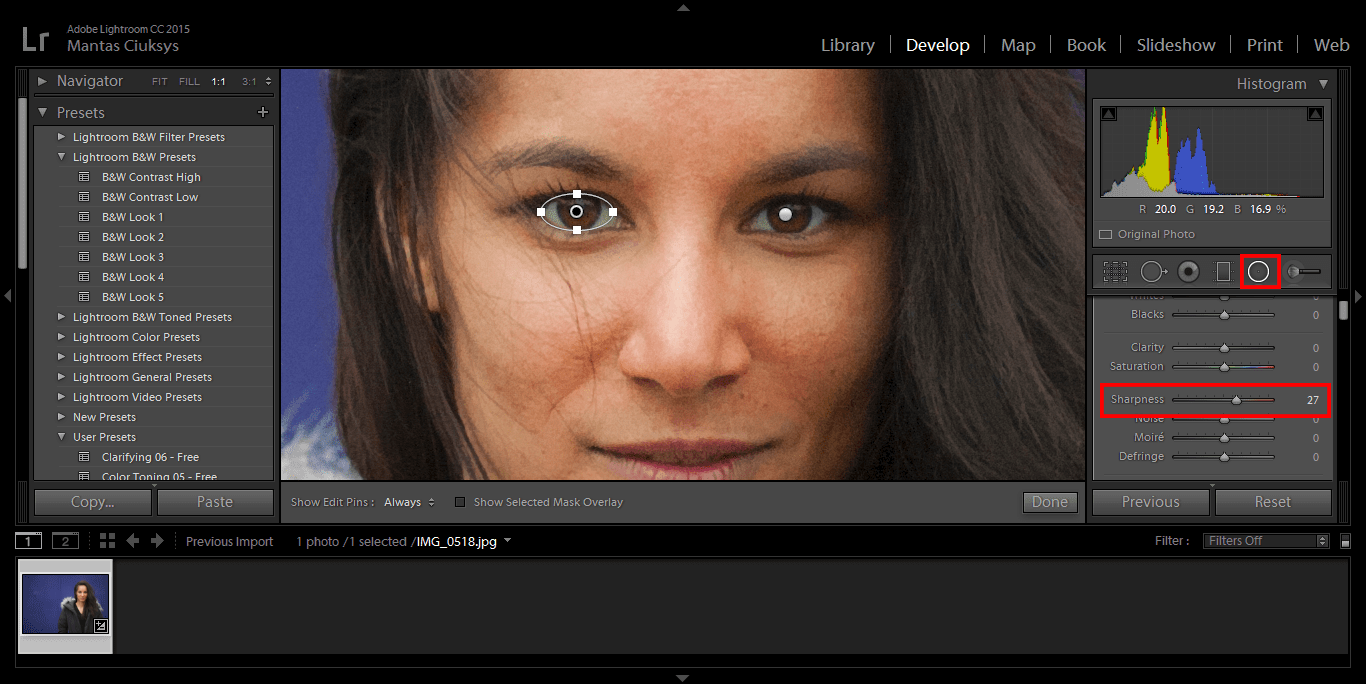
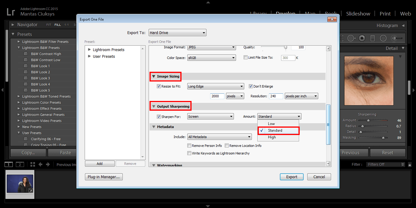
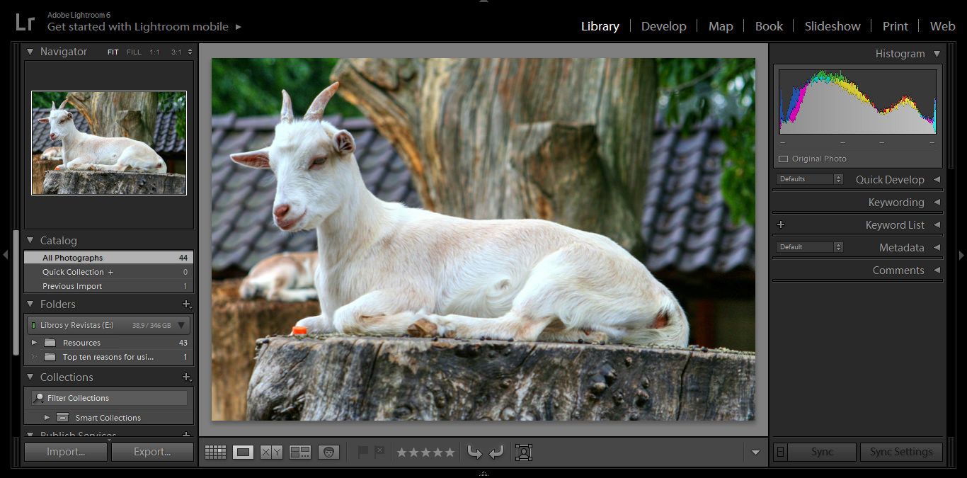
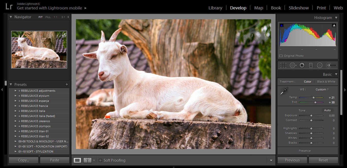
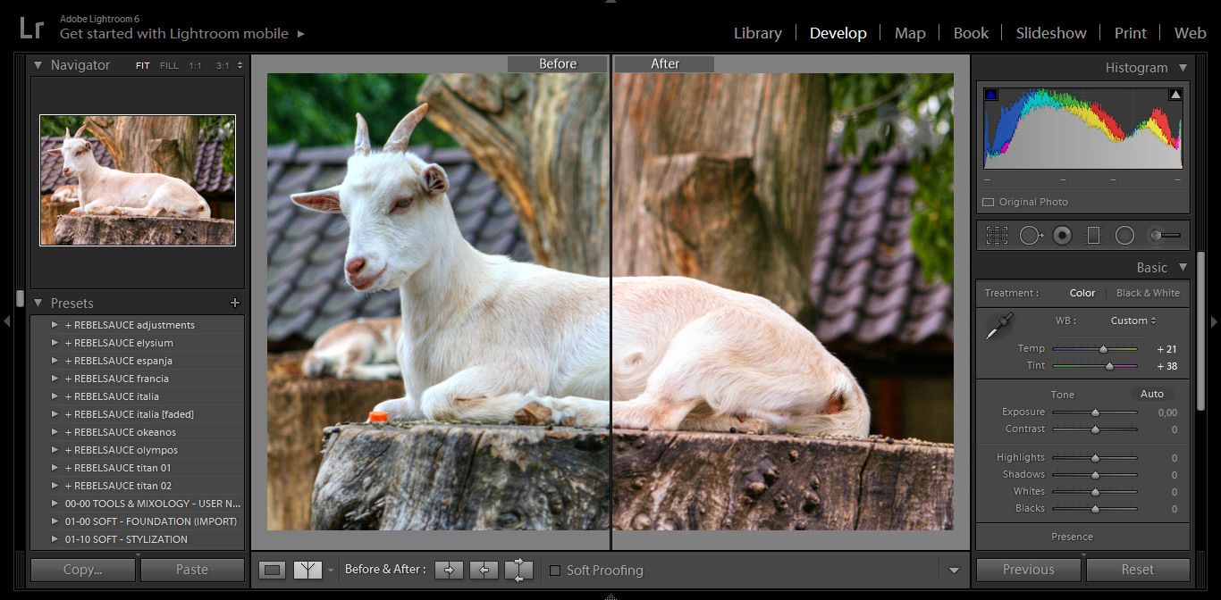
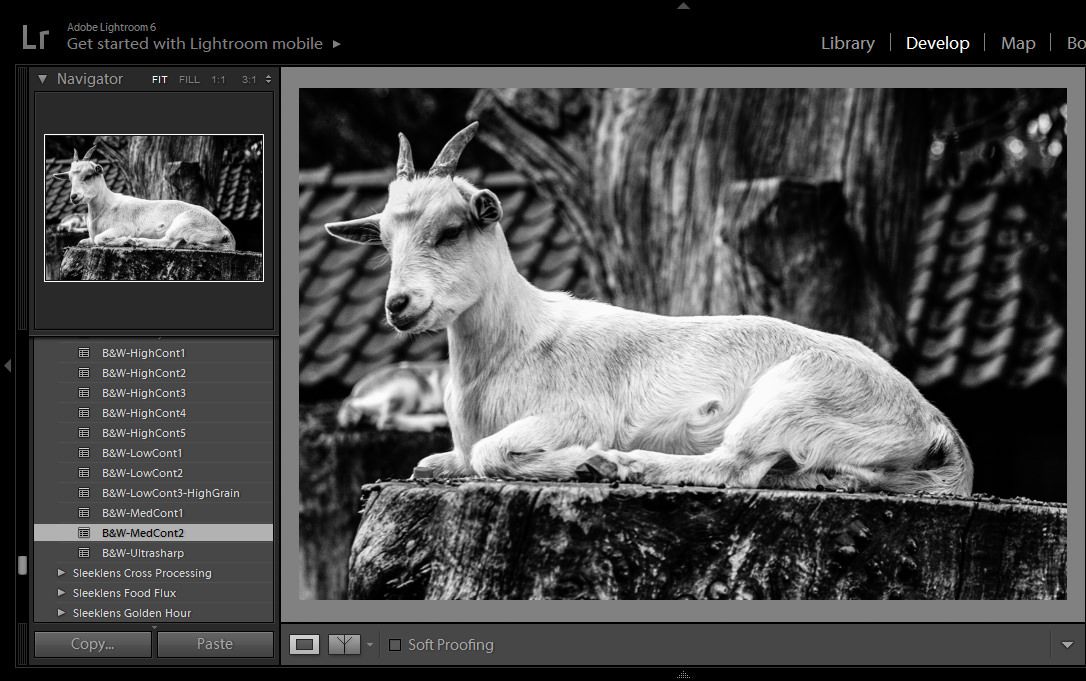
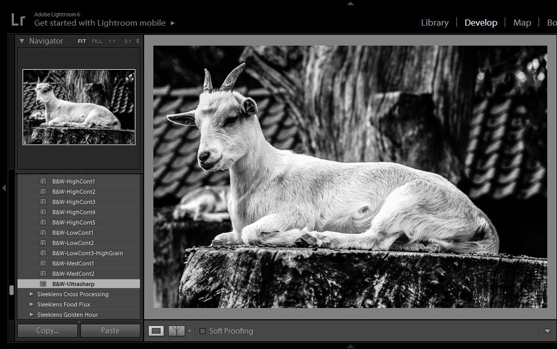
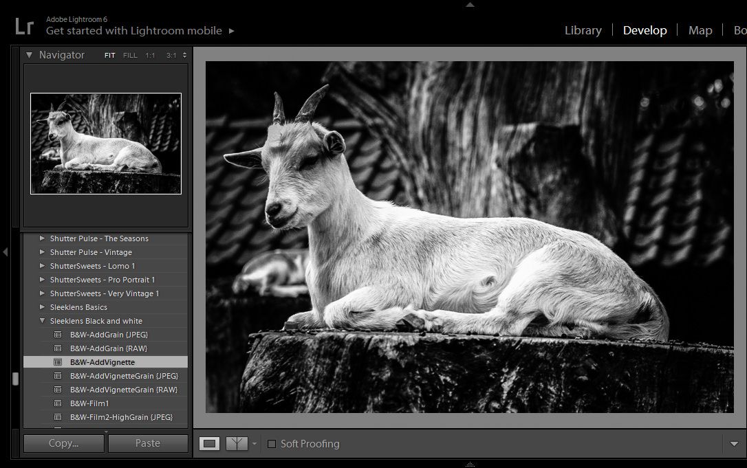
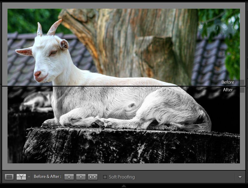

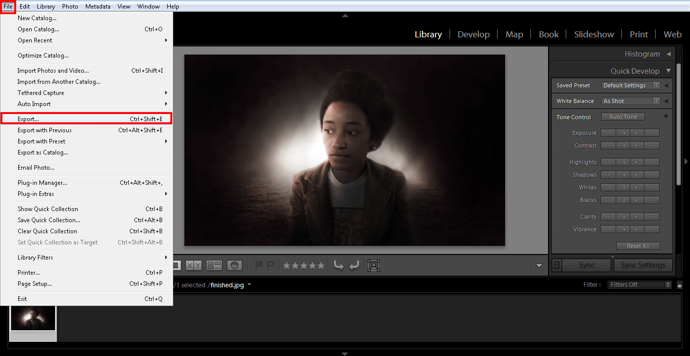
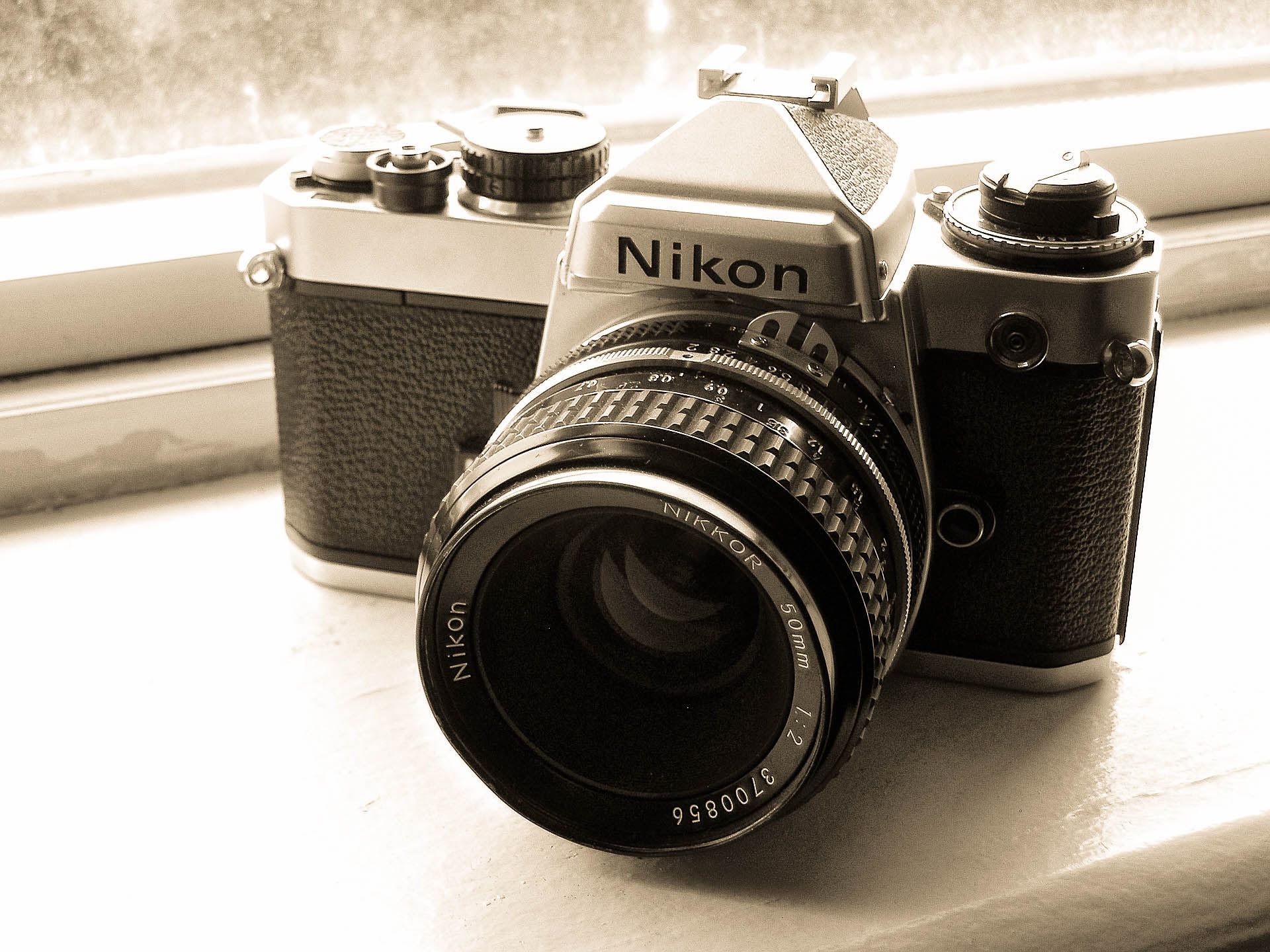
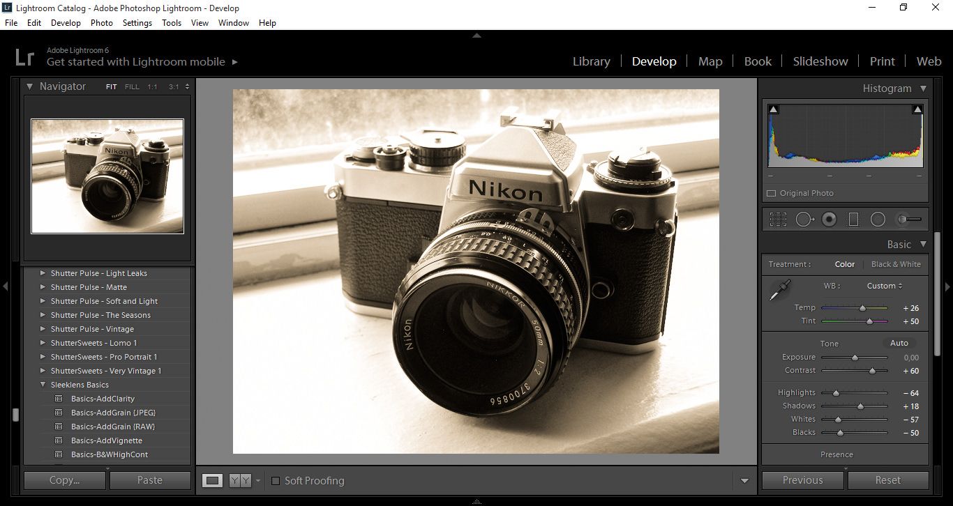
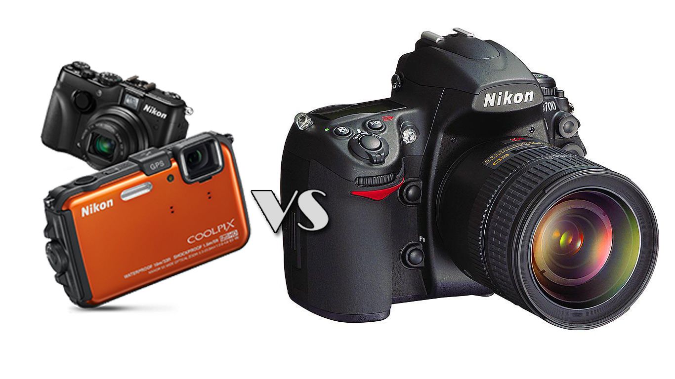
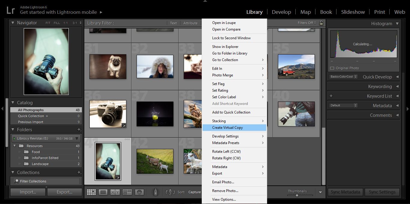
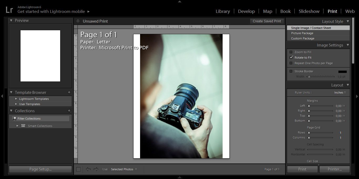
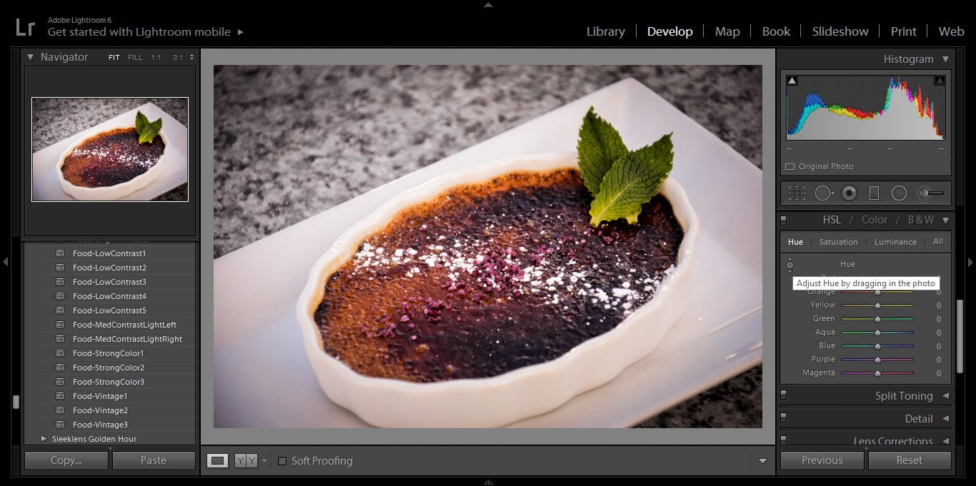

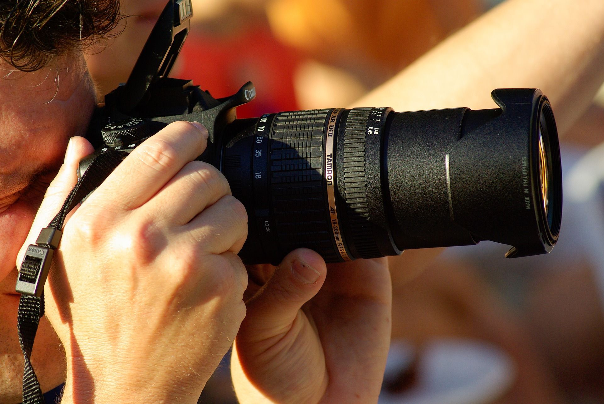

 Facebook
 Google +
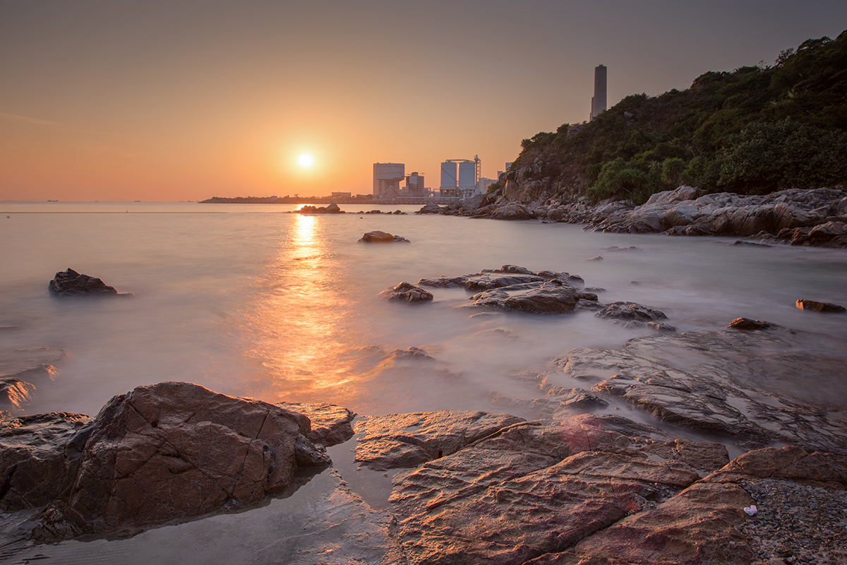