Tag: color

How to adjust the color temperature of your photos directly in your camera

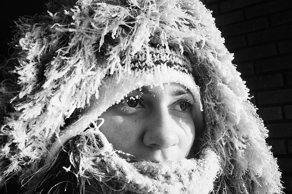
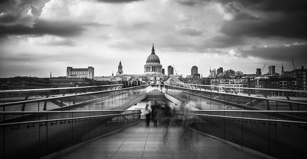
Have you ever taken photos and realized that the colors are not as you saw them in the scene? Don’t worry because this is common in photography. This effect is caused by the difference in the light sources. The sun on a bright day, on a cloudy day, a light bulb… different light sources emit light with different hues and this makes them have different color cast. Our brains “corrects” the color cast, but our cameras don’t do it unless we tell them. Have you ever heard about white balance (WB)? This is what will help you to avoid color casts in your photos due to the light source.  Color and WB might be a bit confusing at first, but once you understand, it gets easy and fun to play with them. Let’s start with color!

How to adjust the color temperature of your photos directly in your camera
The same scene with different color temperature has a totally different effect on the viewer. The upper photo has a slightly yellow cast that makes it seem warm. The lower one has a blue cast that makes it have a cooler feeling to it.

A bit of color science: The connection between color and temperature:

I am not going to get into a huge scientific explanation, but I think it helps to know the story of William Thomson in order to understand where some color concepts are coming from. William Thomson was also known as Baron Kelvin the 1st (1824-1907). He was a mathematical physicist and engineer. He was the responsible for formulating the Kelvin scale which measures absolute temperatures (for that reason temperature is measured in Kelvin units!).

How to adjust the color temperature of your photos directly in your camera
This photo has a color temperature of 5500 Kelvin. This temperature corresponds to daylight and it is usually considered neutral (at this temperature, whites look actually white).

In his experiments, Kelvin noticed that, as it is being heated, carbon changes its color. Thus he saw that it is possible to align a scale of colors to the one of temperature. This is how the concept of color temperature was born.  At absolute zero (-273.15ºC, cold) the corresponding color is black. The visible spectrum of the scale runs between 1700K and 12000K. Ironically, the colors are organized on the kelvin scale in reverse from what we consider as “warm colors” and “cold colors”; “warmer” colors like red orange or yellow have lower temperatures on the kelvin scale than “cooler” colors like blue or purple.

Color temperature and photography

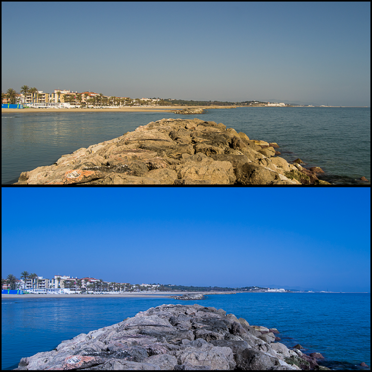
The color temperature of a photograph is the dominance of some colors over others. When the lighting is what we call “neutral” the whites will appear as white. However, when the scene has a light cast that goes towards the red (yellow, orange) or towards the blue than whites won’t look like white anymore, but reddish or bluish respectively. So depending on the light of a scene, its color temperature will vary. Let’s see it with some examples

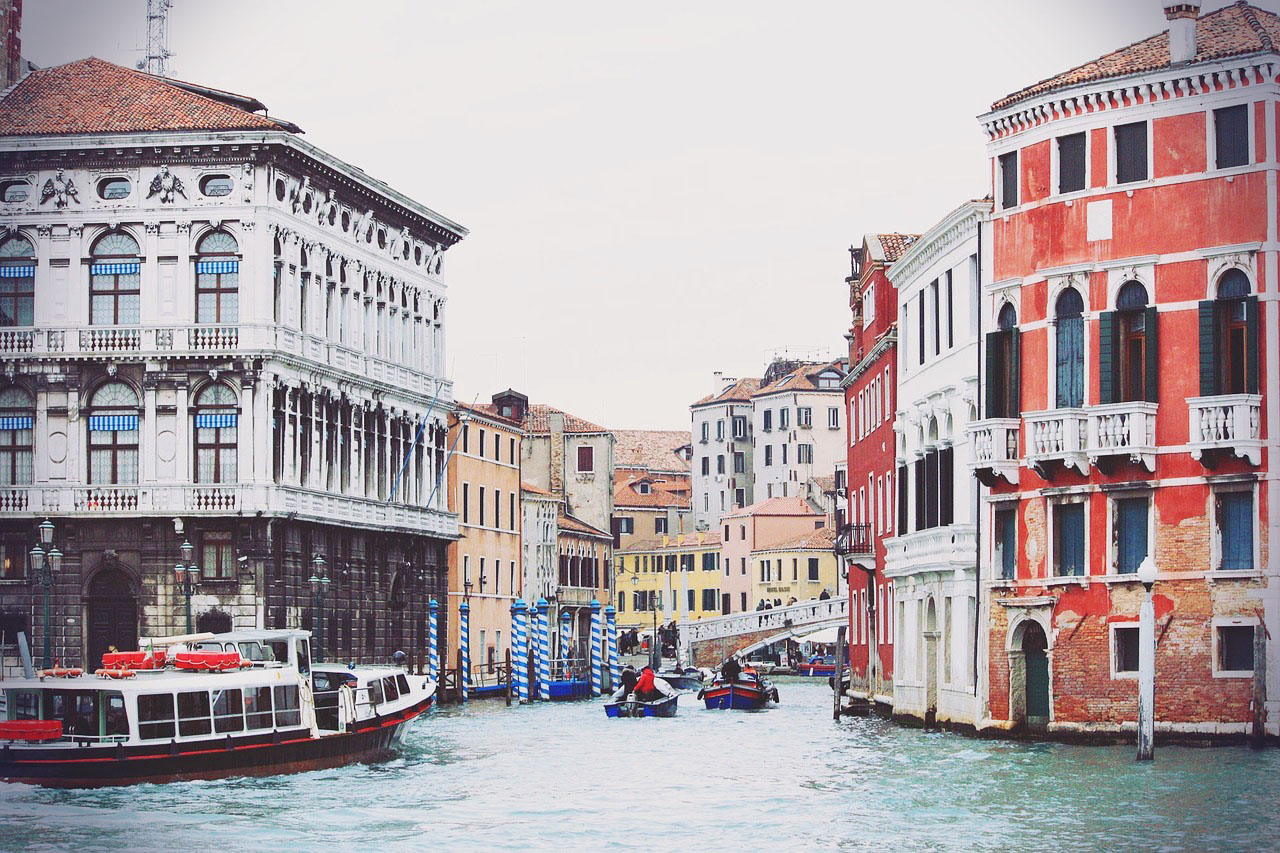
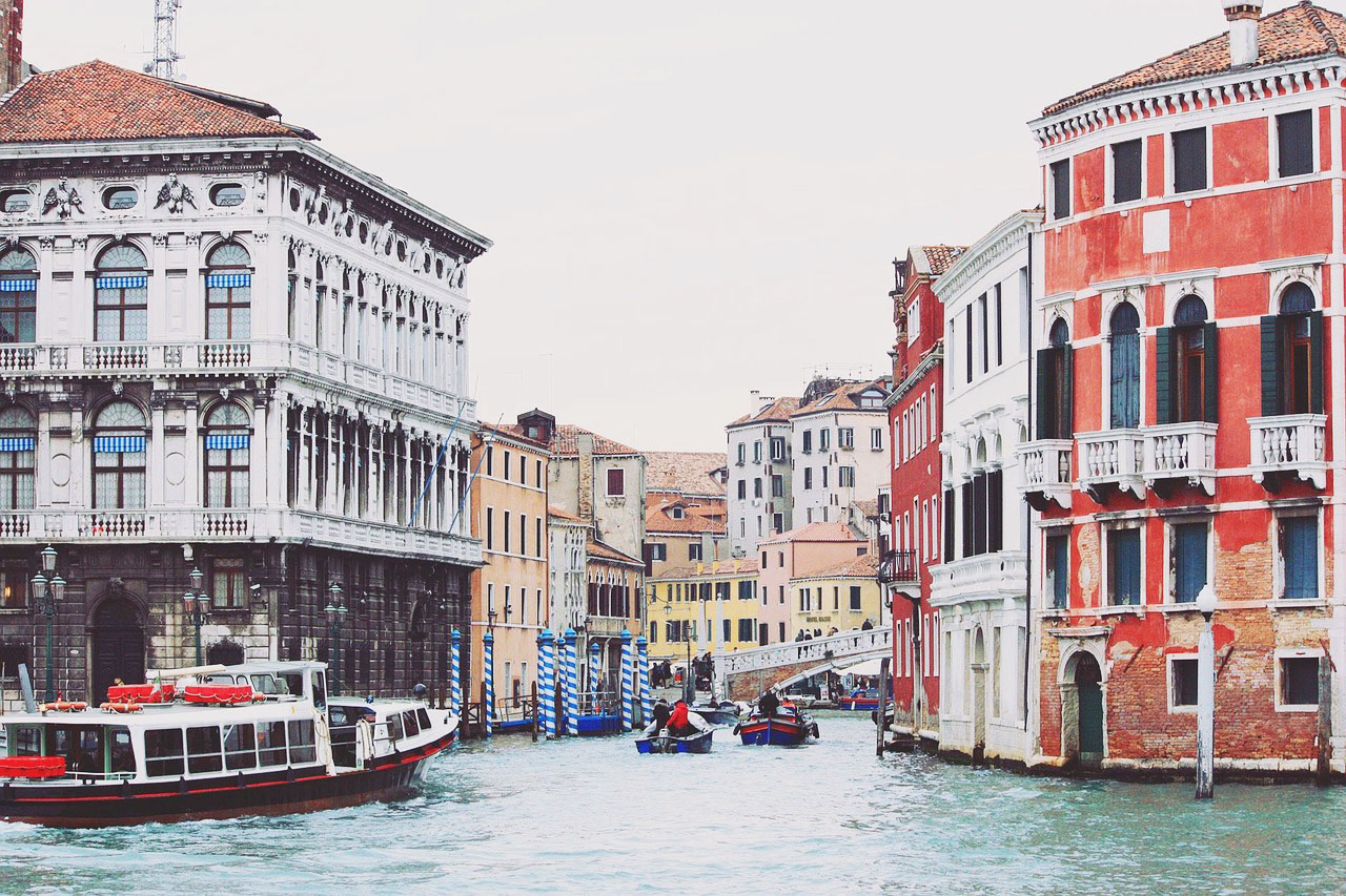
5500K: white or neutral. Correspond to the midday light

How to adjust the color temperature of your photos directly in your camera
This photo has 5500 K. As you can see, the white parts of the shell are white. When color temperature is different than 5500 K, whites turn yellowish or bluish.

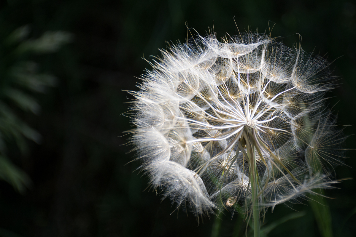
Less than 5500K: more yellow, red

How to adjust the color temperature of your photos directly in your camera
I modified the previous photo to show you the look it has when its temperature is lower than 5500K. As you can see, it takes a yellow cast. The whites are not totally white but cream-yellow.

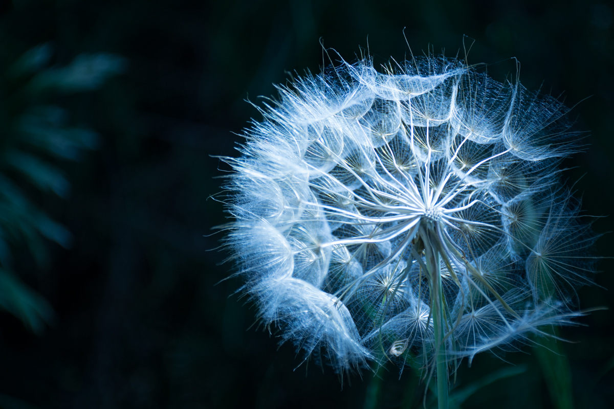
More than 5500K: towards the blues

How to adjust the color temperature of your photos directly in your camera
If the same photo would have had a temperature higher than 5500K, it would have a blue cast.

Some useful numbers that are good to keep in mind are:

1000K: candle light (they are towards the yellows)

2000K: sunset (yellows-reds)

2500K: light bulbs (they usually have a yellowish tint)

6000-8000K: cloudy day (they are towards the blue and gray colors)

So, in different situations, our light emits different color temperatures, which in turn give our photos different hues. This can be used to make beautiful photos. However, this also causes complications. As I said before, our human brains are able to detect and adjust the images we see with our eyes so we understand what is the true color of the object we see. Our cameras are not able to do it and unless we tell them what is the color temperature of the scene.

Fortunately, we have ways to correct the hues of our photos. We can do it in post-processing using Lightroom for example, but usually, I prefer doing it through the camera itself.

How to adjust the color temperature on the field: white balance

Most cameras (even point and shoot compact cameras) have an option to set the white balance, using this option you are telling the camera what type of lighting you are in. Here I will talk in general, but take a look at the manual of your camera to check specifications.

Auto white balance: This is the easiest way and it actually works in most of the cases. I am not the biggest fan of auto modes (I even shoot most of my photos in Manual mode!!), but I had to admit that Auto White Balance does a decent job. You just need to set your camera on Auto WB and it will make the best adjustment according to the measurements it does when the photo is taken. However, in some cases, the AutoWB is not working well (it usually happens more with artificial lights) and then you need to use other settings.

Semi-automatic white balance: In the more basic cameras, you can choose between a few preset defaults. The most common are Cloudy, shade, tungsten, fluorescent and flash. Each one of these presets try to compensate the light temperature in each situation and bring the hues closer to neutral lighting. Let’s see it with some examples:

Photos from cloudy days are usually looking quite gray. The Cloud setting will warm them up already in your camera. The shade preset is doing something similar, but adding a bit more of yellow than the Cloudy preset.

Color temperature
Cloudy days are usually quite cold in their color temperature because they have a lot of blue and gray in them


Color temperature
The Cloudy preset is adding a bit of warmth to the scene by increasing the yellows in the image

For indoors and night photography, fluorescent and tungsten can be really handy. Fluorescent lights are quite cold, so using their preset will warm the image. On the other hand, tungsten lights are usually warm, so their presets will cool down the image.

Color temperature
I took this photo indoors, under a tungsten light. You can see the photo has a yellow cast


Color temperature
The tungsten preset corrects the yellow color cast by adding blue to the image

When you are using a flash, your photos might look a bit cold. The Flash preset will also warm the image a little.

Presets change from camera to camera so have a look to your manual and get to know the presets of your camera and play with them in order to understand the effect they have on the image.

Tell the camera a value in Kelvin:  In the more advanced cameras in addition to the auto WB and the semiautomatic presets,  you can also define the light balance yourself by telling the camera the Kelvin value of the light of the scene.

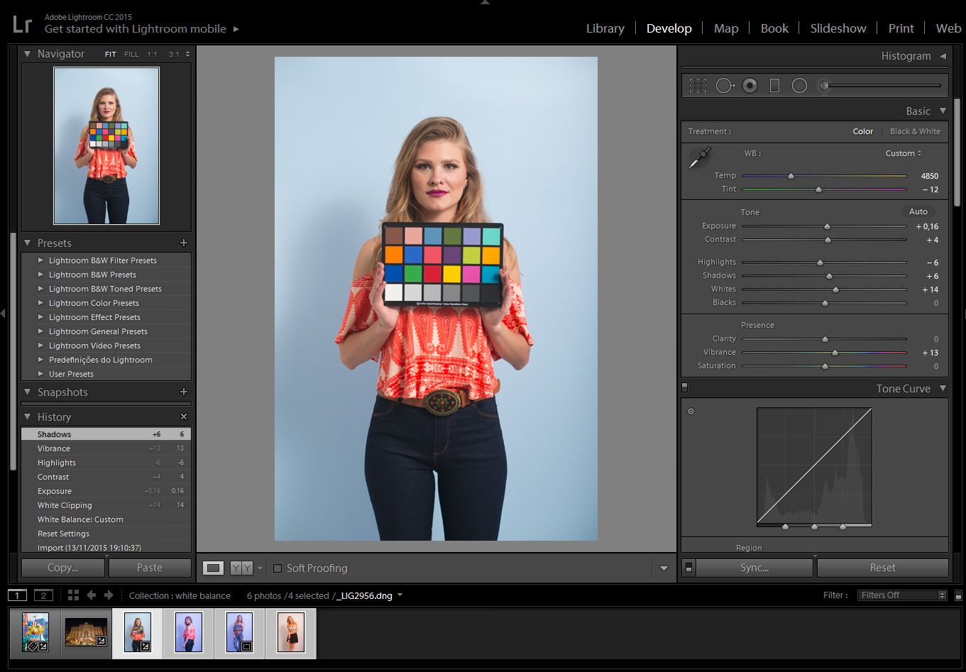
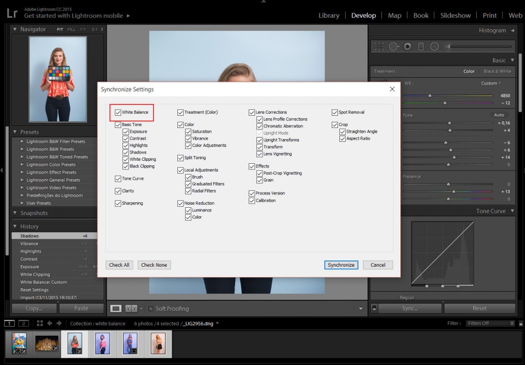
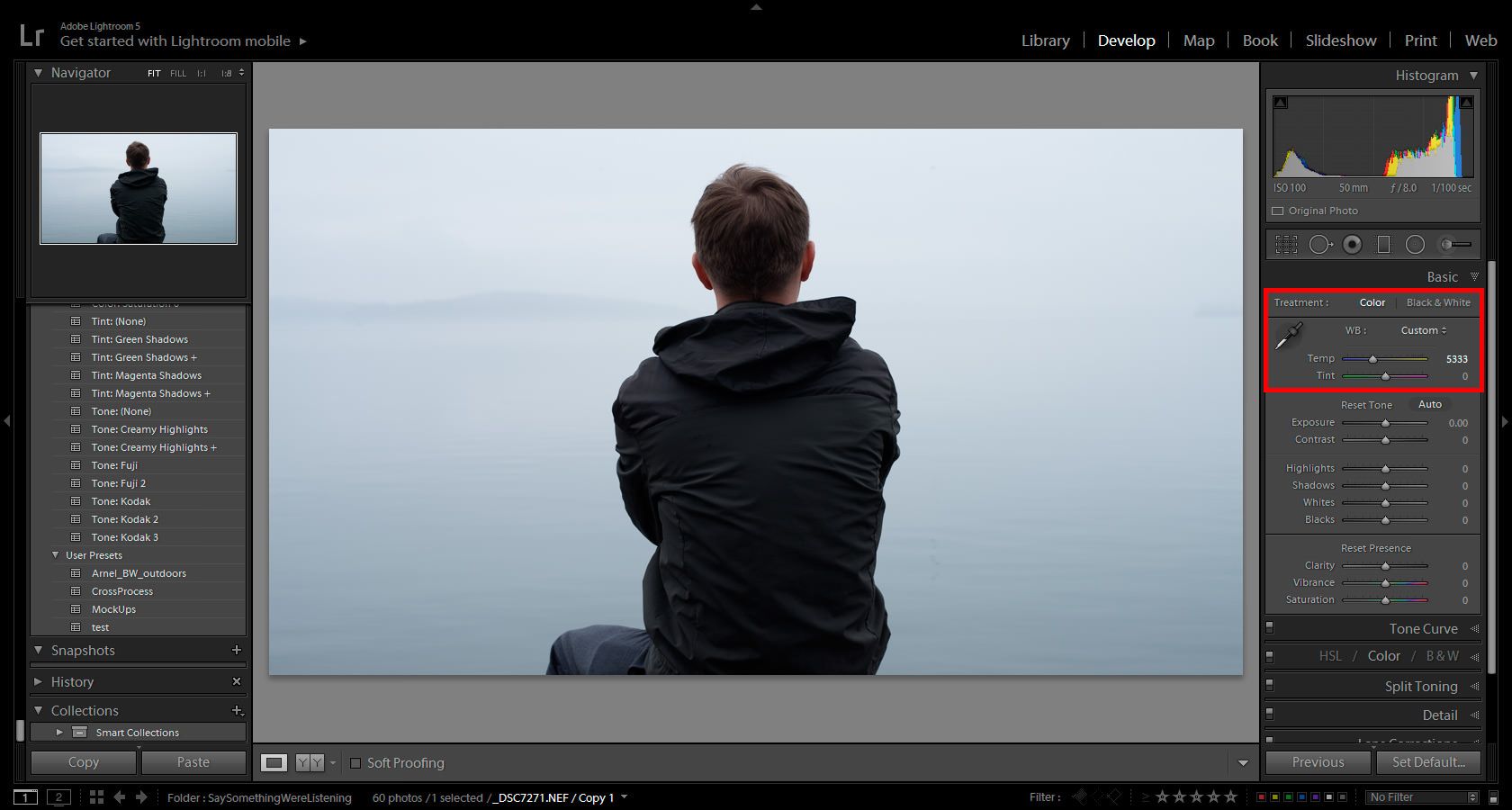
If you took a photo with a color cast you don’t like, don’t worry! You can change it on your computer! However, I highly recommend you to have the files in RAW format and not jpg. Although it is possible to modify color temperature in jpg format, the loss of quality will be so high that it won’t be worth it. With RAW, the process will be easy and your image will keep its quality.

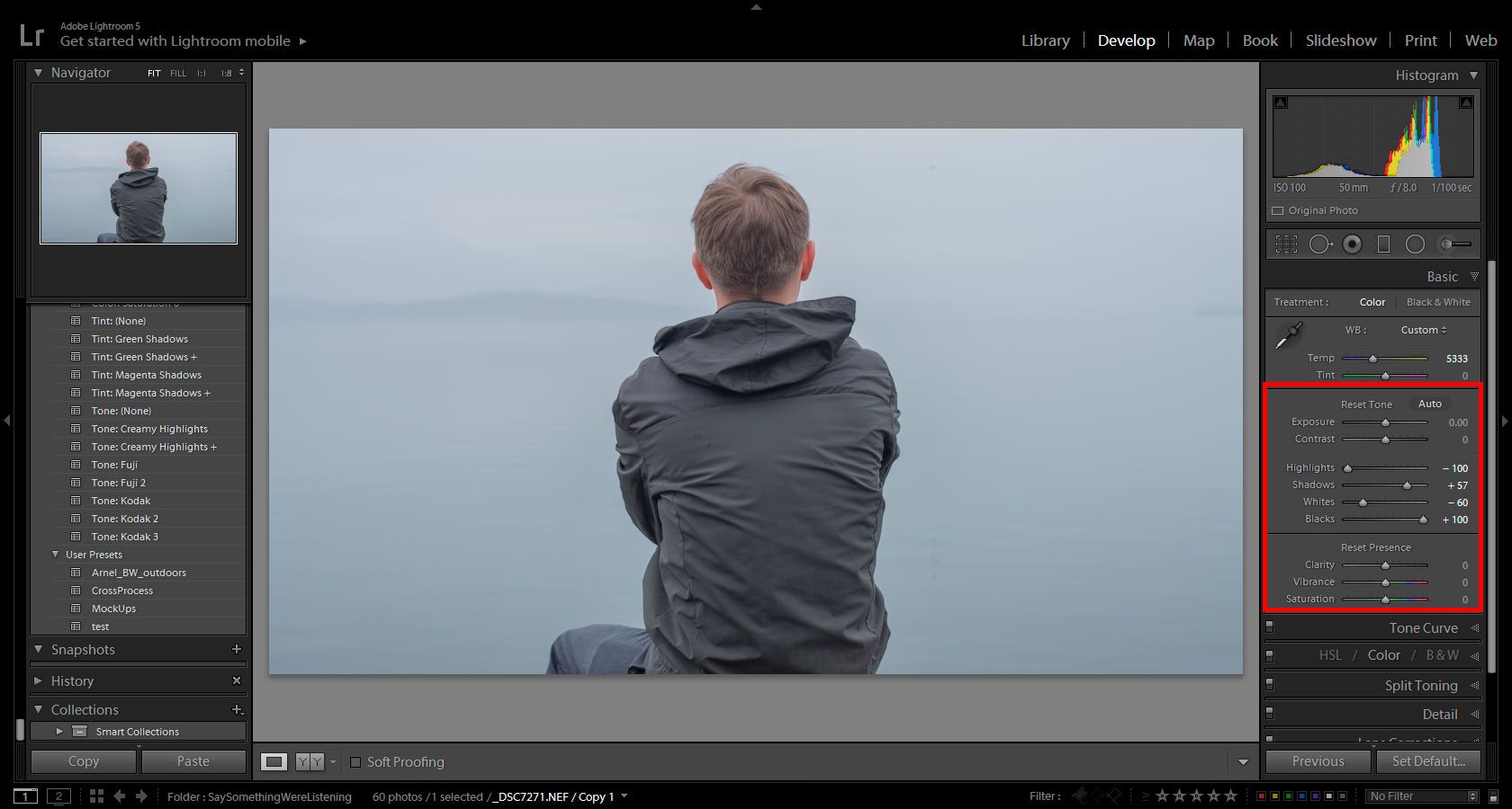
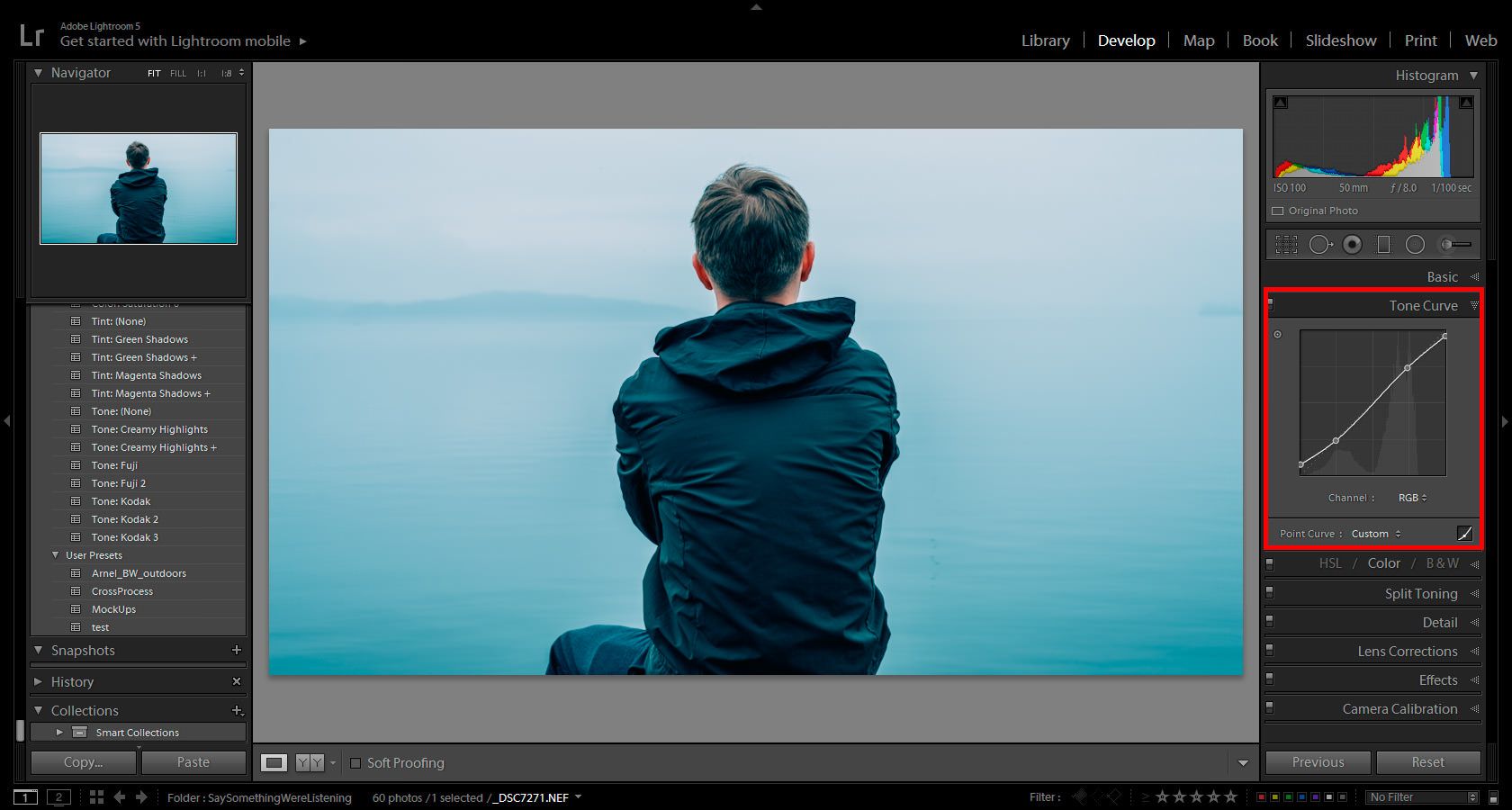
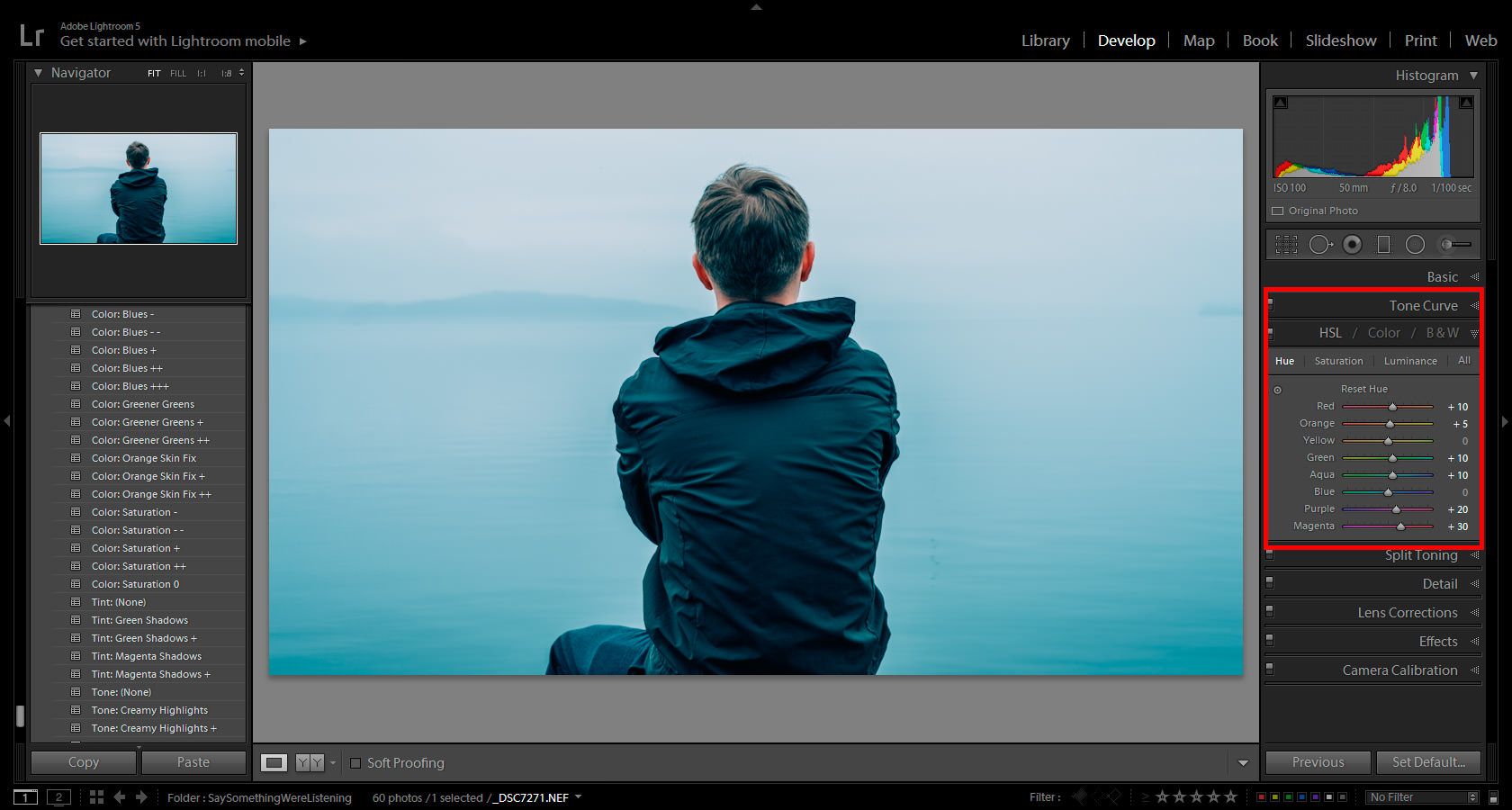
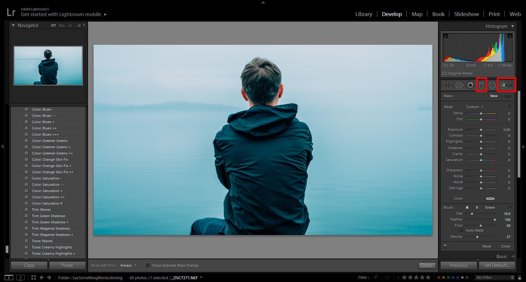
You can adjust color temperature in post-processing using different software. My colleagues wrote about how to do it in  Lightroom, Camera RAW, and Photoshop.

Use color temperature creatively

Now that you have an understanding of color temperature and white balance, you can use the color temperature in order to express what you want in your images. Do you want to give a sense of warmth to your image by adding a bit of yellow? Use the Cloud setting even if it is not cloudy and you will have a yellow cast in your photo! Do you want to add a bit of blues to add a sense of coldness? Try with the Tungsten preset! Experiment and have fun with WB!

Color temperature
I took this photo of a dandelion in the sunlight. It has a pretty neutral color temperature.
Color temperature
This is the same photo, but using the Tungsten preset. This preset added a blue cast to the photo that I find interesting. It might not be the “correct” white balance. I think that when you are being creative, there is not such a thing as “Correct”. If you think that a different WB can express better the way you saw the scene when you took the photo- go for it!!

Happy shooting!!!

Adobe Photoshop Adjustment Layers – Part II

In a previous post I went through the adjustment layers in Photoshop devoted to improving the contrast of your images. This included a couple of the most powerful tools in Photoshop like the ‘Levels’ and ‘Curves’ layers. In this post I will go through the second group of adjustment layers that are designed to make adjustments to the colors of your images. The image below shows the location of the adjustment layers within the user interface of Photoshop. Remember that you can access them as well through the ‘Layer’ menu.

layers3

Vibrance

So let’s start with the first layer of the group. This is the simplest way in Photoshop to change the color saturation of your images. Once you create the layer, two sliders will appear. One is called ‘Vibrance’ and the other one is called ‘Saturation’. The saturation slider simple changes the saturation of all the colors of the image according to the position where you set the slider. This means that, for instance, if you set the slider to the minimum position, you will get a black and white version of your image.

The vibrance slider, in turn, has a more selective effect. While it makes changes on all colors, some colors are less affected. The logic behind the algorithm is to minimize clipping when the sliders get to either extreme. This way you don’t get oversaturated or completely desaturated (black and white) images. In addition, it is designed to act on colors that are less saturated than the surrounding ones and pays special attention on avoiding saturation of skin tones.

The image below shows the result of setting the vibrance slider to its minimum.

layers9

Hue/Saturation

This adjustment layer allows you to adjust the hue, the saturation and the lightness of your image. It has a great advantage over the saturation control in the ‘Vibrance’ layer and it is that you can selectively adjust different colors by either selecting the color from a list of presets or by using the eyedropper tools provided.

Due to this capability, the ‘Hue/Saturation’ layer is ideal for selective coloring an image. With the color bar below the adjustment sliders you can manually select the range of colors that you want to be affected. The image below shows the selection made to turn all the image into black and white except for the greens.

layers10

By changing the lightness you can also turn any color in your image into black or white, making it possible to create some interesting effects, so play around!

Color Balance

The next layer is intended to change the color balance of your photos. Once you create the layer, three sliders will appear. With each slider you can adjust one of the primary colors. This means that, in theory, you have complete freedom to adjust any color within your image. However, working with the sliders is not very intuitive so it is not always easy to make color adjustments with this layer.

One thing you can do is change the temperature of your image. If you want to make it look warmer, what you have to do is increase the slider for Cyan/Red color and decrease the one for Yellow/Blue by the same amount. If you want to make your image look cooler, do the opposite.

The image below shows the result of reducing the warmth of our image using this method.

layers11

Black & White

While the name of this layer is self-explanatory, by no means is its functionality limited to simply decreasing the saturation of all the colors to a minimum. Once you create the layer, you start at that point but after that, you can change how individual colors in the original image will look. For this purpose, there are six individual sliders for six different colors and what you can do with this sliders is modify the lightness of those specific colors.

For instance, if you take the green slider to the minimum, you will end up with a black and white image in which the greens look black and if you do the opposite, the greens will look white. This is particularly useful if you want to adjust the visual contrast of your image, something that is usually really important when dealing with black and white images.

In order to make your life easier, Photoshop also provides an ‘Auto’ button and some presets. With the ‘Auto’ button, Photoshop simply attempts to get an equalized histogram while the presets are intended to modify specific colors. There is also an eyedropper-like tool (symbolized with a hand and two arrows) with which you can select a specific region in your image and, by moving your mouse sideways, adjust the lightness of those specific colors.

Finally, a ‘Tint’ tick box is available. If you tick it, you will then be able to apply a tone to the whole image like sepia or any other color of your choice. The image below shows the result of applying a light sepia tone to our image using this method.

layers12

Photo Filter

This layer provides a much easier way of adjusting the color balance of your image. It basically simulates the effect of applying optical filters of different colors to your camera and provides both a number of presets (like warming, cooling or some specific color filters) and the possibility to select whatever color you like.

A ‘Density’ slider allows you to modify how strong the effect of the filter is in your final image. The image below shows the effect of applying a warming filter to our original image.

layers13

Channel Mixer

This layer provides a way of combining variations of the different color channels to either produce changes in color or black and white images. I would say that trying to make color adjustments with this layer is complicated to say the least, unless you are looking for some specific effect like getting a specific tint in your image. This arises from the way the algorithm behind works, which is increasing or decreasing the saturation of a given channel and adding it to the selected ‘Output Channel’.

However, if your intention is to convert your image to black and white, this layer can provide really nice results. If you tick the ‘Monochrome’ box, Photoshop will set the output channel to ‘Gray’ and then, by adjusting the color sliders, you will be able to change the contrast of the different color components of your original image.

The image below shows the result of converting our original image to black and white and making some adjustments to the color channels in order to get a high-contrast monochrome image.

layers14

Color Lookup

In contrast to other adjustment layers in this group, the color lookup is based on presets only. The word lookup here arises from something called lookup tables. A lookup table is simply a predefined mapping of a given parameter. In this specific case, that parameter is the colors of your original image.

Once you create the layer, three dropdown menus, namely ‘3DLUT File’, ‘Abstract’ and ‘Device Link’. Each menu gives you the option to select between a series of presets or load your own lookup table. And that’s pretty much it. You can go through each of them and try them out. You might find some interesting effects here, so take your time and, as usual with many Photoshop features, each image will have a different feeling even when using the same preset, so it makes sense to try this out whenever you load a new image.

The image below shows the result of applying one of the presets, namely the Crisp_Winter.look.

layers15

So that’s it for the adjustment layers of the second group. In the next post of this series I will go through the layers contained in the third group. These are intended for more specific purposes and thus were grouped by Photoshop into a different category.

I hope you enjoyed this entry and if you have any question regarding the contents, just write me an email!

How to Add a Vignette of Any Color to Any Photo in Photoshop

Ah, the vignette. A tried and true stylistic staple of photography since its inception. Even though a vignette is, strictly speaking, a result of low-quality optical design, it has been adopted by many as a technique to add instant nostalgia and depth to almost any image. The reason this look gives images a vintage feel is because every photograph used to have some level of vignetting. This is actually still true today, but with modern advancements in the lens and camera design (and in-camera software that eliminates any vignetting), we don’t often experience the extreme vignetting like we used to. But this doesn’t mean it has to disappear from our aesthetic vocabularies. In fact, it’s now pretty easy to add a vignette of any color whatsoever, not just black, opening up new possibilities to the modern day photo. Here, we’ll show you one simple technique that will allow you to change the color of you vignette to create just the right feeling in any image.

1. First, you’ll see that our sample image is opened in photoshop and we’ve already made some minor adjustments to it. It’s best to make all other adjustments and edits first so that you don’t balance your image with the vignette in mind, as this can look unnatural in the end.

Screen Shot 2016-03-25 at 12.42.37 PM

2. The next thing we want to do is add a new layer on top of all the others. Do this by clicking the “New Layer” button in the bottom right corner.

Screen Shot 2016-03-25 at 12.44.51 PM

3. Using the “Paint Bucket Tool” on the left side of the screen, fill in the entire new layer with black, which can be selected at the bottom left where the two color swatches are (make sure the black is on top to use that color).

Screen Shot 2016-03-25 at 12.51.28 PM

4. Then you’ll need to add a mask to the same layer you just filled in with black. Do this by clicking the “Add Vector Mask” button on the bottom right corner.

Screen Shot 2016-03-25 at 1.01.24 PM

5. With the mask selected, use the “Elliptical Marquee Tool” on the top left to select a large circle in the center of your image. Even though your image is probably a rectangle, it’s important to make the selection a circle because that’s the shape of a vignette a real life lens would make, which means your final product will look more realistic. To ensure you get a perfect circle, hold down the shift key as you make your selection. Once you’ve made a circle that fits your needs and preferences (the size I have below is a little on the small side), use the arrow keys to nudge the circle to the center of the image.

Do you know how to turn Autumn into Summer in Lightroom and use Photoshop to Create Light Effects?

Screen Shot 2016-03-25 at 1.05.59 PM

6. Check to make sure you “Feather” setting is set to somewhere between 25px and 500px depending on the size of your photo and your personal preferences. Then, making sure your mask is highlighted and not the black layer itself, use the same “Paint Bucket Tool” as before to fill in the selected circle with black. This will actually hide that section of this layer since you are painting the mask with black which hides the layer. This will reveal your original image with a new vignette on top. The last couple of steps may need to be tried a few times for each image to gauge how large of a circle selection is needed and how much feathering is best.

Screen Shot 2016-03-25 at 1.19.04 PM

7. Finally, we can adjust the color and intensity of our vignette freely. To adjust the intensity, just lower the opacity of the layer using the “Opacity” slider on the “Layers Panel.” If you want to change the color, deselect the circle marquee by using the “Marquee Tool” to click on the circle, select the black layer itself (not the mask), and use the “Paint Bucket Tool” to fill the whole layer with a different color.  Below, I adjusted the opacity to 50% and used a reddish color similar to that of the building on the right side of the photo. It’s important to keep your vignette color very dark, otherwise, it won’t look like a real vignette at all.

Screen Shot 2016-03-25 at 1.33.18 PM

Red vignette one

Personally, I was a little underwhelmed by my first attempt shown above, so I went back and experimented a bit, which is key to any good photoshop edit. In a matter of minutes, I was able to retry this technique from the beginning and got a much more satisfying result. I used a larger circle that went all the way to the left and right edges of the image, changed my “Feather” value to 50px, kept the opacity to 40%, and used a color that was closer to the water, giving the whole image a cooler tone. You can see the final result below.

Blue vignette one

And here is the original image for comparison.

Original vignette free

The key to this technique is experimentation. Because you can change the vignette size, feathering, color, and opacity pretty easily, there’s a lot to mess around with. Make sure not to go overboard with the colors, instead of keeping them close to black with a slight lean towards the color you want. Different colors, particularly warm vs cool colors, can drastically change the emotional effect of your image. Sleeklens offers some awesome plugins to adjust the coloring in Lightroom if you don’t want to use this technique. There are also plenty of other ways to give your photos that retro feels, but adding a slightly colored vignette can be a very effective way of altering the mood.

Five Editing Mistakes Beginning Photographers Make

When you’re first starting out in photography, it’s easy to fall victim to a few common mistakes. When I look back at my work from seven years ago, it’s apparent to me (and probably any other photographer) that I fell into many of the same traps as a lot of other beginners. Things that draw attention to your subject don’t necessarily improve the photo–they can simply be distracting.

In this list below we’re going to get in touch with the five most common mistakes beginners tend to make during their journey towards becoming professional photographers:

Heavy Vignetting

2_vinette-1

Exaggerated vignettes are a tell-tale sign of an amateur photographer. Beginners like them because they draw attention to the center of the frame where they are most likely to compose their focus. What they’re effectively doing, though, is underexposing the sides of the image and detracting from their talent. A good photographer ought to use the whole shot, utilizing natural elements to frame the subject. Amateur photographers also like to use vignettes in an attempt to add some drama to the photo. Luckily, there are natural ways to do this–mastering the sun flare technique can really enhance an otherwise lifeless image.

Overusing Presets

3_Going over the top with presets-1

It’s easy to go overboard with presets. Overuse can make a photo look unnatural and unflattering. If you suspect you’ve done too much, you’re probably right. Keep it simple. Instead of over-editing the entire photo, use local adjustments to accentuate specific areas.

Histogram tool can be your best friend under situations like this, as you’re constantly checking over clipped values (mostly at highlights or shadows), but also Lightroom’s before/after mode can be extremely handy for checking where things went wrong.

Overdoing Black and White

4_Only editing in black and white-1

This is the mistake I’m most guilty of in my early work. Converting an image to black and white does not generally make it more artistic. Of course, there are ways to use black and white to effectively enhance a photo, but many new photographers end up using this style as a crutch. The number of variables that color adds to the editing process can be intimidating. Be sure to learn about complementary colors and incorporate them into your photos. However, do try to avoid photographing bright and heavily saturated colors because camera sensors don’t tend to register these colors well. If you’re unsure which way to go, this post can help you decide whether to edit your photo in color or black and white, but also keep in mind that not only black and white effects count as the only range of monochromatic effects – sepia or cyanotype effects also looks appealing for most clients.

Heavily Retouching Skin

5_Over Retouching-1

Most photographers fear that their clients won’t like their photos because of the way they themselves look (by no fault of the photographer). It’s tempting to heavily retouch skin in an attempt to flatter your client, however, it’s best to edit only what is necessary. A good rule of thumb is to touch up or remove only imperfections that are impermanent, such as acne or bruises – try, also, to find flattering angles and accentuate those.

Overdoing such adjustments will end up in unnatural results, mostly if you don’t happen to ace post production tools such as Lightroom Presets & Brushes or Photoshop Actions. In the end, you’re prone to ruin all your hard work by just trying to make it look better.

HDR Processing

6_Going crazy with the clairity slider-1-1

Every photographer wants to learn new techniques; more often than not, though, HDR processing looks a bit over the top. While it can be tempting to bracket exposures, it’s best to avoid it until you’ve mastered basic photography skills first. Instead, if you don’t have enough dynamic range in a shot, bracket the exposure and brush locally in the post.

A quality image ought to appear natural, polished, and simple:

1_original-1

Now that you’re familiar with these common mistakes, you can easily avoid them by mastering photography techniques that surely will take your photographs to the next level! Don’t feel disappointed by making mistakes during your first attempts – everybody had a starting point and a goal to reach, therefore it’s your right to learn from bad experiences and add all that knowledge to your future work.

Hope this guide was useful and keep shooting!

Color or black and white? – A contemporary approach

Already in the last decades of the 19th century, some people were working on the development of color photography, amongst them James Clerk Maxwell. After that, during most of the 20th Century, the love for photography grew and people started taking more and more photos while using either color or black and white films to capture the image they had in mind.

With the invention of the first modern digital camera based on CCD (Charge-Coupled Device) chips in 1975 by Steven Sasson, an electrical engineering working at Eastman Kodak, and the further popularization of digital photography at the beginning of the current century, people started to have the option of choosing between color and black and white without the need to plan ahead as before.

Digital cameras give the user the option to choose whether they want to get the final processed image (e.g. .jpg file) in color or B&W right out of the camera but, more importantly, with post-processing software as Photoshop or Lightroom, this choice can be made during the final stages of preparing the image.

So today, after more than a hundred years since the invention of color photography, we are many times faced with the question whether we think our final image will look better in color or in B&W.

The truth is that, as with many things in photography or any form of art, what looks better is a very subjective matter but, at the same time, and by the way our brains process information, there are certain aspects that are at least slightly more objective. On this small article, I would like to share my ideas on when it might be a good idea to think about converting our color images to B&W. I will not go into any details on converting the images, since you can find some great tutorials about the topic on our blog.

But before beginning, a small advice that you might have read somewhere else already: always shoot in RAW mode; even if you are still not processing RAW files, at some point in the future you probably will, and you will regret not having them for your old photos! Also, the RAW file will always keep the color information, something very handy if we originally planned for a B&W image but in the end we change our mind.

Contrast

One could define contrast as the difference in brightness between the brightest and the darkest pixel in a given image. In a more practical way, I would say that an image with high contrast will have a relatively large amount of very bright and very dark pixels (one could hardly say an image has high contrast if all the pixels but one have the same brightness!).

But why is contrast important here? Well, because one of the things to keep in mind when thinking about B&W photography is that images with very low contrast tend to look rather boring in B&W. Having said this, however, it is important to notice that we can always increase the contrast of an image in post-processing to make it look better in B&W but as a general rule, if there are no bright and dark areas (shadows) in an image, it might be a good idea to keep going with the color version.

b&w_lofoten

Overcast days

Due to the way the brain processes color information, we are generally attracted by images that have some specific colors like some red, yellow and blue. This last one is especially important when capturing parts of the sky. It is for this reason that, unless we have a cloud covered with clouds with a lot of structure (contrast!), having a plain gray sky during an overcast day most of the time calls for a conversion to B&W. This will help merge the sky with the captured scene.

b&w_lindau

Portraits

This one is a less general rule. Portraits tend to benefit from some aspects specifically thought to bring all the attention to the face being captured, but I would say that a well accomplished portrait can always benefit from the special mood transmitted by B&W so, even if you are happy with the final color result, give it a try and convert it to B&W before you make your final decision on this one.

b&w_kiruna

Long exposure

This type of photography is mostly associated with landscapes or cityscapes so, at least for me, the first choice for the final image is usually color. Nevertheless, if the image complies with one of the already mentioned characteristics (e.g. high contrast), the effect given by for instance the motion of clouds or water can give a dramatic effect worth exploring.

b&w_london

The creative process behind the art of photography will always remain a subjective one but I certainly hope that this post was somehow helpful by giving different points of view to think about the use (or removal) of color. So go ahead and play with your images. Convert some of your old images that you have always seen in color to B&W and even try adding interesting effects like HDR and I guarantee you will be surprised by some of the results.

How to Get Perfect White Balance in Lightroom Using a Color Chart

Imagine that you have spent an awfully long amount of time editing a photograph for the cover of a magazine and as soon as you get the copy, the colors did not match what you had on your monitor. Trying to get accurate colors can be quite challenging and the process of getting an efficient color management in lightroom can be a nightmare at first.

From time to time, a client will have some doubts regarding color, saying that the color of a certain product that he sees on his computer is not right or even after printing an image and the color is not the same that you had on your monitor. As photographers, we want to make sure our photographs are printed or delivered to our clients with the correct color that we see on our monitor. Therefore, we have to be certain that the problem is not in our process. That’s why getting accurate colors is such an important factor that can’t be ignored in the photography workflow.

There are some products available on the market, like monitor calibrating devices from brands like X-rite or Datacolor and professional high-end monitors like Eizo and LaCie. Although, it can be quite expensive for someone starting out in photography, color charts can be an affordable way to get the colors right every time, and there are a lot of types and brands to choose from.

In this tutorial, I will show you how to manage colors using only a color chart, while not having to spend a lot of money.

01_all_img
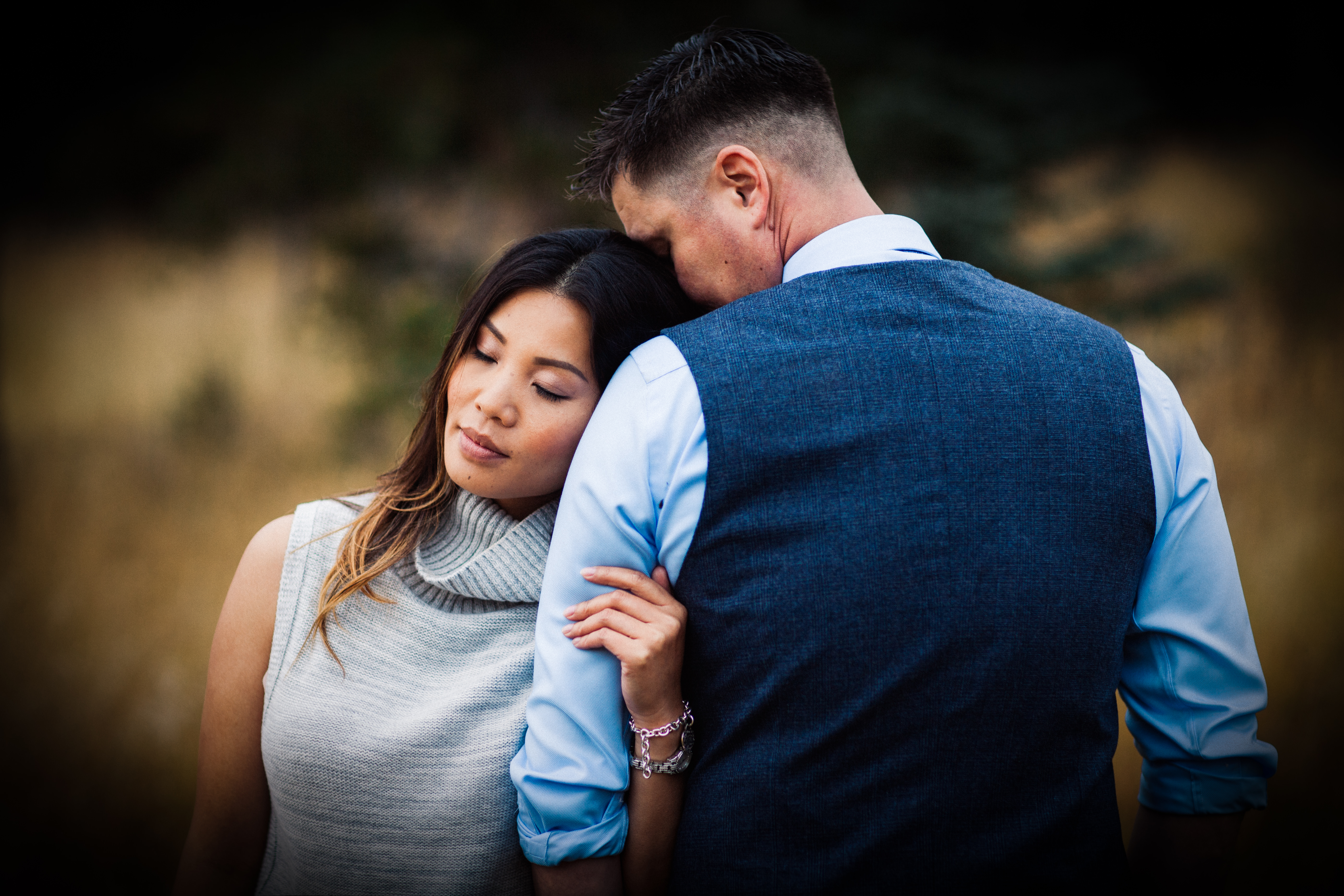
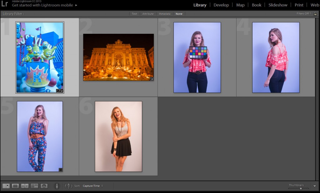
Model:  Jessica Waldow / Photo: Luiz Kim
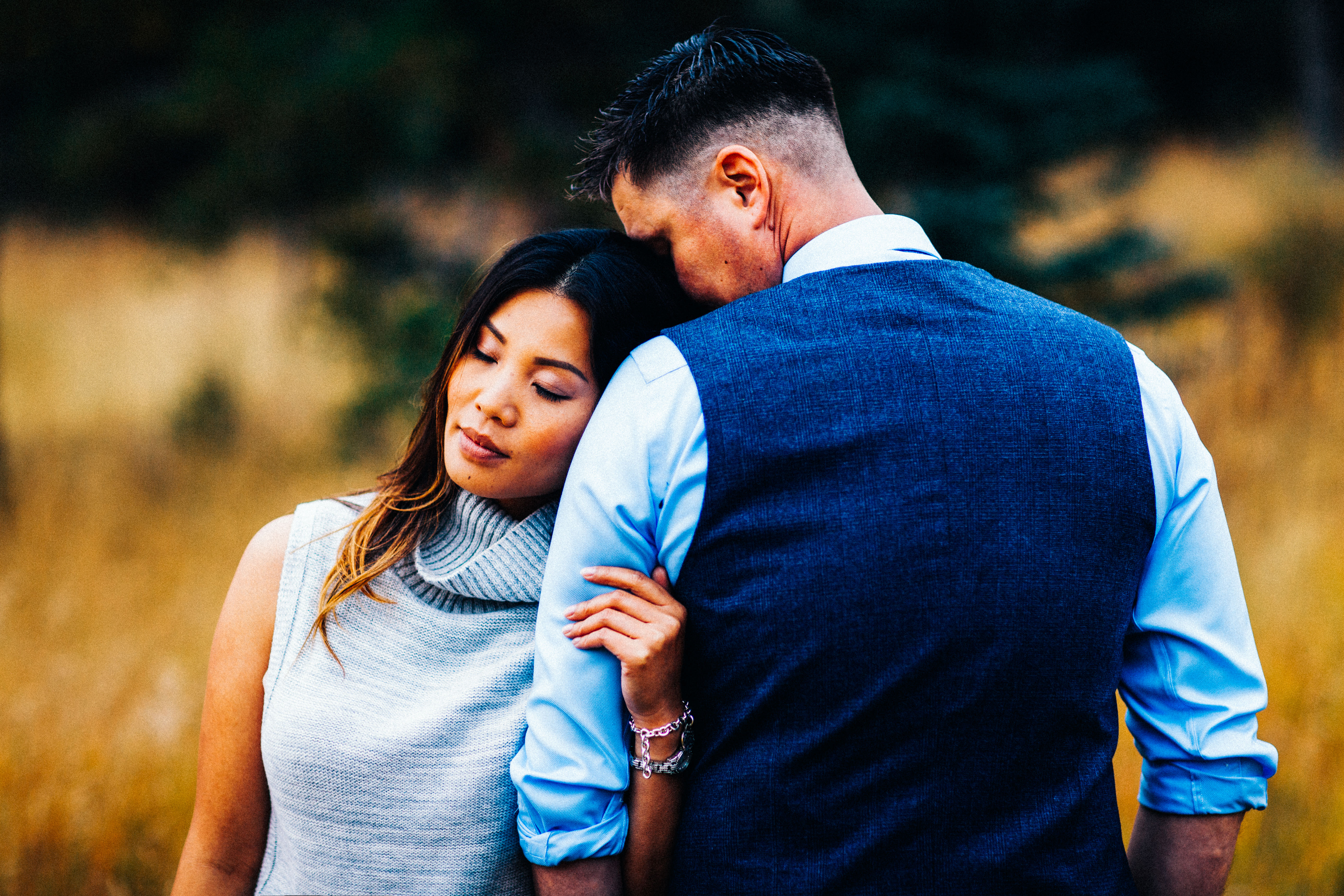
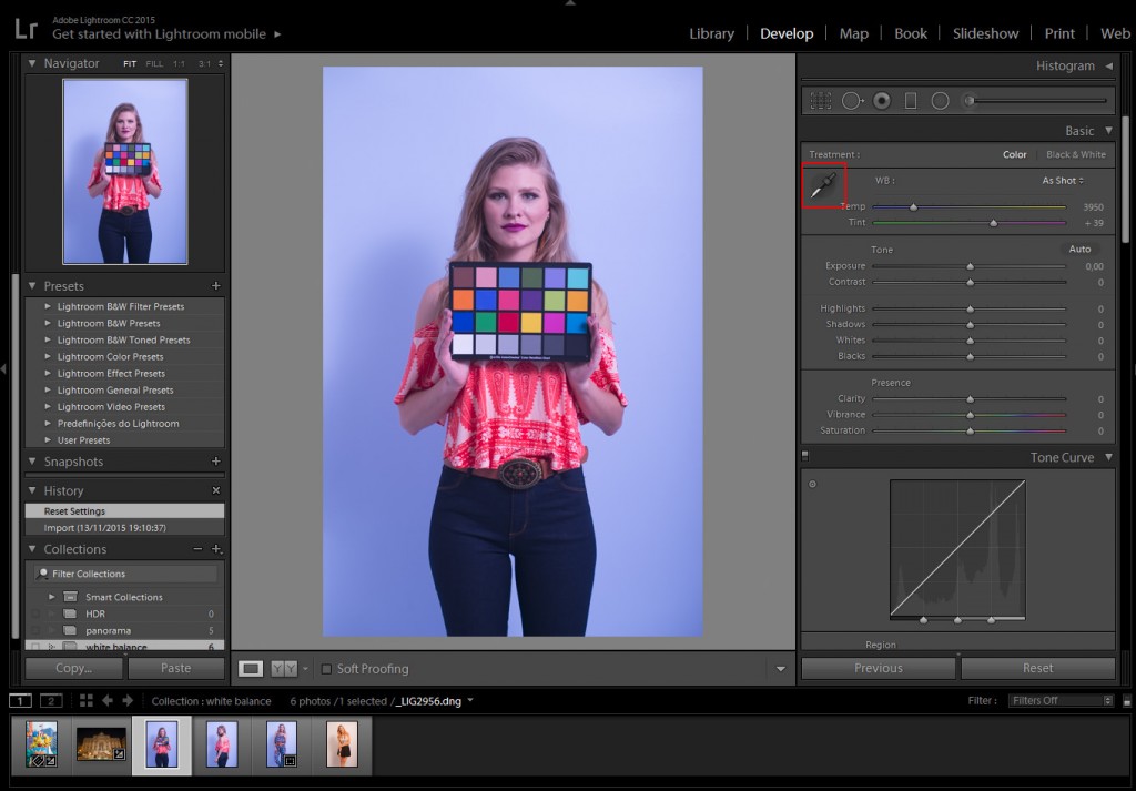
I did a series of photographs for a fashion lookbook (images 3 to 6) using the same light setting and, on purpose, messed with the white balance on my camera, since I photographed in RAW I could tweak the white balance as much as I wanted, nondestructively.

As I mentioned in my last white balance tutorial, studio strobes are set up to 5000K – 5500K, therefore I should have photographed using the setting for the white balance to the flash icon or manually change the setting to 5000K on my camera. The bluish photographs were set up around 2000K and the one with a more yellowish color around 7000K. Even if you set up the white balance on your camera, you will never be a 100% sure if the colors are correct, either because the flash strobe is not giving 5000K – 5500K, or the tint of the photograph appears green or magenta.

Step 1: Photograph the subject with the color chart, position it accordingly to the main light source

After you have set up the lighting for the photo shoot, position the color chart near the main subject and face it toward the main light source.

Click on the White Balance Selector (W), which looks like an eyedropper tool.04_checker_a01

Step 2: select the gray area of the color chart

With the White Balance, Selector tool selected, click on the gray box of the color chart. Each color chart may differ, depending on the manufacturer.

With the White Balance Selector, hover over the image. We can see the preview in the navigator window before we even click it.

04_checker_a03

As you can see, it will automatically correct the white balance of the image, even if your monitor is not calibrated, Using this method guarantees that the white balance is correct.

At this stage, you can edit your image as you would normally do, remembering not to tweak the white balance too much, since the whole purpose is to correct it.

After correcting one image, you can adjust the others as a batch. It doesn’t matter if there are a thousand images, you can match it with the steps below.

Step 3: batch correcting the white balance

Click on the image you have corrected and press shift+click on the last image of the series, that will select the images you want. If you want to select images that are not in order, Ctrl+click for PC, or Cmd+click for mac, selecting the images one by one. Just make sure that the highlighted image is the one with the adjustments.

05_sync_a01

Step 4: Synchronize the settings

Click on the ”sync” button, which is located in the bottom right corner.

The ”synchronize settings” panel will pop up, you can either check just the white balance to sync all the images with the same white balance, or check whatever you want to sync with the settings.

Hit the synchronize button and Lightroom will synchronize the settings.

01_all_img_a02

As you can see, no matter how many photographs you have taken with the same light source, you will always get the correct white balance.

Recovering blown out images in Lightroom

Fall can be a great time to capture many different looks, because of the constant change in weather and colors. On the day of the photo, I wanted to be able to move around quickly and did not want to lug around a bunch of equipment that would get wet and dirty, so all that I used was my camera and tripod. Only using natural light saved me from having to bring extra gear, but also presented a problem. On this day it was very rainy, misty and foggy which gives me the atmosphere I am looking for, but it often times looks washed out in the raw file. If you have ever shot in fog, you know that it can be hard to capture enough detail in the distance and keep your subject properly exposed. All of the moisture in the air catches the light and often times gives you blown out the part in the image.

In this tutorial I am going to walk you through what you need to know to be able to recover an image in Lightroom, that may be blown out.

1. Temperature

This is what the RAW file looks like straight from the camera. The only difference I made was turning down the temperature slightly, as I had my original at around 5500. Now you may be wondering, how do you know where to set the temperature and in reality I don’t. All of these adjustments are not in an exact order, there is a lot of jumping back and forth, from section to section and tweaking until you find what you like. I turned down the temperature knowing that I wanted a cooler and more moody feeling to the image. I wanted to bring out the cold and lonely feeling of someone in a world of their own.

Before we go to the next step take a look at the Histogram and notice the lack of detail in the sky portion of my image.

RecoveringBlownOutImages1

2. Exposure

This is where we are going to make the adjustments to be able to recover some of that sky. I mentioned earlier that shooting in this kind of weather becomes hard to expose properly because the dynamic range can be so vast. When I was shooting, my objective was to set my camera so that I could get as much information in one exposure as possible. There were other ways I could have set the camera (like boosting the ISO) to capture more info, but I kept getting the little island blown out, so I stuck with the settings you see (right under the histogram).

I boosted the shadows/blacks and brought down the highlights/whites. I normally would not do such harsh adjustments, but I needed to in this situation, to achieve my end result. If you compare the histogram of the 1st image with the one below, you will notice that not as much of the right side (white/highlights) of the histogram is clipping.

We can now see that there are some clouds in the sky (slight as they may be) and it is not all white, with no information. This is not enough, though, we have information in the sky, but the image looks bland and the color still does not fit the mood we set out to create originally. The next few steps will be more about editing the color.

RecoveringBlownOutImages2

3. Color

Steps 3,4 and 5 are a peek into some of the color editing decisions I made to pop the subject out at the same time as showing some of the background information we recovered, using the previous steps. I will be doing a color editing tutorial in the future, but in the meantime check out our tutorial for giving your photos a retro feel. In the previous step we recovered the highlight and shadow details, but in the process, we flattened out the image. To fix those adjustments one way to add contrast and color adjustments to your photos, is to use the Tone Curve.

RecoveringBlownOutImages3

4. Color

Next, I played around the HSL (Hue/Saturation/Luminance), again just a peek at your own photos will ask for different settings.

RecoveringBlownOutImages4

5. Split Tone

Then I added more of a cool color to my shadows, using the Split Toning.

RecoveringBlownOutImages5

6. Final Steps

After getting the color  I was going for, I did some light spot removal and added some noise. I do have to mention that for the color work mentioned above, I did use a preset as a starting point and then tweaked it to fit my needs. If you want some presets to speed up your process or to just get you going in a direction, check out the presets available by Sleeklens.

7. Additional Tips

Like many things, when it comes to editing photos in Lightroom/Photoshop there are many ways to get to the final result. If you need to be more precise using tools like the adjustment brush or graduated filter, it will help you get results to specific areas and not have to worry about affecting the whole image.

RecoveringBlownOutImages6

8. Conclusion

Remember, the best way to set yourself up for success in your post processing is to have an idea of what you want your final image to look like. Shooting to capture all of the information in the raw file will help you later.