How to Give your Photos an Old Retro Photographic Feel with Lightroomwww.sleeklens.com
Hi, in this tutorial I’m going to be showing you all how to give your images an old Retro Photographic feel.
You will find similar looks in our Preset packages, here at Our Presets Selection Page.
So the exact look I’m going to achieve today is the look that my parents’ old photos had, now I’m 33 years young 🙂 so you can kind of judge as to when my parents were born, so the photos I’m taking about are the photos that pre date me. You know the ones you find, possibly with your dad in strange clothes, depending on what age you are.
The effects I’m going to show you, I think give a really cool look to your photos. I would use this in many of my Photo Manipulations.
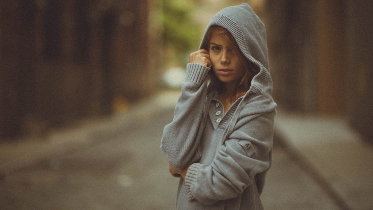
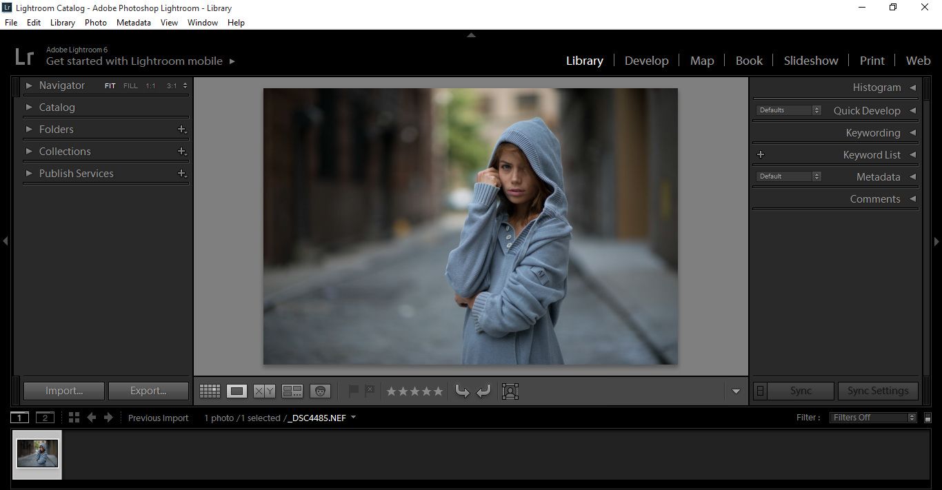
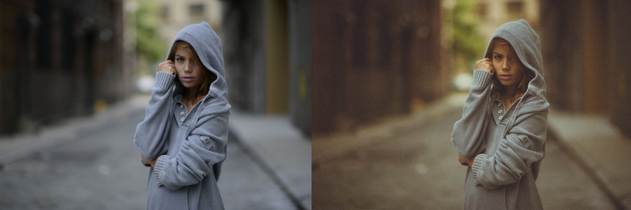
But we are going to be using it on the photo below, provided to me by Sleeklens.com
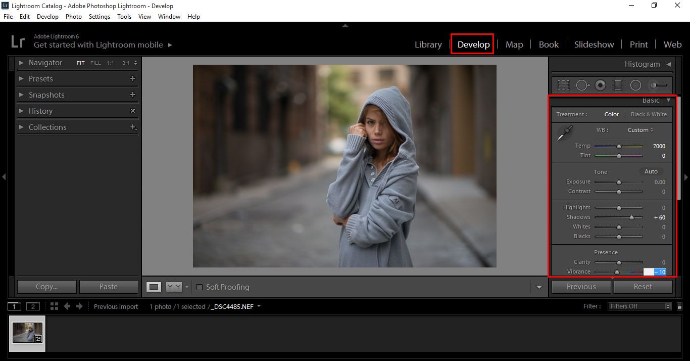
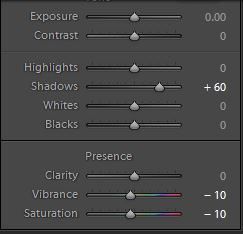
So first thing you want to do, is go to your Basic Section in the Develop Module and go to Shadows, slide it over to about +60
Now do the same thing for Vibrance, and slide to anywhere from -5 to -10
Next step, is to slide your Saturation now to -10, draining some of the colour out of the image.
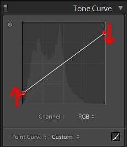
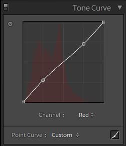
Ok, so now you have done that, go to Tone Curve
This will be where most of the work will be done.
Where its says Channel, make sure you are in RGB
Then, click on the two points highlighted below and drag them from their starting points to roughly where I have them.
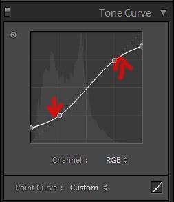
Doing the same, add two new points as shown below and drag to roughly where I have again, just like we did a few seconds ago.
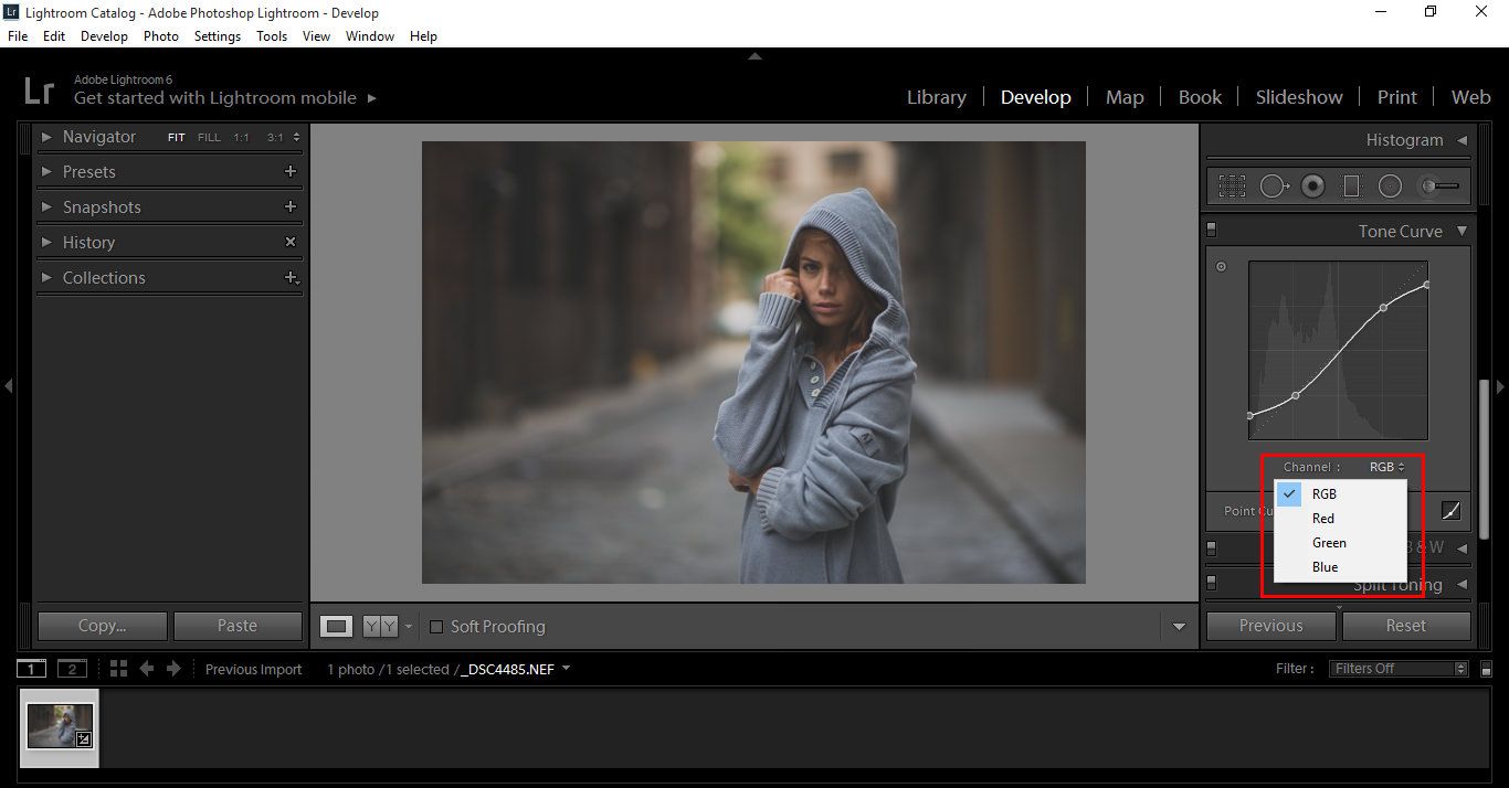
Ok, so if you use the Channel drop down box you will see the following
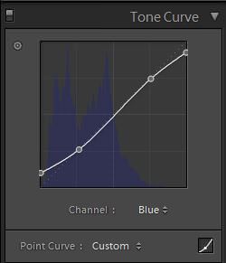
We will now be adding similar settings, like we just did to the Blue and Red Channel. There will some be differences, so copy my settings from the sample pictures below.
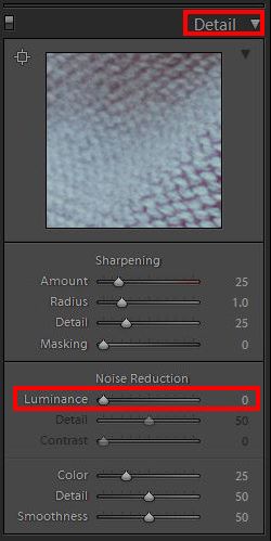
Now, go to Detail and make sure Luminance is at zero.
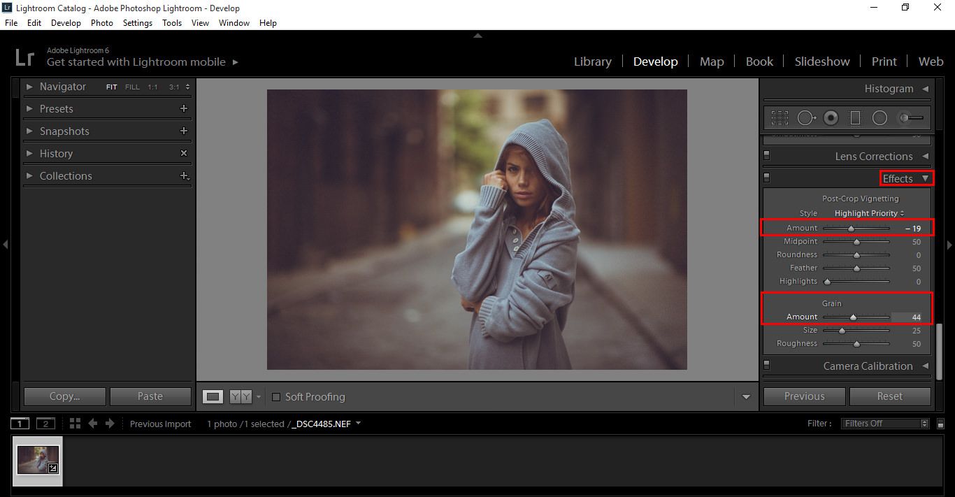
Now go to Effectsand add a little Vignetting by moving the slider to about -19, then add a little Grain, slide to about half way.
So now you’re starting to see some cool effects, and our image is almost there.
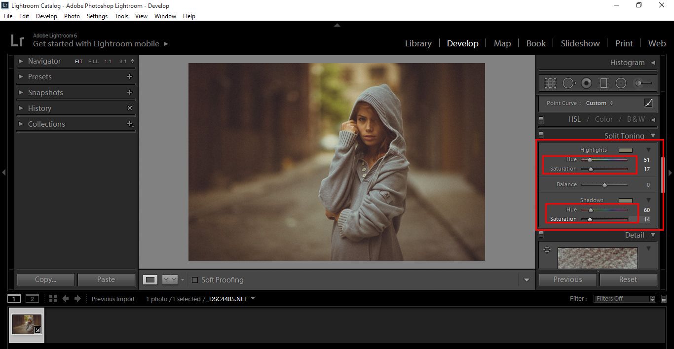
Split Toning is our next step
With the Highlights and Shadows, move our sliders up to where I have them in the image below to add a bit of Retro looking colour.
Just a quick note here, I went back and added more Grain like we talked about in the previous paragraphs, remember this is all relative, there is no right or wrong, it’s what you are happy with. All of these settings can be messed with back and forth until you’re happy, it’s your picture so it can look however you want it to look like.
So I’m going to leave it there, I’m pretty happy with my image.
Graduated from college in 2002 with a degree in Art & Design, I started exploring my way in Graphic Design and Professional Post Production. Full-time freelancer since 2011.


 Facebook
 Google +
Comments (0)
There are no comments yet.