Tag: adjustment layers

Adobe Photoshop Adjustment Layers – Part III

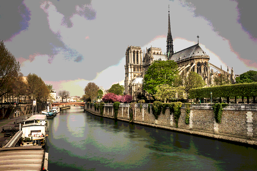
In two previous posts, we looked at the first two groups of adjustment layers in Photoshop: those devoted to make changes in the contrast and those to make changes in the color if images. In this post I will go through the last group of layers available in Photoshop. Below I show once again the full set of fill and adjustment layers for reference.

photoshop layers

This last group, in contrast to the previous two, does not have a general purpose but it simply contains five types of adjustment that are, each of them, designed for more specific purposes.
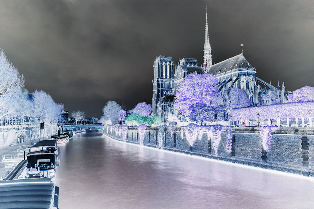
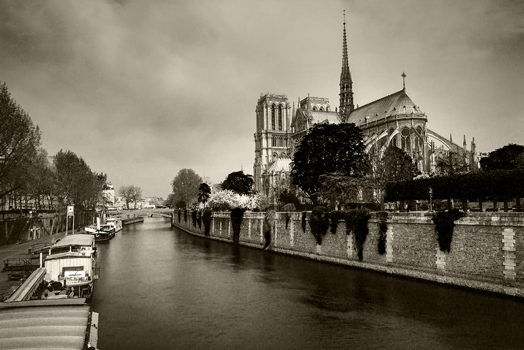
Invert

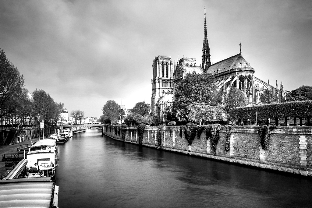
The first layer of the group has a pretty self-explanatory name. What it does is just invert the colors of your image. Inverting a color means subtracting the original value of each color channel from 255 (in an 8-bit image). The resulting image is analogue to looking at a film negative and thus this can be a useful tool if you want to use Photoshop to process your scanned negatives.

You can also use this simply to play around and do some creative color editing. The image below shows the result of applying the negative layer to our original image.

photoshop invert

Posterize

While this layer might not find too much use within the world of photography, it can be useful for visual artists looking to produce particular effects. The idea is to reproduce the effect achieved in earlier times when printing posters and what this layer does is basically downsampling the color resolution of an image. While an 8-bit image will have 255 different levels (or shades) between black and white, with a slider that appears once you create the posterize layer you can reduce the number of those levels to any level between 2 and the original 255. This will create a banding effect as it can be appreciated in the image below (created with 8 levels).

photoshop posterize

Threshold

When applying this layer, Photoshop will convert your image to a 1-bit monochrome, meaning that your new image will only contain black and white pixels. With the creation of the layer, a histogram of the original image together with a slider will appear. The slider is there for you to set where you want the threshold that will define what pixels are turned into white and what pixels are turned into black to be set. Once you set the threshold, all the pixels with luminosity levels above that threshold will be turned white and those with luminosity below the threshold will be turned black.

The image below shows the result of applying the threshold layer with a value of 120.

photoshop threshold

Gradient Map

This layer takes the luminosity values of the original image and converts them to a specific colormap. It is similar to a black and white conversion (in fact, if the right color map is chosen, this is exactly what it will do) only that the colormap is not limited to grayscale values. There are some presets available and each conversion can be inverted as well by ticking the ‘Reverse’ tickbox.

You can obtain some interest results when combining this layer with different blending modes. For instance, the image below was created with a grayscale gradient map and the ‘Hard Light’ blending mode.
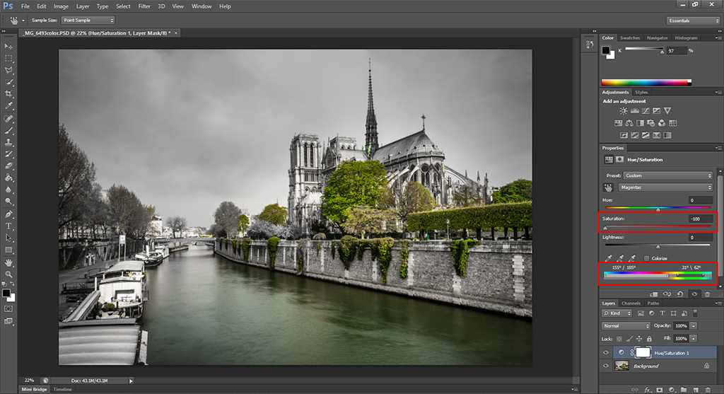
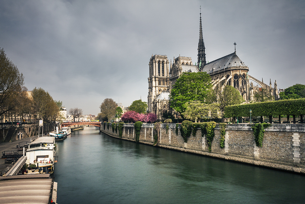
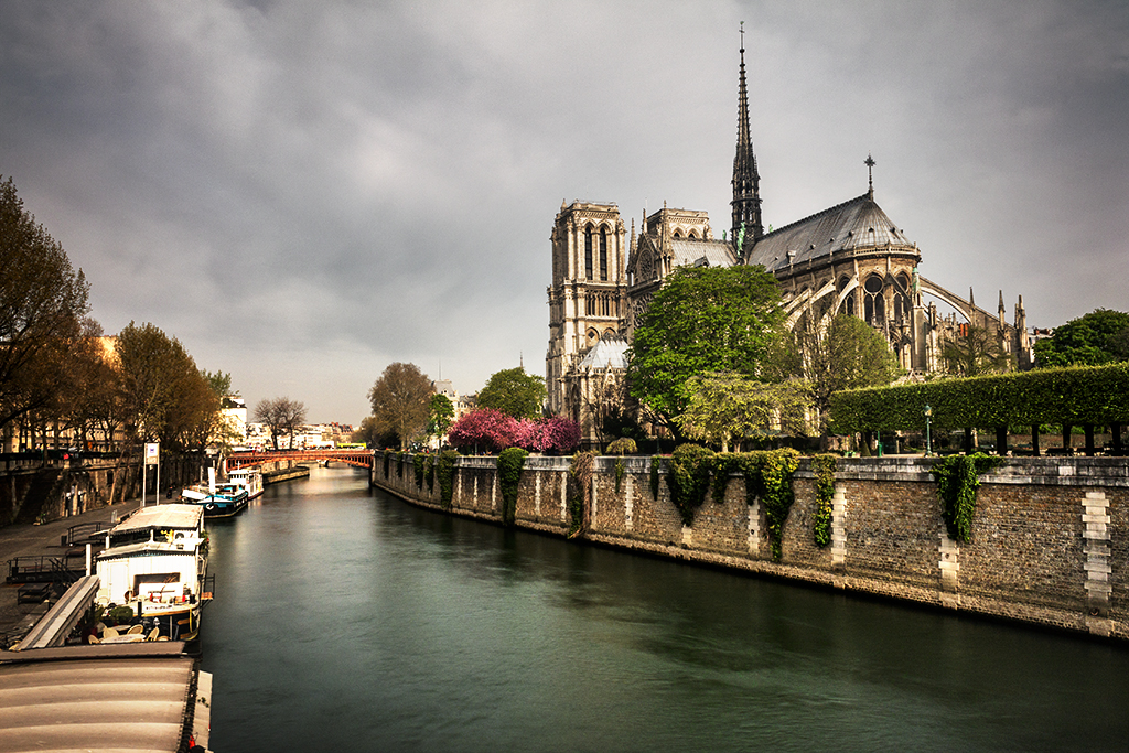
photoshop gradient map

Selective Color

This is probably the most useful layer for photographic purposes within this last group. By selective color, Photoshop does not mean what is usually understood by selective color, i.e. converting an image to black and white while retaining a specific color. What this layer allows you to do is due some subtle kind of color mapping in which you actually control the amount of coloring applied to specific tones.

Once you create the layer, a panel will appear showing a dropdown menu where you can select among nine colors (Reds, Yellows, Greens, Cyans, Blues, Magentas, Whites, Neutrals and Blacks) and four sliders (Cyan, Magenta, Yellow and Black).

Basically, with the dropdown menu you can select which colors within your image you want to alter and with the sliders you can control how much of the indicated tones you want to add or subtract from the selected color. The sliders work with the idea of opposite colors meaning that moving one slider to the right will increase the amount of a given color and moving it to the right will increase the amount of its opposite.

This is actually a pretty useful, although frequently neglected, tool. You can use it to adjust skin tones or hair color in portrait photography or you can use it to selectively increase saturation or contrast in virtually any type of photography.

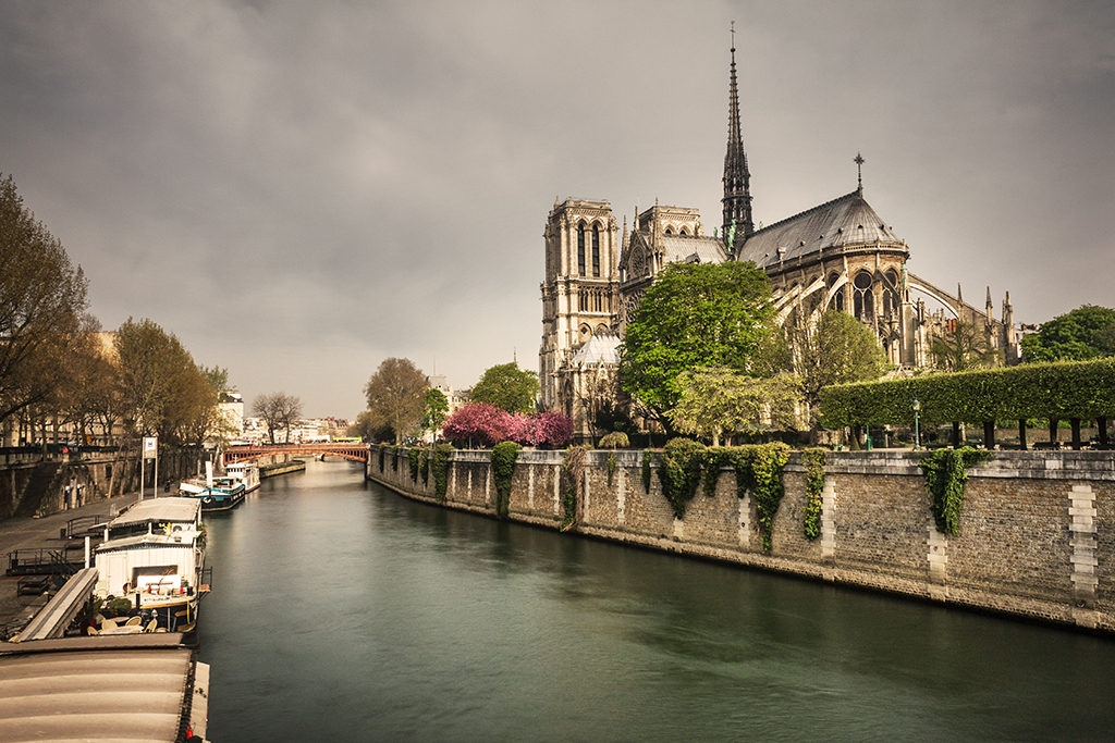
For instance, the image below was obtained moving the ‘Black’ slider all the way to the left with ‘Whites’ selected in the ‘Colors’ menu to increase the contrast in the sky and adjusting the colors of the reds (to increase the saturation of the pink trees and the orange-ish bridge on the back) and the yellows (to change the tone of the trees; yes, usually trees have a strong yellow content!).

Photoshop selective color

So that’s it. Those are all the adjustment layers available in Photoshop. Play with them until you get familiarized. As with blending modes, you will most probably end up including some of them in your workflow while some of them you will rarely touch again. Photoshop is a very powerful software that has many uses, so in fact some tools are intended for some specific users like visual designers and are not that useful for photographers.

Also, keep in mind that, as with any layer, adjustment layers will have completely different impacts when using different blending modes, so take your time as well to explore different combinations and, if you have any question, just contact me.

Adobe Photoshop Adjustment Layers – Part II

In a previous post I went through the adjustment layers in Photoshop devoted to improving the contrast of your images. This included a couple of the most powerful tools in Photoshop like the ‘Levels’ and ‘Curves’ layers. In this post I will go through the second group of adjustment layers that are designed to make adjustments to the colors of your images. The image below shows the location of the adjustment layers within the user interface of Photoshop. Remember that you can access them as well through the ‘Layer’ menu.

layers3

Vibrance

So let’s start with the first layer of the group. This is the simplest way in Photoshop to change the color saturation of your images. Once you create the layer, two sliders will appear. One is called ‘Vibrance’ and the other one is called ‘Saturation’. The saturation slider simple changes the saturation of all the colors of the image according to the position where you set the slider. This means that, for instance, if you set the slider to the minimum position, you will get a black and white version of your image.

The vibrance slider, in turn, has a more selective effect. While it makes changes on all colors, some colors are less affected. The logic behind the algorithm is to minimize clipping when the sliders get to either extreme. This way you don’t get oversaturated or completely desaturated (black and white) images. In addition, it is designed to act on colors that are less saturated than the surrounding ones and pays special attention on avoiding saturation of skin tones.

The image below shows the result of setting the vibrance slider to its minimum.

layers9

Hue/Saturation

This adjustment layer allows you to adjust the hue, the saturation and the lightness of your image. It has a great advantage over the saturation control in the ‘Vibrance’ layer and it is that you can selectively adjust different colors by either selecting the color from a list of presets or by using the eyedropper tools provided.

Due to this capability, the ‘Hue/Saturation’ layer is ideal for selective coloring an image. With the color bar below the adjustment sliders you can manually select the range of colors that you want to be affected. The image below shows the selection made to turn all the image into black and white except for the greens.

layers10

By changing the lightness you can also turn any color in your image into black or white, making it possible to create some interesting effects, so play around!

Color Balance

The next layer is intended to change the color balance of your photos. Once you create the layer, three sliders will appear. With each slider you can adjust one of the primary colors. This means that, in theory, you have complete freedom to adjust any color within your image. However, working with the sliders is not very intuitive so it is not always easy to make color adjustments with this layer.

One thing you can do is change the temperature of your image. If you want to make it look warmer, what you have to do is increase the slider for Cyan/Red color and decrease the one for Yellow/Blue by the same amount. If you want to make your image look cooler, do the opposite.

The image below shows the result of reducing the warmth of our image using this method.

layers11

Black & White

While the name of this layer is self-explanatory, by no means is its functionality limited to simply decreasing the saturation of all the colors to a minimum. Once you create the layer, you start at that point but after that, you can change how individual colors in the original image will look. For this purpose, there are six individual sliders for six different colors and what you can do with this sliders is modify the lightness of those specific colors.

For instance, if you take the green slider to the minimum, you will end up with a black and white image in which the greens look black and if you do the opposite, the greens will look white. This is particularly useful if you want to adjust the visual contrast of your image, something that is usually really important when dealing with black and white images.

In order to make your life easier, Photoshop also provides an ‘Auto’ button and some presets. With the ‘Auto’ button, Photoshop simply attempts to get an equalized histogram while the presets are intended to modify specific colors. There is also an eyedropper-like tool (symbolized with a hand and two arrows) with which you can select a specific region in your image and, by moving your mouse sideways, adjust the lightness of those specific colors.

Finally, a ‘Tint’ tick box is available. If you tick it, you will then be able to apply a tone to the whole image like sepia or any other color of your choice. The image below shows the result of applying a light sepia tone to our image using this method.

layers12

Photo Filter

This layer provides a much easier way of adjusting the color balance of your image. It basically simulates the effect of applying optical filters of different colors to your camera and provides both a number of presets (like warming, cooling or some specific color filters) and the possibility to select whatever color you like.

A ‘Density’ slider allows you to modify how strong the effect of the filter is in your final image. The image below shows the effect of applying a warming filter to our original image.

layers13

Channel Mixer

This layer provides a way of combining variations of the different color channels to either produce changes in color or black and white images. I would say that trying to make color adjustments with this layer is complicated to say the least, unless you are looking for some specific effect like getting a specific tint in your image. This arises from the way the algorithm behind works, which is increasing or decreasing the saturation of a given channel and adding it to the selected ‘Output Channel’.

However, if your intention is to convert your image to black and white, this layer can provide really nice results. If you tick the ‘Monochrome’ box, Photoshop will set the output channel to ‘Gray’ and then, by adjusting the color sliders, you will be able to change the contrast of the different color components of your original image.

The image below shows the result of converting our original image to black and white and making some adjustments to the color channels in order to get a high-contrast monochrome image.

layers14

Color Lookup

In contrast to other adjustment layers in this group, the color lookup is based on presets only. The word lookup here arises from something called lookup tables. A lookup table is simply a predefined mapping of a given parameter. In this specific case, that parameter is the colors of your original image.

Once you create the layer, three dropdown menus, namely ‘3DLUT File’, ‘Abstract’ and ‘Device Link’. Each menu gives you the option to select between a series of presets or load your own lookup table. And that’s pretty much it. You can go through each of them and try them out. You might find some interesting effects here, so take your time and, as usual with many Photoshop features, each image will have a different feeling even when using the same preset, so it makes sense to try this out whenever you load a new image.

The image below shows the result of applying one of the presets, namely the Crisp_Winter.look.

layers15

So that’s it for the adjustment layers of the second group. In the next post of this series I will go through the layers contained in the third group. These are intended for more specific purposes and thus were grouped by Photoshop into a different category.

I hope you enjoyed this entry and if you have any question regarding the contents, just write me an email!

Adobe Photoshop Adjustment Layers – Part I

One of the most powerful features of Photoshop lies on the possibility of doing non-destructive processing of images through the use of layers. Even though there are other ways of preserving the original image while doing post-processing, Photoshop continues to rely on this idea and adjustment layers provide a clean and organized way of doing this.

Adjustment layers can be found at the bottom of the ‘Layers’ panel, right next to the ‘Add a mask’ button. Once you click on the appropriate button, a menu will appear listing the different layers available. The image below shows this menu highlighted in red as well as a photo of the Notre Dame cathedral that I will be using to illustrate the effect that each layer provides.

layers3

The first three options (Solid Color…, Gradient… and Pattern…) correspond to what is called Fill Layers and they simply create a new layer and fill it with either a solid color, a gradient or a given pattern. The rest of the options are the adjustment layers. Both the Fill Layers and the Adjustment Layers can be accessed as well through the Layer menu.

In order to properly cover each layer, I will divide them in three different posts, each one covering one of the groups as organized by Photoshop. In this post, I will cover the first group which contains layers used primarily to adjust the contrast of an image.

Brightness/Contrast

The first layer of the group is the ‘Brightness/Contrast…’ and, as the name suggests, it is intended to change the brightness and contrast of your image. Once you create this layer, depending on how your user interface is configured, somewhere in your window a ‘Properties’ tab will appear. This is the standard behavior for all the adjustment layers.

For the case of Brightness/Contrast, two sliders are available. As you might have already guessed, one is to adjust the brightness and the other to adjust the contrast of your image. You can change each slider as you like and Photoshop also offers an ‘Auto’ button that will adjust both parameters to get what the algorithm interprets as an optimally balanced histogram. After applying this automatic adjustment, the image below results.

layers4

One of the big advantages of working with layers is that, by painting with a black brush over the layer mask that is automatically created with the adjustment layer, you can apply the effect of the layer in a selective way to some specific areas of your image. That way, if you feel that for instance the sky is overexposed after applying the brightness adjustment, you can mask out the effect only on the sky, ending up with a much more balanced image.

Levels

The ‘Levels…’ adjustment layer is a great way to manipulate the overall contrast of an image in a much more controlled way than by simply moving the contrast slider from the ‘Brightness/Contrast’ layer. Once you create it, the Properties menu will show a panel with the histogram of your image and three sliders below. The left slider corresponds to the shadows, the middle slider to the midtones and the right slider to the highlights. With this sliders you can select where in the original histogram each of these markers will lie.

For instance, if you move the shadows slider to the right, you are telling Photoshop that all the brightness values below the position where you put the marker will be clipped as shadows, ending up with a much darker image. The opposite happens if you move the highlights slider to the left, i.e. you will end up with a much lighter image. Finally, the midtones slider has an effect similar to the contrast slider from the ‘Brightness/Contrast’ layer.

This layer also provides an automatic adjustment as well as some presets to increase the overall contrast, make the image darker or lighter among others. Additionally, you can adjust the levels for each color channel individually or, by using three eyedropper tools that are located next to the histogram, set the white, gray and black points in your image and let Photoshop adjust the sliders accordingly.

The image below was obtained by using the eyedroppers for the white and black levels. The white level was selected from the white boat on the left and the black level on the black boat behind.

layers5

Curves

This is arguably the most powerful tool for contrast adjustment in Photoshop and also one of the most difficult ones to get used to. The working principle is similar to that of the ‘Levels’ layer, only that you can set as many points along the brightness range as you like. Once you create the curves layer, once again a histogram of your image will appear, only that this time, apart from having two sliders (one for shadows and one for highlights), a diagonal line going from the bottom left corner to the top right corner will be visible.

This line is basically a mapping of the original brightness values (x-axis) to the new values (y-axis). A newly created layer will have a straight line with slope one, meaning that each value is mapped to itself. In other words, all the pixels with brightness level 10 will be mapped to brightness level 10, those with 20 will be mapped to 20 and so on.

If you click on any position along the curve, a new control point will be created, and you will be able to move up or down that control point until you are happy with the new mapping. For instance, if you want to make the sky (which is the brightest part of our image) look a bit darker, you can set a control point close to the right edge or you can select directly the color you want to adjust using the first eyedropper marked with a small hand right next to the histogram.

Then, dragging this control point will change the mapping of those specific pixels. For instance, if you drag the newly created control point downwards, the pixels will be mapped to a darker value, making all the pixels with that specific brightness look darker. One thing to keep in mind is that the changes in the curve are smooth, meaning that if you only want to change the mapping of a small fraction of the levels, you will have to create several control points to ensure that the rest of the image is not changed.

The following image shows the original image with the sky darkened together with the ‘Curves’ layer and five control points used to get the final result.

layers7

Exposure

The last layer of the group, ‘Exposure’, is similar to the levels layer in the sense that you can adjust the shadows, midtones and highlights using sliders. Once you create the layer, the Properties menu will show a slider called ‘Exposure’, one called ‘Offset’ and one called ‘Gamma Correction’.

The ‘Exposure’ slider changes the overall brightness of the image in a similar way as a change in the exposure while taking the photo would do. In fact, the values given are equivalent to EV steps in your camera. The other two sliders are less obvious.

The ‘Offset’ slider adds or subtracts a specific quantity to all the pixels in the image but the effect is mostly noticeable on the dark areas and somewhat on the midtones. The ‘Gamma Correction’ slider in turn has a similar effect only that more noticeable on the midtones. Also, the effect of the slider is inverted, creating a darker image when moved to the right and a lighter one when moved to the left.

The following image shows the effect of adjusting the three sliders in order to get an image with increased contrast. The effect was masked out at some areas to avoid an overly dark image.

layers8

As you can see, Photoshop provides plenty of choices to properly adjust the contrast of your images. While some plug-ins might provide quick solutions, especially for local contrast enhancement, the use of the native tools usually provides more control avoiding the creation of noise in the process.

While it can take a while to get used to some of the tools, it is always worth taking the time to familiarize with them and in the end, you will most probably end up choosing one method of your preference. While the curves layer might be the most powerful one, creating more than one of the other layers will help you get the same effect in the end, so in principle you are not really constrained to any of them.

In the next post I will go through the next group of layers that are devoted to making adjustments in the colors of your images, so stay tuned and, as usual, if you have any question regarding the contents of this post, just write me an email!