One of the most powerful features of Photoshop lies on the possibility of doing non-destructive processing of images through the use of layers. Even though there are other ways of preserving the original image while doing post-processing, Photoshop continues to rely on this idea and adjustment layers provide a clean and organized way of doing this.
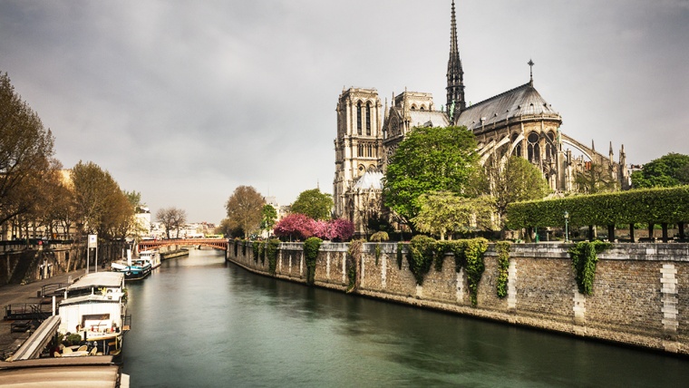
Adjustment layers can be found at the bottom of the ‘Layers’ panel, right next to the ‘Add a mask’ button. Once you click on the appropriate button, a menu will appear listing the different layers available. The image below shows this menu highlighted in red as well as a photo of the Notre Dame cathedral that I will be using to illustrate the effect that each layer provides.

The first three options (Solid Color…, Gradient… and Pattern…) correspond to what is called Fill Layers and they simply create a new layer and fill it with either a solid color, a gradient or a given pattern. The rest of the options are the adjustment layers. Both the Fill Layers and the Adjustment Layers can be accessed as well through the Layer menu.
In order to properly cover each layer, I will divide them in three different posts, each one covering one of the groups as organized by Photoshop. In this post, I will cover the first group which contains layers used primarily to adjust the contrast of an image.
Table of Contents
The first layer of the group is the ‘Brightness/Contrast…’ and, as the name suggests, it is intended to change the brightness and contrast of your image. Once you create this layer, depending on how your user interface is configured, somewhere in your window a ‘Properties’ tab will appear. This is the standard behavior for all the adjustment layers.
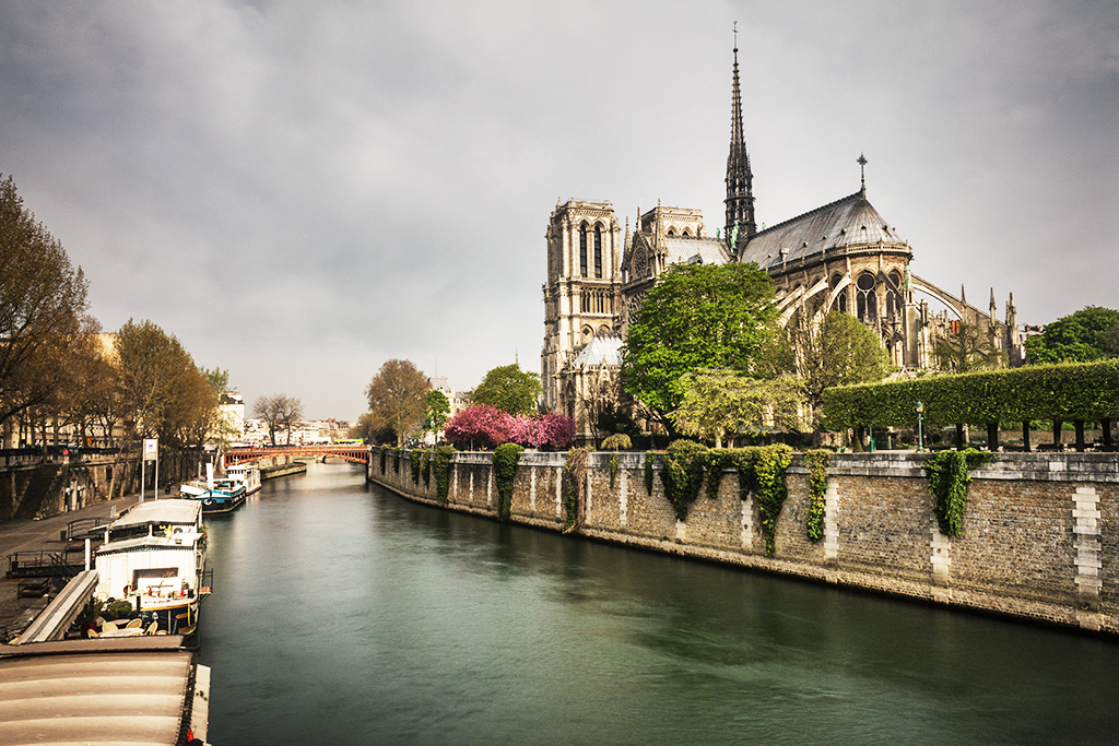
For the case of Brightness/Contrast, two sliders are available. As you might have already guessed, one is to adjust the brightness and the other to adjust the contrast of your image. You can change each slider as you like and Photoshop also offers an ‘Auto’ button that will adjust both parameters to get what the algorithm interprets as an optimally balanced histogram. After applying this automatic adjustment, the image below results.
One of the big advantages of working with layers is that, by painting with a black brush over the layer mask that is automatically created with the adjustment layer, you can apply the effect of the layer in a selective way to some specific areas of your image. That way, if you feel that for instance the sky is overexposed after applying the brightness adjustment, you can mask out the effect only on the sky, ending up with a much more balanced image.
The ‘Levels…’ adjustment layer is a great way to manipulate the overall contrast of an image in a much more controlled way than by simply moving the contrast slider from the ‘Brightness/Contrast’ layer. Once you create it, the Properties menu will show a panel with the histogram of your image and three sliders below. The left slider corresponds to the shadows, the middle slider to the midtones and the right slider to the highlights. With this sliders you can select where in the original histogram each of these markers will lie.
For instance, if you move the shadows slider to the right, you are telling Photoshop that all the brightness values below the position where you put the marker will be clipped as shadows, ending up with a much darker image. The opposite happens if you move the highlights slider to the left, i.e. you will end up with a much lighter image. Finally, the midtones slider has an effect similar to the contrast slider from the ‘Brightness/Contrast’ layer.
This layer also provides an automatic adjustment as well as some presets to increase the overall contrast, make the image darker or lighter among others. Additionally, you can adjust the levels for each color channel individually or, by using three eyedropper tools that are located next to the histogram, set the white, gray and black points in your image and let Photoshop adjust the sliders accordingly.
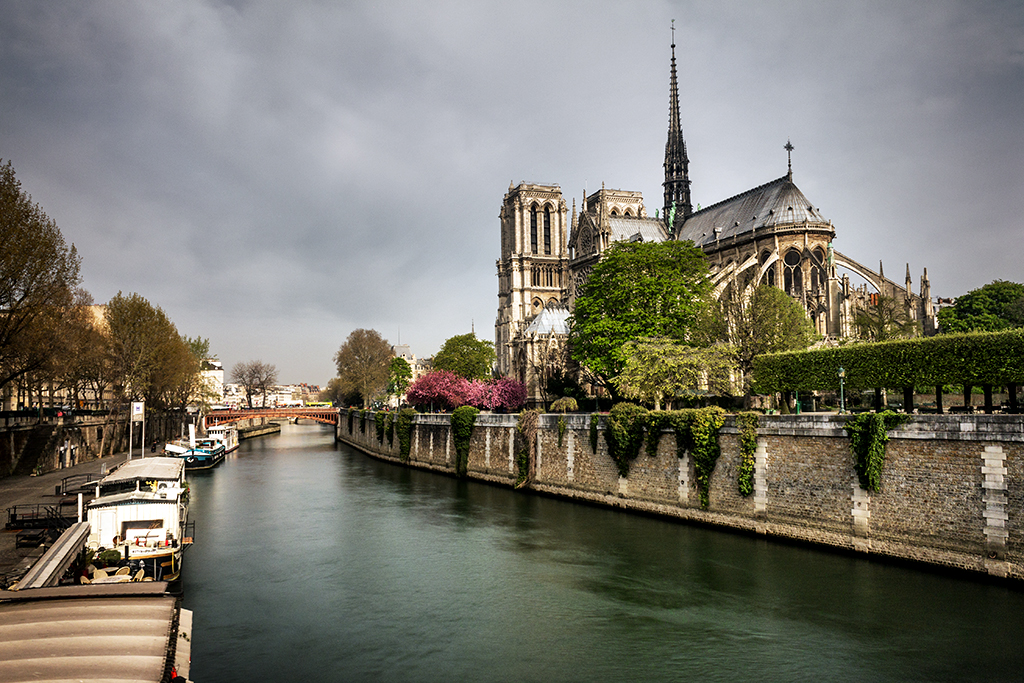
The image below was obtained by using the eyedroppers for the white and black levels. The white level was selected from the white boat on the left and the black level on the black boat behind.
This is arguably the most powerful tool for contrast adjustment in Photoshop and also one of the most difficult ones to get used to. The working principle is similar to that of the ‘Levels’ layer, only that you can set as many points along the brightness range as you like. Once you create the curves layer, once again a histogram of your image will appear, only that this time, apart from having two sliders (one for shadows and one for highlights), a diagonal line going from the bottom left corner to the top right corner will be visible.
This line is basically a mapping of the original brightness values (x-axis) to the new values (y-axis). A newly created layer will have a straight line with slope one, meaning that each value is mapped to itself. In other words, all the pixels with brightness level 10 will be mapped to brightness level 10, those with 20 will be mapped to 20 and so on.
If you click on any position along the curve, a new control point will be created, and you will be able to move up or down that control point until you are happy with the new mapping. For instance, if you want to make the sky (which is the brightest part of our image) look a bit darker, you can set a control point close to the right edge or you can select directly the color you want to adjust using the first eyedropper marked with a small hand right next to the histogram.
Then, dragging this control point will change the mapping of those specific pixels. For instance, if you drag the newly created control point downwards, the pixels will be mapped to a darker value, making all the pixels with that specific brightness look darker. One thing to keep in mind is that the changes in the curve are smooth, meaning that if you only want to change the mapping of a small fraction of the levels, you will have to create several control points to ensure that the rest of the image is not changed.
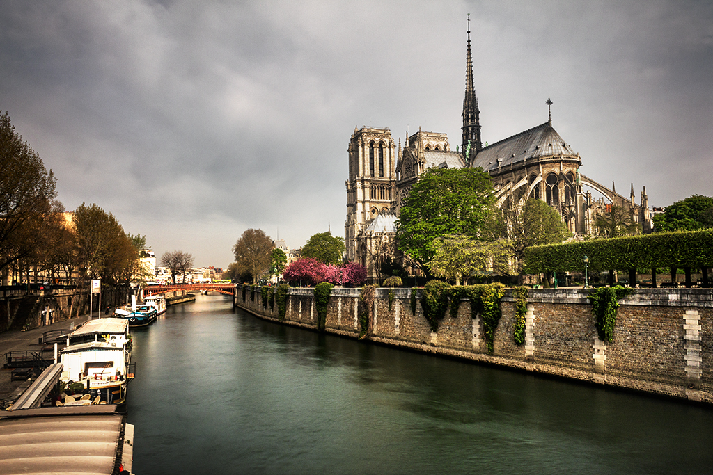
The following image shows the original image with the sky darkened together with the ‘Curves’ layer and five control points used to get the final result.

The last layer of the group, ‘Exposure’, is similar to the levels layer in the sense that you can adjust the shadows, midtones and highlights using sliders. Once you create the layer, the Properties menu will show a slider called ‘Exposure’, one called ‘Offset’ and one called ‘Gamma Correction’.
The ‘Exposure’ slider changes the overall brightness of the image in a similar way as a change in the exposure while taking the photo would do. In fact, the values given are equivalent to EV steps in your camera. The other two sliders are less obvious.
The ‘Offset’ slider adds or subtracts a specific quantity to all the pixels in the image but the effect is mostly noticeable on the dark areas and somewhat on the midtones. The ‘Gamma Correction’ slider in turn has a similar effect only that more noticeable on the midtones. Also, the effect of the slider is inverted, creating a darker image when moved to the right and a lighter one when moved to the left.
The following image shows the effect of adjusting the three sliders in order to get an image with increased contrast. The effect was masked out at some areas to avoid an overly dark image.
As you can see, Photoshop provides plenty of choices to properly adjust the contrast of your images. While some plug-ins might provide quick solutions, especially for local contrast enhancement, the use of the native tools usually provides more control avoiding the creation of noise in the process.
While it can take a while to get used to some of the tools, it is always worth taking the time to familiarize with them and in the end, you will most probably end up choosing one method of your preference. While the curves layer might be the most powerful one, creating more than one of the other layers will help you get the same effect in the end, so in principle you are not really constrained to any of them.
In the next post I will go through the next group of layers that are devoted to making adjustments in the colors of your images, so stay tuned and, as usual, if you have any question regarding the contents of this post, just write me an email!


Please verify your software version before proceeding.
 I’ve verified my software version


 Facebook
 Google +
Comments (0)
There are no comments yet.