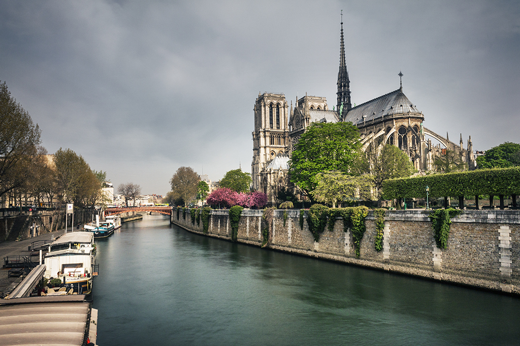
In a previous post I went through the adjustment layers in Photoshop devoted to improving the contrast of your images. This included a couple of the most powerful tools in Photoshop like the ‘Levels’ and ‘Curves’ layers. In this post I will go through the second group of adjustment layers that are designed to make adjustments to the colors of your images. The image below shows the location of the adjustment layers within the user interface of Photoshop. Remember that you can access them as well through the ‘Layer’ menu.

Table of Contents
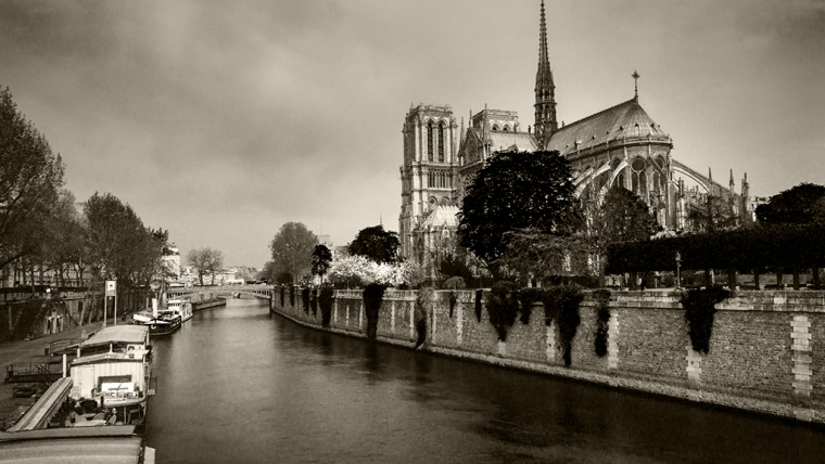
So let’s start with the first layer of the group. This is the simplest way in Photoshop to change the color saturation of your images. Once you create the layer, two sliders will appear. One is called ‘Vibrance’ and the other one is called ‘Saturation’. The saturation slider simple changes the saturation of all the colors of the image according to the position where you set the slider. This means that, for instance, if you set the slider to the minimum position, you will get a black and white version of your image.
The vibrance slider, in turn, has a more selective effect. While it makes changes on all colors, some colors are less affected. The logic behind the algorithm is to minimize clipping when the sliders get to either extreme. This way you don’t get oversaturated or completely desaturated (black and white) images. In addition, it is designed to act on colors that are less saturated than the surrounding ones and pays special attention on avoiding saturation of skin tones.
The image below shows the result of setting the vibrance slider to its minimum.

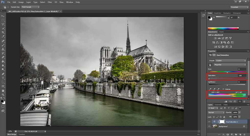
This adjustment layer allows you to adjust the hue, the saturation and the lightness of your image. It has a great advantage over the saturation control in the ‘Vibrance’ layer and it is that you can selectively adjust different colors by either selecting the color from a list of presets or by using the eyedropper tools provided.
Due to this capability, the ‘Hue/Saturation’ layer is ideal for selective coloring an image. With the color bar below the adjustment sliders you can manually select the range of colors that you want to be affected. The image below shows the selection made to turn all the image into black and white except for the greens.
By changing the lightness you can also turn any color in your image into black or white, making it possible to create some interesting effects, so play around!
The next layer is intended to change the color balance of your photos. Once you create the layer, three sliders will appear. With each slider you can adjust one of the primary colors. This means that, in theory, you have complete freedom to adjust any color within your image. However, working with the sliders is not very intuitive so it is not always easy to make color adjustments with this layer.
One thing you can do is change the temperature of your image. If you want to make it look warmer, what you have to do is increase the slider for Cyan/Red color and decrease the one for Yellow/Blue by the same amount. If you want to make your image look cooler, do the opposite.
The image below shows the result of reducing the warmth of our image using this method.
While the name of this layer is self-explanatory, by no means is its functionality limited to simply decreasing the saturation of all the colors to a minimum. Once you create the layer, you start at that point but after that, you can change how individual colors in the original image will look. For this purpose, there are six individual sliders for six different colors and what you can do with this sliders is modify the lightness of those specific colors.
For instance, if you take the green slider to the minimum, you will end up with a black and white image in which the greens look black and if you do the opposite, the greens will look white. This is particularly useful if you want to adjust the visual contrast of your image, something that is usually really important when dealing with black and white images.
In order to make your life easier, Photoshop also provides an ‘Auto’ button and some presets. With the ‘Auto’ button, Photoshop simply attempts to get an equalized histogram while the presets are intended to modify specific colors. There is also an eyedropper-like tool (symbolized with a hand and two arrows) with which you can select a specific region in your image and, by moving your mouse sideways, adjust the lightness of those specific colors.
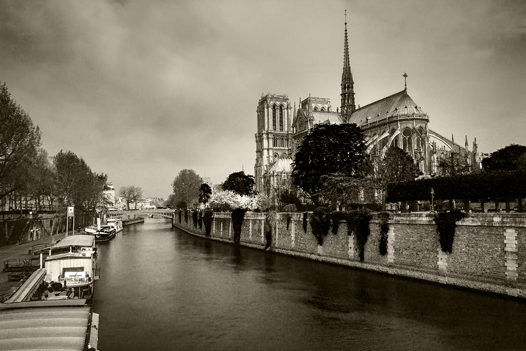
Finally, a ‘Tint’ tick box is available. If you tick it, you will then be able to apply a tone to the whole image like sepia or any other color of your choice. The image below shows the result of applying a light sepia tone to our image using this method.
This layer provides a much easier way of adjusting the color balance of your image. It basically simulates the effect of applying optical filters of different colors to your camera and provides both a number of presets (like warming, cooling or some specific color filters) and the possibility to select whatever color you like.
A ‘Density’ slider allows you to modify how strong the effect of the filter is in your final image. The image below shows the effect of applying a warming filter to our original image.
This layer provides a way of combining variations of the different color channels to either produce changes in color or black and white images. I would say that trying to make color adjustments with this layer is complicated to say the least, unless you are looking for some specific effect like getting a specific tint in your image. This arises from the way the algorithm behind works, which is increasing or decreasing the saturation of a given channel and adding it to the selected ‘Output Channel’.
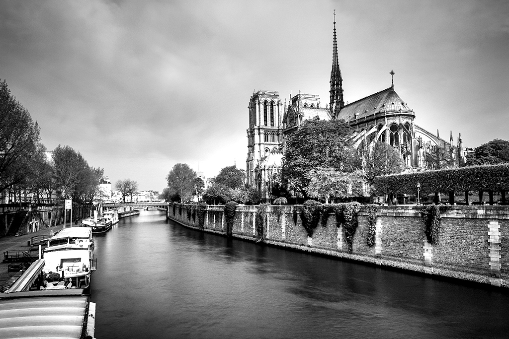
However, if your intention is to convert your image to black and white, this layer can provide really nice results. If you tick the ‘Monochrome’ box, Photoshop will set the output channel to ‘Gray’ and then, by adjusting the color sliders, you will be able to change the contrast of the different color components of your original image.
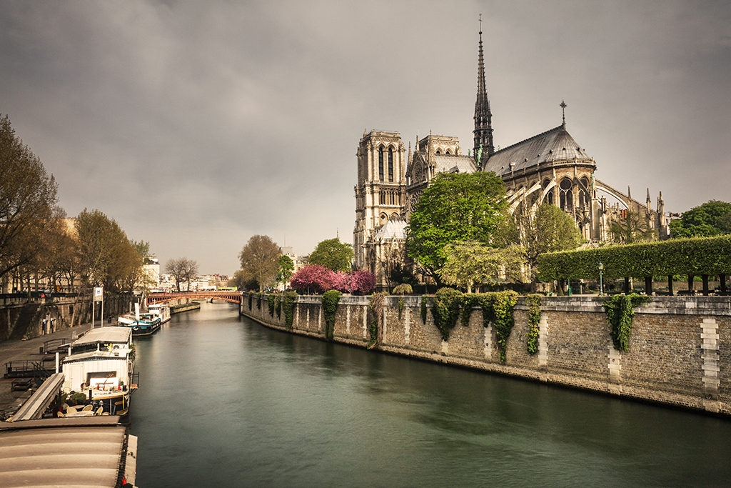
The image below shows the result of converting our original image to black and white and making some adjustments to the color channels in order to get a high-contrast monochrome image.
In contrast to other adjustment layers in this group, the color lookup is based on presets only. The word lookup here arises from something called lookup tables. A lookup table is simply a predefined mapping of a given parameter. In this specific case, that parameter is the colors of your original image.
Once you create the layer, three dropdown menus, namely ‘3DLUT File’, ‘Abstract’ and ‘Device Link’. Each menu gives you the option to select between a series of presets or load your own lookup table. And that’s pretty much it. You can go through each of them and try them out. You might find some interesting effects here, so take your time and, as usual with many Photoshop features, each image will have a different feeling even when using the same preset, so it makes sense to try this out whenever you load a new image.
The image below shows the result of applying one of the presets, namely the Crisp_Winter.look.
So that’s it for the adjustment layers of the second group. In the next post of this series I will go through the layers contained in the third group. These are intended for more specific purposes and thus were grouped by Photoshop into a different category.
I hope you enjoyed this entry and if you have any question regarding the contents, just write me an email!


Please verify your software version before proceeding.
 I’ve verified my software version


 Facebook
 Google +
Comments (0)
There are no comments yet.