Tag: photoshop

Two Easy Ways to Change Colors in Photoshop

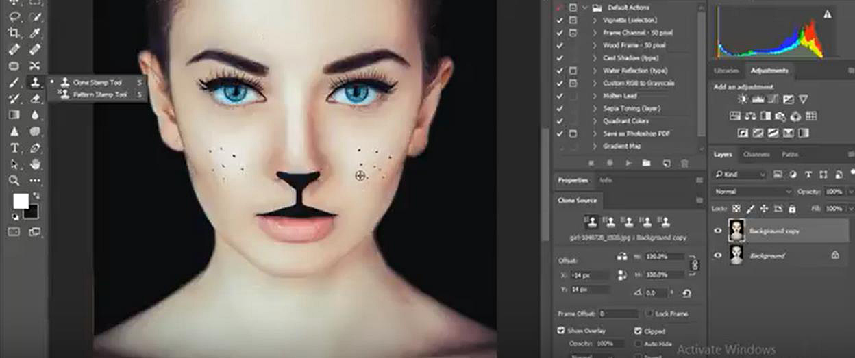
There are many different reasons why you might want to change the color of your photos. Colorizing the whole photo (like giving a sepia tone to a grayscale image) is a rather straightforward process, changing the color of specific parts of an image can be a bit more tricky. However, Photoshop has a couple of tools that can make this process a relatively easy one. One of the things that make Photoshop such a powerful software is that there are many different ways to achieve a final result, and different photographers have different workflows so it is possible that you can find alternative ways to do this, which is perfectly fine.

Apart from simple photographic interest (like changing the color of a model’s clothes to better match a background or enhancing a specific aspect such as the redness of a sunset), colorizing a subject can be very useful for everyday interests such as visualizing how a house, or a part of it, would look like with a different painting before actually even buying a paint bucket.

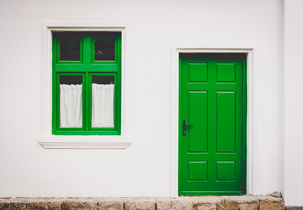
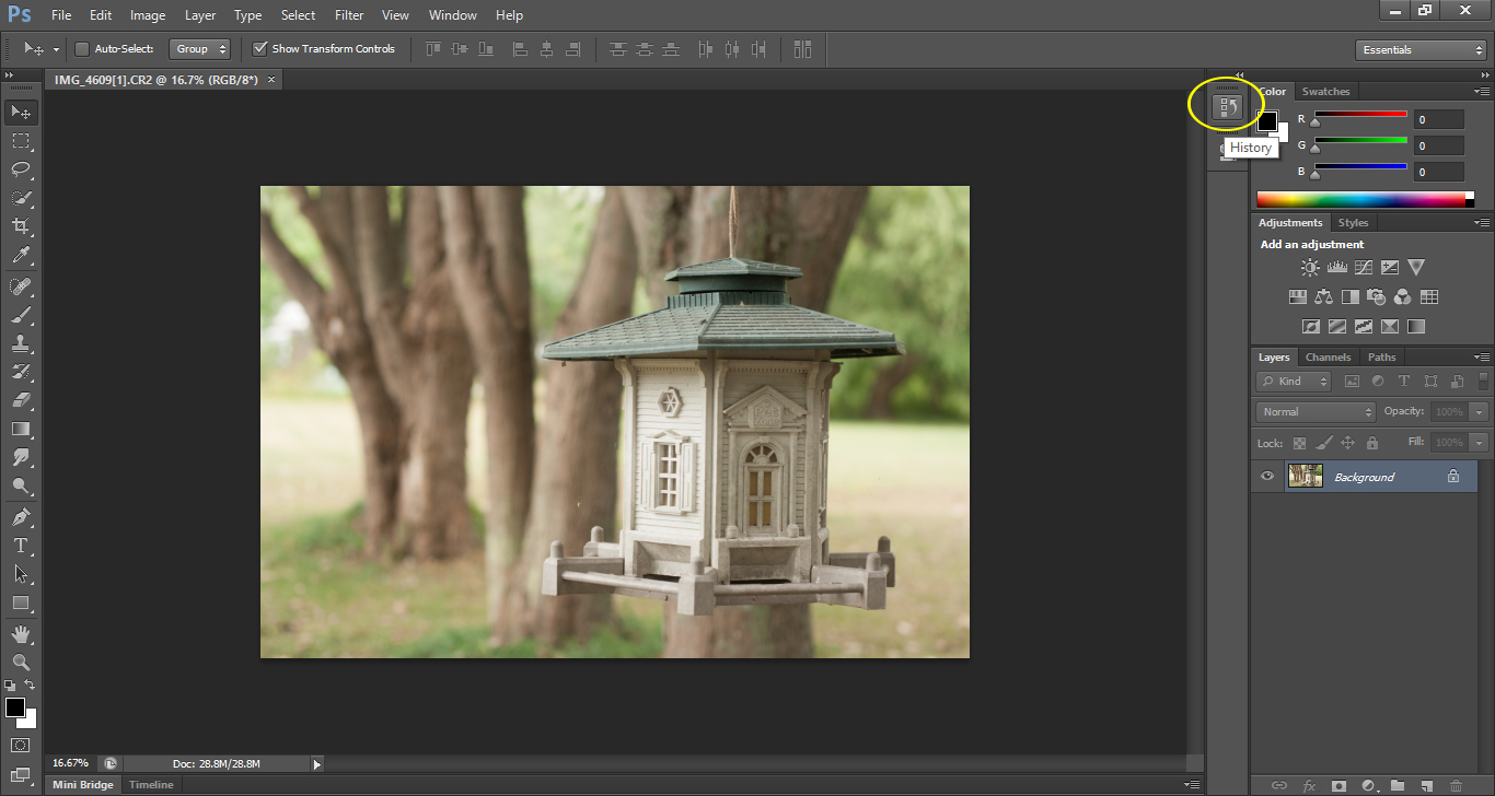
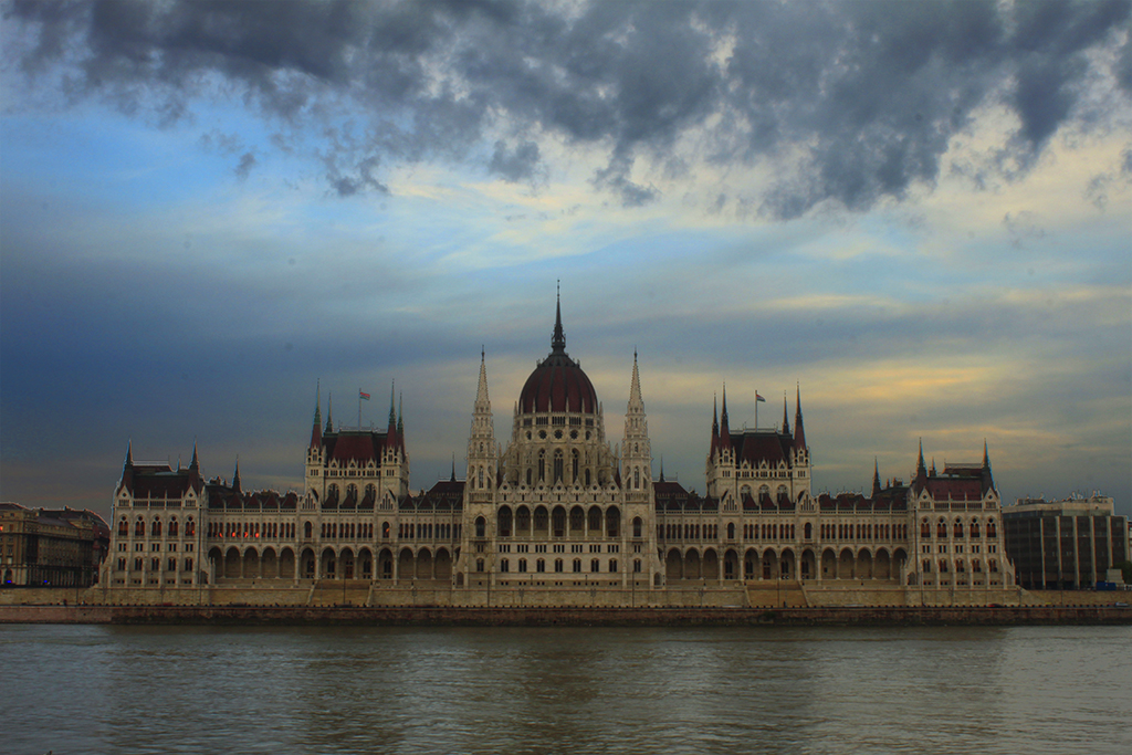
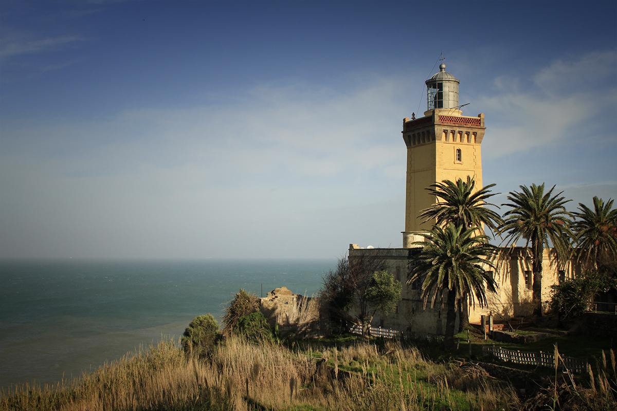
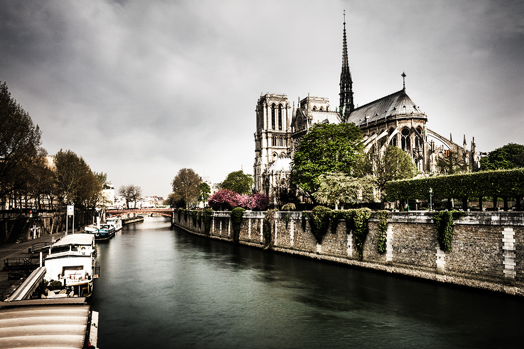
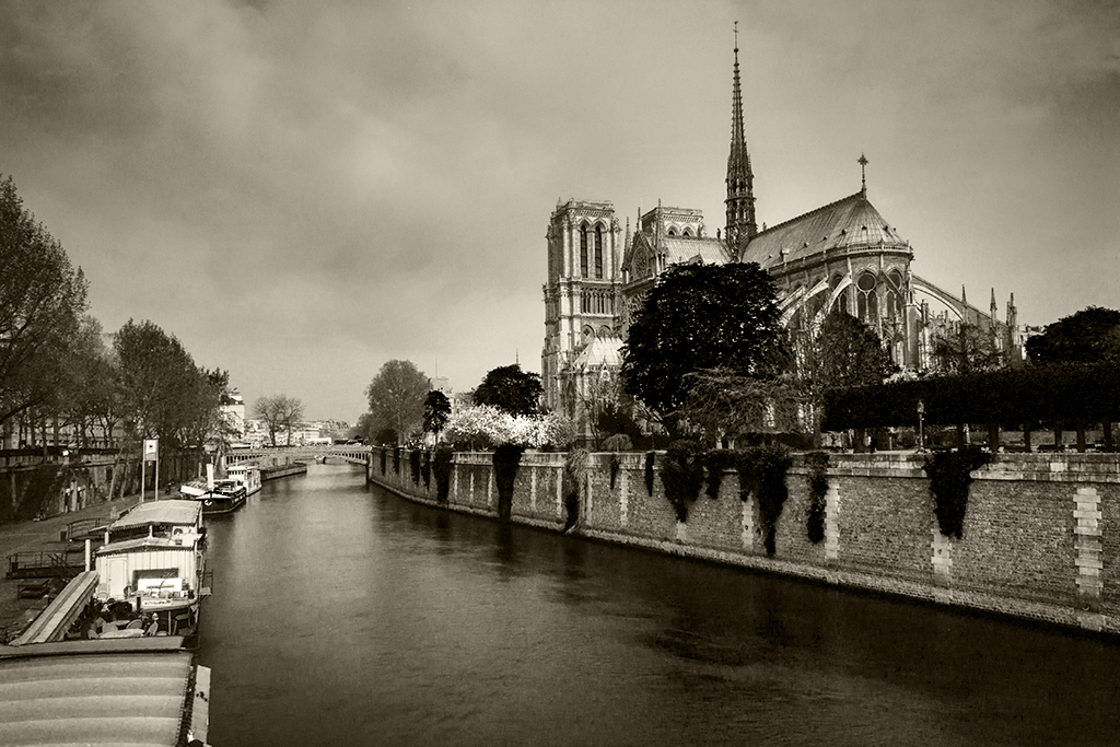
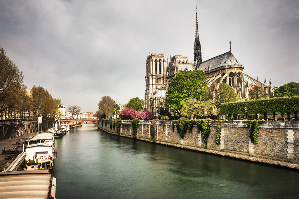
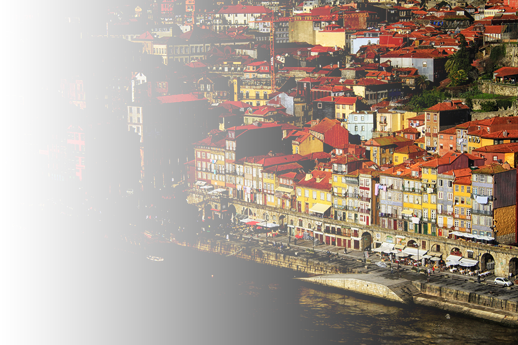
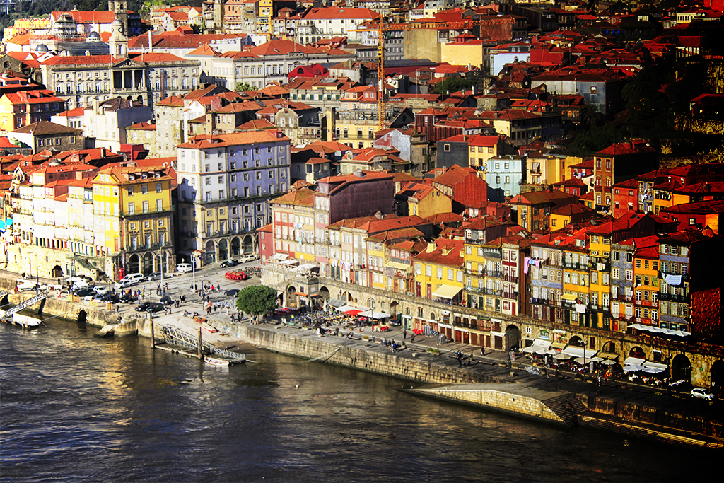
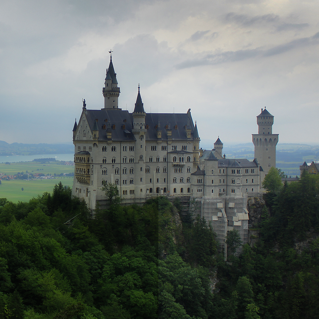
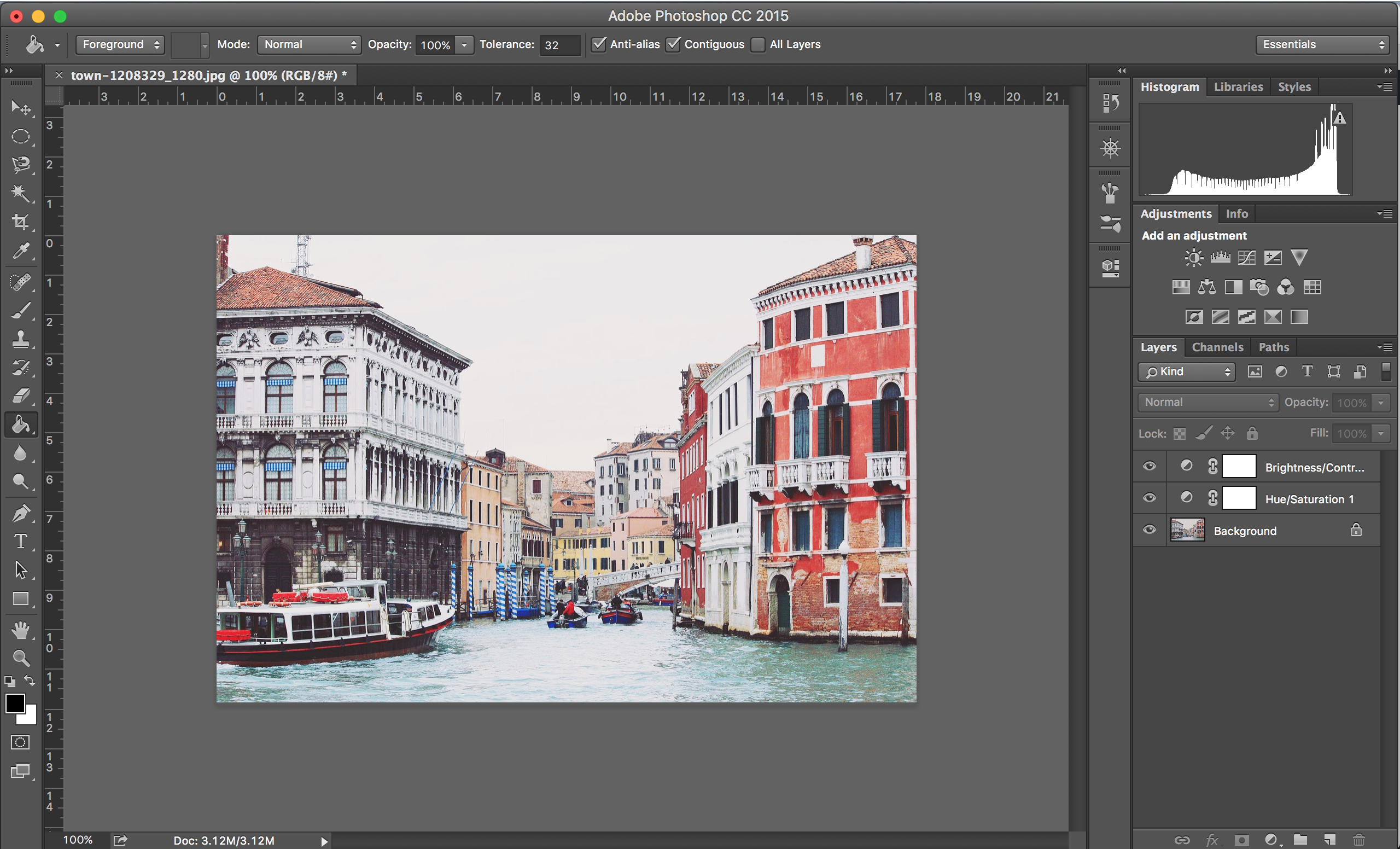
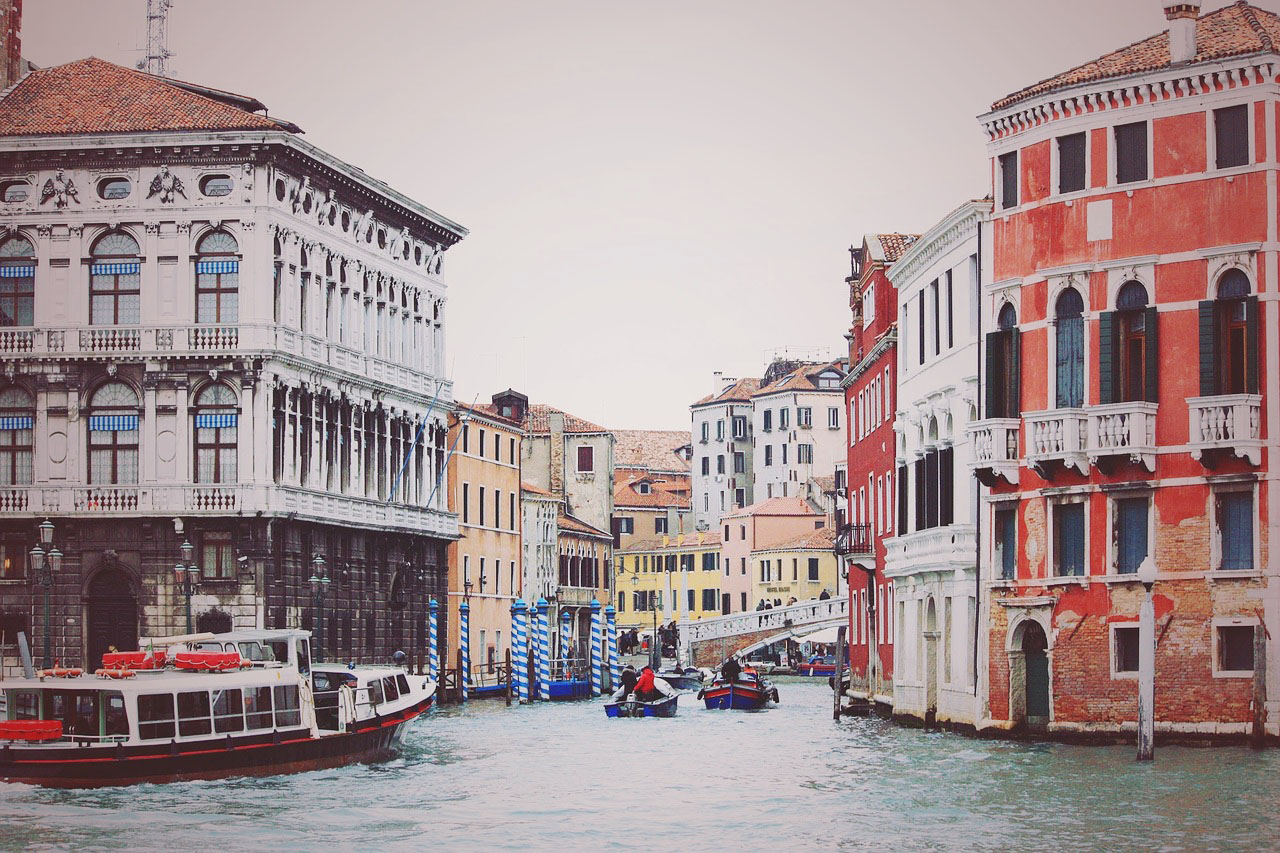
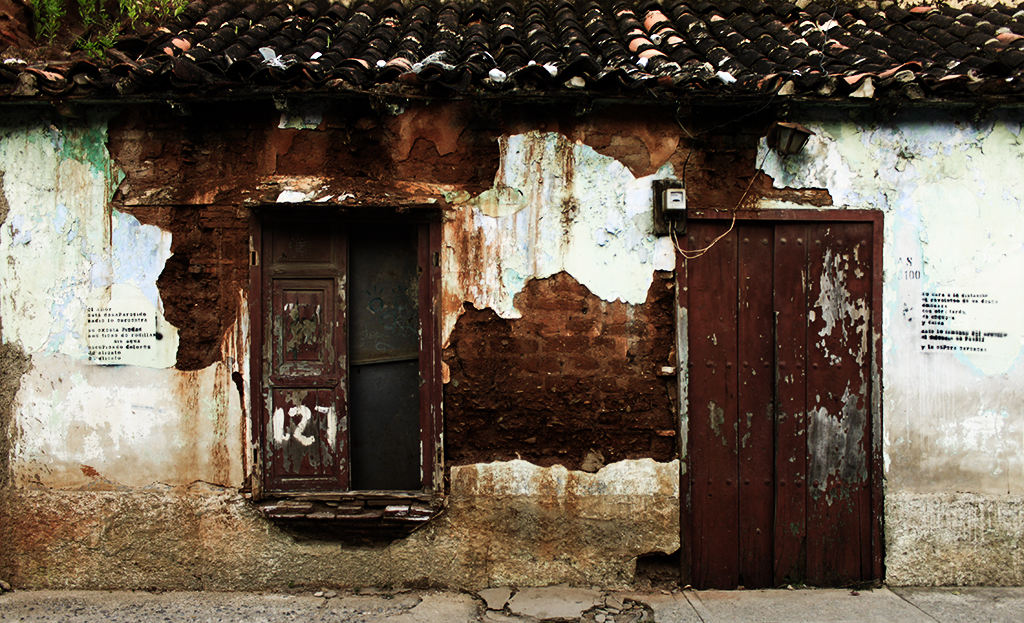
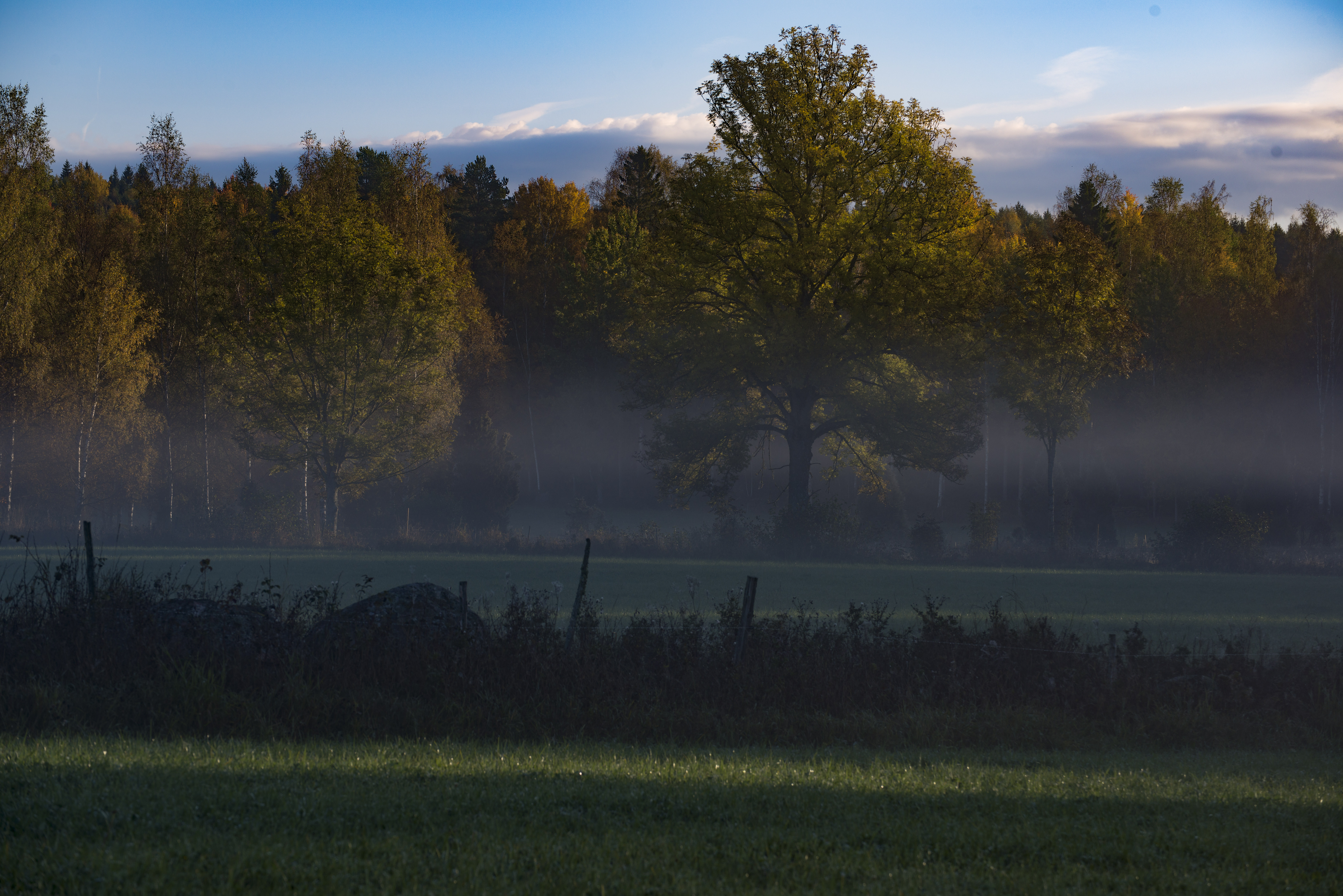
Take, for instance, the following photo of a house, downloaded from Pexels, a free stock photography website.

colorize01

Let’s take action and try to change the color of the door. What allows us to actually change the color of objects without having to worry about each individual pixel is the description of a color not in terms of the RGB channels (the amount of red, green and blue) but in terms of HSI (hue, saturation and intensity). By changing these three factors of a given color, all the Photoshop Textures of the surface we are colorizing will remain intact.

Adjustment layer

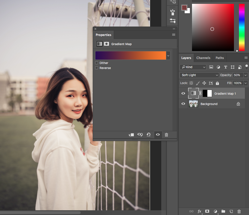
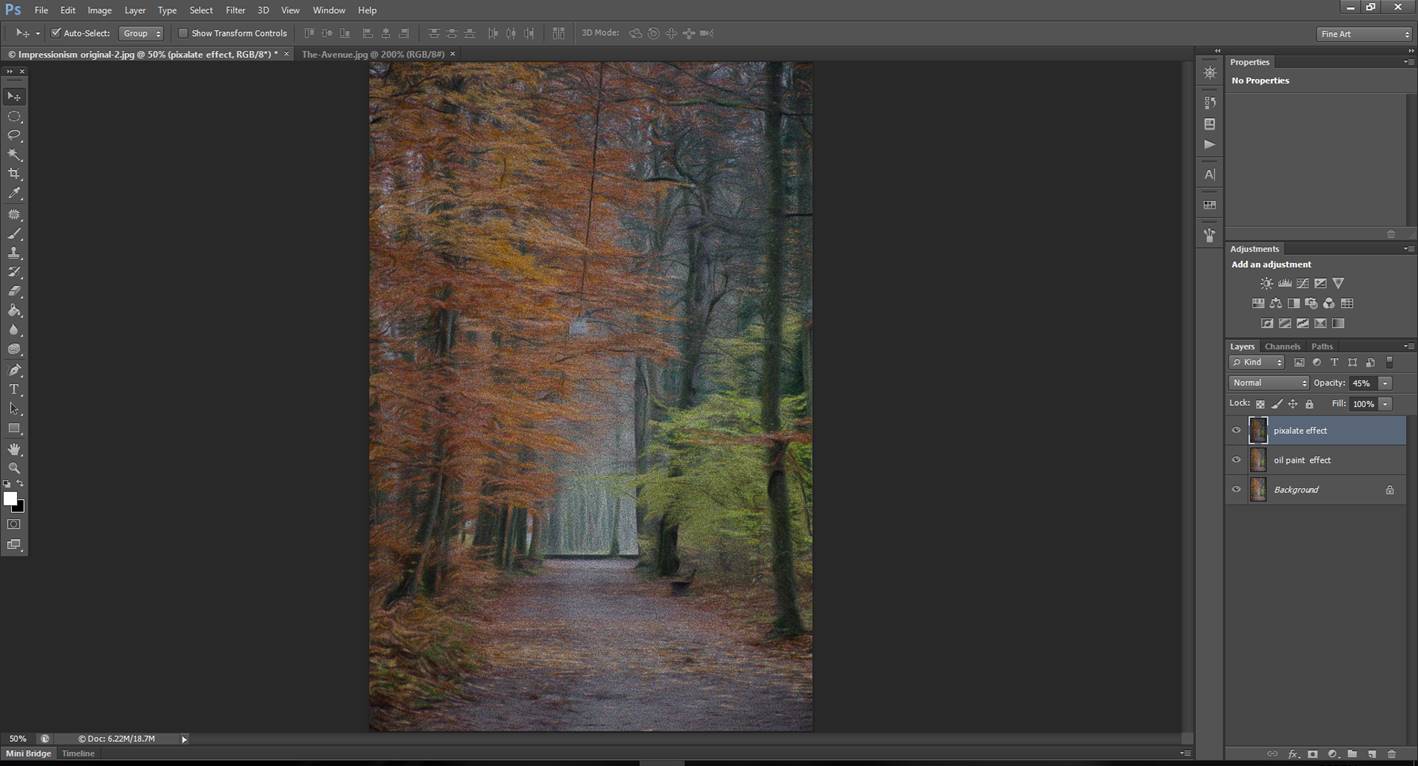
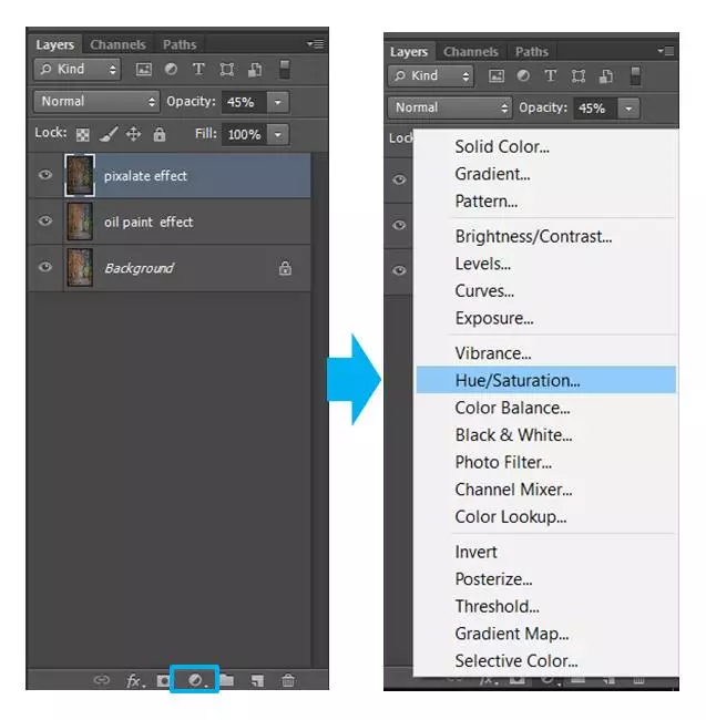
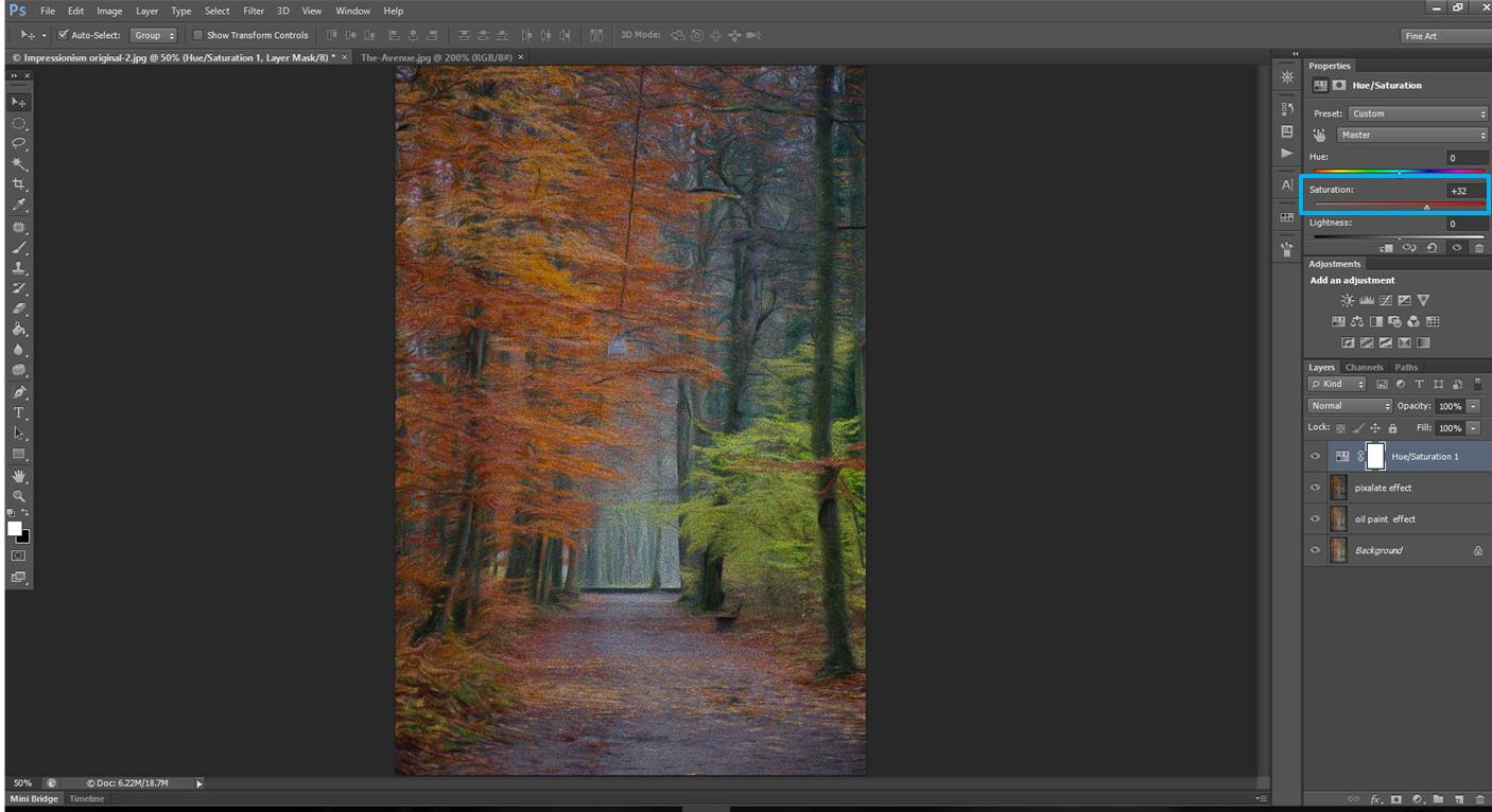
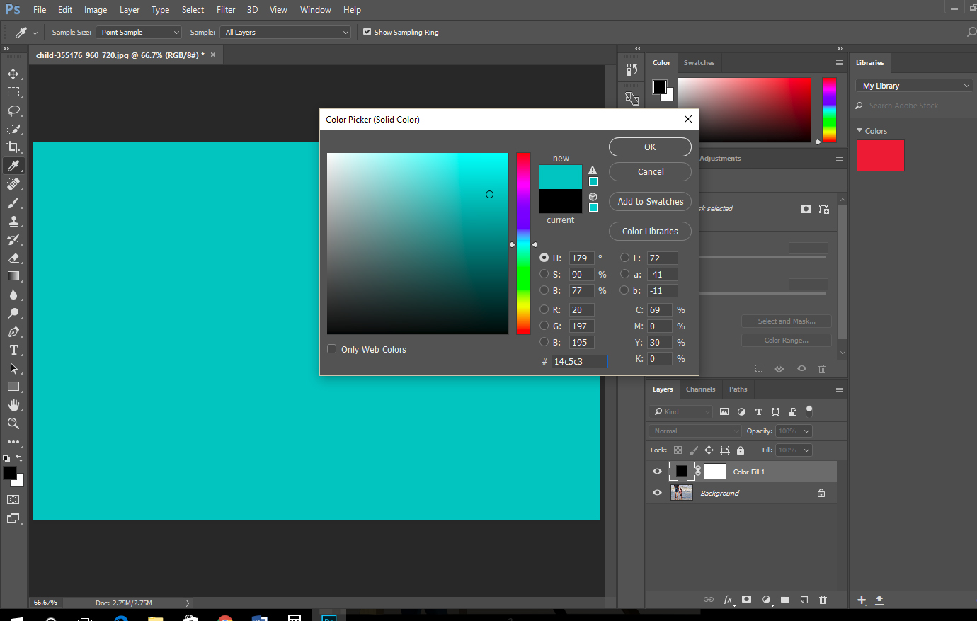
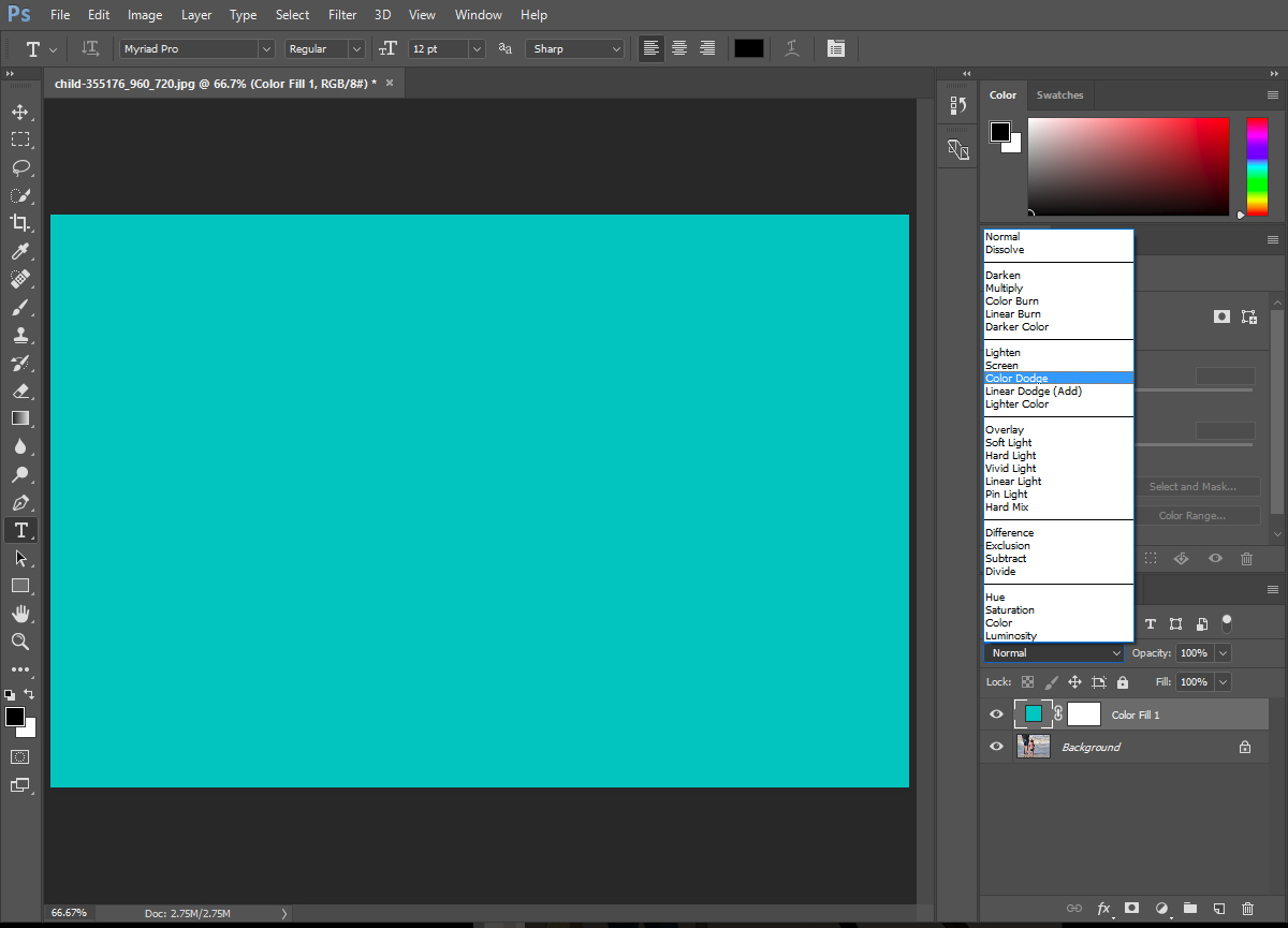
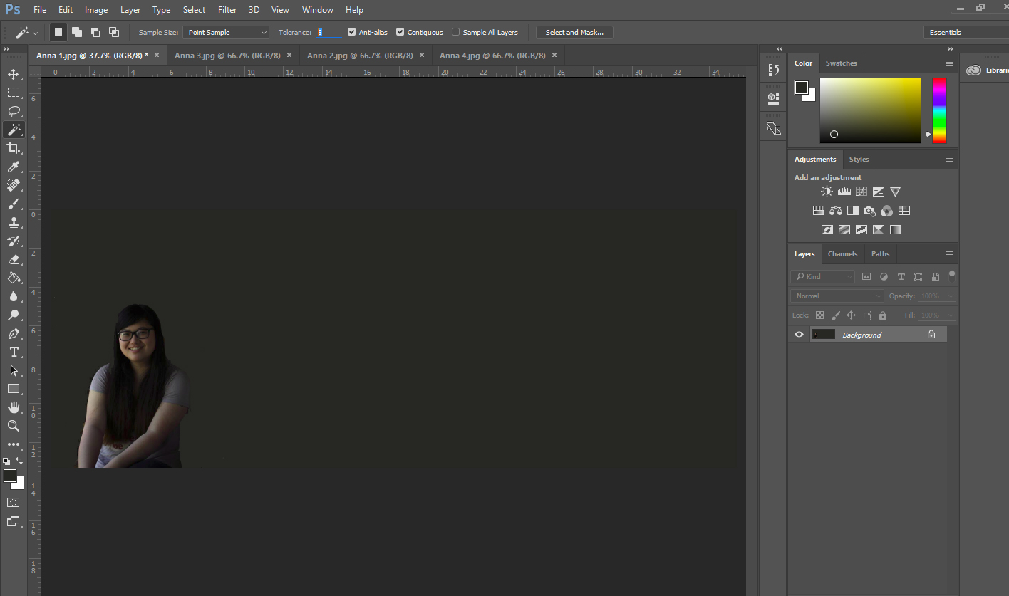
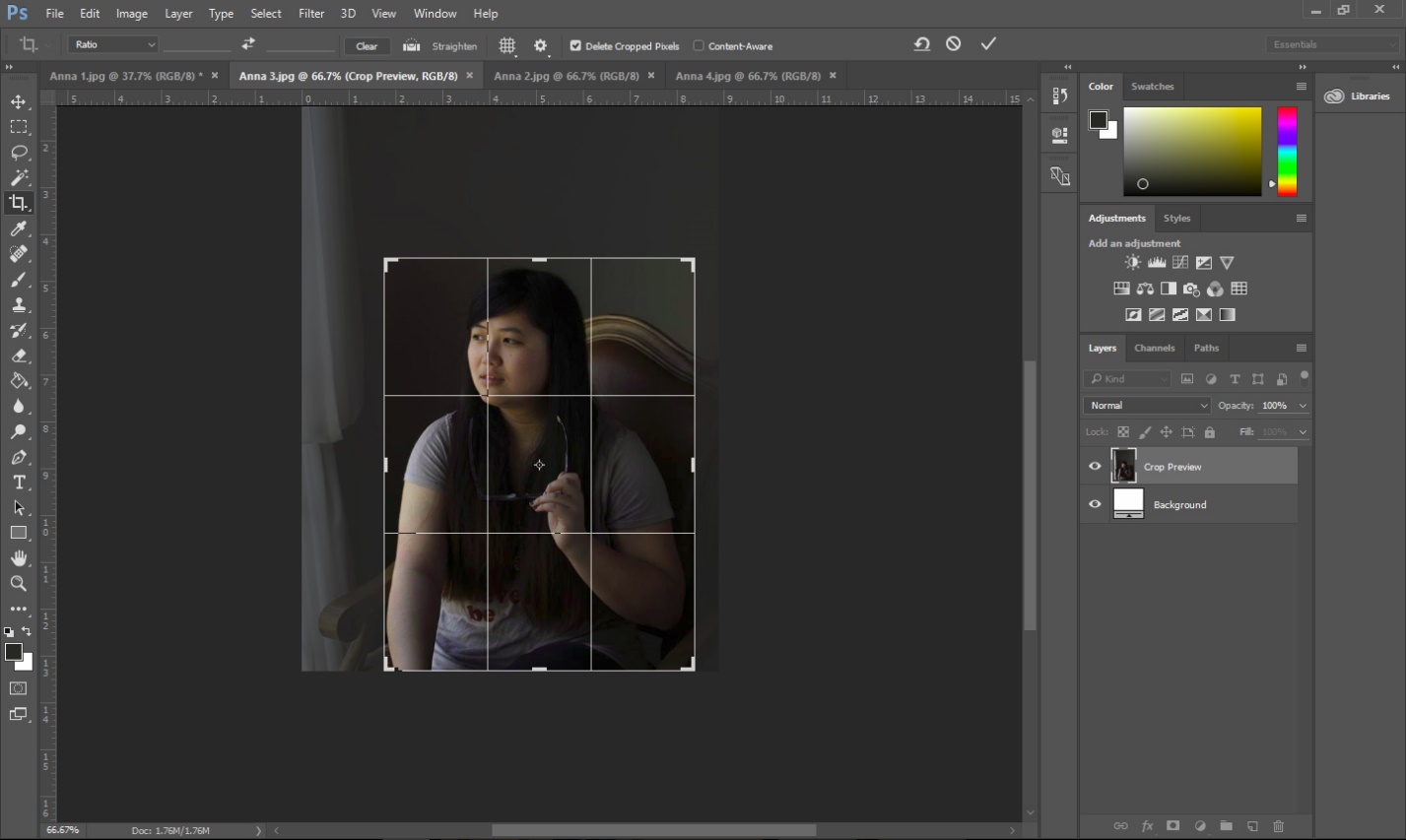
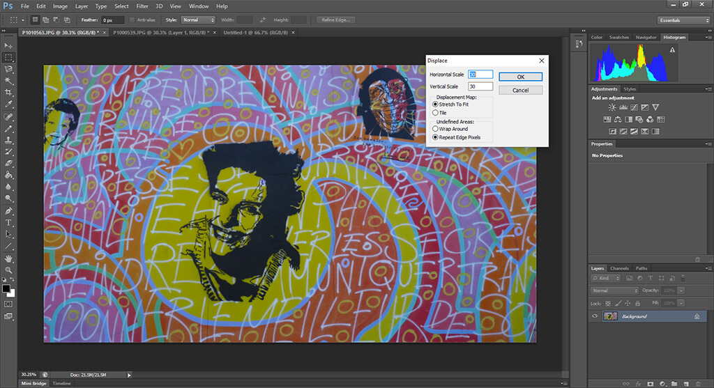
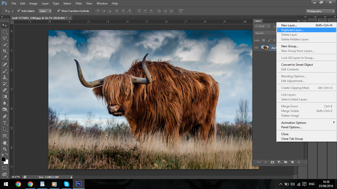
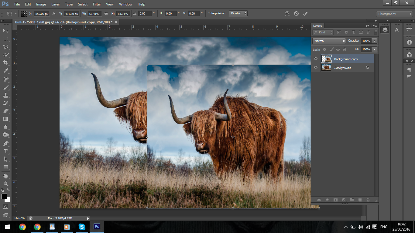
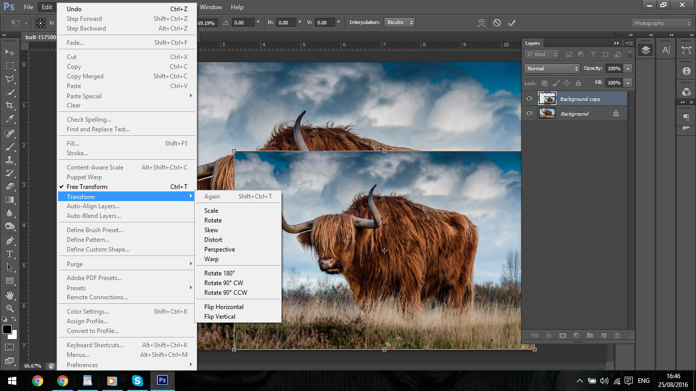
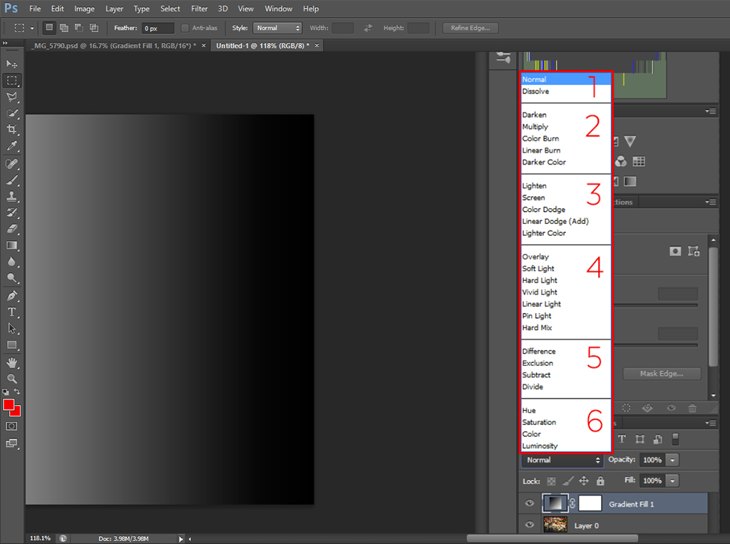
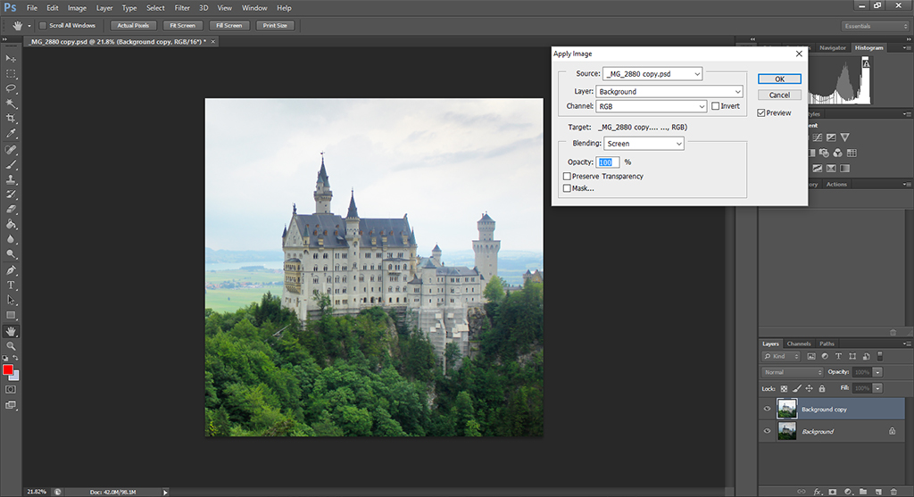
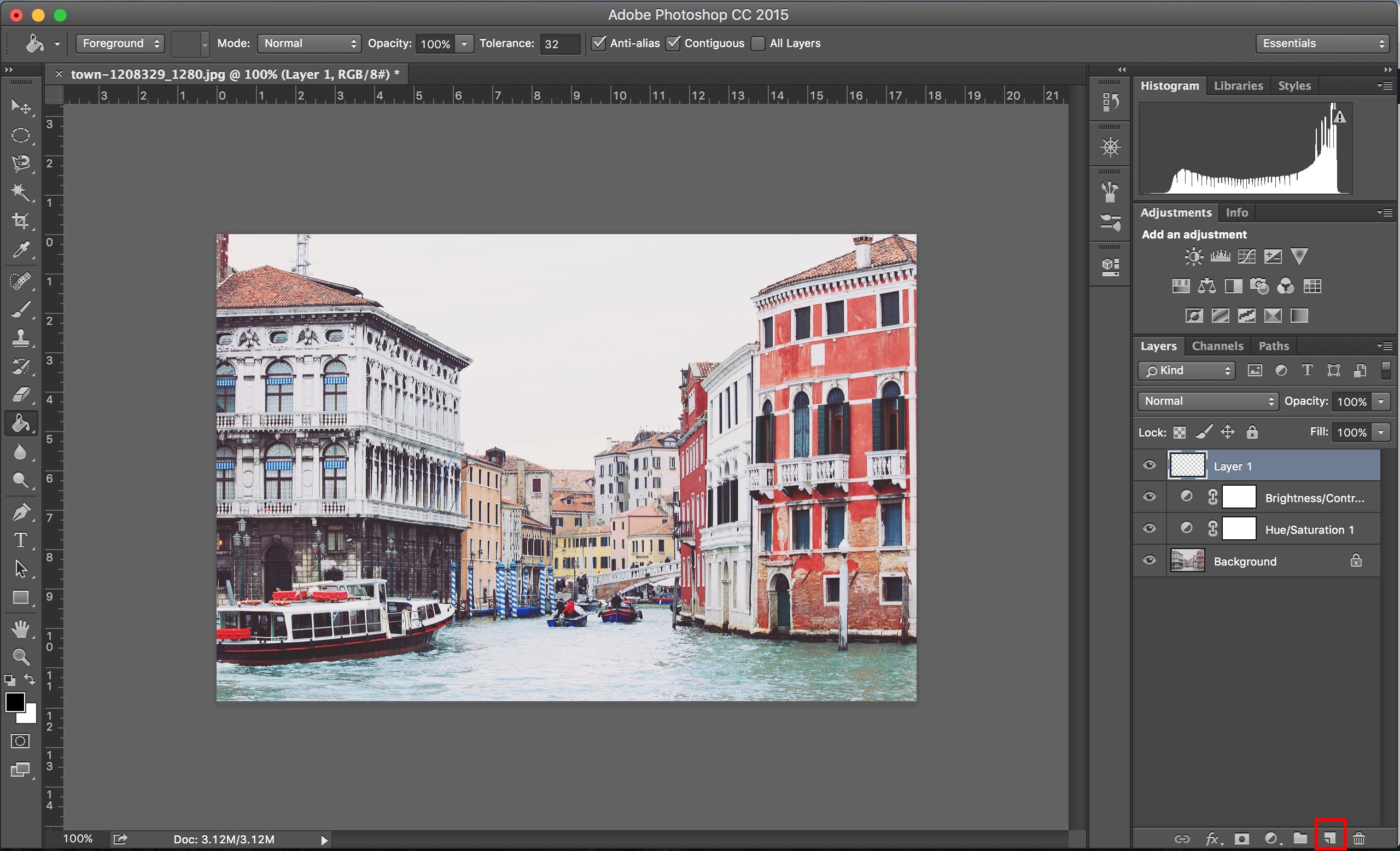
The first method I want to show you here is the use of the Hue/Saturation adjustment layer. Start by duplicating your base layer to make sure that you always have your original image untouched. You can do this by pressing Ctrl+J (in Windows) or by going to the ‘Layer’ menu and clicking on ‘Duplicate Layer…’. Then create the Hue/Saturation adjustment layer by using the menu at the bottom of the Layers panel or by going to ‘Layer’ -> ‘New Adjustment Layer’ -> ‘Hue/Saturation…’.

colorize02

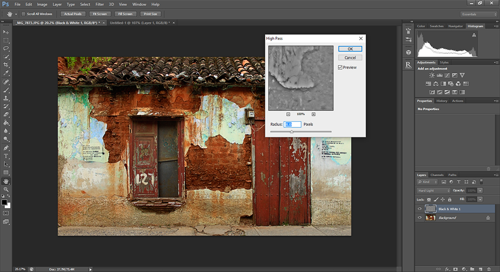
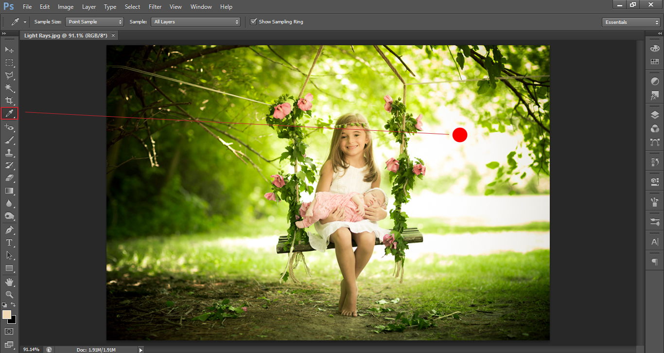
The next step is to select the color you want to change. While to door is clearly green, by simply selecting the green color in the dropdown menu of the Hue/Saturation panel will do a decent job, but not perfect. This is because the range of colors that Photoshop calls green does not cover the whole range of our photo due to the shadows and differences in lighting. To fix this, use the eyedropper tool with the plus sign located at the bottom of the panel and click at different areas of the door, specially at the corners, where the shadows make the green look darker.

colorize03

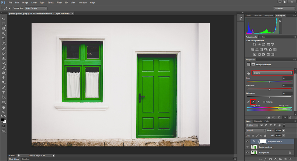
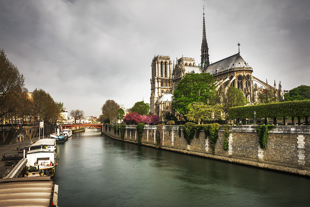
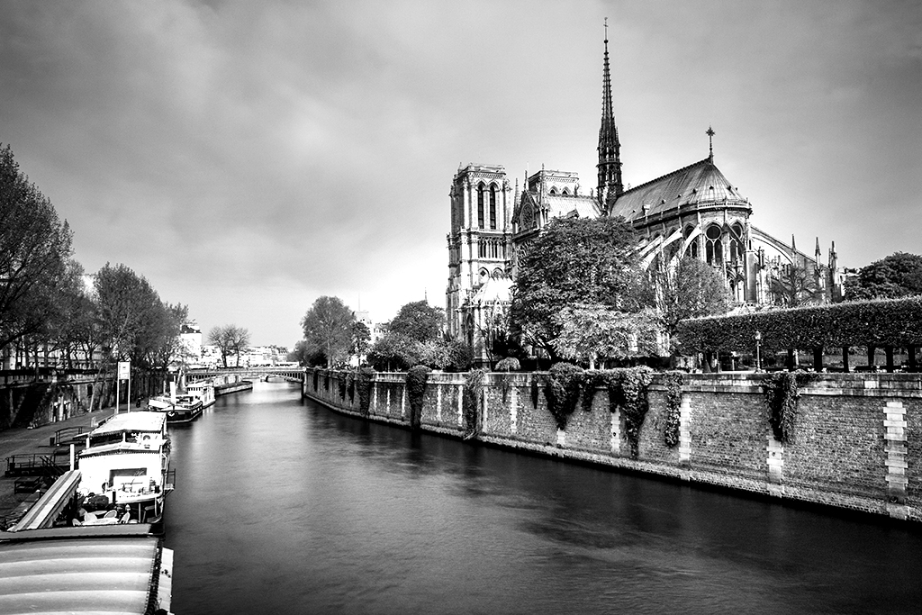
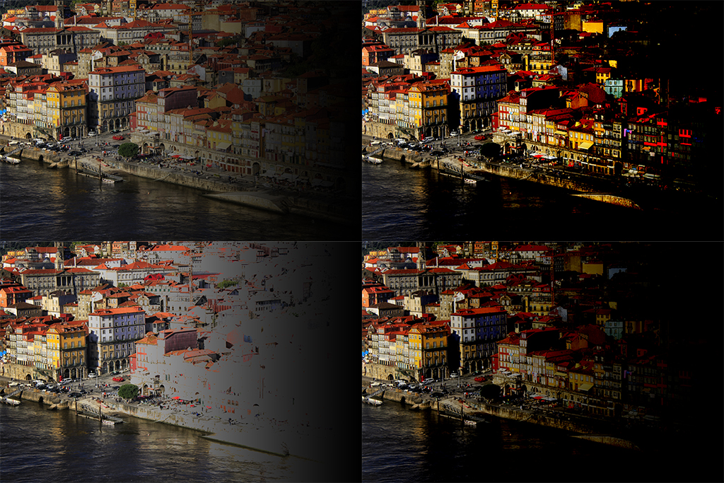
After doing this, if you move the ‘Hue’ slider, you will see how the color of both the door and the window change. You will see that the overall result is quite good, although not perfect. The following image is obtained after increasing the hue to +71.

colorize04

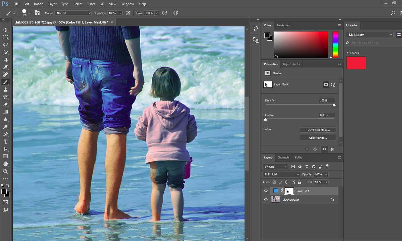
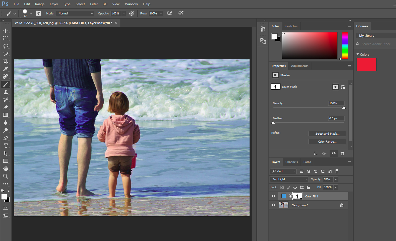
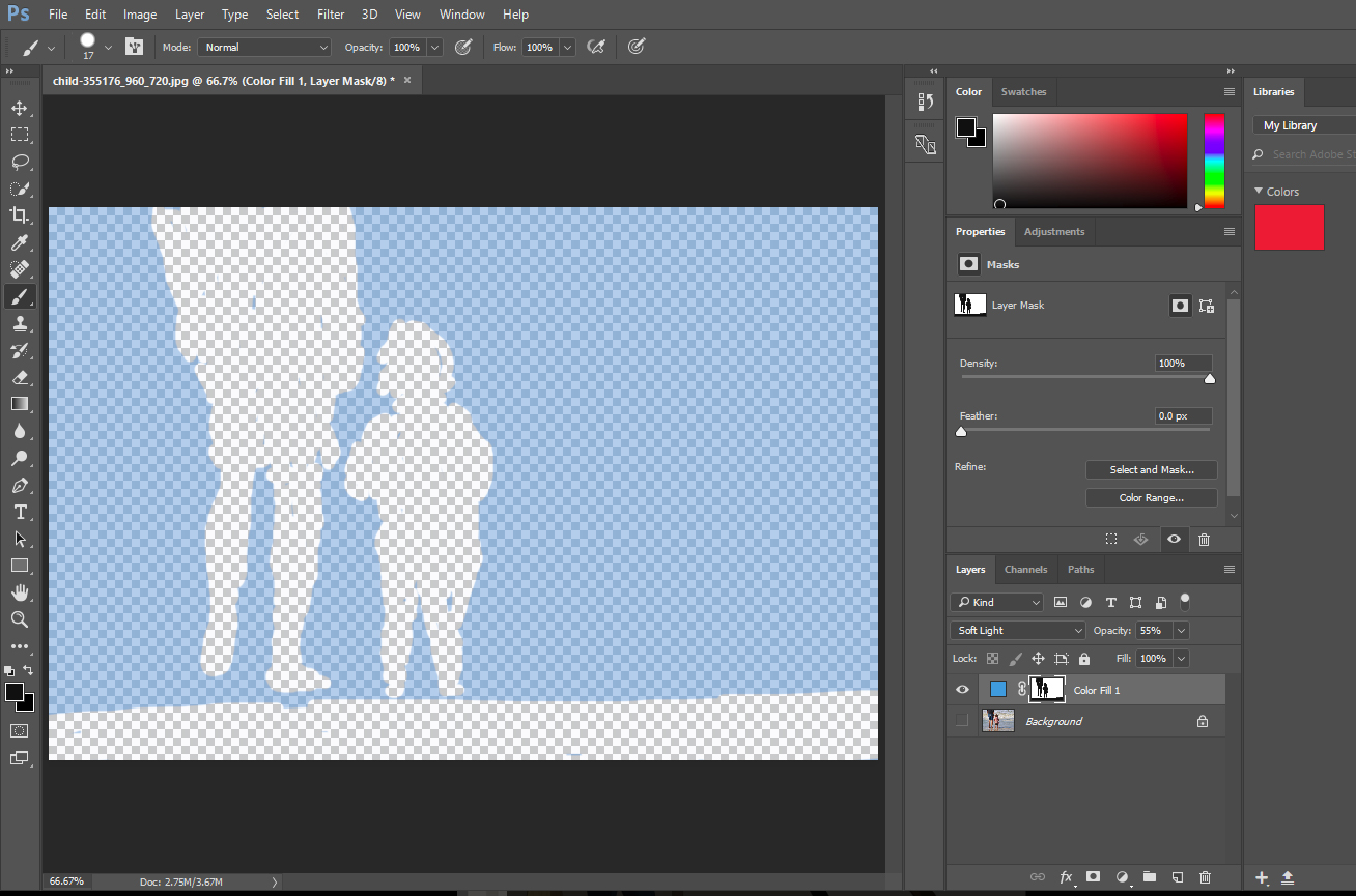
First of all, some things that we did not want to change actually changed, most notably the window, but also the rock border at the bottom of the house. This is because while selecting the color in the Hue/Saturation panel we also selected colors contained in these two parts of our image (this is quite obvious for the window, but not so for the border). Fixing this is quite simple: you just need to paint with a black brush over those areas in the layer mask (white canvas on the right hand side of the Hue/Saturation layer) that is automatically created with the adjustment layer.

The other problem is on the dark areas of the door, mostly on the top and the bottom right corners and the unevenness of the paint in general. You can almost see the green paint below the blue one. To correct this can become quite complicated and involve a lot of work at a small scale. In general, the Hue/Saturation adjustment layer is a great choice when you have either a relatively flat surface or when you have large variations in contrast that you actually want to keep, like for instance when coloring hair.

Color Replacement Tool

For our case, the second option I want to present here makes it possible to get clean result without having to make too many small adjustments. The ‘Color Replacement Tool’ is located together with the ‘Brush Tool’ on the left-hand panel. This tool allows you to sample a color in your photo with a given tolerance and replace it by a pre-selected color, once again preserving the shadows and structure of the area you want to colorize. You can either select the color from the color palette of Photoshop, or hold the alt key with the tool selected and click in any area of your image (or some other image).

The cursor will be now a circle (similar to the brush tool one) but with a small mark at the center. Wherever the mark is, that specific color will be replaced with our pre-selected color, covering all the area marked by the circle surrounding it. This means that if we select a rather large circle, we can put the cursor over any part of the green door without even being careful for the circle not to go outside the door, since Photoshop will make sure that the only colors replaced are those that fall within the color we want to change plus a given tolerance that can be selected by the user.

colorize06

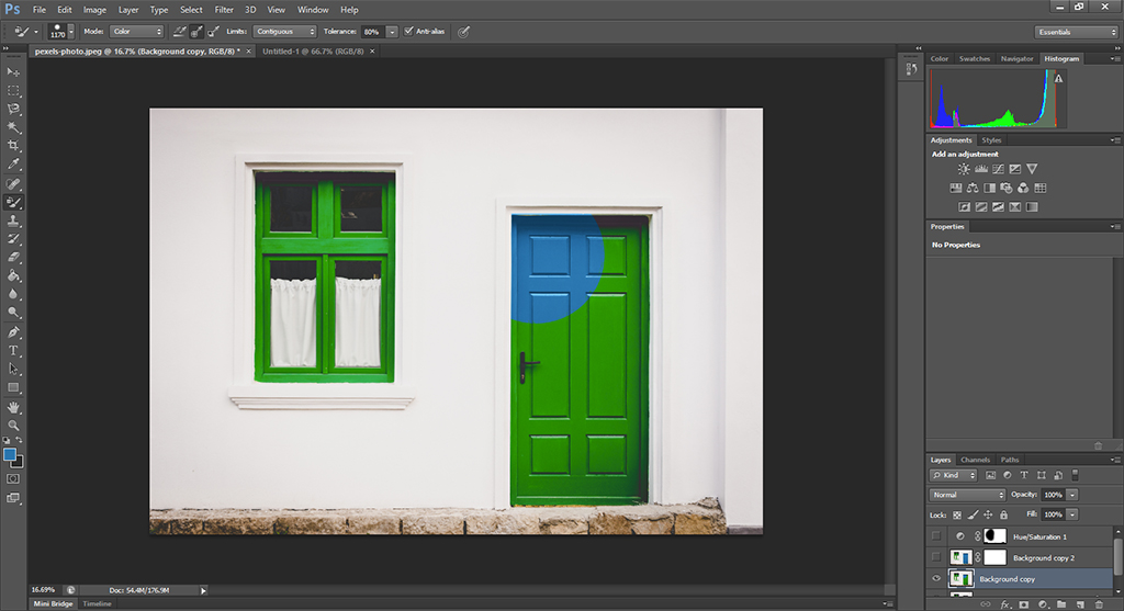
Notice how, even when selecting a large radius (1170 px) and tolerance (80%), Photoshop is able to cleanly select the pixels that do correspond to the door. While painting over the handle, it makes sense to lower the tolerance a bit and, of course, if you are dealing with a low contrast image (our original image has a high color contrast, which makes the whole process much easier!) you will have to play a bit with this value while going through different areas.

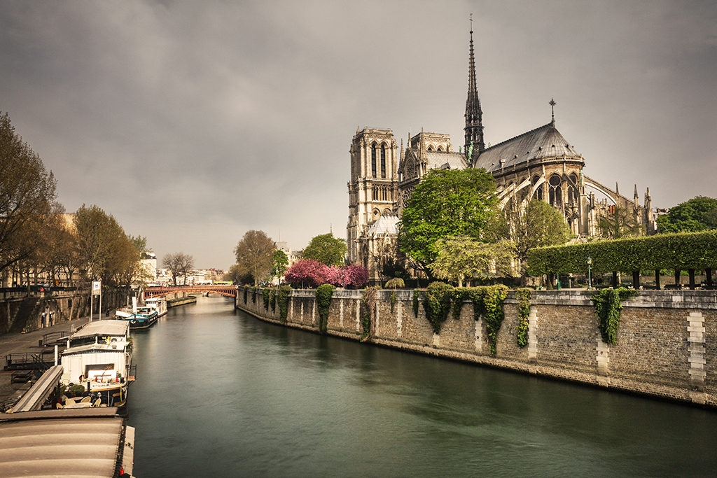
If you look closely, some white areas on the top of the door are also painted in blue. This can be improved, once again, by changing the tolerance or by simply masking out the effect by creating a layer mask and painting over the affected areas with a small brush. The final result after using the color replacement tool over the whole door is shown below.

colorize05

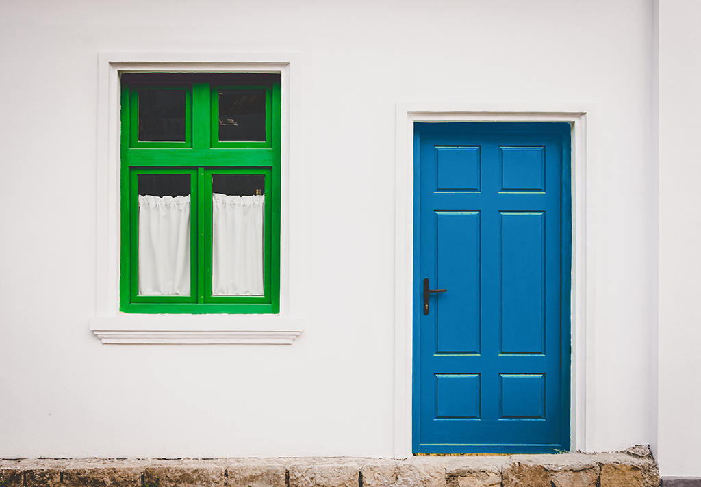
As you can see, the result is consistent over the shadowed areas as well and in general is much flatter than when using the Hue/Saturation method, something that was desired in this case, although not always. As I mentioned earlier, if you are trying to change the color of areas with a lot of contrast that you want to keep in the end (like for instance hair), the Hue/Saturation method will work better, so whatever your situation is, give both methods a try to find the one that suits you best!

Do you want to know how to resize an image in photoshop?


Frequently Asked Questions

Learning how to change color in Photoshop is an important skill to master to level up your photo editing capabilities. You may be able to accomplish some color changes by using Photoshop Actions, which are similar to Lightroom Presets.

Whether you’re new to the Adobe Photoshop color change process or want a refresher, here are some frequent questions users have about how to replace color during editing.

You probably think of hue as a synonym for color, but experienced artists and photographers don’t use the two terms interchangeably. It’s critical to know the difference between color and hue:

  • Color is a general term describing every hue, shade, tone, tint, or shade the human eye can perceive. This includes shades of gray, black, and white.
  • Hue refers exclusively to the pure colors you’ll find on the color wheel. Specifically, only red, orange, yellow, green, blue, and violet are hues.

In essence, all colors have a dominant hue. For example, lavender has the dominant hue of violet, while sage green has the dominant hue of green.

It’s also helpful to understand a few other terms:

  • Shades are created by adding black to a hue to create a darker color. Navy blue, for example, is a darker shade of blue.
  • Tones occur when you add gray to a hue. They are less vibrant versions of the original hue.
  • Tints arise from adding white to a hue. For example, adding white to red creates a pink tint.

Adobe Photoshop allows you to adjust the hue, saturation, and lightness of any image. Within the Hue/Saturation command, you’ll find the Hue Slider that specifically allows you to adjust the hue to change color in your image.

How do you use the Hue Slider in Photoshop? Start by selecting Enhance, then Adjust Color, then Adjust Hue/Saturation. You’ll now see the Hue/Saturation dialog box. It’s a good idea to check “preview” to see the results of the changes you make.

Next, you can select “Master” to adjust all the colors of a specific hue in your image. For example, you can choose green to change all the instances of green. If you drag the slider right, you’ll adjust the color clockwise around the color wheel. Dragging to the left lets you move counterclockwise around the color wheel.

You can also adjust a specific color, such as a single shade of green. If you opt to adjust a single solid color, you’ll see sliders between the color bar that allow you to define the color range to change. You can use the Eyedropper tool to select, add, or subtract colors from the image.

Another way to make image adjustments in Photoshop CC or Photoshop Elements is to select the Colorize option. This approach lets you change all colors by colorizing gray pixels while leaving black and white pixels untouched.

The Eyedropper tool is one of the most valuable assets in Photoshop. As a color picker tool, the Eyedropper empowers you to select colors from anywhere and add them to your swatches for later use. For some users, the Eyedropper tool is the easiest color replacement tool to master.

You can also use the Eyedropper tools while making hue and saturation adjustments. If you want to adjust a specific color range selection, click or drag within the image using the Eyedropper tool. You can use the Add to Sample Eyedropper tool, which looks like the standard Eyedropper with a small “+” next to it, to expand your color range. Want to subtract from the color range? You’ll employ the Subtract from Sample Eyedropper tool, which looks like the standard tool with a small “-” beside it.

You can also use keyboard shortcuts to add to and subtract from the range when using the Eyedropper tool. On both Windows and Mac, clicking shift will add to the range. To subtract from the range, click Alt for Windows or Option for Mac.

A layer mask lets you hide part of a layer. Since layer masks are easy to reverse, they provide significant editing flexibility compared to deleting or erasing part of a layer.

You can use layer masks to complete a color replacement for part of your image without changing colors in your image as a whole. After opening your image, create a duplicate layer in Photoshop. Next, using the layers panel, hide the background layer and add a layer mask to the new layer you created. Select the layer mask and click on the brush tool.

Choose black for the foreground color.  Use the brush to draw over the parts of your image that you do not want to change. Next, select the layer (not the layer mask), then choose Image > Adjustments > Hue/Saturation to select the new color. Turn your background color back on to reveal your edited image.

You’ll often see the terms hue and saturation discussed together in photography, but it’s important to know the difference between the two. Hue refers to each different color of the color wheel – red, orange, yellow, green, blue, and violet. Saturation is color intensity.

You can adjust hue and saturation, along with lightness, using the hue/saturation command. Select Enhance > Adjust Color > Adjust Hue/Saturation to get started. This step will display a dialog box with three sliders: the Hue Slider, Saturation Slider, and Lightness Slider.

Adjusting the Hue Slider will adjust the color on the color wheel. With the Saturation Slider, dragging left will decrease the richness of the colors, while dragging right increases saturation. You can use the lightness slider to change Photoshop lighting effects. To make an image darker, drag the Lightness Slider left to add more black. Dragging to the right will increase brightness by adding white.


PS Tools Used to Make Portraits Stand Out

Simple portraits are beautiful and worthy of being shared online, but sometimes, they can look a bit boring.

However, that doesn’t mean you need to delete every portrait that looks too dull. Knowing how to enhance simple photos will:

  • Make you a better retoucher
  • Inspire you to find beauty even in the most insignificant places
  • Encourage you to get better at mastering simple themes and compositions

Before you’re even tempted to delete that rich collection of simple portraits, try to enhance them using these incredible Photoshop tools.

Patch Tool

photoshop patch tools
If you look closely, you’ll notice that a few of the model’s blemishes and neck wrinkles are gone. Even though the patch tool might seem like an insignificant part of Photoshop, it will make your editing workflow easier.

This handy tool will patch up any blemishes on your model’s face. You can also use it to get rid of wrinkles, stray hairs, and facial hair. Simply draw over the area you’d like to fix and drag it to a clean patch of skin. I recommend dragging your selection horizontally, as this will create a more natural look.

I don’t recommend using this tool to fix large areas on your model’s skin. Dragging a very large selection away from its source will result in blurred, unflattering-looking skin like this:

photoshop patch tools

Gradient Map

If your portraits are lacking in contrast, you don’t necessarily have to use Curves or Levels. Gradient Map, a tool that’s often overlooked, will make your portraits stand out within seconds.

ps tools gradiant map

Before you create a new layer, press D on your keyboard. This will set your colors to black and white.


photoshop tools set colors
You can also find Gradient Map in Image > Adjustments.

When you select Gradient Map, a small window will pop up. Make sure Dither and Reverse are unticked and click Okay. Then, change your layer mode to Soft Light and lower your layer’s opacity until the results don’t look too dramatic. Even though Gradient Map can look images look intense, you can use it to add a bit of contrast to your images without wasting a lot of time.

If you want to give your photos a more nostalgic feel, change your colors to something other than black and white.

PS tools dither and reverse
You can either manually change your colors or choose from a few styles in the Gradient Map window. For this photo, I used a variety of tones to add both contrast and warmth to the image.

Screen Mode

Screen mode is a layer mode that’s often used to create double exposures. It can also be used to add reflections and textures to photos of all kinds.

ps tools double exposure
The extra image, combined with the aforementioned Gradient Map tool, resulted in a portrait with lots of textures and vibrant colors.

For this to work, you need to have a variety of stock photos. You can either take them yourself or download them from a website like Pixabay or Unsplash. Use photos that have a lot of light and space, but also remain open to using photos with unusual compositions.

Place your stock photo over your portrait and change your stock photo’s layer mode to Screen. This will immediately brighten your entire image. If the effect is too dramatic, use the Curves or Levels tools to edit the stock photo only.

If you’re not satisfied with the results, use another image or add multiple photos to your portrait. There’s no limit to how much you can do when it comes to these “double exposures.”

ps tools

Using these simple Photoshop tools, you’ll be able to enhance even the simplest of portraits. And the next time you’re tempted to delete that precious photo, open it in Photoshop and give it a chance to show its true potential.


Photomerge Secrets in Photoshop

Panoramic photos give viewers the surprising sensation of looking at an actual view rather than a flat image. These wide images engage peripheral vision and give a depth, unlike any other photographic style. To get these stunning visuals, however, photographers have to master photomerge. Although the function has many uses outside of regular panoramas, it’s best known for connecting many separate shots of the same, horizontal view.

Photomerge can also compensate for restrictive lenses and limited views. If a photographer can’t fit an entire beach-lined cliff into a single shot, they can take a number of photos that can be joined together in post-production. Photoshop’s photomerge is versatile and necessary in the age of digital photography, but it can be frustrating. A few tips, tricks, and secrets can make the process easier.

beach panorama

Organize Your Images

The biggest and easiest photomerging mistake to make is to not organize your shots before beginning the process. Photo order is everything. Without it, you’ll get a jumbled mess. It’s a lot of wasted time and a headache waiting to happen. The secret to avoiding 90 percent of your issues when merging photos is to take the time to check and double check your image order at the very beginning.

Not All Settings Are Created Equal

The different merging functions in Photoshop create extremely different images. Many will warp your images to make them fit together, and others will leave choppy edges that need to be trimmed out during a later step in post-production. Depending on the scale, number, and orientation of the photos, many of these settings will turn out very poorly. Some, such a spherical, only work in certain conditions, and few stay true to your intended perspective. This means the auto setting isn’t always your friend.

warped photomerge image

Experiment with all the different settings so you understand exactly what they do. Ideally, run the same set of photos through each setting for the best comparison of the differences between settings. Everyone’s tastes are different, but you’ll be able to clearly note which settings heavily distort images (perspective, cylindrical, and spherical) and which generate the fewest changes in your source material (collage, reposition). Remember, the setting makes the image. You don’t want to have to worry about fixing distorted images in post.

Uniformity

There are two easy ways to make your separate pictures blend seamlessly into a unified whole. Once you’ve organized your images and selected your optimal setting, stop to select a few additional options. First, use blending. By checking each Blend Image box, you give Photoshop the power to automatically adjust for exposure discrepancies, color variation, and other slight differences that would disturb the final image’s uniformity.

photomerge blending

Vignette Removal is your second tool. Shadows occasionally creep into your shots, especially from things like the lens hood. Vignette Removal adjusts the image to compensate for those dark spots. It effectively erases them, so you don’t have multiple camera hood shadows across your panorama.

Manual Corrections

As we’ve mentioned before, auto settings will only take you so far. If you want to get the absolute best results from your merged images, you’re going to have to dig into the more detailed settings. This process begins before you even order your photos. Try making images as similar as possible before merging in order to prevent loss of detail.

Start with something simple, like exposure. Lowering exposure while increasing recovery will boost fine detail. If the shadows get too dark, adjust the fill light bar. Use this three-step process on all the images you plan to merge. The color and exposure may not be exactly the same across the board, but you can eyeball your shots well enough to prevent the Blend and Vignette functions from going overboard. This should even save you time when you sit down for final edits.

Accept that There is No Perfect Merge

The ultimate secret of any photography tool is that it cannot produce a perfect image, especially not through automatic settings alone. The good news is, Photomerge isn’t the only feature in Photoshop. Once you have your merged image, it’s time to get serious about cropping.

photomerge cropping

Even though you may have blended five or six images, you may discover that it’s really the combination of one, two, and three (with a sliver of four) that have the best composition. You can’t know what a merged image will look like until after the process is complete, so don’t be surprised if you end up taking fewer pixels from the final merge than you expected. Crop well, crop thoroughly, and don’t feel bad about leaving a lot of image on the chopping block.

Photomerge is all about preparation, careful selection, and lots of cropping. You may not be able to get it right the first time, but by taking control of automated functions like Blend, you can improve your results. You can make the final image even better by performing some basic editing before you merge. In the end, don’t be afraid to crop. Photomerge is only one step in post-production.

How to Master the Clone Stamp Tool in Photoshop

The clone stamp is among one of the most useful tools in Photoshop. It paints a sampled pixel of an image, allowing you to manipulate the photo in a very creative way. The clone tool is beneficial when it comes to adjustments, such as eliminating blemishes and getting rid of objects that could serve as a distraction. It is also useful when it comes to duplicating objects.

In this Photoshop tutorial, we’re going to show you how to use cloning to get rid of unwanted objects in your photograph, as well as provide you with tips that will help you master the clone stamp tool. We’re going to be using the photograph shown below as a starting point.

clone stamp photoshop tutorial

How to Use the Clone Stamp Tool

1. Go to the toolbox in Photoshop and click on the clone stamp.

2. Pinpoint what you want to remove from the photograph. With our current example, we’re going to get rid of the painted freckles on the model’s face.

clone stamp

3. In order to get rid of the freckles, we’re going to use the clone stamp tool to sample her skin. Doing this will make her appear as if she never had any freckles on her face by replacing them with freckle-free patches. To use the tool, position your cursor to the area you want to clone and then Alt-click (Windows) or Opt-click (Mac). Try to match the skin you’re cloning as best as you can. Choose an area that is close to the spot you want to replace and has the same color tone.

alt click clone stamp

4. Take the cursor and click on the freckle. The clone stamp will remove the freckle and replace it with the skin we’ve cloned. Perform this process for each freckle.

using photoshop clone stamp

5 Tips to Help You Master the Clone Stamp Tool

Now that you understand what the clone stamp tool is and how to use it, here are some tips to help make your experience with this fun tool a little easier:

1. Work in a New Layer: Working in a new layer is always important when you’re working in Photoshop. Most of the time, it’s a process when it comes to crafting the perfect photo, and the clone stamp tool can be a bit tricky if you’re not careful. However, once you’ve master this tool, it’ll become your best friend. Working in a new layer helps when you’ve made a mistake. A new layer doesn’t disrupt the original photo, so you can always go back to fix it. Remember, you can flatten your image when you’re done.

photoshop new layer

2. Zoom in on Your Photo: In Photoshop, you always want to make photos look realistic. Zooming in on your photo is important because it allows you to look at the fine details. This is especially important when it comes to using the clone stamp. The clone tool will help you match colors in your photo as accurately as possible. However, most photos have a varying range of colors due to highlights and shadows. Zooming in will ensure that you can effectively use the clone stamp by allowing you to see the different range of colors from the best angle.

3. Set Your Brush Size: Setting your brush size is an integral part of effectively using the clone stamp tool. One issue you can face is having a brush that is too large. If your brush is too large, it will clone areas that don’t actually need to be cloned, causing the photograph to look disfigured, discolored, or unnatural.

brush size photoshop

4. Set Your Brush Hardness: Like your brush size, the hardness of your brush plays a key role in truly mastering the clone stamp tool. Your brush hardness will determine how the cloning will blend. For instance, if you set your hardness to 100%, your edges will be hard and defined. Similarly, if you set it to 0%, the edges will blend. It’s better to start with a softer brush to make subtle corrections to your photograph and move up as needed.

5. Resampling: Anytime you’re using the clone stamp tool, you want to be sure to resample often as this will ensure that you don’t leave a seam where you replace pixels.

clone stamp final image

Clone stamping is a fun and creative tool that will enhance your post processing experience. Many photographers use the clone stamp because it is helpful when it comes to skin retouching, getting rid of distractions, and duplicating objects. We hope that this tutorial has provided you with an easy way to master the clone stamp tool so that you can continue to take your photography to the next level.

Last but not the least, you can learn here how to cut someone’s hair out of a picture using photoshop

Why is Photography Post-Production Important?

Post-production is the defining factor that separates professional quality images from casual snapshots. Just as writers need editing, photographers need post-production. You don’t have to be a professional, though, to benefit from editing tools. Even if you don’t plan on selling or showcasing your photos, you still want your photos to represent what you meant to capture. Although photography techniques and equipment continue to improve, its methods are still primitive compared to the mechanics of the human eye. Post-production gives photographers the opportunity to fix errors and enhance an image’s features so the image lives up to the photographer’s vision.

Post-production is half of the art behind photography. It’s the photographer’s chance to engage with their photos in a hands-on fashion, making improvements and alterations to the RAW image. The photographer’s artistic vision is not complete until after the finishing touches they add using photo editing software like Photoshop or Lightroom.

Flaws

Reality isn’t perfect. Your camera isn’t perfect, either. Sometimes the weather doesn’t cooperate and you’re left with images that appear too dull, too dark, or even overexposed. Accidents happen, too, and you may discover your perfect shot was actually taken with the wrong settings. Portraits may need retouching, and you may discover your photos are off-center or in need of cropping. No photographer, and no camera is perfect.

Photos Aren’t Always True to Life

No matter how advanced your equipment may be, it can’t capture the exact same shades and lighting you perceive with your naked eye. Every photographer is familiar with the frustration of trying to capture a beautiful sky without turning the foreground into a black mass. On the other hand, if you have a clear, well-illuminated foreground, the sky will almost inevitably become a blank, gray or white field. The secret to linking illuminated foreground with fascinating clouds and blue skies is post-production.

editing foreground

Light is essential for photography, but it can still cause problems. Although you can control your light sources very well in an indoor studio, you may still have issues with color. Light causes more problems when you shoot on location, however. You will deal with backlit subjects, side lighting, and frustrating shadows. Your eyes compensate for various light levels, but your camera records all of those levels at the same time, which means even slightly brighter areas will appear overexposed in your image. Post-production allows you to adjust the image the camera captured to match what you saw with your eyes.

Your Vision May Not Be True to Life

Photography is an art form. In order to bring your vision to life, however, you will often have to manipulate the contents of your photo. Post-production allows you to bend reality to suit fantastical shots or to add various effects to your work. It’s common for photographers to blend black and white techniques with color features, or for light sources included in an image to be exaggerated for dramatic effect.

bring photo to life

Post-production also gives you tools to manage the quality and focus of light and color. This is essential for composites and single images alike since these qualities set the tone and mood of your photo. The same qualities also determine the focus of an image. Many of today’s most popular photographers use regular post-production techniques to transform simple images into fantastic glimpses into the photographer’s imagination.

Benjamin Von Wong takes incredible underwater photography, for instance, and relies on post-production to translate flat, gray shots into images full of bright contrasts and dazzling colors. Von Wong routinely overexposes his images in order to have the most range for post-production. While it’s easy to enhance shadows, it’s harder to recover details buried in darkness. Without the edits he makes in post, his images wouldn’t quite be the breathtaking masterpieces that have gone viral.

Even Good Photos Could Be Better

Even a little time in post can turn an average photo into something worth sharing. The second look gives photographers the chance to see their image as a viewer rather than as the photographer. They can assess angles, light, and subject. Cropping, one of the easiest and most common post-production tools, can dramatically change the entire focus and balance of an image.

photo composition

More advanced techniques can reveal details lost to overexposure and restore a realistic color balance to the image. Whether you are improving professional portraits or trying to recapture the memories in your vacation pictures, post-production can make the difference between giving your image a frame or sending it on a trip to the trash can.

Everything you do in post is just as important as the initial shoot. Collecting RAW images is probably more fun than editing them, but a RAW image is an unfinished product. Photographers often display some of their greatest artistic talents in post-production, and photography is one of today’s most popular art forms. It doesn’t matter if you take photographs for yourself or others. You owe it to your craft to spend at least a little time in post-production.

A Photographic Journey around San Felipe, Mexico

I have had the opportunity the past four months to live and photograph around San Felipe, Mexico. San Felipe is located in the Baja California and located about 2-3 hours south of the border along the side of The Sea of Cortes. San Felipe is filled with color, culture, great food, and beautiful desert land. Pack all of the correct gear for your travels and take an adventure to gather some great photographs. San Felipe SignOn your way to downtown San Felipe, you will first spot The Arches, a very popular monument of San Felipe. They call the arches “The Gateway To The Sea” The arches offers many angles. However, the only problem photographing the arches are all of the distractions around such as signs and wires, which you can Photoshop out later. Around and past the arches you will also find a hillside where you can explore to gather some more cultural photographs of the areas. This area is where you will find all of the best authentic food with local taquerias and is always a great photo op in itself by practicing your food photography. Down at the end of San Felipe is The Malecon, which sits next to The Sea of Cortes. The Malecon is lined with restaurants, shopping, and with a great view of the sea. This is where all of the events happen in towns such as food festivals, music festivals, and parades. This is a great place to take some iPhone street photography. San Felipe ArchesSan Felipe Culture

San Felipe Food Truck

San Felipe TacosSan Felipe TortaSan Felipe DowntownSan Felipe MaleconSan Felipe MaleconSan Felipe Shrimp FestivalSan Felipe is also a great place to gather some night photography. One of the best spots for night photography is down at The Shipyard, which you will find at the end of The Malecon. The Shipyard used to be a marina but was flooded, and they could not move the ships, so they are left there are part of a San Felipe gem. Up on a hill, you will find a building, The Boom Boom Room, a place that has also been abandoned and a very interesting location to photograph during the day or evening. Up on a mountain, you will find a little yellow chapel that looks over the town of San Felipe and right next to it is the lighthouse, which you can shoot from ground level or up at the top where the prayer building is. This is a great place to work with your angles. If you are in town during the full moon make sure to catch the moon rise over The Sea of Cortes: I was there for supermoon, and it was an incredible experience and a really good opportunity to try my moon photography skills and also work with some post editing. San Felipe Tampico ShipSan Felipe BoomBoom RoomSan Felipe MexicoSan Felipe ChapelSupermoon in MexicoThere are many smaller day trips you can take from San Felipe for some great opportunities including more water and desert land. On a note of transportation, you will need some form of 4-wheel drive out in the desert. It is a famous landmark in the area is The Valley of The Giants and a photo opportunity you will not want to miss. The valley holds cardon cacti that stand nearly 50 feet high. You can also drive further south to Percebu where you will find a little more surf in the water and also a great location to find treasures along the beach. Along the way, you will find more abounded buildings and interesting homes and land to photograph. The desert land has a lot of beauty to offer, and San Felipe is surrounded by beautiful desert land. You can take a drive out west closer to the mountains for some more variety in your desert landscape. The desert also offers some interesting finds such as bones, rocks, and maybe even a carcass or two. If you are going out in the middle of the day, you will have problems with harsh lighting in your landscapes, but you can always enhance your lighting in post production with landscape Photoshop actions or Lightroom Presets and Brushes. Valley of the GiantsValley of the GiantsPercebuSan Feipe DesertSan Felipe Mexico DesertSan Felipe Mexico DesertI hope you have the opportunity to visit San Felipe in your future travels or even Baja California to discover color, culture, and beautiful desert land by the sea or ocean side. As they say in the Baja “No Bad Days!”

How to Make Impressionism Photos with Photoshop

The inspiration that leads the creation of your photography can come from sources that are not exclusively photography. The different art movements can be a great source of creativity. Romanticism, impressionism, realism, art Noveau… all these tendencies can give you ideas about color palettes, subjects, composition…  In this article I want to show you how to add an impressionist look to your photos in few simple steps in Photoshop.

impressionism

Impressionism

Impressionism is a paint movement that started in France in the 19th century. They were pretty innovative at that time because of their new approach to their work. Briefly, some of the characteristics of Impressionism are:

  • They focused in visual effects and not details. Photography just appeared at that time and painters felt that this new field was able to represent all the details in an image. For that the reason they decided to change their strategy and aim for sensation instead that for accurate representation.
  • They painted mostly outdoors
  • They used bright colors
  • Their main subjects were: passage of time, seasons, weather, leisure…

One of the most famous painters is Claude Monet (1840-1926). In fact, its paint “Impression, sunrise” is the one that gave the name to the art movement. Others are Renoir, BazilleSisley

impression-sunrise-2
“Impression, sunrise”, Claude Monet.

To get the desired effect, impressionism artist used different techniques. One that relevant to us is the “Impasto”. They apply thick layers of paint. For that reason brush strokes are visible. Keep this in mind when you are creating your impressionism images.

How to create an impressionist looking image in Photoshop

Creating images that look like coming from an impressionist artist can be done in few steps using Photoshop.

#1. Choose an image

You can choose any image you want, but I think it is more meaningful to respect the Impressionism ideas. They optimize the technique in order to represent their vision of reality, so if we try to think with an impressionist mind, we have more chances of getting a nice result. Impressionists painted mostly outdoors and they loved to paint about sensations. I would recommend you to start by choosing a nature photography.

impressionism
For this tutorial I chose an autumn photo because of the impressionist’s love for seasons and passing of time.

#2. Choose an impressionism paint you like.

We are going to use the impressionism paint for its colors, so focus on them when you are choosing them. You can, of course, choose any other photo with colors you like or skip this step. But I think that spend some time looking for impressionism paints is a source of inspiration that can have a positive influence in your photography.

the-avenue
I chose “The Avenue”, a work of Claude Monet

#3. Open both images (your original one and your impressionist paint) in Photoshop

impressionism

It is important that you open the 2 photos in Photoshop (Learn about photoshop here).

impressionism
As you can see inside the blue rectangle, I opened both files.

#4. Create 2 new layers in your original image

In your photo, click Ctrl+J twice to create 2 duplicates of your background. You will now have: background, layer1 and layer 2 copy.

impressionism

You can rename them to “pixelate effect” and “oil paint effect” if this makes things easier for you.

impressionism
You can rename a layer by double-click in its name.

#5. Add impressionist effects to the “pixalate effect” layer.

You can change colors in Photoshop in different ways. Here we are going to use the “Match color” tool. To do so, with the “pixelate effect” layer selected, go to Image>Adjustments>Match color

impressionism

A Match color dialog will appear and here you need to select 100 in Luminance, 100 in Color Intensity and 0 in Fade. Then, in Source you need to pick the Impressionist picture you previously chose (step 2) and open in Photoshop (step 3).

impressionism

Press OK and voila! You have the colors of the impressionist picture in your photo! (I love the Match Colors option in Photoshop!!)

impressionism

Now we will add the pixalete filter. For this, you just need to go to Filter>Pixelate>Pointillize.

impressionism

This filter will add points to your image. You can play with the size of the points by changing the Cell size value. I personally like them small, so I am leaving here 3, that is the minimum value.

impressionism

Press OK to apply the filter. The last thing we need to do in this layer is to change the opacity to for example 40-50%.

impressionism

If you don’t like the Pointillize filter, you can try others by going to Filter>Filter Gallery. I personally like trying different filters from the section called “Brush strokes”.

imoressionism
This is how the Filter Gallery look like. There are different “Brush stroke” filters that might work really nice (like the “Angled strokes” filters. I think this one is my favorite!). Fell free to experiment with them.

#6. Add impressionist effects to the “oil paint effect” layer.

If you want to see better the changes you are going to make in the “oil paint effect” layer, you can deselect the “pixalate effect” layer.

impressionism

As in the previous step, we will Match the color to the Impressionist paint you chose. Select the “oil paint effect” layer, and go again to Image>Adjustments>Match color. Same than in step 5. You select 100 in Luminance, 100 in Color Intensity and 0 in Fade. In Source, you pick your Impressionist picture you previously chose and press OK.

impressionism

Now we will add the oil paint filter. This filter will add the look of the brush strokes to your image. Select Filter>Oil paint.

impressionism

A new screen will open. In this screen, you can play with the different values until you get the result you like the most. I personally go for Stylization=10, Cleanness around 7-8, Scale= 0.1, Bristle Detail=10 and Shine=0. You can play a little with all these values until you find one that you like.

impressionism

Press OK to apply the filter. You can now adjust a bit the colors, tone and contrast of the image by selecting Image>Auto Color, Auto Tone and/or Auto Color.

impressionism
In this screenshot you have highlight in blue (selected) the “Auto Color”. The two options on top of it are “Auto Contrast” and “Auto Tone”.

Now select again the “pixalate effect” layer to make it visible and that’s all! You have a nice impressionist looking photo!

impressionism

You can play with your image by changing the impressionist image to witch you Match colors.

2-impressionist-pictures
These two Monet paints have 2 different color palettes. On the left you can see “The Avenue” and in the right “San Giorgio Maggiore At Dusk”, both courtesy of www.claudemonetgallery.org.

2-versions

Here my two impressionist looking versions of the same image: On the left you can see the one that matches colors with “The Avenue” and in the right the one that does it with “San Giorgio Maggiore At Dusk”.

How to get the impressionist look just using my original photo

If you want to keep your original colors, you can follow the same steps skipping all the “Match colors” parts.

impressionism
Here the same photo that we used before, but just with the pixelete and oil paint filter. I didn’t matched colors with any impressionist paint.

If you do so, you might need to increase the saturation of your images color to get the impressionist look. No problem. You can just add a Saturation layer on top of all the others.

impressionism
Add a saturation layer by clicking in the icon in the lower part of the screen, here marked in blue and then selecting “Hue/saturation”.

impressionism

Move the saturation slide until you get the bright colors that are the signature of the Impressionism.

I hope you enjoy this tutorial! Now it is your turn to experiment with your own images. Have fun!

Next learn how to create dramatic effect in Photoshop

Inspired by Blue Lightning TV Photoshop.

Making Water Vibrant in Photoshop

Have you ever taken a vacation to a beach, or followed a river up a mountain? It’s hard not to want to take pictures of the beautiful scenery that water provides. Photographing water can be tricky, however. Often times the picture you take and the image you saw don’t match up. Whether it’s the way the sun reflects on the water or that your camera picked up more of the vegetation around your stream, sometimes the water in your picture comes out looking dark and muddy.

No one wants to remember a good time through pictures of murky water. Fixing this problem in Photoshop is easy, and can turn your dark pictures into beautiful memories.

water-vibrant
Before
water-vibrant-1
After

Create the New Layer

The first step in making your picture amazing is creating your new layer. Add a new solid color layer. Pick out the color that you eventually want your water to look like. (This is a fun opportunity to make fantasy pictures by using an unusual color, like purple). Your picture will then change to that whole color.

water-vibrant-2

In order to see your original picture you need to change the type of layer mask you have set. Different pictures require different settings. The most common are color dodge, color burn, soft and hard light, and overlay. In this example, we use a soft light. Play around with each of the different settings to see which one works best for you.

In this step, it’s important to only pay attention to the water. Don’t worry right now about how the surroundings or any people/animals look in the picture. We’ll be touching those up next. For now, keep your focus on how the settings make the water look.

water-vibrant-3

Separating the Water

Now that you have your water looking amazing, there’s the issue of the background and any people or animals that also inhabit the image. While the water got the special treatment, this often leaves everything else looking weird and out of place. But, there is a simple fix that doesn’t take too long.

Once you’re ready, click on the layer mask of your new layer (the white box next to your color) and set your brush to black. This process removes the layer settings from whatever you paint over. Use this to restore the original beauty to any friends or family or the natural surroundings of your water.

water-vibrant-4

When doing this, use a brush that’s smaller than the area you’re filling in, and just fill in the center. When you’re ready to move to the edges of your subject, be sure to change the opacity of your brush to a lower setting. This way you don’t have to worry as much about accidentally ruining your water. This is also a useful way of painting edges if you have an unsteady hand.

There is no right or wrong here. It all depends on what you want to do. Sometimes it’s best not to paint over everything that isn’t water. If you want to make something or someone in your image pop, it’s best not to paint the background. If you’re on a crowded beach, just paint over your models and leave the rest of the crowd in the layer mask. This will let your subjects be bright and vibrant, and the center of attention in the busy picture. You might also want to paint over some parts of your water, drawing attention to a specific location in your image.

The dad is now unpainted to draw attention to the child

Fixing Mistakes

Once you’ve finished, you may notice some mistakes, or just want to check to be sure you got everything. Here are some simple ways to check your work, and fix any errors you made along the way.

If you want to see if there are any spots in your image you missed, simply turn off the visibility of the background layer. This will produce a screen that shows translucency where you painted over. If you see any spots of color in your person or background, go back over them with your black brush.

water-vibrant-6

If you notice that you accidentally brushed over some water, or you decide later on that you really don’t want to paint over the crowd, it’s easy enough to go back. Simply set the brush to white, and paint back over your mistakes. This reverts that part of the image back to the layer mask settings.

Everyone loves a good picture of water, but it can be hard to produce. More often than not, a beautiful water scene comes out looking dark and murky in the final product. If this happens to you, it’s easy enough to use some simple Photoshop tools to turn your gloomy water picture into the amazingly bright image you remember seeing.

Here are the best ways to change colors in photoshop for you only!

How To Create a 3 x 3 Grid Collage in Photoshop

Creating a collage is a great way to show your photos. They allow you to get a bit more creative with your work and develop your designing skills. And they are perfect both for printing and for social media!

The sizes, number of photos and design of a collage are extremely diverse.  To show you how to create one, I choose the 3×3 square collage for a couple of reasons. First of all, if you have no experience with collage, this 3×3 square format is a great one to start with. You will learn the technique of creating a collage without messing with picture sizes so much (this will be the next step in your learning process). The second reason is because this collage is a great way of sharing your photos on social media, especially on Instagram. Taking into account that Instagram is one of the social platforms more suitable for photographers, I thought it might be interesting for you.

Collage

You can build your collages in different programs. Our college Arnel Hasanovic explained how to create a collage in Lightroom. Today I want to show you how I create collages in Photoshop (Or you can try an action). It takes more time than creating it in Lightroom, but it gives you much flexibility. Let’s jump into it!!

#1. Decide on the final size and resolution of your collage

You can create a collage at any size you like. In this tutorial, I am going to give explanations for a digital collage (I am not thinking of printing it) and I will use the dimensions that are ideal for publishing it later in Instagram. In 2016, Instagram square picture size in pixels is 1080x1080px. If you prefer, you can use any other square size that will be more convenient to you.  Regarding the resolution (pixels per inch, or PPI), 72ppi is considered the standard for internet images.

Collage

If you want to print it, take measurements of the place where you would like to hang or store your collage to have a better idea of the size you need. In your case, you will need to work with the size in centimeters or inches instead of pixels. Just as an example, instead of 1080×1080 px, for you it will be 20x20cm.  But the steps you have to do to create the collage are exactly the same. For printing the recommended resolution is 300 dpi (dots per inch)

#2. Calculate the final size of your individual photos

Now that you know the size of your collage, you can calculate the final size of your individual photos. You just divide the length of your collage by 3 and you have it! In the Instagram collage of 1080×1080 pixels, our individual photos will be 360×360 px (the red square in the image above). Same calculation if you are working with centimeters or inches. For example, if you want a 20x20cm collage, your individual photos will be 6.7×6.7cm.

#3. Pick your individual photos for the collage

Now that we did the hard part of deciding sizes, the fun part starts! You need to pick photos from your collection. You will need just 9, but I recommend you to pick some more in case some of them doesn’t work so well in the collage. I use Lightroom to have my photos organized. What I usually do is creating a collection with the images I want to use to create the collage. If you don’t use Lightroom, you can just pick your photos and put them in a new folder in the computer.

Collage

#4. Resize your individual images

You don’t have to resize them, but doing it will make your life easier. Your final image once in the collage will be 360×360 px. I found really useful to resize my photos to have their short side like my final square (360px).

Collage

As I am coming from my LG collection, I just resize my photos meanwhile I import them to a folder on my computer. Fast and easy! You can use any other software you like to resize your images, including PS. Do this step as you prefer.

Collage

#5. Create your new canvas in PS

The time to work with PS has arrived. If you are a PS beginner, you might find helpful a series of articles written by Julian H where he explains this software from scratch. Today we will start by creating a new canvas 1080 pixels width and 1080px height with a resolution of 72 pixels/inch. I want to create a black canvas. To do so, I choose in the “Background contents” the option of “Background color” and that I have the Background color previously set to black. I also name it as “Collage”. This will be important for step 7.

collage


If you want to print your canvas, remember that in this step you should write 300 pixels/inch in the resolution instead of 72. Your settings will look more like this:


Collage

Click ok to create your brand new canvas.

Collage

#6. Create 9 square white shapes and place them inside your canvas

Select the rectangle tool and check that you have the settings like in the image below: shape, white fill and no stroke. Then click on your canvas and a window will appear. You can then define the size of your square to 360x360px.

Collage

By clicking ok you will create a new layer called “Rectangle 1”. With the move tool (V) you can select the square and move it to the upper left corner.

Collage

To make it faster you can duplicate your rectangle layer 2 times by selecting the layer and pressing twice Ctl+J in Windows or Cmd+J in Mac. With the move, tool arranges the squares to form the first line of your collage. There is a trick here that will make yours like easier. In the move tool, check the box “Auto-select”. This will allow you to select any layer by clicking on it in the canvas instead of moving from layer to layer in order to select the square you need to move.

Collage

Then select the 3 rectangle layers and duplicate them by pressing Ctl+J/Cmd+J. With the move, the tool moves the 3 rectangles to cover the second line of the collage.

Collage

Repeat the steps to cover the 3rd line with white rectangles.

Collage

#7. Open your images in PS and place the first one in the collage

There are different ways to open your images in PS. For collages, I prefer to do Files>Scripts>Load files into Stack.

Collage

A browser will open and you can select all the images you need for the college. They will open as a layer in a new canvas.

Collage

Think in which square you want to place your first image and select its corresponding layer in your “Collage”.

Collage

Come back to your images and right click in the layer that belongs to the image you want in the first square and duplicate layer to the document “Collage” as in the image below.

Collage

The first image is in our collage!

Collage

Important step now!!! Right click on the layer with your image and create a clipping mask. This will constrain the image to the little square.

Collage

Now you can move the photo inside its little square by clicking on the photo with the move tool and drag it where you want. If you need to resize it you can do it by pressing Ctl+T in Windows and Cmd+T in Mac (transform tool) and a rectangle marking the edges of your image will appear. Meanwhile you press shift (check in mac), you can resize the image without losing its dimensions. I repeat… meanwhile you PRESS SHIFT.  You need to play with the moving and resizing until you get the result you want.

Collage

Then press Enter and you have it!

Collage

#8. Place the other 8 images

Repeat step 7 with the other photos. Remember to place the image layer on top of the square layer you want it to appear. Super important!! When you copy the layer with your image to your collage it will appear in the upper right corner.

Collage

Move it to its right square with the move tool first.

Collage


Then create the clipping mask.

Collage

Tip: if you lose track of the square you are looking for, just unselect it for one moment and you will see a black square in the place where the square is supposed to be. Then mark it again and keep placing your images as usual

Collage

Eventually your collage will be finished! Congratulations! Steps 9 and 10 are optional, depending on your antithetical preferences.

Collage

#9. Add a grid

This is going to be way easier than you think! Start by right clicking on your first rectangle layer (or any other you like) and select “Blending options “. Select “Stroke” and choose “Inside” in the Position field.

Collage


A frame will appear inside your selected square. The other parameters are up to you. You can play with the size and the color.

Collage

Now you can just right-click on the square with the frame and Copy Layer Style. Then you select all the other square, right click, and Paste Layer Style.

Collage

Your grid is done!!

Collage

#10. Make the photos look a bit more uniform

You can make the photos look a bit more uniform by adding an Adjustment layer. First thing clicks on the “Create new adjustment layer” and choose “Color Lookup”.

Collage

In the properties, you can select different presets. Check them out and pick the one that suits better your collage. In my case, I picked the one called “Fall colors”.

Collage

#11. Save your collage in jpg and share it! 

Flatten all your images before saving your collage (see image below).

Collage

And that’s all! You can save your collage both as jpg and pdf (in case you want to modify it later). If you made it for Instagram, now it is time to go and share it!!

Collage

I hope you enjoyed making your first 3×3 collage!!

Just in case you wonder how to cut something in photoshop, here is an easy way to cut something complex in Photoshop.

How to Create Snow in Photoshop

If it’s summer time and you’re craving some cold or if you’re trying to get an image of your dog sticking its tongue out in the snow, Photoshop can help make an image a snowy image. Sometimes the weather doesn’t always cooperate with us and it’s not always possible to get the winter photography shot we’re looking for. But using Photoshop, we can make snow whenever and wherever we want.

Creating Your Brush

The first step in creating a winter setting in Photoshop is to create a snow brush. To do this, open a new image in Photoshop, any size or shape. Next, grab the elliptical tool and create two-three shapes on the blank canvas. Use the brush or the paint bucket to fill the circles in black.

To make these two dots into your snow brush, go to Edit, and click on Define Brush. Give your brush a name and it’s ready to be used in any of your images in Photoshop.

create-snow-photoshop-2

Once you’re in the photo you want to edit, there’s one more step to do before you start painting away. Under the Window tab, click on the Brush option. This will pull up a little dialogue window that you can use to edit the way your brush will look as you start to use it. You can change any of the settings that you want to create any kind of snowy effect that you want.

You’ll want to try and create a brush that isn’t too spread out or sporadic, something that is clumped together and defined so that your snow comes out looking realistic. The more chaos that’s in your brush, the more stormy and blizzard-like your final image will look.

create-snow-photoshop-3

Layers of Snow

After you’ve got your brush set up and ready to go, it’s time to start brushing, in layers. Create a few new layers, at least three. Each layer will represent a different size of the brush. You want to create different layers of snowfall to create the illusion that some of it is falling far away in the background, and some flakes are falling right in front of the camera.

It’s important to keep in mind where you’re placing which sized snowflakes. It wouldn’t make logical sense to have the smaller flakes falling on the ground or in front of a featured object. For example, in the example photo, there are three different layers. The top layer is the big flakes that fall in all sections of the scene. The second are smaller flakes that fall in between the subject and the trees. Then there’s a third layer of smaller flakes that appear in the very back. It would not be correct to have layer two or layer three painted over the cat.

Making the Snow Look Real

Now that the snowflakes are there, they probably look too round and defined. Snow doesn’t play that nice on camera. To create the illusion of snow falling, you need to use two blur tools. Under the Filter tab, hover over the Blur category. The two blurs you’ll be using are Gaussian Blur, to make the snow look fuzzy like it’s moving, and Motion Blur, to make the snow look like it’s falling in one specific direction.

create-snow-photoshop-4

You can choose whatever settings you want for these categories. The bigger the Gaussian Blur the harder it’ll look like the snow is falling. The more severe the distance of the Motion Blur, the more it’ll look like you’re taking a picture in a snow storm. A number of snowflakes you painted into your scene will also affect this. To create a blizzard, use more of the brush and keep the blur counts high. With settings like these, your picture will look more like a light snowfall.

Finishing Touches

If any of your snow looks out of place, removing it is simple. Just go to the layer where the discrepancy lies and use the Erase tool to remove some snow. If there’s a section of your picture that seems to be lacking, simply go to the layer needed and paint over it again. Your snow brush is simple and easy to manipulate to help you get the best image you could possibly get.

Adding snow to any picture can help create a sense of wonder and excitement. It can be used to express holiday cheer and childhood joy. Yet the weather is not always cooperative, and getting that perfect snowy picture may be impossible. By using simple Photoshop tools and techniques like these, you can take any photo you have and turn it into a winter wonderland.

Are you familiar with the rule of thirds versus the golden ratio in photoshop?

How to Create a Portrait Sequence in Photoshop

A portrait sequence can be an excellent gift and can be used to capture fun memories of loved ones. The best part is that you don’t have to do anything extra during your photo shoot to create a fun and fabulous sequence of your child, pet, or best friend. A portrait sequence takes the best photos and poses you captured and puts them all together into one fun image.

Steps to Create a Portrait Sequence

The first thing you need to do is take the photos, so you have to organize a portrait photo session. The setup of these photos will affect the amount of post-studio work you need to do, but any series of photos can be used to create stunning images.

The best setup for creating a series of images is to take your photos inside a studio or at home, with the same lighting throughout, against a solid color background. This makes the editing process a lot easier and a lot shorter. For even better results, try to set the lighting up to match the tone of your subject. If you’re portraying the joy of childhood, you want the lighting to be even across the board, set far away to lighten up the whole image. If you’re photographing a more serious subject matter like grief, you’ll want the light to be closer to the subject, casting shadows to create a darker feel. However, even pictures were taken in changing light and inconsistent settings can still be turned into a portrait sequence.

The three images used for this tutorial were taken in a studio. The lighting across all three images is the same, but the background, while the same in all three pictures, proved troublesome in the process.

portrait-sequences-2

While the outcome of these images isn’t terrible, the repeated background and the white curtain make it clear that this is a series of three pictures shoved together instead of one continuous image. But, we can fix that.

Editing the Images in Photoshop

After you have the images you want to use, the first step is to create a large enough canvas to work on. Take the first image in your sequence and use the crop tool to enlarge the image out to the side. You’ll notice a line appear that divides the canvas into sections. Each line represents one image of the original size. Make sure you have at least as many lines as you have pictures.

After this step is complete, you want to make sure the background is one continuous image or color. I used the eye-drop tool to select the wall color and used that as a background. If your image has a lot going on in the back, use the magic wand tool to select your subject. (If you are having trouble selecting things, try messing around with the magic wand’s threshold. The higher the threshold, the more color it will pick up.)

portrait-sequences-3

Now that you have your canvas ready to go, the rest is simple. Take every other photo that you want to use and crop it down to just your subject matter. Use the magic wand to select any lingering backgrounds and fill them in with the color you chose earlier.

Then all you have to do is move the subject into the first image and place them side by side.

If you’re doing something that specifically involves a background, or that uses props, you may find the layer mask and cloning tools invaluable to your efforts.

portrait-sequences-4

You can use the layer mask Reveal All, to paint over the newly added picture but keep the background the same. Make sure your paint brush is set to the color black, and anything your paint over will be removed and instead reveal the background of the first image.

If, after you’ve finished moving everything, there is still an inconsistency in the background or one of the images, you can use the clone tool to reprint part of the image into another. This is useful if your photographing action shots, like a child playing in a leaf pile or a dog chasing a ball.

Whatever the end game is, be it creating a lovely memory of a passed relative or capturing the joy of childhood, creating portrait sequences is a valuable tool. They’re well worth the time and effort to make, especially more complex ones that involve backgrounds and props. After all the work is done, you can see the memories that you’ve captured all in one, concise image that tells a story.

Little Rays of Sunshine: Photographing the Sunburst

When all else fails to inspire me while photographing a scene, I can sometimes depend on one optical phenomenon to save me: the sunburst. As you can see in my sample shots, the sun goes from a blah ball of brightness to a multi-pointed explosion of light rays. Not only does this add an extra bit of visual interest to the overall image, but it suggests movement—the sun is peeking above a distant or not-so-distant object and about to rise or set. It appears as if you’ve nailed a “decisive moment” with the sun at the peak of action. Sort of.

Kayak camp on the Green River, Colorado. This was two different exposures blended together in Photoshop. A tricky shot because I had just a few seconds to nail it before the sun rose above rocks.

The Importance of Camera Settings

In fact, a sunburst does take a bit of timing and forethought. First, the technical stuff. In order to get the flare effect, the lens needs to be stopped down to f/16 or f/22. As you might know, small apertures cause diffraction where light rays coming off a subject whack about as they travel through your lens and hit the sensor not quite as sharp as they could be with a wider aperture (obviously, this isn’t the most scientific way to describe it). Normally, people wring their hands over the image softening diffraction creates, but it’s also what causes the sun to flare out into a burst of light. Wide angle lenses also help to amplify the effect.

Buckskin Gulch, Utah. I had to move around a bit in order to follow the sun as it rose in order to get it smack dab in the center of the crook in the rock. Again, timing was all important as I had just a few seconds to get it.
Buckskin Gulch, Utah. I had to move around a bit in order to follow the sun as it rose in order to get it smack dab in the center of the crook in the rock. Again, the timing was all important as I had just a few seconds to get it.

The other technical concern is exposure because you’re dealing with extremes in brightness, namely the sun versus everything else. Start with aperture priority so the f/22 setting is locked in. Select an ISO that either allows you to handhold the camera or if you have a fetish about noise, as low an ISO as possible. After that, I believe in covering my butt by setting the camera to auto-bracketing and knocking out five shots which are one stop apart in exposure, running from under- to over-exposed. I’m thus assured of having the right exposure. Plus, because scenes with the sun in them can really test a camera’s dynamic range, I have the potential for selecting the best exposure for the sun and sky, and the best for the foreground and then blend them later in Photoshop. My preference is to shoot with a tripod, but it’s not necessary unless your shutter speeds are slow.

The Window of Opportunity

Then there’s that timing thing. In the case of the golden hour (sunrise/sunset), you need to be in a spot just as the sun is about to rise above something—mountains, trees, buildings, whatever—or just as it’s about to disappear behind said objects. Or, if the sun is higher above the horizon, look for objects that will still block part of the sun ball. Trees or buildings work rather well here. The idea is to catch just a slice of the sun which adds to the fleeting feeling of the shot. Lastly, depending on where you are on the earth, you may only have a few seconds to get the right moment where the sun is barely left of the shot.

Climbing the final pitch to the summit of Thunderbolt Peak, Kings Canyon National Park. I was belaying my friend and only took my hands off the rope when he was in a secure position, just as the sun peaked above the rock. No climbers were hurt in getting the shot.

Now that we’ve got that out of the way, let’s talk about the arty part. I look for foreground elements that lead the viewer’s eye to the sunburst. I particularly like it when I can position the camera so the sunburst pops out of a V in, say, a ridgeline. Being a fan of the law of thirds, I don’t like to center the sunburst but, rather, place it off to the side a bit.

A word about positioning the camera. As the sun gets closer to the spot where you want to photograph it, you’ll probably have to tinker with your composition, moving left or right a little, especially if you want the sun rising/setting at a specific location in the image. There are apps that can help you plan for the sun’s path, but none of them know about that little tree on the top of the ridge behind which you want the sun to rise. Also, depending on the tightness of your composition, you might be able to lower or raise the camera in order to get a second or third chance at the sunburst. That is, if it’s sunrise, you shoot the sunburst, lower the camera until the sun is once again behind the object, and then wait for the sun to “rise again” for another try.

Processing

Look at your bracketed images and after choosing the best one, see if you can simply use the Lightroom highlights and shadow sliders to adjust the shot to your liking.

A five-exposure bracket taken on a fire road near La Canada-Flintridge, California.

If that doesn’t work, you can process two bracketed images. I typically select the shot where the sun and background sky have some tone to them (the rays jutting out from the sun will probably be still over-exposed). In the case of the five shots shown above, I chose the darkest sky shot and the middle, “correct” exposure because both would give me that feeling of the evening where the light is a little darker. In Lightroom, I’ll adjust the exposure/highlights/shadows of both to taste. In most cases, I want some detail in both images while maintaining a sense of place and time. I sometimes try Lightroom’s HDR program but it usually fails to get the right look.

sunburst 2

After the above adjustments, I control-click on both frames, right-click to get the contextual menu and choose Edit In>Open as Layers in Photoshop. And then . . .


1) Once the two layers are loaded, align them by choosing both layers, go to Edit>Auto Align Layers. Make sure “Auto” is checked and then click OK.

2) Select the top layer. Then click the “add layer mask” icon at the bottom of the layers panel (third from the left).

sunburst 4-5
Top: Select Align from the Edit menu Middle: Add a mask to the top layer and make a loose selection with the lasso tool of the foreground Bottom: With the foreground color black, click alt/option-Backspace.

3) If the layer with proper sky exposure is on top, make a loose selection around the foreground with the lasso tool. If the layer with the proper foreground exposure is on top, make a loose selection around the sky. Making sure the foreground color is black, tap alt/option-backspace which will fill your mask selection with black and reveal the layer below.

4) In the Properties panel, move the “feather” slider to the right to about 200 pixels which will soften the edges of the mask until they virtually disappear. While you may have to fiddle a little with the mask by additionally painting in black or white to get it right, this will usually blend the two exposures fairly closely.

fire road at sunset 1
The final image.

I’m not saying a sunburst will magically transform otherwise dull scenes, but it does add a kind of kinetic feel to sunrise/sunset pictures you won’t otherwise get.

[About the opening image: A different kind of sunburst taken in Vinegaroon Canyon, Death Valley National Park. It was hot as blazes that day and I wanted to illustrate that feeling with the sun blasting in the sky. I exposed for the foreground knowing the sun would completely over-expose, looking even more menacing.]

Displacement maps in Photoshop

Photoshop is a great tool not only for photographers but also for graphic designers. Some of the available features are definitely thought for photography while some others are almost exclusively oriented to graphic design. There are, however, some tools that can be used for both purposes and displacement maps is definitely one of those.

So what are displacement maps? I have to say that, at least to me, the name is far from self-explanatory. Displacement maps are a way to combine two images in a way that one merges into the other in a natural-looking way. The difference with simple merging is that there will be a primary and a secondary image, and the secondary one will be modified in Photoshop Textures and/or point of view so that it is somehow ‘immersed’ in the primary one.

That sounds a bit confusing, I know. So let’s work with an example to make things clearer. Consider the following two images.

dispmaps02

dispmaps03

The first one is a texture of a tree and the second one a section of the Berlin Wall. So let’s say we want to make the painting look like if it was painted on the tree. There are two things that would change in the image if that was the case. The first one is that one would expect some level of transparency so that the structure of the tree would be visible. This can be achieved by playing with the available blending modes in Photoshop.

The second would be that the shapes withing the painting would be distorted due to the 3-dimensional nature of the tree surface. This is where displacement maps come into play.

In order to work with displacement maps you basically need three components: the two images that you want to combine and the displacement map itself. We have already seen the two images, so let’s take a look at the displacement map.

A displacement map is simply a high-contrast version of the image that will provide the texture. In other words, it is a high-contrast version of the bottom image, the tree in our case. What you have to do is basically open the image, convert it to black and white and increase the contrast a fair amount.

The reason for converting the image to black and white is that we want to work with the lighting contrast, not the color contrast. There are different ways to convert an image but since we are simply interested in getting rid of the colors without using any digital filter, simply going to ‘Image -> Adjustments -> Hue/Saturation…’ and reducing the saturation to a minimum will do the trick. As usual, before making any change either save your original image with a different name or duplicate your base layer (right-click on the name of the layer, usually ‘Background’ and click on ‘Duplicate Layer…’). This way you will avoid the mistake of replacing your original file and loosing it for good.

Now go to ‘Image -> Adjustments -> Brightness/Contrast…’ and increase the contrast until you are happy with the result. This is a subjective step, but in general I would say that you should increase the contrast until you start seeing some parts of the image to get clearly overexposed. For the image of the tree here, I increased it to 100. Bear in mind that for some images you might have to increase the contrast even further. If that is the case, simply repeat the process as many times as necessary.

dispmaps04

And that’s it. This will be our displacement map. The next step is to save the file with any name we want with a .PSD extension. Next, we go to our original image of the Berlin Wall and apply the displacement map to it. For this, go to ‘Filter -> Distort -> Displace…’ and a dialog like the one in the following image will appear.

dispmaps05

The scales are a factor by which the image will be distorted to match the displacement map and you usually want to keep them to relatively low values. You can of course experiment with these values and see the results you get. The next two options correspond to how the displacement will actually work and they are important when the image and the displacement maps are not the same size. In general, it is best to match the sizes before distorting the image, since the result is much smoother.

After you click ‘OK’, a dialog will appear asking you to select the file containing the displacement map. This is the one we already created before. After applying it, your image will look strange, like the one below.

dispmaps06

While it might be a bit hard to see, the image already has the tree patterns somehow embedded. Now you have to select the whole image (Ctrl+A in Windows, Cmd+A in Mac), copy it (Ctrl+C in Windows or Cmd+C in Mac) and paste it (Ctrl+V in Windows and Cmd+V in Mac) on the original tree image in order to create a new layer on top of it.

Next, change the blending mode to ‘Multiply’ and you have your blended images that makes it look like if the painting was indeed created over the tree! You can adjust the opacity of the top layer as well as the contrast and saturation in order to get the result you want, but in general, as you can see, the whole process consists of just a couple of steps and the result is amazing.

dispmaps07

Now go ahead and re-visit your images to find where you could apply this and give it a try. And, as usual, don’t hesitate to post any question in the comments.

How to master the content aware and patch tool in photoshop?

Using Photoshop Vintage Effect to Create Retro Style Photos

Retro is always something that comes back because we all want to think back to the times when we were younger. It is all about nostalgia, and that nostalgia is what gets people trying to create retro looks not only to movies, but to photography as well. That is essentially the entire concept of Instagram.

In the past, it was very difficult to get those retro photograph feelings without using film photography, but with new trends in digital photography and editing software, it is much easier. There are many things you can do in Photoshop and Lightroom to get the vintage look, but today we’re going to focus on the Photoshop side of it.

Making Adjustments

There are many ways that you can use Photoshop to get that retro feel. You can use helpful tools like Sleeklens presets but there is also a series of steps you can go through to make those adjustments to create the retro feel. The choice is yours if you want to do it quickly, or to do it yourself through the following steps.

retro-photography-1

Make It Soft

The first thing to do with the picture is to lower the clarity to -30, which will create a dreamy softness to the image. From this point, you are going to want to adjust the highlights and brightness of the picture. You can increase the exposure by about half a stop, and brighten up the highlights and the whites to get a bit of that burned out Photoshop vintage effect that is crucial to the retro feel.

You should also use the shadow slider to soften the shadows slightly, especially if you had only one light in the studio with you. Once you have done that, you continue to create the warm and soft tone by increasing the temperature of the photo, while also enhancing everything by decreasing the vibrancy.

retro-photography-2

Fix the Lighting

Chances are you are going to have to fix the lighting of the photo in order to get that retro look. When you are using a photo that only had one light source in it, this is very important to fix that lighting look.

The first thing you have to do is to increase the exposure with the adjustment brush that you have in Photoshop.

Once you have done that, you need to bring up the shadows to open everything up, and then you pull down the saturation.

retro-photography-3

Once that has been completed, you will turn on the Auto Mask and that will allow you to make some more unique changes. Take the Auto Mask and brush it on the outside of the subject. This will be important because it won’t ruin the image, but it will fix some of the lighting and shadow problems. Once you have done that, you turn off Auto Mask and then use a small hard brush to erase the images around the subject where the shadow is very strong, and that will bring it back to what it should be in the original retro look.

Great Tip – 4 cool photoshop tools that improve your editing workflow

Using Presets

One of the big advantages of using presets is that all the work is essentially done for you. All you do is load presets into Photoshop and that will allow you to select what you need to create the retro look. This is a good idea if you are planning on creating a lot of pictures that have a retro look. Presets like the “Nostalgic Vintage Collection” can do this for you, eliminating a lot of the tasks you would have to do yourself. Doing that for one picture is fine, doing it for 10 or more will get very tedious and it will take you a long time to get it done properly.

retro-photography-4

Filters

Some cameras will come with software built into the camera that you can use to create that retro look before you take it to Photoshop. This again can help to eliminate some steps for you, with you just needing to fix things like shadows in the program itself. You can also buy filters that create a retro look but again post-production work in Photoshop is usually required.

The retro look is big right now, and creating that retro look will help set you apart from other photographers. When you can create photos that look like they are from decades past, you are helping to create the nostalgic memories that many have for the past, and the pictures of their past.

Photoshop For Beginners Roundup – Part I

Hi everyone, so for today I thought I would take things back to basics a little. I think that a lot of my tutorials are somewhat advanced, although explained well, there are still a few that may be for more advanced users of Photoshop.

So for that reason, you will be seeing more coverage of Photoshop CS6 in many of my upcoming tutorials. In short, I’m going to be showing your the ins and outs of this wonderful program, so come along with me, and hopefully you’re going to learn a lot.

Sit back, enjoy, and learn Photoshop for beginners.

First up start up your program and go to the File Tabs, we’re going to choose a Photo to import.

Screenshot (1270)

If you have a Mac or are using Windows then don’t worry, the program will remain the same through out so both Mac and Windows users can use this Tutorial.

The only complication comes from when we start using Keyboard Shortcuts, but this is for another time so don’t worry about them right now, you don’t need them so to speak, they just speed things up a little so if you never used Keyboard Short cuts it would never matter.

So find your image, I have mine on my desktop but you can be more organised and have your stuff in Pictures or your own image folder, if you know a little about navigating your PC/Laptop then that basic knowledge will help you here if not don’t worry my diagrams will walk your through it.

Screenshot (1271)

Screenshot (1272)

Screenshot (1273)

Cool so you should be seeing your image now opened on to your Photoshop.

The first Tool we’ll be looking at is the Move Tool, which is the very first on the left hand side Tool Bar.

Screenshot (1274)

Click on that and then we’ll go over to the right hand side where you can see layers, then you click on the Layer in there that will say Background and a little Padlock on it.

So that being clicked on, you can now move your mouse up past Fill and Opacity, over the next small bar and you will see a little box at the top right hand side of the layer panel.

Click on that and some option will now appear.

Screenshot (1276)

Click on Duplicate Layer and then press ok.

Screenshot (1277)

You have now created a copy of the bottom layer, which you want to keep as a back up copy, I do this with all my projects so the sooner you know/remember to aswell the better, it really will save you a lot of bother in the future, you can trust me on that one haha.

Now with the Arrow you can click on the ends of the Image and start to change it’s size.

Screenshot (1278)

If you do this while holding the Shift Key on your keyboard it will constrain the size, which means while holding shift you can change the size as normal but it will reduce the size and scale it at the same time so you don’t get any warping.

Screenshot (1279)

So there is further options with this I think you’ll love to know.

If you click on Edit and go down to Transform you will see loads more options.

Photoshop for beginners

Don’t worry about Scale, it does the same as we just did.

Rotate is as it says, Rotate can also be done by hovering around the edge of the image till you see the semi circle icon indicating it has been activated.

The you just click outside your image a Rotate.

If you hold Shift while doing this you can get perfect 90 Degree angles while you Rotate, so pretty easy stuff.

Skew ignore, I’ve personally never used it so don’t bother with that.

Distort allows you to click on the squares on the edge of the image and move it around as the image below shows.

Screenshot (1282)

The next Tool is Perspective which works in the same way only this time the computer will keep the image in Perspective, this is good for adding pictures to walls and stuff like that.

Screenshot (1283)

And last up the Warp Tool.

This is pretty cool, if you want to mess up Faces or Landscapes this is a great Tool, when it’s activated it will lay a grid over your image, then all you have to do is click on the points and drag to what ever position you’d like.

Screenshot (1284)

Stay tuned for our next Tutorial and I’ll teach you more 🙂

Using Photoshop’s History Panel To Fix Editing Mistakes

We all make mistakes. It’s going to happen. After all, mistakes are something that happen and that’s why pencils have erasers. When you are working on photo editing in post production, mistakes used to cost you the photo and often hours of work. That is not the case anymore with new digital software and digital photos. Now, fixing a mistake in a program like Photoshop can be resolved quickly and easily. All it takes is understanding how the history panel works in Photoshop CC.

history-panel-1

How the History Panel Works

When you are using Photoshop, every little thing that you do is recorded by the program. Every mouse click and every keystroke is logged. This is not done to spy on you, or figure out what you are doing, but to provide you with a means to reverse a change that you made. This change could have been made a minute ago, or hours ago. You could spend an hour on a picture, realize you don’t like how it is turning out, and you can revert back to how it looked an hour ago with the click of a mouse and a press of the button. It really is that easy.

Think of it this way, every change you make in a picture is a step in the process. The history panel shows those steps, and all you have to do is step back once, twice, or two dozen times, to get back to where you want to be. Hansel and Gretel left bread crumbs but Photoshop leaves you the history panel to find your way back.

If you’re using Essentials, you’ll find the History icon in the top right corner of your image. If you can’t see that, go to the Window tab and select History.

history-panel-2

The Commands

So, how do you fix mistakes, or redo something that you accidentally undid? Well, as it turns out it is very easy to do.

If you want to step backward once, twice or more, then do the following:

Mac: cmd + opt + z

PC: ctrl + alt + z

That’s it. Keep clicking those and you will move backwards in the history of the picture. The more you use those commands, the farther back you are going to go in steps.

history-panel-3

What if you go back too far and you need to step forward? Don’t worry, Photoshop has you covered there as well:

Mac: cmd + shift + z

PC: ctrl + shift + z

That is once again, all there is to it. Just substitute in Shift and you are able to move forward with ease to fix any undo mistakes you made.

History Preferences

It should be noted that currently, you can only move back 20 steps in the default settings of Photoshop in your history panel. If your mistake was 21 steps ago, well you are out of luck unless you change your history preferences.

Once again, this is made very easy to do by Photoshop. On a Mac, just go to the Photoshop tab on the top of the page, while in Windows you go to Edit. While there, you click Preferences and then choose Performance. There you will find History States.

history-panel-4

history-panel-5

Now, you need to be aware that you can set this to 1000 if you want, but the more steps you save, the larger the memory used is going to be. When you are editing a large file, and you are keeping hundreds of edits in memory, you are going to use a lot of your system memory and you are going to use a lot of your system space. This in turn can cause performance issues on your computer. If you have an extremely fast and powerful computer, then you have nothing to worry about, but older computers will be hard pressed to handle the extra load.

Go Back to the Start

If you are editing and you are not happy with anything you did and you just want to go back to the very start of the entire process, you can do that. There are actually several options to choose from in this regard.

First, you can just close the file and not save it. If you have created something original, that may not be the option that you want.

Second, you can choose File and select Revert, which will take things back to the very beginning of the entire process for you.

history-panel-6

Third, you can click on Snapshot at the top of the history panel.

Making mistakes will happen, especially when you are looking at really large files and complex designs. Being able to move back in time to fix things makes everything easier, and you will be very happy that you can move one, 10, 100 or 1000 steps back if need be. Just remember to change the steps setting so that you don’t lose out if you need to go back 21 steps. You can also start learning about Photoshop actions to keep mistakes to a minimum.

How to add an interesting reflection in photoshop?

Take advantage of selection tools in Photoshop

From all the native functionalities of any image processing software including Photoshop, the selection tools are definitely among the most important ones. For instance, when talking about brightness, the only reason to make global adjustments is a wrongly exposed image from the camera. Most of the times, we will be interested in making local adjustments, for instance in contrast, brightness or color saturation.

While the main functionality when performing these adjustments in Photoshop are the adjustment layers, a clever use of the selection tools will facilitate the whole process.

The problem is that selecting exactly what we want is not always a straightforward or easy process. The different smart selection tools that Photoshop provides take advantage of sharp changes in image properties such as color or brightness.

However, the images we are dealing with and, more specifically, the regions within those images where we want to apply those local adjustments not always have the gradients necessary to make the selection process a clean and simple one. Take, for instance, this image of the Parliament in Budapest, Hungary.

select01

While the photo is relatively well exposed, the sky is a bit overexposed while the foreground is a bit dark. This leads to a loss of details and color contrast. The fact that the sky is not completely overexposed means that detail can still be extracted without the need to combine the photo with a darker one by means of a blending or HDR process. This is usually something desirable, since while blending two images can help achieve a great result, using a single one can significantly simplify the whole process.

As I just mentioned, having structure on the sky means that we can use one of the many selection tools available in Photoshop to select the sky, reduce the brightness and increase the contrast in order to better balance the whole image. However, the same structure that will help us achieve the desired result will make the selection process a non trivial one. As an example, the following image shows the result of applying the ‘Magic Wand Tool’ with a tolerance of 50, which is a rather high value.

select02

In order to select the whole sky, it is necessary to recursively apply the tool to capture the different sections of the sky, something that can be problematic, specially when coming close to the skyline (where the sky meets the buildings).

Since the selection tools rely on rapid changes in contrast, we can take advantage of this by artificially increasing or decreasing the contrast between the different regions of the image, depending on what we want to achieve. The first step in this process is to duplicate our base layer twice and convert the top layer to black and white.

select03

The reason for doing this is that black and white images have larger contrast than color images by definition. From the three layers, the base one is there to preserve the original image, the middle one will become our contrast-corrected color image and the top one is going to serve as a mask to make the selection process an easier one.

The next step is then to increase the contrast of our top layer until the sky is almost completely white and the foreground is almost completely dark. To increase the contrast you can go to ‘Image -> Adjustments -> Brightness/Contrast…’ and simply move the ‘Contrast’ slider to the right. Since you want to dramatically increase the contrast, you will most probably need to repeat this step several times taking the slider to its maximum value.

Pro Tip – Use photoshop vintage effect to create retro-style photos

Another option that will allow you to avoid repeating the same step several times is to create a ‘Levels’ layer over the top layer. Then you need to move the left slider to the right until the foreground becomes almost completely black and the right slider to the left until the sky becomes almost completely white. The most important part of the image is the skyline, so don’t worry too much if not all the sky turns white or the foreground black.

select04

By looking at the image above, it is already evident that the selection process will be much simpler than before. In fact, we can now use the selection by color, given that the difference in color between the top and the bottom parts is remarkable. For this, go to ‘Select -> Color Range…’. Depending on your image, you can adjust the ‘Fuzziness’ to allow the tool to select a wider or narrower range of colors. For our image of the Parliament, since the foreground is noticeably darker than the sky, we can increase the Fuzziness to its maximum value and then select the sky. The following image shows the result of the selection process.

select05

Now the selection cleanly follows the skyline. If there are some spots that were selected in the dark region, you can remove them from the selection using the rectangular selection tool while pressing the ‘Alt’ key.

With this selection, hide the two top layers and select the second layer while keeping the selection (you can save the selection if you want in case you loose it by mistake). Next you can make the adjustments you want and they will only be applied to the sky. Also, by inverting the selection, you can apply changes to the foreground. For the next image, I increased the contrast and decreased the brightness on the sky and increased the brightness on the foreground.

select06

The image looks much more balanced now, but if you look closely, some parts of the skyline look strange, specially the top left corner of the Parliament building. This is because the selection in that region was not perfect because the sky  is a bit darker than on the rest of the image. The easiest way to correct this is to apply a layer mask and mask the top layer in those regions with a low opacity (around 25%).

select07

For the final image, I applied a vignette to help the building stand out. As you have seen, the selection process can be simplified by just adjusting the contrast of a layer that is used only for the selection process. While this process might not be suitable for every image (specially when the contrast between the two regions that want to be adjusted is too low from the beginning), for some images it can produce smooth results and will certainly speed up the whole process.

If you have any questions regarding the contents of this post, just write me an email and I will be happy to help you.

Farm Fresh Photos – Tips for Photographing Fruit and Veg

Whether you’re a greengrocer who wants to show off their wares or just wants to have fun with food photography fruit and vegetables offer many opportunities to create interesting and fun images. Unlike meat fruits and veggies don’t need cooking to look delicious and are generally more colourful and varied in their shape and form.

Before getting creative in the kitchen it’s worth taking a moment to consider how to get the best out of a bunch of carrots or a bowl of apples and making sure everything is set so you get your shots before your produce stops looking its best.

Pick your subjects carefully

The aim of any food photography should be to make the viewer’s stomach rumble and their taste buds salivate, which isn’t going to happen by shooting things that are less than fresh. When picking out produce keep an eye out for the best-looking pieces, avoiding anything that looks wilted or bruised. While the less perfect edibles can still be as tasty this real-life flavour won’t translate into a photo.

In addition to seeking out colourful and interesting-shaped goods think about what’s going on inside as well. There are many fruits that look interesting when sliced open, the obvious choice being an orange though citrus fruits, in general, are attractive when sliced with bright colours and a translucent flesh.

Organic lighting

Depending on the location of your kitchen it might be difficult to take advantage of organic lighting, but if shooting a movable feast try and find a spot where there’s some good natural lighting as this will help the food to look more appealing. Windows, in particular, are great spots to shoot fruit and beautify root vegetables.

Using a fast prime lens with organic lighting will produce bright and clean shots, and it’s worth using a higher f value so the depth of field isn’t too narrow and all the subject is in focus. However, a wider aperture is good for shots after the food has been prepared when you want the draw the viewer into the image.

For really detailed shots that reveal the inner beauty of the fruit or veg use a macro lens to capture all those delicious details.

Work fast, avoid wilting

Like any foodstuff fruit and veg has a finite shelf life, some longer the others. And while some things will stay good for a long time most things will stop looking fresh quite quickly, and may not even look fresh in the shop. If you really want to catch fruit at its freshest it might be worth finding out when your local greengrocer gets their deliveries, or even being there at the moment of harvesting (or if you’re feeling green-fingered try growing your own).

However, some root vegetables will keep their shape for weeks though any leaves, like carrot tops, will be a giveaway sign of something that is less than fresh. Trim off anything that gives the game away if your veggies have been hanging around for a while.

To add some fake freshness to your shots try spraying them with some water, to create droplets on the surface. This will make the subject look dewy fresh and add some interesting reflections to the image if lit correctly.

Perfect your presentation

From cleaning counter tops to adding garnish these little details are worth considering while shooting. It’s easy to remove an unwanted spec of dirt in Photoshop but it’s a lot less easy to convincingly add a sprig of parsley to a bowl of soup.

While earthier coloured surfaces make good backdrops for vegetables to get the freshest shots of fruit white surfaces work best, or bright colours. Shadowy areas will make images look dark and mysterious, rather than fresh and fun, though this could work well for seasonal produce such as a pumpkin.

Go bananas, go nuts

While crisp shots against a bright background may look funky and fun there’s a lot of opportunity for more creative shots with fruit and veg. Pumpkins aren’t the only fruit that can be carved and there are many types of fruit and vegetables that can become a canvas for a sharp knife or a block of marble for budding Michelangelos. If you’re looking for a material to experiment with fresh produce is cheap and plentiful, and can be eaten if things don’t work out as you were hoping.

Think about the varieties of colour and texture that are on offer and have some fun with your fruit, whether you want to create interesting textures or turn a potato into an asteroid.

Processing your produce

Sometimes a good composition and the best local organic produce isn’t enough to produce those magic shots that will make even die-hard meat eaters drool. If there’s still an ingredient missing after the shoot Lightroom can be indispensable for enhancing colours, removing blemishes and making meals worthy of the finest food magazines and menus.

The spot removal tool in Lightroom is ideal for removing small imperfections, while Photoshop’s heal and clone stamp tools are good for dealing with larger problems though will require more time and patience to get natural looking results.

If stuck shooting under fluorescent lighting uses Lightroom’s colour temperature slider to simulate a more natural kind of lighting. Another great way of finessing your food photography is to use the A la Carta workflow for Lightroom, where the various colour burst presets can really make your fruits pop.

When it comes to food photography, especially fruit and vegetables, it’s definitely OK to play with your food. Experiment, have fun and make sure you get your five a day – whether for nutritional purposes or to expand your Lightroom library.

Do you know your photo edit limits?

We are living awesome times regarding to technical advances. Our digital cameras improve every year, the optical of our lenses is high quality, and our photos have better resolution than ever. Also the software for photo editing is in continuum evolution. Photoshop, Lightroom… their editing capacities seem endless.  We can do easily some basic adjustments: hue, exposure, contrast, saturation, clarity or other similar features to improve the look of a photograph. It is what we call enhancement. But we can also clone out objects/persons from the frame; add interesting skies that were not there before, make eyes bigger, people slimmer… (manipulation). These software tools made us free to do as many things as we want. But the fact that we can do what we want means that we should do it? Is it ethical editing photos? Should be define our photo edit limits? The answer to this question is not as easy as it seems.

Photo edit limits
This is the Raw photo. Straight form the camera

Photo edit limits

This is the same photo after I did some enhancements in order to achieve the look I wanted (I darkened the background, I cropped and straightened the photo, adjust contrast, clarity and some other features). I also did some modifications because I deleted the two little bugs that were sitting on the flower and a lighter area next to the flower (lower right corner). I delete them because I found them distracting.

Do an internet search about ethics in photo editing or photo manipulation and you will find all sort of opinions about this subject. Some people think that photo editing is not right, especially when you are talking about photojournalism. Other people believe that photo editing is part of the photographic creative process. They say that photos have always being manipulated somehow. In the past photographers used the dark room to apply their manipulations. Now we do it in a computer. But there is has always been some kind of photo editing.

Photo edit limits

I enjoy editing my photos. In this one I played with Photoshop filters just to give a more painterly look to the photos.

The limits of how much photo edition is acceptable seem to be dependent on the photography field.  In case of photojournalism, there are ethical codes. Although excessive manipulations are not accepted, minor ones usually do. Unfortunately there are no clear standards that define the differences between minor and excessive photo manipulations. Oxford’s university’s Reuters Institute for the Study of Journalism in association with World Press Photo published a report on “The State of News Photography”. The report contains the results of a survey done to the photographers that entered the World Press Photo Competition of 2015.  1549 photographers completed the survey. They answered 63 questions about diverse subjects, including ethics. Almost 73% of the photographers said that they never manipulate their photos (meaning adding or removing elements). So it seems that manipulation is avoided for most of the photographers (notice that I said “most of”. The other 27% manipulate photos at some level sometimes). The answer about photo enhancement was more diverse. Just 9.4% of the photographers admitted never enhancing their photos. All the rest (90.6%) enhanced their photos sometimes (32.7%), half of the time (7.1%), often (21.8%) or even always (28.9%).  They also asked them if they follow ethical guidelines. The answer was interesting:  26% followed their company’s ethical codes and 58% their own standards. This means that more than half of the pictures are subjected to just individual ethical restrictions. Is this right? How do we know the type of editions that the photo we have in front has suffered? Just enhancement? A minor manipulation? What does minor manipulation means for the author of the photo? All these are difficult questions, aren’t they?

Photo edit limits

Did I edit this photo? Although it might seem a pretty simple photo (just a flower), it is also an edited photo. Here I enhanced the sky ad I increased the contrast and the saturation to make the photo more vibrant.

On the other side of the scale we have fine art photography. This field totally relies on photo editing. Fine art photographers use all the available tools to show their internal vision of reality. Fine art photographers are usually Photoshop masters too. However, things are not so clear in other fields. Fashion photography is not subjected to the photojournalism code of ethics. Does this mean that they can alter the image of a model to create an unrealistic view of beauty? How does this affect to the public? And what about nature photography? And landscape? Are the manipulations we do to enhance skies or to delete garbage acceptable?

Photo edit limits

Landscapes are also subjected to enhancements and modifications. I usually enhance the skies and I delete all the garbage I can.

After all this information, it is your turn: To edit, or not to edit: that is the question. You already saw how subjective this issue is. I will share with you my personal decisions about the subject.

My edition boundaries:

  • I do modify backgrounds in order to make them look cleaner: I delete garbage and objects that might distract from the main object of my photo.
  • I do enhance the general appearance of a background: I do basic adjustments and I apply presets if they can save me time or they can help me achieve my photographic vision.
  • I do enhance the look of my models: I keep my models natural and I just do light adjustments to add brightness to their eyes, skin and eyes. I delete pimples and red skin.
  • I do not change the body shape of my model or delete permanent marks (such as beauty marks). I do not change the color of their eyes or hair.
  • I do inform my clients of all the modifications and enhancements I will do to their pictures.
  • I do not hide the type of enhancements and modifications I do to my photos.
Photo edit limits
I do edit my portraits. I usually do basic enhancements and if I modify something, it is the background (to clean it) or some pimples or red skin. I do add brightness to the eyes, skin and hair. But I always keep my model as natural as possible.

Take into account that I am a portrait and nature photographer. I do not do photojournalism or fashion photography. I enjoy editing my photos and I consider it part of the creation of my photography. However, I try always to be respectful and think of the consequences of my editions. Might my editions be harmful to somebody? If the answer is yes, I won’t apply these editions. I hope my point of view will inspire you to define your own photo edition limits.

The Edge of Darkness – Using Vignettes to Improve Your Images

To my mind, there are three kinds of vignettes: First, there’s the optical flaw in many lenses where the corners of an image are darker. There are all sorts of software out there that easily fixes it. For example, with your photos in Lightroom, you can go to the Develop module and then the “Lens Corrections” tab where you’ll find a checkbox for “Enable Lens Corrections.” Click on that and I’ve found that pretty much deals with it. If you want to be really efficient, create an import preset so that all your files are corrected at once when you bring them from the camera card into Lightroom.

Secondly, there’s the kind of boorish, overweight vignette that’s applied to an image and screams, “I’m so insecure about my picture I’m going to pump up the drama to 11.” You’ve no doubt seen this vignette version. A heavy, dark cloud envelopes the image’s subject to such an overwhelming extent, it’s all you notice at first.

The vignette I prefer is much more subtle. I employ it to almost invisibly drawing the viewer’s eye inward so that whatever darkening around the edges I use complements the composition instead of competes with it. The principle is simple: when we look at an image, we almost always immediately zoom in to whatever is brightest in the frame. By toning down the edges, you’re essentially putting up a visual fence that corrals the viewer’s attention to the center of the image so it won’t stray to the less relevant corners. Done right, the vignette is never noticeable to the viewer.

The Post-Crop Vignette

post process vignette_mini
True confession: I’m a sucker for ornate door knockers. I found this one in Riomaggiore, Italy. I applied a modest vignette to it with the Post-Crop Vignetting slider, just enough to darken the corners and keep the viewer’s attention on the knocker.

The simplest way to add a vignette is with “Post-Crop Vignetting” under the “Effects” tab in Lightroom’s Develop module. Trust me, I know the temptations this humble slider presents. Crank up the vignette—that is, slide the Amount to the left, way to the left—and at first it appears you’ve transformed the picture into something moody and almost gothic. Ah, but look again. If the first thing you see is the vignette, then you’ve pushed it too far. When I use this method, I restrict myself to somewhere in the 10-15 range. Never more. I just want to darken the corners a little bit so one’s eyes don’t get adventurous.

The Radial Filter

A little more involved, but not by much, is the more flexible Radial Filter. You can find this in the Develop module below the Histogram and above the tabs. It’s the circle icon second from the right not to be confused with the Spot Removal circle second from the left. Click on this or tap Shift-M. You’ll be presented with a long list of corrections you can make, but for a vignette, the Exposure slider is all you’ll usually need. First, double-click on the word Effect near the top which will zero out all the sliders. The next thing I usually do is lower the Exposure to 1.00. That’s usually too much, but I can judge the initial effect more clearly that way.

with radial filter_mini
This was taken on an 112-mile kayaking trip down the Green River in Utah. In the morning, I would help my wife launch her loaded-down boat. After the shot had been processed in Lightroom, I applied the radial filter lightly so that the eye is drawn to the two of us first rather than, say, the canyon walls in the background. Notice how the oval has been stretched to only cover the kayak and a bit of the surrounding river.

Then move the cursor to the image and drag out to create an oval around the part of the picture you want the viewer to see first. In the case of my example, I wanted to darken the image around my wife and me as I help her launch into the Green River. Everything but what’s in the oval gets a bit darker. No need to get fussy with how exact you are with this first step because the oval is infinitely adjustable. You can move the oval by placing the cursor inside it—it turns into a hand—and then drag the oval to where you need it. Put the cursor outside the oval and you can rotate it. Hover the cursor over one of the four handles and you can stretch or shrink the oval. The Radial Filter gives you far more options in turns of molding the vignette’s shape to conform to your needs.

At this point, resist the urge to over-darken but instead lighten the effect until it’s more subtle, often around -.50 to -.75. How do you tell? Look at the image and ask yourself if you can even see the vignette you’ve created. If you can’t, then go to the little button at the bottom left of the Radial Filter tab which turns off the effect. Toggle the effect on and off. If you can see a difference between where you started and where you ended, then the effect is working but won’t be obvious to the viewer.

Custom Vignettes

My last method, which I use most often even though it takes a little more time, is sending the file to Photoshop for some quality time with layers. I’m especially persnickety when it comes to any image that has sky in it because there’s something ugly and distracting to me about dark corners on a sky. Just doesn’t look right. And the only way to avoid that is with a truly custom vignette. Just the same, this isn’t complicated.

The first thing I do is click on the curves adjustment, place the cursor in the middle of the line and drag down and to the right until the entire image is darker, maybe even darker than I’ll want for the final image. Then I tap Control/Command-I which inverts the curves mask to white and hides what I just did. Next, I grab the Paintbrush, make sure it’s set big and as soft as the slider permits, and after confirming I’m painting with black, I slap the Paintbrush around the edges of the image. But I do this with a plan. If, say, there’s a person in the picture, I avoid painting over her. I almost never paint anywhere in the sky. I conform the vignette to what the image gives me instead of forcing it on the picture. The mask, as you see in the example, is often irregular and nothing like what that simple Post-Crop Vignette function does.

If I go too far, I’ll switch the paint to white and erase whatever masking bothers me. Next, in the Curves adjustment properties box, you’ll notice two little icons at the upper left. One showing the curves graph and another with a big circle. Click on the circle which will bring up two adjustment sliders for the layer mask. Using the second slider labeled “Feather” crank it to the right until you hit somewhere in the 200 pixels range. This will soften the mask so that it’s nearly invisible, but, magically, the effect is still there. You can tell by turning the layer off and on by clicking on the eyeball to the left of the layer named “Curves 1”. If the custom vignette looks a little dark, you can lower the opacity a little.

custom vignette 7_mini
This was the final rappel in a previously unexplored canyon near Death Valley. In the upper left, the curves adjustment has been used to darken the entire image. Upper right: the mask has been inverted and white has been painted over the portions I want to darken for the vignette. Lower left: I’ve feathered the mask to nearly 200 pixels. Lower right: The mask itself showing how irregular the vignette is and customized to avoid darkening the sky and the canyoneering.

Flatten the layers if you so desire (I always do but there are people who like to save the layers in case they need to return), and save the file.

custom vignette 6_mini
Atlas Canyon, Nopah Range. The final image with a bit of contrast added.

As you can tell, I don’t like obvious vignettes. It’s part of my processing toolkit that stays out of sight to the viewer but nevertheless greatly improves the image. So, go lightly with the darkness and it will serve you well.

5 Useful Filters from Nik Color Efex for Photoshop

Even though there are many different image processing software packages out there, for most people, when someone mentions post-processing, the first thing that comes to mind is Photoshop. This is a consequence of the popularity that the program has achieved throughout the years that comes both from a long heritage of users but also from a very powerful set of tools that allow the users to do pretty much whatever they want.

However, sometimes the Photoshop approach to some of the processing techniques is not the most straightforward, and thus different plugins and pre-programmed actions are available out there. While some free options can be found, investing some amount of money can speed up the post-processing workflow to such an extent that, in the end, the initial investment feels insignificant.

One of the most popular plugins out there is Color Efex from the software company Nik. What makes this (and others as well) plugin so attractive is that some complex processing techniques that would normally take several steps in Photoshop only take a single step when using it.

In this post I want to go though five of the most common filters from the Color Efex plugin. For this purpose, I will be using the following image from a lighthouse in Morocco.

coloreffex01

B/W Conversion

This particular filter is not that different from making black and white photos in Photoshop. Once the dialog is open, the user can change the filter color, the strength, the brightness and the contrast.

The different parameters give some control over the final image, even though they can as well be adjusted using adjustment layers in Photoshop. However, unless important adjustments are required, the possibility of making changes in Color Efex makes it possible to save some intermediate steps.

coloreffex02

Brilliance/Warmth

If there is one basic adjustment that Photoshop could make simpler is the white balance of an image. While there are a couple of native options (Hue/Saturation, Color Balance, Photo Filter), the Brilliance/Warmth filter from Color Efex provides a much more intuitive approach by simply providing a slider where you can turn your image ‘Cooler’ or ‘Warmer’.

The disadvantage is that the tool works for all the colors within the image, but many times this is enough and it saves the user the trial and error involved in other methods.

coloreffex03

Darken/Lighten Center

This is Color Efex’s alternative for creating vignettes. While creating a vignette in Photoshop is relatively simple, once again Color Efex provides an easier and more intuitive way of doing it. By providing control over the location of the center of the vignette, its size and the brightness in the brightest and darkest spots, getting the right vignette becomes a very easy task.

coloreffex04

Glamour Glow

A quite useful filter for portrait photography, Glamour Glow is a reproduction of the Orton effect. By combining the original image with a blurred version of itself, this filter creates a dreamy look that can enhance both portraits and landscapes alike, when used with care.

Once again, while this can be reproduced in Photoshop in a not so complicated way, Color Efex does a good job wrapping everything up in a single step.

coloreffex05

Pro Contrast

This is a very powerful filter that is composed of three individual effects, namely ‘Correct Color Cast’, ‘Correct Contrast’ and ‘Dynamic Contrast’.

The first two have an effect on the global scale, with changes in the color and the contrast all over the image. While these two can be useful sometimes, the third one, ‘Dynamic Contrast’, is probably one of the most useful filters in the whole Color Efex plug in.

What it does is make local adjustments in the contrast of the image, making it possible to obtain a final image with a lot of structure where needed and without adding too much noise in flat areas such as the sky. However, some noise is indeed added, so be careful when using it and, in some occasions, it might be necessary to apply a layer mask to selectively remove the effect in those areas where the noise becomes an issue.

coloreffex06

In total, Color Efex has more than 50 filters. I personally find difficult to imagine a situation where some of them could be useful, but others are definitely worth trying. What I showed here are the five that I find the most useful but, as with most things in photography, in the end everything ends up being a matter of personal taste.

Finally, keep in mind that Color Efex is simply one of the many different options that are available in the market, so you might find that some other plugin, actions suite or simply the native tools from Photoshop work best for you.

Finding the Sweet Spot – How to Photograph Chocolate

There’s a lot of things about chocolate that isn’t as simple as they seem, including photographing the delicious cocoa-based treat. A lot of science and art is involved in not only creating chocolate but preparing it as well, and capturing chocolate while making it look delicious can be an equally tricky task.

Like movie props that don’t look so impressive when seen in real-life chocolate can lose it’s magic if it isn’t shot correctly. A lot of chocolate’s voodoo comes from its smell, its taste, and the tactile sensation of holding it. Below is a guide to getting the most out of chocolate and creating images that will get mouths watering and queues forming at your local sweet shop.

Chocolate Photography Tips

Preparing to shoot

It can’t be said enough but chocolate is tricky. To get best results make sure it’s prepared right if making chocolates from scratch (that means tempering the chocolate) and don’t shoot in an environment that is too warm. An ideal room temperature for handling chocolate is 20-22°C if it’s any warmer the chocs will start to melt even before there’s a chance to position them. And remember that chocolate is a vampire – don’t ever, ever expose it to direct sunlight.

Sleeklens - thermometer

In terms of storing the chocolate always go for a cool dry place, and avoid using a fridge if possible. Properly tempered chocolate when kept in a cool place out of the sun will last indefinitely and retain its shine without any problems. Fridges are very moist areas and moisture and can be as deadly to chocolate as sunlight. Droplets may form on top of the chocolate which needs to be dried off before shooting and worse still it may start to turn white, a phenomenon is known as “blooming” – especially if it’s been put in the fridge to set.

Some people might recommend wearing gloves for handling the chocolates, but a lot of gloves will either be dusty (if they’re latex) or be covered in tiny fibres (if they’re cotton) which could come off on the chocs and need cleaning up in Photoshop or Lightroom later. So keep your room cool, handle the subject gingerly and not for too long, and you should be fine.

Selecting your chocolate

If we lived in a black and white world white chocolate would be white, dark chocolate would be black and milk chocolate would be grey. Keep this in mind when considering compositions as the objective is to make the chocolate stand out – use darker backgrounds for white chocolate, lighter ones for milk and dark, and if combining different kinds of choc go for neutral colours such as browns that are darker than white but lighter than milk chocolate.

chocolate chips

Milk chocolate tends to work well in any situation whereas white might become washed out against lighter backgrounds, and dark chocolate might look too black if it’s not lit correctly.

Composition for Chocolate Photography

One of the problems photographing chocolate products is that they’re generally quite small. Unless you’re shooting something that’s Easter Egg-sized or larger it’s difficult to create compositions with people in them where the chocolate is the focus. So you’ll probably be shooting close up, meaning that any flaws on the chocolate will be magnified, but that’s an unavoidable part of shooting chocolate. Add boxes, bowls, and textured backdrops to make your images look more interesting and create a sense of scale (which can be lost if you’re shooting against a plain background).

Think about what colours you’re using as well. White and grey backgrounds will help milk and dark chocolate to stand out while the yellowy white chocolate might fare better against darker or more colourful backdrops. As it’s often connected to romantic occasions reds and purples can work well too.

chocolate bites

A nice simple solution that can work for any kind of chocolate is to use two pieces of A4 copy paper, positioned at right angles to each other. Put the chocolate at the front of the paper on the flat surface and with a narrow depth of field get it in focus so a smooth light grey gradient is created.

Lenses for Chocolate Photography

Unless you’ve been lucky enough to discover a mountain of chocolate in your workspace, chances are you won’t need a wide lens. Something like a 35mm (on a cropped sensor) or 50mm prime lens will work nicely for photographing chocolate when you’re close to it.

chocolate drops

A telephoto lens will also be fine if there’s enough light, the focus might be a bit softer but this can work in the chocolate’s favour. Use the lowest f-stop possible at 35 – 50mm to create a dreamy chocolate vision. If it needs to be a bit sharper just put it up a stop or two.

A narrow depth of field and an out-of-focus background will help draw the viewer’s eye into the picture. In many ways, photographing chocolate should be approached like taking a portrait, with the aim to beautify the subject without exposing the blemishes on its surface.

Lighting for Chocolate Photography

Although it’s true that chocolate shouldn’t be exposed to direct sunlight finding the right natural light can help to make chocolate look even more delicious. Photographing in the late afternoon, a few hours before sunset, in a spot that’s well lit but away from any strong rays can produce great results. Bright, diffuse and, most importantly, cool light is ideal.

dark chocolate lighting

If the lighting is too dark a lot of details will disappear, especially if shooting dark chocolate. Artificial lighting can help this problem, and increase the definition of details on more artful chocs, but make sure the chocolate isn’t left standing too long if it’s in front of a bulb that’s kicking off some serious heat.

LED lights are generally quite cool but if using something warm like a halogen lamp be careful that your magic doesn’t turn into a mess. And if the lighting is too bright it will wash out white chocolate. As mentioned above chocolate products are usually small in scale so a simple desk lamp can provide an adequate source of light.

melting chocolate

Only use a flash as a last resort, especially a built-in one, as it will either glare off the glossy finish, over-expose the chocolate, or create too much contrast between the background and the chocolate if shooting against white. A flash is a sure-fire way to turn dark chocolate into milk chocolate in a photo.

Processing the shots

When it comes to processing chocolate photography there’s a very good chance some touching up will be needed. Any interaction with chocolate, whether picking it up or moving it in a box, is likely to cause some damage to the surface. These may only be minor nicks and scratches that are hard to see with the naked eye but which will become more visible in the final image.

Start with a simple curves adjustment in Lightroom, raising the lights and lowering the darks slightly, then correct the exposure remembering that dark chocolate should be closer to black, milk chocolate brown, and white chocolate yellow. If your dark chocolate is looking more like milk chocolate then it’s probably overexposed.

chocolate bars

There’s a lot of orange in milk and dark chocolate so if you need to tweak their colour go to that channel in the Luminance panel in Lightroom, for white Chocolate use the yellow slider. Reduce the saturation of the orange channel if the dark chocolate is still looking too milky. The A La Carta workflow has a wide range of presets ready to automatically enhance your chocolate pics, such as 2-Color Correct Orange Burst and the Darken Shadow brush.

Dark chocolate can be the most difficult to process, and it’s always best to work on a bright screen. If editing on a screen with the brightness turned down it can be easy to think the chocolate is dark enough, only to find it turns to milk chocolate on a brighter monitor.

Repair any minor blemishes using the spot removal tool in Lightroom or the spot healing brush in Photoshop. The Clone Stamp tool can also be useful but whichever method you chose it can take a while to completely clear up all the imperfections.

white & black chocolate

If you keep the advice above in mind when working with chocolate photography you should be able to get the best out of your subject, and take some drool-worthy pics. Remember that chocolate should look creamy and dreamy, not crumbly and dull, and you’ll be well on the way to sweet success. And the best part is that after a hard day’s shooting, no matter how it’s gone, you can always snack at what you’ve been snapping.

Adobe Photoshop Adjustment Layers – Part III

In two previous posts, we looked at the first two groups of adjustment layers in Photoshop: those devoted to make changes in the contrast and those to make changes in the color if images. In this post I will go through the last group of layers available in Photoshop. Below I show once again the full set of fill and adjustment layers for reference.

photoshop layers

This last group, in contrast to the previous two, does not have a general purpose but it simply contains five types of adjustment that are, each of them, designed for more specific purposes.

Invert

The first layer of the group has a pretty self-explanatory name. What it does is just invert the colors of your image. Inverting a color means subtracting the original value of each color channel from 255 (in an 8-bit image). The resulting image is analogue to looking at a film negative and thus this can be a useful tool if you want to use Photoshop to process your scanned negatives.

You can also use this simply to play around and do some creative color editing. The image below shows the result of applying the negative layer to our original image.

photoshop invert

Posterize

While this layer might not find too much use within the world of photography, it can be useful for visual artists looking to produce particular effects. The idea is to reproduce the effect achieved in earlier times when printing posters and what this layer does is basically downsampling the color resolution of an image. While an 8-bit image will have 255 different levels (or shades) between black and white, with a slider that appears once you create the posterize layer you can reduce the number of those levels to any level between 2 and the original 255. This will create a banding effect as it can be appreciated in the image below (created with 8 levels).

photoshop posterize

Threshold

When applying this layer, Photoshop will convert your image to a 1-bit monochrome, meaning that your new image will only contain black and white pixels. With the creation of the layer, a histogram of the original image together with a slider will appear. The slider is there for you to set where you want the threshold that will define what pixels are turned into white and what pixels are turned into black to be set. Once you set the threshold, all the pixels with luminosity levels above that threshold will be turned white and those with luminosity below the threshold will be turned black.

The image below shows the result of applying the threshold layer with a value of 120.

photoshop threshold

Gradient Map

This layer takes the luminosity values of the original image and converts them to a specific colormap. It is similar to a black and white conversion (in fact, if the right color map is chosen, this is exactly what it will do) only that the colormap is not limited to grayscale values. There are some presets available and each conversion can be inverted as well by ticking the ‘Reverse’ tickbox.

You can obtain some interest results when combining this layer with different blending modes. For instance, the image below was created with a grayscale gradient map and the ‘Hard Light’ blending mode.

photoshop gradient map

Selective Color

This is probably the most useful layer for photographic purposes within this last group. By selective color, Photoshop does not mean what is usually understood by selective color, i.e. converting an image to black and white while retaining a specific color. What this layer allows you to do is due some subtle kind of color mapping in which you actually control the amount of coloring applied to specific tones.

Once you create the layer, a panel will appear showing a dropdown menu where you can select among nine colors (Reds, Yellows, Greens, Cyans, Blues, Magentas, Whites, Neutrals and Blacks) and four sliders (Cyan, Magenta, Yellow and Black).

Basically, with the dropdown menu you can select which colors within your image you want to alter and with the sliders you can control how much of the indicated tones you want to add or subtract from the selected color. The sliders work with the idea of opposite colors meaning that moving one slider to the right will increase the amount of a given color and moving it to the right will increase the amount of its opposite.

This is actually a pretty useful, although frequently neglected, tool. You can use it to adjust skin tones or hair color in portrait photography or you can use it to selectively increase saturation or contrast in virtually any type of photography.

For instance, the image below was obtained moving the ‘Black’ slider all the way to the left with ‘Whites’ selected in the ‘Colors’ menu to increase the contrast in the sky and adjusting the colors of the reds (to increase the saturation of the pink trees and the orange-ish bridge on the back) and the yellows (to change the tone of the trees; yes, usually trees have a strong yellow content!).

Photoshop selective color

So that’s it. Those are all the adjustment layers available in Photoshop. Play with them until you get familiarized. As with blending modes, you will most probably end up including some of them in your workflow while some of them you will rarely touch again. Photoshop is a very powerful software that has many uses, so in fact some tools are intended for some specific users like visual designers and are not that useful for photographers.

Also, keep in mind that, as with any layer, adjustment layers will have completely different impacts when using different blending modes, so take your time as well to explore different combinations and, if you have any question, just contact me.

Capturing images with less Digital Noise

In this blog post, I would like to take the opportunity to talk about an issue with which all photographers are well familiar, or they should be – if they capture their images under high ISO settings and low light conditions. Digital Noise – What is it, and best practices for reducing the effect of it. Let’s first talk about what digital noise is. As you may already know, today’s cameras come equipped with two different sensors – CCD and CMOS. Although they function differently from each other, both of them produce digital noise. The CCD, the more expensively produced sensor, handles noise slightly better, compared to the CMOS, which is cheaper to produce. However, the CMOS requires around 100 times less energy to operate. In order to keep the technical part short, as it can take a long time to cover this topic in depth, I will just mention that – both types of sensor accomplish the same task – capturing light and converting it into electrical signals. During this process, varying under different conditions and settings, different types of digital noise is produced. By the way, I did not begin this post with the intention of showing you how to use Photoshop actions or filters, but instead to show you a practical way of working around this issue well before it is time to start editing your images.

So, what steps do we need to take towards capturing images while reducing digital noise?

Camera:

full frame cameraHaving already mentioned the types of sensors found in today’s modern cameras, the very first thing I would do if I was just getting into photography, is to think about buying a full frame camera (more expensive option – but if your goal is to become a professional photographer, it is a must have). If you click on and read some of the info contained in the links provided above, you’ll find out that the size of the sensor makes a world of difference to the overall image quality – not the pixel count, as many people think. File Format: RAW file format opened in Adobe BridgeThe next step will be – setting my camera to capture images only in the High-Quality RAW format. If you are serious about the photography you do, the best way to go is shooting in RAW – this way you’ll have significantly more data captured on your files, to work with later in Adobe Bridge or Lightroom. Camera Mode: manual settings cameraNow, after we have purchased our cameras and have them set to capture images in RAW format – the very next thing we need to start getting into the habit of is to not use our cameras in Auto mode. You, as a photographer, need to be in full control of the camera when taking pictures, not the camera taking control and leaving you with whatever it thinks were the best settings for the particular situation, especially regarding the use of ISO, aperture and shutter speed.Tripod: tripodNext up is, have your tripod or monopod handy for situations where it would be most useful. Depending on the subject and style of the photography we do, very often we’ll need to use tripod or monopod for longer shutter speed, instead of cranking up our ISO settings. This is particularly helpful if the subject of our photographs is static scenes or objects. However, when we need to capture scenes with moving objects and capture them sharply, not in blurred motion,  then we really can’t avoid using higher ISO settings.Speedlights: speedlightSpeedlight – If the scene you’re photographing is too dark, especially with regards to the level of ambient light, the proper use of Speedlight will help you lift up the shadow areas, overall illuminating the scene. This will result in a lot less visible noise. You can perform your own small experiment by photographing the same scene with the same ISO settings, once without a flash, then again with the flash, comparing the results. Lenses: lensesUsing fast lenses, with a wide aperture, can also be added to our arsenal in the fight against the digital noise. Fast lenses will allow you to capture the image in low light situations with lower ISO settings. For example, you can set up the aperture of your lens to F/2.0, or less if you have this option,  which will allow more light to come through the lens and be recorded by the sensor.


And finally, at this point, we are ready to open our images in Adobe Bridge or Lightroom. We use these two versions of software as our main portal in accessing all of the data that we managed to capture in RAW format and then move on to making further refinements in Photoshop.

I have provided two snapshots bellow of how the Sharpening/Noise Reduction options work, which is a very simple but powerful way to edit your uncompressed RAW images. I won’t be going in depth over what every slider does, as it is quite self-explanatory.  However, I will say that when playing with the sliders in an attempt to reduce noise, make sure to double check your changes by zooming in on a specific region of the image. For example, zooming in on an area of shadows, where noise is very noticeable, using that as the main point for your adjustments.


Image with heavy digital noise – Default RAW settings, inside Adobe Bridge.

noise image bridge

Image with heavy digital noise – Noise reduction applied.

noise reduction


Adobe Photoshop Adjustment Layers – Part II

In a previous post I went through the adjustment layers in Photoshop devoted to improving the contrast of your images. This included a couple of the most powerful tools in Photoshop like the ‘Levels’ and ‘Curves’ layers. In this post I will go through the second group of adjustment layers that are designed to make adjustments to the colors of your images. The image below shows the location of the adjustment layers within the user interface of Photoshop. Remember that you can access them as well through the ‘Layer’ menu.

layers3

Vibrance

So let’s start with the first layer of the group. This is the simplest way in Photoshop to change the color saturation of your images. Once you create the layer, two sliders will appear. One is called ‘Vibrance’ and the other one is called ‘Saturation’. The saturation slider simple changes the saturation of all the colors of the image according to the position where you set the slider. This means that, for instance, if you set the slider to the minimum position, you will get a black and white version of your image.

The vibrance slider, in turn, has a more selective effect. While it makes changes on all colors, some colors are less affected. The logic behind the algorithm is to minimize clipping when the sliders get to either extreme. This way you don’t get oversaturated or completely desaturated (black and white) images. In addition, it is designed to act on colors that are less saturated than the surrounding ones and pays special attention on avoiding saturation of skin tones.

The image below shows the result of setting the vibrance slider to its minimum.

layers9

Hue/Saturation

This adjustment layer allows you to adjust the hue, the saturation and the lightness of your image. It has a great advantage over the saturation control in the ‘Vibrance’ layer and it is that you can selectively adjust different colors by either selecting the color from a list of presets or by using the eyedropper tools provided.

Due to this capability, the ‘Hue/Saturation’ layer is ideal for selective coloring an image. With the color bar below the adjustment sliders you can manually select the range of colors that you want to be affected. The image below shows the selection made to turn all the image into black and white except for the greens.

layers10

By changing the lightness you can also turn any color in your image into black or white, making it possible to create some interesting effects, so play around!

Color Balance

The next layer is intended to change the color balance of your photos. Once you create the layer, three sliders will appear. With each slider you can adjust one of the primary colors. This means that, in theory, you have complete freedom to adjust any color within your image. However, working with the sliders is not very intuitive so it is not always easy to make color adjustments with this layer.

One thing you can do is change the temperature of your image. If you want to make it look warmer, what you have to do is increase the slider for Cyan/Red color and decrease the one for Yellow/Blue by the same amount. If you want to make your image look cooler, do the opposite.

The image below shows the result of reducing the warmth of our image using this method.

layers11

Black & White

While the name of this layer is self-explanatory, by no means is its functionality limited to simply decreasing the saturation of all the colors to a minimum. Once you create the layer, you start at that point but after that, you can change how individual colors in the original image will look. For this purpose, there are six individual sliders for six different colors and what you can do with this sliders is modify the lightness of those specific colors.

For instance, if you take the green slider to the minimum, you will end up with a black and white image in which the greens look black and if you do the opposite, the greens will look white. This is particularly useful if you want to adjust the visual contrast of your image, something that is usually really important when dealing with black and white images.

In order to make your life easier, Photoshop also provides an ‘Auto’ button and some presets. With the ‘Auto’ button, Photoshop simply attempts to get an equalized histogram while the presets are intended to modify specific colors. There is also an eyedropper-like tool (symbolized with a hand and two arrows) with which you can select a specific region in your image and, by moving your mouse sideways, adjust the lightness of those specific colors.

Finally, a ‘Tint’ tick box is available. If you tick it, you will then be able to apply a tone to the whole image like sepia or any other color of your choice. The image below shows the result of applying a light sepia tone to our image using this method.

layers12

Photo Filter

This layer provides a much easier way of adjusting the color balance of your image. It basically simulates the effect of applying optical filters of different colors to your camera and provides both a number of presets (like warming, cooling or some specific color filters) and the possibility to select whatever color you like.

A ‘Density’ slider allows you to modify how strong the effect of the filter is in your final image. The image below shows the effect of applying a warming filter to our original image.

layers13

Channel Mixer

This layer provides a way of combining variations of the different color channels to either produce changes in color or black and white images. I would say that trying to make color adjustments with this layer is complicated to say the least, unless you are looking for some specific effect like getting a specific tint in your image. This arises from the way the algorithm behind works, which is increasing or decreasing the saturation of a given channel and adding it to the selected ‘Output Channel’.

However, if your intention is to convert your image to black and white, this layer can provide really nice results. If you tick the ‘Monochrome’ box, Photoshop will set the output channel to ‘Gray’ and then, by adjusting the color sliders, you will be able to change the contrast of the different color components of your original image.

The image below shows the result of converting our original image to black and white and making some adjustments to the color channels in order to get a high-contrast monochrome image.

layers14

Color Lookup

In contrast to other adjustment layers in this group, the color lookup is based on presets only. The word lookup here arises from something called lookup tables. A lookup table is simply a predefined mapping of a given parameter. In this specific case, that parameter is the colors of your original image.

Once you create the layer, three dropdown menus, namely ‘3DLUT File’, ‘Abstract’ and ‘Device Link’. Each menu gives you the option to select between a series of presets or load your own lookup table. And that’s pretty much it. You can go through each of them and try them out. You might find some interesting effects here, so take your time and, as usual with many Photoshop features, each image will have a different feeling even when using the same preset, so it makes sense to try this out whenever you load a new image.

The image below shows the result of applying one of the presets, namely the Crisp_Winter.look.

layers15

So that’s it for the adjustment layers of the second group. In the next post of this series I will go through the layers contained in the third group. These are intended for more specific purposes and thus were grouped by Photoshop into a different category.

I hope you enjoyed this entry and if you have any question regarding the contents, just write me an email!

Adobe Photoshop Adjustment Layers – Part I

One of the most powerful features of Photoshop lies on the possibility of doing non-destructive processing of images through the use of layers. Even though there are other ways of preserving the original image while doing post-processing, Photoshop continues to rely on this idea and adjustment layers provide a clean and organized way of doing this.

Adjustment layers can be found at the bottom of the ‘Layers’ panel, right next to the ‘Add a mask’ button. Once you click on the appropriate button, a menu will appear listing the different layers available. The image below shows this menu highlighted in red as well as a photo of the Notre Dame cathedral that I will be using to illustrate the effect that each layer provides.

layers3

The first three options (Solid Color…, Gradient… and Pattern…) correspond to what is called Fill Layers and they simply create a new layer and fill it with either a solid color, a gradient or a given pattern. The rest of the options are the adjustment layers. Both the Fill Layers and the Adjustment Layers can be accessed as well through the Layer menu.

In order to properly cover each layer, I will divide them in three different posts, each one covering one of the groups as organized by Photoshop. In this post, I will cover the first group which contains layers used primarily to adjust the contrast of an image.

Brightness/Contrast

The first layer of the group is the ‘Brightness/Contrast…’ and, as the name suggests, it is intended to change the brightness and contrast of your image. Once you create this layer, depending on how your user interface is configured, somewhere in your window a ‘Properties’ tab will appear. This is the standard behavior for all the adjustment layers.

For the case of Brightness/Contrast, two sliders are available. As you might have already guessed, one is to adjust the brightness and the other to adjust the contrast of your image. You can change each slider as you like and Photoshop also offers an ‘Auto’ button that will adjust both parameters to get what the algorithm interprets as an optimally balanced histogram. After applying this automatic adjustment, the image below results.

layers4

One of the big advantages of working with layers is that, by painting with a black brush over the layer mask that is automatically created with the adjustment layer, you can apply the effect of the layer in a selective way to some specific areas of your image. That way, if you feel that for instance the sky is overexposed after applying the brightness adjustment, you can mask out the effect only on the sky, ending up with a much more balanced image.

Levels

The ‘Levels…’ adjustment layer is a great way to manipulate the overall contrast of an image in a much more controlled way than by simply moving the contrast slider from the ‘Brightness/Contrast’ layer. Once you create it, the Properties menu will show a panel with the histogram of your image and three sliders below. The left slider corresponds to the shadows, the middle slider to the midtones and the right slider to the highlights. With this sliders you can select where in the original histogram each of these markers will lie.

For instance, if you move the shadows slider to the right, you are telling Photoshop that all the brightness values below the position where you put the marker will be clipped as shadows, ending up with a much darker image. The opposite happens if you move the highlights slider to the left, i.e. you will end up with a much lighter image. Finally, the midtones slider has an effect similar to the contrast slider from the ‘Brightness/Contrast’ layer.

This layer also provides an automatic adjustment as well as some presets to increase the overall contrast, make the image darker or lighter among others. Additionally, you can adjust the levels for each color channel individually or, by using three eyedropper tools that are located next to the histogram, set the white, gray and black points in your image and let Photoshop adjust the sliders accordingly.

The image below was obtained by using the eyedroppers for the white and black levels. The white level was selected from the white boat on the left and the black level on the black boat behind.

layers5

Curves

This is arguably the most powerful tool for contrast adjustment in Photoshop and also one of the most difficult ones to get used to. The working principle is similar to that of the ‘Levels’ layer, only that you can set as many points along the brightness range as you like. Once you create the curves layer, once again a histogram of your image will appear, only that this time, apart from having two sliders (one for shadows and one for highlights), a diagonal line going from the bottom left corner to the top right corner will be visible.

This line is basically a mapping of the original brightness values (x-axis) to the new values (y-axis). A newly created layer will have a straight line with slope one, meaning that each value is mapped to itself. In other words, all the pixels with brightness level 10 will be mapped to brightness level 10, those with 20 will be mapped to 20 and so on.

If you click on any position along the curve, a new control point will be created, and you will be able to move up or down that control point until you are happy with the new mapping. For instance, if you want to make the sky (which is the brightest part of our image) look a bit darker, you can set a control point close to the right edge or you can select directly the color you want to adjust using the first eyedropper marked with a small hand right next to the histogram.

Then, dragging this control point will change the mapping of those specific pixels. For instance, if you drag the newly created control point downwards, the pixels will be mapped to a darker value, making all the pixels with that specific brightness look darker. One thing to keep in mind is that the changes in the curve are smooth, meaning that if you only want to change the mapping of a small fraction of the levels, you will have to create several control points to ensure that the rest of the image is not changed.

The following image shows the original image with the sky darkened together with the ‘Curves’ layer and five control points used to get the final result.

layers7

Exposure

The last layer of the group, ‘Exposure’, is similar to the levels layer in the sense that you can adjust the shadows, midtones and highlights using sliders. Once you create the layer, the Properties menu will show a slider called ‘Exposure’, one called ‘Offset’ and one called ‘Gamma Correction’.

The ‘Exposure’ slider changes the overall brightness of the image in a similar way as a change in the exposure while taking the photo would do. In fact, the values given are equivalent to EV steps in your camera. The other two sliders are less obvious.

The ‘Offset’ slider adds or subtracts a specific quantity to all the pixels in the image but the effect is mostly noticeable on the dark areas and somewhat on the midtones. The ‘Gamma Correction’ slider in turn has a similar effect only that more noticeable on the midtones. Also, the effect of the slider is inverted, creating a darker image when moved to the right and a lighter one when moved to the left.

The following image shows the effect of adjusting the three sliders in order to get an image with increased contrast. The effect was masked out at some areas to avoid an overly dark image.

layers8

As you can see, Photoshop provides plenty of choices to properly adjust the contrast of your images. While some plug-ins might provide quick solutions, especially for local contrast enhancement, the use of the native tools usually provides more control avoiding the creation of noise in the process.

While it can take a while to get used to some of the tools, it is always worth taking the time to familiarize with them and in the end, you will most probably end up choosing one method of your preference. While the curves layer might be the most powerful one, creating more than one of the other layers will help you get the same effect in the end, so in principle you are not really constrained to any of them.

In the next post I will go through the next group of layers that are devoted to making adjustments in the colors of your images, so stay tuned and, as usual, if you have any question regarding the contents of this post, just write me an email!

Adobe Photoshop Layer Blending Modes Masterclass – Part III

In two previous posts we analyzed four groups of blending modes. In the first one, I introduced the blending modes and explained in detail the ‘Normal’ and ‘Darken’ groups while in the second one I explained the ‘Lighten’ and ‘Contrast’ groups. In this final post of the series I will explain the last two groups of blending modes, namely the ‘Simple’ and ‘Properties’.

Just as I reminder, below I show the image showing the different blending modes in Photoshop once again.

blending3

As with the two previous entries, I will be using, as bottom layer, an image of Porto, a beautiful city in Portugal, and a gradient mask as the top layer.

Simple

Naming this group is not so straightforward since the results that arise from applying the four blending modes that are contained is quite different. I called it ‘Simple’ because the algorithms used are simple mathematical functions.

The first mode, ‘Difference’, does exactly that. It subtracts, pixel by pixel, one image from the other. However, when doing the subtraction it takes into account which pixel is brighter and does the subtraction in such a way that the result is always positive. This means that for some pixels, the final result might be top layer minus bottom layer while for some others it might be bottom layer minus top layer.

The next mode, ‘Exclusion’, is very similar to ‘Difference’ only that the final result has a lower contrast. When blending with white or black, there is no difference between both modes. While using a white mask produces the inverse of the original image as a result, using a black mask leaves the image unchanged.

The ‘Subtract’ mode calculates the simple difference of both images. In contrast to the ‘Difference’ mode, here the result is bottom layer minus top layer no matter the values of each. This difference can cause negative values and these are all set to zero, meaning that all those pixels will be black. Using a flat gray mask result in a darker version of the original image.

The last mode of the group, ‘Divide’, makes a pixel by pixel division of the bottom layer by the top layer. The division, however, is calculated using normalized values where black is zero and white is one (instead of 0 to 255) so using a black mask will yield a completely white image in the end (division by zero) while using a white mask will leave the original image unchanged (division by one).

The following collage shows the four blending modes at work using our two layers. The results are organized in clockwise order starting from the top left corner.

blending13

Properties

And so we get to the final group of blending modes. This group has the particularity that it addresses specific properties of the original image. Since the properties addresses are related to the color of the image, I will be using a modified mask for these four final modes. The following image shows the same gradient mask used for the previous modes, only that it has been colored to better reflect the effect of applying it to the original image.

blending14

The first mode is called ‘Hue’ and it obviously changes the hue of the image. Applying this blending mode keeps the luminance and saturation of the original pixels exactly as they were but adjusts the hue according to the mask being used.

In the case of the ‘Saturation’ mode, the luminance and hue of the original image are preserved and the saturation of the mask is used to produce the final image.

The next mode, ‘Color’, preserves only the luminance of the original image and adds the hue and saturation of the mask to create the final image. This makes this mode a great choice when trying to add color to black and white images or to achieve a sepia tone.

The last mode is called ‘Luminosity’ and, of course, it changes the luminosity of the image while preserving the original hue and saturation. It can be regarded as the opposite of the ‘Color’ mode so, by choosing the right mask, it can serve to turn images into black and white, even though there are definitely easier ways to achieve this.

The following collage shows the results of applying the four blending modes just described to blend the colored mask and our original image. Again, the images are organized clockwise starting from the top left corner.

blending15

As I said at the beginning of the first entry of the series, blending modes are a powerful but often overlooked feature of Photoshop. It is true that, depending on your specialty, you will end up using some of the modes more than others and you will probably never use some of them. However, getting familiar with those that work well for you will definitely boost your personal workflow, so play around with them and remember that sometimes the results might be simply unexpected depending on your image and the mask you used.

As usual, if something was not clear for you, just let me know by means of a comment or simply an email.

Adobe Photoshop Layer Blending Modes Masterclass – Part II

In the previous post of this series we looked at the different blending modes available in Photoshop and how they are organized in six different categories. The following image shows the list of blending modes as it can be found in Photoshop.

blending3

We also looked in detail the first two groups, namely the ‘Normal’ (1) and ‘Darken’ (2) groups. In this post I will describe what the third (‘Lighten’) and fourth (‘Contrast’) groups are about and what each individual mode within those groups does when used to combine or blend two layers. For this, I will be using the same two layers that we used for the first post.

Lighten

Under this category you will find five different blending modes, the same number as in the ‘Darken’ one. In fact, the names and functionalities are very similar in both categories, only that the ‘Lighten’ one can be regarded as the opposite of the ‘Darken’ one. While the five blending modes of the second category produce a darker image, the five contained in this one produce a brighter final image. Also, as you will see now, the algorithm used by each mode is pretty much the same.

The first mode in the category is simply called ‘Lighten’. When this mode is applied, Photoshop looks at each pixel in both layers and replaces the corresponding pixel in the final image by a combination of both, giving a strong weight to the brightest one. This yields, in general, an image that is too bright, even though, as with every blending mode, the final result largely depends on the mask being used. The following image shows the result of blending our two layers with the ‘Lighten’ mode at 100% opacity.

blending7

If you compare the result of using this mode with that of using the ‘Darken’ mode, you will see that both are kind of complementary. While the pixels blended with a white mask are unchanged in the ‘Darken’ mode, those blended with a black mask remain unchanged now. An interesting effect of using this mode with a gray mask (which is basically what happens at the center of the image above) is a foggy appearance. Even though there are more sophisticated ways of adding fog to your images, this is a simple method that can work well under some specific situations, especially if you change the opacity of the layers at different locations. This mode is also very useful when adding brighter elements to an image, such as fireworks or the moon.

The second mode in the category is called ‘Screen’. In a similar way to the ‘Multiply’ mode, this mode also makes use of the multiplication function to produce the final image, only that the two operands are in this occasion the inverse of the bottom and top layers. The final result is a lighter color but the result is much more subtle than when applying the ‘Lighten’ mode. This mode can also give nice results when adding brighter elements, even though it tends to give the feeling of transparency on both layers.

The ‘Color Dodge’ mode is analogue to the ‘Color Burn’ one. In this case, Photoshop looks at the color information of each layer and the final image results in one with lighter colors. This is achieved by reducing the contrast between the two original colors. The ‘Linear Dodge’ mode does something similar, only that it takes the color of the original image and increases the brightness by a factor that depends on the color of the mask. Since both modes apply different algorithm, even though both will produce images with lighter colors than the original one, the specific colors will differ from each other.

The final mode in this category is called ‘Lighter Color’. As with ‘Darker Color’, this mode simply reads the value of each pixel within each layer and assigns the lighter color to each specific pixel in the final image. As with ‘Lighten’, the results tend to be rather strong, making it suitable only for situation where very specific results want to be achieved.

The following collage shows the results of applying each of the four described modes to blend our two layers. The images are organized in clockwise direction, starting from the top left corner.

blending8

Contrast

This group contains arguably the most used blending modes after the ‘Normal’ one. These modes are aimed at improving the contrast of a given image and can be regarded as a combination of the ‘Darken’ and ‘Lighten’ groups. While for the two previous groups the use of white or black masks left some pixels unchanged depending on which mode was being used, here both colors will have an effect on the image, while some shades of gray will leave the image unchanged.

This is also the largest group of all, with seven different blending modes to choose from. The first one, ‘Overlay’, is a combination of the ‘Multiply’ and ‘Screen’ modes. Depending on the lightness or darkness of a given pixel in the original image, the algorithm will make a combination of that original pixel with the multiplied or screened one to produce a final image with stronger contrast. The following image shows the result of applying the ‘Overlay’ mode to our two layers.

blending9

As you can see, the colors and details are much more preserved than for the previous modes, even though I used exactly the same layer. This is because Photoshop is preserving those details by just darkening dark pixels but lightening light ones instead of darkening or lightening everything at once.

The second mode, ‘Soft Light’, produces a similar result, only that softer in the way that the contrast is not increased as much. The algorithm looks at the pixel values of the mask and it darkens or lightens the pixels using a burning or dodging method depending on whether a given pixel is lighter or darker than 50%. This method, as well as the ‘Overlay’ are suitable for creating nice vignetting effects.

The ‘Hard Light’ mode uses a similar algorithm to the ‘Overlay’, only that the pixels used to determine whether a multiplication or a screening is applied are the ones from the mask. Depending on the mask used, highlights (for gray mask values larger than 50%) or shadows (for gray mask values smaller than 50%) will be added to the image. The following image shows the effect of the ‘Soft Light’ (left) and ‘Hard Light’ (right) blending modes.

blending10

The next two modes, ‘Vivid Light’ and ‘Linear Light’ are combinations of the ‘Color Burn’ and ‘Color Dodge’ and the ‘Linear Burn’ and ‘Linear Dodge’ respectively. While each of the latter methods act upon the darkest or lightest pixels producing in general darker or lighter images, the ‘Vivid Light’ and ‘Linear Light’ modes act upon all the pixels increasing the contrast all over the image. The following image shows the result of applying these two methods to our layers.

blending11

The last two blending modes of the ‘Contrast’ group are the ‘Pin Light’ and the ‘Hard Mix’. The ‘Pin Light’ is a very specific method that sets the value of the final image based on the pixels of the top layer. If the value of the top layer is darker than 50% gray, the pixels of the original image that are lighter than the mask are replaced by a combination of both layers while those that are darker remain unchanged. If the value of the top layer is lighter than 50% gray, the opposite happens.

The ‘Hard Mix’ mode takes the RGB values of the mask and adds them to the original image channel by channel. It then maximizes the color contrast by taking the R, G and B values of each pixel to 255 or 0, depending on whether the resulting value from the addition is larger or smaller than 255. This way, an image with extremely high color contrast and a limited palette results. The following image shows the result of applying these last two ‘Contrast’ modes to our images.

blending12

While the ‘Overlay’, ‘Soft Light’, ‘Vivid Light’ and ‘Linear Light’ are some of the most commonly used blending modes, the rest of the modes in this group are very specific and rarely used, at least for landscape and travel photography. However, from time to time it is a good idea to play with all the available blending modes since, due to the complexity of the algorithms involved, many times the results are completely unforeseeable and thus something interesting might arise from using them.

I hope you enjoyed this second part of this series and, as usual, just leave a comment or write me an email if you have any question.

Adobe Photoshop Layer Blending Modes Masterclass – Part I

In this series I want to address in some detail a Photoshop feature that, without being too complicated to understand, it does usually take a long time to get used to and that is the blending modes.

A blending mode is a specific algorithm that Photoshop applies to combine two layers, from now on called top and bottom. For this, an equation involving the pixels of both images is used to calculate the pixels of the final blended image. The calculation is applied pixel-by-pixel, in contrast to the calculations made when using filters, where a convolution process involving surrounding pixels is usually applied.

The exact equation that Photoshop applies for each blending mode is, for obvious reason, not known, but what we are interested on is the final result, so I will take an image and go through each of the different modes available and try to explain what’s going on. This way, you can get an idea of what each mode is suitable for and include them in your personal post-processing workflow.

During this post I will be using the following two images:

blending1

blending2

The first one is an image of Porto, a city in Portugal very close to the northern border with Spain. The second one is simply a gradient mask which serves nicely to the purpose of showing the effect of different blending modes as we will see later on.

Blending mode groups

The first thing you will notice when working with different blending modes is that they are grouped in different categories, even though Photoshop decided not to explicitly name these categories. The following image shows the different blending modes with the categories numbered.

blending3

The reason why the blending modes are categorized the way they are is because all the modes within a group behave in a similar way. Even though these are not official names given by Adobe, we could call each group like this:

  1. Normal: these are the most common blending modes, close to simply putting a layer on top of the other without much calculations involved (this is indeed what the ‘Normal’ mode does).
  2. Darken: these are modes that give as a result an image that is darker than the original one.
  3. Lighten: these are modes that give as a result an image that is brighter than the original one.
  4. Contrast: these modes act directly on the contrast of the original image tending to provide a final image with improved contrast; some of the most commonly used modes belong to this group.
  5. Simple: these modes perform simple mathematical operations and the final result depends strongly on the two images being blended.
  6. Properties: this final group contains modes that act upon specific image properties.

Now let’s look at the specific modes within each of the groups.

Normal

Inside this category there are only two blending modes, namely ‘Normal’ and ‘Dissolve’. While the ‘Normal’ mode does a linear combination of both layers, the ‘Dissolve’ simply combines, in a pseudo-random way, pixels from each of the two images. Both modes are completely opaque meaning that, unless the opacity of the top layer is reduced from 100%, only the top layer will be visible. Below there is an image showing the result of applying both blending modes to our images with an opacity of 50% (left ‘Normal’ and right ‘Dissolve’).

blending4

The ‘Normal’ mode simply darkens the regions where the mask is black and lightens the regions where the mask is white while the ‘Dissolve’ does something similar but some of the mask pixels are left untouched, giving the impression that the image is, precisely, dissolving.

Darken

Here we can find five different modes, all of them aimed at darkening the original image. The first one, simply called ‘Darken’, is a simple algorithm that compares the brightness of each pixel in both layers and makes a combination of both pixels giving more weight to the darkest one to the final image. This gives in general a pretty dark image, even though the final result will largely depend on the mask being used. The following image shows the result of blending our two layers with this method with a 100% opacity.

blending5

Even though some of the pixels on the houses at the right look like if they were overexposed giving a feeling of being brighter than originally, if you use the ‘Eyedropper Tool’ in Photoshop to compare both colors you will see that the resulting pixels are indeed brighter. The apparent overexposure is a result of the eye comparing adjacent colors and, since they are close to dark grays and blacks, they look rather bright.

The ‘Multiply’ mode does exactly that: it multiplies the pixels of the bottom layer by the brightness level of the top layer, with the brightness range being normalized to values between zero (black) to one (white). This normalization is done to achieve the desired result, which is leaving the image unchanged when being blended with white (multiplying by one) and completely disappearing the image when blending it with black (multiplying by zero). This mode, if a gray mask is used, tends to give a decent result when darkening an image.

The ‘Color Burn’ mode works taking into account not only the brightness of each pixel but also the color information. The final result is an image with darker colors, meaning that not only the brightness will change but also the colors. There are two ways of darkening colors. One is by increasing the contrast between two colors and the other one is by decreasing the brightness of the original color. While the ‘Color Burn’ mode applies the first method (with the two colors being the colors of the two original layers), the ‘Linear Burn’ makes use of the second one, simply decreasing the brightness of a given pixel according to the value of the corresponding pixel of the mask. For these two methods, if the image is blended with a white mask, no change will occur.

The final mode in this category, ‘Darker Color’, is very similar to the first one, ‘Darken’ with the difference that, while some combination of colors is made in the ‘Darken’ mode, non is made with ‘Darker Color’, where a simple replacement of the pixel is made according to the values contained in each layer. The following collage shows the results of applying the four modes just described ordered from top left in clockwise direction.

blending6_new

In upcoming posts I will go through the rest of the modes that include what can be regarded as the inverse of the ‘Darken’ modes, namely the ‘Lighten’ modes, a combination of these two, namely the ‘Contrast’ modes and two special groups that are usually applied in more specific situations, namely the ‘Simple’ and ‘Properties’ groups.

Want to become a master of photoshop’s clone tool.

Stay tuned and, as usual, don’t hesitate to contact me if you have any question.

Introduction to Landscape Photography

Content

  • Introduction
  • Before you get started
  • Planning – Location and time
  • Technique – Camera settings (HDR, depth of field etc) and composition etc
  • Post-processing
  • Publishing

Introduction

Four years ago my passion for photography started and the main reason for this was that I explored the beauty of landscape photography. I wanted to get some wonderful wallpapers for my desktop but found myself astounded by the art that is landscape photography instead, I could browse landscape wallpapers for hours. My interest in landscape photography grew and getting my first camera I started doing it myself, today my landscape photography have progressed a lot and I hope to share some tips that will help anyone getting started with landscape photography.farsbooktober2014-10

Before You Get Started

There are of course no definite rules of what you need before you get started but there are some things that I recommend you have and some basic knowledge of photography. In terms of equipment, I recommend that you at least have a camera, lens(es), tripod and a computer with photo editing software (preferably Lightroom and/or Photoshop). That you need a camera is obvious, but what kind of camera? First of all, it needs to take good photos, but there are some other capabilities that are more or less a must. This includes the capability for interchangeable lenses, manual settings, and RAW-format. I recommend having a DSLR from one of the bigger brands since this will give you a wide array of lenses to choose from and a greater possibility to upgrade your equipment within the brand (so that you don’t need to buy new lenses when/if you decide to get a camera upgrade). Any newer DSLR will do just fine, but if you can afford it a full frame camera that is great (don’t be afraid to buy used cameras and lenses), there are also mirrorless cameras that would be suitable, but unless size and weight are important issues I would stick to a DSLR.      photographer-1031249_1920As with any type of photography the lenses are of great importance in landscape photography, and there are three types of lenses that will fill all your needs, these are the normal zoom lens (usually somewhere around 24-70mm equivalent to a full frame sensor, 18-55 on a cropped sensor), the ultra wide angle zoom lens (usually somewhere around 12-35mm equivalent) and the telephoto zoom lens (usually somewhere around 70-300mm). If you have all of these lenses you will be able to capture all types of landscape photography. I recommend that you buy lenses with a big aperture like f/2,8 if you can afford it, but there are cheaper alternatives that work great as well. Depending on your style of photography you will use different lenses more than others, personally, I use my normal zoom lens (24-70mm f/2,8) the most since I find it to be plenty wide for most situations and I also have the possibility to capture tighter images as well.dawn-1284235_1920I would also recommend that you use a tripod for landscape photography, and while it isn’t completely necessary I find that it makes you slow down and think more about the process, such as composition. A tripod will also help you eliminate blurry photos and is a must if you plan to take long exposures. Be sure to use a sturdy tripod that won’t wobble around too much. Another tip for when using a tripod is to also use a cable release so you won’t have to touch your camera, and in that way producing slightly blurred photos. You could also set a timer to eliminate this risk. There is various other equipment that you can use, primarily filters. If you want to achieve long exposures in the daytime you have to use a strong ND-filter, and a circular polarizer is great to have at hand to reduce glare and increase vibrance in photos.filter-1259839_1920For post-processing, you can use whatever software you like, but for some more advanced features, Adobe Photoshop is the way to go. I really like working with Lightroom as well, as it is easy to manage and very powerful.This guide will not be going over how the technical aspects of your camera work, like shutter speed, aperture, and ISO, so if you are not yet comfortable with these aspects of photography I recommend that you read about it. I would say it is essential to know these things if you want to achieve great landscape photography.

Planning a Landscape Shoot

Before you head out to capture amazing landscape photos you need to make some sort of plan, it can be very detailed but it is often good enough to make a general plan. There are three basics in planning a landscape shoot, these are location, time of day and look at the photo/composition. Before you go you should, of course, know the location you are heading to, maybe you have scouted the location the day before or earlier the same day, or maybe you have just found a certain spot through other photographers photos on the internet. Often you will be taking photos in locations that you have never been to before and if you don’t have time to come back to a location several times it can be a good idea to research the place beforehand through sites like 500px. By doing this you will get some inspiration for what photos you want to capture when you arrive at the location. If you are staying in the same place for a longer period I would recommend that you spend a bit more time on scouting locations that you can go to when the time is right, for example during golden hour.branches-325411_1920Time of day is crucial when it comes to landscape photography since we are dependent on the weather and light gave to us by mother nature. We simply have to adapt to mother nature. As a rule of thumb, you should try to capture landscapes during golden hour. That is the hour (give and take) during sunset and sunrise. At this time the light cast by the sun is the most beautiful, and since we are usually trying to take beautiful photos this is the best time for landscape photographers. But of course, you can capture landscapes at different times as well, for example, long exposures during the night or on cloudy days. At least you want to avoid broad daylight since it makes everything very flat and boring. Lastly, you have to plan how you want the photo to look, this is, of course, dependent on the time of day and location but it is good to have an idea about composition and subjects among other things before you arrive at the location. paddle-839814_1920   When I took the photo you can see below I was staying with some acquaintances for two nights, in a beautiful small village at Österlen, Sweden. When I first arrived in the evening I went down to the sea to scout for a location (I didn’t bother taking the photos I wanted at this time since I knew it would be much better at sunrise the next day) and I found two spots that I really liked. I used an app to find out in what direction the sun would rise the next day and decided to try to capture an image where the lines formed by the rocks in the foreground were leading the eye of the viewer towards the rising sun. So the next morning I woke up at about 04.00 (4 AM) to capture the photo I had envisioned the previous day. The sun rose approximately 04.30, but the things you do for great photos… My plan worked out great and I got this photo that I am very happy about.      ÖsterlenApril2014-113

Technique

A big part of photography is technique since we must know how to use our cameras and how to compose a photo to get the best results. I won’t go over in detail how to set up you camera and how the technical aspects of your camera work but rather focusing on the specifics for landscape photography. Some keywords in landscape photography are sharpness and correct exposure. To achieve sharpness you have to use the appropriate aperture, make sure you have focused your lens at the right distance and that there is no risk for blur. Since we want the entire landscape in focus most of the time we should use a smaller aperture. This will also depend on your focal length since the depth of field is smaller on lenses with longer focal lengths. I usually never go below f/8 for my landscape photos, unless it is very dark or I’m using a super wide angle lens (like 16mm equivalent or below). The aim is to have as much of the scene in focus as possible, without having a too small aperture (since that might lead to softer photos). Somewhere around f/8 to F/16 is usually suitable for landscape photography. You also want to make sure that you focus your lens somewhere a third into the frame, which usually is the foreground. If you focus too far back the foreground will be out of focus, but if you focus on the foreground the background will most likely be in focus if you are using a fairly small aperture.dog-190056_1280It is also important that you eliminate any risks of camera shake, by using either a shorter shutter speed (the shutter speed should be no less than the focal length of your lens, so if you are using a 24mm lens the shutter speed should at least be 1/24th of a second) or a tripod. If you are shooting hand-held it is recommended that you use vibration reduction if your lens (or camera) has it (keep in mind that it is called different names depending on the brand). Additionally, It is very important that you have a correct exposure, no matter if you are shooting JPEG or RAW (recommended). Something that really can ruin landscape photos is overexposure, usually meaning that there is no possibility to recover blown highlights in the sky. It is also horrible to have such underexposure that the colors are destroyed by noise when you try to recover the shadows. You should aim for an exposure were highlights are bright (but not blown) and shadows bright enough to increase them a little bit in post-process (if needed). You should rather have a bit darker shadows than to bright highlights. Another option is to use the technique HDR (High Dynamic Range) where you take several photos with different exposures and combine in post-processing, leading to an image with both no blown highlights and bright shadows.waterfall-192984_1280Another very important technical aspect of landscape photography is composition. This is such an important part that is impossible to cover thoroughly but there are some basic tips for landscape composition that you need to know.One important part of composing landscape photos is the rule of thirds. According to this rule, the horizon should be placed either at the top or bottom third, but absolutely not in the middle. This is to create a balanced photo, but of course, there are some exceptions, for example when there is reflection, then it can be nice to place the middle of the reflection in the middle of the frame.


Untitled-1

Another tip is to take advantage of leading lines. You can use lines in photos to lead the viewer to where you want them to look. Lines should be leading into the frame and not out from it since you want the viewer to look at the photo and not be distracted. For example, you can use a stream leading towards a mountain or a path leading the viewer from the foreground to the main subject as leading lines.

_D8A6277-PS-1

Post-Processing

When you are back after a landscape shoot the work is not done yet. What you do with the pictures after they have been taken is crucial to creating a fantastic image. I would almost say that it is in post-processing you turn the photograph from an image file to a piece of art. If you decide to shoot in RAW-format you will have much greater artistic freedom when you edit the photos, since RAW files have much more data in them, meaning you can change exposure and color to a greater extent. I use Lightroom for most of my editing and they use Photoshop for more advanced edits of my favorite photos.When I edit photos I usually try to enhance elements that are already in the picture. But first I create a base edit where I make sure that the exposure and contrast are what I want and then I go on to more in-depth editing, like modifying tones and details of the image. before-afterI highly recommend that you check out the different bundles for landscape photography that Sleeklens has to offer, they are a great and easy way to make your images look fantastic, and by combining different presets you can create completely unique looks.

Photoshop: Landscape Adventure Collection

Lightroom: Landscape Essentials Workflow

Conclusion

I hope you have found this short guide useful and that you will be comfortable to start exploring the wonderful field of landscape photography. This guide has just scratched on the top of an extensive subject and I recommend that you continue reading other guides that can help you get a better understanding for each part of the process, like the composition. Good luck with your landscape photography!

Sleeklens Rain and Snow Overlays: A Comprehensive User’s Guide

Introduction to Rain and Snow Overlays

By using rain and snow overlays you can make your photos more interesting and to a greater extent control the look of your photos. Maybe you wish to achieve a moody look but were afraid to get your camera wet in the rain, or you may wish to create the perfect ambiance in a winter scene but the snow is missing, then our overlays will come to great use.

The principle for applying rain and snow overlays are the same and this article will focus on how to apply and adjust the overlays to your liking.

Snow

Snow overlays

work best when there is snow already on the ground, but it will also work in situations when there might be fresh falling snow. The key here is that there shouldn’t be clear (too) clear skies and that there are no elements showing indications of another time of the year, for example, certain blossoms or the lushness of various vegetations. If there are no signs of snow on the ground it might be smart to use an overlay with less intensity, to really sell the effect.

BnA1

Rain

Rain overlays

can, of course, be used on photos from the entire year, but it is still important that there are no signs of very clear weather or similar. If the selected photo is pretty bright and vibrant an overlay with very heavy rainfall would not be a suitable choice. Generally speaking, you can use more heavy rainfall overlays as the photos get darker and moodier. There are of course exceptions to this guideline.

BnA2

How to Apply the Overlays

Here is the list of steps you need to take to apply the overlays:
1. Importing and resizing
2. Choose Blend Mode and Opacity
3. Colouring and Blurring (not always necessary)
4. Applying layer mask (if needed)

1. Importing and resizing

screenshot1

The first thing you have to do is to import the overlays you want to apply to an image, this is easily done by dragging the overlay from its folder onto your image in Photoshop. When you import the overlay you should be able to resize it directly and now you just have to make sure the overlay covers the entire image, or you can make it even bigger if you like. You can always change the size and position of overlays later using the Free Transform tool (Ctrl + T).

screenshot2

When you are satisfied with the size and position of the overlay just accept by clicking the checkbox icon at the top or press enter.

2. Choose Blend Mode and Opacity

What blend mode you choose is important for the look of the overlay, and you can also change the opacity to get the desired intensity of rain/snow. To choose blend mode you need to have the layer containing the overlay selected and then selecting the blend mode quick menu above the layer panel. The recommended blend modes are “Screen”, “Color Dodge” and “Linear Dodge”. These will make all the black parts disappear leaving just the rain or snow left.

screenshot3

screenshot4
Here you can see how the blend mode “Screen” has removed all the black and adding rain to the image beneath. You can also try “Color Dodge” and “Linear Dodge”, these will give you a brighter, almost glowing, look to the rain or snow.

Next, you can reduce the opacity if want a more subtle effect, simply type in the percentage you want or drag the slider.

screenshot5

3. Colouring and Blurring

This step is not necessary for many occasions, but sometimes it can make a big difference for the overlays. If you find that the rain or snow looks too harsh you should fix it using “Gaussian Blur“. Since the rain doesn’t really have any color in itself but can be “coloured“ by the light in a certain situation, for example, the rain can have a slightly warm tone during sunset. To mimic these situations you need to add some colour to your overlay using a Hue/Saturation filter. If you use the blend mode “Color Dodge“ you do not need to do this since it will pick up some of the ambient colour.

To add a colour tone to an overlay you need to open a Hue/Saturation adjustment layer while having the overlay layer selected. You then need to link it the layer below by clicking the “clip to layer“ icon, the icon furthest to the left in the icon row in the bottom of the Hue/Saturation panel. You also need to tick the box “Colorize“.

screenshot6

You can now change the hue, saturation and lightness sliders to set a fitting tone for your overlay. Keep in mind that it should make the overlay blend better with the rest of the image. In this case, we can see that the photo has a quite cool tone to it, so we need to set the hue to something blue, and we will also keep the saturation low because we do not want the rain to look too much coloured. The lightness should usually be around zero.

screenshot7
As you can see the difference is quite small, but it is important that the rain or snow fits in the picture.

If you want to make the rain or snow a bit softer you can apply a gaussian blur. Go to Filter/Blur/Gaussian Blur while still having the overlay layer selected. Type in a value somewhere around 1 to 4, depending on the size of rain/snow. In this case, I will choose 0,8 since the raindrops are small in this overlay.

screenshot8

Now the basic look of the overlay is finished.

4. Applying Layer Mask

If the snow or rain is covering an important element of your picture you can remove with help of a layer mask. In this case, the raindrops are covering the girl’s face and clothing, and since the overlays are made in such a way that displays depth this can look a bit weird on some occasions. Since rain falls at different distances from the camera it would be strange if the small raindrops, that should be further away, falls in front of a subject closer in the frame. This might completely ruin some pictures with a lot of depth, primarily portraits. For the same reason, we also need to make sure that the bottom of the frame is free from rain since the bottom is closer to the camera and that means that the smaller raindrops should not be visible.

First, you need to create a layer mask, by clicking on the layer mask icon in the bottom of the layers panel. This will create a layer mask in white, and everything that is white in the layer mask is visible, while everything black will be hidden.

screenshot9

Now you simply have to select the brush tool (B) and make sure the brush is soft and color set to black. By painting on the area of the overlay you want to remove you can get rid of rain/snow that is unwanted.

K20A0203-finished
Here is the finished photo

Conclusion

We hope you have found this guide useful and that you will be able to use these techniques in your own photos. When you have mastered these basic skills for applying overlays you can go on with experimenting with other ways to get the most out of our rain and snow overlays, or our starburst overlay. You may also try our sky overlay for PhotoShop. The possibilities are endless and just waiting for you to explore them.

Behind the Photoshop Filters Masterclass – Sharpening

In a previous post, we looked at the mathematical aspects behind one of the basic filters used in image processing, the Gaussian blur. In this post I want to focus on the other basic algorithm that serves as a building block for many of the other post-processing techniques that are usually applied to all kinds of images: the sharpening filter.

It is easy to see sharpening as the opposite of blur. But this does not only hold true for the intuitive aspect but also for the mathematical aspect. While the blur filter is basically a low-pass filter, the sharpening filter is a high-pass filter, meaning that it will leave the high-frequency components more or less unchanged while eliminating or attenuating the low-frequency ones.

High-pass filters are closely related to a technique called edge detection. This is because edges in an image are usually the regions where the high-frequency components are located and thus in order to extract edges, special cases of sharpening filters can be applied.

The technique used to sharpen an image is very similar to the one used to blur it, as it was described in the post dedicated to Gaussian blur and it is based in the convolution of a given matrix (filter) with the image we are applying the filter to. What differs between both techniques is the shape of this filter.

While the filter used for blurring purposes is called Gaussian, the one used for sharpening is called Laplacian. Once again, these filters can be regarded as the opposite of each other. The following figure shows 3D representations of both filters, with the Gaussian on the left and the Laplacian on the right.

figure_1

If you remember from the previous post, the way the Gaussian filter works at a given pixel is by combining information from the pixel itself and the surrounding pixels, assigning a different ‘weight’ to each of them. By emphasizing the center pixel and combining it with ‘smoothed’ versions of the surrounding pixels, a mixture of information is obtained that ends up producing the blurring effect.

The reason why the Laplacian filter works for sharpening images is because in image processing, sharpness is directly related to edges. This time, by giving more emphasis to the surrounding pixels, the edges of different features are enhanced. In fact, the sharpening filter is a two-step process: first, the edges of the original image are extracted and then, those edges, which correspond to detail information, are added the original image, thus giving a much sharper look.

In reality, once the filtered image is obtained, given the negative sign of the central pixel of the filter, it has to be subtracted from the original image in order to enhance the edges. To see how the process works, let’s take an image with easily recognizable edges on it. Take, for instance, this shot of the Brooklyn Bridge in New York City.

sharpen1

The whole image is full of edges, from the structure itself, to the wooden floor, the painted white lines and the supporting steel structure, so quite a rich output from the Laplacian filter is to be expected.

The following image is the the output of applying the Laplacian filter.

laplace_only

Notice how all the edges within the image are extracted quite neatly while the areas without changes are left out. Finally, as mentioned above, subtracting both images taking care of the image values (the filtering can give negative values that cannot be shown in an image) gives the sharpened result, which is shown in the next image.

sharpened_new

If we compare the original image with the final one, it is noticeable how the edges are enhanced while the flat regions like the overcast sky remain unchanged. This is a consequence of the size of the filter applied. For this example, a 3×3 matrix was used and thus no change will be observable for flat regions with a length smaller than 3 pixels and this is the reason why choosing the smallest value for the filter radius in Photoshop will result in smoother images at the end.

If we take, for instance, a 9×9 filter with similar characteristics as the one used for the previous image, the result is a much sharper and noisier image, with a lot of structure on regions that should be rather smooth. The following image shows side by side the output of the Laplacian filter and the filtered image.

both_9by9

In general, when using sharpening filters, always look for the trade-off between getting sharp details where you want them and noise where you don’t. If the areas that you want to leave unaffected are large enough and easily discernible from the rest of the image, it might be easy to apply a layer mask, but if that is not the case, getting the desired results might be just too difficult so the easiest option might be to just reduce the size of your filter.

I hope you enjoyed this second post on post-processing filters and don’t hesitate to write me if you have any question.

How To Resize An Image In Photoshop

Resizing images in Photoshop can be tedious, especially if you’ve got an entire batch to go through. So, here’s a little trick I learned recently that’s saved me a lot of time and hopefully will benefit you too. In this tutorial I will teach you how to set up an Action, which once activated will re-size multiple images at once.

For those who doesn’t know what Actions are, they can be easily defined as Photoshop’s way of automatizing several tasks under the same process. They are crafted in a way for their usage to be universal – therefore you can apply them, regardless of the topic of your image.

It takes a while to set up, but if you follow these 10 steps carefully it will save you time in the long run. The great thing about this is that once you’ve mastered how to set an Action, you can set up Actions for all sorts of things in Photoshop.

Here’s how to do it:

1. First, you’ll need to create a folder for your resized images to move into. I created a file called ‘Resized Images’ on my desktop.

2. Next, open an image in Photoshop. Our next step is going to be geared towards the Action creation process.

3. Go to the Actions panel. If it doesn’t appear on the screen, go to Windows>Actions. My recommendation is to leave it as docked menu, right above of your layer panel.

1

4. At the bottom of Actions panel, there should be an icon which will allow you to create a new Action. It looks like a tiny dog-eared page. Click that.

5. Now choose a name for your Action.

6. Next, we have to record the Action. This process needs to be precise and well done because Photoshop will start tracking every single step you do within the software – My recommendation? Try to practice this process for a while before tracking it via Actions button.

So go to Image>Resize and fill in the field with your desired new size. For my Action, I have chosen to resize all images to 620 px in width.

2

7. Next, go File>Save As>Resized Images (the folder we created at the start). Then close the image.

8. Click stop in Actions panel (the small square at the bottom). The Action should now appear.

9. It’s a good idea to test out the Action before you put it to use, so open up an image and click play on the Actions panel. The image should resize of its own accord. You can check that the resized version has been saved in the Resized Images folder and then you’re good to go.

10. The next and final step is to resize multiple images using the Action we’ve just created. Open Photoshop. Go File>Automate>Batch. Select your Action. For ‘Source’ choose the folder where the images you want to resize are located. Check Destination says ‘Folder’ and that beneath it says ‘Resized Images’ – this will ensure the images will automatically save into the folder you created for them.

Click ‘OK’, sit back, and watch as Photoshop works its magic.

As you can see, a quick and effective process for resizing multiple images under the same step. Most users tend to believe that Batch adjustments can only be accomplished when using Adobe Lightroom or via Adobe Bridge, however, Photoshop does a fairly good job in cases like this one.

Please take into consideration that you can’t go over 10% of size increase on your image file, otherwise, you’re likely to experience undesired side effects such as pixelation (in the opposite case, you won’t have any problem at all).

You can increase the resolution of the image at any time of your editing process; which is advisable when your main goal is to print the final file. 72 px/inch resolution is meant for screen display, 150 px/inch is the minimum value to use when doing the print job and 300 px/inch is the advisable resolution to use. Remember to always set the size manually after increasing resolution values, as this tends to increase the image size in a far too notorious way as a side consequence of the resolution increase (creating noise in the same process).

Hope this guide on image resizing was helpful for you and see you next time!

You can also learn to make a photo look old in photoshop if you want to.

Orton effect – Creating dreamy images in Photoshop

Even though nowadays a large majority of the images produced daily are taken with a digital camera and even though the post-processing has become something familiar to every photography enthusiast, many of the techniques we use to enhance our images actually come from the era of film photography.

On this entry, I want to talk about a special filter that is quite commonly used in portrait photography and that has become popular in landscape photography as well: the Orton effect.

Introduced in the 1980s by photographer Michael Orton, the result obtained from applying it to an image is what can be described as a ‘dreamy effect’. If you have ever used some kind of plug-in software for Photoshop such as Color Effex, you might know this as ‘Glamour Glow’ and, when carefully used, it can produce very interesting final results.

Orton effect in Photoshop

You don’t actually need any plugin to obtain the same effect in Photoshop, though. The Orton effect is just a combination of two images, each of them with specific characteristics. The two images are of the same subject with the main difference being the focus. While the base image needs to be perfectly in focus, the overlaid one is out of focus. The opacity of this top image will affect the strength of the effect on the final image.

Luckily, with the tools available with Photoshop, you don’t even need to shoot different images with different focus. You can simply use a blurring filter in order to get an out-of-focus version of the image you want to process. What you need, though, is a sharply focused image on the first place.

Take, for instance, this image of the Neuschwanstein castle in Bavaria, Germany.

orton1

This is a classic capture of this amazing structure, built by the King Ludwig II of Bavaria and that has served as inspiration for the famous Cinderella castle, located in two of Disney’s theme parks.

Given the nature of the subject, even when the original capture can already show the magnificence of the structure itself and the location, the image can still benefit from some post-processing and it serves as a good example for the dreamy look that the Orton effect can provide.

The first step is to duplicate the original layer in Photoshop. Even though the basic idea of the filter is the combination of two (or more) images with different focus, simply stacking a blurred layer on top of the original one will give an exaggerated effect. The following image was produced by applying a Gaussian blur to the top layer (radius of 40 px) and reducing the opacity in order to combine both layers.

orton2

You can see that the ‘dreamy’ effect is far too strong, making the image look more like foggy. The reason for this is how the blending of Photoshop works. For the image above, the blending mode was left in ‘Normal’, meaning that the layer is simply placed on top of the background layer and the opacity will just make a linear combination of both images.

Another problem with using the ‘Normal’ blending mode is that the final result of the Orton effect tends to darken the original image so a blending mode that increases the brightness of the dark areas is desired. An ideal one for this purpose is the ‘Screen’ mode. So what you need to do is, with the top layer selected, go to Image -> Apply Image… and select your background layer (here simply called ‘Background’) and ‘Screen’ on the Blending drop-down menu.

orton3

This will give an overexposed version of your original image, but still retaining some details on the brightest regions. The next step is to duplicate the top layer. Once you have three layers, apply a Gaussian blur to the top one (Filters -> Gaussian blur…). The amount of blur to apply is not so important right now, since its effect on the final result can be controlled with the opacity of the layer, as we will see in the next step. The image below is a blurred version of the original image with a radius of 30.

orton4

Next, merge the two top layers into one by selecting both layers at the same time and then right click -> Merge Layers so that you end up with only two layers. Finally, by changing the blending mode to ‘Multiply’, you get the final image with the Orton effect applied.

At first, the image will look too dark and the effect might be also too strong, so you can adjust the opacity of the layer until you are happy with the results. The image below was produced with an opacity of 70%. Additionally, I masked the effect with a layer mask around the trees and increased the overall brightness to counteract the effect of the Orton effect. In order to highlight the difference with the original image, I masked out the effect on the right side.

orton6

And that’s it. As you can see, to achieve the effect requires only a couple of easy steps and, if used carefully, you can significantly enhance some of your images, so go ahead and try it and, if you have any question, just write me an email.

Behind the Photoshop Filters Masterclass – Gaussian Blur

In this post, I want to start a short series of entries explaining what lies behind some of the post-processing filters that we use on a regular basis with programs like Photoshop or Lightroom. These articles might be a bit technical, but I’ve always found it interesting to know how things work, so I am pretty sure that there are other people out there that will feel the same.

I want to start by looking at a ‘softening’ filter, the Gaussian Blur. This is a filter that, as the name implies, blurs the image (or sections of it) and is often used to reduce the noise of specific regions or when using specific techniques such as frequency separation. But first, let’s see what a filter is in the first place.

Filters

There are many different types of filters, including the ones used for photography when attaching them to the lens to achieve a specific result. The ones I am focusing here are signal processing filters, meaning that they are applied to given ‘signal’. For the specific case of photography, by ‘signal’ we mean the image we are working with.

However, to better illustrate the basic functioning of signal processing filters, it makes sense to look at a simpler example. Images are two-dimensional (2D) in nature, so we will first see what a filter does to a one-dimensional (1D) signal.

The simpler signal one can imagine for this purpose is a sinusoidal signal. This is, for instance, the type of signal that is used to transmit electricity through power lines. The following image shows a sinusoidal image with a frequency of 1 Hz (Hz being an abbreviation for Hertz, meaning ‘cycles per second’).

figure_1

The frequency is a measure of how many times per second the signal repeats itself. Signal processing filters act upon the so-called frequency components of a given signal, which are the different signals superimposed upon each other, by ‘filtering out’ or eliminating a specific frequency component. Since our simple signal has only one frequency component (1 Hz), it does not make sense to apply any filter, since we will end up with no signal at all.

So let’s complicate our signal by adding another frequency component. This can be achieved in different ways. The following signal was obtained by simply adding a sinusoidal function with a frequency of 10 Hz. What you see now is a superimposition of two frequencies which is actually visible.

figure_2

The two components in the image above are analogue to the low- and high-frequency components of an image. While the fast changing signal, which completes 10 cycles in 1 second, could be related to an area of large changes (like a brick wall), the slow changing one, completing only 1 cycle in 1 second, could be related to soft clouds on a blue sky.

Now, if we apply a low-pass filter (low-pass meaning that we will let the low frequency components pass and will filter out the high frequency components), what we get in the end is the original signal, simply because we removed the added one. In the example mentioned above, this would be similar to getting rid of any detail on the brick wall while maintaining the soft details on the sky.

Image filters

Image filters work on a similar way but, since as mentioned above images are 2D signals, the filters need to be 2D as well. In a past article, I mentioned that images have, as well, low-frequency and high-frequency components. For this reason, we can also apply a low-pass and a high-pass filter. In this post, I will focus on the low-pass filter, which is the basis of all the blurring filters, being the Gaussian blur one of the most common ones.

The way filters are applied to images is based on a mathematical operation called convolution. Simply put, a convolution is a sequential multiplication of a small matrix (the filter) by a large matrix (the image). Notice that from a mathematical perspective, an image is simply a matrix, as it is the filter, and what the convolution does is multiply both matrices at every possible position, starting from, say, the top left corner and ending at the bottom right corner.

The name Gaussian comes from the function defined by the filter matrix. The following image shows the shape of a 1D Gaussian function.

figure_3

To illustrate how the convolution works, it is useful to imagine a ‘1D image’ which, for our purposes, will be a line with X values from 1 to 10 and a constant Y value of 1. The X values can be regarded as the pixels of our 1D camera and the Y values the amount of light of our image.

Now try to imagine the result of multiplying the Gaussian function by our image pixel by pixel. Since the maximum value of the Gaussian function is one, it is easy to see that, at the point of the image that coincides with this maximum, the final result will by 1×1 = 1. The rest of the surrounding pixels will acquire the value of the Gaussian curve. This is a simple case because our ‘image’ was formed of ones only.

What is important here is that the Gaussian function gives special importance to a given pixel while it decreases the information contained on the surrounding ones. The particularity of the convolution process is that this is carried out all over the image which, for our 1D case, would mean moving the filter from the position where the maximum peak matches the first pixel until the one where it matches the last one. What we are doing by this process is that, for any given pixel, a special kind of average value of the surrounding pixels is taken into account to obtain the final pixel.

This might sound a bit complicated, but put in different words, what the filter does is include information from the surrounding pixels for all the pixels in the image. And this is why the blurring effect works. What the image processing software (Photoshop, Lightroom, etc.) does is this mixture of information and how much information is going to be mixed is decided by the radius of the filter, a parameter that can usually be adjusted by the user.

The following image shows the effect of a Gaussian blur applied using a self-written code in a programming language called Python.

figure_4

This post might have not given any useful tip to get better images, but if you are interested in what happens when you click on specific functions of your preferred image processing software, I hope you found this interesting. If you have any question regarding the contents of this post, don’t hesitate to write me an email!

My All Time Post-Processing Mistakes and How to Fix Them

When I first started photography, I didn’t really know what I was doing. All I knew I had a DSLR with a big lens attached to it and that I should post process in Photoshop (CS2, mind you). So, like any other average beginner, I took far more than I could handle. Today, my processing is pretty much clean and simple with a hint of the dreamy/filmy layer. However, it wasn’t always like that. In this post, I’m gonna share with you some of the processing mistakes I wish I hadn’t done. Also, I’m gonna show you some “before & after” photos; they way I was processing at the time and how I’d do it now.

New layer! New what?

Yes, I never bothered to post process using layers. Not that I didn’t want to, rather I never knew it existed or bothered to explore more. Being a total noob, all I wanted was to get that photo out there, as soon as possible. So, I would do what I knew best – image > adjustments. I’d choose a variety of different tools and, yes, you guessed it, apply to the same base layer. Little did I know how handy and vital is layer option to post processing.

Oversaturation and contrast boost 24/7

It didn’t matter whether or not the frame (its tones and exposure) could actually handle extra contrast. There were so many soft, simple scenes that I literally destroyed with overly dynamic and saturated processing. Just because the latter worked great on the photo that I saw online. That was the problem; not examining how your photo makes you feel or which enhancement would improve the final image. I just pumped up the contrast because “Sally“ did it to her sunset photo and it looked great and on fire! My advice would be to study the image you take and choose the processing style according to the emotions in the photo. And, take advantage of the shadow/highlight manipulation option. I didn’t.

ines perkovic 1_mini

On Wednesdays, we applied sepia textures and strong vignette

Well, if you haven’t applied a texture to your image yet, what are you waiting for? For a while, it was my favorite thing to do. I remember that being a part of my “editorial“ phase (dressing my friends as emo teens with wings). I wouldn’t just use soft and simple ones. Oh no, my faves were the scratchy, vintage, sepia textures. Now, I’m not saying all textures are bad. Like everything in life, there is a time and place for everything; advertising, book covers, etc. However, under the influence of popular textured images on Flickr, I gave in. Actually, I ended up purchasing many, just to get that vintage, fairytale sensation to my photos, too. It made my photos look out of sense and tacky.

And the fake vignette phase? The darker the edges, the better. It doesn’t matter if the entire photo was flat out white. Those dark edges were a must. Again, made my photos look confusing and a dread to look at. Now, if I simply had to use them, it would be for portraits with muted, darker background. Basically, where it would blend in all nicely.

ines perkovic 7_mini

That one time I got framed

All those digital photos I put hideous frames too are still well remembered in my mind. Don’t know what I was thinking, adding virtual frames and genuinely being happy about it. That’s not even the worst part. Adding a title in bold, white font was the cherry on top. Now, it would be cool to do that while actually showcasing your work in some art gallery but, for my Flickr gallery? How about no.

Urban Acid, Cross Processing, and Warm Summer action…together?

If there has been something I definitely learned the hard way, it’s applying action after action onto the same image. Whenever I wanted a certain look, I’d use an action for it. You know how, sometimes, you want your photo to be cool and warm at the same time? I didn’t color correct it, I would slap on two different actions; warm and cool. Isn’t it amazing when your model has pink skin? It sure was for me.

ines perkovic 2_mini

Alien Eyes

I understand photography comes in many different forms of expression and post-processing. From heavy, almost science-fiction to barely moving the levels slider. One thing I was doing to all of my portrait photos, was adjusting the eyes. If one had light blue eyes, I’d make them super crystal light blue. It looks fairly unnatural but, like everything, we don’t see our mistakes at that point. Otherwise, we wouldn’t make them.

ines perkovic 6_mini

These little mistakes were mistakes, in my opinion, something I wish I hadn’t done. There is no universal rule telling us what photography is or isn’t. Who knows, maybe in two years, I won’t like what I’m doing now. Photography, go figure.

I hope this guide can be useful as a learning experience to you all, and see you next time!

Replacing an overcast sky in Photoshop

Unless you are a professional landscape or travel photographer, your resources when it comes to photography are limited. This not only includes the availability of gear, but also the time you can afford to spend at different locations to make your planned photos. Also, unless you are incredibly lucky, you must have been standing right on the spot you envisioned so many times with all your gear and ready to press the shutter button only to realize that the scene is almost perfect but the sky is simply dull. This could be due to an overcast day or even a completely cloudless day!

sky1

My main interests in photography are travel and landscape and I always try to get the images I want right out of my camera or at least get images that require minimum post-processing before I publish them somewhere on the internet. However, if the above described situation occurs to me and I definitely don’t have the money to go back to that same spot some other day with adequate weather, I think doing a bit of cheating and fixing the sky in Photoshop is relatively harmless. After all, you can always state that in your posts so that no one can accuse you of being dishonest if you want.

Replace a sky on a photo is not a very hard thing to do with a powerful software such as Photoshop. The difficulty lies in making the final result look credible which basically involves a smooth transition between the foreground of the original photo and the new sky as well as matching the color saturation and luminosity of both parts.

sky2

Take, for instance, the above image from the Isle of Skye in Scotland, UK. Even though the landscapes on Skye are unique, a dull sky like the one on the picture makes the scene looks like a completely uninteresting one. We were traveling through Scotland and stayed on Skye for only three days and, given the infamous Scottish weather, we were lucky enough not to be soaked in rain all the time, but not so much as to have clear, blue skies.

A completely different story comes from a trip we made to Lanzarote, one of the Canary Islands, Spain. Even though we were there in winter, there was not a single day without perfect skies. Sunny days with few clouds on the sky, just the right amount to give dynamism to an otherwise perfectly blue sky.

skies1

So what we are going to do now is take the sky from the photo from Lanzarote and use it in the one from the Isle of Skye. The first thing we need to do is select the sky on the second picture. There are different ways to select specific areas of an image in Photoshop. The two I use the most are Color Range (Select -> Color Range…) and the Magic Wand Tool (located on the tools panel on the left).

This time I used the Color Range tool. Once you open it, you will have the option to control the Fuzziness, which is like a threshold for how sensitive the tool will be. You will usually have to try with different values for this one until you find what works better for what you want to select. What you are telling Photoshop is to select all the pixels in the image with a color similar to the one you select with the eyedropper that appears while on the Color Range tool.

For this image, I left the Fuzziness at 64 and had to select different areas of the sky to make sure the blue as well as the clouds were selected in the end. Once you have a color selected, you can keep adding new ones by pressing Shift on your keyboard before clicking with the mouse on the areas you are interested in.

sky3

The image above shows the final selection. Once we click ‘Ok’, the sky will be selected so we just copy the selection (ctrl+c) and paste it in the image from Skye. The new image with both layers looks terrible. This is because the shapes of the skies in both images is different and there is a mismatch in luminosity as well.

sky4

So the first thing we need to do is change the shape of the new sky so that it covers all the sky regions on the original image. The match does not need to be good at all. We just need to cover the white region of the overcast sky on the left. For this, the Free Transform (Edit -> Free Transform) tool can be used.

Then, we select the overcast sky on the original image. For this, we make the top layer (the blue sky) invisible and, with the bottom layer highlighted, we select the sky with any tool we like. This time I used the Magic Wand Tool. With this tool you will have to play a bit with the tolerance. I usually use relatively low values, between 1 and 10. With larger numbers, more pixels will be selected with each mouse click. Again, by pressing the ‘Shift’ key while selecting we can keep the previous selections and add new ones. With the ‘Alt’ key we can remove parts of the selection, in case we end up selecting some areas we did not want to.

The Magic Wand Tool has the particularity that only surrounding pixels will be selected, in contrast to the Color Range Tool that will select pixels with similar color, no matter where those are.

Once we have the sky selected (keep in mind that the regions close to the horizon can have colors similar to those of the sky, so be careful when selecting those regions; decrease the tolerance if you are having troubles getting the right selection), we save the selection in case we want to do some changes later on. You can do this by going to Select -> Save Selection… and giving a name of your choice to the selection. Then, you invert the selection (Select -> Inverse), make the top layer visible, highlight it and press ‘Del’.

sky5

Now, here is where ‘credible’ becomes important. There are a few issues with the image above that need to be fixed. First, the saturation of the colors need to be similar on the top and the bottom parts; otherwise, the sky will look fake no matter what we do. Second, the transition from the horizon to the sky needs to be subtle.

To solve the first problem, we load the selection we saved before (Select -> Load Selection…) and we change the saturation of the selection until it matches the foreground. This is a subjective step and how much we decrease or increase the saturation will depend on what we like. Here, I decreased the saturation to -40.

sky6

The image starts to look more realistic, but we still need to change smoothen the transition between the foreground and the sky. For this, we merge down the Hue/Saturation layer with the sky layer (Layer 1 in the image above) and create a layer mask. With the layer mask, what we want to do is to reduce the opacity of the sky layer close to the horizon. We do this by selecting the Brush Tool with an opacity of around 50% and a relatively large radius (I used 1900 px for this image) and paint over all the line of the horizon.

Be careful with this last step, since this will define whether your sky looks realistic or not. Play with the opacity but in the end, for the regions close to the horizon, the final opacity needs to be of 100%. You achieve this by passing the Brush Tool several times until you see no transition at all. The final result, after adding some contrast, warmth and vignetting can be appreciated in the following image.

_MG_6171_1024_nob

I hope you enjoyed this tutorial. It might be a bit tricky to get the results you want at first, but with practice you will be surprised in the end. Try this with some of your photos and don’t hesitate to write me an email if you have any question!

How to Add a Vignette of Any Color to Any Photo in Photoshop

Ah, the vignette. A tried and true stylistic staple of photography since its inception. Even though a vignette is, strictly speaking, a result of low-quality optical design, it has been adopted by many as a technique to add instant nostalgia and depth to almost any image. The reason this look gives images a vintage feel is because every photograph used to have some level of vignetting. This is actually still true today, but with modern advancements in the lens and camera design (and in-camera software that eliminates any vignetting), we don’t often experience the extreme vignetting like we used to. But this doesn’t mean it has to disappear from our aesthetic vocabularies. In fact, it’s now pretty easy to add a vignette of any color whatsoever, not just black, opening up new possibilities to the modern day photo. Here, we’ll show you one simple technique that will allow you to change the color of you vignette to create just the right feeling in any image.

1. First, you’ll see that our sample image is opened in photoshop and we’ve already made some minor adjustments to it. It’s best to make all other adjustments and edits first so that you don’t balance your image with the vignette in mind, as this can look unnatural in the end.

Screen Shot 2016-03-25 at 12.42.37 PM

2. The next thing we want to do is add a new layer on top of all the others. Do this by clicking the “New Layer” button in the bottom right corner.

Screen Shot 2016-03-25 at 12.44.51 PM

3. Using the “Paint Bucket Tool” on the left side of the screen, fill in the entire new layer with black, which can be selected at the bottom left where the two color swatches are (make sure the black is on top to use that color).

Screen Shot 2016-03-25 at 12.51.28 PM

4. Then you’ll need to add a mask to the same layer you just filled in with black. Do this by clicking the “Add Vector Mask” button on the bottom right corner.

Screen Shot 2016-03-25 at 1.01.24 PM

5. With the mask selected, use the “Elliptical Marquee Tool” on the top left to select a large circle in the center of your image. Even though your image is probably a rectangle, it’s important to make the selection a circle because that’s the shape of a vignette a real life lens would make, which means your final product will look more realistic. To ensure you get a perfect circle, hold down the shift key as you make your selection. Once you’ve made a circle that fits your needs and preferences (the size I have below is a little on the small side), use the arrow keys to nudge the circle to the center of the image.

Do you know how to turn Autumn into Summer in Lightroom and use Photoshop to Create Light Effects?

Screen Shot 2016-03-25 at 1.05.59 PM

6. Check to make sure you “Feather” setting is set to somewhere between 25px and 500px depending on the size of your photo and your personal preferences. Then, making sure your mask is highlighted and not the black layer itself, use the same “Paint Bucket Tool” as before to fill in the selected circle with black. This will actually hide that section of this layer since you are painting the mask with black which hides the layer. This will reveal your original image with a new vignette on top. The last couple of steps may need to be tried a few times for each image to gauge how large of a circle selection is needed and how much feathering is best.

Screen Shot 2016-03-25 at 1.19.04 PM

7. Finally, we can adjust the color and intensity of our vignette freely. To adjust the intensity, just lower the opacity of the layer using the “Opacity” slider on the “Layers Panel.” If you want to change the color, deselect the circle marquee by using the “Marquee Tool” to click on the circle, select the black layer itself (not the mask), and use the “Paint Bucket Tool” to fill the whole layer with a different color.  Below, I adjusted the opacity to 50% and used a reddish color similar to that of the building on the right side of the photo. It’s important to keep your vignette color very dark, otherwise, it won’t look like a real vignette at all.

Screen Shot 2016-03-25 at 1.33.18 PM

Red vignette one

Personally, I was a little underwhelmed by my first attempt shown above, so I went back and experimented a bit, which is key to any good photoshop edit. In a matter of minutes, I was able to retry this technique from the beginning and got a much more satisfying result. I used a larger circle that went all the way to the left and right edges of the image, changed my “Feather” value to 50px, kept the opacity to 40%, and used a color that was closer to the water, giving the whole image a cooler tone. You can see the final result below.

Blue vignette one

And here is the original image for comparison.

Original vignette free

The key to this technique is experimentation. Because you can change the vignette size, feathering, color, and opacity pretty easily, there’s a lot to mess around with. Make sure not to go overboard with the colors, instead of keeping them close to black with a slight lean towards the color you want. Different colors, particularly warm vs cool colors, can drastically change the emotional effect of your image. Sleeklens offers some awesome plugins to adjust the coloring in Lightroom if you don’t want to use this technique. There are also plenty of other ways to give your photos that retro feels, but adding a slightly colored vignette can be a very effective way of altering the mood.

Improving local contrast in Photoshop

The ability to post-process our own images, that came together with digital photography, has enabled photographers to create images that are closer to the original scene, overcoming the limitations of the camera used to capture the original file. Moreover, with editing software such as Lightroom or Photoshop, any person interested in photography can easily apply changes not only on a global scale to the whole picture, but also on a local scale, improving different aspects like for instance luminosity, color saturation, intensity, contrast and detail.

Today I want to focus on these kind of local improvements and I will specifically focus on contrast and detail. The use of local adjustments for these two aspects is particularly important since global adjustments of contrast and/or detail most of the times result in an undesirable increase in noise, especially on flat areas such as the sky or water surfaces.

To illustrate the process, I will use this image of an old house in the beach town of Choroni in Venezuela.

det_contr1

This is a good example since the image has a lot of structure in those parts where the paint has fallen revealing the brick structure as well as on the door and window but still has some flat areas where the walls are still white. If we increased the contrast in the whole image, unwanted noise would appear in those flat areas and for this reason, applying the changes locally is a much better idea.

The first thing we need to do after opening our file in Photoshop is to duplicate the background layer and convert this new layer into black and white. There are different ways to convert an image into black and white, but here I used the basic Photoshop function located in the ‘Adjustments’ panel.

det_contr2

We then merge the two top layers (‘Black & White 1’ and ‘Background copy’ in our example) so that we are left with the background layer and a black and white copy of it. Next, what we need to do is change the blending mode from ‘Normal’ to ‘Hard Light’ in the dropdown menu left to ‘Opacity’.

Blending modes are a really powerful tool in Photoshop, and yet a poorly understood one. This is in principle a consequence of the complexity behind the different blending modes that makes it almost impossible to predict how each photo will look after applying a specific mode. What the blending mode determines is how the active layer will be ‘applied’ to the underlying one. The most basic mode, the ‘Normal’ mode, simply overlays the active layer pixel by pixel according to the selected opacity. Other layers, in turn, apply different pre-defined algorithms depending on different factors such as luminosity or color.

The ‘Hard Light’ blending mode, specifically, modifies the local contrast of the image by darkening those pixels that are darker than 50% gray on the top layer and lightening those that are lighter than 50%. For this reason, after applying the blending mode, we will end up with an image with an exaggerated contrast.

det_contr3

The next step is to apply a high pass filter (Filter -> Other -> High Pass…) to the top layer. Images, same as sound, can be separated by different frequencies. Low frequency areas are those where changes in luminosity or color are only observable when taking a significant number of pixels, whereas high frequency areas are those where changes are observable within a small number of pixels. For instance, borders (window and door frame, the boundary between painted and unpainted areas, etc.) are high frequency areas and thus the high pass (allowing the passage of high frequency components) will leave this areas unchanged while filtering out the low frequency areas.

Now, remember that we are applying this filter to the top layer, meaning that the changes in contrast applied during the blending process described above will only be left in those areas with high contrast in the original image. The strength of the filter will depend on the image you are editing and your personal taste, but as a general rule, something around 10 should be enough. Here, I applied a strength of 8.

det_contr4

Since we want to enhance the contrast and details locally, the next thing to do is to mask the top layer by adding a layer mask and painting it completely black. This can be easily done by pressing the ‘alt’ key while pressing the ‘Add layer mask’ button below the layers tab.

Finally, by changing the foreground color to white and with the layer mask selected, we can paint over the areas where we want to increase the contrast with the desired opacity and that’s pretty much it. You can enhance the contrast without affecting flat areas.

det_contr5

By combining the blending process and the high pass filter, we ensure that the transition between the regions where we apply the effect and those where we don’t is gradual and soft.

As usual, if there is anything that you would like to have further explained, don’t hesitate to contact me. I will be more than happy to help. Have fun!

Here’s how you can bring your sunset images to another level in photoshop.

Photoshop Sharpness – Getting the most out of your camera

Today I want to address a problem that most of us face at some point during our lives (that sounds dramatic, but it is true, at least if you care about photography anyway!): how to get a perfectly sharp image.

There are a couple of great articles on the Sleeklens blog covering sharpening and noise reduction (two things that are deeply intertwined) in Lightroom, so for this entry I will focus on how to get the sharpest image right from your camera so that the post-processing is as simple as possible. And, for those situations where we had to deal with some blurriness anyway, I will briefly explain a nice technique for that in Photoshop as well.

Capturing the image

First of all, let’s define sharpness, for the purpose of this article, as the contrary to blurriness. This helps us focus on what we need to do to get a sharp image, which is the same as getting an image as free of blurriness as possible.

But where does blurriness come from? In photography, this can originate as an effect of moving the camera or a subject in motion while taking a photo (motion blur), or by more specific aspects related to the camera itself, the lens or filters being used (Gaussian blur). Then there is also the artificial blur that can be introduced with so-called low pass filters, but we are not concerned with that right now.

train-828597_1920

So let’s start with the easy one: motion blur. Unless you are trying to capture moving objects with long exposure photography or experimenting with your camera in different ways, motion blur is something you want to avoid. And there is only one way to do it: get a sturdy tripod and use it whenever you can. Many people only get their tripods out of their bags when they want to take photos under low light conditions, but I really recommend always using your tripod, unless you are after an action shot that happens too quick to set the tripod or if you don’t carry one at all.

That said, even with a very good tripod, a mild wind can shake your camera in a way you cannot perceive but still make your final image look blurry, so if there is any wind at all, try to put your body between the wind and your camera to block as much as you can. Sometimes this might prove harder than it seems, but most of the time this is as much as you can do.

camera-961942_1920

Finally, use the delay function of your camera to give some time for the tripod to stabilize after pressing the shutter button. Two seconds are usually enough, but the exact time will depend on the camera you use.

Now let’s move on to the hard part. Sometimes you might notice that even on a perfectly still day and after spending $500 on a tripod, after you take your photo, go back home and open your file on Photoshop or Lightroom, you realize that the image is blurry anyway! But before throwing away your tripod or getting a new camera, read on (even though it is true that better cameras produce sharper images, chances are that you have some things that you are able to improve in your workflow before thinking about that!).

camera-1125872_1920

One easy thing to try if you are taking long exposures is to turn off the image stabilization of your lens. That sounds counter-intuitive, but if you are using a tripod and taking relatively long exposures, the image stabilization system can actually try to compensate for some motion that is not there, finally producing a slightly blurred image. Image stabilization has helped to push the exposure time at which we definitely need a tripod a lot, but when using a tripod, it becomes unnecessary so taking it out of the way might be helpful sometimes.

The next one is related to the focal length you use. Building lenses is a delicate and difficult task. And building lenses that retain the same sharpness throughout the whole focal length range is almost impossible. It is for this reason that lenses have something called ‘sweet spot’. Simply put, when you take the aperture to the extremes (very small or very large f-numbers) your lens will produced less sharp images. Each lens is different, so the only way to find out the ideal range for your lens is to go out and take the same image only changing the f-number, but as a rule of thumb, staying three steps away from the limits should work quite well.

filter-87327_1920

Finally, using certain types of filters will also affect the overall sharpness of your image. Probably the filters that have the worst effect are neutral density (ND) filters. These filters, used to capture long exposure images in daylight, can have very strong effects both in the sharpness of your image and in the white balance.

But what happens if you end up with a blurry image anyway? You might have needed to use an ND filter or you just did not realize your image was blurry until you got home. What can you do?

Frequency separation in Photoshop

Photoshop, as well as Lightroom, has a set of filters devoted to the sharpening of your images. They are simple to use but they also have a downside: when you want to remove the blurriness of an image, what the filters do is enhance the borders by applying a so-called high pass filter. The problem with high pass filters is that they tend to introduce noise, and this noise can sometimes damage parts of your image, especially those with low contrast such as the sky.

Take a look at this image, captured in the Cordillera Blanca in Peru:

DSCN1995_withouthsharp DSCN1995_withsharp

The top image is the original file without any added effect while for the bottom one a simple sharpening filter was added (Filter -> Sharpen -> Smart Sharpen… in Photoshop). They both might look pretty similar, but if you look closely enough, the top one is a bit blurry, especially noticeable in the mountains. This has been improved in the bottom one, but the problem I mentioned before is there: the sky looks now rather noisy. This is easier to see if we zoom in to 100%:

sky_withoutsharp

sky_withsharp

You can improve the situation by creating a layer mask in Photoshop and masking out the sharpening effect on the sky, but then it gets quite complicated when you try to select the horizon. Luckily enough, there is a nice technique called ‘frequency separation’ that comes to our rescue.

The term frequency separation comes from the fact that images, same as for instance music, are formed of many different components that have different frequencies. While in music high frequency refers to high pitch tones and low frequency to low pitch tones, in photography high frequency refers to regions where there are many changes in contrast within a small area while low frequency refers to regions with few changes over that same area. For instance, in our image, the sky is a low-frequency area (because for a given area there are not many changes in color) while the mountains are high-frequency areas.

So what we want to do is separate the low-frequency part of our image from the high-frequency part in order to be able to separately edit them. This way, we can increase the sharpness in the high-frequency part (mountains in this case) without affecting the low-frequency part (sky).

The first thing we do is duplicate our base layer twice. You can name these new layers however you want. I called them here ‘Low Frequency’ and ‘High Frequency’.

fsep1

The next thing to do is separate the frequencies. The low-frequency component is achieved by blurring the image until you see a uniform sky (or any other part of your image that you don’t want to get modified when applying the sharpening filter later on). The amount of blur will vary, but it usually is relatively large (around 10 pixels or more), so that the whole image looks blurry. For this you make the top layer (high frequency) invisible, select the middle layer (low frequency), go to Filter -> Blur -> Gaussian Blur… and apply the amount you feel happy with. In my case, I chose 50 pixels.

fsep2

For the high-frequency component, we make the top layer visible again, go to Image -> Apply Image… and select Subtract as the Blending method and apply it to the Low-Frequency layer (see the different parameters in the next figure).

fsep3

After you do this last step, the image will look like the one above. This is because you are looking at the difference between the two layers. To get a normal image again, just change ‘Normal’ to ‘Linear Light’ in the drop-down menu right above your layers and to the left of opacity.

fsep4

We are now ready to apply the sharpening filter. For this, we select the top layer, go to Filter -> Sharpen -> Unsharp Mask… and we select the values according to what makes our image look the way we want.

fsep5

Notice that we are able to select relatively large values for the Amount and the Radius and, as we will see in the next couple of images, the sky is unaffected by this.

fsep_nosharp

fsep_sharp

The top image shows a 100% view of a part of the image before the sharpening and the bottom image shows the same area after the sharpening. Notice that the sharpening is visible in the mountains but not in the sky, thus avoiding the appearance of unwanted noise. The really neat thing about frequency separation is that we don’t need to worry about a very precise horizon selection, but with just a few steps, everything is automatically done.

I know this might sound a bit complicated at first (it was for me, at least!) but with practice you will work it out. So, as usual, have fun with it!

How to Create a Collage in Lightroom

A single image can be great for most purposes, but what happens when you do not have any other software besides Lightroom to make a collage or multiple images in one file or even edit with amazing warm tones? Sometimes it’s great to use for displaying your work or even making a contact sheet for your customer. So today, we are going to learn how to take images you like and how to make a collage in Lightroom.

1 – Starting Point

I first start out by culling my photos down to the select few that I think I might want to put in a collage. The way I generally rate my favorites is by giving the images a 5-star rating, you can do this by simply hitting the #5 key on your keyboard. Once I have gone through and selected all of my favorites, I then go to the Filter section (right above your film strip and select “Filter based on rating” and click the 5th star. We have an article on how to select the different image using things such as keywords. You can see below on my film strip that I only have images and each one is rated with 5 stars.

arnel hasanovic collage lightroom tutotial header

2 – Print Module

The second step in our How To Make a Collage in Lightroom tutorial is to get to the next step we have to go into the Print Module, which is at the top. Once you click the module, you will see a screen similar to this. This is where the rest of the steps will take place.

arnel hasanovic collage lightroom tutotial header

3 – Layout Style

Under layout, style selects the Custom Package option. This will allow you to create your own layout and it will not be a single image. To get the images into the layout, start pulling the images from your film strip on the bottom into the canvas space.

arnel hasanovic collage lightroom tutotial header

4 – Exporting

Once you have the image in place how you want them, then it’s time to export. If you try going to File> Export, what will happen is the image selected in your filmstrip will the image exported and not your actual collage. To get around this problem, you have to go to the Print Job section and select “JPEG File” under the ‘Print to” section. This will enable you to export a JPEG anywhere on your computer.

arnel hasanovic collage lightroom tutotial header

5 – Saving

When you have made all of your selections in the Print Job section, then you can export your file. To export the collage all you have to do is “Print to File…”, which will open up a dialog box allowing you to select the location where you want to export your finished file. And this is the final step in our How To Make a Collage in Lightroom tutorial.

arnel hasanovic collage lightroom tutotial header

6 – Conclusion

As you can tell the module is mostly aimed at printing the image, but this is a nice little workaround to be able to make a collage without having to leave Lightroom. This article was aimed at making JPEG collages, but obviously, it can also be printed out. The steps are the same except for the settings needed to print the image. There are a lot of options to dig into when it comes printing and you can experiment to find what works best for you! – And if you want to add a stunning effect to these collages, don’t miss this guide on how to create an old 1800’s retro effect; the ideal companion for vintage layouts! Read here to know more about lightrooom and for presets, check this link.

Using Photoshop to Make Light Rays

Today with Photoshop we’re going to be looking at a really cool technique to create light ray effects for your images. These are awesome and I really enjoy using them to add some real drama.

These will also simulate what expensive lenses can do so, you are not paying crazy money to get shots like we’re going to create.

For this tutorial I have chosen an image from the Sleeklens gallery, which I think will work really well.

Light Rays

So in assessing this image to start with, you’ll want to look at where your light source is coming from.

lr1

Once you have figured that out and are happy with that, then we will move on by creating a new layer.

You do this by opening up your Layer panel on the right hand side, then clicking on the New Layer icon at the bottom, second from the right.

You can also use the Shortcut Ctrl+Shift+N

Then click on OK.

Now there are two ways you can do this, you can use just white or you can click on the Eye Dropper Tool

Then, click the Eye Dropper on the Light Source to give you the actual colour of the Light.

I prefer to use the actual colour of the light, though you can just use white if you wish, and experiment with which one makes you happiest.

lr3

Now that we’re in our new layer, you’ll want to click on the Polygonal Lasso Tool

The keyboard shortcut for this is (L).

Or, you will find it 3rd down on the Right hand Tool bar.

lr4

Now, use this by clicking from the light source out. Using the selection tool, you’ll want to draw the broad and basic shape of the light rays coming out of the sun.

This is where your creativity can take over! Draw as many or as few as you want, make them as big or as small, it is totally up to you.

Once you have drawn your shape, make sure to click the point where you started before closing the selection.

lr5lr6

Next step is to click on your Brush Tool (keyboard shortcut B).

Then, paint over the selection with an opacity of around 40% with a hard or soft brush, it really doesn’t matter, so don’t worry if you don’t know what that is yet. Perhaps save those words in your head for future reference.

The opacity is indicated at the top of the picture below under View.

lr7

 Now Deselect.

lr8

Once you have Deselected go to Filter – Blur – Gaussian Blur.

Set the Blur to around 13, you’ll want the Blur to blend in, but also want it to still remain as a stream of light with its own shape.

Then, set your Layer opacity to about 75.

lr9lr10

Now it’s time to resurface what we talked about a short while ago, remember how I was talking about Soft and Hard Brushes?

Now, I’ll show you what those are.

Click on your Eraser Tool (E) Set the Opacity to 25% as indicated in the Diagram below.

lr11

You will also notice the Brush drop down in the diagram.

This is where you will find all of the different types of brushes.

The first brush indicated is a Soft Brush and the one right beside that is a Hard Brush.

There are literally thousands of brush types out there, probably a lot more. We have our own range for Lightroom and I’m sure similar Photoshop products will be added, so keep an eye out for those, if you’re interested.

Make sure you choose a Soft Brush for this.

You may also need to drop the opacity as you see fit.

What I now want to start doing is going over and erasing the outer areas of the light, weakening the beams to give them a gradient effect, so they will be stronger at the suns end and weaker further out.

Then repeat all the steps on new Layers once or twice more, but each time less and less Blur will be used, right up until the point where a strong beam will be visible.

I recommend you keep the Strong Beams at a very low number, one or two well placed ones will make all the difference.

As a finishing touch, I will go through my layers and on one side of the Girl erase out some of the light to darken the shadow side.

lr12

Your final image should be subtle, that’s the key.

lr13

Bokeh Photography for Beginners

Holidays are a good chance to get great color and lights in your shots. Winter, in general, is a great time to go out and experiment with ways of shooting scenes that are not always at your disposal. With all of those lights and colors for the holidays, also comes the opportunity to create some awesome bokeh. Essentially, bokeh is the way the lens renders out of focus light. It is circles of light like in the above image or the creamy background in portraits if taken with the right settings. Aside from having a nice out of focus bokeh in portraits, there are tons of objects you can use to create some great bokeh by holding objects in front of your lens. Incorporating out of focus elements can enhance your images and give it a mood you otherwise would not have.

1 – Starting Point

So what do you need to know before taking photos, and how to achieve bokeh in your images? Well, the biggest things that go into creating bokeh are the lens choice and the aperture you shoot at. The shape of the bokeh, a lot of times, is determined by the aperture blade amount. Generally, the better the lens the more blades (around 9), while the lower end lenses have about 5. The higher amount of blades creates more of a circle which creates the bokeh, more creamy and soft, where the lower blade count will create something like a hexagon. I tend to prefer the more round bokeh, but that is not to say that the less circular ones are not good and should not be done. Everyone has a preference but it is good to know the difference of why the bokeh might look different from lens to lens.

2 – Prep

If we look at one of the images I started with, we can gain a lot of information by looking at the histogram below. I mentioned above that aperture also plays a role in creating bokeh. One of the things to keep in mind if you are trying to get nice bokeh, is shooting around f 2.0 or wider. Having the lens open wider allows for a smaller depth of focus, thus giving you the out of focus bokeh in your images. What you generally see in portraits is that the subject is in focus and the whole background is out of focus. In the images I shot, I used the foreground as a framing device and made that the out of focus part. So in my image, I made the foreground out of focus and used that as a nice way to introduce some interest in my image. Going, either way, works (either creating the foreground/background out of focus), just as long as there is enough difference in the field of focus to get one of the elements to go blurry. As an artist, that is up to you to decide on how you want to incorporate things being out of focus into your images.

Arnel Hasanovic Bokeh Tutorial

3 – Shooting Bokeh

So, once you have in your head what you want the subject to be and how you want to incorporate bokeh into your shot, you then experiment! When shooting out of focus especially with the object almost touching your lens, it is often unpredictable and fun to see what slight movements will do with the light. In my case I kept adjusting, moving from angle to angle, making minute changes, to get something that looks like the image below. One thing to remember is that the color of the object out of focus can play a big role in helping you get a nice clean image. Before getting this shot I was using some more green light that did not look good against the color of the building, so I moved over to the more red holiday lights and that made all of the difference.

Arnel Hasanovic Bokeh Tutorial

4 – Experiment! Experiment! Experiment!

Did I mention experiment?! Trying out new things and making slight changes with your camera will yield two great and unexpected results that you can learn from. Shooting at night is not something I do a lot of, so when I get a chance to do something I do not normally do, I play around, knowing that there is no consequence for failing. Below is a small sample of the different angles and changes I made along the way to getting the image above. If you notice, a lot of the images look the same in a row, but one move up or down changed it. When working with light bouncing around your lens and it is so close that it almost touched the lens, the smallest change can get you to a winning shot.

Arnel Hasanovic Bokeh Tutorial

5 – Conclusion

Shooting bokeh can be a lot of fun and there are a lot of different ways to incorporate it into an image. Sometimes used just for fun, and other times to hide distracting objects. Whatever the case may be, it’s fun to take a time to try new things and play around.  Below are some other images and uses of bokeh during the night.

Arnel Hasanovic Bokeh Tutorial


How to Go from Lightroom to Photoshop to Wrap Up Editing

As photographers, we have many different options of software to edit our images. The different tools we use are usually geared towards being great at specific tasks, so we end up having to use multiple tools to get the exact look we want. When I just want to lightly edit or keep it as a photo with no manipulation or heavy editing, I start and finish in Lightroom. If I am going to do anything more than the Lightroom options allow, I will start in Lightroom and move into Photoshop to finalize my image. In this tutorial, I am going to show you how I go from editing in LR to finishing in PS.

1 – Starting Point

Let’s say this is the photo I want to edit. I have done all of my edits in Lightroom and now I want to move into doing some more editing in Photoshop. I would do all of my color, lens correction and tone curve edits, but would stay away from doing sharpening and grain. I would do grain and sharpening as a final step, depending on the size and medium of how my final image will go out. In the next step, I will show you the actual settings I have set up for when I export images to Photoshop.

Arnel Hasanovic LR to PS workflow

2 – Settings

 There are many different options in this section, but this is what I go with because I want to have as much and as good of information in my file as I can. To get to this menu you go to Edit>Preferences. Once you do this step you may have to restart LR for the changes to occur.

Arnel Hasanovic LR to PS workflow

3 – Exporting

 After you have changed your settings for the kind of file you want to export, then go to your image> Right Click > Edit In> Edit in Adobe Photoshop (your version). You can also Open as Smart Object, in which if you make any changes in LR they should automatically update in PS. I won’t do this now because I have no need for it in this case. If you look at the options in gray, you have the ability to do HDR and Panorama export from here after selecting a group of photos that apply.

Arnel Hasanovic LR to PS workflow

4 – Photoshop

 Now, this is what I get when the file opens in PS. In this case, after I have done all the edits I want, I click File>Save and it will save the file in the same folder as the original, which will also show up in LR as you will see in the next step.

Arnel Hasanovic LR to PS workflow

5 – Back to Lightroom

 Once you have saved the image in PS you will go back to LR and possibly see the stack of photos icon on the original image. It means there is a photo stack of the related images and if you click on it, you will see the rest of images.

Arnel Hasanovic LR to PS workflow

Once you click the photo stack, you will see 1, 2 or something similar, depending on which photo and out of how many. You now have the images with the PS adjustments back in LR for you to edit or make any further changes that you may need to. I generally would export straight from PS, but if you have any reason to come back into LR then this is how you end in itself. From here you can make your normal export from Lightroom.

Arnel Hasanovic LR to PS workflow

6 – Conclusion

It’s good to know how to jump from one software to another and there are several ways of doing it. This is just my way and the settings I use. If you have other ways, share them with me.

New features in Adobe Photoshop CC 2015

Not so long ago, major updates made to software produced by Adobe were mainly one per year (or even per two years) with the upgrades between versions in the old, but still beloved Creative Suite system. Since 2012, Adobe has implemented the subscription system as the main way of acquiring new licenses for most of their software; therefore, the Creative Cloud system (also known as CC) was born.

For most users, it became a hard to tell task, when it came time to guess if Photoshop (or other software available in the suite) was actually doing major upgrades, or if they were simple patches for fixing user reported bugs – but, Adobe decided to take a step further with the upgrade to version CC 2014.

In a Throwback Thursday fashion, Adobe guys decided to stick to what is widely accepted as tradition, which translated into another upgrade, a year later, to version CC 2015.

So then you may ask yourself: Is it worth the update? Certainly yes, although it could be a problem if you happen to work with a PC that doesn’t have enough resources, such as a decent amount of RAM – Adobe CC 2015 versions are now more RAM consuming since they feature a lot of “live tools”.

Let’s analyze some of the new features that Adobe Photoshop CC 2015 has to offer us!

Dehaze

Just as we were discussing at an earlier post, Dehaze adjustment is one of the amazing wonders that came with the new CC 2015 upgrade. Add or remove haze from your images while saving tons of time in editing.

02_dehaze_mini

This new adjustment can be found in Camera RAW properties, under the Effects tab; but remember, if you don’t upgrade Adobe Camera RAW to its new version (9.1 or above) the slider won’t show up.

Layer Blending options

Remember those days when you had to copy your effects layer several times in order to accomplish a desired effect? Well, not anymore.

Adobe guys thought of everything we need, and how to avoid messing things up when doing advanced adjustments. If you take a look at the Layer Blending mode options you will notice that now several options such as Stroke, Inner Shadow, Color Overlay, Gradient Overlay and Drop Shadow now feature the possibility of duplicating the adjustment made, without needing to duplicate the effects layer; and this can be applied as many times as needed.

02_ps_2015_new_mini

Photoshop now becomes a versatile tool for creating advanced adjustments without needing to create thousands of layers in the process.

Adobe Stock

With the partnership made by Adobe with Fotolia, you can get access to Adobe Stock and get your hands on a content library with over 40 million images. Pretty amazing right?

03_ps_2015_new_mini

This kind of feature is included in the Creative Cloud Photography plan by Adobe, meaning that you don’t have to pay an extra fee for accessing this service. For $9.99/month, I can say that is a great deal.

Artboards

If you know your way around Adobe Illustrator, you are going to love this – Photoshop CC 2015 now has a brand new tool named Artboards, which essentially helps users to create Layouts in a quick, effective way.

04_ps_2015_new_mini

Activated via the Move tool, you can design multiple artboards from a template at once. Copying and sharing content between artboards becomes an easy task, where you can export each artboard independently or all of your artboards at once.

Content-aware updates

And if everything else we mentioned wasn’t enough, you are going to be amazed by the next update.

A well-known feature in Photoshop is named Content-Aware, and it is mostly used when erasing elements from pictures, as well as for sampling in some areas for corrections. Well, Photoshop decided to take it a step further with such a fantastic feature by improving its performance, in regards to affecting elements available on scene.

05_ps_2015_new_mini

This fantastic tool is known as “Transform-On-Drop”, and works with the new “Content Aware Move” tool; where the handles will now appear after you select and move an object in the scene. These handles allow you to rotate, scale, flip or skew the item.

Then, once you’ve applied your transformation, Photoshop will update the location of the new object, remove the old object and fill in the result with content-aware blending.

As you can see, there are way too many aspects in which Photoshop has improved and there is still a great deal for us to see. Are you going to miss this chance of updating the performance of your editing software?

How to Dehaze a Photo in Photoshop CC: Photoshop Dehaze Adjustment

One of the new features behind the upgrade of Photoshop CC to its 2015 version is this brand new “Dehaze” tool, but why is it really important for our postproduction workflow in Photoshop?

Let’s imagine that we have an image like this one

01_dehaze_mini

We can notice the huge amount of fog/haze visible in the scene, but we can’t think of shooting the picture again either because it isn’t convenient or because we did it while travelling. Instead of discarding the picture, we can recover the detail hidden behind the haze by using Photoshop to achieve a result like this one on the picture below.

You may say that Photoshop was able to make such adjustments since long ago, and that is completely true, except for the part that it was time-consuming for each image, which won’t serve efficiency purposes if we have to process a large bulk of images.

The Dehaze tool in Photoshop actually becomes a huge advancement in professional photography workflow, not only for becoming part of Adobe Camera RAW adjustments, but also for allowing users to either add or remove haze in only a few seconds.

How to use Dehaze in Photoshop CC 2015

Select the picture you want to apply the adjustment and duplicate it with the command CTRL+J. A new copy of the background layer will now become the active layer.

Access the Adobe Camera RAW menu by going to Filter>Camera RAW Filter. In there you need to locate the Effects tab for accessing the Dehaze options.

In a very familiar way for Lightroom users, Dehaze works with a slider which, if you happen to move it towards the right side you are going to remove Haze; whereas if you move it to the left you are going to add more Haze to your image.

This adjustment sets a whole new dimension into photography post-work in Photoshop and can be regarded as a fancy tool to use, if you are not yet ready to switch to Lightroom for managing your postproduction work.

Notice how the dehaze effect darkens the image while bringing detail if you move the slider towards the left. That is something you ought to take into consideration if you are working with underexposed images or with scenarios like forests, as the increase made in Contrast will end up making areas look completely dark.

On the other hand, when you increase the amount of haze, despite becoming more blurry, the image will also lose a considerable amount of pigment in the process.

This tool merges under the same several effect parameters that Lightroom handles independently such as Clarity, Contrast, Vibrance and much more. If we want to picture this kind of adjustment in Lightroom, we could label it as an All-In-One preset with the possibility of adjusting its intensity.

Keep in mind that Adobe Camera RAW adjustments are meant for advanced users with plenty experience in postproduction work, so I would advise you to first gain some knowledge on how to make these settings work prior to dealing with them, if you want to accomplish a quality end product.

Good luck and keep editing!

PS: In case you can’t find the Dehaze adjustment at Adobe Camera RAW menu, please make sure you have the latest up-to-date version of it – Current version is 9.2, and the update is packed with Camera RAW 9.1

Here is another cool Photoshop tutorial about glass effect photoshop.