Quick! What are the primary colors? What are the colors of the rainbow? What’s the opposite of red?
While answering those questions seems easy enough, you were also likely wrong. But don’t feel bad, most people don’t actually know the right answers to these questions because anyone who learned about color in an elementary school art class simply didn’t get the whole, extremely complicated story. It’s not because your art teacher had it out for you, but because humanity didn’t actually understand color theory until pretty recently—and we still kind of don’t.
Let’s back track a bit. Why is color theory important to photographers? Because a photo is really just the reorganization (and conversion) of colors meant to trigger a mental picture, emotional state, or memory in a viewer. When you see a photo, the only information you receive about what’s depicted in the photo is through light, since there’s no three-dimensional depth perception, sounds, tastes, smells, or other senses that accompany the simple color patterns that make a photograph.
Much like painters, photographers use color as their primary medium of expression. Not to mention that all those setting and sliders in Adobe Lightroom, Adobe Photoshop, and on your camera follow very simple rules of color theory. So mastering “real” color theory is a goal every photographer should dedicate time and effort toward achieving.
If you’re like most people, you probably said the primary colors are red, yellow, and blue, the colors of the rainbow are red, orange, yellow, green, blue, purple (indigo, violet); and the opposite of red is green. Unfortunately, all those answers rely on an outdated form of color theory still upheld by artists for no other reason than tradition.
Table of Contents
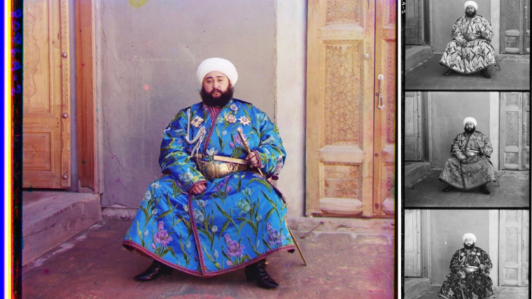
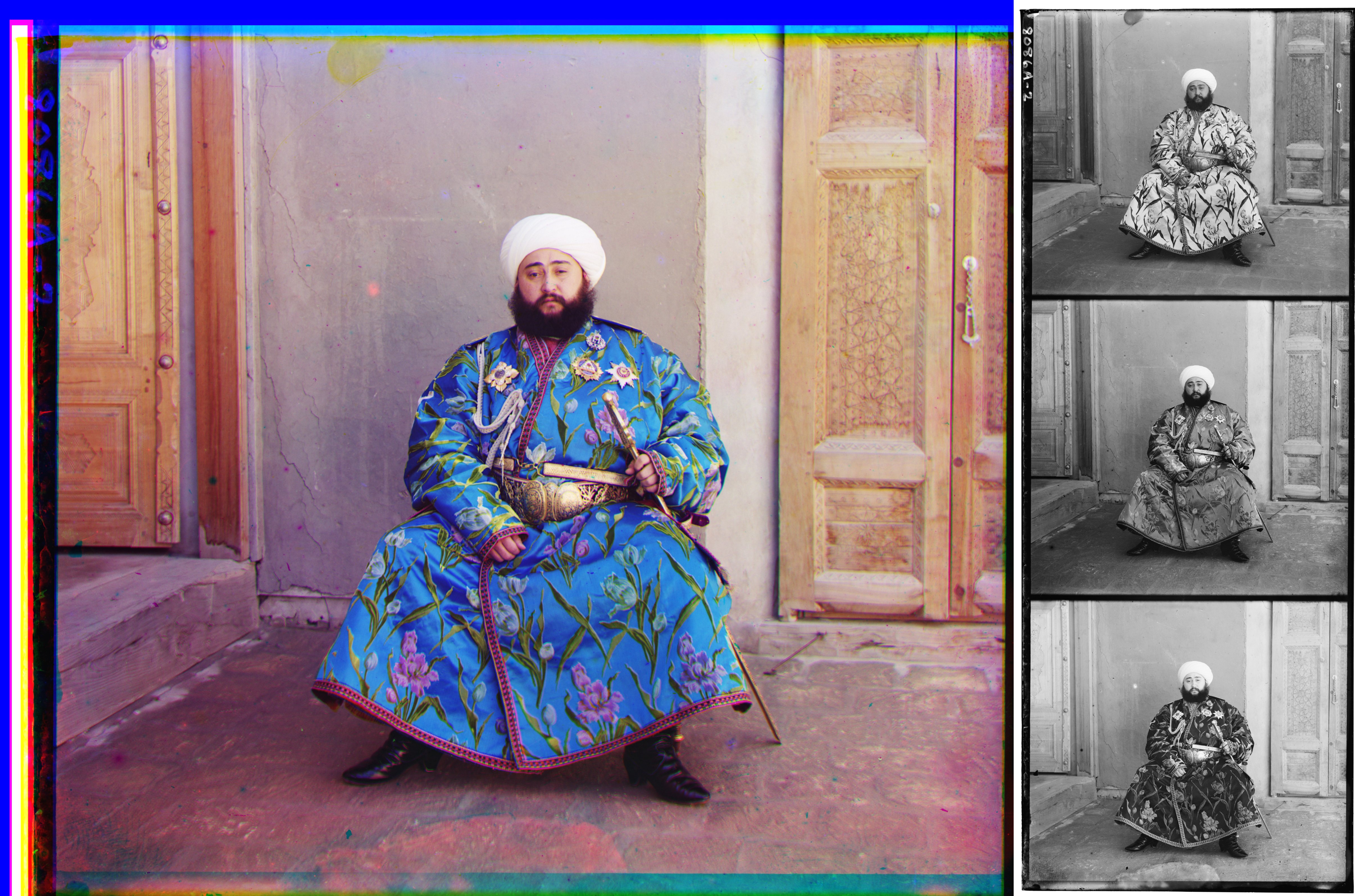
The basic idea of any colour theory system is to find the simplest way to reproduce the most colors that are visible to the human eye. The traditional primaries—red, yellow, and blue—are not the most efficient, which is why James Clerk Maxwell (and others) invented color photography and the RGB system in the mid 1800s. By overlaying a different negative for each of the primary colors, Maxwell made images like the one above—the photos on the right are of the blue, green, and red channels, respectively.
You’ve likely heard plenty about RGB (red, green, blue) color before because it’s what digital screens use to reproduce colors. Basically, using these primaries makes it possible to reproduce a broader range of colors than using RYB…because #science. Not to get too lost in the details, but the three cones in the human eye are sensitive to different waive lengths of light, and while two of them are fairly sensitive to yellow, only one is very sensitive to green, making it a better color to isolate the stimulation of that cone.
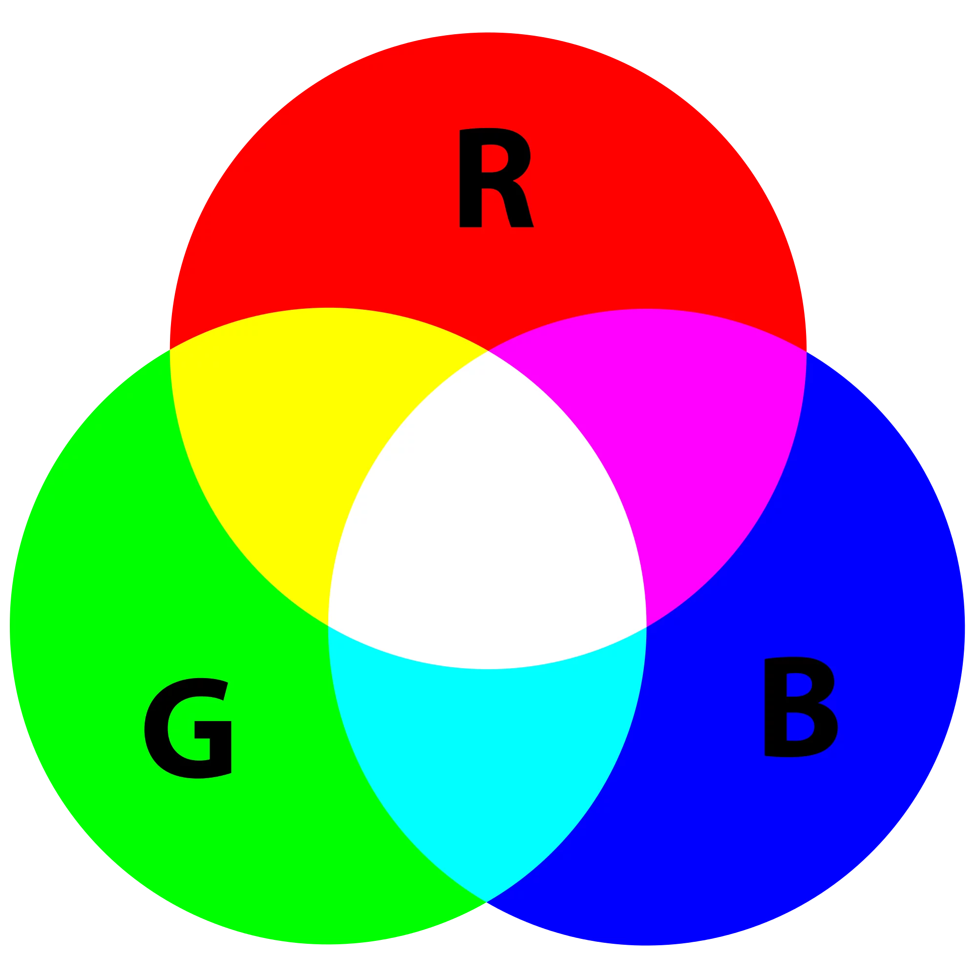
The real takeaway is that the photographer’s color wheel (also known as an additive color wheel) shown above should be based on the camera’s sensor, the computer screen, and the software used to create and edit the image—which all use RGB primaries.
In the above color wheel, we can clearly see the opposites of the RGB primaries by looking directly across the wheel. The opposite of red is cyan; the opposite of green is magenta; and the opposite of blue is yellow. These are the true secondary colors. Fully understanding this system and committing it to memory will make color editing immensely easier. So, let’s look at some very simple examples of adjusting an image’s color balance using a curves layer in Adobe Photoshop. By selecting a particular color channel in curves, we can enhance and suppress the color and its opposite until we get the exact balance we’re looking for based on personal taste and real life vision.
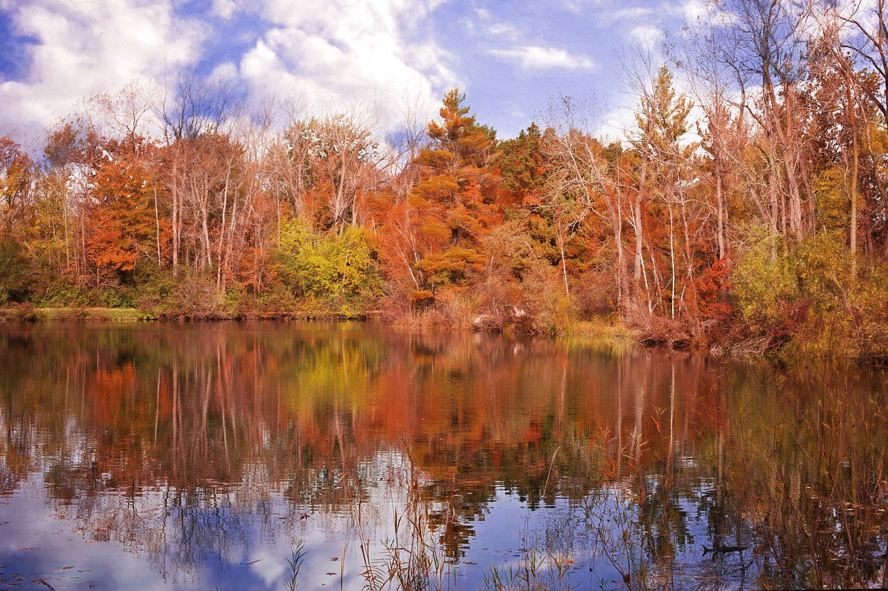
While the above landscape photography image may have acceptable color balance for certain applications, let’s assume we wanted to give it a more realistic depiction of natural fall colors by pushing or pulling each of the various RGB channel curves in Adobe Photoshop. Let’s start with what looks to be the most obvious issue: there is too much red in the trees make. We know from our color wheel that if I take out some the dominant color red, we will also add some cyan, which is perfect because our sky doesn’t have enough cyan, which confirms that this photo needs less red.

By clicking the curves tool under the histogram, we can add a curves layer, select the Red channel, and drag down the curve to an appropriate setting. You can already see that our photo looks better, but lets go through the other channels systematically.
Next we’ll try adding some green, since those leaves still seem a bit dull. Of course, color also has a huge influence on the mood and emotion of an image, so all of these choices are fairly subjective.
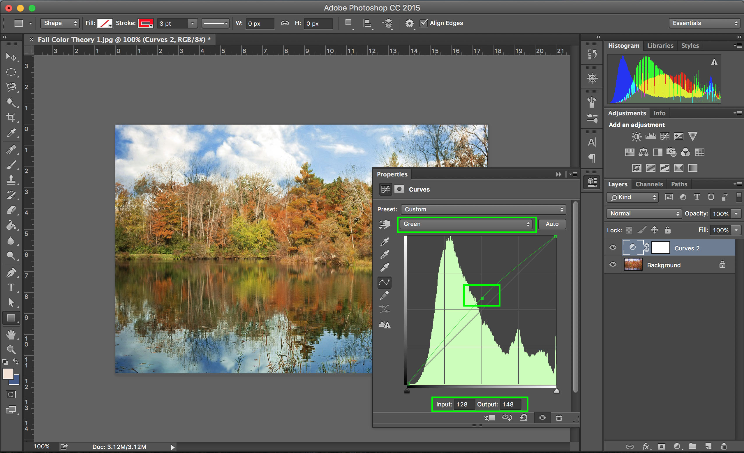
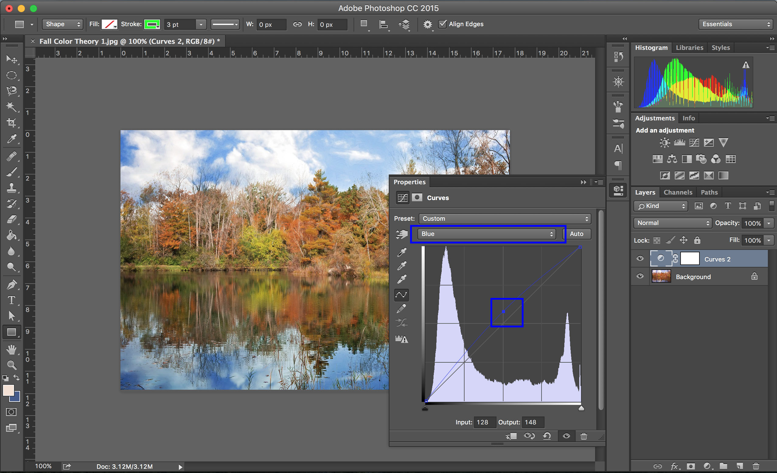
Above, you can see that we’ve selected the Green channel and bumped the curve a bit. A good way to do this with accuracy is to use the input and output settings on the bottom of the curves window. Where the input Green intensity is 128 (the left to right center) the output is 148 (above the vertical center). Lastly, we’ll go bump the Blue channel a bit as well, since the entire photo is looking a bit too yellow (blue’s opposite).
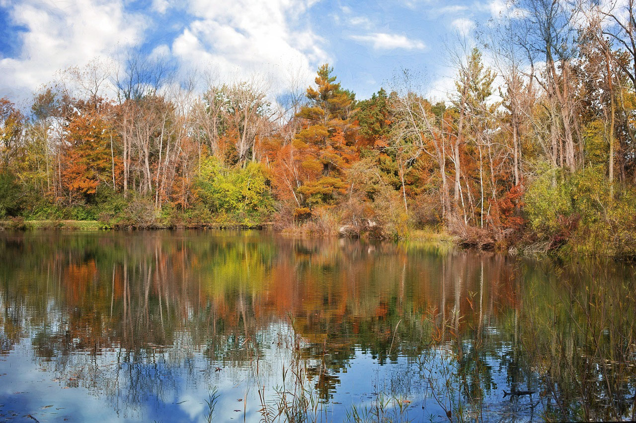
Now we have a final image with much more realistic color scheme. While it’s completely valid to choose not to go for color realism, it’s still important to understand how the RGB primaries and how different colors interact in photo editing to get the effect you’re after. The first thing any photographer should master in editing software is the curves tool, and to do that you need to master the RGB color wheel, so study up!
Below is the original photo followed by the color adjusted photo, for comparison.
Now, let’s go into a bit more detail about how RGB works and how it relates to CMYK, then give a brief overview of how these color standards relate to your camera, and ultimately, to your task as a photographer. Get ready for some light science (pun intended)!
The human eye is made up of rods and cones. Rods see in black and white monochromatic colors, and are great for low-light vision and detecting contrast. Cones are less sensitive, but see in color. Interestingly, in very dark environments you only see in black and white because there isn’t enough light to stimulate your eyes’ cones.
The cones are divided into three groups distributed throughout the back of your eyes. Each type of the three cones is sensitive to a different spectrum of color, and the relative stimulation of each of the three cone types tells your brain what color you are seeing. Below is a graph (yay graphs!) of the sensitivity of each cone type (on the y-axis) vs the wavelength of light (on the x-axis).
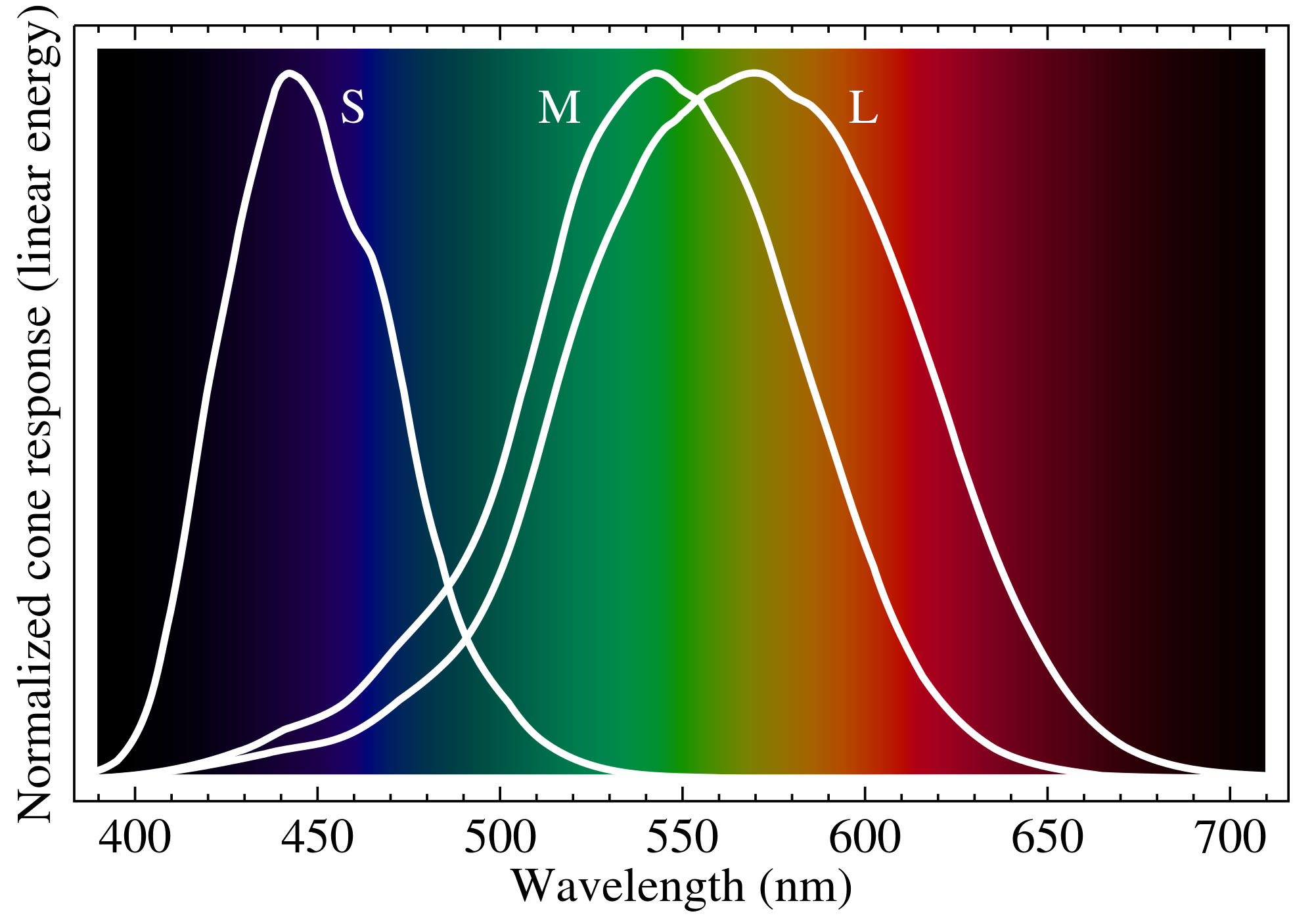
As you can see, the three cones types are called S, M, and L cones. The S cones are sensitive to deep blue through cyan-green light with a peak around blue. The M cones are sensitive to blue through red light with a peak around green. And the L cones are sensitive to blue through deep red light (almost all visible color) with a peak around yellow.
The idea of any color theory is to isolate the stimulation of each cone type, then mix these unique stimulations to trick the eye into thinking it is seeing a specific color. It’s important to note that the isolation of a cone is what we’re after, not the maximum stimulation of that cone. The biggest challenge the human eye presents to color theorists is the almost complete overlap in the sensitivity of the M and L cones. Isolating any one of these cones is difficult, and using yellow light to stimulate the L cone doesn’t isolate it as much as using red light, even though the L cone is more sensitive to yellow than red. One of the best primary color combinations humanity has devised to isolate our own cones is red for the L cone, green for the M cone, and blue for the S cone, or RGB.
As you can see, using yellow as a primary instead of green doesn’t isolate the M cone from the L cone as effectively. But going beyond green towards cyan begins to stimulate the S cone onto of the M and L cones, and is also less effective. Before modern science could accurately track the human eye’s cone sensitivity—and before we even realized there were eye cones or that light was a wave, for that matter—people have been guessing what the best primary colors were by eye, and actually got pretty close with RYB.
So, now that you have a far deeper understanding of your eyeball than you probably ever needed or wanted, let’s go a little deeper into your brain, shall we? As it turns out, there are multiple ways to see the same color, because your eye doesn’t relay different signals to your brain from these two different methods.
Let’s say you wanted to see the color yellow. You have two options, you could look at light with a wavelength around 570nm, pure yellow light; or you could look at a bright light with a wavelength of 650nm (red) and a dimmer light with a wavelength of 532nm (green) at the same time. Both of these methods would stimulate your M and L cones, in the same way, so your brain would have no way of knowing that in the second, two-color method there is actually no “real” yellow light (light with a wavelength of 570nm) present at all. This is what makes yellow a secondary color in the additive RGB system.

The three secondary colors are cyan, magenta, and yellow. These come from the combined stimulation of two of the primary RGB colors. White is what you get when you combine all three primaries, thus stimulating all of your cones; and black is the result of using none of the primaries, thus stimulating none of your cones (otherwise known as a lack of light, i.e. darkness).
Now, let’s loop this all back to photography!
As we discussed, your camera sees in RGB, meaning it has three types of “cones” on its sensor that are sensitive to the red, green, and blue wavelengths. Unfortunately, a camera’s color sensitivity is not very similar to the human eye, for a number of complicated reasons that have to do with the chemistry of silicon, how light gets converted into an electrical signal, the spectral filtration of the glass in a lens, and so on.
Below is a graph of channel sensitivity vs wavelength—just like the one of the human eye we studied earlier, but this time showing the sensitivity of a Fujifilm digital camera with a CMOS sensor.
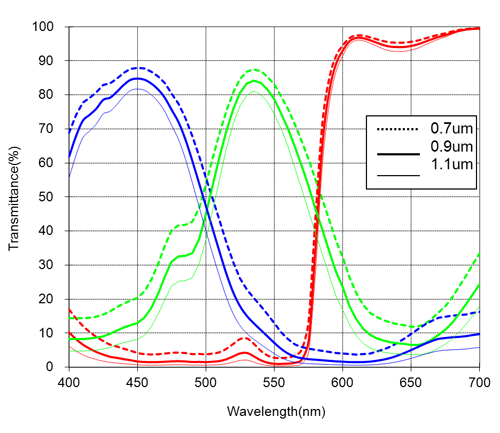
For our purposes, we can ignore that there is three versions of each line. Obviously, this graph is not shaped like the graph for a human eye. This discrepancy accounts for a lot of the color difference between a photograph and what you see in real life. While camera companies spend millions of dollars studying this difference and creating software that accounts for it (which is why you should care about your camera’s image processor), they can’t get it right all the time.
That’s where you come in. As a photographer, a lot of what you do is make up for the difference between the colors your camera sees and the colors you see. Both your brain and the camera’s software adjust for the luminosity, overall color temperature, and tint, contrast, white point, and black point, saturation, and many other relative elements of color automatically. There is absolutely no way for your camera to guess the exact settings in your brain, and it can’t even see the same light anyway. It’s your job as a photographer to make up the difference with a process known as color grading.

Now that we’ve covered which parts of color theory you need to understand, and the science behind it, we’ll discuss the difference between RGB and CMYK primaries, why there’s a fourth “primary” in CMYK, and why we even need to have two sets of primaries.
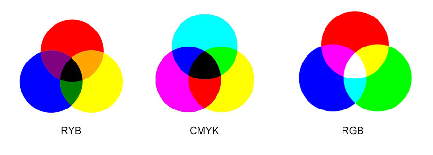
As a quick refresher, look at the above color wheels and remember that in photography (unlike more traditional art forms) we don’t use the RYB color system. Instead, we use RGB, which is a color theory that is based on the biology of the human eye and uses red, green, and blue as primary colors. This is how both you and your camera see the world, and how your computer screen reproduces colors. CMYK, on the other hand, is essentially the inverse of RGB, and uses the secondary colors of cyan, magenta, and yellow as primaries, making red, green, and blue secondaries.
The question is, how can you simply invert a color wheel and get the same results? Well, it’s sort of like how math works the same way with negative numbers as positive numbers. Cyan can be thought of (in RGB) as the presence of cool colors, like blue and green, or it can think of (in CMYK) as the lack of red. Let’s go into that a bit more.
On your screen, the color cyan is made by lighting roughly equal amounts of blue and green within each cyan pixel you see. If you’re thinking in RGB, this makes cyan a secondary color because it takes two primaries to make it. This is, as it turns out, how your camera and computer think of cyan.
This RGB primary system is called additive because it is based on adding light to make colors. The base color (that which has no primaries in it) is black in the additive system, which also means that the center of the color wheel is white because it includes the presence of all three primary colors. Think back to when we learned about the relationship between the cones in our eyes and the primary RGB colors. With all three primaries active, all of our cones are stimulated and we see bright, white light.

If RGB is considered additive, then CMYK is considered (you guessed it) subtractive. This means that the base color is white (stimulating all the cones), and by subtracting the stimulation of one type of cone you get a primary color. If you take all the red out of white light, you see cyan, which makes cyan a subtractive primary color. If your remove all the green, you get magenta, and if you remove all the blue, you get yellow. And, to complete the inversion of RGB, if you combine all subtractive primary colors (and therefore remove each additive primary color) you get black, as seen in the center of the CMYK color wheel.
So which set of primaries is “more correct?” Well, that depends on what you’re using them for. Which primaries you choose is based on the selection of your base color, either white or black.
If your base color is black, then the primaries you add to it should be RGB. If your base color is white, then the primaries you add should be CMYK. Herein lies the reason behind the presence of RGB and CMYK profiles in Adobe Photoshop and other design programs.

Your computer screen’s base color is black—just think of what it looks like when it’s off. The screen then adds the wavelengths of red, dreen, or blue to each pixel in different combinations to stimulate your eye differently, and therefore reproduce colors using the RGB primaries.
Paper, on the other hand, has a white base color—just think of a blank piece of paper. This is why CMYK was invented. Think about gradually adding cyan to a white piece of paper. It would go from reflecting all light (and therefore being white) to reflecting all light minus a small amount of red (and therefore being a light-cyan), to reflecting all light except for red (and therefore being completely cyan). That is subtractive color.
Hopefully, this is all starting to make sense, but you’ve likely been wondering what the K is for in CMYK. Well, this is where everything gets, unfortunately, way more complicated, but we won’t go into all the details here. Suffice it to say that the K stands for Black (why they didn’t just use B, we do not know). In short, the ink pigments used to print on paper are not perfect representations of the subtractive CMY system. It’s extremely difficult (or nearly impossible) to make a chemical that absorbs all/most wavelengths of light to stimulate a particular eye cone, so some small amount of the supposedly absorbed light always gets reflected back. This means that if you try to print black using only cyan, magenta, and yellow ink, you won’t get a true black because each ink will still reflect a small amount of the light it was supposed to absorb entirely.
To make up for this fact (and to make printers more efficient when printing black), printers also have black ink, which is added anywhere that needs that extra bump of light absorption. It is this difference between the theoretical, ideal CMY subtractive system and the real, ink-based CMYK system that makes a color theory in photography so complicated.
If you want to print exactly what you see on your computer screen, you’re going to need to invent your own, magical inks. There is physically no way to print all of the colors you can see on your screen because the chemistry of ink is imperfect. In theory, if there was an ink system that exactly replicated CMY subtractive color (without needing the K), then you could print the exact colors on your screen. But as it turns out, the colors a printer can produce don’t completely overlap with the colors a screen can produce, so some of what you see on your screen can’t be printed, and some of what you see in a print can’t be put onto a screen. Many photo printers partially make up for this limitation by having more than four inks, with some having upwards of 15. Each ink essentially absorbs a different section of the visible color spectrum, which makes for more accurate and vibrant coloring.
In case you haven’t noticed, there are a large number of different color profiles in Photoshop which essentially use different primaries, some RGB based and others CMYK based. Knowing which of these profiles to use for which application is actually really important in producing the colors you’re after.
So, we already know that the RGB (red, green, and blue) primaries are based on the cones in our eyes, each of which is sensitive to a different range of light wavelengths, which is how our brains detect color. What we didn’t talk about, however, is how this plays into the range of colors we can actually see. For obvious reasons, having cones that are sensitive to a wider range of wavelengths would allow you to see a wider range of colors. Interestingly enough, there are people out there with a fourth cone who can see colors you and I can’t even imagine.
Below is a simple graph that shows the range of hues, or gamut, that the average human eye can see.
![]()
You may notice that a lot of the colors in that graph look basically the same, especially in the cyan to green range. That’s because, while your eye can see all the wavelengths represented on this graph, your computer screen can only show some of those colors. Since it’s missing many of the colors you can see, this graph just stretches out the cyan-green range of your screen’s gamut to the edges of the graph, resulting in a large area of mostly the same colors.
Unless you have a fancy, professional photography monitor, your screen can only display what is called the sRGB color space. A color space is basically what you see in the above graph, a range of colors that can be displayed.
sRGB is the most popular color space out there, and it uses three simple primaries that are nowhere near the limit of human vision, but were easy to build into monitors made in the mid-90s, when sRGB was invented.
Below is a graph just like the one above, but only the colors that fall into the sRGB color space are shown, and the outlined area is all of potential human color vision.
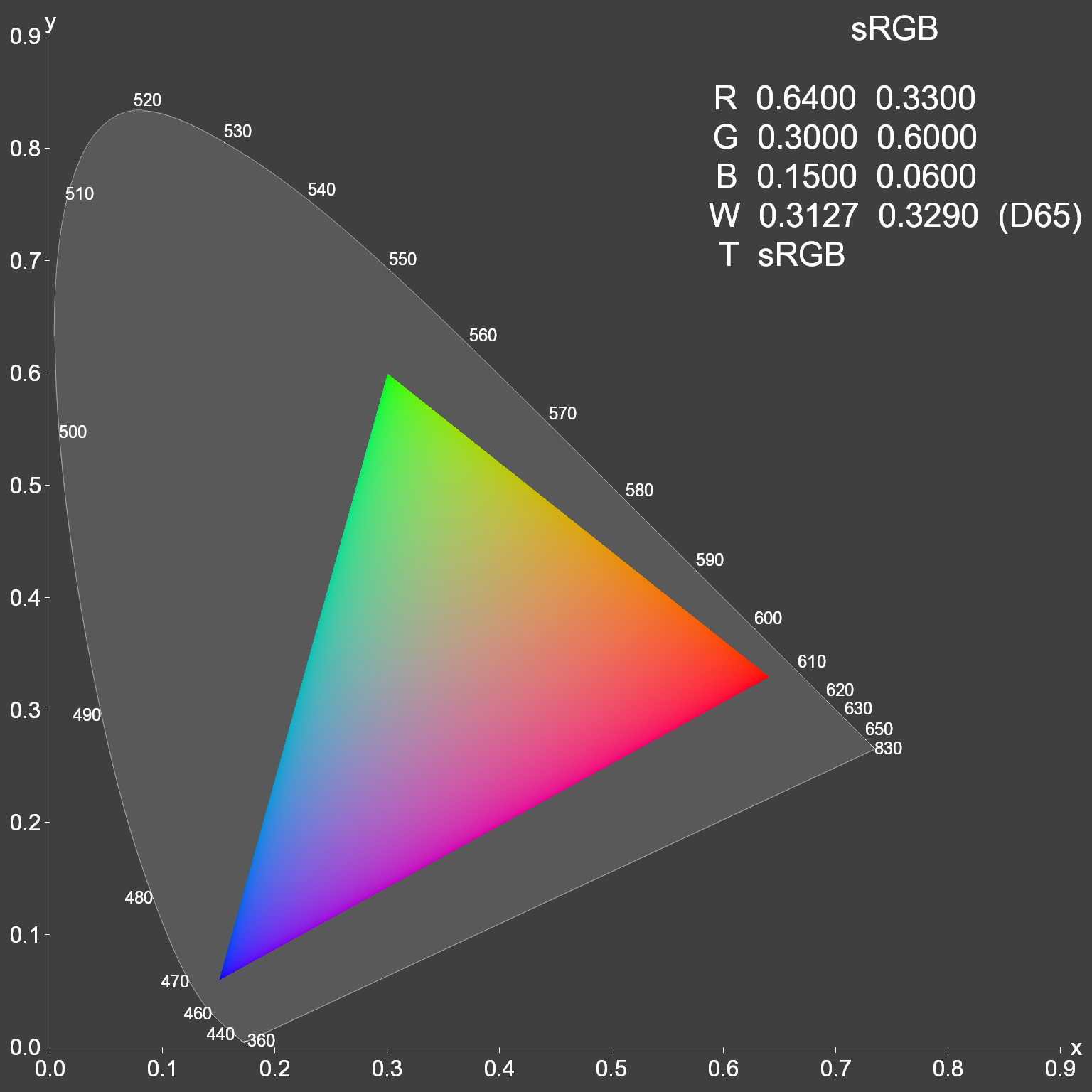
Pretty lame, right? Look at all of those colors you just aren’t seeing when you view a photo on your computer screen. Luckily, there are ways to expand your photos’ color gamut, but they aren’t always your best bet.
Adobe RGB is a color space just like sRGB, but it offers a 35 percent larger range of colors. Almost every camera is capable of capturing photos in this larger color space, but you’ll need to find it within your camera’s settings menu. If you shoot in 16-bit RAW (which you usually should, also in your camera’s settings menu), then you won’t need to worry about this, since all of your image processing can happen after the fact in Adobe Lightroom or Adobe Camera Raw.
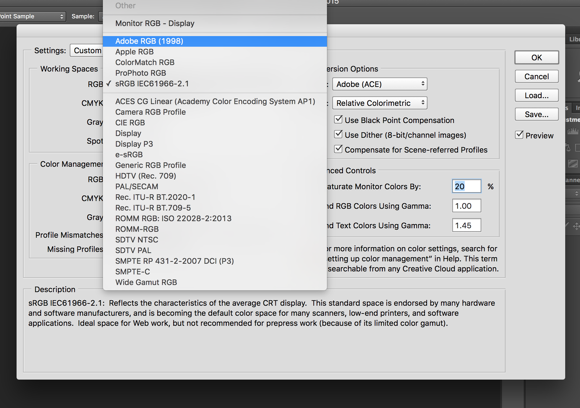
Pretty much any image, even JPGs, can gain some color pop by using the Adobe RGB color space, but this will result in some slight banding in JPGs, especially if the image is edited further. Remember that most computer screens can’t actually display the extra colors anyway, so it’s not always helpful to change to an Adobe RGB color space. But if you’re interested, here’s how to change your working color space in Adobe Photoshop to Abobe RGB.

Open the color setting menu, then change the RGB working space from sRGB to Adobe RGB (1998).
As you can see, there are a whole lot of working color spaces available. That’s because different hardware and software use different standards, but your safest bet for web and almost everything else is sRGB. In fact, using Adobe RGB for web actually makes your images look duller since your browser will compress the extra colors back down to sRGB, usually with poor results. So, unless you plan on printing your photos with a decent photo printer, you should probably stick with sRGB. If you know you will be using a professional printing service, you can open your RAW files in ProPhoto RGB (but don’t do this with JPGs). The rest of the color spaces you can safely ignore, since they’re very specialized.
Below, you can see the relative color gamut of sRGB (small but best for web), Adobe RGB (larger but only useful for print or professional monitors), and ProPhoto RGB (very large but only good for RAW files that will be printed).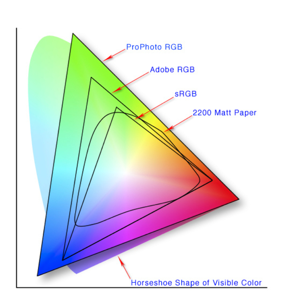
Now, you’ve probably noticed that the ProPhoto RGB triangle appears to extend out of the horseshoe of human vision. That’s because this color space can actually perceive and display colors you can’t even see. On the other hand, there’s still a big chunk of cyan-green missing from this color space, so it’s certainly far from perfect.
Another interesting tidbit on the graph above is the inclusion of 2200 matte paper’s color gamut. You’ll notice that this particular paper (paired with a generic set of photography inks), can display some oranges and yellows that are only available in the ProPhoto RGB color space, some cyans and greens that are only available in the ProPhoto and Adobe RGB color spaces, but it can’t display some blues and magentas that are available in even the smallest, sRGB color space. Herein lies the crux of the color space dilemma.
If you’re printing your images, which Adobe color space should you use? Your best bet is Adobe RGB, since it will cover almost all the space of almost every type of printer/paper combo. If you’re really serious about getting every ounce of color possible, ProPhoto is the way to go. Just remember that no monitor can display all of the ProPhoto colors, so editing may take a bit of guess work. If you aren’t too concerned with getting the most color possible and want the easiest workflow with no conversion necessary between print and web, stick to good ol’ sRGB.
If you send your files to a professional printing service, they should be able to print from any of these spaces with any paper you choose and get good results. If you use a less serious, online service like Shutterfly, you’ll need to send them sRGB files, otherwise the conversion process could give you unsavory final prints. If you’re printing them yourself on your home printer, just follow the color profile setup instructions that come with the paper and you should be all set. Paper manufacturers know how their paper handles color best, so it’s better to just trust them.
Ever taken a picture that came out looking odd but you couldn’t quite figure out what was wrong with it? Ever taken a picture that looked fine but you wished that you had worn that red dress instead of the blue one? Colors affect our life on a daily basis, and a clash of color can sometimes ruin the whole image.
The good thing is that with modern technology, we are able to fix these blunders. By using color theory and some basic Adobe Photoshop skills, it’s easy to fix any color combination-gone-wrong image, or even just used as fun to imagine what you’d look like with bright purple hair.
In general, colors opposite each other on the color wheel complement each other. Colors that are next to each other on the wheel tend to clash, and if they’re both present in your image, it can come out looking odd without the problem being obvious. You can use any basic color wheel to help get the shades right in your photo. All you have to do is find an image or get a screenshot of your preferred color wheel and open it up in Adobe Photoshop.

Next, take the image you want to work with. If you’re trying to fix a color error, pick one of the colors that you want to stay the same, and find that on the wheel. The complementary color you want to use in the next part of the image is the one directly across from the original. (If you’re using three or more colors, you’ll need to make lines on the wheel that divide it into thirds or more to make sure that all colors accurately match each other.)
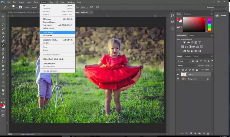
For this image, we chose the red of the girl’s dress, and used the opposite green to change the boy’s clothes. If we wanted to keep the boy’s clothes blue, we would have done a yellow-orange for the girl’s dress to complement them.
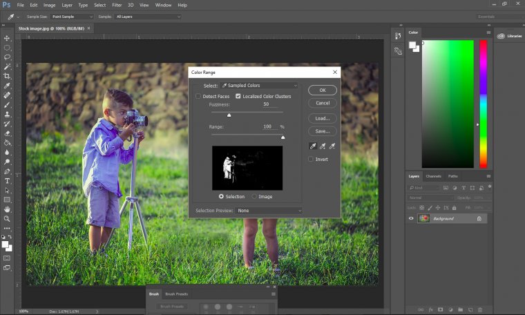
Once you know the complementary colours you’re going to use, you have to select the exact part of the image that you want to change. Make sure all of your work is being done in a second layer, so that you don’t accidentally change the original image. You could simply use the magic wand to select the boy’s clothes, but there’s a faster way using the Color Range selection.
This allows you to pick out a key color in the original image, using the eyedropper, and selecting all of that color in the photo. You can change the range and fuzziness of the selection to include only that exact shade, or allow it to pull in similar shades, such as both the light and dark blues of the boy’s shirt created by the shadows.
Now that what you want to change is selected, you have to choose the color on the wheel you want with the eye dropper and paint over the boy’s clothes. However, it is very important to keep in mind the type of layer you’ve created.
Using the normal setting will create a solid block of color that will lessen the look of your image even more. To ensure a nice overlay of color that doesn’t look blocky, choose either color burn or color dodge. Here, we used color burn, but either of the three will work, with varying looks of outcomes.

If, after you’ve done this, your color palette still seems to be off, or some are popping out of the picture more than others, go into each layer and try adjusting the opacity of each. Increase the opacity of any dark and dingy colors to help bring them to light, and lower the opacity of any colors that are too bright or saturated. This will help your image look more realistic and original.
Beginner classes in any art form will have you start out with black and white before you move into the complex world of colors. Understanding how the color wheel works will help you take photos that are visually pleasing. Being able to edit colors in Photoshop will help you fix any errors and even create whole new looks for yourself and those around you.
Even if you’re not a professional photographer, using color theory can help you take better pictures. By understanding how the human eye, cameras and printers use color, you can start taking photos that look more polished and intentional.
Experiment with these concepts and see what works best for you, then keep practicing until you achieve the results you desire. With a little bit of effort, applying color theory to your photography can yield stunning images that capture the beauty of the world around us.


Please verify your software version before proceeding.
 I’ve verified my software version


 Facebook
 Google +
Comments (1)
Thank you for the clear article. Very helpful for someone who hasn’t really delved into color theory for over 30 years.