Unless you are a professional landscape or travel photographer, your resources when it comes to photography are limited. This not only includes the availability of gear, but also the time you can afford to spend at different locations to make your planned photos. Also, unless you are incredibly lucky, you must have been standing right on the spot you envisioned so many times with all your gear and ready to press the shutter button only to realize that the scene is almost perfect but the sky is simply dull. This could be due to an overcast day or even a completely cloudless day!
My main interests in photography are travel and landscape and I always try to get the images I want right out of my camera or at least get images that require minimum post-processing before I publish them somewhere on the internet. However, if the above described situation occurs to me and I definitely don’t have the money to go back to that same spot some other day with adequate weather, I think doing a bit of cheating and fixing the sky in Photoshop is relatively harmless. After all, you can always state that in your posts so that no one can accuse you of being dishonest if you want.
Replace a sky on a photo is not a very hard thing to do with a powerful software such as Photoshop. The difficulty lies in making the final result look credible which basically involves a smooth transition between the foreground of the original photo and the new sky as well as matching the color saturation and luminosity of both parts.
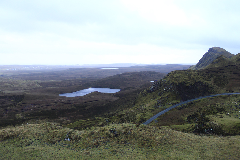
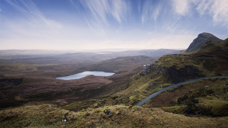
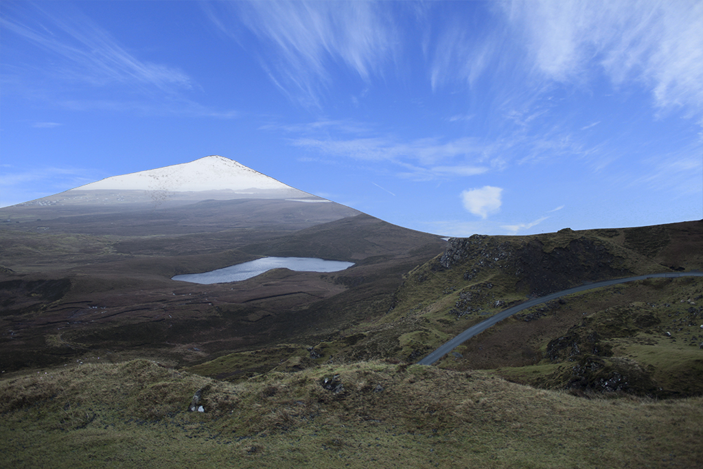
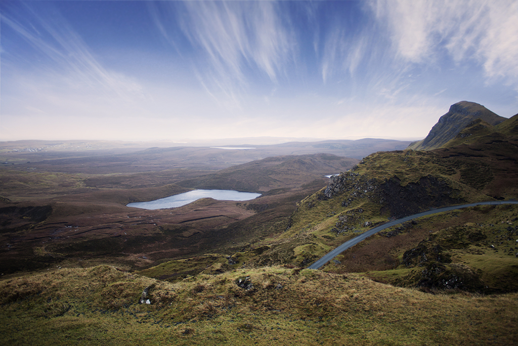
Take, for instance, the above image from the Isle of Skye in Scotland, UK. Even though the landscapes on Skye are unique, a dull sky like the one on the picture makes the scene looks like a completely uninteresting one. We were traveling through Scotland and stayed on Skye for only three days and, given the infamous Scottish weather, we were lucky enough not to be soaked in rain all the time, but not so much as to have clear, blue skies.
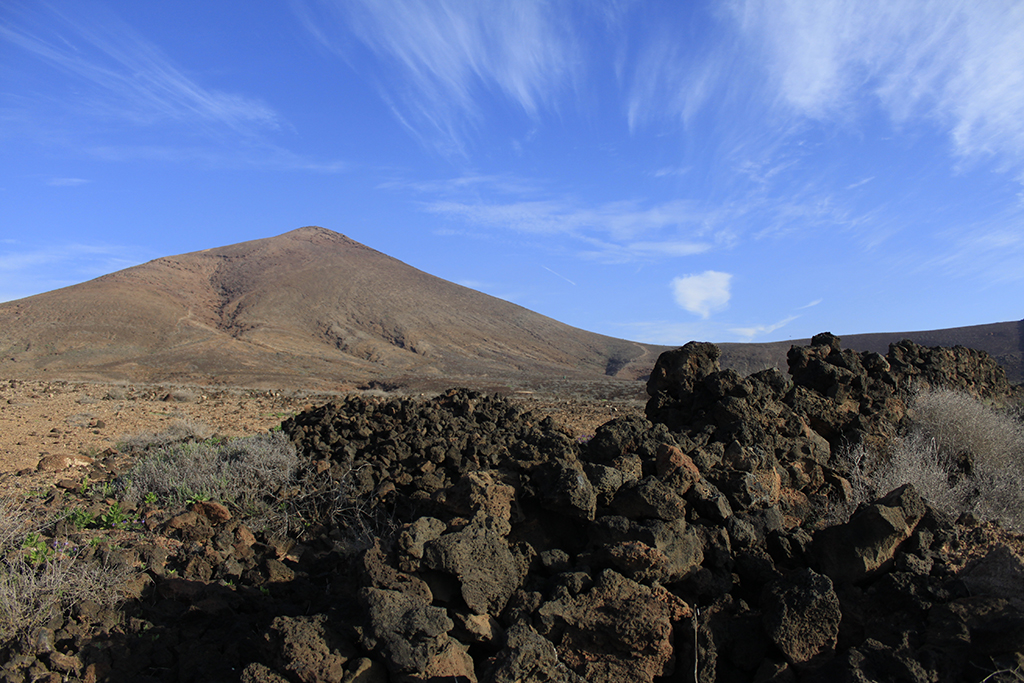
A completely different story comes from a trip we made to Lanzarote, one of the Canary Islands, Spain. Even though we were there in winter, there was not a single day without perfect skies. Sunny days with few clouds on the sky, just the right amount to give dynamism to an otherwise perfectly blue sky.
So what we are going to do now is take the sky from the photo from Lanzarote and use it in the one from the Isle of Skye. The first thing we need to do is select the sky on the second picture. There are different ways to select specific areas of an image in Photoshop. The two I use the most are Color Range (Select -> Color Range…) and the Magic Wand Tool (located on the tools panel on the left).
This time I used the Color Range tool. Once you open it, you will have the option to control the Fuzziness, which is like a threshold for how sensitive the tool will be. You will usually have to try with different values for this one until you find what works better for what you want to select. What you are telling Photoshop is to select all the pixels in the image with a color similar to the one you select with the eyedropper that appears while on the Color Range tool.
For this image, I left the Fuzziness at 64 and had to select different areas of the sky to make sure the blue as well as the clouds were selected in the end. Once you have a color selected, you can keep adding new ones by pressing Shift on your keyboard before clicking with the mouse on the areas you are interested in.
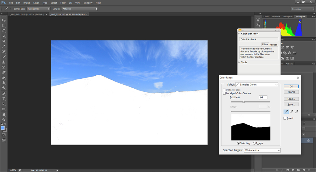
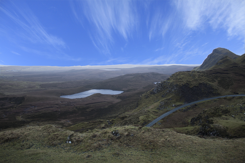
The image above shows the final selection. Once we click ‘Ok’, the sky will be selected so we just copy the selection (ctrl+c) and paste it in the image from Skye. The new image with both layers looks terrible. This is because the shapes of the skies in both images is different and there is a mismatch in luminosity as well.
So the first thing we need to do is change the shape of the new sky so that it covers all the sky regions on the original image. The match does not need to be good at all. We just need to cover the white region of the overcast sky on the left. For this, the Free Transform (Edit -> Free Transform) tool can be used.
Then, we select the overcast sky on the original image. For this, we make the top layer (the blue sky) invisible and, with the bottom layer highlighted, we select the sky with any tool we like. This time I used the Magic Wand Tool. With this tool you will have to play a bit with the tolerance. I usually use relatively low values, between 1 and 10. With larger numbers, more pixels will be selected with each mouse click. Again, by pressing the ‘Shift’ key while selecting we can keep the previous selections and add new ones. With the ‘Alt’ key we can remove parts of the selection, in case we end up selecting some areas we did not want to.
The Magic Wand Tool has the particularity that only surrounding pixels will be selected, in contrast to the Color Range Tool that will select pixels with similar color, no matter where those are.
Once we have the sky selected (keep in mind that the regions close to the horizon can have colors similar to those of the sky, so be careful when selecting those regions; decrease the tolerance if you are having troubles getting the right selection), we save the selection in case we want to do some changes later on. You can do this by going to Select -> Save Selection… and giving a name of your choice to the selection. Then, you invert the selection (Select -> Inverse), make the top layer visible, highlight it and press ‘Del’.
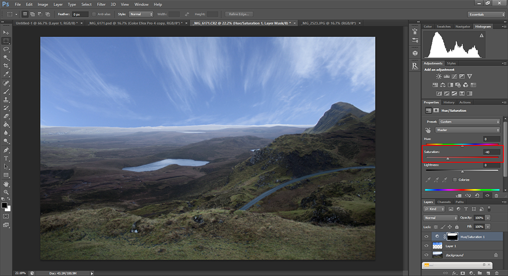
Now, here is where ‘credible’ becomes important. There are a few issues with the image above that need to be fixed. First, the saturation of the colors need to be similar on the top and the bottom parts; otherwise, the sky will look fake no matter what we do. Second, the transition from the horizon to the sky needs to be subtle.
To solve the first problem, we load the selection we saved before (Select -> Load Selection…) and we change the saturation of the selection until it matches the foreground. This is a subjective step and how much we decrease or increase the saturation will depend on what we like. Here, I decreased the saturation to -40.
The image starts to look more realistic, but we still need to change smoothen the transition between the foreground and the sky. For this, we merge down the Hue/Saturation layer with the sky layer (Layer 1 in the image above) and create a layer mask. With the layer mask, what we want to do is to reduce the opacity of the sky layer close to the horizon. We do this by selecting the Brush Tool with an opacity of around 50% and a relatively large radius (I used 1900 px for this image) and paint over all the line of the horizon.
Be careful with this last step, since this will define whether your sky looks realistic or not. Play with the opacity but in the end, for the regions close to the horizon, the final opacity needs to be of 100%. You achieve this by passing the Brush Tool several times until you see no transition at all. The final result, after adding some contrast, warmth and vignetting can be appreciated in the following image.
I hope you enjoyed this tutorial. It might be a bit tricky to get the results you want at first, but with practice you will be surprised in the end. Try this with some of your photos and don’t hesitate to write me an email if you have any question!


Please verify your software version before proceeding.
 I’ve verified my software version


 Facebook
 Google +
Comments (0)
There are no comments yet.