The ability to post-process our own images, that came together with digital photography, has enabled photographers to create images that are closer to the original scene, overcoming the limitations of the camera used to capture the original file. Moreover, with editing software such as Lightroom or Photoshop, any person interested in photography can easily apply changes not only on a global scale to the whole picture, but also on a local scale, improving different aspects like for instance luminosity, color saturation, intensity, contrast and detail.
Today I want to focus on these kind of local improvements and I will specifically focus on contrast and detail. The use of local adjustments for these two aspects is particularly important since global adjustments of contrast and/or detail most of the times result in an undesirable increase in noise, especially on flat areas such as the sky or water surfaces.
To illustrate the process, I will use this image of an old house in the beach town of Choroni in Venezuela.
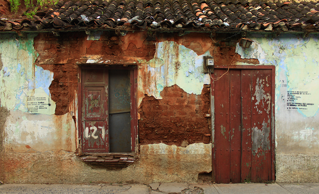
This is a good example since the image has a lot of structure in those parts where the paint has fallen revealing the brick structure as well as on the door and window but still has some flat areas where the walls are still white. If we increased the contrast in the whole image, unwanted noise would appear in those flat areas and for this reason, applying the changes locally is a much better idea.
The first thing we need to do after opening our file in Photoshop is to duplicate the background layer and convert this new layer into black and white. There are different ways to convert an image into black and white, but here I used the basic Photoshop function located in the ‘Adjustments’ panel.
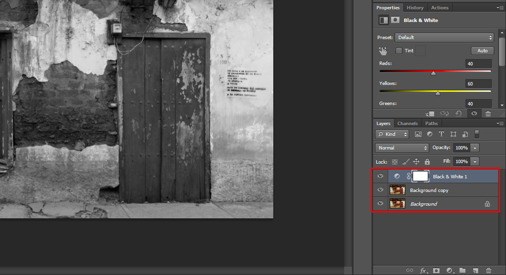
We then merge the two top layers (‘Black & White 1’ and ‘Background copy’ in our example) so that we are left with the background layer and a black and white copy of it. Next, what we need to do is change the blending mode from ‘Normal’ to ‘Hard Light’ in the dropdown menu left to ‘Opacity’.
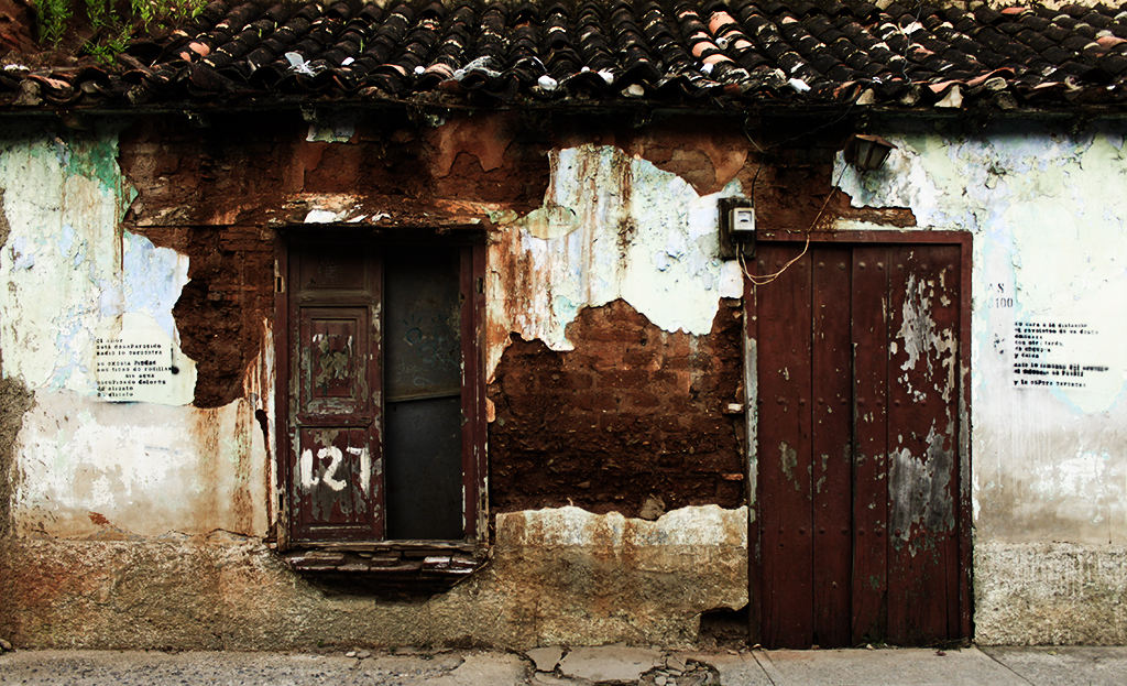
Blending modes are a really powerful tool in Photoshop, and yet a poorly understood one. This is in principle a consequence of the complexity behind the different blending modes that makes it almost impossible to predict how each photo will look after applying a specific mode. What the blending mode determines is how the active layer will be ‘applied’ to the underlying one. The most basic mode, the ‘Normal’ mode, simply overlays the active layer pixel by pixel according to the selected opacity. Other layers, in turn, apply different pre-defined algorithms depending on different factors such as luminosity or color.
The ‘Hard Light’ blending mode, specifically, modifies the local contrast of the image by darkening those pixels that are darker than 50% gray on the top layer and lightening those that are lighter than 50%. For this reason, after applying the blending mode, we will end up with an image with an exaggerated contrast.
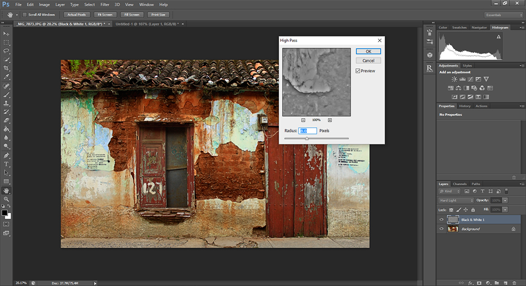
The next step is to apply a high pass filter (Filter -> Other -> High Pass…) to the top layer. Images, same as sound, can be separated by different frequencies. Low frequency areas are those where changes in luminosity or color are only observable when taking a significant number of pixels, whereas high frequency areas are those where changes are observable within a small number of pixels. For instance, borders (window and door frame, the boundary between painted and unpainted areas, etc.) are high frequency areas and thus the high pass (allowing the passage of high frequency components) will leave this areas unchanged while filtering out the low frequency areas.
Now, remember that we are applying this filter to the top layer, meaning that the changes in contrast applied during the blending process described above will only be left in those areas with high contrast in the original image. The strength of the filter will depend on the image you are editing and your personal taste, but as a general rule, something around 10 should be enough. Here, I applied a strength of 8.
Since we want to enhance the contrast and details locally, the next thing to do is to mask the top layer by adding a layer mask and painting it completely black. This can be easily done by pressing the ‘alt’ key while pressing the ‘Add layer mask’ button below the layers tab.
Finally, by changing the foreground color to white and with the layer mask selected, we can paint over the areas where we want to increase the contrast with the desired opacity and that’s pretty much it. You can enhance the contrast without affecting flat areas.

By combining the blending process and the high pass filter, we ensure that the transition between the regions where we apply the effect and those where we don’t is gradual and soft.
As usual, if there is anything that you would like to have further explained, don’t hesitate to contact me. I will be more than happy to help. Have fun!
Here’s how you can bring your sunset images to another level in photoshop.


 Facebook
 Google +