Tag: presets

Most Important Lightroom Features to Explore

Lightroom is one of the most popular photo editing tools on the market. Thus, you have to install the Lightroom presets so you will know. It’s surpassed the competition not only because of its reliable Adobe branding, but because the software uses an intuitive system to deliver the latest creative tools to photographers. The post-production software addresses the most common photo edits with an eye for ease of use and final quality. It also allows incredible batch processing options. There are a number of amazing Lightroom features that will help you create the images you want.

It’s easy to feel overwhelmed when working with new software, especially software as advanced and nuanced as Lightroom. However, some features are more important to understand and master than others. These features are a great place for beginners to start, and a crucial part of any Lightroom presets pro’s skill set.

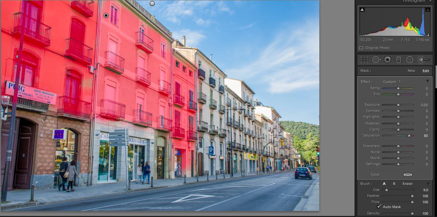
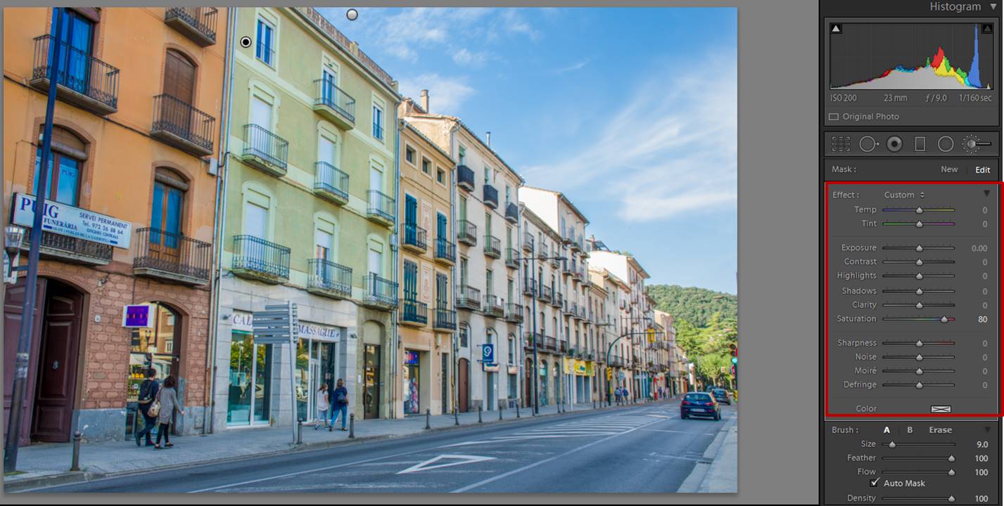
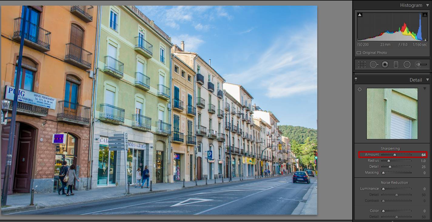
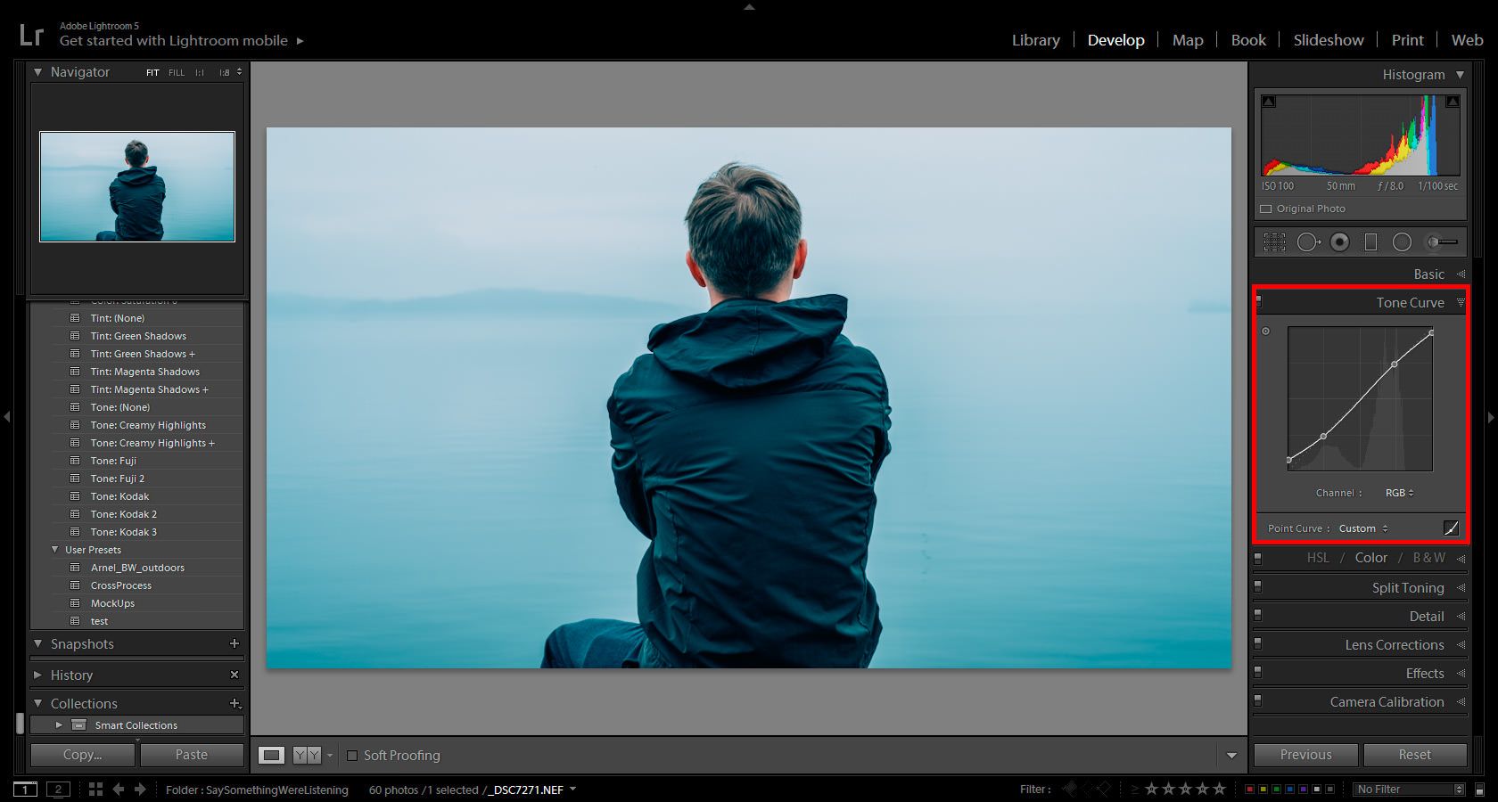
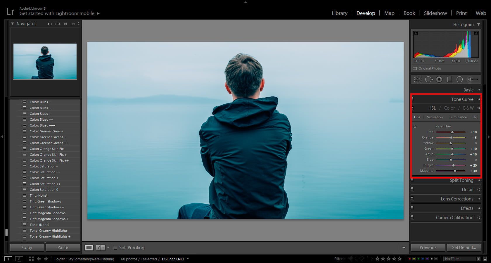
Creative Adjustment Tools

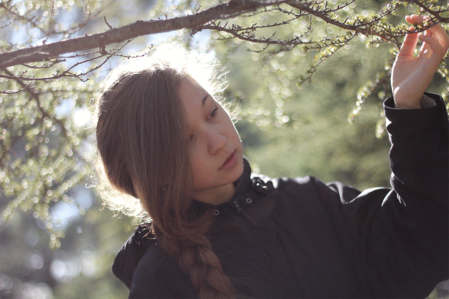
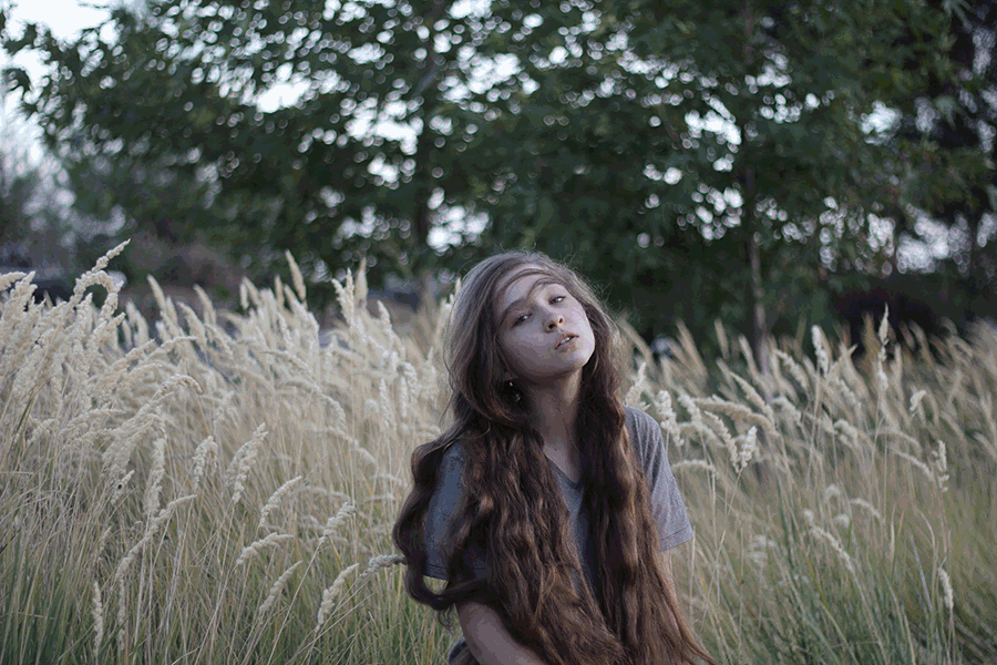
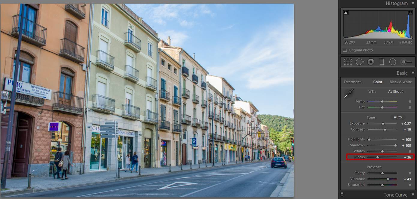
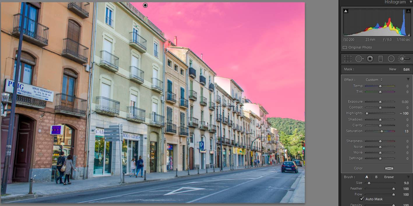
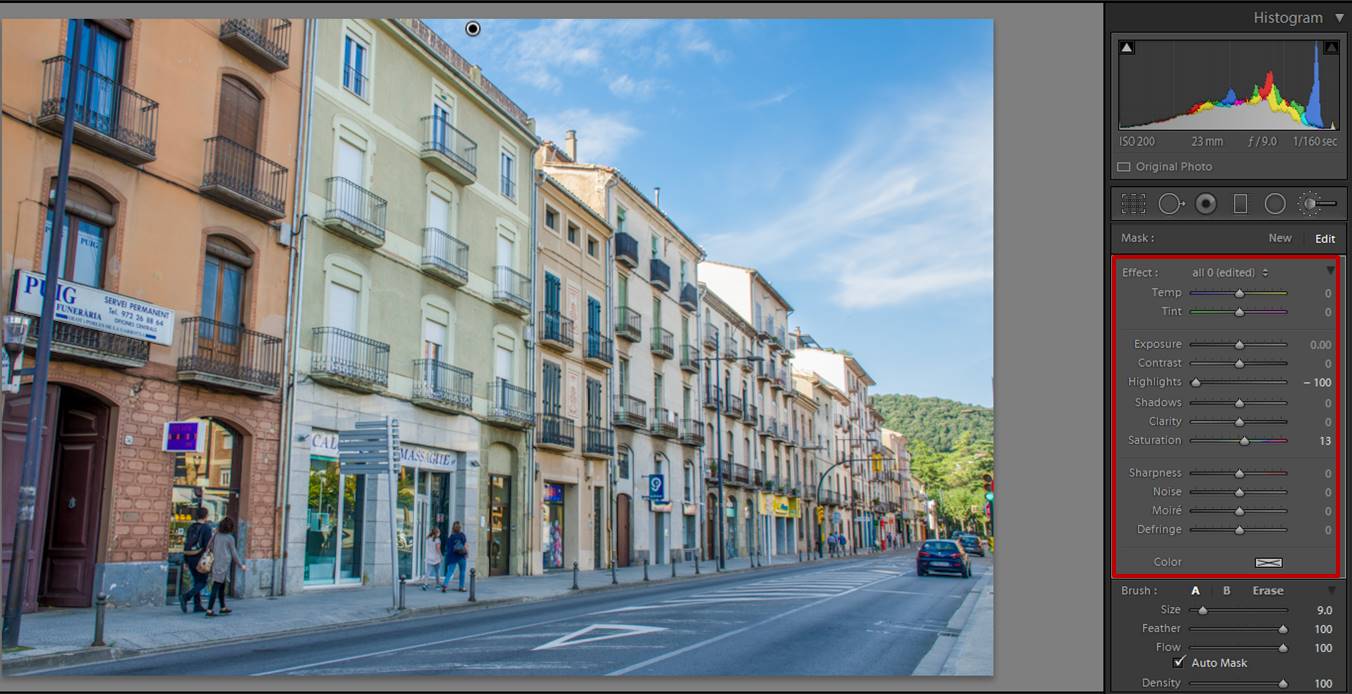
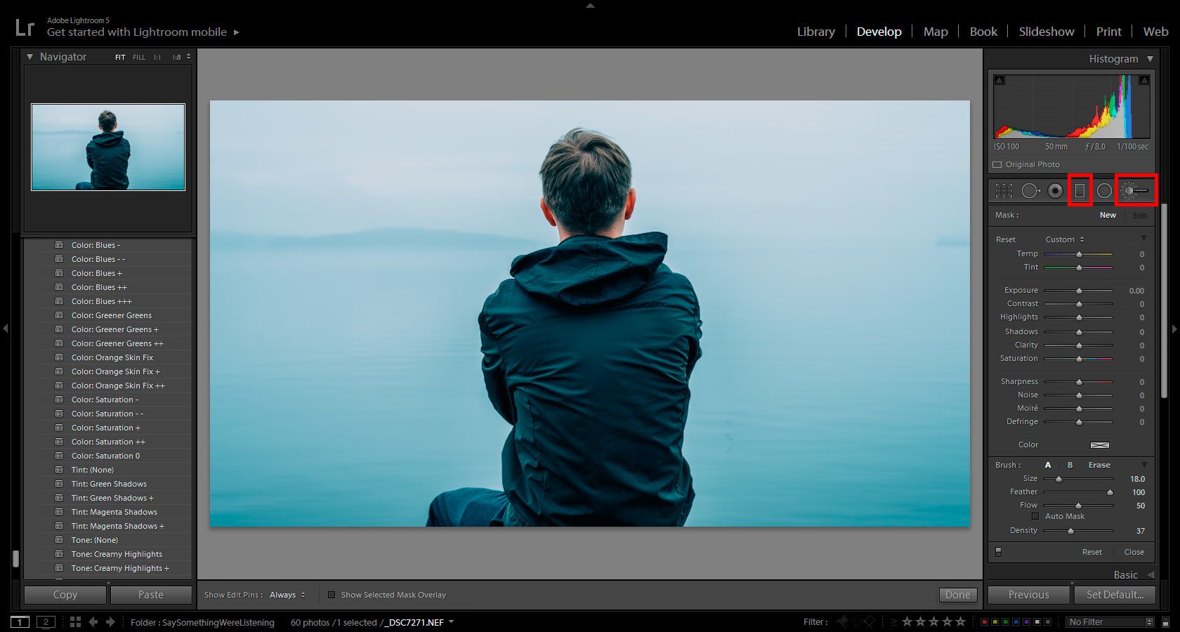
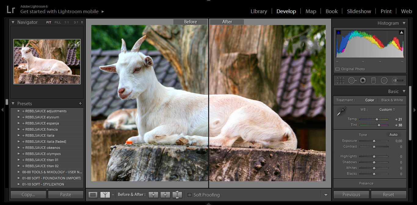
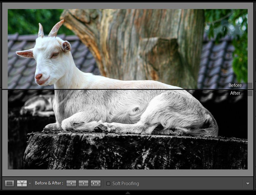
Of all the Lightroom features and creative tools, the gradient filter, adjustment brush, and post-crop vignettes are definitely at the top of the list. They’re simple to use, and they make detail work dramatically easier. Although these tools aren’t strikingly original, they allow users to handle delicate changes for select parts of an image like creating a dreamy portrait effect.

adjust selected color

For example, you can darken overexposed skies, or restore images white-washed by the flash in the foreground without compromising the parts of the picture you like. These Lightroom features combine to address the most common photo errors and enable users to make quick, creative changes that leave a huge impact on the final image.
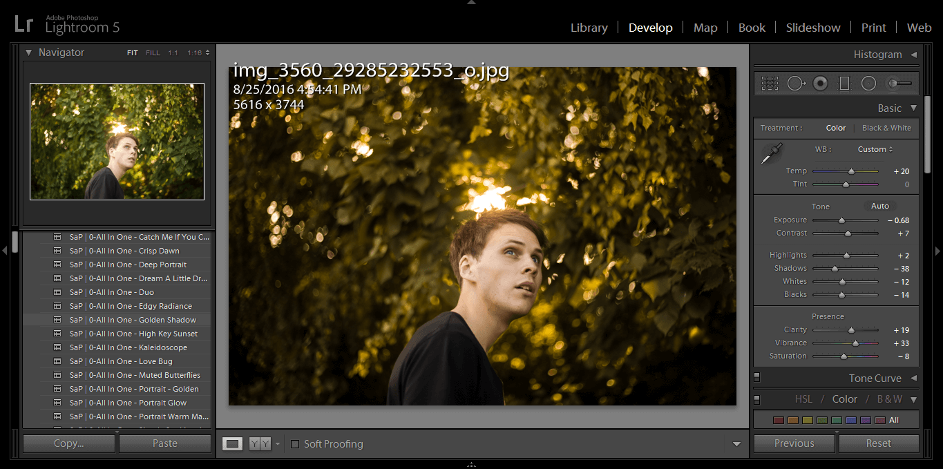
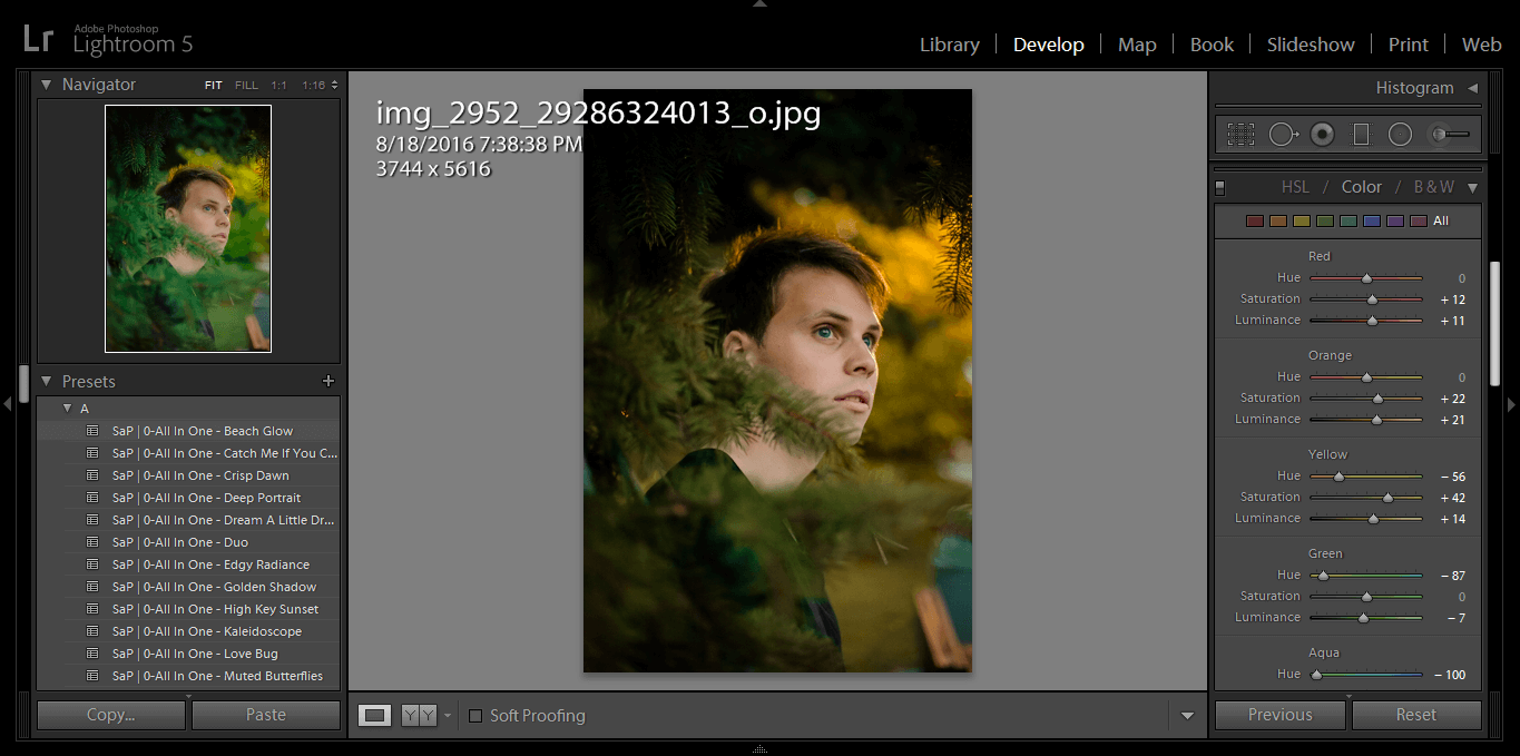
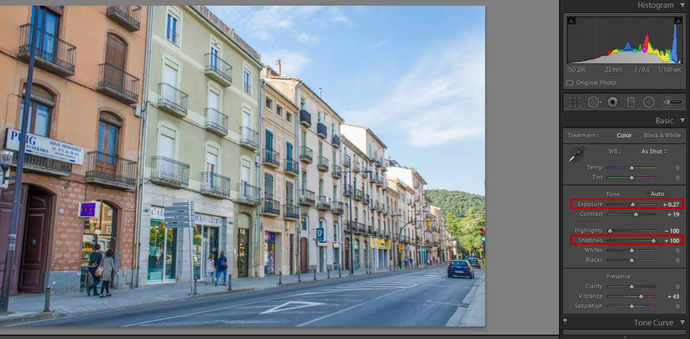
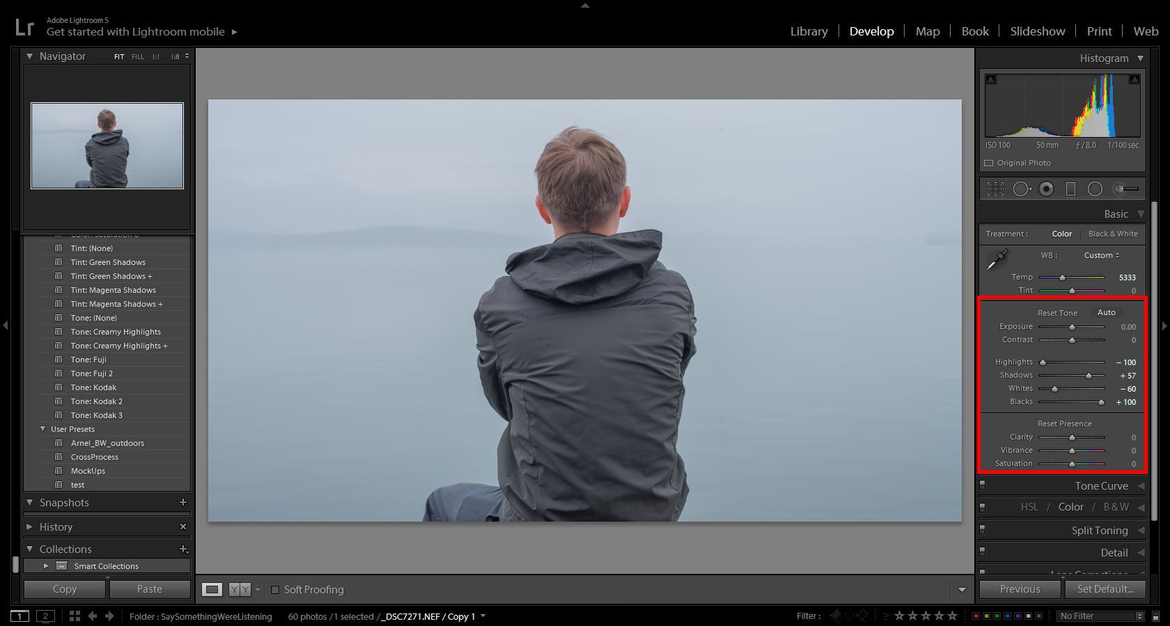
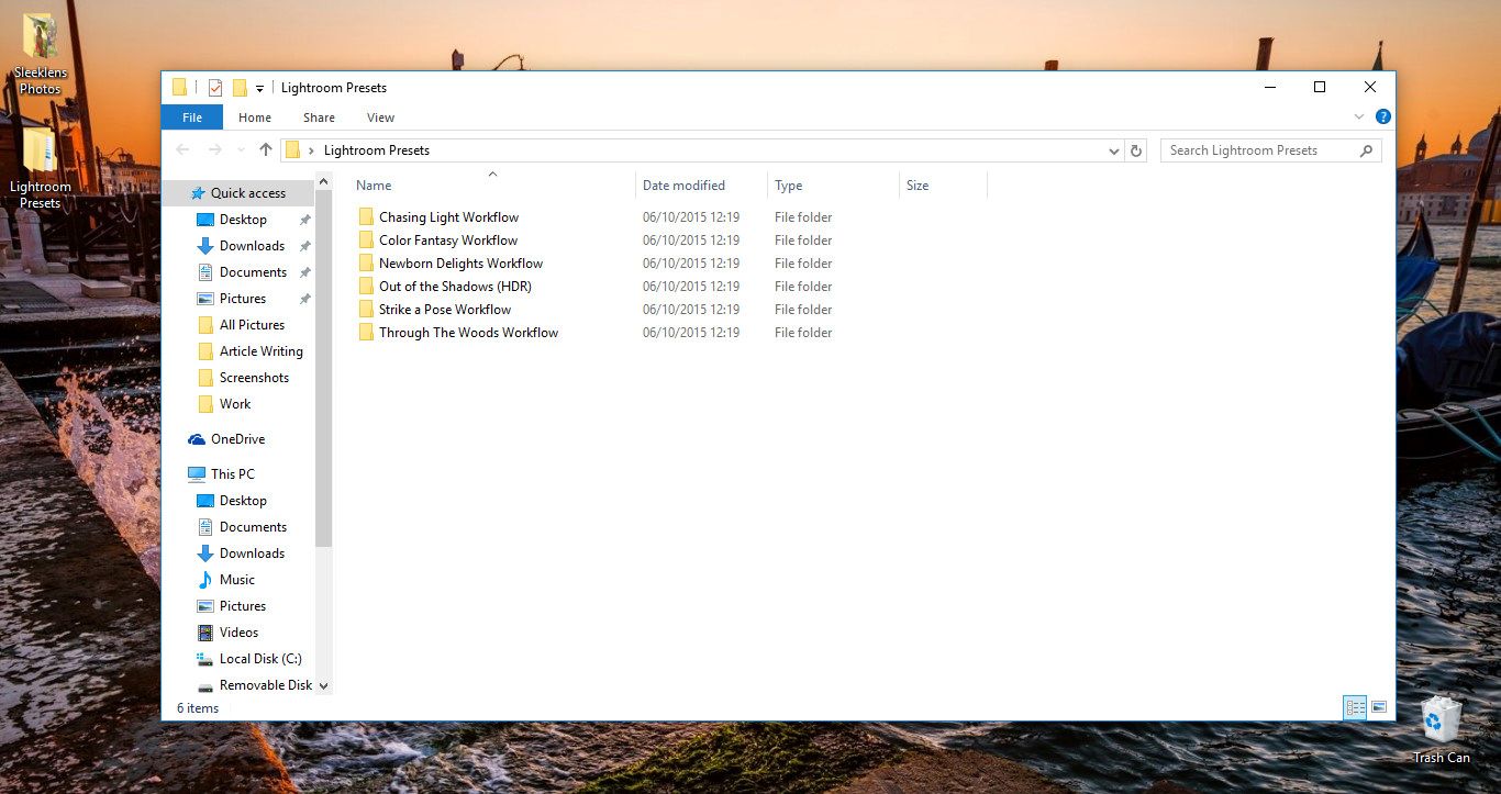
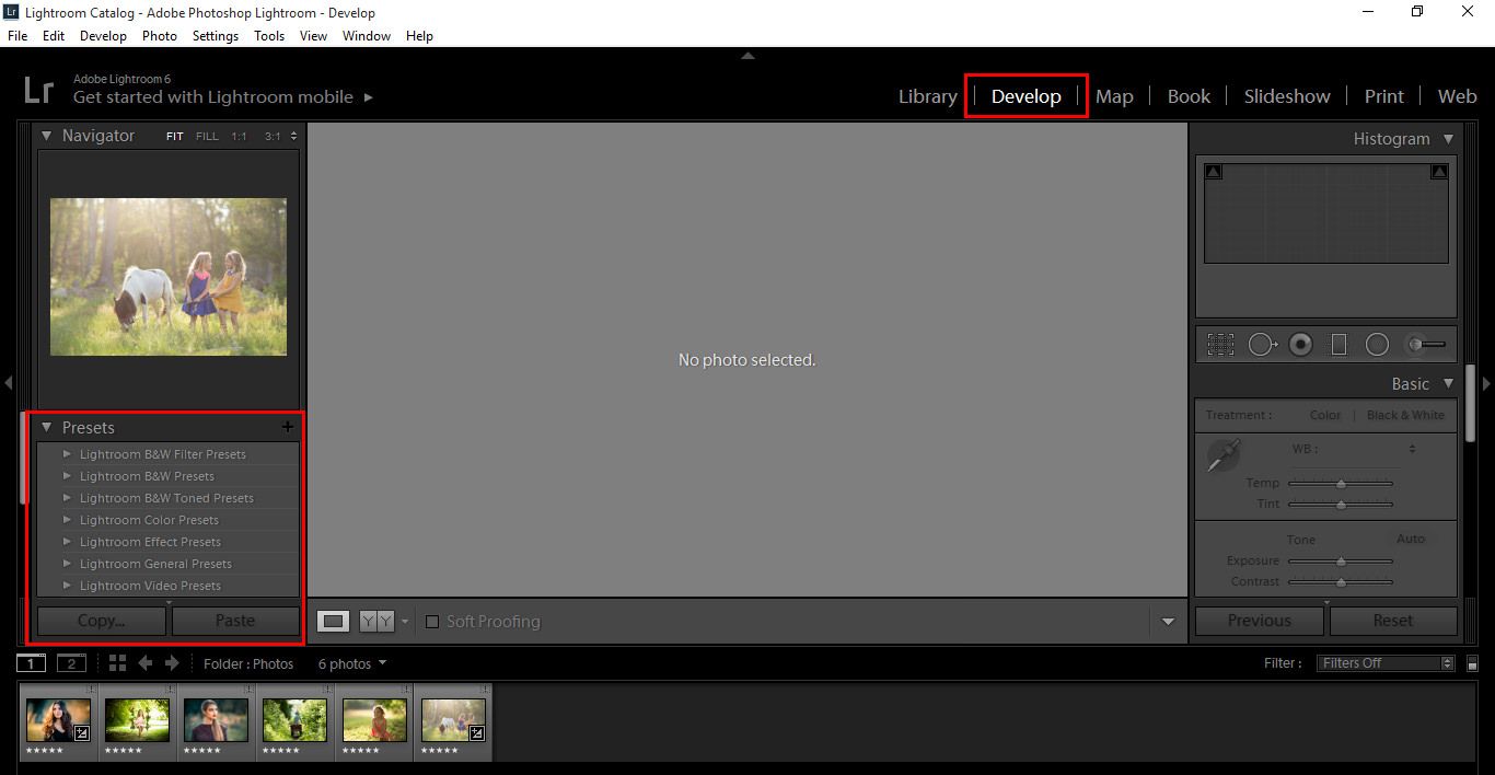
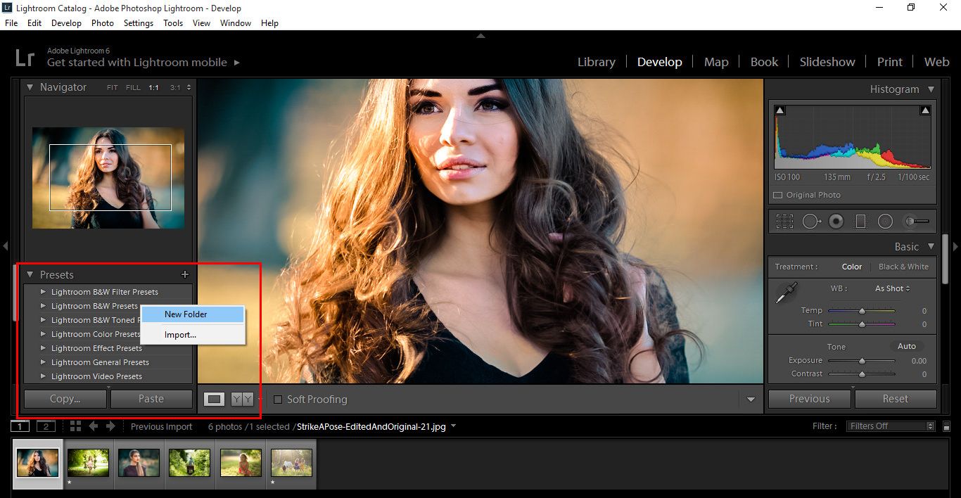
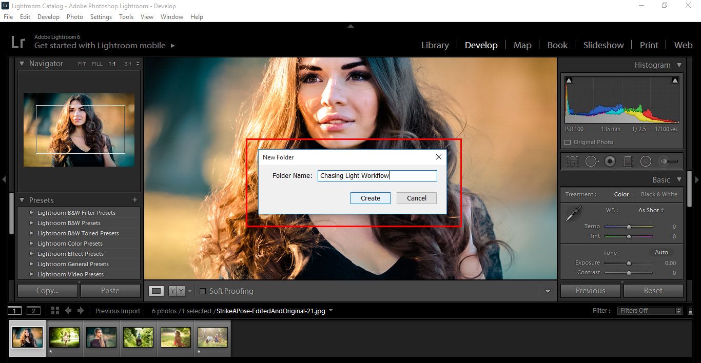
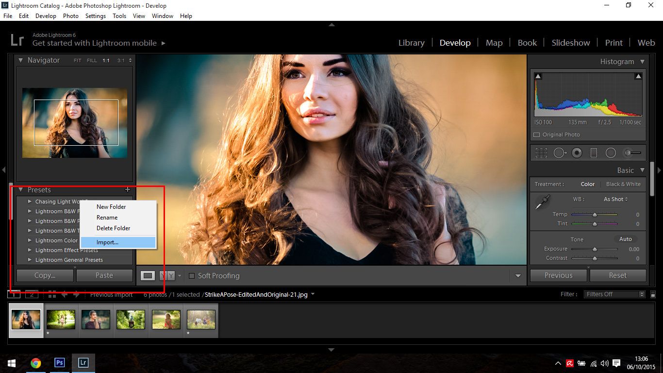
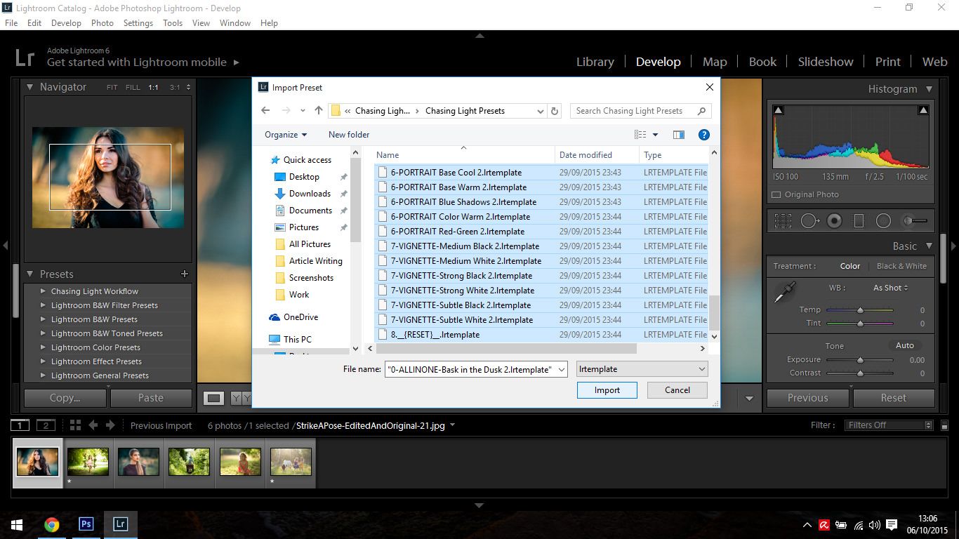
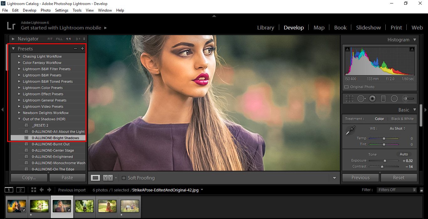
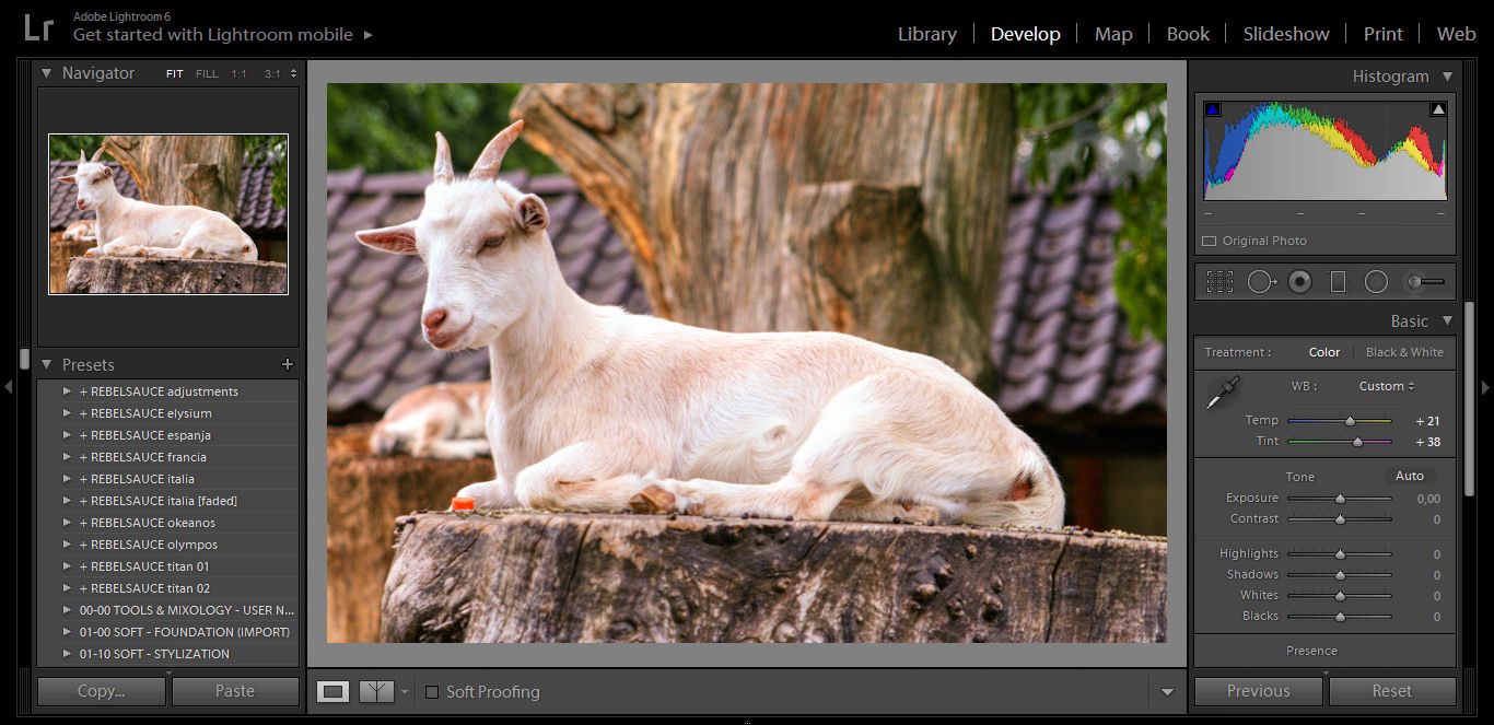
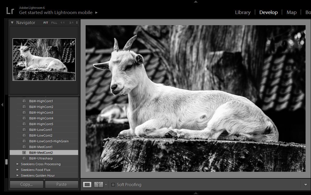
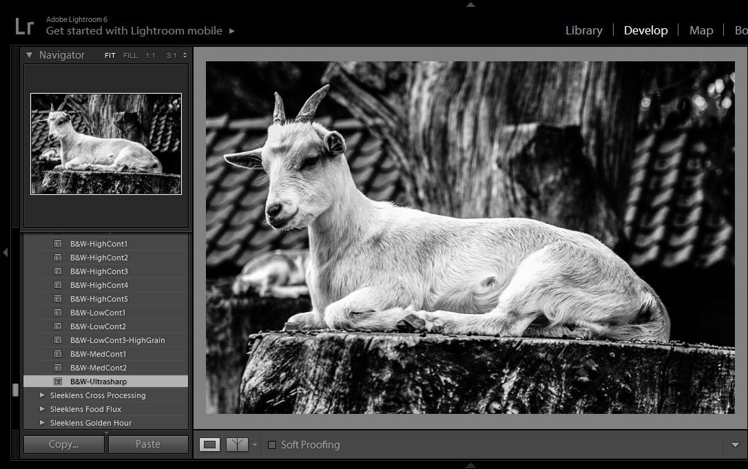
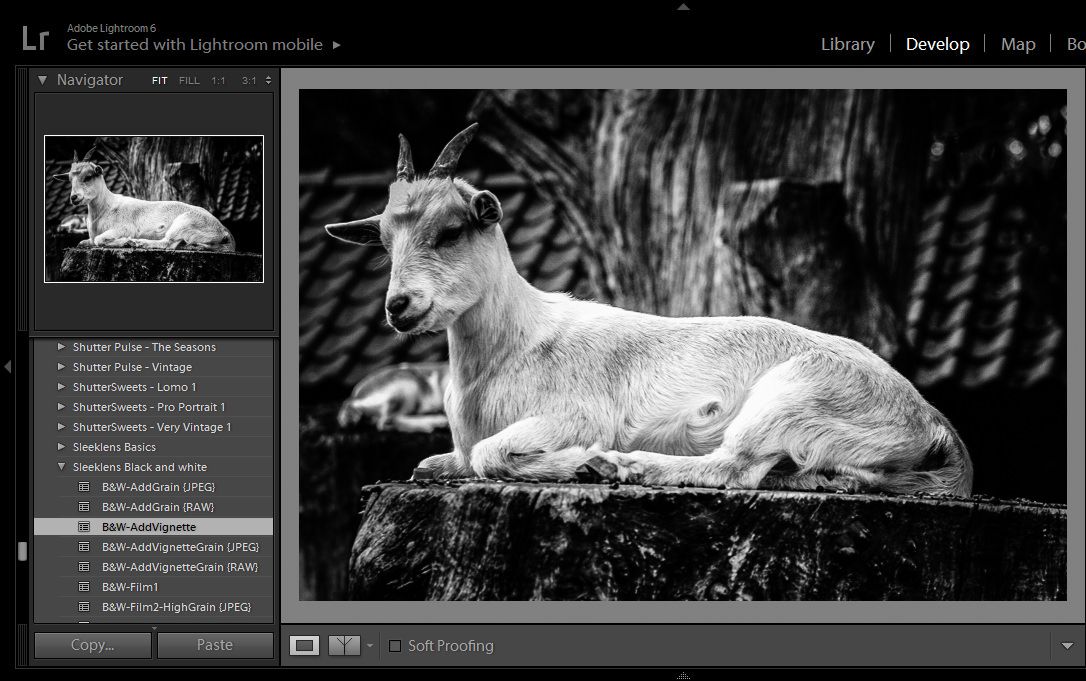
Presets

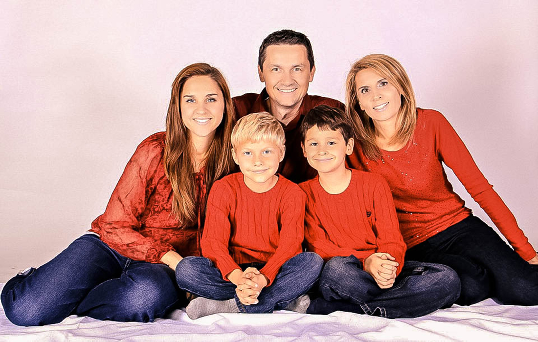
Although many photo editors offer auto-edit presets, Lightroom allows users to develop their own, original presets. Not only do these presets make editing faster and more efficient, but they help photographers develop independent, recognizable styles. Editing every photo from scratch allows for a lot of minor changes that diverge from a photographer’s overall canon of work. There’s nothing necessarily wrong with that, but every artist has a distinct style. Painters use certain colors and brush strokes. Photographers edit to bring out particular colors, alter light, and add contrast. Personal style is just as important for a photographer to develop as it is for a painter.

Quick Develop and Match Total Exposure

Every image needs a little individual tweaking, but if you edit a lot of images from the same shoot, you’ll be making a lot of the same adjustments over and over. Editing photos by the batch, however, through Lightroom’s quick develop tool, allows you to make basic fixes to a whole bunch of images at the same time. It takes the repetition out of editing and allows maximum efficiency for busy photographers.

lightroom batch editing

The batch editing feature becomes even more impressive when you pair it with Lightroom’s match total exposure feature. For instance, if you find after editing the first photo in a series that your lighting was a little brighter than you’d intended, you can use the corrections you made on the first photo to correct the rest in the batch. This not only saves time but also ensures uniformity across images from the same shoot. That way, your portrait collection doesn’t look like your subject’s hair color changes between each image, and your landscape series doesn’t go from forest green to lime between shots. You’ll never have to worry about maintaining white balance across the board ever again.
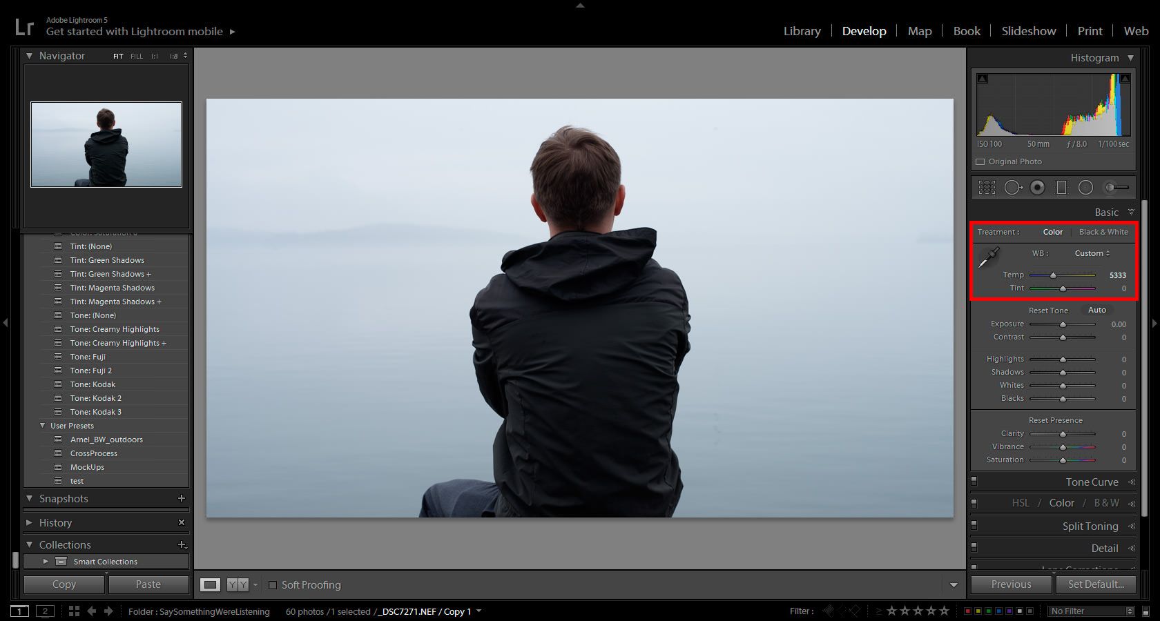
RAW

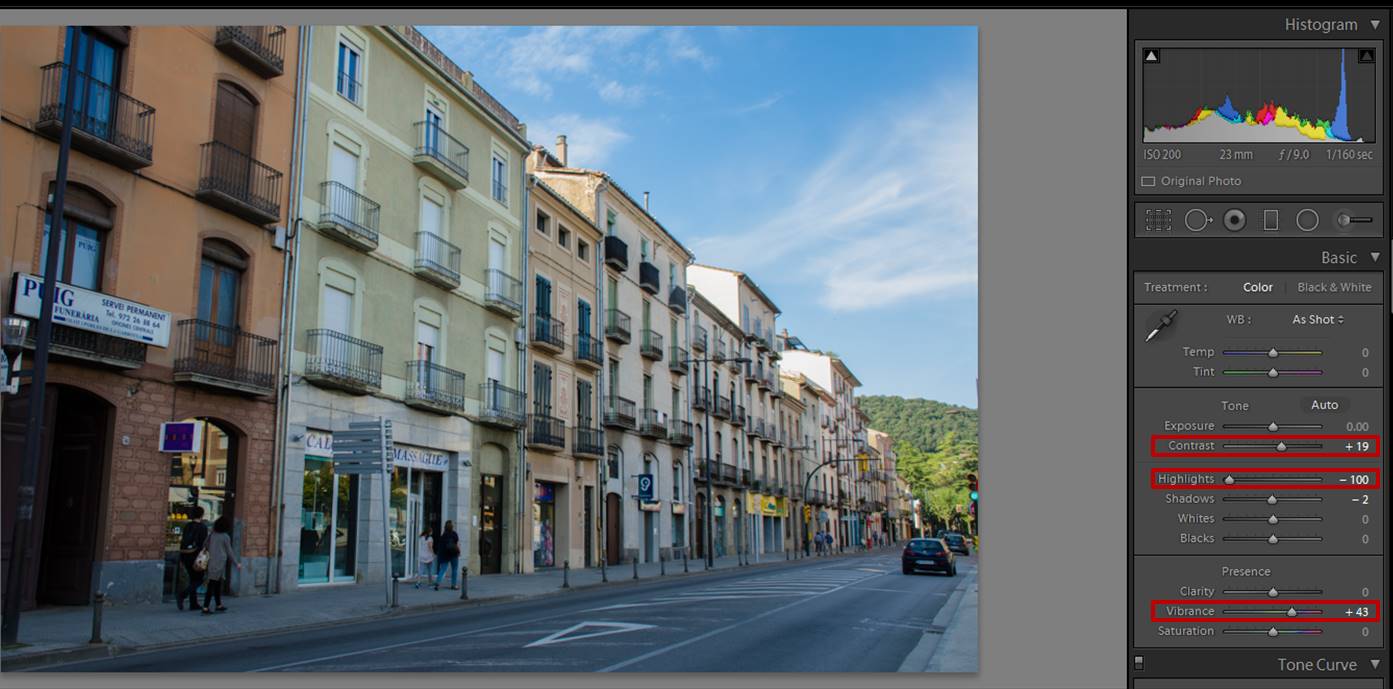
Since photography has entered the DSLR age, photographers are no longer restricted by JPEG files in post production. DSLR cameras can record RAW photos, which are dramatically more detailed than other digital images. Since one of the greatest arguments against digital cameras revolves around image quality, this is a massive improvement. A key Lightroom feature allows users to edit and save RAW files.

Lightroom is able to handle and manipulates RAW files. While Lightroom allows you to edit images from many different file types, RAW files face the least distortion and loss of quality during editing. A JPEG file loses quality whenever you edit it. Whether you’re adjusting white balance and exposure or turning a color image into black and white, you’ll ultimately lose some definition and quality. Lightroom does protect the original of any image to ensure users don’t damage the raw material during editing. However, the final edited image won’t quite have the original’s clarity. This is a problem with the file, however, and not Lightroom.

lightroom raw files

By giving users the chance to edit RAW files, Lightroom has surpassed the majority of the competition. While DSLR cameras can capture these intensely detailed images, editing options are often limited, and sometimes cause quality loss similar to JPEG files. Lightroom has bridged the gap between RAW files and full-service editing tools.

Lightroom relies on a core set of features, and the list above includes the most important to understand. They provide the fastest, most thorough, and nuanced photo editing opportunities. The software is able to support RAW files and process entire batches of photos at the same time. These awesome Lightroom features can help you edit not only well, but quickly.

Make your photographs stand out with Strike A Pose Lightroom presets

An exquisite day beckons to you, asking you to leave your house and shoot outside. You gather your equipment, find a location that catches your eye, and photograph for as long as your free day allows. Confidently shooting in RAW mode, you aim to make use of every precious pixel. Contentment eventually fills your creative mind and you return home, eager to view your new works of art, your potential magnum opus. However, when you import your images into Lightroom, you notice flaws that weren’t noticeable in your camera. The tingles of excitement you had initially felt somewhere in the pit of your stomach no longer exist. Certain colors don’t stand out as dramatically as they did in your camera’s LCD screen and to make it worse, Lightroom reveals your desired effect for a few seconds before teasingly neutralizing the colors and dulling your images.

img_7538

This sudden transition is due to your camera company’s default settings. Chances are that Lightroom’s default settings don’t match that. As a result, any RAW file is slightly adjusted during the rendering process because of Lightroom’s different interpretation of the image data. Is Lightroom, then, attempting to sabotage your work or hinder your artistic progress? No – this matter is easily fixable. One of the benefits of shooting RAW is that the resulting images can be rendered in many ways without being destroyed. Thus, altering photos is easy.

Manually adjusting the contrast and temperature of your image can prove to be effective. However, there’s an easier and far more creative method to get the best results possible. Dreary photos can be fixed easily with a handy tool called a Lightroom preset, a color enhancer which automatically makes an image pop. In most cases, such presets can be adjusted to fit the photographer’s taste and needs (i.e. fixing clarity, saturation, temperature, etc.). Once you obtain a preset, you can use it on several images at once, making the editing process quick and straightforward. If finding the perfect colour combination isn’t within your skill set, you can work with presets to make the most of your images.

img_3814
Edited with “All In One – Sunset Portrait 3”

Sleeklens offers a variety of mesmerizing Lightroom presets for any kind of shoot. The Strike A Pose Lightroom presets are a diverse collection of instant, adjustable portrait enhancers. From richly golden tones to cooler shades, this collection will suit any artist’s taste. Here are a few previews and tips to make the best of these resources.

1. All In One Presets

Strike A Poses’ All In One Presets are instant photo boosters. If you wish to transform your image into something you’ll be proud to share with others, then experiment with these. Hovering over them will allow you to see a preview of what your image will look like. Allow yourself to fearlessly experiment with each one. You never know when a new color combination will lead you to a more experienced version of your artistic self. Remember that presets are instant photo enhancers, not instant photo “perfectors.” Consider them the foundation of your image. One that has the intention of being adjusted and used based on your taste. The more adjustments you make, the closer you’ll get to discovering your own style.

(If, however, the all in one presets don’t strike your fancy, check out the next section for an alternative editing method.)

img_3560_29285232553_o
Edited with “All In One – Golden Shadow”
screenshot-2017-01-02-18-27-17
You can do almost anything with your image – presets just act as helpful color guides. Don’t limit yourself to the “Basic” section. Play with color tones, hues, and sharpness. Make the most of Lightroom’s practical features.


screenshot-2017-01-02-18-11-24
The color section is ideal for playing with hues and saturation.
img_2952_29286324013_o
Edited with “All In One – Beach Glow”

2. Base Presets

The All In One presets are quick fixes, but the second part of the collection has a far more controlled environment for photographers to enjoy.You can neatly place base layers on top of each other to create a noteworthy image. Just imagine the many layers of a cake. The chance to adjust each section as you move from one step to another creates a more open environment for you as a photographer. There are 6 bases in total, all of which contain assorted subcategories; combining these in any way or order will result in outstanding photographs.

img_7538
The editing process for this was:
1: Glow Baby Glow
2: Brighten
3: Reduce yellows
4: Golden Glow
5: High contrast
6: Black dreamy

When an exquisite day calls you to leave your house and shoot again, you don’t have to worry about the editing process. Having confidence in your photos will give you more room to create and grow. This will result in a happier, freer, and more developed photography life.

Good luck!

img_0027_28022987216_o

not

Making Family Portraits Perfect Using the Chasing Light Lightroom Bundle

A good family portrait will hang in a house for years. Everyone who comes through that house will see that picture. So it’s important that the best family picture looks the best that it can. If you’re trying to create the perfect portrait, the Sleeklens Chasing Light Lightroom Bundle can help. The bundle is also useful for perking up any pictures your family has, but that weren’t edited properly. Here, we’ll give you an in-depth guide for turning your family portrait into a perfect memory. Follow along as we transform this picture.

family-portraits-1

The All in One

The all in one section of your Sleeklens Chasing Light bundle is perfect for a quick fix. If you’re a beginner in Lightroom this section is a great place to start. The all in one section will combine the best of the rest of the bundles. Try out the different presets until you find one that works best for you and your picture. For our example photo, we used the preset Matte Glow to darken the background and bring out the natural shape of the outfits.

family-portraits-2

Base

The base section of the Sleeklens Chasing Light bundle is the most important bundle. This will be your building ground for creating the perfect photo. For the example picture, we want to tone down the bright background and create more of a focus on the family members. To achieve this, we used the base preset in the shadows. This does create more of a highlight on the family’s skin and clothes. However, it darkens the background, and draws the attention to the family. The problems created by the highlight will be fixed in later presets.

family-portraits-3

Exposure

In order to adjust the brightness of a photo you’ll want to play with the exposure. Normally this is done when taking the photo. However, the Chasing Light workflow can help you adjust this in the editing section. To help darken the example picture we used the preset Brighten Shadows. This toned down the light of the family’s skin, and brought out their outfits.

family-portraits-4

Color Correct and Tone

For the color correct, not much needs to be done in this picture. Mostly color correct is used to tone down reds, yellows, blues, and greens. However, since the color of the family’s outfits is a focus of the picture, it’s important to leave them bright. We used the preset Fix Red Skin to bring out the family’s natural skin tone a bit.

Chasing Light’s tint/tone presets can help the colors of your photo pop rather than get toned down. However, be careful when using the preset color pop. As you can see in the picture below (on the right) bringing out the bright colors of the red tops actually drowned out the patterns on the outfits. Instead, we used Warm It Up (on the left) to bring out the colors.

family-portraits-5

Polish and Portrait

In the Chasing Light bundle Polish, you can fix errors that occurred in the editing process. This includes fixing colors and highlights. For this example, we used Base Cool. This toned down the red that’s been appearing in the background of the picture. The action also washed out the color of the outfits. However, this was fixed in the next bundle of presets.

The portrait bundles are ones that are used to specifically edit portrait shots. These are groups of settings that are made to match people’s skin tones and outfits. To help bring back the family’s clothing, we used the red/green preset to help pull out the brightness of those colors.

family-portraits-6

Vignette

Normally vignettes are used to surround the family and pull the attention to the people. For this picture, we used the Medium White preset. Sometimes a white vignette looks better than a black vignette. In this case, with the sweaters, the white vignette made the picture feel more like a winter setting.

family-portraits-8

As you can see, using the Chasing Light bundle is an excellent way to edit family portraits. You can help make a perfect picture for your clients or touch up an old family memory. Either way, this bundle is perfect to help create natural looking family portraits that will decorate your home for years.

How to Improve a Dull Photo in Lightroom

Lately, I have been sharing with you several photographic journeys around Catalonia. I have shown you places as La Garrotxa, Sitges, and Barcelona. For me, nature and portrait photographer, it has been a nice challenge to take photos of streets and buildings. I discovered I like it a lot! Once back home, with the photos already in my Lightroom presets catalog, click here. I faced a new issue: how to improve some of the street photos I took? Some of them looked quite dull. My brain is used to think about softening images: I soften flowers to make them look more delicate, I soften wedding photos to make them look dreamy… but softening a street or a building?? It didn’t seem right to me. I did a bit of thinking and a bit of trying and I ended up finding a post-processing workflow that I like to use to improve dull photos. Are you interested in installing presets? See the details here.

I shot this photo in Olot. It might be familiar to you because I used to illustrate one of my last articles.

dull photo

You agree that this photo looks pretty dull, don’t you? However, if you look at the histogram you can see that this image has a lot of potential because no pixels were either too bright or too dark. They were all inside the dynamic range of the photo (If you are not familiar with histograms I invite you to take a look at the article of Julian H about Lightroom Histograms. Before starting working in Lightroom, I recommend you to stop and think what you want to achieve. This will give you an indication of which slides you need to move. In this photo, I wanted to do 3 important things: increase the contrast, give a bit of color to the buildings and recover the sky.

General adjustments

I always start by doing general adjustments (they affect the whole photo). For the first steps processing this photo, I used some of the slides in the Develop Module, specifically in the Basic panel.  I wanted to increase the contrast, so I moved the Contrast slider to the right (+19 in this case). To recover the sky of any photo, you can start by moving the Highlights slide to the left. In today’s photo  I moved it to -100. And to gain a bit of color I increased the Vibrance by moving its slide to +43. Just these 3 adjustments can already improve a dull photo, a lot.

dull photo

However, the buildings had too many shadows, so I moved the Shadows slider to +100 and I increased the exposure a little (+27).

dull photo

It is quite common that when you reduce the shadows of a photo, the contrast gets weak. But it is ok because just by darkening the blacks a bit (-36) you can recover the contrast.

dull photo

Local adjustments

The photo looks better already. However, it can be improved much more by doing adjustments to just some parts of the image (local adjustments). In this case, I wanted to recover the colors of both the sky and the buildings even more. There are several ways to add local adjustments to a photo using Lightroom. Today I used 2 brushes: one for the buildings and one for the sky. If you are not familiar with Lightroom brushes, don’t worry! There is a guide written by Mantas O. Ciuksys on how to use them that will help you a lot! The first brush I used all over the sky and as I wanted to recover the colors I moved the Highlight slider to -100 and I also gave a punch to the saturation (+13). More uses of brush in editing, see here.

dull photo
In pink, the area I brushed for editing just the sky.
dull photo
Here is the sky after applying the local adjustments using a brush with the settings marked by the red square.

The second brush was used on the houses. BUT just on the houses that I wanted to emphasize (the 3 first houses from the left side). This time I increased the saturation quite a lot (+80).

dull photo
In pink, the buildings I brushed in order to apply the local adjustments.

dull photo

You can see how the 3 houses changed after applying the brush to increase the saturation.

Final sharpening

The last adjustment was to increase the sharpening of the whole photo to +64 (Sharpening is in the Detail panel).

dull photo

Here you have the final photo. Much more colorful and vibrant than the dull original one!

dull photo

Using the Sleeklens Brick and Mortar Workflow

If you want to save time in your editing like the one I just showed you, I have good news for you!! You can use the Brick and Mortar Workflow, that comes with 78 presets and 28 brushes. I have been trying it for editing urban photos from my last articles and I am really happy with the results I got with just a few clicks.

The thing I like the most about these presets is that you can stack them, meaning that you can use several of them in the same photo. I will give you an example of this workflow using the same photo from before. I started by applying the following presets:

0-All In One – Beautiful Daylight. This gave already a great improvement.

5-Polish- Make it Pop (to increase the colors of the image).

5-Polish-Sharpening.

6-Tone-Warm-Highlights.

For local adjustments I used 2 of the Brick and Mortar Brushes on the 3 first houses on the left:

Exposure-Brighter Shadows.

Color-Saturation.

And that’s all! It took me less than 2 minutes to edit the photo! Here is the final result!

dull photo

I hope you enjoyed giving a bit of color to some dull photos. Feel free to contact me with any question or suggestions. What do you do with dull photos? Do you do something similar to what I do? Do you have a totally different workflow?  Have a happy post processing!!!

Using Photoshop Vintage Effect to Create Retro Style Photos

Retro is always something that comes back because we all want to think back to the times when we were younger. It is all about nostalgia, and that nostalgia is what gets people trying to create retro looks not only to movies, but to photography as well. That is essentially the entire concept of Instagram.

In the past, it was very difficult to get those retro photograph feelings without using film photography, but with new trends in digital photography and editing software, it is much easier. There are many things you can do in Photoshop and Lightroom to get the vintage look, but today we’re going to focus on the Photoshop side of it.

Making Adjustments

There are many ways that you can use Photoshop to get that retro feel. You can use helpful tools like Sleeklens presets but there is also a series of steps you can go through to make those adjustments to create the retro feel. The choice is yours if you want to do it quickly, or to do it yourself through the following steps.

retro-photography-1

Make It Soft

The first thing to do with the picture is to lower the clarity to -30, which will create a dreamy softness to the image. From this point, you are going to want to adjust the highlights and brightness of the picture. You can increase the exposure by about half a stop, and brighten up the highlights and the whites to get a bit of that burned out Photoshop vintage effect that is crucial to the retro feel.

You should also use the shadow slider to soften the shadows slightly, especially if you had only one light in the studio with you. Once you have done that, you continue to create the warm and soft tone by increasing the temperature of the photo, while also enhancing everything by decreasing the vibrancy.

retro-photography-2

Fix the Lighting

Chances are you are going to have to fix the lighting of the photo in order to get that retro look. When you are using a photo that only had one light source in it, this is very important to fix that lighting look.

The first thing you have to do is to increase the exposure with the adjustment brush that you have in Photoshop.

Once you have done that, you need to bring up the shadows to open everything up, and then you pull down the saturation.

retro-photography-3

Once that has been completed, you will turn on the Auto Mask and that will allow you to make some more unique changes. Take the Auto Mask and brush it on the outside of the subject. This will be important because it won’t ruin the image, but it will fix some of the lighting and shadow problems. Once you have done that, you turn off Auto Mask and then use a small hard brush to erase the images around the subject where the shadow is very strong, and that will bring it back to what it should be in the original retro look.

Great Tip – 4 cool photoshop tools that improve your editing workflow

Using Presets

One of the big advantages of using presets is that all the work is essentially done for you. All you do is load presets into Photoshop and that will allow you to select what you need to create the retro look. This is a good idea if you are planning on creating a lot of pictures that have a retro look. Presets like the “Nostalgic Vintage Collection” can do this for you, eliminating a lot of the tasks you would have to do yourself. Doing that for one picture is fine, doing it for 10 or more will get very tedious and it will take you a long time to get it done properly.

retro-photography-4

Filters

Some cameras will come with software built into the camera that you can use to create that retro look before you take it to Photoshop. This again can help to eliminate some steps for you, with you just needing to fix things like shadows in the program itself. You can also buy filters that create a retro look but again post-production work in Photoshop is usually required.

The retro look is big right now, and creating that retro look will help set you apart from other photographers. When you can create photos that look like they are from decades past, you are helping to create the nostalgic memories that many have for the past, and the pictures of their past.

Shooting Wedding Details: A Comprehensive Guide

Effectively capturing details is essential to communicating the atmosphere and emotions of your clients’ wedding day. Formal shots and group photos are essential, but often times it’s the little things that really bring back memories.

First, let’s clarify exactly what is meant by the word “detail.” In this case, “detail” refers to two things: smaller articles that are particularly valuable to the couple (wedding rings, especially), and things that do not necessarily carry any sentimentality, but aid in expressing the spirit of the celebration. Adequately documenting these particular elements requires that the photographer adheres to a few simple guidelines.

The Basics

Regardless of what you are shooting, it’s important to pay attention to angles and composition. When I’m working on details, I always shoot directly above or directly in front of my subject. Usually, any other angle detracts from the image and makes the photograph appear unbalanced.

bouquet-of-roses-1246490_1280

If you’re shooting small details, using a macro lens is imperative. It’s impossible to photograph a multifaceted diamond without one. Again, I’m emphasizing wedding rings, but this applies to any tiny object that would otherwise lose detail without a lens that lacks the ability to focus closely.

Furthermore, lighting plays an extremely important role in sufficiently enhancing smaller features. Position your subjects next to a window or another source of natural light. Artificial light typically comes from above and casts harsh shadows (just as if you were shooting outdoors at high noon).

Photographing Sentimental and Essential Details

Valuable objects directly related to the wedding must be captured clearly and thoughtfully. Jewelry, clothing, decorations, the cake, etc. are the unique accessories that showcase the couple’s personalities and will thus be some of their most treasured photos. The goal here is to highlight each item without complicating the image and detracting from the subject. I like to add outside elements that complement the subject. This is really a great way to augment shots of jewelry or other accessories that are very small. If you have the opportunity to work outdoors, you can use sticks, leaves, rocks, and so forth to give the image a rustic, nature-inspired vibe.

20151004-175926-2_mini

If you can’t go outside, simply find ways to add eye-catching textures or patterns to the shot, or incorporate something else that is special to your clients to add interest.

20150711-142947-478_mini

The bride’s dress is equally important. The same rules apply, but it can sometimes be difficult to get a creative shot of the gown. Again, incorporate textures and patterns when you can.

20150711-135407_mini

Creating a unique dress shot requires a little artistry and sometimes, improvisation. At one of the weddings I worked last summer, we had been having a tough time finding a nice place to photograph the dress. The hotel was beautiful, but the circumstances just weren’t quite right. We ended up taking the dress down to the lobby and asked the concierge if we could hang it from their chandelier. Surprisingly, they agreed, and it looked perfect. Then, as I stepped back through the automatic doors to get a wider shot, I ended up with this:

dress_mini

The point is, you can always find creative ways to work around seemingly impractical or unappealing situations. Keep in mind, too, that when you’re shooting wedding dresses, it is important to get wide shots of the entire dress as well as close-ups of the fabric and details.

dress2

Photographing Non-essentials

After you’ve covered the necessities, you can really get creative with the more obscure details. These are particularly important, though, because they really help convey the feel of the entire day. Not to mention, this is really a lot of fun during the reception or whenever you have some downtime. I also take a lot of pride in images like these because they sincerely express my unique photography style.

painting_mini

I try to choose things that will evoke strong feelings in the couple long after the wedding. They may forget little things like what they were eating while getting ready, details in the room where the bride prepared, and so forth. When they look back at these photos in years to come, all of the emotions of the day will come flooding back, and that is really the fundamental goal of quality wedding photography.

makeup_mini

chandelier_mini

To further enhance your wedding day details, Sleeklens offers a wide array of Lightroom presets and Photoshop actions.

Five Editing Mistakes Beginning Photographers Make

When you’re first starting out in photography, it’s easy to fall victim to a few common mistakes. When I look back at my work from seven years ago, it’s apparent to me (and probably any other photographer) that I fell into many of the same traps as a lot of other beginners. Things that draw attention to your subject don’t necessarily improve the photo–they can simply be distracting.

In this list below we’re going to get in touch with the five most common mistakes beginners tend to make during their journey towards becoming professional photographers:

Heavy Vignetting

2_vinette-1

Exaggerated vignettes are a tell-tale sign of an amateur photographer. Beginners like them because they draw attention to the center of the frame where they are most likely to compose their focus. What they’re effectively doing, though, is underexposing the sides of the image and detracting from their talent. A good photographer ought to use the whole shot, utilizing natural elements to frame the subject. Amateur photographers also like to use vignettes in an attempt to add some drama to the photo. Luckily, there are natural ways to do this–mastering the sun flare technique can really enhance an otherwise lifeless image.

Overusing Presets

3_Going over the top with presets-1

It’s easy to go overboard with presets. Overuse can make a photo look unnatural and unflattering. If you suspect you’ve done too much, you’re probably right. Keep it simple. Instead of over-editing the entire photo, use local adjustments to accentuate specific areas.

Histogram tool can be your best friend under situations like this, as you’re constantly checking over clipped values (mostly at highlights or shadows), but also Lightroom’s before/after mode can be extremely handy for checking where things went wrong.

Overdoing Black and White

4_Only editing in black and white-1

This is the mistake I’m most guilty of in my early work. Converting an image to black and white does not generally make it more artistic. Of course, there are ways to use black and white to effectively enhance a photo, but many new photographers end up using this style as a crutch. The number of variables that color adds to the editing process can be intimidating. Be sure to learn about complementary colors and incorporate them into your photos. However, do try to avoid photographing bright and heavily saturated colors because camera sensors don’t tend to register these colors well. If you’re unsure which way to go, this post can help you decide whether to edit your photo in color or black and white, but also keep in mind that not only black and white effects count as the only range of monochromatic effects – sepia or cyanotype effects also looks appealing for most clients.

Heavily Retouching Skin

5_Over Retouching-1

Most photographers fear that their clients won’t like their photos because of the way they themselves look (by no fault of the photographer). It’s tempting to heavily retouch skin in an attempt to flatter your client, however, it’s best to edit only what is necessary. A good rule of thumb is to touch up or remove only imperfections that are impermanent, such as acne or bruises – try, also, to find flattering angles and accentuate those.

Overdoing such adjustments will end up in unnatural results, mostly if you don’t happen to ace post production tools such as Lightroom Presets & Brushes or Photoshop Actions. In the end, you’re prone to ruin all your hard work by just trying to make it look better.

HDR Processing

6_Going crazy with the clairity slider-1-1

Every photographer wants to learn new techniques; more often than not, though, HDR processing looks a bit over the top. While it can be tempting to bracket exposures, it’s best to avoid it until you’ve mastered basic photography skills first. Instead, if you don’t have enough dynamic range in a shot, bracket the exposure and brush locally in the post.

A quality image ought to appear natural, polished, and simple:

1_original-1

Now that you’re familiar with these common mistakes, you can easily avoid them by mastering photography techniques that surely will take your photographs to the next level! Don’t feel disappointed by making mistakes during your first attempts – everybody had a starting point and a goal to reach, therefore it’s your right to learn from bad experiences and add all that knowledge to your future work.

Hope this guide was useful and keep shooting!

How to Work with the Forever Thine Workflow in Adobe Lightroom

Hello, today we are going to get into wedding photography, and how to make editing this complex subject easier, using the “Forever Thine Workflow” by Sleeklens.

The best part about this Forever Thine workflow is that it is specifically aimed towards wedding photography, which is extremely helpful for a photographer who has taken hundreds of shots, and then needs to make a ton of quality edits in a short amount of time. Our “Forever Thine Workflow” comes with 112 wedding specific presets which will give you plenty of options to edit with. This workflow also includes 23 brushes, allowing you to make any local or precise adjustments to your photograph.

I have my photo pulled up, so let’s go ahead and get right into it. The first thing that I am going to do is go into the “Forever Thine” presets. We’ll scroll down to the Base presets and click on Base – Warmer. Then we will scroll down some more until we get to the Tone/Tint presets, this time going to Fading Dream. Remember, even though presets are one click edits, you can still go over to the navigation to tweak and adjust as needed.

For my photo I am going into the Basic tab, then changing the Tint to +45 and the Clarity to +40.

Next, we will use a brush to make a small adjustment to the photo. Going into our “Forever Thine” brushes, we will use the Fix Underexpose brush. We’ll apply this brush right in the center, directly on the subjects to bring a bit more light to them.

As you can see, that edit took less than a minute to perform, improving the overall quality of the photograph and added a nice, warm dreamy feel to it.

Moving on to the next photograph. For this one, we will be using the “Forever Thine” Black & White presets. So,let’s scroll down and select the Black & White – Ivory preset.

Once applied, we will tweak this preset a bit by going over to the panel and moving the Whites up to +31.

Next, we’ll go back to the “Forever Thine” brushes to make a few small adjustments. Going into the Wedding brushes, we’ll go with Shiny & Bright. We will use this brush generally on the subjects, doing this three times, clicking New each time. This is just bringing up the shadows a little bit and adds a bit more light.

Now we’ll go back and choose another one of our “Forever Thine” brushes, this time we are going to use the Wedding – Clarity & Detail brush. As its title suggests, this brush is used in areas where you want to enhance the clarity and details. For the photo that I am using, We’ll run this brush mostly over the bride’s veil and dress, which will help bring out the detail of the lace a bit more.

Now that we are done with this one, the before and after shows that after only about a minute or so of work, we have taken a color photo and quickly created a nice black & white photograph with beautiful enhancements.

And now on to our third and final photograph. In this photo, we will start out by using one of the “Forever Thine” Wedding – Film presets, we’ll go with Breakfast at Tiffany’s. This preset adds some contrast and gives this photo a really nice brownish, sepia like tone.

Next, I will go over to the panel and use the Spot Removal Tool to clear up the street in the picture a little.

Now that we have done that, let’s go into our “Forever Thine” brushes. Once again, we are going to use the Wedding – Shiny & Bright brush. We will run that brush over the bride and her veil, then click New to start a fresh brush, this time going with Wedding – Fix Underexpose.

We will use the Fix Underexpose brush on the bride and her bridesmaids in the back, slightly turning up the Exposure as we go, just to add some more light to all of them.

So, now I am going to use one of the custom brushes that comes with Lightroom. We’ll go with the Tint brush, but make some minor adjustments before we apply it. I’m going to set the Tint to 36 and the Temperature at 29. We will use this brush on a couple of the bridesmaids who have a little paler skin, just to make them blend in a bit more.

We can tweak this photo a bit more by going to the Detail tab, then to Sharpening and raise the amount just a bit more.

In the end effect, we have really brought the bride out more and muted the colors some with a nice slight sepia tone. We have also enhanced the contrast and light, giving the photograph a more polished and professional look overall.

As you can see the “Forever Thine Workflow” not only helps make editing wedding photos much easier, but drastically cuts down on processing time as well, while allowing you to create breathtaking photographs, preserving those memories for a lifetime.

I hope this Forever Thine workflow tutorial was helpful. Make sure you check out our other tutorials and hopefully you can try these workflows for yourself soon.

How to work with Grayscale Essentials: Creating Vintage Photographs

Hello all! Today we have another tutorial on how to work with the “Grayscale Essentials” workflow by Sleeklens. Specifically, We’ll be talking about creating vintage photographs using the Matte, Sepia and Film Grain presets that are included with this workflow.

So, let’s get right into it. For my first photograph, I have a picture up of a boy sitting in front of what appears to be a wood paneled building.

Getting started, the first thing that I’m going to do is go into the “Grayscale Essentials” Tone/Tint presets. We are going to use the Tone/Tint – Sepia preset.

Once that has been applied, we will go over to our Basic panel and make some adjustments to that preset, turning the Contrast and Exposure up just a little bit.

Now let’s go back over to the presets, this time we’ll go with the Effects – Film Grain 3 preset, to give the photo an even more vintage feel. This preset will give the photograph kind of a grainy texture.

The last thing that we’ll do to this photograph is use a vignette. Going back into our “Grayscale Essentials” presets, we will scroll down and select Film Grain Vignette 5. When applied, we will get a white vignette, however I want it to be black. We can change this by going over to the panel on the right and going into Effects, then Highlight Priority. From there we will move the Amount Slider back until the vignette is as dark as we want it to be.

What you may find with older photographs is that if they aren’t in black & white or not completely tone sepia, you’ll often find the colors more muted. For that, we can go into the Colors tab and make adjustments. In this photo we are going to turn down the saturation of the colors, to get more muted tones. Next in the Colors tab, we’ll go to Luminance and turn up the Yellow and Aqua.

So, that’s one way to do it. What we have done mutes the colors a bit and given its an old, used photograph feel.

Now let’s move on to our next photograph. We’ll start with this photo by converting it to black & white. To do this, we will scroll down through our “Grayscale Essentials” presets, until we get into Film – Black & White Contrast 3. Once we’ve applied that preset we will scroll back up through our presets and select Exposure – Matte Finish, giving the photograph that vintage matte finish that we often see with older pictures.

Next we will go ahead and tone it with the Tone/Tint – Sepia 3 preset.

Then, like the previous photo, we are going to use a vignette again, but instead of using the vignette preset, this time we are going to go into Effects and make our own.

So, go over to the panel on the right, then go into the Effects and move the Amount slider to lighten it up a bit.

Go back over to the “Grayscale Essentials” presets and find the Base preset. This time we’ll go with Base – Classic, just to add a little bit of a darker tone. After applied, I am going to open up the Basic tab and make adjustments by bringing the Contrast, Highlights and Shadows down just a bit.

Now we want to add that grain back in. To do that, we will go to our Effects presets and select Film Grain 4, really adding a grainy vintage feel to the picture.

That is all we are going to do with this one. We started with a highly saturated, modern photograph and gave it a really nice vintage feel.

Now we will move to our third photograph. For this one, I am going to start with an All in One preset.

Let’s go into our “Grayscale Essentials” presets and click on the All in One – Yogi Bear preset. I like this preset because it does convert the photo to a grayscale, but it also adds a sepia tone to it, which give this photo a nice dark brown tone.

Next we will go to the Base – Clean preset, to bring a little bit of light back into the picture. Then to get that grainy effect, we will use the Effects – Film Grain 3 preset.

Before we finish I want to also add a vignette, so for that I am going to use Film Grain Vignette 3, but like earlier, I would prefer it not to be white. So to fix that, like with the previous photo, we will go into our Effects, the Highlight Priority and move the Amount slider down to give the vignette a much darker tone.

Next, we will go into our “Grayscale Essentials” brushes, then scroll down and select Light – Brighten. I’m going to run this brush all over the subjects, increasing the Exposure some, just to add a little more light and help them stand out a bit.

In the after effect of this photo, you’ll see that we have added the matte effect, the grain and the sepia, all coming together nicely to give this photograph that old fashioned, vintage look.

I hope you all enjoyed this short tutorial and found it helpful. Hopefully you can try it for yourself and create some beautiful images soon !

How to Work with Grayscale Essentials: Working with Tone and Tint

Today we have a short tutorial about how to work with the “Grayscale Essentials” workflow from Sleeklens, specifically, adding tone and tint to your black & white photographs.

Now that I have my photo up that I will be working with, the first thing that we will do is is apply an All in One preset.

First, I’ll apply the All in One – Matted preset, then scroll down through the many other “Grayscale Essentials” presets and apply Tone/Tint – Violet.

Now let’s move over to the Split Toning, this is where I will be able to make the changes that I want. As I look down in the Shadows, it shows that I have a kind of blue tone. Here I can go in and change that, moving it up to a more of a dark purple tone by just dragging the little dropper around to where I want it, then I’ll turn the Saturation all the way up.

For the Highlights we have a light reddish pink color, so we will change that to an actual pink, but way down to the bottom for a pale tone. As we play with the Saturation, you’ll see that it gets really, really pink or back down to a very subtle color. I will also lower the Balance Slider, located in the middle, making the photograph turn more purple. To fix that, we will just decrease the Saturation a bit under Shadows, and slightly increase the Saturation under Highlights.

So, now we have gone through and changed the tone of this photograph. We started with color photographs and changed it to black & white, then we applied a violet tone to it. Remember that, you can use the settings to change your photo any way that you like. Sometimes it’s nice to have a slight color tone to your black & white photographs, they don’t always just have to be grey, black and white.

Now, we will move on the our next photograph of a little girl sitting on a rock, with what appears to be some farmland in the background.

For this one, we will start out by applying the All in One – White Castle preset to convert the photo to black & white.

Then we’ll scroll down and apply POLISH – Sharp as a Tack, then we will also apply the FILM – B&W Contrast 4.

With those presets applied, I have added a lot of contrast and kind of blown out the highlights just a little bit. To fix that, we will go over to our Basic tab and turn down the Highlights some.

Next we’ll go back over to our “Grayscale Essentials” presets, this time scrolling down through the many Tone and Tint presets. For this photo we are going to go with the Green/Red preset, which isn’t really my favorite, but as mentioned before, we can go into the Split Toning and change it to how we like it.

Green and red are opposite each other, but can sometimes be complimentary colors, however we will go ahead and change the Shadows to more of a blue color and lower the Saturation quite a bit.

For the Highlights, I will change the color to a brighter green and decrease the Saturation quite a bit here as well.

So, let’s now move on to our “Grayscale Essentials” brushes and select the Light – Darken brush. We’ll turn the Exposure down and apply this brush to the girl’s white shirt, because it is extremely white and kind of distracting from the rest of the photograph. While applying this brush, I will also turn the Contrast up a little, then the Shadows, Highlights and Whites down.

When it comes to the tone and tint, you can really use whatever color that you like, it’s up to you. For my photo I went with a greenish blue color and added a little detail. This just changes the picture a little and gives a bit more of an artistic feel to it.

So that’s it for this one. I hope this was helpful and that you can go try it for yourself soon.

How to work with Chasing Light: Using Light and Color on Portraits

Hello, welcome back! Today we are going to be working with the “Chasing Light” workflow from Sleeklens, this time we’re learning about how to use light and color on portraits, in order to make our subject stand out.

Now that I have the photo up that I want to work on, let’s start out by working with some of the “Chasing Light” presets. We’ll go with POLISH – Sharpen 2 for the first one.

The next preset that we will apply is a BASE preset, we’ll go with Fresh Color 2.

Now that we have applied a couple of presets, now we will go over to our “Chasing Light” brushes and use those to really enhance the detail in my Photo.

So, let’s open up the “Chasing Light brushes and scroll down to the LIGHT – Brighten brush. We will run this brush all around the subjects face and hair, just to add more light in general. Now I will click New, using the same brush once more, but this time I will turn the Exposure up a little bit. I will also make my brush a little smaller, you can also do this using the bracket keys([]) for the keyboard shortcut.

We will use the brush to kind of contour and add some more light to the face, going over the typical areas such as the forehead, cheeks, chin and bridge of the nose.

For this photo, I’m going to repeat the process with this brush again, but now I will make the brush even smaller and turning up the exposure some. I will use it to go over my subject’s eyes.

Now we will click New to start a fresh brush and go back into our “Chasing Light” brushes, now choosing Soften Skin. I am going to use that brush all around the face. Since we did apply the Sharpen preset at the beginning, it kind of sharpened the detail on the face a little too much, so we will just use this Soften Skin brush to soften it out some.

Moving on, let’s click New, and choose another “Chasing Light” brush, this time we’ll use the LIGHT – Darken brush. I will use this brush all around in the background. While applying this brush, I am going to turn the Exposure down just a little bit. By darkening the background and adding light to the subject, we are making the subject really stand out from the background in the photo.

The last brush that we are going to use for this photograph is the LIGHT – Brighten Highlights brush. We will apply this brush to the hair to add a tiny bit of definition, especially to the darker parts.

That’s all we’re going to do to my first photograph. In the before and after view, You will see that we have sharpened the photograph, added a lot of light to her eyes and face. We have also really made the subject stand out from the background more.

So, moving on to my next photograph. For this one we will also start out by applying some of the “Chasing Light” presets. The first one that I will apply is going to be the POLISH – Sharpen preset.

For the second preset we will go up to the COLOR CORRECT presets and click on Reduce Greens. However, I don’t want to reduce the greens too much, so I will go over the colors tab and move the Green Slider up just a little bit.

Next we will move on to our brushes. Let’s go into our “Chasing Light” brushes and scroll down to LIGHT – Add Golden Sun. We’ll click on this brush and run it around the brighter area, to add a more golden haze to the photo. You would add this to where the sun appears to be affecting the photo more.

Now, we will click New and get started on a new brush. We will go with the LIGHT – Brighten brush again, in this photo I will turn up the Exposure some and run this brush over the girl sitting on the scene, just to add some more light to her.

Next we will start a New brush and go back into the “Chasing Light” brushes, this time going down to the LIGHT – Darken Shadows brush. I am going to run this brush all around the areas behind and under the subject to add a little more depth and dimension.

Now let’s go back over to the presets and apply the TONE/TINT Warm It Up preset. Since we added that golden sun effect, I want to make it a warmer portrait.

Once that preset has been applied, we will go back into our brushes. We’ll go with the LIGHT – Darken brush and apply to the areas behind and under the subject, adjusting the Exposure as we go. We will also use this brush in the hair, just to darken some of the highlights a bit.

Let’s now go back over to the presets, this time we are going to use the Medium Black Vignette. Although, it is a little too much of a vignette, so what we can do is open our effects and look for something that say “Highlight Priority”, then move the Amount Slider up just a little.

That is all we will do with this photograph. If you watch the accompanying video, you will see that in the before and after, we have added a bunch of light directly on the subject and darkened the area surrounding her. We have also added a golden, sunny haze and really warmed up the photograph in general.

For our final Photograph, we have a photo of a girl holding an umbrella over her left shoulder.

To start out we are going to apply an Exposure preset, since the photograph seems to be a little underexposed. So, let’s go with the Brighten 2 preset, then we will go over, open up the Basic tab and turn the Exposure down just a bit, as the effect was just a little too bright for this photo.

Now we will go into our brushes and scroll down to the LIGHT – Brighten brush, just as we did in the previous photograph. We’ll go ahead and apply that all over the subject, we’ll also apply this brush to the umbrella that she is holding as well. You can click New and repeat the process as much as you need, adjusting things like Exposure as you go along, to get the look that you want.

Next, click New to start a fresh brush, then we will go back into our “Chasing Light” brushes, and this time we are going to choose the COLOR – High Saturation brush. We will use this brush to go over the dress that she is wearing, to bring out all of the colors. So for this, I will turn the Saturation up a lot, then the Exposure and Contrast up a little.

Similar to what we did with our last photo, we’ll go ahead and add a Vignette to this one as well, also going with the Medium Black.

Then, we will go back into our “Chasing Light” brushes and select the Darken Shadows brush. I will use this all throughout the background.

Before we finish, I am going to adjust the vignette slightly. Let’s go down and open up Effects and Highlight Priority, then pull up the amount just a little bit.

So, the before and after of this photo will show that we have added a lot of light to the girl and brought out a lot of color in her dress. We have also darkened the background a bit to the photograph a little more depth and make her stand out.

I hope you all enjoyed this tutorial and found it helpful. Now go out there, try it for yourself and discover what you really do with your photographs, with the help of Sleeklens.

Recovering blown out images in Lightroom

Fall can be a great time to capture many different looks, because of the constant change in weather and colors. On the day of the photo, I wanted to be able to move around quickly and did not want to lug around a bunch of equipment that would get wet and dirty, so all that I used was my camera and tripod. Only using natural light saved me from having to bring extra gear, but also presented a problem. On this day it was very rainy, misty and foggy which gives me the atmosphere I am looking for, but it often times looks washed out in the raw file. If you have ever shot in fog, you know that it can be hard to capture enough detail in the distance and keep your subject properly exposed. All of the moisture in the air catches the light and often times gives you blown out the part in the image.

In this tutorial I am going to walk you through what you need to know to be able to recover an image in Lightroom, that may be blown out.

1. Temperature

This is what the RAW file looks like straight from the camera. The only difference I made was turning down the temperature slightly, as I had my original at around 5500. Now you may be wondering, how do you know where to set the temperature and in reality I don’t. All of these adjustments are not in an exact order, there is a lot of jumping back and forth, from section to section and tweaking until you find what you like. I turned down the temperature knowing that I wanted a cooler and more moody feeling to the image. I wanted to bring out the cold and lonely feeling of someone in a world of their own.

Before we go to the next step take a look at the Histogram and notice the lack of detail in the sky portion of my image.

RecoveringBlownOutImages1

2. Exposure

This is where we are going to make the adjustments to be able to recover some of that sky. I mentioned earlier that shooting in this kind of weather becomes hard to expose properly because the dynamic range can be so vast. When I was shooting, my objective was to set my camera so that I could get as much information in one exposure as possible. There were other ways I could have set the camera (like boosting the ISO) to capture more info, but I kept getting the little island blown out, so I stuck with the settings you see (right under the histogram).

I boosted the shadows/blacks and brought down the highlights/whites. I normally would not do such harsh adjustments, but I needed to in this situation, to achieve my end result. If you compare the histogram of the 1st image with the one below, you will notice that not as much of the right side (white/highlights) of the histogram is clipping.

We can now see that there are some clouds in the sky (slight as they may be) and it is not all white, with no information. This is not enough, though, we have information in the sky, but the image looks bland and the color still does not fit the mood we set out to create originally. The next few steps will be more about editing the color.

RecoveringBlownOutImages2

3. Color

Steps 3,4 and 5 are a peek into some of the color editing decisions I made to pop the subject out at the same time as showing some of the background information we recovered, using the previous steps. I will be doing a color editing tutorial in the future, but in the meantime check out our tutorial for giving your photos a retro feel. In the previous step we recovered the highlight and shadow details, but in the process, we flattened out the image. To fix those adjustments one way to add contrast and color adjustments to your photos, is to use the Tone Curve.

RecoveringBlownOutImages3

4. Color

Next, I played around the HSL (Hue/Saturation/Luminance), again just a peek at your own photos will ask for different settings.

RecoveringBlownOutImages4

5. Split Tone

Then I added more of a cool color to my shadows, using the Split Toning.

RecoveringBlownOutImages5

6. Final Steps

After getting the color  I was going for, I did some light spot removal and added some noise. I do have to mention that for the color work mentioned above, I did use a preset as a starting point and then tweaked it to fit my needs. If you want some presets to speed up your process or to just get you going in a direction, check out the presets available by Sleeklens.

7. Additional Tips

Like many things, when it comes to editing photos in Lightroom/Photoshop there are many ways to get to the final result. If you need to be more precise using tools like the adjustment brush or graduated filter, it will help you get results to specific areas and not have to worry about affecting the whole image.

RecoveringBlownOutImages6

8. Conclusion

Remember, the best way to set yourself up for success in your post processing is to have an idea of what you want your final image to look like. Shooting to capture all of the information in the raw file will help you later.

Importing and Reviewing Presets in Lightroom

Hey 🙂

Hope you’re having a great day and with you here let’s make it better by learning a few things with our guides to Lightroom.

In this Tutorial I am going to be taking you through step by step, how easy it is to Import Presets.

You will most likely receive your Presets in Zip File format, open those as normal to which ever folder you use.

For this Tutorial I have mine saved onto my Desktop.

Importing and Reviewing Presets Pic 1

In Lightroom you will see the tab Develop, as shown in the picture below

Click on that and on the bottom left you can see the Presets section, this is what we are going to be working with today.

Importing and Reviewing Presets Pic 2 (2)

Once there, Right Click on one of your Presets as shown below.

We’re going to add some Presets that we want to work with.

Importing and Reviewing Presets Pic 3

Then, you will be given an option to click on New Folder.

I then name the Folder after the Preset that I am planning on adding, in this case Chasing Light Workflow will be my first.

Click Create.

Importing and Reviewing Presets Pic 4

Ok, so now Right Click on the Folder that you just created and Click on Import.

Importing and Reviewing Presets Pic 5

To find my file I had to Click on Desktop on the left hand side of the pop up, then I clicked on the Folder containing my Presets. I opened that Folder, then had to highlight all the files and click Import.

Easy enough…

Importing and Reviewing Presets Pic 6

Give it a couple of seconds to load and you will have all your new Presets loaded and ready to use, I have 5 more in total to add.

  • Color Fantasy Workflow
  • Newborn Delights Workflow
  • Out of the Shadows (HDR)
  • Strike a Pose Workflow
  • Through The Woods Workflow

So I just repeat the process and add, this took me less than 2 minutes to do.

Now I have a few hundred Presets ready for use. How cool is that? 🙂

All of these Presets can be purchased from our store

In my honest and humble opinion, Presets can be used by just about anyone, from the very basic rank beginner, right up to a professional level.

I myself have a great understanding of Adobe Lightroom and can fly through the settings to get my pictures looking exactly the way I want them to look, but I have to admit that I really enjoy using Presets.

One major advantage is due to the Speed of which I can produce quality work, now I’m fast, very fast at editing but I can’t beat the speed of clicking through Presets.

More advantages that I like quite a bit… in fact this would probably be the main reason that I use presets.

And that being….

That I love scanning through Presets and finding the ones that I may never have thought of using on my image.

The styles are all there for you to use just by clicking through them in the Presets panel, so no real thought or energy is required.

Importing and Reviewing Presets Pic 7

You can get a really good fresh perspective on things, it’s really great I must say.

Some Great Advantages for beginners of using presets are that, some of you guys may not have a clue how to reach a certain look that you are going after in your head. I know that when I first started playing around with editing I would get some good results, come back at a later date on a new image wanting to achieve the same look and would have completely forgotten the settings that I had found through trial and error.

When using Presets you may stumble upon that exact result you want and then save it in your notes for future use.

Presetting eradicates this inconsistent trial and error way of working, to which I used to be somewhat of a victim.

For now I’m going to leave it there, I want you to take a few minutes and go over what you learned in this Tutorial

So enjoy using Presets while discovering all the great options that it offers.

See you next time!

Make your B&W Pictures Stand Out with Sleeklens Presets

Black&White photography despite being a common theme in both amateur and professional photography requires a good amount of skill in order to transform your pictures properly into Black&White. Even if some cameras can shoot in this mode, it is better if you shoot in normal tint mode and then use external software in order to create the Black&White effect. With the help of Sleeklens presets, we are going to create a stunning B&W picture inside Adobe Lightroom!

Open up Lightroom and import the picture you want to edit. In my case I’ll be working with this picture of a goat resting on what seems to be a chopped tree. Switch to the develop module.

01_bw_bundle

For this workflow, we are only going to adjust the White Balance in the Basic Adjustment panel.

02_bw_bundle

As you can see, the image now looks warmer.

03_bw_bundle

Now it’s time to work with the Black&White preset bundle from Sleeklens. One thing to consider is that this preset bundle makes a difference with images in RAW and images in JPEG, which is quite the advantage since color management doesn’t work the same way with unprocessed files such as RAW photos.

The bundle allows users to adjust the image with regards to the amount of Contrast managed with the Sliders. In my opinion, I usually work with Medium Contrast presets in most cases, since they apply to almost every kind of scene we have, but on certain occasions we may use either High or Low contrast settings.

First I am going to apply a MedCont2 preset for this image. Why didn’t I choose MedCont1? Because as you can see the result would have ended up being brighter than what I intended. Since I plan to add a black vignetting effect to reinforce the B&W feeling, the MedCont2 works better, whereas the MedCont1 works perfectly for a white vignetting effect.

04_bw_bundle

Add an Ultrasharp preset to this composition in order to bring in more detail. Be careful if you previously added some extra adjustments with the Basic Panel, as the image might start looking like an HDR from the excessive detailing, rather than a stunning B&W.

05_bw_bundle

Finally apply the AddVignetting preset for creating the vignetting effect and voilà!

06_bw_bundle

If we do a Before/After shot now we can appreciate how, in only a very few clicks, we managed to make this common image into a beautiful Black&White picture.

07_bw_bundle

Presets apply to all users, regardless of their skills or their experience inside Lightroom. Just try to “label” your work in order to make the decision easier of which preset bundle suits your needs, and let Sleeklens do the magic for you!