Tag: Adobe Lightroom

Adobe Lightroom Classic CC Gets a Facelift

Lightroom Classic CC has been given a slight renovation and a facelift. Back in April of this year Adobe released and introduced users to version 7.3 of the much used and loved Adobe Lightroom Classic CC software. This Lightroom Classic CC update included bug fixes, support for new camera models and lenses as well as some new features and enhancements.  In this article, I am going to review some of the changes that this latest update introduced to the Lightroom Classic CC user interface. Specifically, I am going to be focusing on the changes made to the Develop Module.

Do You Have An Active Adobe Creative Cloud Subscription?

Before I dive into the user interface changes, I just want to point out that this update is only available for Creative Cloud members with an active account. Users with expired accounts or those using the older standalone Lightroom versions will not be entitled to avail of these new changes. Now would probably be a good time to renew your Creative Cloud account or even sign up for the first time.

As of writing this article, the latest version available is that of version 7.3.1. The latest minor release was made available also in April shortly after the initial 7.3 major release was published. Version 7.3.1 was issued to address a few bugs that were reported in the early days after the initial 7.3 release. The Creative Cloud application always pushes down the very latest release of the Adobe products so you need not worry about getting an older version while updating.

Adobe Lightroom Classic CC Gets A Facelift

Once you have downloaded and installed the latest Lightroom Classic CC update, which will require you to close your Lightroom Classic CC application before allowing the installation to complete, you will notice a few changes within the Basic Panel within the Develop Module. These are the changes that I am going to discussing throughout the rest of this article.

In summary, these changes are:

  1. Camera Profiles Moved from Calibration Panel to Basic Panel
  2. New Camera Profiles Added
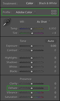
  3. Dehaze Slider Moved From Effects Panel to Basic Panel
  4. Tone Curve Size Increased

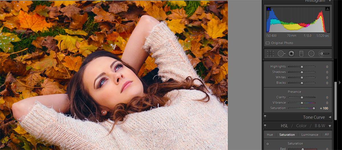
The first three out of the four mentioned above will be obvious to you once you check out the new interface. I personally really liked what I saw when I first launched my Lightroom Classic CC application after updating to version 7.3. In my mind, I always wondered why they had the Camera Profiles hidden away down in the Calibration Panel. Choosing the correct Camera Profile to play a major part in the overall look and feel of your image while processing as the Camera Profile will adjust how the colors are displayed as well as adjusting the histogram.  Anyway, let’s dive into each of the four updates that I outlined above in more detail.

Lightroom Classic CC V7.3 Screenshot

Camera Profiles

Moving the Camera Profiles from the Calibration Panel to the Basic Panel is a fantastic change and one that many of us welcomed in Lightroom Classic CC version 7.3. I am happy to see that Adobe has listened to its users as many of us have been wanting this for several releases now. It made absolutely no sense having the Camera Profiles hidden away in the Calibration Panel as it is the last panel listed in Develop Module. It never really surprised me when most of my Photography Workshop clients would inform me that they had no idea they could even change the Camera Profiles!

You can access all of these profiles by clicking on the icon (the one that looks like 4 boxes) on the right-hand side of where it says [Profile:].

Lightroom Classic CC Calibration Panel

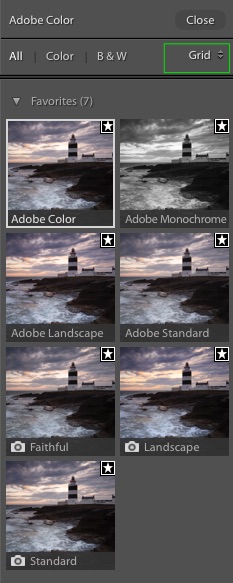
This will then load the Profile Browser. By default, this is set to display in a Grid style layout whereby you will see Thumbnails of your current selected image with respect to each of the different profiles available for selection. You can change the layout from Grid to either the Large or List layout options but I personally prefer the default Grid layout.  The white box indicates the currently selected profile and the small star in the top right of each thumbnail indicates that the profile has been marked by you as a favorite.

Lightroom Classic CC Profile Browser

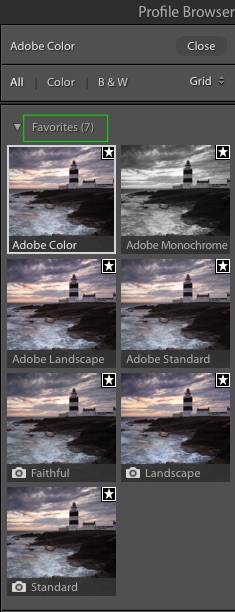
You can add and remove the various profiles from favorites list when and as you see fit. To do this, simply click on the star icon.

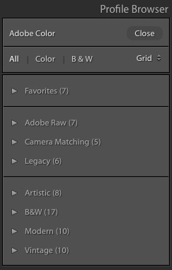
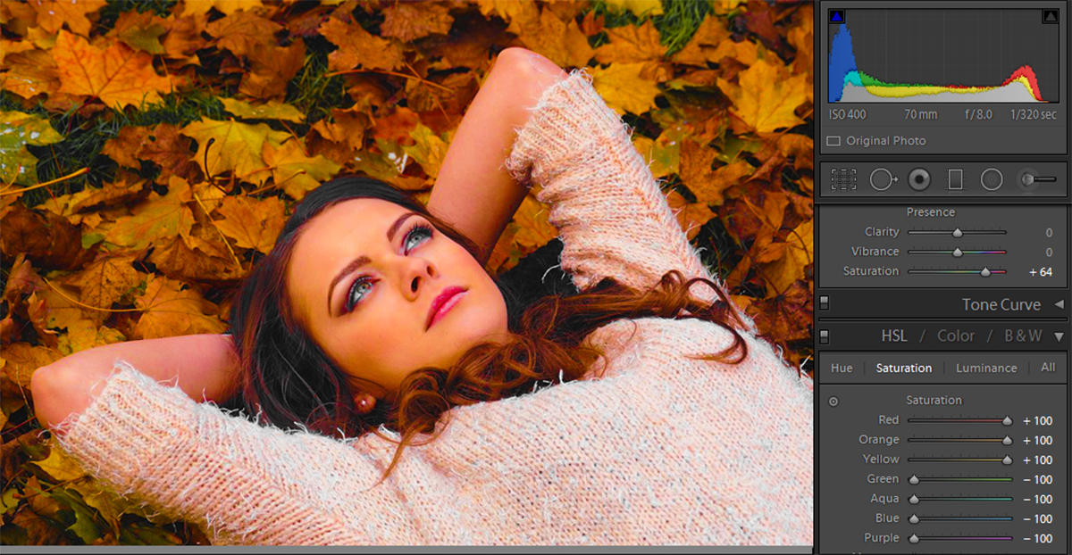
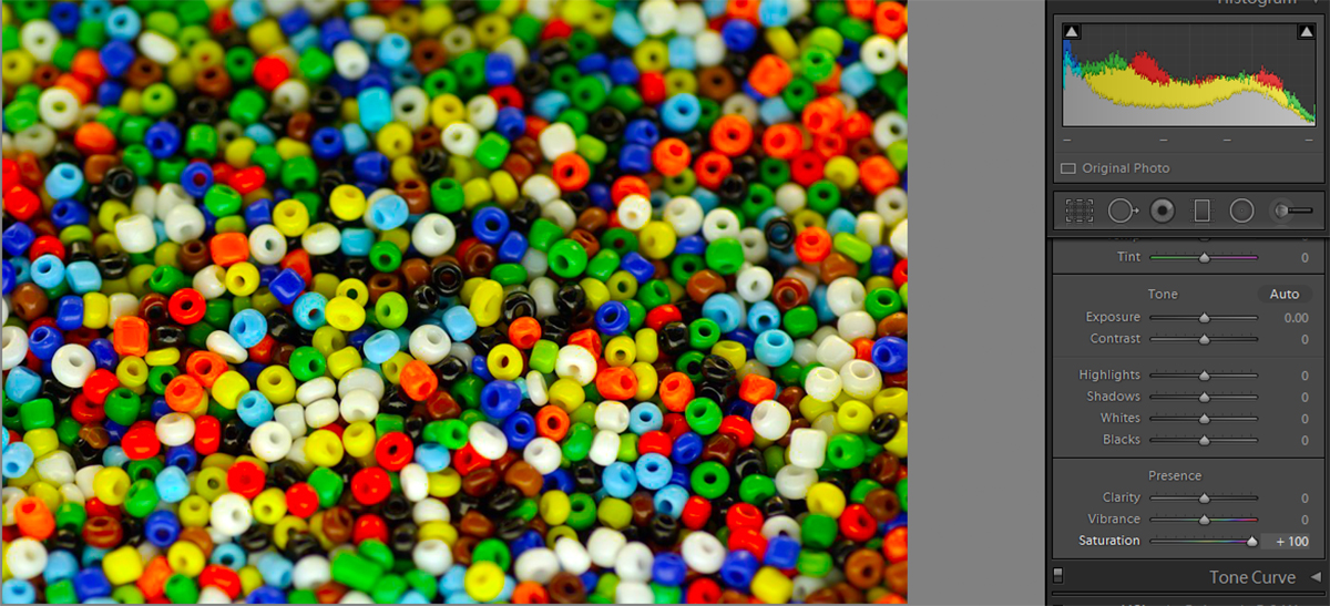
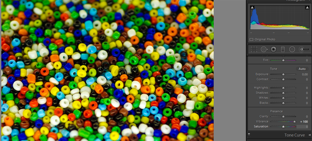
Not only have Adobe moved the Camera Profiles to the Basic Panel but they have also introduced updated and brand new profiles as well. Thanks to Lightroom Classic CC version 7.3, we now have the option and ability to choose between the new Adobe RAW profiles, the updated Camera Matching profiles and also some older Legacy profiles. As well as this, you can select between various new Creative Profiles that are contained within the Artistic, B&W, Modern and Vintage groups respectively.  Clicking on the drop-down arrow next to each of the Profile Groups will expand or collapse that particular group.

You can then simply scroll through the various Profiles until you come across one that you like. One of the features that I like here is that you can simply hover your mouse over the respective profile and it will render an example of the profile within both the Navigator image preview window to the top left of the Lightroom interface as well as in the main image preview window. The profile is actually only applied once you click on the profile.

Lightroom Classic CC V7.3 Screenshot

You will probably have noticed that I only had seven Profiles marked in my Favorites Group. My three favorite Camera Matching profiles and my 4 favorite Adobe RAW profiles. These are the profiles that best suit my needs and processing style. But of course, that is not to say that you cannot find something within new Creative Groups that will really suit your own style and help make your images pop!

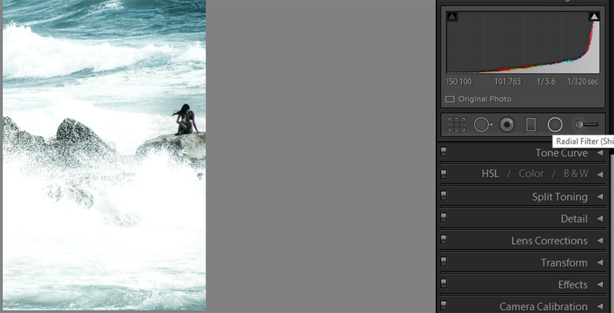
Dehaze Slider Given A New Home

Lightroom Classic CC V7.3 Dehazed Slider

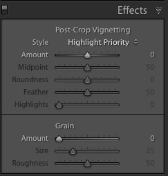
As you will see from the above screenshot of the Effects Panel the Dehaze slider has disappeared! Well, it hasn’t really. Adobe was again being nice and clever and moved it to the Basic Panel as well. It is now listed right under the Clarity slider and above the Vibrance and Saturation sliders. The new home for the Dehaze slider certainly makes sense, especially seeing as it is probably one of the basic adjustments that you might want to make while processing the image. I tend not to use the Dehaze sider a great deal myself but it is nice to have it available here in what is the main adjustments panels as opposed to being hidden away in another panel that I would otherwise never really go to.

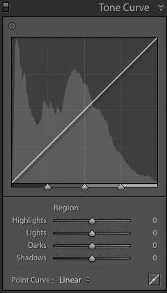
The Larger Tone Curve

Along with the relocation and addition of new Camera Profiles as well as the relocation of the Dehaze slider, Lightroom Classic CC version 7.3 also introduced a larger Tone Curve. While the Tone Curve graph is definitely larger, I most certainly did not notice it straight away. But maybe that was just me? According to Adobe, “in this release of Lightroom Classic CC the Tone Curve has been expanded to optimize tone curve adjustments”. I never really had a problem with the old Tone Curve, so I will just have to take their word for it.

Lightroom Classic CC V7.3 Tone Curve


My Thoughts On Lightroom Classic CC 7.3

Overall I really like this release. The relocation of the Camera Profiles from the Basic panel to the Effects panel was a great move. The addition of brand new Camera Profiles was a nice added bonus which I am sure will be appreciated and used by many Lightroom users. And the relocation of the Dehaze slider is also very welcome in my eyes. These changes certainly help speed up my processing workflow a little anyway.


Have you updated yet? How do you find this Lightroom Classic CC version? Let us know in the comments as I would love to hear your thoughts and feedback.

SaveSave

Most Important Lightroom Features to Explore

Lightroom is one of the most popular photo editing tools on the market. Thus, you have to install the Lightroom presets so you will know. It’s surpassed the competition not only because of its reliable Adobe branding, but because the software uses an intuitive system to deliver the latest creative tools to photographers. The post-production software addresses the most common photo edits with an eye for ease of use and final quality. It also allows incredible batch processing options. There are a number of amazing Lightroom features that will help you create the images you want.

It’s easy to feel overwhelmed when working with new software, especially software as advanced and nuanced as Lightroom. However, some features are more important to understand and master than others. These features are a great place for beginners to start, and a crucial part of any Lightroom presets pro’s skill set.

Creative Adjustment Tools

Of all the Lightroom features and creative tools, the gradient filter, adjustment brush, and post-crop vignettes are definitely at the top of the list. They’re simple to use, and they make detail work dramatically easier. Although these tools aren’t strikingly original, they allow users to handle delicate changes for select parts of an image like creating a dreamy portrait effect.

adjust selected color

For example, you can darken overexposed skies, or restore images white-washed by the flash in the foreground without compromising the parts of the picture you like. These Lightroom features combine to address the most common photo errors and enable users to make quick, creative changes that leave a huge impact on the final image.

Presets

Although many photo editors offer auto-edit presets, Lightroom allows users to develop their own, original presets. Not only do these presets make editing faster and more efficient, but they help photographers develop independent, recognizable styles. Editing every photo from scratch allows for a lot of minor changes that diverge from a photographer’s overall canon of work. There’s nothing necessarily wrong with that, but every artist has a distinct style. Painters use certain colors and brush strokes. Photographers edit to bring out particular colors, alter light, and add contrast. Personal style is just as important for a photographer to develop as it is for a painter.

Quick Develop and Match Total Exposure

Every image needs a little individual tweaking, but if you edit a lot of images from the same shoot, you’ll be making a lot of the same adjustments over and over. Editing photos by the batch, however, through Lightroom’s quick develop tool, allows you to make basic fixes to a whole bunch of images at the same time. It takes the repetition out of editing and allows maximum efficiency for busy photographers.

lightroom batch editing

The batch editing feature becomes even more impressive when you pair it with Lightroom’s match total exposure feature. For instance, if you find after editing the first photo in a series that your lighting was a little brighter than you’d intended, you can use the corrections you made on the first photo to correct the rest in the batch. This not only saves time but also ensures uniformity across images from the same shoot. That way, your portrait collection doesn’t look like your subject’s hair color changes between each image, and your landscape series doesn’t go from forest green to lime between shots. You’ll never have to worry about maintaining white balance across the board ever again.

RAW

Since photography has entered the DSLR age, photographers are no longer restricted by JPEG files in post production. DSLR cameras can record RAW photos, which are dramatically more detailed than other digital images. Since one of the greatest arguments against digital cameras revolves around image quality, this is a massive improvement. A key Lightroom feature allows users to edit and save RAW files.

Lightroom is able to handle and manipulates RAW files. While Lightroom allows you to edit images from many different file types, RAW files face the least distortion and loss of quality during editing. A JPEG file loses quality whenever you edit it. Whether you’re adjusting white balance and exposure or turning a color image into black and white, you’ll ultimately lose some definition and quality. Lightroom does protect the original of any image to ensure users don’t damage the raw material during editing. However, the final edited image won’t quite have the original’s clarity. This is a problem with the file, however, and not Lightroom.

lightroom raw files

By giving users the chance to edit RAW files, Lightroom has surpassed the majority of the competition. While DSLR cameras can capture these intensely detailed images, editing options are often limited, and sometimes cause quality loss similar to JPEG files. Lightroom has bridged the gap between RAW files and full-service editing tools.

Lightroom relies on a core set of features, and the list above includes the most important to understand. They provide the fastest, most thorough, and nuanced photo editing opportunities. The software is able to support RAW files and process entire batches of photos at the same time. These awesome Lightroom features can help you edit not only well, but quickly.

Lightroom Masterclass: What is Clarity?

Clarity is simply a part of contrast. Just like how contrast can sharpen your image, so can clarity. But what is it that makes it not contrast? When you adjust the contrast on an image, you’re adjusting the whole image. Clarity can be used to adjust specific parts of an image in Lightroom presets. However, you don’t get to choose those parts. Clarity takes the mid-tones of an image and enhances them, bringing sharpness to a photo and increasing the texture found there. It is great to use as a spot tool and can be the perfect way to enhance your images in Lightroom. To do this, we have to import the Lightroom preset.

Texture Enhancing

Clarity is most often used to enhance texture. Because it only brings out the mid-tones, it helps sharpen the image and show off the natural textures which is also important when doing panorama in Lightroom. Changing it is very simple. When in Development, you can increase or decrease the clarity of a whole picture. Under the Basics tab you’ll find a Clarity slider. (You’ll also see the Contrast slider that can be used with the in conjunction to further enhance images). Below is the image we’ll be working with.

lightroom clarity setting

Next is the image with the slider all the way up (to the right). By bringing out the mid-tones, not only do the waves become sharper, but the texture of the rocks is featured more heavily.

sharpen image midtones

Notice how this also gives the image a bit of a grainy feel, but fully brings out the mid-tones. For a softer look, raise the slider just a bit to give it a more natural feel.

Soften Texture

Increasing clarity isn’t the only way to edit an image. You can also lower the clarity of an image to make it appear softer and a little hazy. Here’s our example image taken to the other extreme, with the slider all the way down (to the left).

soften texture

You can see how, with the mid-tones toned down, the water and rocks become hazy and blurry. This can actually be used to your advantage if you’re a water photographer. Sometimes, having water with a hazy effect is just what you want. You can’t always photograph water with a steady camera at a low shutter speed. So, in Lightroom, you can simply photograph the water as needed and use the clarity slider to give it that motioned/hazy look.

Spot Enhancing

When adjusting clarity in Lightroom, you don’t have to fix the whole image. You can use the radial filter and adjustment brush to further enhance your image. Let’s look at the low clarity example one more time. That’s the effect we want for the water, we want to show off its hazy confusion. But the model in the picture doesn’t stand out enough for us. Now what do we do? We can use the radial filter to select the model, and then increase the clarity to enhance her mid-tones.

spot enhancing

When she becomes sharper and has more texture, she’ll draw the eye and all attention to her, the subject of the image.

Playing with Portraits

Clarity is a very important tool if you want to quickly touch-up a portrait photograph. Let’s look at how we can influence portraits by using this image as an example.

adjusting portrait clarity

This image already looks pretty stellar, but we can make it even more fantastic. Let’s start by softening texture. We can use the adjustment brush to single out the model’s skin, focusing particularly on the cheeks, where a bit of rough skin shows itself. Then, just as the low clarity softened the water, we can decrease the slider to soften the skin. Already the image looks a bit better.

softening portrait texture

Next thing we’d want to do is increase the clarity around the eyes. Eyes draw the attention and the clearer they are, the more interested the viewer is in the image. Here’s the photograph with the eyes on high clarity to show off the difference. In reality, you might want to tone it down so it isn’t as bright and in-your-face.

high clarity eyes

With just two simple steps we’ve turned a great photo into an amazing one. Clarity is one of the most useful, easy-to-use settings for images. It brings out the mid-tones in a picture and helps show off natural textures. Of course, lowering the setting can also help soften images. And using the radial filter or adjustment brush can help you merge the two extremes to create eye-popping, and catching, pictures.

Lightroom Masterclass: What is Saturation?

For many different reasons, you can take a picture and have the color come out not as you expected. Maybe the fall leaves are too dull, or maybe your friend’s sweater is too bright and overshadows the rest of the image. Whatever the cause may be, the fix doesn’t have to be difficult. By using the saturation setting in Lightroom, you can easily turn any lackluster or overly bright picture into a masterpiece. All you need is a basic understanding of how the saturation tab works.

We’ll use the below image as an example to learn about saturation in Lightroom and how you can use it to really spruce up your photos.

adding color to dull photo

As you can see, the picture itself looks just fine. But the leaves look dull and it doesn’t really scream fall colors. There are a lot of different ways you can use saturation to get unique and creative results for this picture.

Basic Color Enhance

One of the easiest and quickest ways to use saturation in Lightroom is under the Basics tab. Once you’re in Development, the Basics tab should already be open, if it’s not, just click on it to access some basic sliders. The one you’ll be using most often for color is the Saturation slider. It’s pretty easy. If you want to enhance colors and really make them pop, move the slider up (to the right) until you reach a desired color level.

lightroom color enhancing

This is also the tab to use for a quick black and white effect. By moving the slider down (to the left), you can remove the color from the photo.

black and white photo using saturation

Pick and Choose

Saturation doesn’t have to be an all or nothing deal. Under the HSL tab, you can use saturation to create different, amazing effects. First, you can use the Saturation sub tab to pick and choose which colors to enhance. In the example below, we chose to only enhance the reds, oranges, and yellows to really get the best fall colors. Unlike the full saturation, this will only enhance the colors you chose. You can see the differences in how bright the leaves are compared to the grass and the hazy glow that the settings give the model.

choose colors to enhance

Something fun you can do is enhance only one color, and turn down all of the others. This will lower the other colors to black and white status, yet leave your selected color intact. Here’s our example with the yellow all the way up, and everything else lowered.

enhancing one color lightroom

Monotone

Under the Split Toning tab, you can use Highlights and Shadows to achieve even more fun effects. For this special saturation method, you need to click in the colored boxes to choose a color. Then, simply slide the saturation bar up (to the right) to give your photo a monotone feeling to it. Here, the shadows are set to blue which adds a cool, winter look to the picture.

create monotone coloring lightroom

And here is our picture with the highlights set to yellow. This brings back some of that fall feeling, with a little bit of summer glow mixed in.

yellow highlights lightroom photo

These are two great, quick and easy ways to give a picture a certain feeling or mood with very little editing. You can also use these settings to create fun and whacky pictures by picking unusual colors like purple or green for your monotone images.

Sometimes photo editing requires a bit of pre-planning, but post-production is important and totally worth it. Of course, you can’t control everything in your world. But if you know that you’re going to be doing a fall photoshoot in a pile of leaves, it may be best to leave out the red/yellow/orange outfits, or at least have them be dull. If someone is wearing a bright red sweater and you go to enhance the red leaves, you’re going to have one ugly fall sweater on your hands. It’s best to keep these photo editing abilities in mind when you go out to plan your next shoot.

Changing colors in your image doesn’t have to be a difficult chore. You don’t need to be proficient in photo editing, and you don’t need to spend hours fixing them up. Lightroom’s saturation settings allow you to quickly and painlessly enhance or remove colors from your work.

Now that you know how saturation works, and all of the cool things you can do with it, go out there and try it for yourself! Let us know your favorite techniques!

Lightroom Vibrance: What is Vibrance?

What is vibrance? Technically, it’s not a real word. Instead, it was a word made up by Adobe to essentially mean “smart saturation”. In that sense, vibrance does the same thing that saturation does, it affects the way colors appear in pictures. So how does vibrancy work differently than saturation? If they both do the same kind of thing, why use vibrance over saturation? To start, let’s take a look at how the two settings affect pictures differently.

Take a look at the photo above; it’s a basic image of a bunch of colored beads. This is a perfect example for comparing saturation and vibrancy in Lightroom.

Vibrance vs. Saturation

If we put the vibrance and saturation sliders up to full amounts, we get very different responses. The image below shows the beads with the normal saturation setting. As you can see by the chart on the right, the saturation levels out all of the settings, bringing out the reds, blues, greens, and yellows. This makes everything in the picture pop.

vibrance saturation

Below is the same image with full vibrancy. As you can see, the results are very difference. Vibrance is programmed to pick up on the picture as a whole and analyze what is needed. The chart on the right shows that with the vibrance setting, the blues are really defined. This setting focuses on them and generally leaves the yellows, greens, and reds alone.

lightroom vibrance setting

Why Does This Happen?

Why do two settings both meant to emphasize color result in two different end pictures? The reason is the ‘smartness’ behind the vibrance settings. Vibrance is programmed to leave skin tones alone because when you increase the brightness of all the colors in a picture, you come out with some very red skin. To avoid this, it actively avoids reds, yellows, and greens. By doing this, the setting won’t alter the color of skin tones.

Below is a picture of a woman where the settings were adjusted using saturation. As you can see, her skin has an unnatural golden tone to it. While the saturation setting does bring out the bright red of her coat, it also brings out the reds and yellows of her skin tone, creating an unwanted effect.

saturation

Next is the same picture edited with high vibrance. While this doesn’t bring out the bright color of her coat, it does keep her skin at a natural color. Maybe a golden effect is desired, in which case the saturation tone would be a good choice. However, in keeping with reality, it’s best to use the vibrance setting to allow the skin tones to stay the same.

high vibrance

Vibrance also creates a unique effect when it is reduced. When you lower all of the saturation, you get a black and white picture, losing all of the brightness all of the colors create. However, using the vibrance to lower the brightness of color creates a different effect.

low vibrance

Instead of complete black and white, as would happen with saturation, the vibrance simply dulls the colors, instead of removing them completely. Essentially the vibrance doesn’t completely block out the colors, it doesn’t target them to such an extent that the saturation does.

Adjusting Both Settings

Of course, it needn’t be all one or the other. Often times mixing the two settings can create the prefect desired image. Let’s return to the portrait of the young lady. The full saturation setting caused the vest to pop but made the girl’s skin tone too golden. Whereas the vibrance setting kept the skin tone level but failed to increase the appeal of the jacket. When we increase both of them, the skin tone remains natural, yet the jacket increases in color and appeal.

natural skin tone

Vibrance is a useful tool to help colors in a picture pop. It’s especially useful if you’re working with portraits. The setting will still help colors pop but will keep skin tones simple. When planning photoshoots with vibrancy in mind, try to incorporate blues and fewer reds. The vibrance setting will ignore the reds in the photo, but enhance the blues. By building a portrait setting around blue and green colors, you can ensure a final picture with bright colors and natural skin tones.

How to Process an Interior Photograph in Lightroom

In a lot of cases, photographers face a situation where an interior photograph turns out looking a bit flatter when it is first captured. This post will tell you exactly how to process an interior photograph shot to make it best appearing for its purpose as well as an image in itself.Parasu dental care-011The photograph displayed above was shot for a chain of dentistry. The purpose of this image being taken was for their website and other marketing purposes. In the first look the photograph turns out looking flat, underexposed, and also has a yellow tinge to it which brings down the appearance of the whole image and makes it look heavy. The rich white colour that is present in the actual interior surrounding can be better depicted than it is already captured. Rectifying these setbacks would also make it a photograph that will have better use for the purpose it was taken, that is for any sort of display. Few of these corrections could make the picture turn out to be perfect for its use in a website or as a visual in another marketing method or just as a plain image and all these amendments can be easily met through Lightroom. The following are the steps to quickly fix the drawbacks in the image that is giving it a dull appearance. The following are the settings under which the photograph was captured:The shot was taken with the aperture set at f/8.0, a shutter speed of 1/100 and an ISO of 1600. The lens used were of 16-35mm with an aperture of f/2.8 L II USM. The model of the camera used to take the shot was a Canon 5D MK III.The first thing that has to be fixed in this image is its exposure. With the help of a Histogram which looks like a graphical representation of the exposure, one can easily fix a photo’s exposure in Lightroom. Open the image in Lightroom’s setting called the ‘Develop Module’, and press the ‘J’ key to let Lightroom know you if any clippings are currently happening while you are editing the image. This means that if any area on the image gets any darker than it is supposed to be, Lightroom will immediately let you know by highlighting that particular area that is under exposed by displaying a blue color over the under exposed portion of the picture on the screen. Similarly, if any area on the image gets any lighter than it should be or over exposed, Lightroom will let you know the same by displaying a red color over the over exposed portion of the photograph in an instant.After making the adjustments, the photograph will appear to be something like this:Parasu dental care-011-3The next step would be fixing the White Balance in the photograph. This is to bring in the white color that would be more suitable for a website or marketing purpose and also to remove any dull yellow shade that is bringing in the heavy look and pulling down the entire look of the image.The White Balance of the actual picture taken was 5400 K and the tint was at 46. Even after having changed the White Balance of the picture to a 4400 K, we find that the tint remains unchanged. Although, if we were to shift the tint either way, towards magenta or green we may bring in either of the two shades, magenta or green, which is not what we require. To avoid this, we do not want to tamper with the tint feature.

For the final step, the image below contains the basic panel corrections that are the last required touch ups of the image correction process. You will notice that you can see the contrast, the shadows as well as the black settings to bring the image to the necessary contrast. Clarity is also increased by a very small extent to bring in a final touch to the image that we want to acquire in order to obtain the perfect image that can be used for any marketing purpose. Apply the sharpening, lens correction and noise reduction tools accordingly after which your image is ready once you export the same.

Screenshot 2016-08-16 18.33.37

Screenshot 2016-08-16 18.34.13

Screenshot 2016-08-16 18.34.30

The final picture will look something like this after all the processing is done to it:Parasu dental care-011-2

How to Create a Blanket Fade Effect in Lightroom

Blanket Fade effect is the effect whereby an image is made to disappear gradually or the sound volume is gradually decreased to a lesser volume or zero. It is a great technique to highlighting selected portions of the image. Do you ever wonder how so many amateur photographers seem to have perfect and beautiful blanket fade in their images or wondered how the photographer got that background fading like that?Blanket Fade Effect Let us share with you today how to get the perfect blanket fade effect for your photograph using the photograph below which was taken for a pre-wedding shoot. The blanket fade effect though cannot be applied for all kind of photographs but it can surely be used and applied for newborns, portraits in general for people. Below is the SOOC image which is a little blunt in terms of attention and emphasis due to the wall which makes the whole picture stiff and flat. We would want our subjects and the picture to bounce more in terms of colour and sharpness. Let us go about fixing the image step by step.Blanket Fade EffectAs we have already seen in our previous article, we always start by fixing the exposure or the White Balance. Likewise, for this picture, we took the As shot Temp and Tint from 5200 and +17 to 5590 and +10 respectively. Although, you can keep shifting and toggling around with these until you feel like the picture has improved to the maximum. You will have to remember here to avoid getting a magenta or green shade across the image while adjusting the Tint slider. Reducing the Highlights fully to the last, that is to a -100 as well as bringing down the Whites brings down the brightest and overexposed portions of the photograph. Here we have brought down the White to a -26 in order to lessen the over exposed stone wall that grabs a bit of the attention that the subject should be getting. To make the subject stand out, we bring down the exposure of the wall a bit. We mean to achieve this through the Blanket fade effect, the most important part of the whole post. This is where the main effects are added to the picture. Until now, we have briefed you with the editing that takes place to any normal photograph that is imported to Lightroom for edits.Pressing and holding shift and M simultaneously will activate what is called the Radial Filter in the Develop Module. One can find the radial filter tool below the Histogram in the Develop Module. For more details on the Develop Module shortcuts, you can read up here.After you activate the Radial filter, you can place it over the subject for the effect. You can increase or decrease the size of the overlay by accordingly pulling in/out the circumference of the elliptical overlay to increase or reduce the area respectively.The basic idea is to mask over the area you want to apply the fade effect on. To get a little more insight you can check out the picture below and see how we’ve applied the methodology to the image. You can choose to reduce the exposure, saturation, and sharpness of the portions outside the selected mask that you created using the Radial filter. We have reduced the Exposure by -0.50, and the Clarity of the picture to a -100. We’ve brought down the Saturation to -51 and the Sharpness of the image to -100 but increased the Noise to +50 to create a complete fade effect on the walls.Blanket Fade EffectThe feather slider lets you smoothen out the Effect so that it blends in with the picture and doesn’t stand out like a bubble. This is important to ensure that your image looks natural as you do not want your picture to be screaming out ‘edited!’. Previously, before the Radial filter was available in Lightroom, the one method that existed to achieve this effect was a roundabout and tedious task, which was using the Adjustment Brush to take it over the area you either want the effect on or don’t want the effect on. Thanks to the Radial filter which easily takes care of that for you instantly. The Radial Tool in Lightroom is easy to work with and also a very helpful and handy tool in many cases and we hope you found this article useful. A small change in the exposure and will direct the viewer’s eyes towards the subject, and thereby increase the impact your photograph creates on the beholder.Blanket Fade Effect