What is vibrance? Technically, it’s not a real word. Instead, it was a word made up by Adobe to essentially mean “smart saturation”. In that sense, vibrance does the same thing that saturation does, it affects the way colors appear in pictures. So how does vibrancy work differently than saturation? If they both do the same kind of thing, why use vibrance over saturation? To start, let’s take a look at how the two settings affect pictures differently.
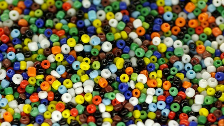
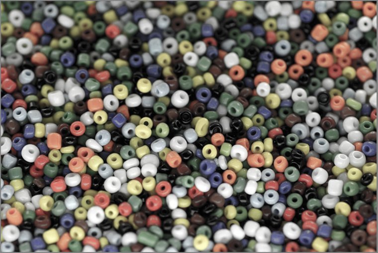
Take a look at the photo above; it’s a basic image of a bunch of colored beads. This is a perfect example for comparing saturation and vibrancy in Lightroom.
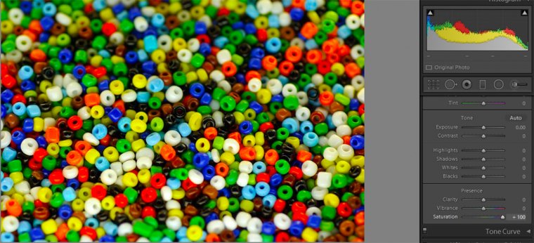
If we put the vibrance and saturation sliders up to full amounts, we get very different responses. The image below shows the beads with the normal saturation setting. As you can see by the chart on the right, the saturation levels out all of the settings, bringing out the reds, blues, greens, and yellows. This makes everything in the picture pop.
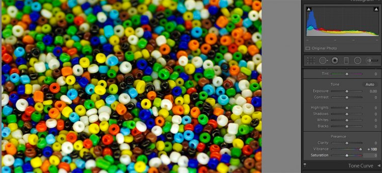
Below is the same image with full vibrancy. As you can see, the results are very difference. Vibrance is programmed to pick up on the picture as a whole and analyze what is needed. The chart on the right shows that with the vibrance setting, the blues are really defined. This setting focuses on them and generally leaves the yellows, greens, and reds alone.
Why do two settings both meant to emphasize color result in two different end pictures? The reason is the ‘smartness’ behind the vibrance settings. Vibrance is programmed to leave skin tones alone because when you increase the brightness of all the colors in a picture, you come out with some very red skin. To avoid this, it actively avoids reds, yellows, and greens. By doing this, the setting won’t alter the color of skin tones.
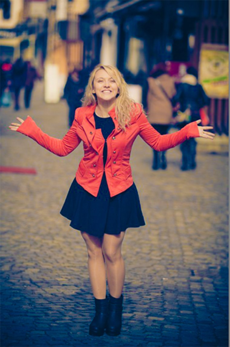
Below is a picture of a woman where the settings were adjusted using saturation. As you can see, her skin has an unnatural golden tone to it. While the saturation setting does bring out the bright red of her coat, it also brings out the reds and yellows of her skin tone, creating an unwanted effect.
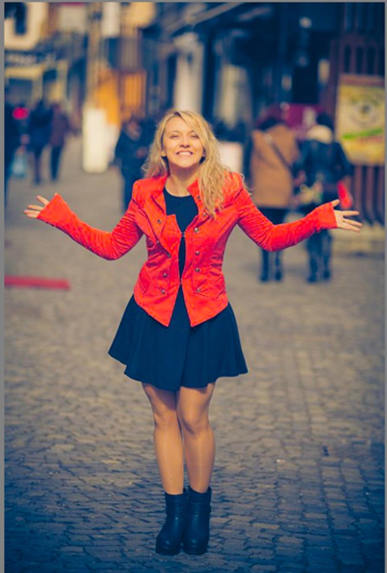
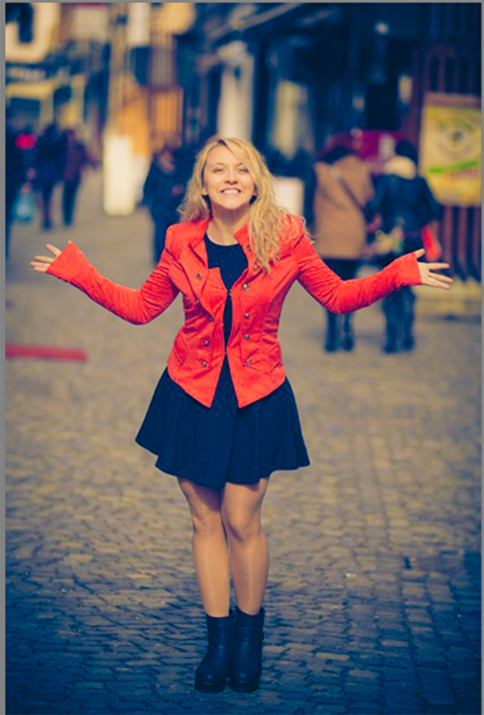
Next is the same picture edited with high vibrance. While this doesn’t bring out the bright color of her coat, it does keep her skin at a natural color. Maybe a golden effect is desired, in which case the saturation tone would be a good choice. However, in keeping with reality, it’s best to use the vibrance setting to allow the skin tones to stay the same.
Vibrance also creates a unique effect when it is reduced. When you lower all of the saturation, you get a black and white picture, losing all of the brightness all of the colors create. However, using the vibrance to lower the brightness of color creates a different effect.
Instead of complete black and white, as would happen with saturation, the vibrance simply dulls the colors, instead of removing them completely. Essentially the vibrance doesn’t completely block out the colors, it doesn’t target them to such an extent that the saturation does.
Of course, it needn’t be all one or the other. Often times mixing the two settings can create the prefect desired image. Let’s return to the portrait of the young lady. The full saturation setting caused the vest to pop but made the girl’s skin tone too golden. Whereas the vibrance setting kept the skin tone level but failed to increase the appeal of the jacket. When we increase both of them, the skin tone remains natural, yet the jacket increases in color and appeal.
Vibrance is a useful tool to help colors in a picture pop. It’s especially useful if you’re working with portraits. The setting will still help colors pop but will keep skin tones simple. When planning photoshoots with vibrancy in mind, try to incorporate blues and fewer reds. The vibrance setting will ignore the reds in the photo, but enhance the blues. By building a portrait setting around blue and green colors, you can ensure a final picture with bright colors and natural skin tones.


Please verify your software version before proceeding.
 I’ve verified my software version


 Facebook
 Google +
Comments (1)
FINALLY, I fully understand the difference and ways to alter the effect. Thank you for this.