
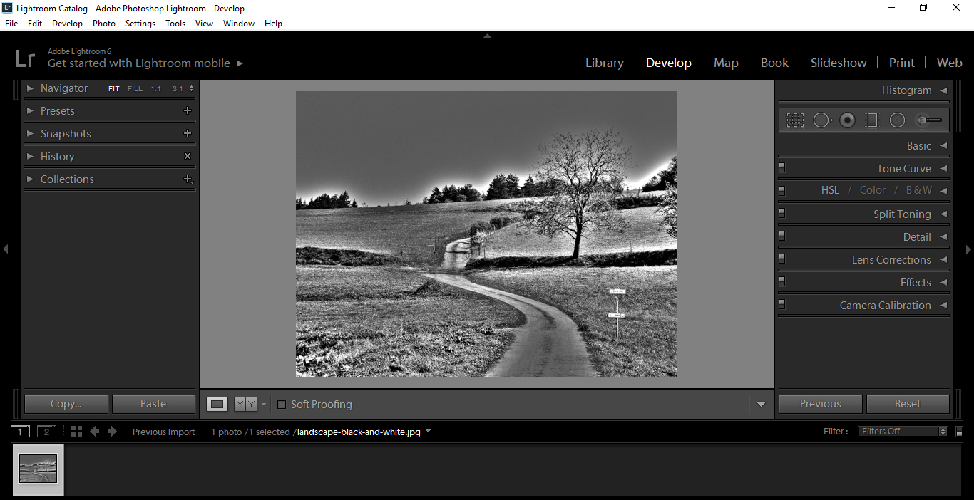
Hi, today we will be taking a look at the differences between the Basic Panel and the Tone Curve Panel in Lightroom. Thus, we need to install Lightroom presets.
So we’ll be taking a look at what the sliders do compared to each other and to make things easier for you to understand we’ll be using a Black and White image in Lightroom presets. This is the opposite when using selective color in Lightroom because we use colorful image there, change the background to black and white then focus only on the highlight color.
First, I want to give a quick explanation of the two Tone Curve settings.
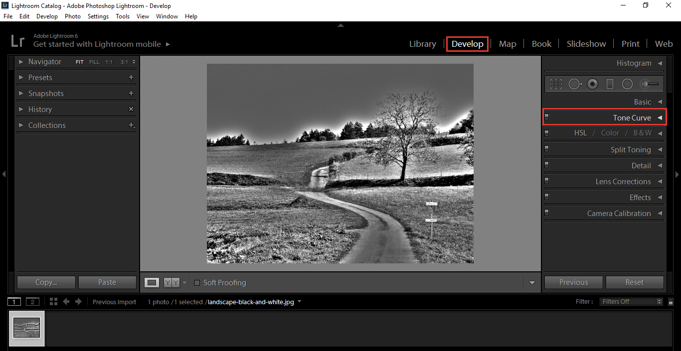
Click on Develop then your Tone Curve Panel on the right hand side.
The two images below show the Point Curve and the Region Curve .
Point Curve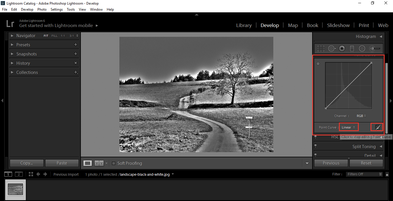 Region Curve
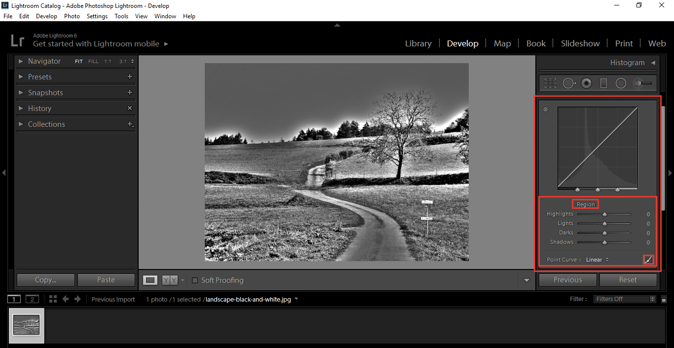
Click on the lower right hand corner and select between the two which are highlighted (it is the smallest Red Selection in the picture).
Both do the same job, but at the same time they are different! Don’t worry, all of that will be explained.
So we’ve had a brief look at the Tone Curve. Now, lets go to the Basic Panel and open that up (Above Tone Curve).
Go to the Highlights Slider.
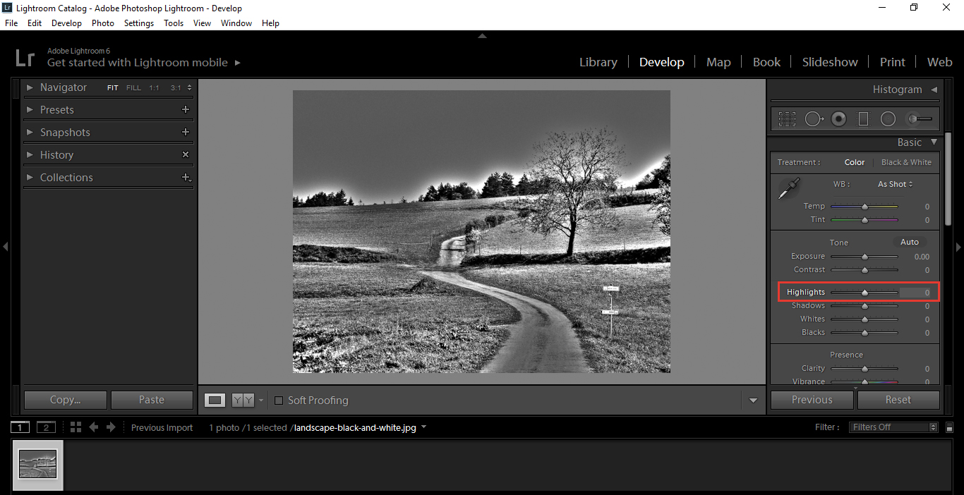
Quick Note: Histogram – situated above the Basic Panel.
This indicates the pixels on the image, in this image the ones on the left indicate the darkest and the right indicates the lightest. So, the white areas in between are the various different shades, and the high peak above where it says ‘Original Photo’ indicates the most common colours and shade of the pixels in this image.
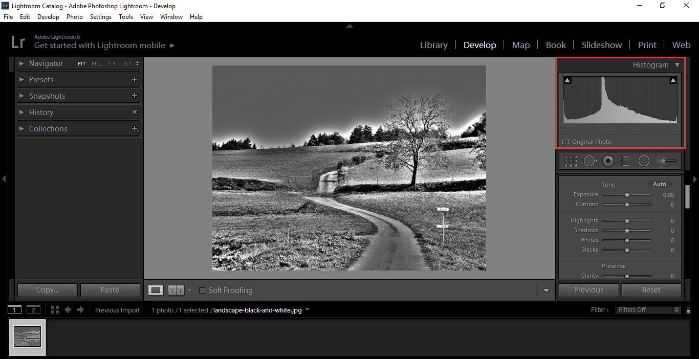
So, you will notice when you slide the Highlight Slider back and forth you will see it stretch and pull all of the Pixels to one side or the other.
Now, go back to the Tone Curve Panel and do the same with the Highlight Slider in Region Curve Mode.
You will now notice more of a swelling, than a stretch. It only really effects the lighter pixels rather than the over all image, which gives the image more depth.
This is why many people including professionals prefer the Tone Curve over the Basic.
To better demonstrate, click on the Clipping Highlight indicated in the picture below and you will see the lightest or whitest pixels indicated in red.
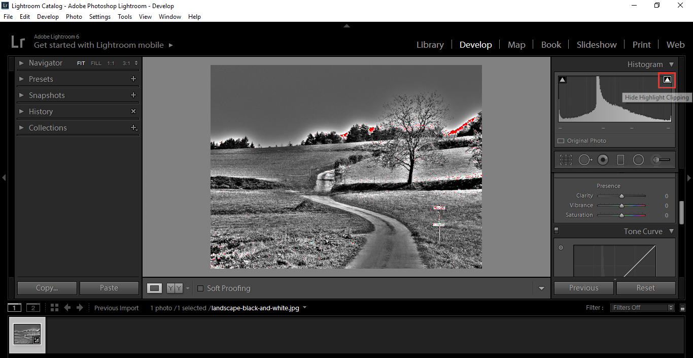
So take a second, and move the Highlight Slider back and forth on both the Tone Curve and Basic Panel to see the differences on the ‘Red Highlighted’ pixels, so you will be able to notice difference between the two.
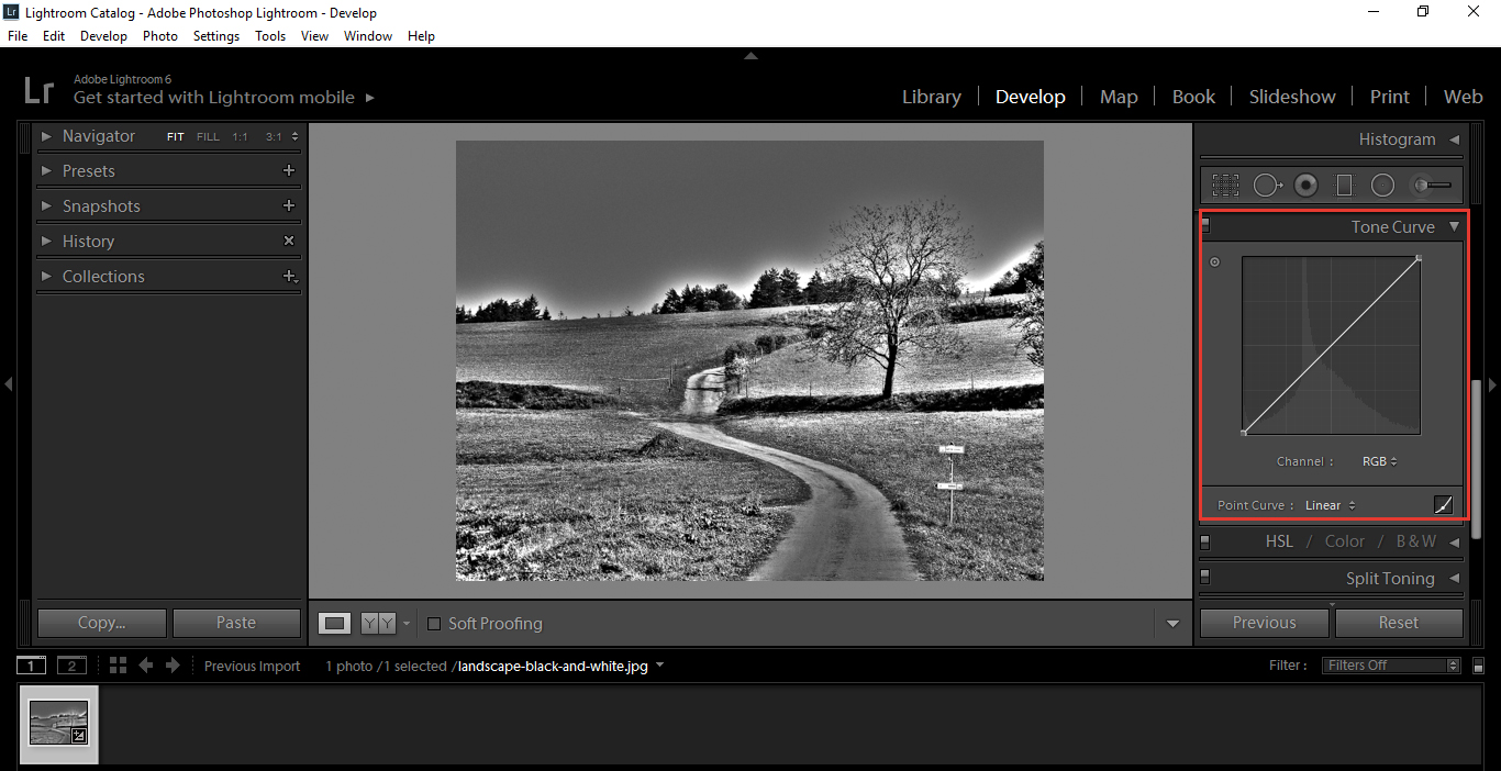
Let’s take a closer look at the Tone Curve now.
The Tone Curve includes three sliders for Shadows, Mid tones and Highlights.

Each will have a different number attached to them, 25, 50 and 75. Each number indicates where highlights, shadows and mid tones begin.
So, for example, when you move your Highlights Slider, nothing below 75 will be affected.
The same goes for the Shadows and Mid tones (Also known as the lights), so when you mess with the darks and shadows, nothing above that point will be affected.
You can also change at which point the Highlights and Shadows begin buy moving the position of the Sliders.
This comes in handy when you want to target specific areas of the images. For example, if there was a group of dark shadows and not so dark shadows, but I wanted further darken the dark shadows I could move my darks back until only those desired shadows were affected.
In Short the Tone Curve will give you a more specifically targeted adjustment, and the Basic Curve will give an overall adjustment.
Now that we covered Basic Curve and Tone Curve, lets take a look at the Point Curve.
Remember when I said, the Point and Region Curves did the same thing, but differently?
…Well, this is how.
With the Region Curve, there are out sliders and indicated numbers and the Point Curve just has the graph.
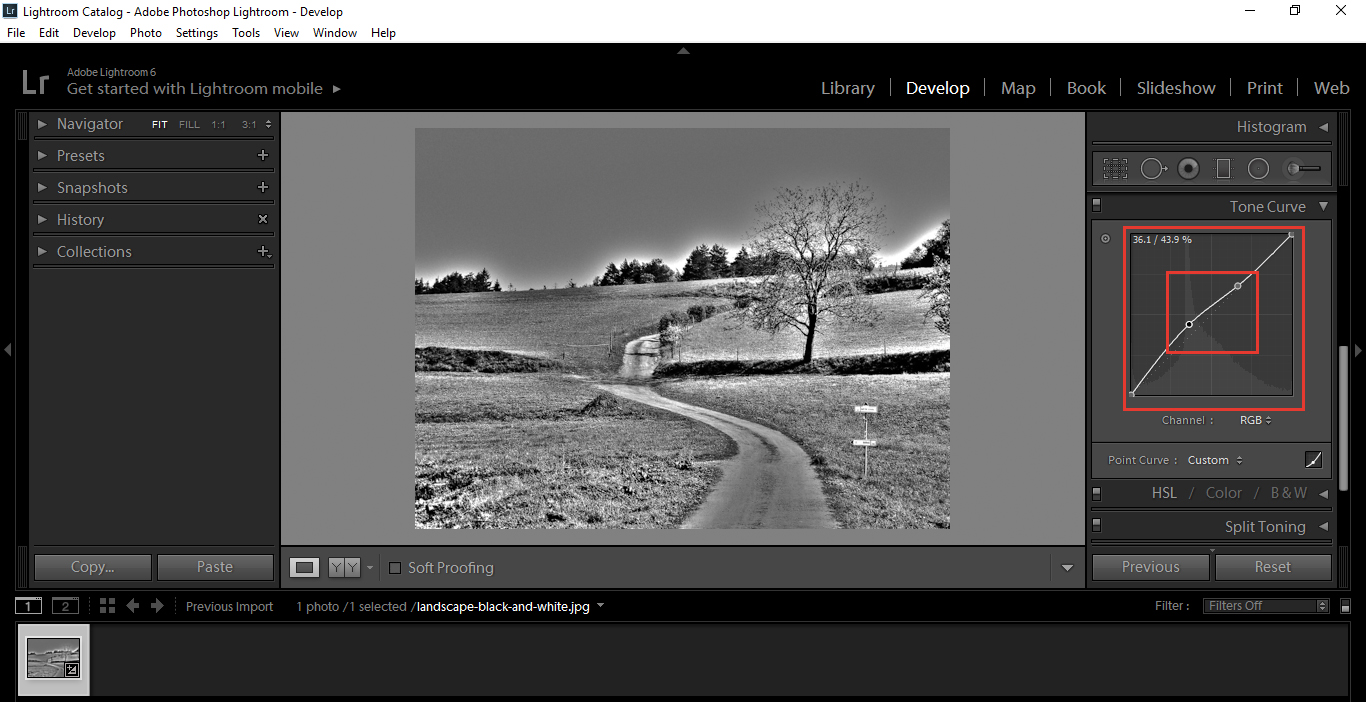
This is were you will need to understand the Histogram a little more. As you can see faintly in the background, the Histogram and the line running from top to bottom.
Clicking on the line will indicate where on the Histogram you’re going to mostly affect.
This method is good, but I prefer to use the Region Curve Method.
So, that’s really it in a nut shell, so I hope you got something out of this and have a better understanding of the differences.
You will notice in a lot of our Presets, these will already be corrected to help you further with your editing. The advantages with the Presets is that you can cycle through hundreds of these types of settings in minutes, resulting in some interesting effects.


Please verify your software version before proceeding.
 I’ve verified my software version


 Facebook
 Google +
Comments (1)
Thank you!