Tag: saturation

Lightroom Masterclass: What is Saturation?

For many different reasons, you can take a picture and have the color come out not as you expected. Maybe the fall leaves are too dull, or maybe your friend’s sweater is too bright and overshadows the rest of the image. Whatever the cause may be, the fix doesn’t have to be difficult. By using the saturation setting in Lightroom, you can easily turn any lackluster or overly bright picture into a masterpiece. All you need is a basic understanding of how the saturation tab works.

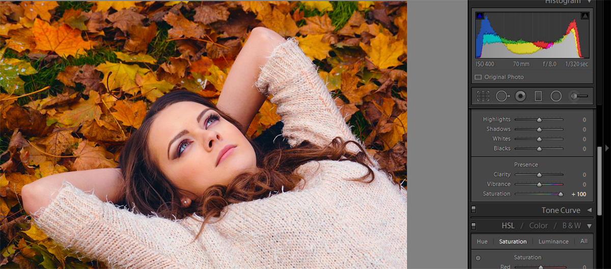
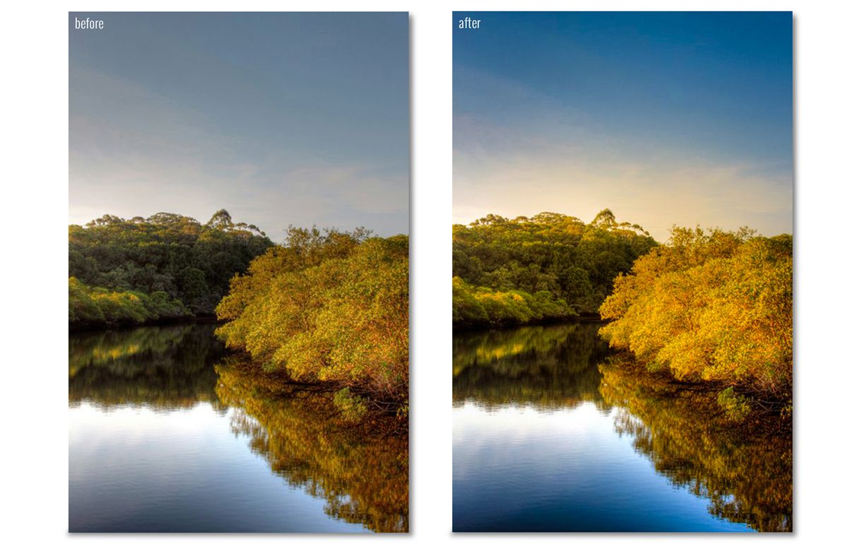
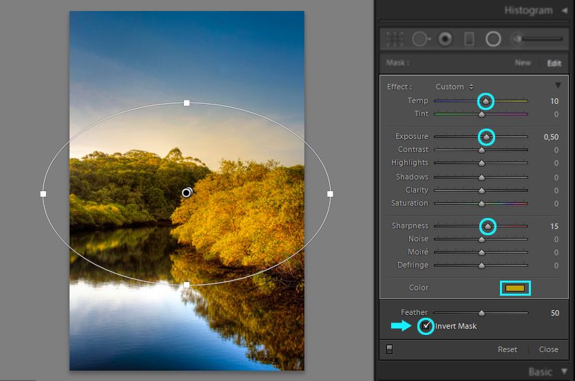
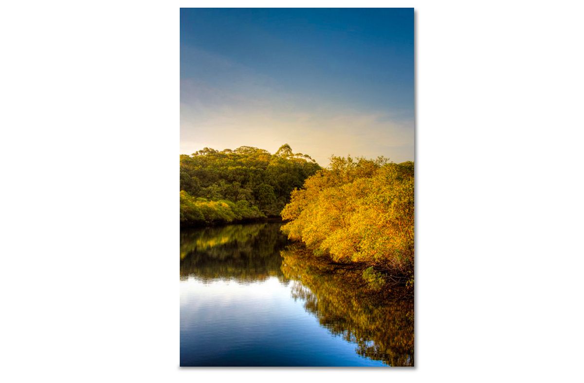
We’ll use the below image as an example to learn about saturation in Lightroom and how you can use it to really spruce up your photos.

adding color to dull photo

As you can see, the picture itself looks just fine. But the leaves look dull and it doesn’t really scream fall colors. There are a lot of different ways you can use saturation to get unique and creative results for this picture.

Basic Color Enhance

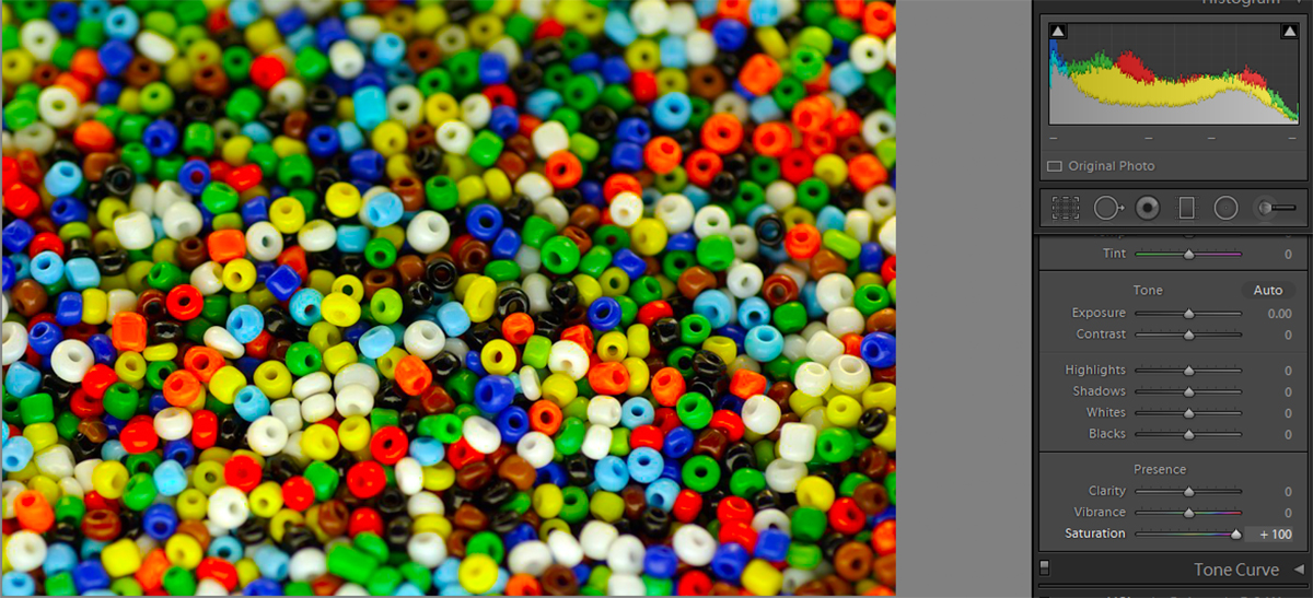
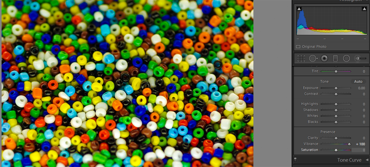
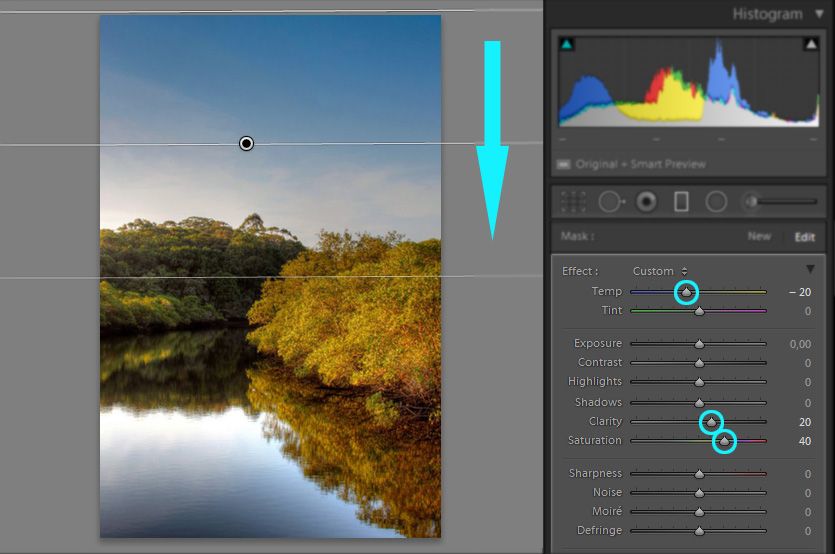
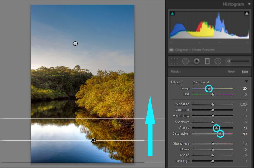
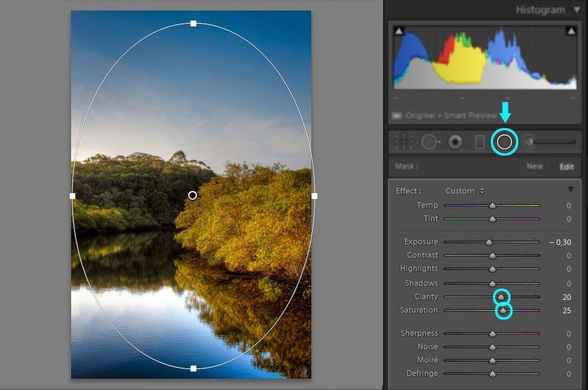
One of the easiest and quickest ways to use saturation in Lightroom is under the Basics tab. Once you’re in Development, the Basics tab should already be open, if it’s not, just click on it to access some basic sliders. The one you’ll be using most often for color is the Saturation slider. It’s pretty easy. If you want to enhance colors and really make them pop, move the slider up (to the right) until you reach a desired color level.

lightroom color enhancing

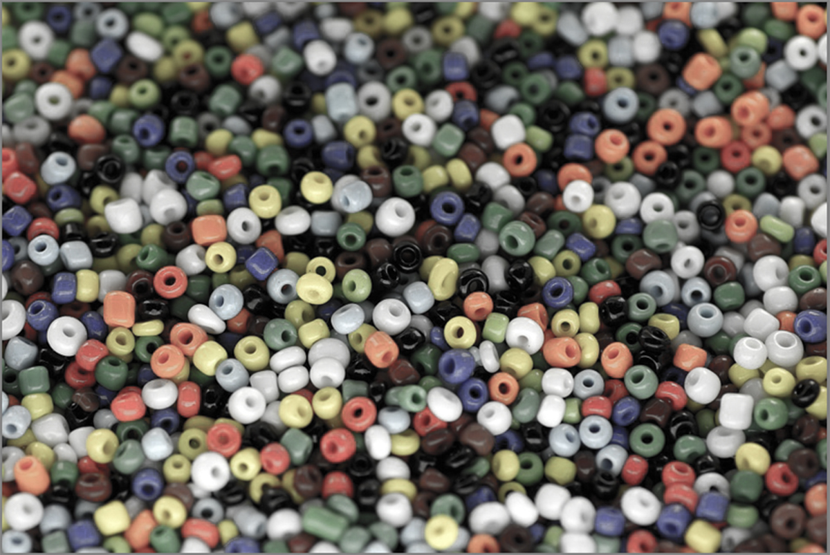
This is also the tab to use for a quick black and white effect. By moving the slider down (to the left), you can remove the color from the photo.

black and white photo using saturation

Pick and Choose

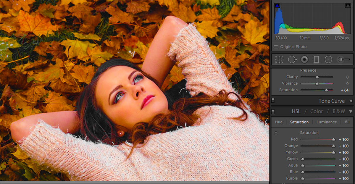
Saturation doesn’t have to be an all or nothing deal. Under the HSL tab, you can use saturation to create different, amazing effects. First, you can use the Saturation sub tab to pick and choose which colors to enhance. In the example below, we chose to only enhance the reds, oranges, and yellows to really get the best fall colors. Unlike the full saturation, this will only enhance the colors you chose. You can see the differences in how bright the leaves are compared to the grass and the hazy glow that the settings give the model.

choose colors to enhance

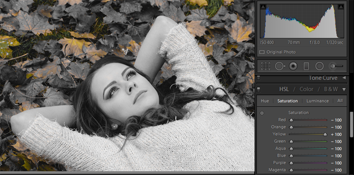
Something fun you can do is enhance only one color, and turn down all of the others. This will lower the other colors to black and white status, yet leave your selected color intact. Here’s our example with the yellow all the way up, and everything else lowered.

enhancing one color lightroom

Monotone

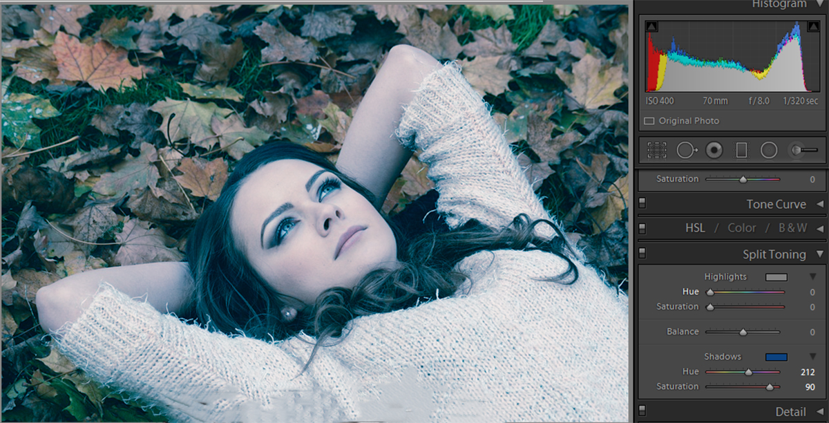
Under the Split Toning tab, you can use Highlights and Shadows to achieve even more fun effects. For this special saturation method, you need to click in the colored boxes to choose a color. Then, simply slide the saturation bar up (to the right) to give your photo a monotone feeling to it. Here, the shadows are set to blue which adds a cool, winter look to the picture.

create monotone coloring lightroom

And here is our picture with the highlights set to yellow. This brings back some of that fall feeling, with a little bit of summer glow mixed in.

yellow highlights lightroom photo

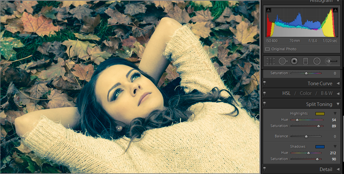
These are two great, quick and easy ways to give a picture a certain feeling or mood with very little editing. You can also use these settings to create fun and whacky pictures by picking unusual colors like purple or green for your monotone images.

Sometimes photo editing requires a bit of pre-planning, but post-production is important and totally worth it. Of course, you can’t control everything in your world. But if you know that you’re going to be doing a fall photoshoot in a pile of leaves, it may be best to leave out the red/yellow/orange outfits, or at least have them be dull. If someone is wearing a bright red sweater and you go to enhance the red leaves, you’re going to have one ugly fall sweater on your hands. It’s best to keep these photo editing abilities in mind when you go out to plan your next shoot.

Changing colors in your image doesn’t have to be a difficult chore. You don’t need to be proficient in photo editing, and you don’t need to spend hours fixing them up. Lightroom’s saturation settings allow you to quickly and painlessly enhance or remove colors from your work.

Now that you know how saturation works, and all of the cool things you can do with it, go out there and try it for yourself! Let us know your favorite techniques!

Lightroom Vibrance: What is Vibrance?

What is vibrance? Technically, it’s not a real word. Instead, it was a word made up by Adobe to essentially mean “smart saturation”. In that sense, vibrance does the same thing that saturation does, it affects the way colors appear in pictures. So how does vibrancy work differently than saturation? If they both do the same kind of thing, why use vibrance over saturation? To start, let’s take a look at how the two settings affect pictures differently.

Take a look at the photo above; it’s a basic image of a bunch of colored beads. This is a perfect example for comparing saturation and vibrancy in Lightroom.

Vibrance vs. Saturation

If we put the vibrance and saturation sliders up to full amounts, we get very different responses. The image below shows the beads with the normal saturation setting. As you can see by the chart on the right, the saturation levels out all of the settings, bringing out the reds, blues, greens, and yellows. This makes everything in the picture pop.

vibrance saturation

Below is the same image with full vibrancy. As you can see, the results are very difference. Vibrance is programmed to pick up on the picture as a whole and analyze what is needed. The chart on the right shows that with the vibrance setting, the blues are really defined. This setting focuses on them and generally leaves the yellows, greens, and reds alone.

lightroom vibrance setting

Why Does This Happen?

Why do two settings both meant to emphasize color result in two different end pictures? The reason is the ‘smartness’ behind the vibrance settings. Vibrance is programmed to leave skin tones alone because when you increase the brightness of all the colors in a picture, you come out with some very red skin. To avoid this, it actively avoids reds, yellows, and greens. By doing this, the setting won’t alter the color of skin tones.

Below is a picture of a woman where the settings were adjusted using saturation. As you can see, her skin has an unnatural golden tone to it. While the saturation setting does bring out the bright red of her coat, it also brings out the reds and yellows of her skin tone, creating an unwanted effect.

saturation

Next is the same picture edited with high vibrance. While this doesn’t bring out the bright color of her coat, it does keep her skin at a natural color. Maybe a golden effect is desired, in which case the saturation tone would be a good choice. However, in keeping with reality, it’s best to use the vibrance setting to allow the skin tones to stay the same.

high vibrance

Vibrance also creates a unique effect when it is reduced. When you lower all of the saturation, you get a black and white picture, losing all of the brightness all of the colors create. However, using the vibrance to lower the brightness of color creates a different effect.

low vibrance

Instead of complete black and white, as would happen with saturation, the vibrance simply dulls the colors, instead of removing them completely. Essentially the vibrance doesn’t completely block out the colors, it doesn’t target them to such an extent that the saturation does.

Adjusting Both Settings

Of course, it needn’t be all one or the other. Often times mixing the two settings can create the prefect desired image. Let’s return to the portrait of the young lady. The full saturation setting caused the vest to pop but made the girl’s skin tone too golden. Whereas the vibrance setting kept the skin tone level but failed to increase the appeal of the jacket. When we increase both of them, the skin tone remains natural, yet the jacket increases in color and appeal.

natural skin tone

Vibrance is a useful tool to help colors in a picture pop. It’s especially useful if you’re working with portraits. The setting will still help colors pop but will keep skin tones simple. When planning photoshoots with vibrancy in mind, try to incorporate blues and fewer reds. The vibrance setting will ignore the reds in the photo, but enhance the blues. By building a portrait setting around blue and green colors, you can ensure a final picture with bright colors and natural skin tones.

How to Make Your Picture Standout using Lightroom

Vignetting

a picture is often used to enhance the subject of a composition, and Lightroom has an automatic feature to create vignetting in the effects panel. However, this software’s native effect only darkens the edges of the picture, making it look very artificial for my taste. So in this tutorial, you’ll learn an alternative way to make the same effect using specific adjustments in Lightroom, improving your picture and making it stand out just like the before and after below. Let´s go!

How to make your pictures standout using Lightroom

Step 1) Open Lightroom and Import and/or Open the selected image you want to tweak. Then, go to develop mode and select the graduated filter tool on the right tools panel, that way you’ll create a new mask in your image:

Create a graduated filter maskStep 2)

When you select this tool, you’ll notice the cursor will become a cross, click at the top edge of your image and drag to the middle of the image, maintaining a straight line. This way, you’ll create a mask on your image, and can tweak with the adjustments from the right panel, just as a usual image, but it will only apply to the area highlighted by the mask. You can tweak with the values according to your style of editing, but these are the values I’ve used for this example:

Create the first mask

Lowering the temperature of the image and increasing the saturation, I could enhance the colors of the sky, and by tweaking the clarity values, I was able to increase the edge’s contrast, enhancing the details of the sky.

Step 3)

Now you’re gonna do the same thing as the previous step, but this time clicking and dragging from the bottom edge to the middle of the image. You can make the adjustments in the right panel, but for this example, I’ve used the same values from the first mask.

Create the second mask

Step 4) In this next step you’re gonna make the edges of the picture darker than the middle, just like the default vignette effect, but better! Create a radial filter by clicking the tool on the right panel, you’ll notice the cursor will become a cross also (just like the graduated filter). To create this new mask, click at the center of the image and drag all the way to one of the edges, but this time it has a rounded shape. The values I’ve used are in the images below but, again, it will depend on the image you use and the style of editing you have.

Create a radial filter mask

In my case, I like to bring colors to the picture by increasing the saturation and tweak a little bit in the clarity dial to enhance the details of the shadows. To darken the edges of the image, like the default vignette, I´ve lowered the exposure dial a bit.

Step 5)

To finalize the effect, you’ll create another radial filter just like the previous one. Click on the center of the image and drag to the edges, but this time you’re going to invert the mask by checking the box “invert mask” at the bottom of the right panel:

Create a inverted mask

To emphasize the tone at the center of the image, I´ve increased the temperature just a little bit and added a warmer color to the mask, by clicking on the color box at the bottom of the panel and selecting a color similar to the ones at the center of the image. I´ve also adjusted the exposure and sharpness to enhance the details at the center of the image.

By now you should have ended with a totally different picture from the one you had at the beginning of this tutorial. Click “Done” and you can export the picture the way you do usually.

Final Result

In this tutorial, we learned how we could make our pictures stand out using two great tools from Lightroom, the graduated and radial filters. The final result was an image with enhanced colors and a smooth vignette effect with no dark edges. If you have any suggestions or doubts you can write a comment below or contact me directly. See you next time!