Tag: Exposure

What is Shutter Speed?

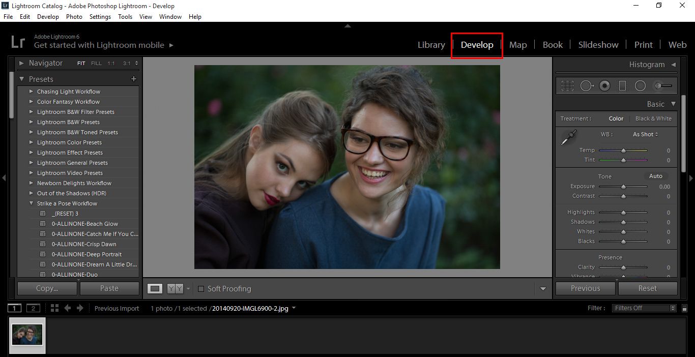
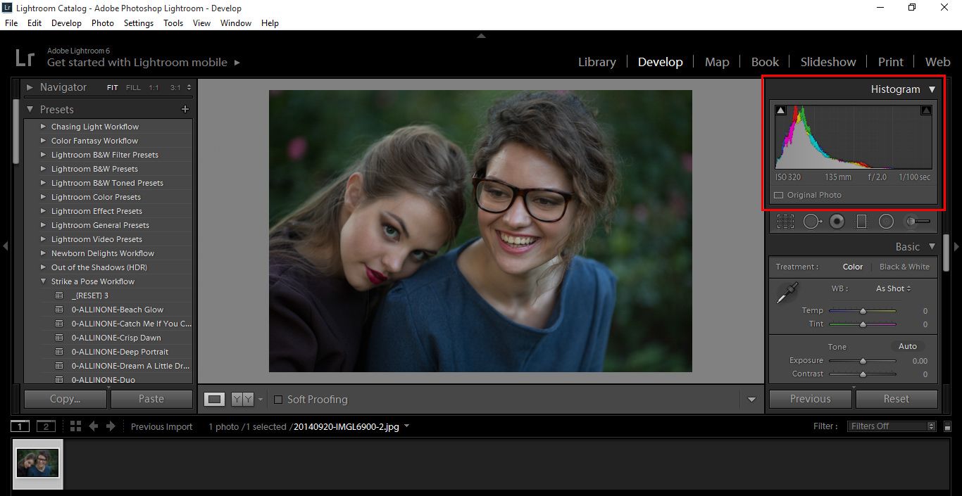
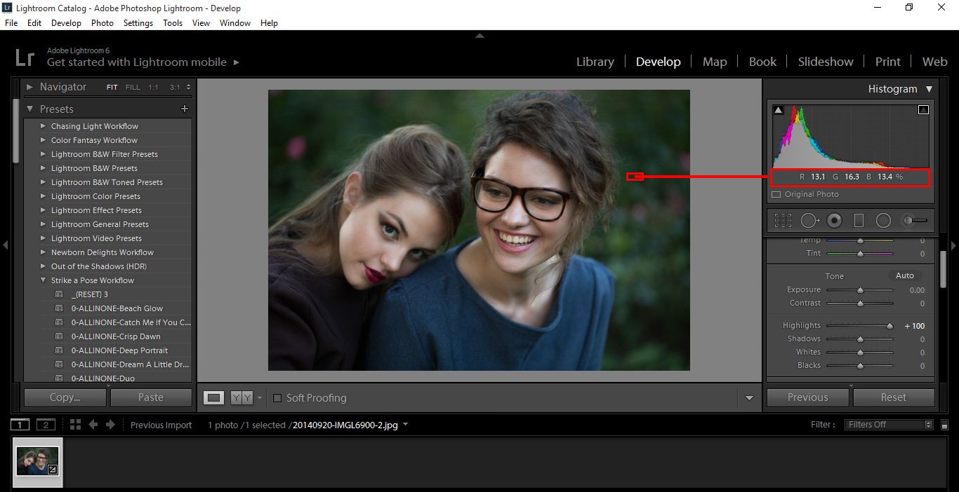
When it comes to photography basics, mastering the the exposure triangle is imperative to taking a well-lit photograph. In this post we will talk about one of the three elements that control exposure: shutter speed.

What is Shutter Speed?

Your camera has a shutter, which is a curtain in front of the sensor. When this curtain is closed the light can’t reach to the camera sensor. The shutter curtain opens and let light into your camera. When you press the camera shutter button, it is open just for a certain time (usually for fractions of seconds or one/few seconds). The amount of time that it is open is the time that the camera sensor is exposed to light, it is known as “shutter speed”.

Shutter speed is measured in either seconds or fractions of seconds. Keep in mind that in the second case, the bigger is the denominator of the fraction, the shorter is the time that the camera shutter is open. For example, 1/4000sec is a much faster shutter speed than 1/250sec.

What is shutter speed scheme


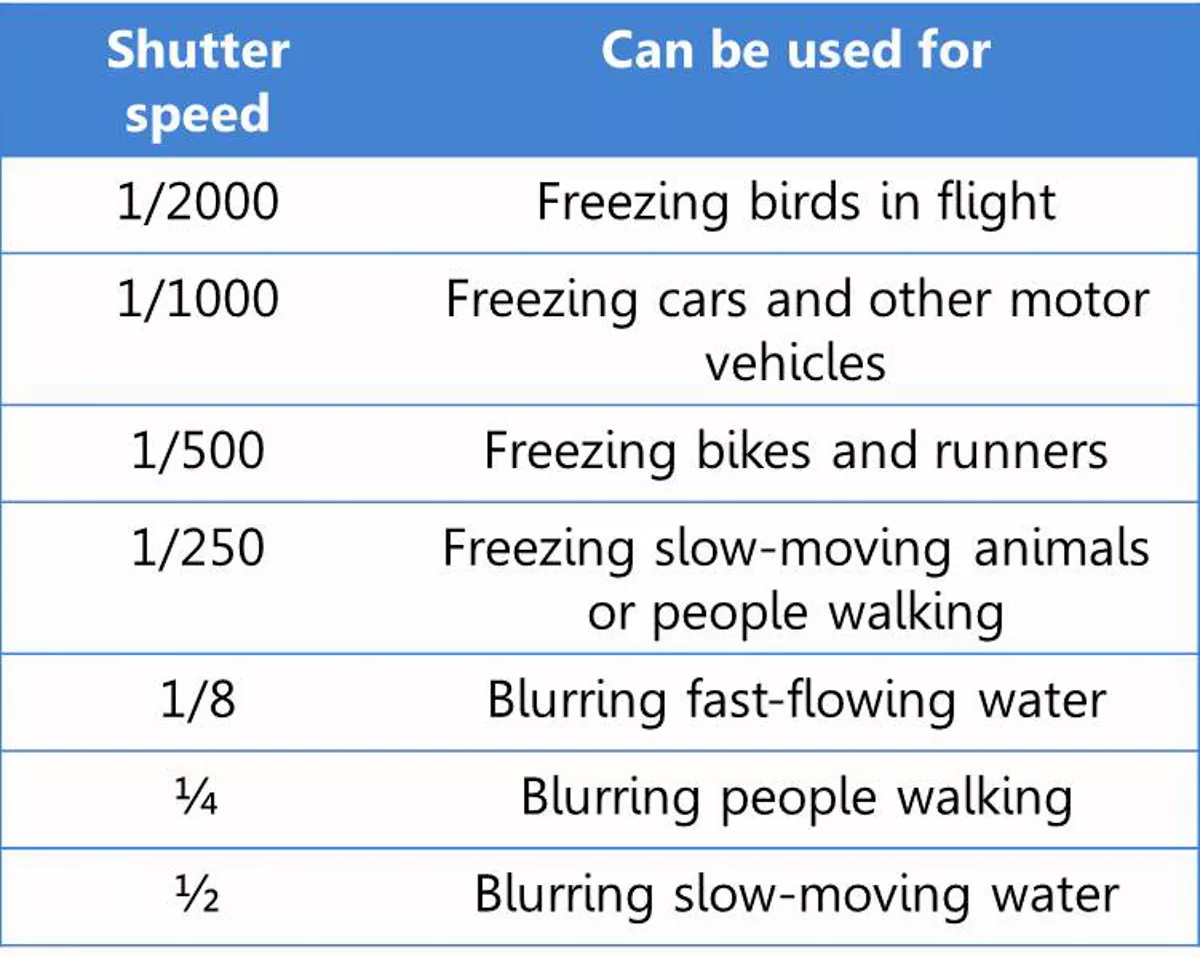
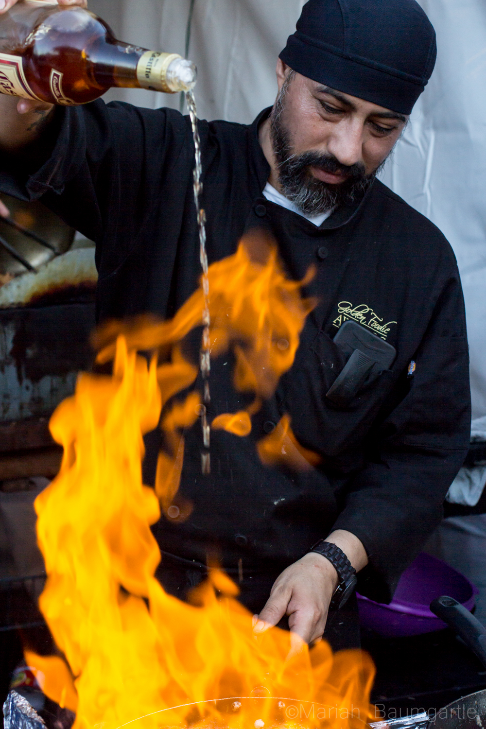
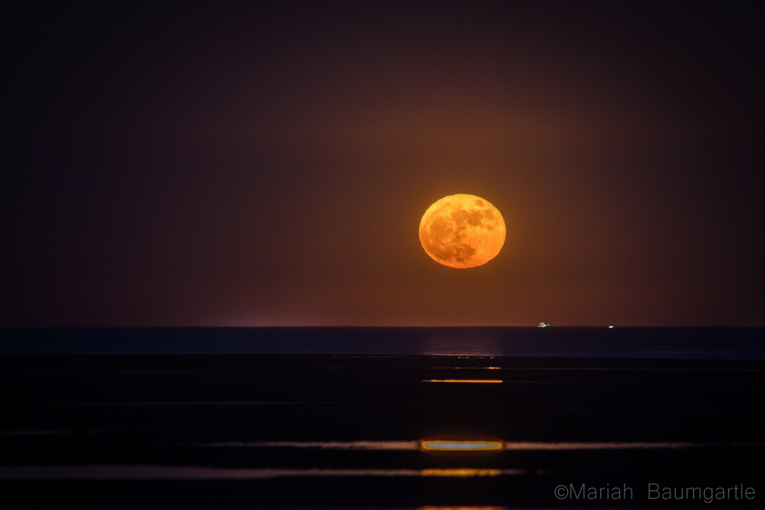
Shutter speed can be used creatively because short shutter speeds (also known as a faster shutter speed) freeze action while long speeds (also called slow shutter speed) can create motion blur. In the latter case, moving objects appear blurry along the direction of their movement. It is useful to know which shutter speeds are good for freezing or blurring some common actions. These numbers will give you a good starting point for your own experimentation.

Shutter speed table
The numbers in this table are an approximation.

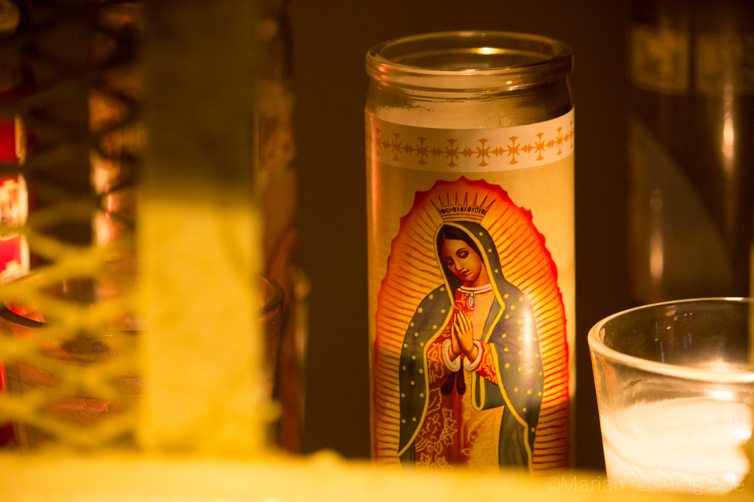
When you are shooting at lower shutter speeds, you can get blurriness even if you don’t want it. This happens especially when you are taking pictures holding the camera in your hands. When the shutter speeds are slow, the slightest movement of your hands makes the picture blurry (I mean the unwanted “OMG this mountain looks blurry”—this is known as camera shake, not the creative blurriness we were talking in the previous paragraph). For that reason it is recommended to use a tripod when using a slow shutter speed.

What is the threshold between using tripod and not? It is said that you need to use a tripod when your shutter speed is less than 1/focal length. The result of the equation is expressed in seconds. Focal length is the measure of how much you are zooming. It is easier to understand with an example: if you are using a focal length of 35mm, then you need a tripod when the shutter speed is 1/35sec. For myself, I know that I need a tripod when I shoot slower than 1/80sec, doesn’t matter the focal length I am using. I guess there is a personal factor here. If you don’t have a tripod, look for alternatives that can help you to stabilize your camera. For example, you can lean on solid and stable things (trees, walls, light posts, tables…).

Benefits of Using Different Types of Shutter Speeds

With this understanding, let’s look at the benefits of using different types of shutter speed.

In the tutorial video above, we have a photo capturing a waterfall and this is taken at a faster shutter speed. What this does is that it is freezing the water coming out of the waterfall. But we have seen amazing waterfall photos with silky smooth waters and those are taken at a slower shutter speed. What this does is that when the camera opens the shutter, it’s seeing the motion of the water and then closing, allowing it to show the motion of the water thus giving a silky smooth appearance of the water.

We also have another example of light coming into the camera. If we have the photo and want to take a photo of it, we are going to have a very slow shutter speed with everything set neutral, we will have a dark image. We need to make sure it is exposed to the right situation. We will, therefore, allow more light to come into the camera, using a longer shutter speed. It’s going to vary from scene to scene and this is what we call ‘exposure triangle’ where you try to have everything calculated including the shutter speed. So, when you have a longer shutter speed, you are allowing the collect manner of light to hit the sensors thus giving you the proper exposure.

Shutter Speed Practice Exercises

Messing around with shutter speed can help you to set the tone or add emotion to an image. In essence, the less motion in a photo, one could say there are more tension and drama to be seen.

Imagine catching a still frame of a friend or group of friends laughing simultaneously. Within that image, with a fast shutter speed, you’re guaranteed to capture the raw emotion on each face. As opposed to our example of the waterfall, where the camera captures the movement of the water, giving it a soft, cotton type look. This then makes the image more soothing, peaceful and serene. You can try these shots in low light conditions or make use of the shutter priority mode where the camera automatically adjusts your ISO and aperture levels  so you don’t end up with an overexposed image.

Exercise 1: Understand How Shutter Speed Affects Light

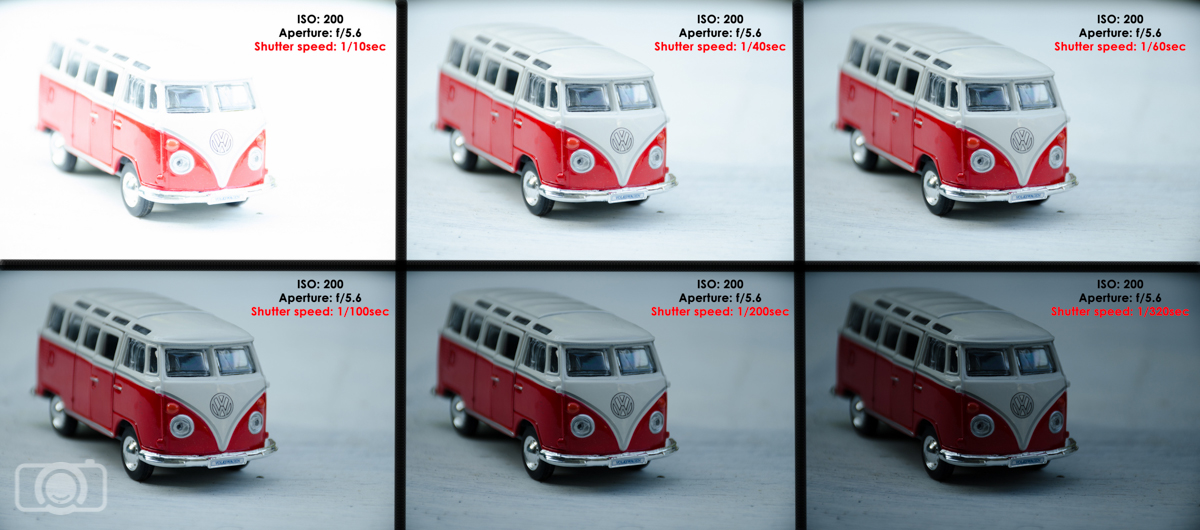
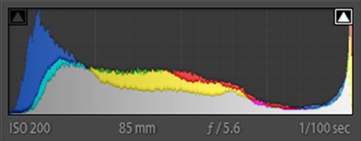
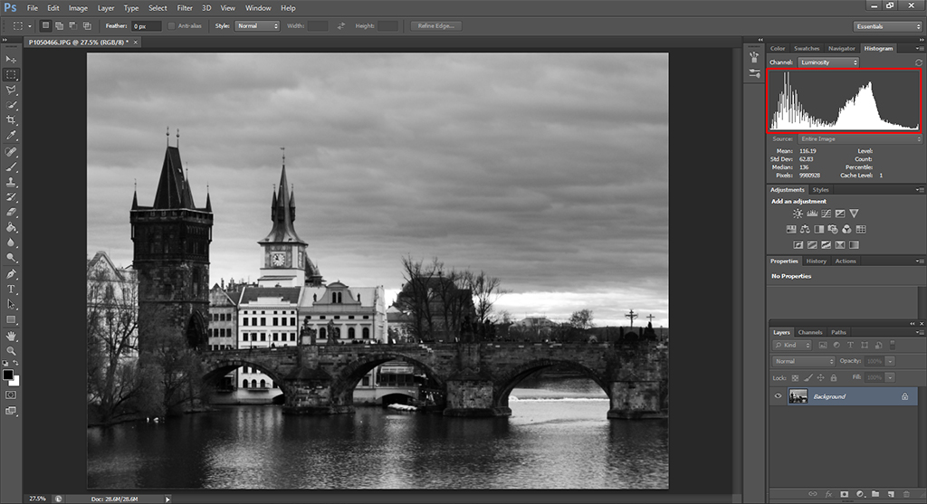
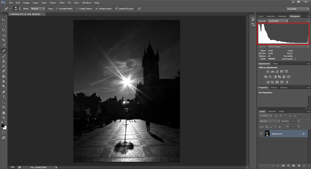
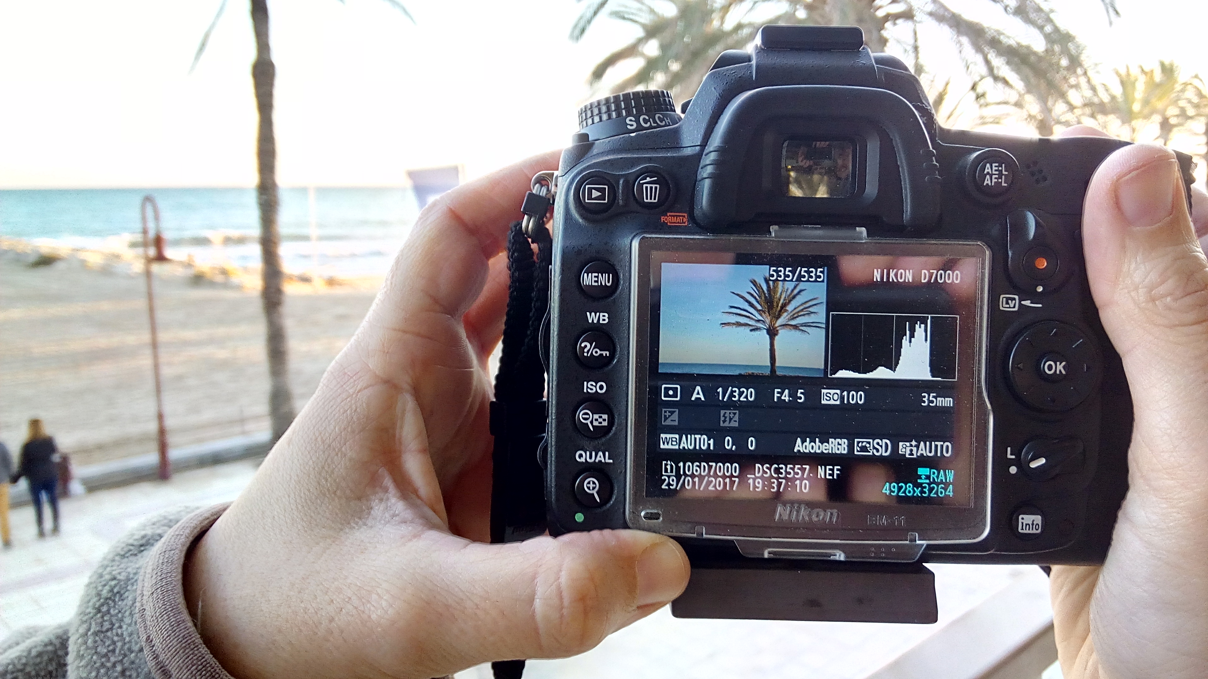
For this exercise you need to set your camera on manual mode. Then, fix the ISO to a certain value. ISO 100 or 200 is a good way to start. After that, fix the aperture. You can try a value of f/5.6. Find a subject for your photos and set the camera on a tripod (or any alternative means of stabilization). Take a photo using a slow shutter speed (for example 1/10sec). Take photos changing the camera shutter speed progressively. Once you are done, check what happened with the exposure of your photos. The only thing that changed between your photos was the shutter speed because you fixed the ISO and aperture. So whatever changes you see in the exposure are due to the changes in the shutter speed. You can repeat this exercise with new values of ISO and/or aperture and see what happens!

The numbers in this table are an approximation.

Exercise 2: Understand How Shutter Speed Works with Other Camera Settings

For this exercise you need to set your camera in Shutter Speed Mode. Set the ISO on a fixed value, for example ISO 100 or 200.  Find a moving subject for your photos (I used a Maneki-neko—this cat turned out to be really useful for practicing exposure) and set the camera on your tripod.

Take photos while changing the camera shutter speed progressively. As you are using shutter speed mode, the camera is constantly changing the aperture in order to get what it considers a good exposure, so all your photos will look the same from the point of view of amount of light. Go over your photos and see which aperture value the camera used for each shutter speed value. The faster the shutter speed, the lower is the light going into the lens (because the lens is open just for a short time) and to compensate for that, the aperture needs to be bigger (remember that bigger aperture is expressed with lower f numbers). Have a look at your photos. Did you managed to freeze the movement? At which shutter speed? Do you have any photos with motion blur?

Exercise 2 shutter speed
When you use Shutter speed mode, you play changing with the shutter speed and the camera will adjust the aperture in order to obtain a well exposed photo.

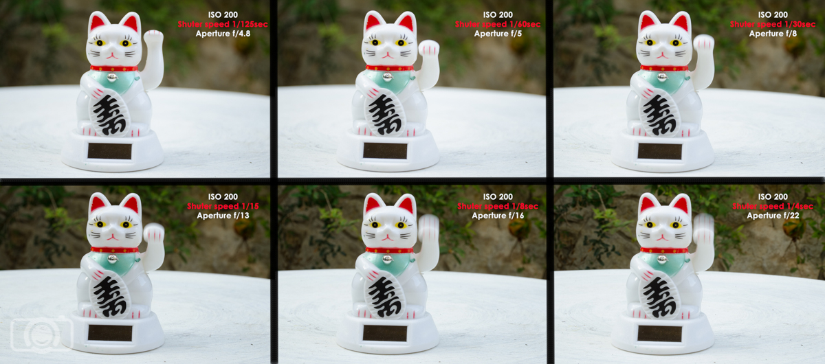
Depending on the lens you are using, It is possible that the camera won’t be able to compensate for the shutter speed by the aperture. For example, the lens that I used today is an AF-S Nikkor 18-140mm 1:3.5-5.6G; its aperture can open to a maximum of f/3.5. Other lenses can open more and reach f/1.8. Check always which is the maximum aperture of your lens and take into account that if you zoom in, this value will change a little (for example, when I zoom to 140mm with my lens, I can open it not to f/3.5 but only to f/4.8). If you reach the aperture limit of your lens, what you can do to get a well exposed photo is use a slower shutter speed. If you still want to keep the fast shutter speed, as you can’t change the aperture (you reached its limit), you will need to play with the ISO settings. You can have a look to our college  Damon Pena’s post to see another example of ISO adjusting.

Exercise 3: Freezing and Blurring Moving Objects

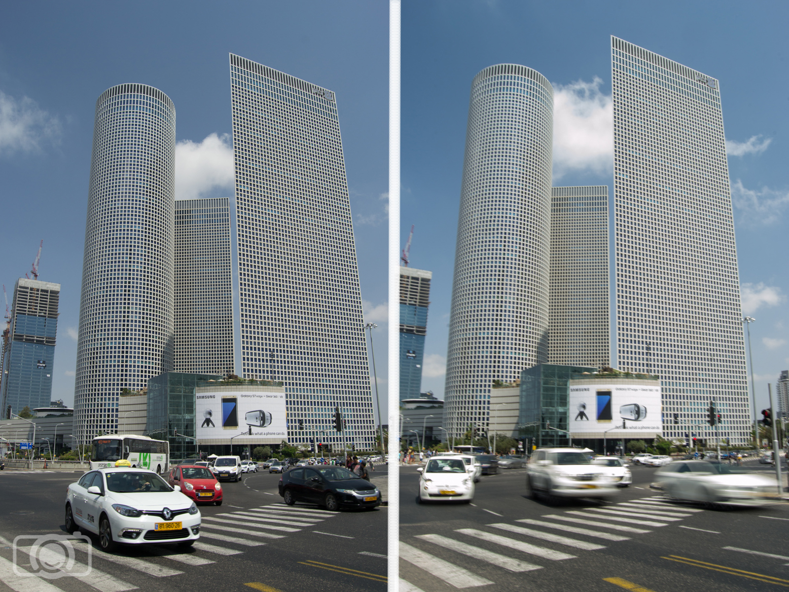
This is one of my favorite exercises! Go to the street and take photos of moving things. Cars are perfect subjects. Set your camera in the same way as in exercise 2 (Shutter Mode and ISO 100 or 200).  Use your tripod/alternative option to stabilize the camera. Pick a fast shutter speed and take a photo of a moving car. Did you manage to freeze it? Change to a slow shutter speed. Is the car blurry now? You can try also to freeze/blur bikes, runners, walking people, pets. Try to use varying shutter speeds to see how the camera setting affects motion.

Shutter speed and movement
I took these two photos in a busy junction in Tel Aviv (Israel). In the left my camera was set on: ISO 100, f/9and shutter speed 1/160sec. The cars were not going too fast, so I managed to freeze them. In the right my settings were ISO 100, f/22 and shutter speed 1/6sec. At this shutter speed I got the blur motion I was looking for.

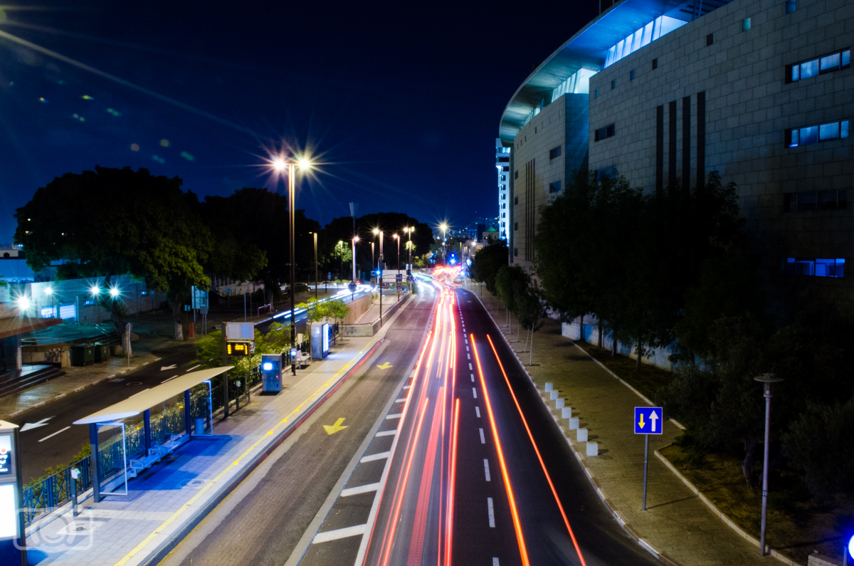
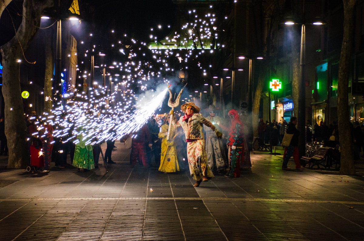
Exercise 4: Night Photography

If you like night photography, you might also like playing with light trails. Light trails are the lines recorded from the movement of a point of light (like for example cars) during the exposure. Set your camera on a tripod (important). With the camera on Manual mode, set a low ISO, an aperture higher than f/8 and try different long shutter speeds until you get the light trails you like. Maybe you will need to reset ISO and aperture values to get a good result.

Night long exposure
Light trails are always fun. I set my tripod and camera on a bridge in Haifa (Israel). I tried several settings and I ended up using ISO 500 (although you can use lower ISOs too), f/22 and a shutter speed of 6 seconds. This shutter speed worked well in my case because it allowed me to capture long light trails. Shorter shutter speeds also allowed me to capture light trails, but they were short (They didn’t stretch all over the road).

I hope these exercises will help you to get familiar with shutter speed. Soon you will be able to get more creative by freezing and blurring your subjects. Have a happy shooting!!

What is a Histogram?

Today I want to talk about one of the most helpful features of the camera—the histogram. Don’t think I always liked histograms. When I started, I found them complicated to understand and in fact, I totally ignored them for a while. However, once I saw the point of the histogram, I started checking them on the screen of my camera every time I was taking a shot. Trust me; the time invested in understanding histograms is totally worth it. They will become one of the best tools you will have, both in the field and in post-processing.

Histogram

What is a Histogram?

A histogram is a graphical representation of any type of information, it does not have to be an image. In formal terms, a histogram is a bar plot that represents the number of occurrences (y-axis) of a given event (x-axis). This could be, for instance, the number of people with a given age within a group. Imagine, for instance, a photography club where the members have different ages as follows:

  • 20 years old: 3 members
  • 21 years old: 1 member
  • 22 years old: 1 member
  • 23 years old: 4 members
  • 24 years old: 1 member
  • 25 years old: 6 members
  • 26 years old: 0 members
  • 27 years old: 2 members

A frequency histogram representing the data set above would look like the following figure.

hist1In this sample size, you can see the age range represented on the x-axis and the number of members with a given age on the y-axis. This way of presenting the information is very simple and easy to interpret, hence the widespread use of histograms in all branches of numerical data analysis.

A  histogram in photography is a graph that shows the range of tones in your photos—in other words, it tells you the frequency distribution of shades in the photo you just took. The x-axis will represent the intensity or brightness (which can go from 0 to 255 on an 8-bit image) and the y-axis will represent the number of pixels with that given brightness. In the case of a grayscale image, a single histogram contains all the information of the image, while in the case of a color image three separate histograms are needed, one for each of the basic colors.

Given an image, a histogram can be constructed, but given a histogram, an image cannot be constructed. In other words, when a histogram is created, important information is lost and thus histograms cannot be used as compressing algorithms. This is because the histogram tells us how many pixels have a given brightness level, but it does not give any information on the location of those pixels within the image.

How to Read a Histogram

So what information can we get from a histogram? This is related to a rule of thumb according to which the more spread among all values a histogram is (i.e. flat) the more balanced the image will be. Now, when applying this rule, you need to take into account what type of image you are dealing with.

Take, for instance, the following black and white image of the Charles Bridge in Prague together with the histogram (highlighted with a red rectangle) as shown in Photoshop.

hist2

There are a couple of things that we can learn from this example image. First of all, the scene looks rather dark, and that is why almost all the data point pixels are on the lower (leftmost) half of the histogram. The histogram is ordered from left to right, with the darkest value (0) on the left and the brightest one (255 when working with an 8-bit image) on the right.

In addition to this overall frequency distribution of the brightness values, it is also noticeable that there are two main peaks with a valley in between. In this particular image, the reason for these two peaks is that both the water and the bridge itself are rather dark while the rest of the buildings and the overcast sky are lighter. This means that the scene itself lacks of mid tones and hence the gap in the histogram.

If we improve the image by increasing the brightness and the contrast, we end up with a much flatter histogram that also covers a wider range of brightness values.

hist3

Now you can see how the center of the bulk of pixels moved to the right and it lies much closer to the center of the histogram. At the same time (and as a consequence of this), the image looks much more balanced than before.

If you look closely to the histogram, especially on darkest pixels, you can see that the bar graph is now much more disperse than before, with a lot of variations and low values intertwined with high values. This is actually a consequence of the algorithm used to increase the contrast in Photoshop, which is similar to a histogram equalization.

Now, what happens if your image was intended to be dark? Good photos are not necessarily those that comply with all the rules known like for instance a flat histogram, completely in-focus or well balanced in colors. After all, that is why automatic modes do not always produce the images we are looking for.

The example image below, once again from Prague, is a backlit scene that was intended to be dark in order to create a high contrast photo as a result.

hist4

Notice how the histogram shows a skewed distribution of pixels on the left side, with a relatively high peak on the far right side of the histogram chart. This is the result of having the Sun on the image, which, even though small, is very bright while the rest of the scene is underexposed to capture the silhouettes and shadows. Trying to get a flatter histogram chart with this example image would render a completely different (and unwanted) result.

Finally, in the example image below, from the Red Square in Moscow, is a much more balanced histogram chart—the vertical axis is reflected on a histogram centered at the mid tones. Even though there is a high concentration of pixels on the middle, the overall histogram shape has a normal distribution—it is symmetric and has a good coverage of all the values without getting into the extremes (under or overexposed areas). This is also a natural consequence of the scene being captured, with no strong shadows or light sources included.

hist5

Notice that even though this is a color image, the histogram chart I am showing is the luminosity one. This is because what we are interested on here is the exposure balance of the picture, so the full color histogram will not yield any useful metrics for our purposes.

How to Check the Histogram on a Camera

When capturing an image, it is useful to look at the histogram shape for a couple of reasons. First, the back screen of your camera can be brighter or darker than the average monitor. This means that you could get disappointed when you get back home and open your images with your computer. Also, if the ambient light is too strong, the contrast of the camera screen might no be good enough to distinguish whether your image is properly exposed or not. However, histograms will always be visible and, as long as you stay away from the extremes (unless that’s your intention!), once you get back home you will at least be able to do a good job with post-processing, since your image will not have completely dark or burnt out areas.

You can set your camera to show you the histogram chart on its screen each time you take a photo. This is quite handy, especially at the beginning when you are still not used to checking it and you might forget to ask for it. In my Nikon camera, in order to see the histograms in the playback, I needed to check the histogram chart in the menu of the Display mode. If you have another type of camera, have a look at the Manual and check how you can set it. It will probably be something similar to what I explained for the Nikon.

Most cameras also have the option to show you the RGB histogram. In fact, this is a group of three histograms, each one showing you the histogram of colors Red, Green and Blue. Today, I am going to focus on the general histogram chart, but I just want you to know that you have the option to use it by the 3 colors as well, should you choose to do so.

Histogram

How to Check a Histogram in Lightroom

You can see the Histogram both in the Library Module and the Develop Module, but you can only really use it for the Develop Module.

So, click on Develop.

histo

You will see it at the Top Right hand corner.

histo1

You can also access it by pressing (Ctrl+0) that’s Control + Zero, or on a Mac it will be Command + Zero.

So we could go super in depth here talking about the Histogram, but that is really not necessary to learn how to use it and get great results.

The Histogram is really just a bar graph plotting out all the pixels on your image.

In the example image below, where I have highlighted you will notice R G B with percentages on it, and you will notice how this changes as you hover over areas on your image. This is useful when you are checking areas and you think it looks a little too “Red” or whatever, and you start to change the colors up trying to balance it out to get a normal distribution, you can use these percentages as a guide for that.

histo2

You’ll understand more as I go along.

You will also notice when you hover over the Graph it is split up into 5 sections.

Blacks

Shadows 

Exposure

Highlights

Whites

By clicking and holding on these individual areas you can you can then manipulate your images.

Play around with each one for a few minutes and when you are familiar, Press Ctrl Z to undo until you are back at the start.

For Photography we would mostly use the Highlights and Shadows area, we would also play around with exposure, but the first two would be our main focus so we’re not losing much detail. For example, a bright Sun or edge of a cloud may be far too bright and you’d want to bring that down just a touch.

The same goes for the opposite , like Black Wheels on a Black Car, you may want to take it back a little and show a bit more detail.

So as an example, we’ll take my starter image below.

20140920-IMGL6900-2

As you can see it’s a little Dark due to the exposure, the Highlights aren’t great and it’s a little saturated with color.

To Fix this, I’m first going to Click on Highlights and slide it to the Right a little, to give a bit of life to the models.

Then I’m going to do the same with my Shadows, only this time I’m going to slide to the left a little to bring out those Darks more in the Eyes, Background and Hair.

And Finally, I’m just going to play with the Exposure a little, it’s not really necessary, but it is good to have a look and see if I can balance the image just a little and see if I can make any further improvements.

You can also play with the Blacks and The Whites too, I found that by sliding the Black area to the right it gave me a little bit more color.

Now you will notice on the histogram bar chart, there are two upward facing triangles.

histo3

When you click on them, what they indicate are the areas in my image that is absolute Black or absolute White, my whites were fine which means my Highlights are all good and the Blue Dots Highlighted in the Image above are true Black, on this occasion those true Blacks are fine, there’s no problem there. But as mentioned before, you may lose some detail in the Shadow areas, you’d then have to play with Black, sliding back and forth to try to fix it as best as you can.

In my image the Blacks are spot on, no problems with those as they’re deep in the Shadows.

To check back and forth instead of clicking on them all the time, you can press (J) to show both Whites and Blacks, Whites will be in Red and Blacks in Blue.

Getting Familiar with the Histogram

Histograms can look a bit scary at first, but once you know what to look for, they are quite friendly. The histogram is a bar graph with a horizontal axis and vertical axis which represent the shades you have in your photo. On the left edge you have the pure blacks and as you go to the right on the axis you have lighter and lighter tones until you reach to the pure white in the right edge. I have a little trick to remember where are the blacks and whites in the histogram. I always think the histogram is like “B&W photography”, black is first (in the left) and whites after them (in the right). For this trick to work you have to think from a left-to-right writing mode.

Histogram


OK, so now we know what the horizontal axis means. What about the vertical axis (i.e. height of the histogram)? It tells you how much of each shade you have in the photo. The basic principle of reading the histogram chart is the same; the more data peaks you have in one area on the horizontal axis and the higher they are means that these are the tones and shades that are the most dominant in the photo.

Histogram

Let’s see this in a real photo:

Histogram


The histogram is a great tool for getting well-exposed images. A general rule of thumb is to have the histogram chart stretched all over the horizontal axis and avoiding having a skewed distribution (spikes) at the extreme left and/or right of the axis.

Histogram
This photo is quite balanced, you can see that the histogram stretches almost all over the horizontal axis, the most dominant colors here are bright and for that reason, we see higher peaks on the right side of the histogram (but not at the edge)

A photo with too many peaks in the blacks means that it is too dark or underexposed. To correct the exposure, you will need to increase the light of your image by, for example, using a wider aperture or increasing the ISO.

Histogram
This photo was under-exposed, that is why it is so dark and the histogram stretches only over the left-hand side of the axis, and we see that the peaks (which are high enough to be called spikes) are concentrated at the left-hand edge

On the other hand, if the photo has a lot of high peaks in the white, it means that it is overexposed or even burnt. This time, to correct the exposure, you will need to decrease the light of your image by, for example, using a smaller aperture or a lower ISO.

Histogram
This photo has been over exposed and parts of it are even burnt, the histogram shows just that; we see the graph is very low the most part of the axis and only towards the right-hand edge of the axis the histogram rises sharply


Now you know! If you see that your histogram is too much in the blacks or in the whites, this means that you MIGHT need to correct the exposure of the image. Notice that I said MIGHT. Why? Because photography is a creative craft, so it might just happen that having an underexposed or overexposed photo is exactly what you are aiming for. You need to think what do you need in your final image and then see if the histogram you have matches what you are looking for. I will show you with a little game!

Let’s play the histogram game!

I am going to show you a histogram and you need to make an observation to decide which kind of photo might correspond to it. Spoiler alert! Don’t scroll down too far or you will see the answer! Let’s see the first one:

Histogram 1


histogram-correfocs

Options:

  1. A boiled egg on a white table
  2. A night photography of a street event
  3. A chess board
  4. A multi-color chicken

Solution: Number 2! In night photography you will get histograms with a lot of peaks in the blacks area. But this is normal because night is dark and black is what we expect to find in the frame.

Histogram

Histogram 2


histogram-egg-white

Options:

  1. A boiled egg on a white plate
  2. A beach at night
  3. A chess board
  4. A gray cat on a brown sofa

Solution: Number 1! We got a histogram with a lot of whites because the image is mostly white!

Histogram

Histogram 3

histogram-egg-black

Options:

  1. A polar bear in the snow
  2. A groom in black sitting in a black car
  3. A multicolor bouquet of flowers
  4. Eggs in a white plate on a black table

Solution: Number 4! Here the histogram shows peaks in both blacks and whites and almost no middle tones because the photo has high contrast: white and black are the main colors.

egg-in-black-1

Histogram 4

Histogram

  1. A cat in the middle of the night
  2. A bride in the snow
  3. A colorful house with a sunburst
  4. A colorful patchwork blanket

Solution: Number 3! The beautiful Gaudi House and the most part of the photo is well exposed, so the histogram has a lot of middle tones. However, the sun-star makes the whites in the histogram quite high. Exactly what I wanted!

Histogram

What do you think about histograms now? Still scary? I hope not! It takes a bit of practice to get used to them, but believe me, it is totally worth it! A basic histogram can be very useful, but you need to get used to the particularities of each image in order to correctly read it. Something similar goes with post-processing. No matter how bright or dark your monitor is, looking at the cumulative histogram will always give you an objective assessment of the exposure of your final image. This way you will avoid the problem of publishing a photo that looks too dark or too bright in other people’s monitors.

Grab your camera and tell me how it goes! Have a happy shooting!

How to Fix Overexposed Photos in Lightroom

We’ve all been there: attempting to capture the heart of a photo shoot in a limited amount of time, coming home with a heart full of wild excitement, and being disappointed with the results. Maybe you shot on a sunny day, creating bright photographs that somehow managed to conceal your subject completely. Perhaps you shot during the golden hour, resulting in beautifully warm – yet unbearably bright – images.

Photographer friend, I have some good news for you: fixing these lighting errors is possible using a number of editing programs. The program we’ll be focusing on today is Lightroom. After installing the Lightroom presets, you will see that Lightroom presets is filled with a plethora of handy little tools like exposure, highlights, shadows, clarity, and more. These tools – which can be altered by using sliders – can fix both dramatic and minor issues. If you’re refusing to share one of your favorite shots due to overexposure, the tutorial below will help you fix your dilemma. In no time, you’ll be able to find potential in photographs that, at first glance, seem impossible to fix. This will give you more opportunities to add great photos to your portfolio and make your shots less stressful.

//

Before you begin, it’s very important to remember the power of shooting in RAW mode. The value of RAW lies in the amount of image data it collects; JPEG stores less image data, resulting in photographs whose quality isn’t the best it can be. Thus, editing RAW files enables the photographer to alter things dramatically without instantly ruining the overall quality. When it comes to images that are too bright or too dark, this is especially valuable.

Preset-loving folks, please keep this in mind: In Photoshop, it’s possible to use an action after editing your image and not lose any of the minor details you fixed. In Lightroom, however, this is possible but not easy to achieve. When presets are applied, any changes you made before the application are completely altered to fit the preset’s inbuilt adjustments. To avoid losing precious work, apply your desired preset first and then work with the sliders. This will save you a lot of time and frustration.

Now that you’re aware of these points, let’s begin!

The Basic panel contains the most important sliders – if you were to use only those during the editing process, you’d get an abundance of great images. Imagine how wonderful your work can be if you master the basics, apply stunning presets, and understand how to use Lightroom’s other panels (such as Tone Curve and Split Toning). It would be great also if you could master how to remove blue cast photos in Lightroom.

//

  • Exposure: dragging the slider to the left will darken your image significantly. Use this tool carefully as it will affect every part of your image. Of all the sliders, exposure is the most sensitive to changes. Keep this in mind as you experiment with it. Since the eye isn’t always sensitive to small changes, use the before & after tool as often as you can.
  • Contrast: this is as important as exposure, though playing around with it won’t result in overly exaggerated shots (especially if your photograph is very flat). Even a contrast of +100 could work! Drag the Contrast slider to the right until you’re satisfied with the results.
  • Highlights and Whites: the brightest parts of your photo can be fixed using these sliders. Blown out highlights in photos can be softened by dragging the highlights slider to the left. To help your shot reclaim its beautiful contrast, increase the whites by dragging the slider to the right. This will help maintain a balance and prevent any clipping from happening. (Clipping is the loss of image data – this is common when working with photos that require much editing.)
  • Shadows and blacks: to recover the strength of shadows in an overexposed image, drag the shadows slider to the right and the blacks slider to the left. Similarly to the previous point, this balance will get rid of unnecessary clipping and let your image naturally stand out.
  • Clarity: if you feel that your image has the potential to look even better, increase its clarity. Too much clarity will result in very unnatural looking photos, so be careful as you drag the slider to the right.

Once you’re done with the basics, feel free to experiment with other panels. Now you’re ready to make the most of any shoot, no matter how bright it may be outdoors. Be proud of yourself for learning something new!

//

Happy shooting, and don’t forget to never stop learning.

Tips and Tricks for Using a Light Meter

Light meters might seem like an intimidating piece of equipment, but they can be one of the most important tools a photographer has at their disposal. The information provided by a light meter can help you set your exposure properly to achieve the mood you’re looking to capture in your image. By using the reading from a light meter, you can set your camera to shoot the image correctly exposed, or under or overexposed to suit your artistic style.

Cameras have a limit to the level of brightness they can capture, called dynamic range. A good light meter gives you an idea of where these areas of brightness fall. It shows you which areas will be either too light or too dark to contain any details.

measure exposure

That way, you can adjust your camera’s exposure to capture the most important parts of the image. You can also see if you need to expand the dynamic range of the scene by switching to a high dynamic range technique.

However, your camera can often produce inaccurate light readings. This happens especially often if you’re shooting a scene with a lot of black or a lot of white, to influence the perceived brightness. This confuses the computerized meter, and if you trust your camera to adjust the exposure for you, you’ll end up with a disappointing result.

Types of Light Metering

Built-in light meters aren’t capable of measuring incident, or ambient, light. This is the light that falls directly onto your subject and is measured through the meter’s lumisphere, which looks like a white dome. With an incident light meter, you can correct exposure errors that can occur when your subject is backlit.

exposing backlit photo

Reflective light metering picks up the brightness of the light bouncing off your subject and can be set to measure the light using several different patterns. Evaluative metering uses a precise algorithm to measure the exposure in several zones within the frame. Center-weighted metering will prioritize the middle of the frame when judging exposure. Finally, spot metering reads the light in just a small part of the frame.

By measuring the intensity of both ambient light and reflective light, a hand-held light meter can give you a much more accurate reading. Once you’ve input your ISO, and your shutter speed in certain instances, the meter tells you what f-stop setting to use on your camera to achieve the perfect exposure.

Shooting Landscapes

You probably only need an incident meter reading to accurately set your exposure for capturing landscapes. Hold out your meter and check to see that the light hitting your lumisphere is the same light falling on the scene you hope to shoot. Make sure you don’t have the lumisphere in direct sunlight – you want to measure the incident light in the shadowy parts of the scene, to retain as much detail as possible in your image. Once you’ve pressed the meter button to see the f-stop reading, set your camera’s shutter and aperture and get shooting.

landscape exposure tips

A reflective meter reading will be more accurate if you use your meter’s memory button to capture readings from a number of areas with differing brightness. Use the average button to get an appropriate exposure value, and use that average reading to set your camera.

Shooting Portraits

Using an incident light meter when shooting portraits helps you to retain the details and tones of your subject’s skin and face, creating a more accurate and interesting portrait. Use the lumisphere to get a reading of the light falling on your subject’s face and adjust your camera’s settings accordingly. Portraits are generally more flattering when they are shot slightly overexposed. Once you’ve got your reading, bump your camera up one more stop for a bright, attractive head shot.

light metering portrait tips

Again, take several readings from important parts of your subject – highlights on their cheeks, shadows in their hair and clothes. Press the average button to see the final exposure value to input on your camera.

Shooting Still Life

A light meter is a very valuable tool for shooting professional quality still life product photos. Capture a reading of the light hitting your subject by using your meter’s lumisphere, no matter how bright or dark your subject is. The reading from your meter will give you a good base exposure to set your camera, but feel free to bump it up or drop it down a few steps to achieve the effect you’re looking for.

still life exposure settings

By now, you should have an idea of which areas are most important to get a good reading with a reflective spot meter. The average of these readings will give you a solid exposure value, but again, adjust it however you like to capture the mood you hope to achieve.

Using a light meter will take a bit of practice, but the more you use it, the more you’ll understand how helpful this tool can be for any kind of photography. Save yourself tons of post-processing work and retain the important details in every shot by investing in a professional light meter to shoot properly exposed images every single time.

A Photographic Journey around San Felipe, Mexico

I have had the opportunity the past four months to live and photograph around San Felipe, Mexico. San Felipe is located in the Baja California and located about 2-3 hours south of the border along the side of The Sea of Cortes. San Felipe is filled with color, culture, great food, and beautiful desert land. Pack all of the correct gear for your travels and take an adventure to gather some great photographs. San Felipe SignOn your way to downtown San Felipe, you will first spot The Arches, a very popular monument of San Felipe. They call the arches “The Gateway To The Sea” The arches offers many angles. However, the only problem photographing the arches are all of the distractions around such as signs and wires, which you can Photoshop out later. Around and past the arches you will also find a hillside where you can explore to gather some more cultural photographs of the areas. This area is where you will find all of the best authentic food with local taquerias and is always a great photo op in itself by practicing your food photography. Down at the end of San Felipe is The Malecon, which sits next to The Sea of Cortes. The Malecon is lined with restaurants, shopping, and with a great view of the sea. This is where all of the events happen in towns such as food festivals, music festivals, and parades. This is a great place to take some iPhone street photography. San Felipe ArchesSan Felipe Culture

San Felipe Food Truck

San Felipe TacosSan Felipe TortaSan Felipe DowntownSan Felipe MaleconSan Felipe MaleconSan Felipe Shrimp FestivalSan Felipe is also a great place to gather some night photography. One of the best spots for night photography is down at The Shipyard, which you will find at the end of The Malecon. The Shipyard used to be a marina but was flooded, and they could not move the ships, so they are left there are part of a San Felipe gem. Up on a hill, you will find a building, The Boom Boom Room, a place that has also been abandoned and a very interesting location to photograph during the day or evening. Up on a mountain, you will find a little yellow chapel that looks over the town of San Felipe and right next to it is the lighthouse, which you can shoot from ground level or up at the top where the prayer building is. This is a great place to work with your angles. If you are in town during the full moon make sure to catch the moon rise over The Sea of Cortes: I was there for supermoon, and it was an incredible experience and a really good opportunity to try my moon photography skills and also work with some post editing. San Felipe Tampico ShipSan Felipe BoomBoom RoomSan Felipe MexicoSan Felipe ChapelSupermoon in MexicoThere are many smaller day trips you can take from San Felipe for some great opportunities including more water and desert land. On a note of transportation, you will need some form of 4-wheel drive out in the desert. It is a famous landmark in the area is The Valley of The Giants and a photo opportunity you will not want to miss. The valley holds cardon cacti that stand nearly 50 feet high. You can also drive further south to Percebu where you will find a little more surf in the water and also a great location to find treasures along the beach. Along the way, you will find more abounded buildings and interesting homes and land to photograph. The desert land has a lot of beauty to offer, and San Felipe is surrounded by beautiful desert land. You can take a drive out west closer to the mountains for some more variety in your desert landscape. The desert also offers some interesting finds such as bones, rocks, and maybe even a carcass or two. If you are going out in the middle of the day, you will have problems with harsh lighting in your landscapes, but you can always enhance your lighting in post production with landscape Photoshop actions or Lightroom Presets and Brushes. Valley of the GiantsValley of the GiantsPercebuSan Feipe DesertSan Felipe Mexico DesertSan Felipe Mexico DesertI hope you have the opportunity to visit San Felipe in your future travels or even Baja California to discover color, culture, and beautiful desert land by the sea or ocean side. As they say in the Baja “No Bad Days!”

How to Make Your Picture Standout using Lightroom

Vignetting

a picture is often used to enhance the subject of a composition, and Lightroom has an automatic feature to create vignetting in the effects panel. However, this software’s native effect only darkens the edges of the picture, making it look very artificial for my taste. So in this tutorial, you’ll learn an alternative way to make the same effect using specific adjustments in Lightroom, improving your picture and making it stand out just like the before and after below. Let´s go!

How to make your pictures standout using Lightroom

Step 1) Open Lightroom and Import and/or Open the selected image you want to tweak. Then, go to develop mode and select the graduated filter tool on the right tools panel, that way you’ll create a new mask in your image:

Create a graduated filter maskStep 2)

When you select this tool, you’ll notice the cursor will become a cross, click at the top edge of your image and drag to the middle of the image, maintaining a straight line. This way, you’ll create a mask on your image, and can tweak with the adjustments from the right panel, just as a usual image, but it will only apply to the area highlighted by the mask. You can tweak with the values according to your style of editing, but these are the values I’ve used for this example:

Create the first mask

Lowering the temperature of the image and increasing the saturation, I could enhance the colors of the sky, and by tweaking the clarity values, I was able to increase the edge’s contrast, enhancing the details of the sky.

Step 3)

Now you’re gonna do the same thing as the previous step, but this time clicking and dragging from the bottom edge to the middle of the image. You can make the adjustments in the right panel, but for this example, I’ve used the same values from the first mask.

Create the second mask

Step 4) In this next step you’re gonna make the edges of the picture darker than the middle, just like the default vignette effect, but better! Create a radial filter by clicking the tool on the right panel, you’ll notice the cursor will become a cross also (just like the graduated filter). To create this new mask, click at the center of the image and drag all the way to one of the edges, but this time it has a rounded shape. The values I’ve used are in the images below but, again, it will depend on the image you use and the style of editing you have.

Create a radial filter mask

In my case, I like to bring colors to the picture by increasing the saturation and tweak a little bit in the clarity dial to enhance the details of the shadows. To darken the edges of the image, like the default vignette, I´ve lowered the exposure dial a bit.

Step 5)

To finalize the effect, you’ll create another radial filter just like the previous one. Click on the center of the image and drag to the edges, but this time you’re going to invert the mask by checking the box “invert mask” at the bottom of the right panel:

Create a inverted mask

To emphasize the tone at the center of the image, I´ve increased the temperature just a little bit and added a warmer color to the mask, by clicking on the color box at the bottom of the panel and selecting a color similar to the ones at the center of the image. I´ve also adjusted the exposure and sharpness to enhance the details at the center of the image.

By now you should have ended with a totally different picture from the one you had at the beginning of this tutorial. Click “Done” and you can export the picture the way you do usually.

Final Result

In this tutorial, we learned how we could make our pictures stand out using two great tools from Lightroom, the graduated and radial filters. The final result was an image with enhanced colors and a smooth vignette effect with no dark edges. If you have any suggestions or doubts you can write a comment below or contact me directly. See you next time!

A Guide to Using the Adjustment Brush in Lightroom

Correcting exposure, color balance, and contrast are likely how you begin editing the majority of images in Lightroom presets. Often, it might be all that is required to finish editing the image; however, to take your images a step further Lightroom has given its users a tool called the Adjustment Brush. It allows for photographers and retouchers to localize their editing by carefully selecting specific parts of the image to enhance, hide or correct. The Adjustment Brush is a fairly easy tool to master, but it comes with a few settings that need to be understood, to use this tool well. This is the complete guide to using the Adjustment Brush in Lightroom.

The Adjustment Brush tool is found in the Develop module of the Lightroom panel which can be found if you have an installed Lightroom presets.  You can quickly access the Develop module by using the keyboard shortcut ‘D’. The Adjustment Brush tool is marked as a dotted circle with a brush coming out of it – make a habit of using keyboard shortcut ‘K’ to access the tool, to save time when retouching.

Adjustment Bursh

Once the tool is selected, you will see that the mouse pointer turns into a circle. It marks the area affected by the Adjustment Brush. Further, you will notice that it opens a number of options that change what affect the Adjustment Brush will have on the image.

The first two sliders control the temperature and color tint of the image. These, in short, control the white balance settings of the Adjustment Brush. For example, you could use this tool stylistically to add a complimentary color in the shadows of an image for a more saturated photo.

Adjustment Bursh2

Moving forward, the next six sliders control the exposure and tone settings of the Adjustment Brush. Exposure will change the overall tone shift of the area affected by the Adjustment Brush. The contrast will control the ratio between the black and the white values of the image, which can be the further adjusted by the last two ‘Whites’ and ‘Blacks’ sliders. The Highlights slider will control the extent to which the Adjustment Brush affects the brightest sections of the adjusted area, while the Shadows slider will control the darker areas. Adjusting these settings can help you bring certain parts of the image forward or hide other areas in shadows.

Adjustment Bursh3

The next section allows for changes in clarity (one of the features you have to consider for rating system in Lightroom), which controls the contrast of the lines in the image, and saturation, that affects the intensity of the colors in the area of the adjustment brush. Often clarity can be great in revealing the amount of detail present in the image; however, usually you want to avoid adding it to faces as it will accentuate lines and creases in the skin – to avoid that we can use the Adjustment Brush tool to only increase clarity outside those areas.

Adjustment Bursh4

The next section is responsible for correcting the issues caused by the camera sensors. First, are the Sharpness and Noise sliders that can be used to make parts of the image stand out from the rest or used to reduce noise and grain caused by the camera sensor. The Moire slider is there to compensate for the Moire effect that occurs when a frequency of pattern in the image aligns with the pixels of the sensor, resulting in a distortion of that pattern. The Defringe slider reduces the chromatic aberration caused by lens shortcomings.

Adjustment Bursh5

Further, the Color option of the Adjustment Brush allows you to select a color cast that the brush will add to the affected area of the image. Last part of the Adjustment Brush options controls the Size, Feather, Flow and Density of the Adjustment Brush. A quick way to adjust the size of the brush while retouching is to use the keyboard shortcut ‘[‘ to make it smaller and ‘]’ to increase its size. The Feather of the Adjustment Brush controls how quickly the Adjustment Brush will fade into the rest of the image. The larger the Feather level – the more gradual the fade will be.

Adjustment Bursh6

Flow affects how quickly the Adjustment Brush is applied to the image. If it is set to 100%, it means the Adjustment Brush will affect the area to a maximum level. If it is set to 50%, only half of the effect of the Brush will be seen.

The Density slider is similar to Flow and controls the amount of change that can be applied by the Adjustment Brush; however, unlike Flow, it will limit the effect indefinitely, meaning that once it is set to a specific value that area will always remain affected at that percentage, unless the Adjustment Brush settings are changed.

Last, the Auto Mask options attempts to guess, which parts of the image you aim to be affected by

the Adjustment Brush. It does so by checking for contrast ratios between pixels, meaning that if you have a subject in the image that clearly stands out from the background, it should be able to easily identify that you only want the subject affected; however, if the background is very cluttered, likely, it will not be able to distinguish the subject well.

Adjustment Bursh7

If you are finished with the first set of adjustments, you can create a new brush. Simply click the ‘New’ option in the Adjustment Brush settings panel, set the new settings for the Adjustment Brush and start applying it to the image. Note, that you will be painting on top of the first Adjustment Brush that you used. A quick way to undo the changes made by the Adjustment Brush is to hold the ‘Alt’ key while brushing the areas you want to be undone.