Tag: tutorial

How to Create Panorama in Lightroom CC

Have you ever desired to take a panoramic photograph and your camera doesn’t have the panorama feature? Do you want to do panoramas without switching to Photoshop or other specialized software? Have you forgotten to take your wide angle lens with you on your vacation? Do not give up on the amazing scenery that is in front of you. Following this tutorial, all you will have to do is photograph some parts of the scene and the software will process your images to produce a panoramic image within Lightroom CC (2015).For those who are not familiar with Panoramic Photography, it is a technique of photography that captures a series of images using a photographic camera and aligns them all together, to make a single photograph with a wider aspect ratio than a commonly used photograph.

Before Lightroom CC (2015) came out, in order to stitch together multiple images, you needed to switch between Photoshop or use other specialized software. Even though there are some cameras that have the panorama feature built into them, but most professional DSLR cameras do not.

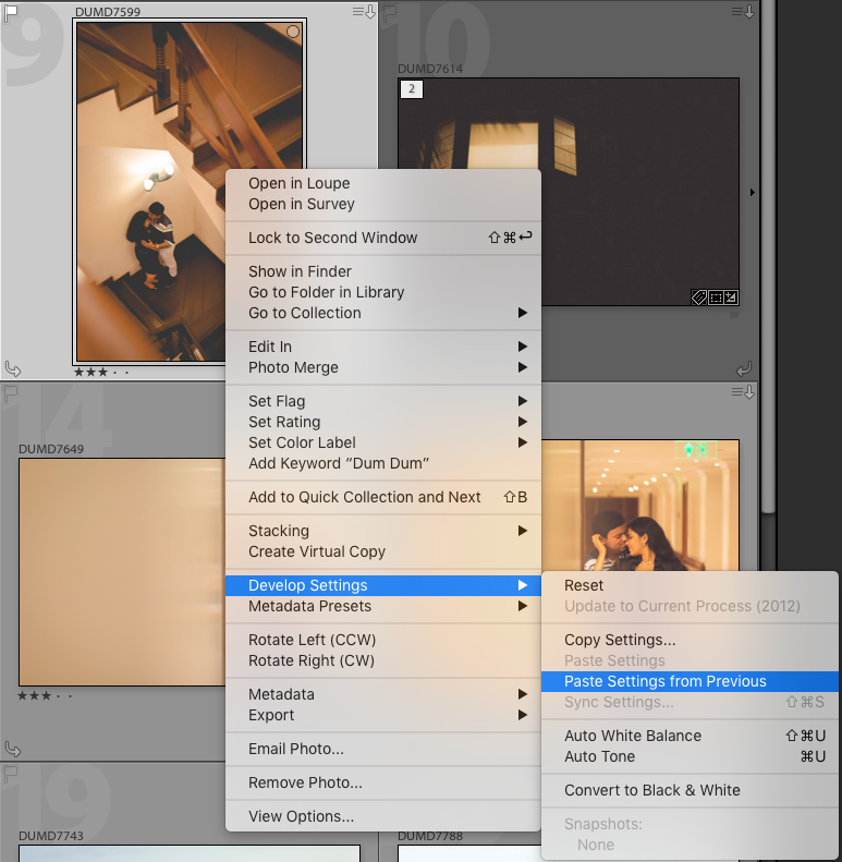
Recently, after the latest update, you can create your panorama images inside Lightroom CC itself. The best part is that after the software process all the images, it will create a brand new seamlessly stitched RAW file from the images without rendering the images in pixels, with this new raw file, you will be able to retouch the panorama preset in Lightroom as you would any other image. So, you have to know first how to install Lightroom preset and once it has been installed, you can now create your panorama images inside the Lightroom CC.

Panorama is a feature that has been missing for a long time in the software. In order to create breathtaking panoramas, just follow the simple steps below.

Step 1 – Take multiple shots with your camera

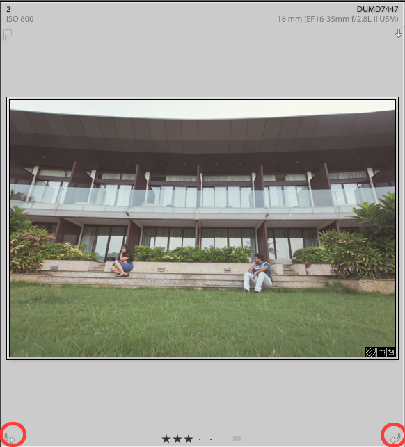
  • With your digital camera take multiple pictures from left to right or from bottom to top, depending on the scenery you have chosen.
  • After the first shot is taken, while shooting the subsequent photos, make sure to get a little bit of the scene of the previous image so that Lightroom has data to render them together.
  • If you are using a DSLR or a camera that can manually change its settings, do not change the aperture of the camera. For example, if you use an aperture opening of F11 make sure you use it in every single shot.
  • I did not use a tripod to shot the images used in this tutorial, although it is not crucial, the use of a tripod is recommended.

import

Step 2- Import your images into Lightroom

Import the images that you have photographed.

File/Import Photos and Video 

import_select

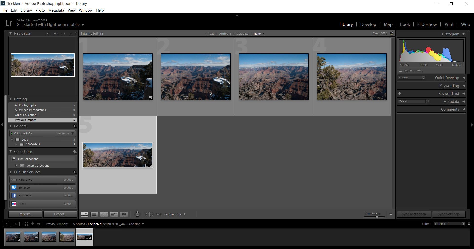
Step 3 – Select the images

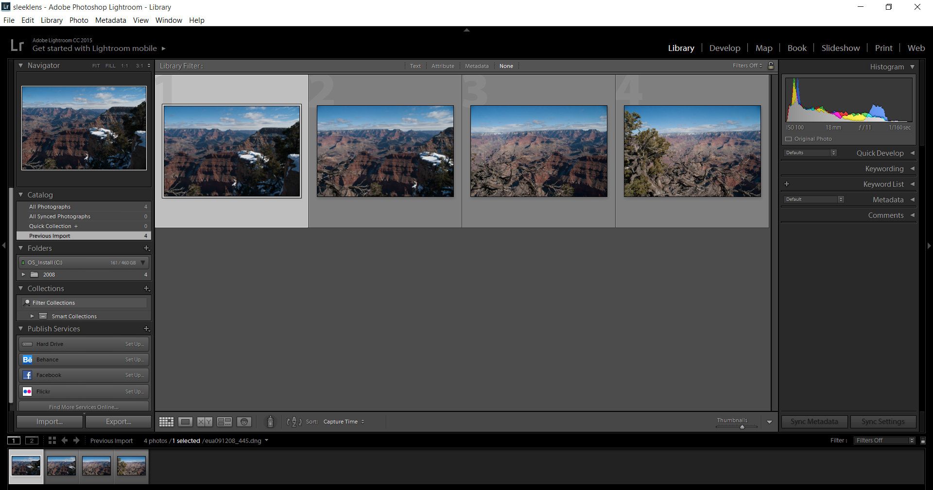
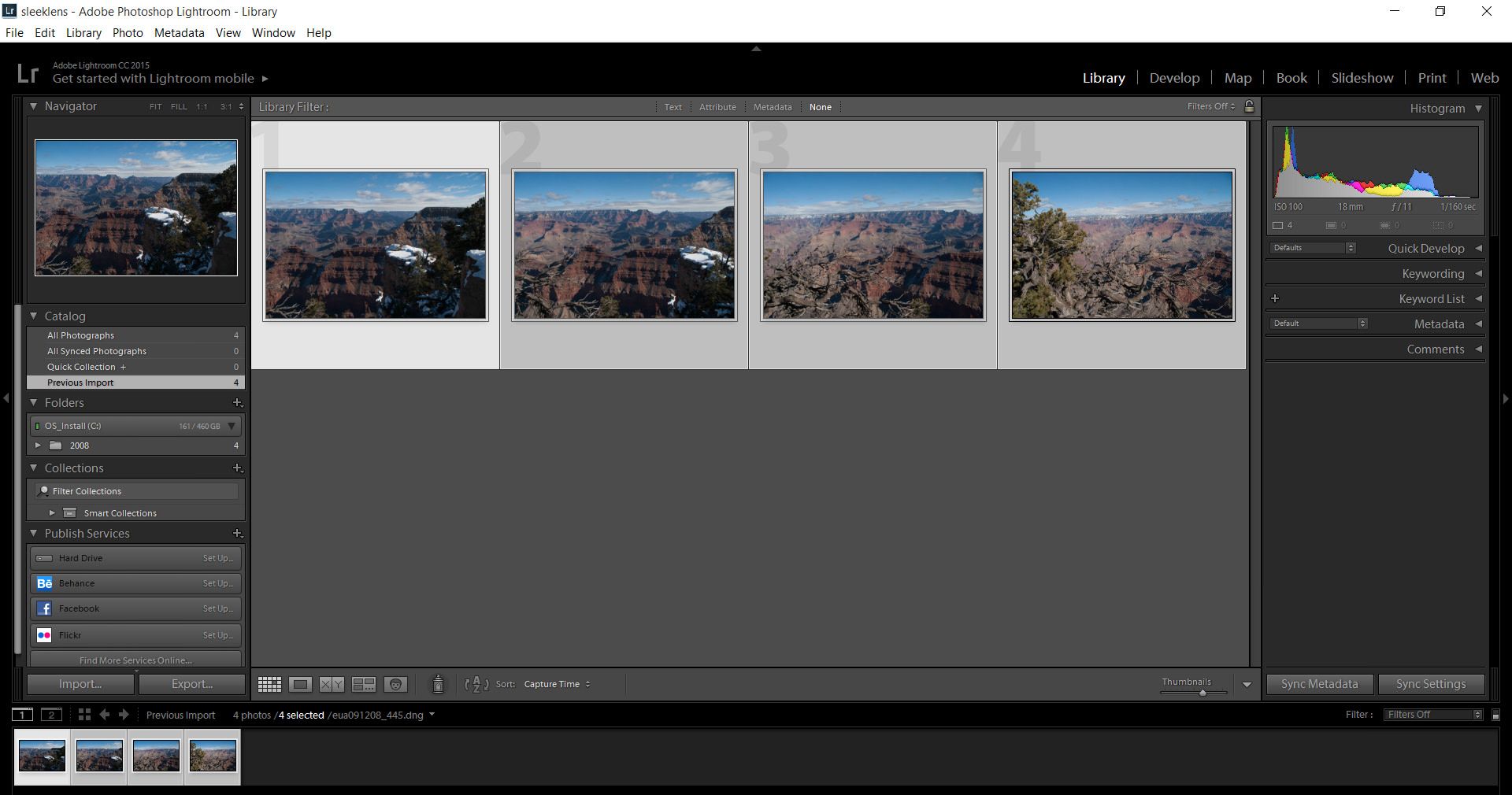
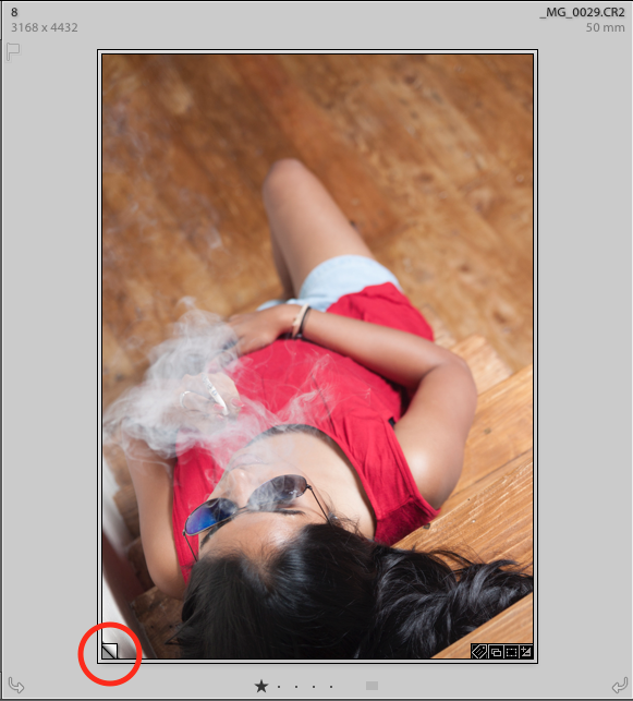
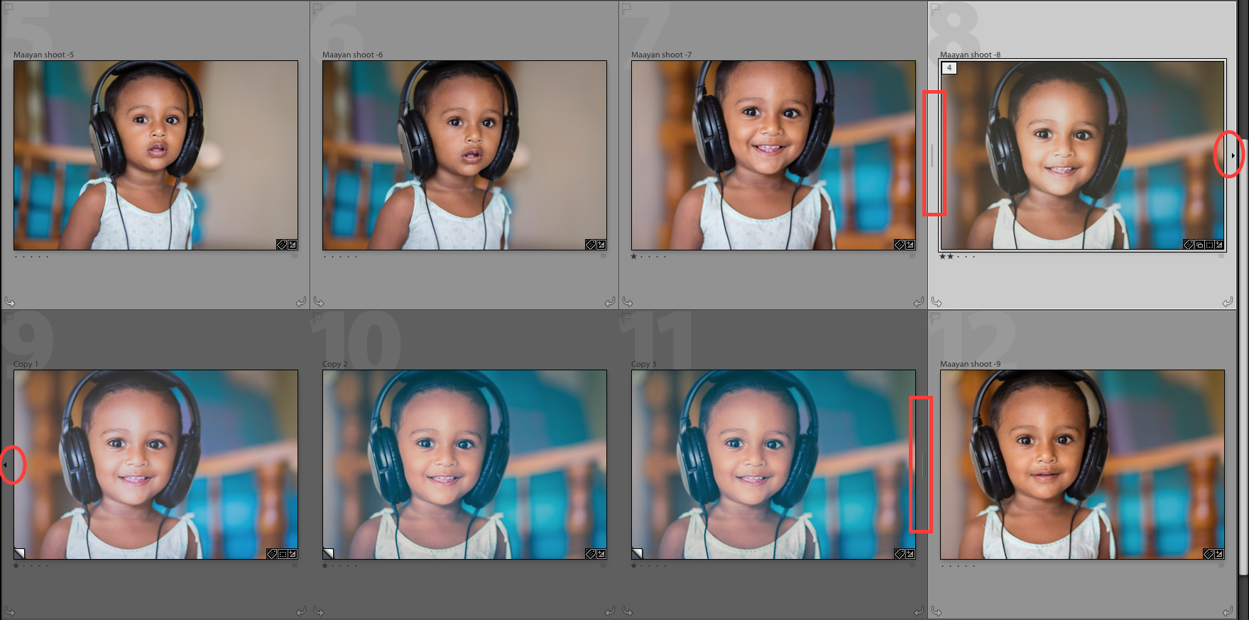
Select all the images that will be used. Shift+click the first image and click on the last image in order to select all the images.

If your images are not in sequence, (cmd+click on the mac or ctrl+click on the PC) on each image to select them.

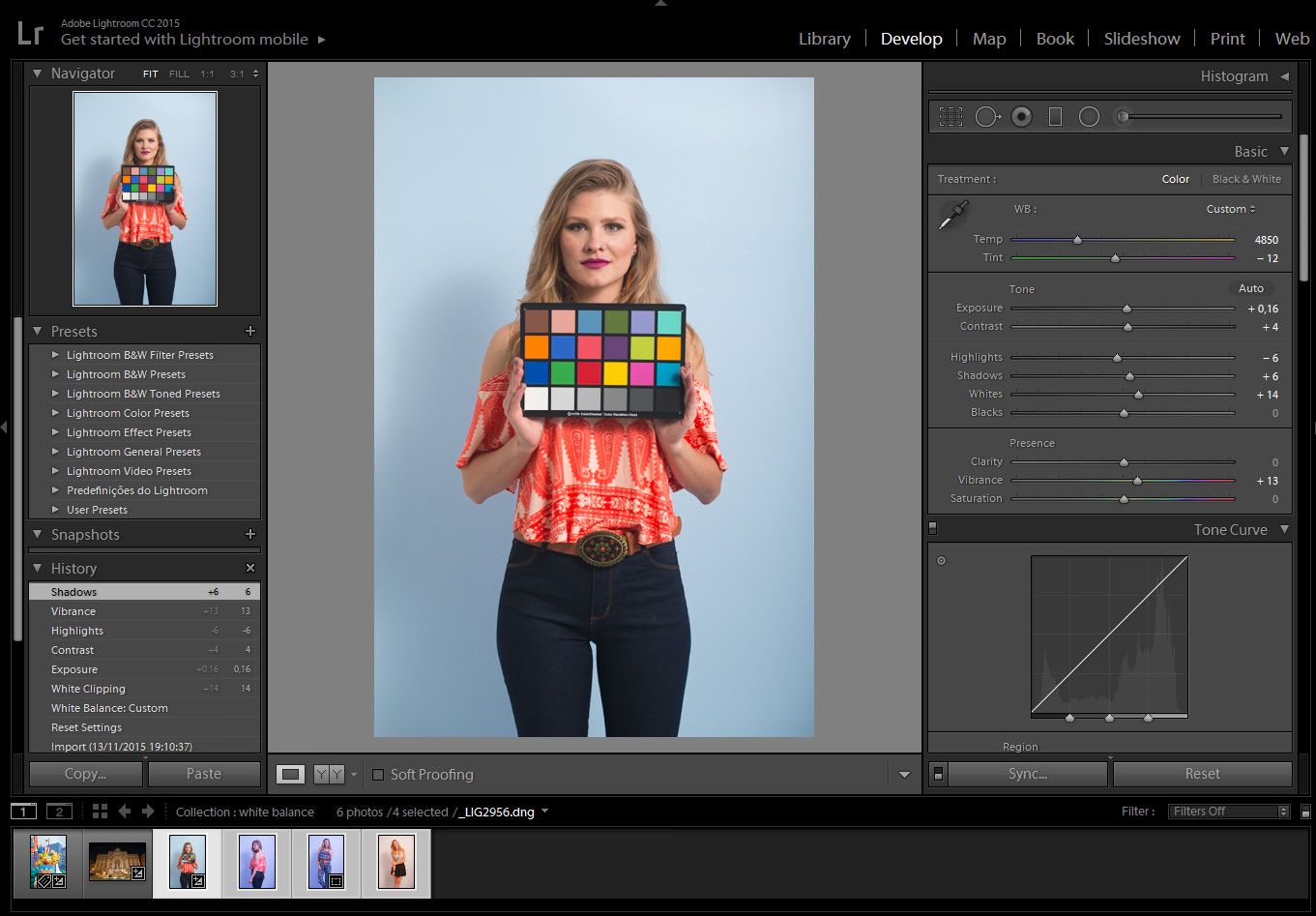
There is no need to adjust your images on the Develop Module at this stage. We will do it afterward, on the final image.

photomerge-panorama02

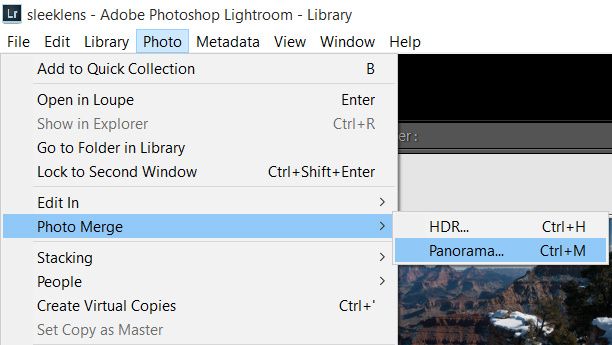
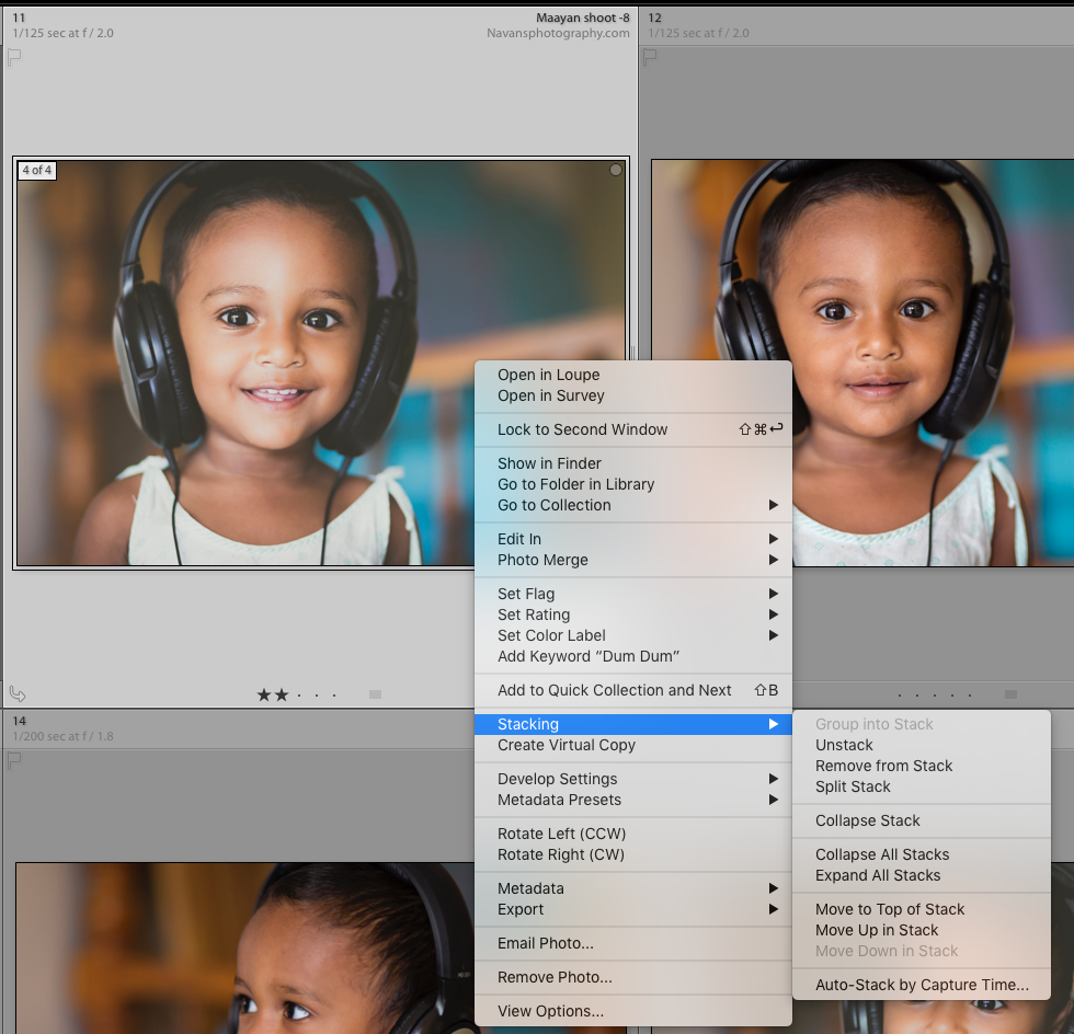
Step 4 – Merge the images 

After selecting the images, go ahead and merge them together.

Photo / Photo Merge / Panorama (cmd+M on the Mac or ctrl+M on the PC)

pano_autosphe

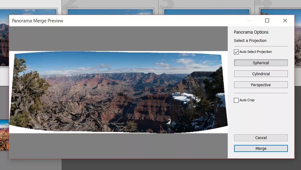
Panorama Merge Preview box will appear.

  • Auto Select Projection: Lightroom will choose automatically which projection fits better.
  • Spherical: The images will be aligned and transformed as they were inside a sphere. Best for wider or multi row panoramas.
  • Perspective: The images will be aligned and transformed as they were mapped to a flat dimension. Best for architectural photography.
  • Cylindrical: The images will be aligned and transformed as they were inside a cylinder. Best for wide panoramas, but with straight lines.
  • Auto Crop: The white edges will automatically be cropped. You can also crop it later on even crop it inside Photoshop, that way you can recover these white areas.

click Merge after the best settings are chosen.

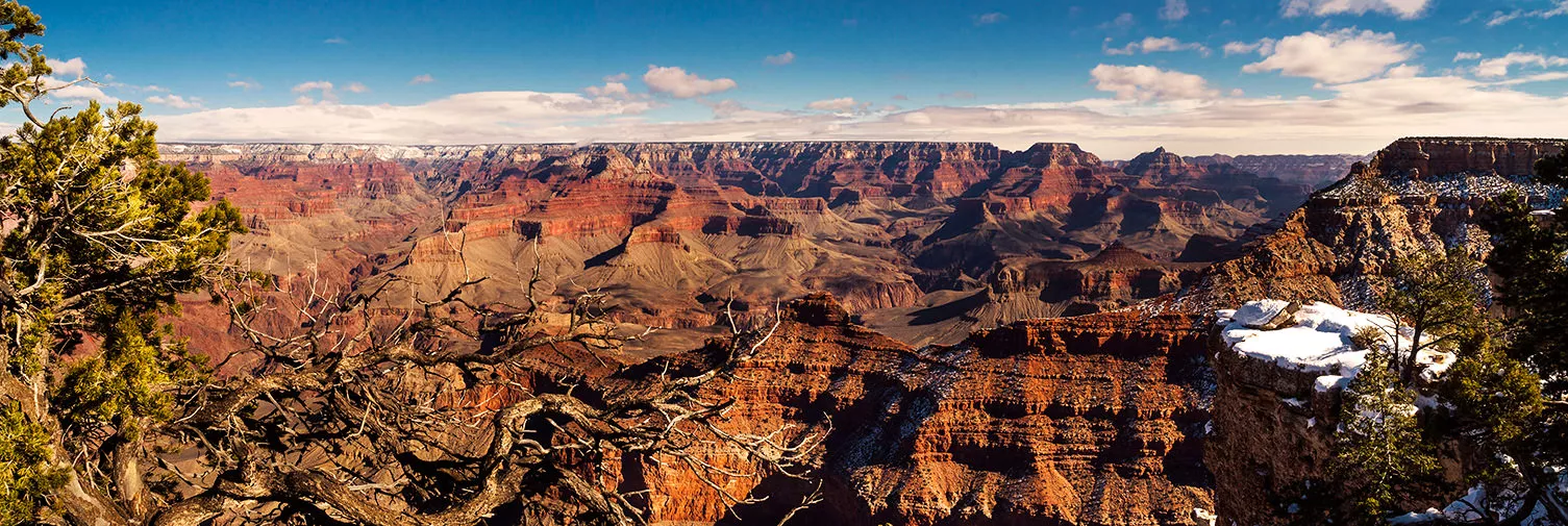
After that, Lightroom will render all the images together. Depending on your machine it may take some time to do the renderings.

newpano

Step 5 – Adjust the final stitched image

The neat thing is that Lightroom creates a brand new RAW file, that means that you will end up with the maximum capability to edit your image.final01

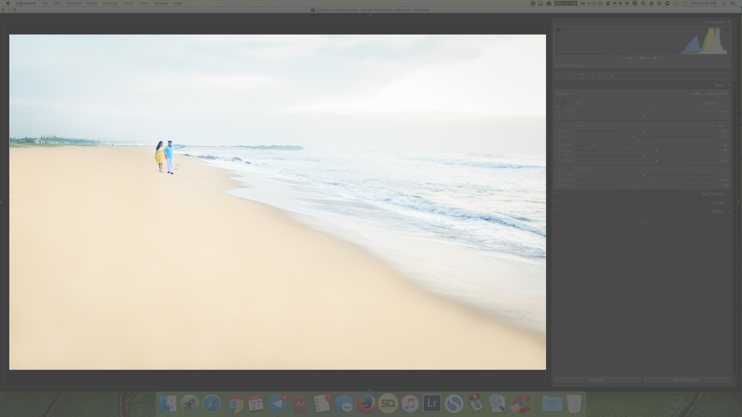
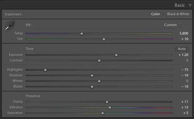
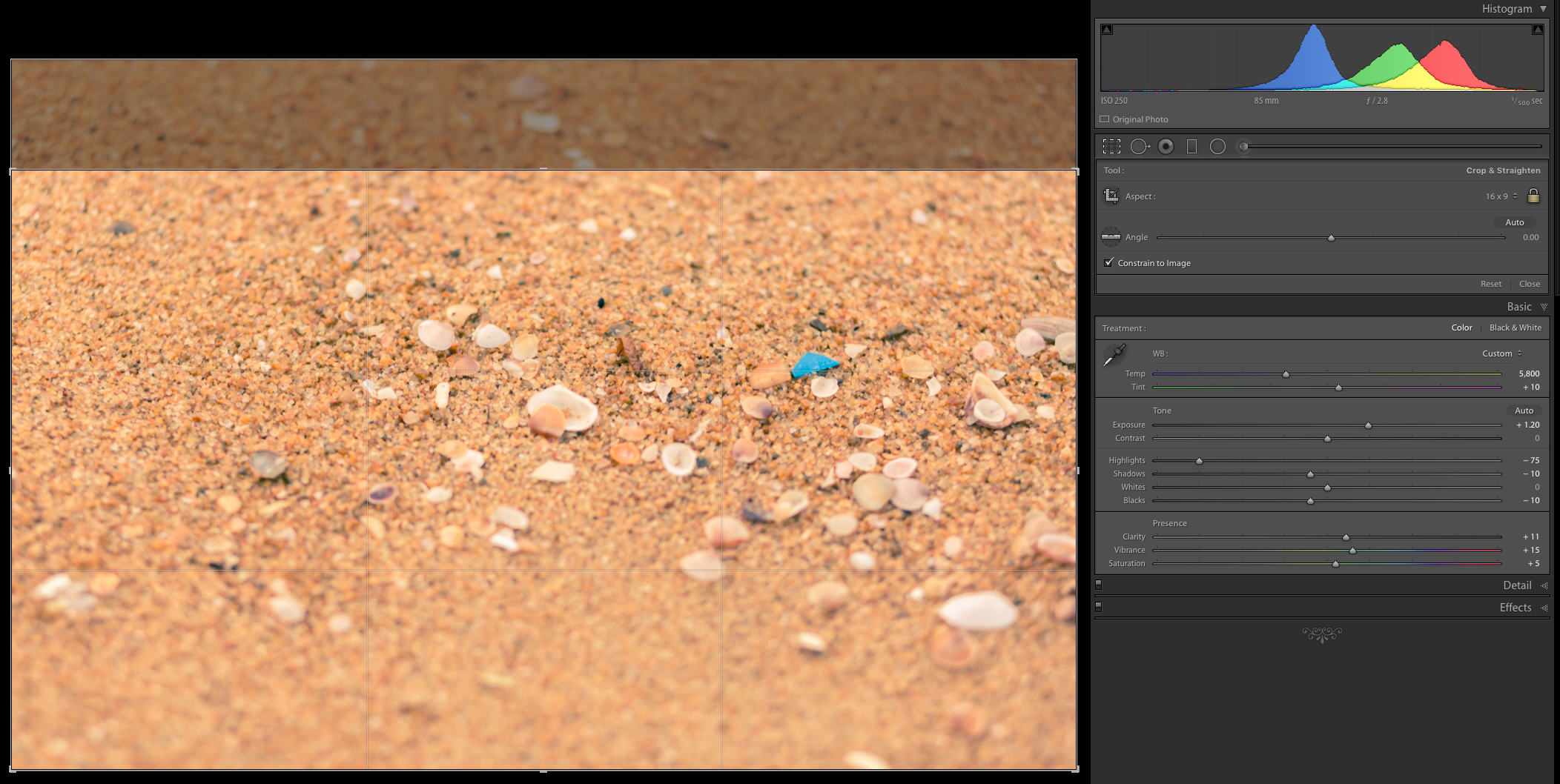
Select the new file and adjust it on the Develop Module as you would normally do in any other image.

In the end, you will end up with a nice panoramic picture.  So, did you enjoy our tutorial?  You may want to check on other tutorials such as How to Correct White Balance in Photoshop and let me know if you find it helpful.

final02

You can watch this helpful video to learn how to make a panorama photo in Adobe Lightroom. This feature has been there for quite a while much like the HDR feature and they were kind of added at the same time. The feature is super easy and does a very good job of stitching together all the images no matter how many you have.

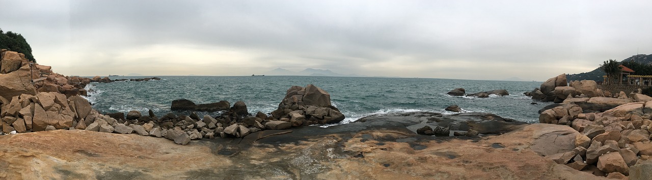
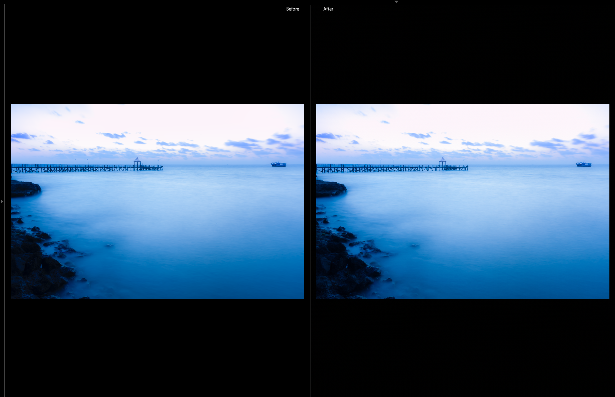
As we begin, you can see that we have eight images at the bottom which I took. These are almost 180 panorama and this was handheld since I did not have a tripod with me. As such, it’ll take a little bit more work for the program to go ahead and stitch them together. This is also a very tricky scene since as I was taking the image, the waves were constantly moving so it’ll also stitch those as well.

To get the panorama, I will highlight on all the images, right click on them, and then choose “Photo Merge” and then Panorama. This gives us a final rendering for the preview and it is clear that this is a little bit low quality and this is just to give Lightroom a little bit easier time to mess with it since it has many pixels to play with especially with eight photos.

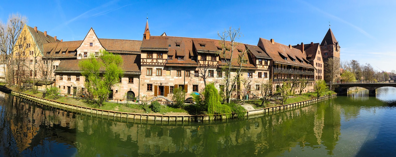
We have several projection options to work with including spherical, cylindrical and perspective. The spherical was great for a wide panorama especially that transitions into objects that are kind of in the frame and so it’ll be the best one for the image we have because of the sphere that we have on the bridge. Cylindrical is kind of has the same effects as spherical but does a better job in making vertical line stay straight. However, we are interested more in the horizontal lines than in the horizon of the image, as this makes spherical much better. On the other hand, perspective is mainly suitable for real estate and architectural stuff as it seeks to do a lot of distortion.

We will, therefore, stick with the spherical projection. We have a couple of features such as auto crop which takes away the white space and kind of automatically crops it in so you don’t have to do it later. We also have boundary warp which is a new feature in Lightroom and kinds of take all the white features and stretches the image to try and fill out spaces in the image. We will use the boundary warp and increase the cover size to 100 and this fills in space very easily thus giving us an image that is perfectly fitting in the available space. We can opt to reduce the numbers and then do some cropping but this will mean going back into Photoshop to try and fill in the spaces.

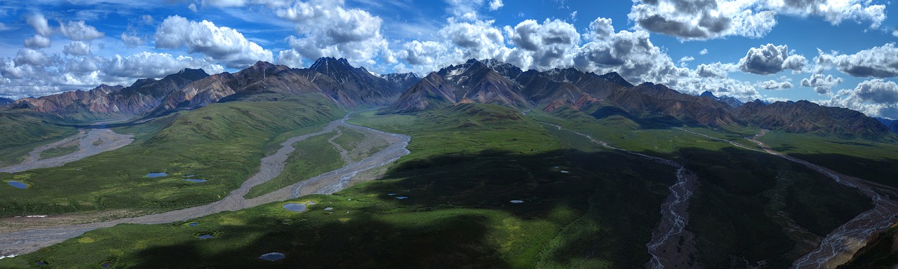
With all the white spaces filled, we will click “Merge” and wait for the program to put all the images together. Once done, we will have an extra image on top of our initial eight. This is the panorama image which looks great and everything is stitched together perfectly.

The next step will be to fix some of the distortions which arise when we shoot panorama images especially if you have them handheld. To fix some of these distortions we will go to Lens Collection and enable for Profile Collection and then go to Transform and try auto to see whether it’ll collect things for us. However, this only does some minimal collections and therefore we will need to play around with the distortion. We will, therefore, go back to Lens Collection and try playing around with the distortion so as to get some straight line. We will need to change things such as scale, aspect, and the rest until we get the best results possible.

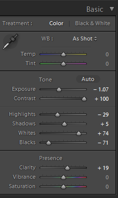
This done, we can go ahead and do the fun bit of changing the effects including the shadows, highlights, vibrancy, clarity and temperature to make it look like a sunrise. Once this is done, we will have our panorama image which includes all the eight images combined into a single image. If we want a large image, we will have a lot of data to play with. We can even crop this image to make it narrow one or crop parts of it to make different size photo print if we want to. All these will come out looking perfect since we have all the data to play with which is a combination of the eight images we had. This is the beauty of making panorama images since you have different cropping aspects and know that your image will come out very clear because of the data you have.

You can check more of our Lightroom tutorials as well as Lightroom Presets and Photoshop Actions to help you do your post-processing edits in an easy and remarkable way.

How to Shoot Portraits at Home

In this text, I talk how to do home portrait photography when without proper studio gear. I once faced a situation where I was asked to take a profile photo of a professional with short notice and I had no studio equipment available. Here is my workflow for that kind of situations. It is basically by the book, i.e. I follow the basic guidelines with no secrets or magic here, or maybe just a little with post-processing.

1. The Light

First and the last thing everyone talks when teaching photography is lighting. It is so important that some photographers even first look to find a great light and after that, they start looking something to take a photo at. In order to take a great photo, you need great light. So, at home, you need to look for the best light available, and that will be the big window on the sunny side. If you live in the Nordic country and it is a period of polar night approaching, you need to use that window when the sun is up that brief moment, if any. There are lots of setups how to use light, but in a standard setup, you set your subject sideways by the window so that the window is mostly on the front side of the face. You may want to achieve the “Rembrandt triangle” on the shadow side of the face. If window light is too harsh, you may move your subject further away or use some diffusor on the window. In the example photo below I had white almost transparent curtains covering the window to soften the light during home portrait photography.

Natural Light Portrait Example 2

The window light may be enough, but if you are not looking for too dramatic shadows, you can improve the quality by filling the shadow side with some light. This can be achieved in multiple ways. Some reflector can be used. If you do not have a proper photography reflector you can use any white surface; cardboard, white sheet or anything. In the example photos, I used a reflector with silver coating. Silver coating seemed to match the light coming through the white curtains better than reflector with gold or half gold. I set the reflector right next to subject as close as possible to reflect the light from the window to the shadowy side. You need to have the reflector in front of the subject and not totally on the side or otherwise you will lighten the ear and the back of the head. We did not have any assistant available so I set the reflector leaning against a chair that was standing on the bed.

If you have off-camera flash available with some diffusor or softbox you can, of course, use that to fill the shadow side. But be subtle not to flatten the image too much. You can also use on-camera flash if you are able to turn it backward or sideways to reflect via the walls. But this depends on a lot on the room and you need to be careful not to create extra shadows.

2. The Background

A good photographer always checks the background first before concentrating on the actual subject of the photo. To get good portraits at home you need to find a good background, which usually is a plain wall without anything on it. The tricky thing is that you need that background to be near to the best light. I have two good windows for indoor portraits at home and to utilize the other one, I need to remove one painting from the wall. The background is an important factor that makes professional photographers different from beginners. For each and every photo, you need to check the background and get as little distraction there as possible. The color of the background matters also, but that is a discussion of its own.

Natural Light Example 3

3. The tricky part: the right pose and facial expression

It depends a lot on the person how easy it is to get a good facial expression. For some people, it is just “smile” and “click” and that’s it, but for most of the people you only get that awkward Chandler-smile (check from Google or YouTube). If you are not working with a professional model that can make a good face with minimal guidance, this will be the tricky part. What kind of expression you want depends also of course on your goal and your subject. For a company executive photo, you need to get that trustworthy smile, for heavy metal guitarist, you may want to get that murderous look. A teenage girl may want that (in?)famous duckface look.

I usually start with getting the pose right. For normal home portrait photography, you want to turn the shoulder line a little bit diagonal towards the camera. Then you need to get them sit straight and bear their head up. If you take the photo lower than their eyes they look more majestic and more authoritarian. If you take the photo little higher than eye level you get their eyes look bigger and there is a bigger change to diminish the possible double chin. This is also the right position if you are taking that duckface photo. If you get your subject to lean little bit forward you can get more attentive and personal looking photo. Leaning forward also diminishes possible double chin.

When I get the pose right I take a couple of photos without asking for any facial expression. This is also the time to check that your camera settings are right and that you get the correct exposure. Then I ask the subject to smile and I take a couple of photos regardless how awkward the smile is. Do not tell them! At this point praise how good photos you are getting. At this point, they usually get more relaxed and confident as they think that you already have the photo. Do not tell them if you do not have the perfect one yet. Then I usually use a little trick: I ask them to do something crazy. Stick tongue out, roll their eyes or anything crazy. If you get a smile as a reaction to your suggestion, capture that! If you get that crazy look, capture it. (That may be priceless.) And be ready to take a photo right after the crazy face when they usually do that natural relaxed smile. That is the one I am aiming for. The crazy face exercise is just a distraction to get them relaxed and to trigger the smile. There are of course other strategies to get the right expression, like the one the famous Cartier-Bresson is said to have: just wait until there is the right expression.

It is also a good advice to take photos when the subject is actually not posing for a photo. Like the leftmost example in the beginning of this text. Some people are just natural talent, like the boy below.

Natural Light Example 3

4. Post-processing – where the magic happens

Something which non-photographers may not realize is that nowadays almost every photo published by professionals are processed with a computer. There are zillions of great photos on Internet and people are so used to see processed photos, that if you want to make your photo pop-out, you need to get the final edge via post-processing it with the computer. Post processing is where you update a good photo to a great photo. Nowadays the skills on post processing are one essential factor that makes the difference between just ok photographers and the great ones.

The amount of processing depends on your goal. For beauty magazines and advertisements the amount of processing seems to be nowadays unnatural. For normal portrait photo without any artistic effect, you want to do only some subtle adjustments so that the person in a photo does not even realize what kind of tricks you have done with the computer. There are lots of tutorials how to retouch your portraits and how to do e.g. some facial contouring. You may sharpen and brighten the eyes or even do some more advanced enhancing of eyes in Photoshop. You may also smooth the skin a little, adjust color vibrance, lighten the shadows if needed, add some clarity to the hair, check the lip color, whiten the teeth (but just little if you are not doing a Pepsodent ad).

If the photo is going to Internet, nowadays the trend seems to go towards the more high key type of photo, i.e. you may want to brighten the highlights and shadows quite a lot compared to a normal natural looking documentary photo. You may also want to add some vignetting to the background. You also need to crop the photo. This is actually one of the most important things in post processing. You want to have the position of the subject within the frame to be perfect and that is done by cropping. I usually take the original photo too wide framed to have more room for post processing decisions about the final crop. There is an advice around that if you want to improve your photos, go closer. That applies to post processing also; It usually helps to crop tighter. If I have the feeling that there is something wrong in the photo, or something is missing, is usually try to crop tighter. Nowadays it is completely ok to cut off the top of the head. That gets a more intimate feeling on the photo, just like leaning forward. See the rightmost example photo.

Below is the final photo, which was taken according to the original request. The three photo series on the beginning of the blog text is my own vision, which we took right after the photo below was taken. Other photos in this article are more of my examples of photos taken in front of a window without artificial flashes.

IMG_2608_mini

Portrait Photography Tips and Tricks

Need some tips for your camera settings? Ok, here you go. Use as low ISO as possible. If you want to have whole head sharp, use something like F11 and adjust shutter time accordingly. If you are shooting without a tripod you do not want to go to longer than 1/80 or 1/60. I usually do the portraits without a tripod to be able to adjust the position and angle quickly. If you do not have enough light or if you want to get more focus on eyes, and blur ears little, go to lower F value. You can even go to 2.8 or lower if your lens allows. I usually set ISO to 100 and start with aperture priority mode with F8-2.8 depending on the light and the effect I want. If I want to have more control and do more adjustments then I switch to manual mode.

How about focal length then? That is really a topic of its own. Some people prefer 200mm. Sometimes 80mm is referred as portrait lens. If you check portraits on Peoples magazine or similar you may be surprised to see that there is more and more portraits taken with wide angle, something like 24mm. So, to be on safe side, use anything between 70-200mm for normal portraits. For beauty photos go towards 200mm. If you want to get more character out, go towards wider angle.

The Value of Window Light in Portrait Photography

The concept of light can be intimidating, especially for beginners. Even if artificial light isn’t in the picture, the natural light might seem exceedingly difficult to work with. If you look at it from another point of view, however, then you’ll see the beauty of light’s many personalities. No matter where you are, be it in the safety of your home or out in nature, you’ll encounter countless opportunities to work with unique lighting situations. Throughout a single day, it’s possible to find a plethora of photo-worthy spots where fantastic, well-lit portraits can be taken.

Window light is especially useful for beginners in the photography world. It can be very uncomfortable to openly shoot outdoors when you’re not confident in your new found interest. When I discovered photography, I didn’t dare to photograph in public for fear of being thought of as an unfit artist. Though my fears were irrational, they were also an understandable reaction to a lack of skills. If you can relate to this or any other form of shyness, anxiety, or overthinking, then you’ll find much comfort in knowing that shooting great images indoors is very possible. Once you familiarize yourself with your creative skills, your confidence will naturally increase.

//

You might think that windows are too simple. Though they may be limiting to a certain degree, working with them right at the beginning of your photography journey will help your imagination thrive rapidly. The more challenges you face as a beginner, the easier it’ll be to find ways out of seemingly impossible artistic situations. If your mind gets used to finding solutions no matter how large an obstacle is, you’ll gracefully navigate through potential future difficulties such as unsuccessful photo shoots and technical issues.

In addition to strengthening your patience, experimenting with window light will allow you to appreciate the power of limited light. Oftentimes, we seek open locations and perfectly lit spots which guarantee beautiful results. Finding comfort in a lack of light will allow for interesting compositions, which will, in turn, allow for even greater portraits when you do shoot in locations with more light.

//

If you don’t know where exactly to start, simply stand in front of a window. If you’d like to take photos of someone else, it would greatly help to have a test shoot with yourself beforehand. A test shoot will allow you to understand the way light embraces facial features from different angles. Simply take photos of yourself from different positions and angles; this will strengthen the relationship between you and your camera. When you have a shoot with a client or a friend, you won’t be overly confused about light’s interesting ways of working. Furthermore, you’ll be more familiar with self-portraiture, a wonderful genre that encourages self-reflection, vulnerability, and creativity.

//

On days when the weather isn’t at its kindest, window light can be just as useful. While harsh midday light will compel your subject to squint, milder light on overcast days will provide a mild glow. If you want to make window light stand out even more on such days, use a reflector. This will serve as an extra source of light, brighten your subject’s face, and give their eyes an extra sparkle. My favorite kind of light is one that hits half of a subject’s face, creating a portrait that is reminiscent of 18th-century paintings. Windows make this effect very easy to achieve.

If you’re shooting indoors on a particularly bright day, curtains will come in handy. In addition to softening the harsh light, curtains will cast stunningly intricate shadows on your subject’s face. This will not only give you many ideas to work with, but it will also provide you with refreshing and dreamlike decorations. In portfolios, such photographs stand out beautifully. Don’t be afraid of using other kinds of fabric for creating shadows, too.

//

Window light possesses far more potential than most people imagine. Its versatility can satisfy photographers with all kinds of preferences. Whether you’re in the mood for a soft, harsh, or dreamy light, a window will provide you with the ideal environment for your shoot. If you take advantage of this easily accessible light, you’ll be one step closer to being a more open-minded artist and thinker. If you make the most of your imagination, you’ll find yourself thriving along with your photographs in no time.

Happy shooting!

How to Fix Overexposed Photos in Lightroom

We’ve all been there: attempting to capture the heart of a photo shoot in a limited amount of time, coming home with a heart full of wild excitement, and being disappointed with the results. Maybe you shot on a sunny day, creating bright photographs that somehow managed to conceal your subject completely. Perhaps you shot during the golden hour, resulting in beautifully warm – yet unbearably bright – images.

Photographer friend, I have some good news for you: fixing these lighting errors is possible using a number of editing programs. The program we’ll be focusing on today is Lightroom. After installing the Lightroom presets, you will see that Lightroom presets is filled with a plethora of handy little tools like exposure, highlights, shadows, clarity, and more. These tools – which can be altered by using sliders – can fix both dramatic and minor issues. If you’re refusing to share one of your favorite shots due to overexposure, the tutorial below will help you fix your dilemma. In no time, you’ll be able to find potential in photographs that, at first glance, seem impossible to fix. This will give you more opportunities to add great photos to your portfolio and make your shots less stressful.

//

Before you begin, it’s very important to remember the power of shooting in RAW mode. The value of RAW lies in the amount of image data it collects; JPEG stores less image data, resulting in photographs whose quality isn’t the best it can be. Thus, editing RAW files enables the photographer to alter things dramatically without instantly ruining the overall quality. When it comes to images that are too bright or too dark, this is especially valuable.

Preset-loving folks, please keep this in mind: In Photoshop, it’s possible to use an action after editing your image and not lose any of the minor details you fixed. In Lightroom, however, this is possible but not easy to achieve. When presets are applied, any changes you made before the application are completely altered to fit the preset’s inbuilt adjustments. To avoid losing precious work, apply your desired preset first and then work with the sliders. This will save you a lot of time and frustration.

Now that you’re aware of these points, let’s begin!

The Basic panel contains the most important sliders – if you were to use only those during the editing process, you’d get an abundance of great images. Imagine how wonderful your work can be if you master the basics, apply stunning presets, and understand how to use Lightroom’s other panels (such as Tone Curve and Split Toning). It would be great also if you could master how to remove blue cast photos in Lightroom.

//

  • Exposure: dragging the slider to the left will darken your image significantly. Use this tool carefully as it will affect every part of your image. Of all the sliders, exposure is the most sensitive to changes. Keep this in mind as you experiment with it. Since the eye isn’t always sensitive to small changes, use the before & after tool as often as you can.
  • Contrast: this is as important as exposure, though playing around with it won’t result in overly exaggerated shots (especially if your photograph is very flat). Even a contrast of +100 could work! Drag the Contrast slider to the right until you’re satisfied with the results.
  • Highlights and Whites: the brightest parts of your photo can be fixed using these sliders. Blown out highlights in photos can be softened by dragging the highlights slider to the left. To help your shot reclaim its beautiful contrast, increase the whites by dragging the slider to the right. This will help maintain a balance and prevent any clipping from happening. (Clipping is the loss of image data – this is common when working with photos that require much editing.)
  • Shadows and blacks: to recover the strength of shadows in an overexposed image, drag the shadows slider to the right and the blacks slider to the left. Similarly to the previous point, this balance will get rid of unnecessary clipping and let your image naturally stand out.
  • Clarity: if you feel that your image has the potential to look even better, increase its clarity. Too much clarity will result in very unnatural looking photos, so be careful as you drag the slider to the right.

Once you’re done with the basics, feel free to experiment with other panels. Now you’re ready to make the most of any shoot, no matter how bright it may be outdoors. Be proud of yourself for learning something new!

//

Happy shooting, and don’t forget to never stop learning.

Photomerge Secrets in Photoshop

Panoramic photos give viewers the surprising sensation of looking at an actual view rather than a flat image. These wide images engage peripheral vision and give a depth, unlike any other photographic style. To get these stunning visuals, however, photographers have to master photomerge. Although the function has many uses outside of regular panoramas, it’s best known for connecting many separate shots of the same, horizontal view.

Photomerge can also compensate for restrictive lenses and limited views. If a photographer can’t fit an entire beach-lined cliff into a single shot, they can take a number of photos that can be joined together in post-production. Photoshop’s photomerge is versatile and necessary in the age of digital photography, but it can be frustrating. A few tips, tricks, and secrets can make the process easier.

beach panorama

Organize Your Images

The biggest and easiest photomerging mistake to make is to not organize your shots before beginning the process. Photo order is everything. Without it, you’ll get a jumbled mess. It’s a lot of wasted time and a headache waiting to happen. The secret to avoiding 90 percent of your issues when merging photos is to take the time to check and double check your image order at the very beginning.

Not All Settings Are Created Equal

The different merging functions in Photoshop create extremely different images. Many will warp your images to make them fit together, and others will leave choppy edges that need to be trimmed out during a later step in post-production. Depending on the scale, number, and orientation of the photos, many of these settings will turn out very poorly. Some, such a spherical, only work in certain conditions, and few stay true to your intended perspective. This means the auto setting isn’t always your friend.

warped photomerge image

Experiment with all the different settings so you understand exactly what they do. Ideally, run the same set of photos through each setting for the best comparison of the differences between settings. Everyone’s tastes are different, but you’ll be able to clearly note which settings heavily distort images (perspective, cylindrical, and spherical) and which generate the fewest changes in your source material (collage, reposition). Remember, the setting makes the image. You don’t want to have to worry about fixing distorted images in post.

Uniformity

There are two easy ways to make your separate pictures blend seamlessly into a unified whole. Once you’ve organized your images and selected your optimal setting, stop to select a few additional options. First, use blending. By checking each Blend Image box, you give Photoshop the power to automatically adjust for exposure discrepancies, color variation, and other slight differences that would disturb the final image’s uniformity.

photomerge blending

Vignette Removal is your second tool. Shadows occasionally creep into your shots, especially from things like the lens hood. Vignette Removal adjusts the image to compensate for those dark spots. It effectively erases them, so you don’t have multiple camera hood shadows across your panorama.

Manual Corrections

As we’ve mentioned before, auto settings will only take you so far. If you want to get the absolute best results from your merged images, you’re going to have to dig into the more detailed settings. This process begins before you even order your photos. Try making images as similar as possible before merging in order to prevent loss of detail.

Start with something simple, like exposure. Lowering exposure while increasing recovery will boost fine detail. If the shadows get too dark, adjust the fill light bar. Use this three-step process on all the images you plan to merge. The color and exposure may not be exactly the same across the board, but you can eyeball your shots well enough to prevent the Blend and Vignette functions from going overboard. This should even save you time when you sit down for final edits.

Accept that There is No Perfect Merge

The ultimate secret of any photography tool is that it cannot produce a perfect image, especially not through automatic settings alone. The good news is, Photomerge isn’t the only feature in Photoshop. Once you have your merged image, it’s time to get serious about cropping.

photomerge cropping

Even though you may have blended five or six images, you may discover that it’s really the combination of one, two, and three (with a sliver of four) that have the best composition. You can’t know what a merged image will look like until after the process is complete, so don’t be surprised if you end up taking fewer pixels from the final merge than you expected. Crop well, crop thoroughly, and don’t feel bad about leaving a lot of image on the chopping block.

Photomerge is all about preparation, careful selection, and lots of cropping. You may not be able to get it right the first time, but by taking control of automated functions like Blend, you can improve your results. You can make the final image even better by performing some basic editing before you merge. In the end, don’t be afraid to crop. Photomerge is only one step in post-production.

How to Master the Clone Stamp Tool in Photoshop

The clone stamp is among one of the most useful tools in Photoshop. It paints a sampled pixel of an image, allowing you to manipulate the photo in a very creative way. The clone tool is beneficial when it comes to adjustments, such as eliminating blemishes and getting rid of objects that could serve as a distraction. It is also useful when it comes to duplicating objects.

In this Photoshop tutorial, we’re going to show you how to use cloning to get rid of unwanted objects in your photograph, as well as provide you with tips that will help you master the clone stamp tool. We’re going to be using the photograph shown below as a starting point.

clone stamp photoshop tutorial

How to Use the Clone Stamp Tool

1. Go to the toolbox in Photoshop and click on the clone stamp.

2. Pinpoint what you want to remove from the photograph. With our current example, we’re going to get rid of the painted freckles on the model’s face.

clone stamp

3. In order to get rid of the freckles, we’re going to use the clone stamp tool to sample her skin. Doing this will make her appear as if she never had any freckles on her face by replacing them with freckle-free patches. To use the tool, position your cursor to the area you want to clone and then Alt-click (Windows) or Opt-click (Mac). Try to match the skin you’re cloning as best as you can. Choose an area that is close to the spot you want to replace and has the same color tone.

alt click clone stamp

4. Take the cursor and click on the freckle. The clone stamp will remove the freckle and replace it with the skin we’ve cloned. Perform this process for each freckle.

using photoshop clone stamp

5 Tips to Help You Master the Clone Stamp Tool

Now that you understand what the clone stamp tool is and how to use it, here are some tips to help make your experience with this fun tool a little easier:

1. Work in a New Layer: Working in a new layer is always important when you’re working in Photoshop. Most of the time, it’s a process when it comes to crafting the perfect photo, and the clone stamp tool can be a bit tricky if you’re not careful. However, once you’ve master this tool, it’ll become your best friend. Working in a new layer helps when you’ve made a mistake. A new layer doesn’t disrupt the original photo, so you can always go back to fix it. Remember, you can flatten your image when you’re done.

photoshop new layer

2. Zoom in on Your Photo: In Photoshop, you always want to make photos look realistic. Zooming in on your photo is important because it allows you to look at the fine details. This is especially important when it comes to using the clone stamp. The clone tool will help you match colors in your photo as accurately as possible. However, most photos have a varying range of colors due to highlights and shadows. Zooming in will ensure that you can effectively use the clone stamp by allowing you to see the different range of colors from the best angle.

3. Set Your Brush Size: Setting your brush size is an integral part of effectively using the clone stamp tool. One issue you can face is having a brush that is too large. If your brush is too large, it will clone areas that don’t actually need to be cloned, causing the photograph to look disfigured, discolored, or unnatural.

brush size photoshop

4. Set Your Brush Hardness: Like your brush size, the hardness of your brush plays a key role in truly mastering the clone stamp tool. Your brush hardness will determine how the cloning will blend. For instance, if you set your hardness to 100%, your edges will be hard and defined. Similarly, if you set it to 0%, the edges will blend. It’s better to start with a softer brush to make subtle corrections to your photograph and move up as needed.

5. Resampling: Anytime you’re using the clone stamp tool, you want to be sure to resample often as this will ensure that you don’t leave a seam where you replace pixels.

clone stamp final image

Clone stamping is a fun and creative tool that will enhance your post processing experience. Many photographers use the clone stamp because it is helpful when it comes to skin retouching, getting rid of distractions, and duplicating objects. We hope that this tutorial has provided you with an easy way to master the clone stamp tool so that you can continue to take your photography to the next level.

Last but not the least, you can learn here how to cut someone’s hair out of a picture using photoshop

How to Create a Portrait Sequence in Photoshop

A portrait sequence can be an excellent gift and can be used to capture fun memories of loved ones. The best part is that you don’t have to do anything extra during your photo shoot to create a fun and fabulous sequence of your child, pet, or best friend. A portrait sequence takes the best photos and poses you captured and puts them all together into one fun image.

Steps to Create a Portrait Sequence

The first thing you need to do is take the photos, so you have to organize a portrait photo session. The setup of these photos will affect the amount of post-studio work you need to do, but any series of photos can be used to create stunning images.

The best setup for creating a series of images is to take your photos inside a studio or at home, with the same lighting throughout, against a solid color background. This makes the editing process a lot easier and a lot shorter. For even better results, try to set the lighting up to match the tone of your subject. If you’re portraying the joy of childhood, you want the lighting to be even across the board, set far away to lighten up the whole image. If you’re photographing a more serious subject matter like grief, you’ll want the light to be closer to the subject, casting shadows to create a darker feel. However, even pictures were taken in changing light and inconsistent settings can still be turned into a portrait sequence.

The three images used for this tutorial were taken in a studio. The lighting across all three images is the same, but the background, while the same in all three pictures, proved troublesome in the process.

portrait-sequences-2

While the outcome of these images isn’t terrible, the repeated background and the white curtain make it clear that this is a series of three pictures shoved together instead of one continuous image. But, we can fix that.

Editing the Images in Photoshop

After you have the images you want to use, the first step is to create a large enough canvas to work on. Take the first image in your sequence and use the crop tool to enlarge the image out to the side. You’ll notice a line appear that divides the canvas into sections. Each line represents one image of the original size. Make sure you have at least as many lines as you have pictures.

After this step is complete, you want to make sure the background is one continuous image or color. I used the eye-drop tool to select the wall color and used that as a background. If your image has a lot going on in the back, use the magic wand tool to select your subject. (If you are having trouble selecting things, try messing around with the magic wand’s threshold. The higher the threshold, the more color it will pick up.)

portrait-sequences-3

Now that you have your canvas ready to go, the rest is simple. Take every other photo that you want to use and crop it down to just your subject matter. Use the magic wand to select any lingering backgrounds and fill them in with the color you chose earlier.

Then all you have to do is move the subject into the first image and place them side by side.

If you’re doing something that specifically involves a background, or that uses props, you may find the layer mask and cloning tools invaluable to your efforts.

portrait-sequences-4

You can use the layer mask Reveal All, to paint over the newly added picture but keep the background the same. Make sure your paint brush is set to the color black, and anything your paint over will be removed and instead reveal the background of the first image.

If, after you’ve finished moving everything, there is still an inconsistency in the background or one of the images, you can use the clone tool to reprint part of the image into another. This is useful if your photographing action shots, like a child playing in a leaf pile or a dog chasing a ball.

Whatever the end game is, be it creating a lovely memory of a passed relative or capturing the joy of childhood, creating portrait sequences is a valuable tool. They’re well worth the time and effort to make, especially more complex ones that involve backgrounds and props. After all the work is done, you can see the memories that you’ve captured all in one, concise image that tells a story.

Batch-Process Cleverly on Lightroom

So, remember all those times when you come back home from a shoot with a hundred shots with varied light set-ups? Remember, struggling and pushing to process all those beautiful shots one by one? Will I make your day better if I told you how to cleverly batch-process these images? Maybe, yes.

So, the easiest way to processes your images without consuming too much time would be to split them into batches. When you go for a wedding shoot, or some indoor event, you end up with over hundreds of images in varying light set-ups. So what you can do is split these images into batches of 5 or batches of 10 and apply a setting/edit common to all these selected photographs.

Ideally, a “shoot” indicates that you’ve used various lenses, applied different ISO speed settings, etc. And different images look different depending on the kind of light that got reflected in that moment or depending on the kind of colours that got captured in that particular moment. So how do you cleverly segregate these images into different batches? How do you figure out which ones to group together?

The fundamental idea is to choose a set of photographs where you can apply a group of similar settings. Follow the steps below to make your work progress a lot faster, easier, and a lot more efficient.

Step – 01

Choose a set of photographs (it can range from a set of 4 photographs to almost 20 photographs), this is what we call a “Batch”. Start correcting the first photograph in that set – adjusting Exposure, White Balance, Tint, Tone curve, Sharpness, etc. Remember, you’re going to apply all these settings later to the rest of the batch, so make sure that your corrections will apply similarly for the remaining images as well.

Screenshot 2016-07-19 13.37.35
The first three images are the ones I’ve combined into a batch for similar processing.

Tip: Do not make major adjustments with the local correction tools, as this might vary from one image to another. What you correct for one image might not apply to the next, even though you’ve grouped them all in the same batch.

Step – 02

The next step is to copy the develop settings from the first photograph, and paste them to the rest of the images in that particular batch. Or alternatively, select the first image, press and hold the ‘Shift’ key and select the remaining photographs. Then, click on the “Sync Settings” button that appears on the lower right bottom of the Library Module.

Batch Processing – Synchronize settings.

Tip: Shortcut to Sync settings is Command + Shift + S

Once you click the sync settings button, a dialog box will open asking about the settings which you would like to copy to the remaining photographs. Make sure that you deselect all the local corrections, and select everything else. Remember, local corrections vary from image to image. So it is advisable to work on the images individually for those changes.  

Step – 03

Repeat the above steps 1 and 2, until you are done with all the photographs in the batch. 

Step – 04

This is the stage that takes up considerable amount of time. True, it depends on the number of images we’re dealing with and the kind of correction it requires, but this stage also calls for some care and concentration so we don’t go wrong.  All the local correction tools namely Crop tool, Adjustment brush tool and Spot removal tool shall be applied manually to each and every photograph in that particular batch. And there we go, you’ve now learned how to speed up your work process while cleverly using the batch process method.Just like how you copy paste the settings from one image to another, you can copy paste noise correction settings as well. The trick is to filter out your images based on a particular ISO setting. Use the filter tool, and filter out images with similar ISO settings. Let’s look at an example. Say, I’m looking for images with an ISO of 1600. Use the filter tool, and filter out all the images in my collection with similar ISO settings. Let’s say Lightroom provides me with a set of 80 images. What do I do no? Pick one image, apply noise-correction changes to this one image, and sync these settings to the remaining 79 images. Tada!

So, use the batch process method effectively, and reduce stress, time-consumption and make your work a lot more fun. We hope this article helped you out, and if yes, let us know about our experience in the comments below.

Local Correction Tools – Lightroom

Color correction is an art form that relies on your perception, experience, and interpretation of the image. We can do this correction if we have an installed Lightroom presets. The fundamental difference between Global & Local correction tools is simple:Global edits are the enhancements we make to the whole photograph.Global correction does apply the changes across all the pixels in the frame. Global editing shouldn’t be used to correct one part of an image, to the detriment of the remainder.Too often I’ve seen people adjust the white balance of an entire photo to try to achieve “perfect” skin tones. Not only is this quite difficult, it frequently makes the rest of the photo look strange. Good global edits are essential, but they don’t negate the need for local editing. Well-executed local edits are the difference between a nice photo and a great one.Whereas local correction tools apply the changes only based on the areas we choose to apply. Some of the Basic Lightroom tools and Photoshop’s Shadow/Highlight act locally and do not treat all pixels with the same brightness values as identical. Some of the Local correction tools in Lightroom  Presets are:
Crop tool(R)
Spot removal tool(Q)
Red eye removal tool
Graduated filter(M)
Radial filter(Shift+M)
Adjustment brush(K)

Local Correction Tools - Toolbar
Local Correction Tools – Toolbar

These tools are available only in develop module and are placed right below the histogram on the right side.

  • Crop tool ( R)
    Crop tool helps us to recompose the photograph that we have taken, to make it aesthetically better or to simply make it more pleasing to the eye. The kind of cropping we do, without a doubt, will vary from one photograph to another. Some might require minor corrections on the horizon while some others might require vertical alignments. Regardless, the crop tool provides the photographer with an opportunity to play around with the proportions, perspective, and the way a photograph looks ultimately. This tool plays a vital role in the post-processing of a photograph.

    Click the Develop tab at the top of your workspace. Locate and select the Crop & Straighten tool icon in the toolbar, which opens the options for the tool. Alternatively, press “R” on your keyboard to open the Crop & Straighten tool options. 

    The Crop & Straighten tools are often the first step many photographers use when editing photos in Lightroom. Use these options to crop a photo for Instagram, straighten crooked photos, or prepare photos for printing.

    Crop Tool features
    Crop Tool features
  • Spot Removal (Q)
    In the Develop module, select the Spot Removal tool from the tool strip, or press Q.

    The Spot Removal tool in Lightroom lets you repair a selected area of an image by sampling from a different area of the same image. It helps us remove dust speckles, insignificant or unnecessary elements from the photograph, remove skin blemishes, etc. On an advanced level, the spot removal might also help to us to remove certain elements from the photograph, like a person, overhead electrical wiring, etc. 
    The two spot removal techniques are Clone and Heal.

    Heal matches the texture, lighting, and shading of the sampled area to the selected area.
    Clone duplicates the sampled area of the image to the selected area.
  • Spot removal tool - features.
    Spot removal tool – features.
  • Red eye removal tool
    Red Eye will remove the red discoloration of a person or a pet’s eyes that can result from a camera flash going off. Unfortunately, there aren’t any shortcuts available for this particular Lightroom feature, but this is yet another vital tool when it comes to post-processing photographs. To remove a red eye from an eye on a photograph, you can use this tool to remove the red eye and to enhance the eye.
  • Spot removal tool.
    Red-Eye Removal Tool.
  • Graduated Filter Tool
    Graduated Filter Tool
  • Graduated filter (M)
    In the Develop module, select the Graduated Filter tool from the tool strip, or press M.
    The Lightroom Graduated Filter is a versatile tool for making local adjustments to your photos.This tool is a huge help for landscape photo retouch as it can be used to enhance the details from the foreground and the skies.
  • Radial Filter (Shift + M)
    The background or elements surrounding the primary object of your photograph can distract the viewer. To draw attention to the subject, you can create a vignette effect. The Radial Filter tool enables you to create multiple, off-center, vignetted areas to highlight specific portions of a photograph.

    In the Develop module, select the Radial Filter tool from the tool strip, or press “Shift + M”.
  • Radial Filter Tool
    Radial Filter Tool

    Adjustment Brush (K)

    The Adjustment Brush tool, literally, works like a brush. The changes or corrections get applied to those regions that you select or brush over. This is one the major advantages of this particular tool – make changes to specific areas or regions of the photograph. The Adjustment Brush tool lets you selectively apply Exposure, Clarity, Brightness, and other adjustments to photos by “painting” them onto the photo.

    In the Develop module, select the Adjustment Brush tool from the tool strip, or press K.

Adjustment Brush Tool

The adjustment brush tool combined with the graduated filter tool are a deadly combination. These two tools together have the power to create/produce magical outputs even out of the most simple photographs.

Lightroom is great for processing your photos and understanding how its tools work will help you use it more effectively. Use these features, play around with the tools and tell us about your experience in the comments below. 🙂 

Adobe Lightroom’s Rating System Guide for Beginners

When you have hundreds, maybe even thousands of images you need a way to sort through them that’s both quick in practice and set-up. Lightroom gives the photographer several methods of tagging / attributing images ready to be put into collections and you may find you have a preferred method or actually find them all useful. Whatever the outcome, this Lightroom’s Rating System tutorial will talk you through the various tagging methods as well as give you tips on why rating your images is important.Lightroom offers three different rating systems – star ratings, flags and colors. Star ratings are usually used to record the quality or value of the photo, with 1-star photos being poor, and 5-star photos being the best you’ve ever taken. Grading the photos gives you more information to help you find the best photos again later. The downside is if you’re indecisive, you could spend ages trying to figure out whether a photo deserves 2 stars or 3, and as your photography improves, your older 3-star photos might only count as 2-star photos now. But, you can always change the rating on a photograph, so you don’t have to worry about it much, now. Flags are much simpler, having just 3 states – flagged, unflagged or rejected. It’s quicker to decide whether you like the photo or not, so if you find yourself dithering between 2 and 3 stars, flags might be the ideal system for you.Colors are kind of open to interpretation. This gives you a lot of flexibility, but it also means that in order to get the most out of color labels you will need to develop your own system. For example, when you are finished with a photo and it is ready to export you could mark it as green. When there is a photo that you know you want to print you could mark it as red. Photos that need more work could be set to yellow. The colors can mean whatever you want them to mean, you just need to decide on the system that will work for you.These three options are collectively referred to as “Image Attributes”.

Why would you need this feature?

The answer to this question is simple. You need to use these features too:

  1. Keep your workspace organised.
  2. Easily sort through your library.
  3. Save a lot of time.
  4. Make your work a lot more friendly, neat and easy.
  5. Easily separate and tell the difference between specific shots in various ways.

How do you effectively use this feature?

First you have to install the Lightroom preset.  When you are in the library module of Lightroom presets, if you look near the bottom of the screen you should see the controls for flags, stars, and colors.Screenshot_2

Star Rating in Lightroom

Like I said before, an image can be given a star rating ranging from 0-5, with 0 being the worst and 5 being the best. It’s best to apply the theory that the more stars an image have the better you believe it is. This will speed up your work-flow and stop things becoming confusing when you’re looking back through your images. Rating stars can be set or displayed in any view of the Library module (Grid view, Loupe view or Survey view). There are multiple ways to provide star rating to your image(s):

  1. Select the photo that you want to rate, then choose Photo > Set rating and select a number from the drop-down list.  
  2. Alternatively, select the image you wish to rate and press a number from 1 – 5 on your keyboard to rate the picture.
  3. Hover your mouse cursor over a thumbnail and to the bottom left you will see 5 dots appear. Clicking on these allows you to apply a number of stars to the image. But please note that this method works only in the Grid View.

Tip 1: You can select photos and press ] to increase the rating or press [ to decrease the rating.Tip 2: You may find the Compare View useful when applying stars as this will allow you to compare two similar shots side-by-side so you can decide which one deserves the higher score.

How to Flag Photos in Lightroom

The main purpose of flagging photos is to help you know which ones to keep and which ones to reject. When it comes to flags each photo will be in one of three states: it can be marked to keep, marked to reject, or unmarked.

  1. The quickest way to pick or reject an image is to use the keyboard shortcuts:
    P – to pick an image.
    X – to reject an image.
    U – to mark an image as unflagged.
  2. Alternatively, you can select an image in Grid view or Loupe view, and mark it as any of the three ( Flagged, Rejected or Unflagged). Choose Photo > Set Flag > Choose any of the options from the drop-down list. This method works in any of the views (Grid, Loupe or Survey)

Note: Marking a photo as “Reject” will not remove it from the Library. They will simply be grouped as rejected photographs.

A flagged image.


A rejected image would have a flag icon with a cross over it. (top left of the cell)

Colour Labelling

Labeling photos with a certain color is a flexible way to quickly mark a large number of photos. Like I mentioned before, colours are open to interpretation. They can mean whatever you want them to mean, and you just have to identify a system that works best for you. Like the other two attributes, the colour rating can be done in a number of methods:

  1. Select the photograph that you want to rate, choose Photo > Set colour rating and choose a colour from the drop-down menu.
  2. Alternatively, you can also use the keys 6-9 to select a particular colour.
    the “6” key for red
    the “7” key for yellow
    the “8” key for green
    the “9” key for blue

Unfortunately, the colour purple does not have a keyboard shortcut. Press the same number key again to remove the colour rating. Once applied, the colours will be visible around the images.

An example of what a colour-rated cell would look like.

That covers three of Lightroom’s most powerful features for keeping your photos organized. The key is to decide on your own system and then actually use it by tagging your photos.

We hope this article is helpful in guiding you to maintain a clean and organized workspace. Leave a comment below and let us know about your experience. And if you’re interested about lightroom’s features, check our post about Lightroom Masterclass in Clarity.


Shortcuts for Lightroom’s Develop Module

Knowing some key shortcuts makes one’s job a lot easier and faster. It makes your work process faster and your job a lot more comfortable. In our previous article, we had discussed some key shortcuts to know while working in the Library module of Lightroom. So naturally, this article will focus on the next module- the one with a lot of action- the develop module of Lightroom. So, what is the Develop module? It is the part of Lightroom that lets you, literally, develop your image into one that looks magical and enticing. It is the part of Lightroom that allows you to process your image into something much better. So, knowing a few key shortcuts for this module will help you a lot in the long run.

View All Lightroom Develop Module Shortcuts

Like in the Library module, “Ctrl + Alt + /” on the Windows or “Command + Alt + /” on the Mac will take you to a window that shows all the shortcuts applicable for the Develop module only. This is helpful when you quickly want to refer the shortcut for a particular process.

Develop Module shortcuts.

Display Options

Some people don’t like the hindrance of a hundred panels on the left and right, while processing an image. So, is there a way to hide all those panels from view? Yes. TAB 

: Press the Tab key on your keyboard to hide the side panels from view. Press the Tab key again to view the panels.

: Press the F key to enter full-screen mode. Now, work without any disturbance!

: While working on the image, press the L key to dim the lights surrounding the image. This highlights the image area and helps you to view your progress better. Press the L key again to remove light completely from the surrounding area. And press the L key again, to bring the lights back on.

Dim lights . These settings can also be changed in Preferences.

Adjustment shortcuts for Basic Panel

If you are in the habit of using your keyboard in Develop module, then you should know some of these keys to control the entire basic correction panel only.
1. Press period (.) or comma (,) for selecting a slider (e.g., Exposure)
2. Then press plus (+) to increase the value and press minus (-) to decrease the value of the same.
3. Now press period (.) to go to the next.

Basic Correction Panel

Tip:

You can save any of the local adjustment tool settings as a preset which can be used for any of the tools. For example, if you are a portrait retoucher, you may want to save your favorite skin-softening settings as a preset. You can do that by clicking “Save as a preset” at the bottom of the local correction tool set. Likewise you can save any kind of settings which you may use often.


Save settings as Preset shortcut.

Auto Tone & Auto White Balance

Most of the time, you start with and finish with the Auto Tone in Lightroom specially if the photos are family or friends photo or even vacation documentation collections. When you don’t want to spend a lot of time setting your WB and retouching:

  1. To set Auto WB:”Ctrl + Shift + U” on Windows ; “Command + Shift + U “ on Mac
  2. To set Auto Tone:”Ctrl + U” on Windows ; “Command + U “ on Mac

Cropping And Straightening

The Straighten Tool within Crop tool can be used to straighten out a photo by drawing a line across the horizon that should be a straight. The crop will automatically adjust itself so this line. This is useful if the horizon line is not leveled or you want to straighten against a pillar or vertical line. If you have many photos that need leveling or straightening, you can speed up the process by using this shortcut: Just press R to go to the crop tool. Now to straighten with the keyboard rather than accessing the Straighten Tool by clicking on the icon in the panel, just hold down the Command (Mac) / Control (Win) key and the straighten tool will appear. From there just draw the line and the crop will adjust. This is a quick way to straighten a photo without needing to click on the tool itself.

Cropping and straightening.

Tip:

O : Show Cycle Crop grid overlay.

Shift + O : Show Cycle Crop grid overlay orientation.

Create Virtual Copies

For those of you aren’t aware of what virtual copies are, read our previous article on the significance of virtual copies in Lightroom, to know more about their uses. Now, for those of you use virtual copies regularly, did you know that “Ctrl + ‘ “ on Windows or “ Command + ‘ “ on Mac will create a new virtual copy? Yup, it’s that easy. You don’t have to right click the image and select “Create Virtual Copy” every time. Make work faster, use the shortcut!

Create a new virtual copy.

Paste Settings from one image to another

Shortcut: “Ctrl + Alt + V” for Windows or “Command + Option + V” for Mac. Transfers all the adjustment settings from the selected photo onto the current photo. When you have images that require similar processing, this is the most valuable and time-saving shortcut!

Screenshot 2016-06-27 16.57.28
Paste settings from one image to another.

Export your Image

So, the easiest way to export your image is to press “Ctrl + Shift + E” for Windows or “Command + Shift + E” for the Mac.You can export photos using the same settings from the most recent export session that was set manually, including modified presets. Use “Ctrl + Alt + Shift + E” or “Command + Option + Shift + E” and export the image with the previous settings saved. Easy!

Now, need to mail the image to the client for approval? Need to show your boss before printing? What do you do? Use “Ctrl + Shift + M” or “Command + Shift + M” to email the image directly from Lightroom to the recipient.

Export settings.
Export settings.

We hope this article was helpful to you. Please share your comments below and let us know if we have missed out on any other interesting shortcut.


Lightroom Library Module Shortcuts

One of the simplest and most important ways to speed up your photo editing is by using shortcuts. Lightroom has hundreds of shortcuts, and it would be nearly impossible to memorize them all. But by learning a key few, you will be able to save hours over the course of your lifetime.We are going to focus on some key shortcuts that every photographer/image processor should know while working on the Library module in Lightroom.

View All Shortcuts

Lightroom provides us with a number of shortcuts to make our jobs a lot easier and less time-consuming. But what most people do not know is the pop-up window that gives you a list of all these existing shortcuts for your reference.

Ctrl + / on the windows or Command + / on the mac will take you to the shortcut window. Not all of us can remember the keys and codes for all processes, so this one is handy for those of us who need to refer to the shortcuts guide once in a while to brush up our memory. More specifically, using the keys “Ctrl + Alt + /” or “Command + Alt + /” while in a particular module will show you the shortcuts window for that particular window that you’re operating on.
For example, using the keys “Ctrl + Alt + /” or “Command + Alt + /” while in the Library module will show me the shortcuts applicable for the library module only. Screenshot 2016-06-24 16.37.34

While in the library module, use Ctrl+Alt+/ or Command+Alt+/ to view the shortcuts applicable for library module.

Rotating Images

Sometimes, we’d like to rotate images to view them from a different perspective – either portrait or landscape. But do we always have to open up the image in Loupe view to rotate it clockwise or anticlockwise, or do we have to press the little rotate icon every time? No. To rotate your images to the left, hit “Ctrl + [”. To rotate your images to the right, hit “Ctrl + ]

To rotate multiple images at once, go to the Grid View (“G”). Once you are in the Grid View, select your images by holding down “Ctrl” while clicking on your images and rotate by using the same shortcuts.

An image thumbnail showing the clockwise and anticlockwise rotate icons.

Flagging, Unflagging And Rating

P: For picking images to be flagged.

X: For rejecting images that are already flagged.
U: For unflagging images.
Numbers 1 – 5: For star rating
Numbers 6 – 9: For color labelingTip: If you want to delete all the rejected images from Lightroom, use “Ctrl + backspace” or “Command + backspace”. A separate dialogue box will pop asking if you want to either delete it from Library or from harddisk itself. Dialogue box pops up upon deletion of a rejected image. A dialogue box pops up upon deletion of a rejected image.

Caps Lock For Auto-Advance

Whether you use stars, flags, or colors, rating your photos is an important step in Lightroom workflow. Going through and rating every photo accounts for a significant amount of time. You can cut down on some of that time by using the Caps Lock Auto Advance. Within the Library Module, turn on the CAPS LOCK key (or go to Photo -> Auto Advance). After rating a photo, rather than using the arrow key to advance to the next photo, Lightroom will automatically do it for you. This trick works for stars, flags, and color labels.

Use the auto-advance feature to complete your flagging and rating process in a jiffy!

Use the auto-advance feature to complete your flagging and rating process in a jiffy!

To Toggle Between Different Modules

There is a total of 7 Modules in Lightroom and each corresponds with numbers from 1 – 7. To switch to a Module, hit “Ctrl + Alt + 1-7” or “Command + Option + 1-7

.“1” is the Library Module, “2” is the Develop Module, “3” is the Map Module, and so on. For example, if you want to go to the Develop Module, hit “Ctrl + Alt + 2.”

Alternatively, press the key D on your keyboard while in the Library module to move to the Develop module quickly. Saves time and works best.

The different Lightroom modules. The different Lightroom modules.

Stacking 

Stacking is an important tool that all photographers use to maintain an organised and neat workspace. If you don’t already know about stacking, read our article on the significance of stacking in lightroom.For those who already know about stacking, here are some shortcuts to help you out.

Group into stack :
Ctrl + G / Command + G
Unstack : Ctrl + Shift + G / Command + Shift + G
Collapse / Expand Stack: S key
Move to top of stack: Shift + S
Move up in stack: Shift + [
Move down in stack: Shift + ]Image stacking in Library Module

Image stacking in Library Module

Import / Export Files

To import images into Lightroom, hit “Ctrl + Shift + I”. This will bring up the Import Dialogue Box. Hit “Ctrl + Shift + E” to bring up the Export Dialogue Box to export your images out of Lightroom

We hope these shortcuts prove helpful to you. Let us know in the comments below if we’ve missed you out on any other interesting shortcut, so we can make our jobs a lot easier too.


Creating Virtual Copies in Adobe Lightroom

What are Virtual Copies?

Let’s say you’re working on an image for a client, and you want to present them with an original color copy, a B&W copy and one with your creative effects on them. How do you go back to select the file that you finalize? Do you retrace your steps all the way back to reach the first version of the image? No. This is where virtual copies come in. Virtual copies literally mean creating copies of a particular image to choose from at a later stage. You get to make a copy of every new instruction that you create for the image without affecting the original file. Creating a virtual copy allows you to have fun experimenting and not worry that you won’t be able to find your way back to the image edit that you loved before. Didn’t you know virtual copies existed? And you want to create multiple versions of the same image to fuel your creative experiments? Well, what might keep you from doing that is having to duplicate a high-resolution file each time you wanted to try a different look because it would eat up most of your hard drive space and RAM. But, guess what? Virtual Copies don’t take up any disk space. Okay, maybe some space, but very, very, little. Far less than what an entirely new image would take up. The reason is that they are virtual. Technically speaking, all they really are is another preview of the image and some metadata determining the edit. They don’t really come to life until you export them.  That’s when the file is actually created.

So, How do you create a Virtual Copy?

You create a virtual copy by just Right-clicking on the original photo and then choosing Create Virtual Copy from the pop-up menu, or using the keyboard shortcut Command
+ ‘ on the Mac and Ctrl + ‘ on a windows system. These virtual copies look and act the same as your original photo, and you can edit them just as you would your original, but here’s the difference: it’s not a real file, it’s just a set of instructions. A virtual copy doesn’t copy the original file rather only the instructions from the original file and displays the visual changes being made. Hence, it doesn’t occupy any hardware space. The instruction files are merely in Kilo Bytes. This way, you can have as many of these virtual copies as you want, and experiment to your heart’s content without filling up your hard disk.How to create a virtual copy.

How to create a virtual copy.

How do you Differentiate between the original file and a Virtual Copy?

That’s a good question. So you’ve created a number of virtual copies and you rearranged the order of your images on the filmstrip, and now you don’t know which one is the original file and which one is the virtual copy that you made? Here’s a tip – your virtual copies will have a little icon on the bottom left of the image. Something that looks like a folded page.Screenshot 2016-06-17 19.24.50

How do you delete a virtual copy?

So how do you get rid of them?  Very easy.  Right click (or hold the Control key on a Mac and click) on the Virtual Copy and select Remove Photo. This will bring up an option to remove the virtual copy.  Select remove, and it’s gone. OR, Just select the photograph you don’t need and hit “Delete” on your keyboard. While you can remove Virtual Copies in basically any order, you can not remove Master photograph and keep the Copies. Master photograph refers to the original imported image. If you remove it, all associated Virtual Copies will be removed as well. But, you can change which Virtual Copy acts as the Master photograph. Go to your Library module, select the Virtual Copy you want to set as Master, choose “Set Copy as Master” from the “Photo” drop-down menu. Upon removal of Master photography, Lightroom will ask whether you want to remove it from Lightroom catalog only or delete it altogether from your hard drive.So there, you have now successfully deleted the image you didn’t like.

Can you compare the images that you’ve edited?/Can you compare the Virtual Copies?

Yes, you can. Lightroom allows you to compare various images in order for you to decide better. If you created a Virtual Copy using an already edited image as a starting point, and now you want to compare the two versions before finalising on one, simply press the key “Y” on your keyboard and it’ll take you to a Before/After window. The image on the left is the Before picture – either an image with the previous edit or the raw, unedited one-  and the image on the right is your After image – the image with the latest edits and adjustments. Moreover, pressing “Y” with Master photograph selected will show how an image looked like upon Import in comparison to how it looks with current adjustments.Kindly note that these shortcuts work only when you’re in the Develop module.

Comparing two images.

But the above shortcut works only when you want to compare two images.

What if you have ten versions of the same image and you want to compare all them? Don’t worry. Lightroom has a feature for that as well. Go back to the Grid view, select your original photo and all the virtual copies, then press the letter “N” on your keyboard to enter Survey view. This allows you to view all your virtual copies at once, so now you can just pick the one you like the most and get rid of the rest.

Survey mode.
Survey mode.

Virtual copies are an excellent way to create, edit, and crop an image without affecting what you have already done to the image. It is one of the most flexible and easy ways of comparing and/or exporting different image looks within Lightroom. They are also highly useful when working on new presets, because you get to see subtle changes to the image and compare them without having to cancel out any settings. It makes your job that much easier.

Adobe Lightroom and Image Stacking

Stacking images in Library module in Lightroom is nothing but putting together similar photographs into a group. The images that you group are layered on top of one another with the most active image placed on top. You can expand the stack to view all the images when you need to. Image Stacks in Lightroom are great for organizing photos that are visually similar – to make your catalogs easier to browse.

An expanded image stack.

Stacking photographs is highly helpful to keep your library & filmstrip organized, stacking is especially helpful in organizing a portrait photo session photos, but you can use it for any kind of shoot you feel apt. When grouping photos in a stack, the photos are stacked according to their sort order in the Grid view, with the active photo at the top of the stack.

The stack images are shown to the user by displaying some symbols around the cells and over the images as well.

Screenshot 2016-06-21 12.51.50

The number of photos in the stack is displayed in the upper-left corner of the thumbnail.

To see the images under the top image in the stack, use the command Photo > Stacking > Expand Stack, or press the S key. Clicking the vertical bar at the side of the top image will “expand” the stack so you can see the underlying images, and clicking it again “collapses” the stack. Stacking the photos lets you easily access them all in one place instead of having them scattered across rows of thumbnails.
Screenshot 2016-06-21 12.50.09

Stacking features

Few features of stacking in Lightroom:

  • Now if you add a single photograph from a stack to a collection, that particular photo alone will be part of the collection and not the entire stack.
  • If you wish to remove one single photograph from a stack, just right click on that particular photograph; Right click → Stacking → Remove from Stack. This will remove that selected photograph from the stack. Removing photos from a stack keep them in the Lightroom catalog. Deleting photos from a stack removes them from both the stack and the catalog.
  • Split Stacking – This is when you want to split an existing stack into two separate stacks.

    Note: The Split Stack command is not available if you select only the top photo in a stack.

  • Collapse All Stacks – This will collapse all stacks to show only the top-most pictures on the library grid.
  • Expand All Stacks – This will expand all the stacks in your library to show you detailed images in each stack.
  • You can change the order of images in a stack as well. Within the Photo > Stacking menu, there are menu options to move an image to the top of the stack or to move an image up or down in the stack. But you can also drag and drop the images to place them in the desired order.To move the image up the stack: Shift + Left Bracket

    To move the image down the stack: Shift + Right Bracket
  • Auto-Stack by Capture Time –  you specify how closely together in time the photos have to have been captured. As you can imagine, the longer the time between photos allowed, the more stacks of unrelated photos you are likely to get.

Auto Capture-time dialog box

Auto-Stack Capture Time dialog box

In the Auto-Stack By Capture Time dialog box, drag the Time Between Stacks slider to specify the minimum duration between capture times that creates a new stack. The timer can be set up to one hour. Once you select the capture time frame, Lightroom tells you the number of the images that will be included and the number of images that will not be included. It also shows you an immediate preview of the stack. The images that are included in that particular stack will be in a light gray cell. This preview updates immediately as you change the Timeframe.

I hope this article helped you declutter your library a bit. Let us know your feedback in the comments.


Become a More Creative Photographer Through Restrictive Projects

There are many ways to become an excellent photographer. Though some begin their practice through formal education, such as high school or college classes, many modern photographers are completely self-taught. Ultimately, how you acquire your photography knowledge is of little importance compared to the results you achieve. However, through my own experience and education, I have learned that there’s one technique that is guaranteed to improve your creativity as a photographer: restrictive projects.

While most photography classes wisely make heavy use of restrictive projects, this learning method is not necessarily the most intuitive nor the easiest for self-taught photographers. The basic idea is to impose strong constraints on a key element or variable within photography, then take loads and loads of photographs within those constraints. When first starting out, restrictive projects often focus on technical elements, like only using f/2.8, setting all exposures to over one second, or the eternal first assignment: manual focus and exposure only. While these are excellent ways to get to know the ins and outs of your camera, the same principals can be applied to creative thinking to bring your photography to the next level.

© Nate Eames
© Nate Eames

My absolute favorite restrictive project, one that I inevitably return to when I feel my creativity slipping, is location restrictions. As you can probably guess, this just means deciding to spend a large chunk of time only shooting in one area. It’s important to choose an area that’s the right size, has enough visual material to work with, and is different from your usual locations. The size and challenge of your area should be chosen depending on your own aesthetic, skill, and experience, but it’s best to keep the area size to something you can see all at once, not an entire town or the like. It’s also important not to intermingle a restrictive project with your regular work, but to focus all of your creative energy on this singular location for as long as you can.

Recently, I took it upon myself to only shoot on one small, industrial block in Brooklyn for a weekend. I was shooting film (both color and black and white) with an Olympus XA, a very simple, compact rangefinder that further limits my freedom and forces me to think laterally. The photos throughout this article are all from that weekend project.

© Nate Eames
© Nate Eames

You probably won’t like all of the images you shoot during your restrictive projects, and you may not like any of them. However, that’s just a sign that you really are challenging yourself. That challenge is what makes restrictive projects so effective. With this type of exercise, you aren’t after fantastic results, you’re going for self-improvement and growth. Professional photographers often get bogged down by their work from taking the same sort of images over and over because clients expect a certain aesthetic from them. While a long-time wedding photographer is likely very good at taking outdoor group portraits thanks to years of practice, that type of repetition can also stymie the creative flow and ultimately cap one’s potential. Usually, the reaction to a creative rut is to free yourself from any limitations and go take photos of whatever you fancy when you get the chance. While this kind of exploration is also important, developing the ability to see subject matter in multiple ways can free any practice from monotony.

Creating limitations for yourself isn’t always the easiest thing to do, so below are some ideas for potential restrictive projects that you may find helpful, organized thematically. If one of them sounds easy, don’t do it. If one of them sounds extremely boring, don’t do it. The best restrictive projects are the ones that are intriguing and intimidating at the same time.

© Nate Eames
© Nate Eames

Example Restrictive Project Assignments:

  • Locations:
    • Only shoot on one city block
    • Only shoot within reaching distance of your own house
    • Only shoot facing towards the sun
  • Subjects:
    • Only shoot objects smaller than your shoe
    • Only shoot the ground
    • Only shoot photos with the sun in them
    • Only shoot manmade objects that are green
    • Only shoot people without photographing their faces
  • Camera settings:
    • Only shoot with the aperture wide open
    • Only shoot with something in the foreground out of focus
    • Only shoot at the minimum focusing distance for any lens
    • Only shoot a telephoto lens while indoors
    • Only shoot vertical panoramas
  • Physical techniques:
    • Only shoot without looking through the viewfinder/screen
    • Only shoot crouched down
    • Only shoot from the hip
© Nate Eames
© Nate Eames

Hopefully, one of the above “assignments” will trigger your intrigue while still feeling difficult to accomplish. Regardless of what restriction you choose, the most important part of this practice is determination. It’s not enough to take photos of one city block until you can’t think of any more good shots to take. In fact, that’s precisely when the project begins. The goal is to take photos past the point of creative exhaustion; when you can’t possibly think of anything else to take that wouldn’t be either repetitive or terrible, keep shooting. Eventually, you will always get a second wind and find new perspectives or personal aesthetics that you never thought existed, and that is when you truly grow as a photographer.

How to Get Perfect White Balance in Lightroom Using a Color Chart

Imagine that you have spent an awfully long amount of time editing a photograph for the cover of a magazine and as soon as you get the copy, the colors did not match what you had on your monitor. Trying to get accurate colors can be quite challenging and the process of getting an efficient color management in lightroom can be a nightmare at first.

From time to time, a client will have some doubts regarding color, saying that the color of a certain product that he sees on his computer is not right or even after printing an image and the color is not the same that you had on your monitor. As photographers, we want to make sure our photographs are printed or delivered to our clients with the correct color that we see on our monitor. Therefore, we have to be certain that the problem is not in our process. That’s why getting accurate colors is such an important factor that can’t be ignored in the photography workflow.

There are some products available on the market, like monitor calibrating devices from brands like X-rite or Datacolor and professional high-end monitors like Eizo and LaCie. Although, it can be quite expensive for someone starting out in photography, color charts can be an affordable way to get the colors right every time, and there are a lot of types and brands to choose from.

In this tutorial, I will show you how to manage colors using only a color chart, while not having to spend a lot of money.

01_all_imgModel:  Jessica Waldow / Photo: Luiz Kim

I did a series of photographs for a fashion lookbook (images 3 to 6) using the same light setting and, on purpose, messed with the white balance on my camera, since I photographed in RAW I could tweak the white balance as much as I wanted, nondestructively.

As I mentioned in my last white balance tutorial, studio strobes are set up to 5000K – 5500K, therefore I should have photographed using the setting for the white balance to the flash icon or manually change the setting to 5000K on my camera. The bluish photographs were set up around 2000K and the one with a more yellowish color around 7000K. Even if you set up the white balance on your camera, you will never be a 100% sure if the colors are correct, either because the flash strobe is not giving 5000K – 5500K, or the tint of the photograph appears green or magenta.

Step 1: Photograph the subject with the color chart, position it accordingly to the main light source

After you have set up the lighting for the photo shoot, position the color chart near the main subject and face it toward the main light source.

Click on the White Balance Selector (W), which looks like an eyedropper tool.04_checker_a01

Step 2: select the gray area of the color chart

With the White Balance, Selector tool selected, click on the gray box of the color chart. Each color chart may differ, depending on the manufacturer.

With the White Balance Selector, hover over the image. We can see the preview in the navigator window before we even click it.

04_checker_a03

As you can see, it will automatically correct the white balance of the image, even if your monitor is not calibrated, Using this method guarantees that the white balance is correct.

At this stage, you can edit your image as you would normally do, remembering not to tweak the white balance too much, since the whole purpose is to correct it.

After correcting one image, you can adjust the others as a batch. It doesn’t matter if there are a thousand images, you can match it with the steps below.

Step 3: batch correcting the white balance

Click on the image you have corrected and press shift+click on the last image of the series, that will select the images you want. If you want to select images that are not in order, Ctrl+click for PC, or Cmd+click for mac, selecting the images one by one. Just make sure that the highlighted image is the one with the adjustments.

05_sync_a01

Step 4: Synchronize the settings

Click on the ”sync” button, which is located in the bottom right corner.

The ”synchronize settings” panel will pop up, you can either check just the white balance to sync all the images with the same white balance, or check whatever you want to sync with the settings.

Hit the synchronize button and Lightroom will synchronize the settings.

01_all_img_a02

As you can see, no matter how many photographs you have taken with the same light source, you will always get the correct white balance.