Tag: white balance selector

How to Get Perfect White Balance in Lightroom Using a Color Chart

Imagine that you have spent an awfully long amount of time editing a photograph for the cover of a magazine and as soon as you get the copy, the colors did not match what you had on your monitor. Trying to get accurate colors can be quite challenging and the process of getting an efficient color management in lightroom can be a nightmare at first.

From time to time, a client will have some doubts regarding color, saying that the color of a certain product that he sees on his computer is not right or even after printing an image and the color is not the same that you had on your monitor. As photographers, we want to make sure our photographs are printed or delivered to our clients with the correct color that we see on our monitor. Therefore, we have to be certain that the problem is not in our process. That’s why getting accurate colors is such an important factor that can’t be ignored in the photography workflow.

There are some products available on the market, like monitor calibrating devices from brands like X-rite or Datacolor and professional high-end monitors like Eizo and LaCie. Although, it can be quite expensive for someone starting out in photography, color charts can be an affordable way to get the colors right every time, and there are a lot of types and brands to choose from.

In this tutorial, I will show you how to manage colors using only a color chart, while not having to spend a lot of money.

01_all_img
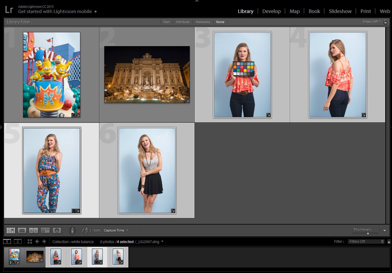
Model:  Jessica Waldow / Photo: Luiz Kim

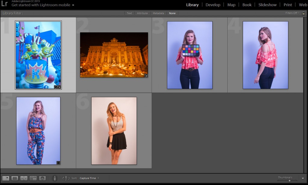
I did a series of photographs for a fashion lookbook (images 3 to 6) using the same light setting and, on purpose, messed with the white balance on my camera, since I photographed in RAW I could tweak the white balance as much as I wanted, nondestructively.

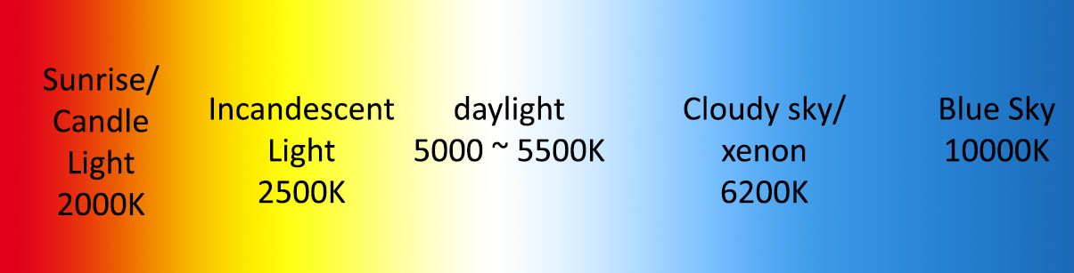
As I mentioned in my last white balance tutorial, studio strobes are set up to 5000K – 5500K, therefore I should have photographed using the setting for the white balance to the flash icon or manually change the setting to 5000K on my camera. The bluish photographs were set up around 2000K and the one with a more yellowish color around 7000K. Even if you set up the white balance on your camera, you will never be a 100% sure if the colors are correct, either because the flash strobe is not giving 5000K – 5500K, or the tint of the photograph appears green or magenta.

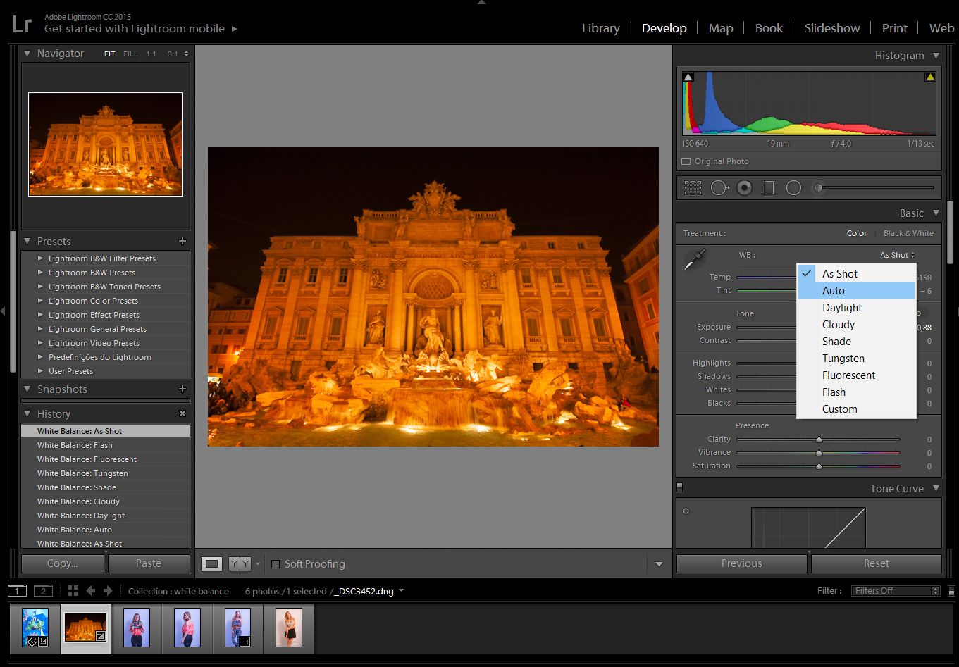
Step 1: Photograph the subject with the color chart, position it accordingly to the main light source

After you have set up the lighting for the photo shoot, position the color chart near the main subject and face it toward the main light source.

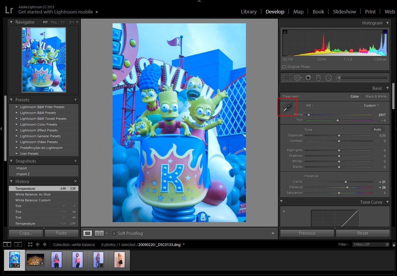
Click on the White Balance Selector (W), which looks like an eyedropper tool.04_checker_a01

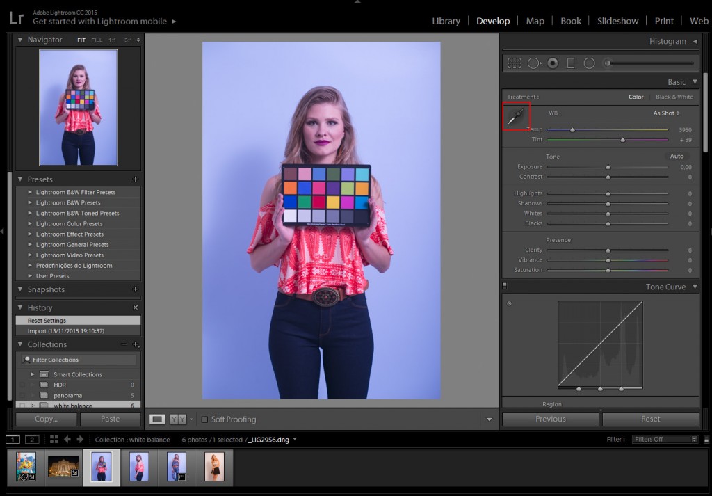
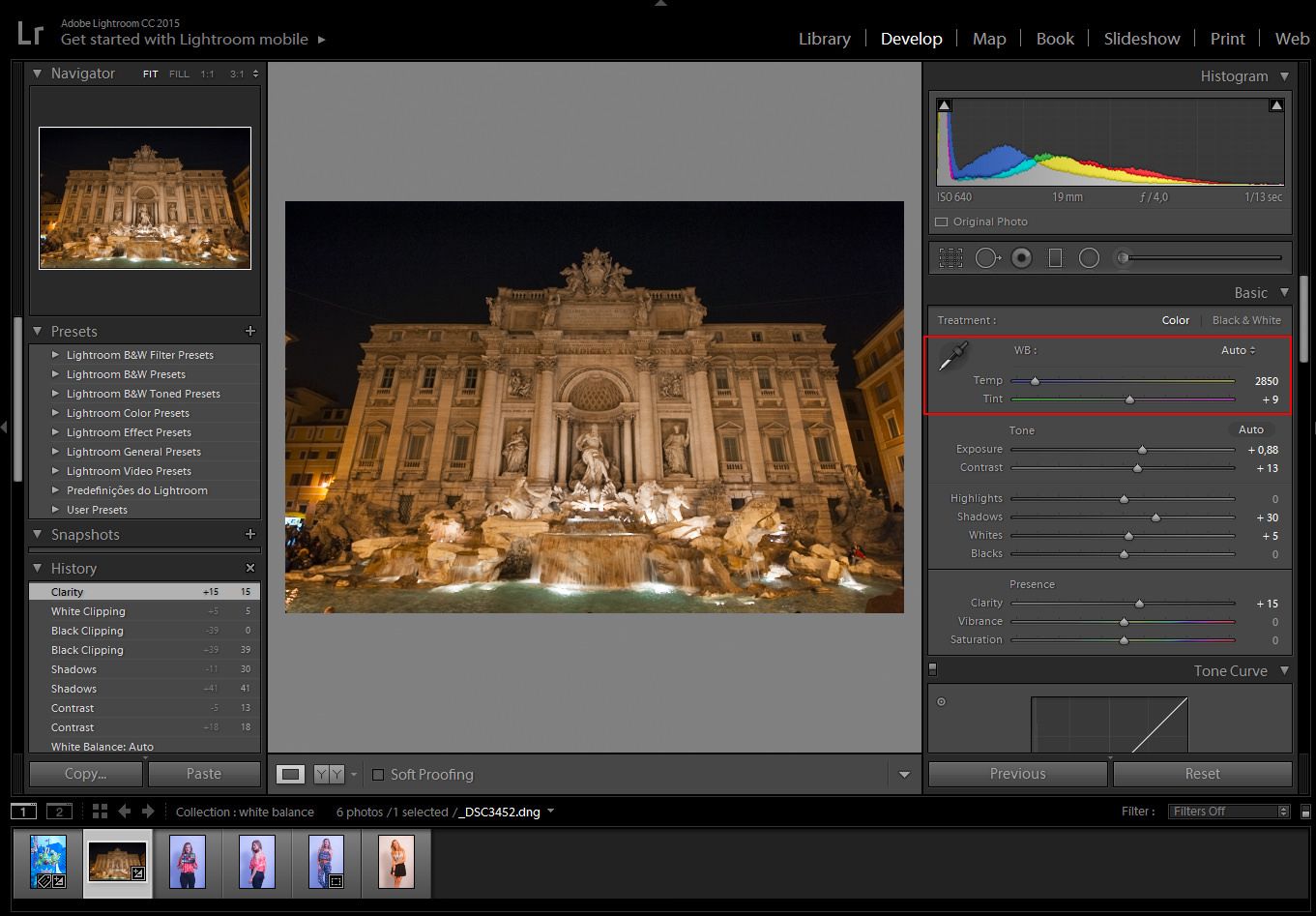
Step 2: select the gray area of the color chart

With the White Balance, Selector tool selected, click on the gray box of the color chart. Each color chart may differ, depending on the manufacturer.

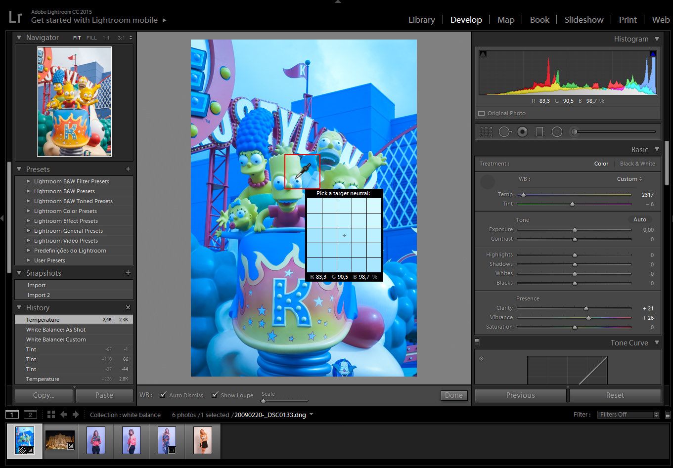
With the White Balance Selector, hover over the image. We can see the preview in the navigator window before we even click it.

04_checker_a03

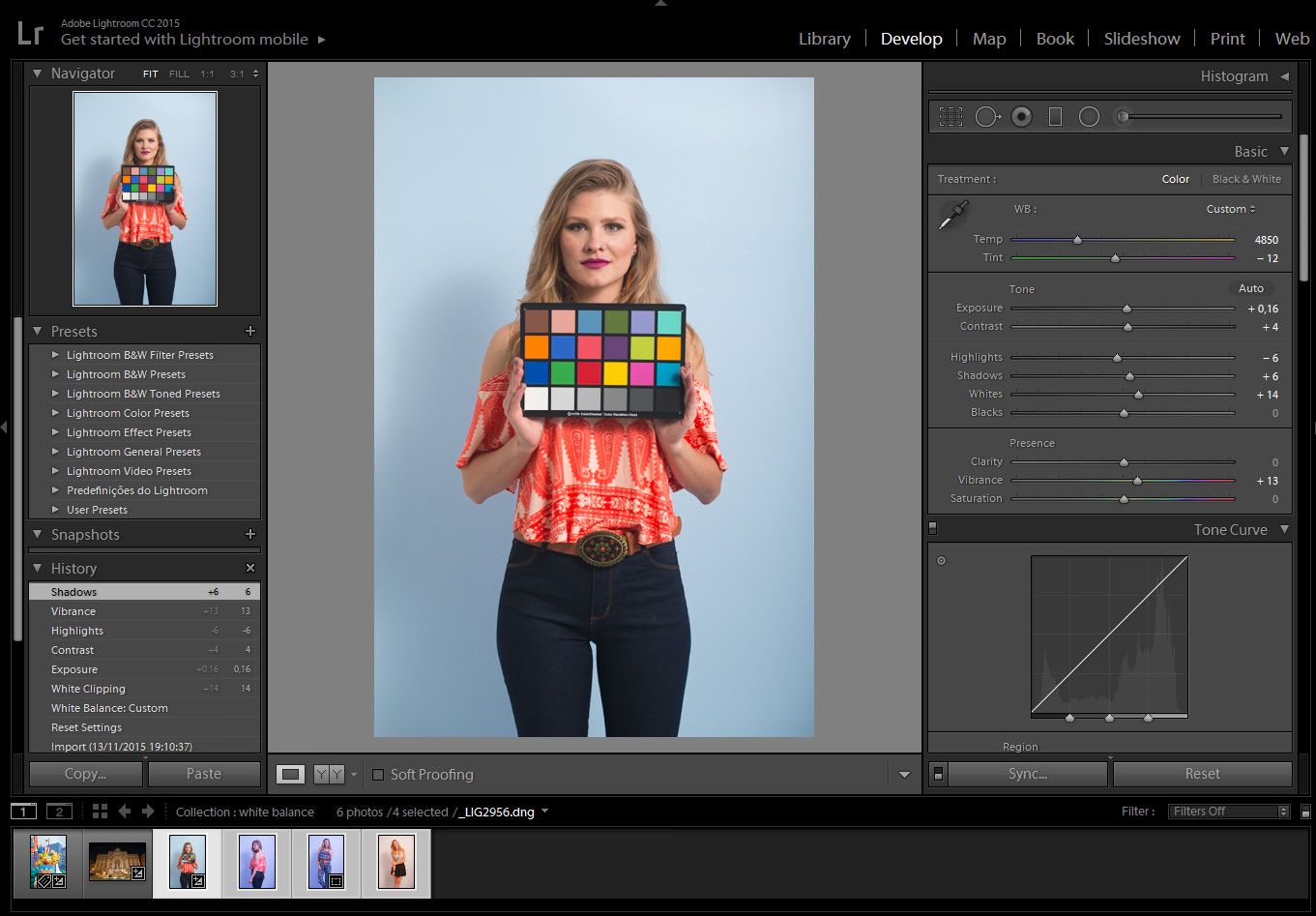
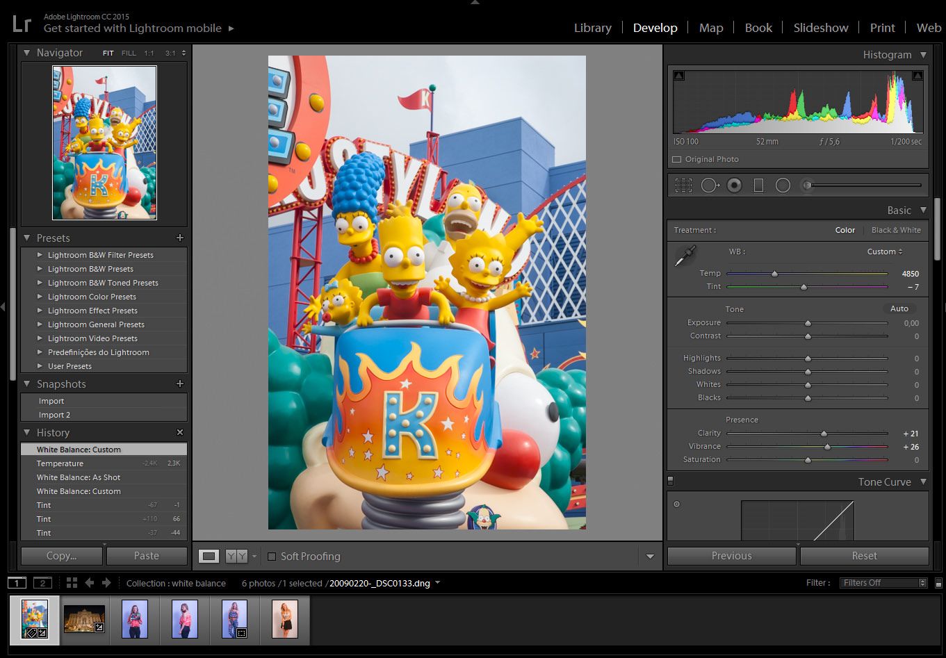
As you can see, it will automatically correct the white balance of the image, even if your monitor is not calibrated, Using this method guarantees that the white balance is correct.

At this stage, you can edit your image as you would normally do, remembering not to tweak the white balance too much, since the whole purpose is to correct it.

After correcting one image, you can adjust the others as a batch. It doesn’t matter if there are a thousand images, you can match it with the steps below.

Step 3: batch correcting the white balance

Click on the image you have corrected and press shift+click on the last image of the series, that will select the images you want. If you want to select images that are not in order, Ctrl+click for PC, or Cmd+click for mac, selecting the images one by one. Just make sure that the highlighted image is the one with the adjustments.

05_sync_a01

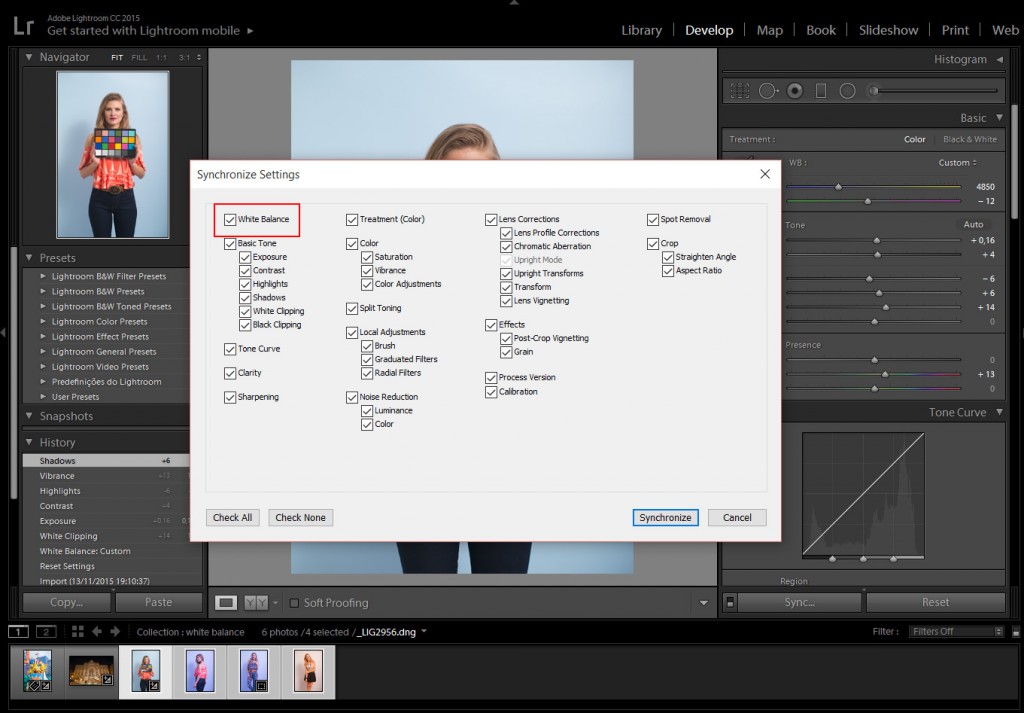
Step 4: Synchronize the settings

Click on the ”sync” button, which is located in the bottom right corner.

The ”synchronize settings” panel will pop up, you can either check just the white balance to sync all the images with the same white balance, or check whatever you want to sync with the settings.

Hit the synchronize button and Lightroom will synchronize the settings.

01_all_img_a02

As you can see, no matter how many photographs you have taken with the same light source, you will always get the correct white balance.

White Balance in Lightroom

Do we need to give up on our images, just because the image came out a little bluish or reddish? The answer is no. Well, if you photograph in RAW, you can correct the colors later on inside Lightroom. So we have to download Lightroom presets to correct this. Not that you can’t do it in JPG, but doing it on a RAW image is a nondestructive way to correct any of your images, even if you did not correct it on your camera beforehand. So don’t give up on your image, we can make it work. It’s just like not giving up on your photographic negatives because we can .

For those who are just beginning in photography, white balance, color temperature, Kelvin, 5000k, etc. can seem difficult to understand, but with Lightroom, we can manage it quite intuitively.

Light temperature is measured in Kelvin and every type of light has a certain temperature, and each temperature has a certain color, like a candle light which is red or xenon car lights that have a more bluish color. When you are messing with your camera’s white balance, you will see an icon of a sun, shadow, flash or clouds. When you select any of them, what the camera is attempting to do is to compensate for the light you are photographing.

chart

To illustrate the temperature, let’s separate them into 3 different categories: RED, NEUTRAL, and BLUE.

RED: Candle Light 2000K, sunrise/sunset 2000-3000K, incandescent lights 2500K.

NEUTRAL: the Sun at its peak around 5500K, flashes and studio flash strobes are in that range as well.

BLUE:  xenon 6200K and blue sky 10000K.

Our eyes adjust automatically to the color temperature either in the shade or in the sun, but the camera is not able to do that, therefore you will have to do it for your camera. There are a lot of hardware devices that will help you get the correct colors every time; monitors for photography, monitor calibrating devices, color checker cards, color booths, etc.

In this Lightroom presets tutorial, we will learn how to correct the white balance of photographs, either by using manual settings or automatic settings or by using the White Balance Selector.

02_trevi_a01

In this particular image, the color temperature is way off. As we can see, the image is quite red, most people would delete the image and try to set the correct white balance in the camera, then take the shot again. But, since I have photographed in RAW, I can always change the white balance settings later inside Lightroom, in a nondestructive way.

For those shooting JPG, it is best that you choose the correct white balance in your camera. Lightroom can try to correct it later, but not as it would with a RAW image.

02_trevi_a02

In the Develop Module, we have some presets to choose from, as we would have inside our camera settings.

Auto: the auto mode does a pretty decent job on outdoor photographs, but when indoors, we sometimes may have to adjust it a bit further.

The other preset settings will correct it as the names would suggest; daylight will assume that you have photographed outdoors in daylight, cloudy as on a cloudy day, or tungsten, as under a tungsten light bulb and so on.

If any of those presets won’t fit your needs, we can always correct it manually.

02_trevi_a03

In order to manually correct the color temperature, we can change the temperature and tint sliders.

Temp: will correct the white balance from blue to yellow.

Tint: will correct the white balance from green to magenta.

01_simps_a01

In this particular image, the white balance is off too, tending to a more bluish feel.

We could correct it manually like we did on the image before, but if there is something in the scene that you remember that has a neutral color, we can use it in our favor to correct the color temperature automatically.

01_simps_a02

Click on the White Balance Selector (W), which looks like an eyedropper tool and click either on the white or the black part of Bart Simpson’s eye. That’s because the White Balance Selector tool will work on the neutral colors like whites, grays, and blacks.

Using the White Balance Selector, hover over the image. We can see the preview in the navigator window before we even click it.

01_simps_a03

After you click on a neutral color, Lightroom will try to correct it by assuming the color you clicked is neutral white, neutral gray or neutral black depending on the color you chose to click.

Sometimes you can see that is not 100% correct, so you can tweak the temperature to get the desired color, but at least it could be a starting point.

This way we can easily correct the colors of the images. If you need to get the perfect color, either for those clients that need the correct color of their product or if you are photographing a work of art, using a color checker card can be an effective way to do it, I will make a tutorial on that later.