Tag: white

Color or black and white? – A contemporary approach

Already in the last decades of the 19th century, some people were working on the development of color photography, amongst them James Clerk Maxwell. After that, during most of the 20th Century, the love for photography grew and people started taking more and more photos while using either color or black and white films to capture the image they had in mind.

With the invention of the first modern digital camera based on CCD (Charge-Coupled Device) chips in 1975 by Steven Sasson, an electrical engineering working at Eastman Kodak, and the further popularization of digital photography at the beginning of the current century, people started to have the option of choosing between color and black and white without the need to plan ahead as before.

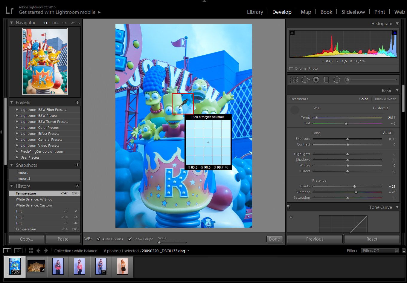
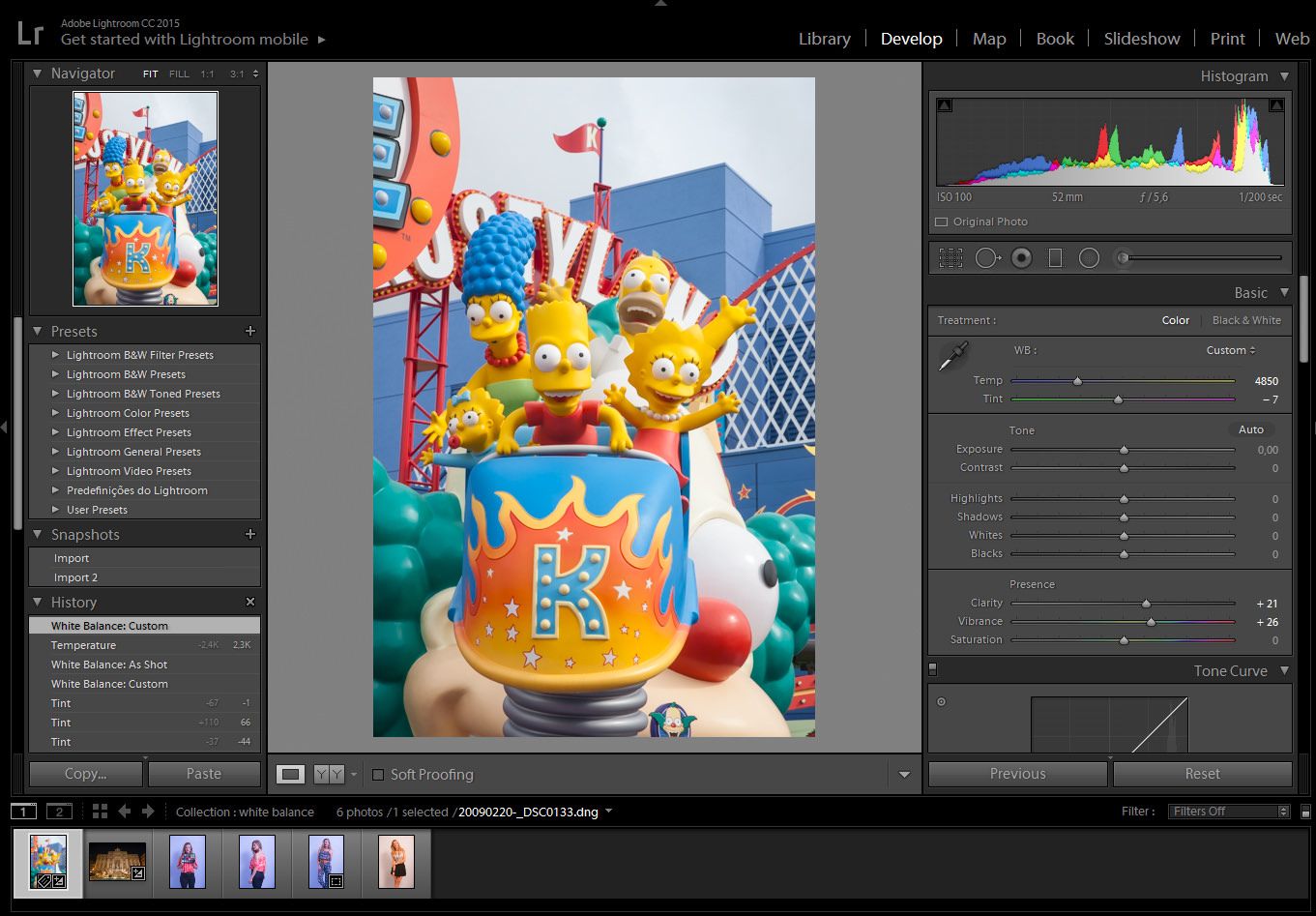
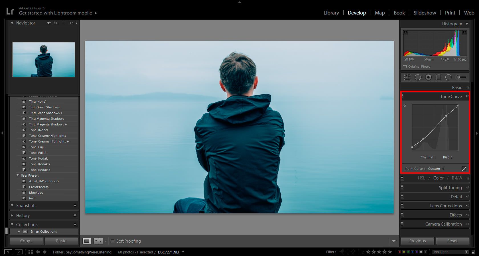
Digital cameras give the user the option to choose whether they want to get the final processed image (e.g. .jpg file) in color or B&W right out of the camera but, more importantly, with post-processing software as Photoshop or Lightroom, this choice can be made during the final stages of preparing the image.

So today, after more than a hundred years since the invention of color photography, we are many times faced with the question whether we think our final image will look better in color or in B&W.

The truth is that, as with many things in photography or any form of art, what looks better is a very subjective matter but, at the same time, and by the way our brains process information, there are certain aspects that are at least slightly more objective. On this small article, I would like to share my ideas on when it might be a good idea to think about converting our color images to B&W. I will not go into any details on converting the images, since you can find some great tutorials about the topic on our blog.

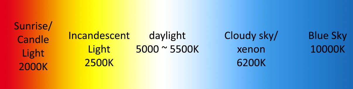
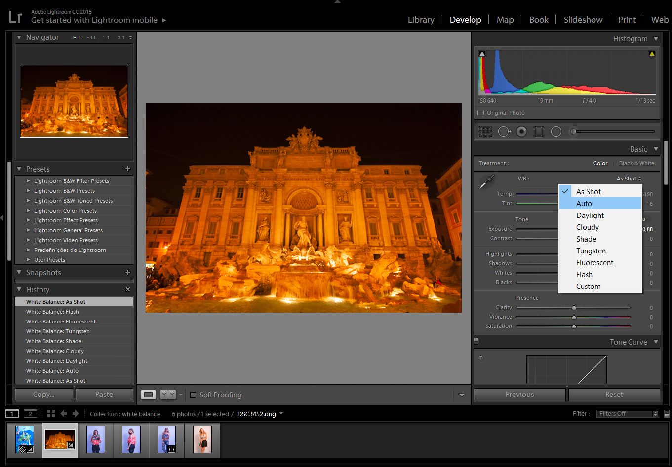
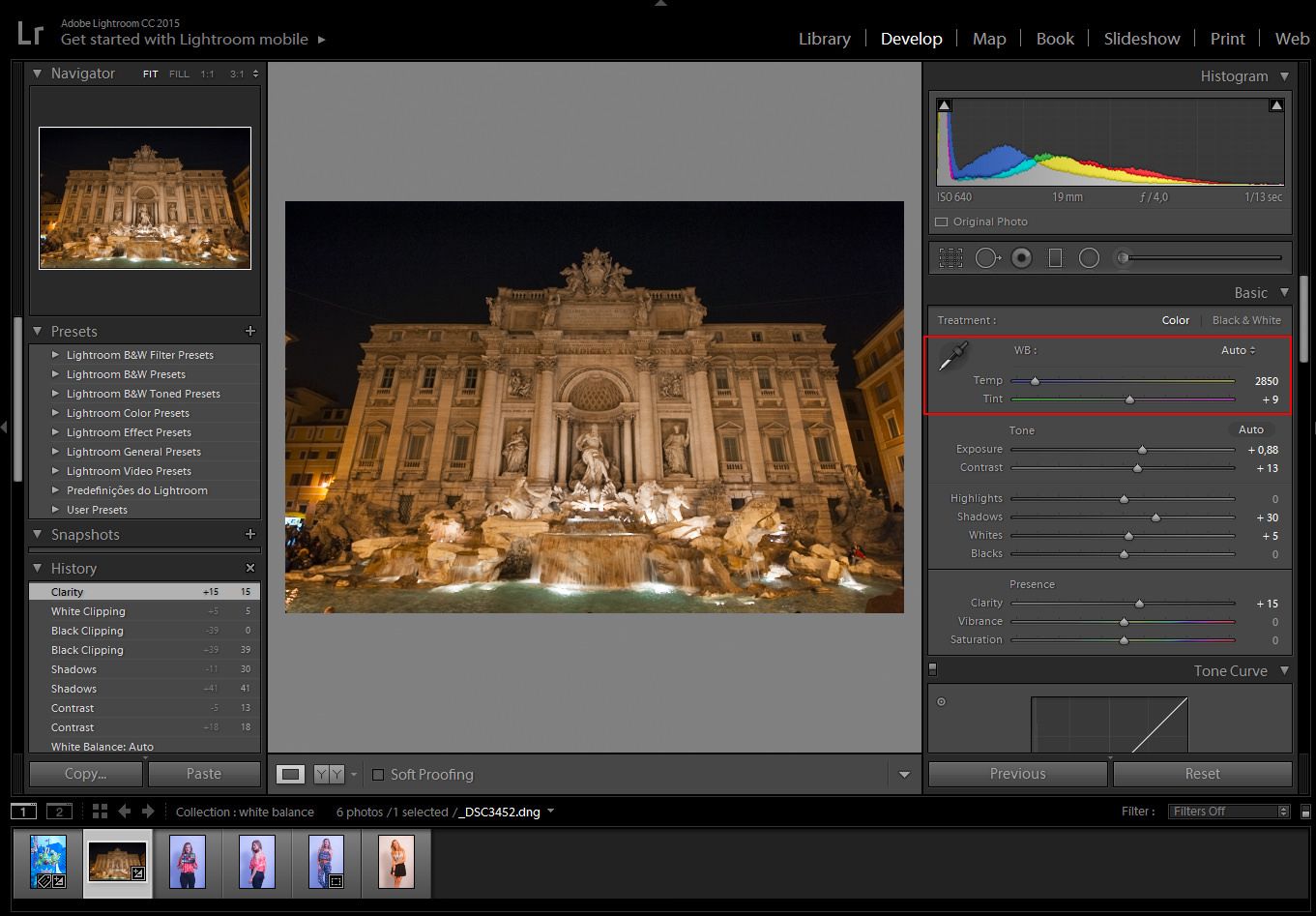
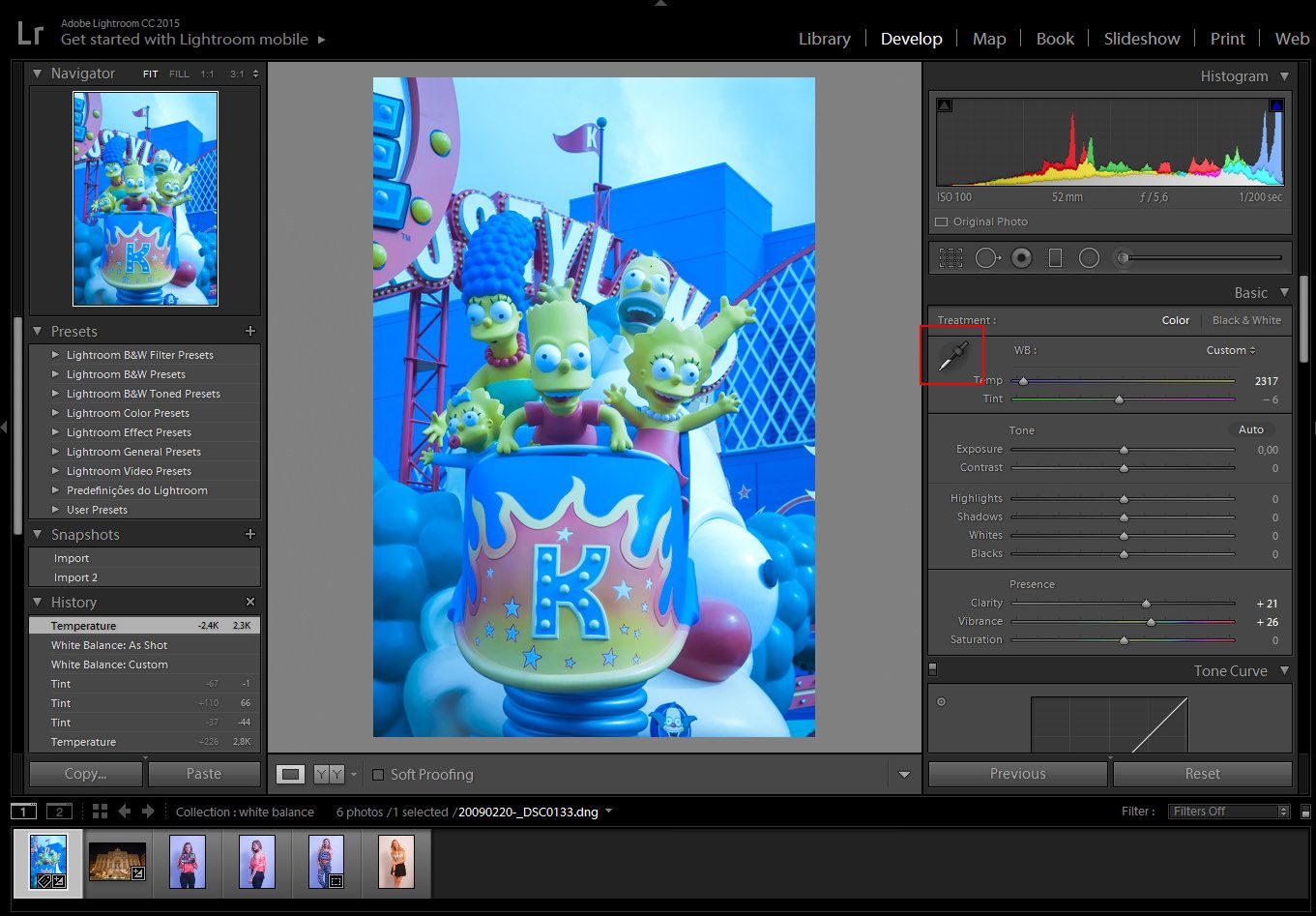
But before beginning, a small advice that you might have read somewhere else already: always shoot in RAW mode; even if you are still not processing RAW files, at some point in the future you probably will, and you will regret not having them for your old photos! Also, the RAW file will always keep the color information, something very handy if we originally planned for a B&W image but in the end we change our mind.
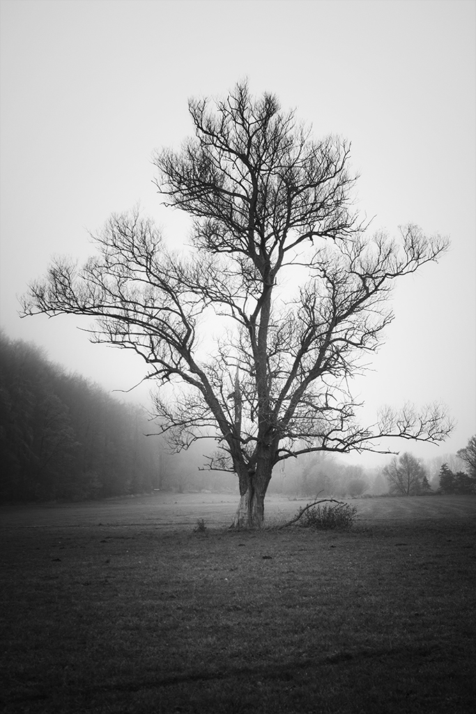
Contrast

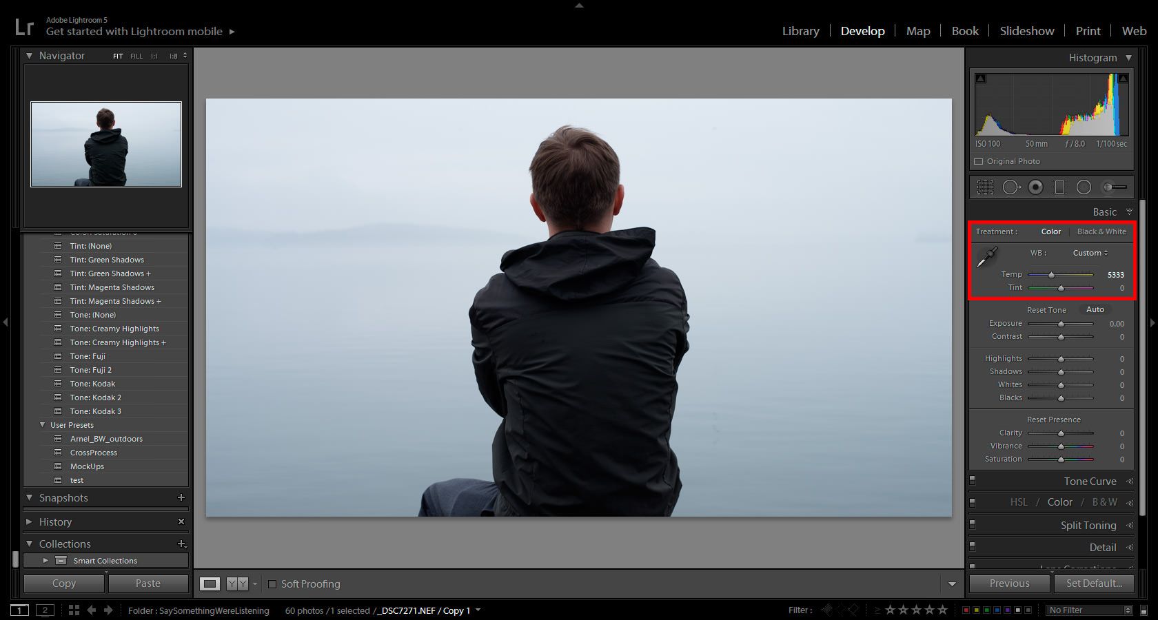
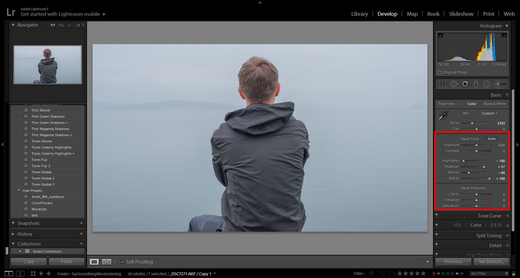
One could define contrast as the difference in brightness between the brightest and the darkest pixel in a given image. In a more practical way, I would say that an image with high contrast will have a relatively large amount of very bright and very dark pixels (one could hardly say an image has high contrast if all the pixels but one have the same brightness!).

But why is contrast important here? Well, because one of the things to keep in mind when thinking about B&W photography is that images with very low contrast tend to look rather boring in B&W. Having said this, however, it is important to notice that we can always increase the contrast of an image in post-processing to make it look better in B&W but as a general rule, if there are no bright and dark areas (shadows) in an image, it might be a good idea to keep going with the color version.
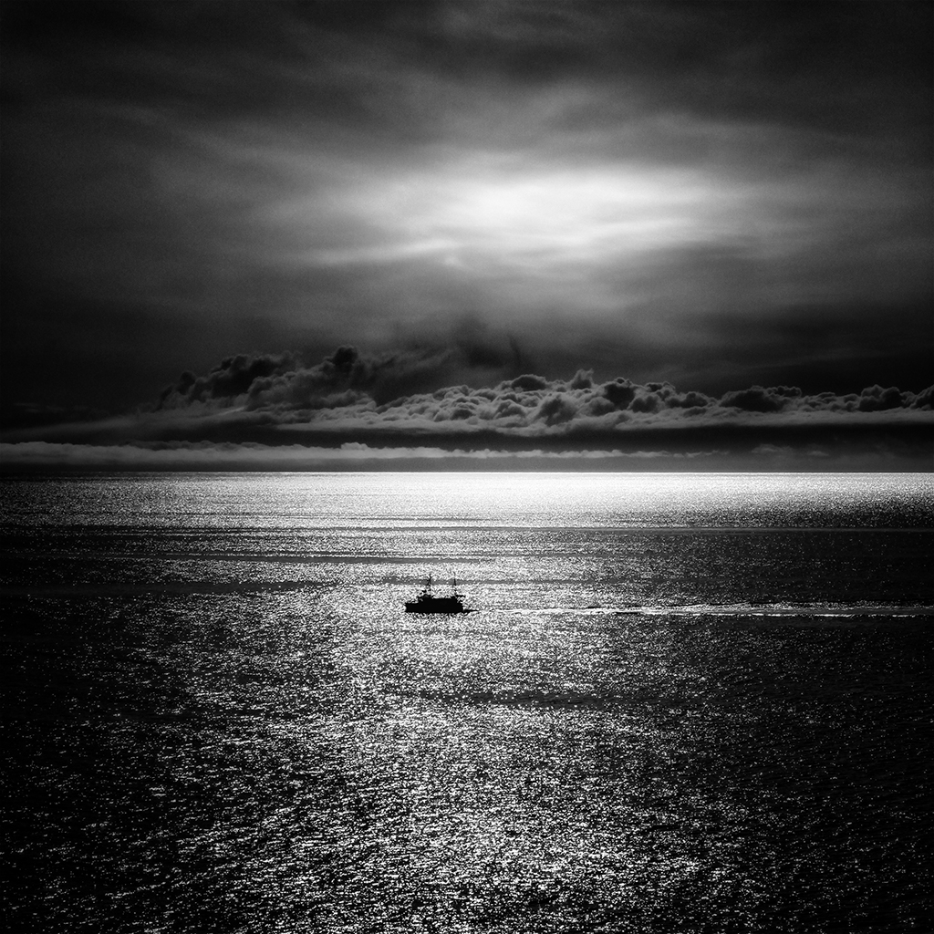
b&w_lofoten

Overcast days

Due to the way the brain processes color information, we are generally attracted by images that have some specific colors like some red, yellow and blue. This last one is especially important when capturing parts of the sky. It is for this reason that, unless we have a cloud covered with clouds with a lot of structure (contrast!), having a plain gray sky during an overcast day most of the time calls for a conversion to B&W. This will help merge the sky with the captured scene.
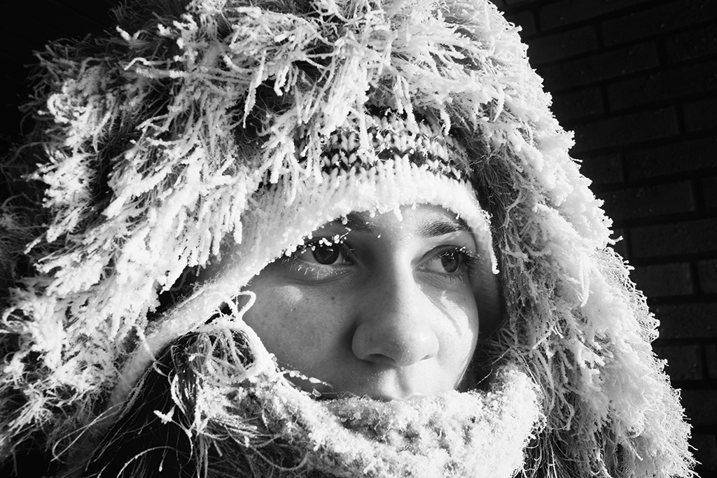
b&w_lindau

Portraits

This one is a less general rule. Portraits tend to benefit from some aspects specifically thought to bring all the attention to the face being captured, but I would say that a well accomplished portrait can always benefit from the special mood transmitted by B&W so, even if you are happy with the final color result, give it a try and convert it to B&W before you make your final decision on this one.
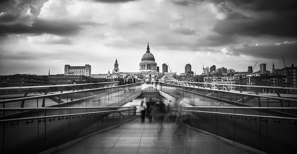
b&w_kiruna

Long exposure

This type of photography is mostly associated with landscapes or cityscapes so, at least for me, the first choice for the final image is usually color. Nevertheless, if the image complies with one of the already mentioned characteristics (e.g. high contrast), the effect given by for instance the motion of clouds or water can give a dramatic effect worth exploring.

b&w_london

The creative process behind the art of photography will always remain a subjective one but I certainly hope that this post was somehow helpful by giving different points of view to think about the use (or removal) of color. So go ahead and play with your images. Convert some of your old images that you have always seen in color to B&W and even try adding interesting effects like HDR and I guarantee you will be surprised by some of the results.

White Balance in Lightroom

Do we need to give up on our images, just because the image came out a little bluish or reddish? The answer is no. Well, if you photograph in RAW, you can correct the colors later on inside Lightroom. So we have to download Lightroom presets to correct this. Not that you can’t do it in JPG, but doing it on a RAW image is a nondestructive way to correct any of your images, even if you did not correct it on your camera beforehand. So don’t give up on your image, we can make it work. It’s just like not giving up on your photographic negatives because we can .

For those who are just beginning in photography, white balance, color temperature, Kelvin, 5000k, etc. can seem difficult to understand, but with Lightroom, we can manage it quite intuitively.

Light temperature is measured in Kelvin and every type of light has a certain temperature, and each temperature has a certain color, like a candle light which is red or xenon car lights that have a more bluish color. When you are messing with your camera’s white balance, you will see an icon of a sun, shadow, flash or clouds. When you select any of them, what the camera is attempting to do is to compensate for the light you are photographing.

chart

To illustrate the temperature, let’s separate them into 3 different categories: RED, NEUTRAL, and BLUE.

RED: Candle Light 2000K, sunrise/sunset 2000-3000K, incandescent lights 2500K.

NEUTRAL: the Sun at its peak around 5500K, flashes and studio flash strobes are in that range as well.

BLUE:  xenon 6200K and blue sky 10000K.

Our eyes adjust automatically to the color temperature either in the shade or in the sun, but the camera is not able to do that, therefore you will have to do it for your camera. There are a lot of hardware devices that will help you get the correct colors every time; monitors for photography, monitor calibrating devices, color checker cards, color booths, etc.

In this Lightroom presets tutorial, we will learn how to correct the white balance of photographs, either by using manual settings or automatic settings or by using the White Balance Selector.

02_trevi_a01

In this particular image, the color temperature is way off. As we can see, the image is quite red, most people would delete the image and try to set the correct white balance in the camera, then take the shot again. But, since I have photographed in RAW, I can always change the white balance settings later inside Lightroom, in a nondestructive way.

For those shooting JPG, it is best that you choose the correct white balance in your camera. Lightroom can try to correct it later, but not as it would with a RAW image.

02_trevi_a02

In the Develop Module, we have some presets to choose from, as we would have inside our camera settings.

Auto: the auto mode does a pretty decent job on outdoor photographs, but when indoors, we sometimes may have to adjust it a bit further.

The other preset settings will correct it as the names would suggest; daylight will assume that you have photographed outdoors in daylight, cloudy as on a cloudy day, or tungsten, as under a tungsten light bulb and so on.

If any of those presets won’t fit your needs, we can always correct it manually.

02_trevi_a03

In order to manually correct the color temperature, we can change the temperature and tint sliders.

Temp: will correct the white balance from blue to yellow.

Tint: will correct the white balance from green to magenta.

01_simps_a01

In this particular image, the white balance is off too, tending to a more bluish feel.

We could correct it manually like we did on the image before, but if there is something in the scene that you remember that has a neutral color, we can use it in our favor to correct the color temperature automatically.

01_simps_a02

Click on the White Balance Selector (W), which looks like an eyedropper tool and click either on the white or the black part of Bart Simpson’s eye. That’s because the White Balance Selector tool will work on the neutral colors like whites, grays, and blacks.

Using the White Balance Selector, hover over the image. We can see the preview in the navigator window before we even click it.

01_simps_a03

After you click on a neutral color, Lightroom will try to correct it by assuming the color you clicked is neutral white, neutral gray or neutral black depending on the color you chose to click.

Sometimes you can see that is not 100% correct, so you can tweak the temperature to get the desired color, but at least it could be a starting point.

This way we can easily correct the colors of the images. If you need to get the perfect color, either for those clients that need the correct color of their product or if you are photographing a work of art, using a color checker card can be an effective way to do it, I will make a tutorial on that later.

Recovering blown out images in Lightroom

Fall can be a great time to capture many different looks, because of the constant change in weather and colors. On the day of the photo, I wanted to be able to move around quickly and did not want to lug around a bunch of equipment that would get wet and dirty, so all that I used was my camera and tripod. Only using natural light saved me from having to bring extra gear, but also presented a problem. On this day it was very rainy, misty and foggy which gives me the atmosphere I am looking for, but it often times looks washed out in the raw file. If you have ever shot in fog, you know that it can be hard to capture enough detail in the distance and keep your subject properly exposed. All of the moisture in the air catches the light and often times gives you blown out the part in the image.

In this tutorial I am going to walk you through what you need to know to be able to recover an image in Lightroom, that may be blown out.

1. Temperature

This is what the RAW file looks like straight from the camera. The only difference I made was turning down the temperature slightly, as I had my original at around 5500. Now you may be wondering, how do you know where to set the temperature and in reality I don’t. All of these adjustments are not in an exact order, there is a lot of jumping back and forth, from section to section and tweaking until you find what you like. I turned down the temperature knowing that I wanted a cooler and more moody feeling to the image. I wanted to bring out the cold and lonely feeling of someone in a world of their own.

Before we go to the next step take a look at the Histogram and notice the lack of detail in the sky portion of my image.

RecoveringBlownOutImages1

2. Exposure

This is where we are going to make the adjustments to be able to recover some of that sky. I mentioned earlier that shooting in this kind of weather becomes hard to expose properly because the dynamic range can be so vast. When I was shooting, my objective was to set my camera so that I could get as much information in one exposure as possible. There were other ways I could have set the camera (like boosting the ISO) to capture more info, but I kept getting the little island blown out, so I stuck with the settings you see (right under the histogram).

I boosted the shadows/blacks and brought down the highlights/whites. I normally would not do such harsh adjustments, but I needed to in this situation, to achieve my end result. If you compare the histogram of the 1st image with the one below, you will notice that not as much of the right side (white/highlights) of the histogram is clipping.

We can now see that there are some clouds in the sky (slight as they may be) and it is not all white, with no information. This is not enough, though, we have information in the sky, but the image looks bland and the color still does not fit the mood we set out to create originally. The next few steps will be more about editing the color.

RecoveringBlownOutImages2

3. Color

Steps 3,4 and 5 are a peek into some of the color editing decisions I made to pop the subject out at the same time as showing some of the background information we recovered, using the previous steps. I will be doing a color editing tutorial in the future, but in the meantime check out our tutorial for giving your photos a retro feel. In the previous step we recovered the highlight and shadow details, but in the process, we flattened out the image. To fix those adjustments one way to add contrast and color adjustments to your photos, is to use the Tone Curve.

RecoveringBlownOutImages3

4. Color

Next, I played around the HSL (Hue/Saturation/Luminance), again just a peek at your own photos will ask for different settings.

RecoveringBlownOutImages4

5. Split Tone

Then I added more of a cool color to my shadows, using the Split Toning.

RecoveringBlownOutImages5

6. Final Steps

After getting the color  I was going for, I did some light spot removal and added some noise. I do have to mention that for the color work mentioned above, I did use a preset as a starting point and then tweaked it to fit my needs. If you want some presets to speed up your process or to just get you going in a direction, check out the presets available by Sleeklens.

7. Additional Tips

Like many things, when it comes to editing photos in Lightroom/Photoshop there are many ways to get to the final result. If you need to be more precise using tools like the adjustment brush or graduated filter, it will help you get results to specific areas and not have to worry about affecting the whole image.

RecoveringBlownOutImages6

8. Conclusion

Remember, the best way to set yourself up for success in your post processing is to have an idea of what you want your final image to look like. Shooting to capture all of the information in the raw file will help you later.