
The list of elements that have a role in the composition of your photography is quite long: lines, patterns, symmetry, texture, depth of field, color… yes! Color! Have you ever considered a color like a composition element? If your answer is not, keep reading because I will give you some information that might change the way you approach color in your photography.
Table of Contents
Colors are generally associated with certain emotions.
Red: Passion, intensity, power, strength and attention

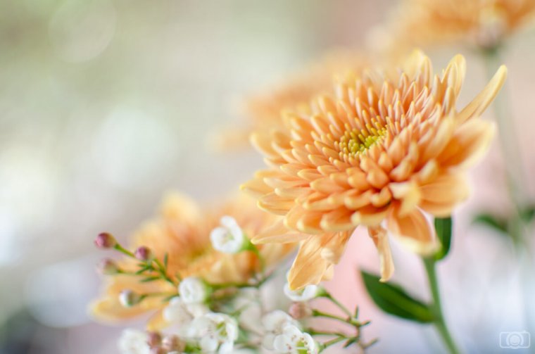
Orange: enthusiasm, joy, optimism, creativity
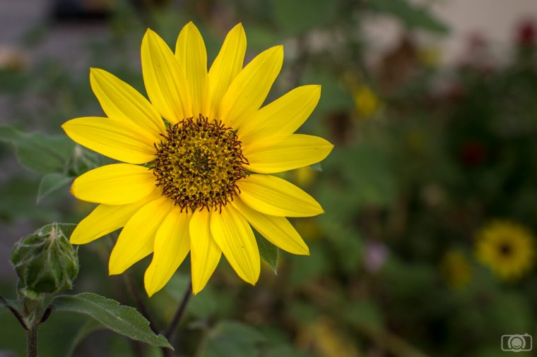
Yellow: energy, intellect, happiness
The 3 previous colors (red, orange and yellow) are also known as warm colors. They are exciting colors. They give a feeling of high energy.
Green: nature, tranquility, freshness, harmony, fertility

Blue: calmness, peace, responsibility, confidence, trust

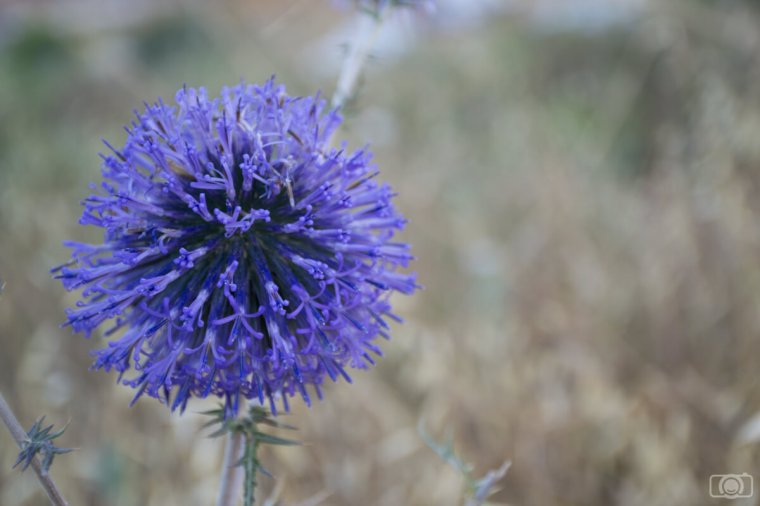
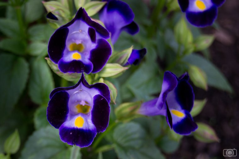
Purple: royalty, extravagance, luxury, mystery
The 3 previous colors (green, blue and purple) are also known as cold colors. They are considered relaxing colors. They give a feeling of calmness.

Black: elegance, formality, power, sexy, mystery

Brown: stability, structure, support

The 3 previous colors (white, black and brown) are also known as neutral colors and they are usually great as backgrounds.
Although there are general interpretations of colors, as individual with different social background and experiences, we perceive them in different ways. I mean, there is a subjective aspect in color interpretation. The feelings a color awakes in you might be different than mines. It is for that reason that we have personal preferences for certain colors. I can give you an example of a personal interpretation of colors. According to the list, purple symbolizes royalty, wisdom, and luxury. For my mom, this color means fear because when she was a little girl she was terrorized for some religious parade in which people was wearing purple clothes. She had a life experience that completely shaped her relation with the purple color to the point that nothing at home was in this color (or any of its shades). You can probably find examples like this one in your own life.
In the moment you are composing your photo, you can stop one moment and think if you can include colors that will contribute to your composition. What do you want to say with your photo? Do you want your image to have a general feeling of balance and calmness? Then you might consider to include mostly cold colors such as green and blues and avoid as much as possible elements in warm colors.

If you want something more energetic, you should consider to include warm colors.

You can also mix warm and cold colors to get a combined feeling of warm and freshness

You can also play with the color of your photos in post processing using for example Lightroom. To do that, it is better that you shoot your photos in RAW. This photo format will give you more flexibility in the editing for changing colors.
There are different ways you can change the colors of your images. Today I am going to focus on a really straightforward one: playing with the Temperature slider. This technique will help you to get familiar with colors and moods. Once you master this one, you can get into other ways to do it, such as adding color filters or by using the split tone sliders.
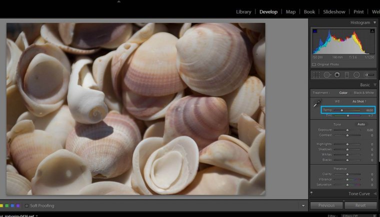
You will find the temperature slider in the Develop module, in the Basic adjustments. Moving the slide to the left you decrease the temperature of your colors, meaning that you make them cooler. If you move it to the right, you increase the temperature, adding warm to your photo.
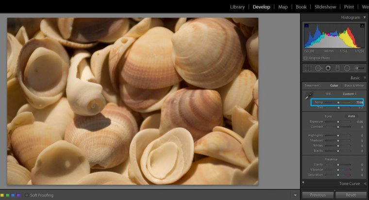
You can get warmer tones by moving the temperature slider to the right. In this particular image, a value of 7119 worked pretty well.
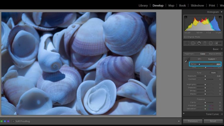
You can get cooler tones by moving the temperature slider to the left.
Deciding which is the right color for your photos is up to you because it depends on what you felt when you were taking the photo and the feelings you want to express.

Now it is your turn to experiment with colors. Tell me how do you feel about adding color to your photo composition and if you are happy with your new results! Enjoy!


Please verify your software version before proceeding.
 I’ve verified my software version


 Facebook
 Google +
Comments (0)
There are no comments yet.