Today I want to talk about one of the most helpful features of the camera—the histogram. Don’t think I always liked histograms. When I started, I found them complicated to understand and in fact, I totally ignored them for a while. However, once I saw the point of the histogram, I started checking them on the screen of my camera every time I was taking a shot. Trust me; the time invested in understanding histograms is totally worth it. They will become one of the best tools you will have, both in the field and in post-processing.
Table of Contents
What is a Histogram?
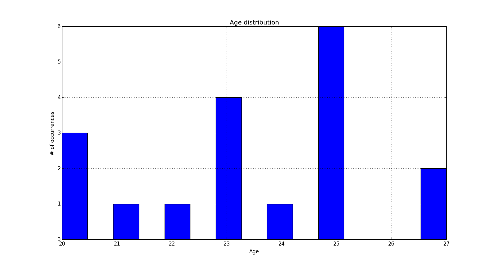
A histogram is a graphical representation of any type of information, it does not have to be an image. In formal terms, a histogram is a bar plot that represents the number of occurrences (y-axis) of a given event (x-axis). This could be, for instance, the number of people with a given age within a group. Imagine, for instance, a photography club where the members have different ages as follows:
20 years old: 3 members
21 years old: 1 member
22 years old: 1 member
23 years old: 4 members
24 years old: 1 member
25 years old: 6 members
26 years old: 0 members
27 years old: 2 members
A frequency histogram representing the data set above would look like the following figure.
In this sample size, you can see the age range represented on the x-axis and the number of members with a given age on the y-axis. This way of presenting the information is very simple and easy to interpret, hence the widespread use of histograms in all branches of numerical data analysis.
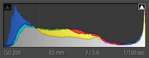
A histogram in photography is a graph that shows the range of tones in your photos—in other words, it tells you the frequency distribution of shades in the photo you just took. The x-axis will represent the intensity or brightness (which can go from 0 to 255 on an 8-bit image) and the y-axis will represent the number of pixels with that given brightness. In the case of a grayscale image, a single histogram contains all the information of the image, while in the case of a color image three separate histograms are needed, one for each of the basic colors.
Given an image, a histogram can be constructed, but given a histogram, an image cannot be constructed. In other words, when a histogram is created, important information is lost and thus histograms cannot be used as compressing algorithms. This is because the histogram tells us how many pixels have a given brightness level, but it does not give any information on the location of those pixels within the image.
How to Read a Histogram
So what information can we get from a histogram? This is related to a rule of thumb according to which the more spread among all values a histogram is (i.e. flat) the more balanced the image will be. Now, when applying this rule, you need to take into account what type of image you are dealing with.
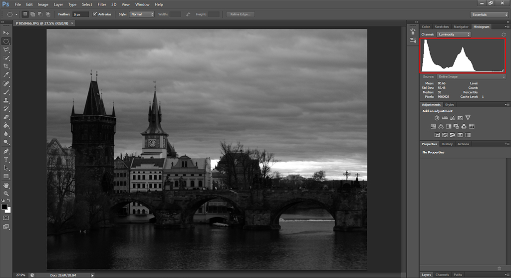
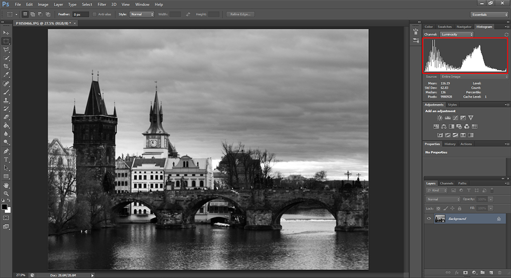
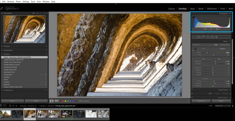
Take, for instance, the following black and white image of the Charles Bridge in Prague together with the histogram (highlighted with a red rectangle) as shown in Photoshop.
There are a couple of things that we can learn from this example image. First of all, the scene looks rather dark, and that is why almost all the data point pixels are on the lower (leftmost) half of the histogram. The histogram is ordered from left to right, with the darkest value (0) on the left and the brightest one (255 when working with an 8-bit image) on the right.
In addition to this overall frequency distribution of the brightness values, it is also noticeable that there are two main peaks with a valley in between. In this particular image, the reason for these two peaks is that both the water and the bridge itself are rather dark while the rest of the buildings and the overcast sky are lighter. This means that the scene itself lacks of mid tones and hence the gap in the histogram.
If we improve the image by increasing the brightness and the contrast, we end up with a much flatter histogram that also covers a wider range of brightness values.
Now you can see how the center of the bulk of pixels moved to the right and it lies much closer to the center of the histogram. At the same time (and as a consequence of this), the image looks much more balanced than before.
If you look closely to the histogram, especially on darkest pixels, you can see that the bar graph is now much more disperse than before, with a lot of variations and low values intertwined with high values. This is actually a consequence of the algorithm used to increase the contrast in Photoshop, which is similar to a histogram equalization.
Now, what happens if your image was intended to be dark? Good photos are not necessarily those that comply with all the rules known like for instance a flat histogram, completely in-focus or well balanced in colors. After all, that is why automatic modes do not always produce the images we are looking for.
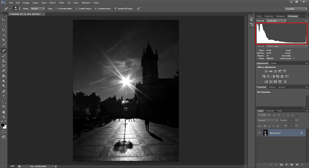
The example image below, once again from Prague, is a backlit scene that was intended to be dark in order to create a high contrast photo as a result.
Notice how the histogram shows a skewed distribution of pixels on the left side, with a relatively high peak on the far right side of the histogram chart. This is the result of having the Sun on the image, which, even though small, is very bright while the rest of the scene is underexposed to capture the silhouettes and shadows. Trying to get a flatter histogram chart with this example image would render a completely different (and unwanted) result.
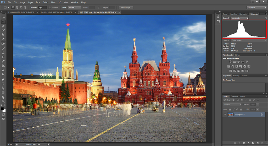
Finally, in the example image below, from the Red Square in Moscow, is a much more balanced histogram chart—the vertical axis is reflected on a histogram centered at the mid tones. Even though there is a high concentration of pixels on the middle, the overall histogram shape has a normal distribution—it is symmetric and has a good coverage of all the values without getting into the extremes (under or overexposed areas). This is also a natural consequence of the scene being captured, with no strong shadows or light sources included.
Notice that even though this is a color image, the histogram chart I am showing is the luminosity one. This is because what we are interested on here is the exposure balance of the picture, so the full color histogram will not yield any useful metrics for our purposes.
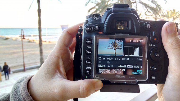
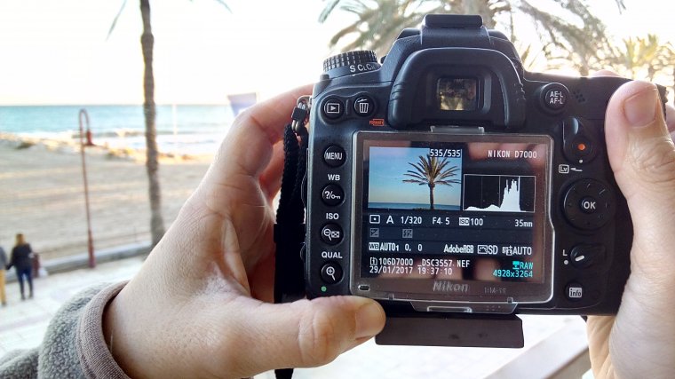
How to Check the Histogram on a Camera
When capturing an image, it is useful to look at the histogram shape for a couple of reasons. First, the back screen of your camera can be brighter or darker than the average monitor. This means that you could get disappointed when you get back home and open your images with your computer. Also, if the ambient light is too strong, the contrast of the camera screen might no be good enough to distinguish whether your image is properly exposed or not. However, histograms will always be visible and, as long as you stay away from the extremes (unless that’s your intention!), once you get back home you will at least be able to do a good job with post-processing, since your image will not have completely dark or burnt out areas.
You can set your camera to show you the histogram chart on its screen each time you take a photo. This is quite handy, especially at the beginning when you are still not used to checking it and you might forget to ask for it. In my Nikon camera, in order to see the histograms in the playback, I needed to check the histogram chart in the menu of the Display mode. If you have another type of camera, have a look at the Manual and check how you can set it. It will probably be something similar to what I explained for the Nikon.
Most cameras also have the option to show you the RGB histogram. In fact, this is a group of three histograms, each one showing you the histogram of colors Red, Green and Blue. Today, I am going to focus on the general histogram chart, but I just want you to know that you have the option to use it by the 3 colors as well, should you choose to do so.
How to Check a Histogram in Lightroom
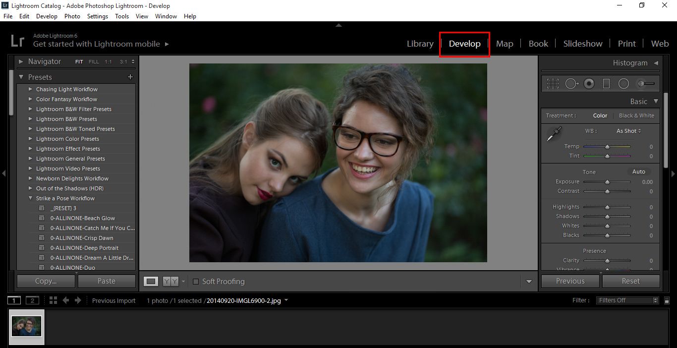
You can see the Histogram both in the Library Module and the Develop Module, but you can only really use it for the Develop Module.
So, click on Develop.
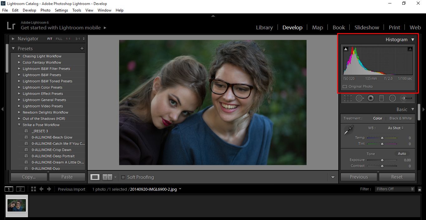
You will see it at the Top Right hand corner.
You can also access it by pressing (Ctrl+0) that’s Control + Zero, or on a Mac it will be Command + Zero.
So we could go super in depth here talking about the Histogram, but that is really not necessary to learn how to use it and get great results.
The Histogram is really just a bar graph plotting out all the pixels on your image.
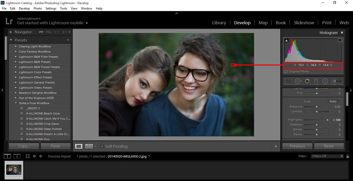
In the example image below, where I have highlighted you will notice R G B with percentages on it, and you will notice how this changes as you hover over areas on your image. This is useful when you are checking areas and you think it looks a little too “Red” or whatever, and you start to change the colors up trying to balance it out to get a normal distribution, you can use these percentages as a guide for that.
You’ll understand more as I go along.
You will also notice when you hover over the Graph it is split up into 5 sections.
Blacks
Shadows
Exposure
Highlights
Whites
By clicking and holding on these individual areas you can you can then manipulate your images.
Play around with each one for a few minutes and when you are familiar, Press Ctrl Z to undo until you are back at the start.
For Photography we would mostly use the Highlights and Shadows area, we would also play around with exposure, but the first two would be our main focus so we’re not losing much detail. For example, a bright Sun or edge of a cloud may be far too bright and you’d want to bring that down just a touch.
The same goes for the opposite , like Black Wheels on a Black Car, you may want to take it back a little and show a bit more detail.
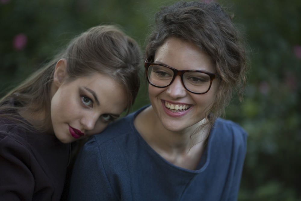
So as an example, we’ll take my starter image below.
As you can see it’s a little Dark due to the exposure, the Highlights aren’t great and it’s a little saturated with color.
To Fix this, I’m first going to Click on Highlights and slide it to the Right a little, to give a bit of life to the models.
Then I’m going to do the same with my Shadows, only this time I’m going to slide to the left a little to bring out those Darks more in the Eyes, Background and Hair.
And Finally, I’m just going to play with the Exposure a little, it’s not really necessary, but it is good to have a look and see if I can balance the image just a little and see if I can make any further improvements.
You can also play with the Blacks and The Whites too, I found that by sliding the Black area to the right it gave me a little bit more color.
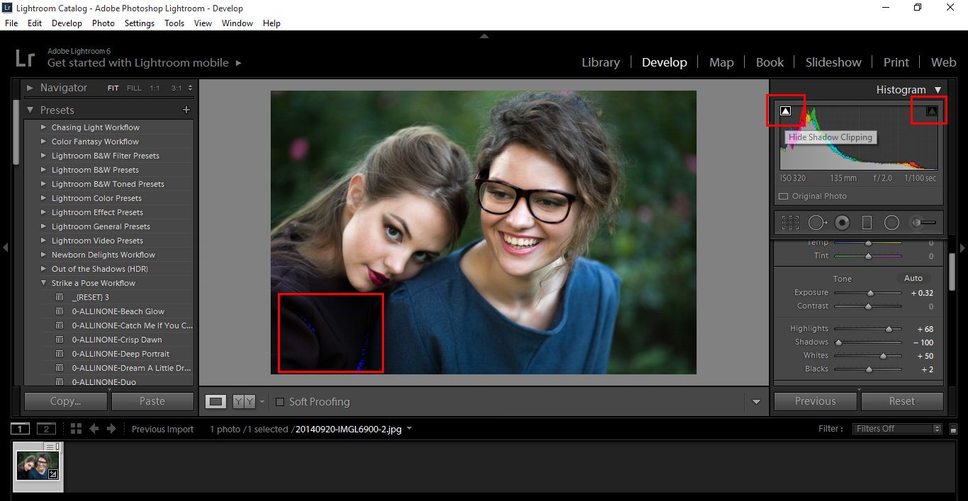
Now you will notice on the histogram bar chart, there are two upward facing triangles.
When you click on them, what they indicate are the areas in my image that is absolute Black or absolute White, my whites were fine which means my Highlights are all good and the Blue Dots Highlighted in the Image above are true Black, on this occasion those true Blacks are fine, there’s no problem there. But as mentioned before, you may lose some detail in the Shadow areas, you’d then have to play with Black, sliding back and forth to try to fix it as best as you can.
In my image the Blacks are spot on, no problems with those as they’re deep in the Shadows.
To check back and forth instead of clicking on them all the time, you can press (J) to show both Whites and Blacks, Whites will be in Red and Blacks in Blue.
Getting Familiar with the Histogram
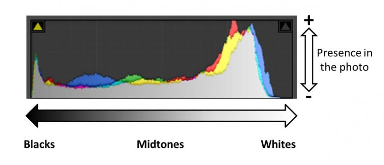
Histograms can look a bit scary at first, but once you know what to look for, they are quite friendly. The histogram is a bar graph with a horizontal axis and vertical axis which represent the shades you have in your photo. On the left edge you have the pure blacks and as you go to the right on the axis you have lighter and lighter tones until you reach to the pure white in the right edge. I have a little trick to remember where are the blacks and whites in the histogram. I always think the histogram is like “B&W photography”, black is first (in the left) and whites after them (in the right). For this trick to work you have to think from a left-to-right writing mode.
OK, so now we know what the horizontal axis means. What about the vertical axis (i.e. height of the histogram)? It tells you how much of each shade you have in the photo. The basic principle of reading the histogram chart is the same; the more data peaks you have in one area on the horizontal axis and the higher they are means that these are the tones and shades that are the most dominant in the photo.
Let’s see this in a real photo:
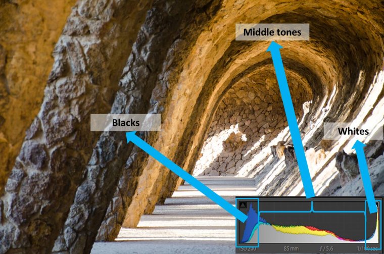
The histogram is a great tool for getting well-exposed images. A general rule of thumb is to have the histogram chart stretched all over the horizontal axis and avoiding having a skewed distribution (spikes) at the extreme left and/or right of the axis.
This photo is quite balanced, you can see that the histogram stretches almost all over the horizontal axis, the most dominant colors here are bright and for that reason, we see higher peaks on the right side of the histogram (but not at the edge)
A photo with too many peaks in the blacks means that it is too dark or underexposed. To correct the exposure, you will need to increase the light of your image by, for example, using a wider aperture or increasing the ISO.
This photo was under-exposed, that is why it is so dark and the histogram stretches only over the left-hand side of the axis, and we see that the peaks (which are high enough to be called spikes) are concentrated at the left-hand edge
On the other hand, if the photo has a lot of high peaks in the white, it means that it is overexposed or even burnt. This time, to correct the exposure, you will need to decrease the light of your image by, for example, using a smaller aperture or a lower ISO.
This photo has been over exposed and parts of it are even burnt, the histogram shows just that; we see the graph is very low the most part of the axis and only towards the right-hand edge of the axis the histogram rises sharply
Now you know! If you see that your histogram is too much in the blacks or in the whites, this means that you MIGHT need to correct the exposure of the image. Notice that I said MIGHT. Why? Because photography is a creative craft, so it might just happen that having an underexposed or overexposed photo is exactly what you are aiming for. You need to think what do you need in your final image and then see if the histogram you have matches what you are looking for. I will show you with a little game!
Let’s play the histogram game!
I am going to show you a histogram and you need to make an observation to decide which kind of photo might correspond to it. Spoiler alert! Don’t scroll down too far or you will see the answer! Let’s see the first one:
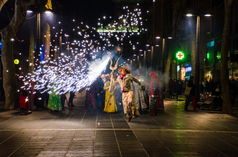
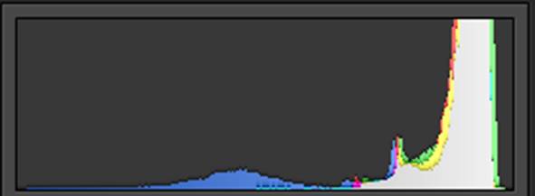
Histogram 1
Options:
A boiled egg on a white table
A night photography of a street event
A chess board
A multi-color chicken
Solution: Number 2! In night photography you will get histograms with a lot of peaks in the blacks area. But this is normal because night is dark and black is what we expect to find in the frame.
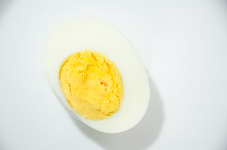
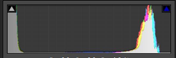
Histogram 2
Options:
A boiled egg on a white plate
A beach at night
A chess board
A gray cat on a brown sofa
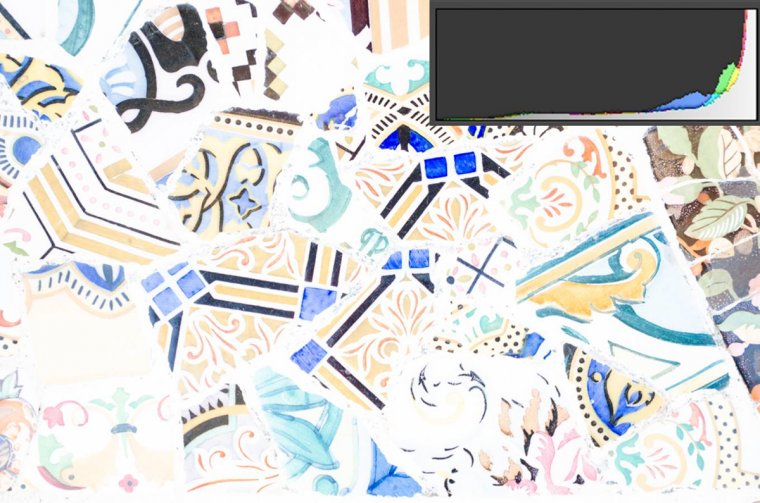
Solution: Number 1! We got a histogram with a lot of whites because the image is mostly white!
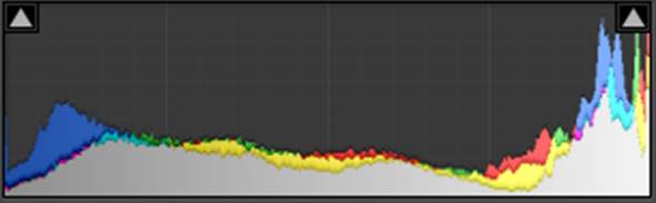
Histogram 3
Options:
A polar bear in the snow
A groom in black sitting in a black car
A multicolor bouquet of flowers
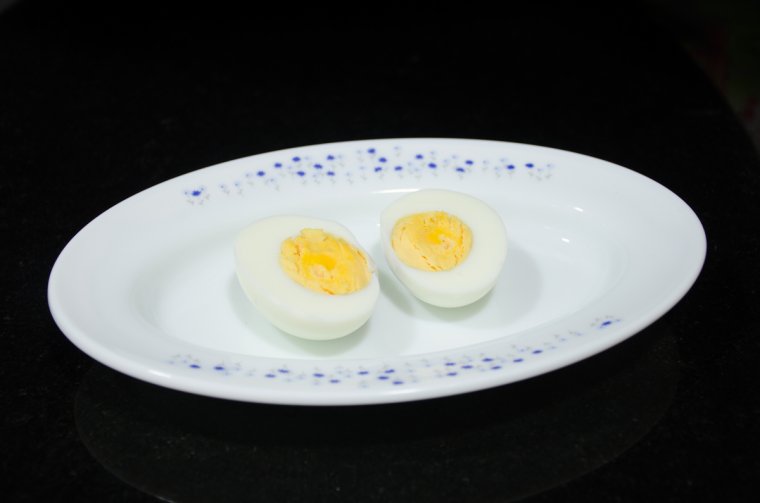
Eggs in a white plate on a black table
Solution: Number 4! Here the histogram shows peaks in both blacks and whites and almost no middle tones because the photo has high contrast: white and black are the main colors.
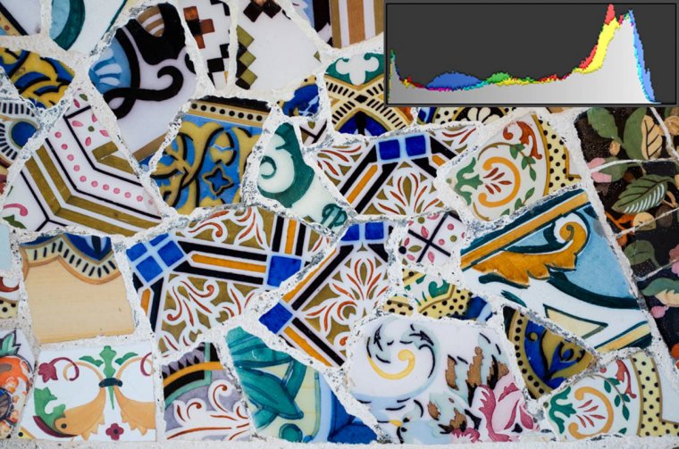
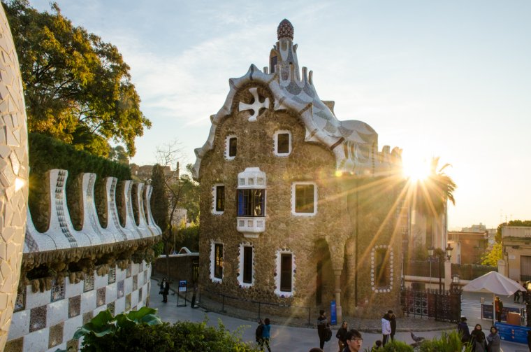
Histogram 4
A cat in the middle of the night
A bride in the snow
A colorful house with a sunburst
A colorful patchwork blanket
Solution: Number 3! The beautiful Gaudi House and the most part of the photo is well exposed, so the histogram has a lot of middle tones. However, the sun-star makes the whites in the histogram quite high. Exactly what I wanted!
What do you think about histograms now? Still scary? I hope not! It takes a bit of practice to get used to them, but believe me, it is totally worth it! A basic histogram can be very useful, but you need to get used to the particularities of each image in order to correctly read it. Something similar goes with post-processing. No matter how bright or dark your monitor is, looking at the cumulative histogram will always give you an objective assessment of the exposure of your final image. This way you will avoid the problem of publishing a photo that looks too dark or too bright in other people’s monitors.
Grab your camera and tell me how it goes! Have a happy shooting!
I am a biologist and a self-taught photographer based in Barcelona (Catalonia). Buddhist philosophy has a strong influence on me: I have a deep appreciation to life and I give a huge value to the little things that makes our days happier. I became a passionate about photography when I got my first camera and I understood that photography allows me to express my way of approaching life. I love learning so I am always willing to trying new things. These days I am shooting mostly nature and portraits.


 Facebook
 Google +
Comments (0)
There are no comments yet.