Tag: vintage

Using Photoshop Vintage Effect to Create Retro Style Photos

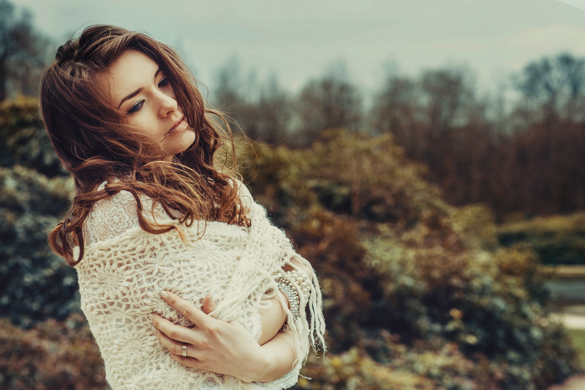
Retro is always something that comes back because we all want to think back to the times when we were younger. It is all about nostalgia, and that nostalgia is what gets people trying to create retro looks not only to movies, but to photography as well. That is essentially the entire concept of Instagram.

In the past, it was very difficult to get those retro photograph feelings without using film photography, but with new trends in digital photography and editing software, it is much easier. There are many things you can do in Photoshop and Lightroom to get the vintage look, but today we’re going to focus on the Photoshop side of it.

Making Adjustments

There are many ways that you can use Photoshop to get that retro feel. You can use helpful tools like Sleeklens presets but there is also a series of steps you can go through to make those adjustments to create the retro feel. The choice is yours if you want to do it quickly, or to do it yourself through the following steps.

retro-photography-1

Make It Soft

The first thing to do with the picture is to lower the clarity to -30, which will create a dreamy softness to the image. From this point, you are going to want to adjust the highlights and brightness of the picture. You can increase the exposure by about half a stop, and brighten up the highlights and the whites to get a bit of that burned out Photoshop vintage effect that is crucial to the retro feel.

You should also use the shadow slider to soften the shadows slightly, especially if you had only one light in the studio with you. Once you have done that, you continue to create the warm and soft tone by increasing the temperature of the photo, while also enhancing everything by decreasing the vibrancy.

retro-photography-2

Fix the Lighting

Chances are you are going to have to fix the lighting of the photo in order to get that retro look. When you are using a photo that only had one light source in it, this is very important to fix that lighting look.

The first thing you have to do is to increase the exposure with the adjustment brush that you have in Photoshop.

Once you have done that, you need to bring up the shadows to open everything up, and then you pull down the saturation.

retro-photography-3

Once that has been completed, you will turn on the Auto Mask and that will allow you to make some more unique changes. Take the Auto Mask and brush it on the outside of the subject. This will be important because it won’t ruin the image, but it will fix some of the lighting and shadow problems. Once you have done that, you turn off Auto Mask and then use a small hard brush to erase the images around the subject where the shadow is very strong, and that will bring it back to what it should be in the original retro look.

Great Tip – 4 cool photoshop tools that improve your editing workflow

Using Presets

One of the big advantages of using presets is that all the work is essentially done for you. All you do is load presets into Photoshop and that will allow you to select what you need to create the retro look. This is a good idea if you are planning on creating a lot of pictures that have a retro look. Presets like the “Nostalgic Vintage Collection” can do this for you, eliminating a lot of the tasks you would have to do yourself. Doing that for one picture is fine, doing it for 10 or more will get very tedious and it will take you a long time to get it done properly.

retro-photography-4

Filters

Some cameras will come with software built into the camera that you can use to create that retro look before you take it to Photoshop. This again can help to eliminate some steps for you, with you just needing to fix things like shadows in the program itself. You can also buy filters that create a retro look but again post-production work in Photoshop is usually required.

The retro look is big right now, and creating that retro look will help set you apart from other photographers. When you can create photos that look like they are from decades past, you are helping to create the nostalgic memories that many have for the past, and the pictures of their past.

How to Work with Forgotten Postcards: Creating Light Leaks in Lightroom

Welcome back!

Today we have a short tutorial on creating light leaks, using our “Forgotten Postcards” workflow.

In the old days of film cameras, sometimes you would have an issue with light leak where for one reason or another light would get in and expose the film when it wasn’t supposed to, but that can sometimes make a really neat effect. Since modern digital cameras don’t really have light leaks, so we are going to show you how to add them to your digital photos, using the “Forgotten Postcards” workflow.

With my photograph pulled up, we will get started by going into our “Forgotten Postcards” presets and applying Color Correct – Reduce Greens, which will help us with that washed out, desaturated vintage look.

Scrolling down we will find 15 light leaks preset to choose from, which recreate effects that would be seen with an old camera that would have had a light leak.

For this photograph We are going to use Light Leak 13, which adds a nice golden hue. However, for me, there is a little too much yellow. We can fix that by going over to the panel and making adjustments like turning the Saturation down, or you could do it by applying another preset, which is the way we will do it now.

So, going back over to the presets, we’ll apply the Tone/Tint – Less Saturation preset. Once applied, it toned down the gold color a bit.

The next thing that we’ll do is add a vignette. We will go with Subtle Black.

The effects that we have made to this photograph are pretty subtle with more muted tones. It does have some vintage attributes, but very subtly.

Let’s go to our next photograph now. With this photo we are going to use a more traditional light leak effect, but first we will start by applying a Matte preset. For this we will use Vintage – Matte Watermelon.

Then, we will go to the Light Leak presets and select Light Leak 3, which gives us the light leak effect all around the edges.

Once applied, I’m going to adjust this a little and change the colors through the panel. The color that I want to tone down is the red one, so I will click on that and turn the Saturation down just a bit, then actually change the red to more of an orange tone.

Now we want to bring a little more light to the subject, so for that we will open up our “Forgotten Postcards” brushes and scroll down to the Light – Brighten brush. Turning up the Exposure a little, we will run this brush over the little girl, who is the subject in this photograph.

Looking at our after effect, we didn’t really change too much. We did give the photo an analog feel with that light leak effect. We have also added a really rich tone to it as well.

Let’s move along to our third photograph.

We will start this one with one of our “Forgotten Postcards” Nostalgic Effect presets, using Vintage 10, which will give the photo a muted sepia tone and wash the color out.

Next we will apply Light Leak 13, which adds a reddish tone. This isn’t exactly what we were going for, so we’ll click the filter button and adjust it by moving the effect back and rotating it a little. Also, we will change the color by moving it down to a lighter tone.

Now that we have that the way we want it, let’s go ahead and apply a vignette to give it more of an antique feel. Scrolling down through our “Forgotten Postcards” presets we are going to apply Vignette – Subtle Black.

That was a really quick edit, but we made quite a difference to this photograph. The effects that you’ll get from the Light Leaks aren’t necessarily realistic effects, but you will the aesthetic that you may be looking for in that old fashioned, vintage look. In certain situations, that may be exactly what you are looking for.

I hope you enjoyed this tutorial and found it helpful. Try our “Forgotten Postcards” workflow for yourself and see what you can create!

How to work with Forgotten Postcards: Vintage Effects in Lightroom

Hello, today we have a tutorial on applying vintage effects with our “Forgotten Postcards” workflow. This is a really great workflow since that vintage aesthetic is really popular right now, which “Forgotten Postcards” is great for, with all of the tools to add rich tints and hazy atmospheres to your photographs.

I have my photo pulled up, so let’s get right into it!

We will start with one of the “Forgotten Postcards” Vintage presets, Scroll down and we will go with Matte Autumn. Once applied, this preset doesn’t only darken the photo, but also adds a bit of a brown tone to it.

The next thing that we’ll do is polish this up a little by applying the Polish – Sharpen preset.

Then, we are going to stack a Base preset on top, let’s go with Base – What Dreams May Come to add a little more light.

Now that we have applied three preset to this photo, it has already made a big difference. Now it’s time to move over to our “Forgotten Postcards” brushes.

With the brushes open, scroll down and the first brush that we are going to use will be the Face – Sharpen Face brush. Although I want this photograph to have a hazy look, I don’t necessarily want that on the subject’s face. So, we will turn the Clarity up and apply this brush to her face to help keep her in focus.

Click New to start a fresh brush, then the next one that we are going to use is the Light – Brighten brush. Similar to what we did with the Sharpen brush, we will apply this brush to our subject, turning up the Exposure as we go. I will tweak this brush just a bit more by turning the Highlights down and the Contrast up a little.

A lot of times when applying this kind of vintage look to a photograph by using warm, rich tones, the eyes can often get washed out. So, the next thing that we’re going to do is basically color the eyes back in to make them a little less muted. Let’s go into our brushes and scroll down to the Color – Aqua brush. Before we apply this brush, let’s make the brush smaller and adjust the color a little, moving the blue down to a less bright tone. Then, just run the brush around the iris of each eye.

Once I have colored her eyes, I will turn the Saturation, Exposure and Contrast up a bit, adding more light and contrast.

We took a nice photograph and wanted to give it an old school, vintage look, so we have added a hazy atmosphere and a rich, warm tone to it. But, we kept the detail of the subject and the color in her eyes.

Let’s move along to our next photograph.

In this next photo, I am going to start with one of the “Forgotten Postcards” Base presets. Scrolling down through those, we will go with Base – Auto Tone to add more light to the photograph.

Another common effect that you will see with vintage photos is a matte effect, so for this one we will scroll down to the Matte presets and apply Vintage – Matte Watermelon, which has added a warmer tone to the photo.

Now we will move over to our “Forgotten Postcards” brushes. Let’s open them up and select the Light – Brighten brush. I am going to turn up the Exposure and Contrast, then apply this brush over the girl in the picture, since she is the subject, we want to add more light and pull her out a little.

We will click New and start a fresh brush.

Now we are going to go back into our brushes and select the Color – Mustard brush. This brush has a really nice yellow color, adding a nice tone to your photograph. Turning the Exposure down, we will run this brush all around the edges, adding a richer tone to the scene.

As we look at the before and after of this photograph, you’ll see that we started with a nicely exposed photograph. Then, we added a matte effect and a hazy atmosphere surrounding the subject. We also added a warmer, richer tone with that mustard colored brush. Finally, we added a bunch of light to the subject to bring the focus in on her.

Now, on to our third photograph. This clean and modern looking photo is kind of a less conventional photograph to give a vintage look to, but we are going to do it anyway, since I think it will work out nicely.

To get started we are going to apply the All in One – Yesteryear preset, which will add a matte effect with muted colors. The one thing that happens when applying this preset is the Clarity get raised way up, but we can tweak that by just going into the Basic tab and turning it back down some.

Now we are going to go down to the Nostalgic effects, for this we will go with the Nostalgic Effect – Vintage 1preset, which will brighten the photograph while adding a rich, warm tone.

I am going to tweak this a little by turning the Highlights down, as some of the highlights were kind of blown out and really bright around the windows and curtains in the background.

Even though we are going for the effect of muted colors, I do want to bring some of the blue back into the photograph because the blue details in the clothing will work really nicely.

So for that, we will go into the Color tab and under Saturation, we will turn the Blue and Aqua up a bit. Once turned up, it brings a lot of that color back to the clothing.

The last thing that we will do is add a vignette to this photograph which is traditionally seen in old or vintage photography. Going back to our “Forgotten Postcards” presets, let’s scroll down and select Vignette – Subtle Black which will add a subtly darker toned border around the outer edges.

Hope this guide helps you out and don’t forget to check our videoguides on how to edit photographs with “Forgotten Postcards Workflow” – you can ace vintage effects in only a couple of minutes!

How to Work with Forever Thine: Vintage Aesthetics in Lightroom

Welcome back! Today we’ll be taking a look at how to work with the “Forever Thine” wedding themed workflow, more specifically, how to apply a vintage looking aesthetic to your photographs.

This is becoming more popular, especially with weddings that are outdoors, in the spring or fall. The effects give the photographs a nice homegrown, vintage wedding look.

Let’s go ahead and get started with my first photograph, which is of a bride and groom walking from their outdoor wedding ceremony.

To start this one off, we will use a “Forever Thine” Base preset. Let’s scroll through those and select Base – Camellia, which will lighten the photo up just a bit.

Next, we’ll move on to a Tone & Tint preset and to help create that vintage, faded matte effect, we will apply the Fading Dream preset.

Another nice aesthetic that is really popular is a matte effect. With several different matte effects included in the “Forever Thine” presets, there many choices. In this photo we are going to go with the Matte – Wanderlust preset. Once applied it has added some contrast, but also added some matte finish to the darker areas.

To adjust this preset a little we will go into the Tone Curve, by dragging the bottom of the lineup some we will add to the matte effect.

Other presets that add a nice vintage look are the Film presets, so let’s scroll down to those and go with Film – Sunset Boulevard, which will change the color and tone a bit.

Next, we’ll move over the “Forever Thine” brushes, starting off with the Light – Darken Shadows brush. Making the brush larger and lowering the exposure, we’ll apply this brush to the background to help darken the shadows some, making sure to get in close to the subjects so they aren’t outlined by a ring of light. The point of using this brush is really to bring the focus to the subjects of this photograph.

In the before and after, starting out with a nice wedding photograph, we added an old school or vintage effect which goes along nicely with the fall theme already in the photograph.

So now we’ll move on to another photograph, this time of a bride and groom on a shoreline with the bride’s veil blowing in front of them. Like the previous photograph, we will give a vintage effect to this one as well.

Getting started, we are going to go back to our “Forever Thine” Film presets and like the previous photo, we’ll apply Sunset Boulevard.

Next, we will scroll down to the Wedding Vintage presets and apply First Class.

The really nice thing about these presets is that they are completely stackable, so while applying one on top of another, you aren’t canceling out the effects of the one previously applied.

Now just to tweak this preset a little, we’ll go over and open the Basic tab, then move the Clarity up just a bit.

Those are the only two presets that I’m going to apply, now we’ll move over to our “Forever Thine” brushes.

Starting out, we will use the Light – Brighten Highlights brush. Let’s turn the Exposure up and apply this brush all around the bride’s veil as well as the groom’s suit.

Now let’s go back into the “Forever Thine” brushes, then scroll down to the Wedding – Clarity & Detail brush and apply this brush to the veil and dress, to help bring some more of the detail out.

Next, I am going to open up the Basic tab and move the Exposure and Contrast up slightly.

Now when we applied one of the presets, we lost a lot of the blue in the sky. To fix that and bring it back we’ll open up the controls for the colors, then slide the Blue up some. I’ll push the Red down a tiny bit as well.

Finishing up with this photograph, we can see that we have given it an older looking sepia effect with a nice brown tone. The picture that we started with was a nice photograph, we just gave it more of a vintage look, which is really trending right now.

Now, on to our third photograph. In this photo the bride and groom are standing in front of a white fence, a little further back from the camera. This is a nice photograph, however above the subjects it looks like some of the highlights coming through the trees are a bit blown out, so we will have to fix that as we go.

Getting started, we are going to go into our presets and apply Wedding Vintage – Pine, which darkens the photo and gives it a warmer tone. Once applied, let’s open the Basic tab and slide the Highlights down quite a bit, so we can get some of that detail back in the background. It has really darkened the photograph, but we will bring some like back to the subjects as we go along.

This photograph is framed naturally by the trees in it, but we are going to enhance that by adding a vignette. In this photo we will use Vignette – Black Heavy. Since this is really dark, we will go over the Effects tab and Slide the Highlight Priority Amount up a little so it isn’t as dark around the edges.

Let’s now move over to the “Forever Thine” brushes and select Wedding – Fix Underexpose which will help bring some light back. So, we’ll make the brush a little bigger and run this all around the subjects and the center of the photo, turning up the Exposure, Contrast and Clarity while we go.

Now going back into the brushes, let’s use the Wedding – Clarity & Detail brush. Turning the Exposure up, we will run this brush right around the bride and groom to bring a bit more detail and light back to them.

That’s all that we will do with this photograph. By adding this vintage effect, we have focused a lot of light on the subjects while giving it a nice warm tone and color.

I hope that you enjoyed this tutorial and found it helpful. Hopefully you’ll be able to try our “Forever Thine Workflow” for yourself soon.

How to work with Grayscale Essentials: Creating Vintage Photographs

Hello all! Today we have another tutorial on how to work with the “Grayscale Essentials” workflow by Sleeklens. Specifically, We’ll be talking about creating vintage photographs using the Matte, Sepia and Film Grain presets that are included with this workflow.

So, let’s get right into it. For my first photograph, I have a picture up of a boy sitting in front of what appears to be a wood paneled building.

Getting started, the first thing that I’m going to do is go into the “Grayscale Essentials” Tone/Tint presets. We are going to use the Tone/Tint – Sepia preset.

Once that has been applied, we will go over to our Basic panel and make some adjustments to that preset, turning the Contrast and Exposure up just a little bit.

Now let’s go back over to the presets, this time we’ll go with the Effects – Film Grain 3 preset, to give the photo an even more vintage feel. This preset will give the photograph kind of a grainy texture.

The last thing that we’ll do to this photograph is use a vignette. Going back into our “Grayscale Essentials” presets, we will scroll down and select Film Grain Vignette 5. When applied, we will get a white vignette, however I want it to be black. We can change this by going over to the panel on the right and going into Effects, then Highlight Priority. From there we will move the Amount Slider back until the vignette is as dark as we want it to be.

What you may find with older photographs is that if they aren’t in black & white or not completely tone sepia, you’ll often find the colors more muted. For that, we can go into the Colors tab and make adjustments. In this photo we are going to turn down the saturation of the colors, to get more muted tones. Next in the Colors tab, we’ll go to Luminance and turn up the Yellow and Aqua.

So, that’s one way to do it. What we have done mutes the colors a bit and given its an old, used photograph feel.

Now let’s move on to our next photograph. We’ll start with this photo by converting it to black & white. To do this, we will scroll down through our “Grayscale Essentials” presets, until we get into Film – Black & White Contrast 3. Once we’ve applied that preset we will scroll back up through our presets and select Exposure – Matte Finish, giving the photograph that vintage matte finish that we often see with older pictures.

Next we will go ahead and tone it with the Tone/Tint – Sepia 3 preset.

Then, like the previous photo, we are going to use a vignette again, but instead of using the vignette preset, this time we are going to go into Effects and make our own.

So, go over to the panel on the right, then go into the Effects and move the Amount slider to lighten it up a bit.

Go back over to the “Grayscale Essentials” presets and find the Base preset. This time we’ll go with Base – Classic, just to add a little bit of a darker tone. After applied, I am going to open up the Basic tab and make adjustments by bringing the Contrast, Highlights and Shadows down just a bit.

Now we want to add that grain back in. To do that, we will go to our Effects presets and select Film Grain 4, really adding a grainy vintage feel to the picture.

That is all we are going to do with this one. We started with a highly saturated, modern photograph and gave it a really nice vintage feel.

Now we will move to our third photograph. For this one, I am going to start with an All in One preset.

Let’s go into our “Grayscale Essentials” presets and click on the All in One – Yogi Bear preset. I like this preset because it does convert the photo to a grayscale, but it also adds a sepia tone to it, which give this photo a nice dark brown tone.

Next we will go to the Base – Clean preset, to bring a little bit of light back into the picture. Then to get that grainy effect, we will use the Effects – Film Grain 3 preset.

Before we finish I want to also add a vignette, so for that I am going to use Film Grain Vignette 3, but like earlier, I would prefer it not to be white. So to fix that, like with the previous photo, we will go into our Effects, the Highlight Priority and move the Amount slider down to give the vignette a much darker tone.

Next, we will go into our “Grayscale Essentials” brushes, then scroll down and select Light – Brighten. I’m going to run this brush all over the subjects, increasing the Exposure some, just to add a little more light and help them stand out a bit.

In the after effect of this photo, you’ll see that we have added the matte effect, the grain and the sepia, all coming together nicely to give this photograph that old fashioned, vintage look.

I hope you all enjoyed this short tutorial and found it helpful. Hopefully you can try it for yourself and create some beautiful images soon !