Tag: post processing

Tips for Post-processing Forest Images in Lightroom

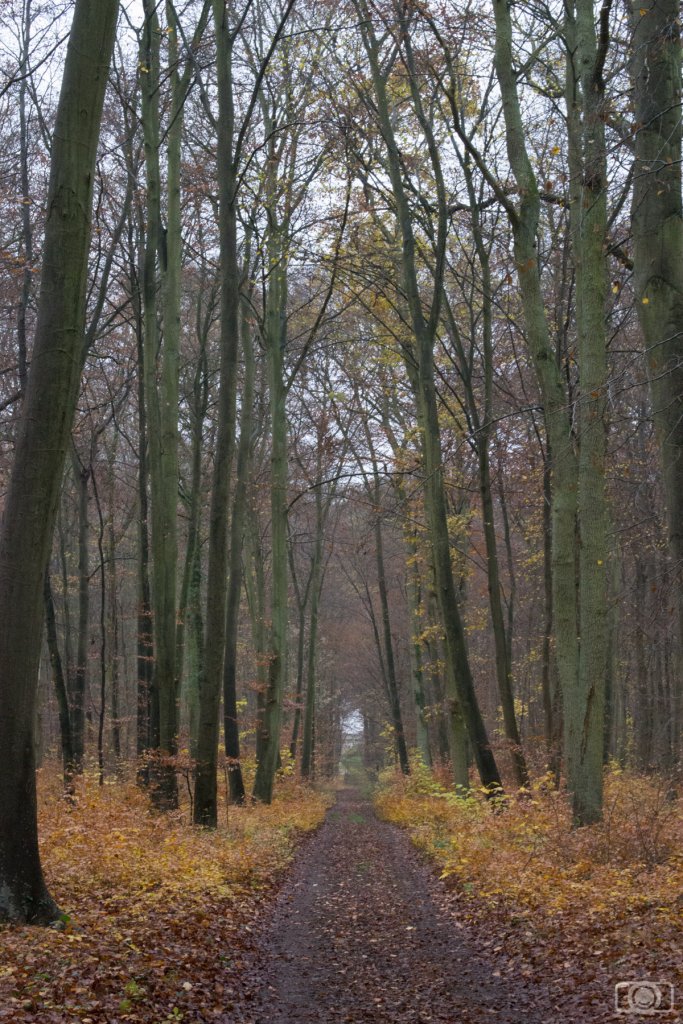
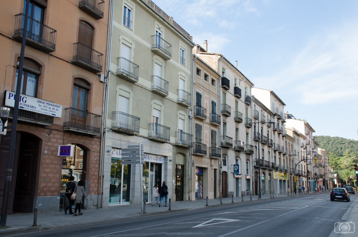
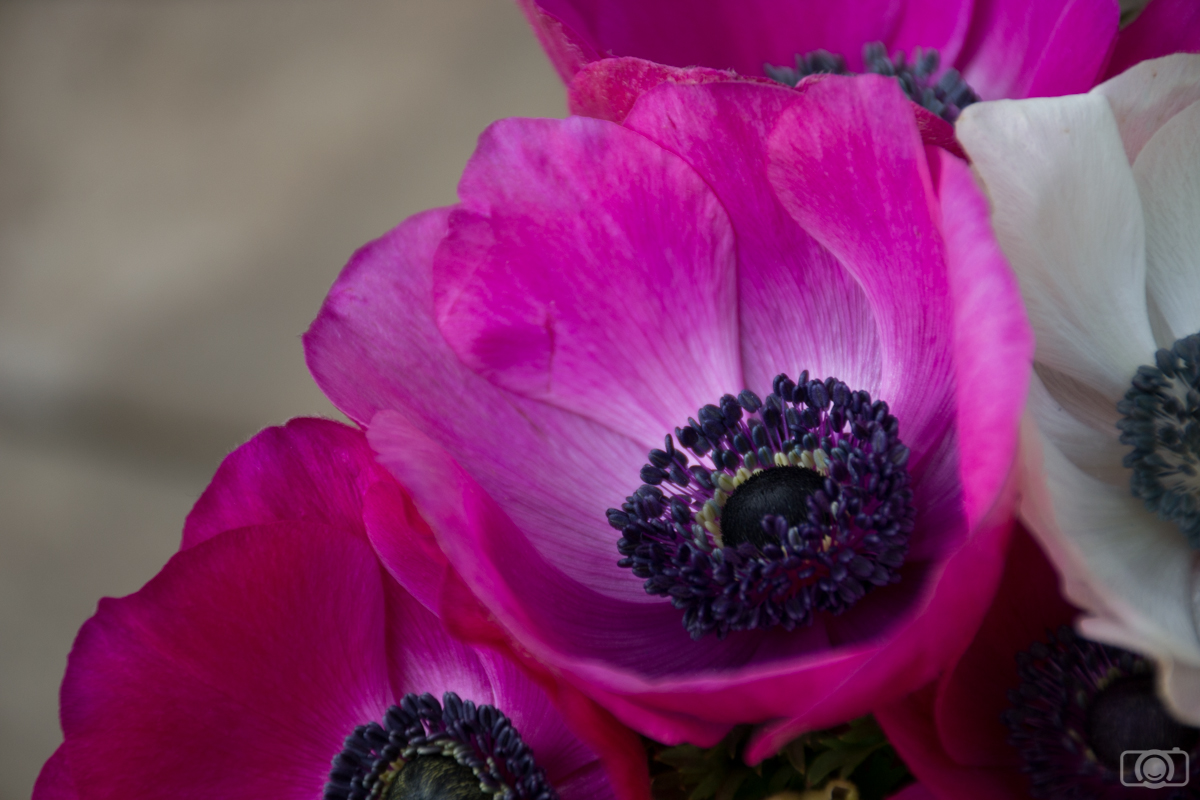
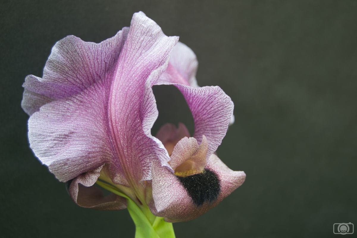
If you like nature and landscape photography you probably take photos of forests, your local wood or even parks. I can teach you how to install presets if you want. In Mark Jones’ article you will find nice tips for forest photography. I take a lot of forest photos in autumn, so in winter I usually find myself with a bunch of photos to post-process. In today’s article, I am going to give you some tips that will help you on the post-processing in Lightroom of all the forest images you already collected. This is a lot different from editing a macro photography in Lightroom.

forest images

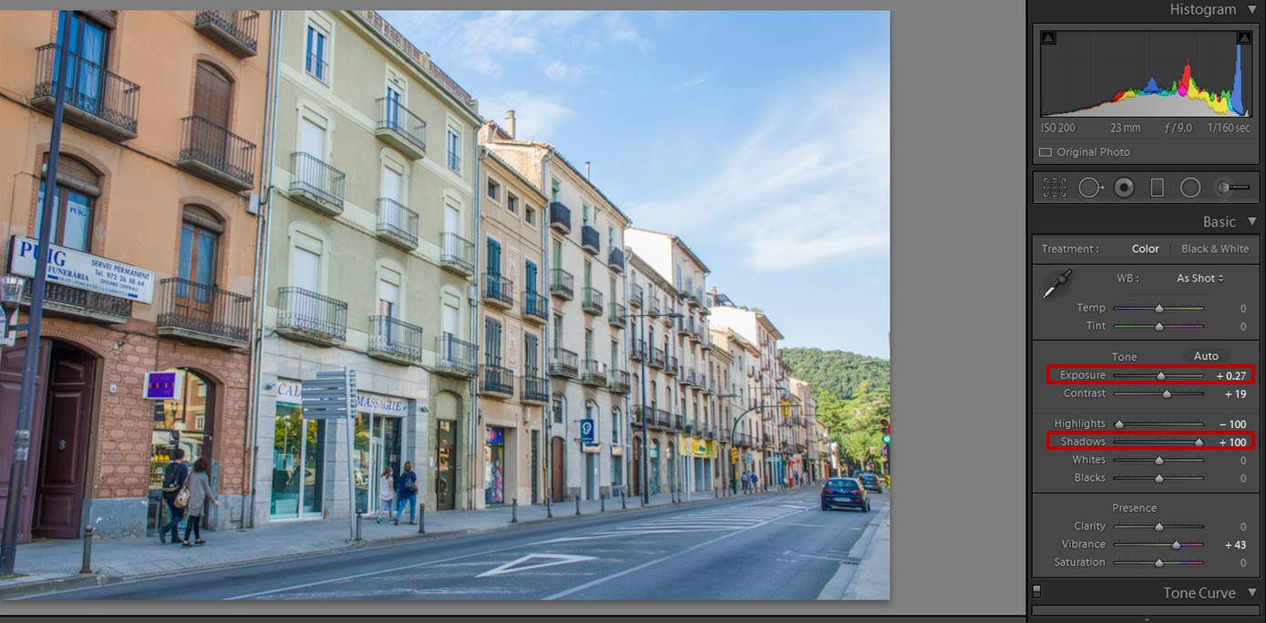
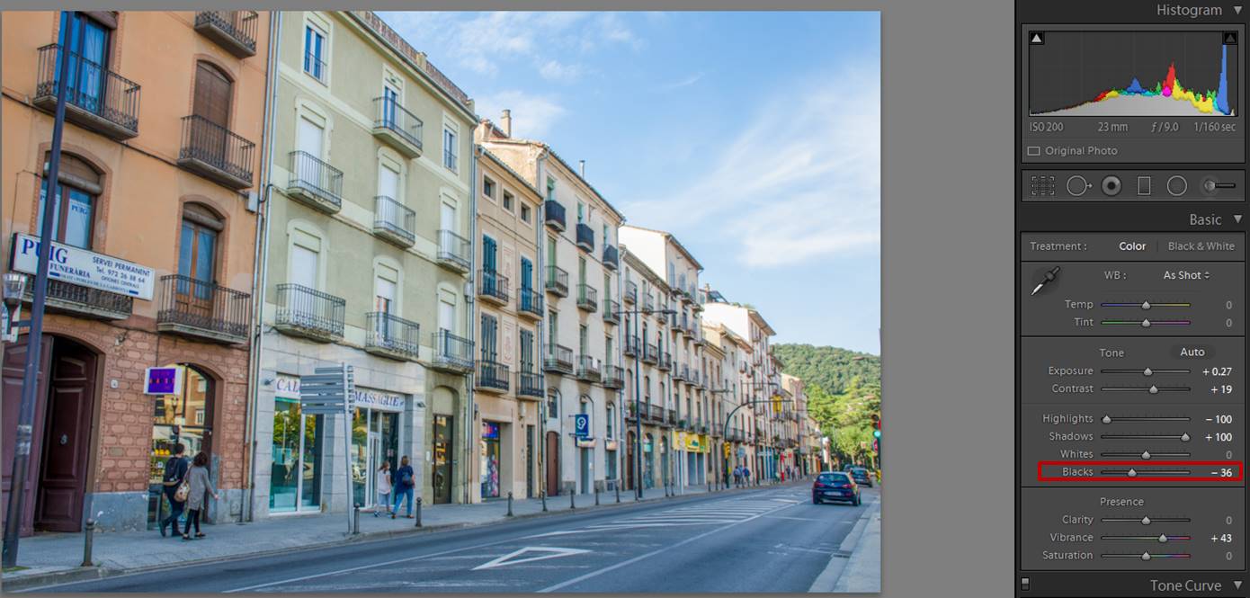
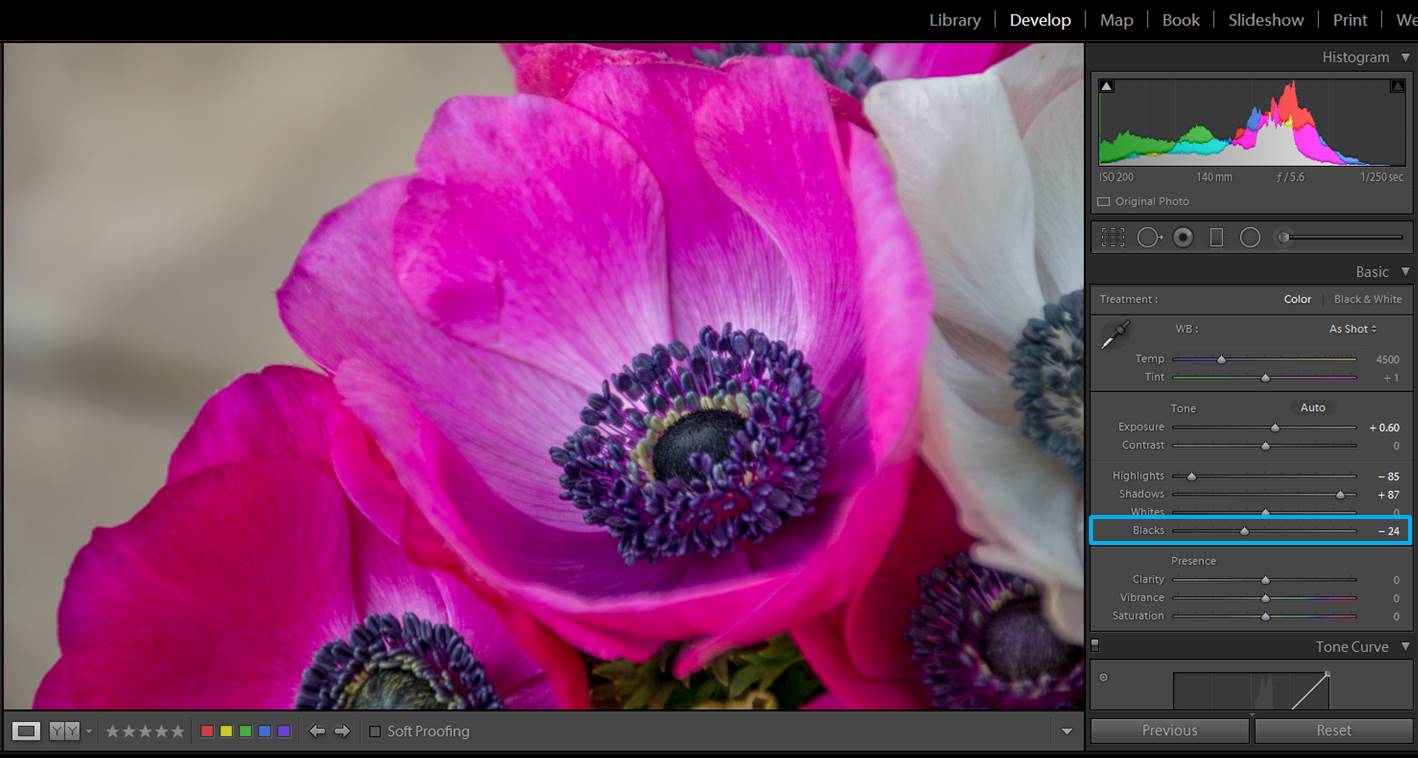
Decrease shadows and increase blacks

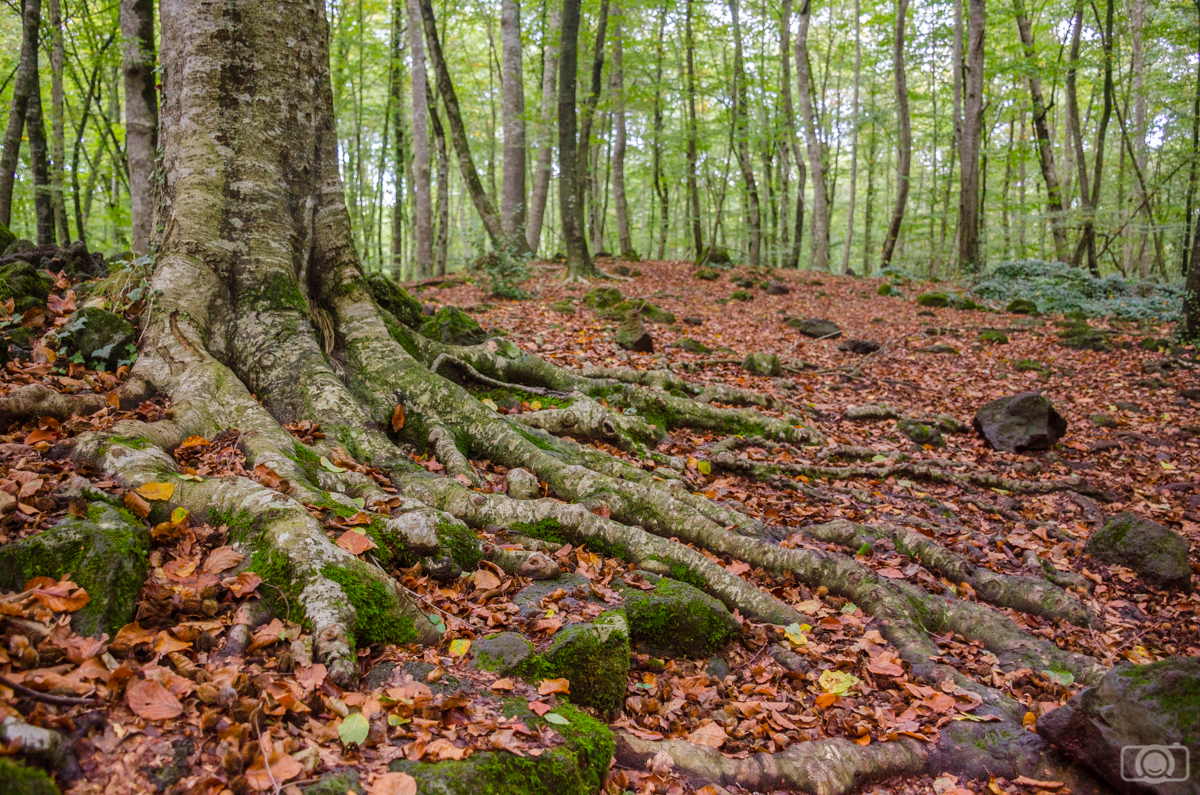
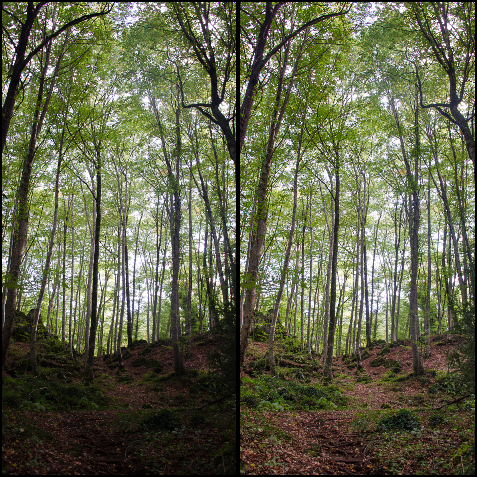
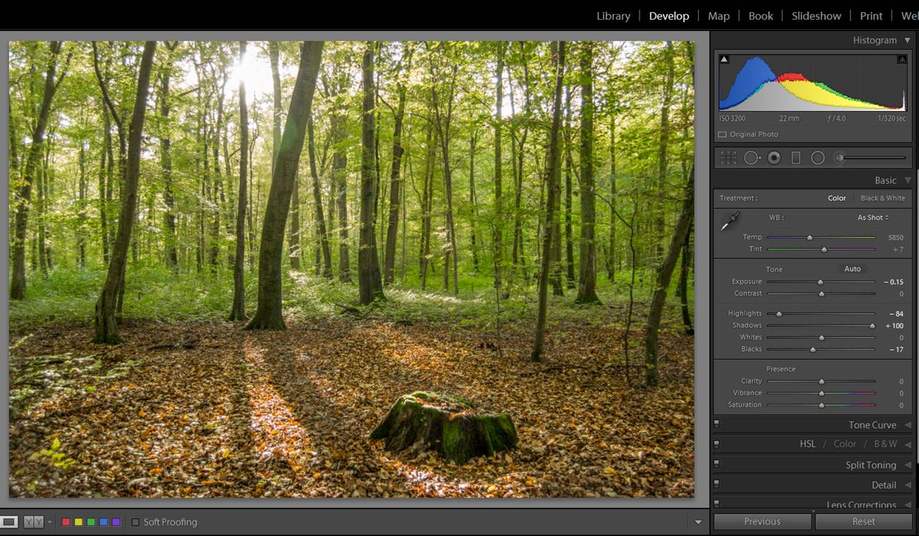
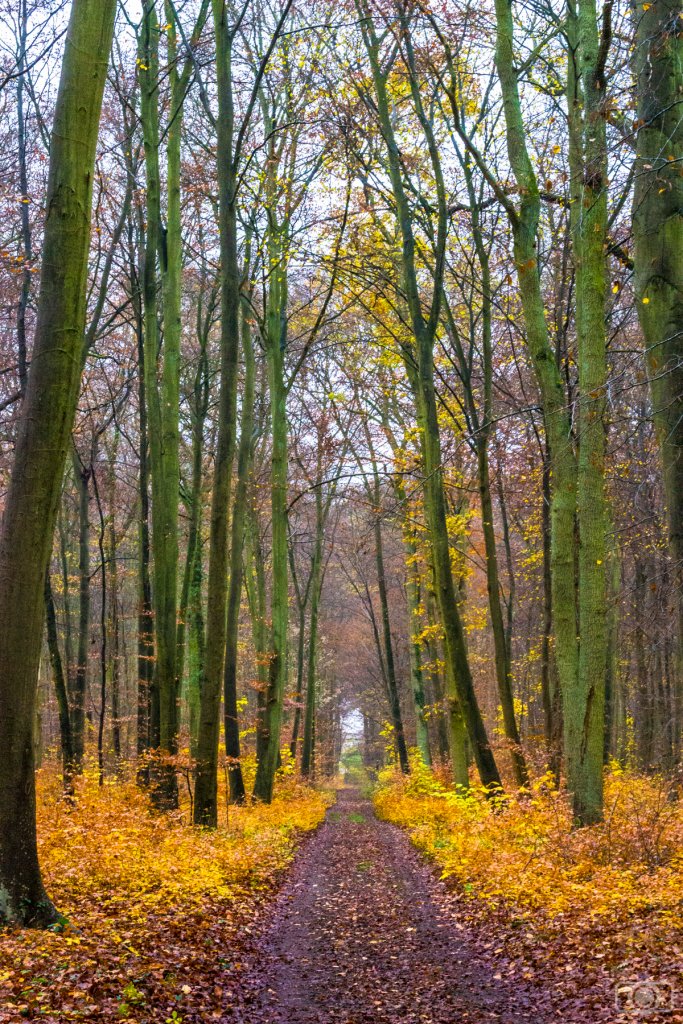
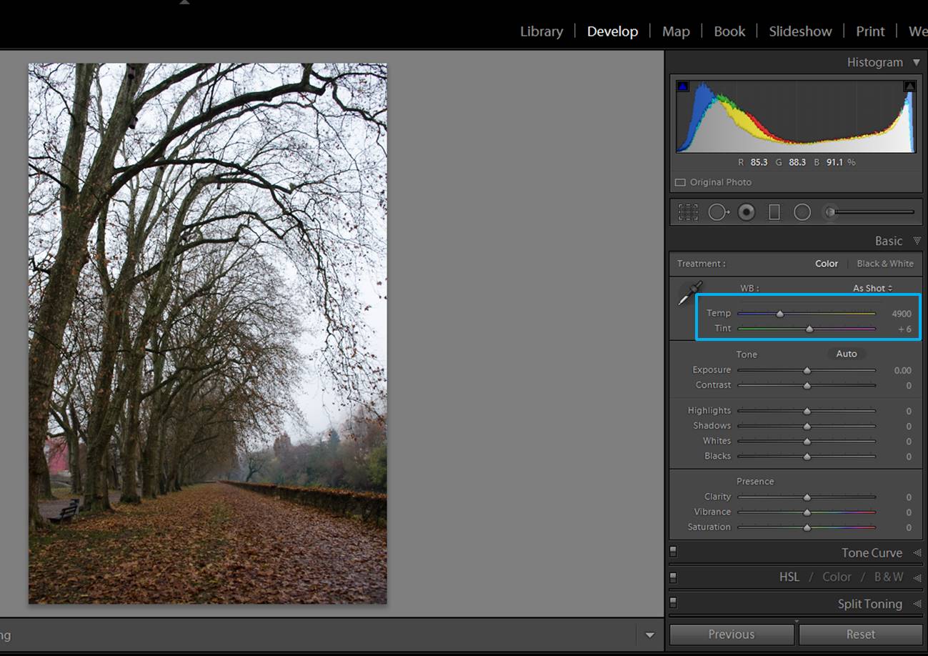
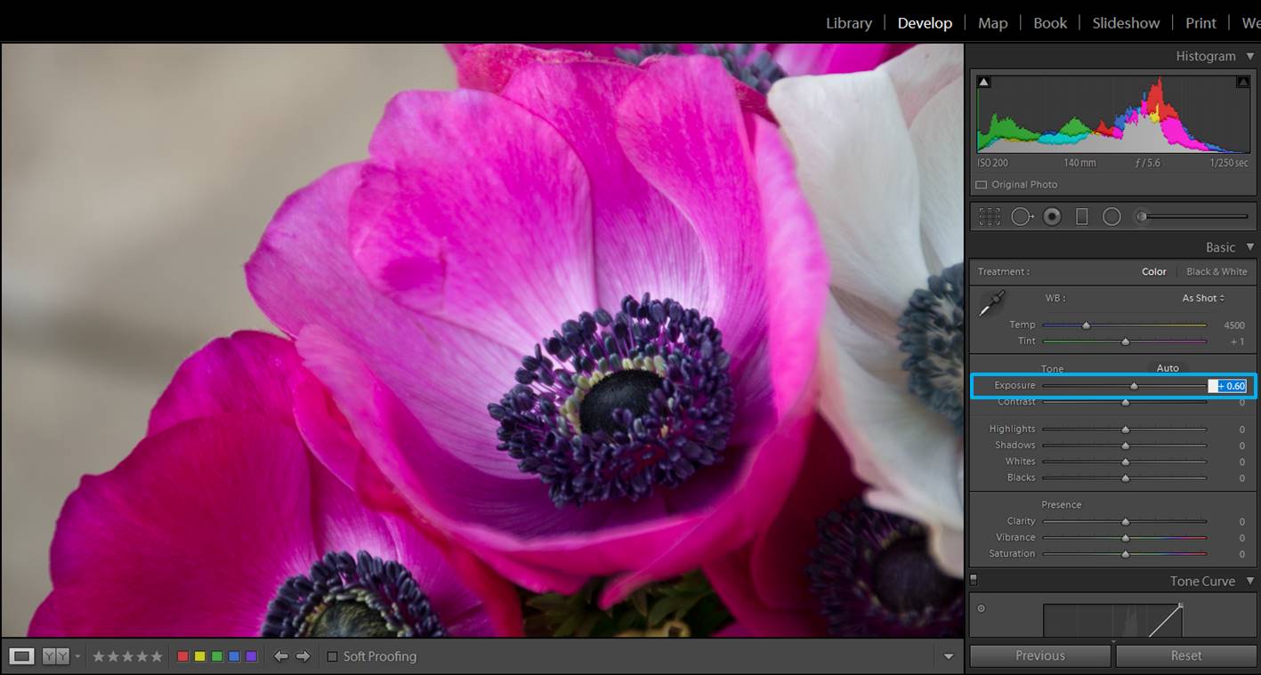
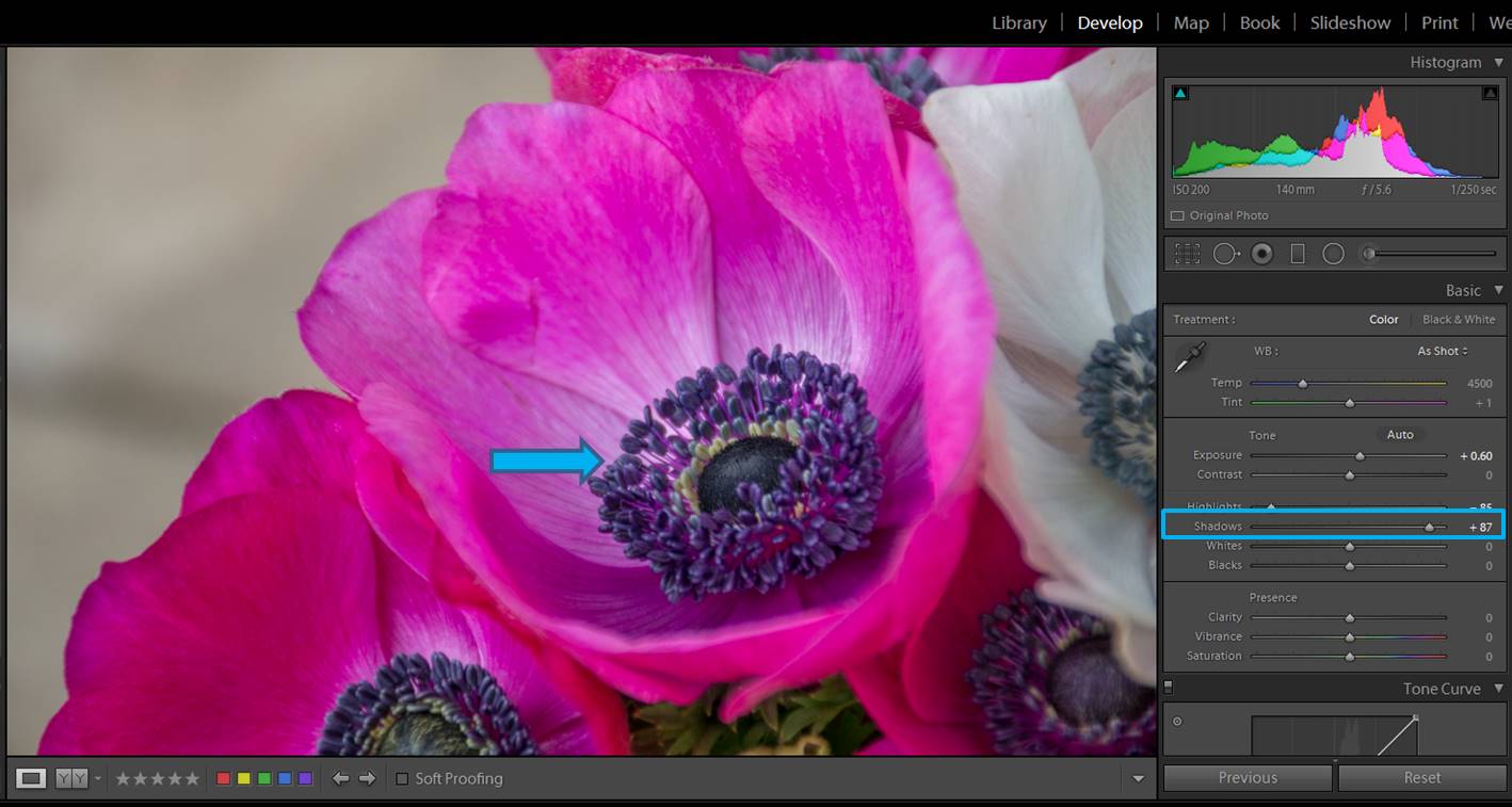
When you take photos of trees, with the light coming from up and going through leaves you usually get the upper part of the image with a nice exposure but the soil remains in the shadow.

forest images
This is the non edited photo. As you can see, the leaves are well exposed, but the earth is way too dark.

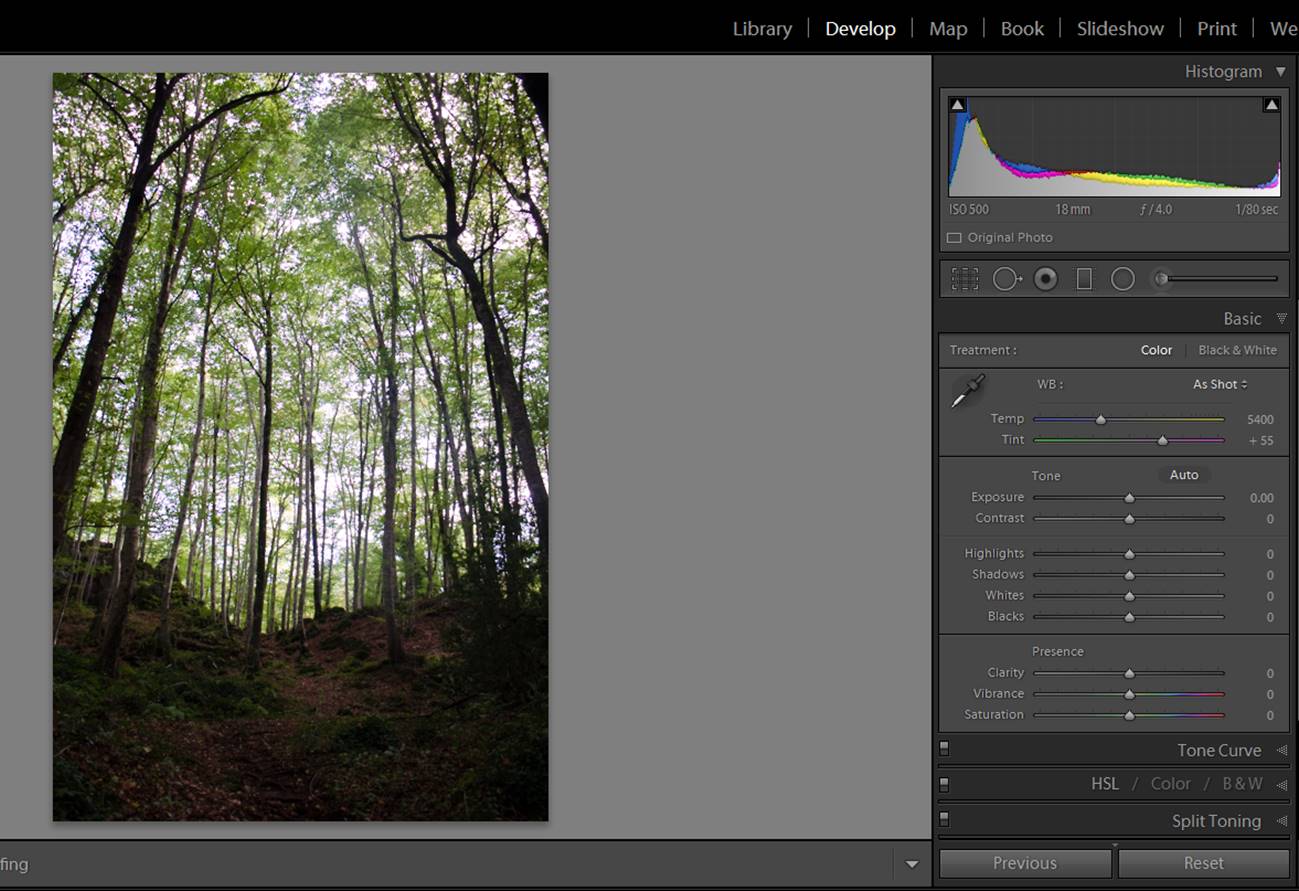
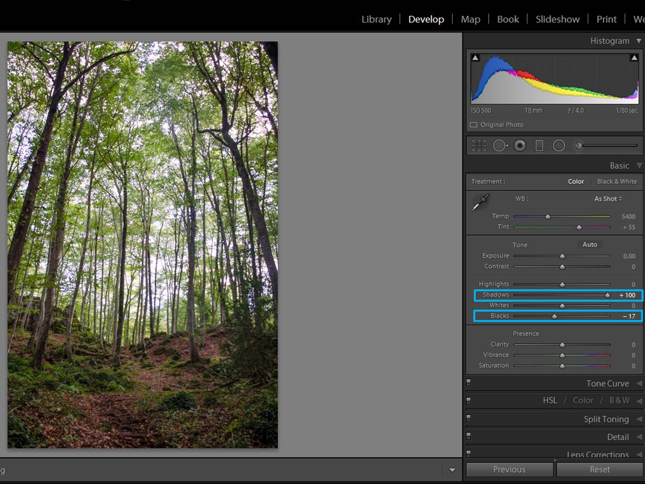
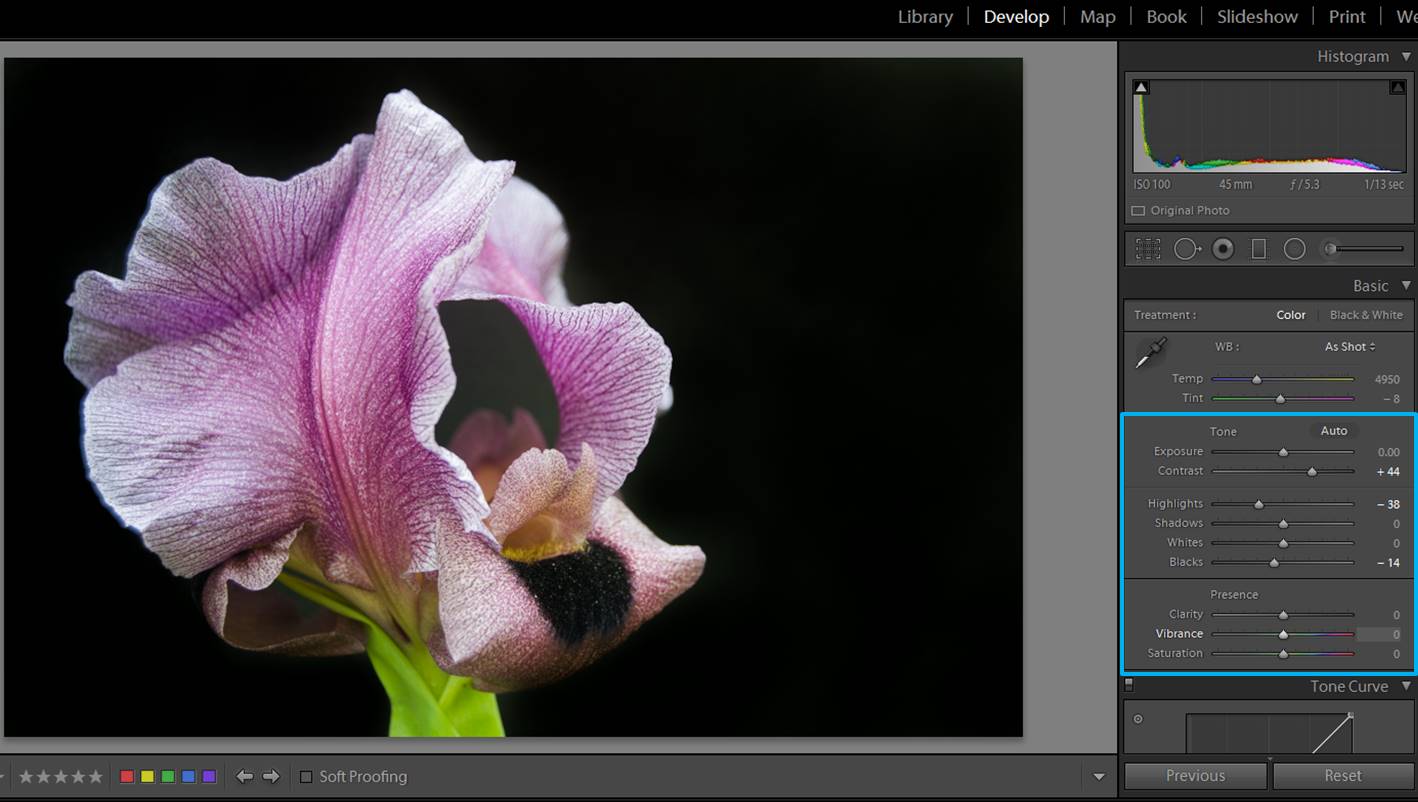
You can improve your photo by opening the shadows (moving Lightroom preset Shadows slider to the right). Maybe this will make you lose a bit of contrast, but you can fix it easily by darkening the Blacks (moving the Blacks slider slides to the left). With these two adjustments you will make appear the details in the shadows without losing contrast in the blacks.

forest images

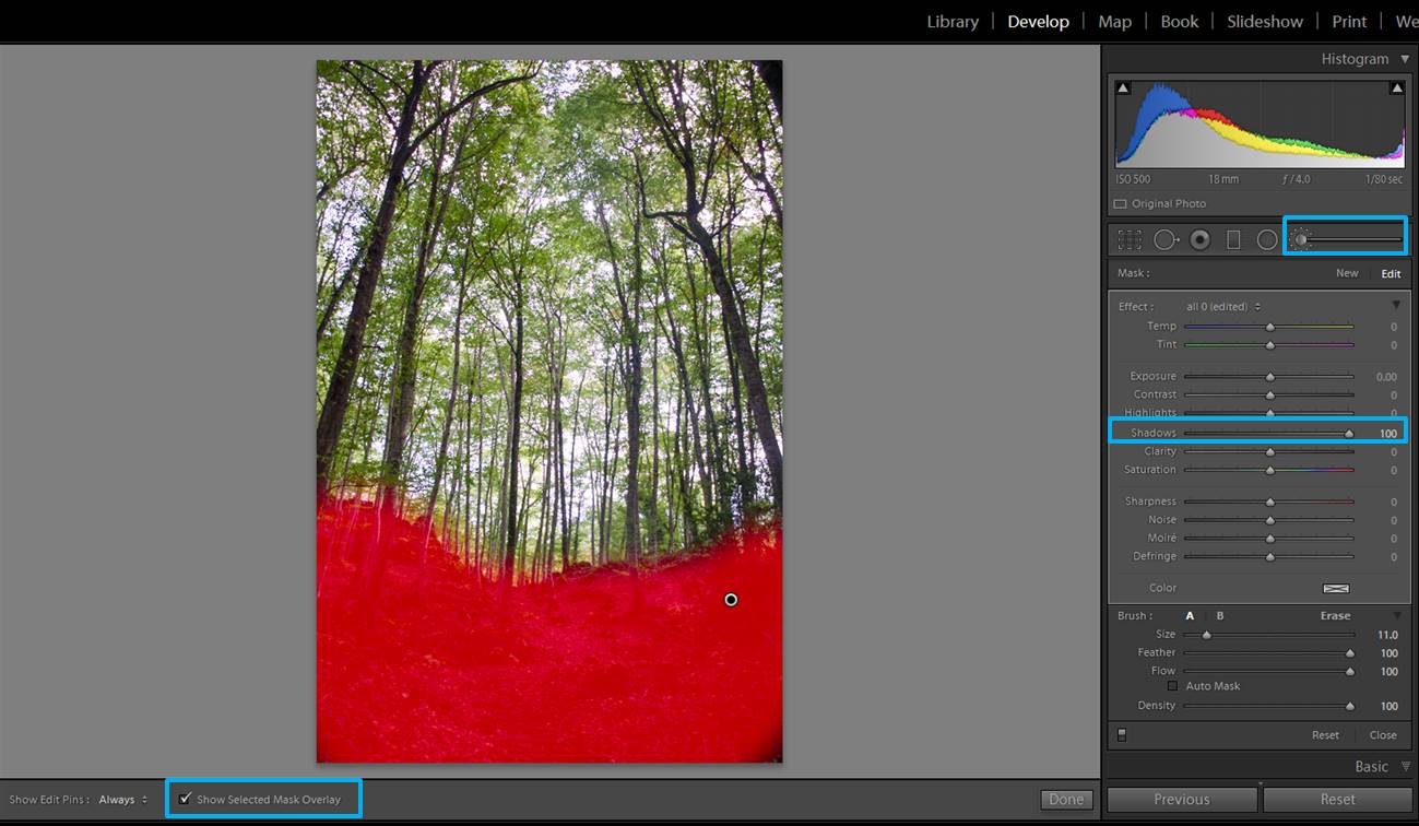
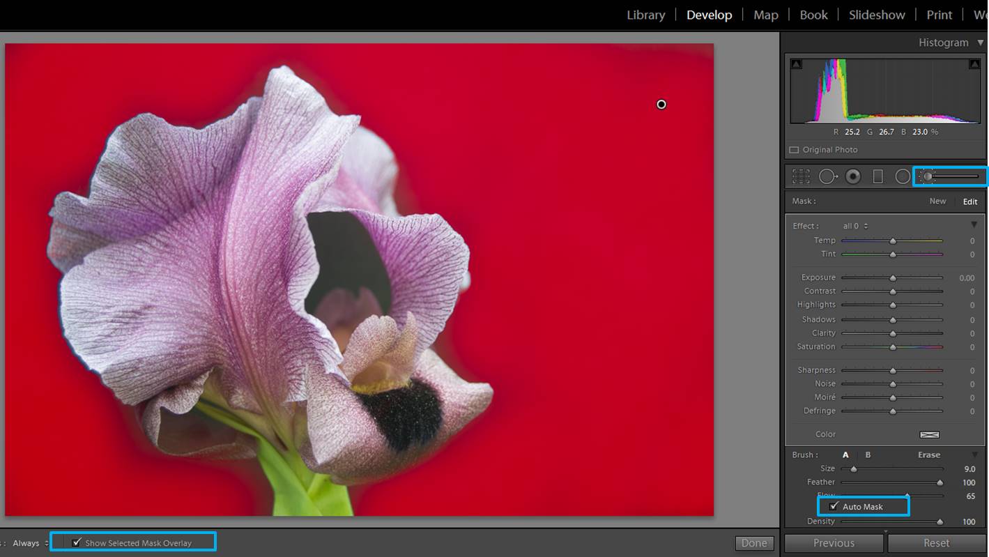
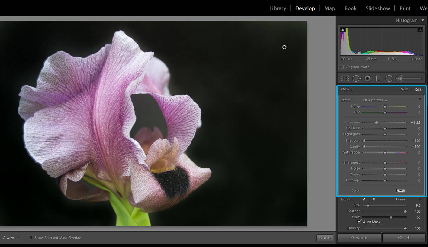
If you want to open the shadows a bit more, you can do it using the brush tool. Select a brush with the shadows slider towards the right and “paint” the area you want to work with.

forest images
You can “paint” areas of your image with a brush that will brighten the shadows even more (Shadow slider towards the right side). If you check the box that says “Show Selected Mask Overlay” you will see in red the area you are painting in.

With these adjustments you can improve a lot a photo with a combination of light and shadow

forest images
On the left, the non-edited photo. On the right the image after brightening the shadows and darkening the blacks. I will probably work a bit more in this image (color, highlights…), but as you can see, just with these simple adjustments you can improve a photo a lot.

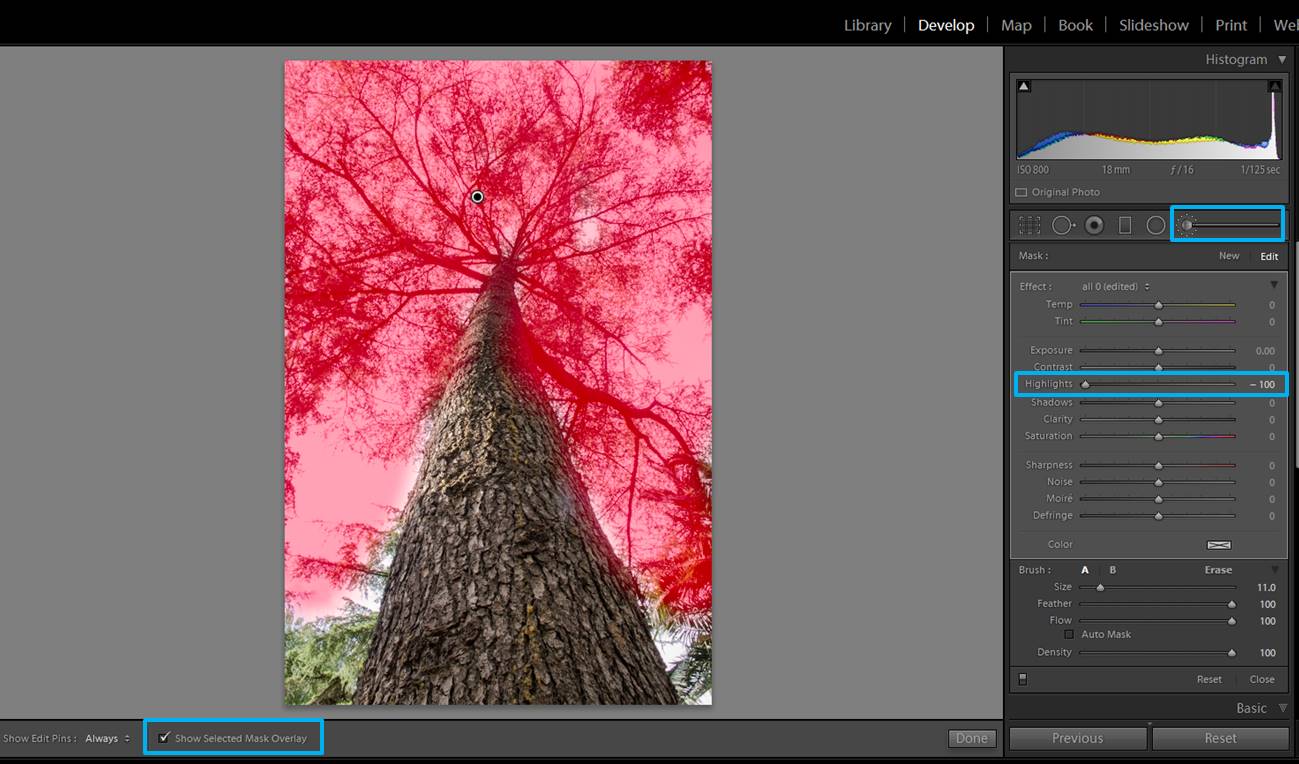
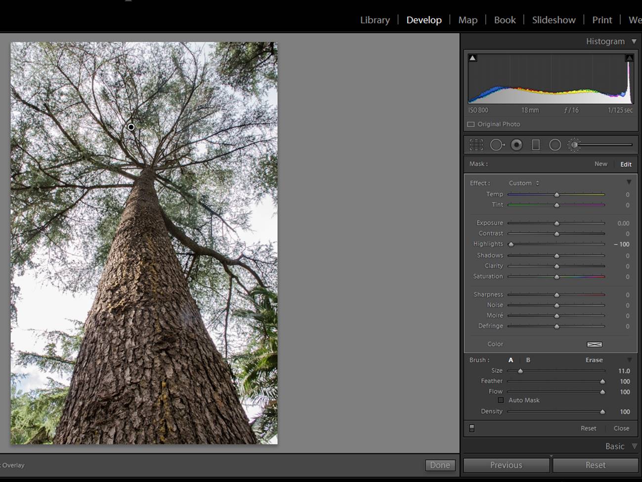
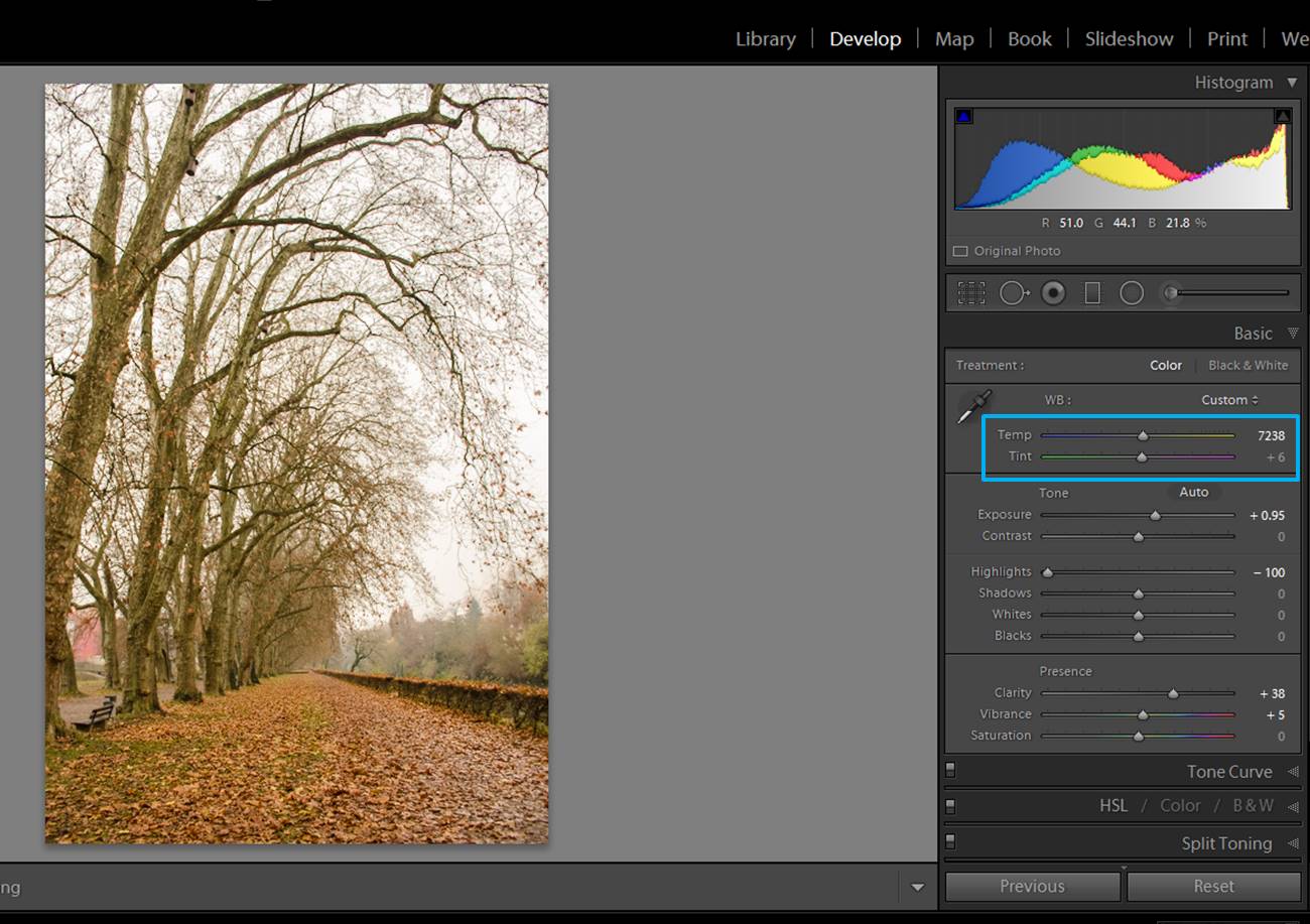
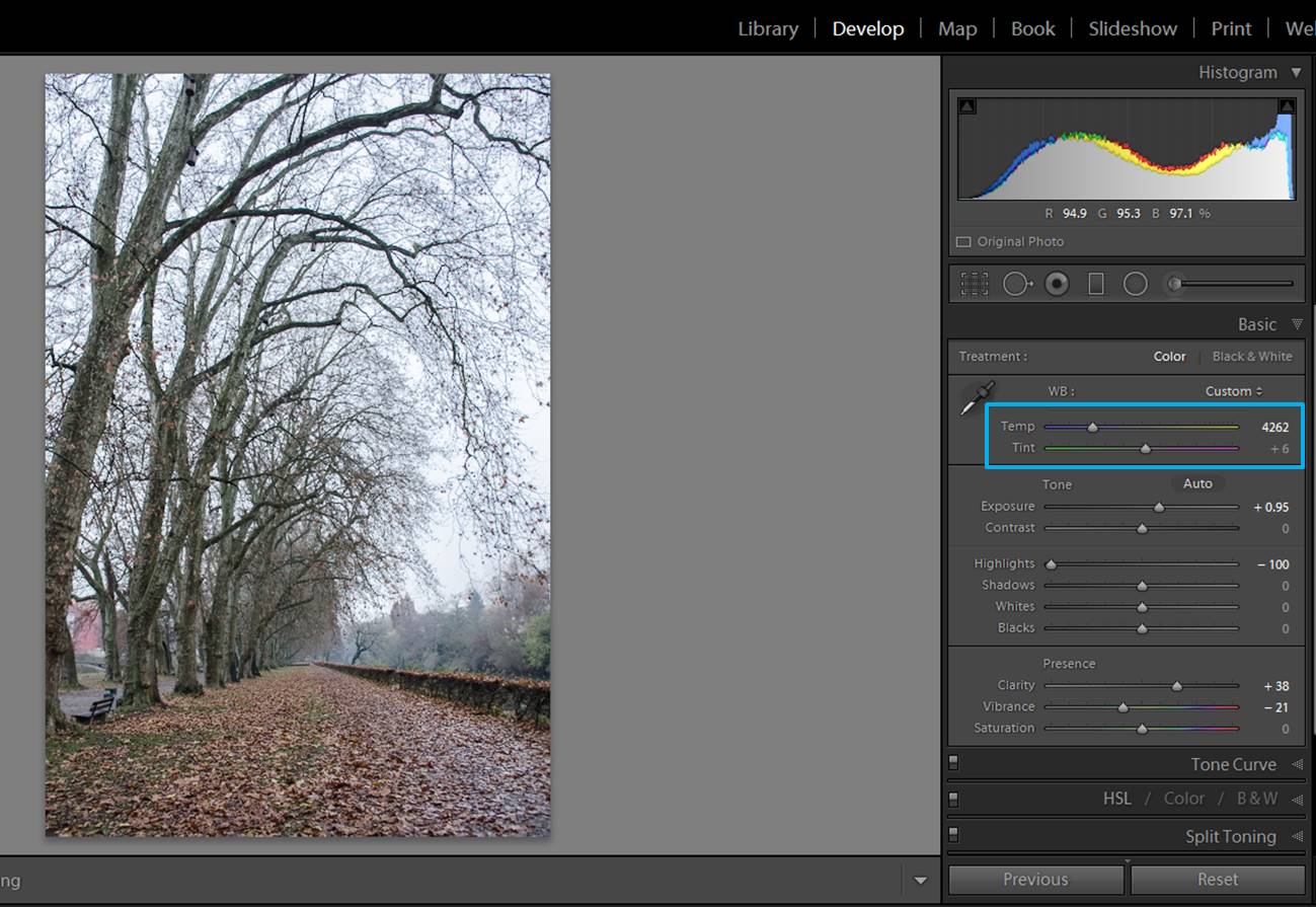
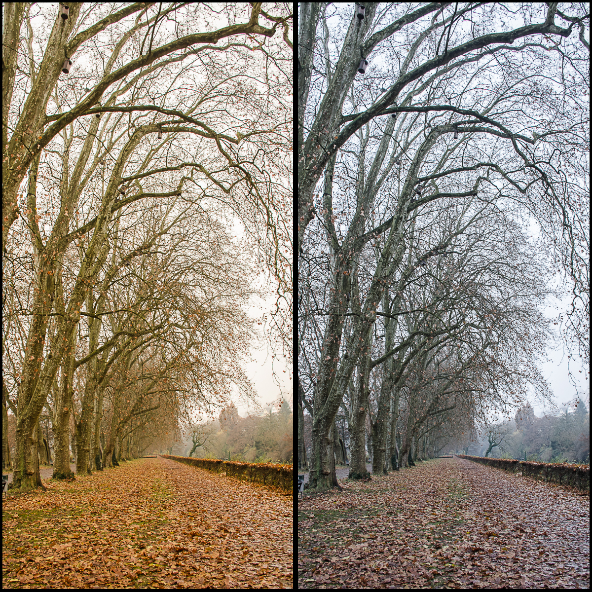
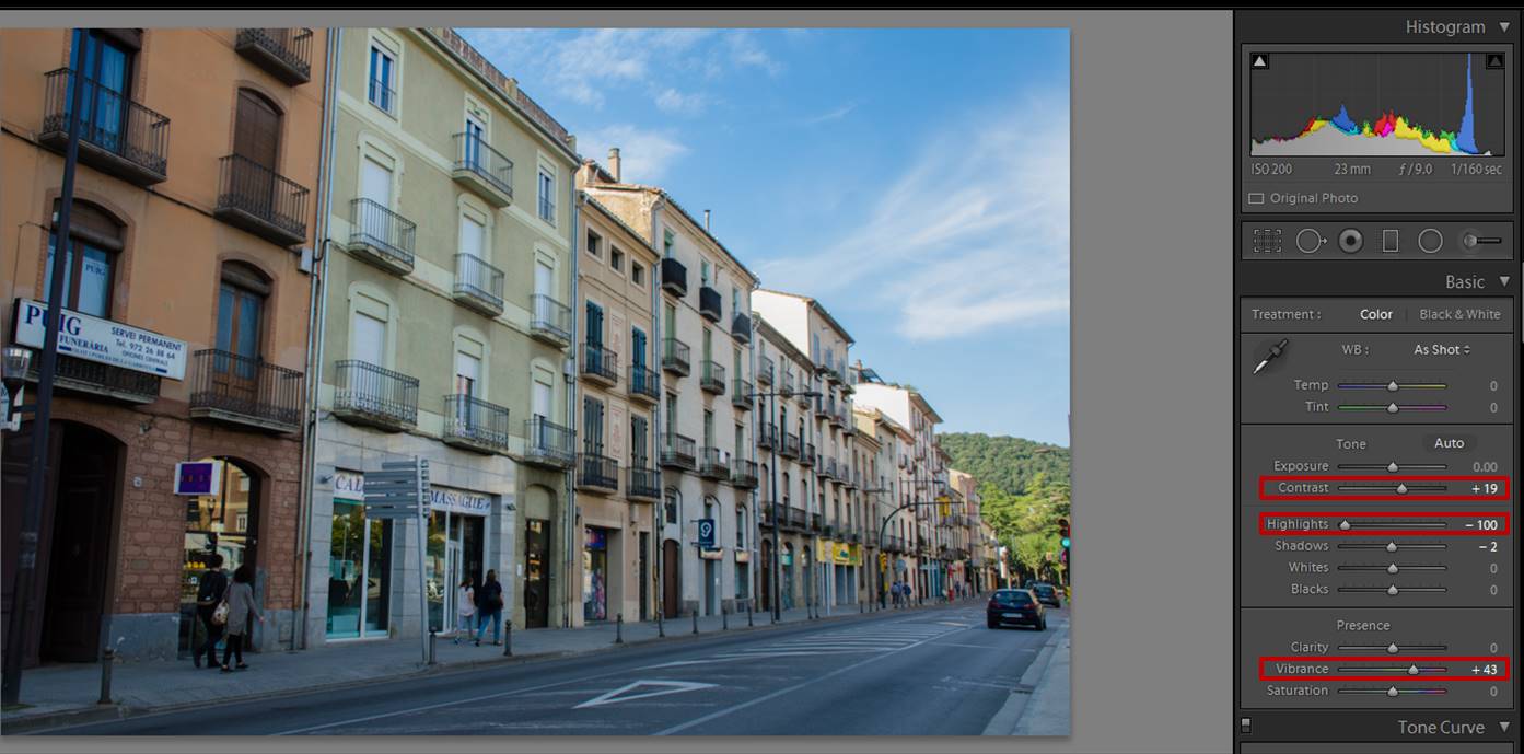
Adjust the highlights

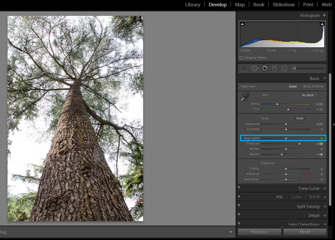
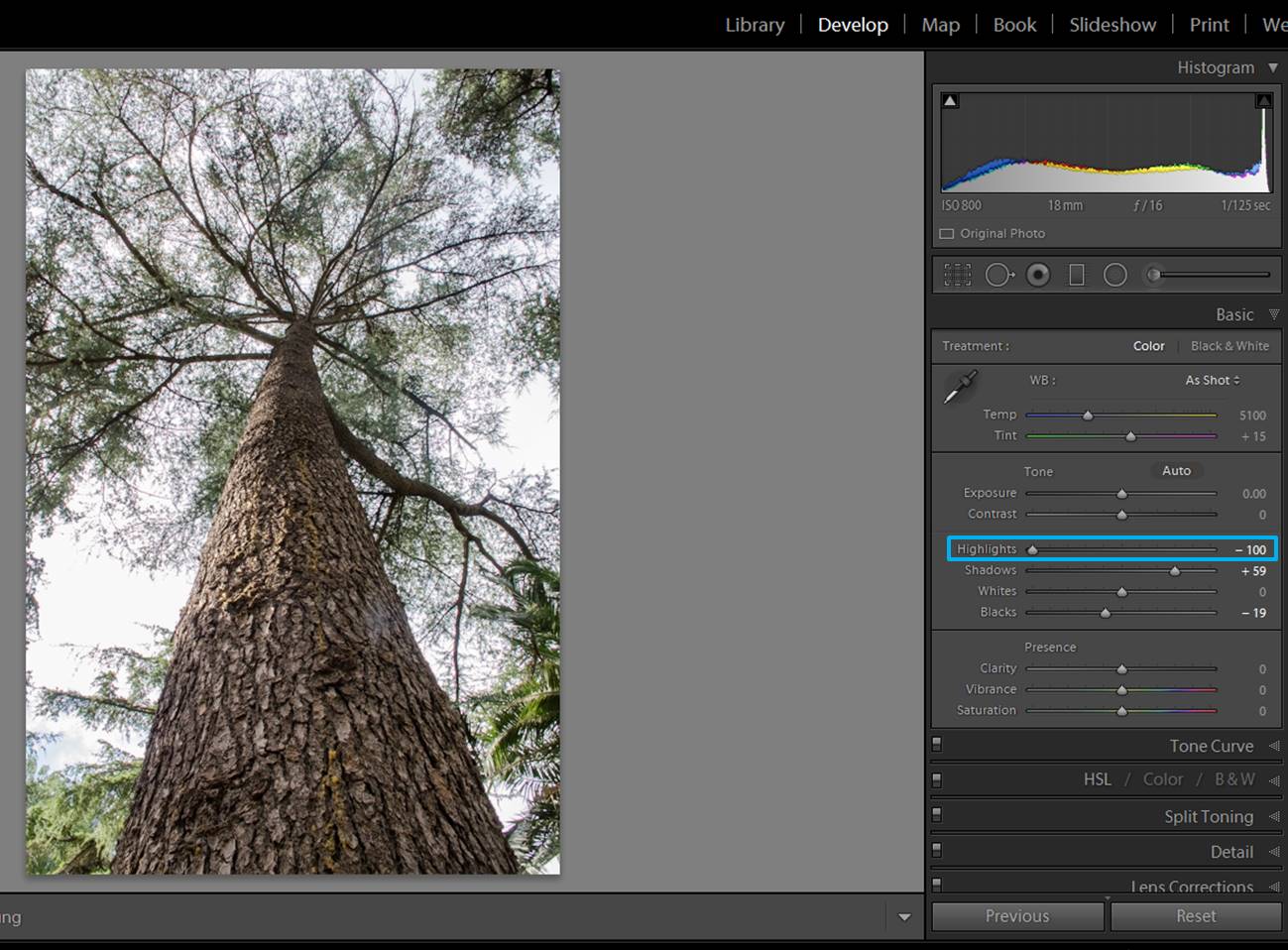
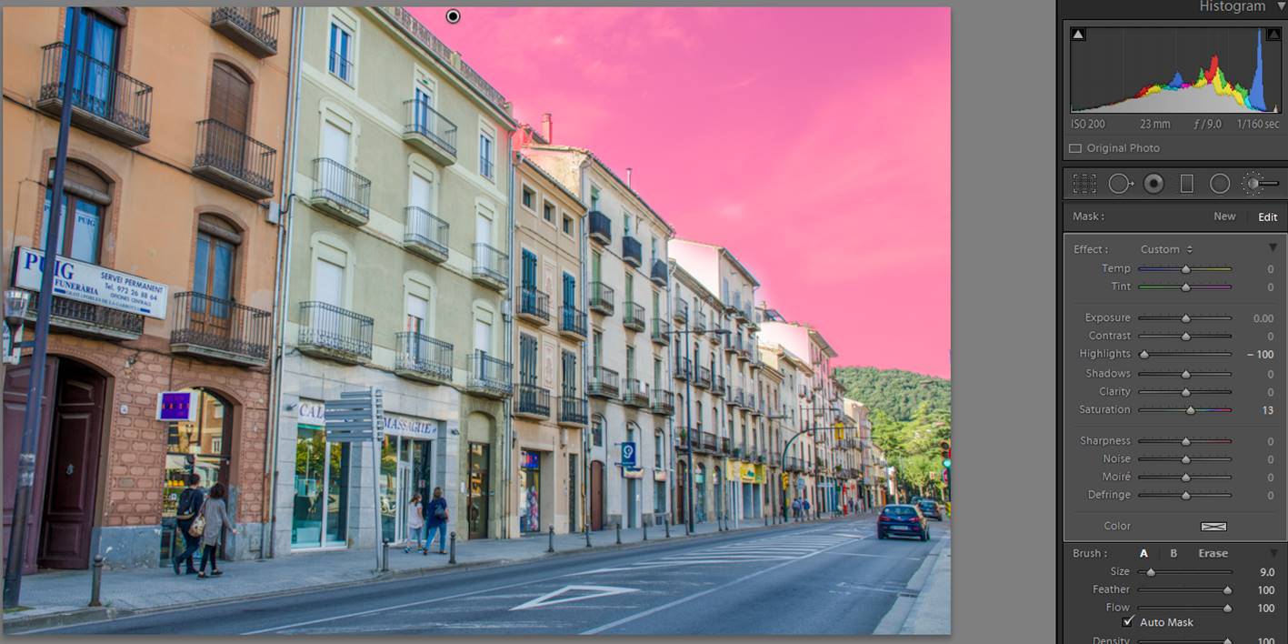
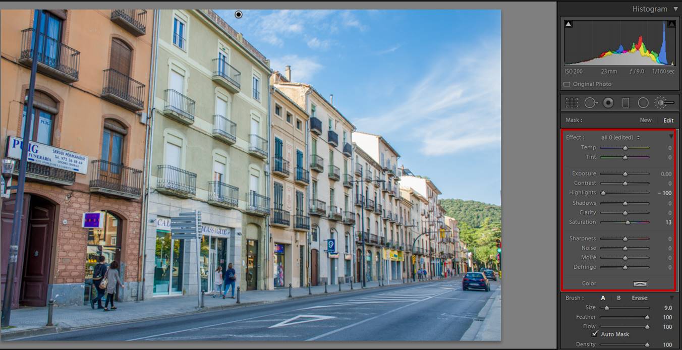
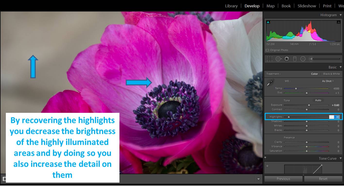
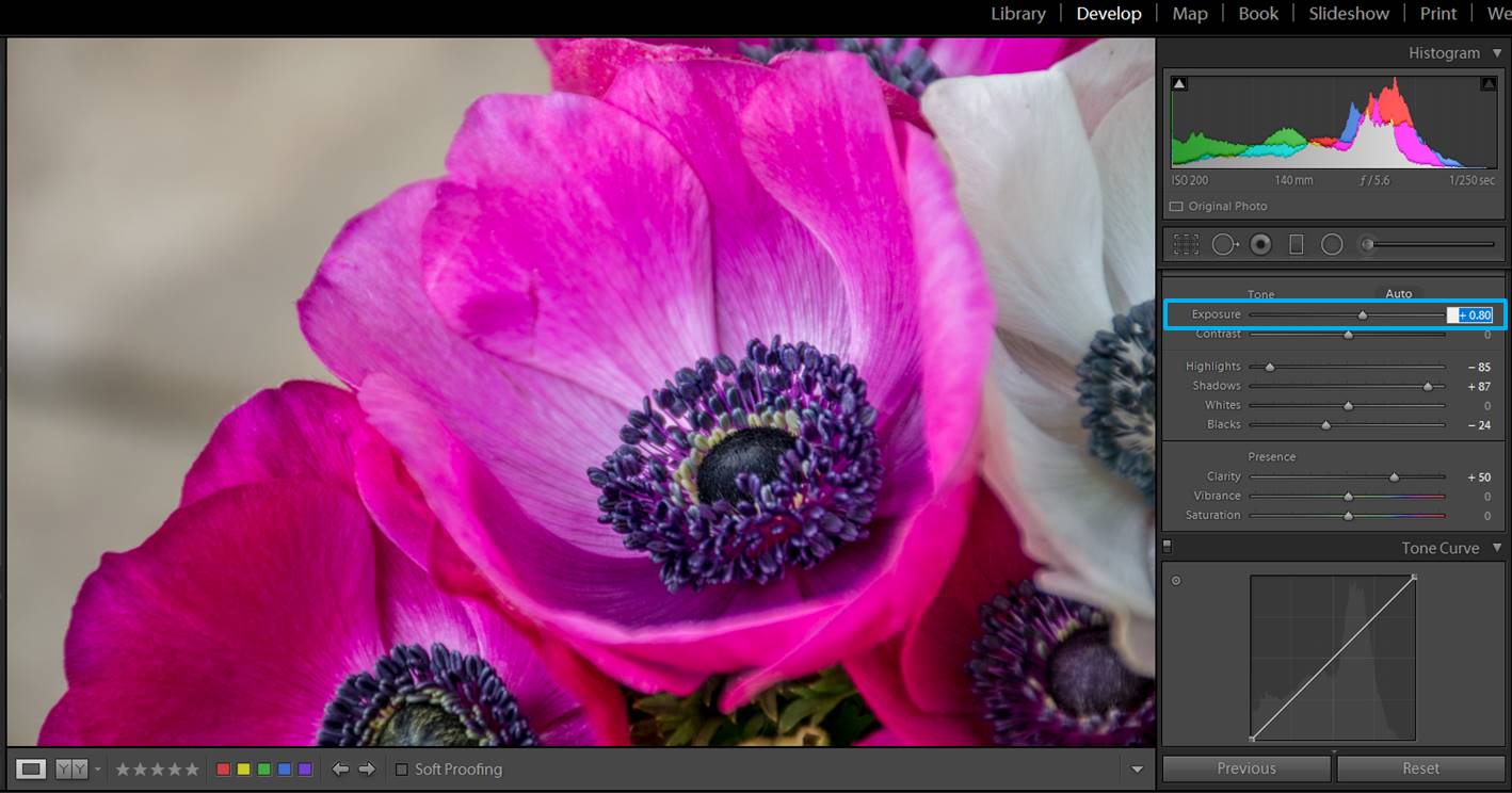
When you take photos of forests you will end up with images that are well exposed in some areas, but others are quite overexposed. It happens for example when you take photos of a tree from its base.

forest images
This is the non edited photo. The sky and some of the higher branches are clearly overexposed.


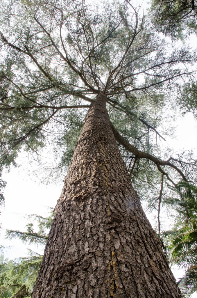
The tree is well exposed, but some branches and the sky can get quite overexposed. In these cases, adjusting the highlights might help you. You can do it in the whole image.

screenshot-tree-1
As you can see, in the non edited photo the Highlights have a value=0.
screenshot-tree-4
Once you slide the Highlights to 100, you will see that you recover detail form the overexposed area.

Or you can do it in just some areas by using the brush tool.
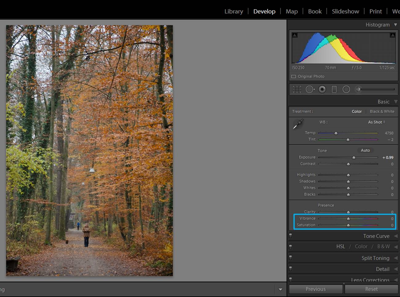
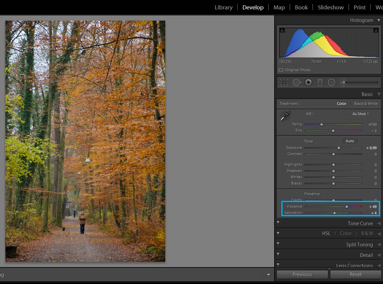
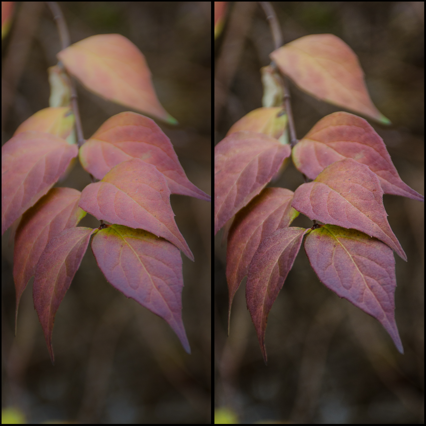
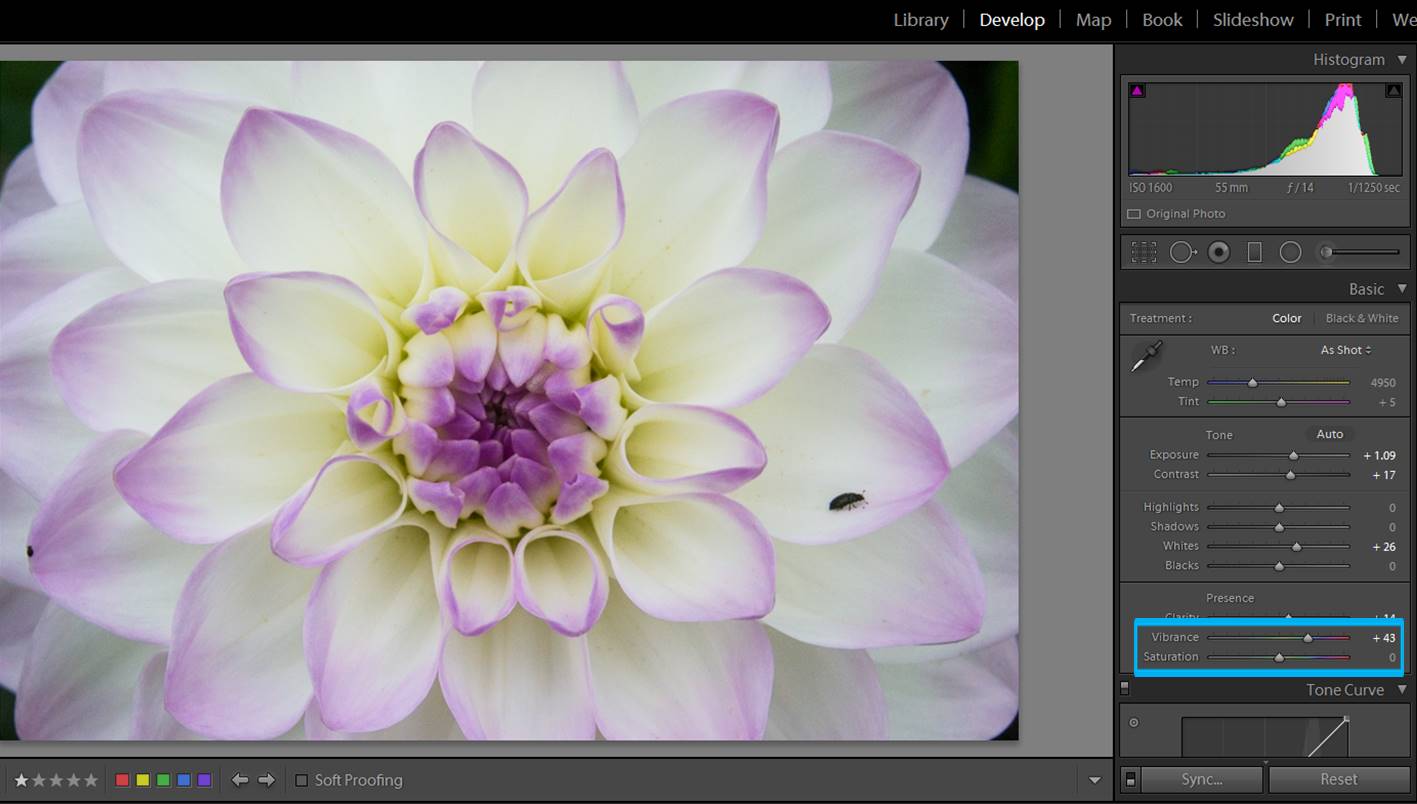
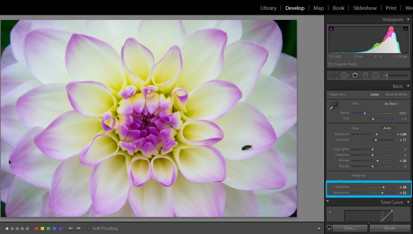
screenshot-tree-2
As before, you can “paint” areas of your image with a brush. This time its setting will affect the Highlights (slider towards the left side).
screenshot-tree-3
This is the final edited image.

Adjust colors

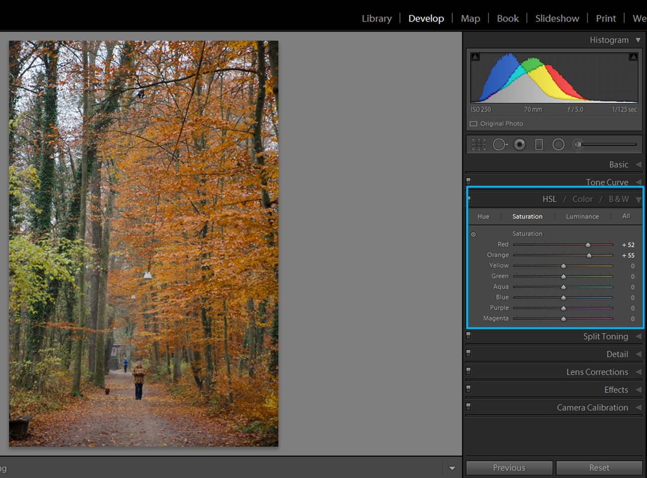
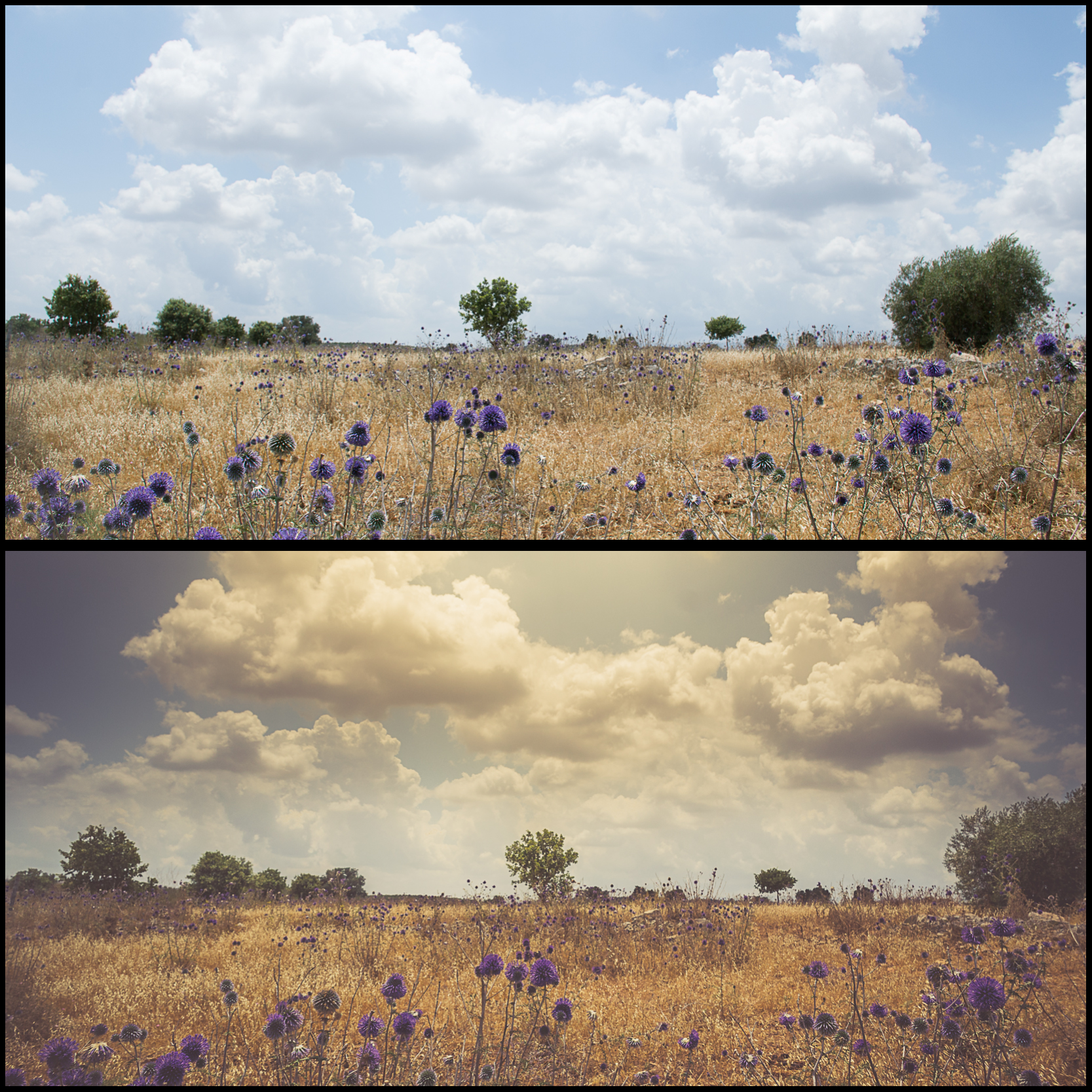
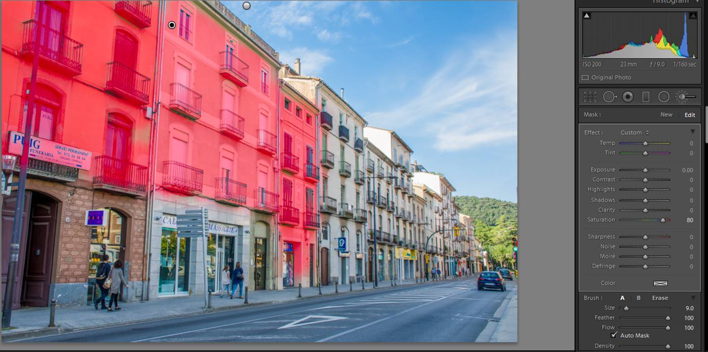
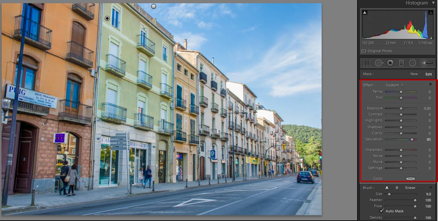
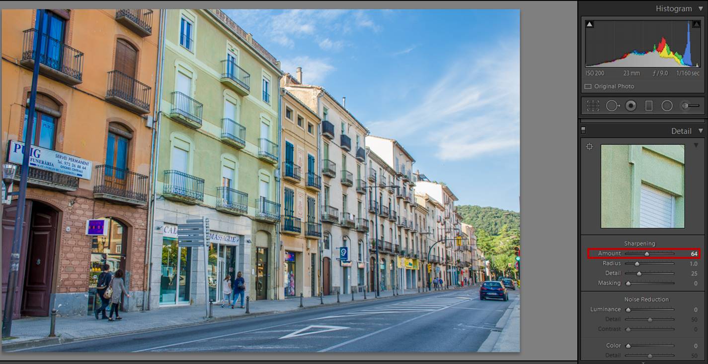
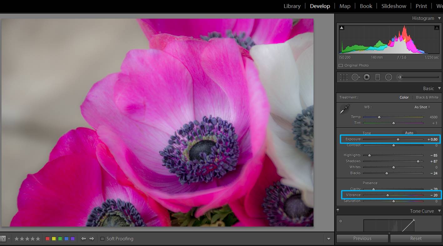
Colors are an important element in forest photography. The way you adjust the colors will depend on what you want to communicate with your photo, so it is quite subjective. With forest photography, increasing the intensity of the colors might work quite well. To do that, you can increase the vibrance and/or the saturation by moving its sliders to the right.

forest images
Here the non edited photo. The values of both vibrance and saturation are 0.
forest images
You can increase both vibrance and saturation, but take care because too much color might look unnatural. Try to find a balance.

You can be more selective by adjusting individual colors in the HSL/Color/B & W section. You can see that each color has its own slide of hue, saturation and luminance. I usually modify just the saturation.

forest images
In autumn forest photos, increasing the saturation of just red and orange might be enough.

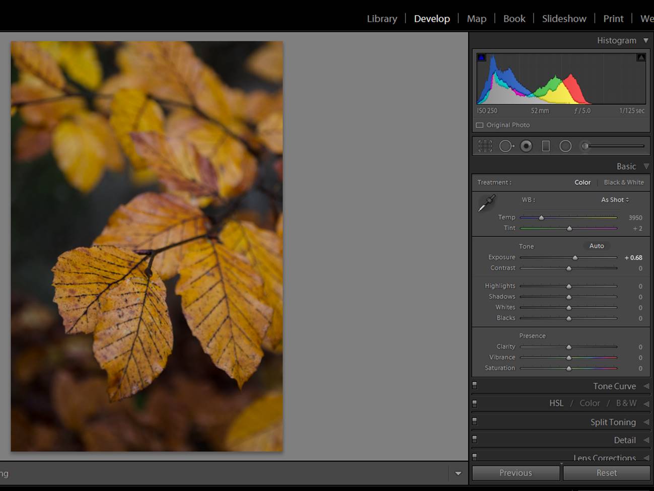
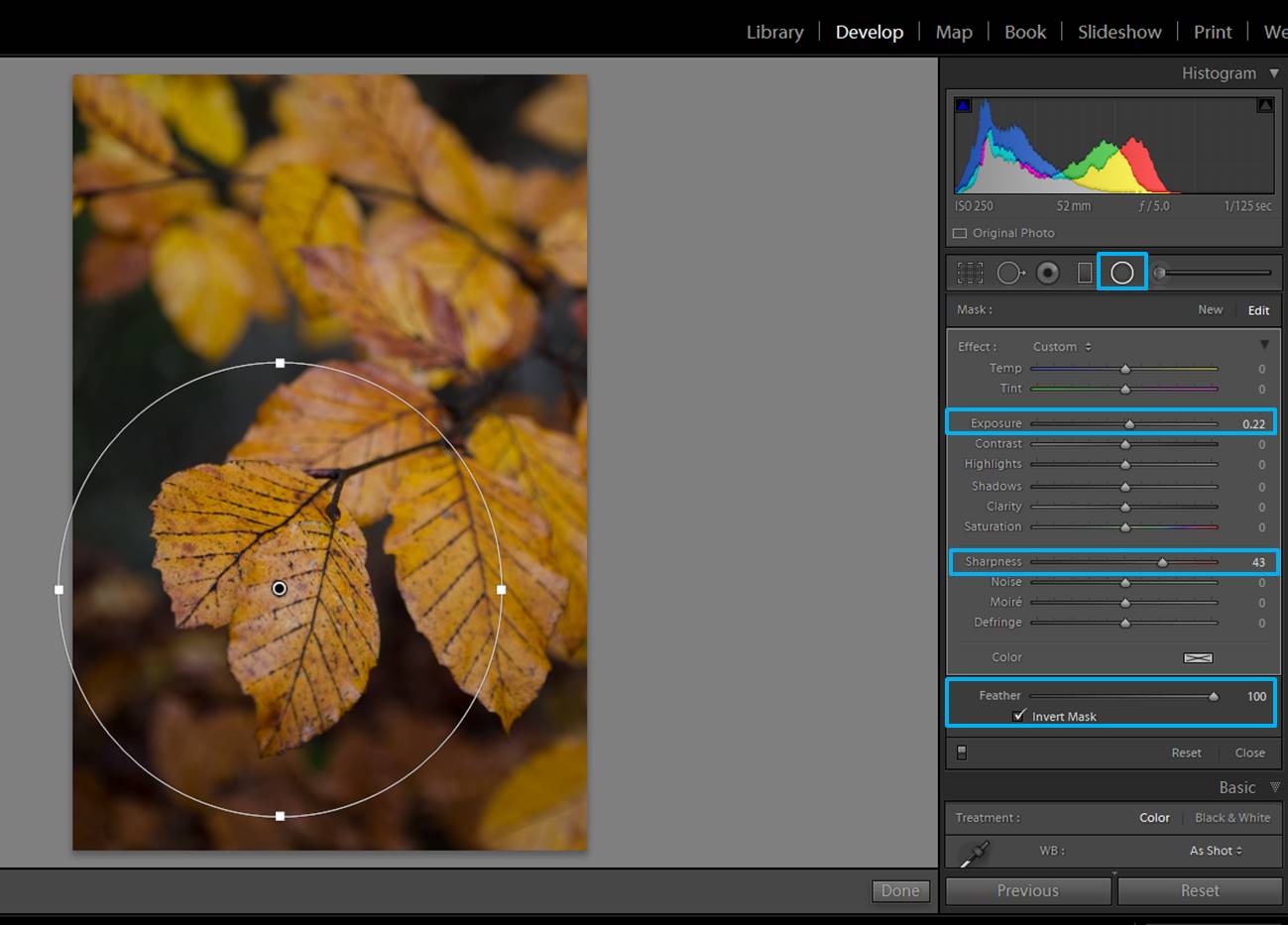
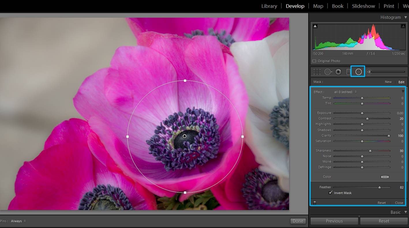
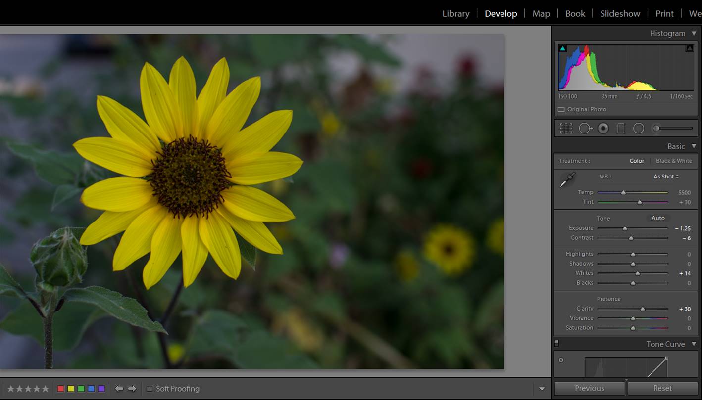
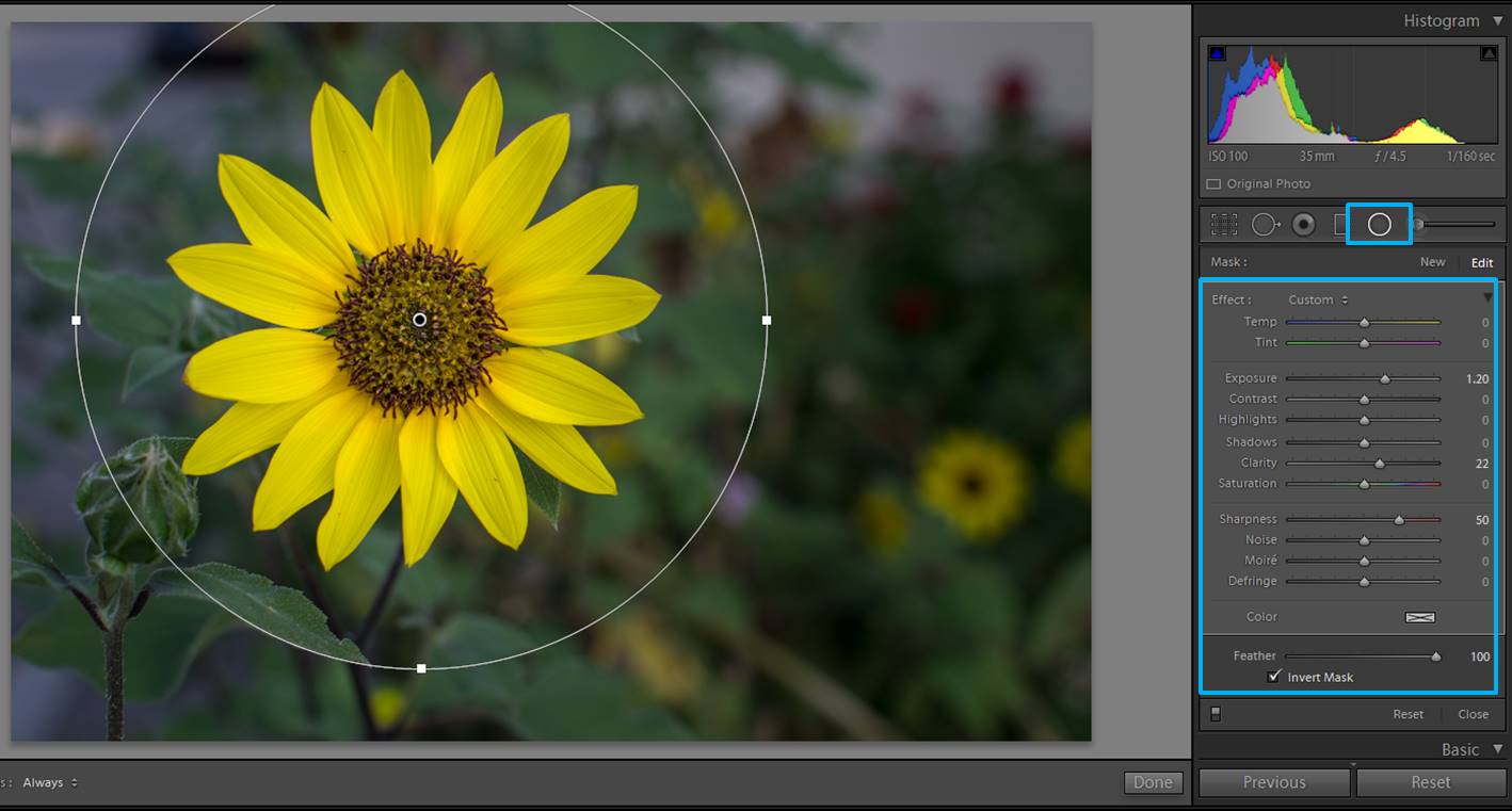
Highlight the main subject of your photo

You can highlight the main subject of your image by making it a bit lighter or a bit sharper. This is easily achieved by adding a circular filter.
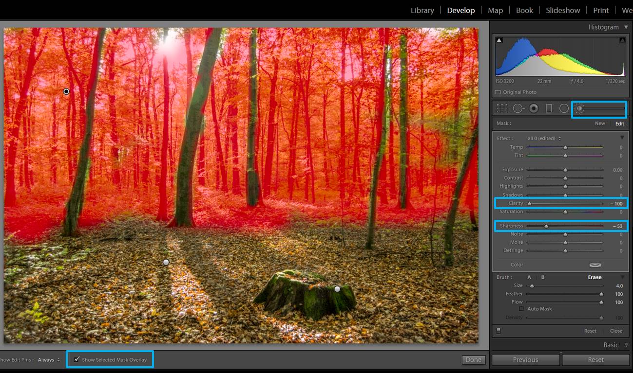
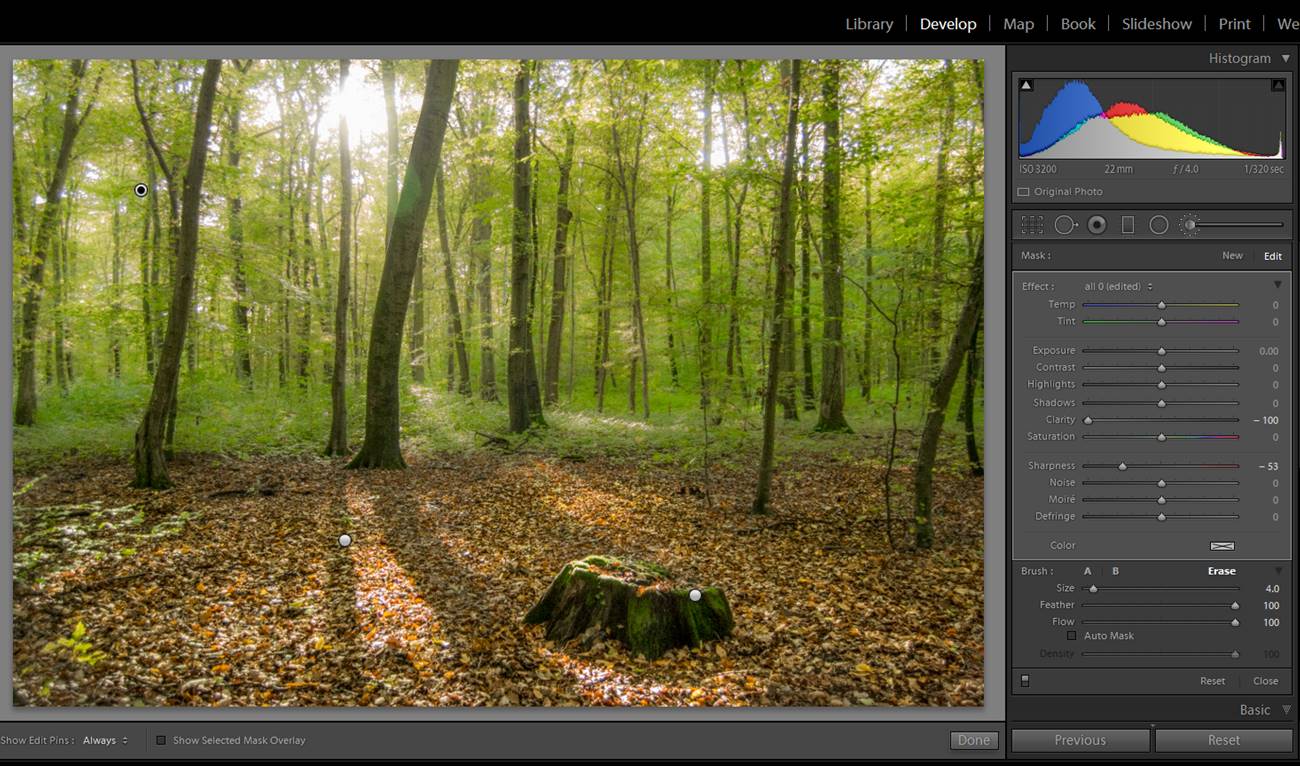
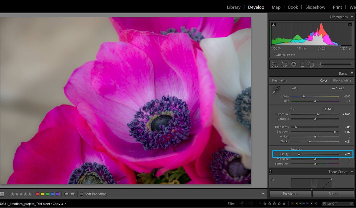
forest images
This is the original photo. I would like to highlight a bit more some of the leaves in the foreground.
forest images
If you add a circular filter, to make adjustments inside the circle you need to check the box “Invert Mask. A Feather value of 100 makes changes in exposure and sharpness (in our particular case) look smooth.

Add a dreamy look

If you are looking for a dreamy mood, you can achieve it by blurring some parts of the photo and adding a matte effect.

forest images
I made some little adjustments in this image (exposure, highlights…). Now I would like to add a more dreamy look.

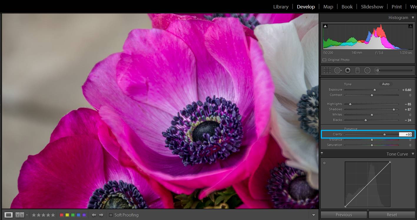
To blurry some parts of the photo you can either use the brush tool or the circular filter tool. In both cases, you need to decrease the sharpness and/or clarity.

forest images
Here I applied a brush to decrease both the clarity and the sharpness of just the leaves.
forest images
You can see like the blurriness achieved by the brush give to the trees a more dreamy effect than when they are sharp.

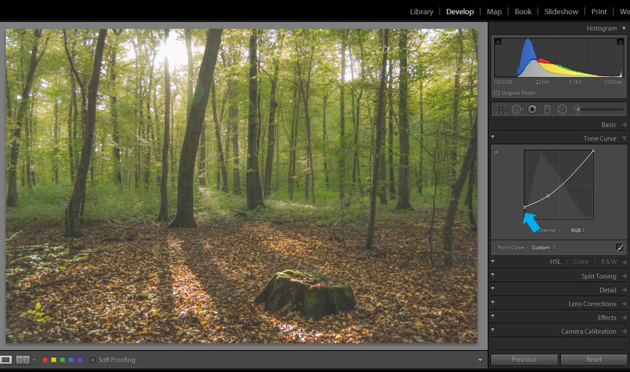
To achieve a matte effect you will need to make some changes in the Tone curve.

forest images
This is the Tune curve adjustment panel. When you move the cursor on top of the curve it might appear as a little cross. If it does not, click on the little box mark here with a blue arrow.

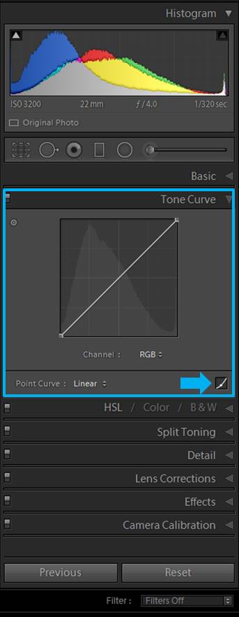
You can select a point in the curve that it is around 30%-40% to anchor it. When you select it, you see a circle in the curve. This means that you can move any other part of the curve, but this particular spot will remain there.

forest images


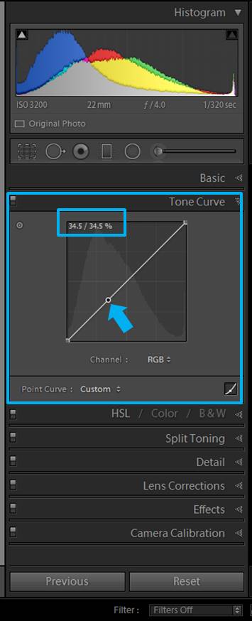
Then you can drag up the left bottom of the Tone curve. You can try with 10% up and adjust it according to your taste.

forest images

Try some presets

If you need to post-process a lot of photos you might find useful to check some made presets as the Through the Woods Workflow. They will speed up your editing.

forest images
This original photo has potential, but it seems a bit dull right now.

The good thing of these particular presets is that they have been designed for landscape photography. You can stack several presets on one single image, giving you a lot of flexibility.

forest images
In the History panel you can see that I applied 5 presets and their effects stack on top of each other. The photo looks totally different now.

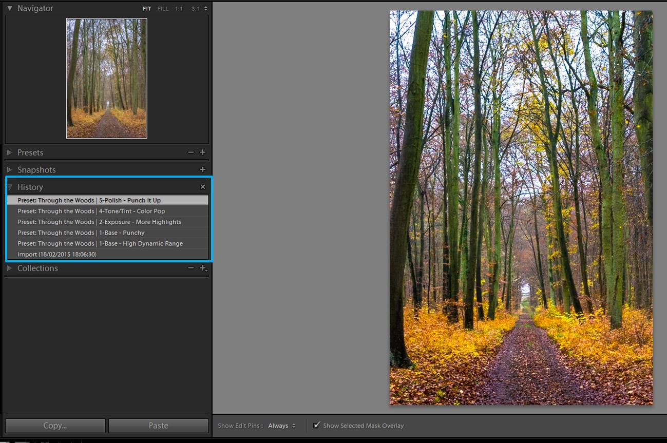
They also provide you with brushes.

forest images
Here you can see all the brushes provided for doing local adjustments In this case, I chose the one for Brighten the shadows and I applied in some of the trees.

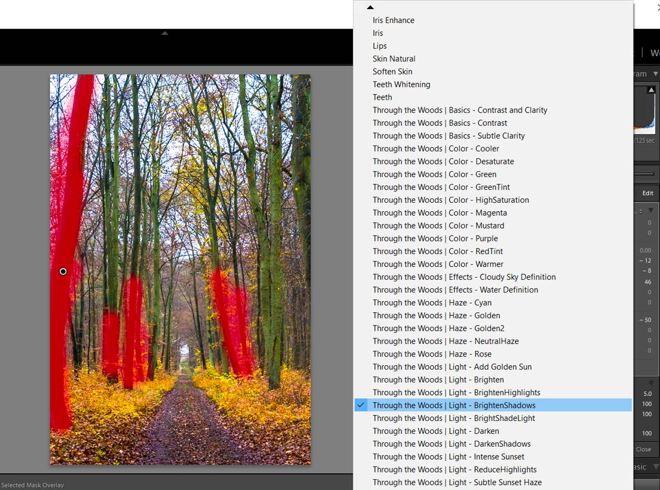
Another thing I also like is that the names given to the presets and brushes are intuitive, so you can easily find the ones you need. And if they are not exactly fitting your needs, you can always adjust them a little. However, they already gave you a good starting point.

forest images
Final image. It took me to edit it just 2 minutes.

I hope you liked this tips for post-editing your forest photographs. Do you have any other tip? I would love to hear about it! Have a happy post-processing!!!

How to post-process your images according to your photographic vision

I like reading and watching all kind of tutorials and talks about photography. I have a list of photographers I admire but the one that has had more influence on me is David du Chemin. He is a world and humanitarian assignment photographer that promotes quite actively the idea of developing your own photographic vision. At first the concept of “my own photographic vision” sounded foreign to me. I am not a famous photographer and I don’t even have the best quality gear. How was I going to have a photographic vision?  Well, I was mistaken. We all have a photographic vision. The difference is that some of us are not aware meanwhile others work actively in order to develop it and express it.

sleeklens-37-1

The concept of photographic vision can be confusing. One of the reasons I like David du Chemin is for his way of making complicated things look achievable. He defined vision as the way YOU see the world. It is unique because it depends on how your eyes and mind filter the image you see in front of you. Thanks to this definition I understood that I also have a vision of life and I decided to work on discovering it (this will probably be a life-long job). I focused in the 2 big parts of my workflow: shooting and post-processing. Today I want to focus in the post-processing part and tell you the 3 things I started doing that are helping me to find and express my vision.

sleeklens-37-4
You won’t find your photographic vision one day and that’s all. Your vision will evolve and change along your life because it is the way you see things.

Make a personal list of how do you understand certain components of a photo

I found really useful to look other photographers’ works in order to understand my vision. This might seem a bit contradictory at first, but let me explain myself better. We all have a particular way to understand a scene. This is because we all have a different background, experiences, feelings… so we face things and react to them in unique ways. It is part of the beauty of being human.

mosaic-1
Which one of these 2 images do you prefer? This will depend on the things they make you think when you see it. One of them will fit your vision better than the other and just you can know the reason for that. Working on your vision means to study your reactions and thoughts, it is a kind of self-study.

I find really difficult to establish abstract connections between elements of an image such its color or sharpness and my feelings or vision. For that reason I decided to do a bit of research about myself using other photographer’s images at first. How I do it? I look for a photo that calls my attention and then I study the feelings the image awakes on me and the possible connection between the feeling and the  photo element. Writing my conclusions in a document or notebook is a good way to keep track of my thoughts.

I use this list to know myself and not to copy the style of the other photographers. You should check photos that you like and also the ones you don’t like too much (it is also good to know what generates this rejection feelings). For example, thanks to my research I know that sharp images for me are synonym of energy and strength.

sleeklens-37-5
This image is quite sharp and for me sharpness means strength.

Now, if I take a picture in which I want to express energy and strength I know that one option to achieve it is to sharpen the image in post-processing. Or after watching tones of photos of flowers I realize that I love when they look a bit blurry in the border of the petals because this gives them a delicate look.

sleeklens-37-6
Thanks to my study of photos I understood that I connect some blurriness with softness.

I let myself to growth the list slowly in order to enjoy the whole process of understanding the way I see things. Follow your own rhythm and try not pushing your vision.

Work on your photos thinking on the feeling you had when you were shooting

Ideally, I would recommend to post-process the photos as soon as you can because then you will have fresh in your mind the vision you had meanwhile you were shooting. Maybe you were happy, or melancholic, or taking some photos make you think in a particular subject. The idea is making this thoughts pop out in the post-processing. This will depend on your own way to see the world, but I will give you some examples using my vision just that you can understand what I mean:

For me happy moments are full of light and color, so a photo that expresses my vision of happiness will look something like this:

sleeklens-37-7

However, I relate nostalgic moments with a kind of dreamy mood, so if I want to express this in the same image, it will look like this:

sleeklens-37-8

In this case, the post-processing will depend on your way to understand happiness and nostalgia. For that reason doing some previous work on knowing yourself (previous tip) will be really helpful.

We can’t always post-process our photos right after shooting. We might be taking photos far from our computer and it will take us time to get there. Or maybe we are busy and we just find the time for post-processing after some days after the shooting (or even weeks!). In that cases I try to make a real effort of remembering my feelings on the shooting day or I even write in a little notebook some notes that will help me to fly back to the real scene once I am sitting in front of the computer.

Start by choosing just few post-processing tools that will help you to express your vision

There are a lot of post-processing tools you can use in order to better express your vision. However, it can be a bit overwhelming to do a self-discovery work about your vision and at the same time try to master all the Lightroom or Photoshop tricks. I would tell you to focus in few tools and once you feel comfortable with them, you can introduce more. Some tools that can be good to start with are both the Temperature (Temp), Tint and and Clarity slide in Lightroom.

With the Temp and Tint slides, you can modify the colors of the whole image to fit the vision you had when you took it. You just need to play around with the slide until you get to a point that fits you.

screenshot-1
Here a photo I took in Germany with its original values of Temp and Tint.
screenshot-2
When I was there I was amazed by the autumn look of the scene. For that reason, I moved the Temp slide towards the yellows and browns.I wanted to increase the autumn colors.
screenshot-3
But imagine that instead of autumn colors I want to show how cold it was over there and that the place was quite lonely. In that case I will move the Temp and Tint towards cold colors (blue for example) and grey. For some reason I always relate cold weather with blue and grey color. This is my particular vision of “Cold”.
mosaic-2
My vision of autumn in the left vs my vision of “cold” in the right.

Moving the clarity slide you can either make all the details of the image stand out or you can soften them.


mosaic-3
In the image in the left I moved the clarity slide to the left (decrease clarity) in order to give the leaves a softer look, that for me is synonym of being delicate. On the left, the clarity slide was moved towards the right (increase clarity). You can see the details of the leaves better. The image looks harder, that for me means that these leaves were quite tough.

I hope you liked this tips for starting working on your photographic vision. Do you have any other technique to do it? I would love to hear about it! Have a happy post-processing!!!

How to Improve a Dull Photo in Lightroom

Lately, I have been sharing with you several photographic journeys around Catalonia. I have shown you places as La Garrotxa, Sitges, and Barcelona. For me, nature and portrait photographer, it has been a nice challenge to take photos of streets and buildings. I discovered I like it a lot! Once back home, with the photos already in my Lightroom presets catalog, click here. I faced a new issue: how to improve some of the street photos I took? Some of them looked quite dull. My brain is used to think about softening images: I soften flowers to make them look more delicate, I soften wedding photos to make them look dreamy… but softening a street or a building?? It didn’t seem right to me. I did a bit of thinking and a bit of trying and I ended up finding a post-processing workflow that I like to use to improve dull photos. Are you interested in installing presets? See the details here.

I shot this photo in Olot. It might be familiar to you because I used to illustrate one of my last articles.

dull photo

You agree that this photo looks pretty dull, don’t you? However, if you look at the histogram you can see that this image has a lot of potential because no pixels were either too bright or too dark. They were all inside the dynamic range of the photo (If you are not familiar with histograms I invite you to take a look at the article of Julian H about Lightroom Histograms. Before starting working in Lightroom, I recommend you to stop and think what you want to achieve. This will give you an indication of which slides you need to move. In this photo, I wanted to do 3 important things: increase the contrast, give a bit of color to the buildings and recover the sky.

General adjustments

I always start by doing general adjustments (they affect the whole photo). For the first steps processing this photo, I used some of the slides in the Develop Module, specifically in the Basic panel.  I wanted to increase the contrast, so I moved the Contrast slider to the right (+19 in this case). To recover the sky of any photo, you can start by moving the Highlights slide to the left. In today’s photo  I moved it to -100. And to gain a bit of color I increased the Vibrance by moving its slide to +43. Just these 3 adjustments can already improve a dull photo, a lot.

dull photo

However, the buildings had too many shadows, so I moved the Shadows slider to +100 and I increased the exposure a little (+27).

dull photo

It is quite common that when you reduce the shadows of a photo, the contrast gets weak. But it is ok because just by darkening the blacks a bit (-36) you can recover the contrast.

dull photo

Local adjustments

The photo looks better already. However, it can be improved much more by doing adjustments to just some parts of the image (local adjustments). In this case, I wanted to recover the colors of both the sky and the buildings even more. There are several ways to add local adjustments to a photo using Lightroom. Today I used 2 brushes: one for the buildings and one for the sky. If you are not familiar with Lightroom brushes, don’t worry! There is a guide written by Mantas O. Ciuksys on how to use them that will help you a lot! The first brush I used all over the sky and as I wanted to recover the colors I moved the Highlight slider to -100 and I also gave a punch to the saturation (+13). More uses of brush in editing, see here.

dull photo
In pink, the area I brushed for editing just the sky.
dull photo
Here is the sky after applying the local adjustments using a brush with the settings marked by the red square.

The second brush was used on the houses. BUT just on the houses that I wanted to emphasize (the 3 first houses from the left side). This time I increased the saturation quite a lot (+80).

dull photo
In pink, the buildings I brushed in order to apply the local adjustments.

dull photo

You can see how the 3 houses changed after applying the brush to increase the saturation.

Final sharpening

The last adjustment was to increase the sharpening of the whole photo to +64 (Sharpening is in the Detail panel).

dull photo

Here you have the final photo. Much more colorful and vibrant than the dull original one!

dull photo

Using the Sleeklens Brick and Mortar Workflow

If you want to save time in your editing like the one I just showed you, I have good news for you!! You can use the Brick and Mortar Workflow, that comes with 78 presets and 28 brushes. I have been trying it for editing urban photos from my last articles and I am really happy with the results I got with just a few clicks.

The thing I like the most about these presets is that you can stack them, meaning that you can use several of them in the same photo. I will give you an example of this workflow using the same photo from before. I started by applying the following presets:

0-All In One – Beautiful Daylight. This gave already a great improvement.

5-Polish- Make it Pop (to increase the colors of the image).

5-Polish-Sharpening.

6-Tone-Warm-Highlights.

For local adjustments I used 2 of the Brick and Mortar Brushes on the 3 first houses on the left:

Exposure-Brighter Shadows.

Color-Saturation.

And that’s all! It took me less than 2 minutes to edit the photo! Here is the final result!

dull photo

I hope you enjoyed giving a bit of color to some dull photos. Feel free to contact me with any question or suggestions. What do you do with dull photos? Do you do something similar to what I do? Do you have a totally different workflow?  Have a happy post processing!!!

Tips for editing your flower photographs in Lightroom

In a previous article I gave you some tips about flower photography. Today I want to talk about the editing of this type of photos. I always recommend doing your best in the moment of capturing the photo. Invest some time looking for the right perspective, work on the composition of your image, avoid cluttered backgrounds, focus on the right spot and aim for a good exposure.  However, there are some simple things you can do in post-processing that can make your flower photo even better.

sleeklens-29-final-sharp-1

I will show you some of my general post editing tips in Lightroom.  They are general, not universal. These tips will give you a good basis to start with, but they might not work in all the situations you might encounter. You will need to experiment with your flowers a little (this is part of the fun in photography, isn’t it?). The basic idea behind all my editings is to make my main flower/s pop out. So let’s jump to Lightroom Develop module and see how these tips goes!

Do some global adjustments first

This is a good tip for any kind of photography. First of all do the global adjustments, meaning the ones that affect the whole photo. For this tutorial I am going to use this straight of the camera photo:

Straight of the camera photo

The slides I like to work with are:

  • Exposure: You might need to adjust a bit the exposure (or a lot if you didn’t manage to adjust it at the moment of taking the photo). If your photo is overexposed, you need to move the slide to the right and if it is underexposed, to the left.

screenshot-2

  • Highlights: I usually try to recover some highlights by moving the Highlight slide to the left. This is especially useful if you have to deal with a background which is too bright because it will bring a bit of detail to the photo. By default, our eyes are drawn to bright things so they tend to focus on the lighter areas of an image. If the background is too bright it will draw our eyes to it and make us ignore the flower, and this is exactly what we don’t what want!! So if you can make the background less bright, it will be better. This doesn’t mean that you always need a dark background. You can use white backgrounds too. What I mean is that they should not be extremely bright.

screenshot-3

  • Shadows and blacks: If I see that my main subject has an interesting area too dark, I move the shadow slide to the right. You will see how details will appear in your image.

screenshot-4

However, the contrast of the area can get a bit weak. Increase a bit the blacks (moving Blacks slide to the left) and your problem is solved! By decreasing shadows and increasing blacks you give a higher dynamic range to your image.

screenshot-5

Add your personal touch with the clarity slide

I love the clarity slide! This is the point in the editing when you really need to decide which kind of final look you want for your flowers. Do you want to show all the little details of your flower? Then you should move the clarity slide to the right. This might darken your photo a little, so you might need to adjust the exposure again.

screenshot-6

screenshot-7

If you prefer a softer look, move the clarity slide to the left.

screenshot-8

In this case too, you might need to adjust the exposure. In the example, by changing the clarity I also causes the colors to stand out a bit too much, to counter this side effect, I moved the vibrance slide to the left in order to get a more natural look.

screenshot-9

When you decrease the clarity of a photo you get this blurry dreamy effect. However, you might like to keep the details in specific parts of the photos. For this, you can use a circular filter like in the image below.

screenshot-10
You can add a circular filter to do local adjustments in your photos. In this case I checked the “Invert Mask” because I wanted the adjustments to be made inside the circle. I wanted the center of the flower to be more defined, so I increased the clarity and the sharpness of the area inside the circle. Note that I feathered the circular filter quite a lot to make the adjustments gradual from the center of the circle to the outside.

So here you have the 2 versions of the same photo.

This is the final shraper version of the image
This is the final sharper version of the image
This is the final softer version of the image

Increase (or not) vibrance/saturation 

By increasing the vibrance and/or saturation you can make the colors of your flower pop out. However… if you increase them too much your flower’s color can get to a point it looks unreal. If you are doing some creative post-processing, this might be a good thing. But if you are trying to achieve a natural-looking flower image, too much vibrance and saturation will not be good.

screenshot-12
I did some general adjustments to this image, but I didn’t touch the vibrance and saturation slides yet.

I usually increase the vibrance little by little until I reach to a point that I like. Sometimes you won’t need to touch vibrance/saturation at all because your original picture has already beautiful colors.

screenshot-13
I usually increase the vibrance little by little so I could find a point where the colors stand out, but the flower still looks real

screenshot-14

In this image I increased both the vibrance and the saturation too much the so that you can see their effect on the photograph. You should be careful with these slides because you can reach an unnatural look pretty easily.

Highlight your subject

Imagine that you have a photo like the one below. The background is ok because it is quite dark, but your flower does not really stand out.

screenshot-15

In this situation you can use a circular filter to highlight your flower and make it the focus of your image. I usually add the circle, then I check “Invert Mask” so that all the adjustments will affect the inner part of the circle and I feather it at 100 to make the adjustments look gradual. You might need to play a little with your adjustments, but usually you will need to increase the exposure. I also like to add a bit of sharpness and clarity, but this is up to you!

screenshot-16
I use the circular filter to increase the exposure of my main subject/s and make them pop out from the darker background.

If you are using black backgrounds…make them really black!

If you are using black backgrounds for your flower photography, they might look a bit grey-ish in the original photo.

Straight of the camera photo
Straight out of the camera photo

Make them really black by using Lightroom brush tool. You just need to “paint” the background. I like to check the “Show Selected Mask overlay” because then I can see in red the places where I paint. Another tip: check “Auto Mask” and Lightroom will detect the edges and will help you to paint just the background (and not “stray” with the brush onto the flower).

screenshot-17
When you have the “Show Selected Mask Overlay” checked, you can see in red the places where you “painted” with your brush. Check also “Auto Mask” to make Lightroom help with not painting outside of the borders.

Once you have painted the background, adjust the brush by decreasing the exposure, making the shadows darker (slide to the left) and make it smooth by moving the Clarity slide to the left too.

screenshot-18

Last thing is doing general adjustments to the photo to make the flower really stand out!

screenshot-19

Now it is your turn to practice with your own flower photos and Lightroom! Do you have a tip I have not included here? Tell me about how it goes with your editing! Have a happy post-processing!!