In a previous article I gave you some tips about flower photography. Today I want to talk about the editing of this type of photos. I always recommend doing your best in the moment of capturing the photo. Invest some time looking for the right perspective, work on the composition of your image, avoid cluttered backgrounds, focus on the right spot and aim for a good exposure. However, there are some simple things you can do in post-processing that can make your flower photo even better.
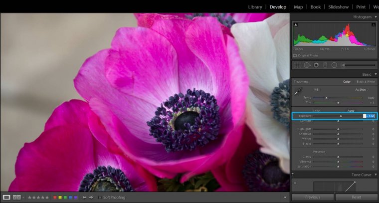
I will show you some of my general post editing tips in Lightroom. They are general, not universal. These tips will give you a good basis to start with, but they might not work in all the situations you might encounter. You will need to experiment with your flowers a little (this is part of the fun in photography, isn’t it?). The basic idea behind all my editings is to make my main flower/s pop out. So let’s jump to Lightroom Develop module and see how these tips goes!
Table of Contents
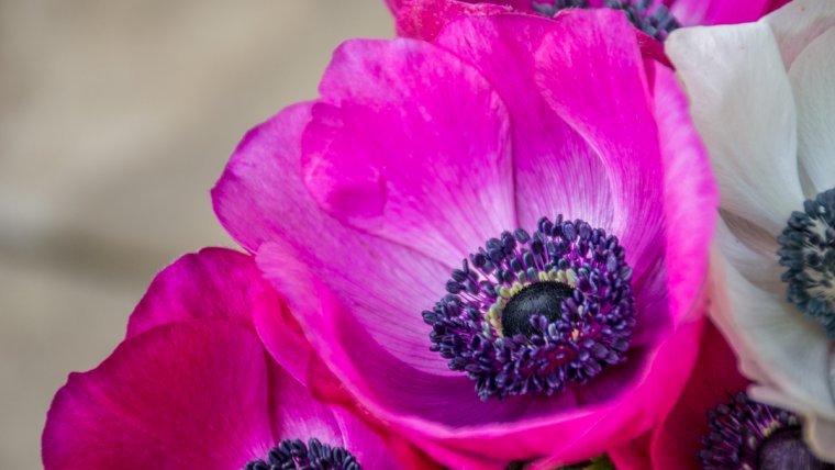
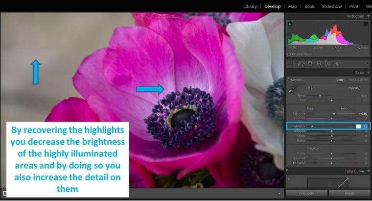
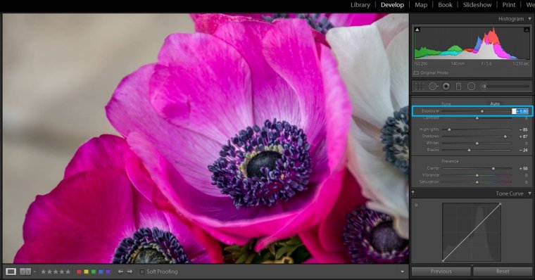
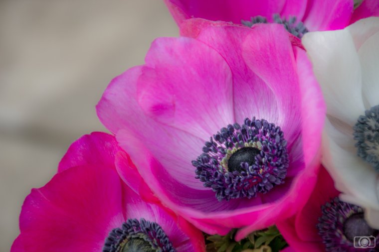
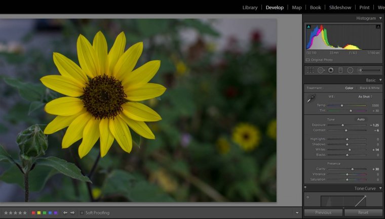
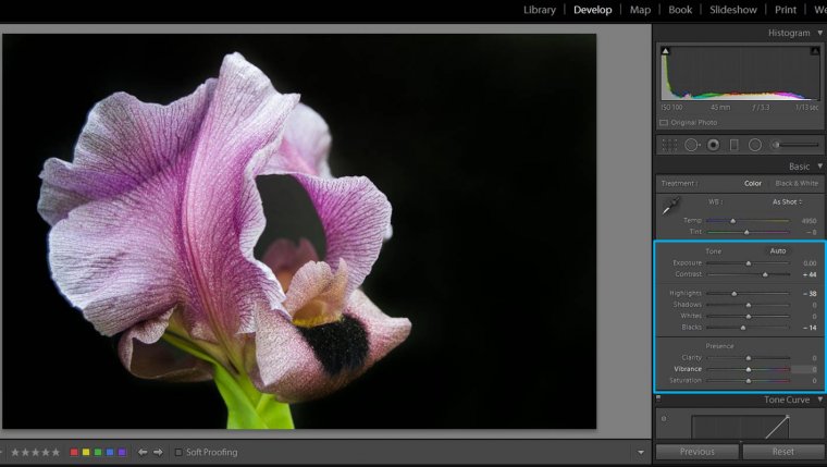
This is a good tip for any kind of photography. First of all do the global adjustments, meaning the ones that affect the whole photo. For this tutorial I am going to use this straight of the camera photo:
The slides I like to work with are:
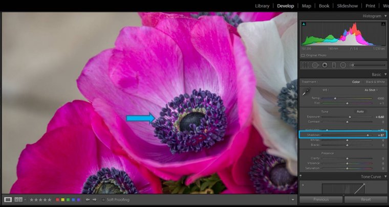
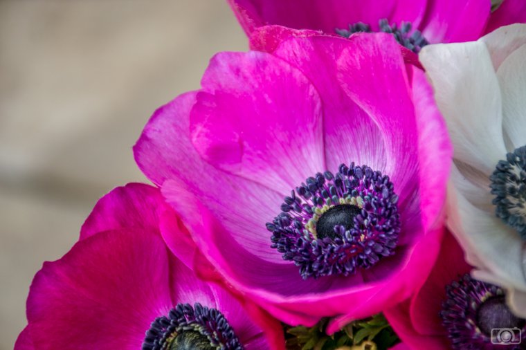
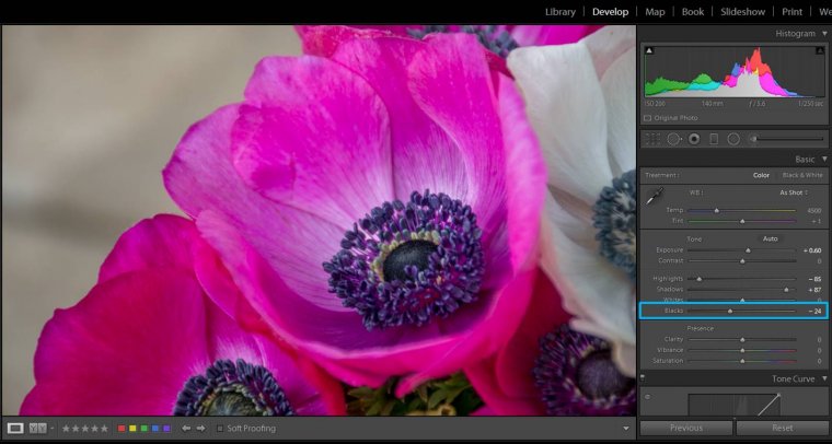
However, the contrast of the area can get a bit weak. Increase a bit the blacks (moving Blacks slide to the left) and your problem is solved! By decreasing shadows and increasing blacks you give a higher dynamic range to your image.
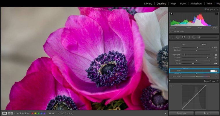
I love the clarity slide! This is the point in the editing when you really need to decide which kind of final look you want for your flowers. Do you want to show all the little details of your flower? Then you should move the clarity slide to the right. This might darken your photo a little, so you might need to adjust the exposure again.
If you prefer a softer look, move the clarity slide to the left.
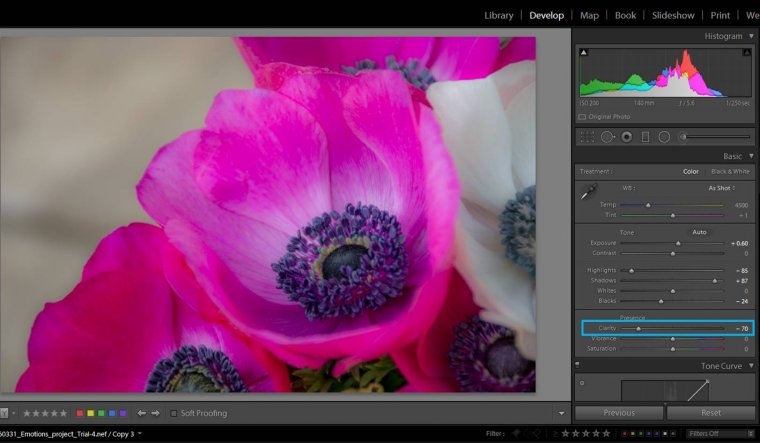
In this case too, you might need to adjust the exposure. In the example, by changing the clarity I also causes the colors to stand out a bit too much, to counter this side effect, I moved the vibrance slide to the left in order to get a more natural look.
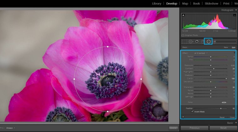
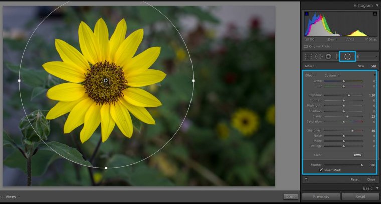
When you decrease the clarity of a photo you get this blurry dreamy effect. However, you might like to keep the details in specific parts of the photos. For this, you can use a circular filter like in the image below.
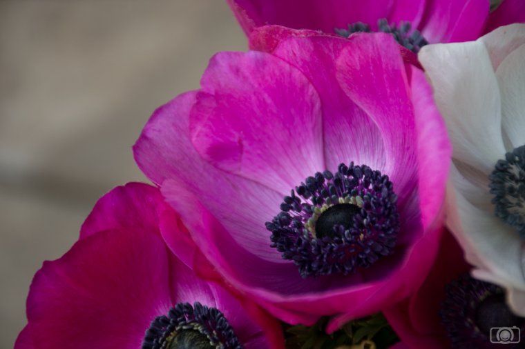
So here you have the 2 versions of the same photo.
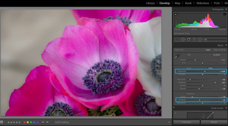
By increasing the vibrance and/or saturation you can make the colors of your flower pop out. However… if you increase them too much your flower’s color can get to a point it looks unreal. If you are doing some creative post-processing, this might be a good thing. But if you are trying to achieve a natural-looking flower image, too much vibrance and saturation will not be good.
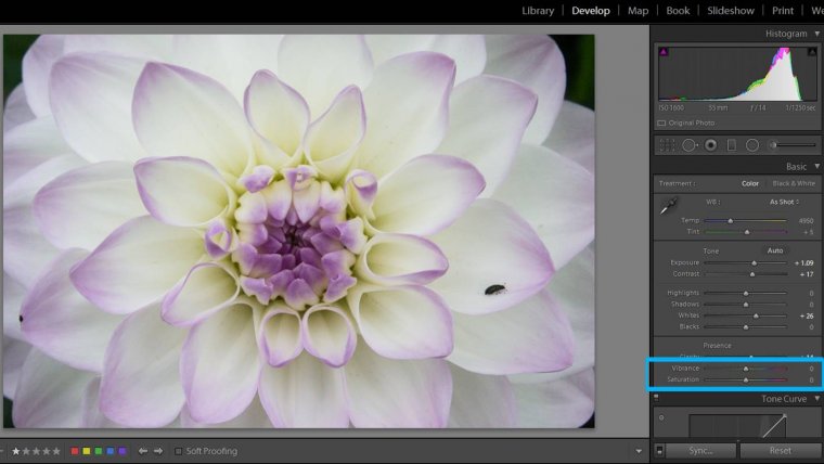
I usually increase the vibrance little by little until I reach to a point that I like. Sometimes you won’t need to touch vibrance/saturation at all because your original picture has already beautiful colors.
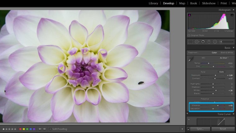
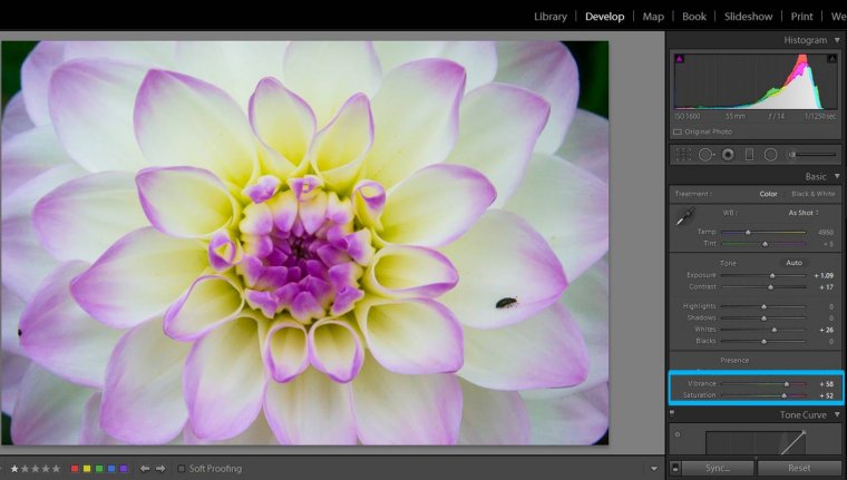
In this image I increased both the vibrance and the saturation too much the so that you can see their effect on the photograph. You should be careful with these slides because you can reach an unnatural look pretty easily.
Imagine that you have a photo like the one below. The background is ok because it is quite dark, but your flower does not really stand out.
In this situation you can use a circular filter to highlight your flower and make it the focus of your image. I usually add the circle, then I check “Invert Mask” so that all the adjustments will affect the inner part of the circle and I feather it at 100 to make the adjustments look gradual. You might need to play a little with your adjustments, but usually you will need to increase the exposure. I also like to add a bit of sharpness and clarity, but this is up to you!
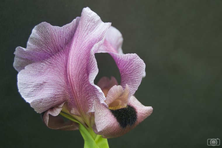
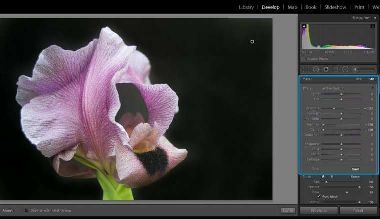
If you are using black backgrounds for your flower photography, they might look a bit grey-ish in the original photo.
Make them really black by using Lightroom brush tool. You just need to “paint” the background. I like to check the “Show Selected Mask overlay” because then I can see in red the places where I paint. Another tip: check “Auto Mask” and Lightroom will detect the edges and will help you to paint just the background (and not “stray” with the brush onto the flower).
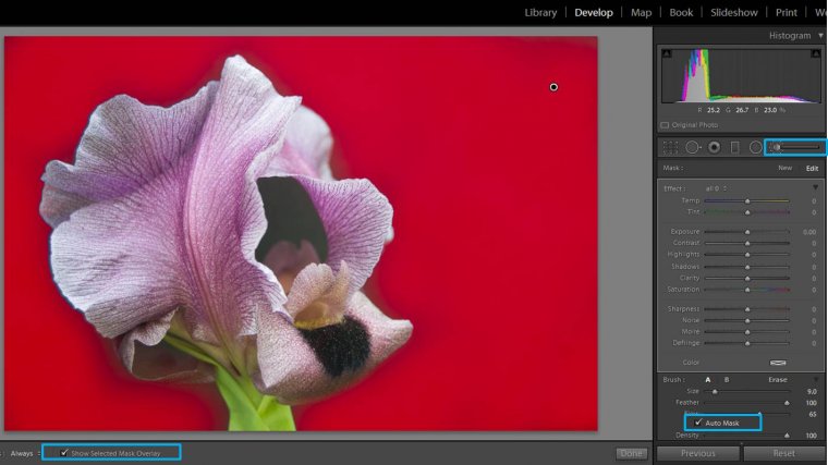
Once you have painted the background, adjust the brush by decreasing the exposure, making the shadows darker (slide to the left) and make it smooth by moving the Clarity slide to the left too.
Last thing is doing general adjustments to the photo to make the flower really stand out!
Now it is your turn to practice with your own flower photos and Lightroom! Do you have a tip I have not included here? Tell me about how it goes with your editing! Have a happy post-processing!!


Please verify your software version before proceeding.
 I’ve verified my software version


 Facebook
 Google +
Comments (0)
There are no comments yet.