Tag: b&w

When Should You Embrace B&W Photography?

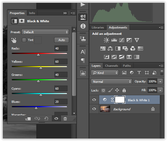
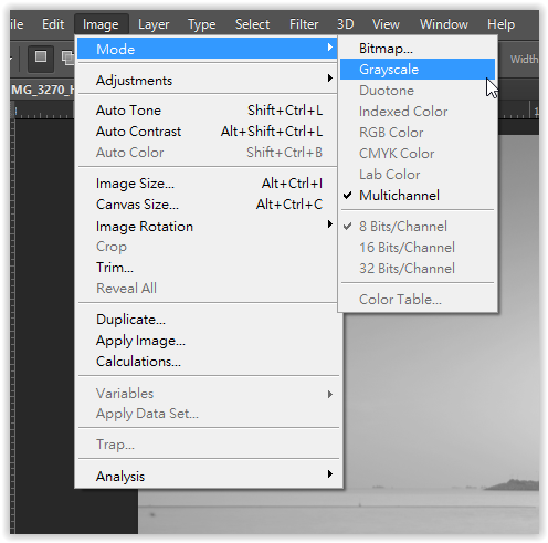
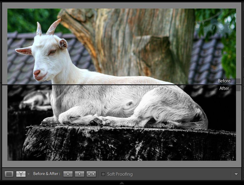
When does an image deserve to be converted to black and white? This is a question you have probably asked yourself countless of times during confusing editing sessions. Some photographs simply look better in black and white, while others stand out gracefully only when their true colors are present. Others look fantastic no matter what.

To make the decision-making process easier, consider the points below. They’ll help you answer important questions about your work, ones that will give your photographs a chance to shine in the best way possible. You’ll be compelled to observe your image, spot both distracting and appealing elements, and come to a conclusion you won’t regret.

This is when you should embrace b&w photography:

cat yawning


When Your Photograph Is Hard to Edit

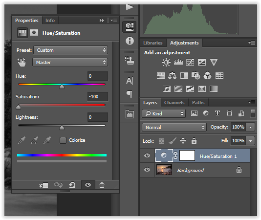
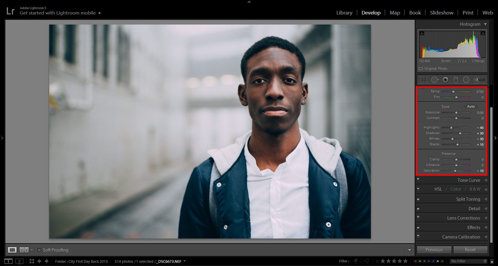
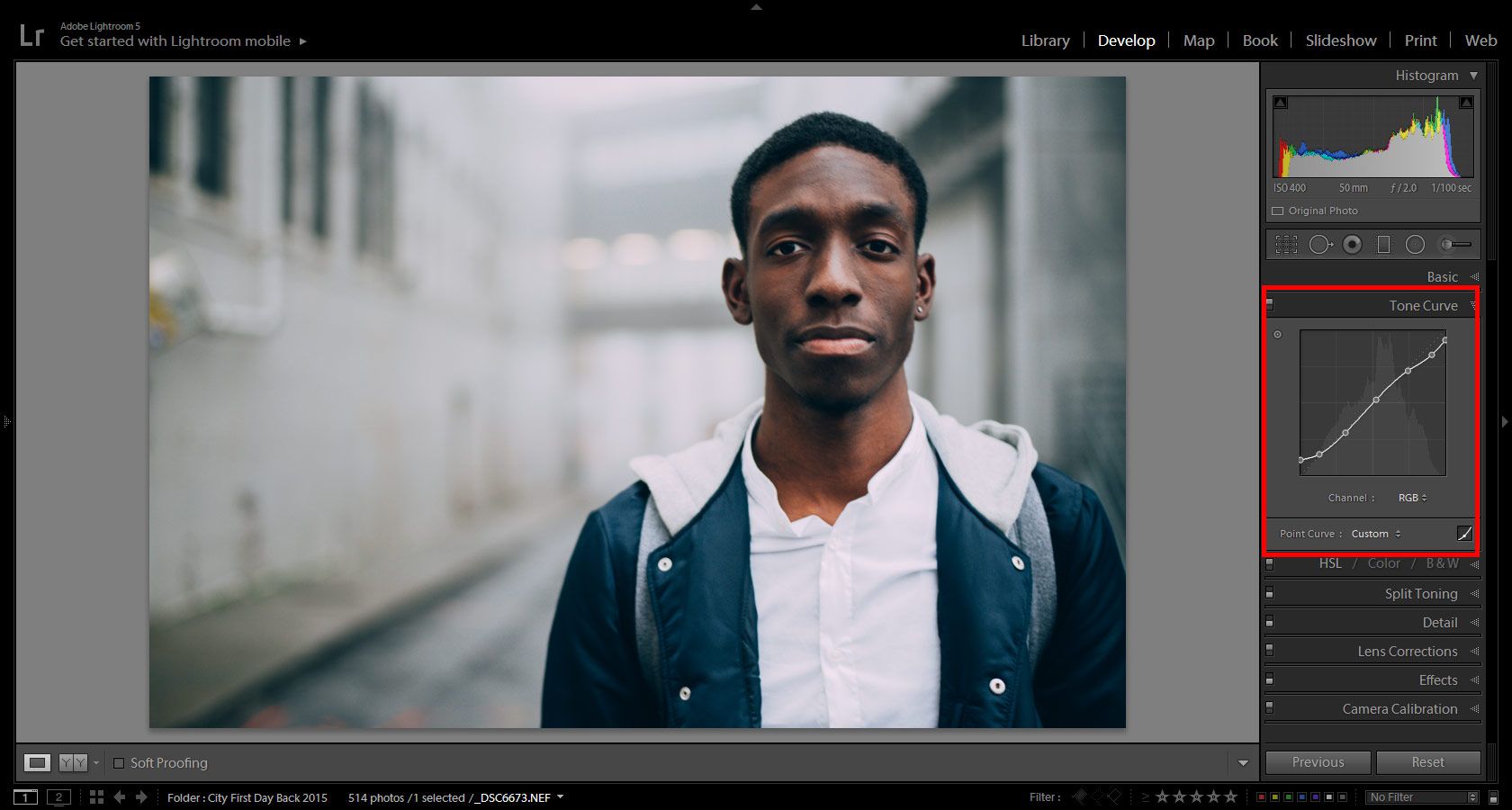
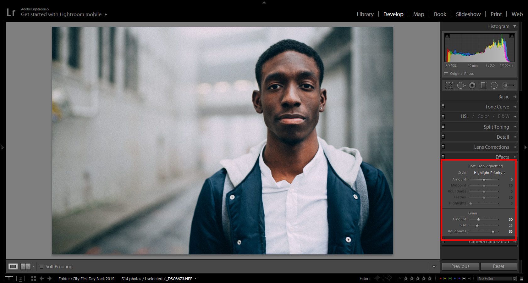
Some photographs simply don’t look appealing in color. More often than not, those same images look significantly more beautiful in black and white. If your photo has too many distracting colors, chances are that you’ll like its monochromatic version much more. I’m often surprised to see what a dramatic change a simple conversion can make!

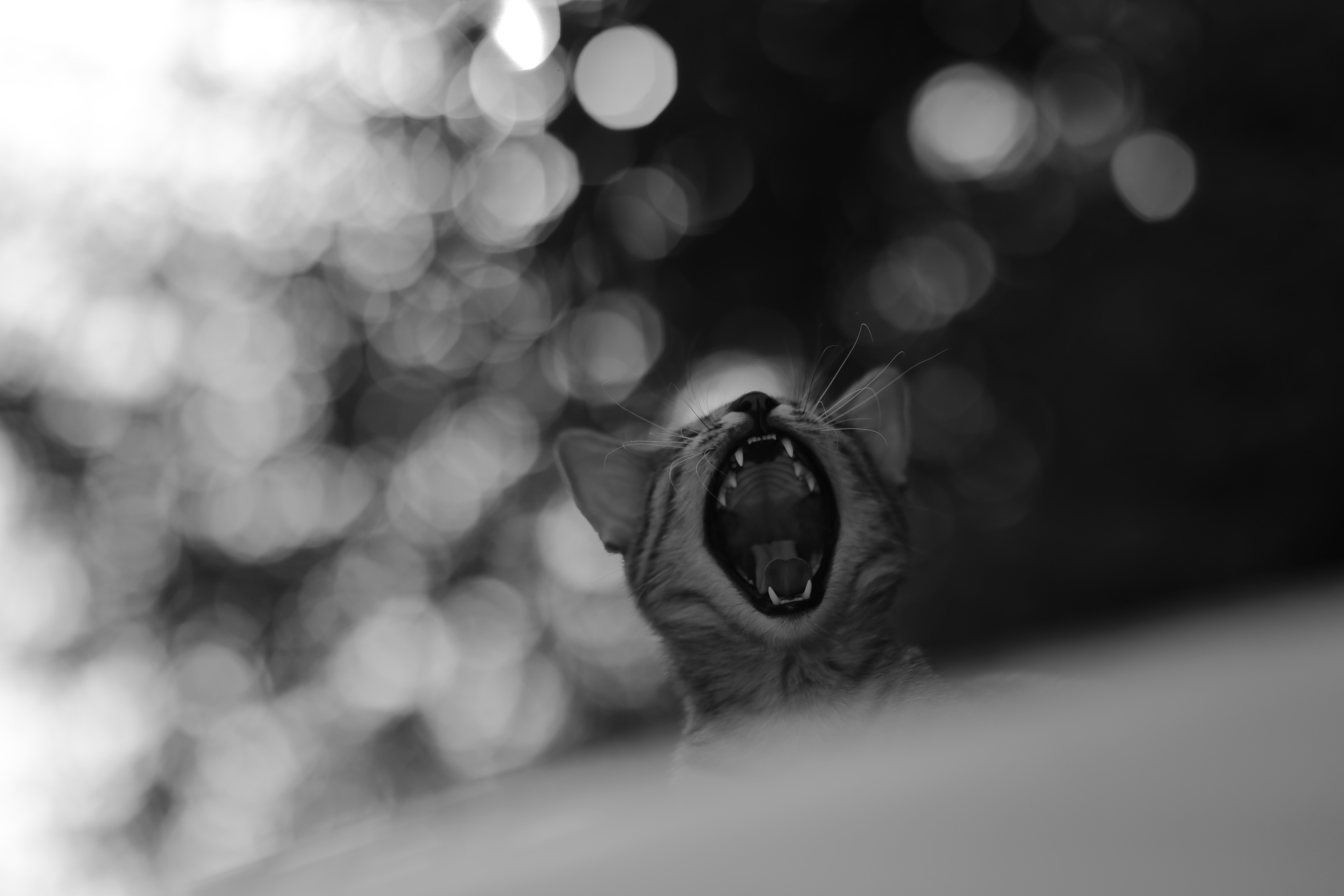
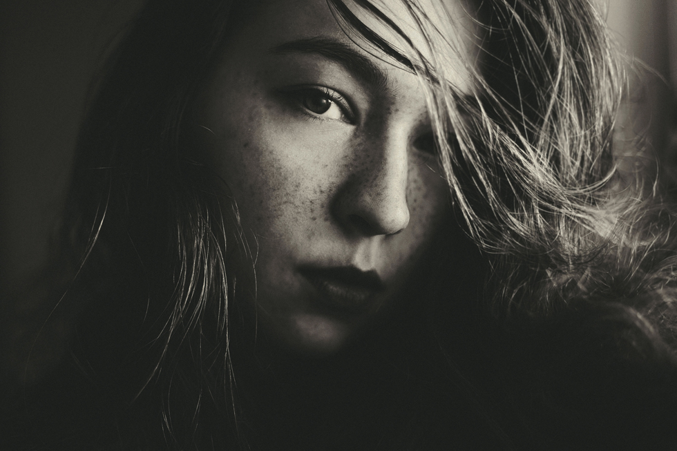
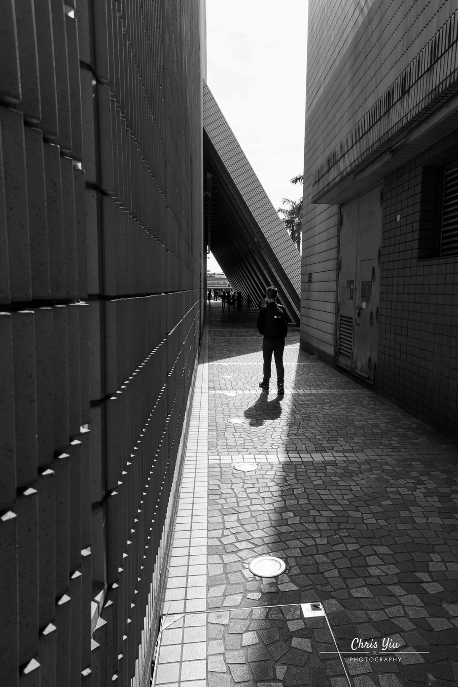
When There Are Lots of Shadows

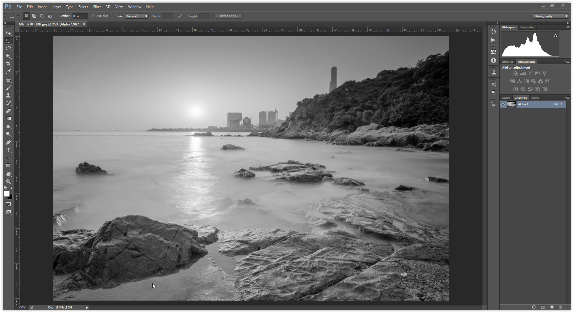
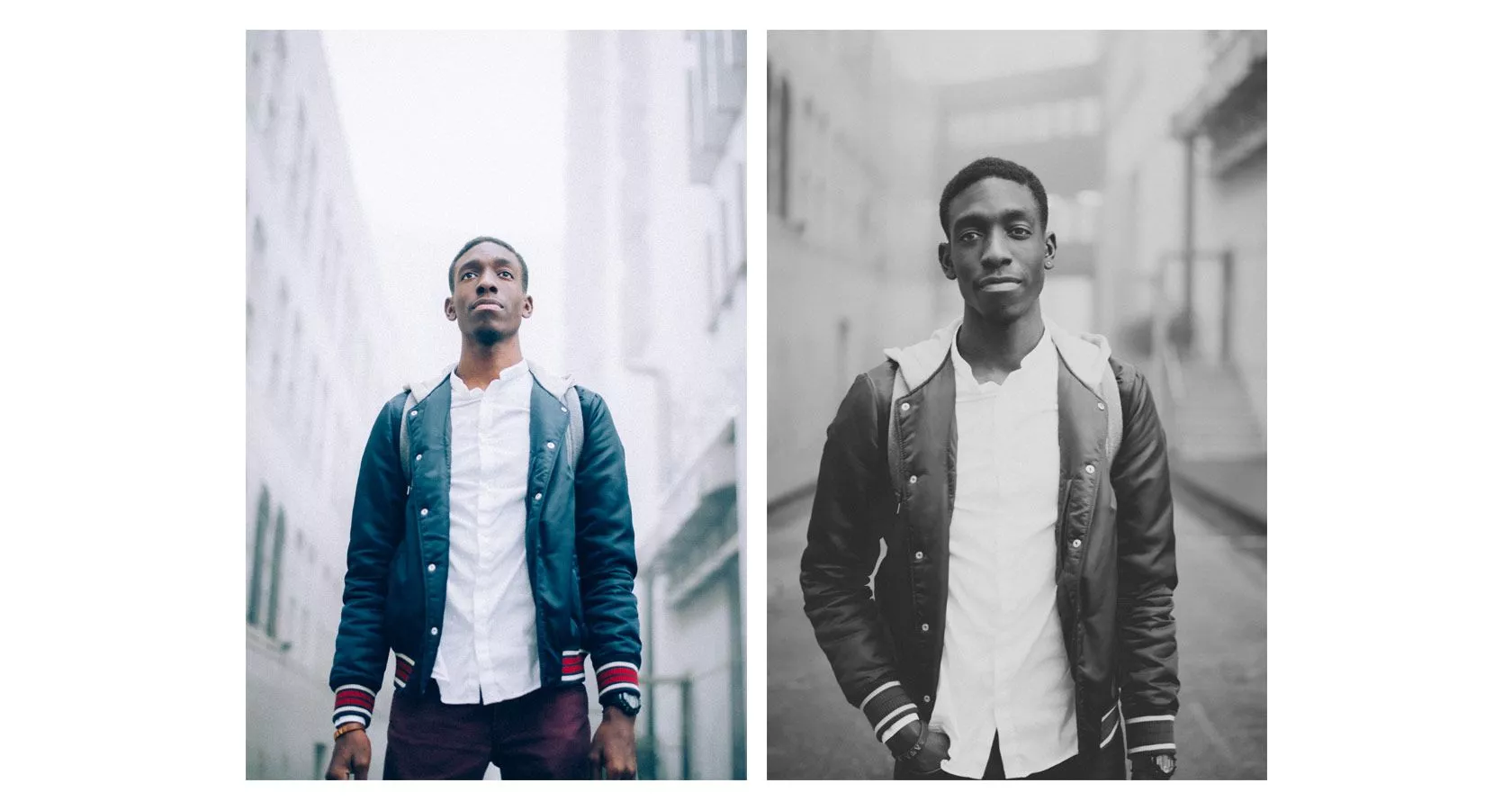
A person’s face partially hidden by mysterious shadows, a street filled with silhouettes on a bright day, and a mountain surrounded by intimidating rainclouds all have one thing in common: they possess photogenic shadows. Impactful black & white photographs often have a lot of contrast, so pointing it out in your own work using highlights and shadows will make it look all the more astounding.

man and train

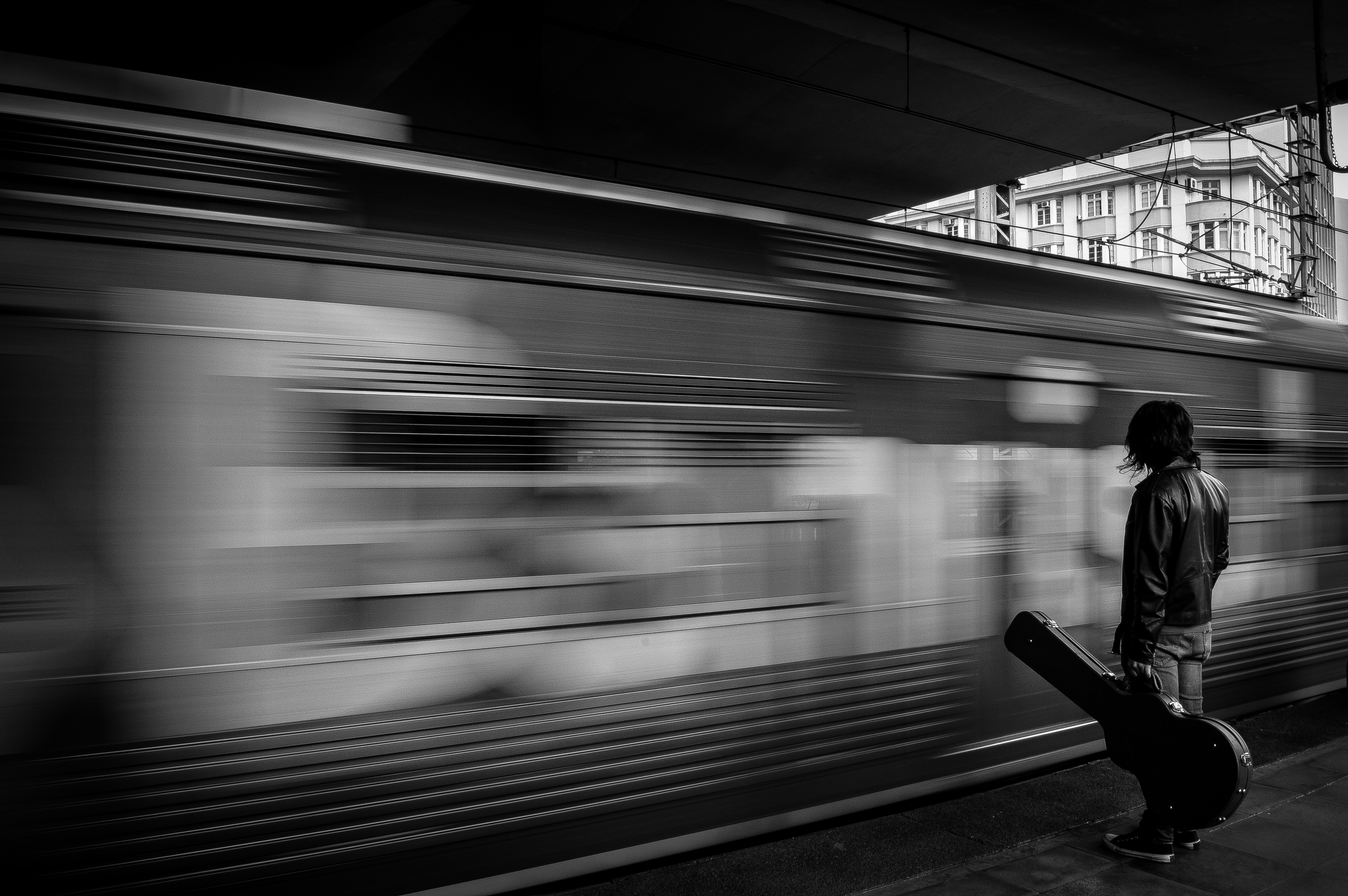
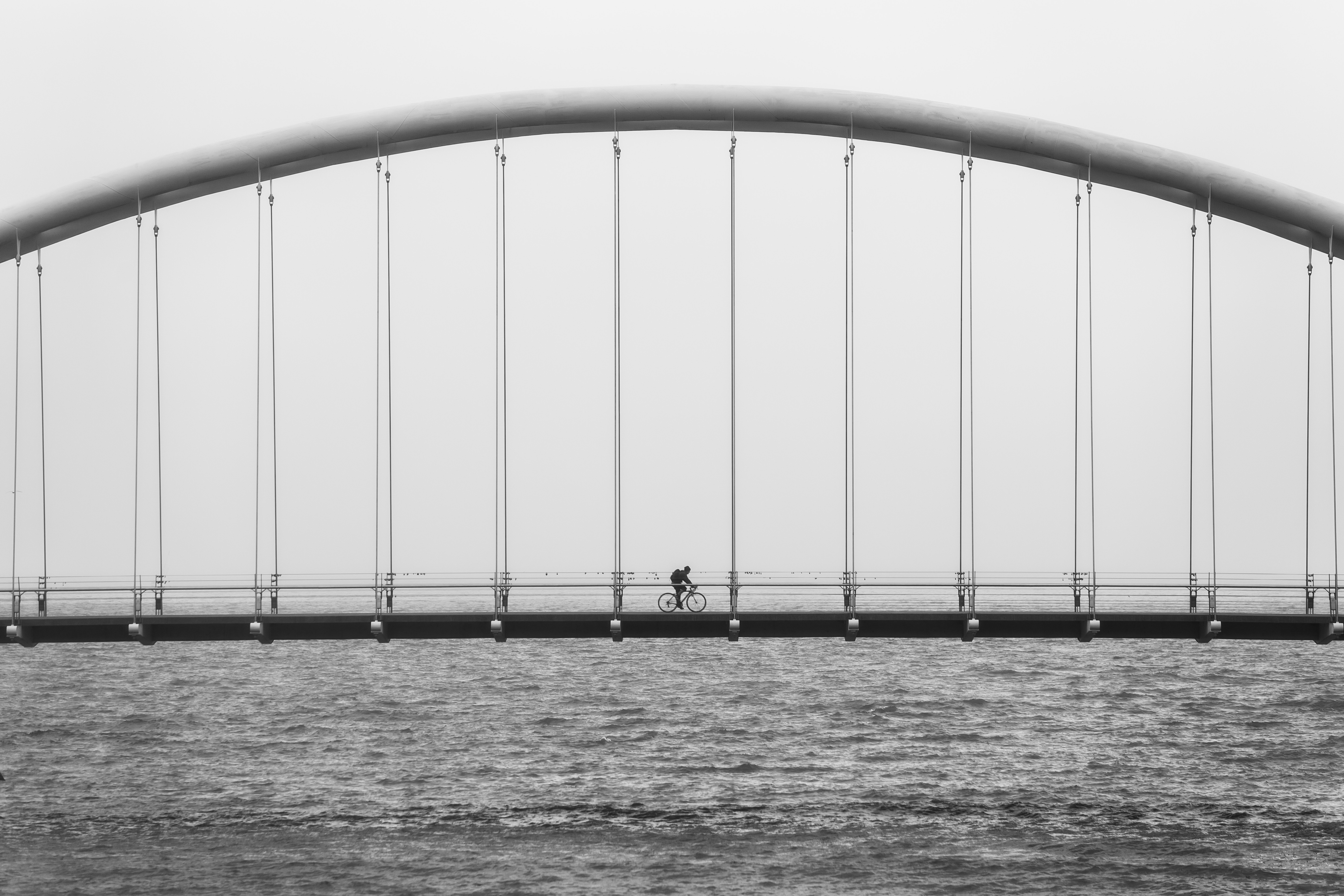
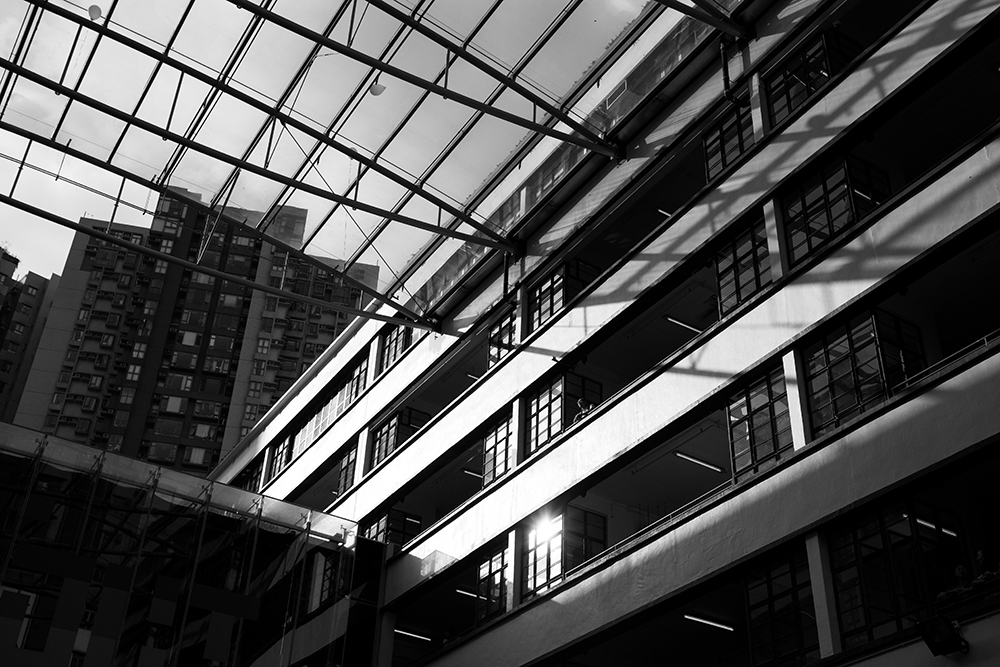
When You Want to Get Rid of Busy Elements

In addition to color, there are many elements that can ruin a photograph’s composition. A background filled with moving objects of various colors, shapes, and sizes may distract the viewer’s eye and obliterate the entire meaning of an image. If you have photos of locations crowded with different subjects, convert your results to black & white. This will help viewers clearly see what you want them to see.

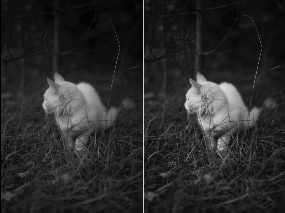
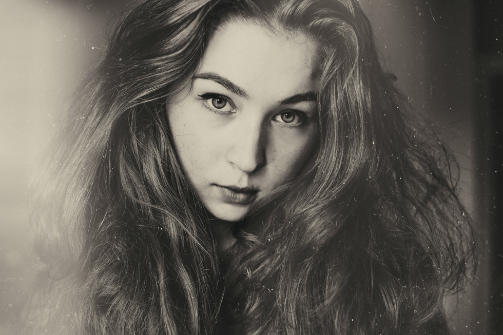
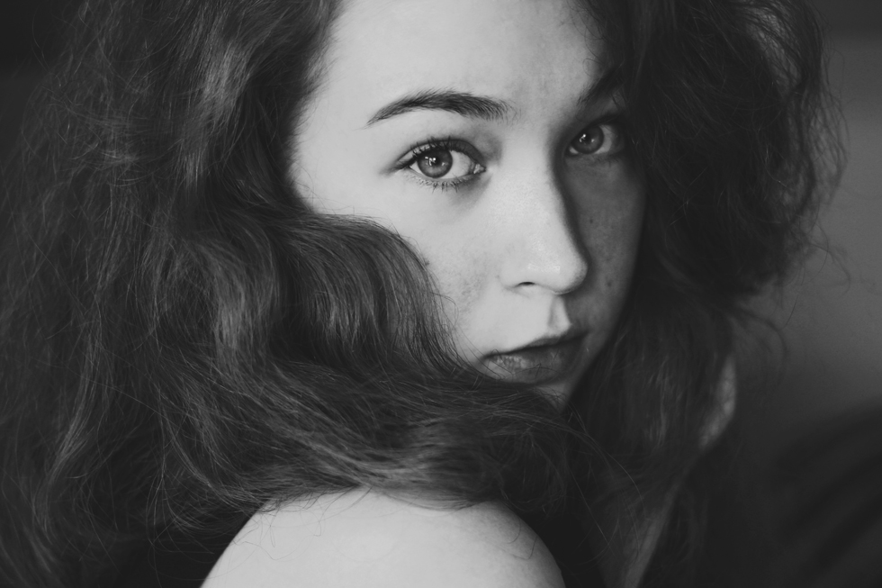
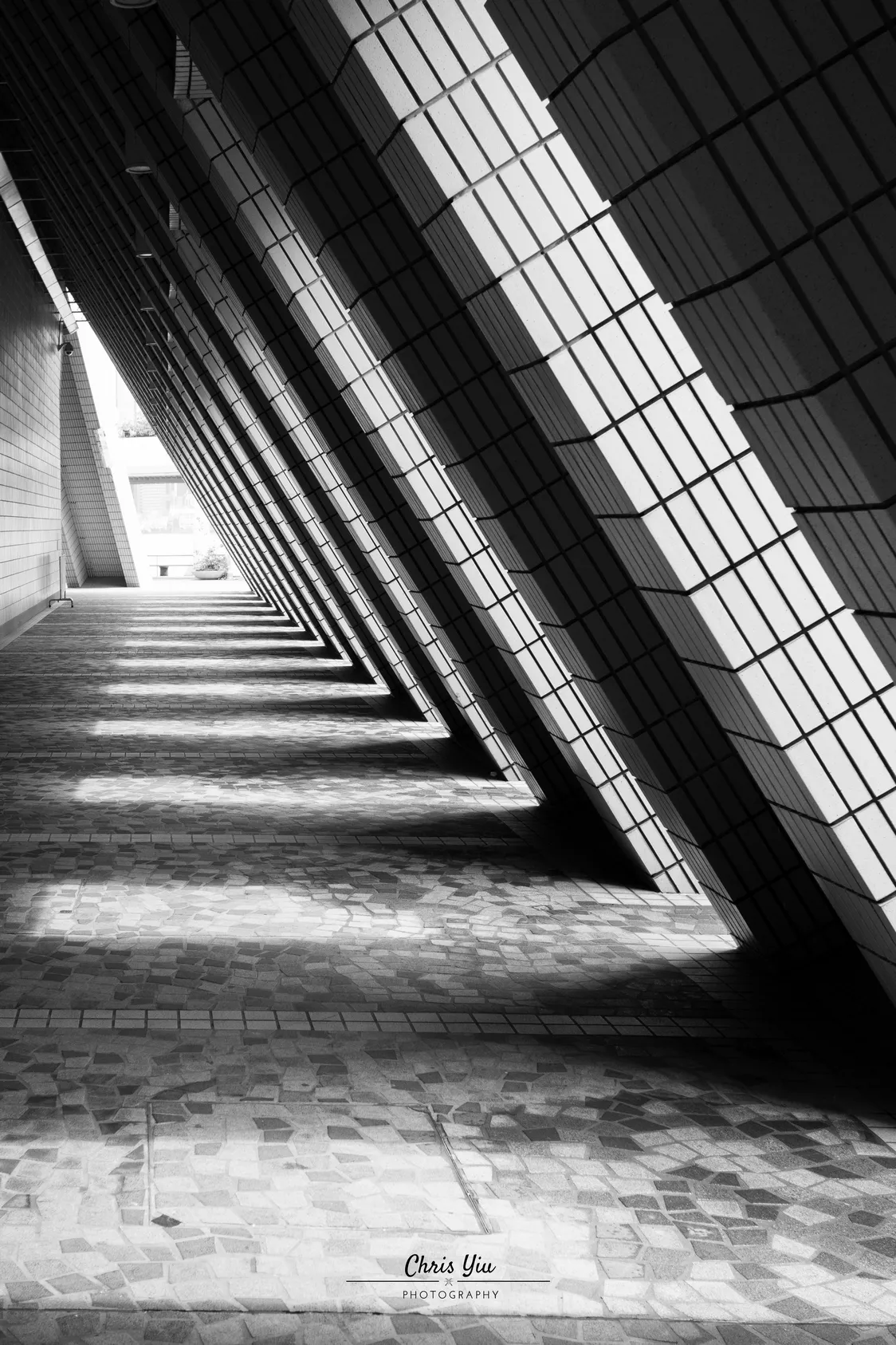
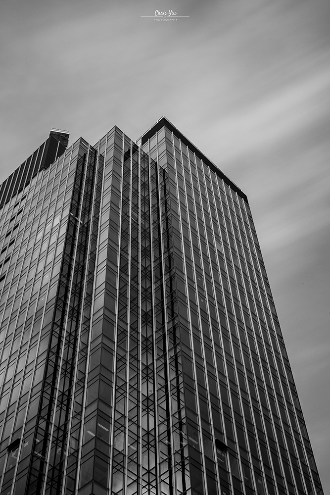
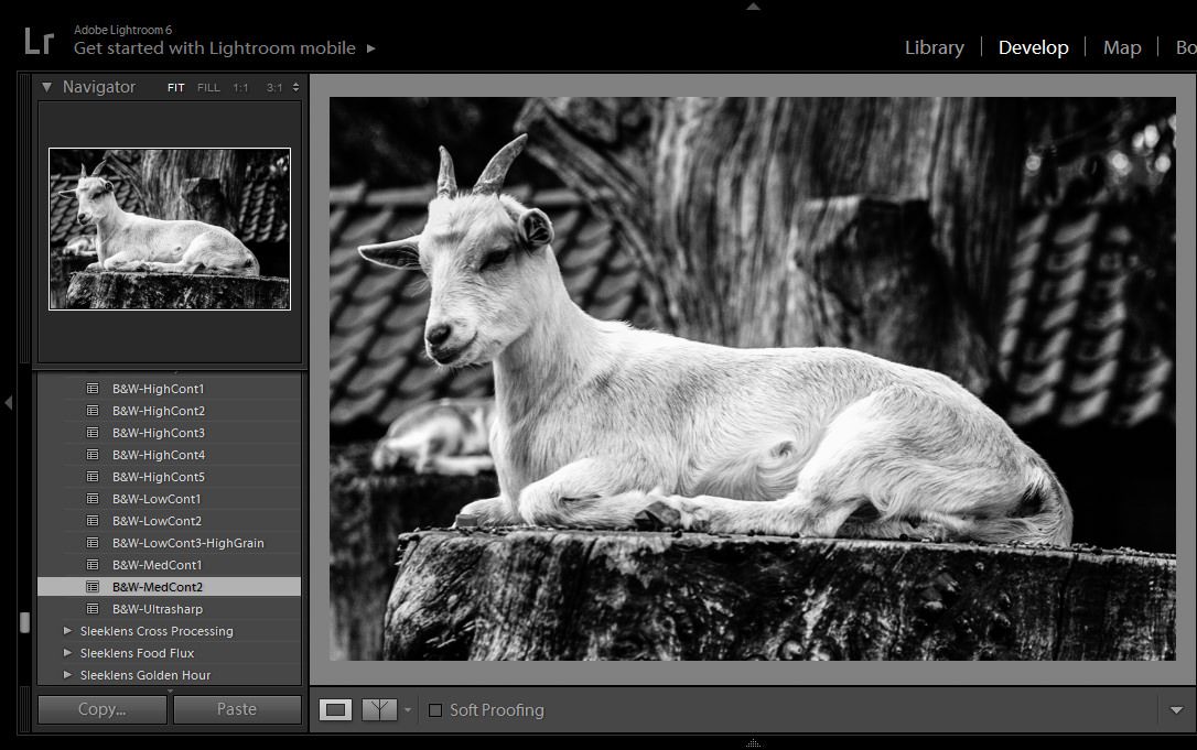
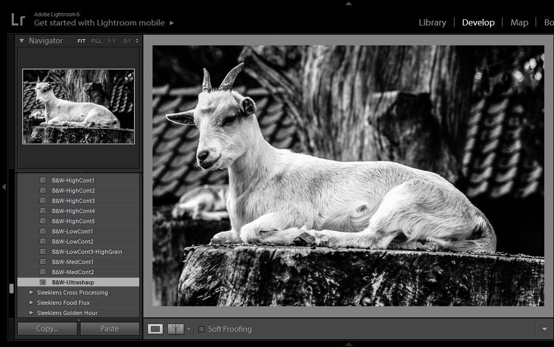
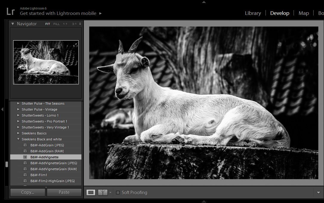
When There Are Textures Involved

Eye-catching textures have the potential to get lost in colorful compositions. Faces, houses, roads, and landscapes are all made up of elements that, when devoid of color, transform into masterpieces of their own. If your image is filled with interesting lines, patterns, and shapes then consider converting it to black & white. To really enhance the textures in your image, gently increase the clarity, contrast, and sharpness in your editing program.

comparison for b&w
Edits like this are subtle yet effective. To create a similar effect, increase your photograph’s clarity, contrast, and sharpness in Lightroom. The Tone Curve tool is also very helpful when it comes to intensifying highlights and shadows.


When There’s an Abundance of Negative Space

Environments are ideal for telling deeper stories, focusing on unusual subjects, and highlighting things the human eye wouldn’t notice at first glance. Unfortunately, environments are also known for their negative space, something that can prove to be a nuisance during the editing process. If you take very atmospheric and environmental photographs, black & white photography may be perfect for you. Black & white conversion will turn any extra space into an aesthetically pleasing blank canvas.

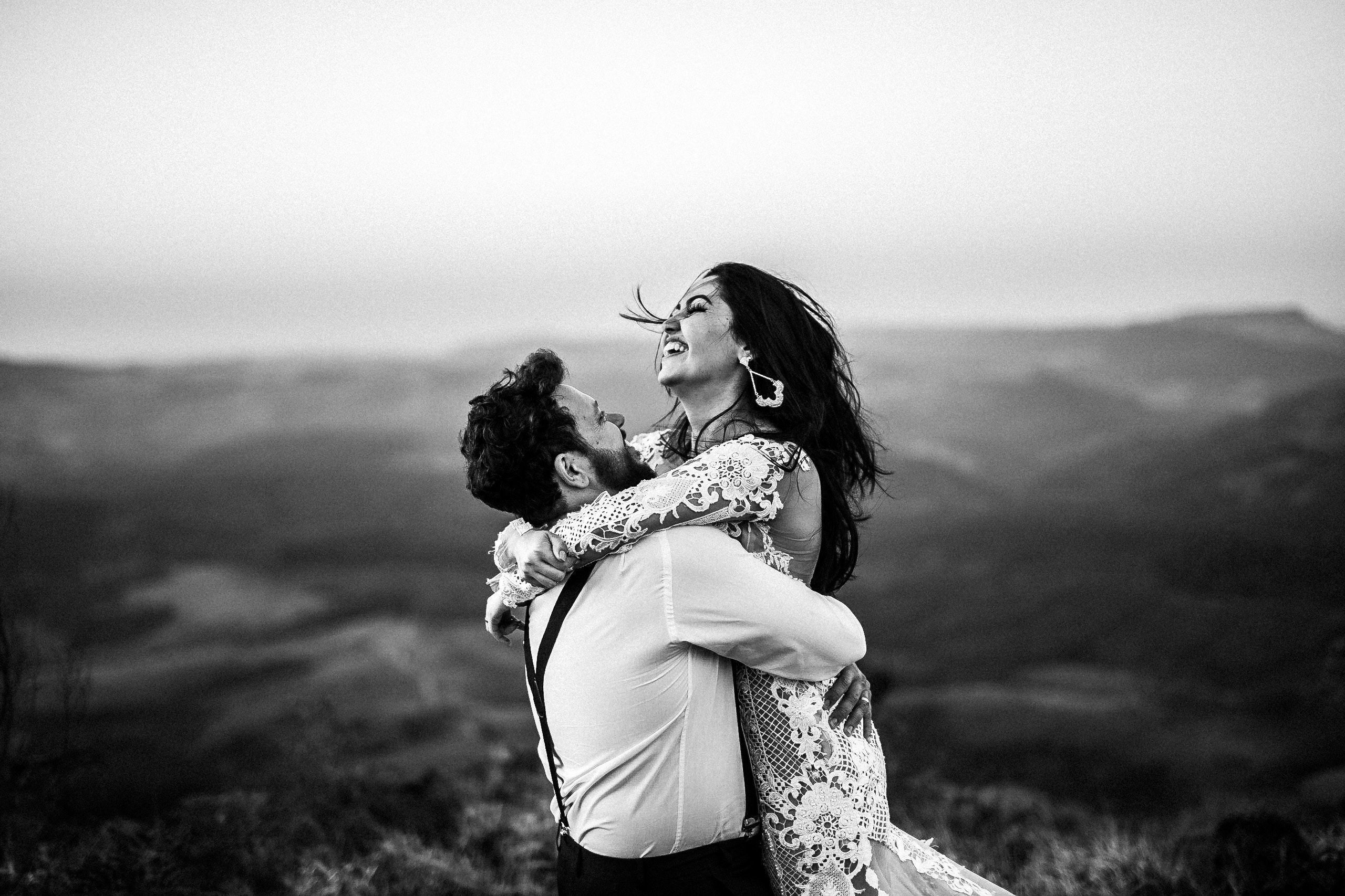
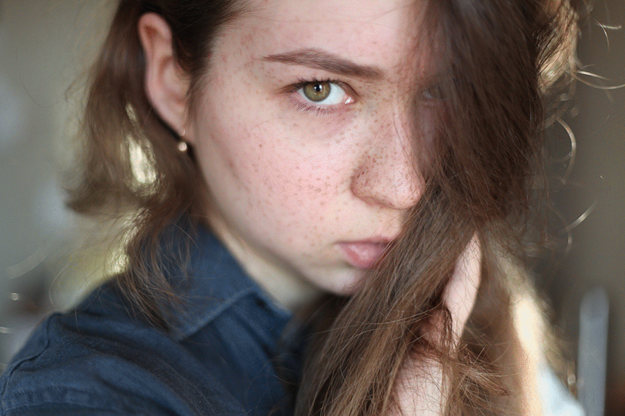
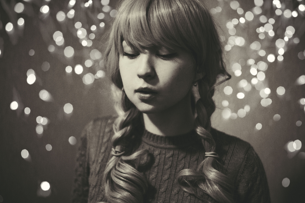
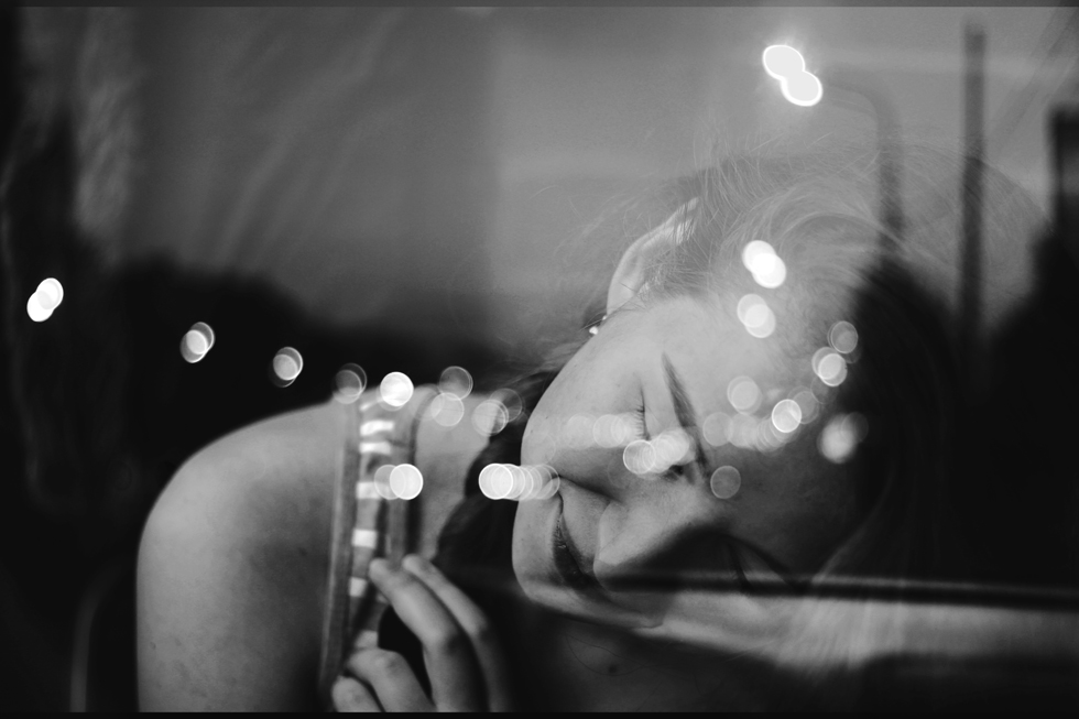
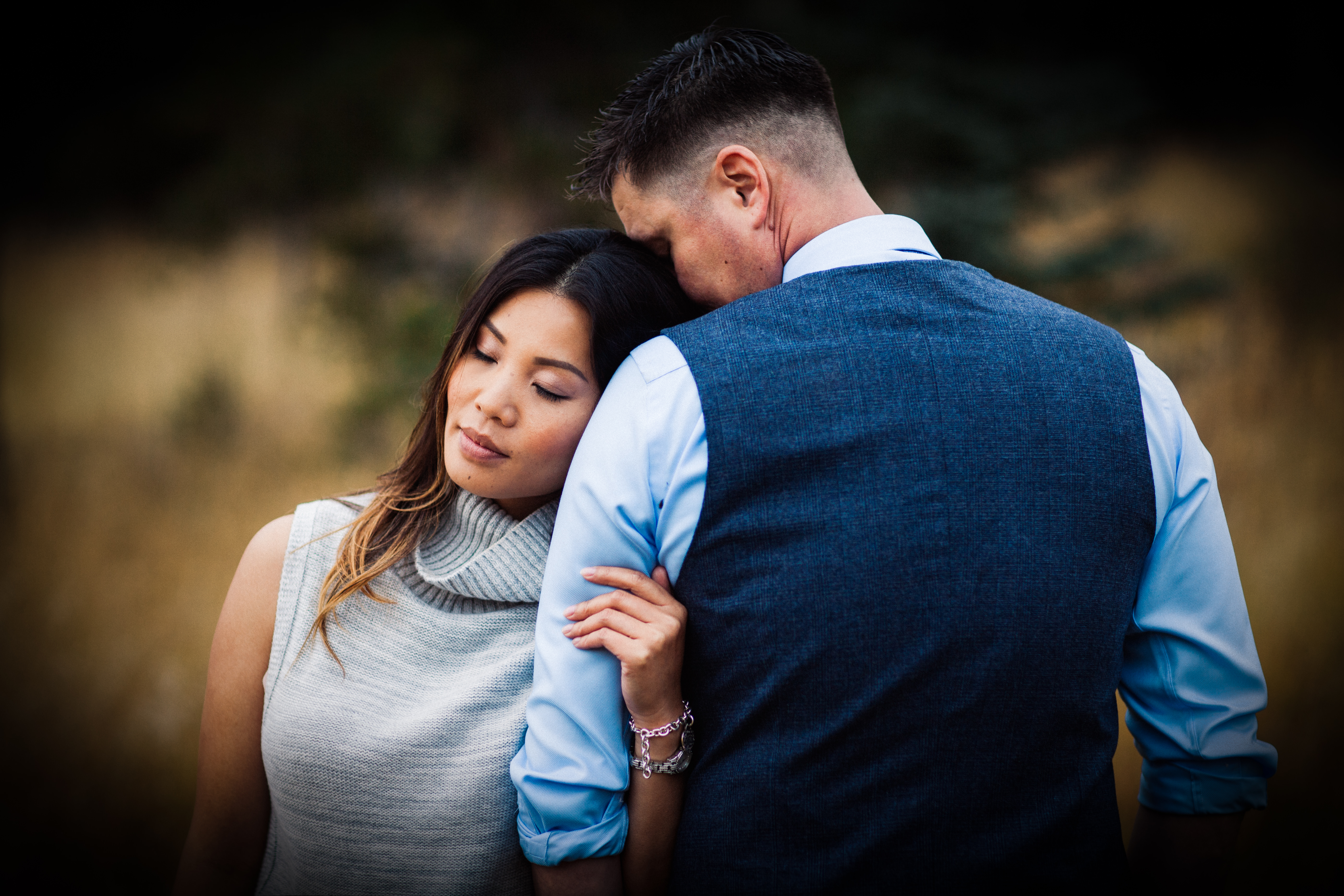
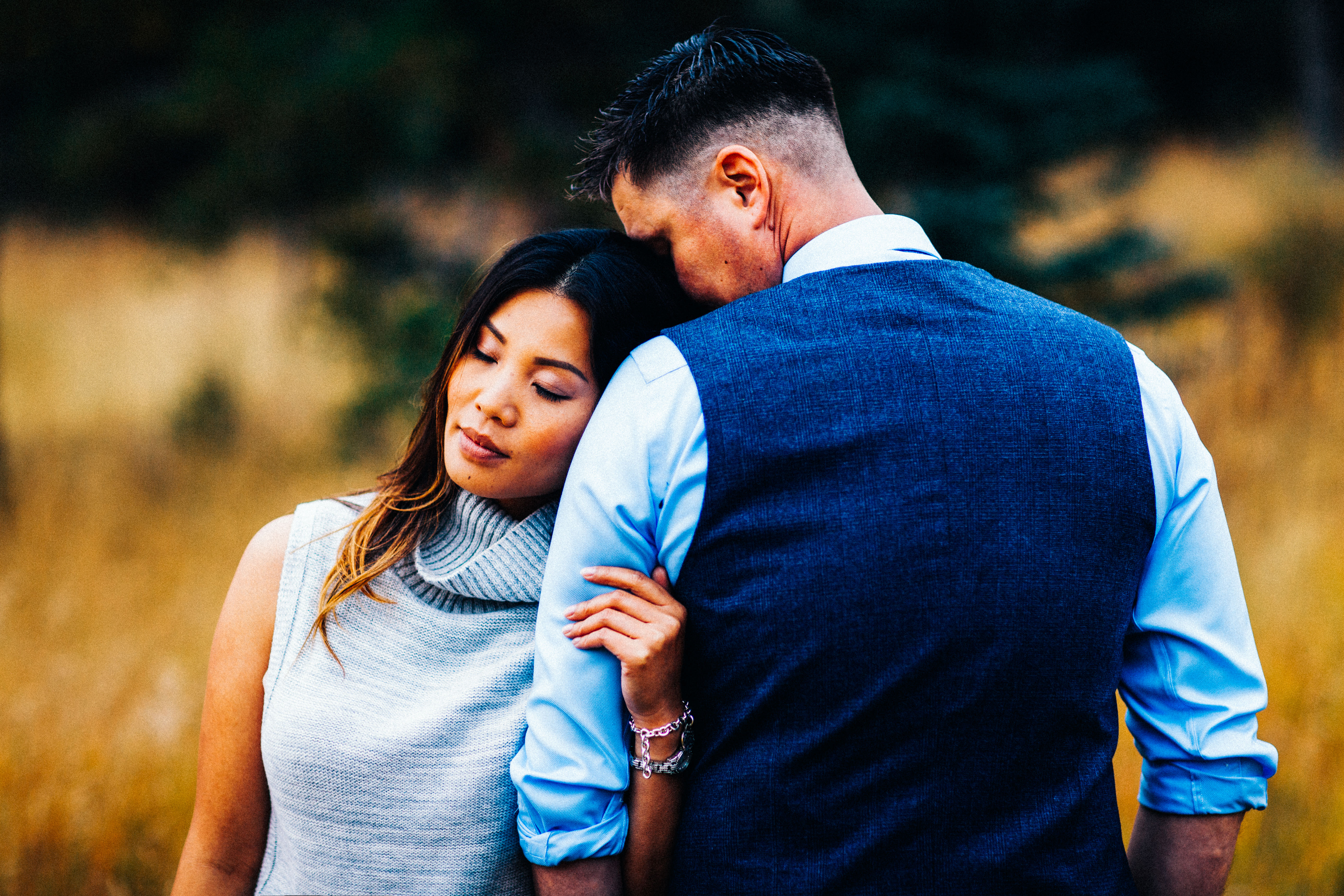
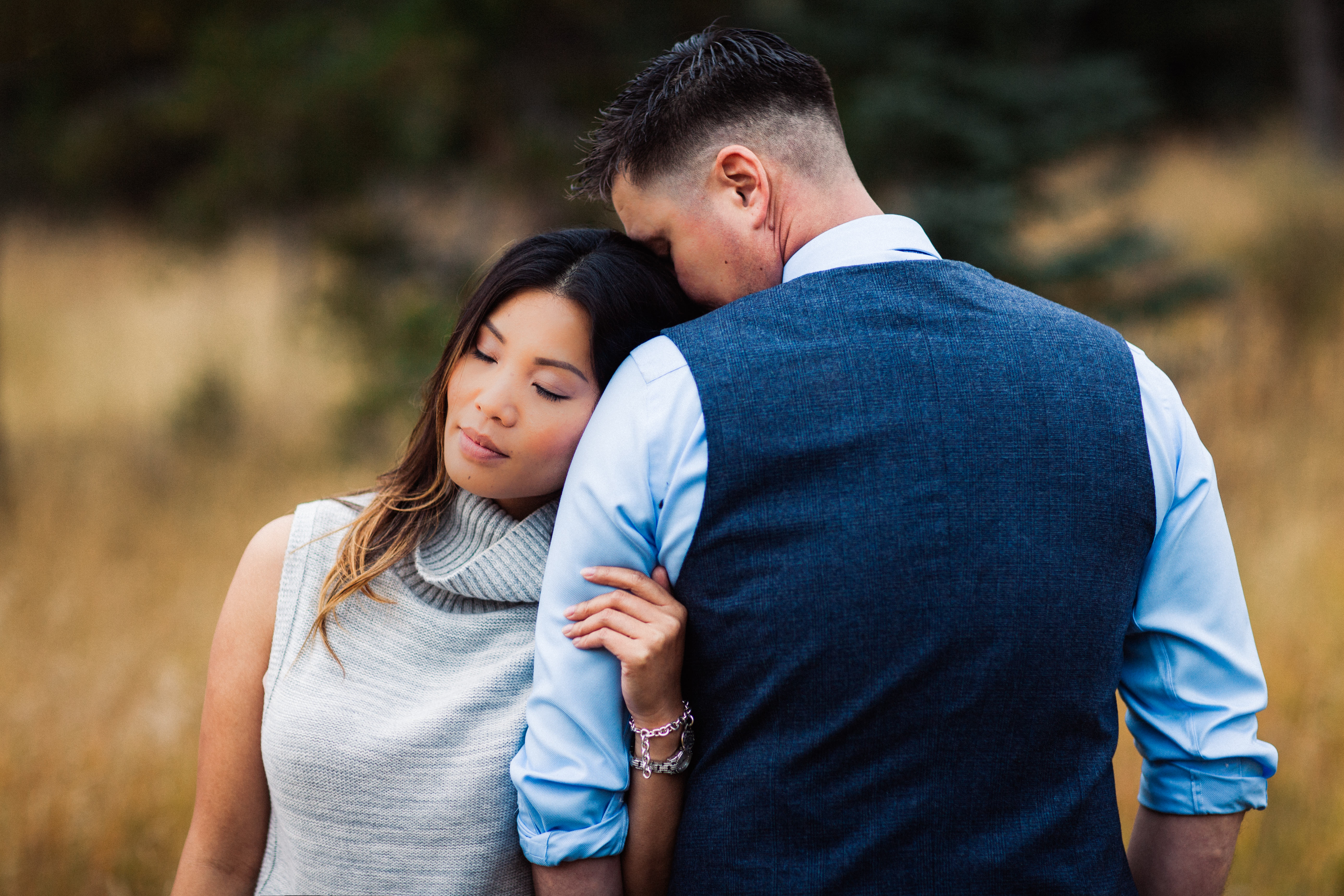
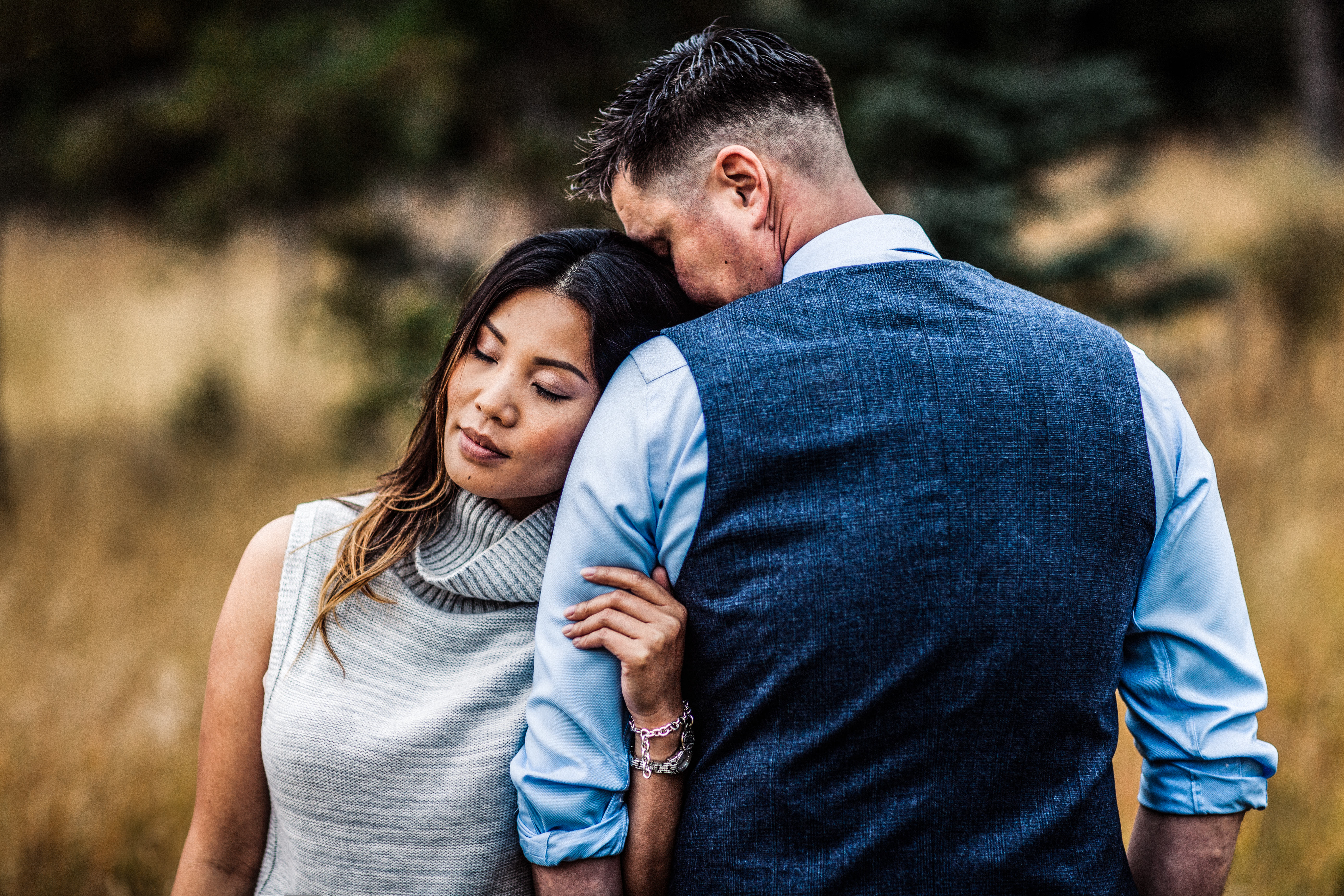
When Emotions Are Your Main Focus

This is particularly helpful for portrait photographers. Relationships between people – and human emotions in general – look very genuine and raw in black and white. Experiment with black & white if you have intimate photos of this sort, and you may get very touching results.

happy couple laughing

From now on, black & white photography will no longer be an unsolvable mystery. Whether you’re an avid portrait photographer, a curious landscape artist, or an eager photography enthusiast, a solid knowledge of black & white photography’s strengths will strengthen your own work. Once you familiarise yourself with the approaches above, you’ll know exactly what to do with every image you edit in the future.

cycling on a bridge

How to make your black and white photographs stand out

You’re editing an elegantly colored image and suddenly you feel compelled to use the black and white tool, just to see if it’ll make your photo even more striking. When you convert it, however, the results are unappealing – you stick to your original variegated photo instead. What if you had taken the time to experiment longer? Would the image be more striking in black and white?

img_1867_15644269483_o
Though photos, when adorned with all kinds of colours, are exotic, there’s just as much beauty in monochromatic images, albeit on a different level. If you’re seeking to add more depth and emotions to your portfolio, don’t be afraid to use the black and white tool. If you take the following tips and notes into consideration while shooting, you’ll receive pleasing and portfolio-enriching results.

xo_20898876233_o
Colours provide us with limitless possibilities. We can alter them using all kinds of handy tools in our editing programs. Colours not only present us with vibrant compositions but also offer us a world of creative freedom. Therefore, it’s easy to understand the hesitation photographers experience when a black and white option is available – it seems to be opposite of vibrant or freeing. Though those two factors are essential in any artist’s life, limiting them can yield impressive results.
Limitations are creativity boosters – let’s use the story in Room by Emma Donoghue as an example: the main characters, a mother and her child, have been unfairly forced to reside in a single room for many years. For the child, the room is the only world he has seen, but he finds endless value in every object and corner. What he sees in his few possessions and what he makes of his tiny world is eye-opening. What if we, in our tremendously large worlds, made the most of everything by carefully taking our possessions apart and finding incredible value in them? Editing your photos in  black and white is ideal for such experiments – remove all colors from your artwork and you’ll be faced with unsettling obstacles. These constraints will allow you to see possibilities in anything, be it in your personal life or in your art, giving you a chance to find comfort in the uncomfortable.

solitude_23877933852_o

You might be unsure as to how to begin this challenge of poetic self-discovery. First, try to take a few existing photographs for the sake of experimenting. If you’d like to have a proper shoot first, focus on elements such as freckles and eyes – these are beyond striking in black and white, and they will dramatically increase the overall quality of your work. (If you or your subject don’t have freckles, drawing them on with an eyebrow pencil will also work!) Take photos of your surroundings, too, in case a great double exposure will come out of your experiment. Pay attention to details, as they will be the ones standing out once you’ve removed all colour from your photos.
Contrast is of utmost importance in the black and white realm. High, but not overdone, contrast adds a certain thoughtfulness to photographs. It compels the viewer to think about the subject and the story they’re attempting to tell. Though colours have the same storytelling ability, they don’t put as much emphasis on the emotions of the subject. The clarity tool in Lightroom is also very helpful when it comes to dramatic emotions. A slight increase will enhance your image in the most beautiful way.

To take it a step further, try working with monochrome: varying tones of only one colour. This will add a unique touch to your otherwise black and white images, further allowing you to challenge yourself (this time with only one colour). A hint of colour will add a feeling of maturity to your images (think of withering vintage photographs – all kinds of ideas can emerge from that thought alone). You can also add texture (specifically dust and scratches) to your photos. The more you experiment, the more you’ll enjoy the beauty of black and white photography.

our-world_14565657687_o

img_6092

Not only do black and white images inspire you to look at daily events and objects from a fresh perspective, but they also challenge you in the healthiest of ways, proving that limitations can be incredible teachers. If intensifying the emotional aspect of your art is in your field of interests, then be fearless when it comes to black and white photography – you’ll create incredible works of art with it. Even if you end up preferring vibrant colours to desaturated ones, you will have challenged yourself and learned something refreshing, unfamiliar and eye-opening. That’s something to be proud of as an artist.

roaring-like-a-lion-in-my-heart_15320886509_o

Knacks of Shooting in Black and White and Conversion of Black and White Images

In the early days, there was only black and white photography due to technical limitations. We could say black and white photography is the most original form of photography. Although color photography is now a mainstream, there are still numerous photographers who are passionate about black and white. I used to believe it was the dullest style I could think of until I truly understood the spirit of it. Black and white photography are, in my opinion, the purest yet the most challenging form of photography. The purity of it captivates my heart. Since then, I have become a big fan of black and white photography. Sometimes, colors can be a distraction for the viewers. Without the disturbance of colors, viewers could focus on the beauty of the composition, lighting, and shape of the subject.

But, black and white photography is not as simple as the majority think. It is not a simple conversion of a color image into grayscale image. As some of the scenes are not suitable to be presented in black and white, we will have to consider whether a photo should be shot in black and white or color beforehand. In this article, I would like to offer some tips on shooting black and white images. In addition, I will include a brief introduction to the methods of black and white image conversion.

How to Take Good Black and White Photos?

First, you can search for a scene where strong contrast in lighting or rich gradient exists. It is essential to capture the spectacular light while shooting in black and white as there are no colors in the photograph. It becomes the stage of lighting. The following two photos are some examples of black and white photos with notable brightness contrasts. In the first photo, I waited for the man to walk into the ‘bright triangle’ before clicking the shutter. This composition highlights the subject in the photograph. Imagine if I pressed the shutter before the pedestrian entered the ‘triangle’, viewers could hardly see the subject.

Secondly, you can seek the points, lines, and planes in the surroundings. These are the basic elements that construct a picture. You have to figure out the relationships between them in a scene and a suitable composition to capture what you see. This is also applicable to architectural photography as planes and lines are commonly found in modern buildings. The photo below demonstrates how we can apply during a photo shoot. The triangle is the dominant shape, which is a ‘plane’ element, in this image. In addition, there is also an invisible guiding line which starts from the bottom right-hand corner extending to the upper left-hand corner.

Thirdly, you can consider shooting black and white photos with long exposure. If it is done appropriately, it will add a fine-art feel to your photo. The moving objects in a long-exposure photo will be blurred. Such blurring effect could make your work looks more abstract. The following image is an example of long-exposure photography in black and white.

How to Make Photos Black and White in Photoshop

In this section, we would go through different skills and methods of the conversion of black and white images. Undoubtedly, each method has its own pros and cons. You may choose the most suitable one according to the circumstances.

1. Desaturation

This is the quickest and easiest method. You simply suppress the saturation value of your color photo to -100 and you will have a black and white photo. But, desaturation is not an optimal way out. It has the least flexibility during the conversion process. You have no control on how it desaturates the image. The photo usually turns out with undesired results.

2. Black and White Adjustment

I usually convert my photos into black and white with this method. It gives you tons of control over the conversion process. You may adjust the lightness of each color separately until it fulfills your expectation. For instance, if you move the slider of Red to the left, the parts of the photo with red color will turn into dark gray or even black or vice versa.

3. Lab Color

Lab color, which is pronounced as ‘L-a-b’, is a color space. It has nothing to do with the abbreviation of Laboratory. This color space is named after the channels it includes, which are namely Lightness, a and b. It is a good choice for conversion of the black and white image as it separates the lightness value from the color of the photo.

First, you need to go to Image> Mode> Lab Color to convert the photo into the Lab color space.

bw3

You can notice that the channels are changed into Lightness, a and b which were originally Red, Green, and Blue if your photo was in RGB color space.

You may proceed to delete the a and b channel and keep the lightness channel untouched. Then you will get a black and white image.

After that, convert it into Grayscale so as to ensure all the remaining color information is completely eliminated. That’s all.

bw6

Hope this guide was helpful for you guys and see you in the next guide!

Five Editing Mistakes Beginning Photographers Make

When you’re first starting out in photography, it’s easy to fall victim to a few common mistakes. When I look back at my work from seven years ago, it’s apparent to me (and probably any other photographer) that I fell into many of the same traps as a lot of other beginners. Things that draw attention to your subject don’t necessarily improve the photo–they can simply be distracting.

In this list below we’re going to get in touch with the five most common mistakes beginners tend to make during their journey towards becoming professional photographers:

Heavy Vignetting

2_vinette-1

Exaggerated vignettes are a tell-tale sign of an amateur photographer. Beginners like them because they draw attention to the center of the frame where they are most likely to compose their focus. What they’re effectively doing, though, is underexposing the sides of the image and detracting from their talent. A good photographer ought to use the whole shot, utilizing natural elements to frame the subject. Amateur photographers also like to use vignettes in an attempt to add some drama to the photo. Luckily, there are natural ways to do this–mastering the sun flare technique can really enhance an otherwise lifeless image.

Overusing Presets

3_Going over the top with presets-1

It’s easy to go overboard with presets. Overuse can make a photo look unnatural and unflattering. If you suspect you’ve done too much, you’re probably right. Keep it simple. Instead of over-editing the entire photo, use local adjustments to accentuate specific areas.

Histogram tool can be your best friend under situations like this, as you’re constantly checking over clipped values (mostly at highlights or shadows), but also Lightroom’s before/after mode can be extremely handy for checking where things went wrong.

Overdoing Black and White

4_Only editing in black and white-1

This is the mistake I’m most guilty of in my early work. Converting an image to black and white does not generally make it more artistic. Of course, there are ways to use black and white to effectively enhance a photo, but many new photographers end up using this style as a crutch. The number of variables that color adds to the editing process can be intimidating. Be sure to learn about complementary colors and incorporate them into your photos. However, do try to avoid photographing bright and heavily saturated colors because camera sensors don’t tend to register these colors well. If you’re unsure which way to go, this post can help you decide whether to edit your photo in color or black and white, but also keep in mind that not only black and white effects count as the only range of monochromatic effects – sepia or cyanotype effects also looks appealing for most clients.

Heavily Retouching Skin

5_Over Retouching-1

Most photographers fear that their clients won’t like their photos because of the way they themselves look (by no fault of the photographer). It’s tempting to heavily retouch skin in an attempt to flatter your client, however, it’s best to edit only what is necessary. A good rule of thumb is to touch up or remove only imperfections that are impermanent, such as acne or bruises – try, also, to find flattering angles and accentuate those.

Overdoing such adjustments will end up in unnatural results, mostly if you don’t happen to ace post production tools such as Lightroom Presets & Brushes or Photoshop Actions. In the end, you’re prone to ruin all your hard work by just trying to make it look better.

HDR Processing

6_Going crazy with the clairity slider-1-1

Every photographer wants to learn new techniques; more often than not, though, HDR processing looks a bit over the top. While it can be tempting to bracket exposures, it’s best to avoid it until you’ve mastered basic photography skills first. Instead, if you don’t have enough dynamic range in a shot, bracket the exposure and brush locally in the post.

A quality image ought to appear natural, polished, and simple:

1_original-1

Now that you’re familiar with these common mistakes, you can easily avoid them by mastering photography techniques that surely will take your photographs to the next level! Don’t feel disappointed by making mistakes during your first attempts – everybody had a starting point and a goal to reach, therefore it’s your right to learn from bad experiences and add all that knowledge to your future work.

Hope this guide was useful and keep shooting!

How to work with Chasing Light: Using Light and Color on Portraits

Hello, welcome back! Today we are going to be working with the “Chasing Light” workflow from Sleeklens, this time we’re learning about how to use light and color on portraits, in order to make our subject stand out.

Now that I have the photo up that I want to work on, let’s start out by working with some of the “Chasing Light” presets. We’ll go with POLISH – Sharpen 2 for the first one.

The next preset that we will apply is a BASE preset, we’ll go with Fresh Color 2.

Now that we have applied a couple of presets, now we will go over to our “Chasing Light” brushes and use those to really enhance the detail in my Photo.

So, let’s open up the “Chasing Light brushes and scroll down to the LIGHT – Brighten brush. We will run this brush all around the subjects face and hair, just to add more light in general. Now I will click New, using the same brush once more, but this time I will turn the Exposure up a little bit. I will also make my brush a little smaller, you can also do this using the bracket keys([]) for the keyboard shortcut.

We will use the brush to kind of contour and add some more light to the face, going over the typical areas such as the forehead, cheeks, chin and bridge of the nose.

For this photo, I’m going to repeat the process with this brush again, but now I will make the brush even smaller and turning up the exposure some. I will use it to go over my subject’s eyes.

Now we will click New to start a fresh brush and go back into our “Chasing Light” brushes, now choosing Soften Skin. I am going to use that brush all around the face. Since we did apply the Sharpen preset at the beginning, it kind of sharpened the detail on the face a little too much, so we will just use this Soften Skin brush to soften it out some.

Moving on, let’s click New, and choose another “Chasing Light” brush, this time we’ll use the LIGHT – Darken brush. I will use this brush all around in the background. While applying this brush, I am going to turn the Exposure down just a little bit. By darkening the background and adding light to the subject, we are making the subject really stand out from the background in the photo.

The last brush that we are going to use for this photograph is the LIGHT – Brighten Highlights brush. We will apply this brush to the hair to add a tiny bit of definition, especially to the darker parts.

That’s all we’re going to do to my first photograph. In the before and after view, You will see that we have sharpened the photograph, added a lot of light to her eyes and face. We have also really made the subject stand out from the background more.

So, moving on to my next photograph. For this one we will also start out by applying some of the “Chasing Light” presets. The first one that I will apply is going to be the POLISH – Sharpen preset.

For the second preset we will go up to the COLOR CORRECT presets and click on Reduce Greens. However, I don’t want to reduce the greens too much, so I will go over the colors tab and move the Green Slider up just a little bit.

Next we will move on to our brushes. Let’s go into our “Chasing Light” brushes and scroll down to LIGHT – Add Golden Sun. We’ll click on this brush and run it around the brighter area, to add a more golden haze to the photo. You would add this to where the sun appears to be affecting the photo more.

Now, we will click New and get started on a new brush. We will go with the LIGHT – Brighten brush again, in this photo I will turn up the Exposure some and run this brush over the girl sitting on the scene, just to add some more light to her.

Next we will start a New brush and go back into the “Chasing Light” brushes, this time going down to the LIGHT – Darken Shadows brush. I am going to run this brush all around the areas behind and under the subject to add a little more depth and dimension.

Now let’s go back over to the presets and apply the TONE/TINT Warm It Up preset. Since we added that golden sun effect, I want to make it a warmer portrait.

Once that preset has been applied, we will go back into our brushes. We’ll go with the LIGHT – Darken brush and apply to the areas behind and under the subject, adjusting the Exposure as we go. We will also use this brush in the hair, just to darken some of the highlights a bit.

Let’s now go back over to the presets, this time we are going to use the Medium Black Vignette. Although, it is a little too much of a vignette, so what we can do is open our effects and look for something that say “Highlight Priority”, then move the Amount Slider up just a little.

That is all we will do with this photograph. If you watch the accompanying video, you will see that in the before and after, we have added a bunch of light directly on the subject and darkened the area surrounding her. We have also added a golden, sunny haze and really warmed up the photograph in general.

For our final Photograph, we have a photo of a girl holding an umbrella over her left shoulder.

To start out we are going to apply an Exposure preset, since the photograph seems to be a little underexposed. So, let’s go with the Brighten 2 preset, then we will go over, open up the Basic tab and turn the Exposure down just a bit, as the effect was just a little too bright for this photo.

Now we will go into our brushes and scroll down to the LIGHT – Brighten brush, just as we did in the previous photograph. We’ll go ahead and apply that all over the subject, we’ll also apply this brush to the umbrella that she is holding as well. You can click New and repeat the process as much as you need, adjusting things like Exposure as you go along, to get the look that you want.

Next, click New to start a fresh brush, then we will go back into our “Chasing Light” brushes, and this time we are going to choose the COLOR – High Saturation brush. We will use this brush to go over the dress that she is wearing, to bring out all of the colors. So for this, I will turn the Saturation up a lot, then the Exposure and Contrast up a little.

Similar to what we did with our last photo, we’ll go ahead and add a Vignette to this one as well, also going with the Medium Black.

Then, we will go back into our “Chasing Light” brushes and select the Darken Shadows brush. I will use this all throughout the background.

Before we finish, I am going to adjust the vignette slightly. Let’s go down and open up Effects and Highlight Priority, then pull up the amount just a little bit.

So, the before and after of this photo will show that we have added a lot of light to the girl and brought out a lot of color in her dress. We have also darkened the background a bit to the photograph a little more depth and make her stand out.

I hope you all enjoyed this tutorial and found it helpful. Now go out there, try it for yourself and discover what you really do with your photographs, with the help of Sleeklens.

How to Give Your Photo a Film Look with Lightroom in a Few Easy Steps

Creating images allows me to connect with people and make them feel like they are looking through my eyes and feeling what I feel. Like the title suggest we will be looking at how to get a film look with your images. The reason I like using the methods that I will show you below is because to me the images feel more tactile. I want people to be able to look at it and get a sense of everything I did when I shot it. So today, I want you to feel the atmosphere, the cold and the mood.

1 – Starting Point

I’m starting here in this tutorial, if you want to see the decisions and what the reasoning is behind some of the choices in the Basic panel then check out the rest of the Sleeklens Blog. We can see that it was very foggy, cold and somewhat wet when I took the photo. For me shooting in the fog is one of my favorite times to shoot. I get the moody atmosphere, great textures, and color that sets a somber tone. The color is part of getting certain film looks, so if you examine the film looks that you like it will be easier for you to choose your color. Think about the following steps to get even closer to a film look.

Arnel Hasanovic Film Look Tutorial

2 – Tone Curve

To get that film look, one of the first things that I do after thinking about the color is start by adjusting my Tone Curve. Bringing up the black point and lowering the white point will ensure that the white is slightly darkened and the black point brightens up a bit. Moving the points slightly is the key! Moving the points too far up or down can give you way too much clipping and may not result in the effect you are looking for. We are essentially crushing the color and if this is not what you want to go with, then skipping this and maybe using the next step, would be better for you. It is all a matter of taste and experimenting with what you would like your images to look like.

Arnel Hasanovic Film Look Tutorial

3 – Grain

It might be hard to see in these images because of the compression but look at the left side of the image where the white wall is. You will notice that there is grain added. To me, this step is something that makes the photo tactile, something on which you can reach out and touch the texture. It adds a certain personality and realness to images. Changing the amount, size and roughness will give you different looks. Try different combinations, because not every photo will look its best with the same settings. Flipping the Effects module on and off will help you see before and after, which will help you determine the amount of grain you may want to put on. Also, not all grain is created even. There are products and plugins out there that focus on creating effects like grain which might do a better job for your needs and desired looks.

Arnel Hasanovic Film Look Tutorial

4 – Conclusion

Here are a few other photos that were shot at the same time. They got slightly different edits, but what remained the same, was the fact that I did the same steps as above. I moved the black/white points in the Tone Curve module and I added grain to each image. As I mentioned earlier, experiment and try using these tools to help you achieve the look you want and need. Do not use something because others use it. You are an artist and you have taste, so use the tools that help you achieve your vision.

Arnel Hasanovic Film Look Tutorial

Make your B&W Pictures Stand Out with Sleeklens Presets

Black&White photography despite being a common theme in both amateur and professional photography requires a good amount of skill in order to transform your pictures properly into Black&White. Even if some cameras can shoot in this mode, it is better if you shoot in normal tint mode and then use external software in order to create the Black&White effect. With the help of Sleeklens presets, we are going to create a stunning B&W picture inside Adobe Lightroom!

Open up Lightroom and import the picture you want to edit. In my case I’ll be working with this picture of a goat resting on what seems to be a chopped tree. Switch to the develop module.

01_bw_bundle

For this workflow, we are only going to adjust the White Balance in the Basic Adjustment panel.

02_bw_bundle

As you can see, the image now looks warmer.

03_bw_bundle

Now it’s time to work with the Black&White preset bundle from Sleeklens. One thing to consider is that this preset bundle makes a difference with images in RAW and images in JPEG, which is quite the advantage since color management doesn’t work the same way with unprocessed files such as RAW photos.

The bundle allows users to adjust the image with regards to the amount of Contrast managed with the Sliders. In my opinion, I usually work with Medium Contrast presets in most cases, since they apply to almost every kind of scene we have, but on certain occasions we may use either High or Low contrast settings.

First I am going to apply a MedCont2 preset for this image. Why didn’t I choose MedCont1? Because as you can see the result would have ended up being brighter than what I intended. Since I plan to add a black vignetting effect to reinforce the B&W feeling, the MedCont2 works better, whereas the MedCont1 works perfectly for a white vignetting effect.

04_bw_bundle

Add an Ultrasharp preset to this composition in order to bring in more detail. Be careful if you previously added some extra adjustments with the Basic Panel, as the image might start looking like an HDR from the excessive detailing, rather than a stunning B&W.

05_bw_bundle

Finally apply the AddVignetting preset for creating the vignetting effect and voilà!

06_bw_bundle

If we do a Before/After shot now we can appreciate how, in only a very few clicks, we managed to make this common image into a beautiful Black&White picture.

07_bw_bundle

Presets apply to all users, regardless of their skills or their experience inside Lightroom. Just try to “label” your work in order to make the decision easier of which preset bundle suits your needs, and let Sleeklens do the magic for you!