How to Work with Color Fantasy: Warm vs Cool Colors in Lightroomwww.sleeklens.com
Today we are going to be working with Sleeklens’ “Color Fantasy Workflow”, more specifically, we will be talking about how to identify and enhance warm and cool color tones in your photographs. For those that may not know, the warm colors are the reds, oranges and yellows, while the cooler colors are blue, greens and purples. These, you can find if you install the Lightroom presets. So, let’s get right into it.
The first photograph that I am going to work with having a city street in the background, not giving the photo very much warmth. This cooler toned picture has a lot of blue and gray really with the only warmth coming from the subject’s skin and a little bit of the brick in the background.
To get started, we will go into the “Color Fantasy” in the Lightroom presets. In order to bring out those cool tones and enhance its overall, the first preset that we’re going to use for editing in Lightroom is the All in One – Light, Contrast and Color. Once applied, This preset has brought out more of the blue, but it has also brought out the warmer tones in the subject’s skin.
Next, we’ll scroll down the Base – Dreamy preset and apply that, which will add a soft feel to the photograph.
Then to enhance the blue in the photo, we will apply the Color – Blue Burst preset.
Now that we have applied those presets, we will go over and open the Color tab to manually manipulate the colors. To achieve a cooler looking picture, I want to take some of the warm tones out of it. Going to the orange, red and yellow, I will adjust the sliders. Starting with the red, we’ll turn that down quite a bit to help cool off the red brick and building fronts in the background. Next we’ll adjust the orange slider down just a little, if we turn it down too much we will lose the color and pigment in the subject’s skin, which will look weird. Like the orange, we will only adjust the yellow slider just a little bit.
Going back into our “Color Fantasy” presets, we will now apply a vignette to this photograph. For this one we’ll go with the Strong Black vignette, to add some contrast and help focus the light to the center on the subject.
Although the photograph that we started with already had those cooler tones, we went in and really enhanced them. In the before and after shown in the accompanied video, you’ll be able to see the obvious differences that were made to the photo. Refocusing the tone and light, we have enhanced the complimentary effects of the subject’s skin tone with the cooler colors in the photograph.
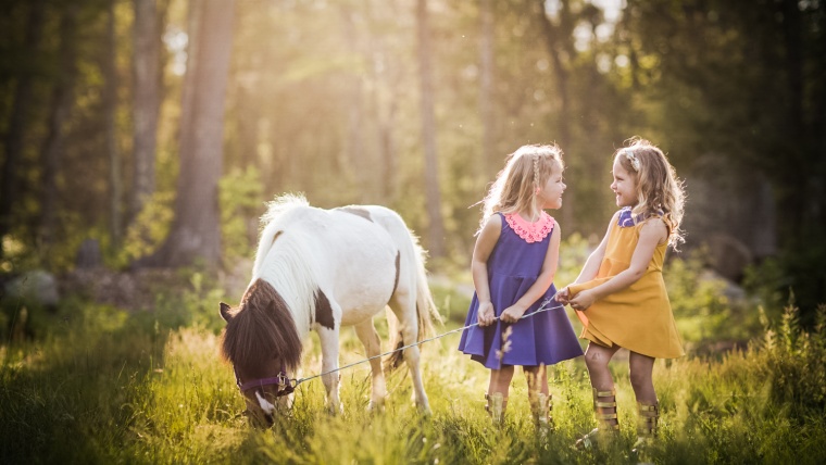
Moving on to our next photograph, which opposite of the previous photo, has a warmer feel to it. With the yellowish tan in the tall grass and also the pink and magenta tones in the clothing, so we will go ahead and enhance those warm tones.
Starting out with an All in One preset, let’s scroll down and select Retro Vibe, which is going to bring some light and a matte effect to the photograph.
Still in the “Color Fantasy” presets, we will scroll down to the Base presets and click on Splash.
Next, we want to bring out the nice magenta colors in the photo, so to help with that we will apply the Color – Magenta Burst preset, which will make these colors stand out much more.
Now in this photograph, I think a vignette would be really nice and help bring the subjects forward more. So, the vignette that we are going to apply to this photo in the Vignette – Brown Black. With this vignette the brown toward the inside in coming from the masks that have been applied to the photo, and the black is coming from the effects and our Highlight Priority. Once applied, it seems a little too dark for this photo, so what we will do is get rid of the Highlight Priority and turn that way up, but leave the Masks on there. This will leave us with the brown effect, while getting rid of most of the black.
If necessary, we can move the mask to better suit the photo with the cursors. We are going to move the masks in this picture by rotating and moving forward and back to best suit this photograph.
Now, we are going to move over to the “Color Fantasy” brushes. Once we click New, let’s scroll down to the Color – Warmer brush. We’ll turn up Saturation and use this brush down in the lighter areas in the grass, giving the photo a subtly warmer effect.
Go ahead and start a fresh brush by clicking New, and the last brush that we’ll use for this photo will be the Color – Desaturate brush. We will use this brush around the top of the photo, to take some of the blue out.
What we end up with is a much warmer photograph, bringing more light and color to the center and really enhancing it overall.
Let’s go on to our third photograph, which has a mixture of warm and cool colors, with a warmer red on the steps and the cooler green of the ivy along the sides. In this case you could go either way with it, but for this photo I’m going to go with a warmer tone.
To start out, we will go into our “Color Fantasy” presets and select Base – Auto tone to bring more light back into the photo.
Then, we’ll go down and click on the Exposure – Darken Shadows preset to add a little contrast.
And on top of those two, we’ll add the Polish – Sharpen preset.
Now I want to focus on the little girl in the photo, so we’ll go into our “Color Fantasy” brushes, this time we will go with the Light – Brighten brush.
We’ll turn the Contrast and Saturation up and the Shadows and Exposure down, then run this brush over the subject, adding a little more light and helping her to stand out more.
So, that was a pretty quick edit and all I am going to do to this photograph. The color in this photograph is really nice the way it is and doesn’t need much enhancement. All we have done was apply three presets and a brush, really changing the photo quite a bit.
Starting out, this photograph was really dark and a bit underexposed, the colors weren’t as bright and the photo was really dull and washed out. The edits that we made have brought a lot of light and color back into this photograph. You may also want to read our post about batch editing in Lightroom.
I hope this tutorial was helpful as well as enjoyable. Hopefully you will be able to try out our “Color Fantasy Workflow” for yourself soon.
Pia Lopez is a self-taught photographer, graphic designer and ArchViz artist. As Content Director of Sleeklens.com, her work is driven by her two biggest passions: technology and art.


 Facebook
 Google +
Comments (0)
There are no comments yet.