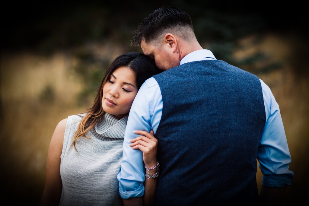
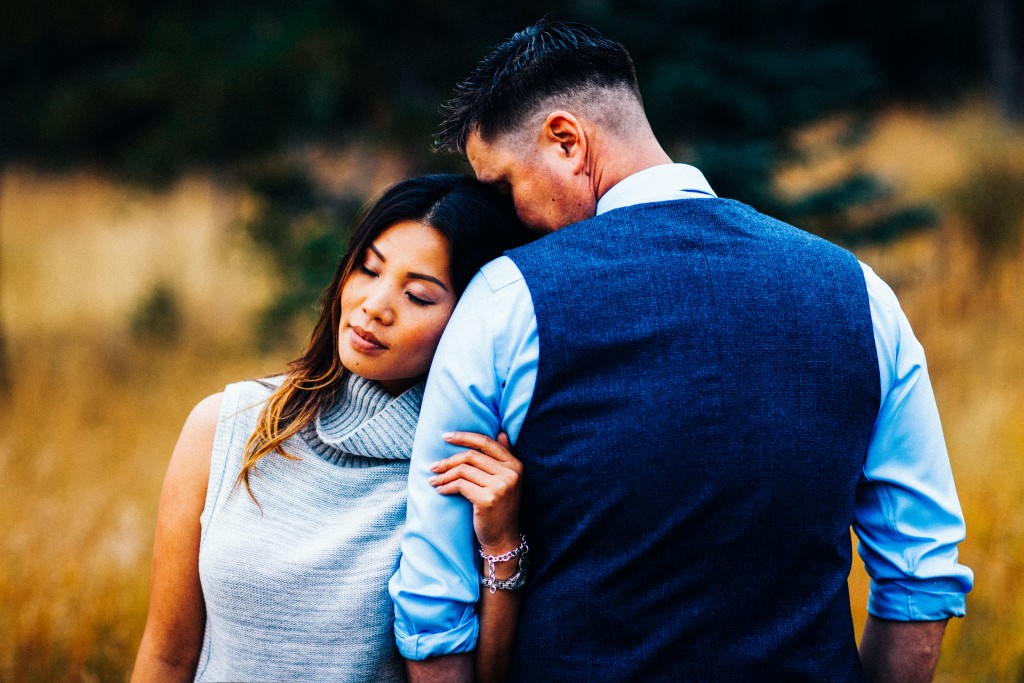
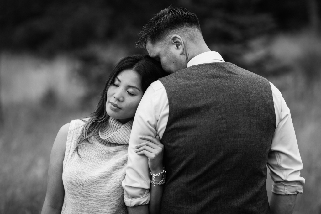
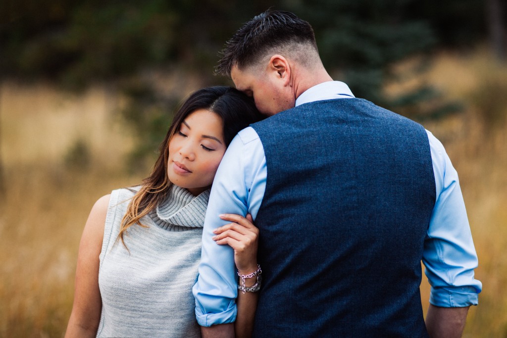
Tag: black and white

The Power of Seeing Monochrome: Tones of Black and White

Colors have a way to give you a bright and cheerful feeling. There is just something about a photo that speaks colors. It brings out that energy and brightens up your day with it. Did you know that even photos in Black and White/Monochrome can intrigue you?
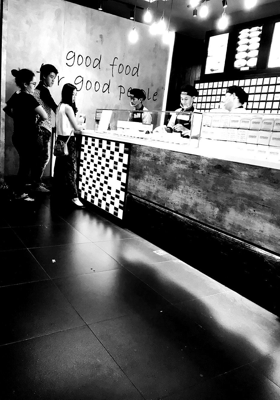
people

Black and White definitely gives you a retro feeling of the olden days, when photographers like Andre Kertesz, Henri Cartier-Bresson, Fan Ho created wonderful artistic memories. At the same time, in current times you will find many photographers including myself, trying to experiment shooting or even editing in Black and White to create a different moment with a touch of the past.

How do we find the right photo to edit in Black and White? Or maybe capture a moment in Black and White?

In a recent assignment titled “Cities in Black and White” on National Geographic by Matt Adams, I tried to experiment and submit to the assignment. We were allowed to edit photos into black and white. In the assignment, Matt gave us a guide as to what to see or how to find the right photo to edit. It was not easy to choose the colored photos to transform them in Black and White yet, it was a fun learning experience. It has also continued to help and guide me to keep improving and trying out various edits to get the right tones of Black and White.
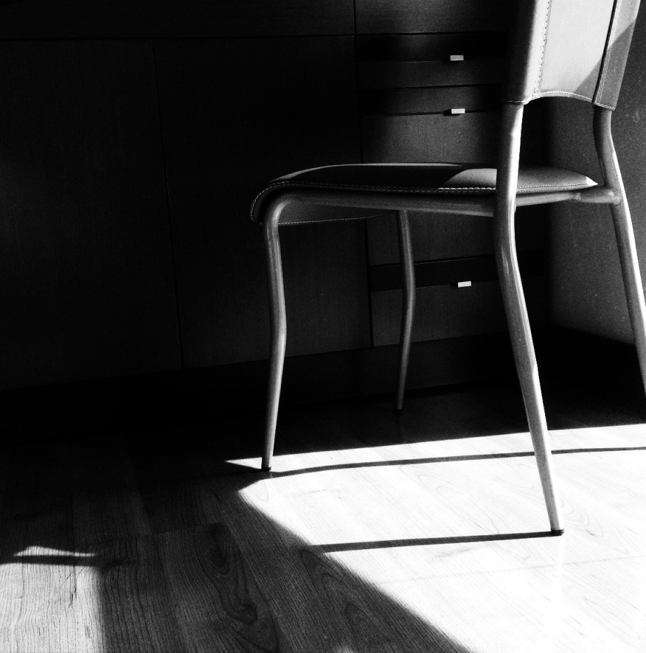
chair

Seeing through black and white can be a challenge but it can be simple. We have been quite accustomed to having the option of shooting in color that when looking at black and white it feels too plain. It is in that simplicity that many great moments have been created in the past and even today.

The photo above has been shot in pure black and white. There was the “Weekend Hashtag Project WHP” on Instagram at the time titled “Shadows and Light” if I recall correctly. This project helped me to experiment capturing in black and white. I saw the chair and the sunlight during the day was pretty good to create a shadow effect. From a particular angle, I captured the shot, to portray the serenity of the moment using the chair as my object.

We now turn to comparing between color and monochrome photos to see how editing and conversion can also bring out a good black and white tone to photos.
art

art

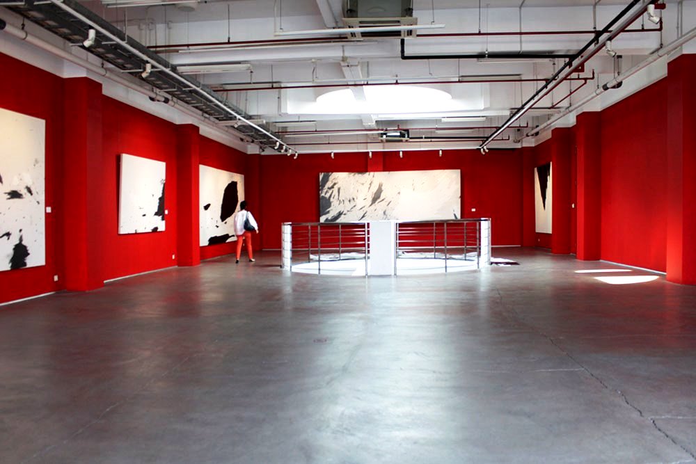
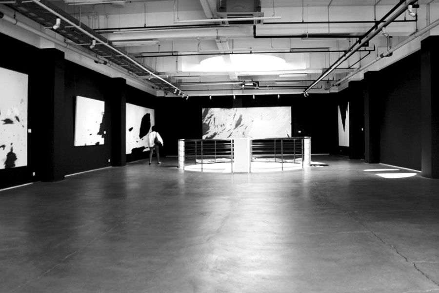
This prominent red colored photo of an art gallery brings the moment to life with the red, the artwork and the structures. I chose this photo to transform it into black and white. As you will see once transformed, there is a completely new sense of the moment. Everything is the same the artwork, structure, and perspective. We can’t say that color is missing as the essence is the same. It is now just a matter of personal preference.
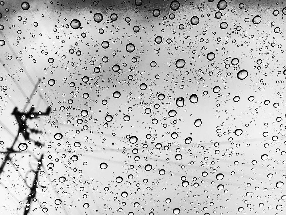
drops

drops

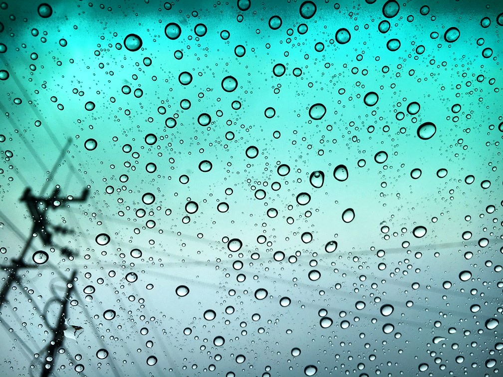
In this photo, the raindrops with the bluish green background bring the raindrops to life with every detail of it. After we convert it to black and white we can see not just the raindrops are alive but every single aspect of the photo is visible. There is complete clarity. The black and white is my personal preference as it defines what I wanted to capture the moment.
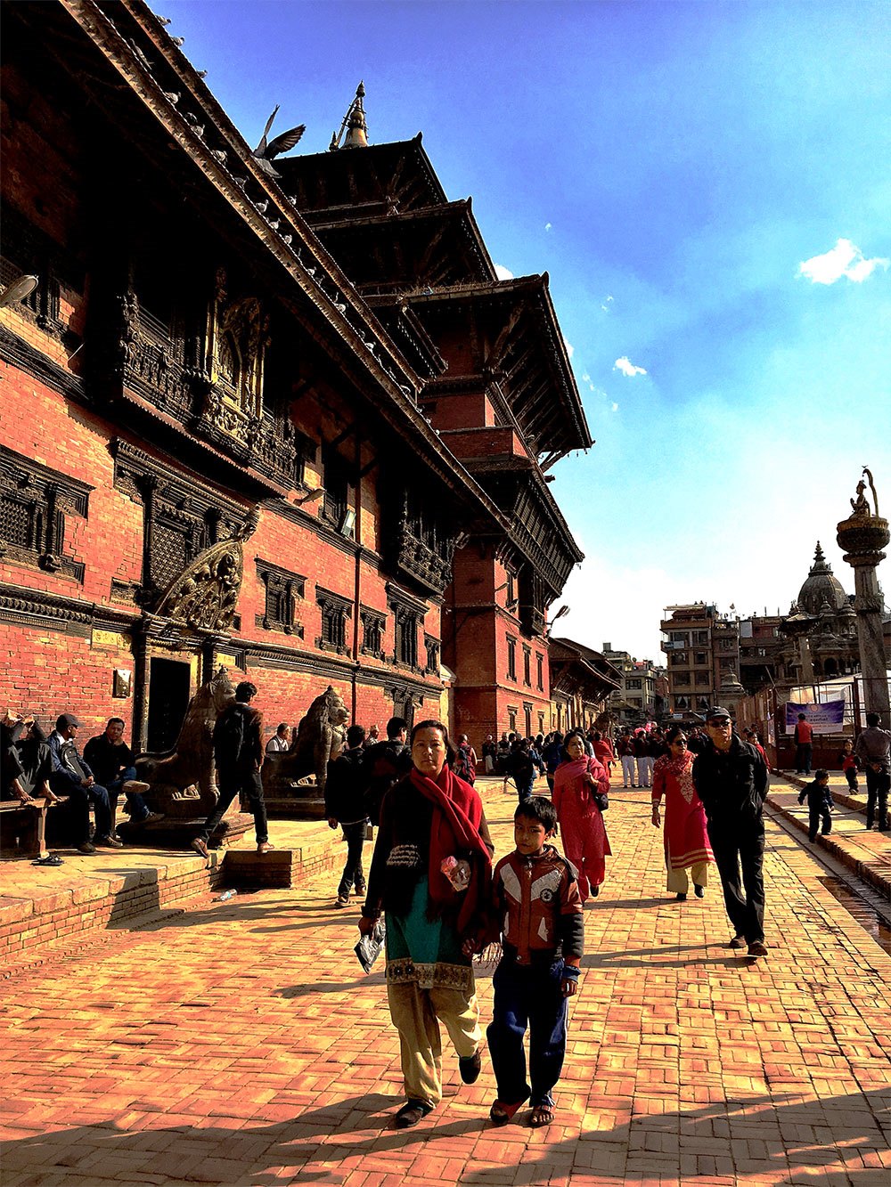
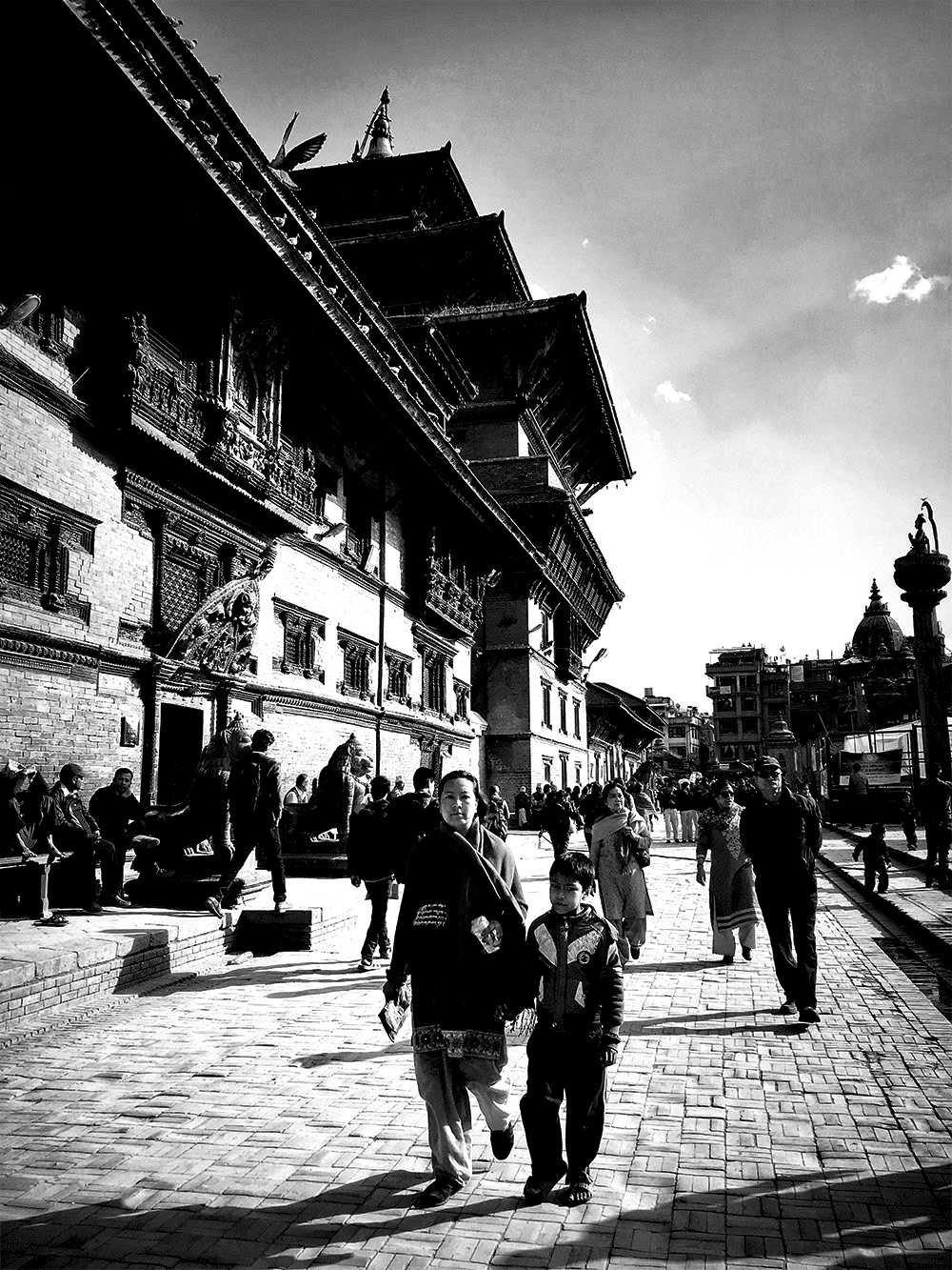
people

people

Walking around Patan Durbar Square, Nepal this scene was quite pleasant. The details of the wonderful palace building with the sunlight blue skies and people walking around created a lovely moment. Capturing this in color and after a while transforming it to black and white, made the moment feel more captivating. The details of every aspect pop out more through monochromatic tones.
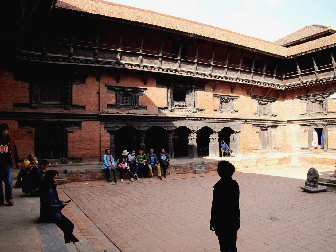
inside

inside

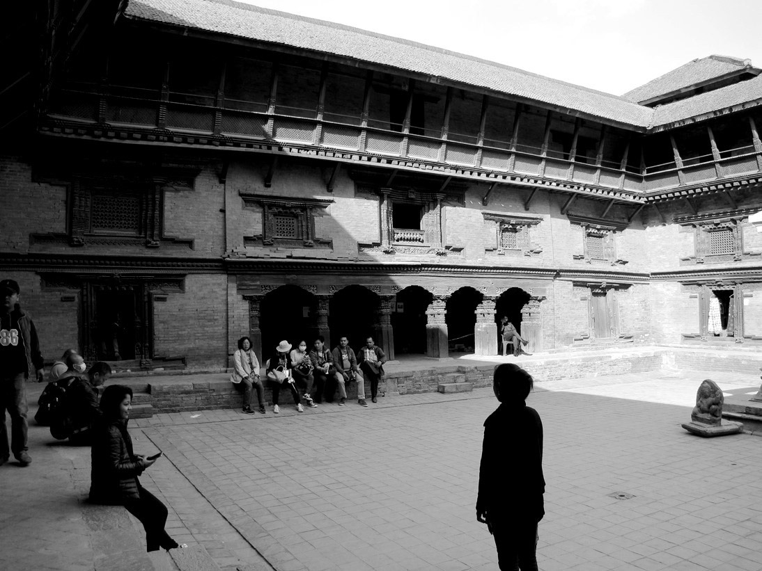
The insides of Patan Museum, Nepal was a feast for the eyes. The architecture and intricacy kept me fascinated looking for various aspects to capture this royal beauty. As we entered, without thinking I just clicked this scene of the girl standing and people sitting around. After completing the National Geographic assignment, I tried experimenting by converting this image to black and white and turns out the transformed version is much better. It focuses completely on the girl standing thus, creating a complete moment around it.
church

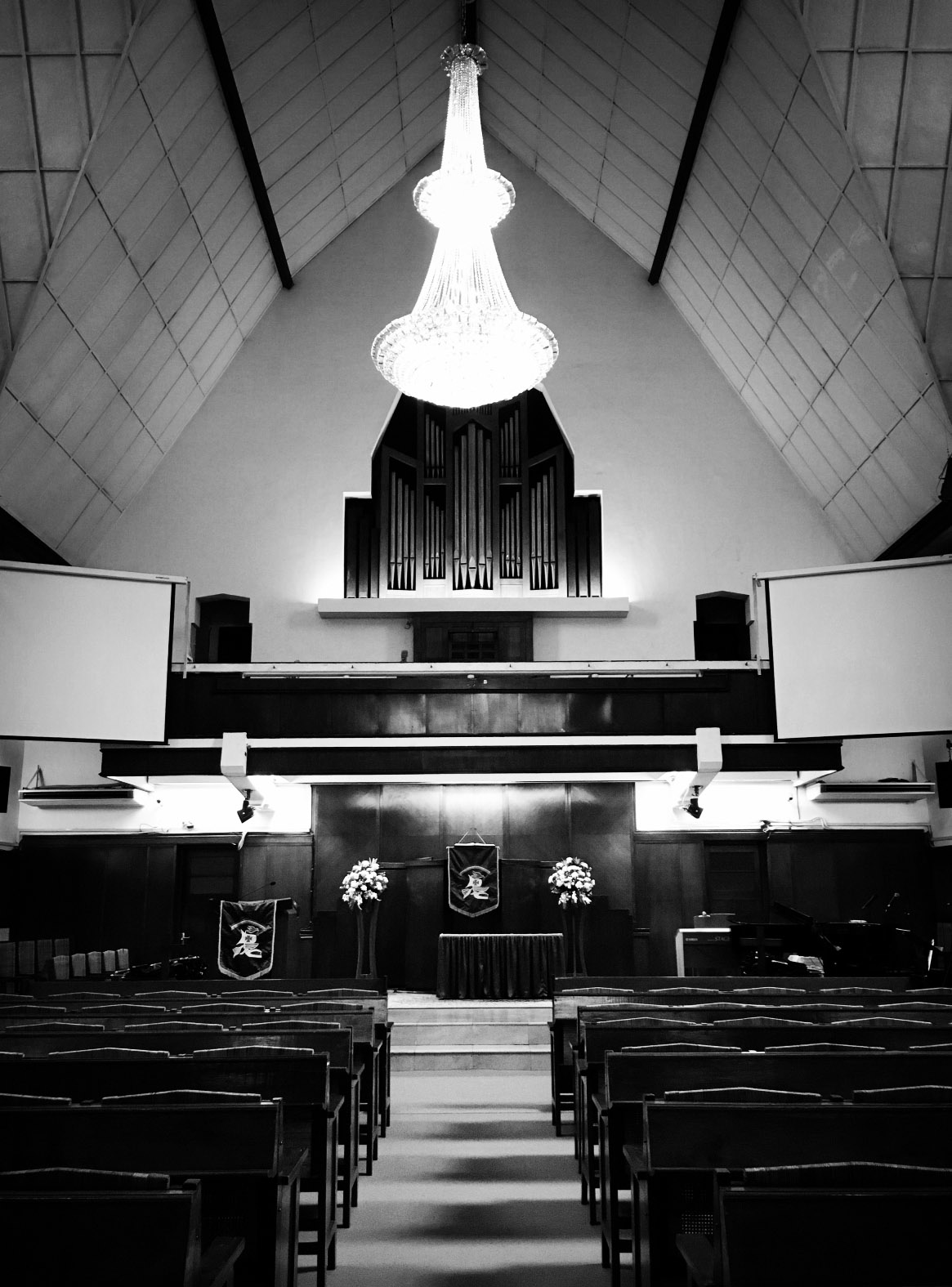
This moment was another pure black and white capture inside a Cathedral. The lighting inside was perfect to bring out the details and the black and white tones defined this moment entirely.
grounds

grounds

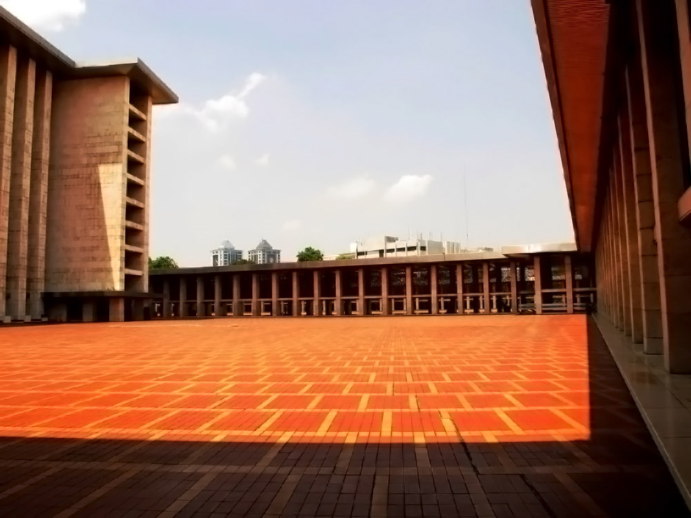
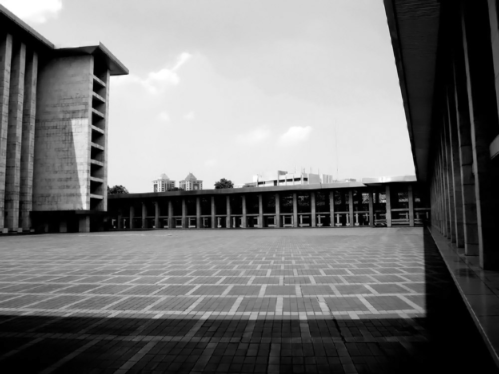
Lastly, through this patterned inside ground of Istiqlal Mosque, we can see how the colors combined with the skies form symmetry. Patterns can help to define black and white tones in moments more. Changing the image to black and white gives it a refined touch where all the lines and structure come in harmony together.

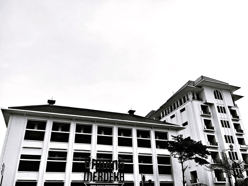
There is no perfect combination or formula to doing it right, just simply practicing. Fan Ho said, “it was always his goal to wait for the lighting and composition to fall into place when photographing.” That could be our benchmark when capturing in monochrome. As for editing, there could be many things we can take into consideration like patterns, structure, architecture or even people. It really all depends on finding the right balance and tones to convert it. Requires a lot of trial and error to get what you are looking for in the photo.
structure

Monochrome will continue to be something we experiment on as we do not have the limit of films and that is what makes it a challenge. The questions of how did they do it in the past? How did they learn the balance of composition? The simplicity and limit enhanced their creativity to get it right. They were able to capture the essence of what composition is not quickly, but smoothly. With color, it can feel like we have more distractions when focusing on an object or moment. Both has its positives, eventually, the choice is ours to make and create photos to share and inspire.

Black and White Lighting – How to Light a Black and White Portrait

Lighting is essential to photography, and this is especially true for taking black and white photographs. Depending on what kind of lighting you’re using, you can capture a flat image or silhouette, a dark image with textured portions of the foreground showing through the shadows, or a crisp image in which you get a clear portrait of the subject with all of the rich texture and dimensionality.

You need to know what style you’re going for before you determine what kind of natural or artificial lighting you’ll need. You should also take the subject of the photograph into consideration as different types of lighting work better on different subjects. Portraits will be our subject today, so let’s take a look at different lighting techniques for this type of black and white photograph.

Portraits and Lighting

When working with black and white portraiture, if you’re outdoors, overcast lighting actually works really well. While this will produce a pale image in color, in black and white it creates nice contrasts between the lights and shadows. You’ll also pick up the grayscales that add depth and rich texture to the image.

If you’re indoors, you’ll need to play around with main lights and fill lights until you create a rich tonality. Find a balance between the highlights, shadows, and mid-tones by playing around with the positioning and number of lights that you use. It can help to set your camera to preview the shot in black and white even though you will take the shot in color and convert it later using a computer program.

Strong directional lighting will create harsh shadows that may not look good in a black and white portrait, which is why overcast outdoor lighting works better than bright sunlight. Remember this when you’re playing with the lighting in your studio. Try using a strong backlight with soft foreground lighting to create strong contrasts without losing the mid tones that add depth and texture.
black-white-portrait-2

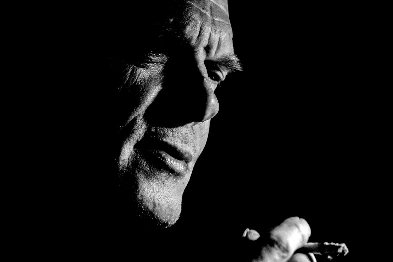
On the other hand, you may enjoy the look of harsh shadows created by hard, directional lighting in a black and white image. As shown in the above photograph, it can create some interesting contrasts. The only real rule is to discover your style, then set up your lights to reflect it.
General Rules to Follow, Bend, or Break

As with any form of art, it’s better to understand why something works than it is to follow a set of rules with the blind hope that you’ll get the shot you want.

With black and white photography, the name of the game is contrast. You want deep blacks and ultra-whites to stand out against each other within the image. At the same time, however, you don’t want to create such a stark contrast that you end up with a flat image – or maybe you do.

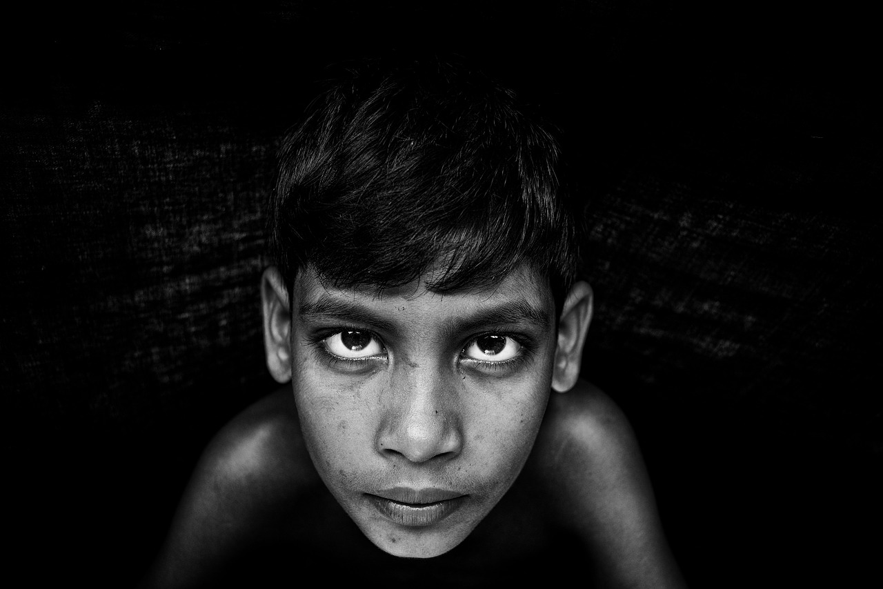
Black and white portraits, specifically, bring in another element to style. A black and white photograph is all about capturing mood and emotion with the image. When you are deciding what style of lighting to use, keep in mind what mood you wish to convey. Also, the eyes of the person are one of the most important parts of the image as the expression of your subject will also affect the mood of the shot.

black-white-portrait-3a

So, if you’re shooting indoors—whether your subject is a person or a still-life object—think about what you want the final image to look like before you set up the lights. If you are going for something two-dimensional, use hard lights in the background. You can choose to fill in the foreground with some soft lighting if you want to create a little more texture, but you don’t have to if a silhouette or flat image is what you’re going for.

Shaping Light

If you want something more three-dimensional and with all the detail, you may not need a hard light in the background. However, you will need to play around with more soft lights off to the sides and in the foreground. This will bring out more of the grayscale, creating a richer texture without losing the contrast. This creates a dark background wherein only the softly lit portions of your subject shine through.

Lastly, if you want a more even image that doesn’t focus as much on contrast, and captures all the detail of the shot, use a combination of hard backlighting and soft foreground lights. You’ll want to create a little deeper shadowing than a color image would require keeping the photo from falling flat but try not to create a harsh shadow unless you are going for a particular style.

Have fun playing around with lighting to see what kind of shots you get, and remember that bending the rules can sometimes result in a truly unique picture.

A Historic View On The Square Photography Format

There are different formats when it comes to photography. Without taking into account the cropping, cameras capture images with different aspect ratios (the relative sizes between width and height) with the well-known 3:2 being the most popular one. With the overwhelming popularity of digital cameras over film cameras nowadays, the different formats lost their sense to some extent, since digital post-processing makes it trivial to modify our images to have whatever format we want. This was, however, not always the case, with different formats competing with each other during the era of film photography.

One of the first formats to become popular among amateur photographers was the so-called 120 film, introduced by Kodak in 1901. This film, with a width of 61 mm, allowing for different exposure formats, including 6 x 9 (with a 1.5:1 or 3:2 aspect ratio) and 6 x 6, with a 1:1 or square aspect ratio. The 135 film, also introduced by Kodak in 1934, has an aspect ratio of 3:2 and quickly grew in popularity among photographers, becoming the most popular film by the end of the 1960s and until the popularization of digital photography.

However, during all those years until digital cameras took over the market, some manufacturers kept selling cameras that used square films, the first one being produced by Rollei in the late 1920s. Another big brand that was always active in the manufacturing of square-format cameras is the Swedish Hasselblad.

square00

With digital photography, things changed in many different ways. The most obvious one is that light is not captured by film anymore, but by digital sensors. These sensors (with CMOS and CCD technology covering virtually all the market) basically transform incoming photons into electrons that can be read out by the electronics within the camera to produce the final image.

While there are different sizes available, in general two groups of sensor are the most common ones: crop (or APS-C) and full frame. These two sensors mainly differ in their size, with the full-frame having a similar size to a 35 mm film and the APS-C being smaller by a factor of 1.6. For instance, the Canon EOS 5D Mark III has a sensor of 36 x 24 mm and the Canon EOS 7D Mark II has a sensor of 22.4 x 15 mm. If you divide the width by the height in both formats, you can see that both have a 3:2 (or 1.5:1) aspect ratio.

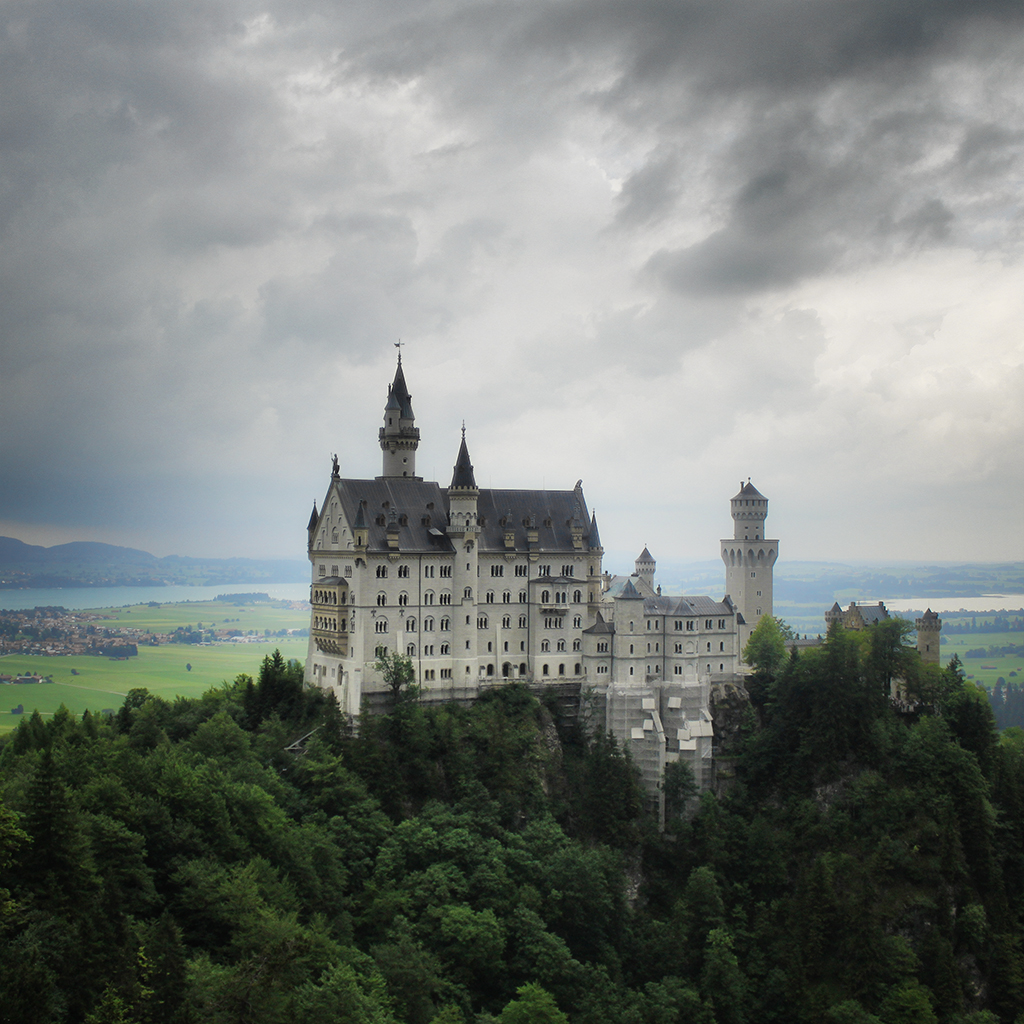
At least to my knowledge, no major brand produces any camera with a square sensor nowadays, but since cropping any image to any desired aspect ration including square is extremely easy with any processing software, the square format has seen an increase in popularity during the last decade, something that was surely influenced by the choice of this format during the first years of the popular sharing site Instagram.

The truth is that the square format can open a completely different world of creation for you, even with your old photos, if you haven’t tried it yet. The inherent simplicity of the format (with no distinction between landscape and portrait format) presents both new possibilities and limitations that you need to get used to.

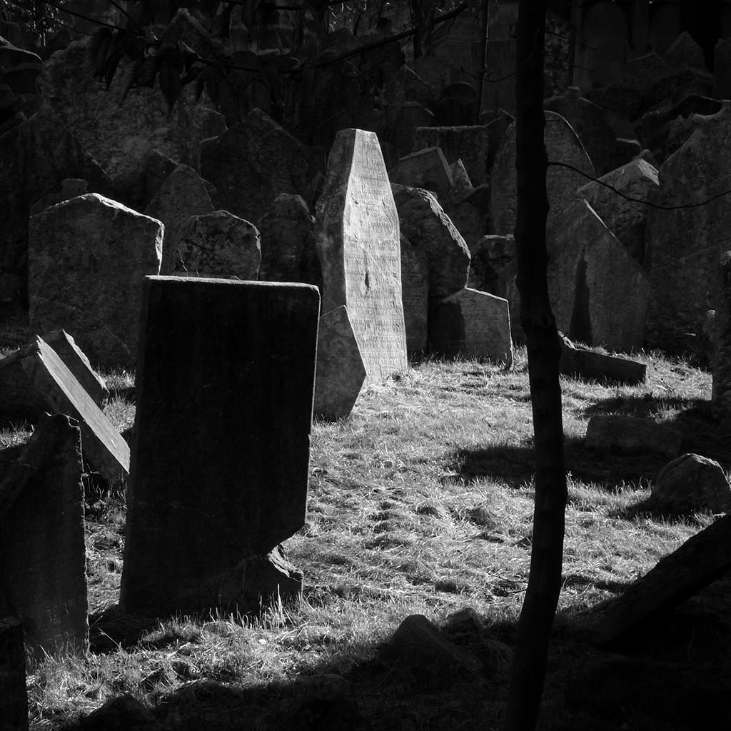
One of the nicest things I find about it is that it tends to produce great results when you actively neglect the famous rule of thirds. This can be seen in the images shown before of the Old Jewish Cemetery in Prague, Czech Republic. The original image places all the elements to the sides of the center, while the square one has the illuminated grave right on the middle and the final result works pretty well.

square02

In general, placing your subject right at the center of your image works pretty well with square format, while with rectangular formats it gives rather dull images. It also works very well in combination with black and white, helping to emphasize the main subjects while giving a ‘fine art’ look, whatever your definition of fine art is.

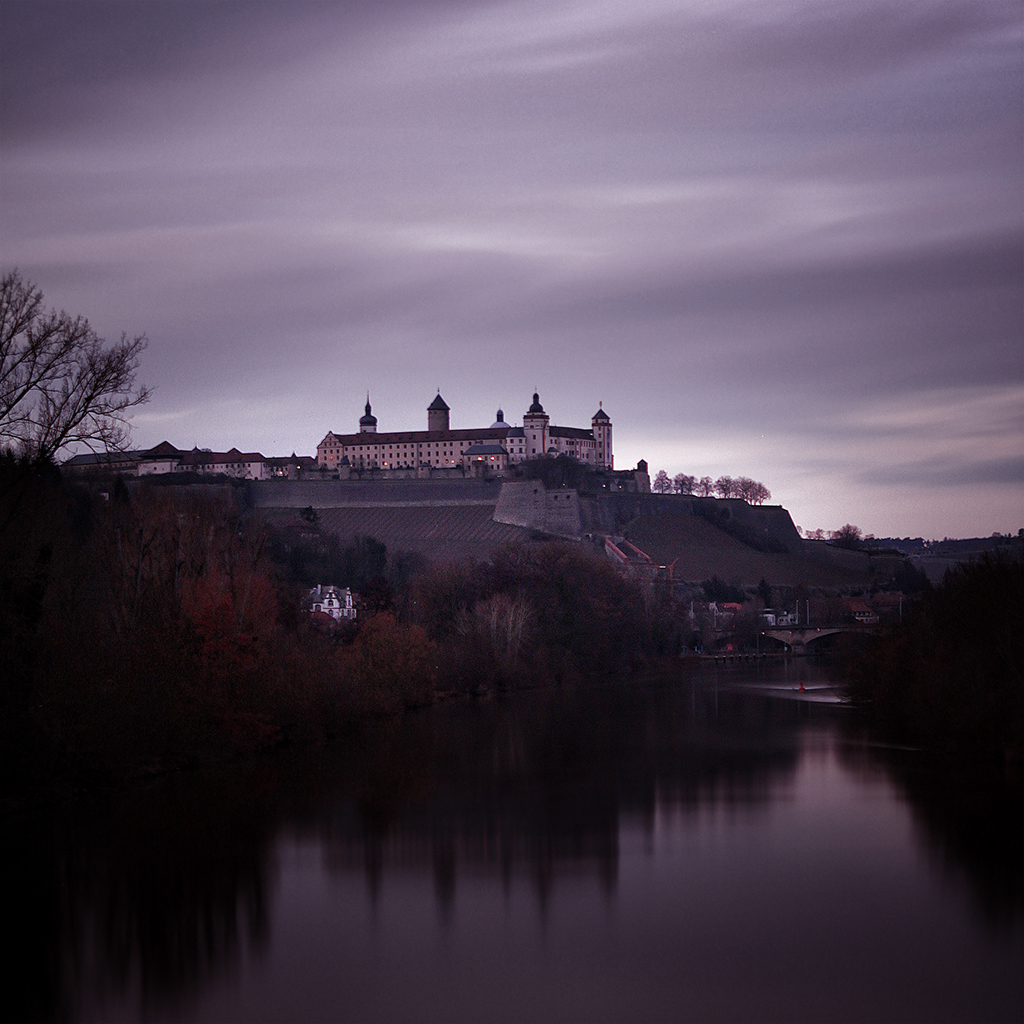
I also find that the combination of long exposure with the square format gives great results. For instance, the image below of the Marienberg fortress in Würzburg was taken at dusk. The strange coloration is actually coming from using a neutral density (ND) filter to achieve the long exposure and, while I would usually change the white balance to get a more natural look, I personally find the result quite appealing, something that does not happen if I keep the original rectangular format.

square04

If you find yourself unable to go out and take photos due to whatever reason, going back to your image library and trying out different compositions while cropping your images to square format will provide you a great source of inspiration and, in addition, next time you are out making photos I can guarantee that you will start looking at your subjects (be it portraits, landscapes or anything that you want) from a different perspective.

Five Editing Mistakes Beginning Photographers Make

When you’re first starting out in photography, it’s easy to fall victim to a few common mistakes. When I look back at my work from seven years ago, it’s apparent to me (and probably any other photographer) that I fell into many of the same traps as a lot of other beginners. Things that draw attention to your subject don’t necessarily improve the photo–they can simply be distracting.

In this list below we’re going to get in touch with the five most common mistakes beginners tend to make during their journey towards becoming professional photographers:

Heavy Vignetting

2_vinette-1

Exaggerated vignettes are a tell-tale sign of an amateur photographer. Beginners like them because they draw attention to the center of the frame where they are most likely to compose their focus. What they’re effectively doing, though, is underexposing the sides of the image and detracting from their talent. A good photographer ought to use the whole shot, utilizing natural elements to frame the subject. Amateur photographers also like to use vignettes in an attempt to add some drama to the photo. Luckily, there are natural ways to do this–mastering the sun flare technique can really enhance an otherwise lifeless image.

Overusing Presets

3_Going over the top with presets-1

It’s easy to go overboard with presets. Overuse can make a photo look unnatural and unflattering. If you suspect you’ve done too much, you’re probably right. Keep it simple. Instead of over-editing the entire photo, use local adjustments to accentuate specific areas.

Histogram tool can be your best friend under situations like this, as you’re constantly checking over clipped values (mostly at highlights or shadows), but also Lightroom’s before/after mode can be extremely handy for checking where things went wrong.

Overdoing Black and White

4_Only editing in black and white-1

This is the mistake I’m most guilty of in my early work. Converting an image to black and white does not generally make it more artistic. Of course, there are ways to use black and white to effectively enhance a photo, but many new photographers end up using this style as a crutch. The number of variables that color adds to the editing process can be intimidating. Be sure to learn about complementary colors and incorporate them into your photos. However, do try to avoid photographing bright and heavily saturated colors because camera sensors don’t tend to register these colors well. If you’re unsure which way to go, this post can help you decide whether to edit your photo in color or black and white, but also keep in mind that not only black and white effects count as the only range of monochromatic effects – sepia or cyanotype effects also looks appealing for most clients.

Heavily Retouching Skin

5_Over Retouching-1

Most photographers fear that their clients won’t like their photos because of the way they themselves look (by no fault of the photographer). It’s tempting to heavily retouch skin in an attempt to flatter your client, however, it’s best to edit only what is necessary. A good rule of thumb is to touch up or remove only imperfections that are impermanent, such as acne or bruises – try, also, to find flattering angles and accentuate those.

Overdoing such adjustments will end up in unnatural results, mostly if you don’t happen to ace post production tools such as Lightroom Presets & Brushes or Photoshop Actions. In the end, you’re prone to ruin all your hard work by just trying to make it look better.

HDR Processing

6_Going crazy with the clairity slider-1-1

Every photographer wants to learn new techniques; more often than not, though, HDR processing looks a bit over the top. While it can be tempting to bracket exposures, it’s best to avoid it until you’ve mastered basic photography skills first. Instead, if you don’t have enough dynamic range in a shot, bracket the exposure and brush locally in the post.

A quality image ought to appear natural, polished, and simple:

1_original-1

Now that you’re familiar with these common mistakes, you can easily avoid them by mastering photography techniques that surely will take your photographs to the next level! Don’t feel disappointed by making mistakes during your first attempts – everybody had a starting point and a goal to reach, therefore it’s your right to learn from bad experiences and add all that knowledge to your future work.

Hope this guide was useful and keep shooting!

Creating your own preset in Lightroom

Working as a graphic designer I usually have to develop corporate identities, and an essential part of the branding process is to establish a visual style for the photography, illustration, and images used in the brochures and editorial design as well. Some important factors are subject in the photo, lighting, cropping style, colors, depth of field and so on.

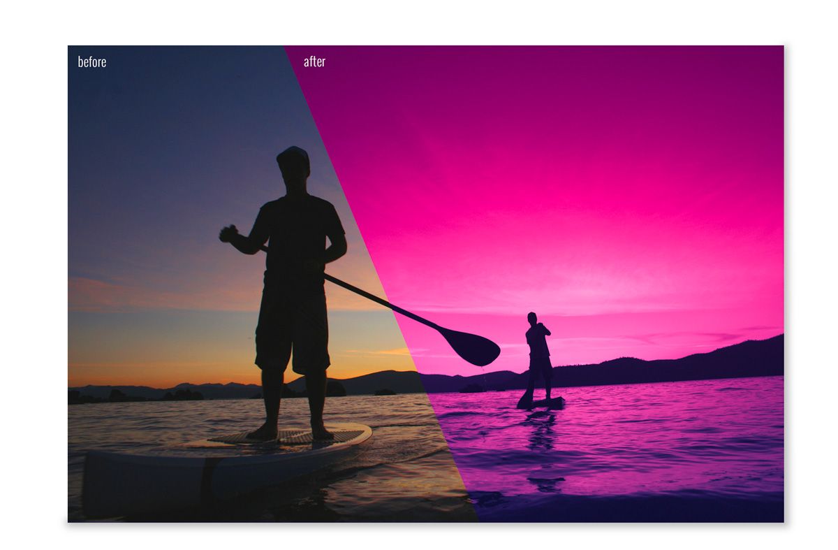
Another important factor is the post-processing that must follow these visual style criteria. Thanks to the Lightroom Presets, today we’re able to do this with ease and speed, editing dozens of the picture at the same time by just clicking one button! You must be saying, how can I create a preset to use in my own branding visual style? Don´t worry, this is what we’ll learn in this tutorial, and is so simple that it can be done in 5 steps. Ready?

Before and after applying preset

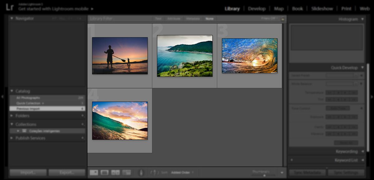
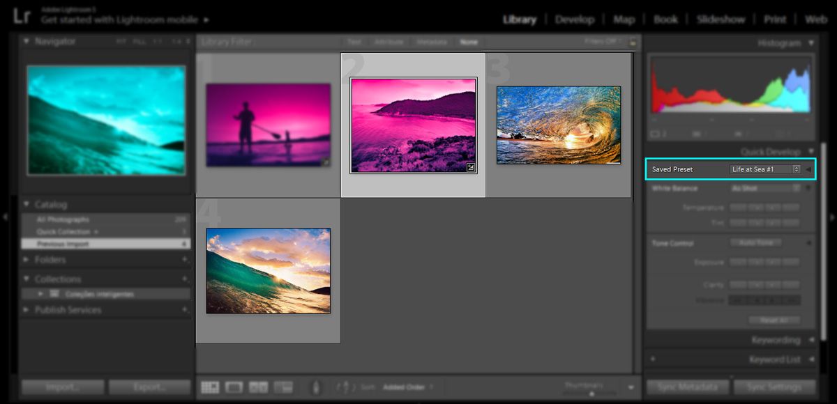
Step 1) Open Lightroom and import all the images that you want to apply the visual style too. In my case, I’ll be using this 4 stock pictures (found on Google) that imply the subject of my branding visual styles, such as sea, aquatic sports and dynamism.

Import images into Lightroom

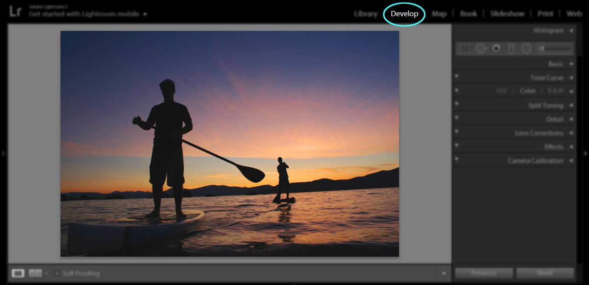
So we can create our preset, we must first adjust the settings of our picture according to our branding visual style. In this case, select your first picture and go to develop mode.

Entering Develop Mode in Lightroom

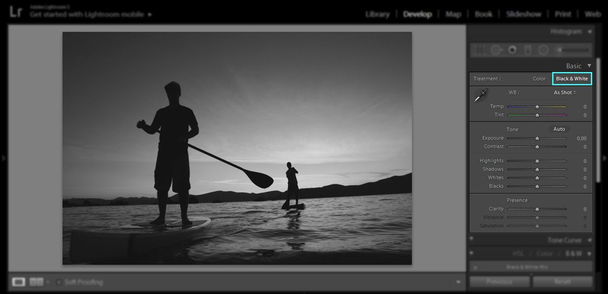
The first thing we must do is to eliminate all the colors of the original image, by going into the basic panel and clicking “Black & White”. This step will convert your image to black and white automatically, but you may tweak the dials according to your style of editing.

Turning Black & White in Lightroom

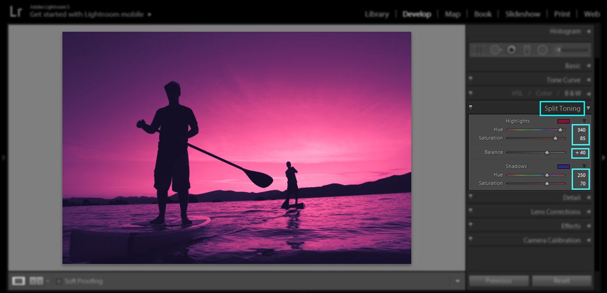
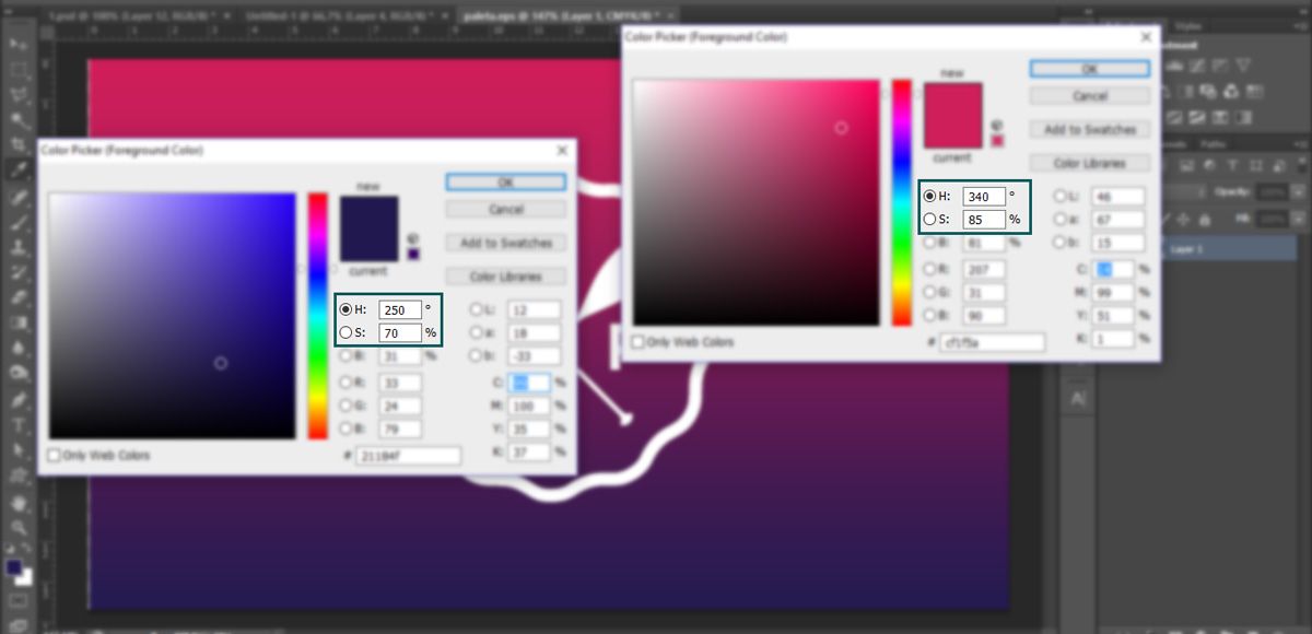
Step 2) Now, we’re gonna open the “split toning” panel on the right and work with the main colors of the branding visual style. In my example, I’m using the hue and saturation values I’ve found, using the eyedropper tool in Photoshop (image below).

Split Toning with Lightroom

Hue & Saturation values in Photoshop

What I did was, match these two values of hue and saturation and use it in the highlights and shadows dials of my image. I’ve used the lighter color for the highlights, and the darker color for the shadows, but feel free to explore the possibilities. I’ve also tweaked the balance value in order to achieve a better balance between the two colors.

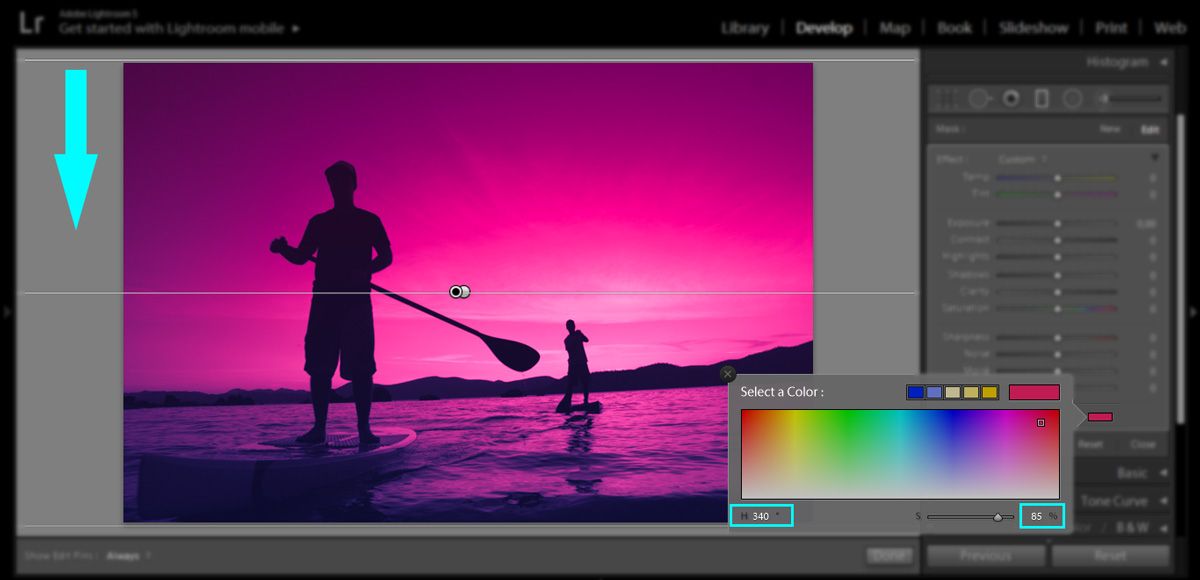
Step 3) Next step, we’re gonna create a graduated filter mask. Click the graduated filter tool, on the right panel and drag from the bottom edge of the image all the way to the top edge. You can leave the values default, but we’re gonna change the mask color with the same values of the previous step.

Creating a graduated filter mask in Lightroom

For the bottom of the image, I’ve used the darker color. Now we’re gonna do the same thing, but this time drags from the top edge of the image to the bottom and selects the lighter color on the color mask box:

Creating a graduated filter mask in Lightroom

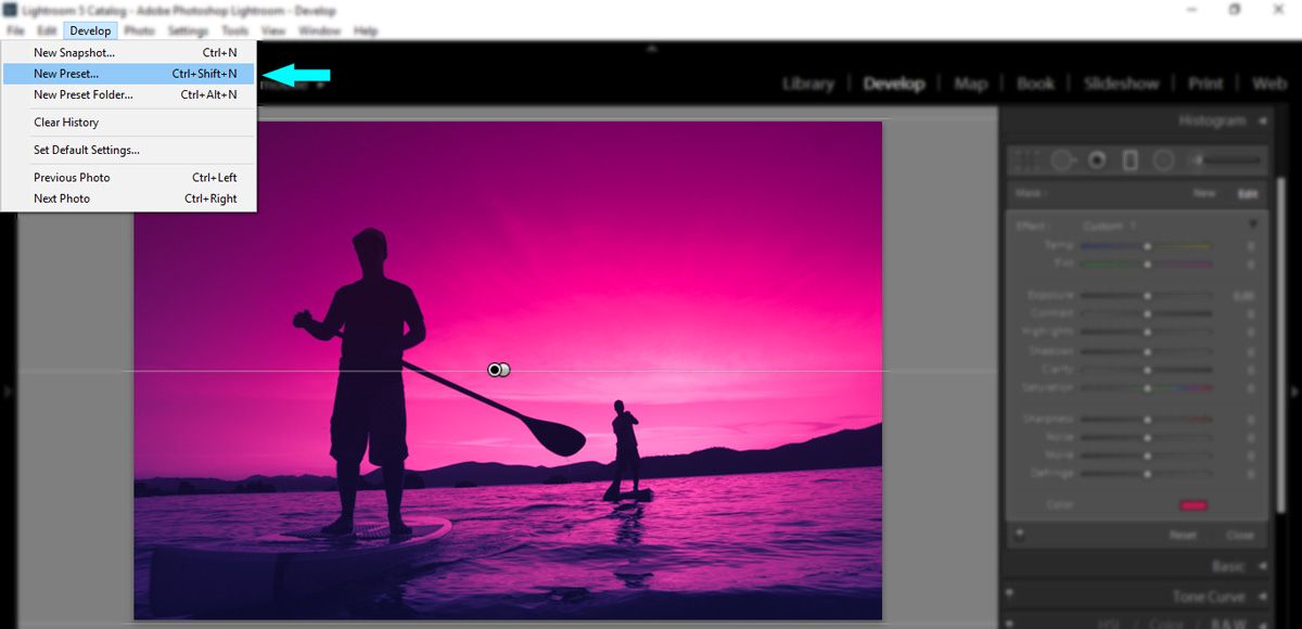
Step 4) This is the final aspect of the visual style we want for all of the images. Hit “Done” and let’s proceed to create the preset, in order to apply it to the other images. Still in develop mode, go to the top menu in “Develop > New Preset…”

Creating a new preset in Lightroom

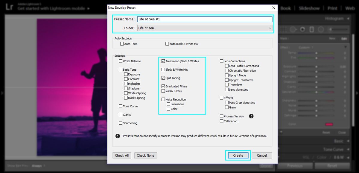
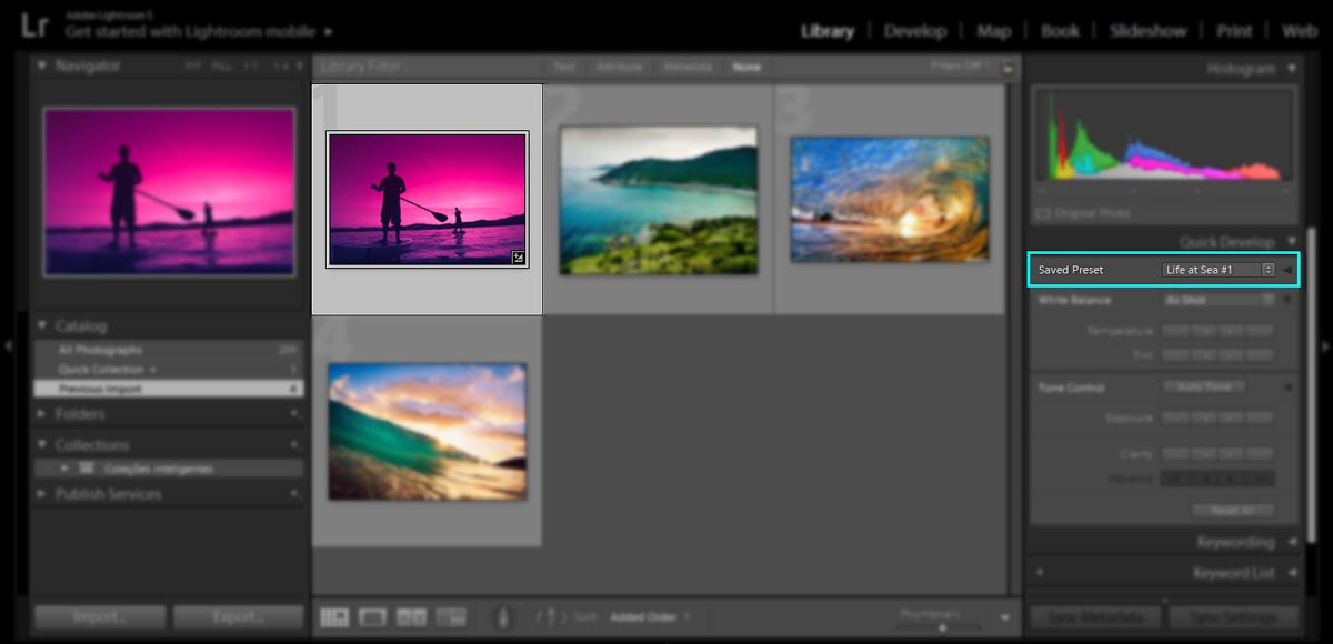
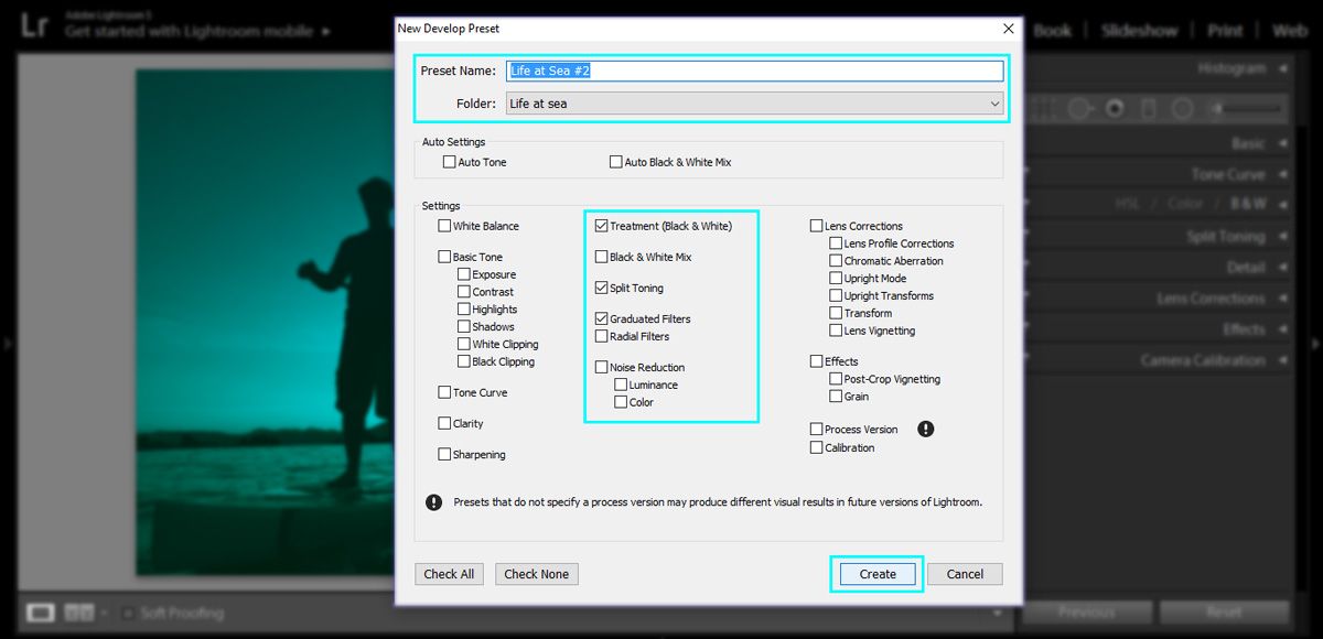
In the window that opens, we can choose a name for our preset. In the example below, I’ve also created a folder to eventually save other presets for this same branding project. You can see that I’ve only checked the boxes of the adjustments used for the preset, like split toning, graduated filter and also treatment (black & white).  Click “Create” and our preset is now available in the Lightroom library.

Configuring a new preset in Lightroom

Saved preset in Ligthroom

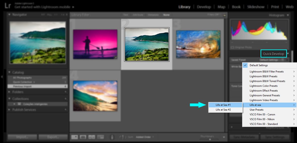
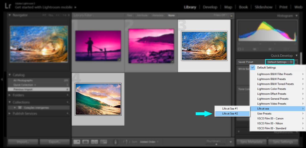
Step 5) In order to apply this preset to your picture, select the picture you want to use, then go to quick develop on the right panel and click on “saved preset”. In the drop down menu, go all the way to the folder you’ve created (the Lightroom default folder for created presets is “User presets”), click on the name of the preset and you’ll notice that the picture will instantly change to the applied preset.

Applying the preset in Lightroom

Final Result

For this example, I’ve also created another preset with different toning and colors, and after I was satisfied with the result, I just clicked on “Develop> New preset…” and created another preset using a different name.

Creating a preset in Lightroom

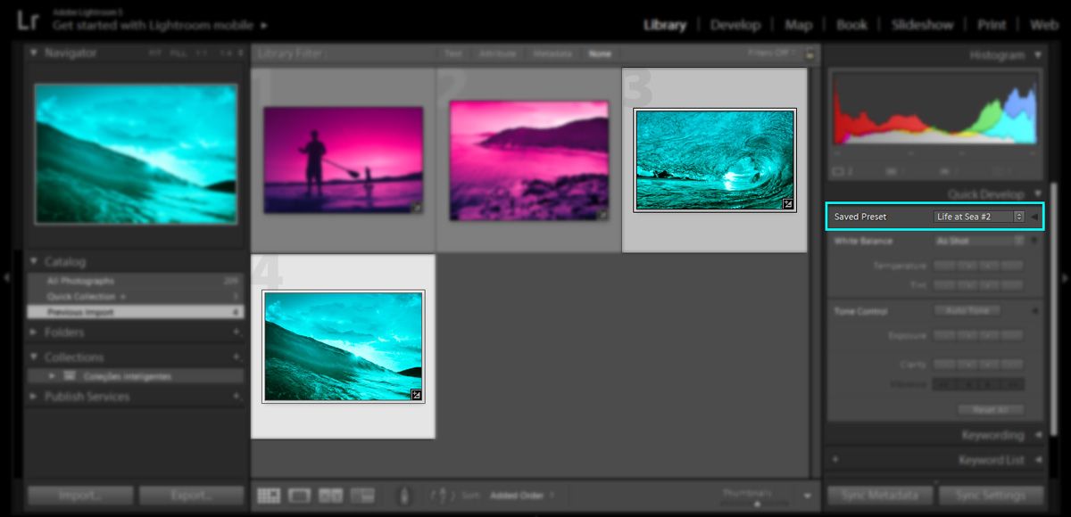
You can also apply the presets in several pictures at the same time, by selecting them and applying the preset the same way as before.

Applying the preset in Lightroom

Final Result

The final result is an image with the visual style of your branding project, and now you can apply the logo and graphic elements as you like. The best part is that it’s possible to create as many preset as you need for your project! One thing I’m sure of, you’ll never suffer again by having to apply the same visual style in your pictures one-by-one.Finalvisual style with logo applied

If you have any suggestions or doubts you can write a comment below or contact me directly. See you next time!

How to Give Your Photo a Film Look with Lightroom in a Few Easy Steps

Creating images allows me to connect with people and make them feel like they are looking through my eyes and feeling what I feel. Like the title suggest we will be looking at how to get a film look with your images. The reason I like using the methods that I will show you below is because to me the images feel more tactile. I want people to be able to look at it and get a sense of everything I did when I shot it. So today, I want you to feel the atmosphere, the cold and the mood.

1 – Starting Point

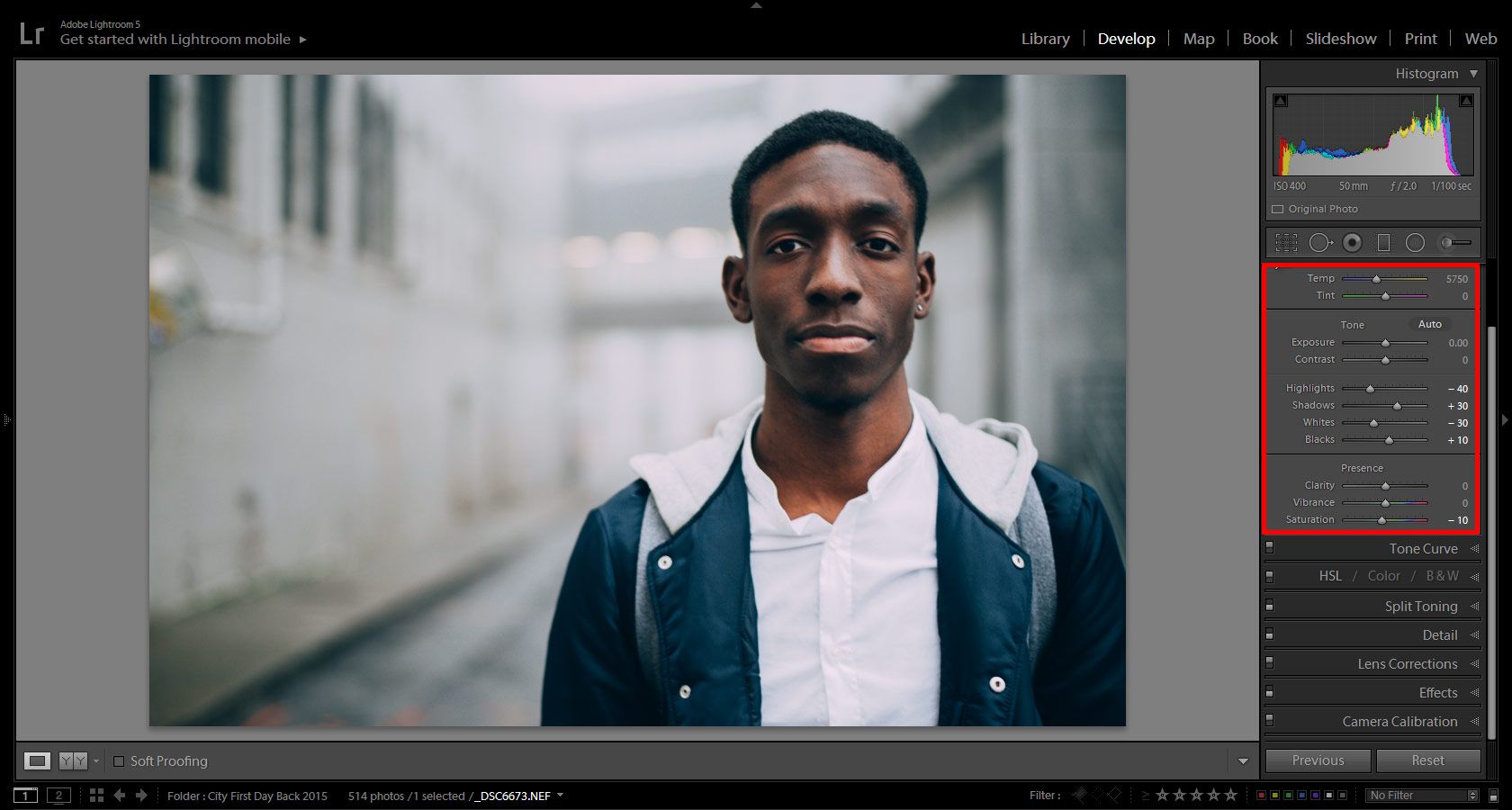
I’m starting here in this tutorial, if you want to see the decisions and what the reasoning is behind some of the choices in the Basic panel then check out the rest of the Sleeklens Blog. We can see that it was very foggy, cold and somewhat wet when I took the photo. For me shooting in the fog is one of my favorite times to shoot. I get the moody atmosphere, great textures, and color that sets a somber tone. The color is part of getting certain film looks, so if you examine the film looks that you like it will be easier for you to choose your color. Think about the following steps to get even closer to a film look.

Arnel Hasanovic Film Look Tutorial

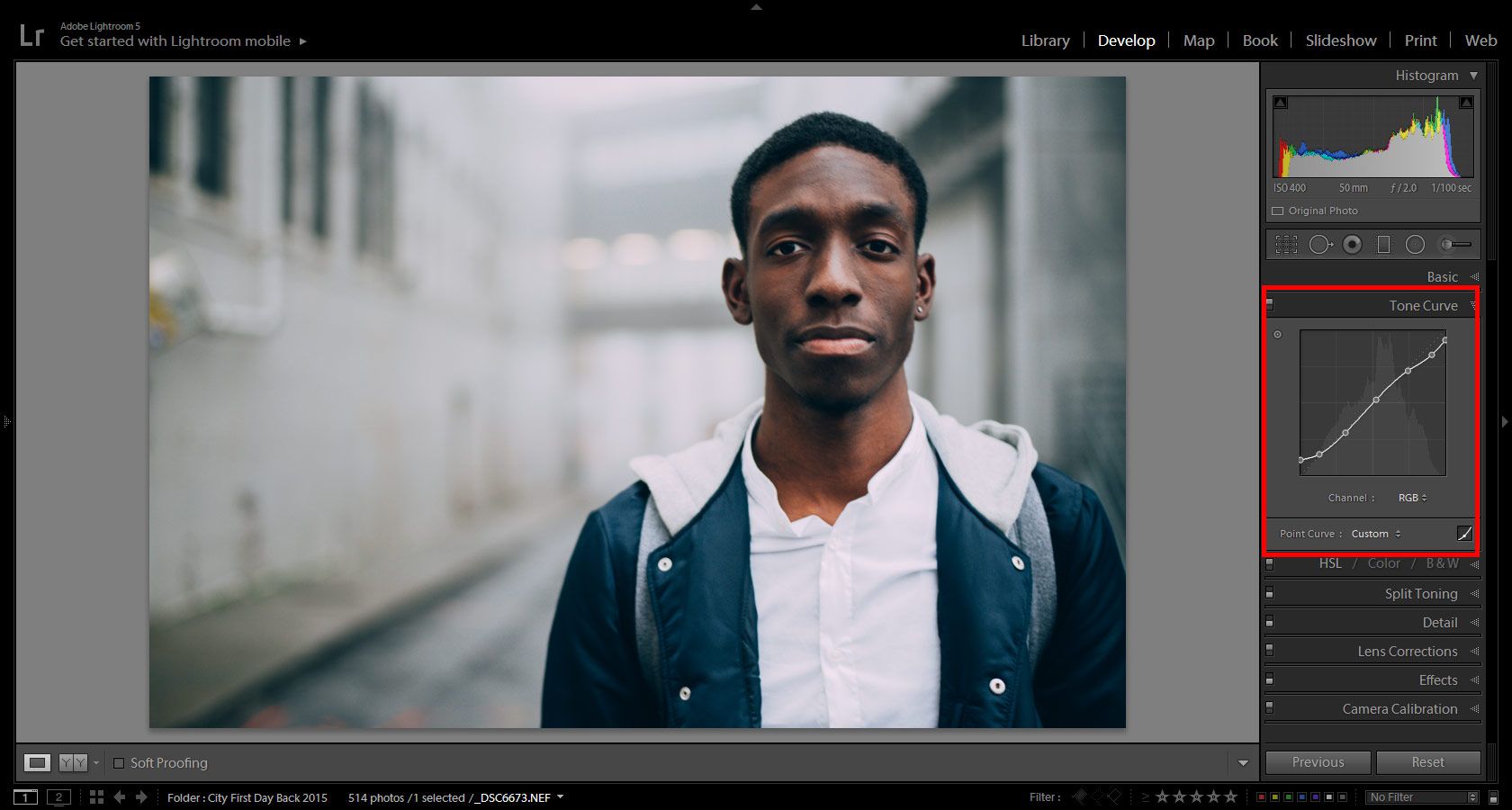
2 – Tone Curve

To get that film look, one of the first things that I do after thinking about the color is start by adjusting my Tone Curve. Bringing up the black point and lowering the white point will ensure that the white is slightly darkened and the black point brightens up a bit. Moving the points slightly is the key! Moving the points too far up or down can give you way too much clipping and may not result in the effect you are looking for. We are essentially crushing the color and if this is not what you want to go with, then skipping this and maybe using the next step, would be better for you. It is all a matter of taste and experimenting with what you would like your images to look like.

Arnel Hasanovic Film Look Tutorial

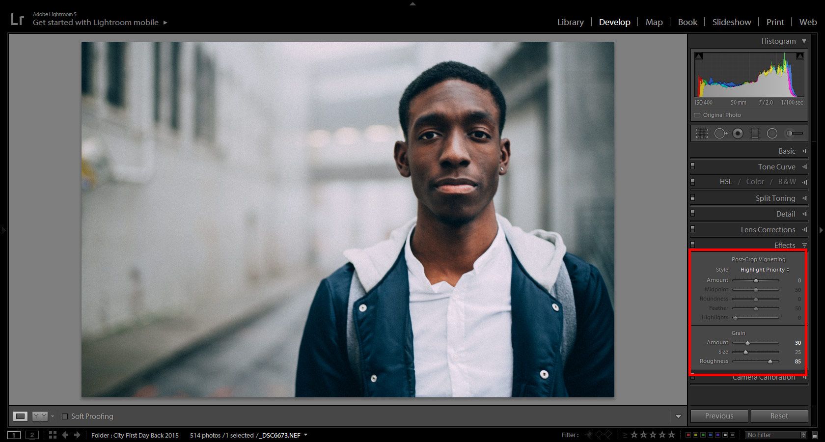
3 – Grain

It might be hard to see in these images because of the compression but look at the left side of the image where the white wall is. You will notice that there is grain added. To me, this step is something that makes the photo tactile, something on which you can reach out and touch the texture. It adds a certain personality and realness to images. Changing the amount, size and roughness will give you different looks. Try different combinations, because not every photo will look its best with the same settings. Flipping the Effects module on and off will help you see before and after, which will help you determine the amount of grain you may want to put on. Also, not all grain is created even. There are products and plugins out there that focus on creating effects like grain which might do a better job for your needs and desired looks.

Arnel Hasanovic Film Look Tutorial

4 – Conclusion

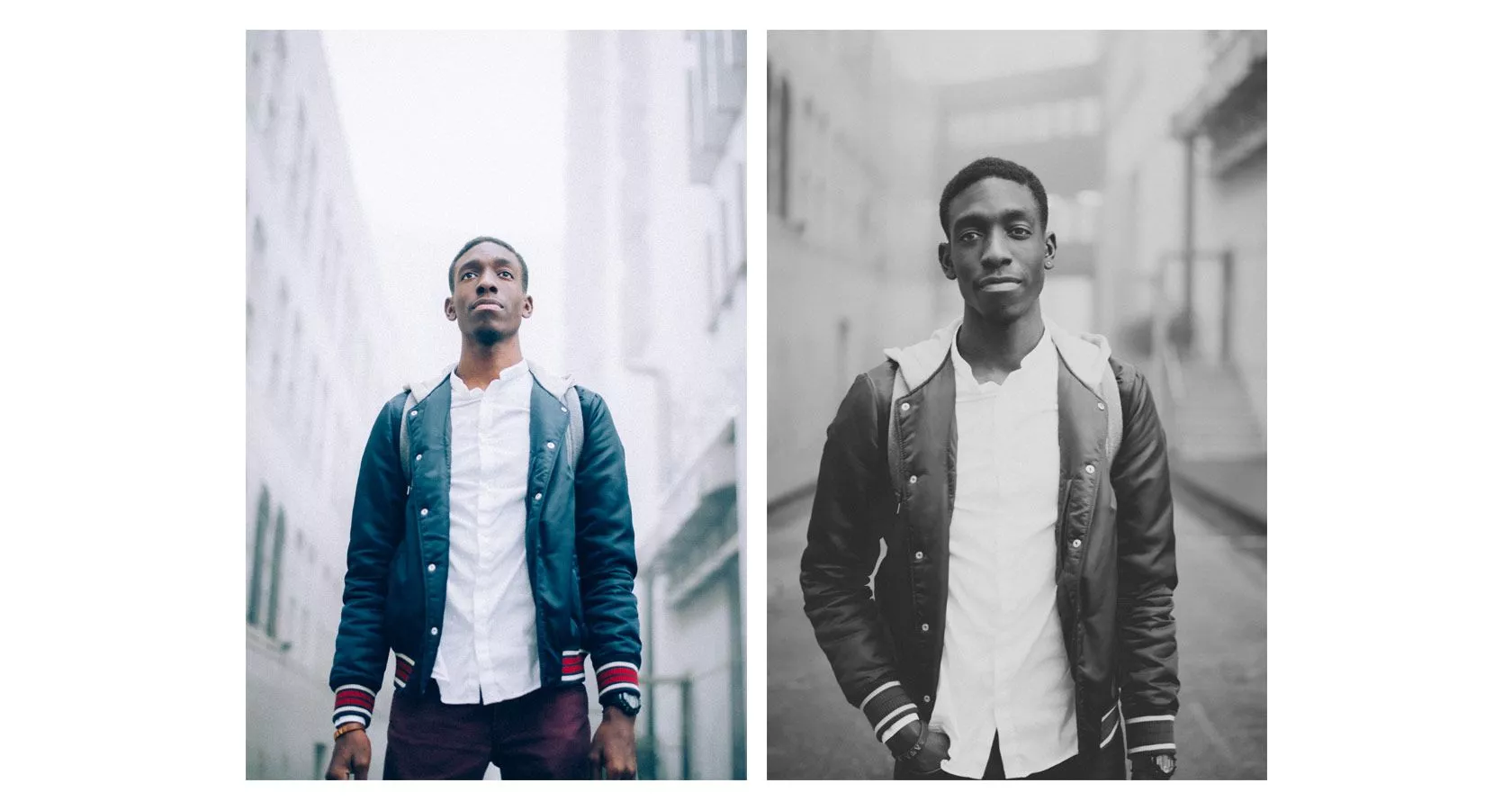
Here are a few other photos that were shot at the same time. They got slightly different edits, but what remained the same, was the fact that I did the same steps as above. I moved the black/white points in the Tone Curve module and I added grain to each image. As I mentioned earlier, experiment and try using these tools to help you achieve the look you want and need. Do not use something because others use it. You are an artist and you have taste, so use the tools that help you achieve your vision.

Arnel Hasanovic Film Look Tutorial

Converting your Images into Great Black and White Edits in Lightroom

Hello again,

In this tutorial, I am going to show you how to create some really great Black and White edits for your images and give them that Artistic, Professional feel that you get in Fine Art Photography.

This will give your images that classy feel and will look great anywhere from your wall at home to your social media profiles.

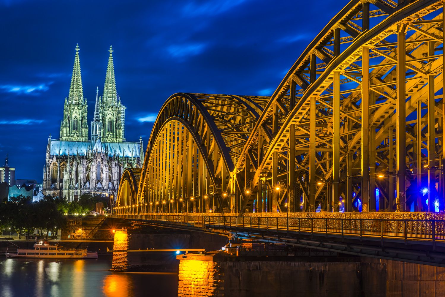
We will start with this beautiful image created by using the Out of the Shadows HDR Preset

20150715-_D8A86251

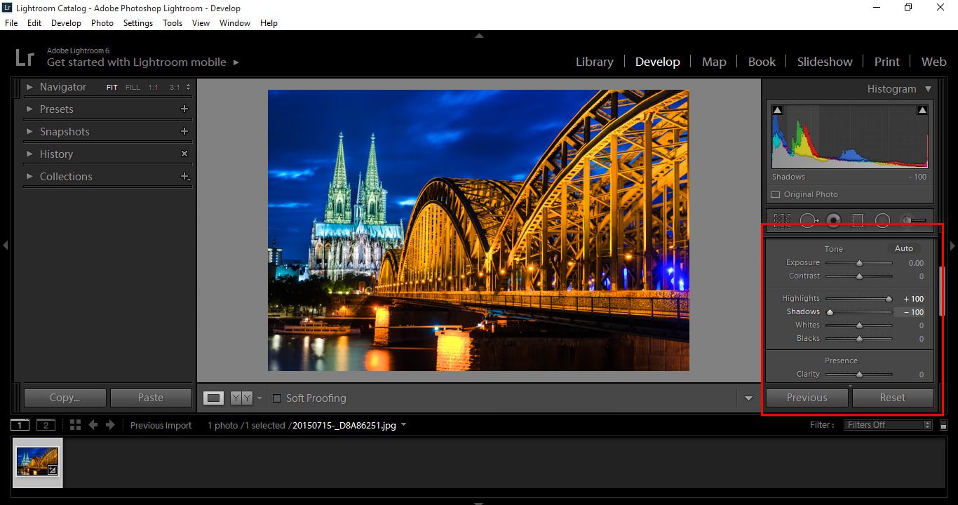
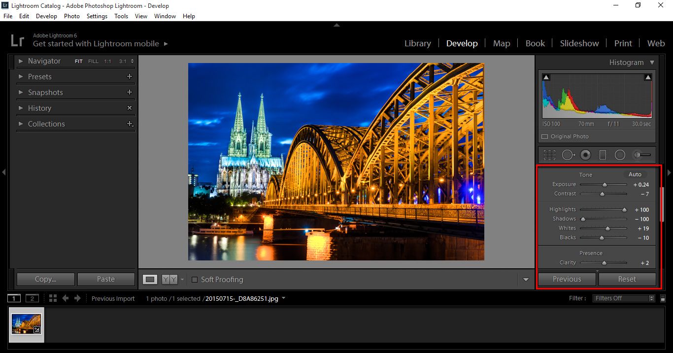
The first step I take, is to move the Highlights up full to +100 to further brighten my image and the Shadows down to -100 to Darken and really bring those out. That is my preference for this particular image, but I suggest playing around with the settings a little yourself and see what you like best.

Black&White1

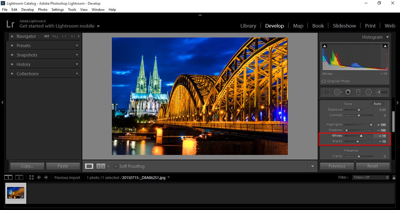
Next, I bring the Whites up a little and Blacks down a little just like in the previous step, just giving these a little nudge as they are very sensitive. They aren’t really all that necessary, but I want to just get a little bit more range out of my image.

Black&White2

You can also play around with Exposure, Contrast and Clarity. I don’t have to do too much with this image as my Presets have done a great job, but with Raw images you will have to work a little more on them. We will leave that for another tutorial.

Here I haven’t needed to use Exposure much, but I did Sharpen a little with Contrast and Clarity, again feel free to play around and if you think you’re getting lost, you can simply move your sliders back to zero.

Black&White3

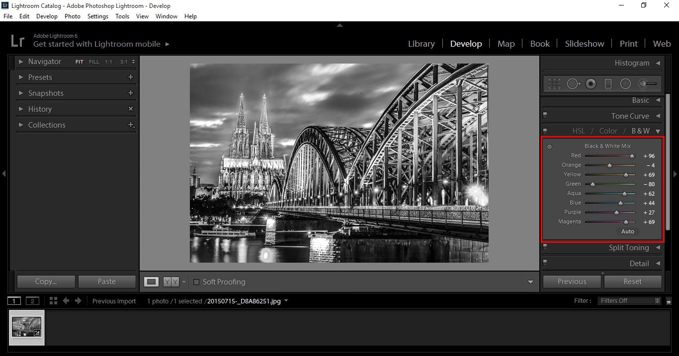
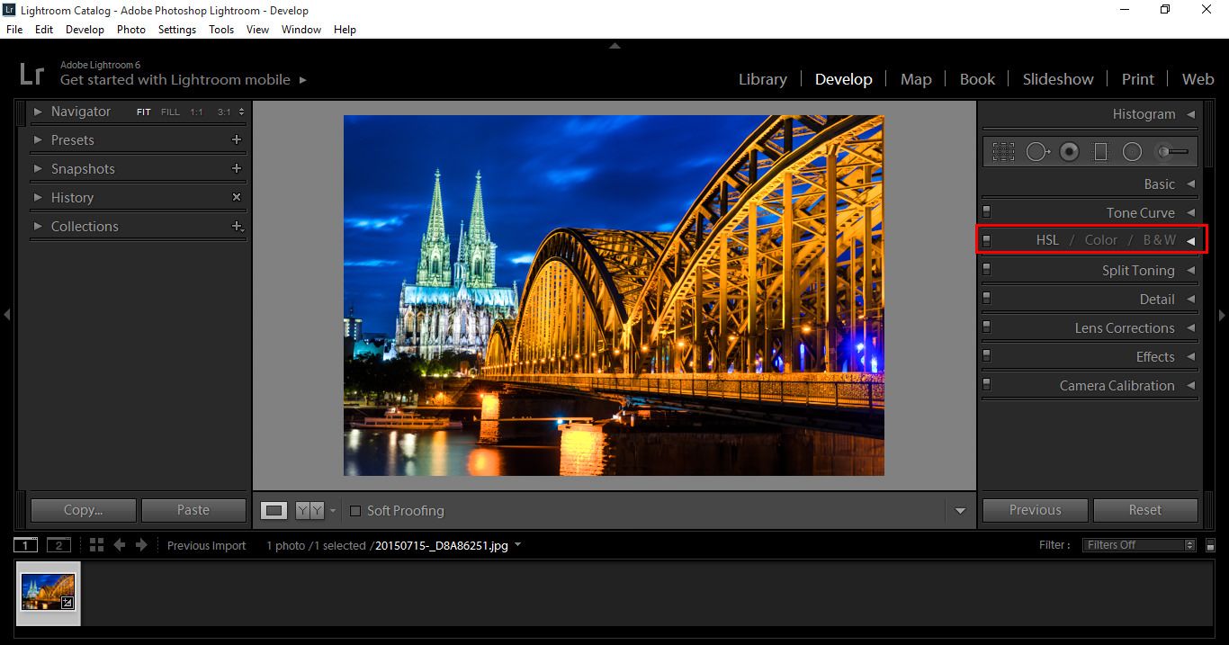
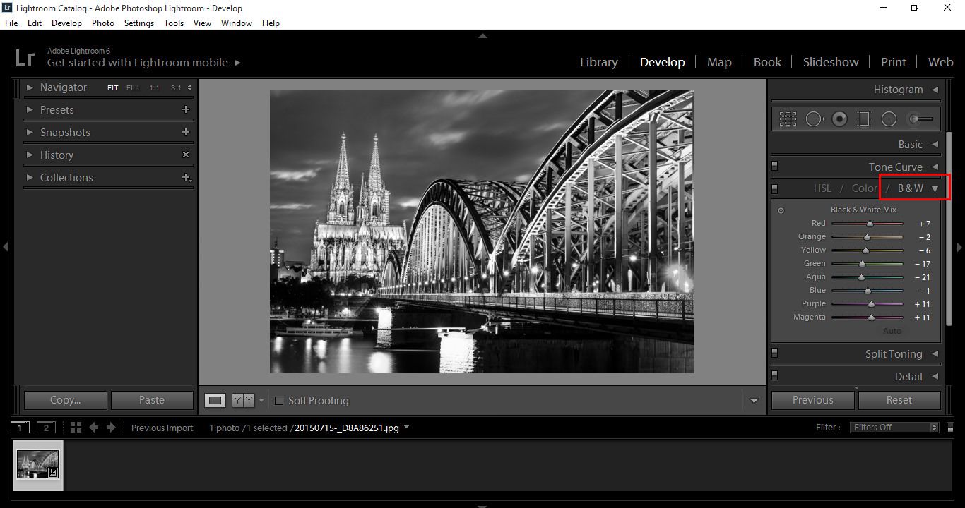
Now go to the HSL panel and click on Black and White.

Black&White4

Black&White5

You will now see that the image has been converted to Black and White.

On the left you will see colour sliders just under the B & W tab.

This will allow you to pick out individual colours that are in your original image and strengthen or weaken them, by sliding back and forth as in the previous paragraphs.

Quick note, double clicking on the slider will set that back to zero.

In the next image below, you will see that my image is a lot sharper, while playing around with the Black and White Mix I decided to go back to my original settings and play around a little more. I wanted to go for a real HDR feel, so I pretty much set everything else back to zero and upped my Clarity 100.

This left my image with an almost illustrated appearance that I really liked, combined with the Black and White Mixer.

This shows that you can play around, go back and forth and do pretty much what feels good to you.

Black&White6

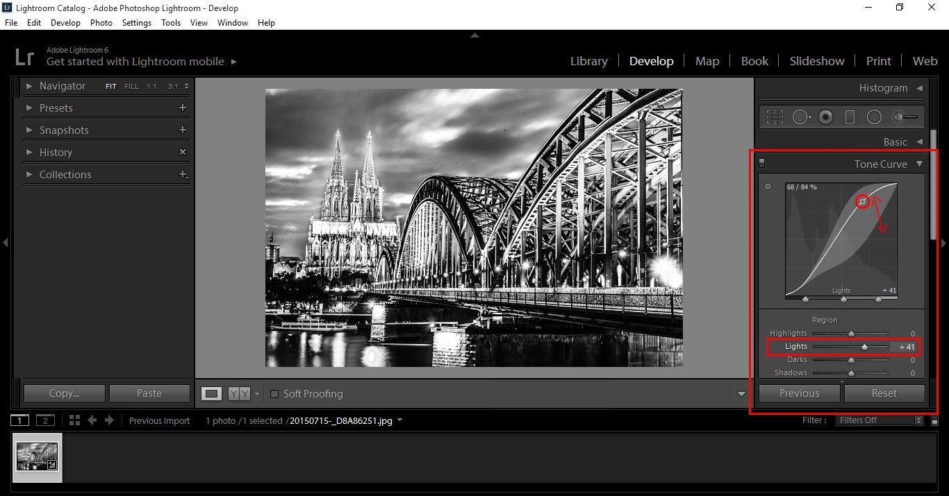
Another setting you can apply is the use of Tone Curve located just about the HSL panel.

If you are familiar with Photoshop and the Curve tools, then this will not be new for you as it is very similar, if not, it doesn’t matter as it’s very easy to use.

Black&White7

Click the point indicated with a red circle and move it up or down to change the effects, this will then move in correspondence to the Region Panel below. You can also move the sliders, whichever you like best.

Using this, you will see dramatic changes in the lighting effects from neutral, to light and to dark.

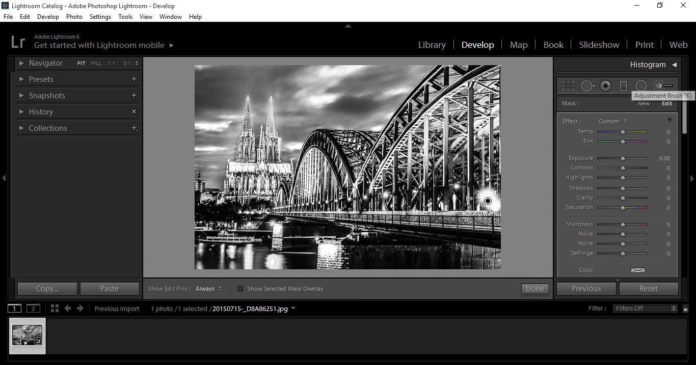
So now that we’re this far, I want to show you the Brush Tool.

Sometimes in your image you would like some areas to be more clear than others, or darker or lighter.

That’s when the Brush Tool comes in super handy.

So, press (K) and you will see a Panel open up with lots of little settings.

Black&White K

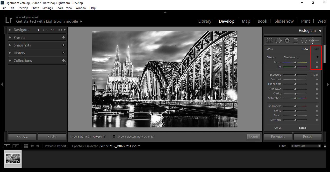
Quick note: if you ever want to reset the settings, hover over Effect, which has been highlighted with a small red box, press Alt and Effect will change to Reset, click on that and everything will be back to default.

In my brush settings, I click on the Triangle below edit as indicated in the below image and your settings will appear.

I want to Feather my brush for this image, so I put that to 1oo and I have Auto mask on, so it doesn’t bleed as much into other parts of the image.

At any stage I can hit [ or ] to quickly increase or decrease the size of my brush.

Black&White9

Black&White10

While using the Brush if you want to erase something that you did just and are unhappy with, you can hold down the Alt key and paint back to erase.

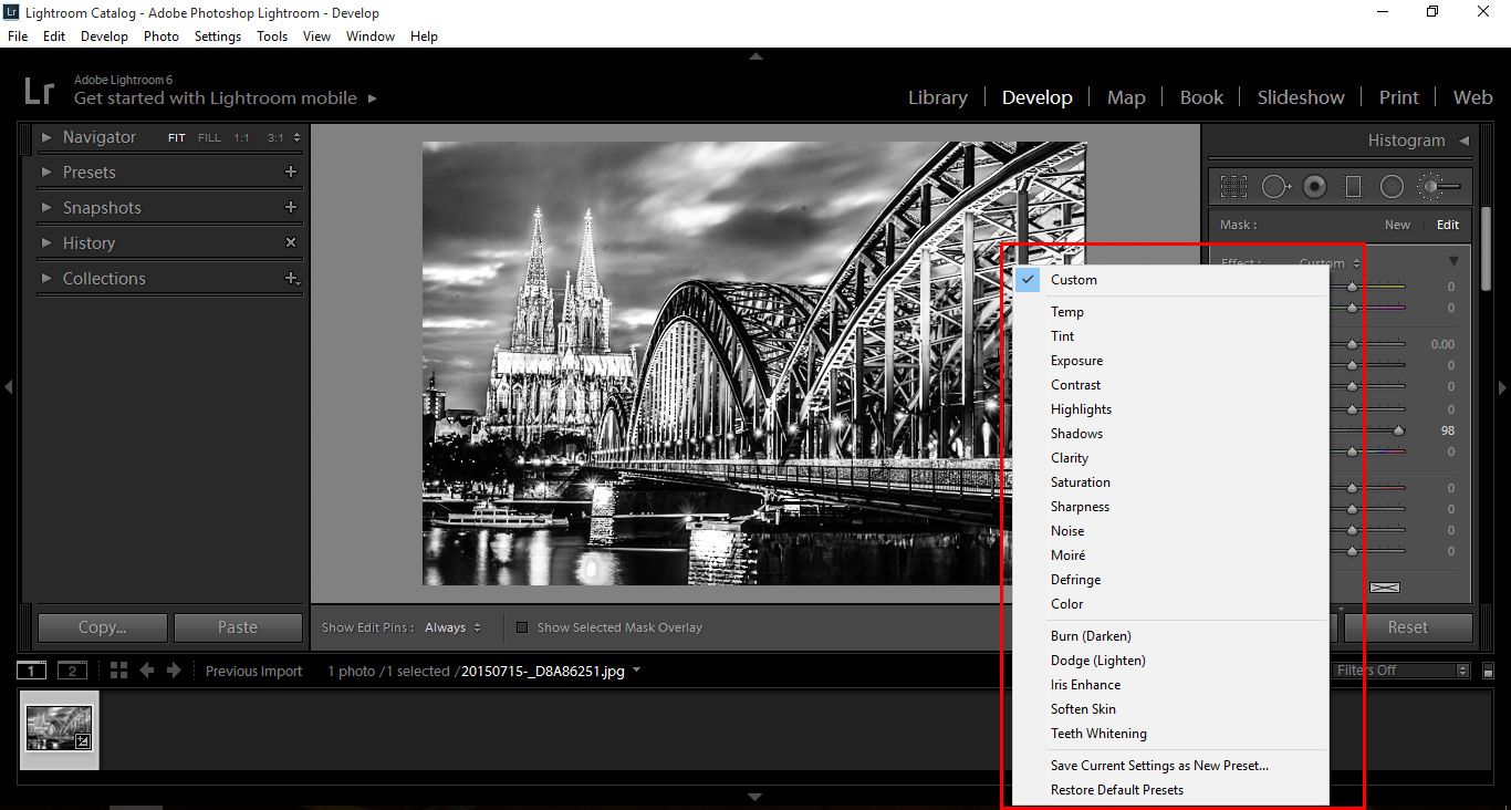
Black&White11

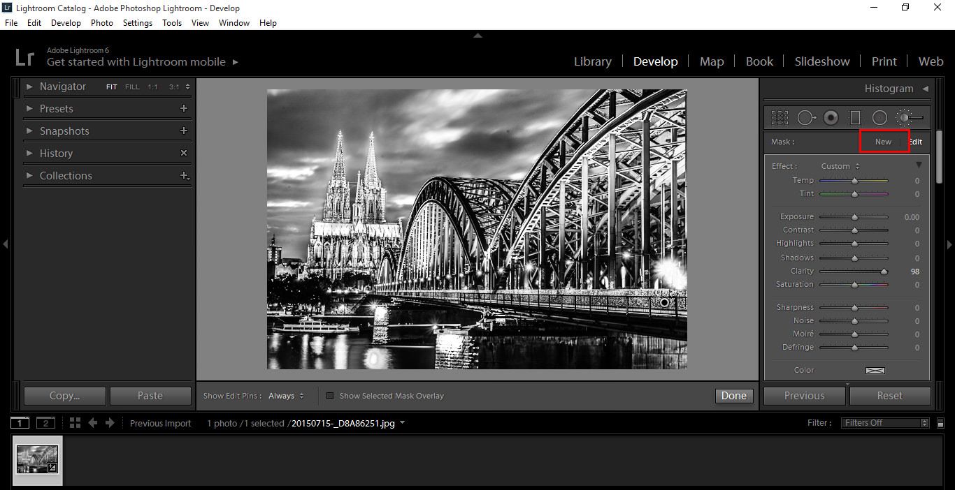
Clicking on Custom will bring you to your different settings, again I would suggest playing around and getting Familiar here as there are a lot of settings to go through. I used a lot of Contrast and Clarity in my image to pick out Shadows and more Details. When you are done with one edit, click New to start another and follow the process just described.

NewBlackandWhite

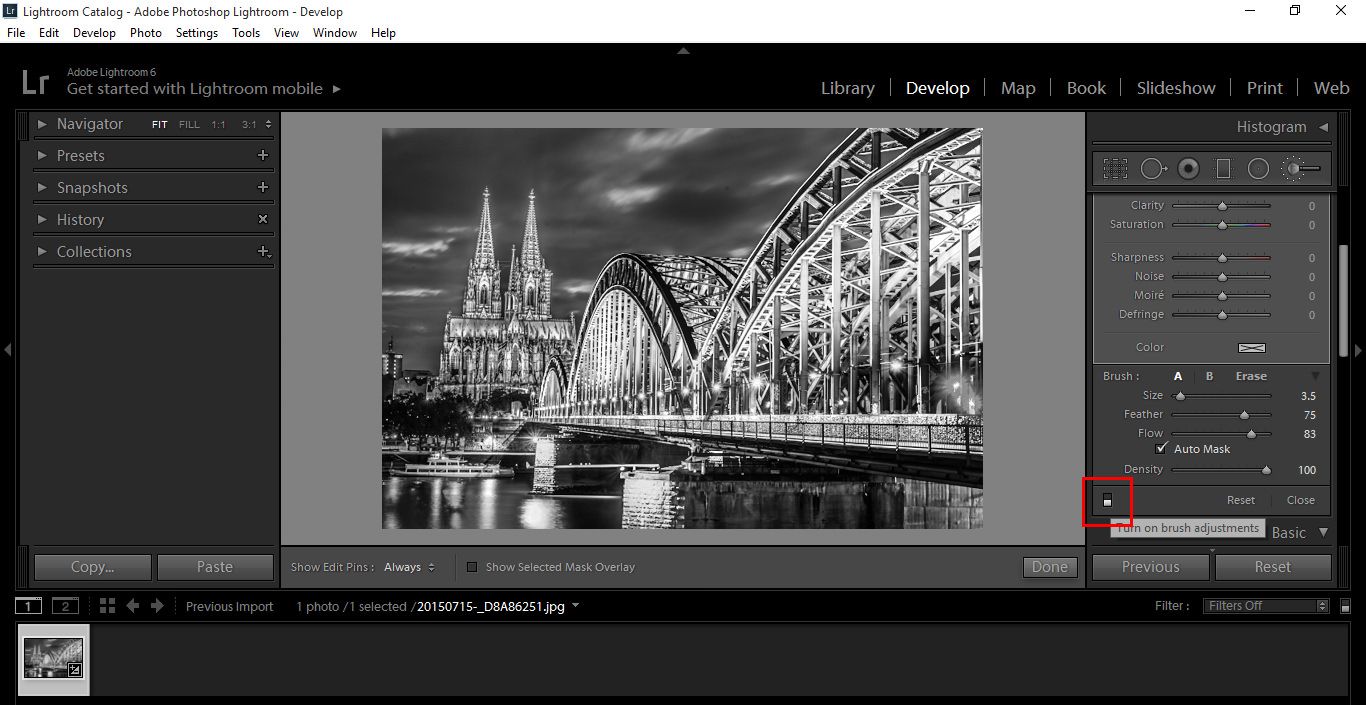
You can turn your progress on and off by clicking on the highlighted area shown below.

Black and White on and off

Another good way to check your progress and edit, is to use the Show Selected Mask Overlay option. This way you can go back in and edit more finer details, erasing the mask.

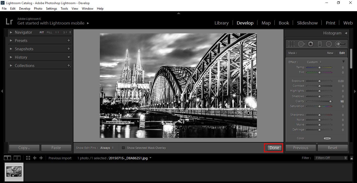
Once I’m happy I press Done 🙂

Black&White12

Check out my before and after.

Before and After