Tag: noir

Get Creative with an App: Cool Smartphone apps for photography – Part 2

Smartphones have made our lives a lot easier especially for photographers. The continuous developments in technology and gadgets with improvised cameras on smartphones, allow us to capture any moment in one click. They also come with a range of applications to choose from for photo editing. This is the second part of the article, a continuation from Get Creative with an App – Cool Smartphone apps for photography. In this article, I will share with you some tips from a few of my go-to apps: Fragment, Noir, LoryStripes, Darkroom, and Mextures.

photoedit app1

FRAGMENT

This is an app created by talented individuals at Pixite Source. When feeling inspired, I like to juxtapose images and get creative with them. Fragment is an interesting app where you can create different variations to your images. The app is packed with many features to use, in case you get confused you are able to use their random fragment feature to pick the one that suits you.

fragment1 fragment2

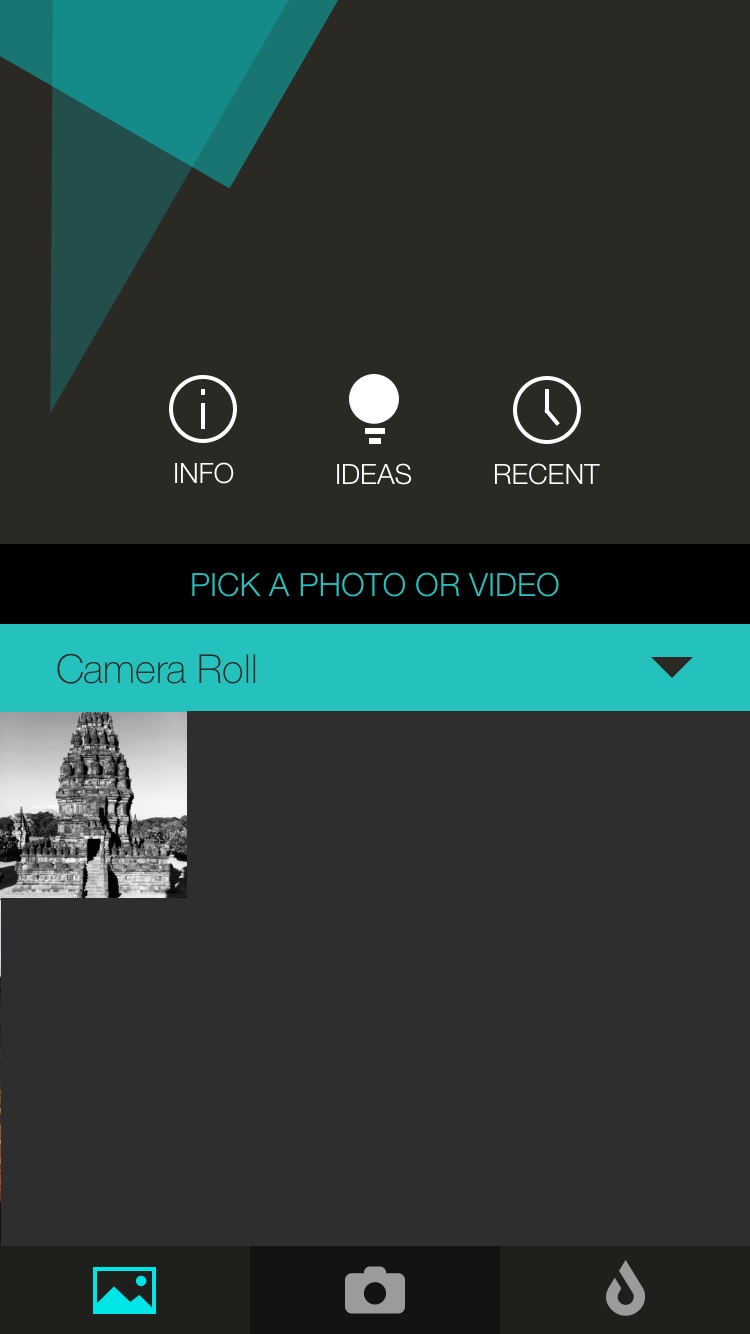
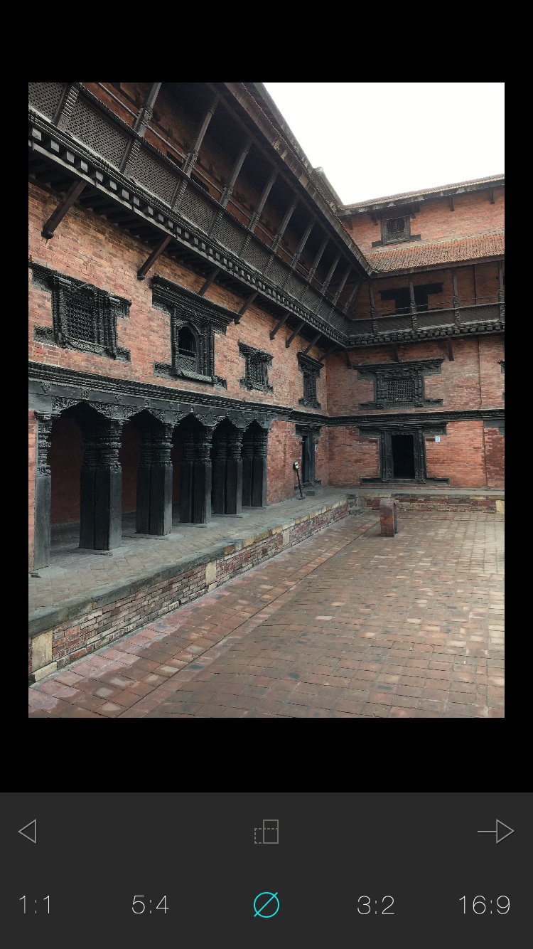
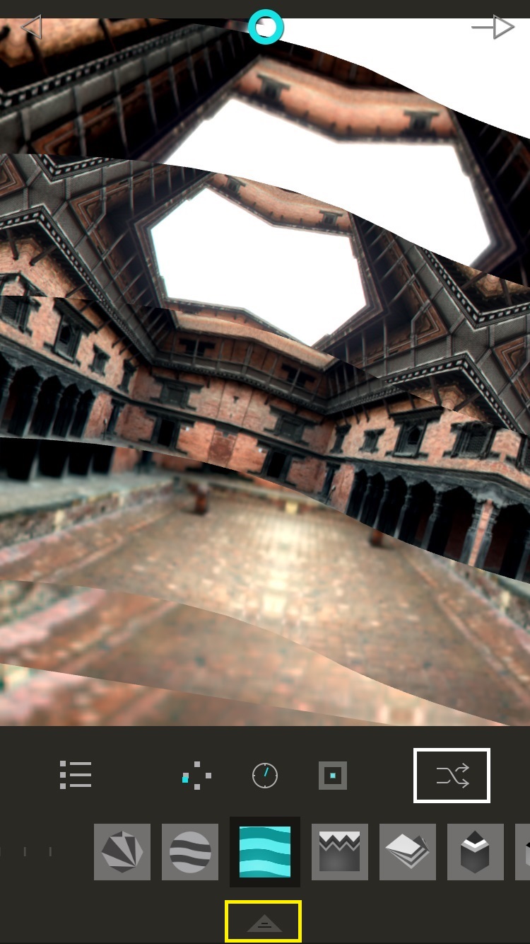
After opening the app and choosing the photo you want to work with, you will come across the screen below. Click the white highlighted option (randomized fragments) and choose the fragment you like. If you want to edit the fragment from the photo, you need to click the red highlighted option to see which fragment works for you. Upon completion, you may choose to save or refragment.

fragment3 fragment4

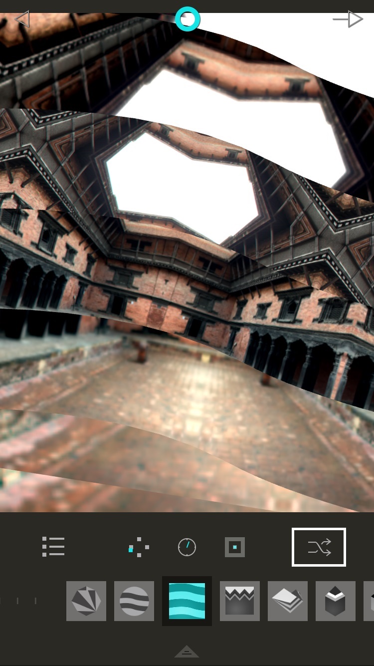
When you are satisfied with all options you chose, you can click the yellow highlighted option as seen in the image below. By clicking it, you will be able to adjust the brightness, contrast, 3D effects, blur some parts or even invert as in using colors for a contrast between two fragmented portions.

fragment7

fragment5
After Edit

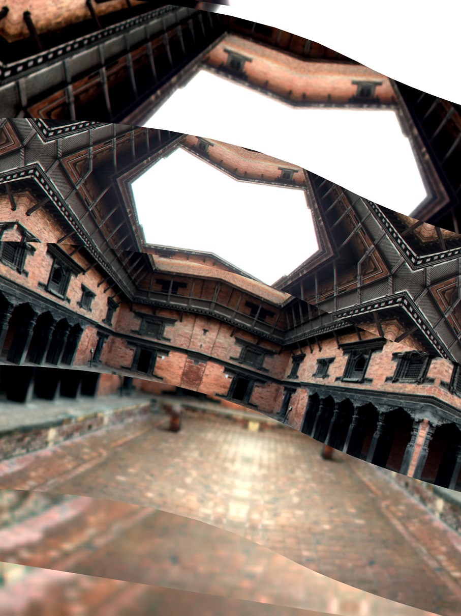
Fragment works when you want to create a quick juxtapose edit to your images, it has many options, and it adds a completely different look to your images. I like using this app most of the time for editing with graphical options.

LORYSTRIPES

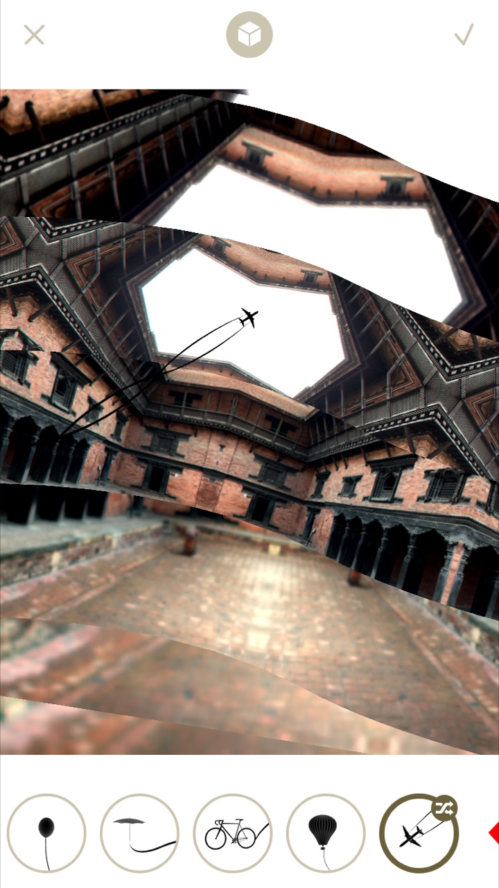
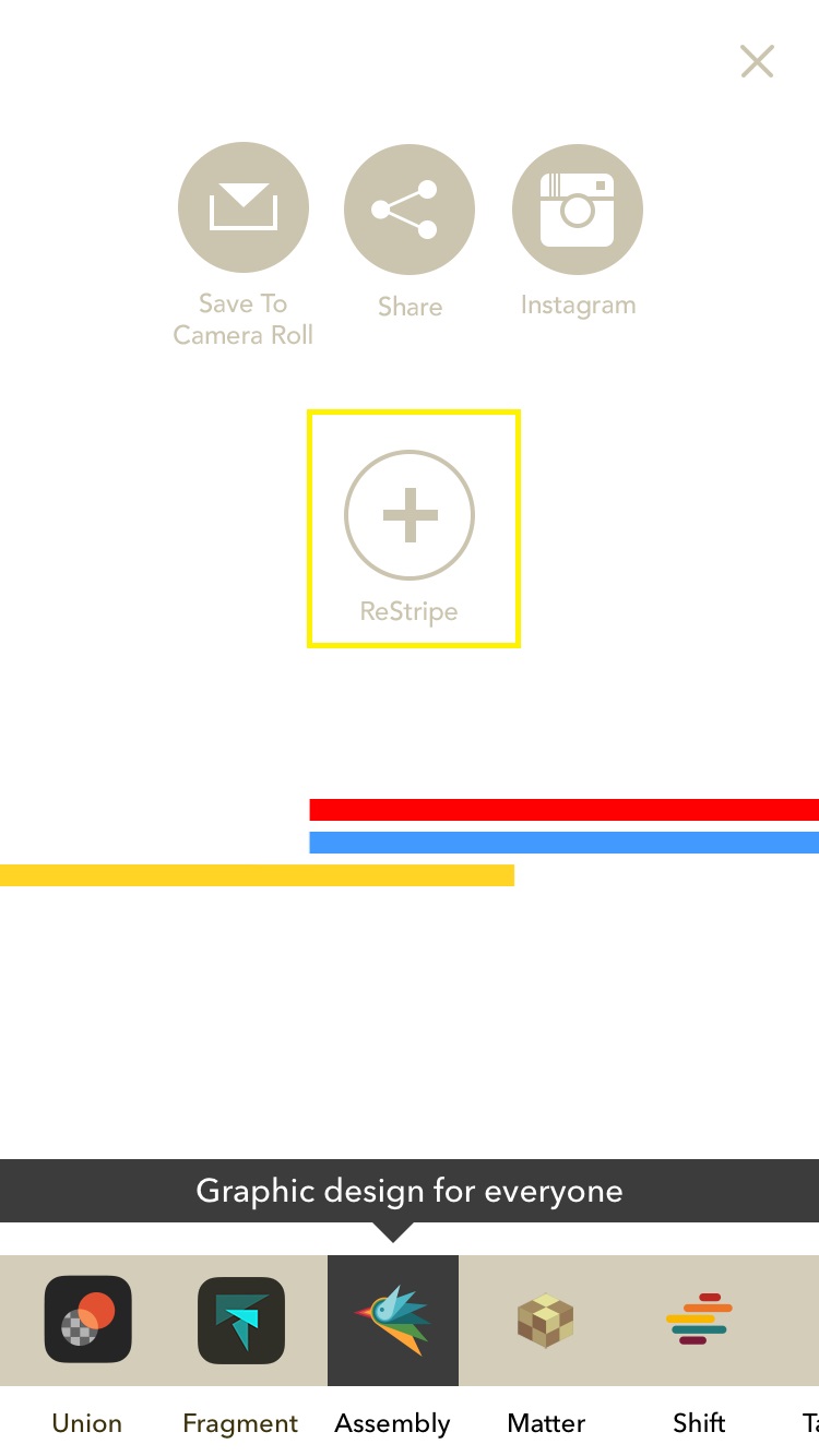
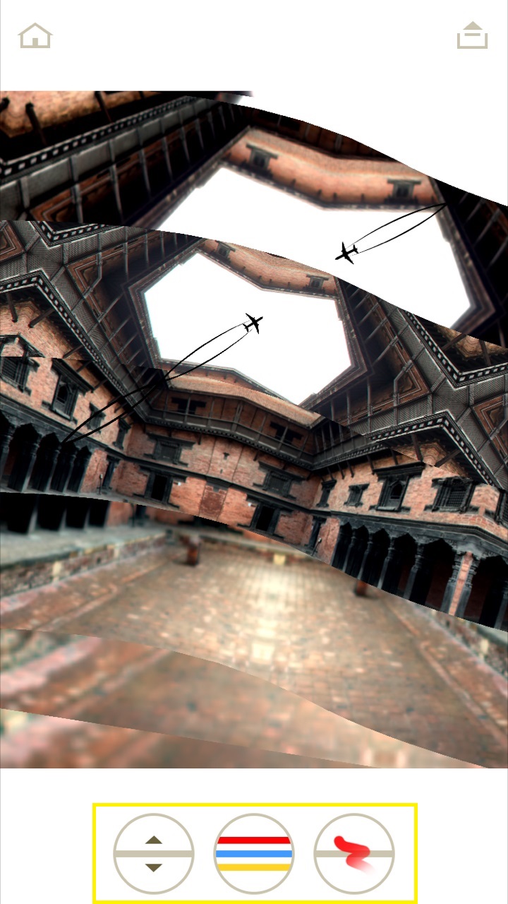
Continuing from Fragment another Pixite Source creation app, to complete my edit I go to LoryStripes to add some finishing touches to the same image. You may choose to do this by using the same image, or you can use a completely new image for a different kind of edit to your image. As the name of the app goes, this app is all about Stripes with various icons and styles. As you can see in the image below, I have chosen to add the airplane style, if you see on the corner of the style there is small randomize icon where you can click on it to choose how you’d like the style to be placed.

lorystripes1 lorystripes2

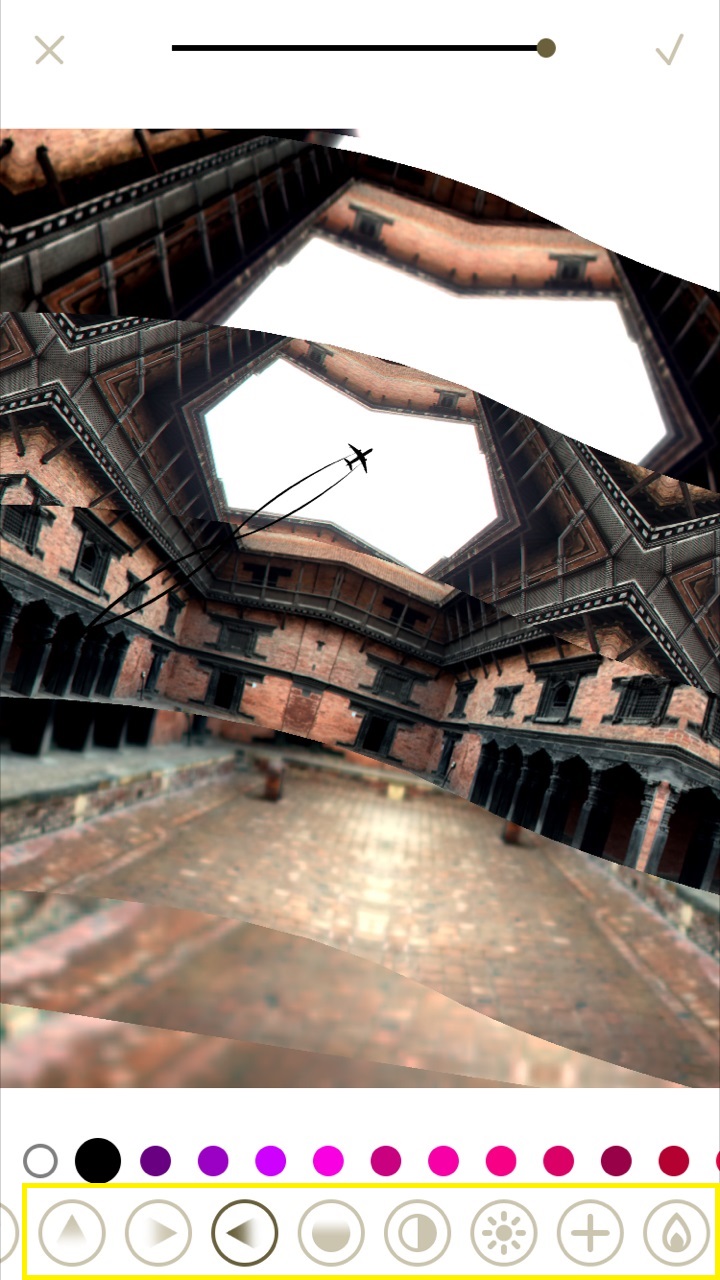
In the image below, you will see the next screen after selecting your style. In this screen, you can click any of the options highlighted in yellow to choose the color and visibility of your style. As I would like to add another airplane style after completing my edit, I choose to click ReStripe.

lorystripes3 lorystripes5

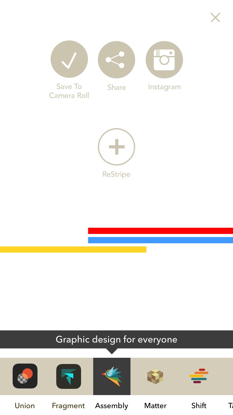
In order to erase a portion of the style, see image below and click the yellow highlighted options. Upon completion, click save.

lorystripes6 lorystripes7

lorystripes8
After Edit

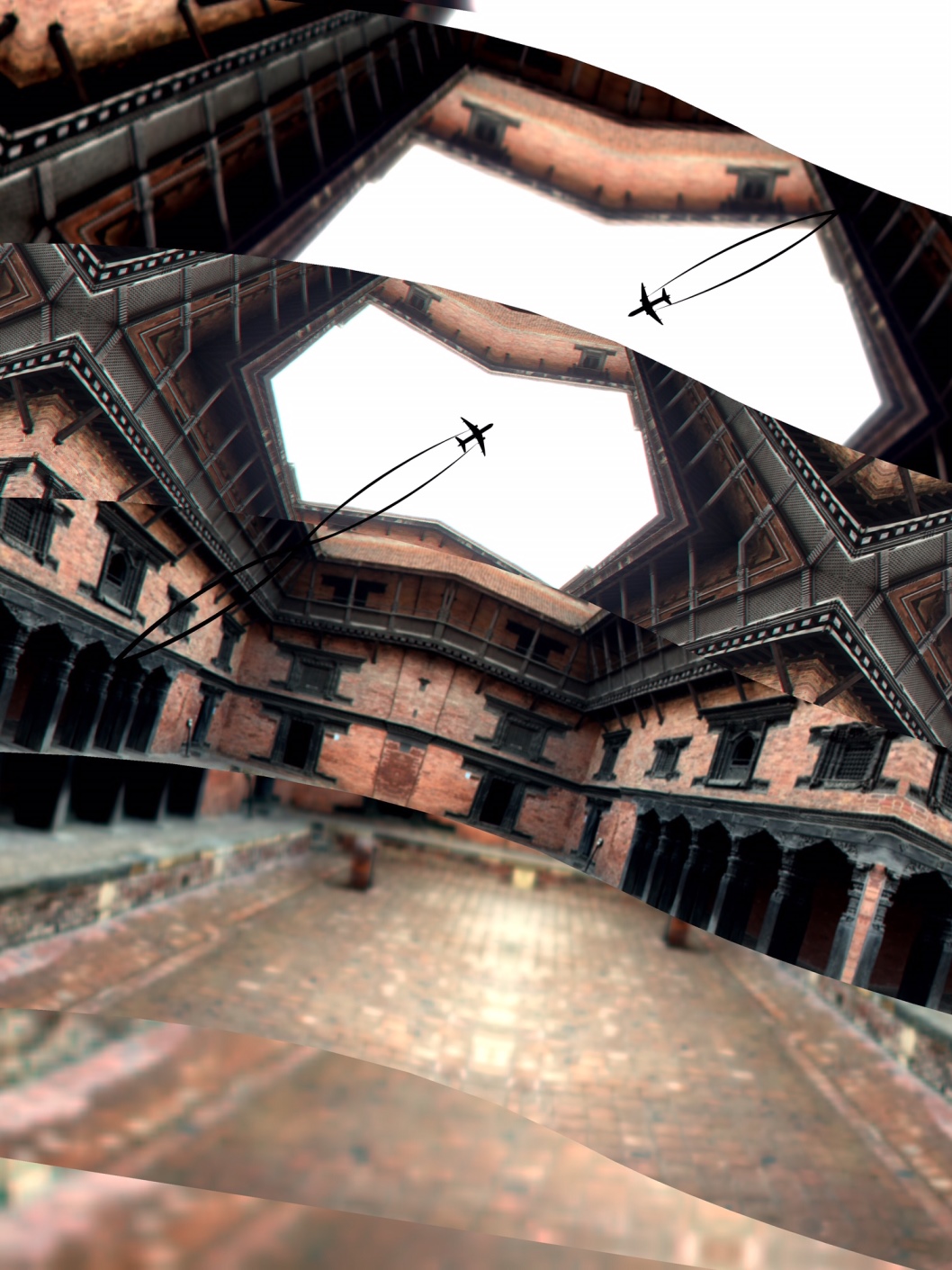
Lorystripes is a good app to work with when looking for lines. It also helps to broaden your imagination with its 3D styles to add to your images and compile a new outlook. I use this app to add icons that the app provides to create an imaginative approach in my images.
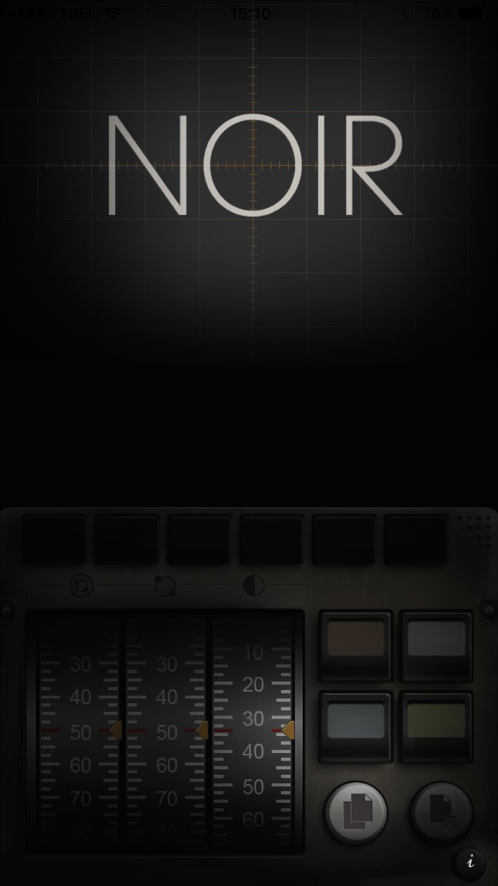
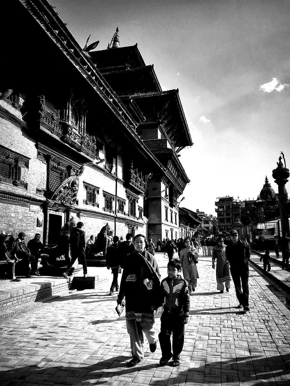
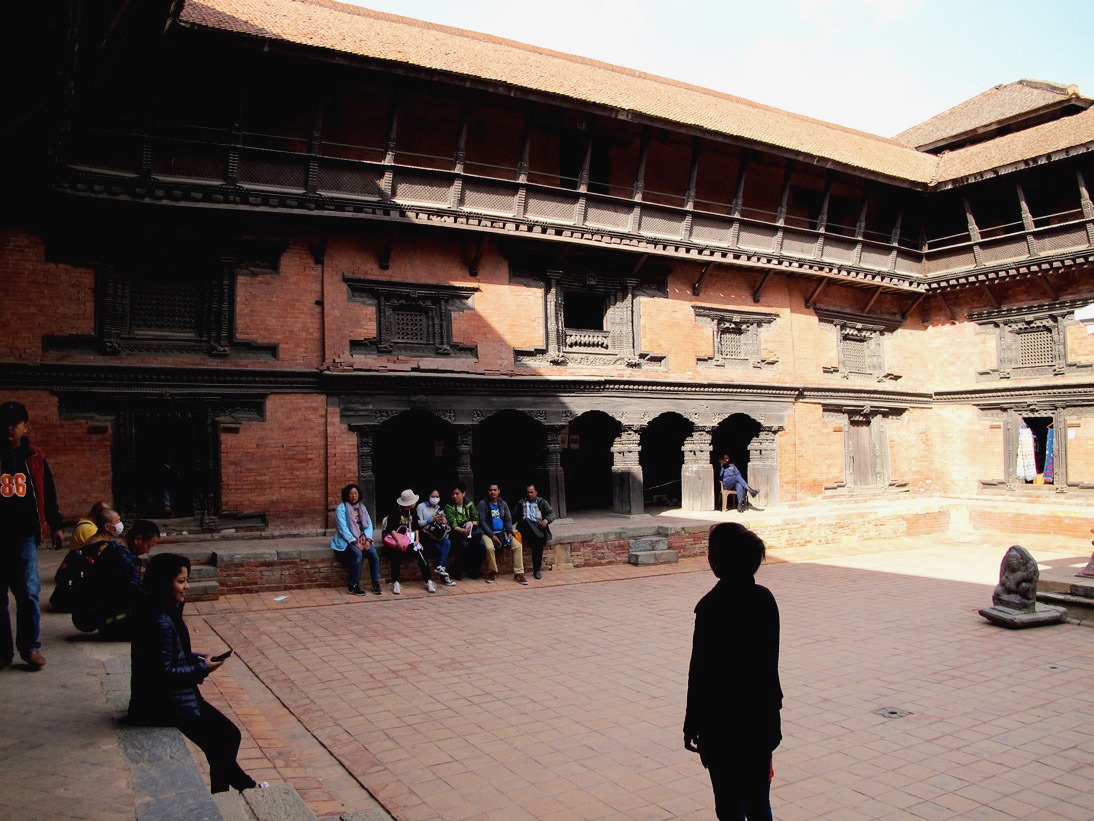
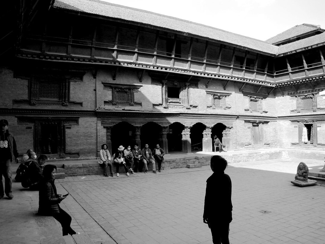
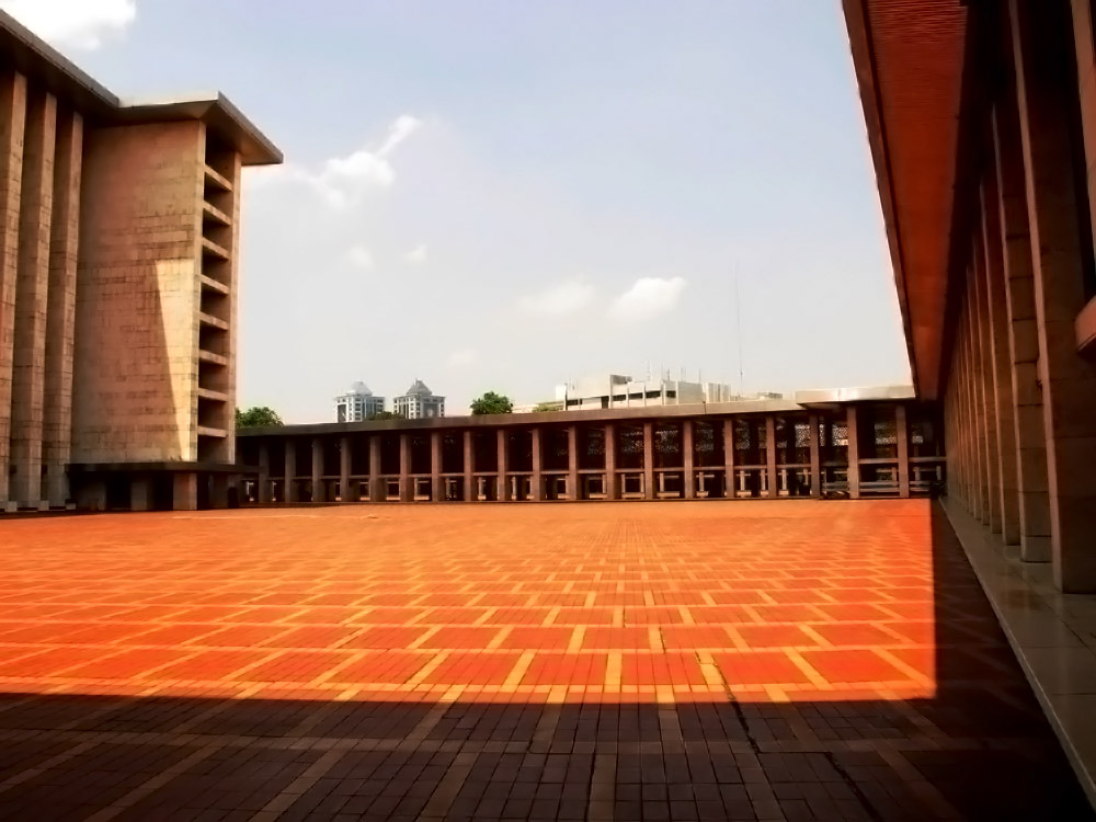
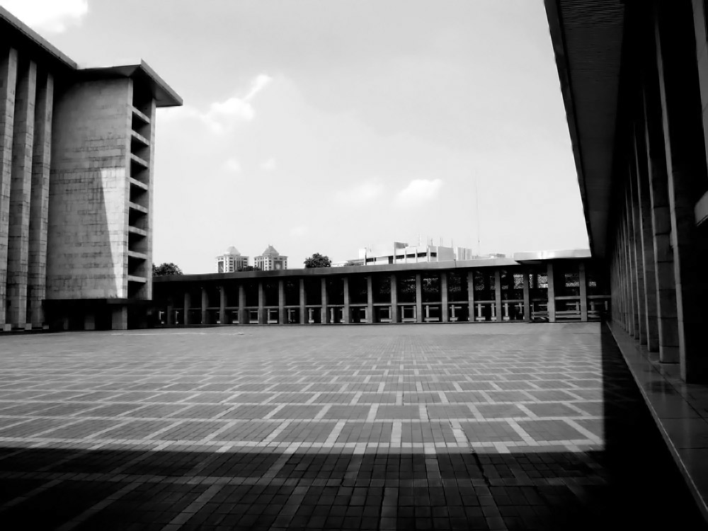
NOIR

My all time favorite Black and White conversion app would have to be Noir. This app converts your image to a clean and crisp black and white, hassle free. It doesn’t require too much effort to edit your colored image. The features are pretty straightforward.

After uploading your image, see the white highlighted options to choose the color you’d like as your background and preferred color sepia, blue, green or black and white.

noir app1 noir app2

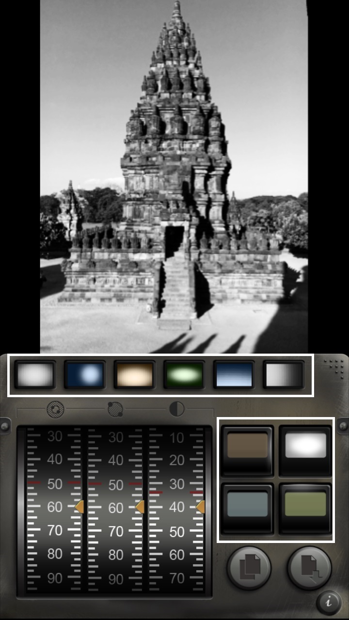
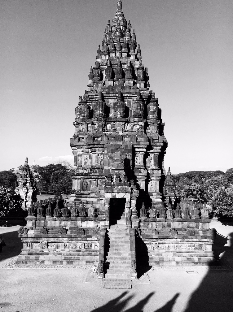
You will also see the meters in the above image to adjust the composition of your image. When doing the edits, you will notice the image is slightly blurred, ignore it and continue editing. Once you complete the edit, you will see the results.
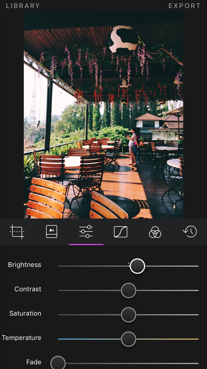
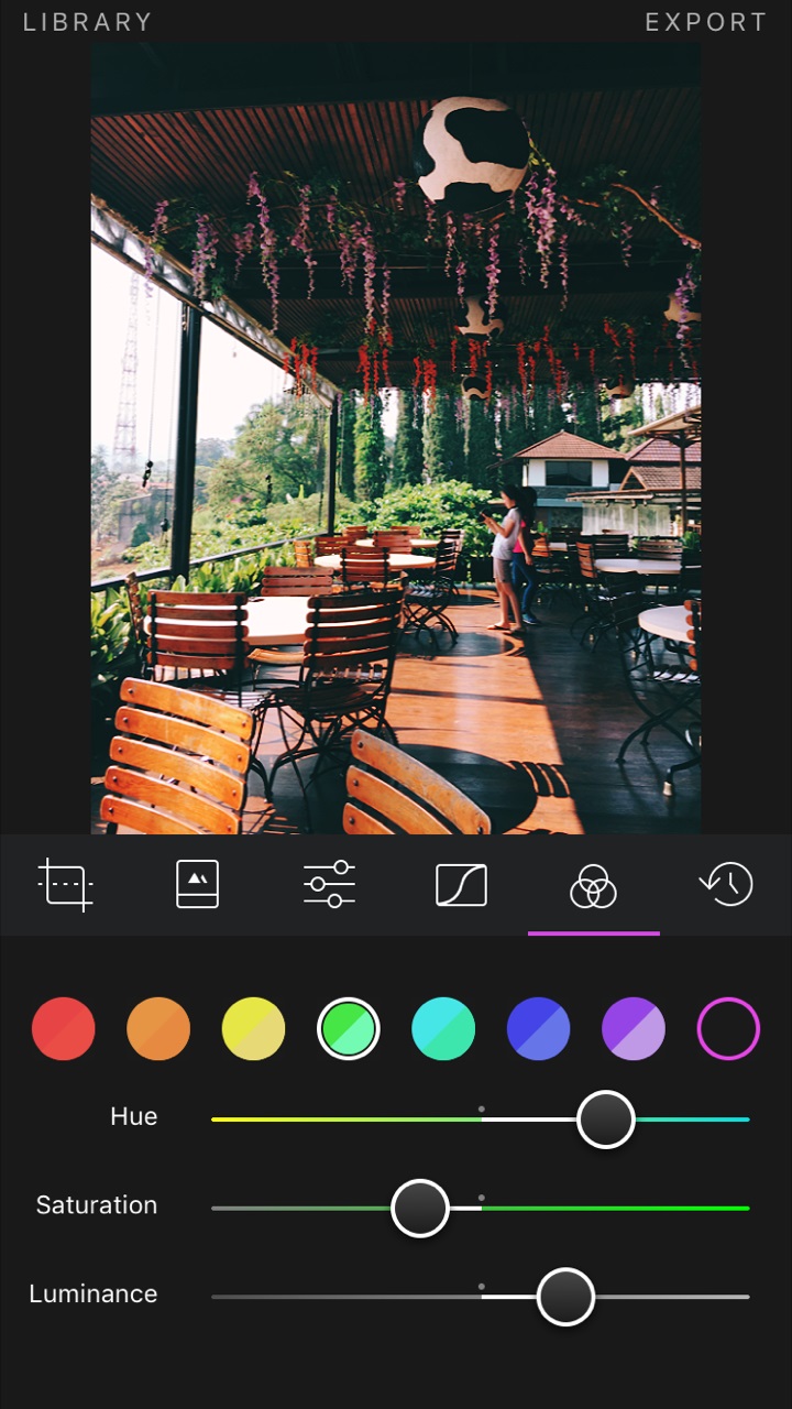
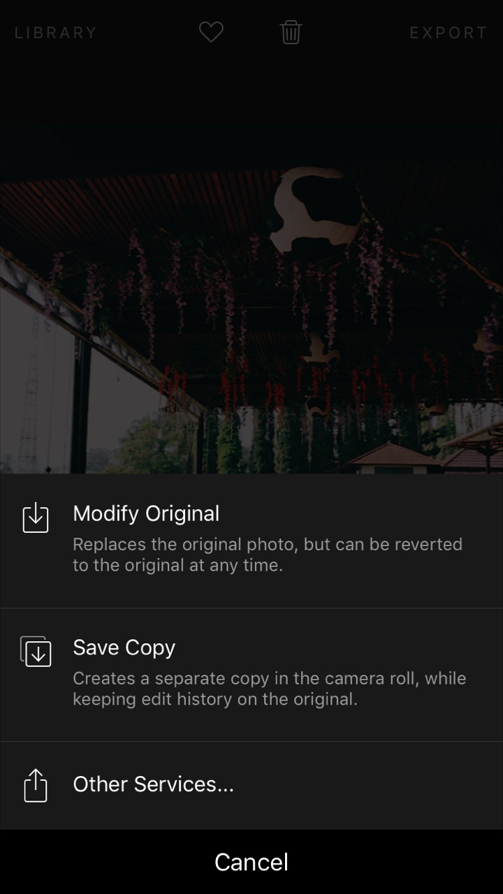
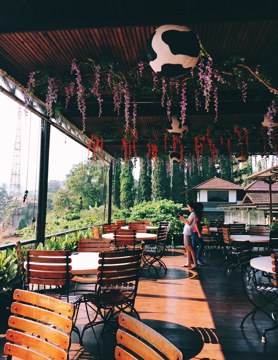
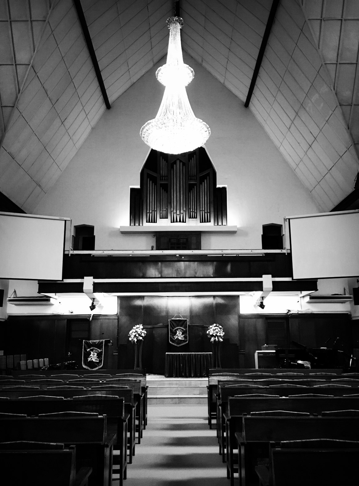
noir app4
After Edit

DARKROOM

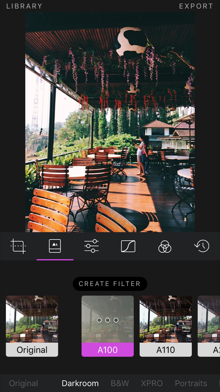
Darkroom is not an app I use much but, for instant and simple filters this app gives good results. It is simple to use with nice filters to choose from. If you see the images below, the editing process is not tedious. You can start by choosing the preferred filter and then adjusting the brightness, contrast, etc. for the composition. Apart from Snapseed, I would recommend this app for a good clean image.
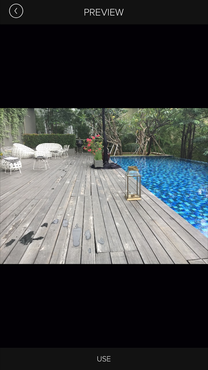
darkroom app1 darkroom app2

darkroom app3 darkroom app4

darkroom app5
After Edit

MEXTURES

Dreamy, vintage, dusty looks? All of this can be achieved using this one app. Even if I don’t use it often, but this app is the solution for all sorts of filters and colored editing. It gives your image a fresh and subtle touch. The way around this app is easy especially for beginners or even experts. Simply choose the desired formula to overlay your image, if you like the result, then your image is ready to save. If you would like some different styles or color, you may do some minor edits to it to complete the image. See images below for the complete steps.

mextures app1 mextures app2

mextures app3 mextures app4

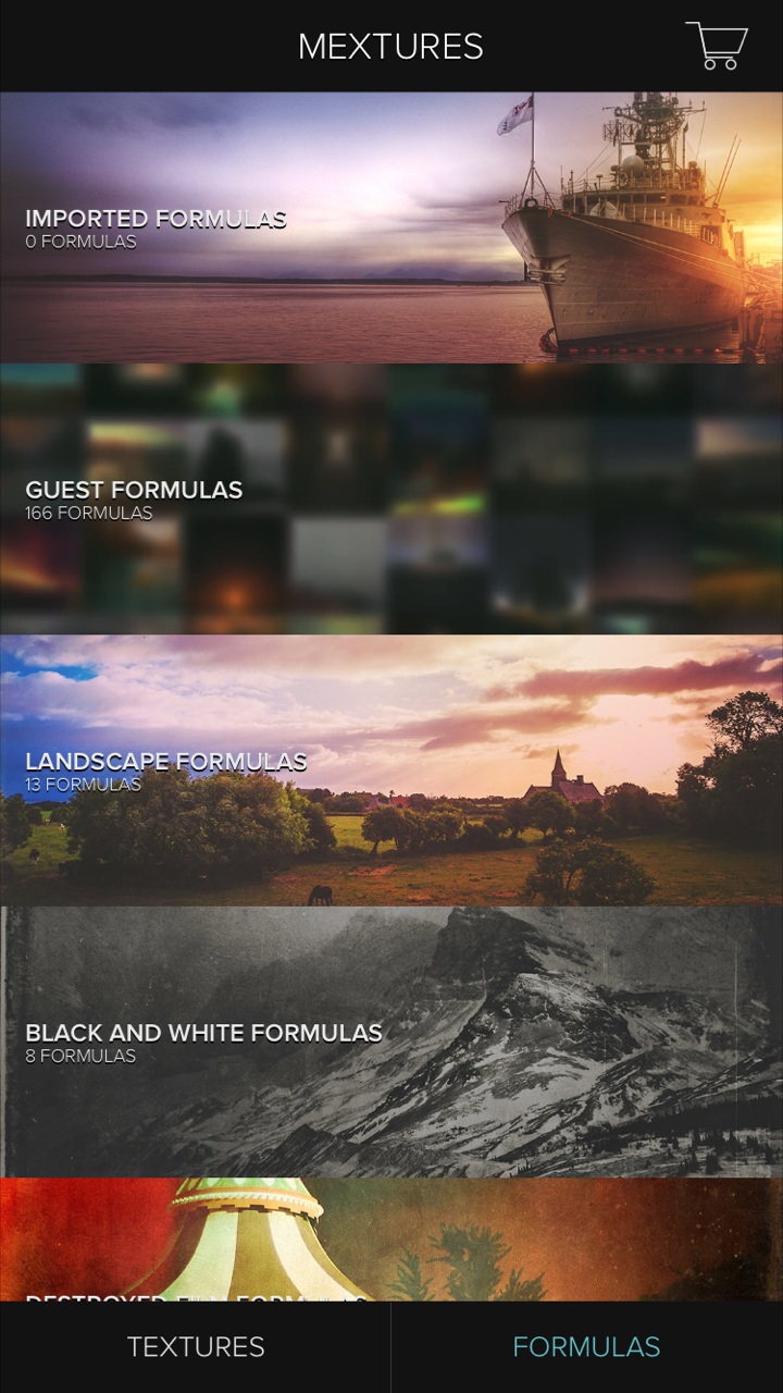
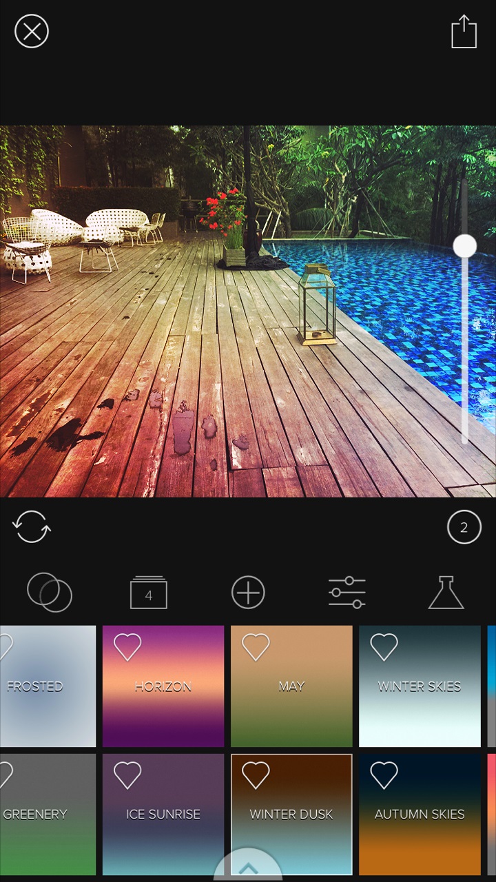
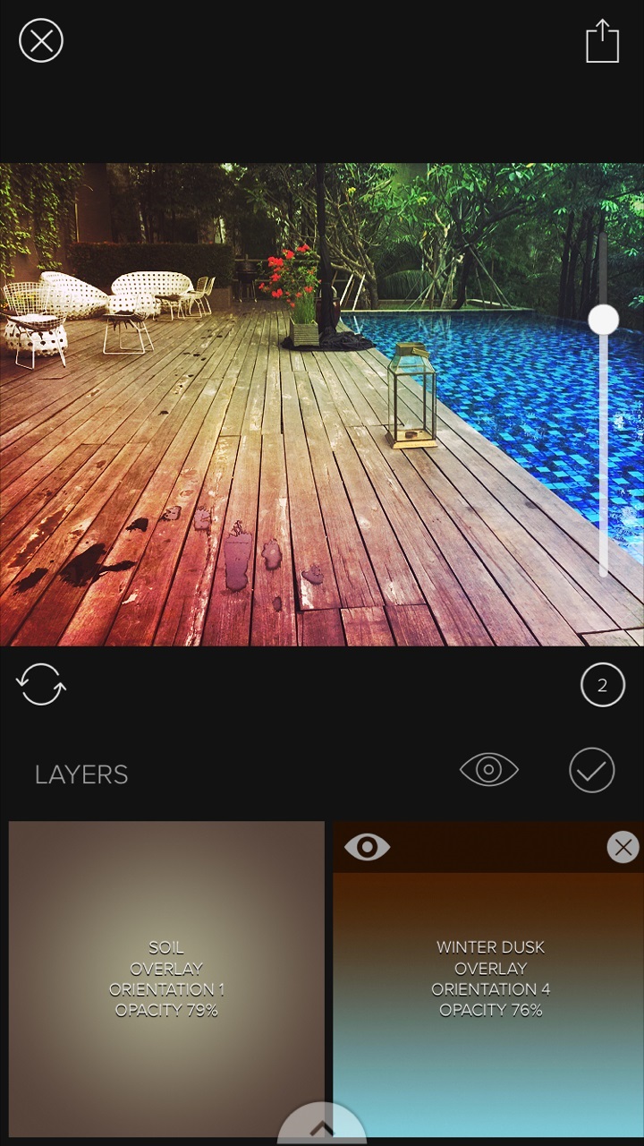
In the last two images above, you will see the settings after you have chosen the formula. The formula divides itself into 4(four) layers (depending on formula) for you to play around and modify. To have the complete set of the overlay filters and formula you need to pay for it on AppStore but, they also have discounted packages for a reasonable price.

mextures app5
After Edit

In conclusion, all the above apps mentioned, including from the first part of this article, are mostly the apps I love and enjoy using. There is no specific go-to app, despite a number of new apps emerging and evolving, I still find myself using these apps for my edits. The choice is yours, which app suits your taste to create images that stand out. Enjoy the process and continue to share your innovative creations!

The Power of Seeing Monochrome: Tones of Black and White

Colors have a way to give you a bright and cheerful feeling. There is just something about a photo that speaks colors. It brings out that energy and brightens up your day with it. Did you know that even photos in Black and White/Monochrome can intrigue you?

people

Black and White definitely gives you a retro feeling of the olden days, when photographers like Andre Kertesz, Henri Cartier-Bresson, Fan Ho created wonderful artistic memories. At the same time, in current times you will find many photographers including myself, trying to experiment shooting or even editing in Black and White to create a different moment with a touch of the past.

How do we find the right photo to edit in Black and White? Or maybe capture a moment in Black and White?

In a recent assignment titled “Cities in Black and White” on National Geographic by Matt Adams, I tried to experiment and submit to the assignment. We were allowed to edit photos into black and white. In the assignment, Matt gave us a guide as to what to see or how to find the right photo to edit. It was not easy to choose the colored photos to transform them in Black and White yet, it was a fun learning experience. It has also continued to help and guide me to keep improving and trying out various edits to get the right tones of Black and White.

chair

Seeing through black and white can be a challenge but it can be simple. We have been quite accustomed to having the option of shooting in color that when looking at black and white it feels too plain. It is in that simplicity that many great moments have been created in the past and even today.

The photo above has been shot in pure black and white. There was the “Weekend Hashtag Project WHP” on Instagram at the time titled “Shadows and Light” if I recall correctly. This project helped me to experiment capturing in black and white. I saw the chair and the sunlight during the day was pretty good to create a shadow effect. From a particular angle, I captured the shot, to portray the serenity of the moment using the chair as my object.

We now turn to comparing between color and monochrome photos to see how editing and conversion can also bring out a good black and white tone to photos.

art

art

This prominent red colored photo of an art gallery brings the moment to life with the red, the artwork and the structures. I chose this photo to transform it into black and white. As you will see once transformed, there is a completely new sense of the moment. Everything is the same the artwork, structure, and perspective. We can’t say that color is missing as the essence is the same. It is now just a matter of personal preference.

drops

drops

In this photo, the raindrops with the bluish green background bring the raindrops to life with every detail of it. After we convert it to black and white we can see not just the raindrops are alive but every single aspect of the photo is visible. There is complete clarity. The black and white is my personal preference as it defines what I wanted to capture the moment.

people

people

Walking around Patan Durbar Square, Nepal this scene was quite pleasant. The details of the wonderful palace building with the sunlight blue skies and people walking around created a lovely moment. Capturing this in color and after a while transforming it to black and white, made the moment feel more captivating. The details of every aspect pop out more through monochromatic tones.

inside

inside

The insides of Patan Museum, Nepal was a feast for the eyes. The architecture and intricacy kept me fascinated looking for various aspects to capture this royal beauty. As we entered, without thinking I just clicked this scene of the girl standing and people sitting around. After completing the National Geographic assignment, I tried experimenting by converting this image to black and white and turns out the transformed version is much better. It focuses completely on the girl standing thus, creating a complete moment around it.

church

This moment was another pure black and white capture inside a Cathedral. The lighting inside was perfect to bring out the details and the black and white tones defined this moment entirely.

grounds

grounds

Lastly, through this patterned inside ground of Istiqlal Mosque, we can see how the colors combined with the skies form symmetry. Patterns can help to define black and white tones in moments more. Changing the image to black and white gives it a refined touch where all the lines and structure come in harmony together.

There is no perfect combination or formula to doing it right, just simply practicing. Fan Ho said, “it was always his goal to wait for the lighting and composition to fall into place when photographing.” That could be our benchmark when capturing in monochrome. As for editing, there could be many things we can take into consideration like patterns, structure, architecture or even people. It really all depends on finding the right balance and tones to convert it. Requires a lot of trial and error to get what you are looking for in the photo.

structure

Monochrome will continue to be something we experiment on as we do not have the limit of films and that is what makes it a challenge. The questions of how did they do it in the past? How did they learn the balance of composition? The simplicity and limit enhanced their creativity to get it right. They were able to capture the essence of what composition is not quickly, but smoothly. With color, it can feel like we have more distractions when focusing on an object or moment. Both has its positives, eventually, the choice is ours to make and create photos to share and inspire.