Let’s take a look at split toning in Lightroom to help you on your freelancing journey or just to groom your Photoshop skills and see how other photographers get the best out of their images.
Our range of Lightroom presets have split toning incorporated into them, so definitely check those out if you want to see a wide variety.
For this tutorial, we’ll be looking at how to do split toning manually. While presets do this with the click of a button, Lightroom split toning will require just a little bit more patience and trial and error to achieve the look you are happy with.
What is Split Toning?
Split toning is a color grading technique that involves applying a different colour tone to the shadows and highlights of an image. This can be used to create a split tone effect, where the shadow area is tinted one color and the highlight is tinted another. Split toning can also be used to add a creative touch to an image, or to correct colors that have been inadvertently shifted during the editing process.
Split Toning in Lightroom
Let’s start with a Lightroom tutorial on how to add a split tone to a photo.
Adding a different color to the shadows and highlights of a photo is known as split toning. It is a variation on toning where only one or two colors are added to the image.
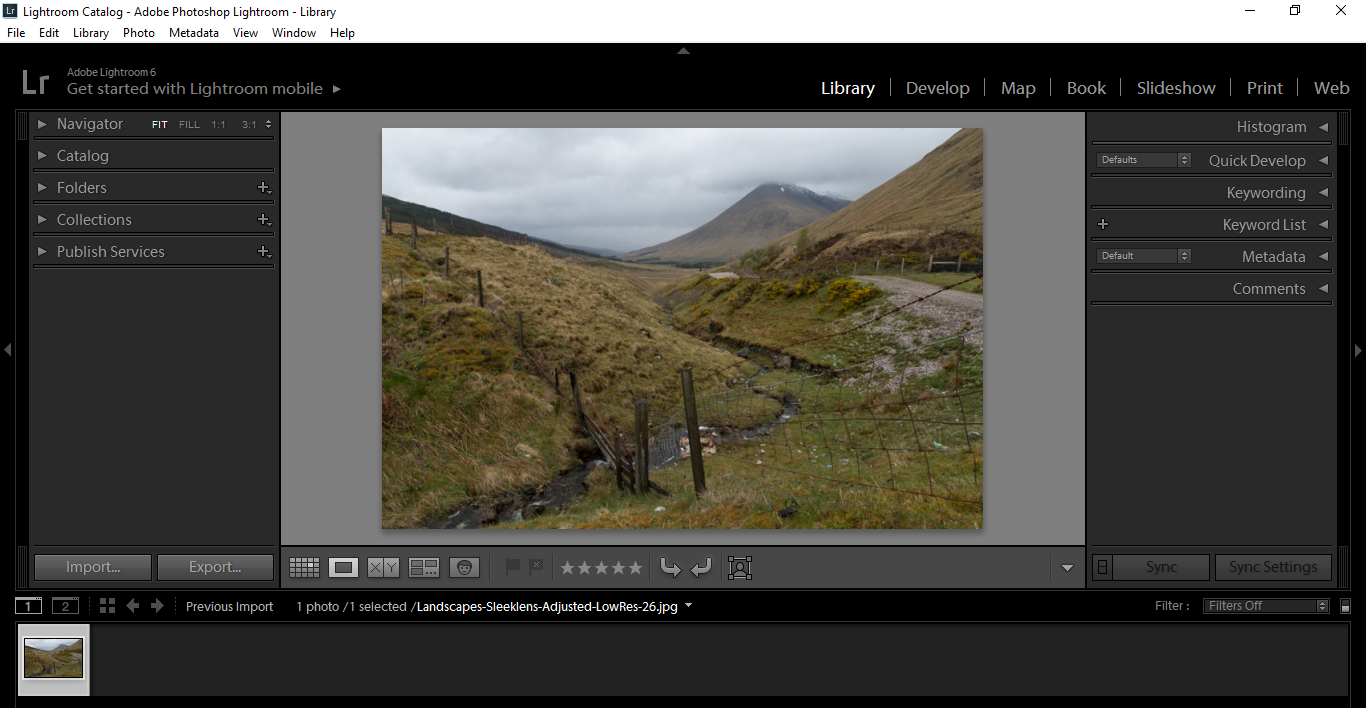
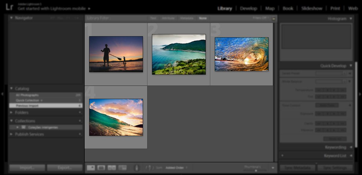
We’ll start off with an image that hasn’t yet been edited. It’s a little dull and saturated. Thankfully, split toning in Lightroom will add some great colors to it.
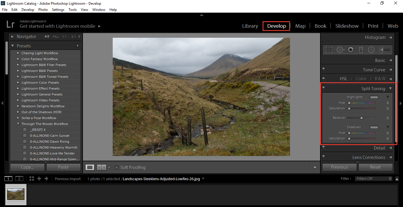
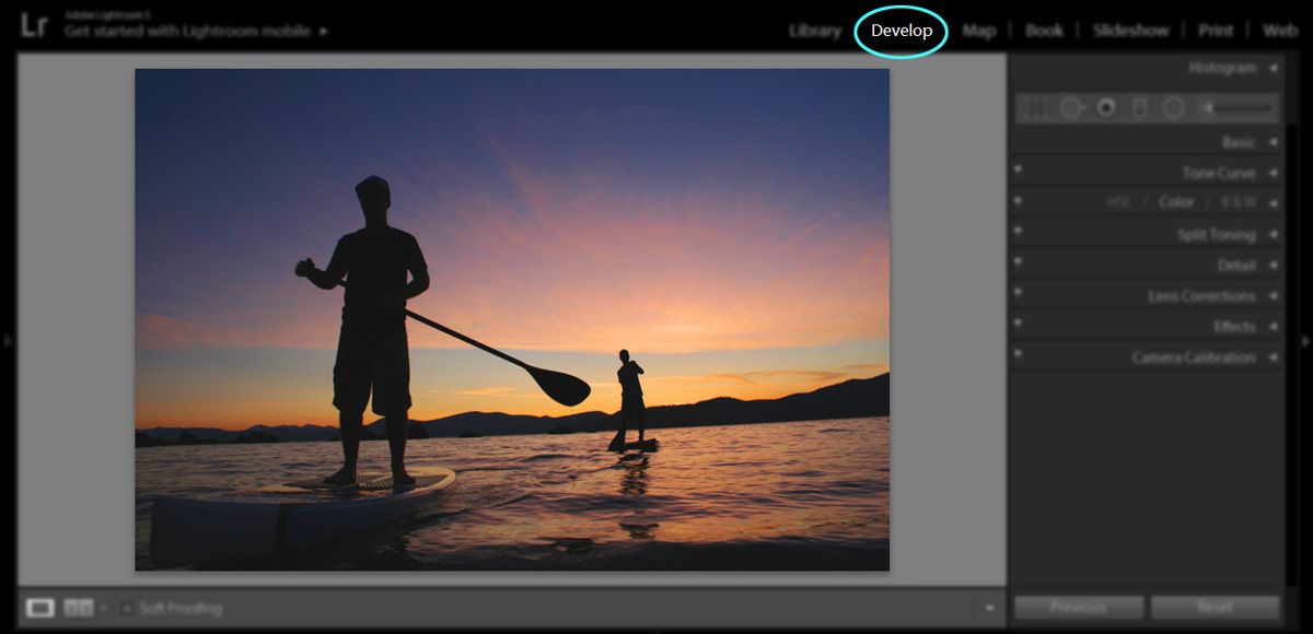
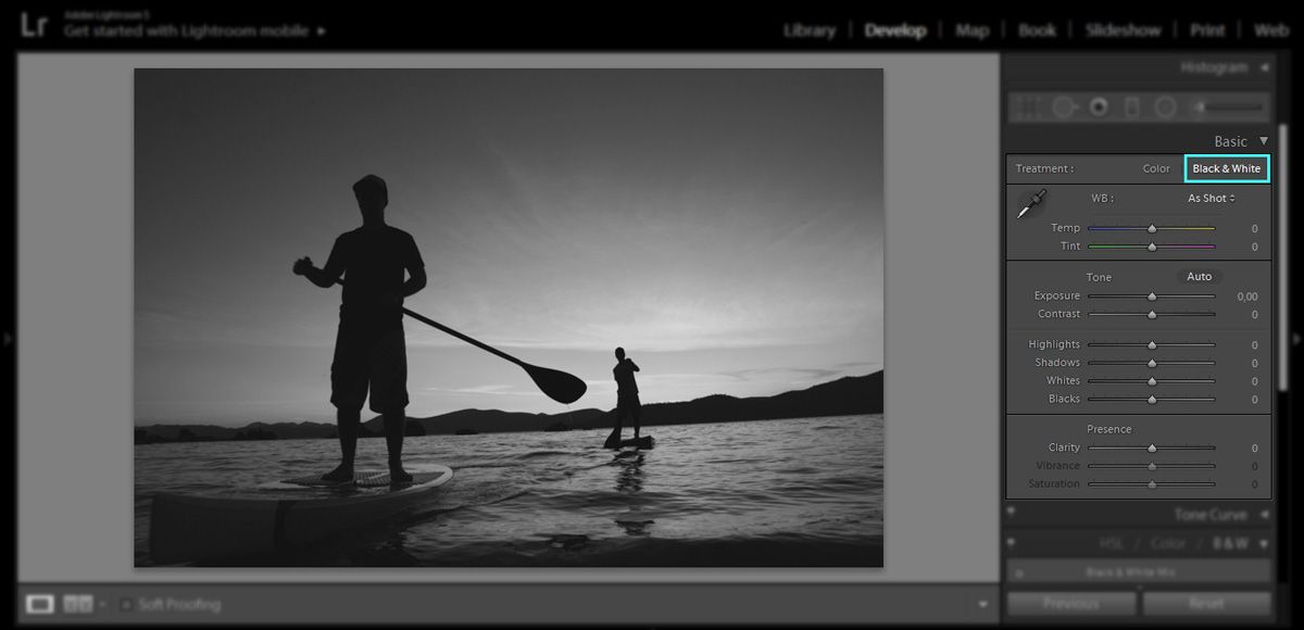
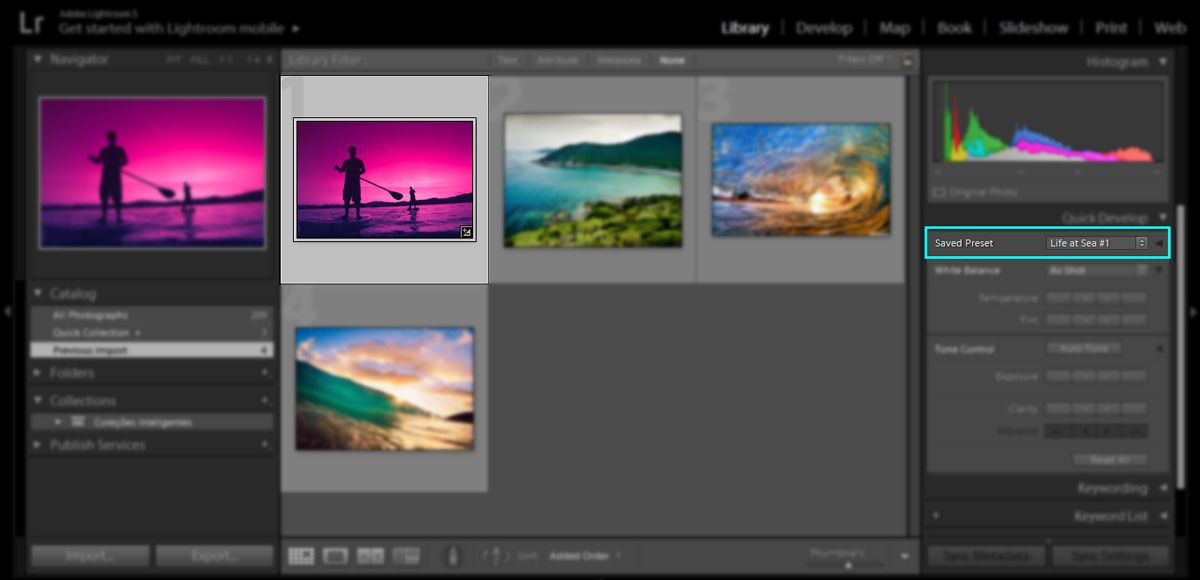
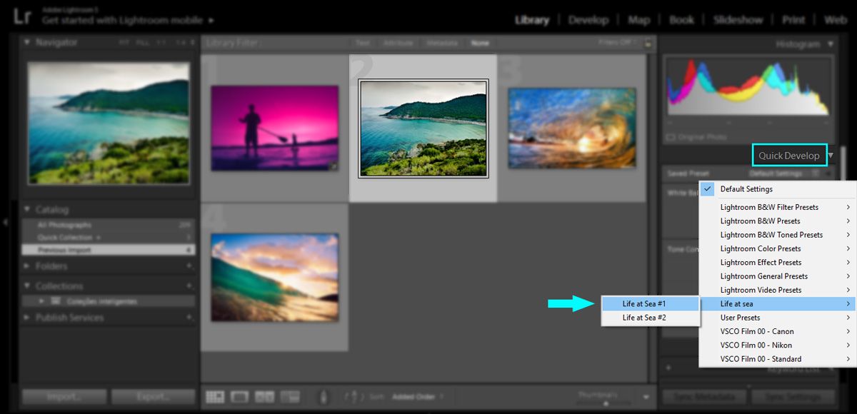
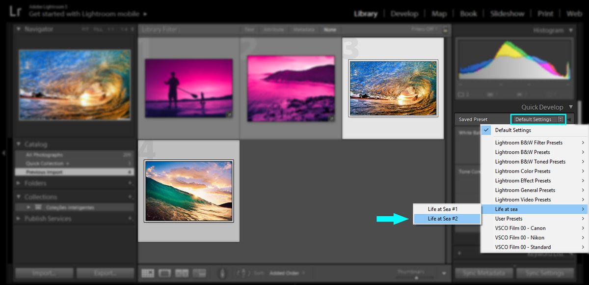
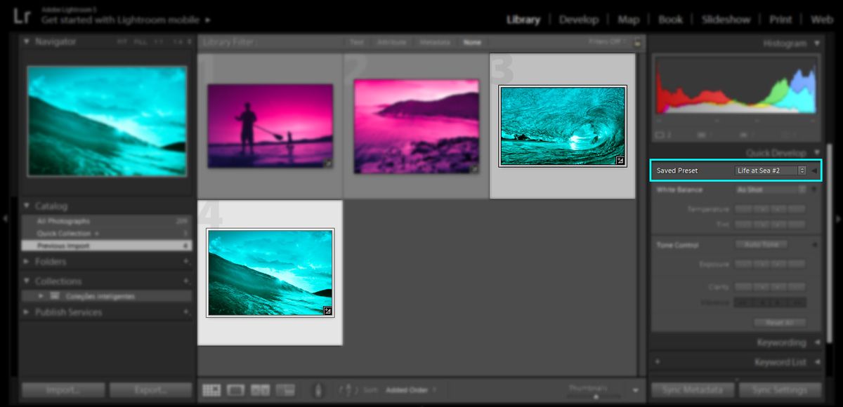
Open the Develop module and on the right side, you can choose to use split toning—fourth down on the list below HSL/Color/B&W.
Open Basic Panel
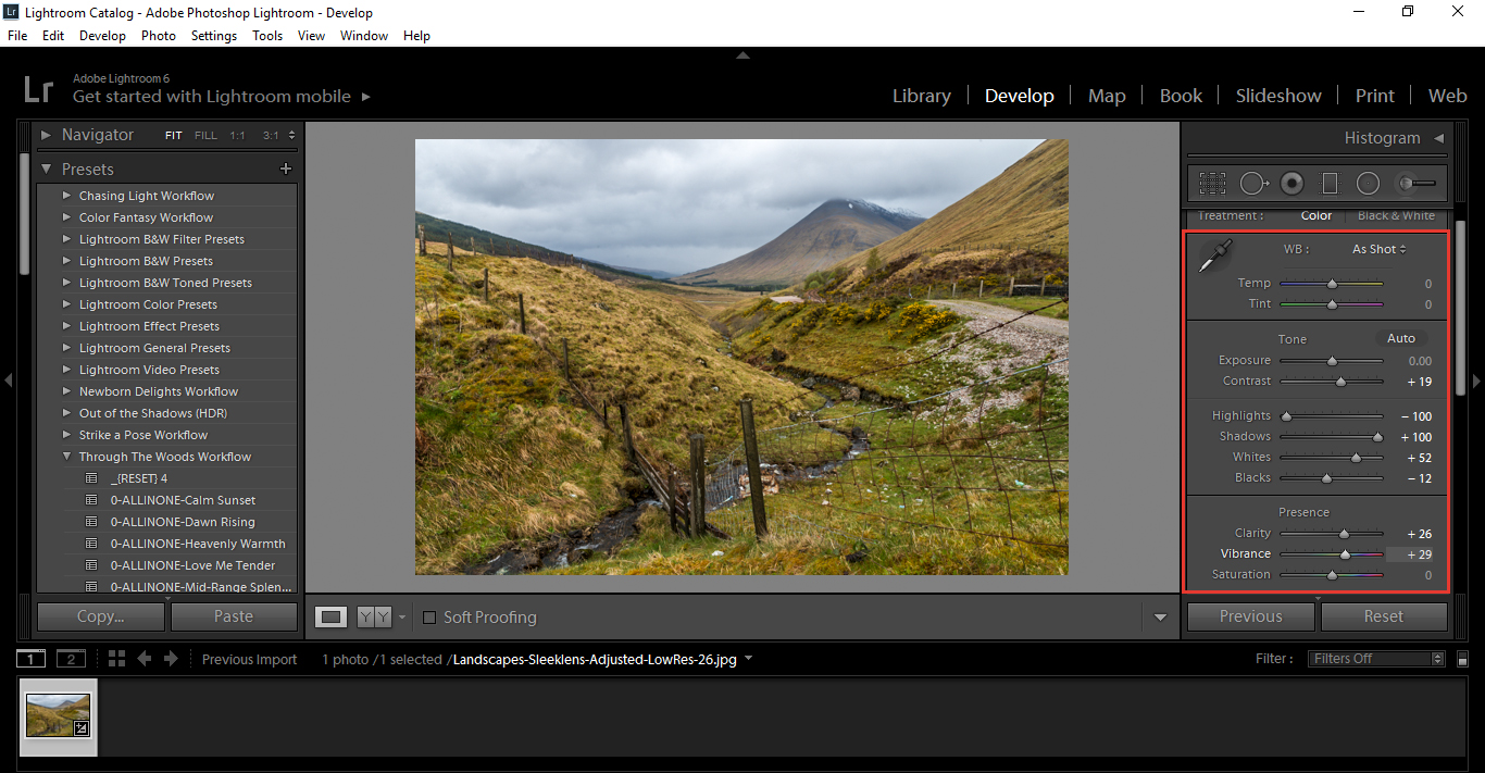
First, we’re just going to tidy our image up a little and see how the Basic Panel can improve your image from the start. This step may not be all that necessary, because you might have already taken a pretty good image, but just in case, here are a few ways you can make some simple improvements.
These are the settings I would use for a landscape photo. I add a little contrast first, anywhere from +20 to +30 should be enough. Then, I put my highlights down and my shadows up.
With blacks and whites, I hold the Alt key, and then select or choose the hue slider. You will see the screen turn all white for the black slider, and all black for the white slider. What you do is slide the black to minus until you start to see Black dots appear on the white balance screen. Don’t go too far—you just want them to start to appear. Then, do the exact same for the white balance slider, only this time you slide right toward plus instead of minus. Choose sliders wisely, and remember that there are various colors that aren’t used more often, such as blue, yellow, sepia, etc. Now, add a little vibrance and clarity—anywhere round +30 should be fine.
Remember these setting are not set in stone, so whatever you feel is good for you is good. You can always go back later and adjust.
Adjust Highlights and Shadows
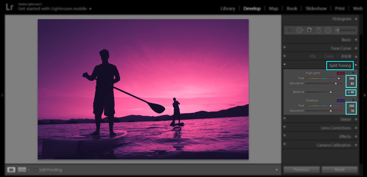
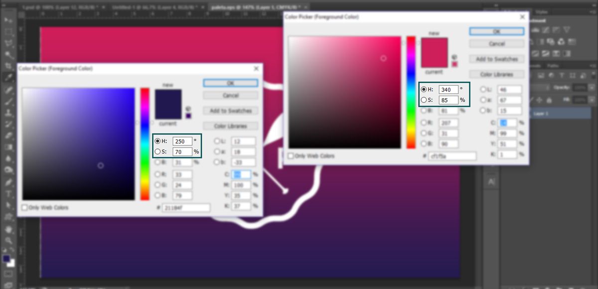
You will see Highlights and Shadows split tone or tones. This means that the Split Toner adjusts those colors separately.
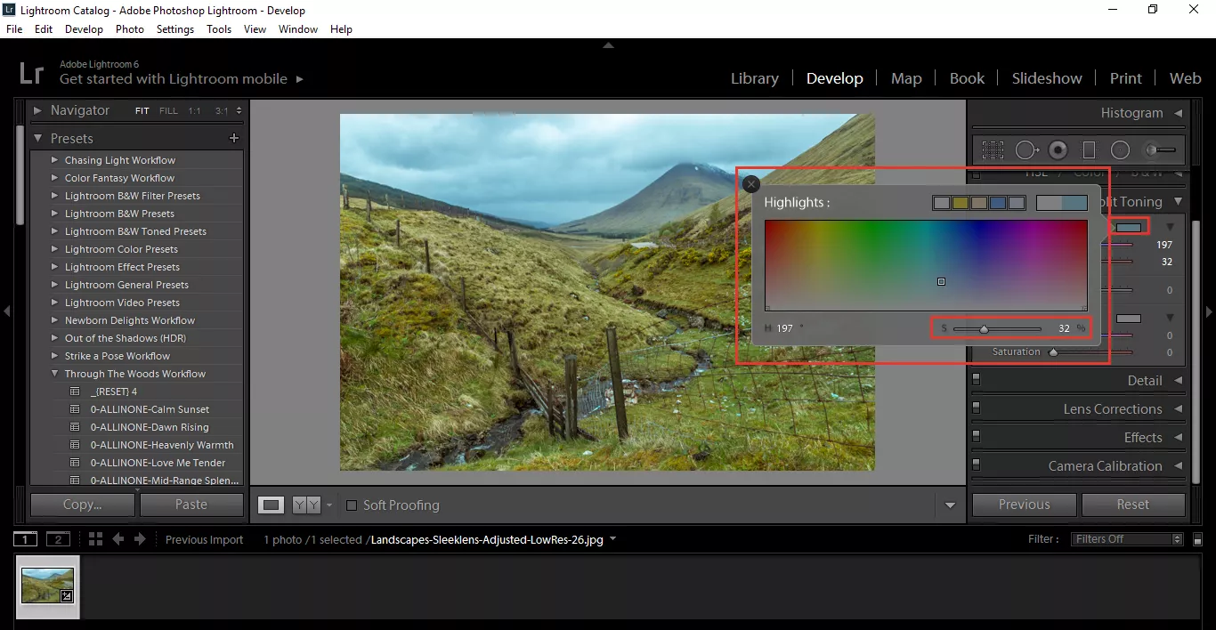
To the right of where it says shadows and highlights, you will see a rectangle. When you click on that, your color picker will pop up. That will allow you to directly select a color with the Eye Dropper tool from the color wheel, which will affect all the Highlights/Shadows in the image. At the bottom of that pop-up, you will see a saturation slider with ”S” and a percentage. That indicates your saturation (how grayed out color can become, or how strong the color can become). You can use that to get precise colors, or you can just hit the button and move around inside the pop-up. It is on the Lightroom split toning panel as well.
Do you love this section of ours, tell us in the comments
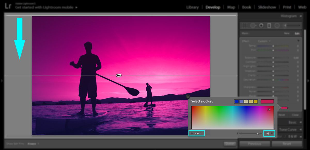
Shadows work in the exact same way. I’m going to use my Shadows to intensify the grass and Highlights to intensify the colors in the sky. Try to work a balance here so you don’t get too much of one colour—the balance slider will assist you with that. The cool thing about the Balance Slider is you can make your color image look more winter-like by cooling everything towards the blue side, or more summery by going the opposite way. Then, you can go to your Basic Panel and lighten or darken the photo with the Highlights and Shadows. I would also give the vibrance a small tweak to intensify the colors just a little more.
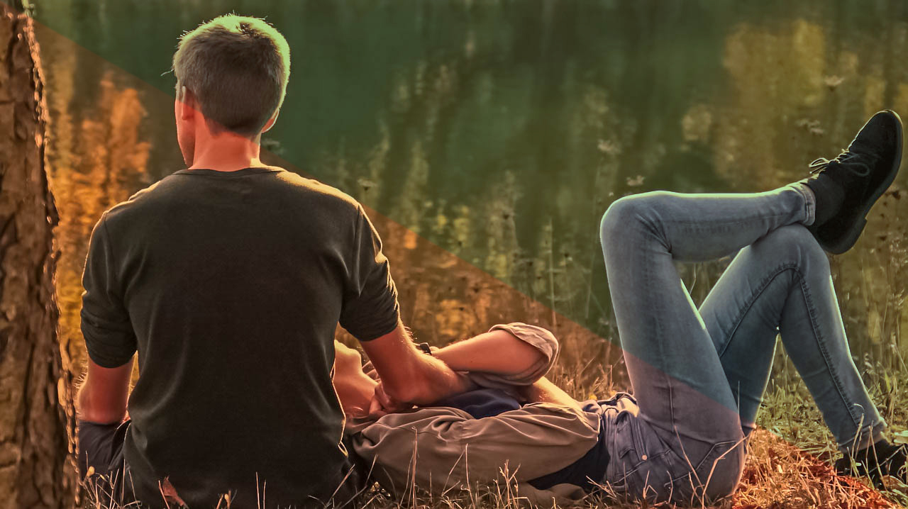
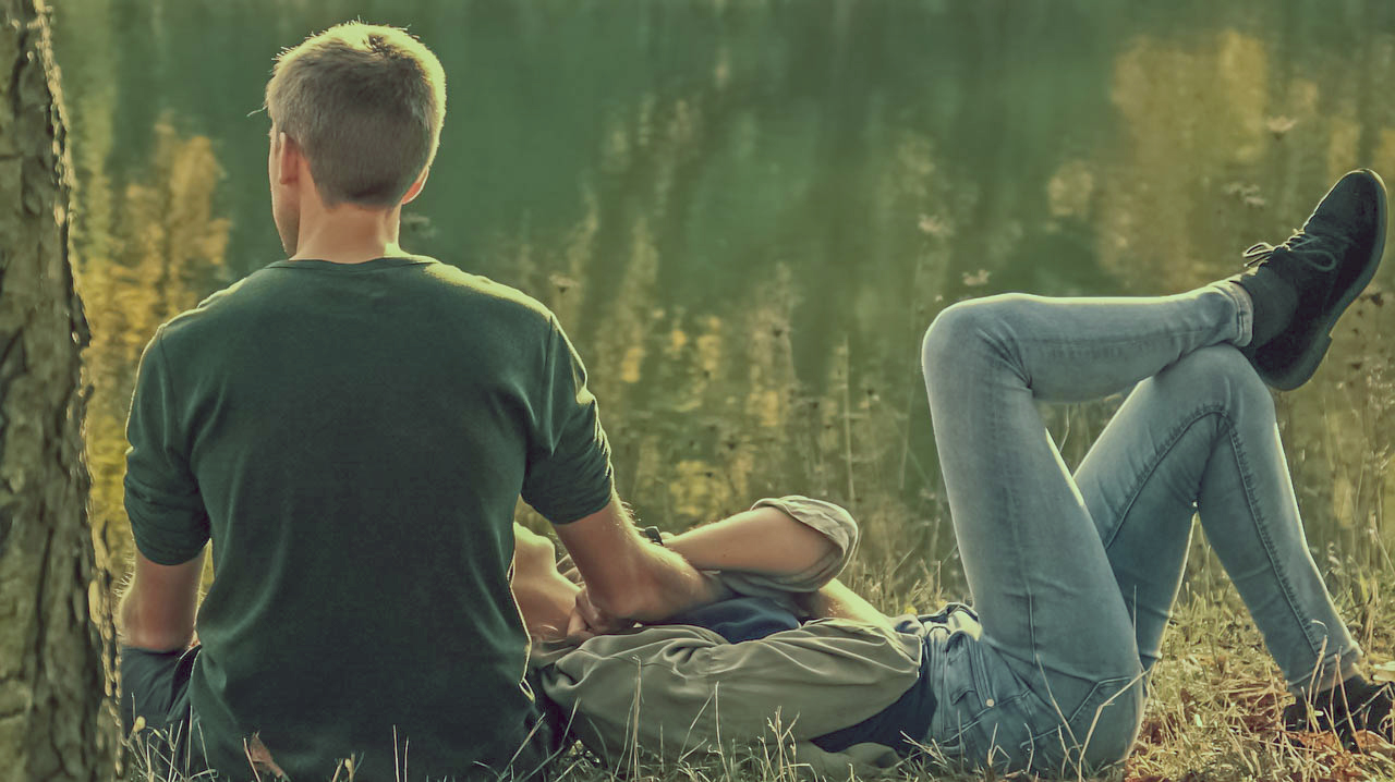
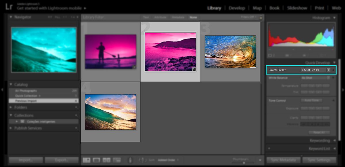
Have a look at the before and after of the color image and the difference that it has made.
Before. After.
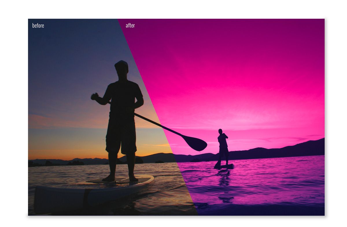
If you want to get great looking photos like these without having to go through this whole process, remember, we have lots of great presets that will do this in a split second. All the photographers reading our post, remember, imagination is key.
Split Toning in Photoshop
As photographers, we need to have trained eyes to capture the right moment, light, and composition in order to create a piece of art. An image that will express a certain look or mood, conveying the photographer’s message/idea or current mood. But the creative process of photography doesn’t always finish just with capturing the images, in fact, this is where it just begins.
As soon as photography was invented, photographers started to use various editing techniques as a way of extending the artistic merits of their craft. One such technique was the so-called “split tone.” In the analog days, this was achieved in a dark room. Luckily, nowadays, we don’t need a whole room filled with chemicals to emulate this effect—all we need is a PC, calibrated monitor, and Adobe Photoshop.
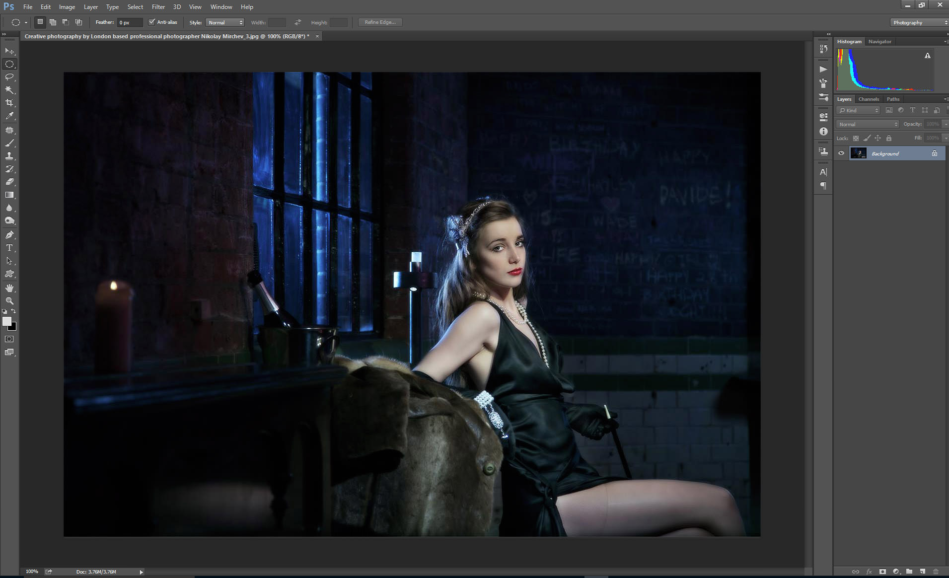
We’ve already shown you how to add a split tone effect to your photos using Adoble Lightroom. Now, let’s talk about how to achieve the same effect using Adobe Photoshop. In this example, we will be using an image of a flapper girl and give it a moody, sepia look.
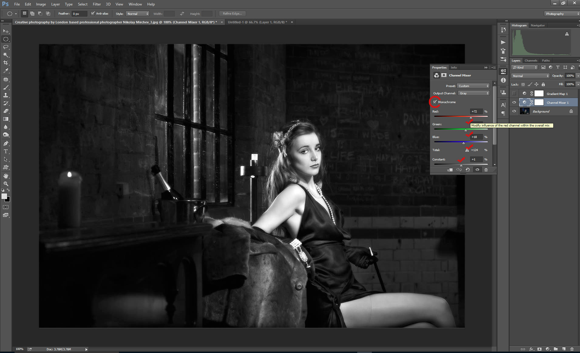
Convert to Gray Scale
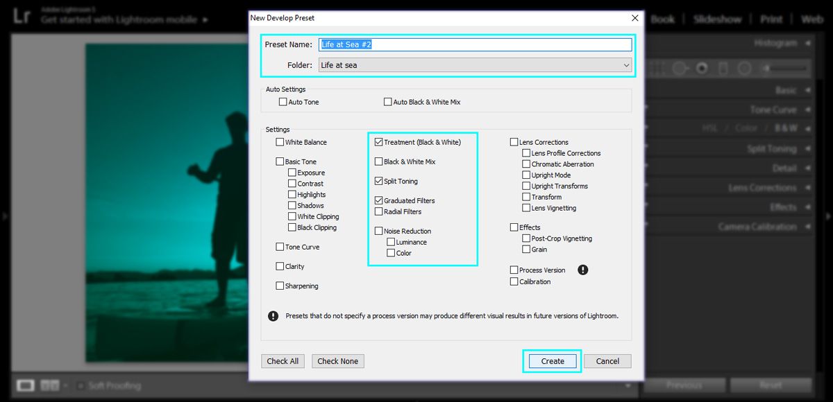
The very first thing we need to do to the image is to convert it to a gray scale. In this instance, I will use the “Channel Mixer” tool to quickly convert my image. In case you need to speed up this process, and you have the perfect formula for your B&W conversion, a good option will be is to use Photoshop Actions. On the example image bellow, I have marked, with red checks, the sliders I used in the process.
Open Gradient Editor
In the next step will be adding a Gradient Map Adjustment Layer. Once you have it open, in the properties box, click on the gradient strip in order to access Gradient Editor window. This is where all the magic will be happening.
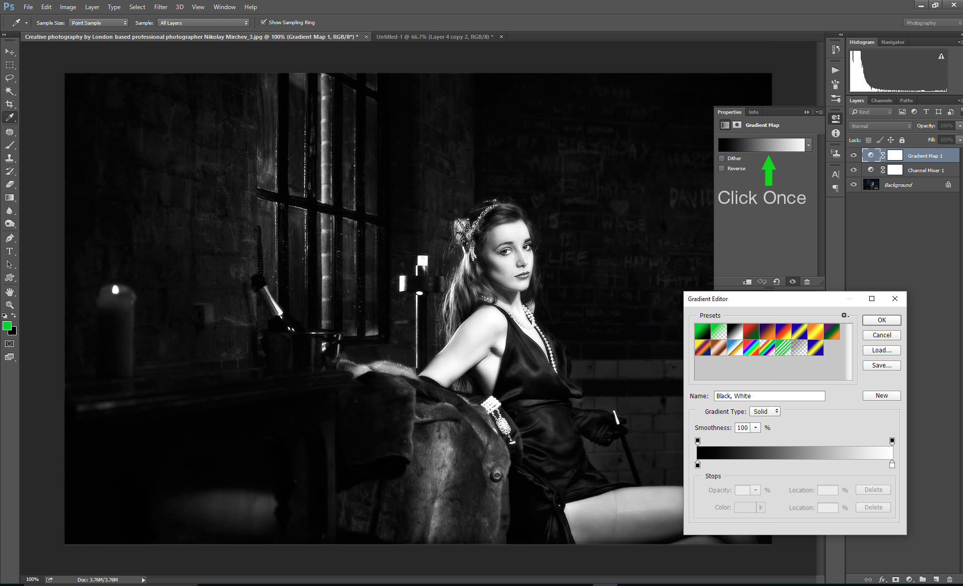
At this stage, our image is still B&W. You may get a different gradient preset by default. If this is the case, select b&w gradient. Now, you need to pick the colors for the shadows and highlights—as shown in the images below.
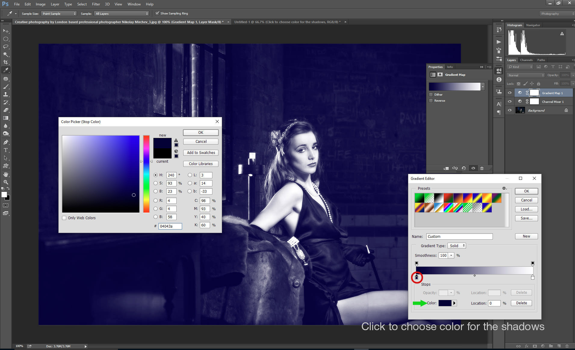
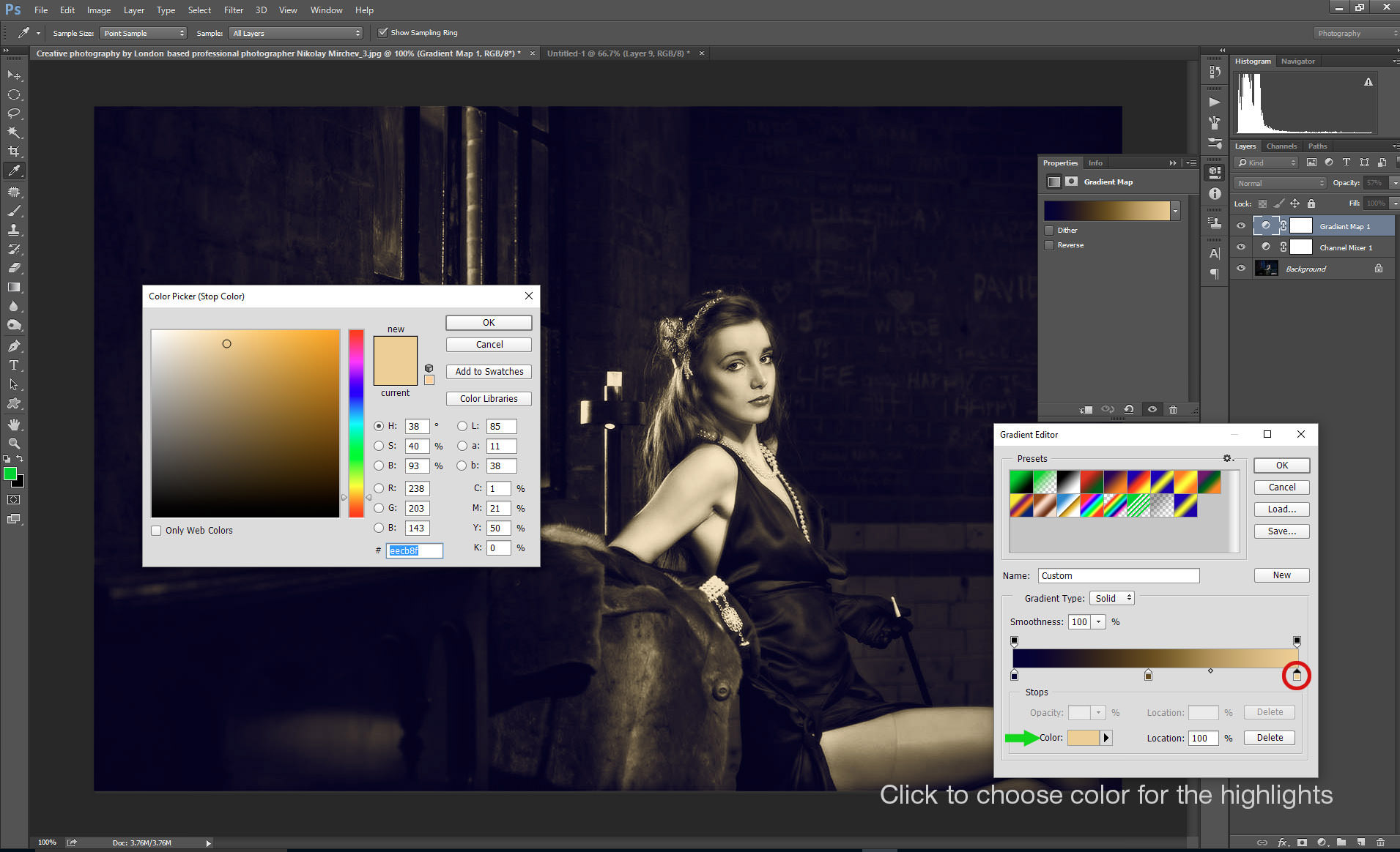
On the last image, you can see that I have also added a color variation to the midtones too. Another thing to notice (and it’s quite helpful to know), is the small dot on the slider. Moving it left or right helps you control the balance between the colors you have picked within the range. On the next image, you can see that as soon as I added midtones to the slider, it created two two dots. These control the balance in the range of the colors we’ve picked so far.

Now it is time to hit the Ok button, and you will get a result similar to the image below. The effect is quite strong, but for our purposes, it is a good example of how the image is split into different tones.
Now, all we need to do is reduce the opacity of the Gradient Map Layer, and voila—you now have a beautifully split toned image.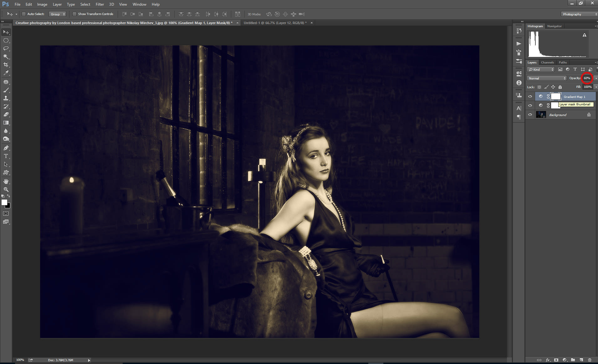
Color Toning in Photoshop Using the Levels Tool
Now, let’s take a look at color toning using the Levels Tool.
This technique can be applied to any image, including landscapes, portraits, etc.
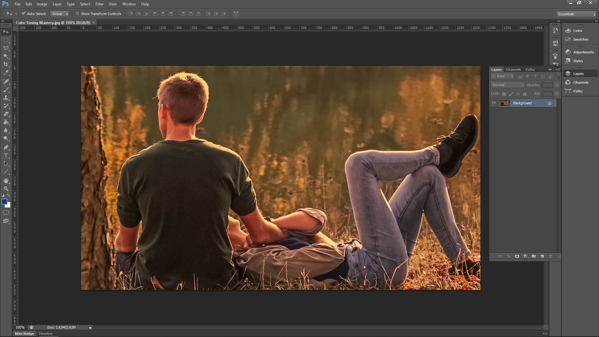
The image I’m using feels a little too red, in my opinion. I want to bring more of green out in the image, and perhaps add a little blue and yellow in there too.
Create Adjustment Layer
For this Photoshop tutorial, we’re going to be using an adjustment layer. This is a separate layer for the actual adjustment.
Adjustment layers let you go back at a later date and adjust the edit instead of going to ‘image – adjustments’ and working directly on the image.
Open Levels Panel
First, go to Layer-New Adjustment Layer – Levels

When you go through the ‘OK confirmation’ etc., you will now see the new layer on the right-hand side in the layers panel.
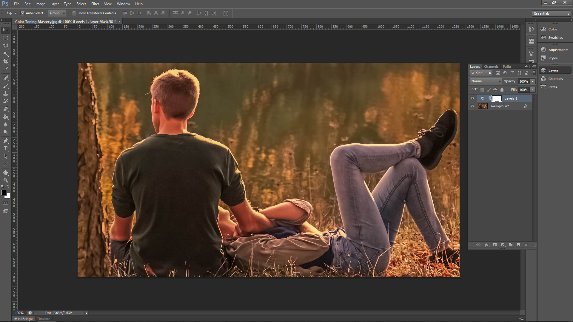
If at any time the actual levels panel disappears, double click on the black and white circle icon.
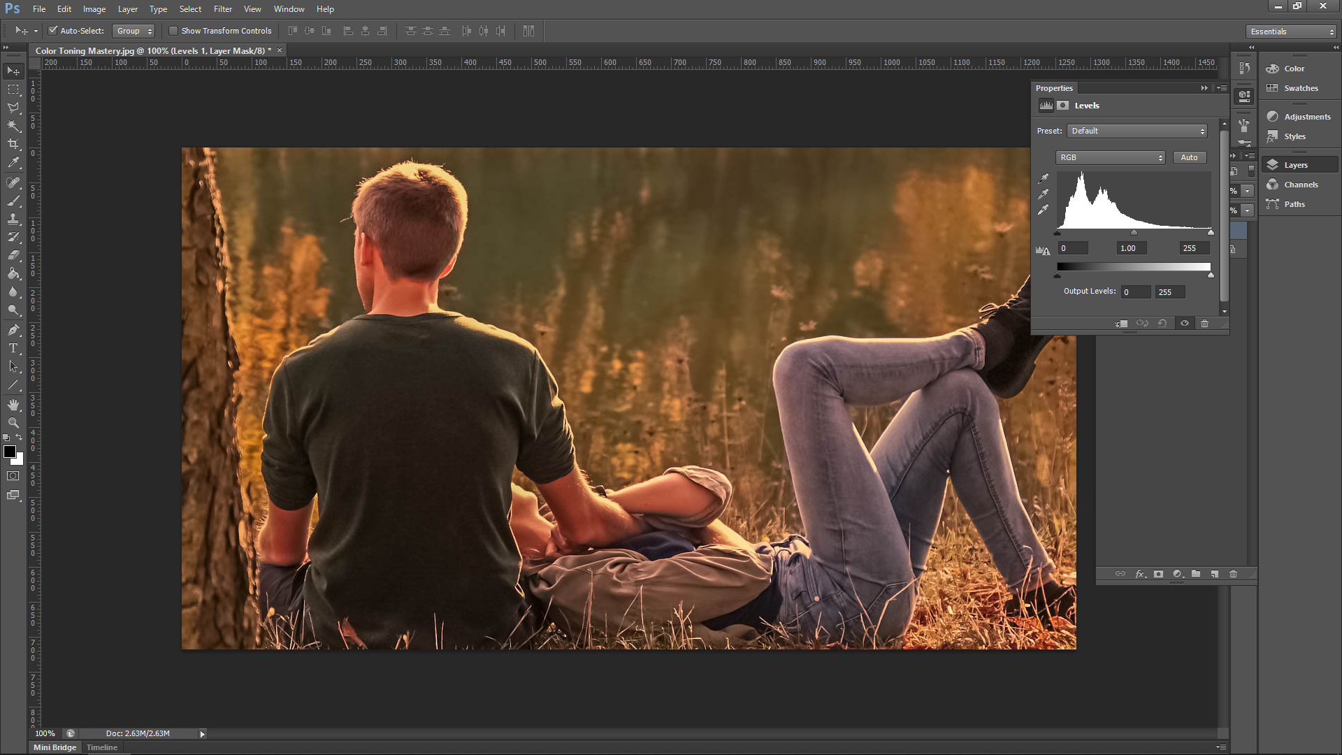
So just a quick brief on levels, in the first histogram you will see three sliders:
- Left = Darks
- Middle = Mid-tones
- Right = Lights
This time, when you slide the slider on the right towards the center it will make the darks areas of your photo lighter. Sliding the slider on the right-hand side towards the center will make the light areas darker. You can also use a combination of the two slider sections once you start to get a real feel for what they do. Take a minute and play around with the sliders to get a feel for what they do, and then slide them back into place when you’re done.
Adjust RBG Levels
Now let’s start color toning.
The way to do this is to use the channels option that’s available. Look for the ‘Auto’ button in the levels panel that we have open. Beside that, you will then see RGB. When you click on that you will then see the color channels.RGB stands for Red, Green, Blue. When you move the sliders in RGB, you adjust the colors individually.

Now, we are going to go through each channel and see what we can come up with. As stated, my goal here is to remove the reds and give the image a more green/blue tone. The way that I do this is by clicking on the red channel first.
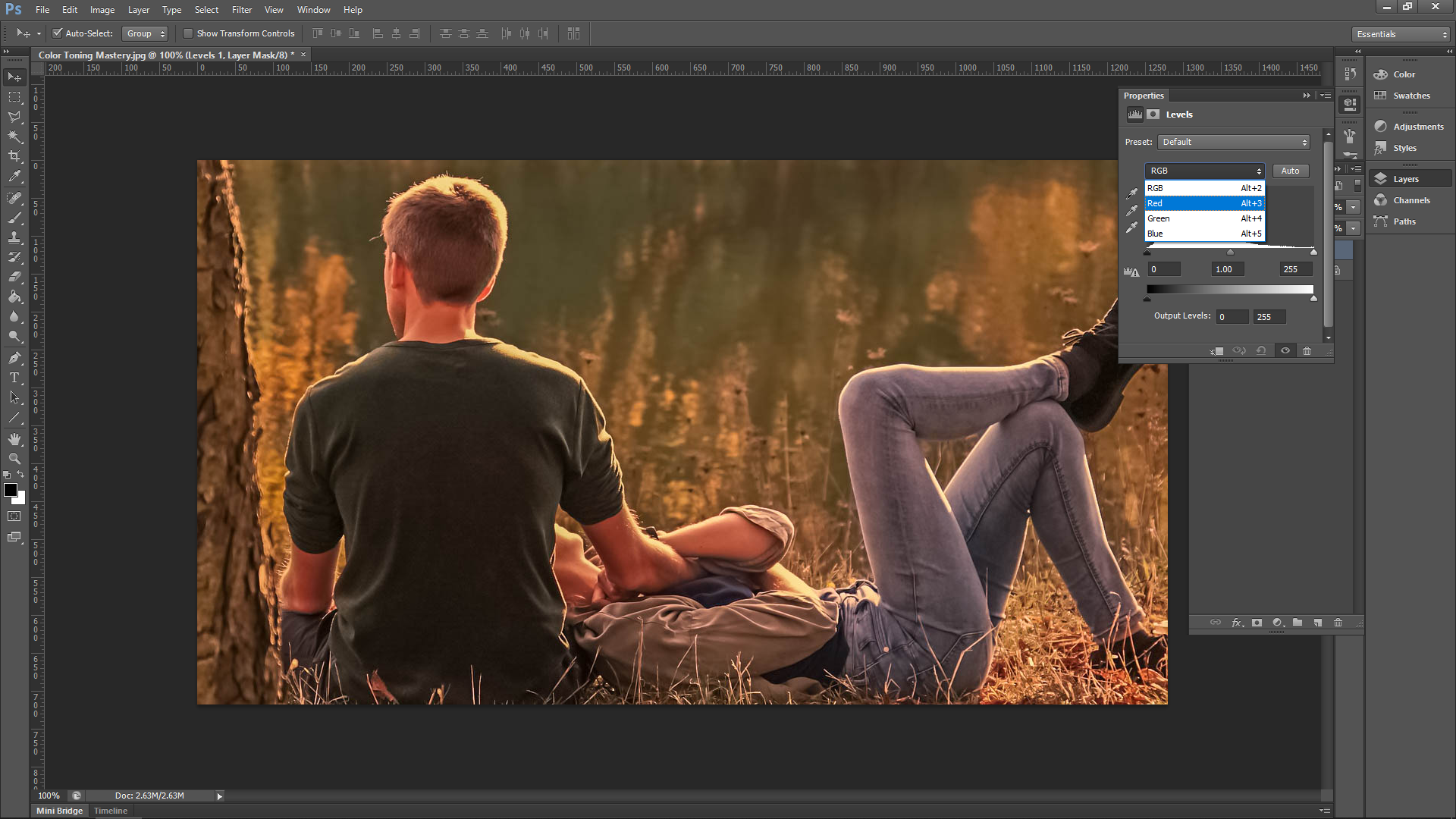
Now I will try the bottom sliders first to see what happens. When I slide the left-hand slider, you will see that it actually adds more reds to the image. Therefore, the opposite slider must do the opposite and instead of red, it will now add more green.
Now you see that the sliders to add the complementary color. If you look at a colour wheel, you will see that the complementary colors are:
- Red – Green
- Blue – Yellow
I’ll do my Red channel first to see what happens using the bottom sliders. I’m not going to bother with the Green channel, as it is the same as the red—though in saying that you can try the middle three sliders on that if you wish. Then, I’ll finish off with the Blue channel and see if I can add a little bit of Blue.
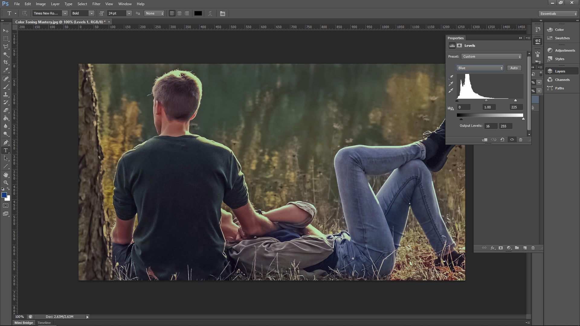
That is pretty much it. Just a very quick way to adjust Color Tone that takes a matter of seconds.
For the adjustments I don’t want to give you a set formula on the colors because the knowledge of the complementary colors should be enough. Instead, I would rather play around with your image until you reach a point where YOU are happy.Doing this over time will help you develop an eye for what looks good and what doesn’t, which is where we all want to be when learning photography.
Split Toning Adds Depth, Drama to Your Photography
All of the steps we cover above were very good exercise, which will help you understand how the tools work, which in turn, will help you become a better artist—one who is in control of the entire creative process. But there is one little trick I like to reveal…
As we all know, programs such as Adobe Photoshop or Adobe Lightroom are well packed with different sorts of presets, and it turns out that we offer a variety of toning Lightroom presets and Photoshop Actions to achieve the same effects with just a few clicks. These create a very balanced split toning effect, and can be a good starting point for your photo editing work.


 Facebook
 Google +