Back during the days when I worked in a darkroom to produce my black and white and color prints, I loved going to galleries to see other photographers’ work for inspiration. (With the Internet in full bloom in images, I’ve regrettably not seen a gallery show for years.) Part of the experience was examining the prints for clues as to how they (or someone they hired) transformed a simple film negative into a sometimes magical image hanging on the wall.
One such photographer was Ansel Adams. I remember one exhibit where some of his more famous photographs were older prints and then later seeing a show of the same shots but printed more recently. Something didn’t look right. They were different. More contrasty. The blacks, in particular, were so deep they lent an occasionally menacing feel to the scene. What happened?
Turns out ol’ Ansel simply changed his mind as to how he rendered his vision. While I found something jarring about his new attitude in many of his prints, I had to applaud him for rethinking his images, no matter how famous, and applying fresh emotions to them.
These days, it’s so easy to rework past photos, I think it’s almost mandatory to revisit one’s older work for fresh ways to approach the images. What might have been a product of so-so processing a few years can turn into sparkling examples of your best work today.
With that in mind, I believe there are three reasons to go back to old photos. Here they are.
A Change in Attitude
In moments of self-aggrandizement, I like to think that I’m evolving, getting better with age. As such, my slant on interpreting an image changes from time to time and I refuse to stick with one approach forever. How boring. This being the case, I think it’s always worth my time to go back through the archives and find pictures that could use a fresh coat of pixels.
How I handle my landscapes has definitely gone through stages of retooling. I used to think starting up a shot with contrast and saturation made it more noticeable in the overcrowded pantheon of landscape photographers. Now, I’ve mellowed a bit and prefer to suggest how it felt to be there, known as a sense of place. It’s less dramatic but more honest, I think.
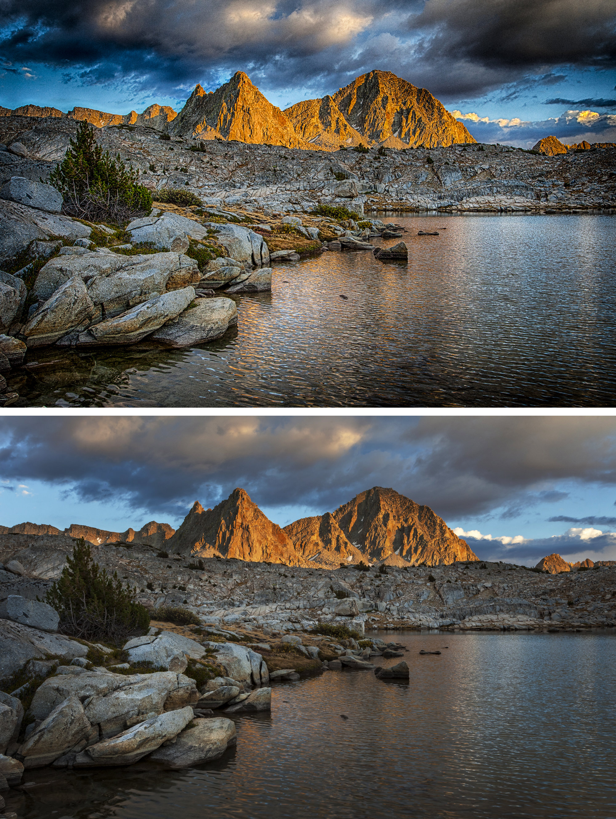
Take the above sunset shot from Dusy Basin in Kings Canyon National Park. It got a little crunchy when I first processed it eight years ago. So much so, it’s hard for me to look at it. The contrast and saturation take away from a sense of place. If I saw this for the first time, I couldn’t imagine what it was like to sit there as the sun went down.
So I went back to work and produced the version you see below the first. Ah, much better. It’s not that I put a lot of work into the revision (it takes longer to describe than do). I first took the four bracketed exposures I made the scene and ran them through Lightroom’s HDR menu. The nice thing about this software is how natural—even restrained—the results can be.
I then applied to the result a healthy amount of highlight adjustment to bring back the sky and shadow adjustment to bring out details primarily in the rocks and water. I then asked Lightroom for its opinion on the whites and blacks by holding the shift key while double-clicking on the words “Whites” and “Blacks.” This auto action adds contrast and counteracts the softening that opening the shadows usually produces. I then took the image to Perfect Effects 9, clicked on Dynamic Contrast (natural), lowered the result by 50% and then added Color Enhancer (fall enhancer) and again lowered it about 50% along with reducing the amount of orange. Lastly, I opened the file in Photoshop where I dodged the rocks a little bit, darkened the peaks and added a vignette to the bottom half.
I’m now happier with the photograph. It’s darker and softer, more like how it felt to sit there on a rock and watch the sunset.
A Change in Software
The Adobe alchemists are always introducing some new feature that I could have used a few years ago on a group of photographs. There are all sorts of examples here. I fell in love with Lightroom’s radius tool for its ability to shine a light, if you will, on an isolated part of the image. I went back through my catalog of canyoneering shots and re-processed innumerable pictures of canyoneering rappelling, a subject the radius tool seemed especially adept at improving. A more recent update is with Boundary Warp in the Photo Merge/Panorama menu.
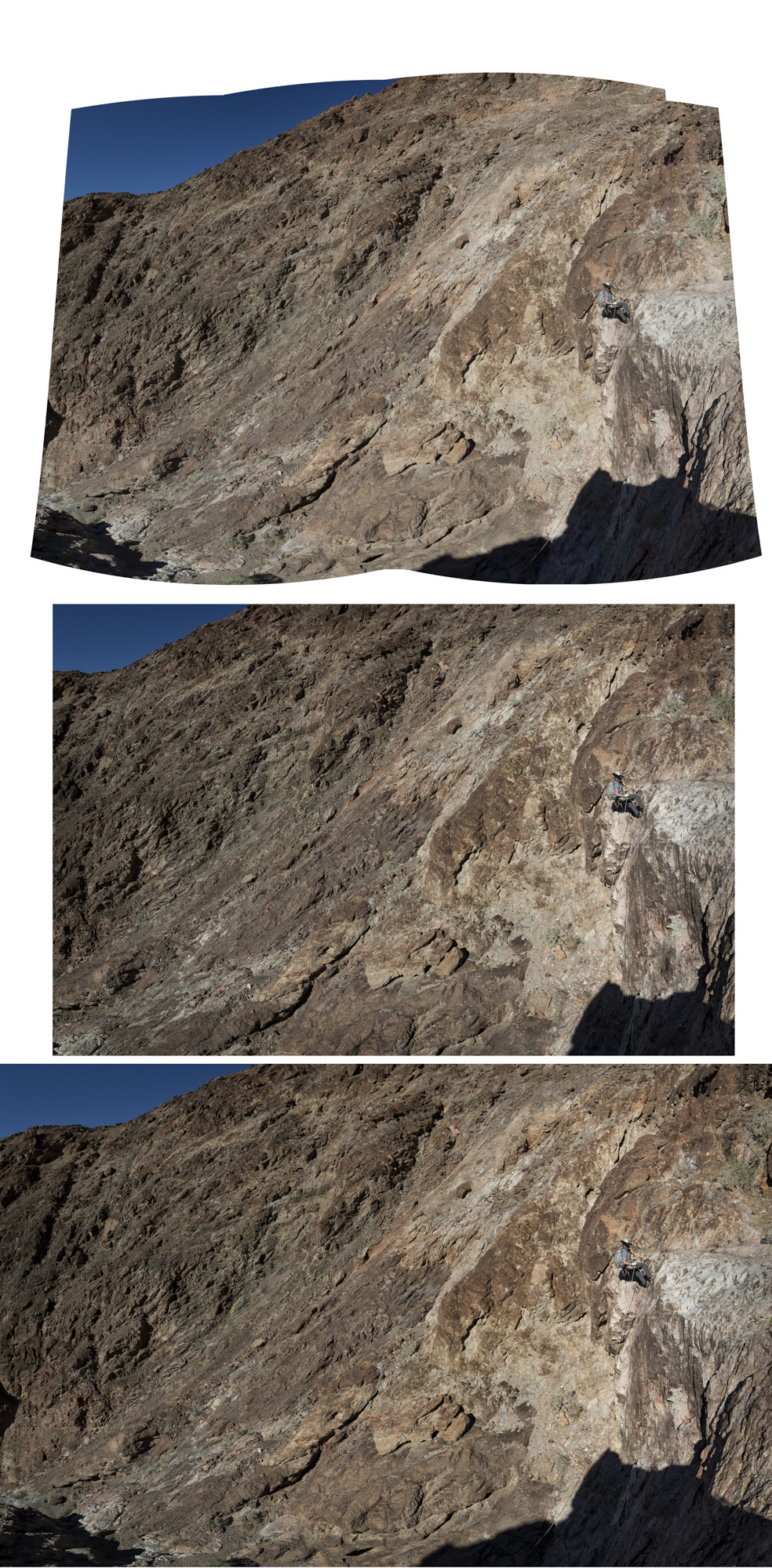
That’s where the above example comes in. I’m not the fussiest person when it comes to shooting panoramas and hence Lightroom’s stitching program once left me with bizarre distortions in order blend the individual components into one. But now there’s Boundary Warp and I’m able to hold on to far more of the image without cropping out the distortions.
As you can see in the first go-through without Boundary Warp, I had to severely crop to get rid of the dead spaces the stitching program left behind. In the second, using Boundary Warp which figures out how to fill in those places, I was able to retain more of the image that in my opinion preserves the original intention of the shot to show this pipsqueak of a woman in a huge canyon.
A Change in Skill
I offer as evidence how I’ve learned a thing or two since I started working with digital files the following example taken at Marie Lakes along the Pacific Crest Trail in the Sierra Mountains of California.
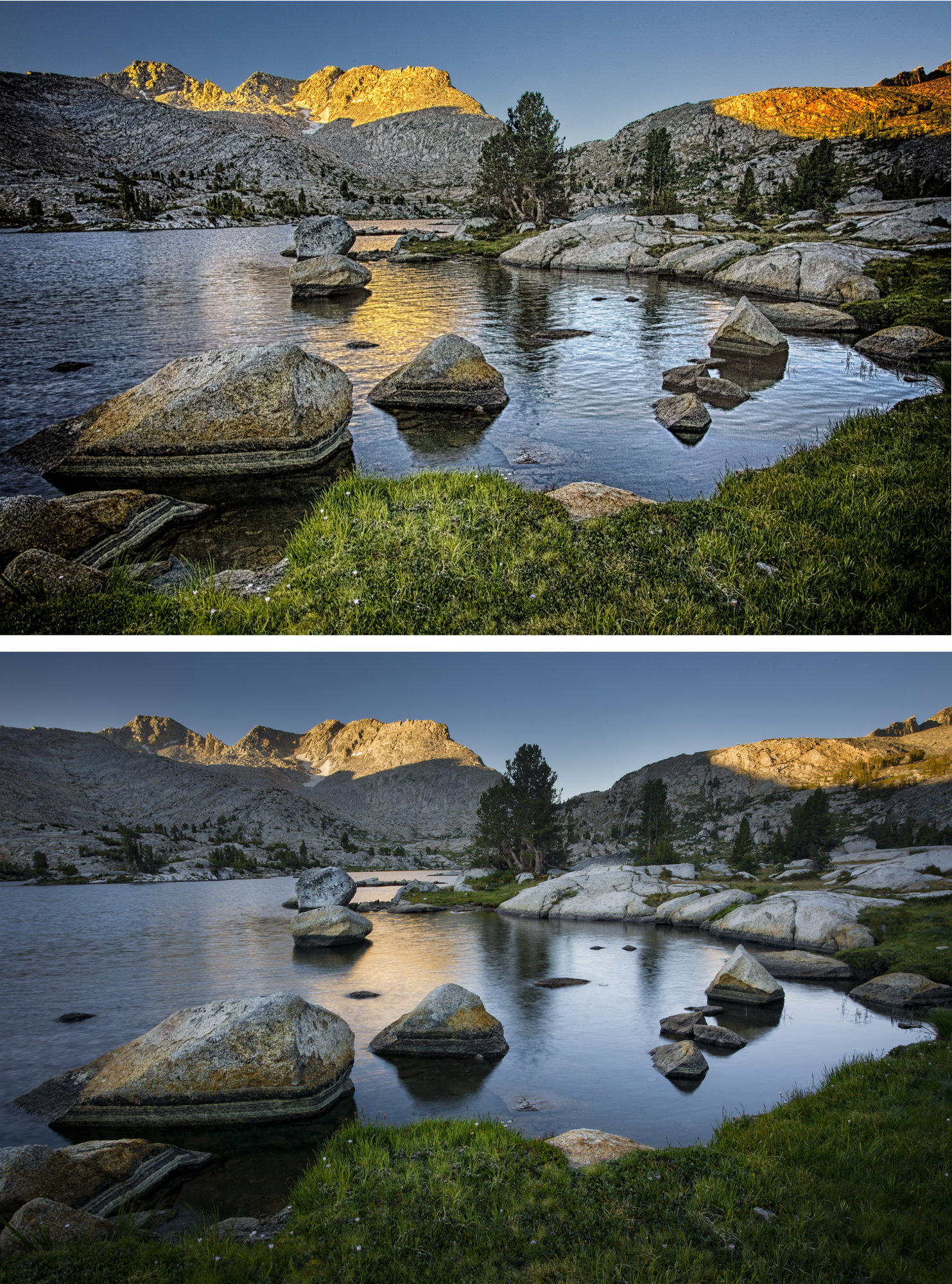
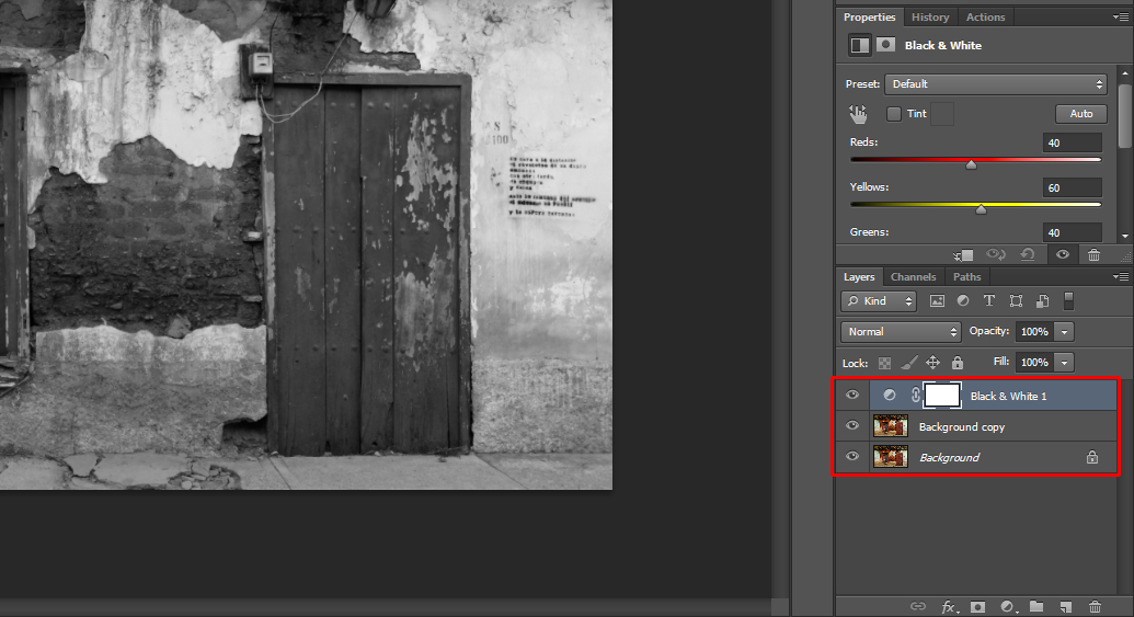
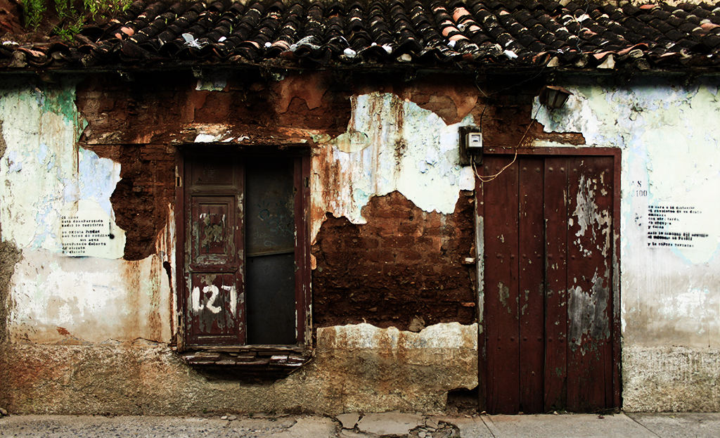
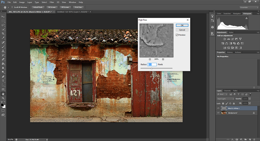
That first one is a pretty egregious execution of bad HDR. Hey, what did I know? But after a few years, I developed the ability to blend bright skies with darker foregrounds using Photoshop rather than an HDR program. I simply take, say, five bracketed exposures (usually with the camera on a tripod, but not always), and then back at the computer I choose the best exposure of the foreground and of the sky. After doing some minor adjustments to each in Lightroom, I select both, right click, go to the Edit In menu and select Open As Layers in Photoshop (at the very bottom of the list). Once in Photoshop, I move the shot with the properly exposed sky to the top of the layer stack. I next select both layers, go to Edit/Auto Align Layers and leave it at the default Auto. Once the layers are aligned, I alt/option-click on the Add Mask icon (this makes the mask black) at the bottom of the layers panel. I then take the lasso tool and draw a very loose selection around the sky on the top layer—really loose! With white as the foreground color, I press Backspace-Alt (Option on Mac).That creates a pretty ugly mask which you now have to soften in the Properties panel, cranking up the Mask feathering all the way up to 200. Most times this method works for me a lot better than HDR software (but not always—your pixels may vary).
This is what I did for my second processing attempt at this picture and it worked far better.
In a way, going back through old work and re-processing it can be fun and rewarding. Previously mediocre images can often be livened up simply because after a few years you know so much more about your craft and how to wield that Photoshop ax a little more gently.


 Facebook
 Google +