Photoshop is a great tool not only for photographers but also for graphic designers. Some of the available features are definitely thought for photography while some others are almost exclusively oriented to graphic design. There are, however, some tools that can be used for both purposes and displacement maps is definitely one of those.
So what are displacement maps? I have to say that, at least to me, the name is far from self-explanatory. Displacement maps are a way to combine two images in a way that one merges into the other in a natural-looking way. The difference with simple merging is that there will be a primary and a secondary image, and the secondary one will be modified in Photoshop Textures and/or point of view so that it is somehow ‘immersed’ in the primary one.
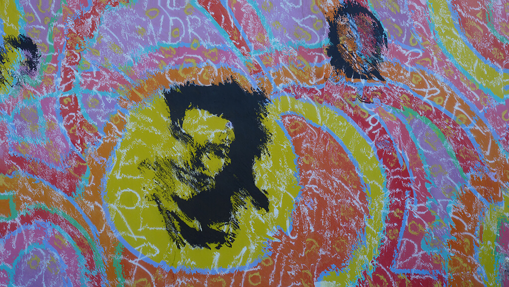
That sounds a bit confusing, I know. So let’s work with an example to make things clearer. Consider the following two images.
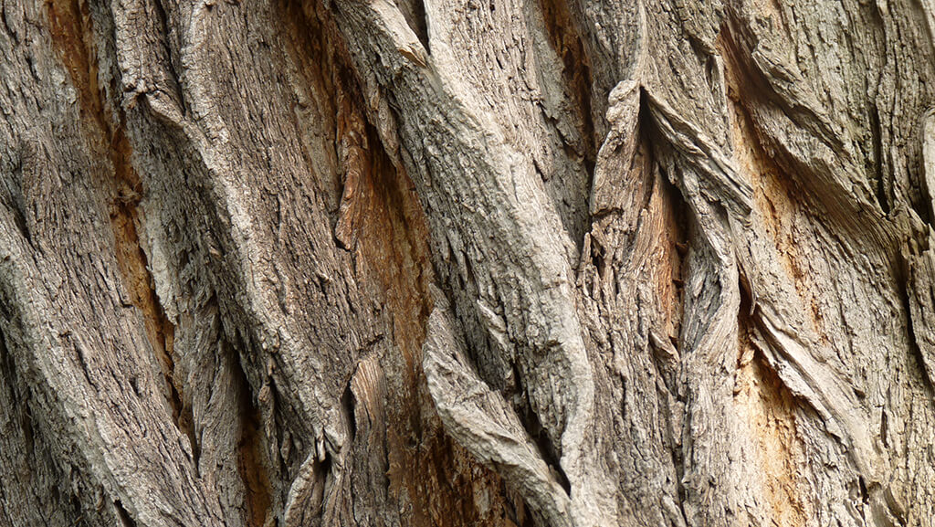
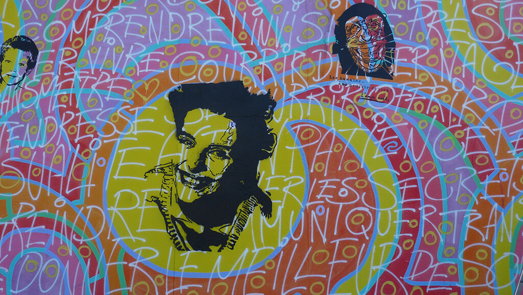
The first one is a texture of a tree and the second one a section of the Berlin Wall. So let’s say we want to make the painting look like if it was painted on the tree. There are two things that would change in the image if that was the case. The first one is that one would expect some level of transparency so that the structure of the tree would be visible. This can be achieved by playing with the available blending modes in Photoshop.
The second would be that the shapes withing the painting would be distorted due to the 3-dimensional nature of the tree surface. This is where displacement maps come into play.
In order to work with displacement maps you basically need three components: the two images that you want to combine and the displacement map itself. We have already seen the two images, so let’s take a look at the displacement map.
A displacement map is simply a high-contrast version of the image that will provide the texture. In other words, it is a high-contrast version of the bottom image, the tree in our case. What you have to do is basically open the image, convert it to black and white and increase the contrast a fair amount.
The reason for converting the image to black and white is that we want to work with the lighting contrast, not the color contrast. There are different ways to convert an image but since we are simply interested in getting rid of the colors without using any digital filter, simply going to ‘Image -> Adjustments -> Hue/Saturation…’ and reducing the saturation to a minimum will do the trick. As usual, before making any change either save your original image with a different name or duplicate your base layer (right-click on the name of the layer, usually ‘Background’ and click on ‘Duplicate Layer…’). This way you will avoid the mistake of replacing your original file and loosing it for good.
Now go to ‘Image -> Adjustments -> Brightness/Contrast…’ and increase the contrast until you are happy with the result. This is a subjective step, but in general I would say that you should increase the contrast until you start seeing some parts of the image to get clearly overexposed. For the image of the tree here, I increased it to 100. Bear in mind that for some images you might have to increase the contrast even further. If that is the case, simply repeat the process as many times as necessary.
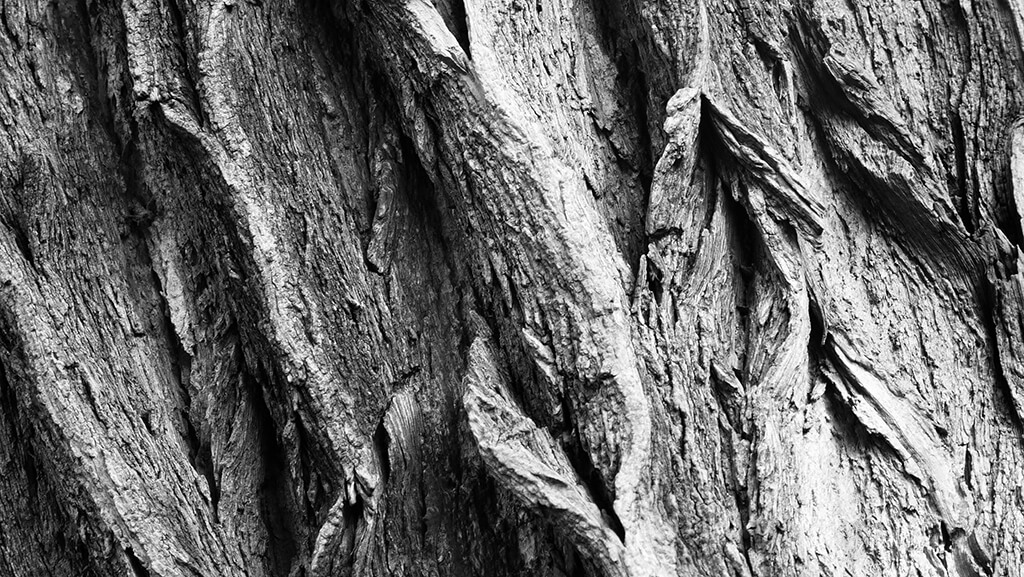
And that’s it. This will be our displacement map. The next step is to save the file with any name we want with a .PSD extension. Next, we go to our original image of the Berlin Wall and apply the displacement map to it. For this, go to ‘Filter -> Distort -> Displace…’ and a dialog like the one in the following image will appear.
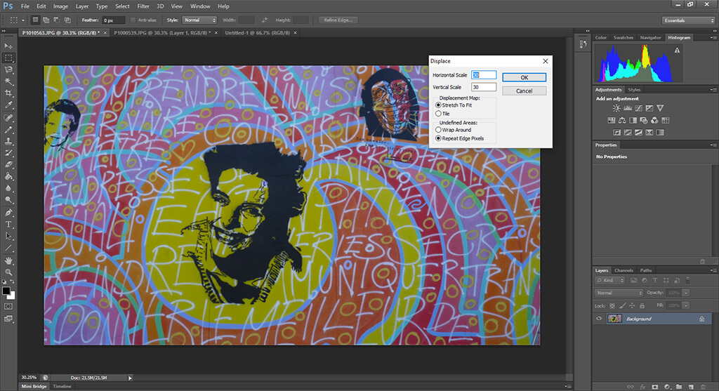
The scales are a factor by which the image will be distorted to match the displacement map and you usually want to keep them to relatively low values. You can of course experiment with these values and see the results you get. The next two options correspond to how the displacement will actually work and they are important when the image and the displacement maps are not the same size. In general, it is best to match the sizes before distorting the image, since the result is much smoother.
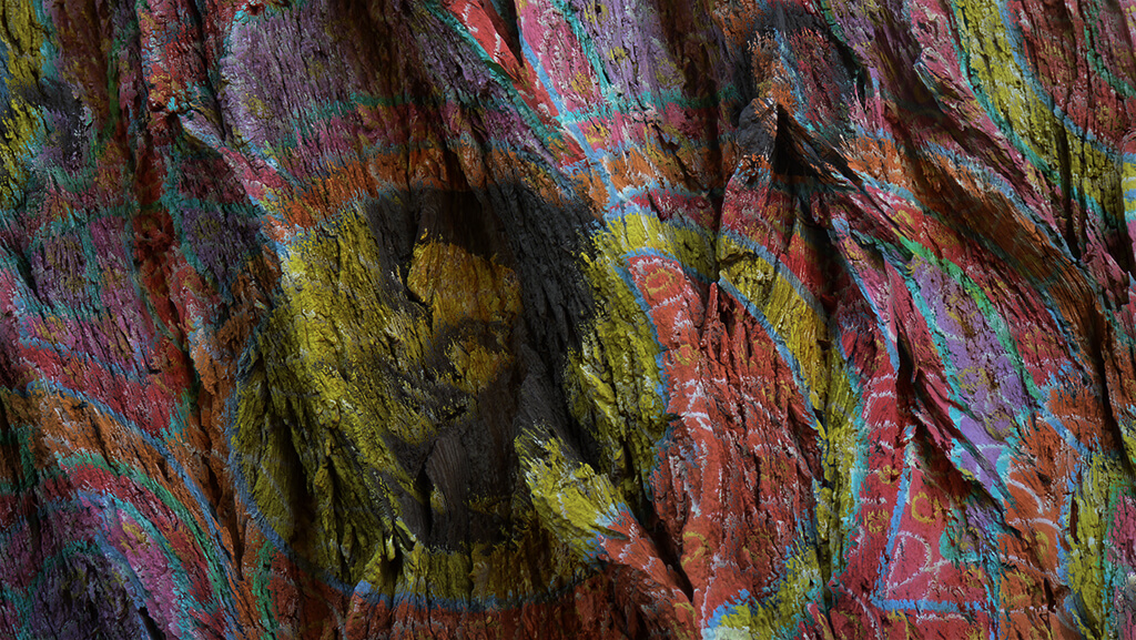
After you click ‘OK’, a dialog will appear asking you to select the file containing the displacement map. This is the one we already created before. After applying it, your image will look strange, like the one below.
While it might be a bit hard to see, the image already has the tree patterns somehow embedded. Now you have to select the whole image (Ctrl+A in Windows, Cmd+A in Mac), copy it (Ctrl+C in Windows or Cmd+C in Mac) and paste it (Ctrl+V in Windows and Cmd+V in Mac) on the original tree image in order to create a new layer on top of it.
Next, change the blending mode to ‘Multiply’ and you have your blended images that makes it look like if the painting was indeed created over the tree! You can adjust the opacity of the top layer as well as the contrast and saturation in order to get the result you want, but in general, as you can see, the whole process consists of just a couple of steps and the result is amazing.
Now go ahead and re-visit your images to find where you could apply this and give it a try. And, as usual, don’t hesitate to post any question in the comments.
How to master the content aware and patch tool in photoshop?

 Facebook
 Google +