How to Achieve Awesome Winter Scenes with Lightroomwww.sleeklens.com
Hi All,
As we are coming into that winter cold weather that many of us get around Christmas time, I thought I would go with a picture that suits the mood.
Today we’re going to turn our not so greatly exposed winter scene into an awesome one.
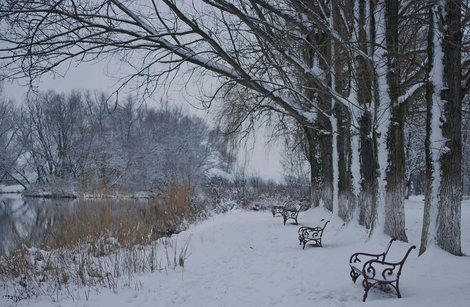
So, as you can see from this photo, I have dropped the exposure on it to simulate a photo taken on a dull day and not getting the exposure quite right.
The original photo was a gorgeous image from freebigpictures.com, so I’d like to give a shout out to them for the use of this photo. I’m going to try to recreate that or better using Lightroom. Maybe a guide to color management in Lightroom would help.
With winter scenes, you will find you will have challenges right off the bat with White Balance and Exposure.
The reason this happens is because of the amount of White reflecting light, causing you to end up with a very Grey tone to your image, looking very under Exposed.
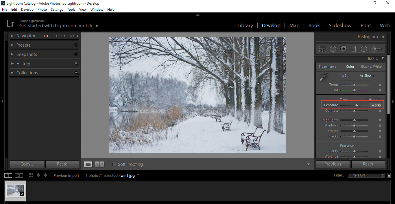
We’ll start with exposure first.
You will find that in the Develop Module – Basic.
If your shot is under exposed you will want to move the slider to the right. (Under Exposed images will appear dull)
If the image is over exposed, move your slider to the left. (Over Exposed images will appear very bright, so much so that you will lose details in objects with lighter colours such as white)
The Key to this is to make it bright, but not to the point where you start to lose details. Play with it back and forth, so your eyes become adjusted to the subtle changes and go with what you think is best.
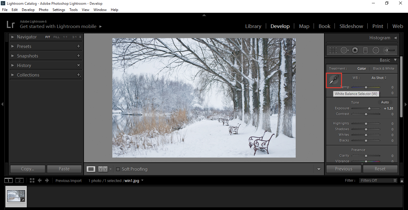
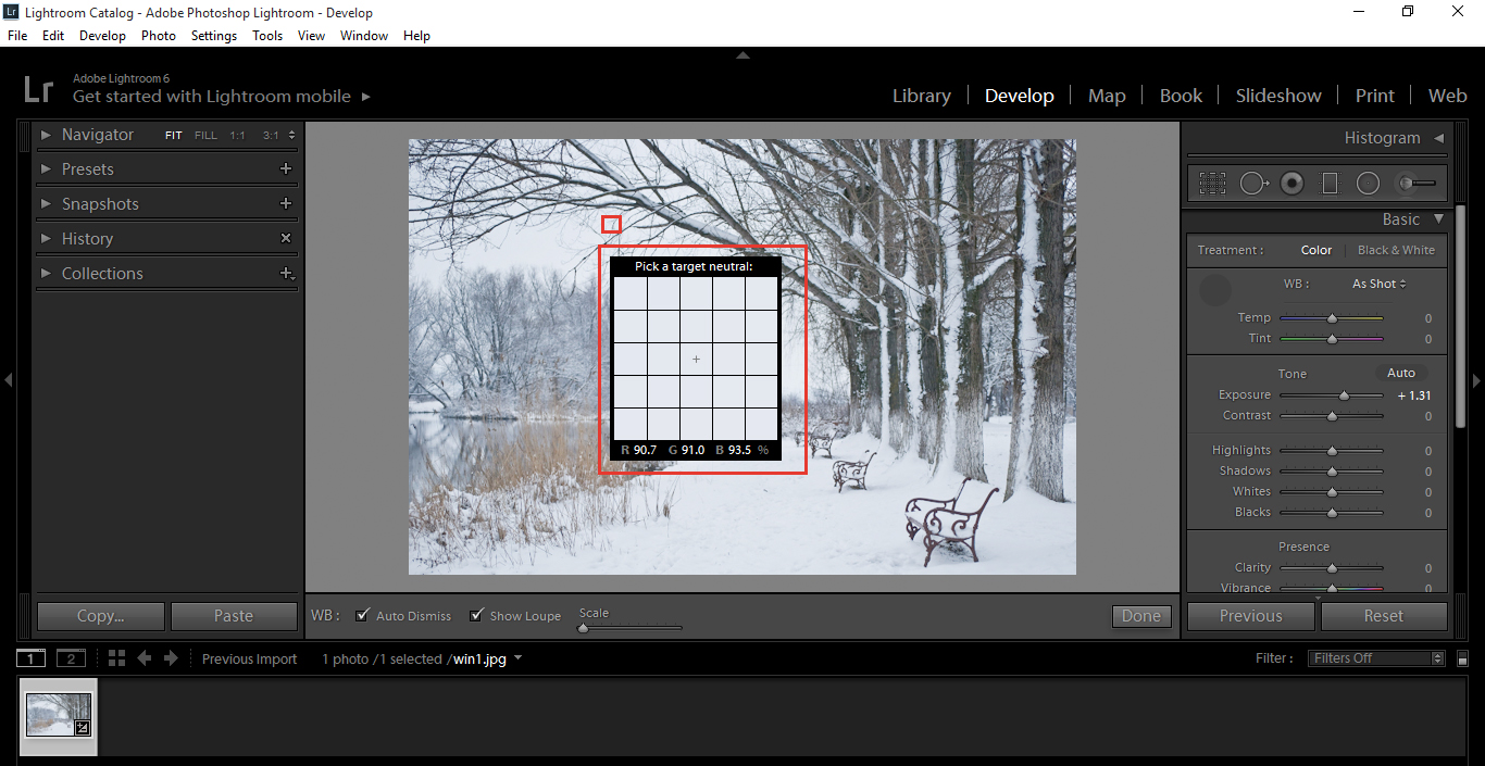
Click on the Eye Dropper shown below, or you can press (W) on your keyboard.
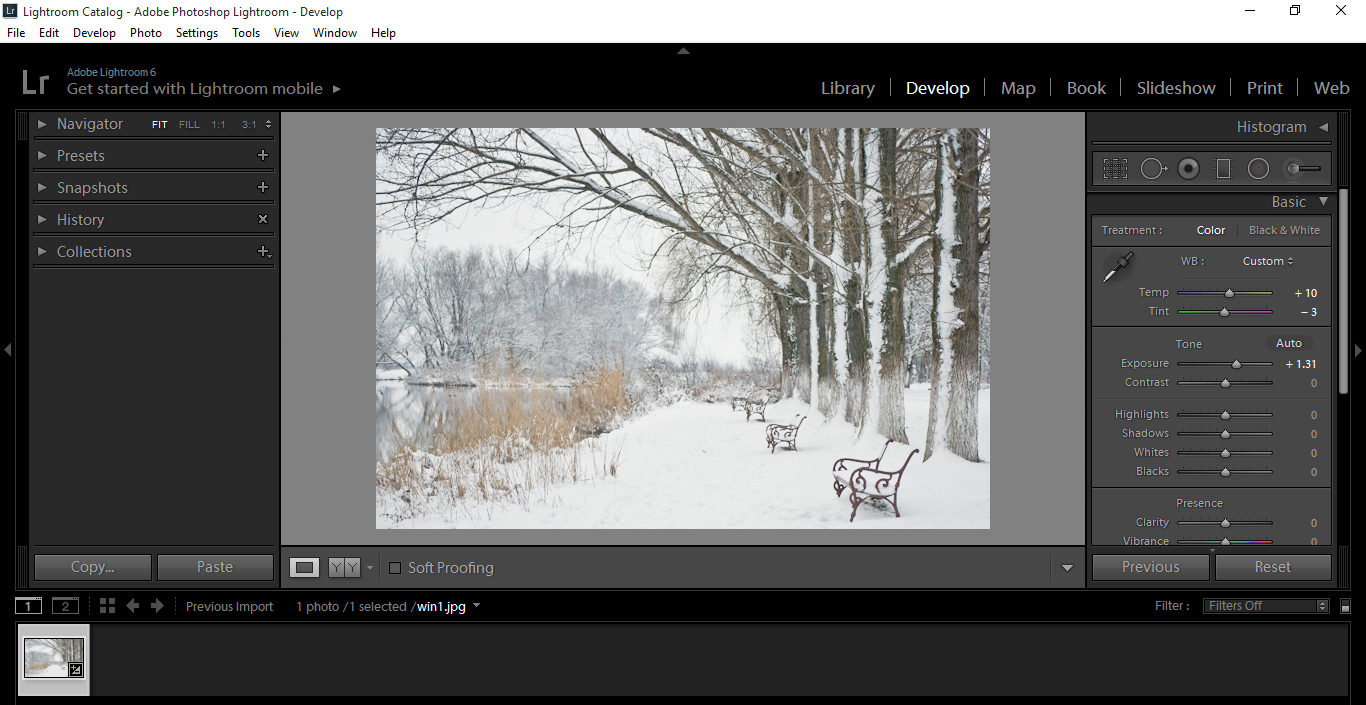
Move your cursor over to the sky and find and area that has some light gray and click on it. You will see a significantly warmer shift in the colour.
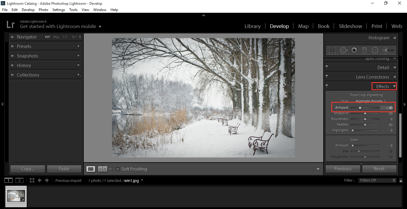
To improve this image further, take a deeper look into our Effects panel.
Go to Post Crop Vignetting and slide the amount just a little to the left until you are happy with the effect.
This will send the viewer’s focus more towards the center path and off into the vanishing point.
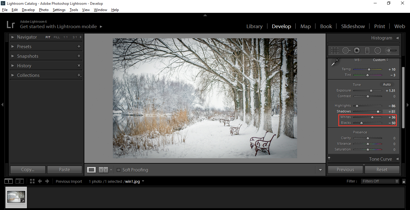
Now, click on your Basic Panel, where you were when you changed the Exposure.
Decrease your Highlights and increase your Shadows. You will have to use your own judgement with this, but that will be good training for your eye, so play around and find the right effect.
Then move to your Whites and Blacks just below the Highlights and Shadows.
Now with these, hold Alt and then slide. You will see with the whites, the Screen will turn black and with the blacks, the Screen will turn white.
Sounds complicated and maybe even confusing, but it really isn’t and after the first go, you’ll have it down.
So, for example, with the whites you will see a screen that has a lot of little pixels, once you move the slider to the right.
You want to adjust it to the point where it has a full black screen, right on the edge. That way you will have the perfect balance in your image.
You do the exact same thing for the blacks, but you are allowed a little bit more margin for error with that.
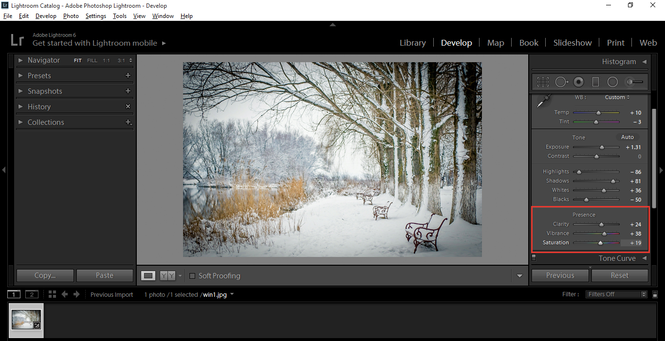
In the same panel at the bottom, below where you just worked to add a bit more life to your image you can adjust the clarity, vibrance and saturation until you are happy with the levels, don’t go too crazy with these, a rule of thumb I would use is, I’d think does that look like real life? if the colours are too strong then reduce.
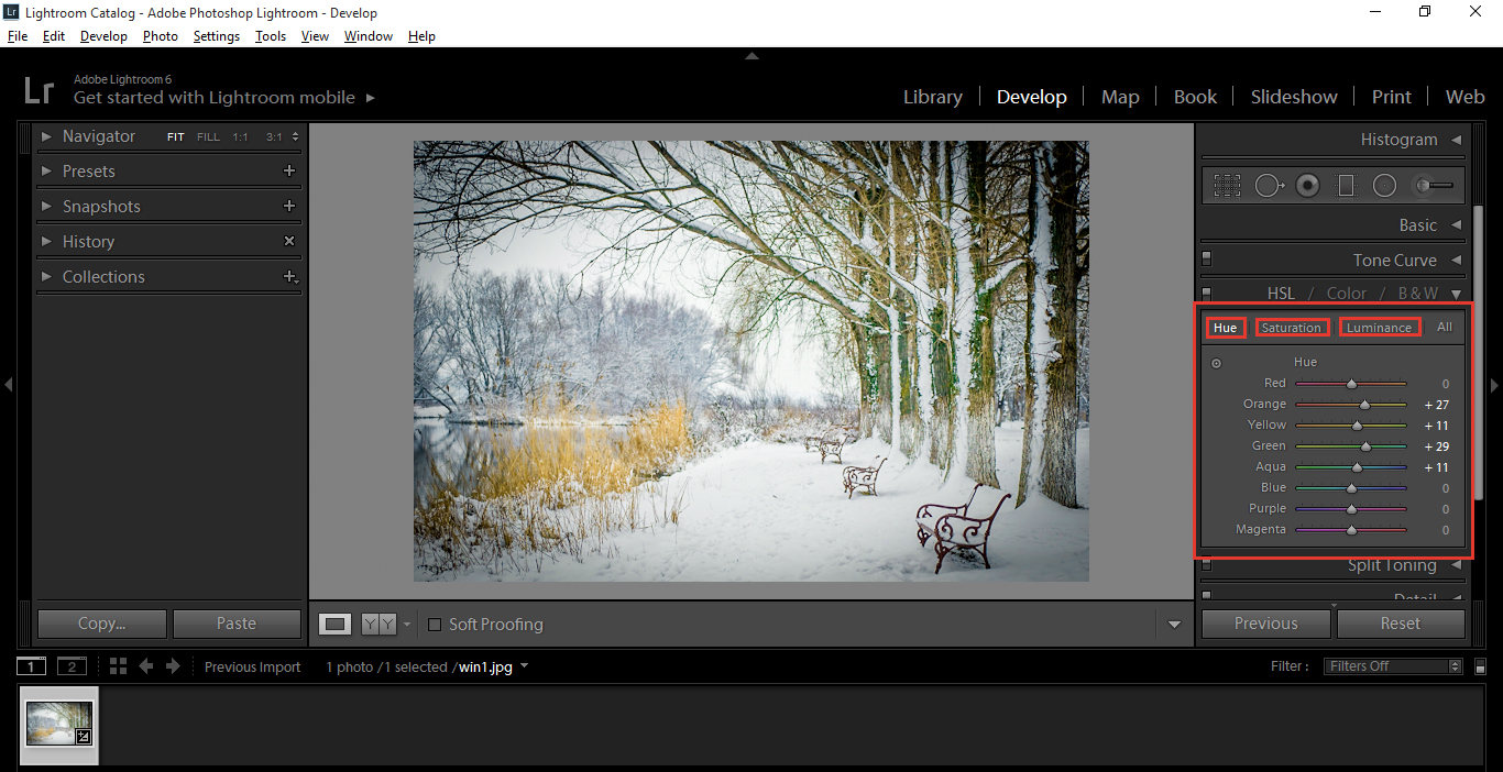
Last but not least, click on your HSL Panel.
Increase Orange, Green and Yellow, as this will strengthen the colour in the Trees and Foliage. As an experiment you can also check out the other sliders to see if they make any positive changes also.
There are three options to pick from, Hue, Saturation and Luminance.
I did basically the same adjustments with all three, but you may not have to. Saturation may do the trick by it’s self, but no harm giving it a try.
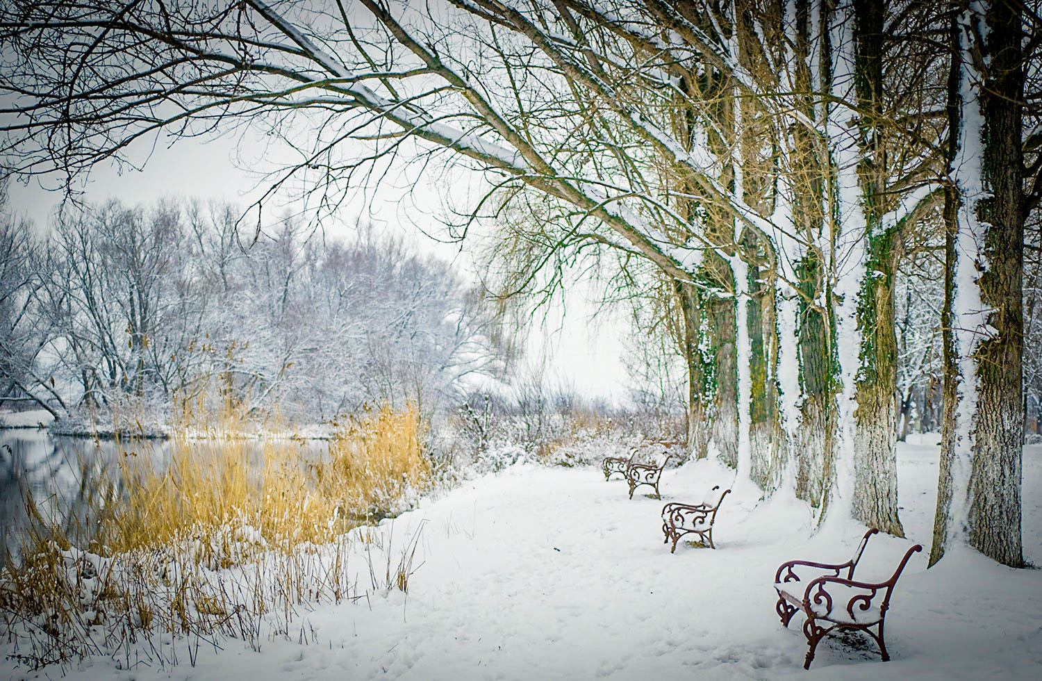
And that’s it, by now you should have an image that has been massively changed from the one you started with. I hope you got something out of this, to help with your Winter shots.:)
But, what if you think that these adjustments are not enough to bring out the best of your images; is there another way to speed up this whole process? Fortunately for us, yes. With the help of Lightroom Presets and Brushes, read here. We can enhance our postproduction workflow by over 200%.
Imagine you want to capture a blizzard for your winter scene, but you have one of the following problems:
Your camera is not weather sealed
You don’t have as much skill as you wished you have
You can’t get out of your house in the middle of a snowstorm
Lightroom can make our daily job as photographers an easier task, while having fun in the process. If you’ve ever heard of Photoshop overlays, those are layers with special effects applied on them to enhance your photographs by adding elements that didn’t take part in the original scene. Most commonly, overlays are the ones labeled as “season overlays”, and could be a snow/rain/tone-tint overlay – Lightroom has its own way of creating these overlays, which can be managed with a combination of presets and brushes.
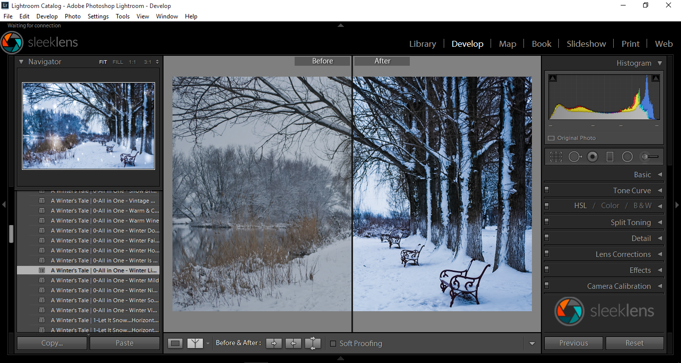
Our latest bundle “A Winter’s Tale” has everything you could ever dream of and more for enhancing winter photography. Do you want to post produce a winter photograph in only a few steps? No problem, you can manage it in a one-click fashion with “A Winter’s Tale” Workflow and its wide variety of presets.
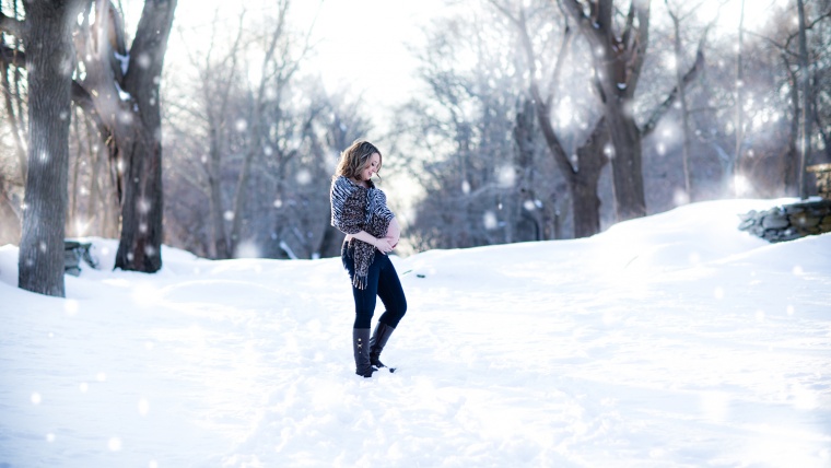
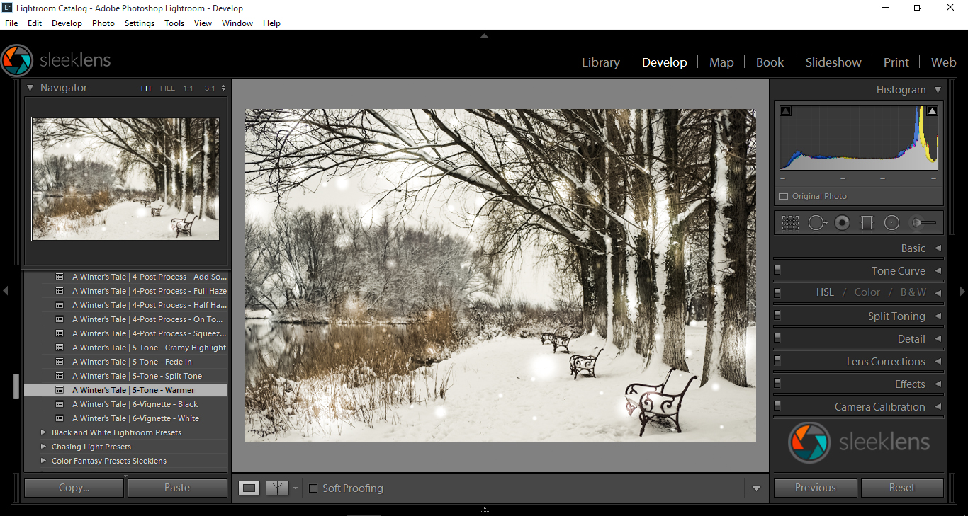
The ‘Let it snow’ presets are able to create amazing effects such as this snow blizzard, that truly looks like it was of the real shot.
Or you can work your way through the stackable presets available in this bundle, While combining them with a variety of 27 brushes for applying local adjustments to your presets.
Hope you found this guide to be useful and see you next time! To know more about lightroom, tick this. You may also be interested in color management, see and know about it here.
Graduated from college in 2002 with a degree in Art & Design, I started exploring my way in Graphic Design and Professional Post Production. Full-time freelancer since 2011.


 Facebook
 Google +
Comments (0)
There are no comments yet.