How to work with Forgotten Postcards: Vintage Effects in Lightroomwww.sleeklens.com
Hello, today we have a tutorial on applying vintage effects with our “Forgotten Postcards” workflow. This is a really great workflow since that vintage aesthetic is really popular right now, which “Forgotten Postcards” is great for, with all of the tools to add rich tints and hazy atmospheres to your photographs.
I have my photo pulled up, so let’s get right into it!
We will start with one of the “Forgotten Postcards” Vintage presets, Scroll down and we will go with Matte Autumn. Once applied, this preset doesn’t only darken the photo, but also adds a bit of a brown tone to it.
The next thing that we’ll do is polish this up a little by applying the Polish – Sharpen preset.
Then, we are going to stack a Base preset on top, let’s go with Base – What Dreams May Come to add a little more light.
Now that we have applied three preset to this photo, it has already made a big difference. Now it’s time to move over to our “Forgotten Postcards” brushes.
With the brushes open, scroll down and the first brush that we are going to use will be the Face – Sharpen Face brush. Although I want this photograph to have a hazy look, I don’t necessarily want that on the subject’s face. So, we will turn the Clarity up and apply this brush to her face to help keep her in focus.
Click New to start a fresh brush, then the next one that we are going to use is the Light – Brighten brush. Similar to what we did with the Sharpen brush, we will apply this brush to our subject, turning up the Exposure as we go. I will tweak this brush just a bit more by turning the Highlights down and the Contrast up a little.
A lot of times when applying this kind of vintage look to a photograph by using warm, rich tones, the eyes can often get washed out. So, the next thing that we’re going to do is basically color the eyes back in to make them a little less muted. Let’s go into our brushes and scroll down to the Color – Aqua brush. Before we apply this brush, let’s make the brush smaller and adjust the color a little, moving the blue down to a less bright tone. Then, just run the brush around the iris of each eye.
Once I have colored her eyes, I will turn the Saturation, Exposure and Contrast up a bit, adding more light and contrast.
We took a nice photograph and wanted to give it an old school, vintage look, so we have added a hazy atmosphere and a rich, warm tone to it. But, we kept the detail of the subject and the color in her eyes.
Let’s move along to our next photograph.
In this next photo, I am going to start with one of the “Forgotten Postcards” Base presets. Scrolling down through those, we will go with Base – Auto Tone to add more light to the photograph.
Another common effect that you will see with vintage photos is a matte effect, so for this one we will scroll down to the Matte presets and apply Vintage – Matte Watermelon, which has added a warmer tone to the photo.
Now we will move over to our “Forgotten Postcards” brushes. Let’s open them up and select the Light – Brighten brush. I am going to turn up the Exposure and Contrast, then apply this brush over the girl in the picture, since she is the subject, we want to add more light and pull her out a little.
We will click New and start a fresh brush.
Now we are going to go back into our brushes and select the Color – Mustard brush. This brush has a really nice yellow color, adding a nice tone to your photograph. Turning the Exposure down, we will run this brush all around the edges, adding a richer tone to the scene.
As we look at the before and after of this photograph, you’ll see that we started with a nicely exposed photograph. Then, we added a matte effect and a hazy atmosphere surrounding the subject. We also added a warmer, richer tone with that mustard colored brush. Finally, we added a bunch of light to the subject to bring the focus in on her.
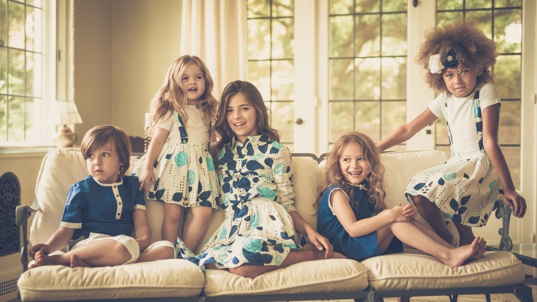
Now, on to our third photograph. This clean and modern looking photo is kind of a less conventional photograph to give a vintage look to, but we are going to do it anyway, since I think it will work out nicely.
To get started we are going to apply the All in One – Yesteryear preset, which will add a matte effect with muted colors. The one thing that happens when applying this preset is the Clarity get raised way up, but we can tweak that by just going into the Basic tab and turning it back down some.
Now we are going to go down to the Nostalgic effects, for this we will go with the Nostalgic Effect – Vintage 1preset, which will brighten the photograph while adding a rich, warm tone.
I am going to tweak this a little by turning the Highlights down, as some of the highlights were kind of blown out and really bright around the windows and curtains in the background.
Even though we are going for the effect of muted colors, I do want to bring some of the blue back into the photograph because the blue details in the clothing will work really nicely.
So for that, we will go into the Color tab and under Saturation, we will turn the Blue and Aqua up a bit. Once turned up, it brings a lot of that color back to the clothing.
The last thing that we will do is add a vignette to this photograph which is traditionally seen in old or vintage photography. Going back to our “Forgotten Postcards” presets, let’s scroll down and select Vignette – Subtle Black which will add a subtly darker toned border around the outer edges.
Hope this guide helps you out and don’t forget to check our videoguides on how to edit photographs with “Forgotten Postcards Workflow” – you can ace vintage effects in only a couple of minutes!
Pia Lopez is a self-taught photographer, graphic designer and ArchViz artist. As Content Director of Sleeklens.com, her work is driven by her two biggest passions: technology and art.


 Facebook
 Google +
Comments (0)
There are no comments yet.