Tag: tips

Five Editing Mistakes Beginning Photographers Make

When you’re first starting out in photography, it’s easy to fall victim to a few common mistakes. When I look back at my work from seven years ago, it’s apparent to me (and probably any other photographer) that I fell into many of the same traps as a lot of other beginners. Things that draw attention to your subject don’t necessarily improve the photo–they can simply be distracting.

In this list below we’re going to get in touch with the five most common mistakes beginners tend to make during their journey towards becoming professional photographers:

Heavy Vignetting

2_vinette-1

Exaggerated vignettes are a tell-tale sign of an amateur photographer. Beginners like them because they draw attention to the center of the frame where they are most likely to compose their focus. What they’re effectively doing, though, is underexposing the sides of the image and detracting from their talent. A good photographer ought to use the whole shot, utilizing natural elements to frame the subject. Amateur photographers also like to use vignettes in an attempt to add some drama to the photo. Luckily, there are natural ways to do this–mastering the sun flare technique can really enhance an otherwise lifeless image.

Overusing Presets

3_Going over the top with presets-1

It’s easy to go overboard with presets. Overuse can make a photo look unnatural and unflattering. If you suspect you’ve done too much, you’re probably right. Keep it simple. Instead of over-editing the entire photo, use local adjustments to accentuate specific areas.

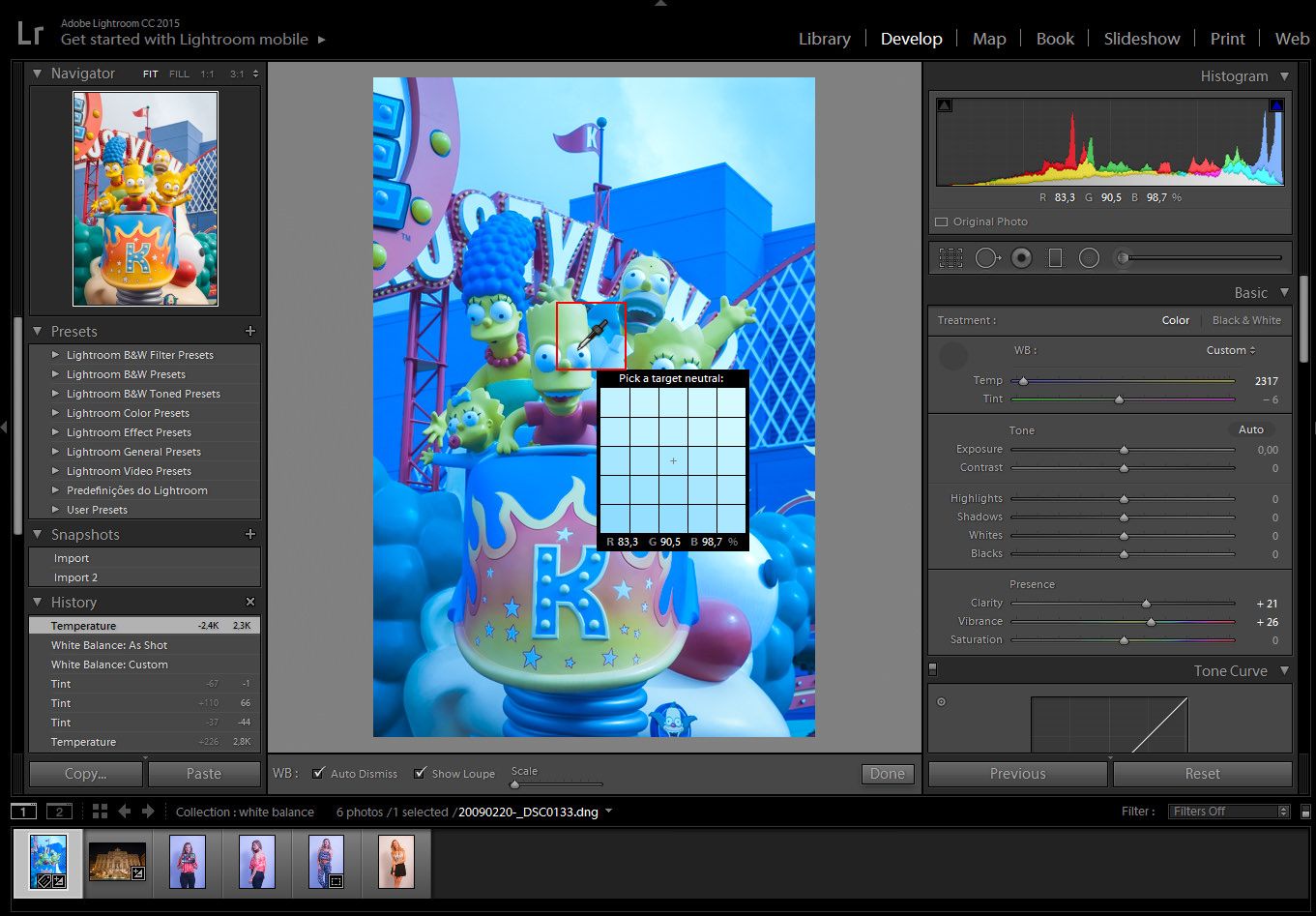
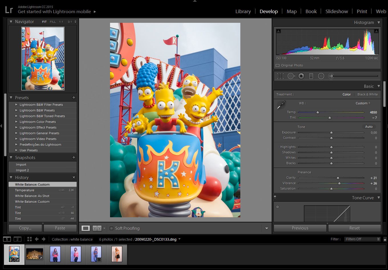
Histogram tool can be your best friend under situations like this, as you’re constantly checking over clipped values (mostly at highlights or shadows), but also Lightroom’s before/after mode can be extremely handy for checking where things went wrong.

Overdoing Black and White

4_Only editing in black and white-1

This is the mistake I’m most guilty of in my early work. Converting an image to black and white does not generally make it more artistic. Of course, there are ways to use black and white to effectively enhance a photo, but many new photographers end up using this style as a crutch. The number of variables that color adds to the editing process can be intimidating. Be sure to learn about complementary colors and incorporate them into your photos. However, do try to avoid photographing bright and heavily saturated colors because camera sensors don’t tend to register these colors well. If you’re unsure which way to go, this post can help you decide whether to edit your photo in color or black and white, but also keep in mind that not only black and white effects count as the only range of monochromatic effects – sepia or cyanotype effects also looks appealing for most clients.

Heavily Retouching Skin

5_Over Retouching-1

Most photographers fear that their clients won’t like their photos because of the way they themselves look (by no fault of the photographer). It’s tempting to heavily retouch skin in an attempt to flatter your client, however, it’s best to edit only what is necessary. A good rule of thumb is to touch up or remove only imperfections that are impermanent, such as acne or bruises – try, also, to find flattering angles and accentuate those.

Overdoing such adjustments will end up in unnatural results, mostly if you don’t happen to ace post production tools such as Lightroom Presets & Brushes or Photoshop Actions. In the end, you’re prone to ruin all your hard work by just trying to make it look better.

HDR Processing

6_Going crazy with the clairity slider-1-1

Every photographer wants to learn new techniques; more often than not, though, HDR processing looks a bit over the top. While it can be tempting to bracket exposures, it’s best to avoid it until you’ve mastered basic photography skills first. Instead, if you don’t have enough dynamic range in a shot, bracket the exposure and brush locally in the post.

A quality image ought to appear natural, polished, and simple:

1_original-1

Now that you’re familiar with these common mistakes, you can easily avoid them by mastering photography techniques that surely will take your photographs to the next level! Don’t feel disappointed by making mistakes during your first attempts – everybody had a starting point and a goal to reach, therefore it’s your right to learn from bad experiences and add all that knowledge to your future work.

Hope this guide was useful and keep shooting!

How To Be Productive As A Freelancer

There are several perks that make freelancing an enticing option: the freedom to work from home, to choose your own hours, to work independently and even the option to accept or decline a project. However, these same benefits can easily become catalysts to idleness and inaction.

Perhaps the most important factor in maintaining productivity as a freelancer is self-discipline. It’s very easy to get distracted without a supervisor checking in or having set work hours to adhere to. With that said, one must exert a good amount of willpower; freelancing is by no means “easier” than any other work.

Time management, then, is one of the most crucial aspects of successful freelancing. One of the simplest ways to ensure a productive workday is to allocate a specific amount of time to each task. Set a timer for X amount of minutes and work on a set assignment until it goes off, then move on to the next project. For every hour of work, give yourself a fifteen-minute break. On a larger scale, keeping a calendar is crucial. It is important to be aware of what needs to be done well in advance. Nothing slows down progress like an unexpected project. If you have a smartphone, it may be beneficial to link a digital calendar to all of your devices. That way, you’ll always know what needs to be done—even when you’re away from your workspace—and can plan accordingly. Apple products make this especially easy, but Google also offers a digital calendar to anyone with an account. Additionally, iPhone users can take advantage of the Reminders feature or the wide array of to-do list apps available. Of course, an old-fashioned to-do list scrawled on notepad works just as well.

watch-1149597_960_720_mini

If you find it difficult to stay focused at home, you may benefit from working elsewhere. Take your laptop to a coffee shop or head to the library and utilize one of the study rooms. For projects that require a bigger setup (editing on a large monitor, scanning and printing photos, etc.) it may be worth investing in a small office space further from home. For some this is not financially feasible, in which case, designate a specific area of your home to work only.

dictionary-1149723_960_720_mini

Unfortunately, as photographers in this day in age, we can’t avoid working with our computers. And as we all know, the Internet can be a dangerous place–especially when there is work to be done. Luckily, there are a handful of apps designed to squelch procrastination by blocking certain websites for a specified period of time. Windows users can download FocalFilter; SelfControl is available to Mac users. If you must browse the web, at least use it as an opportunity to improve your work: learn how to recover blown out images, improve your bokeh, or perfect your white balance.

laptop-1149412_960_720_mini

Finally, taking care of your health is one of the most straightforward ways you can improve your performance. While it seems obvious, it is worth reiterating that diet and exercise are imperative for optimal efficiency. If you find yourself skipping meals or avoiding the gym, you’re bound to get groggy, cranky, or otherwise unable to focus. Many of us immediately grab a cup of coffee when we start to crash, but there are a number of other (and sometimes healthier) ways to recharge. For instance, tea is an excellent alternative to coffee and comes with many additional health benefits. Peppermint tea is a good choice because even the scent alone is energizing. As far as foods are concerned, some are better than others when it comes to providing the necessary concentration and energy to get work done. Foods known for improving focus and concentration include avocado, salmon, dark chocolate, and nuts. Supplements are another easy way to boost your health and thus improve your work. Ginkgo biloba is a supplement that helps with memory and concentration. (It also comes in tea form.) B vitamins are another group of highly advantageous supplements. B vitamins help your body to convert food into energy, making you that much more alert!

In any case, discipline and self-care are crucial to a successful freelance career. As long as you make the necessary adjustments to improve your work habits and take care of your body, you are that much more likely to increase your productivity.

How to Get Perfect White Balance in Lightroom Using a Color Chart

Imagine that you have spent an awfully long amount of time editing a photograph for the cover of a magazine and as soon as you get the copy, the colors did not match what you had on your monitor. Trying to get accurate colors can be quite challenging and the process of getting an efficient color management in lightroom can be a nightmare at first.

From time to time, a client will have some doubts regarding color, saying that the color of a certain product that he sees on his computer is not right or even after printing an image and the color is not the same that you had on your monitor. As photographers, we want to make sure our photographs are printed or delivered to our clients with the correct color that we see on our monitor. Therefore, we have to be certain that the problem is not in our process. That’s why getting accurate colors is such an important factor that can’t be ignored in the photography workflow.

There are some products available on the market, like monitor calibrating devices from brands like X-rite or Datacolor and professional high-end monitors like Eizo and LaCie. Although, it can be quite expensive for someone starting out in photography, color charts can be an affordable way to get the colors right every time, and there are a lot of types and brands to choose from.

In this tutorial, I will show you how to manage colors using only a color chart, while not having to spend a lot of money.

01_all_imgModel:  Jessica Waldow / Photo: Luiz Kim

I did a series of photographs for a fashion lookbook (images 3 to 6) using the same light setting and, on purpose, messed with the white balance on my camera, since I photographed in RAW I could tweak the white balance as much as I wanted, nondestructively.

As I mentioned in my last white balance tutorial, studio strobes are set up to 5000K – 5500K, therefore I should have photographed using the setting for the white balance to the flash icon or manually change the setting to 5000K on my camera. The bluish photographs were set up around 2000K and the one with a more yellowish color around 7000K. Even if you set up the white balance on your camera, you will never be a 100% sure if the colors are correct, either because the flash strobe is not giving 5000K – 5500K, or the tint of the photograph appears green or magenta.

Step 1: Photograph the subject with the color chart, position it accordingly to the main light source

After you have set up the lighting for the photo shoot, position the color chart near the main subject and face it toward the main light source.

Click on the White Balance Selector (W), which looks like an eyedropper tool.04_checker_a01

Step 2: select the gray area of the color chart

With the White Balance, Selector tool selected, click on the gray box of the color chart. Each color chart may differ, depending on the manufacturer.

With the White Balance Selector, hover over the image. We can see the preview in the navigator window before we even click it.

04_checker_a03

As you can see, it will automatically correct the white balance of the image, even if your monitor is not calibrated, Using this method guarantees that the white balance is correct.

At this stage, you can edit your image as you would normally do, remembering not to tweak the white balance too much, since the whole purpose is to correct it.

After correcting one image, you can adjust the others as a batch. It doesn’t matter if there are a thousand images, you can match it with the steps below.

Step 3: batch correcting the white balance

Click on the image you have corrected and press shift+click on the last image of the series, that will select the images you want. If you want to select images that are not in order, Ctrl+click for PC, or Cmd+click for mac, selecting the images one by one. Just make sure that the highlighted image is the one with the adjustments.

05_sync_a01

Step 4: Synchronize the settings

Click on the ”sync” button, which is located in the bottom right corner.

The ”synchronize settings” panel will pop up, you can either check just the white balance to sync all the images with the same white balance, or check whatever you want to sync with the settings.

Hit the synchronize button and Lightroom will synchronize the settings.

01_all_img_a02

As you can see, no matter how many photographs you have taken with the same light source, you will always get the correct white balance.

White Balance in Lightroom

Do we need to give up on our images, just because the image came out a little bluish or reddish? The answer is no. Well, if you photograph in RAW, you can correct the colors later on inside Lightroom. So we have to download Lightroom presets to correct this. Not that you can’t do it in JPG, but doing it on a RAW image is a nondestructive way to correct any of your images, even if you did not correct it on your camera beforehand. So don’t give up on your image, we can make it work. It’s just like not giving up on your photographic negatives because we can .

For those who are just beginning in photography, white balance, color temperature, Kelvin, 5000k, etc. can seem difficult to understand, but with Lightroom, we can manage it quite intuitively.

Light temperature is measured in Kelvin and every type of light has a certain temperature, and each temperature has a certain color, like a candle light which is red or xenon car lights that have a more bluish color. When you are messing with your camera’s white balance, you will see an icon of a sun, shadow, flash or clouds. When you select any of them, what the camera is attempting to do is to compensate for the light you are photographing.

chart

To illustrate the temperature, let’s separate them into 3 different categories: RED, NEUTRAL, and BLUE.

RED: Candle Light 2000K, sunrise/sunset 2000-3000K, incandescent lights 2500K.

NEUTRAL: the Sun at its peak around 5500K, flashes and studio flash strobes are in that range as well.

BLUE:  xenon 6200K and blue sky 10000K.

Our eyes adjust automatically to the color temperature either in the shade or in the sun, but the camera is not able to do that, therefore you will have to do it for your camera. There are a lot of hardware devices that will help you get the correct colors every time; monitors for photography, monitor calibrating devices, color checker cards, color booths, etc.

In this Lightroom presets tutorial, we will learn how to correct the white balance of photographs, either by using manual settings or automatic settings or by using the White Balance Selector.

02_trevi_a01

In this particular image, the color temperature is way off. As we can see, the image is quite red, most people would delete the image and try to set the correct white balance in the camera, then take the shot again. But, since I have photographed in RAW, I can always change the white balance settings later inside Lightroom, in a nondestructive way.

For those shooting JPG, it is best that you choose the correct white balance in your camera. Lightroom can try to correct it later, but not as it would with a RAW image.

02_trevi_a02

In the Develop Module, we have some presets to choose from, as we would have inside our camera settings.

Auto: the auto mode does a pretty decent job on outdoor photographs, but when indoors, we sometimes may have to adjust it a bit further.

The other preset settings will correct it as the names would suggest; daylight will assume that you have photographed outdoors in daylight, cloudy as on a cloudy day, or tungsten, as under a tungsten light bulb and so on.

If any of those presets won’t fit your needs, we can always correct it manually.

02_trevi_a03

In order to manually correct the color temperature, we can change the temperature and tint sliders.

Temp: will correct the white balance from blue to yellow.

Tint: will correct the white balance from green to magenta.

01_simps_a01

In this particular image, the white balance is off too, tending to a more bluish feel.

We could correct it manually like we did on the image before, but if there is something in the scene that you remember that has a neutral color, we can use it in our favor to correct the color temperature automatically.

01_simps_a02

Click on the White Balance Selector (W), which looks like an eyedropper tool and click either on the white or the black part of Bart Simpson’s eye. That’s because the White Balance Selector tool will work on the neutral colors like whites, grays, and blacks.

Using the White Balance Selector, hover over the image. We can see the preview in the navigator window before we even click it.

01_simps_a03

After you click on a neutral color, Lightroom will try to correct it by assuming the color you clicked is neutral white, neutral gray or neutral black depending on the color you chose to click.

Sometimes you can see that is not 100% correct, so you can tweak the temperature to get the desired color, but at least it could be a starting point.

This way we can easily correct the colors of the images. If you need to get the perfect color, either for those clients that need the correct color of their product or if you are photographing a work of art, using a color checker card can be an effective way to do it, I will make a tutorial on that later.