Learn Photoshop Layer Styles with Sleeklenswww.sleeklens.com
youHi everyone, today I’m going to start taking you through the Photoshop Layer Styles Panel.
There are going to be 2 or 3 parts to this series, so keep and eye out for the other segments that are coming soon.
With what we have learned in our Photoshop Beginners Roundup Tutorials which is a great start to learning Photoshop. Once you master the fundamentals in these beginner level tutorials, you will be well on your way to mastering Photoshop. Moving forward, let’s go through the meat and potatoes of how to work with Photoshop.
So now we’re going to take that a step further and advance a little bit further with Photoshop Layer Styles, exploring everything it has to offer us and what function is used for.
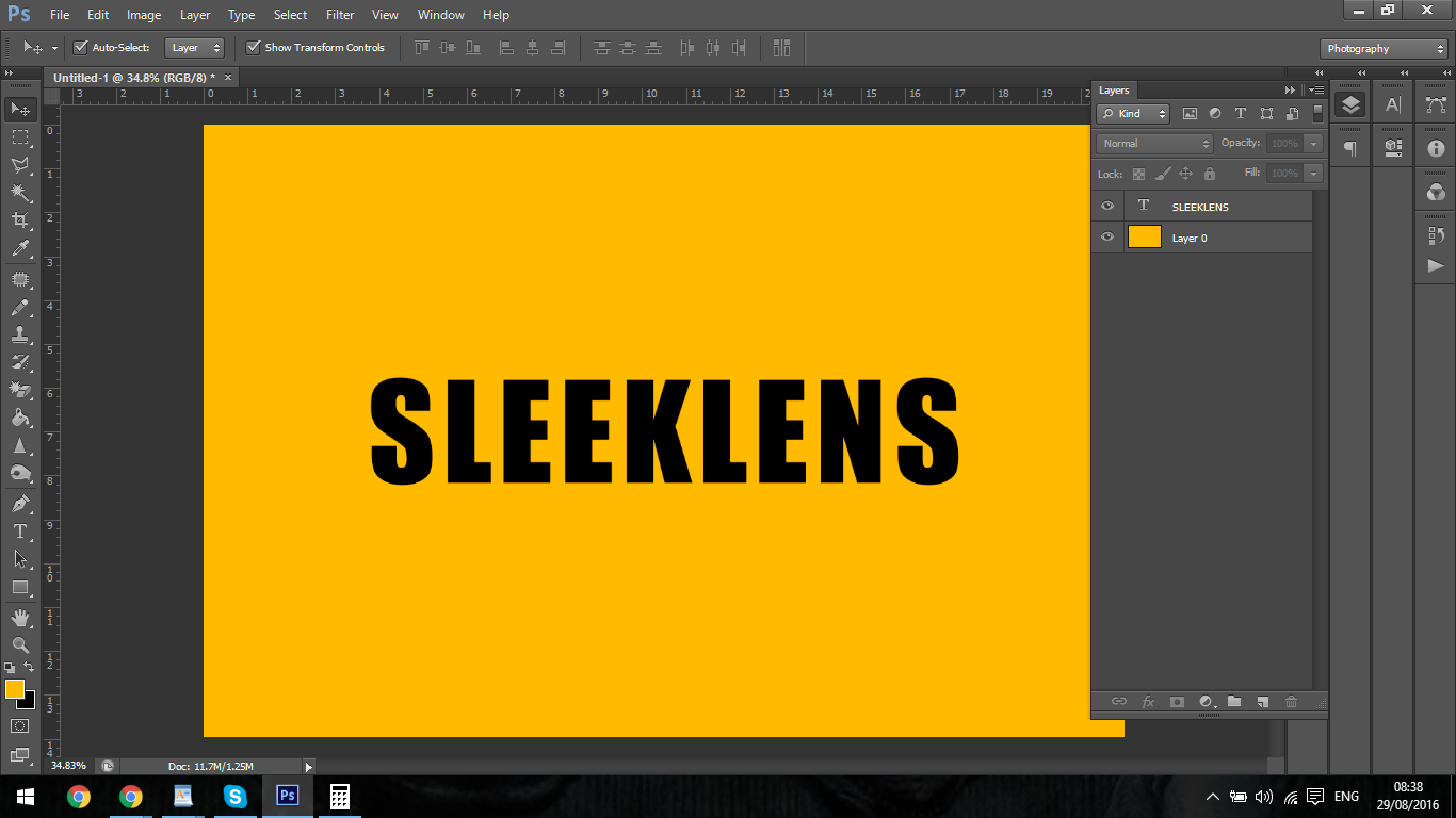
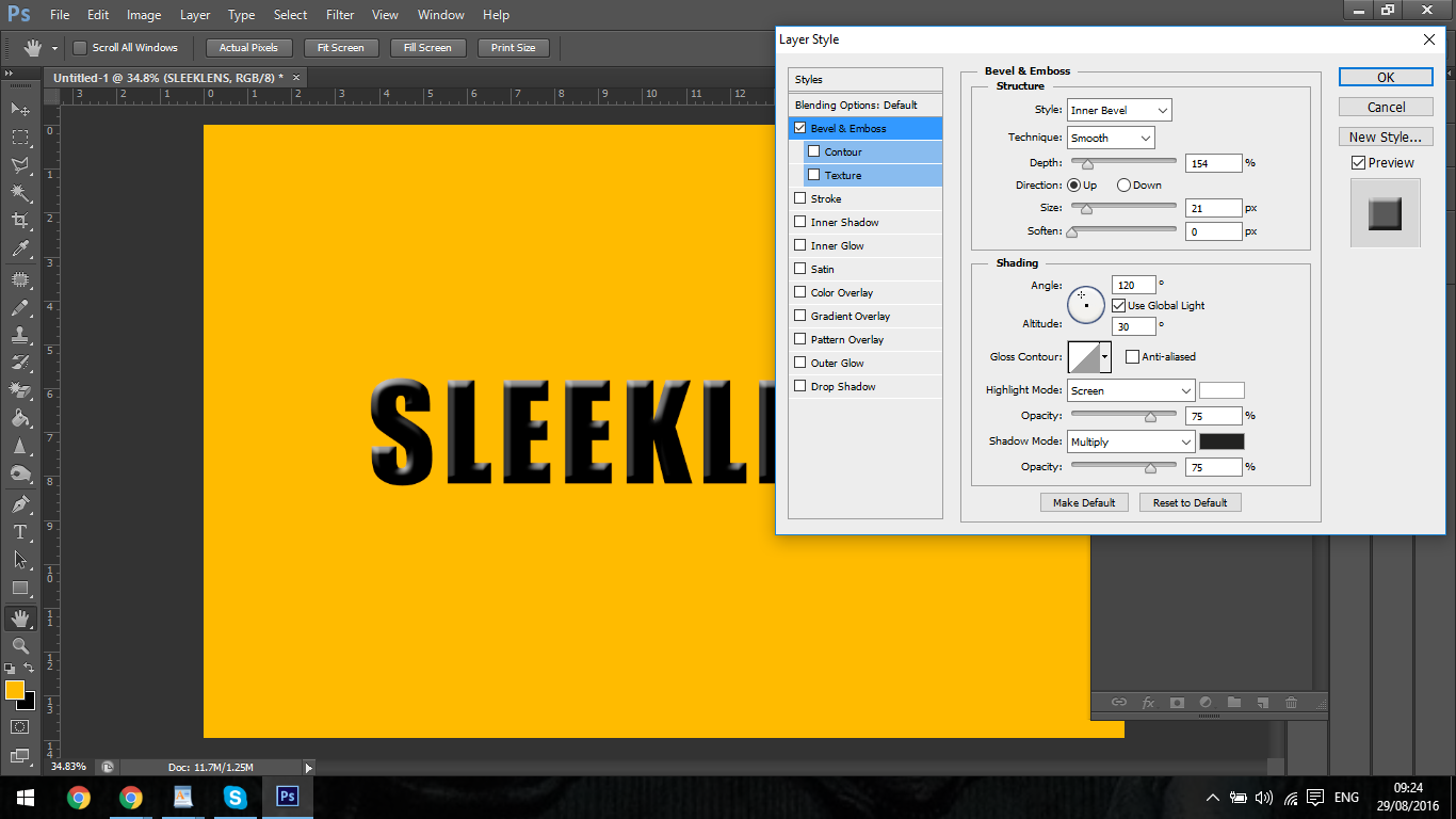
Starting off you can see that I have added the text ‘Sleeklens’ instead of an Image
To the right, you can see the two layers in my Layers Panel.
Layer zero ‘Layer 0’ which is the background and the Text Layer with Sleeklens written on it.
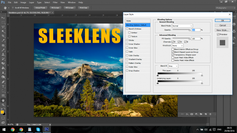
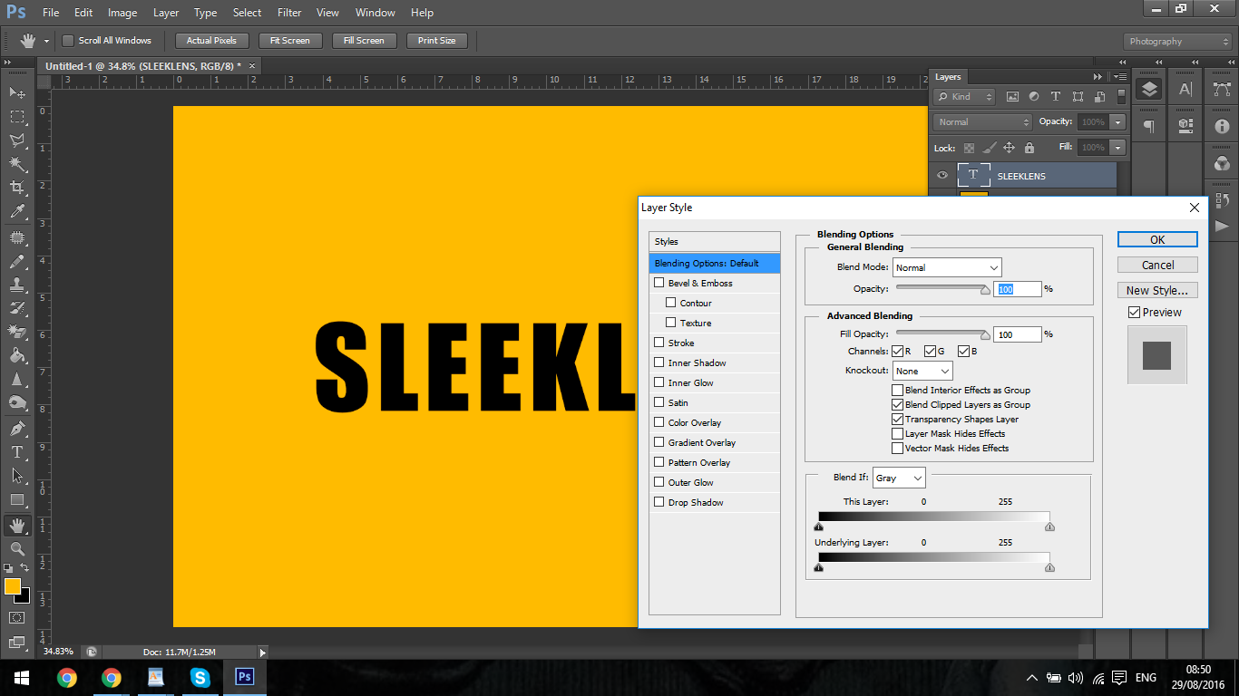
So to activate Photoshop Layer Styles all you have to do is double click on the Layer you want to change, in this case, we will be working with the Text Layer, so double click on that please and your screen should look like mine below.
This will bring you to the first section of the Photoshop Layer Styles Panel, we don’t have to do too much with this so we’ll move on, the only thing from this panel I will mention is the Opacity Slider.
When you slide this you will create a transparent effect on the layer you are manipulating.
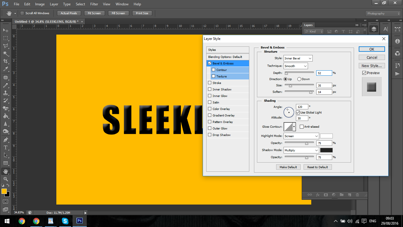
The first thing we’re going to look at is Bevel & Emboss.
You will find this on the left under Blending Options Custom, so click on that to we have a look at what option this can give us.
Now in the middle you will see a few more options open up to you.
The first in the list is Style.
You will now see the 5 different options, the option I have on screen is Inner Bevel, this will create a 3D effect, the rest do similar actions outside and in the Text, this being an active tutorial take a minute or two to check out what all options these give you.
Now we’ll move to the options below, with Photoshop being mostly straight forward, most of the names will be a clear giveaway as to what each one does.
Adjusting the Depth will increase or decrease the 3D effect, Direction will change the light direction from top to bottom or vice versa.
Size of course the size and then you have soften below that which will take away the contrast and smooth the edges.
Next up lets look below to the Shading Panel.
Now I wont go super deep into this as I want you to explore it for yourself right now.
If you check the angle you will see by clicking on the angle circle you will change the light source to all different angles instead of just up and down as before so it’s a little more advanced.
Gloss contours will give you different options with the Bevel Style.
The Highlight Modes and Shadow Modes with the Drop Down Boxes (Where it says screen and Multiply) If you go through all for these and play with the opacity you will get some cool effects varying up the over all look of the Text.
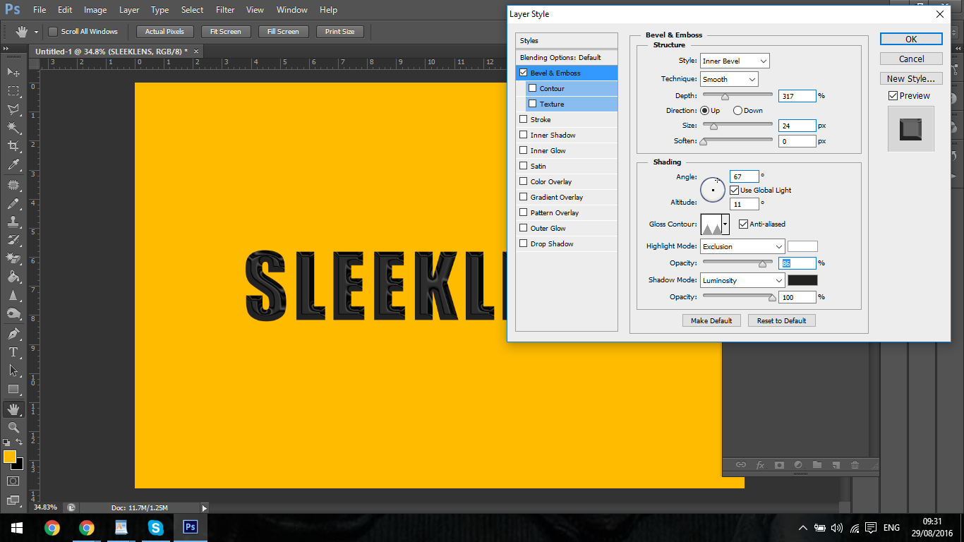
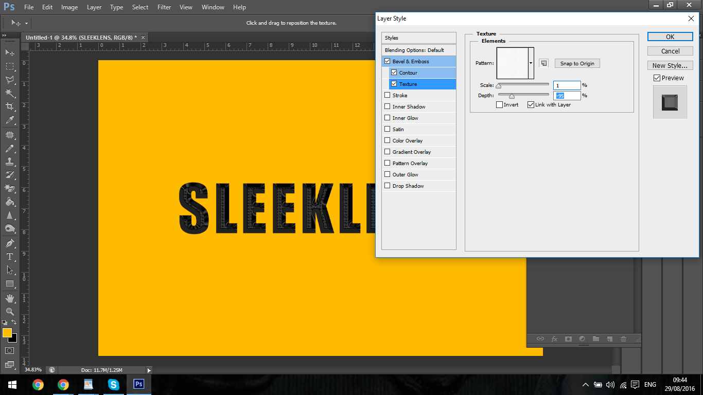
Then finally to the left under Bevel & Emboss you will see Contour and Texture.
The Contour will increase your Bevel further and Texture will add… Texture 🙂
All pretty easy stuff, once you have a good understanding of the task that each of the tools is designed to perform.
Bevel & Emboss is mostly used for Text, I only really use it for text, other uses I would find for it is if you are adding some sort of metal object to an image then you could use Bevel & Emboss to add some depth to it and give that image a bit more of a 3D effect apart from solid objects like that I mostly use Bevel & Emboss for text, it’s great for giving a shiny metallic effect.
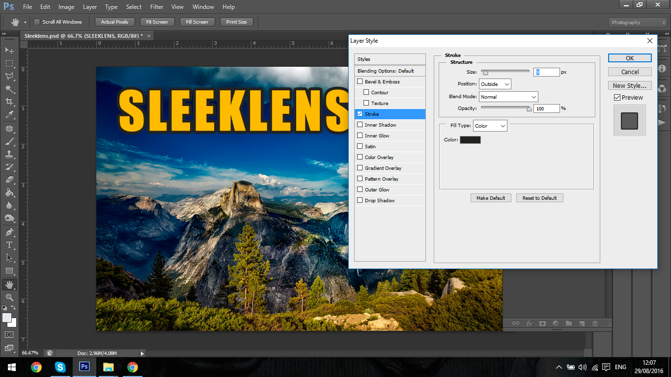
Next on the list is looking at how we can make Text stand out from our images.
Sometimes your image will be very cluttered of it will have dull colours which can be hard to see Text on it once it’s been overlayed.
Photoshop Layer Styles will provide us with several options to make this a thing of the past so let’s take a look at the first.
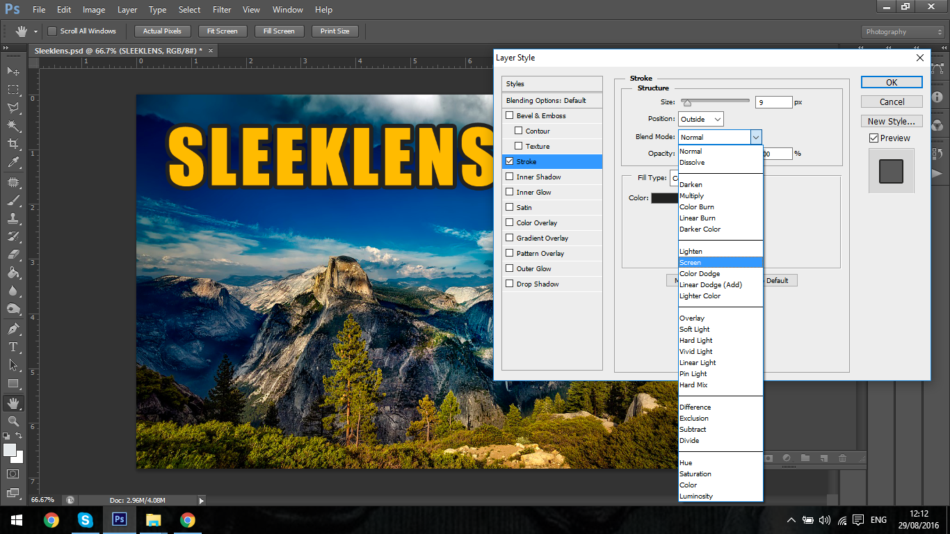
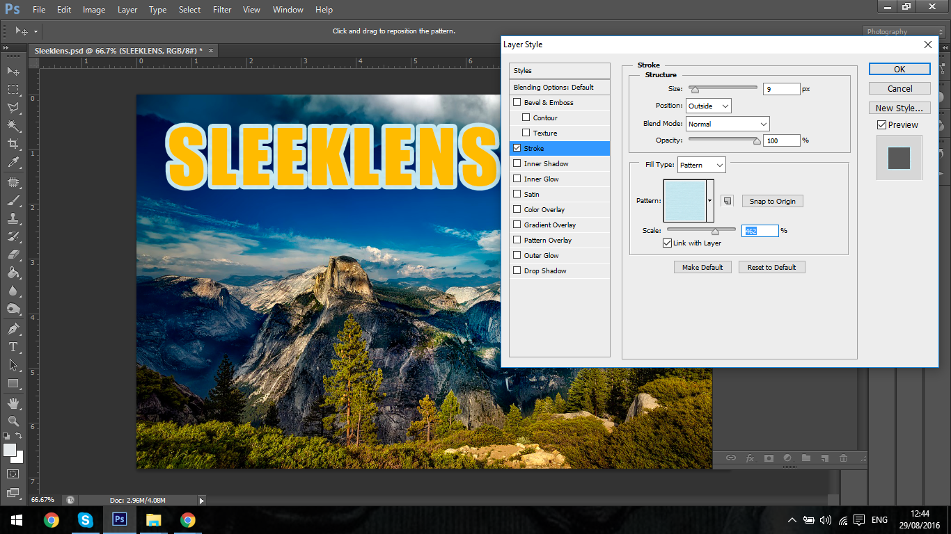
The Stroke.
Basically what the Stroke is, is an outline around your Text.
In your middle panel you will see the options, you will see the size slider to increase or decrease the size.
Below that we have Position, what this does is move your Stroke from the outside to the center or to the inside, 90% of the time you will only be using the outside, personally I haven’t used the other two options at all in Photoshop that I can remember.
Below that will be your Blend Modes, these will give you various effects that will change the opacity and colours etc, it’s not really that important for strokes if at all, but you can have a little play with the drop down box with all the options and see what you can come up with.
Then after that we have our standard Opacity Slider, which just changes the transparency of the Stroke.
Ok so all pretty easy so far.
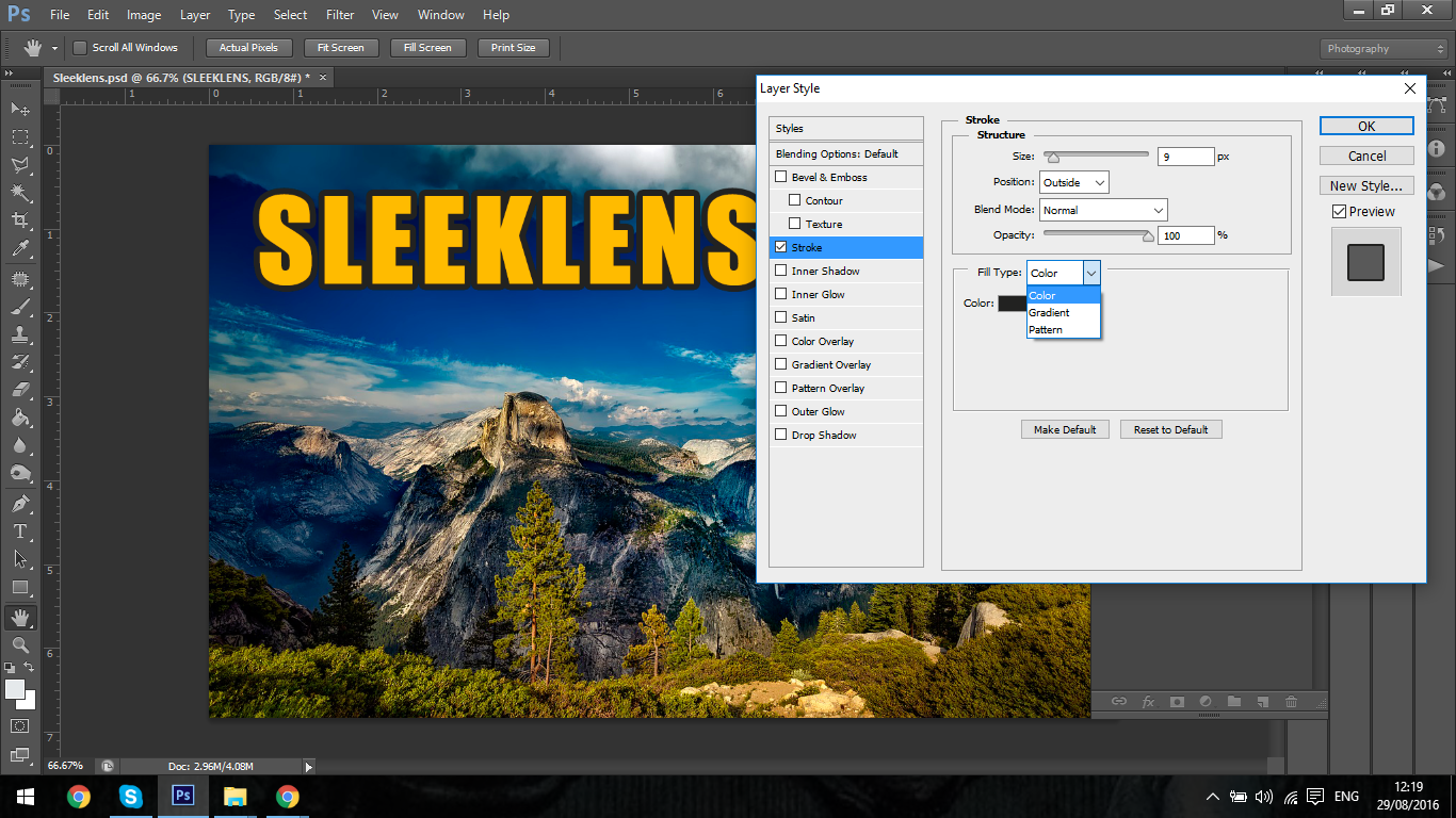
Next we’ll take a look at the Fill Type.
You have three options in the Fill Type, these options are…
Colour
Gradient
Pattern
Starting with the Colour, this is just the solid colour of the stroke, when you click on this and then double click below the drop down box were it says Colour a panel will appear that will let you choose your colour, in there you have every colour under the sun.
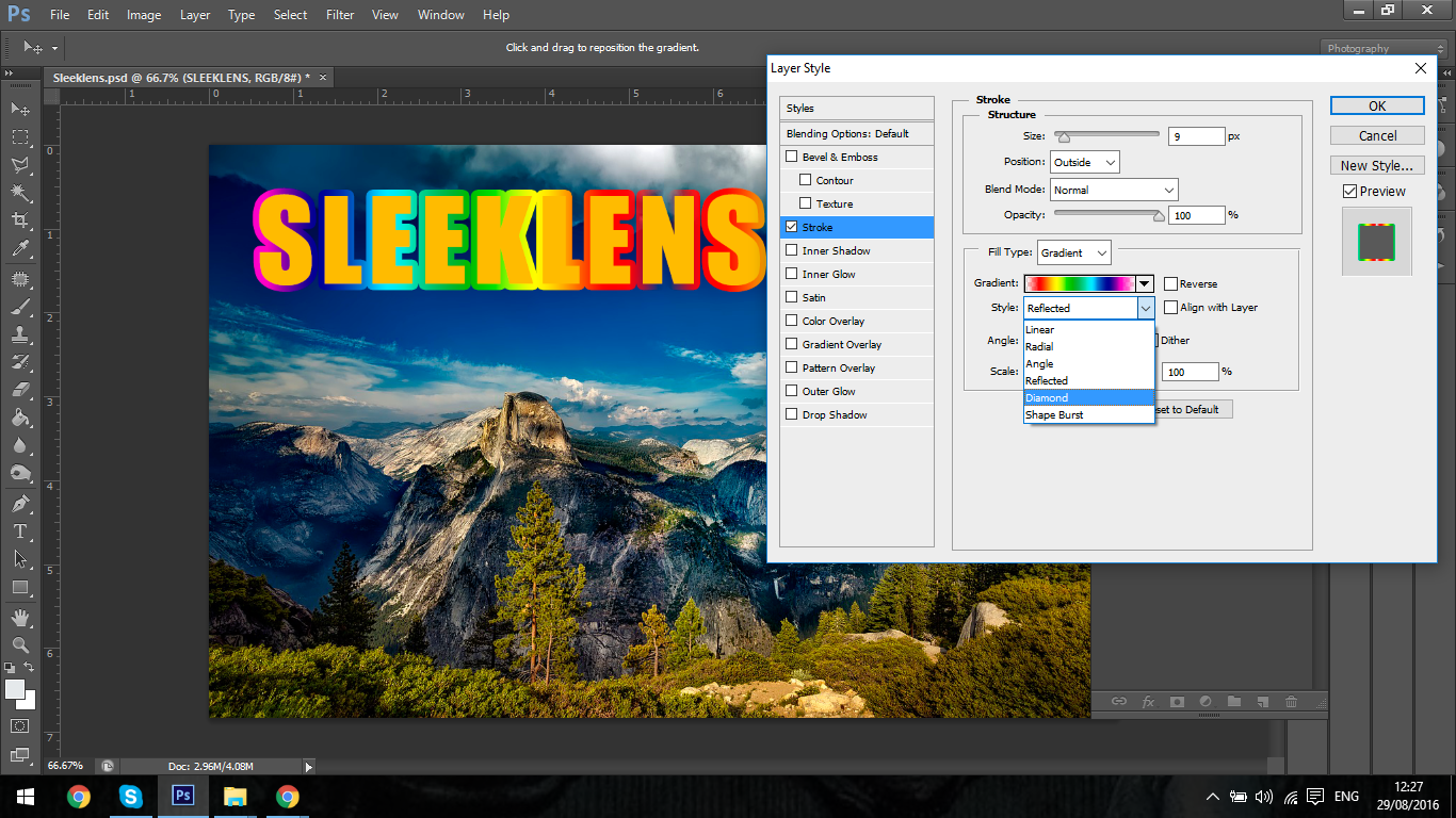
Next Gradient, what a Gradient is, one colour blending into another, so it could be dark to light or complimentary colours.
In the options you will see all the different options, I’d advise you to take a few mins to play around with the options.
The style drop down box will give you the options to have a different look to your gradient, Linear will be just your standard straight line but the others start to get a little bit more interesting.
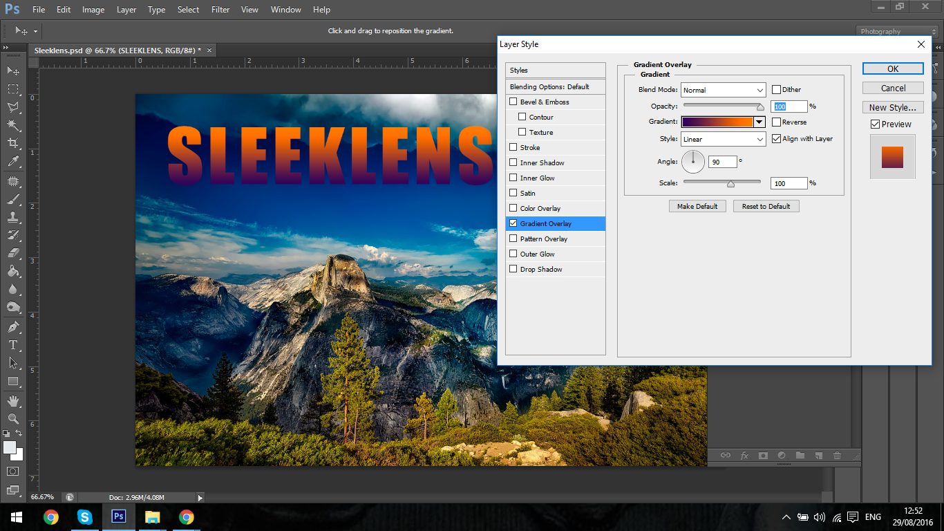
So quickly I’m going to skip down 5 to the Gradient Overlay.
This works in the exact same way as your Stroke Gradient, only it will cast a Gradient over the main object.
The options are all the exact same.
So back to where we were in the Fill Styles below Gradient you can change the Scale and Angle, pretty cool.
So all very easy and straight forward.
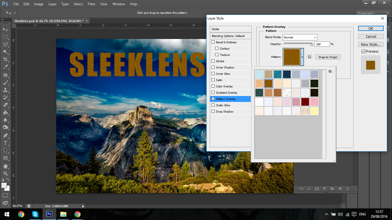
Then last we have Pattern.
Before I go into the Patterns I just want to mention the Scale Slider, this will change the depth and detail to your patterns so just bare that in mind.
So click into your Pattern.
You will see many options appear that you can choose from, you can also add your own but that’s for a whole different Tutorial.
There’s not much I can say here except to try them out, have a play around and see what you like.
So as we did before with the Gradient we also have the same option for the main image, this is below the Gradient Overlay, it’s called Pattern Overlay.
Just as before this has all the same options as the one for your Stroke, then you can change the Blend modes and Opacity if needs be.
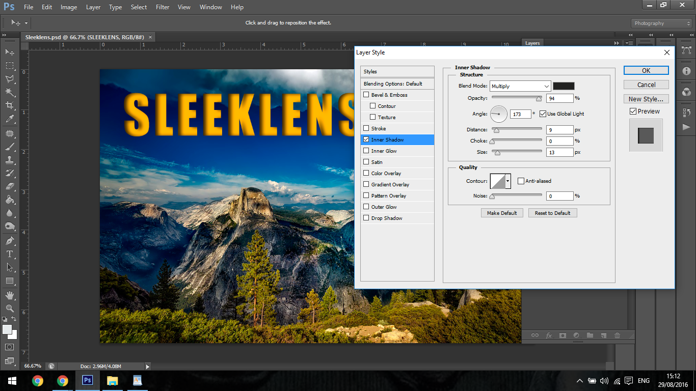
Inner Shadow
So I would use inner shadow if I wanted to add some depth to Text or somewhat of a solid object within an image.
Inner Shadow gives the object the appearance that it has been cut out of the image or stamped in.
With this I don’t use the Blend Options I just stick to the Opacity, Distance, Choke and Sizes Sliders and of course the Angle Circle.
One use that comes to mind that I can remember recently was I had to add Text to wooden boxes in a wine cellar, I added my Text and used this exact technique to apply the stamp effect. It worked perfect and you couldn’t tell once I had played around with the settings to get the correct angle of light and the correct opacity.
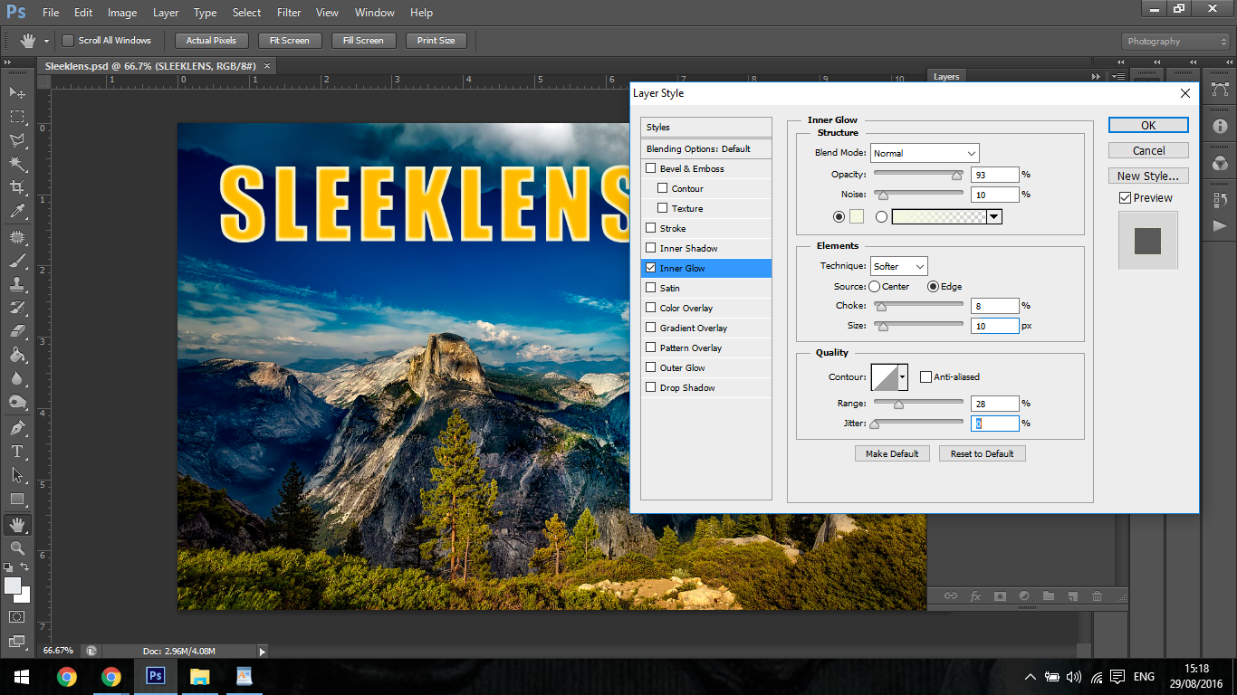
Inner Glow
I don’t really have too much to say for this option as it’s not something that I would ever really use, I can’t even remember the last time I used it.
But I will talk over the setting and what it could be possibly used for.
So as you see in the first of the middle panels you can see the standard Opacity slider, below that is the Noise Slider.
Noise is to put it into an extreme short term, an object that is highly pixelated.
All the other sliders really just increase or decrease size and intensity, personally I feel that the Stroke Option with an inner Stroke does the same, but like I said it’s not something I would normally ever use, but feel free to think for yourself on this one for ways you could use it.
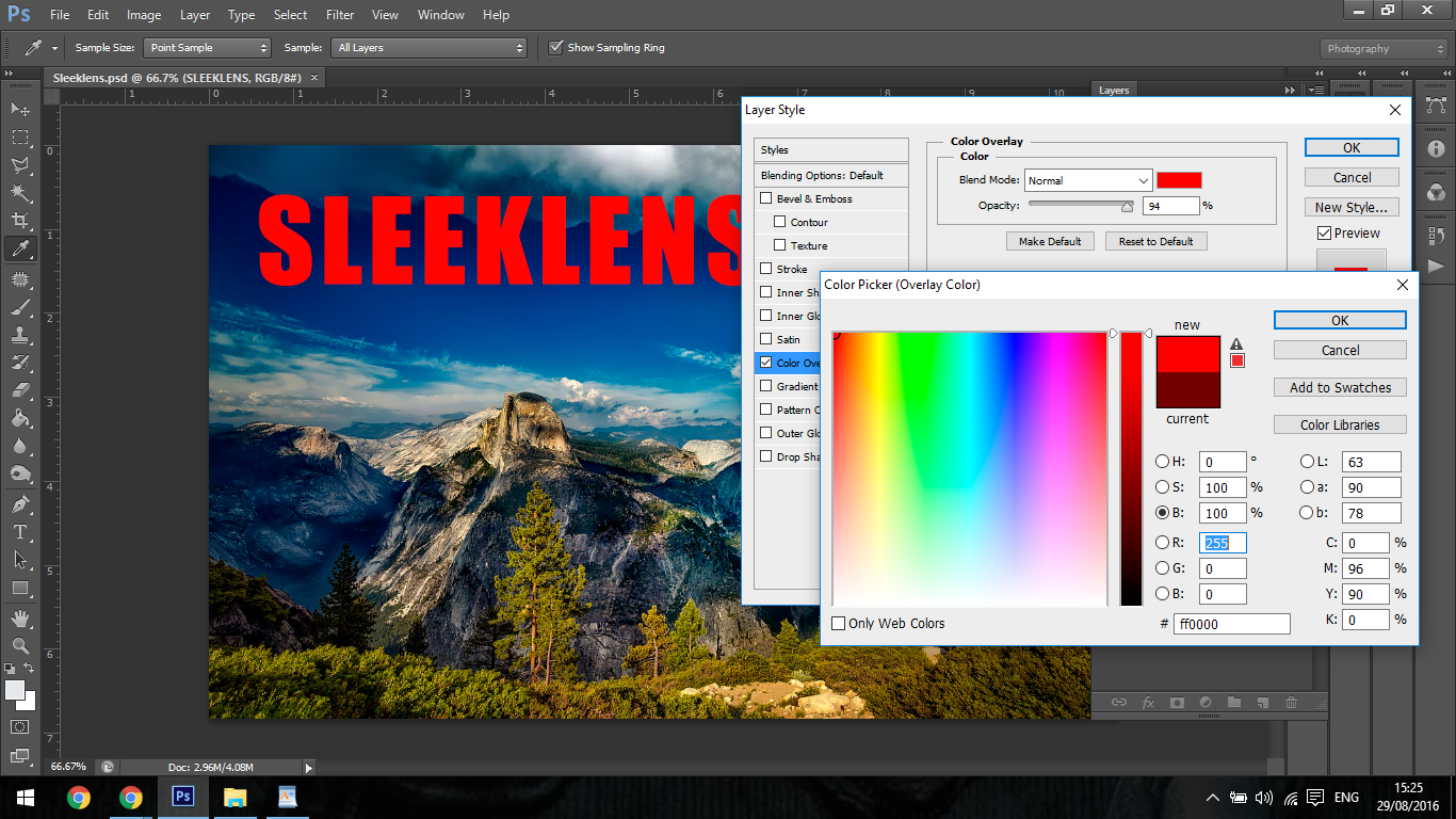
Colour Overlay
Simply put this option just overlays other colours, so if you had something that was purple but wanted it green you could use this option.
All you do if double click on the colour box, a panel will then appear and you can choose your colour as you see fit.
The only manipulation you can do with this is to drop it’s opacity and mix the colours from underneath with the overlay.
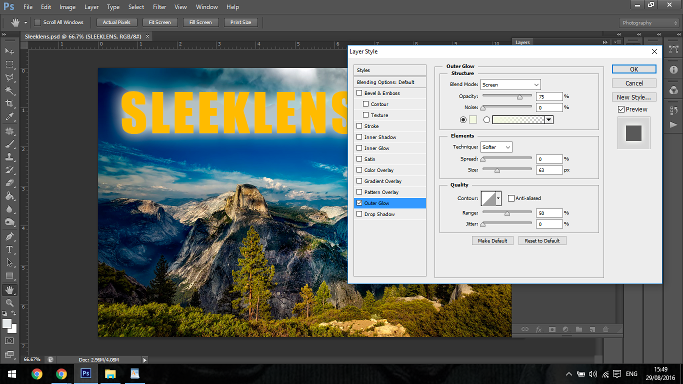
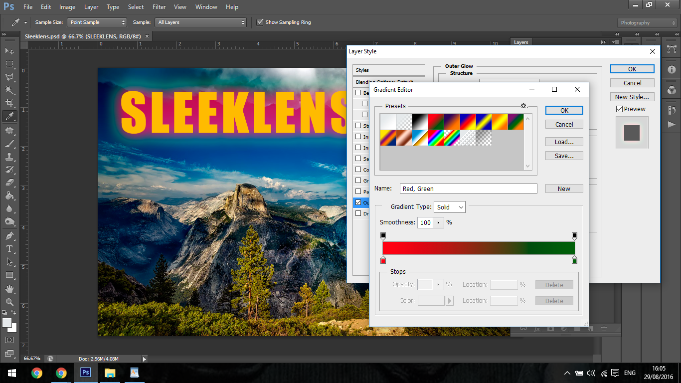
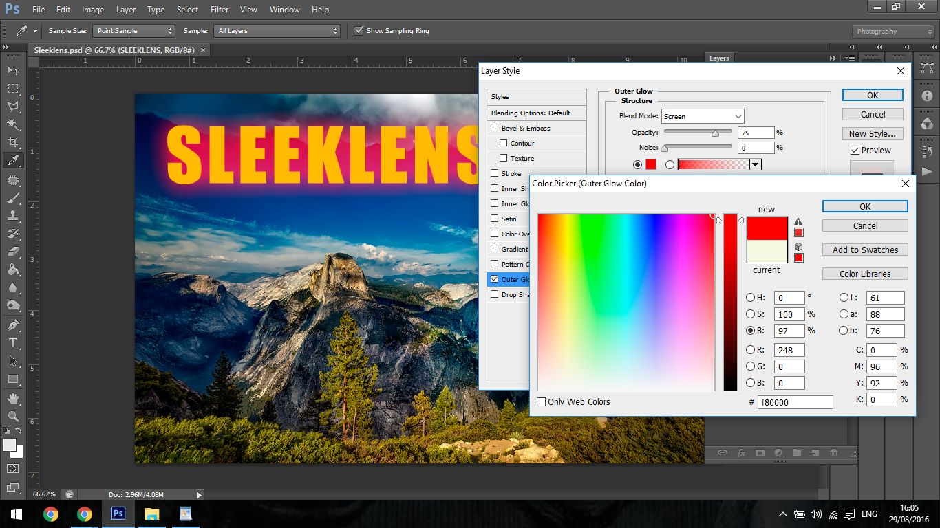
Outer Glow
This works in much the same was as the Inner Glow option.
It has all the same slider etc only difference is it now creates a halo effect around the outside of your object.
You can also change the colour of the Glow which I didn’t mention in the Inner Glow part of this Tutorial and add a Gradient.
The Gradient is applied just like we did with the Stroke Gradient, you find both the Change colour option and the Gradient option the structure panel.
All you have to do is double click and you’re good to go.
You can create cool lighting effects with this option, I have used it many times to help me bring my Text forward.
In the Elements section you will find Spread and Size, these both increase and decrease the luminosity of the Glow from very large to very fine and above those you will see ‘Technique’
The two options this give you is a soft blurred effect and then a more targeted effect were you can see the actual shape, I find the Precise option great for when objects are in the sky, it really makes the look like they’re coming out of the clouds.
Last up we have Drop Shadow.
This option is a great all rounder, I use it when I insert objects into photos, I will add a little Drop Shadow, work with the Angle circle until I get the lighting direction correct, then play with the Opacity, Distance, Spread and Size until I get the perfect fit.
With Text it’s great to add a Drop Shadow in as it will push your Text froward, but the key here is to be subtle.
You have to be subtle enough so that the shadow remains realistic, you don’t want huge contrasted lines.
Graduated from college in 2002 with a degree in Art & Design, I started exploring my way in Graphic Design and Professional Post Production. Full-time freelancer since 2011.


 Facebook
 Google +
Comments (0)
There are no comments yet.