Hello, so I’m guessing you’re a car enthusiast?
Well if you are or if you’re not it’s not going to matter because I got an awesome Photoshop/Lightroom tutorial for you today.
You will learn some awesome techniques to improve your images or simply just to widen your skill set in general.
Today I got a huge one for ya!
We’re going to be applying some magic to just an ordinary photograph of a car and we’re going to be making it look like it’s a million bucks!
So if you’re not a professional photographer then a lot of times it can be hard to get shots that right away look amazing.
The weather can be off, or the subject could be in an area with shadows that you can do nothing about.
But don’t worry, that can all be easily fixed when you got the know-hows using Photoshop and Lightroom…
And anyway, who really these days bar the top tear of photographers with studios and perfect lighting all set up will get perfect photos right off the bat, anyone?
I know I defiantly don’t that’s for sure.
I do probably 90% of my work on Photoshop or Lightroom, but in saying that.
When I take pictures I still keep in mind I’m trying to take a really good shot.
With everything being digital these days and film no longer burning holes in our pockets we can afford to take hundreds of images and work back using Lightroom and Photoshop lucky enough.
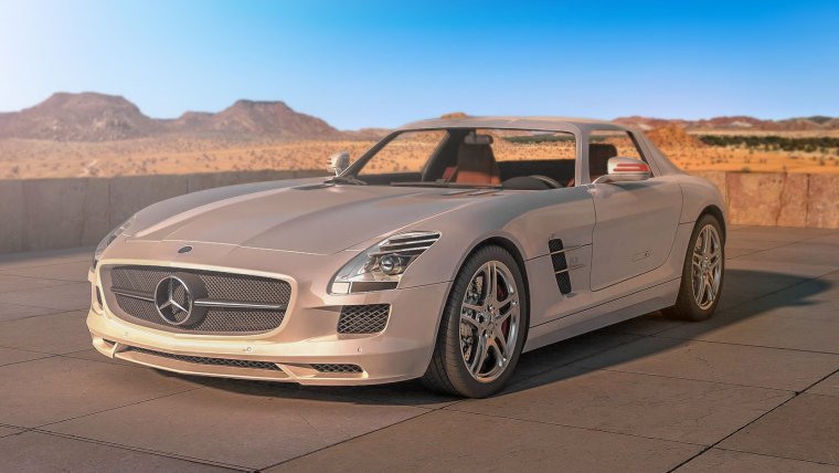
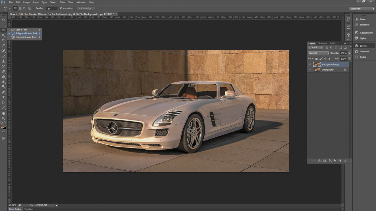
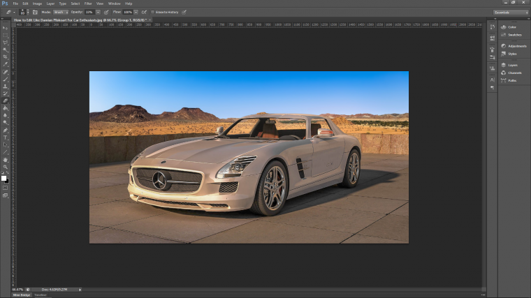
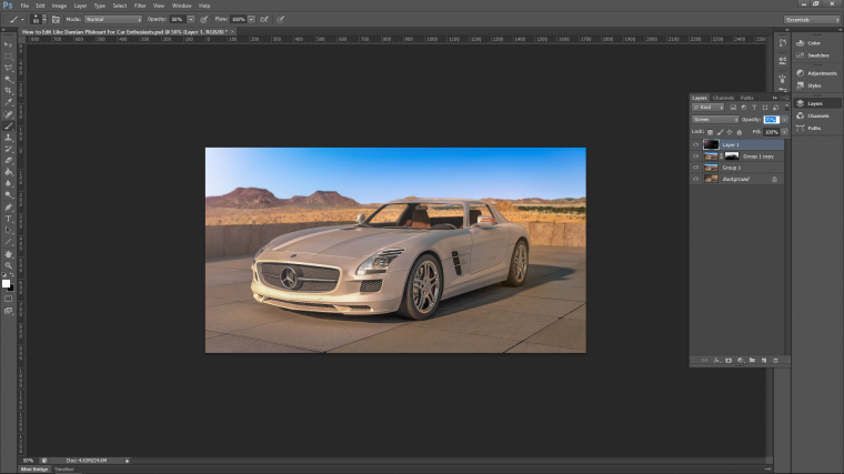
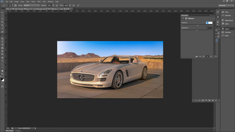
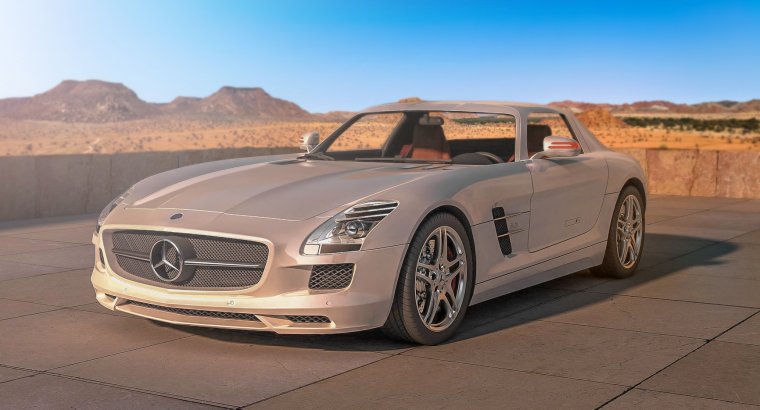
So let’s get ourselves and awesome image of a car.
Bare in mind that the image you’re going to be looking for should not be retouched already or have any sort of filter added to it at all.
Something similar to the image that I have below that I’m going to use for mine will be perfect.
[Image from Pixabay]
You can see that there is no weird lighting etc.
It’s just a standard, very cool but somewhat ‘dull’ image taken with a normal SLR camera.
So cool let’s start our tutorial!
First we are going to work with Lightroom, so go ahead and open that up and import your image and get prepared in Develop. [See this Lightroom Tutorial if you don’t know how yet]
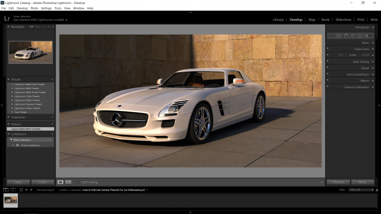
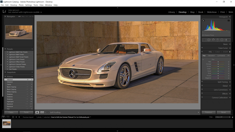
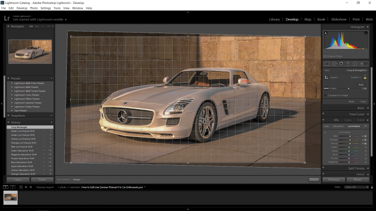
When you are ready, open up ‘Basic’ on the right-hand side.
You will see all the sliders there in my image below with my explanation underneath the image so make sure you read that while looking at the image so you know what’s actually going on and understand it.
These are my settings for those.
Temp – I choose +10 because I wanted to add a little bit of warmth to my image. [Note: you go the other way it cools it down]
Tint – I’m going to add +10 for this too just to add a tiny little bit more warmth but in a different color.
Exposure – With this, we’re going to go the opposite way -10 just to fade those colors back a little.
Highlights – My standard when editing is to just drop the Highlights the whole way to -100, this is my default.
Shadows – I do the exact same with shadows on I go the opposite way +100, this too is my defaults.
[Note: with the highlights and shadows, they are my defaults but I’m still going to keep my awareness of how the image looks, if it looks terrible or starts getting weird pixels then reel these back a little until it looks decent again]
Whites – so there is a trick to Whites, that is to hold ‘Alt’ while you slide your slider… you will see your screen blank out! now, when this happens to find the perfect Whites balance slide your slider until your image nearly disappears completely.
Blacks – same rules apply here as you did with Whites.
Again just be mindful of how your image looks.
The last thing that I’m going to do for this first edit is to just add +10 to my clarity so it sharpens my image up a touch.
If you want to see how your image now compares to what your started out with key in the backslash key which look like so… \
At this stage if you think it’s a bit much then you can pull a few of those edits back a little touch.
I would suggest waiting to just before we switch over to Photoshop to do this as we still have a good bit more to take care of and your image will look different.
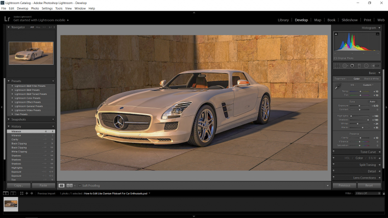
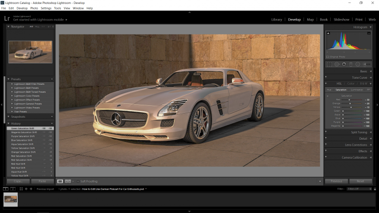
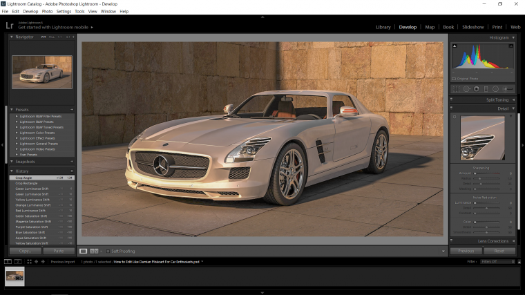
Now that those first little steps are complete, hit the arrow beside ‘Basic’ to close it up so you can see better and look down until you see HSL and click on that.
You will see the color sliders now appear as it is in my example image below.
In that you will see ‘Hue’ ‘Saturation’ Luminance’
Ok, so I’m going to work with Saturation first.
I want to just tone down the colors a little, so look at your image and look for the basic colors, so mines very orange so I’ll be toning that color group down a little, also a little blue as it’s in my car and shadow.
My settings are as follows.
Red -30
Orange -20
Yellow -10
Green -100
Aqua -100
Blue -100
Purple -100
Magenta -100
Now these are “my” settings, so do what looks good for your image! you just want to drain a tiny bit of color out of the colors.
I was able to go to -100 with Green downwards because the was practically zero in my image apart from my shadows.
Yours probably will be very different to mine, and as we talked about we can always go back and re-edit later.
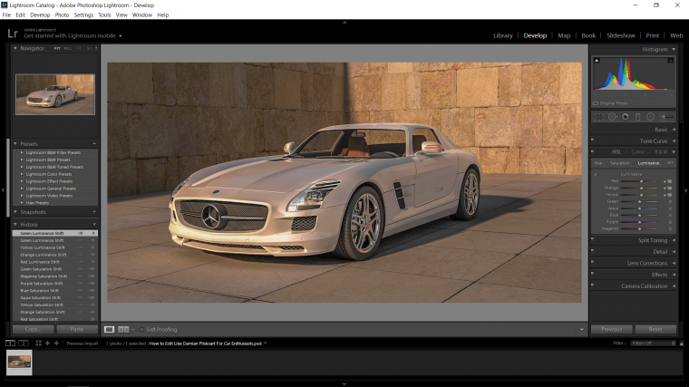
Next, we’ll go into the Luminance panel and I’m just going to do kinda the reverse of what I just did to add a little bit more color into Red Orange and Yellow only not as harsh.
So I’ll just up them +10 and leave the rest.
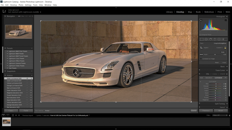
Now I’m just going to adjust the composition of my image, I feel like there’s too much on that right hand side.
Press (R) on your keyboard to open up your Crop Tool.
You can now adjust the edges to where you want them to be, and if you click the top of the barrier you can rotate it as well!
Sharpening is next I feel, I think I’d like to add some here just to make it look a little more dynamic or whatever.
I’m just going to close the panel as we did with ‘Basic’ and then open up ‘Detail’
You will now see in the panel two main options.
They are…
Sharpening & ‘Amount’ and Noise Reduction & ‘Luminance’.
Think of these are two sides to a scale, so when you add sharpening you will start to see pixelization which is what noise is.
So the more Sharpening you add, the more you will have to compensate with Luminance if noise starts to appear.
It’s all about finding that balance without the image becoming odd looking.
The settings that I felt worked good for my image were +30 for Sharpening & ‘Amount’ and +15 for Noise Reduction & ‘Luminance’
We are now done with the Lightroom portion of our Tutorial so save up and export your image out ready to be opened in Photoshop.
[See the end of this Lightroom Tutorial if you don’t know how to export yet]
Let’s now open our image up in Photoshop.
File – Open find your image and double click on it.
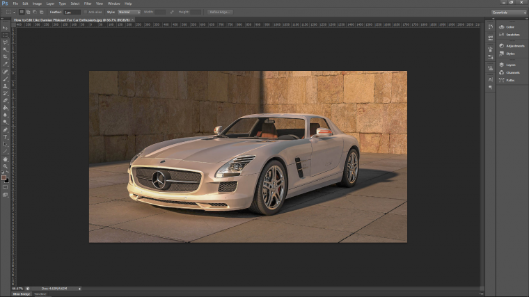
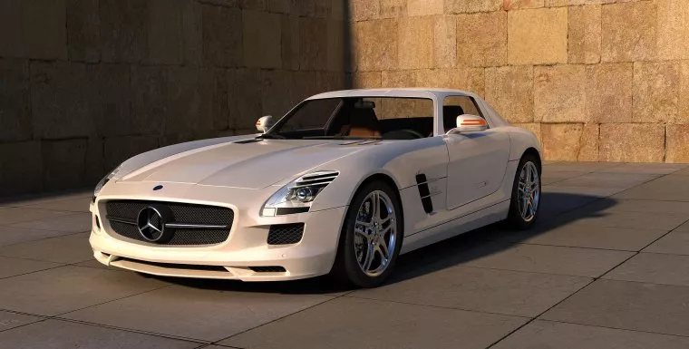
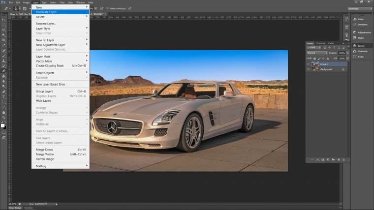
Now that I’m in Photoshop I think I’m going to remove my background and replace it with something a little more interesting.
Note: this is only a side option that I have chosen to do, you do not need to do this, so I’m not going to go into detail on this, you don’t have to do this option if you have a cool background, it’s just mine was kinda bland 🙁
My thoughts on this is I’m going to leave that first block in the wall so it looks like a little 1 foot sized wall with some sort of epic background. [Check this tutorial out as an example of Photo Manipulation]
So to do this first I’m going to create a duplicate layer of my image.
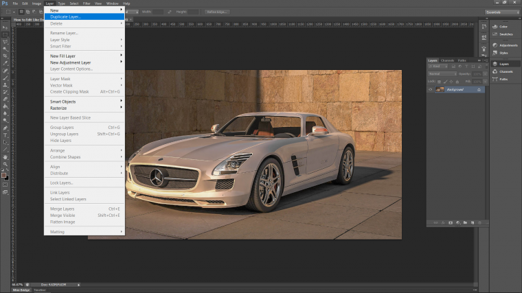
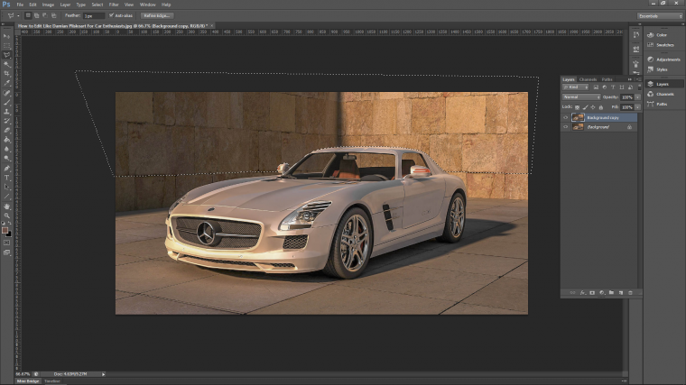
Then open up your Lasso Tool and add 1 to where it says ‘Feather’ to add a little blur to your edges [just under the top menu on the left]
Now you just click a long your edge, be creative with your image, make your selection as you think the image would look, so you see in mine I’m kinda drawing the top of the wall.
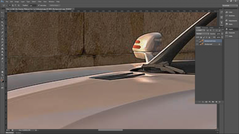
Once you join your selection then press delete on your keyboard to erase that portion of the image.
Don’t get the inside of the care as well.
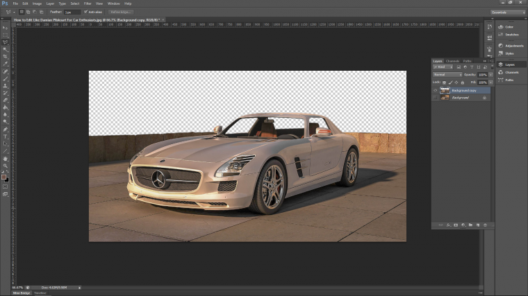
Ok so let’s get back to the main tutorial.
Now we’re going to add a little blur to the background and give the image a bit more depth.
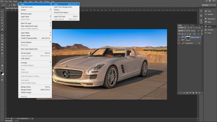
So create a new duplicate layer.
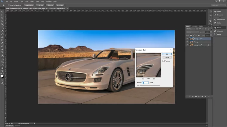
Then go to Gaussian Blur.
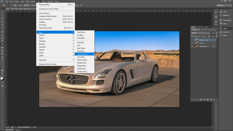
Give it a 2 and press OK.
Next, we’ll create a mask by going to Layer – New – Layer Mask – Reveal All.
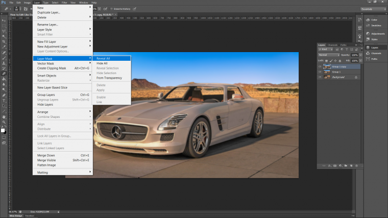
Now you’ll see the White Thumbnail appear beside your top layer.
Using Black on a soft paint Brush and an opacity of 50% you then start to paint out and blend the foreground in so the car (minus the inside) and the ground in front all comes back into focus.
Now we’re going to add a little bit of a Lighting Effect to the image.
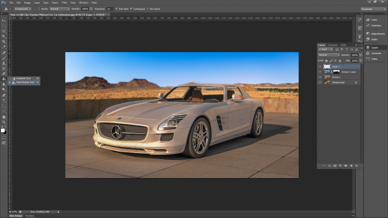
Create another new layer tat we are going to be working on.
When you have that layer then we have to fill it with Black, you do this via the Paint Bucket Tool.
When you have that selected, you simply just click on your image to fill the layer with Black.
PS: take note of the direction and angle your light on your image is coming from.
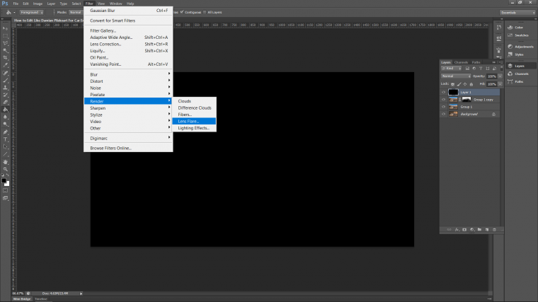
Now to create the cool effect.
You will find it in the menu option Filter at the top of your screen.
Go into that and then down to Render.
In Render, you will then find Lens Flare.
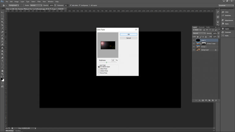
Now move the lighting effect you see in the middle of your panel to the direction your light is coming from on your image.
When it’s placed you can then move the brightness of the effect up.
I moved mine just up over 100% somewhere round there will be fine because you can always drop the opacity of the actual layer.
when you’re happy hit OK.
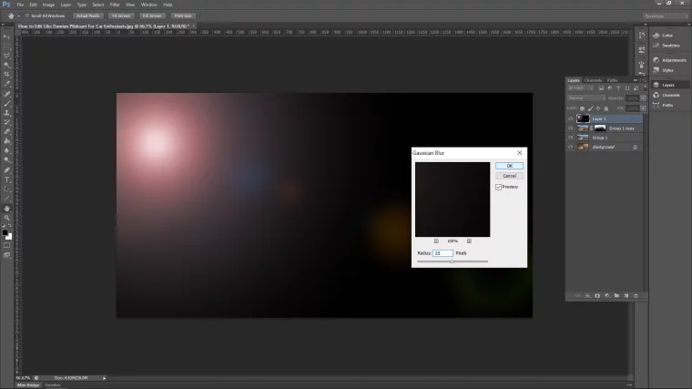
When that’s all sorted, let’s get a blur on it, same as before let’s go to Gaussian Blur.
Filter – Blur – Gaussian Blur
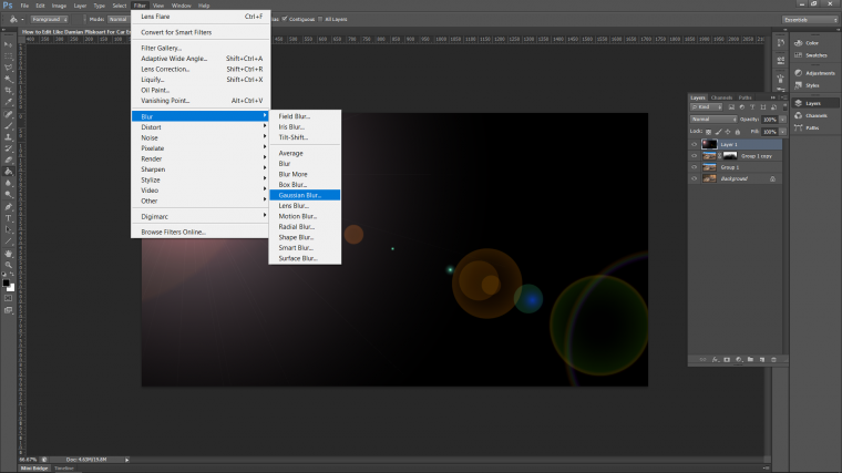
A Blur Radius of 35 will look good!
Hit OK when you’re happy.
At this stage, we are nearly done, but we have to add a Blend Mode to our lighting Effects Layer.
So in the layers panel on the right hand side you will see the word ‘Normal’
Click that and it will open up a large menu of Blend Modes.
These do various things to the layer so if you want to have a play around for a little bit then go ahead and see what everything does.
But when you do you’re going to want to go back and choose the Screen Blend Mode!
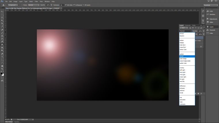
This will now make your layer transparent so only the black is removed but the effect is still there!
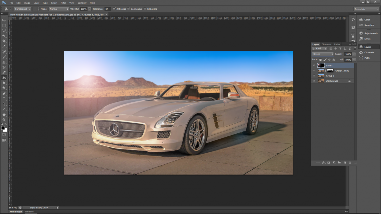
The last thing that I’m going to do with the lighting effect is to position it a little bit better.
So Key in on your Keyboard Alt+T to open up Free Transform.
Then you can move the effect around and change the size and shape of it to whatever you want like mine below.
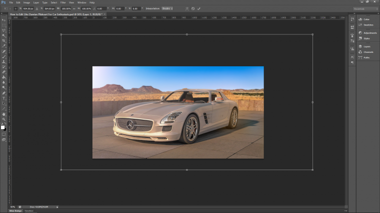
If you feel your Lighting Effect is a little too strong then as I mentioned you can drop the opacity of the actual layer.
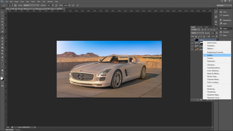
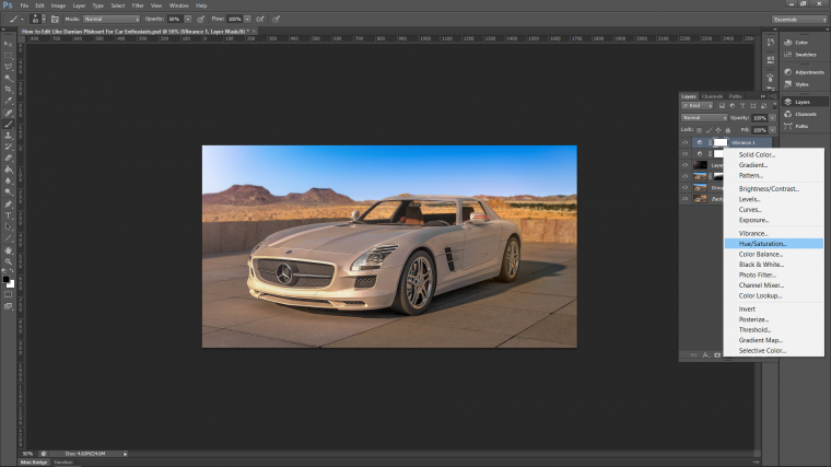
Now I’m going to finish up with a few adjustment layers and then one last touch with the brush tool.
To create an adjustment layer look on your layers panel at the bottom and you will see a half circle.
Click that and the menu will appear, this will be done 3 times.
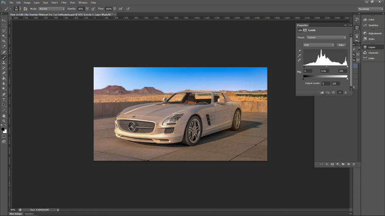
Levels first.
I just moved the middle slider towards the right a little to add a bit more contrast darkening the shadows.
Next Vibrance.
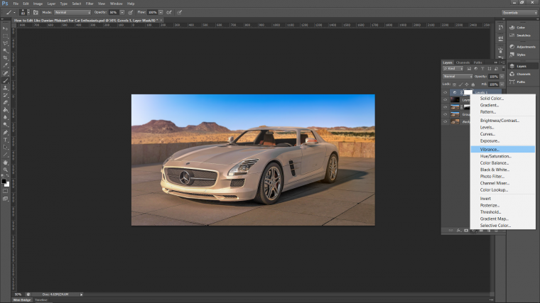
I moved my slider to the right again to add a little bit more color to my image.
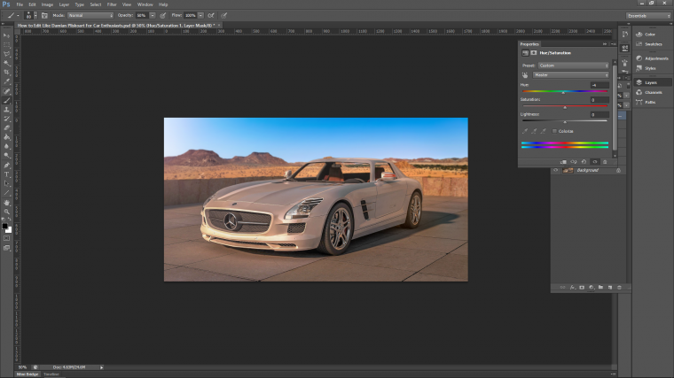
Lastly Hue and Saturation.
I moved my slider the tiniest bit to the left toward yellow just to warm my image up a tiny bit more.
Last I created a new layer, enlarged my brush with white as my option and still at 50% and then just click on the left-hand side of my screen to fill that area, then I dropped the layer’s opacity so it blends.
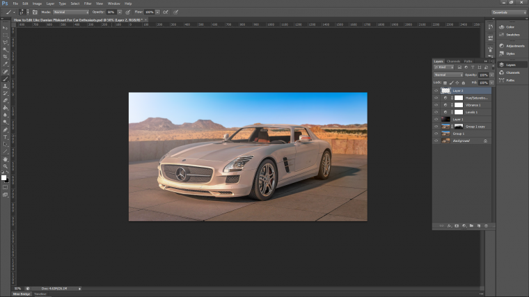
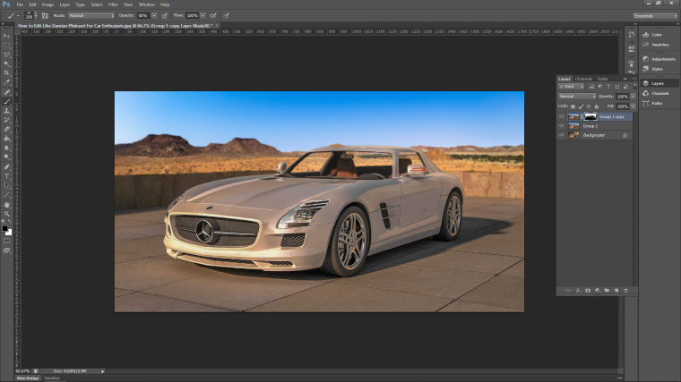
That’s it! your image should look like my image below 🙂 hope you enjoyed.


Please verify your software version before proceeding.
 I’ve verified my software version


 Facebook
 Google +
Comments (3)
Nice post about car photo editing. Both the beginner and learner can learn a lot of things form this post
Everyone will like your collection, Thanks .
Thanks for sharing this content. Your article is very helpful. carry on bro.