Hi everyone and welcome back to another cool tutorial on Photoshop.
I’m sitting in my favourite chair atm looking out at the rain so I’m ready to churn out so great content for you today that I hope you will enjoy and find a use for, even if it does just help you learn the nuts and bolts of Photoshop.
Today I’m going to be showing you the Lith Print effect Action.
So the official definition used in Wikipedia for this is as follows…
“A lith print is a photographic printing process that uses standard black-and-white photographic paper with the lithographic developer (often heavily diluted standard developer) to produce a print with dark shadows and soft, bright highlights. The effect has been described as “creamy highlights and hard shadows an appearance, not unlike a charcoal drawing”. Tones, colours, and subtle hues different from standard black-and-white print can be achieved”
Or as I like to call it, making your Photo look really old and really old west look.
So I’m going to do a crossover here I’m going to take something new and make it look old.
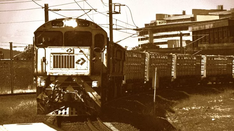
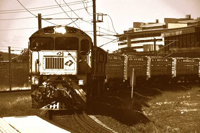
Check out the image I’ll be using below.
This modern-day train by the end of this will hopefully be transformed into something that looks like it was in a Photo taken a hundred years ago or more.
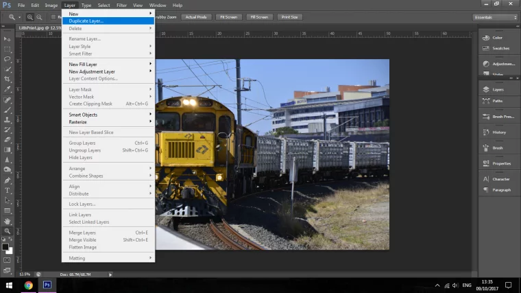
Ok, so the first thing that I’m going to do is create two duplicate and re-name them to fit the task they will undertake.
I do this by going to Layer – Duplicate Layer
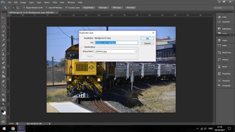
When you do this you will notice a panel appear, on the top bar As: you will be able to fill in the name of the Layer.
The first I’m going to call it mid range and the second one I’m going to call it Shadow and Highlight.
Now that these are ready you will see in the panel on the right-hand side with the layers, there is a little eye icon beside it.
Click on the eye on the top layer so the Mid Range one is visible and the top one the Shadow and Highlights one is hidden.
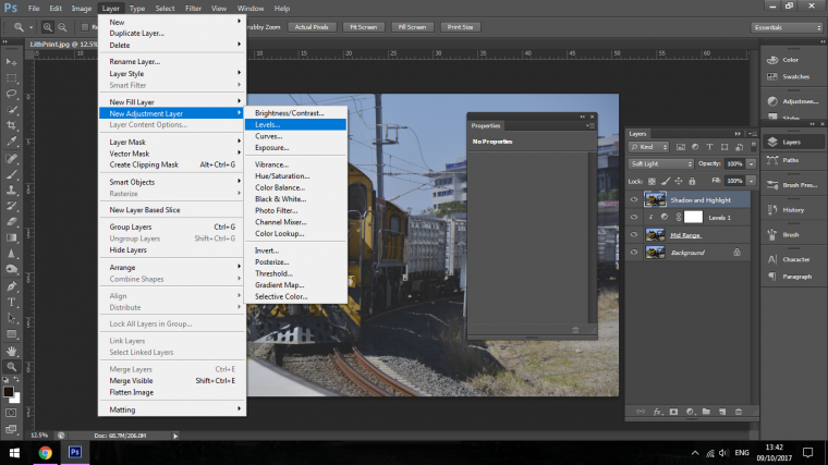
On the Layer Mid Range, I’m going to create a Levels Adjustment Layer.
I do this by going to Layer-New Adjustment Layer – Levels
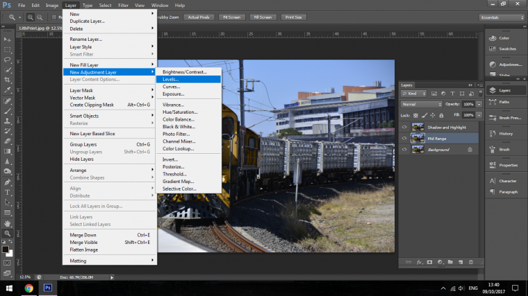
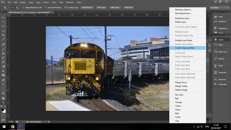
Now you will notice that there will be a new layer just above your layer that you’re looking to change, we will have to create a clipping mask for this so that when we adjust it, it will only adjust that layer, this is done by right-clicking on that adjustment layer and then clicking on Create Clipping Mask.
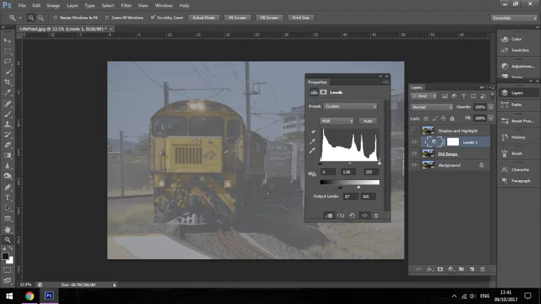
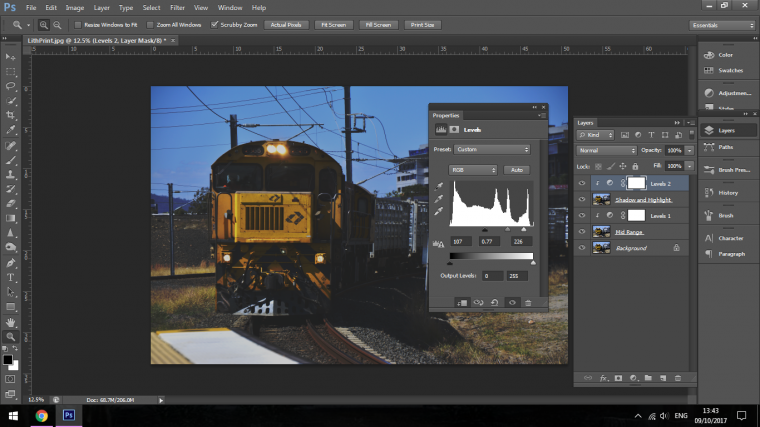
Now in the Layers panel, and just quickly if you need to activate if you click on the circle with the half filled.
Double click that and the panel will appear.
Now you will see the histogram and another bar below that going from Black to White.
The bottom bar is the one that you want to use.
So you take the slider in turn at each end and you drag them in towards the centre.
Don’t worry so much about how it looks yet as we’ll be adjusting it to compensate later once we have established the other steps.
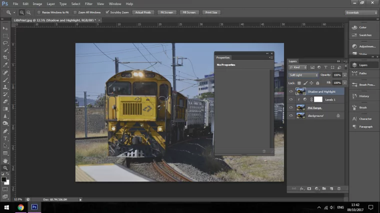
Now, once that has been completed you will have to now activate the top layer again by clicking on the eye icon.
Now in the image below you will see in the layers panel beside opacity the words Soft Light.
Yours will not say this just yet, this is your Blending Mode.
Click here and choose Soft Light now.
Go through the steps again by creating a Levels adjustment layer and creating the clipping mask again for that.
Now this time in the Layers panel we’re going to be using the middle histogram instead of the bottom slider which we used in the Mid Range.
Click the Black Marker and drag it towards the centre so that it strengthens the Shadows.
Leave the middle one alone and move right to the White Marker, now do the opposite with it and pull it towards the centre as well right to left this time.
Again don’t worry too much about the effect that it creates as we will be able to adjust later.
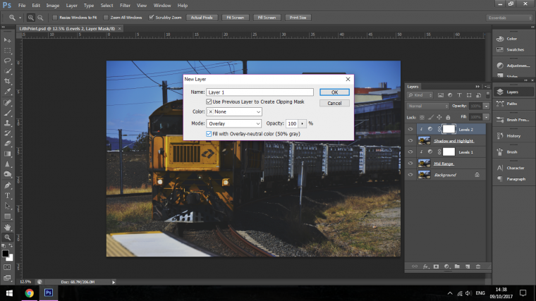
Next, we will move on by creating a new layer on the top of our other layers.
We do this by going to Layer-New Layer.
Then in the little section called Mode click in there and choose Overlay.
When you do this you will be able to choose “Fill with Overlay-neutral color (50% grey” this way you will be able to make edits on this layer but the main part will be invisible.
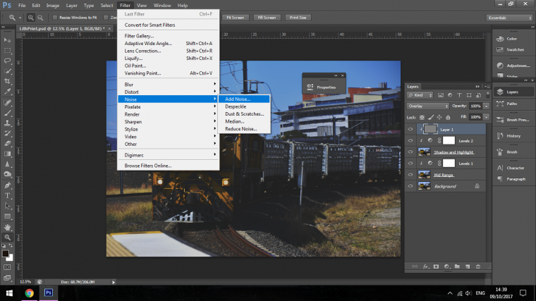
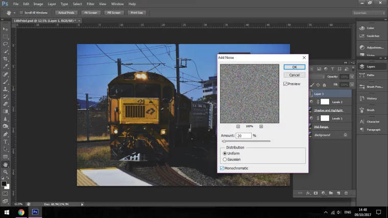
To see this go to Filter – Add Noise
By the way, this part with the noise is not an example, we will be using this layer.
So go there, add noise to around 20.
See images below for reference.

When this is done just take the exact same step again, just go to using the same layer, Layer – Add Noise
Make sure that you are clicked on Uniform and Monochromatic is checked this time around.
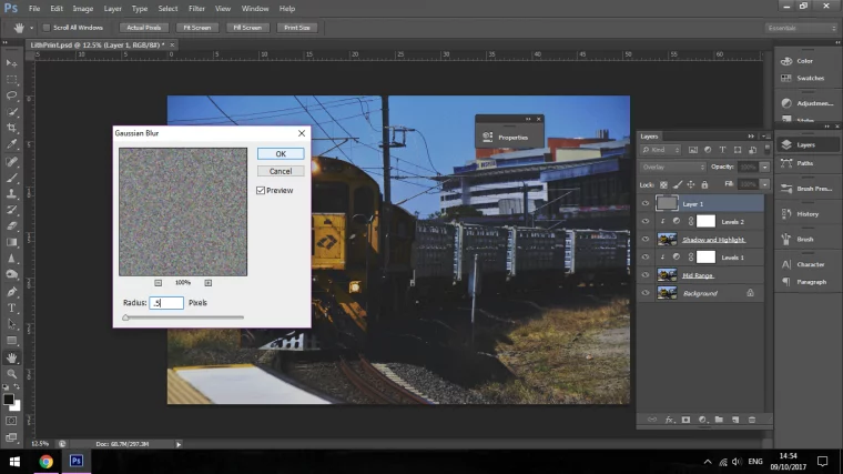
Now I’m going to go to Filter again but instead of choosing Add Noise I’m going to click on Blur instead.
Then go to Gaussian Blur.
Set your blur to .5 so the effect will be subtle.
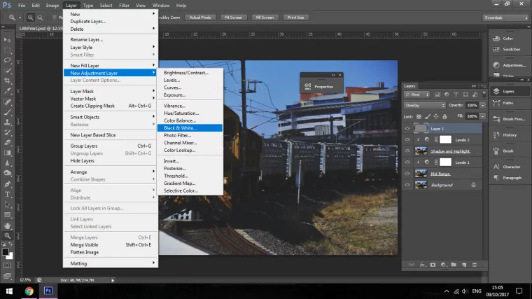
The next step is to add a Black and White Adjustment Layer
Go to Layer-New Adjustment Layer and then go down to Black and White
Now when you do this you will see that a whole panel opens up with some colour sliders.
So the deal with these is, you can slide this about and it will according to the colour you are messing around with darkening or lighten that individual colour.
For example, if you have an image of some flowers but the Red flowers in that image was a little dull when you convert to black and white you can now slider the red slider to the right-hand side and the colour will no be enhanced quite a bit.
Play around with the sliders and see what you can come up with that makes your eye happy.
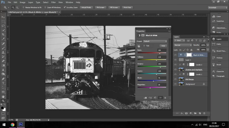
Once you are happy with what you have then change your layer to 85% bringing just a little bit of some of the colour back into the image.
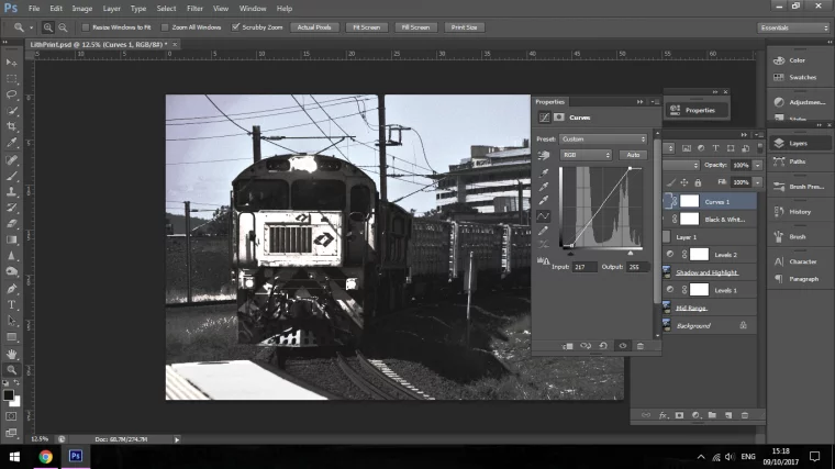
The next step that we’re now going to take it to add a Curves adjustment layer to our image.
So by now, you should pretty much know how to create an adjustment layer but just in case, remember to go to layer, new adjustment layer and then look down through the options that they have for you there.
Of course, we’re going to be choosing Curves.
Your panel will now open up and you will see a graph with a line running through it, take the top part of the line and click the very edge of it.
Then drag it towards the left to increase the highlights.
When you have done this do the exact same with the dark side at the very bottom of the graph.
So when you do this your image should resemble the image that I have below.
Now we have gotten this far we can now look to add the Lith Tone to our image.
Lith effects are known for having that yellow tinge or somewhat of a sepia look.
There are a few different ways you can create this effect with using gradient maps etc but for this, I will use Colour Balance,
I will do this by creating a New Adjustment Layer again and choosing Colour Balance of course.
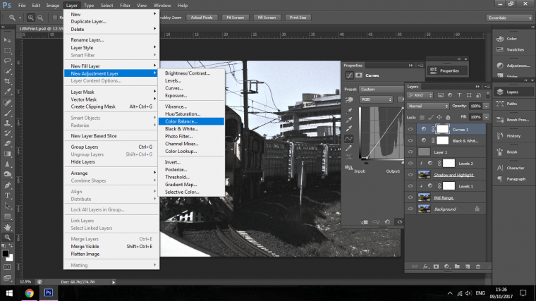
Now once the Colour Balance panel appears you will see that there is a tones dropdown box, in there you can see Shadows – Mid tones – Highlights
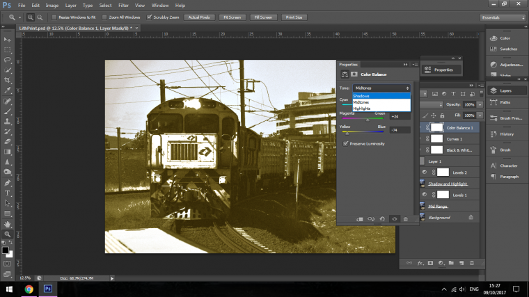
Now you will have to go through each of these and have a bit of a trial and error session to see what the best effect is to please your eye baring in mind that you have to keep the yellowish sepia colour.
This may take you a little bit of time though saying that not “that” much time, you could get this sorted in about 3-4 minutes if you were very particular on how you wanted it to look.
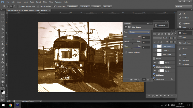

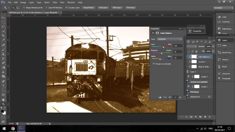
Once you are done you will end up with something that looks like my image below.
Hope you enjoyed and learned a lot.
Here’s what you need to do to add a vignette of any color to any photo in photoshop.


Please verify your software version before proceeding.
 I’ve verified my software version


 Facebook
 Google +
Comments (0)
There are no comments yet.