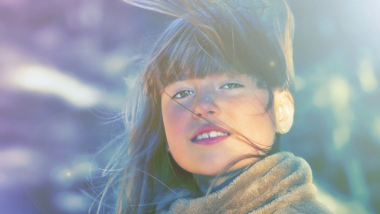
In this one I’m going to be showing you how to create a cool light effect for your portraits that you will be able to save an use again and again on different images, I’ll also show you how to do that.
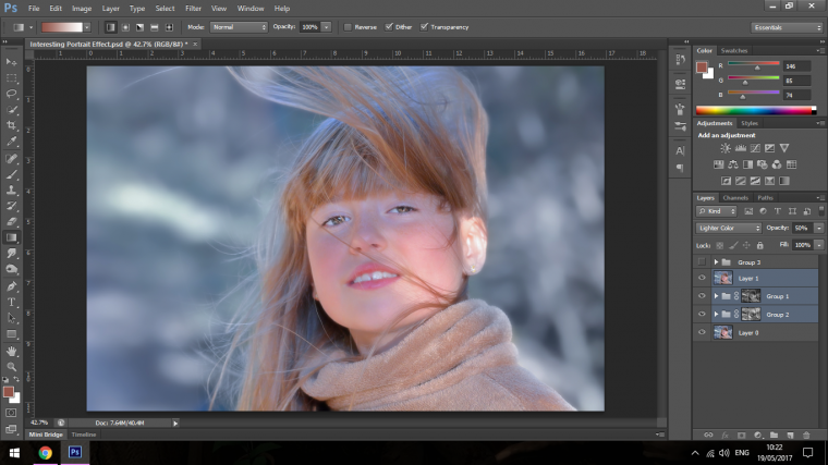
So the first thing we are going to do is to create two duplicates of our main layer so we can use and still have a back up if needed to duplicate more.
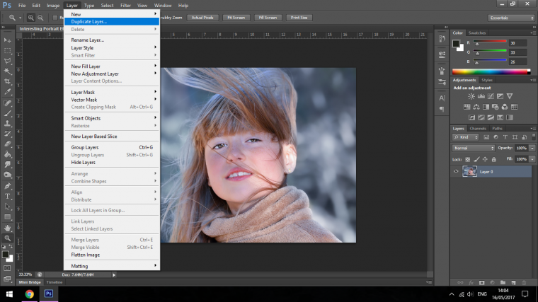
When you have that done click the eye icon on the top layer to hide it for a second, we’ll be coming back to it shortly.
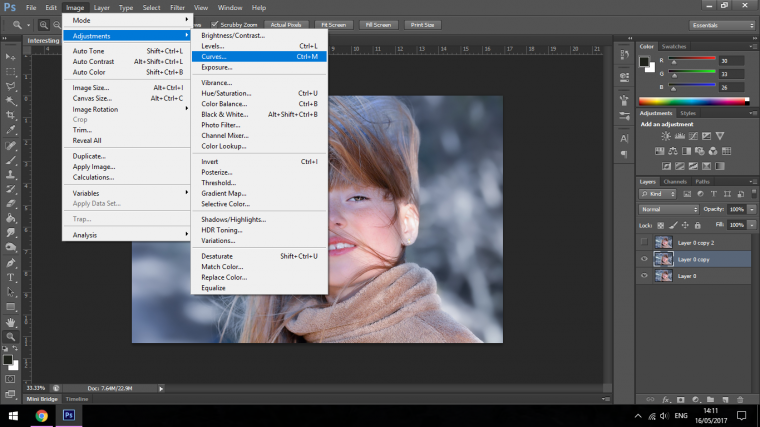
What we have to do now is to create Curves Adjustment layers for both of our new layers.
With the first we want to make out Highlights more prominent, so click on the middle of the histogram line and drag it up about 3 quarters the way up the immediate square, you will see everything lighten up.
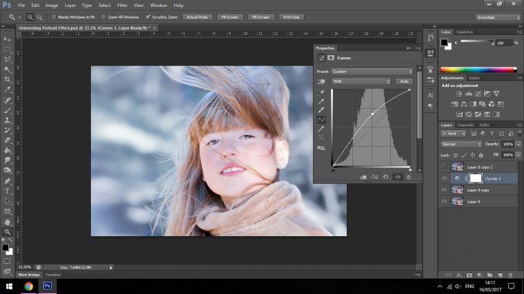
Now create another Curves Adjustment Layer on the other layer but do the opposite that way this layer will now be darkened.
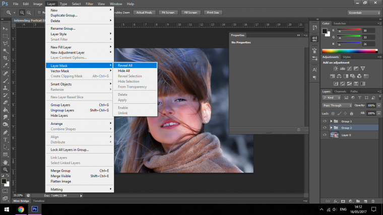
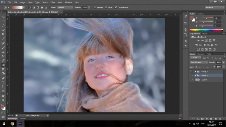
Then you will have to Group the layer with its Adjustment layer, you do this by Clicking on one layer, hold Shift on your keyboard then click on the second.
Then key in Ctrl-G, then that will group the two together.
Do the same for the other pair.
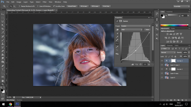
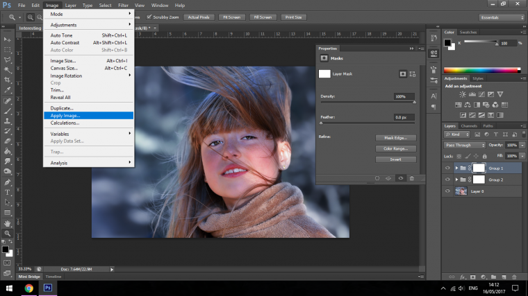
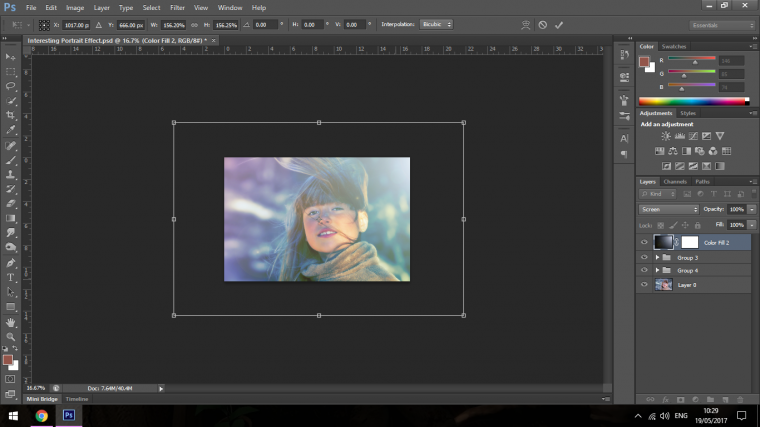
Next, create a layer mask for both as shown below.
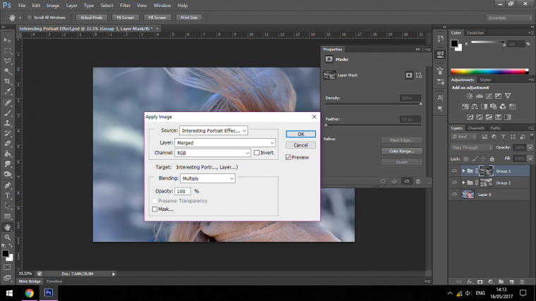
Then for each go to Apply Image.
What this will do is it will create a mask for the Shadows and for the Highlights for each image.
So for the first, which is the Lighter image you will have to check the Invert box in the panel, it’s right under Layer and to the right of Channel.
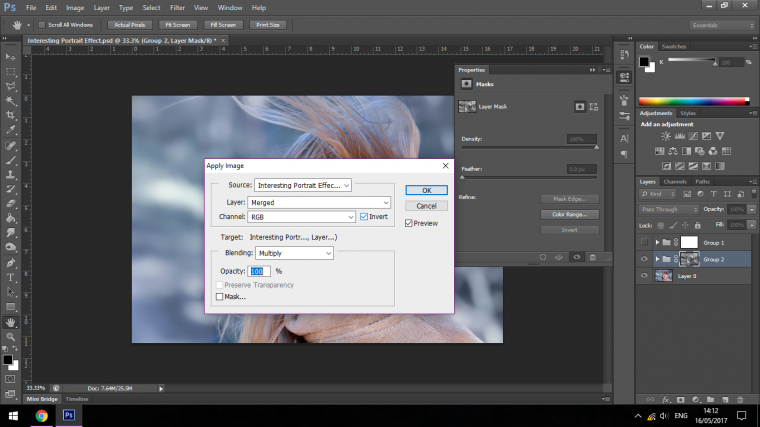
Then you do the same for the Darker image only this time instead of checking Invert, you uncheck it.
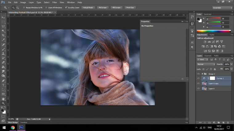
Great now we’re ready to move on.
Next hit on your Keyboard Ctrl + Shift + Alt + E
This will create a stamp of the image, that means it will combine off the element without destroying the originals into one image.
You will see that appear in your Layers panel above everything else.

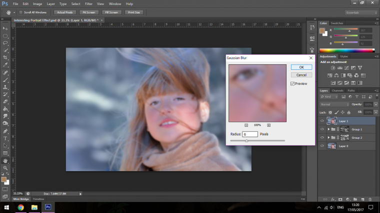
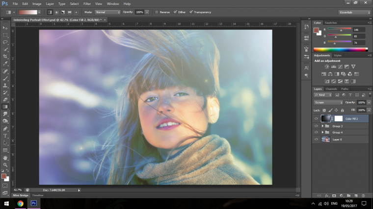
Next, we’ll add a slight Gaussian Blur Effect.
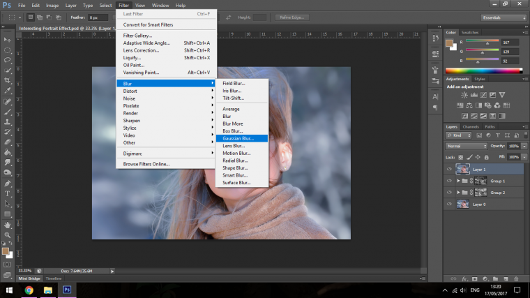
I think that a Radius of about 6 Pixels will do the trick.
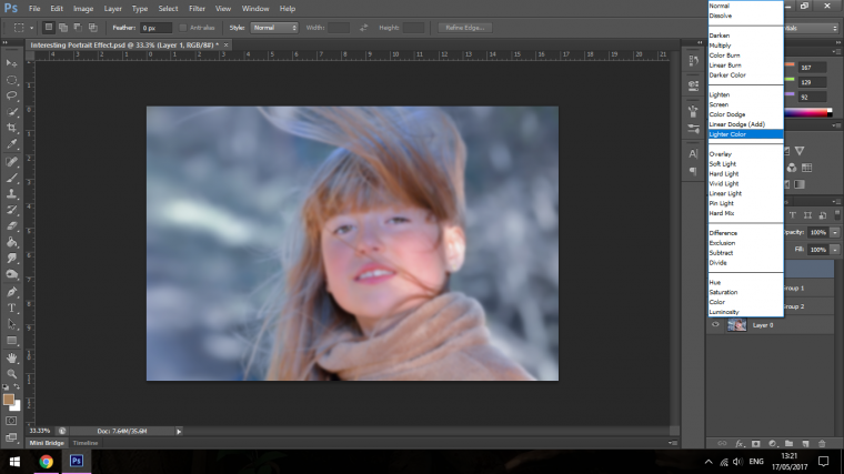
Then once you have this complete change the Blend Mode to Lighter Colour.
You will find the Blend Mode in the Layers Panel to the right-hand side where you will see the Opacity and Fill Options, Blend Mode is the Drop Box to the left-hand side of these options, it will be labelled as Normal to start with unless you have changed it at some point yourself, when you click on that Drop Box you will then see all the options that are available to you, click on the suggested option.
For us, that’s Lighter Colour as mentioned.

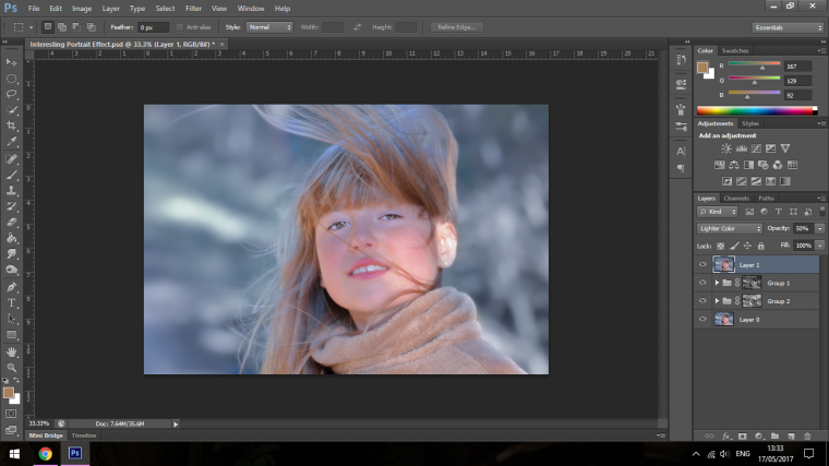
Then you can drop the Opacity to around 50%
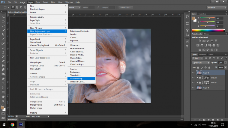
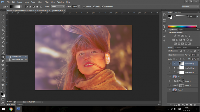
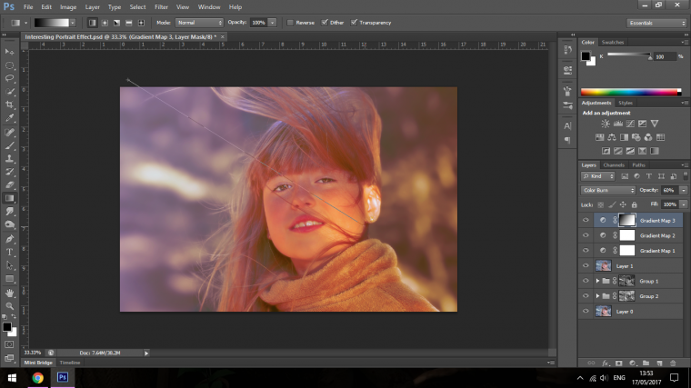
Now we’ll add some of the Cool effects we’ve been waiting for, for this create 2 Gradient Map Adjustment Layers.
Once you click OK and you get the Gradient Map Panel appear click on the color line to open up the Gradient Editor, in there you can change Gradients and Colours to what you would like.
The combinations are endless.
I would suggest though that you know which colors go with which, so it might be a good idea to check up on the colors wheel or on the Adobe Colour Wheel. (https://color.adobe.com/)
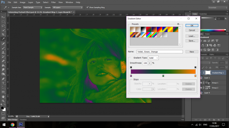
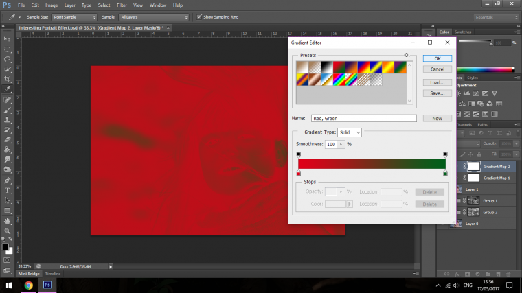
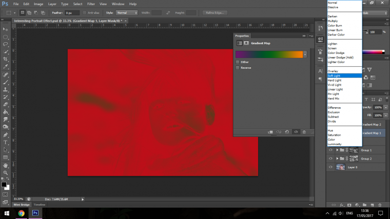
Once you have figured out the colors that you are going to use then change one of the Layers to the Blend Mode Soft Light and the other one to Screen.
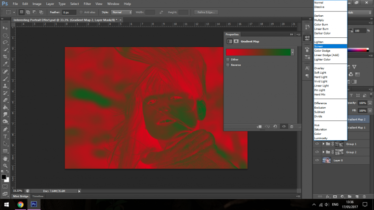
Now start to play around with the Opacity of each layer till you get a look at your image that satisfactory.
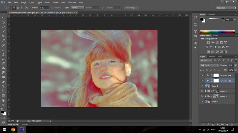
I also added in a Third which you should do too if you want, this will all be trial and error and I encourage you to try these out without my full guidance as this section is to do with your creativity.
You can also change the direction of your Gradient but choose the Gradient Tool, then Clicking and Dragging over your image to do so.
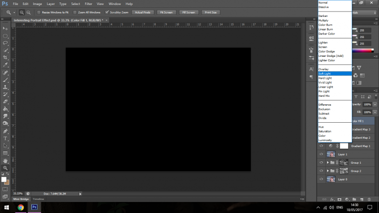
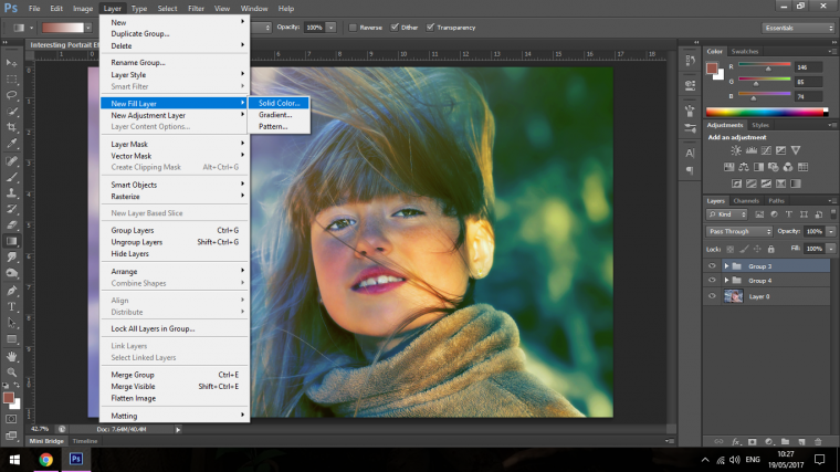
Right now what we’ll do with our image is to add a Black Layer, then change the Blending Mode to Soft Light.
If you forgot where Blending Mode is, here is a quote from Part one…
“You will find the Blend Mode in the Layers Panel to the right-hand side where you will see the Opacity and Fill Options, Blend Mode is the Drop Box to the left-hand side of these options, it will be labelled as Normal to start with unless you have changed it at some point yourself, when you click on that Dropbox you will then see all the options that are available to you, click on the suggested option.”
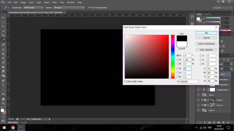
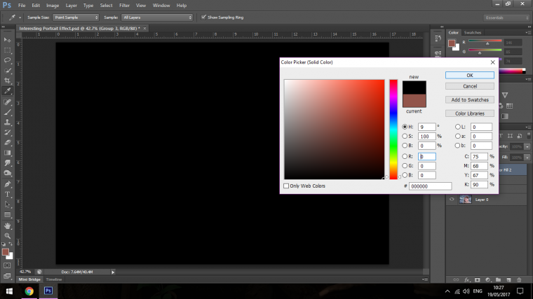
Go to Layer – New Fill Layer and choose Solid Colour
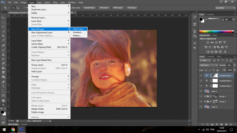
You will have to click through a few Panels until you come to the one below, so just click OK till you see the image below.
Once that appears click at the very bottom to choose Black.
Then as we talked about choosing Soft Light as your Blending mode, this will increase some of the contrast for your image.
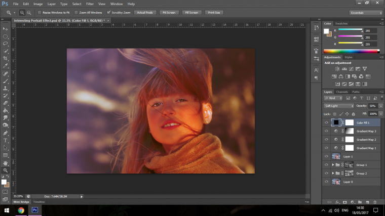
The image may now be a little too dark so feel free to drop the Opacity down, I went to 50% as I think that looks pretty cool, I may change as I got along which is why I’m using Non-Destructive Adjustment Layers! hint hint… 🙂
Now add a Curve Adjustment Layer as we have been doing previous using Image – Adjustments.
Set the Histogram by Clicking and Dragging as follows.
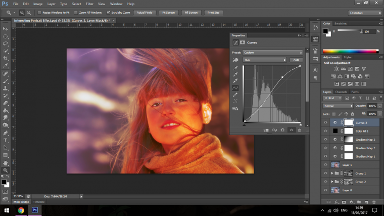
Now change the Blending mode of your Curves Adjustment Layer to Screen and Adjust your Opacity on that Layer to where it looks good for you, I went with 70% as my Image is rather Dark.
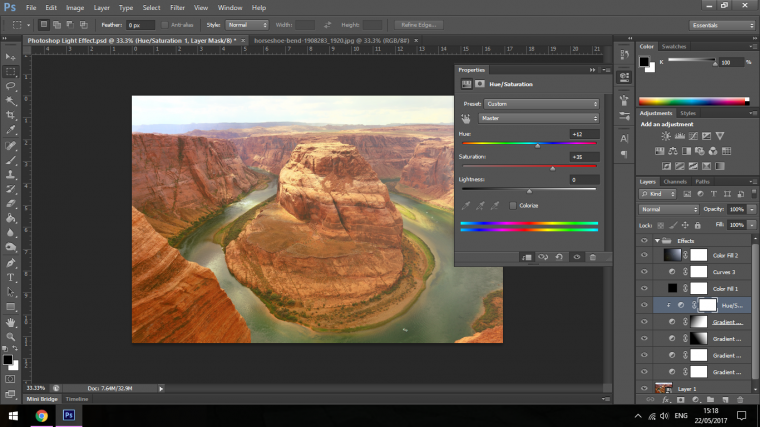
Now click on your Top Stacked Gradient Adjustment Layer and then create a Hue and Saturation Adjustment Layer, right click on that and choose to Create Clipping Mask
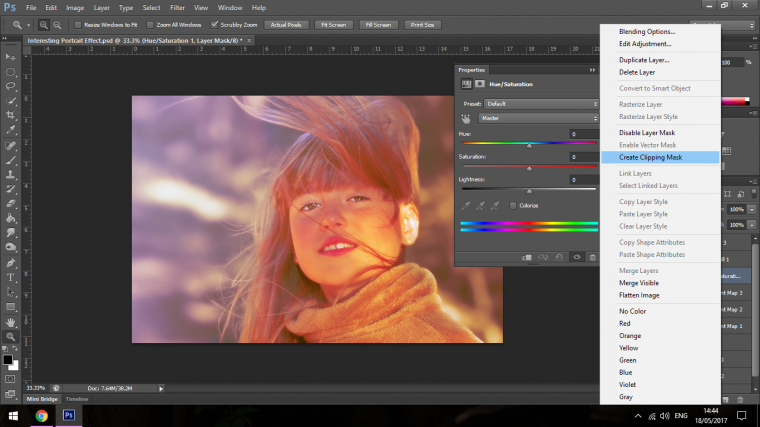
Now you will be able to play around with the Colours by sliding the Hue Slider back and Forth, you can also do the same more Sparingly with the Saturation Slider to see what you come up with.
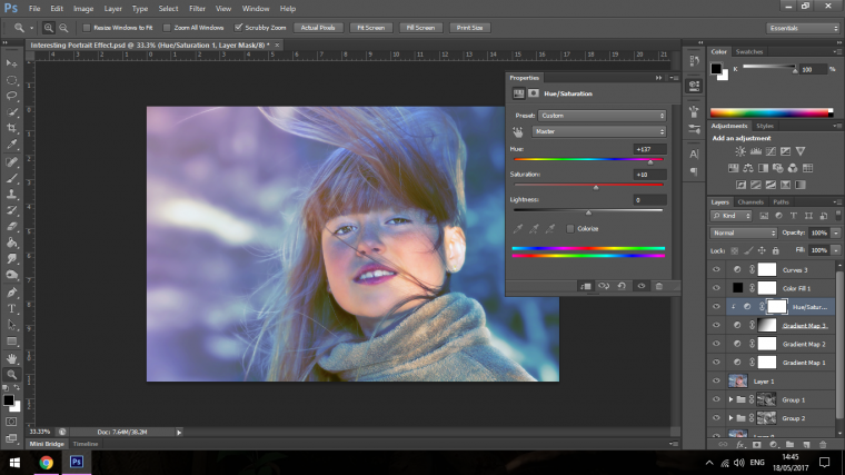
If you also want at this stage you can add in another Gradient under the top stacked Layer.
So based on the Colour Wheel with the image being mostly Purple I’m going to add some Yellow to the side the sun is on, you can this time flick through the Blending Modes and Play with the opacity and see what you come up with if you choose to explore this extra option, you may be quite happy with your image as.
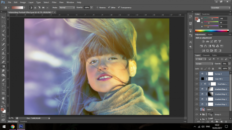
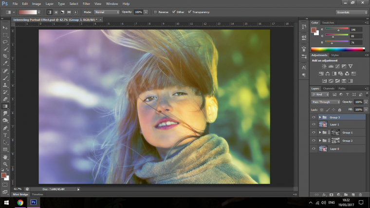
Now I’m just going to group all the different option together.
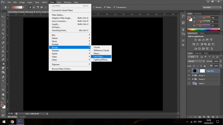
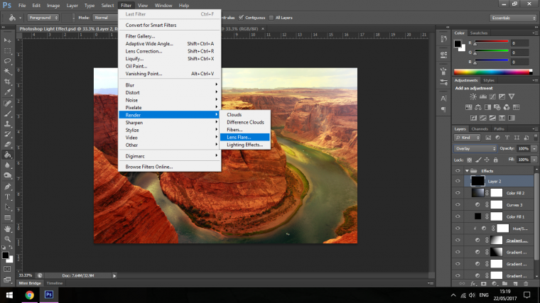
The last touch I want to do to my image is to add some Lens Flare.
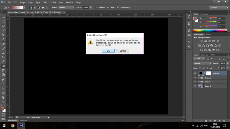
The way to do this is to create a new fill layer and fill it with Black as we did shortly before.
So go to Layer – New Fill Layer – Solid Colour
Change the Fill Colour to Black just as we did before.
Now to add the Lens Flare.
You find this in Filter – Render – Lens Flare
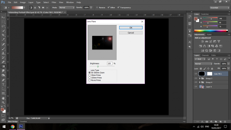
Click Ok
Now the Panel is open and you will see the Lens Flare on a mini Screen, you are able to click on this and move it around, so move it to where the light source is in your image.
Then you can increase the Brightness and change the type of Lens Flare, I increased my Brightness to 141% but do it to where you think will suit in your image, I also changed my Type to 105mm Prime, but you can choose whichever one you like the best.

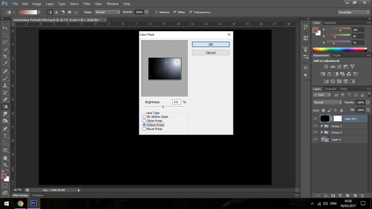
Then I clicked ok, but when I did I wanted to reposition it a little.
I keyed in on my keyboard Ctrl + T to open up my Free Transform Tool.
Then I was able to increase the size and position it better.
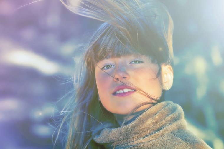
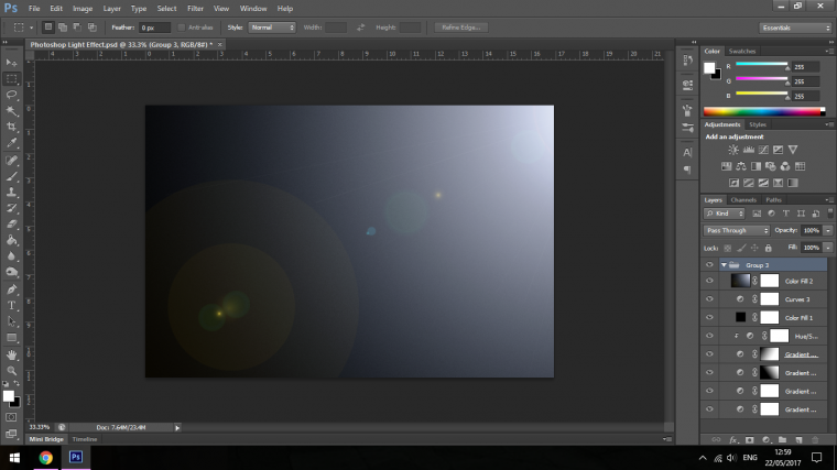
This is how my image ended up.
The first thing that I’d like you to do is save the File under a different name, something like mine ‘Photoshop Light Effect’
Now we can delete the original image.
That should be the first group with the original image that will be your first layer.
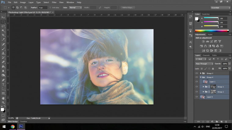
If you have any other files outside of your second group then click and drop those in, then rename the folder as Effects.
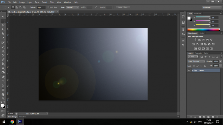
Now we’re good to go, what we’ll be going over now is more on the Artistic side and sharing my thoughts while we use this effect, I’ll also show you how to add it to your images/add the image to your effect.
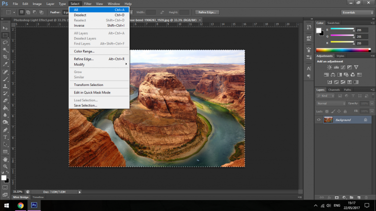
Let’s apply this to our first image and see what it looks like.
The first image I’m going to take a look at will be a desert scene, so the Lens Flare Effect should show up pretty good.
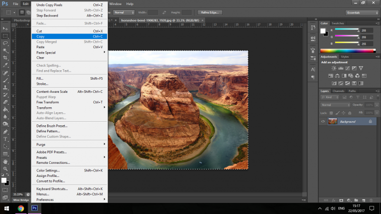
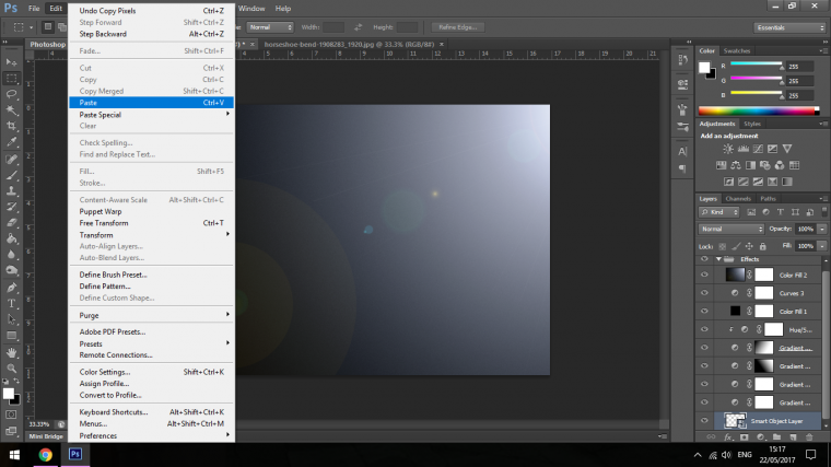
Go to Select and Select All
Once you’ve done this Copy the Image
Edit – Copy
Click on to your Effect and Paste the image in there right at the bottom, don’t worry too much about the placement of your image because you can simply click on it and drag it down to the bottom of the folder, I usually place it on the outside of the folder at the very bottom that way if I was to make the effect more subtle I can just quickly drop the opacity of the Effects Folder.
Edit – Paste
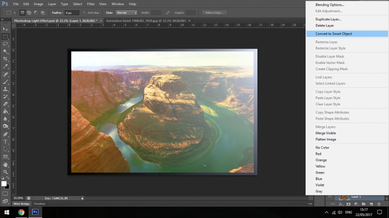
Convert the image to a Smart Object first before any resizing is done, this is important so that you preserve the details in your image when you resize.
When you go to resize and this will vary quite a bit from image to image, I first hit Ctrl t to open up my Free Transform Tool, I then hold down Alt and Shift on my keyboard while I click and drag out my image, this will resize the image to perfect constraints out from the centre of the image.
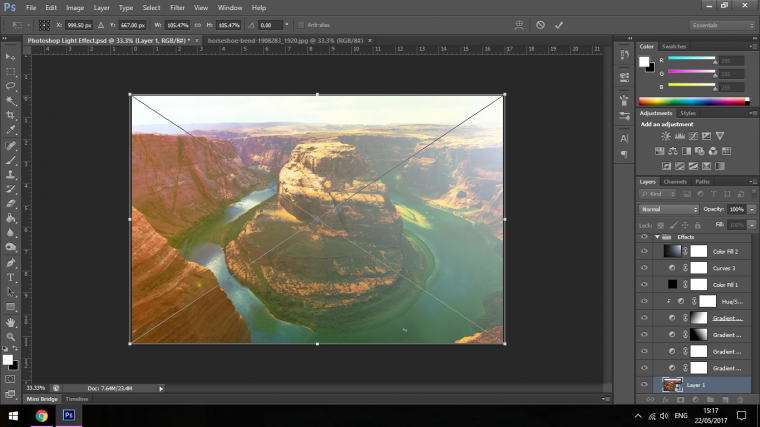
Press Return when you’re done.
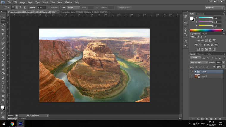
Your image should now be nicely added to your effect.
Now you will be able to click open the Effects folder and change the individual effects as you see fit by double clicking on them.
With this image it’s a contrasting image, the main colors are Red and Green, opposites so it will work really good when you change the Hue and saturation up, so I want to concentrate on how these two images appear.
If you wish you can also add in new Lens Flare Renders adding to them.
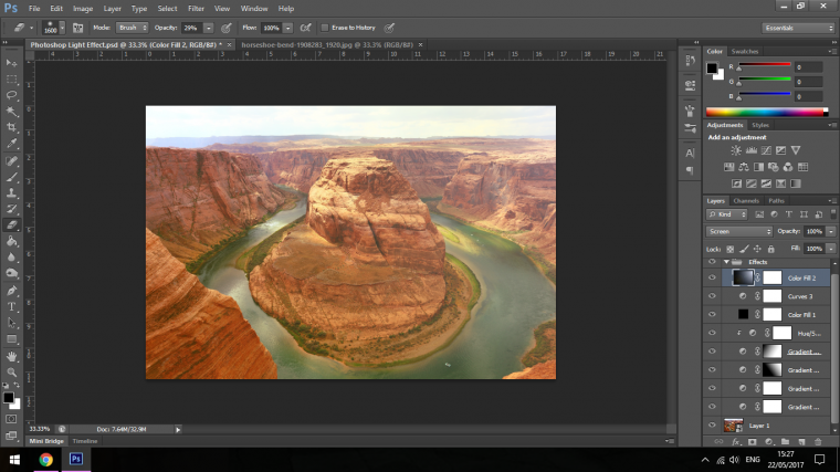
Our effect has given a pretty cool vintage look that I’m happy with, so let’s try it out on another image and see how it’s affected.
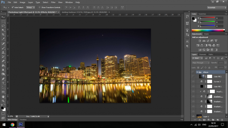
Ok, so this image that we’re going to go with is a pretty intense city night scene, with our effect we can defiantly intensify it a lot further.
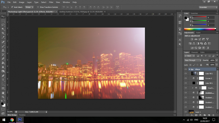
So the effect goes on and it’s pretty extreme to start off with, I do like it but I think I could pull the image out a little more.
So as we talked about previously the first thing that I’m going to do is to drop the over all effect folders opacity.
I’ll drop it by about 50%
Then I’m going to go in a drop the Lens Flare by 50% as well, it’s far too strong atm.
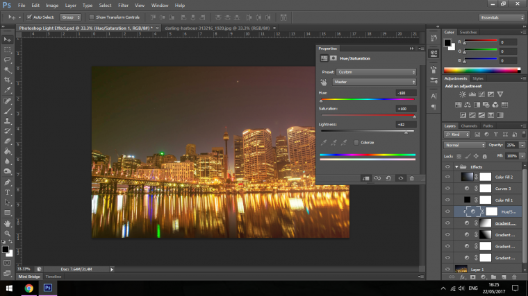
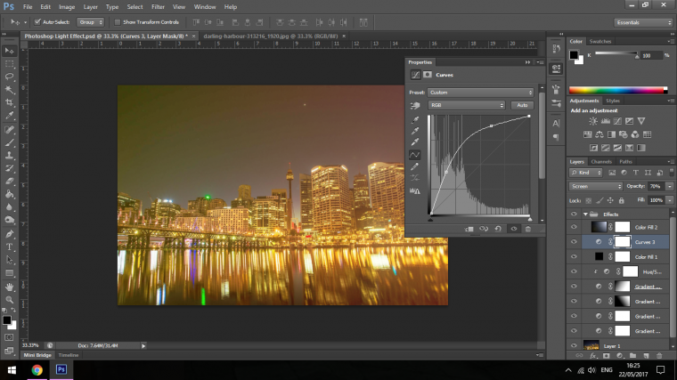
The last little touches I’m going to do is to play with the Hue and Saturation and the Curves Adjustment Layer, my focus is to increase the lights.
So hopefully you enjoyed these tutorials and learned a lot from them.
Look out in the future as there will be many more Free tutorials brought to you by Sleeklens.
Keep on Photo shopping 🙂


Please verify your software version before proceeding.
 I’ve verified my software version


 Facebook
 Google +
Comments (0)
There are no comments yet.