Hello! hi there, hope you are well and happy to see you here for another Photoshop Tutorial, so for today I want to take a look at the Photographer Toni Mahfud, I follow a good few of these Photographers on Instagram and for style I think you should too if you have an account so you can keep up to date with current/recent(ish) trends, I find a lot of these types of Photographers not only good for inspiration to how an image could look in terms of applying the styles to just normal editing but also for photo manipulations/composites.
Ok so Toni I would say is more of an art based photographer, his work has a lot of creative ideas in there but today we’ll just be focusing in on his editing style as best I can figure it out.
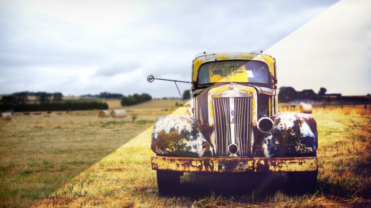
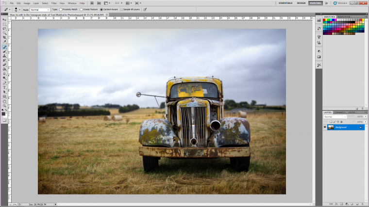
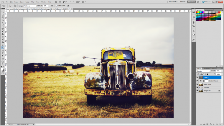
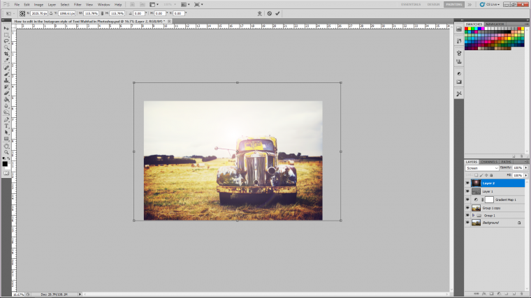
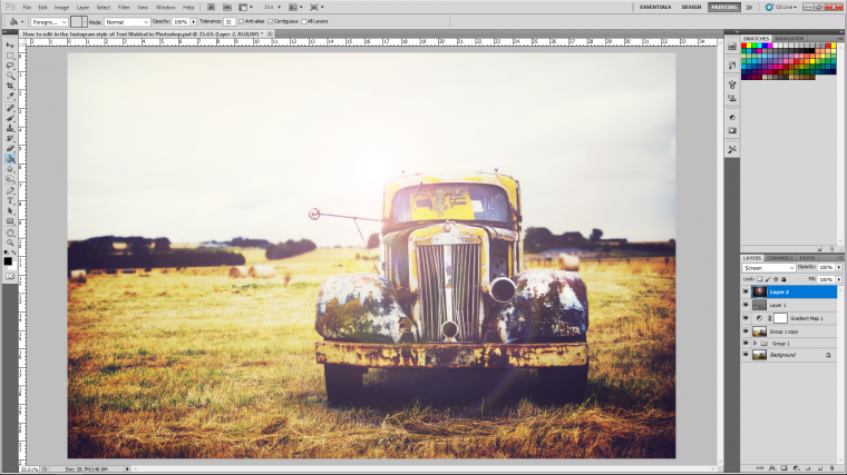
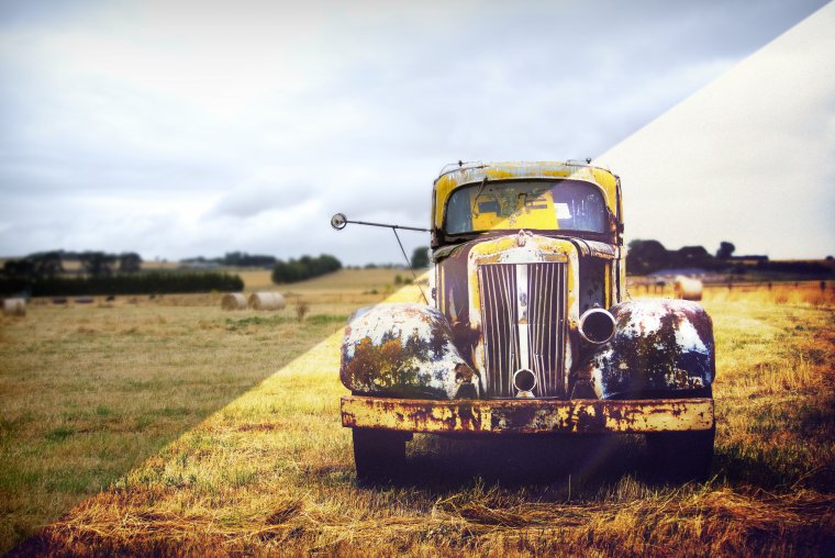
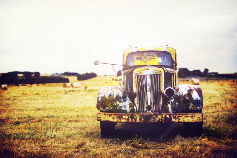
Cool, so check out my image for today…
So you don’t just have to use this type of image, if you like you can apply it to any image you like, If you take a sec to check the photographer up on Instagram you can even copy the types of images that he uses.
This type of editing really brings out the beautiful browns in the highlights and the blues and purples in the shadows, it’s a good mix, so without any further intro’ing let’s get actually started.
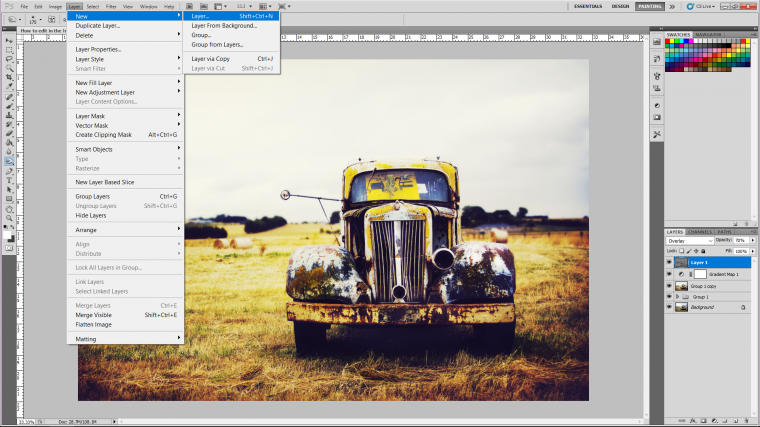
So first let’s create a new copy of our image by going to Layer – Duplicate Layer and click on OK.
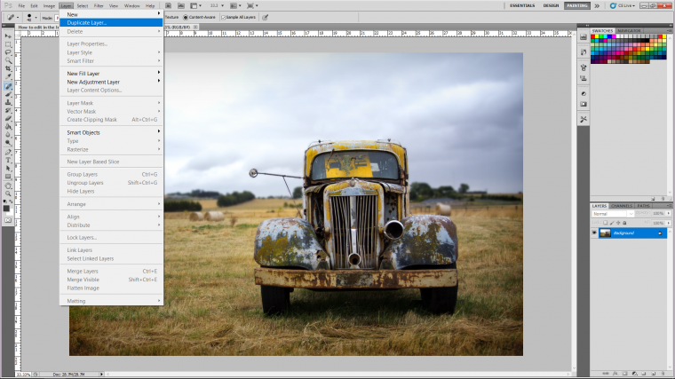
Make sure that you click on the new layer that has just appeared in your layers panel to the right-hand side! it will be named background copy.
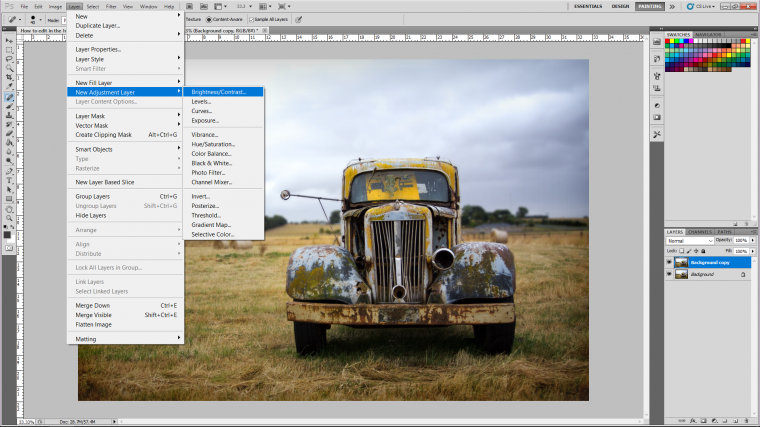
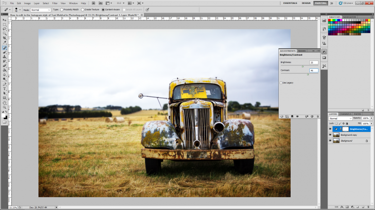
Ok so when you get that sorted you will want to add an adjustment layer, so an adjustment layer is an edit, but it will become a layer on its own just like the image, you will be able to go back at any stage and re-edit when you use adjustment layers if you don’t then the edit you make will be permanent so it’s better to always use adjustment layers.
So click on Brightness/Contrast, and what we’re going to do here is darken the dark’s and lighten the lights.
So when the little adjustment panel appears with the two sliders on it slide the two of them to the right, the edits will be determined on your image, I got away with +25 for the Brightness and 45 for the Contrast [Shadows/Darks]
My only rule of thumb here would be don’t make the image too bright that it gets all blown out and you start to affect the detail and the same pretty much goes for the dark’s as well but you have a little bit more give with those.
Check out Best Photoshop Actions with free examples
Next let’s sharpen the image up a little bit, to do this re-click on the duplicate layer again and then go to Filter – Sharpen – Sharpen
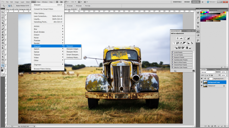
Doing this once should be enough.
You can zoom in and check as you do this by first using the bracket keys on your keyboard, if the image becomes too pixelated then you have gone too far to take a step back, this you can do by holding Ctrl + Alt then hitting (Z)
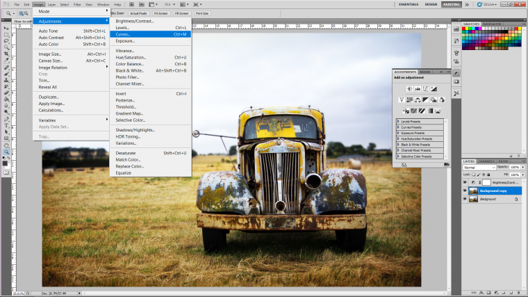
Next, let’s open up a Curves Adjustment Layer.
Image – Adjustments – Curves
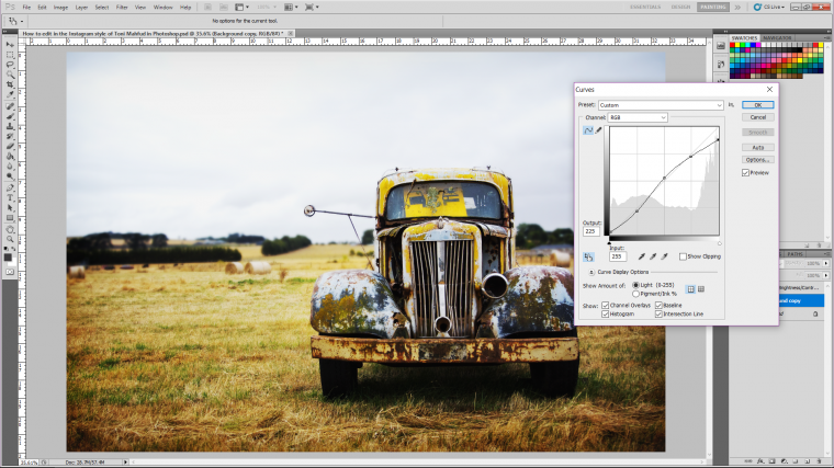
Ok so for this listen up because it might be a little confusing at first.
When you open curves you will see a graph appear with a line through it, at the very bottom left-hand corner, click on the line and drag it up a little [first you might want to look at my example image below], OK then click and drag the line at the first box on the graphs top right and drag it down a little, now click on the very middle of the entire graph and drag the line up a little then drag the line down at the very first corner of the top right hand sides box, then lastly click the very corner of the entire graph and pull it down.
You basically want your graph to look like my graph below, don’t worry about being totally perfectly accurate, we have room to manoeuvre here so you’re good!
Click Ok when you’re done!
Ok so at this point we’re going to open up a new adjustment layer and this time we’re going to choose Color Balance.
When that is open you will see 3 sliders with 6 colours labelled.
You will also notice that there is a setting above that for Tone.
Shadows
Midtones
Highlights
So we are going to be playing around with these.
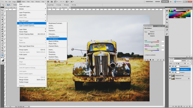
Click the circle beside Highlights so that you have Highlights on, then we are going to add some warmth to the highlights,
so make the number for the highlights about -25, this will add yellow and browns into the image.
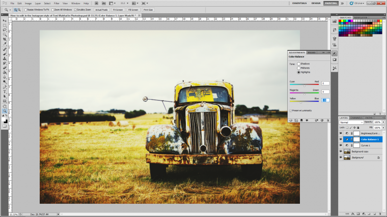
Next I’m going to go through the same process for the Mid-tones and the Shadows only this time I’m not going to add yellow, I’m going to add blue, so for the mid tones I’m going to slide the slider until the number is about 20, then for the shadows I’m going to make the number around 10.

Now your image may be a little bit dark at this stage but don’t worry we’ll be fixing that very very soon!
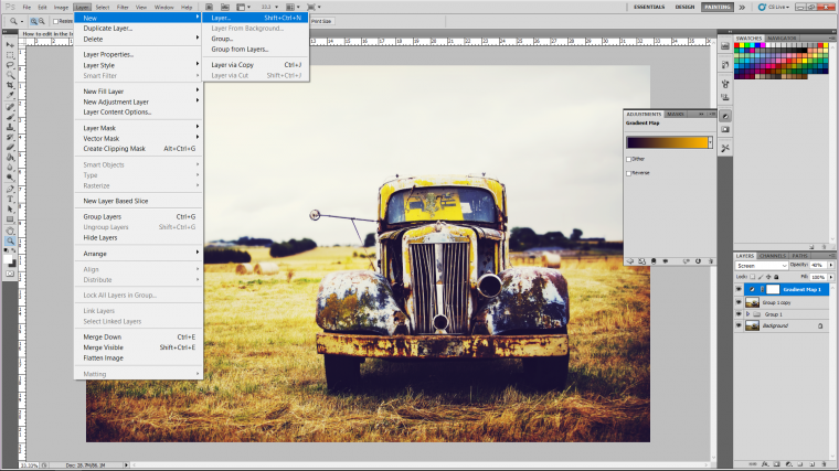
Now we are going to group everything together.
To do this
Click the top layer, hold shift and click the duplicate layer…
You will now see all the layers minus the very bottom one has now been highlighted, next hold Ctrl and key in the letter (G) and you will see all your layers are now in a nice neat little folder.
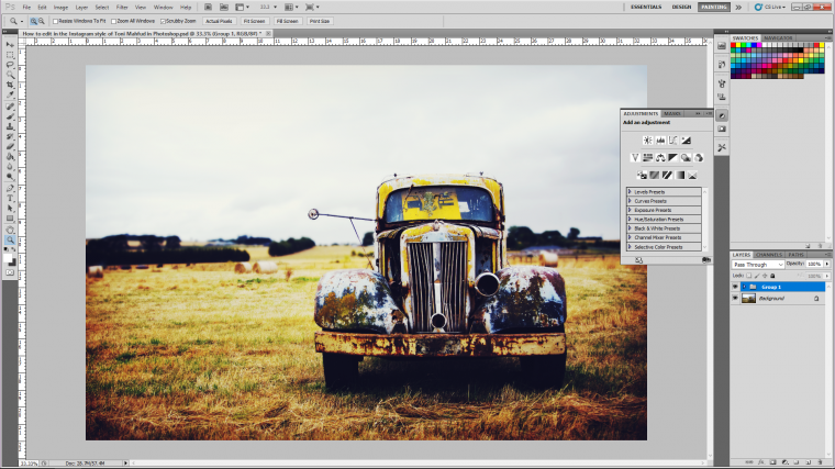
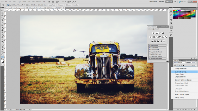
Next right click on the folder and click on Duplicate Group.
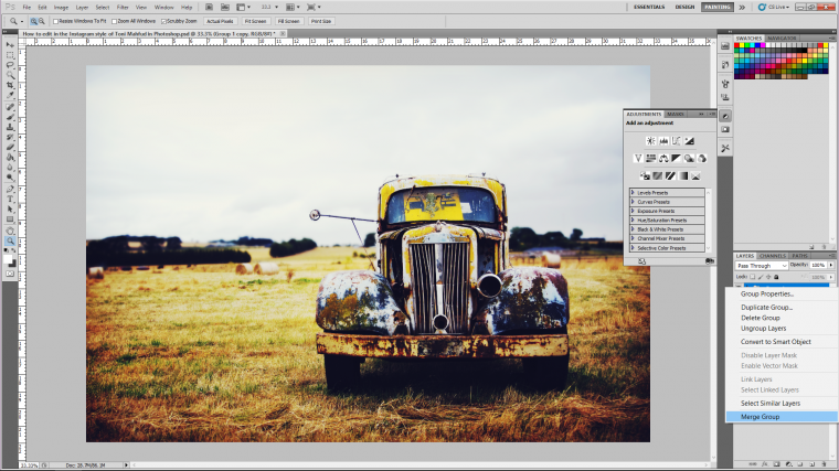
You will see a copy appear, when you do right click on that and then click on Merge Group.
You will now have a fresh copy of your image that if you wish can do a bit of retouching on if you are not 100% happy with whatever it is from the original if it’s a portrait it may have some blemishes or whatever.
Anyway on with the editing…
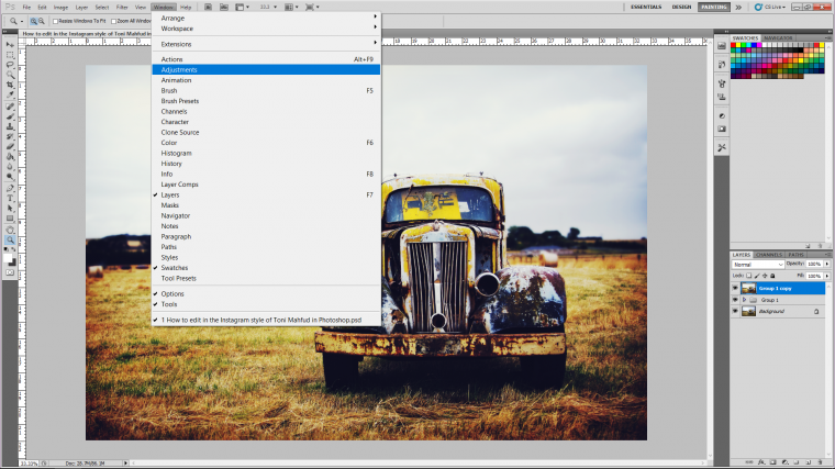
Now click where it says ‘Window’ in the top menu and then click on Adjustments.
The adjustments panel will appear on the right.
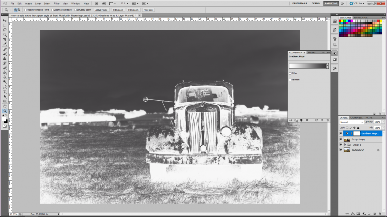
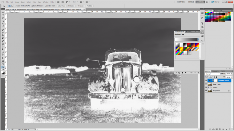
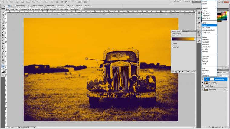
Look at all the little icons there, see the bottom row, click on the 4th one across which when you leave your mouse cursor over it, it will say ‘Create a new Gradient Map adjustment layer’

Now everything will turn black and white/should turn…if it doesn’t turn the same colour as my example image below all good, because ti really doesn’t matter what colour, to be honest.
Now in the panel double click on the gradient bar that goes from dark one side to light the other because we’re going to change that to the one that is a dark purple navy and orange, it should be the 5th one across in the presets selections.
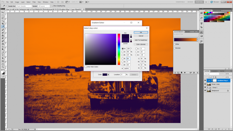
Another panel should now be showing, you will see the bar with the colour and at the bottom of that bar at each side, you will see tabs that you are able to double click on so that you can change the colour.
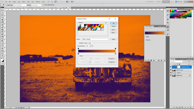
I’m going to do this to both the colours and I’m going to change them to more of a darker navy purple by clicking the colours I want on the large square.
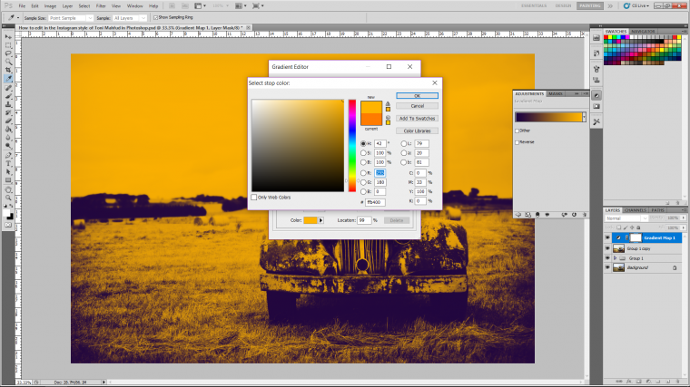
Then I’m going to change the orange to more of a dirty brown based yellow by sliding the side slider up a little until I reach the colour and then hit Ok.

Next, I’m going to change the blend mode!
The way to do this is if you look in the layers panel you will see the word ‘normal’ click that and a big drop style panel will appear…when that does look for the option that says ‘screen’ and click that.
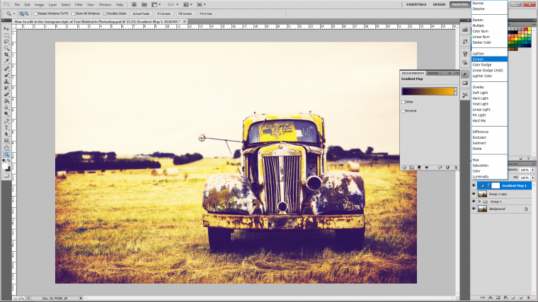
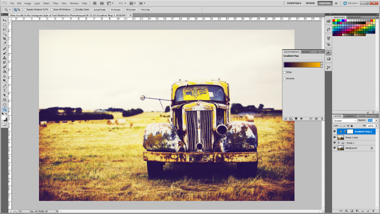
If the filter is too strong you can reduce the opacity of gradient layer, I had to change mine to 70%, I probably could have gone a little bit further but for now I’ll leave it at that, after all, I have adjustment layer, don’t you 🙂
Now, before continuing, let’s see one of the highlights of this effect. Take eyes for example; if you look on Toni Mahfuds eyes they really stand out, this is due to dodging and burning, so if you are working with a portrait remember to add special attention to the eyes and match those as best you can with Toni’s.
So the way to do dodging and burning the none destructive way, meaning you don’t just do it directly on to your image…but you create a new layer above everything else, so do that now.
When the panel appears you will see several options in there, you will notice that it has a built-in blend mode simply labelled ‘Mode’
Click on that and choose ‘Overlay‘
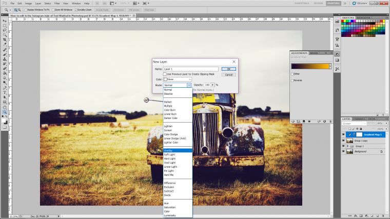
When you do this you will see that there is a little box below that has now appeared that will let you fill the layer with 50% grey.
Click on that box.
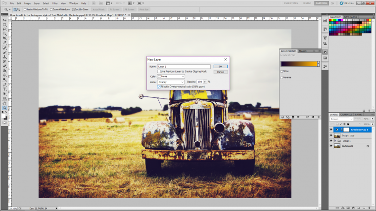
When you press ok it will look like nothing has happened… but it has, you know has a see-through layer that you can work on.
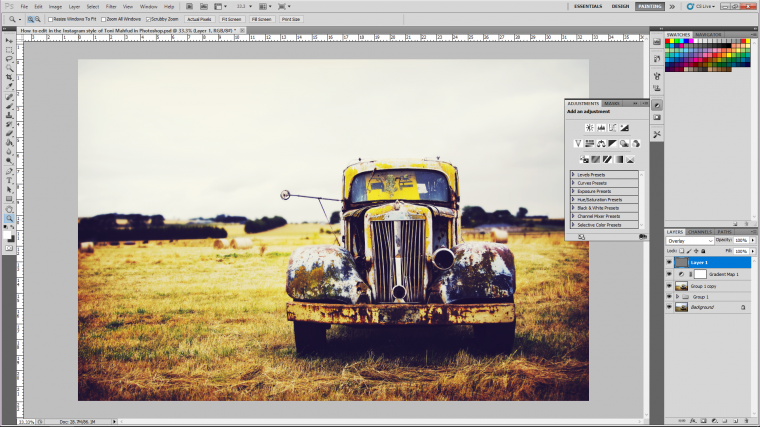
So now we Dodge first, so look at the example image below, and click on what I have which is the Dodge Tool, this will work highlights.

At the top menu you will see Exposure, change that to about 50%, if it’s too strong down worry because you can hit Ctrl + Alt and then Z and you can re-adjust.
So what you do with this tool is to concentrate on the highlights and light areas, so think of the edges etc and then you simply just paint over then, you will noticeably see them now starting to stand out a lot more.
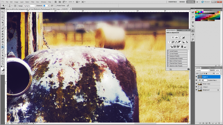
Next below the Dodge Tool you will see the Burn Tool and yes, this will do the opposite, so you use this over the shadows and dark areas, so do the exact same as you just did except the opposite!

Cool so after spending about 5-10 minutes you should be done with the dodge and burn process, you can take longer if you wish and remember that if everything looks too harsh at the end of dodging and burning you can simply drop the opacity of the layer until it looks respectable.
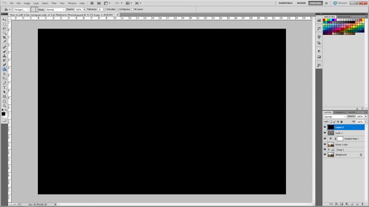
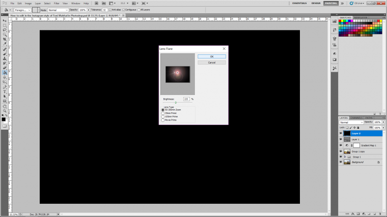
Now we’re going to create a lighting effect so create another new layer on top of everything.
Click on the Paint Bucket Tool as shown below, choose black as your colour and fill your entire screen with black.

Now go to Filter – Render – Lens Flare.
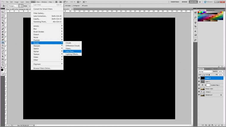
Change the brightness to about 120-150% and click OK.
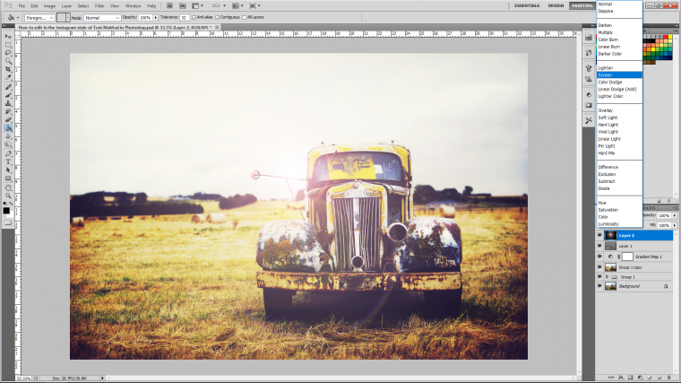
Then as we did before change the blend mode of that layer in the layers panel to Screen.
Your image should now be looking pretty good! and there are only a few more little steps that we need to take to complete or image.
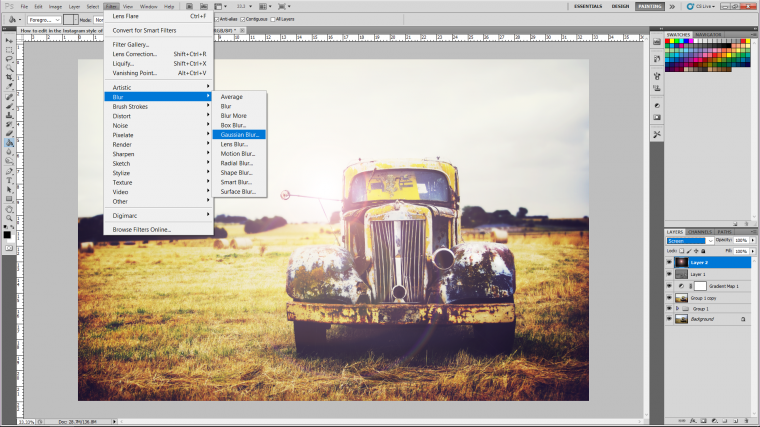
The next one is to blur that lighting effect a little so it’s not so harsh.
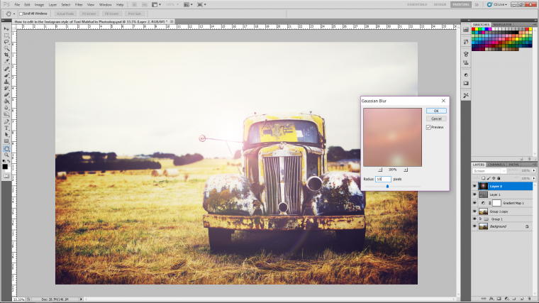
I do this by going to Filter – Blur – Gaussian Blur
When the panel appears to change it to around 10 Pixels which should be enough and click OK.
If you don’t like the position of your lighting effect you can key in Ctrl + T for free transform and adjust the image as you see fit.
Keep in mind that when you hold shift you can change the layers size to whatever works without it warping out of shape.
Hit return when you’re happy.
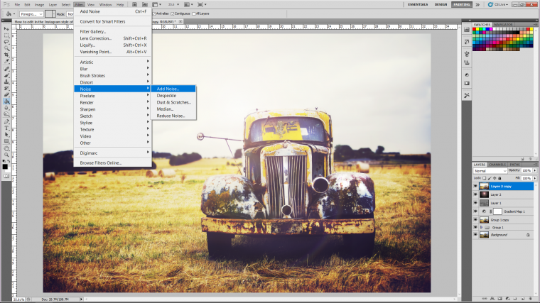
Now the last little touch that we are going to do is to add some noise also known as adding grain to your image.
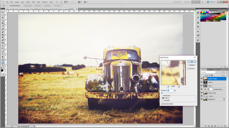
We use the Noise filter for this, so go to Filter – Noise – Add Noise.
When you see the panel that appears change it to around 5, this may change due to the size of your image but if it starts to look like it has a subtle enough amount of grain then you are good!
Awesome, hope you enjoyed and hope your image is looking amazing!
Read this quick guide on how to use Adobe Photoshop to remove unwanted logos.


Please verify your software version before proceeding.
 I’ve verified my software version


 Facebook
 Google +
Comments (0)
There are no comments yet.