Hi everyone, today I’m going to talk about a subject that you probably rarely hear, I know that in all my experience it’s definitely not a subject that I have come across too often.
That subject is! how do I know if my image will look cool as a Black and White Image?
So B&W can apply to both Photoshop and Lightroom, but for variety of my tutorials overall I’ll go with Lightroom for this as I feel Lightroom is far more suited for these kinds of edits, when I use Photoshop I generally use it for more Photo Manipulation work but if you are looking at this and you only have Photoshop then don’t worry, the same theories apply to both.
Let’s take this scenario, so working as a Freelancer I have had many projects working with the likes of wedding photographers to help them with their editing when they are short of time.
Usually, they will say to me that they want 200 awesome colour images and 50 black and white out of a batch of 1000 or whatever they took.
So I use these ideas to pick which ones would look good for black and white.
The first that I will use is I’ll take a scan through images and I’ll try to simply just imagine an images possibility as a black and white image.
It sounds super easy and super simple but really it is not and you have to develop an eye for this!
So when you do this what you are looking for if the contrast in the lights to dark’s, so if you take a few minutes there go to some professional street photography websites and look over a few of their images, what you will notice is that there will be a great contrast in the blacks to Whites which in turn gives you a really good image.
If an image is pretty devoid of shadows and the like then it will make for a somewhat uninteresting [depending on the image, of course ‘rules’ can be broken] but in general the image wont really have a tremendous amount going on in it so therefore it will be as said uninteresting…
As an exercise, pick out 5 images from either you collection or whoever’s and see which ones you think will look cool then later you can apply the other ideas I will be adding to this Tutorial to your images.
So you are looking for images with a good range of shadows to highlights and then try to see in your head the colours drain away to black and white.
One other thing I’ll add as well is that if there is lots of different colours within your image then it will be good so long as the contrast is good because once you start to edit a little you can take each colour and enhance it while in Black and White.
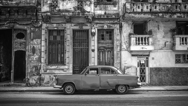
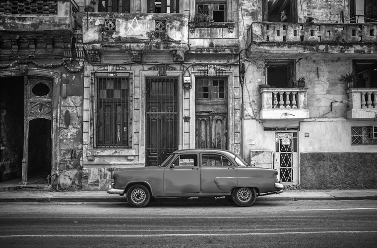
Let’s take a look at the image below shall we and see what would make this image a good black and white image and I’ll give you my practical reason.
Ok so straight away if you look at the nice dark contrast between the bike, the steps and the lamp post to the building and the path you can right away imagine how this would look if converted to black and white, and also take in to account that you could do a little bit of enhancement and light correction as well to increase the contrast so keep that in mind also.
But also let’s take into account the windows and the green around this, we can really bring that green out while in black and white, then we got all the contrast in the stone path too, once we start to edit all those little-contrasted details will stand out brilliantly.
Ok so now that you know what you are looking for in your image, how do your images that you picked out compare? if they are similar then good job, if not then do you think you could try to find better ones?
Remember also that you can change the contrast and try to salvage images in the editing process too…
But better to start out with a good foundation from the start instead of being in damage control from the word go.
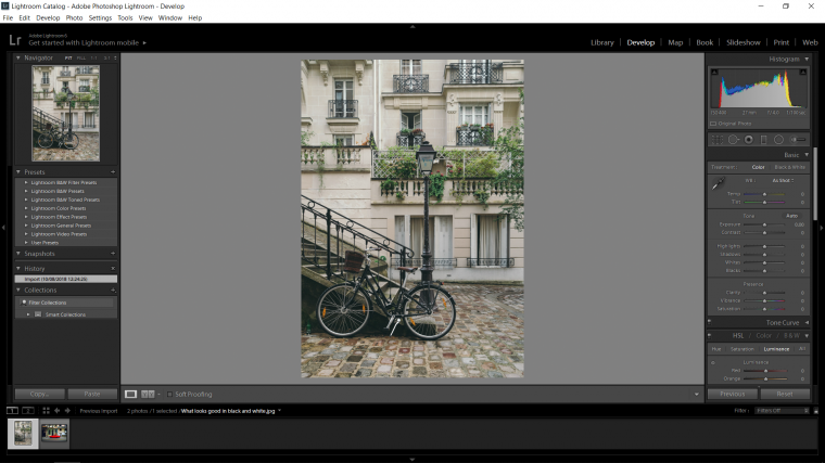
Ok so the next way will be a more hands-on Lightroom way to do it, so get your Lightroom open and get your images imported and ready to go, so I’ll be looking your to follow along with one or two images then at the very end take it upon your self to edit the rest of your images with what you have learned.
Cool, let’s begin.
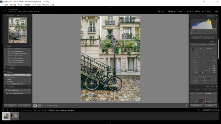
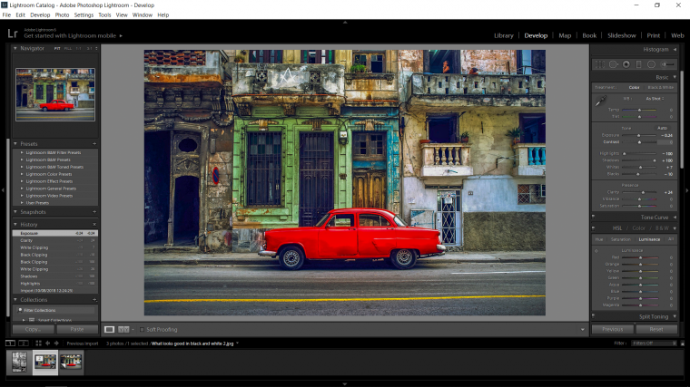
So a lot of times we would be trying to figure this out in post-production, so I would start out by doing the basic editing process I do for all my images which are to go to the Basic Panel and drop the Highlights all the way to the left, then I’d push the Shadows the opposite way all the way to the right.
Then I hold Alt while I click on the Whites and move the slider about until I see the image appear as pixels on my screen, then I’ll pull it back to the point where basically all my pixels have disappeared.
I then do the exact same with the Black slider.
Then I might add just a little bit of Clarity for good measure.
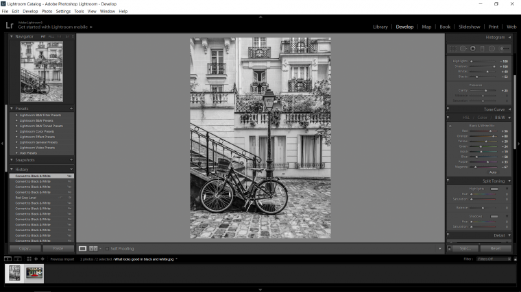
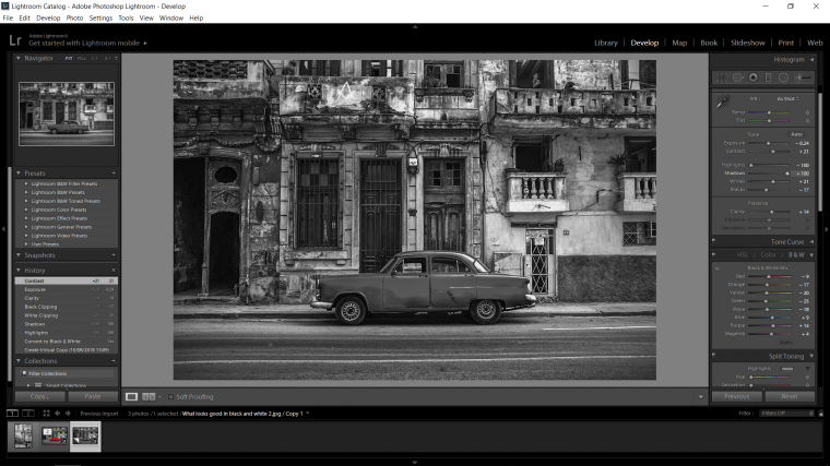
So good, now what? well if you hit (V) on your keyboard you will see that your image will now turn to Black and White.
You should also notice that the B&W portion on the right panel will open up now and you will see all the colours listed as the Black and White Mix.
This means that you will be able to change the intensity of the colours while in Black and White using this mix of sliders, so play around with those and see what results you get and stick with the ones you like.
[Note that on some versions of Lightroom, when you key in (V) again it will lose all the edits you did, so maybe take a little note of them when you go to edit for real]
Ok, next up we are going to go to our other image and create a virtual copy.
To do this right click on your image and chose the option when you see it in the drop down.
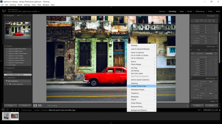
You will now see the little thumbnail on the bottom, if you click it, it will disappear and reappear when you click again.
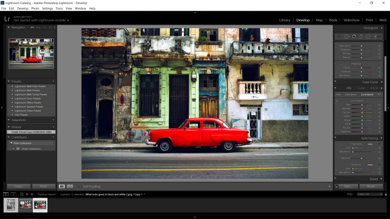
So clicking on the first one you can edit it just like we did before with the Highlights down and Shadows up and the Blacks and Whites fixed up using the hold Alt trick etc adding a little Clarity.
Then you can flip to the other image and scroll down until you see the B&W panel, then click on it, once you do just follow the exact same process as you did above shifting the Highlights down, the Shadows up and using holding Alt to perfect your Whites and Blacks, but this time if you wish you can add some contrast too and if you wish you can play with the colour mix too just as we did previously.
Then you will be able to flip between the two of them and see which you like best out of the two, and if you like both then you have the two there anyway so all good.
So that’s the way that I would do it and I’m sure you will find these little processes very helpful along with the idea of looking for contrast.
That in itself is a skill and must be developed, once you develop this skill you will start to become a far better photographer overall and you will start to look for the drama in the contrast of your image, once you start to see these things then you will be able to start noticing on a whim interesting images and your skill in composition will improve.
This is how the likes of street photographers create such wonderful real life in the moment shots, the walk around with their eyes open and when they see the image [which will come with practice] they just snap.
Really it’s a kind of sixth sense.
Get out there and enjoy!


Please verify your software version before proceeding.
 I’ve verified my software version


 Facebook
 Google +
Comments (0)
There are no comments yet.