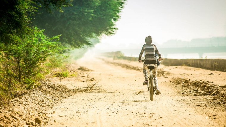
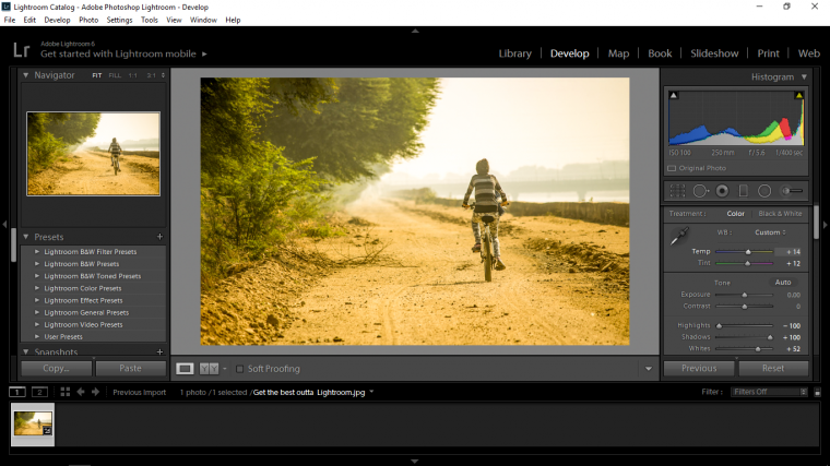
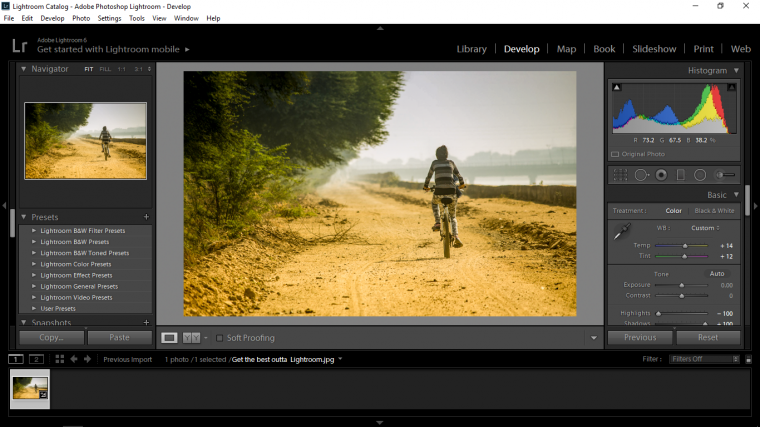
Ok, so we have our image/images loaded up onto our Lightroom, let’s get right into the editing portion of this Tutorial.
For this we should be in Develop so if you are not in there then go up to the menu where it says Library and click on Develop.
When you do this you will see the edit option on the right-hand side, scroll through that until you see the panel that says Basic on the top of it, in there you will see a whole bunch of little sliders and options, might be a little bit confusing with all these options at the minute but you will know these inside out in no time at all.
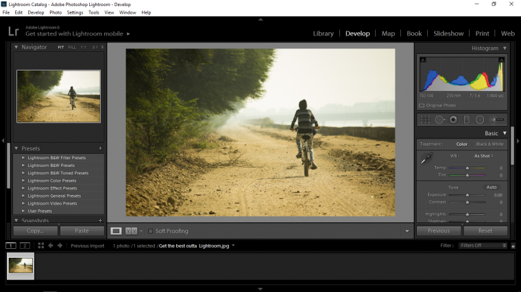
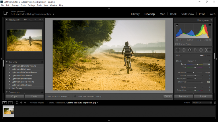
Next step then is to look for Highlights and Shadows, what we are going to do here I generally do every single time I go to edit an image in Lightroom.
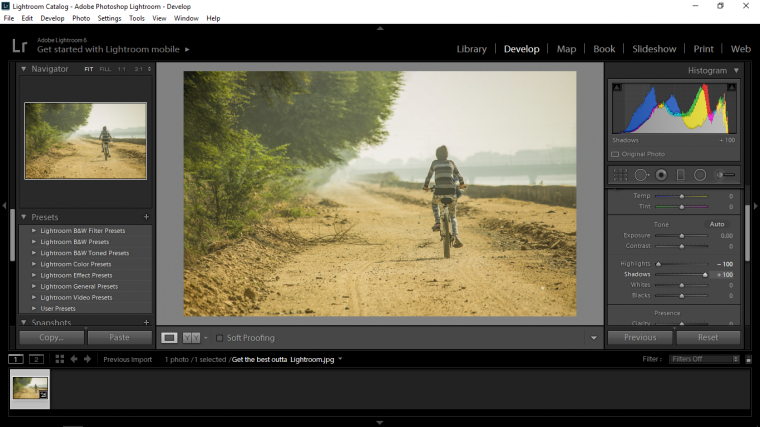
Take the Highlights first and click on the slider, pull the slider all the way left to -100.
When you have this done then click on the Shadows and click on drag it to the opposite side, so you are going to the right-hand side this time all the way to +100.
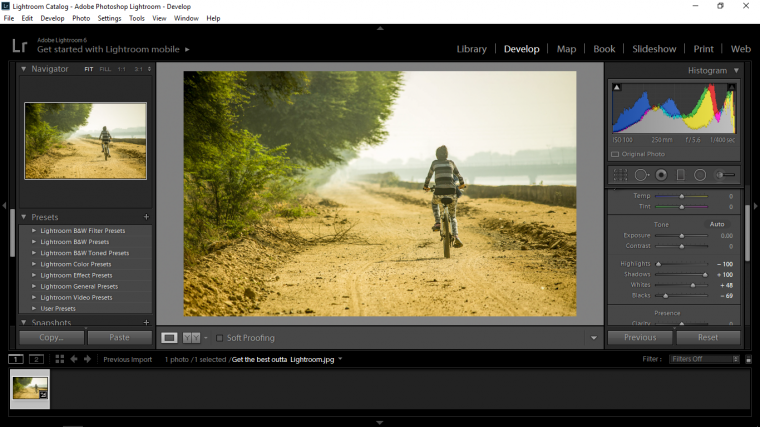
Next, we are going to work with the Whites and the Blacks
There’s a little trick you can do with the Whites and the Blacks, the trick is to get perfect Whites and Blacks hold Alt.
So take the Whites first, click on the slider and hold ALT on your keyboard, you will see your image go completely Black or close to it.
Slide your slider [this depends on the image as to whether you slide right or left so just try both] until you start to see some of the images appear in the form of white pixels.
You want to have it kind of on a knife edge, so just a few pixels should be showing and you will be fine.
Now do the exact same with the Blacks on the opposite will happen, where there was a Black screen there will now be a White one and the pixels will now be Black.
Next let’s go to Temp and warm our image up a little, my plan here is to add some warmth to the foreground and cools to the background therefore giving the image a little bit of distance.
To do this I both slide the Temp Slider to the right a little keeping in mind that it has to look natural so just a little bit should be fine.
Just below that you will see Tint, do the same for Tint.
Next, I’m going to add a gradient to my image, so just above the slider that we have been playing with you will see 6 little icons the first looks like a grid, so the fourth in from the left you will see a standing rectangle, click on that.
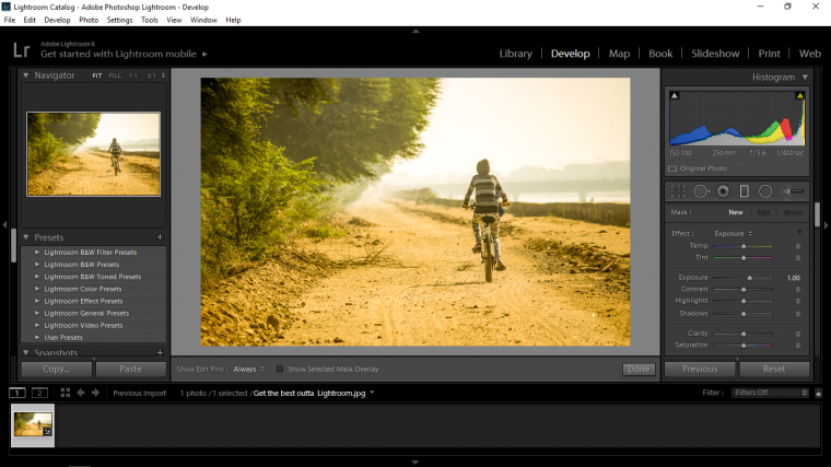
When you do that you will see some options appear, go to exposure and decrease that a little by sliding the slider to the left.

Then click and drag the gradient from the top to the bottom or halfway whichever you want, you basically want to cover the sky background.
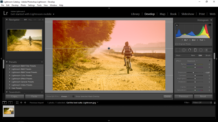
Then you can go to your Temp again and add a little bit of blue in there.
Remember that when you are clicked into the gradient that you can reposition it at any time by clicking on the guides at the middle, top, and bottom.
Just a little tip as well, when you create this gradient, go to Shadows in its options and slide its slider all the way to + 100, this will bring back some detail in the trees etc.
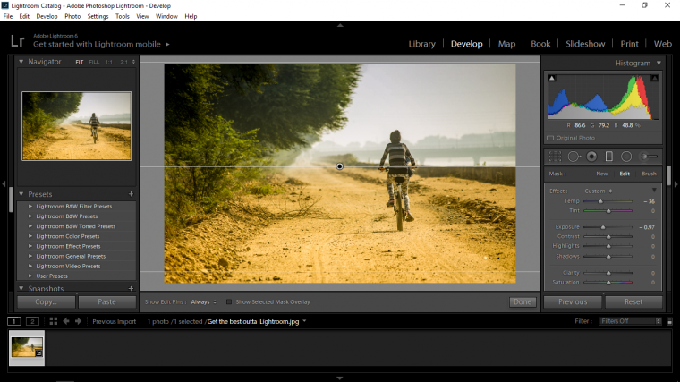
Next press (K) on your keyboard to activate the Brush Tool.
We are going to add in a bit more warmth again so certain areas.
So in the sliders option add a little bit of yellow in the Temp (Temperature)
Then scroll down the brush options until you see Flow and Density, decrease these down to about 1 quarter.

So the areas that I’m going to add some color back to is the bridge portion of the image.
And we’re looking good.
We will finish up in Part 3


Please verify your software version before proceeding.
 I’ve verified my software version


 Facebook
 Google +
Comments (0)
There are no comments yet.