How to pull the best out of your colours without going HDR in Lightroom: Dreamywww.sleeklens.com
Hi
So, our image is looking good so far, but we can still do more, so lets look at what else we can do to make our image look even more awesome and finish up this LightroomTutorial!
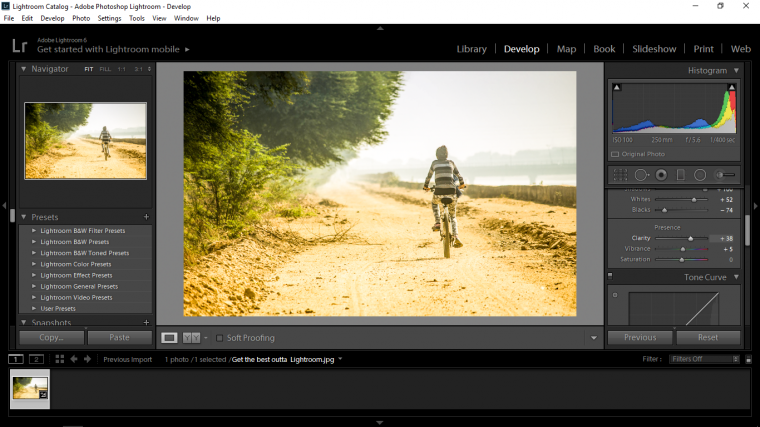
The first thing in the final edits that I’m going to take a look at is the Contrast and the Exposure, I want to see if I can make any improvements to my image by tampering with these a little bit and see what results we get.
So I’ll go to Exposure first and same way we did with the Whites and Blacks hold Alt and slide the slider until you start to see a few of those pixels start to appear.
Then with Contrast I’m just going to move it back and forward to see what I get out of it if anything, this is going to be more your judgement so just until you are happy with the result.
Next we’ll scroll down and see what we get with Clarity, I would suggest being subtle with Clarity as it could be a little over powering.
Then do the same with Vibrance.
You have to be very subtle with Vibrance, you will see when you use it, it amplifies the colours quite a bit so probably do that to where you you think it looks good then go for a little walk and get a drink of water or whatever and come back to see if your opinions have changed on how the edit looks so far, I would also suggest doing this right at the end, a little break and coming back with fresh eyes can make the world of difference to the final image once done!
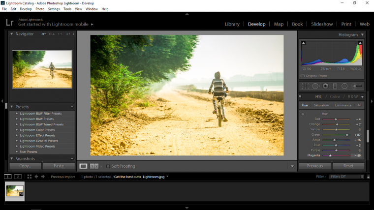
Now we’re going to look for HSL, scroll about until you find it in the edit options, once you see it click on it and you will open up a panel full of colour sliders.
In the sliders you will see a sub menu with Hue and Saturation in it, there will also be Luminance and All but we don’t need to worry about the last two just Hue and the Saturation option for this.
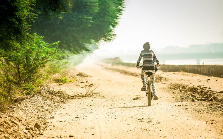
So first lets look at Hue, for my image I want particular attention to go into the trees so I’m going to be playing around with the greens.
Remember that while doing this to keep it somewhat realistic, of course a little artistic license can be had.
Then move into Saturation, the colours that I’m going to Saturate (which means I’ll be draining the colour out of them by sliding left) is the Blues and the Yellows.
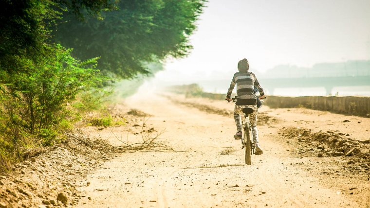
I want the sky to be faded slightly and the road to give that extra depth between them and the trees, I’m not that concerned with the person.
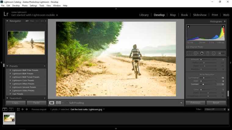
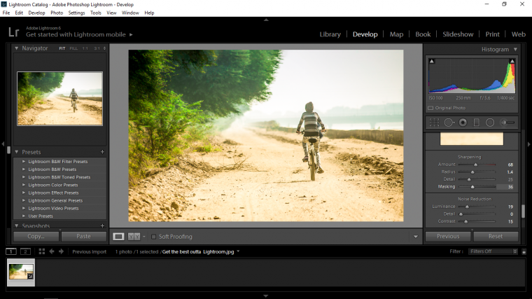
Next I’m going to look for Noise Reduction.
Ok I’m doing this on purpose by the way, I want you to actively look down the panels for yourself and find these, that way it will go into your head been because YOU have to look for it yourself, just know that they are all in the right Basic Panel area.
In there you want to decrease the sliders sliding them to the left to give a slight haze, this will get rid of any weird grain on your image.
Next scroll up one to Sharpen, go to the bottom of it’s sliders to you see Masking, hold ALT and start to move the slider until you start to see the edges of the image pretty clear, that will sharpen the image up a little without losing any of the haze.
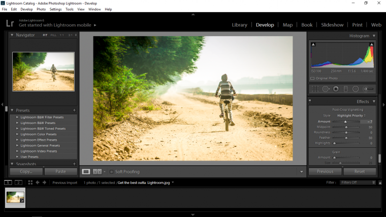
The last thing that I am going to do is to go to Effects and to Post-Crop Vignetting.
I will click on the slider for ‘Amount’ and slide it to the left to add a little bit of dark around the edges of the image in general.
Again with this use your best judgement.
And we’re done, all we have to do now is save the new image.
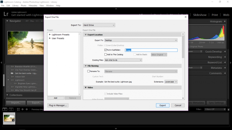
So go to Library and look to the bottom left until you see the word ‘Export’
A Panel will now appear, you can click on the check box to ‘Put in Sub-folder’ and name it, you will see in my image below I have just named my folder as ‘Image’
Then click ‘Export’ and you will find that folder in which ever location you picked.
And our image is complete, hope you learned a lot 🙂
Graduated from college in 2002 with a degree in Art & Design, I started exploring my way in Graphic Design and Professional Post Production. Full-time freelancer since 2011.


 Facebook
 Google +
Comments (2)
Thank you 🙂 glad I could help
Nice tutorial Julian.