Hi all, and welcome to this New Lightroom Tutorial were I’m going to be taking a look at adding some really cool warm tones to my image. Maybe later on, we could be spending time on to talk about workflow workthrough in Lightroom. But as of now, let us first discuss the ins and outs of editing amazing warm tones in Lightroom.
Recently, I have been working with a Fitness Trainer that has her own range of gym gear.
So I’ve been doing up her images.
We settled on this really cool warm toned browns and oranges for the images which I think look really classy.
So I’m going to share my exact process with you today.
Open up your image in Lightroom.
The image I will be using hash browns in it already so it’s going to be easy to transition to where I want the colors to be.
Your image might be very different.
If that’s the case, just slide the sliders more than what I have it at or less.
That means using you out intuition just a little bit in this tutorial.
But don’t worry I’m not leaving you completely out in the rain, the basics of the process are the exact same. Need to know more installing presets? Click here.
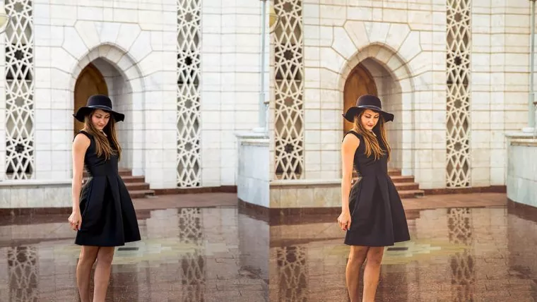
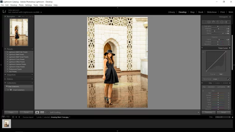
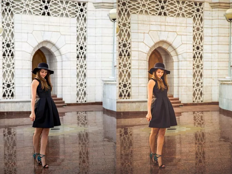
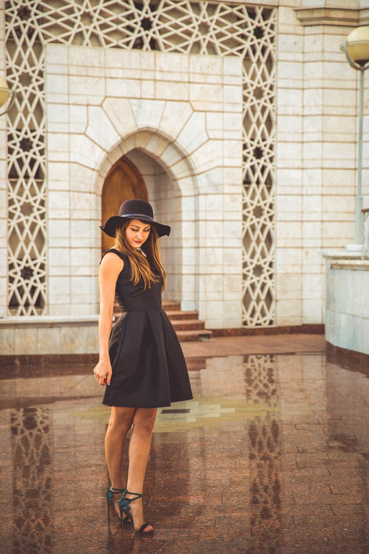
Ok, so this is the image I’ll be using below.
You can see that there are some nice warm tones in there already.
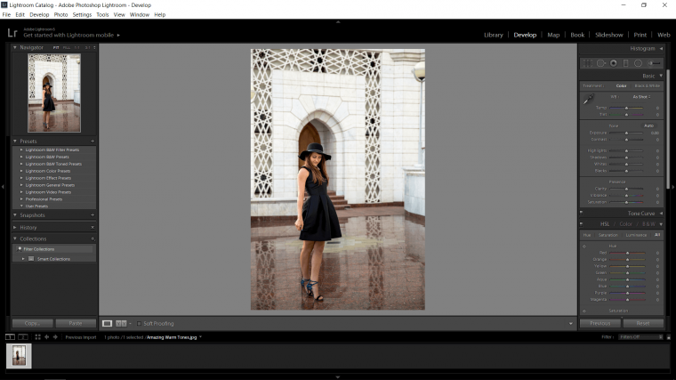
The first thing I want to do is go to ‘Develop’ you’ll see it on the top right.
In there look for Basic, it’s the first tab.
When you open that up you will see the Temp and Tint sliders.
I move the Temp +15 to the right to add yellow, which adds warmth.
Below that I’ll add in some green tint, I chose -10.
This will just get rid of any crazy pinks in there that will clash with the yellow.

Let’s add some contrast too! I went with 45, so for you, this might work too, if not to be safe stay around 35.

After that I decided to work with my shadows a little bit, I went with +15, I felt this looked we’ll be balanced.

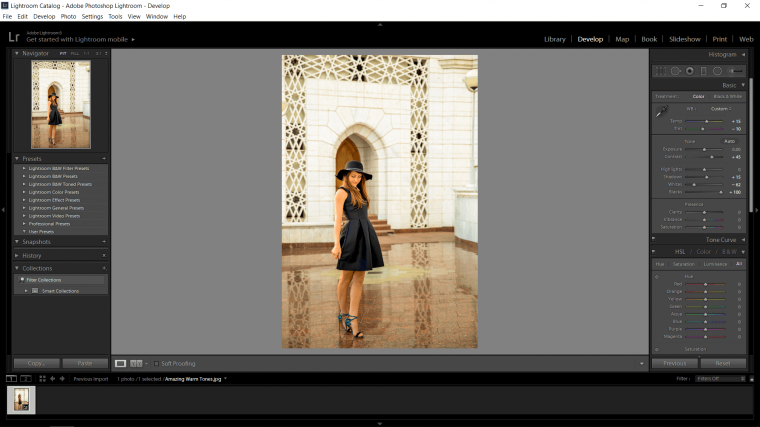
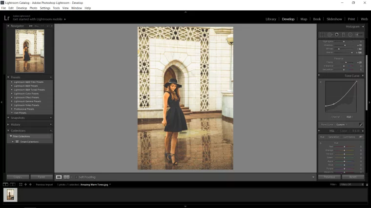
Next, let’s take a look at Whites and Blacks.
With this I hold ‘Alt’ on my keyboard, when you do this you will see the screen turn black and white.
To achieve the perfect level you pull the slider across until the pixelized version of your image has either disappeared or is just on the verge.
The rare occasion this will not work, like below for me, my blacks went all the way to +100.
If this happens just double check with your image and if it’s not looking so good.
Just pull those Blacks or Whites back so your image looks normal.
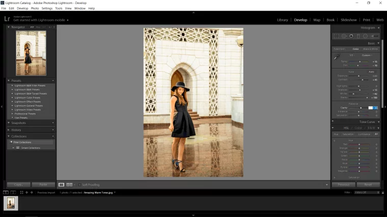
I’m going to add some clarity now, +25 to give it a little boost in sharpness but nothing too crazy.
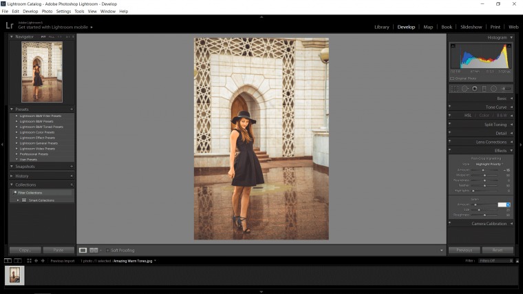
We are now done with the Basic Panel, so let’s move to Tone Curve.
You will see below the histogram with the line through it.
At the bottom right of that panel, you will see a little box similar to the histogram.
Click it to you see the other option available.
The one we will be working with is the one without the sliders, so make sure that your image looks exactly like mine below.
Now what I did here was I clicked at the top of the first graph square to make an anchor.
Then I clicked on the bottom left point and pulled it upward until it gave me a cool drained/lightly foggy look.
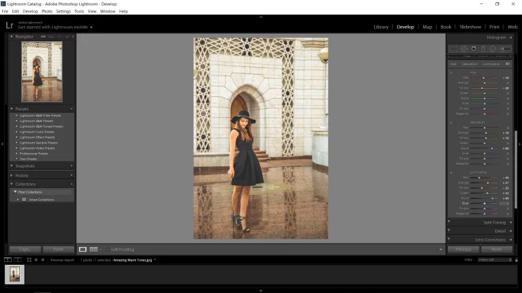
Now I’m just going to go into my HSL panel.
My only suggestion here would be to just try out all the sliders and see what happens.
I stuck with only subtle edits here with oranges and yellows.
I did most of my work in the Luminance section.
try to match the color sliders with the colors in your image.
If you can’t get the exact color, match the closest slider with the color in the image.
The very last thing I did was to go down to effects.
I added a tiny Vignette, only -15 on the Amount as seen below.
Also, I decided to add some grain too, I figured it would work well so I added a small amount.
That’s it, as you can see from my before and after image, a lot more warmth has been added to my image and there if much more atmosphere about it too because of that. More of Lightroom presets? Check this out!
Hope you enjoyed this tutorial. If you want more tutorials, visit this link.


Please verify your software version before proceeding.
 I’ve verified my software version


 Facebook
 Google +
Comments (1)
Wow! It’s the first time using Lightroom that I get the look that I want and like without using any preset. Thank you so much!