
Hi there and welcome back to part two, I’m sure you are ready to get started as I am, so get your Lightroom program ready and let’s get on with our Tutorial.
So far we have messed around with the basics sliders settings and got a pretty nice feel to our Image as is, but there is still a good bit left to do to we get our full completed final piece.
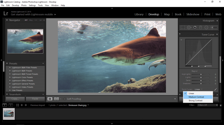
One of those things I want to try out is the Tone Curve Tool, you will find it under Basic.
When you open it you will see a square with a line running through it.
Now you could grab on the line and drag to see what it does, if you do this you can hit Ctrl + Z to undo if you want to try.
You can also hit the little icon at the bottom right of your Tone Curves panel, it looks like your histogram but has a dot on it, if you click that you will see the sliders for the Tone Curve Tool.
Or!
We could just try to see what the presets do…so look to see the word Linear and click on that, you will now see two other options to try, I was happy with a medium but your image may look better with strong.
Cool now we’ve done that let scroll down a little more until you see HSL.
When you find that look at the submenu in there, it has the words ‘Hue’ etc on it, click where it says ‘All’
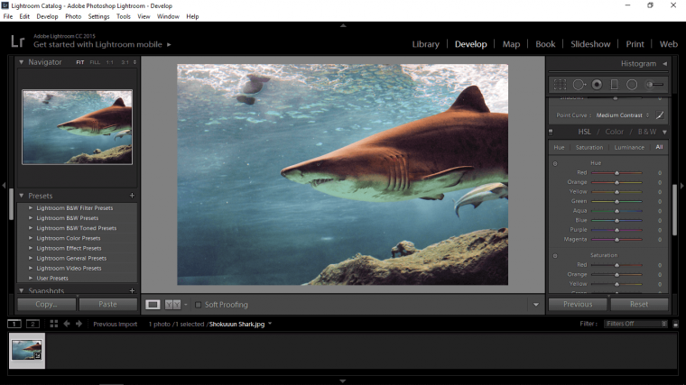
Ok so with this panel you’ll see all the different color sliders, so with the top one Hue, if something is too strong in the color you can look for the color and then reduce or the opposite, of course, is true also.
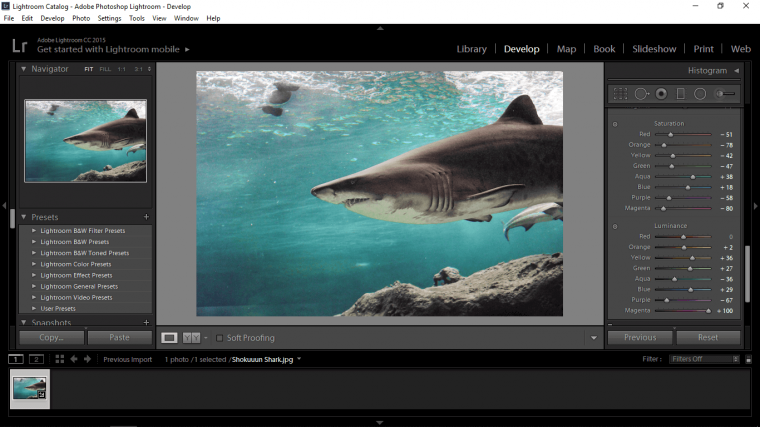
So I still feel like I’ve too much Green in my image so I’m going to reduce that, so I’ll slide Green and Aqua to the left until I’m happy with the results and they’re bluer.
The second one is Saturation, so in my image, you will see there is a lot of yellow and green, these are the colors that I’m going to try to get rid of totally, so I’m going to look for those color sin my saturation to slide to the left and reduce.
The next is Luminance, so now you’re doing the opposite and finding the colors that you do want, the blues and turquoises etc and you are going to be adding a little Luminance to these.
To drum it all up in a nutshell, I want a good contrast between the shadows, highlights and the blue tones, so anything resembling white will look a nice white/cream colour, the shadows will be a nice dark saturated colour leaning towards grey and the blues will pop as well as all the little details and patterns.
So as long as you know the general rule you should be able to just play around and figure this out for yourself fingers crossed.
If all fails use my images below as a reference, but this is something that has to be kind of ingrained in yourself.

This all may take a little while to do so just keep at it, these sliders are all non-destructive, so in Photo Editing terms this means that at any stage of the editing process you will be able to go back and move the sliders around for different results.
So if you were looking to get a few different images out of the one image that you are using then you could make all your initial edits and then after you have exported the file onto your desktop or where ever you are planning on saving it and then go back into your image in Lightroom and change up all the settings, then you would just repeat the export process which I will show you at the end of this tutorial and rename the file.
Ok so that’s it I’m happy to leave it here.
Hope you learned a load and continue to learn and get better! it’s a lot easier than you might think 🙂
See you in the next tutorial.


Please verify your software version before proceeding.
 I’ve verified my software version


 Facebook
 Google +
Comments (0)
There are no comments yet.