Hi everyone, today I want to take a bit of a detailed look into the lightroom Tone Curve using Lightroom and explain the best method on how to use tone curve in Lightroom. Through this tutorial, you will witness the best method to use the easiest yet the most powerful tools one can find in Lightroom, i.e., the Tone Curve. Using the Tone Curve Panel allows you to take control of the darkness as well as the lightness of various parts of an image or photograph. Instead of altering colors separately, the lightroom Tone Curve tool manages certain areas of an image’s actual tones. Via this article, we will help you understand tone curves in Lightroom. And when does that happen? When you simply read the article.
Table of Contents
Simply called curves by many photographers, the lightroom tone curve is one of those powerful tools that impact the overall contrast as well as the brightness of the image. When you adjust the tone curve, you are able to make your photo or image darker or brighter. In this article, we will also tell you how to use curves in Lightroom and how to make adjustments to the Tone Curves.
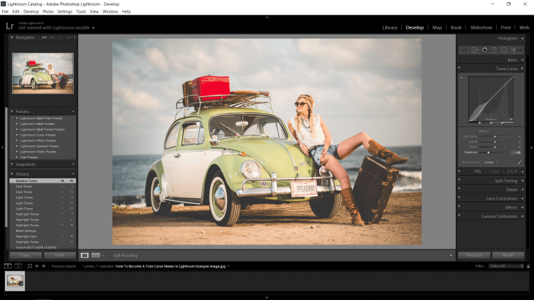
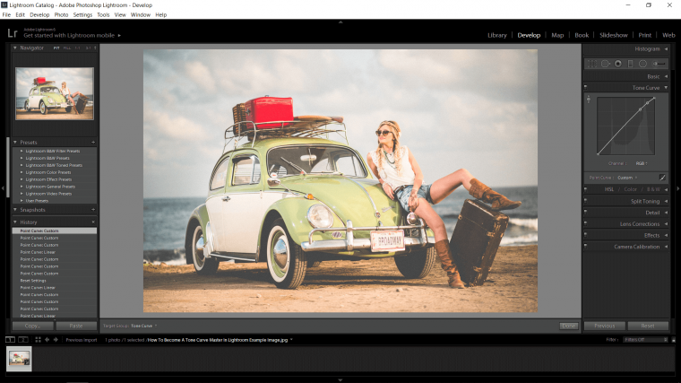
You can easily find the lightroom tone curve panel in the Lightroom Develop module. It is located on the far right. When you hit the triangle, you make the panel drop-down, thereby, allowing you to make the desired tone curve adjustments.
I believe I have touched upon this subject a few times just as a by-product of the subject that I was actually discussing so I felt the need to make a Lightroom Tutorial on this subject and just throw it out there for you all to learn from and use as a guide if you so feel like it…or are in desperate need for guidance as I have been many many times in the past haha. But you have to install your lightroom presets then you can now open your Lightroom presets. Don’t worry cause this time, you won’t need an image or indoor portrait in Lightroom. Just the program.
Have a look at the top right-hand side for the word ‘Develop’ and click on this, in this section is where you will find the lightroom Tone Curve.
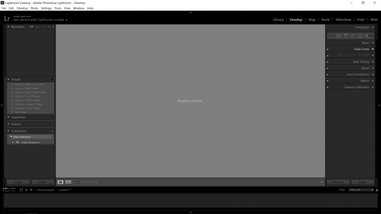
If you can’t locate the Tone Curve then in the Develop section right-click over one of the other options and a menu will pop up.
Make sure the lightroom Tone Curve has been checked!
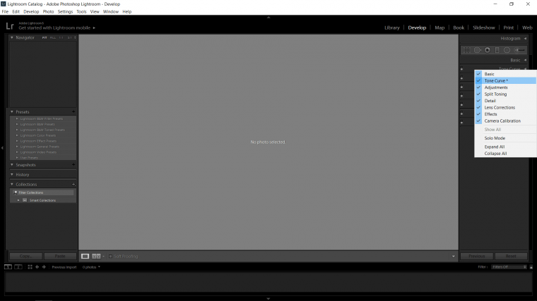
Click on the drop-down box just to check it out, just click on that small arrow to the right of it.
Then you will see a few small sliders and the main box graph with the line running slanted from right top to left bottom.
Now out of the two sections there, the one with the line running through it and the sliders at the bottom, these can be considered the same thing but applied in a different way.
To select the tone curve presets, click on the up/down triangle which is located beside the words point curve.
I would consider the main graph to be easier to use but when I say that I mean by like about 1%, for best results and I say that loosely once you know all you need to know with this Tool, then you’ll end up just mixing the two up using whatever at the time you feel is more appropriate which again, I say very loosely.
Ok so one with the description of what the Tone Curve does, so, the Tone Curve is used to adjust the…
Shadows
Mid-tones
Highlights
Darks and shadows
Making them either Lighter or making them darker without affecting the other two at any which combination, so if I was to adjust my Shadows my Mid-tones and Highlights will be safe so long as I don’t make a huge drastic adjustment which 99.9% of the time you will never do unless it is very specific to what you are doing.
Let’s just do a quick demonstration I’d like you to follow along to.
It’s time to grab an image to use, any image or photo will do for this demonstration, you can use yours or any interesting free stock if you desire.
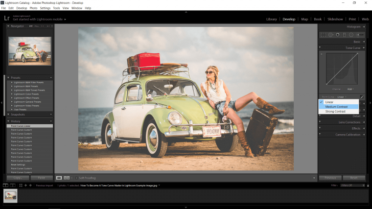
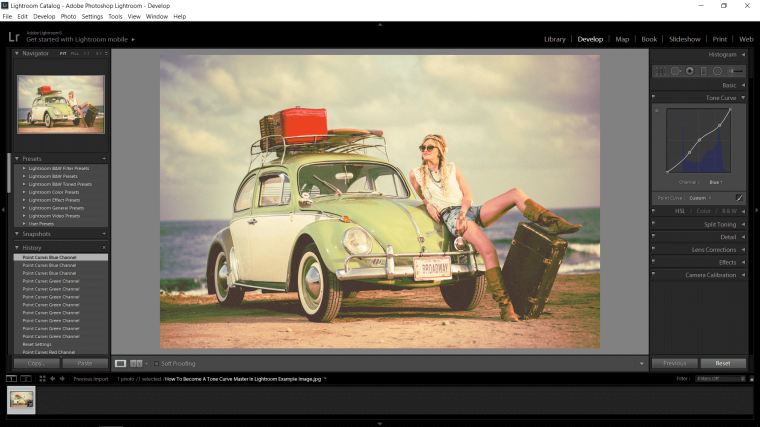
So look at the image above on the Tone Curves the main box with the line running through it, that side of the box works as follows when you shift the values.
At the bottom, it is darker and as you advance towards the top it gets lighter.
The same goes for the bottom as well only the bottom is actually marked that you can see it.
Now with your mouse just run your pointer over the line to you see the small diagram it gives you, treat this as a kind of a predictor line as to what will be effected on your graph.
So now you know basic lets now hit the button on the top slider which is highlights! as you hover your mouse over the slider you will see the same predictor appears on your graph just as before.
And when you move it you will notice the line on the actual diagonal line move just as the predictor pretty much shows you as we just discussed.
By the way, if you want to Reset everything if you have played around with a few of those sliders etc. which you are totally free to do you can just hit the button on ‘Reset’ at the bottom there just beside ‘Previous’
So the general rule is, up is lighter and down is darker and left is darker and right is lighter.
Now you will notice Lights and Darks just below Highlights, consider these the Mid-tones split into two.
So you know that up and down darkens and lightens and left to the right darkens and lightens.
Below I have just added a few tone curves examples in the Images of each so you can see just to really drum it into you.

Ok so the next thing that we’ll look at is just above the Region sliders [the ones we just messed with], so at the very bottom of the graph box you will see that there are three slider tabs as well, what these do is, if you take the furthest one as shown below and move it to the right…

And then you repeat what we just did with the Region sliders again hovering over the highlights slider you will now see that the area prediction will now be a different shape, so as you move these about you will find that you get different results according to how much you have opened or closed those sliders.
So essentially you are making, for example, the Highlights that are affected limited or more in general.
This applies to all the region sliders.
In simple terms, if you wanted to affect the shadows just a little you could slide the shadows tab which is the first out of those three, to the left to restrict it, then you would go back to the Region sliders and work that way back and forth etc. and note that when you restrict one, you will get more range out of the opposite side to it, so with the shadows restricted you will now have more range of the mid-tones.
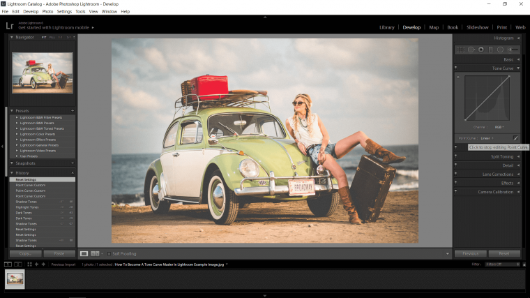
Ok so let’s now advance on to the Point Curve which a lot of people consider being more effective, as I said before they’re both similar, so in the end, choose which you prefer and work the other in slowly until you are using both, I guess that would probably be the best way to do it, I think from memory I actually started off with the Curve due to coming over to Lightroom from Photoshop and just because you could click and grab and I basically knew nothing of the actual inner workings of the Tone Curve in Lightroom at the start.
The way these Curve works is you have to hit the button and hold on the diagonal line on the graph [so that’s the inside of the square]
But first! you must hit the small icon that closes, you will see the icon to push in the image below, it looks like a little micrograph and when you hover over it, it will show, ‘Click to stop editing Point Curve’
So if I wanted to make my shadows darker I would hover my mouse over the area that I wanted to affect, then I’d click on the diagonal line as shown.
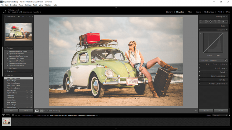
You can put several points on the line where you want to affect it, and then you can play with it that way, where you put the points on the diagonal line is up to you but I would say that you should gander of where you put the points as the same as in those 3 slider tabs in the region sliders.
Then as we talked about before, up is lighter and dragging down adds darkness.
Note as well that you can also hit the button on your point and move it side to side as well, you get a full range out of these points.
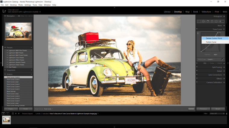
If you end up unhappy with where you have placed one of your points then no worries all you have to do in that situation is to right-click on the point, then a pop up will appear, in that you will see ‘Delete Control Point’, hit that and the point will now be removed.
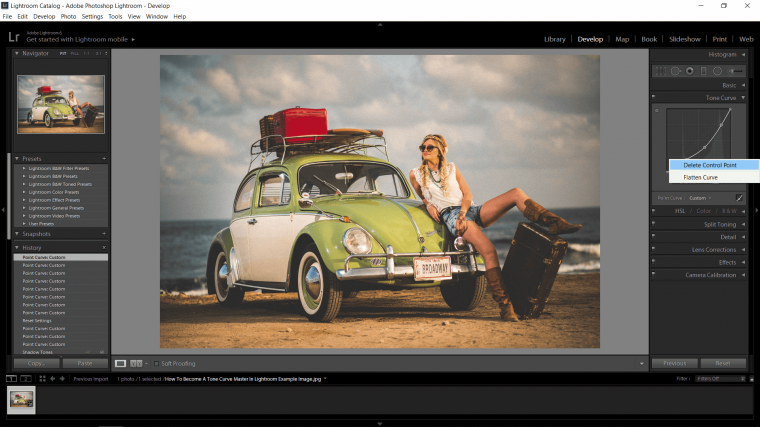
And of course, if you end up with a total disaster that can happen from time to time just click on flatten the tone curve and that will reset your tone curve back to the start again.
Now we have the basics of the Region Sliders and the Point Curve let’s have a look at a few more in-depth areas of the Tone Curve, to start let’s look at a couple of the Presets they have available for you.
Have a look just to the left of the little Icon we clicked earlier on the Tone Curve Tool and you will locate the words ‘Point Curve’ and most likely depending on what you’ve been doing you will locate the word ‘Linear’ on that, click on that and you will see there are a couple more options available to your there for your Contrast.
Click the each there now just to see how they affect your Image.
Then to reset that just go back on to ‘Linear’
This same is available to you in the Region drop-down also so remember that if you ever use that as your primary editing option.
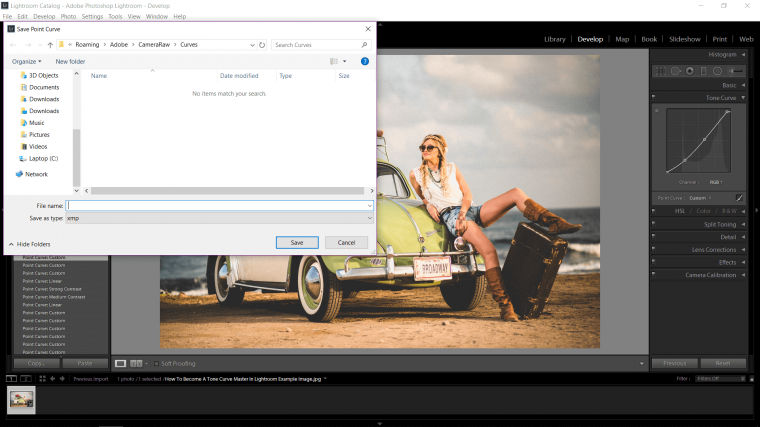
Further, if you choose your own, as in you make your own points etc. you have the chance to save it if you like it and it works for a certain type of image or photo.
Consider that you have a whole batch of images but you will be doing them over different dates, so you will get some now, some later when they’re done and some may be at the end of the month, but you figured out a great edit that you really like and that works for a broad range of your images if not them all, then in that Presets box we just looked at you will now locate the word ‘Custom’ hit on box again and at the bottom, there is a choice to ‘Save’
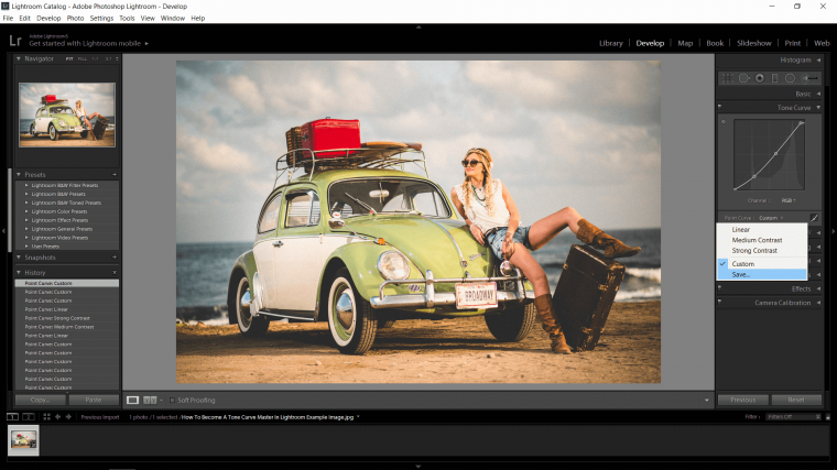
Then just choose the name that you think best fits [Example: Canyon Shadows] or whatever you are doing and save to the default location.
Ok, now I’m just going to reset back to Linear.
Further, we’ll take a look at an choice called ‘Targeted Adjustment’
So if you look at the top left-hand corner of the Tone Curve box you will find a little circle with a dot in it kinda like a Target funny enough almost as if Lightroom had that planned eh.. lol anyway, the way you use the Targeted Adjustment Tool is first to click on the small target to activate it, you’ll know it’s activated when you find two little arrows at the top and the bottom of it.
Now all you have to do is hit the button on a specific area that you would like to either brighten or darken, so if you look at my image or photo on the car at the minute it I feel that it is very washed out looking and I feel I can strengthen that color.
So all I do is hit the button on the car and either drag up or drag down till I see an improvement if any at all if you have to try a few times then, by all means, go ahead with that and try a few different points.
Then as before if you are unhappy with something for whatever reason you can right-click on the point and delete it as we did before, you also have that Flatten Curve option too to reset totally.
Just note that generally when you select a color and edit it the rest of the image or photo will be edited too, to a lesser extent so just watch out for that also.
You are also able to do this to different areas too, you don’t have to just stick to the one color and that’s that. So, for example, I feel that the edit I just did for my image or photo has blown out the whites a little bit too much, so I’m just going to select the whites in the sky and find what options I have with the Targeted Adjustment Tool.
Remember for this you have a circular range, so you can move the point up down left or right!
So after trying out a few options, unfortunately, to balance that White in the image or photo it drains the Green of the car and the other images too so we will have to start looking into channels next to enhance colors!

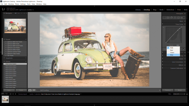
Ok let’s look at Channels! so scan your eyes over to the lightroom Tone Curve box and below the graph, you will find the word ‘Channel’, beside that then you will find RGB which stands for Red, Green, Blue. [This is what your image or photo is made up of]
So when you click RGB you will find those colors listed, each of those colors are a different channel, so if you were to select Red and apply everything that we already learned to the Graph when isolating whatever color that you want to work with then you will be able to brighten, strengthen, make darker etc. etc.
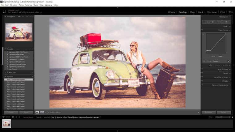
So I talked about how I wanted to make the Green stand out a bit more as I felt it was very saturated.
To do this I will just select the word ‘Green’ in my menu there.
Because each image is different I will not be able to guide you in the direction of exactly what to do so all I can tell here is, keep it subtle and with what you know already just trial and error until you find something that you like, sometimes you won’t get a very good result and you will probably have to go to other tools but hey that’s Lightroom for ya and that’s how the games played.
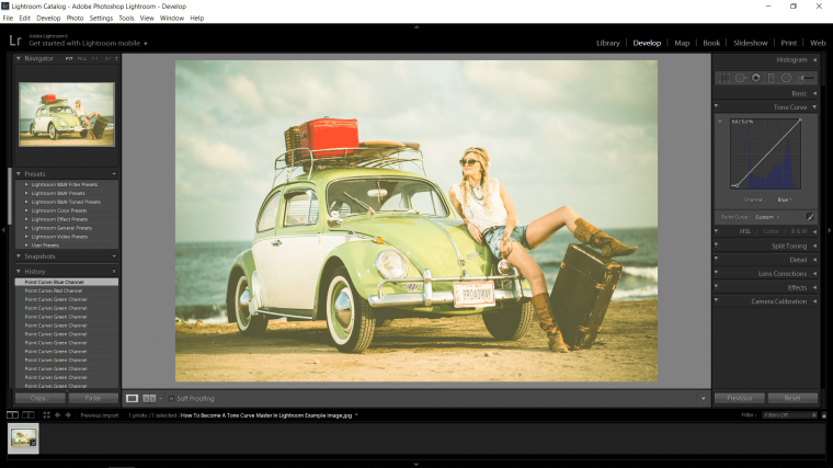
But it’s not all over yet because we can do this to several colors, so when I adjusted my image took on a very Red looking tone, well to fix this sort of thing I suggest just going through each channel until you reach a happy medium.
Another cool way you can try is to create 3 points, so, for example, I could take the top point on the right, make another in the dead center and in the middle of that I can create the third, in the middle, then when I click the middle point and move it about I will only be affecting that exact area, so essentially you are isolating, for example, the shadows or a mixture of 2 elements like the shadows and mid-tones.
You can place these points anywhere you want, I would suggest as I said a second ago just trial and error it and as you gain more experience you will get a natural feeling for this sort of thing and you won’t even really gander about it anymore as you work you’ll just do it.
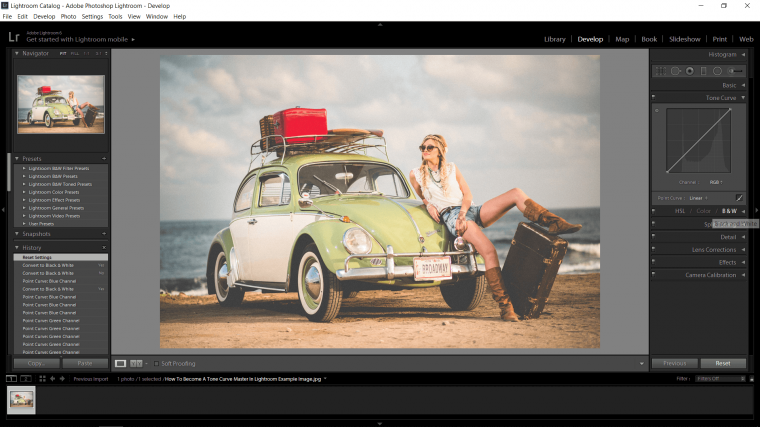
The last thing that I’m going to talk about using the Tone Curve is how to use it for Toning Black and White Images.
So we’ll choose this scenario as an example, imagine you have to create an old western look to some images, well the way to do that is to first change the image to Black and White.
To do this, first as you are working along with this Tutorial I’m guessing, so Reset everything by hitting that reset button at the bottom of your screen on the right.
Then convert the image to Black and White by clicking on the little B & W tab just below the lightroom Tone Curve Graph, you will see it on the right-hand side of the example image below if you are stuck but I’m sure you’ll get to it.
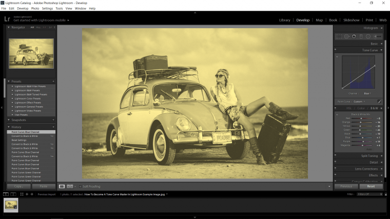
Ok, we’re ready, so a little color theory to get us going on this color toning business.
Old West images are generally brownish yellowish, so how to get this tone onto my image when we don’t have those colors, well we are now dealing with opposites/complementary colors and a little mixing theory.
Mixing first, to get brown you have to cross yellow and red and then darken it, really brown is just dark orange.
So to add this tone first I have to add yellow, well yellow is blues opposite so we click right at the top of the diagonal line and pull it down to add the yellow tone, this works for all the colors, when you do this exact technique for the other two colors you don’t exactly get the opposite you’ll get more of a pink and cyan but using all three you can generally get the color you are looking for.
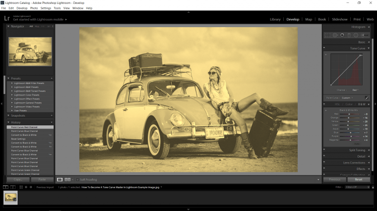
To finish up I just add that last little bit of Red to push the color towards Brown.
To apply the same lightroom tone curve adjustments to other photos, the easiest procedure would be to use the Lightroom “Sync” option. This option is located at the bottom of the Develop panel.
We hope that you are able to comprehend how to use the Tone Curve in Lightroom, make adjustments and the process to use curves in Lightroom.


Please verify your software version before proceeding.
 I’ve verified my software version


 Facebook
 Google +
Comments (0)
There are no comments yet.