Hi everyone, I’ve had some things pop up recently like how to brighten eyes in Lightroom. So, I decided to do a little Tutorial on Golden Hour Photo Editing in Lightroom to help you with your Images.
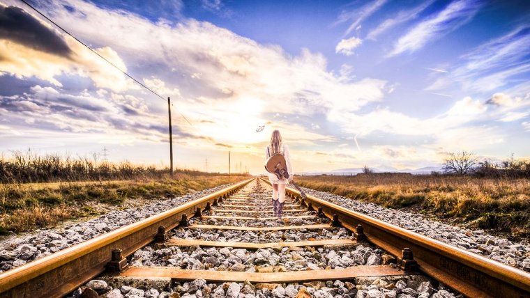
I have this awesome Photo Composite that I found on Pixabay that I’m going to be working with today. It would be great if you know how to install Lightroom presets as it could help with the editing of golden hour photo.
If you can find something similar as to the lighting then that would be perfect and I’m sure you’ll find plenty out there in all those free stock image sites if you want to look, or if you’re a little bit lazy sometimes like me then Pixabay should defiantly be an option unless you have your own preferred free stock site. Now, let’s do the editing in Lightroom preset.
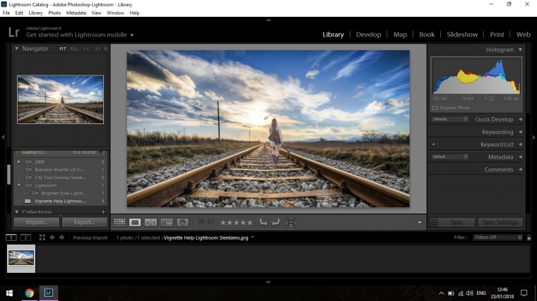
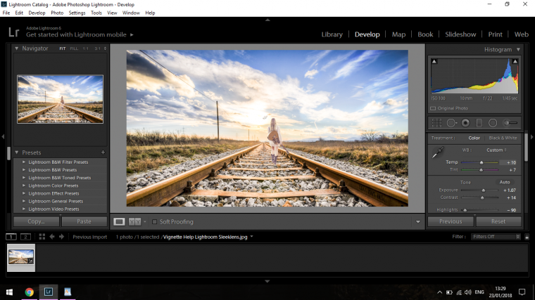
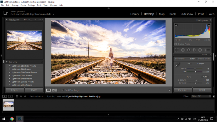
We are now in Lightroom. I’m going to click on Develop, you’ll see it on the top right-hand side beside Library which you are in right now.
When you click on that you’ll see the Basics Panel on the right-hand side.
In there is a whole bunch of editing slider options for you to choose from.
The first thing I’m going to do is to increase the Exposure.
I brought my exposure up to a +0.90
You can do this by either clicking, highlighting then typing in or you can grab the slider with your mouse and move it manually.
Whichever you like best is up to you, no biggy.
Now that this is done, we’ll be working with the sliders below, so that’s the Highlights to the Blacks.
The numbers here will be relevant to what looks good on your screen so I can’t tell you an exact figure, all I can say is just to use your best judgment and see what looks good for you.
But the general rule is, I’m going to…
Decrease my Highlights
Increase my Shadows
Increase my Whites
and
Decrease my Blacks
What this will do is all the little details that would have been blown out when you changed the Exposure will now reappear and add depth and contrast to your image again.
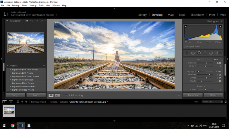
If you wish you can go back in and add a little bit more Exposure and then just below that you will find the Contrast slider, if you wish you can increase this to just a little bit.
Now I’m just going to go above that where you will see Temp and Tint.
I don’t really want to do too much with Tint but I will raise up the Temp just a little bit, this is also relevant to the Image.
So think of it like this, if you see too much of one color in the image then try to balance it out the other way, so too much blue, your image is more Cool than Warm so I would move my slider to the right-hand side in Temp.
Same with Tint, you may see too much Green in your image overall so you would move it to the right a little more until it looked better.
This will come with practice, but as always just try to make it look ok to your own eye, there’s no rules set in stone here.
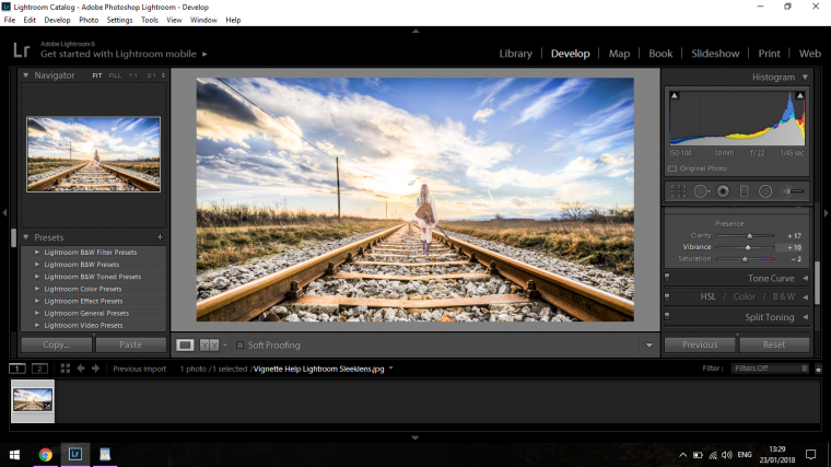
When I’m finished there I’m going to move on to my Clarity, you’ll find that further down towards the bottom of your Basics panel.
I’ll just add a little bit here, nothing crazy.
The same with the Vibrance, you don’t want to go too heavy with the Vibrance in general because it can be very overpowering, so to balance this out I then decrease the saturation which is below Vibrance.
Saturation adds greys to your image, therefore, neutralizing the colors down a little bit depending on how much you add, so be careful not to go too far and completely grey out your image, if you do, just slide the slider back the other way and it will all come back.
You can go back and fine-tune all these edits whenever you want so don’t worry too much, you just have to find that balance and it just takes a little bit of fine tuning as said.
So I would suggest at this stage is to perhaps go over everything that we have learned so far and tweak here and there as we see fit just to get your eye used to the subtle changes.
You may want to change a few things.
So take about 5-10 minutes to do this and see what happens, usually once I do an edit I like to get up and take a walk, I remember in a Podcast I was listening too a few years back that it was important to do this kind of thing and to exercise your eyes by looking at objects far and near while out getting some air for a minute or two.
You should come back fresh so that any mistakes or whatever you will be able to pick up on the lot better than if you were just in the one spot staring at the screen for hours.
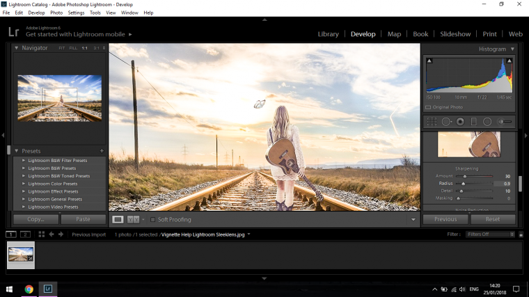
The next thing we’ll be looking at is sharping our image up a bit.
You will find this on the right-hand side again, so the scroll bar on the side if you click on that and drag down until you see ‘Detail’
Then click on that and you will find Sharpening.
For me, these below are my settings,
Amount = 30
Radius = 0.9
Detail = 10
These setting are not set in stone, they were relevant to my image so remember what looks good on yours may vary a lot to what looks good on mine.
My only rule of thumb would get to the point where you will see grain [Pixelization] and then bring it back a little until you don’t see it anymore.
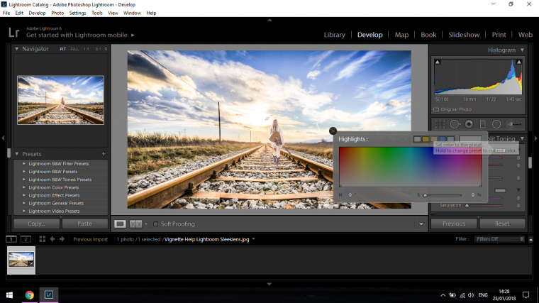
Next edit we’ll look at doing is Split Toning.
So scroll up on that sidebar that we used to find ‘Detail’ and you will find Split Toning.
With Split Toning you can usually just slide the sliders manually to get the effect you want if you know exactly what you are doing, of course, you can give it a go with trial and error as well but Lightroom also provides you with presets.
So take a look at your panel there for a second, and you will see the words Highlights and below that Shadows.
Besides those, you will see a long rectangle to the right of those words for both.
Double click them.
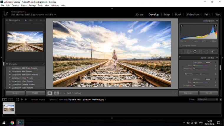
Now you’ll see a pop-up panel appear in front of you.
In that panel, you will see a collection of 5 different rectangles.
These are your presets and they will add a tone to your image.
So for this, I want to warm my image up, usually, I would choose yellow and red colours, we don’t have red here but a very strong yellow.
Now this yellow would be far too strong for our image so the preset in the middle beside it will be perfect.
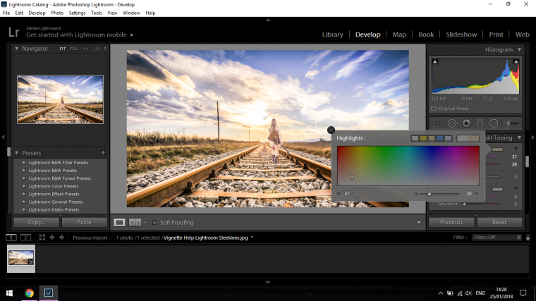
Click on that and you will see your image change in tone.
Your tone may be far too strong or the opposite.
So to fix this you could click within the box containing all the colors and try to find something satisfactory within that or even better, at the bottom there you will see there is a little bar with a slider.
When you slide this to the right you will increase the saturation of the color and when you slide to the left towards the S you will start to see your image become more saturated and the color will start to drain out of it.
Play around with this for a few minutes and see what you can find, when you are happy then you can move on to the Shadows just below.
For the Shadows, we will follow the exact same process.
Same rules apply here.
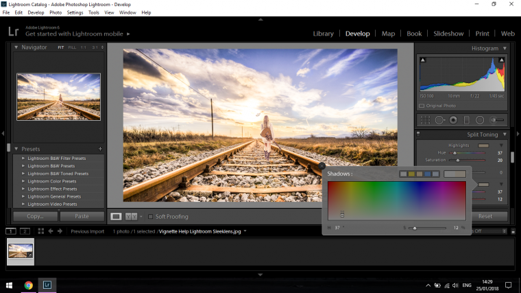
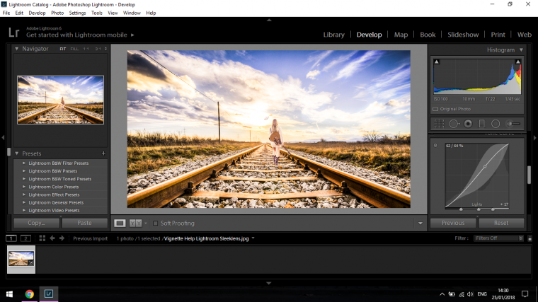
When you are finished move on to the Curves panel same way you found the others, I’ll not tell you if it’s up or down I’ll let you figure that out for yourself and help ingrain this into your memory through actions.
Once you find it, you’ll see a funny little graph, all you have to do is click on the horizontal line about 1 quarter the way in and drag it down a little, then move up the line to about 3 quarters and drag it up, this will add some Highlights and shadows.
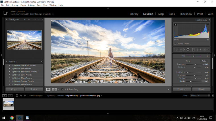
Last but not least I’m going to go back to Temp and Tint and adjust accordingly to what I think looks good.
And my Final Image looks like so,


Please verify your software version before proceeding.
 I’ve verified my software version


 Facebook
 Google +
Comments (0)
There are no comments yet.