In the previous article, we have discussed how to adjust various exposure-related parameters to restore an underexposed photo. We have also gone through the steps of using graduated filter in Lightroom. This time we will discuss how to adjust saturation separately for each tint. Before we move on, do you want to know how to install lightroom presets? It is necessary that you have this install so you would understand the differences between saturation and vibrance in Lightroom presets.
You may have come across these two terms in a book about photography. They are similar in certain ways as both of them are related to ‘color intensity’. I would recommend you to stay away from the saturation setting in Lightroom, though. It is because when you increase the saturation of a photo, you will probably get unexpectedly saturated results as it boosts the saturation of the whole photo blindly. On the other hand, vibrance is smarter as it is capable of identifying the comparatively saturated parts of a photo. When you increase the amount of vibrance, it will leave the originally saturated parts untouched. It selectively boosts the saturation level of the photo so you do not need to worry about getting an over-saturated image. In a nutshell, vibrance should be your way to go in most cases.
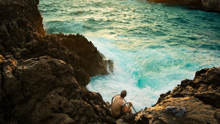
Although you could get decent results quickly by tweaking vibrance, in some situations you may want to tune the saturation of certain colors. For example, you are editing a photo of magic hour. You need to boost the purple color in the sky while leaving the orange color near the horizon untouched. I’m going to explain how it can be done in Lightroom.
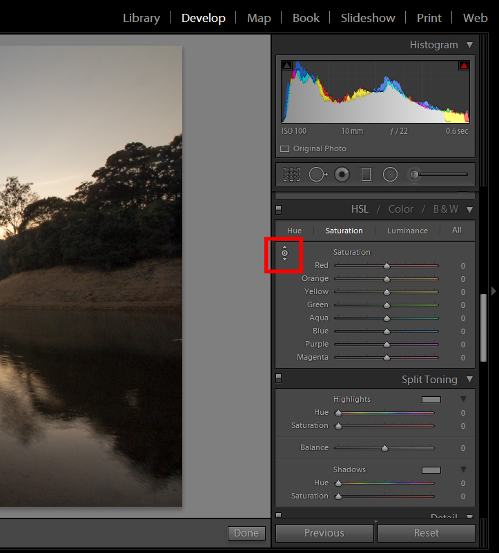
We are using the same photo in this tutorial. The photo above is the edited version of the last tutorial. Firstly, you will need to navigate to Develop in Lightroom. All the magic starts here. Then, keep scrolling downwards until you see the HSL rollout. HSL is the abbreviation of Hue, Saturation, and Luminance. The concept of HSL might be slightly more complicated than the previously mentioned exposure-related parameters but HSL are indeed useful in fine-tuning the colors of your photos. We will only focus on Saturation in this tutorial, though. Choose Saturation on the rollout and click on the button inside the red rectangle.
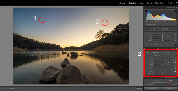
I would like to enhance the saturation of blue and yellow and therefore we will move our cursor to Circle 1 and Circle 2 and drag your cursor upwards. Lightroom will identify the color around the area you dragged the cursor upwards and the saturation of those colors will be increased or vice versa. Navigate to the HSL rollout again and you will see we actually adjusted more than two colors; that’s because Lightroom recognizes the tints available on each color and adjust the overall color as an end result. In a few words: if you’re adjusting a blue hue, take for certain that some subtle variations on either greens or purples are going to show up as they are directly affected by this – on the other hand, yellows, reds, and similars won’t be affected as the tint is not available. If you happen to increase the saturation slider via Basic Panel Saturation, the whole scene would have been affected instead.
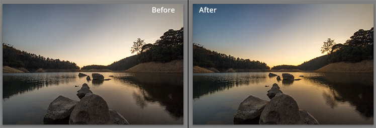
Here is the comparison of before and after editing. You may notice that the colors of the lower half of the photo are basically remaining untouched while the upper half is decently saturated, which resembles the actual scenery. If you go too far with the lower half you’re basically going to clip your shadows, meaning that data is going to be lost due to extreme dark conditions.
There are three ways to adjust saturation of a photo: they are namely saturation, vibrance and the HSL method. I would recommend the latter two as they give you more flexibility on tweaking the colors of your photos. Keep in mind your edits need to feel realistic enough, so overdoing saturation would end up in some nasty results that will opaque your well-done job.
Other examples of creative effects you can add to your photographs are Split Toning and HDR effects, mostly for Landscape images as they are classics for such topics and can also be used for Lightroom mobile.
Hope you enjoyed this tutorial and see you next time!.


Please verify your software version before proceeding.
 I’ve verified my software version


 Facebook
 Google +
Comments (0)
There are no comments yet.