
Hi there, I have a big tutorial for you today and by the end of it, I think your Sunset editing in Lightroom will take a massive leap in quality.
What I’m going to do today is to go over several Sunset images and walk you through the steps that I would take in a Sunset editing process.
You will be able to hear my thoughts through this Tutorial so to speak and see my thinking process in what I think will be good or not for each photo that I decide to do. You will also know from here how to install Lightroom presets and use it for editing.
You will get a lot out of this tutorial and you will be able to apply what you learn here to edits that you do in Lightroom, so what you learn here will not just be restricted to Sunsets but you will be able to take the thinking process and adapt it to other types of editing like how to remove chromatic aberration in Lightroom.
Ok so in case you are completely new to Lightroom I’m going to take you from the very beginning right to the end, from opening to saving right at the end and closing the program.
So let’s get going, we have a lot to learn and I’ve babbled enough already in this introduction!
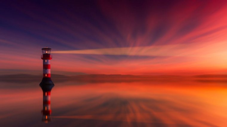
Ok so check out the 4 images that I’m going to be using today and we’ll start to edit using the Lightroom presets.
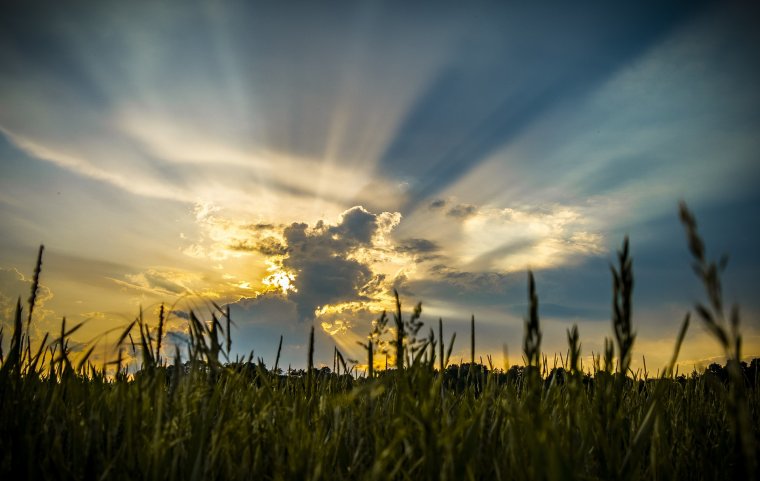
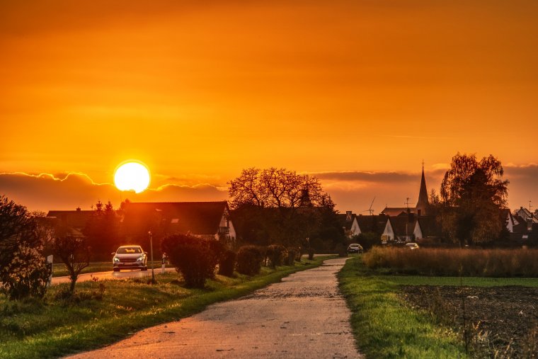
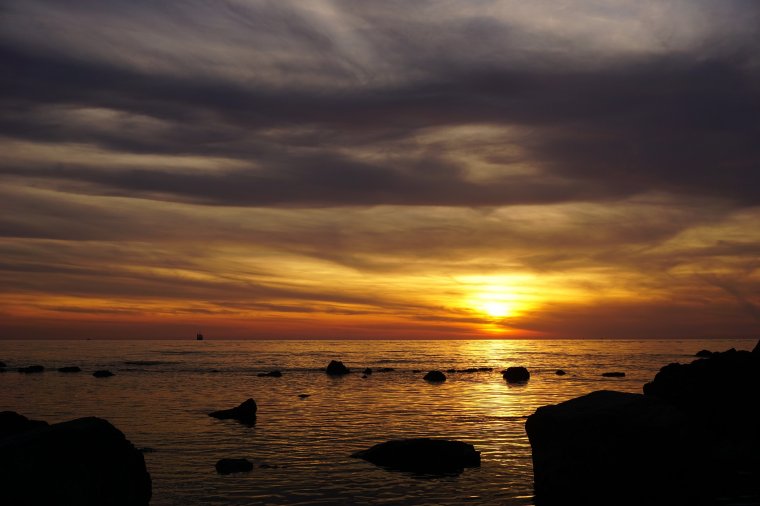
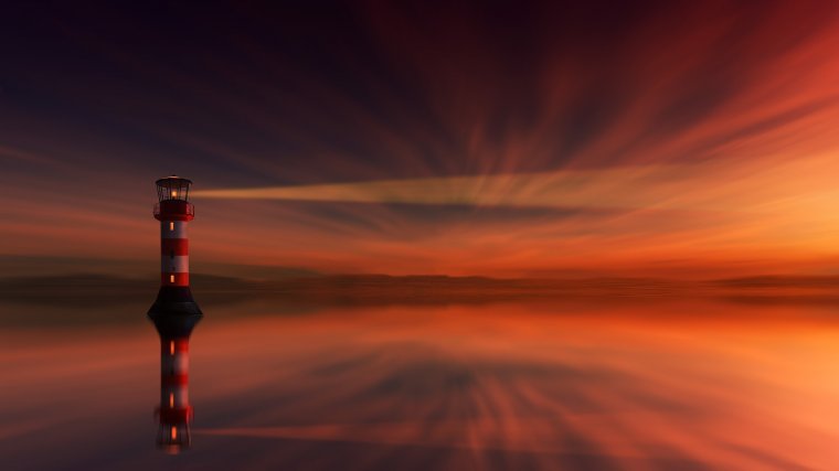
I found these images on a Free Stock Site I use called Pixabay.com, I used the Keyword ‘Sunset’ to find them, feel free to use this site too and if you know of any other Free Stock Sites then feel free to add them in the comments below as I always like to broaden my range when it comes to Free stock Sites.
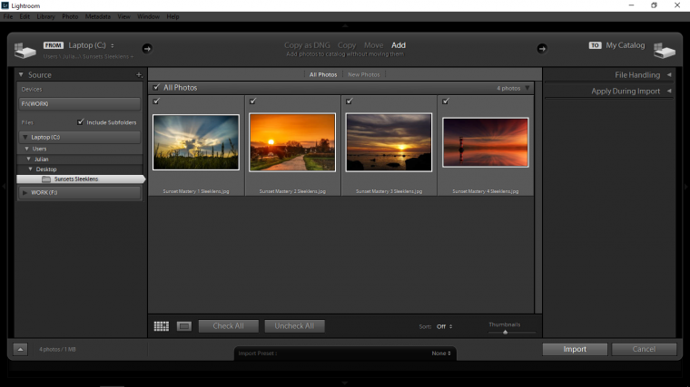
When you have chosen your image/images then add them to a folder on your desktop like so.
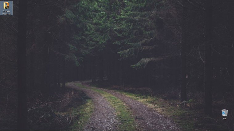
Ok cool, we’re set to open our files.
Double click on your Lightroom Program to get it started up.
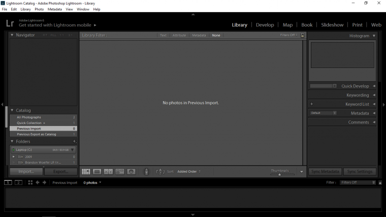
Ok to open your files up Lightroom is a strange one if you’re used to the standard old ‘File – Open’
Lightroom does things in a slightly different process than say the standard Photoshop way to open files up.
To open Files you have to be in ‘Library’… so if you look at the example image about on the top right you will see a few options ranging from Library to Web, so we should be in Library, if not, click on that now.
Then on the opposite side, the bottom left you will see ‘Import’
Then at the top left the tab on that panel that has just appeared [where it says ‘From’ on my example image] click on that to open up a drop-down menu, in that you’ll see Other Source, click on that.
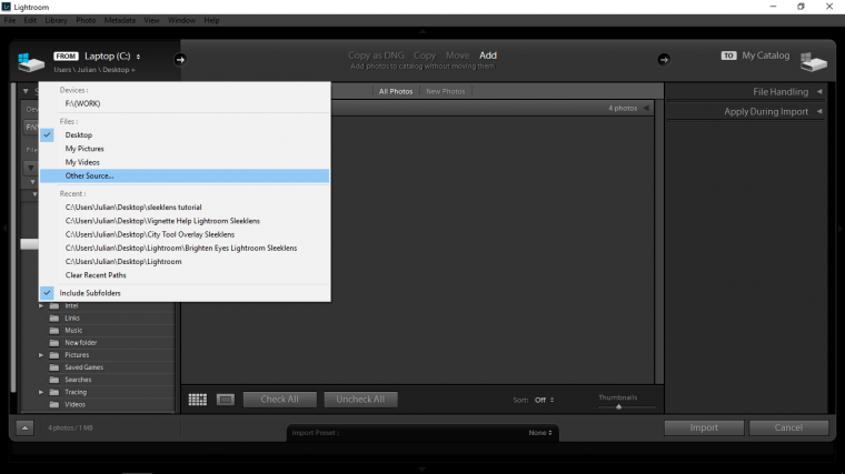
Then navigate your way to Desktop where you’ll see your Folder waiting for you.
Click it and then click on Select Folder.
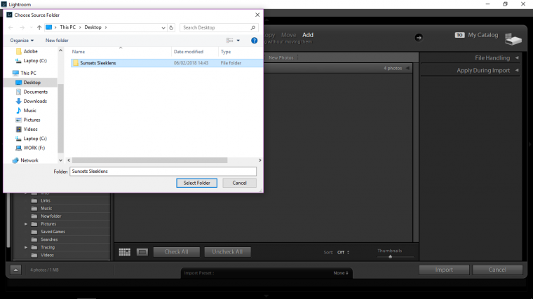
Your images will now open up.
Now on the bottom right-hand side, you will see Import, hit that and you’re images will now be ready and waiting for you to start to edit.
To start the editing process you have to be in Develop.
So remember where we have seen ‘Library’ scan back to that and you’ll see Develop beside it, click here and you’re good to go…finally.
See what I meant by Lightroom has a ‘Slightly different process’
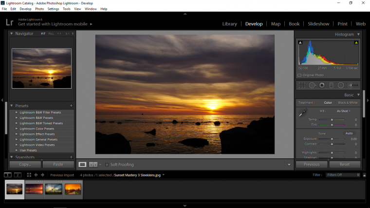
Right, now you will see in the middle of the image above on the right-hand side the word ‘Basic’
If that’s open like mine is clicked on the arrow to the right of the word basic to close just for a second.
When you do this you will see all the other options that there is.
And just above the word basic you will see 6 little icons and above that Histogram.
Don’t worry about Histogram but the 6 little Icons [Which I will be calling them] is what we want to look at now, so if you take a second just to hover over those with your mouse cursor you will see the individual names appear.
Remember this because when I say “in the 6 icons” followed by the Tool in question I want you to actively find them by your self by hovering over them.
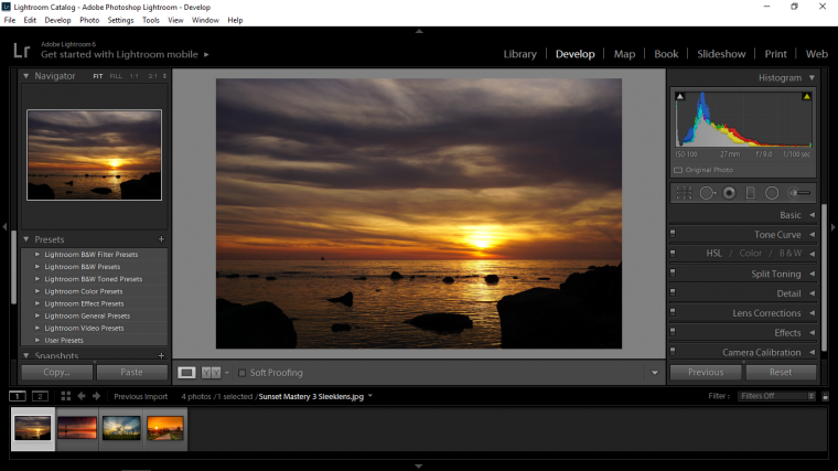
Ok so that’s the basics of getting started in Lightroom.
Now next, I’m going to open up my Basic Panel again and find where Highlights, Shadows, Whites and Blacks are.
The general rule I follow with the slider here is Left, Right, Right and Left.
So I decrease the highlights first by sliding its slider to the left a little, then the shadows to the right and so on with the Whites and Blacks.
There is a handy little trick with the Whites and the Blacks, if while clicked onto their sliders you can hold Alt on your keyboard, this will turn your screen black, when you start to work with the sliders you’ll see the image start to appear in little pixels, when this happens it basically means that you have hit the sweet spot.
Next just look above that you’ll see Exposure and Contrast, then up one more again and you’ll see WB which stand for White Balance.
You will see it should say ‘As Shot’ click on that and you should see a few options, I clicked on Auto to see what it would do and it just so happens that I was pretty happy with the result which increased the blue in my sky, I liked the contrast between the blue and yellow so I decided to leave it, if I wanted to I could work with the Temp and Tint slider but I was happy here not to.
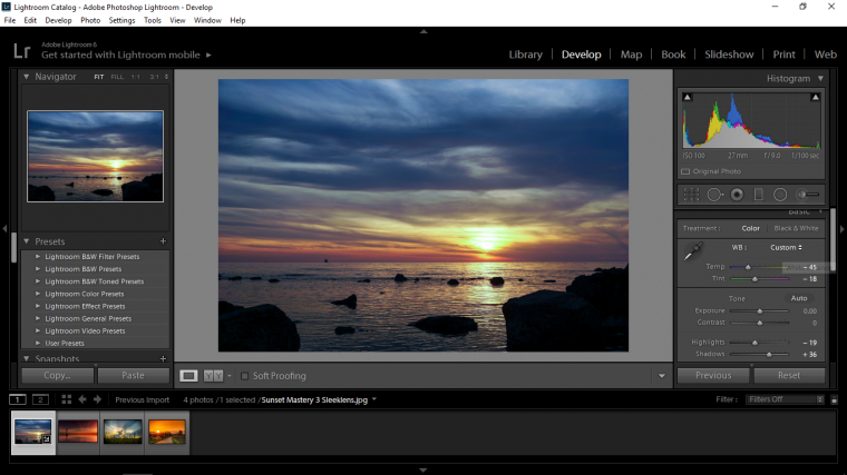
But I really want to bring that sunset out a bit more, so remember the 6 Icons above Basic? awesome.
Click on that, then click one your sun a drag out.
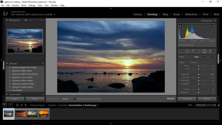
When you do this you will create an ellipse.

When you are happy with the ellipse you can then start to work with the sliders below, the first one I’m going to be working with is Temp, Tint, Exposure, and Contrast.
So I’ll just pull the exposure back a little so it darkens the sky, I’ll add some contrast, so I slide that to the right.
Then I’m going to add some Temp and a little Tint to increase the power of the sunset.
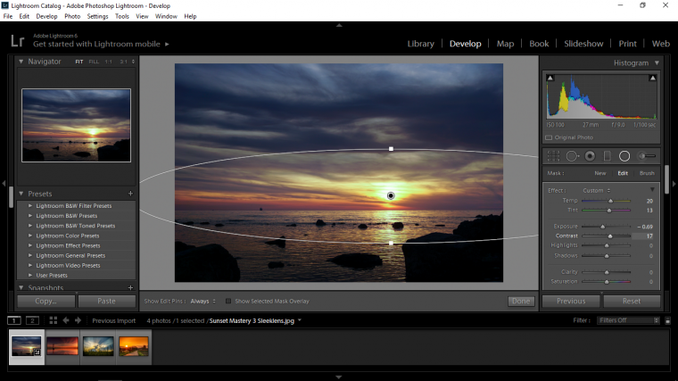
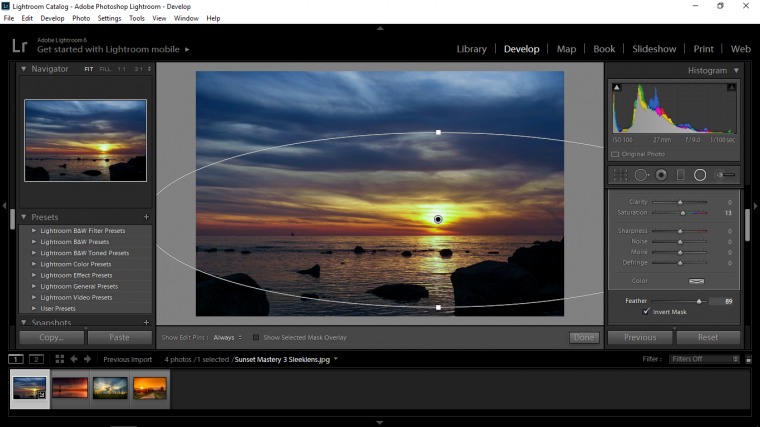
So at this point I thought I could perhaps invert to see what effect it would give me as I felt the sunset was weak, so I scrolled down where my sliders are until I found the Feather and Invert options, and just a quick note as I passed I added a little saturation to increase the colour.
I clicked on the Invert Box and slid my Feather Slider to the right and just like that my image became instantly awesome, I was very happy with it so I decided that’s where I was going to leave it.
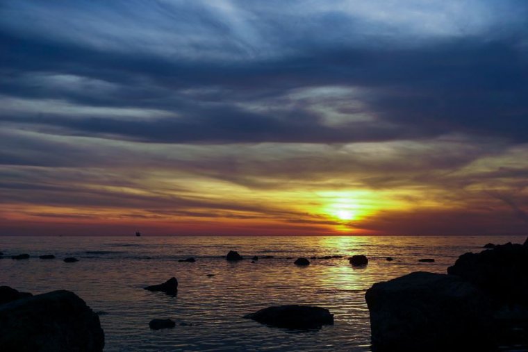
Ok cool, let’s move to our next image then.
So I just have to say I think this image is awesome! I’m not sure what I can do to improve it but I’ll try to find something.
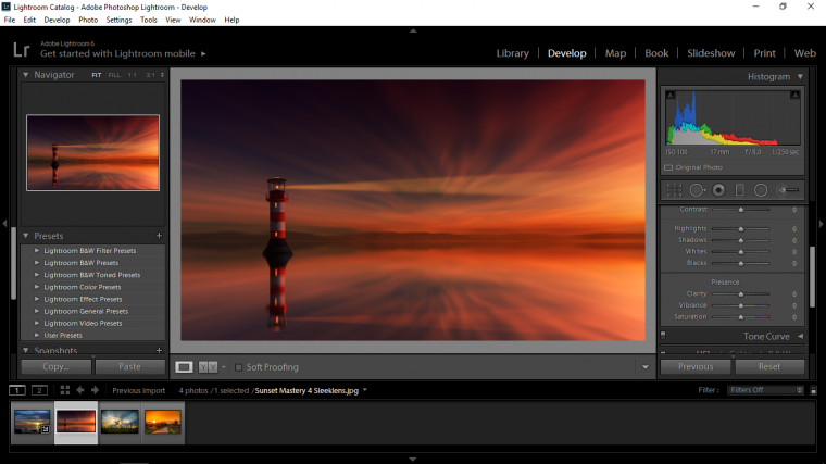
Ok so I think what I’m going to do with this is to take a Linear Gradient, which is the forth of your 6 icons there, I’m going to click on the middle and drag it out a little bit as to catch the center light.
I feel that sunset on the far right of the picture could be increased.
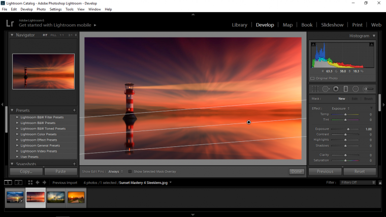
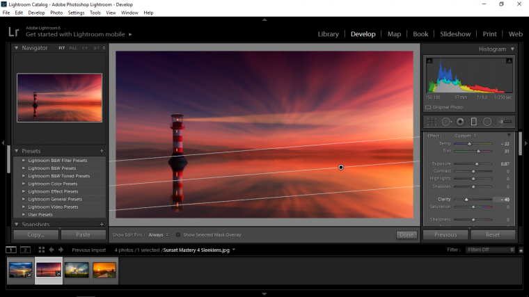
Then to play with the colors a little bit I dropped the Temp but increased the Tint.
I think this added a nice color mix to my image.
Then I wanted to increase the Exposure a little to lighten it up a little.
The last thing I did with the image was to drop the Clarity, the reason I did this was because when you do this it adds a little bit of a blur to your image which in this case because the image somewhat of a soft blurred time-lapsed image I thought it would look good and fit well, which it has.
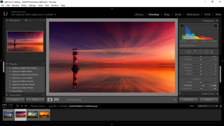
I know I said above the last thing I would do but no, when I hit done I thought, I could add a little bit of vibrancy and saturation to make those colors pop just a little bit more.
So I went back to my basic panel and did that with great results, I am very happy with the edits and will leave it now as is.
Ok so let’s get right into it with our third image.
I think this image looks great, what we’re dealing with here is whats called in color theory as analogous colors, which means they are all beside each other on the color wheel, so the blues and yellows mixed becomes green.
I think we can do a lot with these colors!! I’m looking forward to this one.
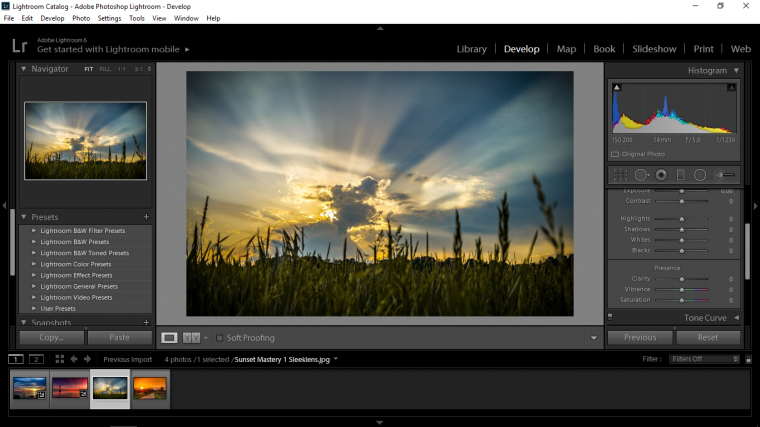
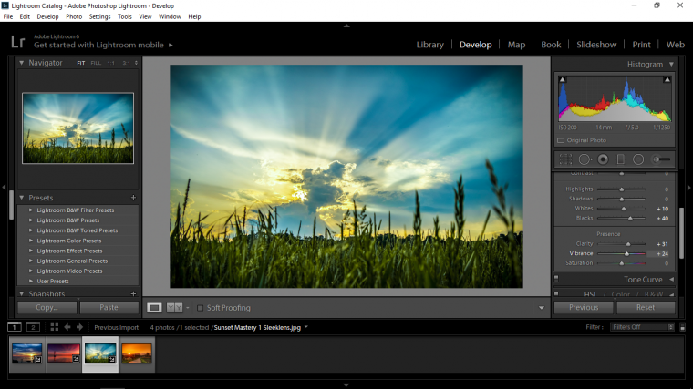
First thing I did here was to go to my Blacks and Whites and find that sweet spot that I was talking about. (Remember with the black screen holding Alt)
I just wanted to increase the lights a little without blowing them out.
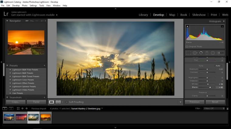
Next increased my exposure a little, again I just did this a little bit because I don’t want to blow the lights out, I want you to see the contrast in the clouds.
So to do that I went to my Temp and Tint.
Ok so because Yellow is my middle color and green and blue is more dominant I increased my Blue and my Green, so the effect this had on my image was to strengthen the Yellow.
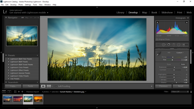
This really brought the colors out so I think I’m going to add a little Vibrance which will strengthen the colors further and a little Clarity to sharpen up the image and really give it a good contrast.
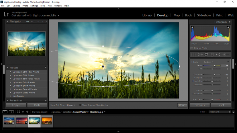
Now I’m going to use that Radial Filter again, remember the one from the first image and I’m just going to do the same by starting it over the sun.
You may have to scroll down the options again and invert it so that the lightest part is directly over the sun.
Then I added some more yellow with Temp and increased the Exposure a slight bit more.
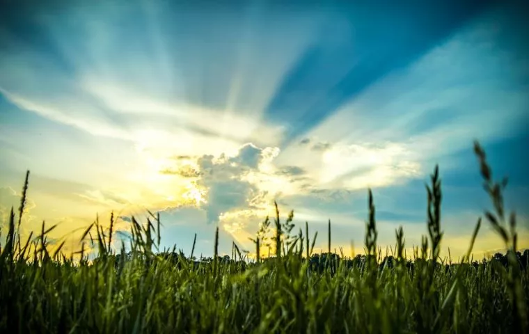
I think I will leave this image now as is I’m really happy with the results that Lightroom gave me.
Right, let’s get going with our fourth and final image, let’s see what magic we can apply to this interesting image!
Ok, check it out.

So what could we do with this image?
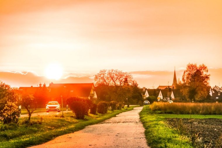
Well, first I’m going to find that sweet spot again with the Whites and Blacks! because what I am thinking of doing is to have a Radial Filter directly over the sun so that the right-hand side and shadows are dark giving the image a really strong contrast between the orange and the greens.
Then I’ll increase the Vibrance and bring both the Green and Orange up.
So I first got my sweet spot using the Alt key in combination with the Whites and Blacks, I got to my sweet spot and then just slightly went over it just a very slight touch.
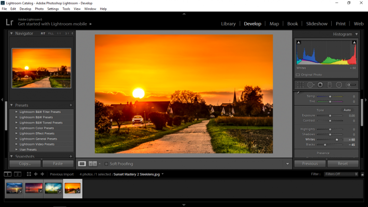
Now for that Radial Filter!
So I click directly on the center of the sun and holding shift on my keyboard I pull out from the center and create a perfect circle.
Then I needed to Invert because the edits were on the outside, you can check this quickly by sliding exposure to see what happens, then return exposure to zero and scroll to the bottom and click on Invert.
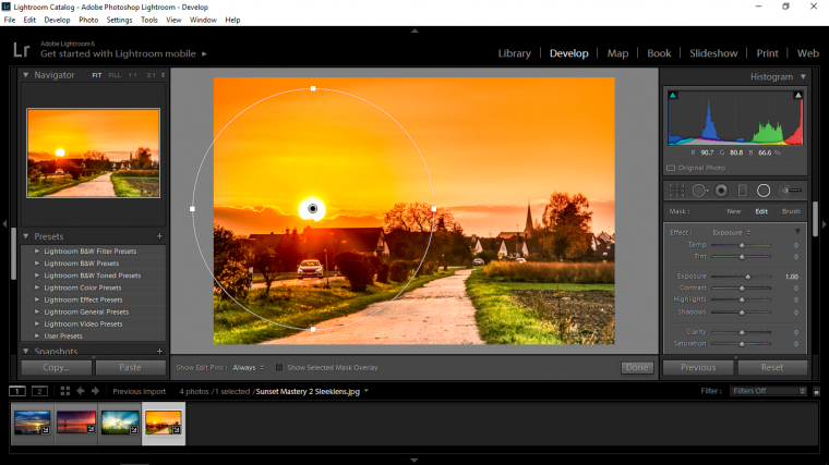
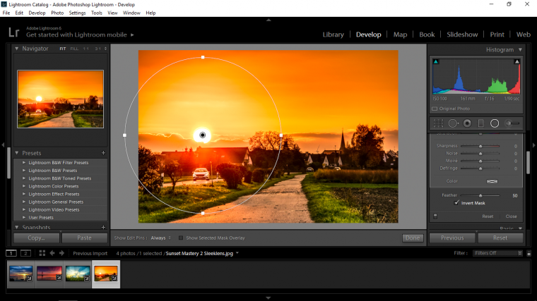
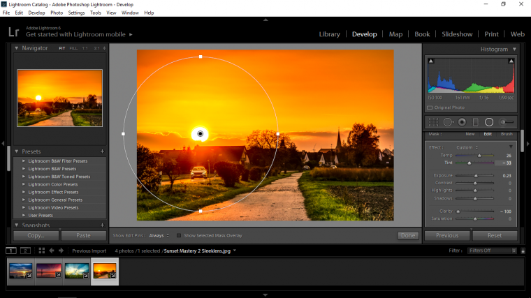
Ok so at this point I increased my Yellows and Greens.
I pulled exposure up a little (very slightly!) you will notice yourself as you work with the exposure how the light will get blown out, you’ll see fringes as well around your images starting to appear when you overdo it.
I dropped clarity for the same reasons as I did before to blend the colors a little bit better.
Then I hit done.
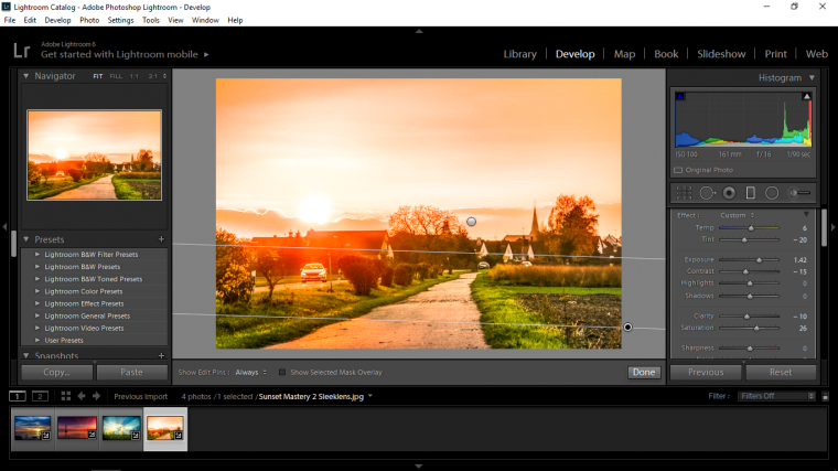
Now I’m going to concentrate on getting the most out of the grass, I want the contrasting green.
Next, I click on my graduated Filter, the fourth over on the 6 icons.
And over the green Grass, I pulled the Gradient.
For this as an exercise I want you to go ahead a do this for yourself without my commentary, see what results in you get, my advice is to just have a mess around until you feel happy with the result that you have gotten, experiment and see what you come up with.
By now I bet you’ll do just fine.
Ok, so I’m going to leave it there for this Tutorial, told you it would be long, hope you learned a lot 🙂
Comments (0)
There are no comments yet.