Seems like you’re here looking to become a master at using Photoshop’s Curves Tool, well now…
So just a brief to start off with, I would say that I use the Curves Tool in just about every single image I edit.
Curves are great, it has many different uses from lightening and darkening your image to contrast and color enhancement.
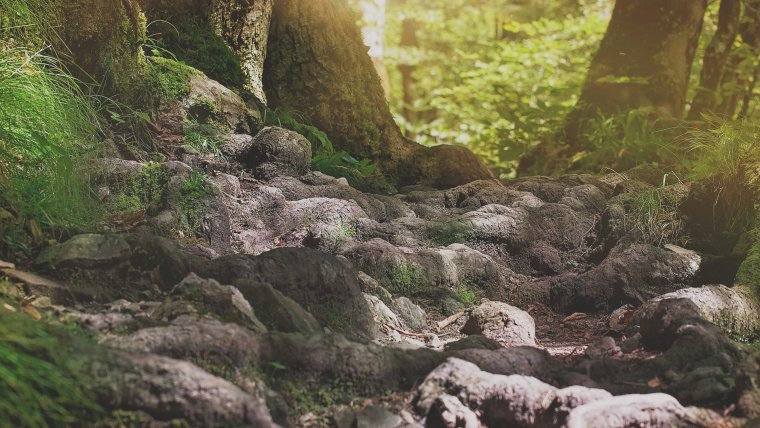
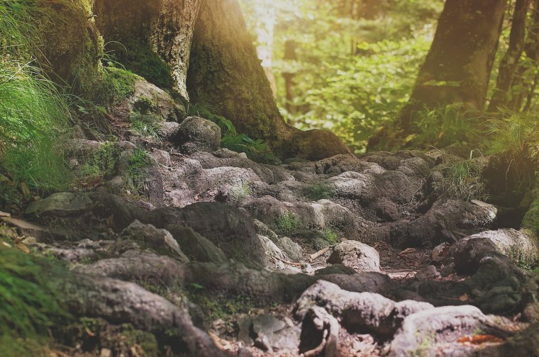
The image I want to use today is this image below.
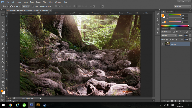
I figure with a Curves Tutorial an image with a good amount of light and dark would work wonders, so if you can get an image sort of similar to this where you have a nice array of shadows and highlights then that would be great.
Ok so to create a Curves layer you can go to Layer – New Adjustment Layer – Curves
Just a quick note on what an adjustment layer is in case you don’t already know, an adjustment layer is a layer that can be edited at any time.
This is good practice to keep in always making adjustment layers because if you don’t you may find yourself stuck further down the line when it comes to editing a certain image.
So make adjustment layers instead of editing directly onto your image.
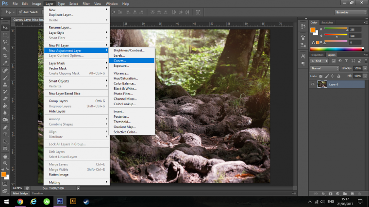
Click Ok when prompted.
You will now see it appear on the right-hand side of your screen.
It’s the Graph with the line running diagonally through it from the left bottom to the right top.
The bottom left represents the highlights and the top right represents the shadows in your image.
Everything in the middle is known as Mid Tones, so essentially the pure color minus shadows and highlights.
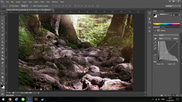
If you click and hold on the line you will be able to adjust the highlights and shadows.
So take a few seconds to click and play around with that and see what it does and the adjustments it will make to the image.
If I click and drag the line up to the left you will see that the image has now become a lot lighter.
You will have to be aware that when you do this you have to be careful not to blow the colors out.
Blown out colors are when they are so bright you lose detail.
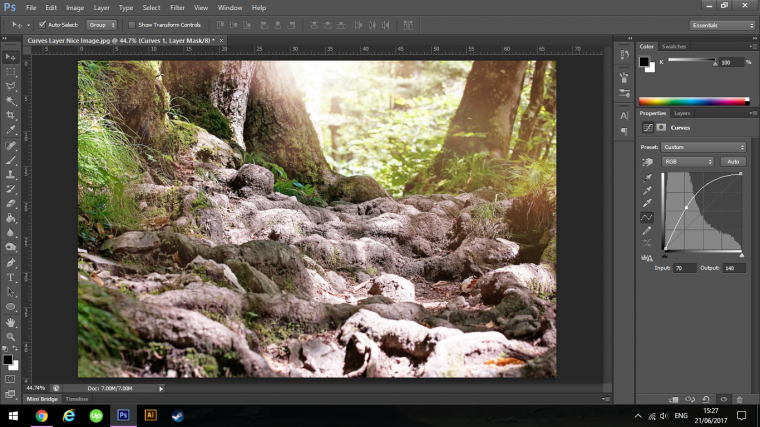
If we now apply this to our Colour range then we can do something similar.
Say I thought that my image was too warm, meaning that there is too much red for instance in it then I would have to go to the drop down box with RGB on it.
When I click on this I will be opening up my color channels.
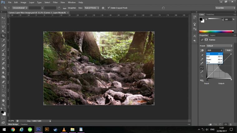
So I choose Red in the list.
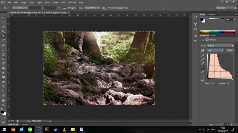
Click on the line and drag it down towards the bottom left slightly you will see the image will now start to drain of red and produce a colder effect through out the entire image.
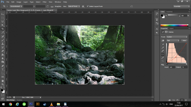
So if you take a minute or two just to go through that list and experiment applying what we just talked about you will be able to see the types of color effects that the Curves Adjustment Layer will allow you to do.
This is very effective for Colour correction and should definitely be one of your go to’s over some of the other Tools available.
So let’s take for example that I don’t want this image to be a cold image, instead, I want to take advantage of the sunlight in the background and create a more summery feel to the image.
What I will do is to drag the opposite way with the red, don’t go too crazy because you don’t want your image to look like it’s overlay red, just enough to enhance that sunlight in the background.
Lucky enough because we are using adjustment layers we can always go back and forth to edit again.
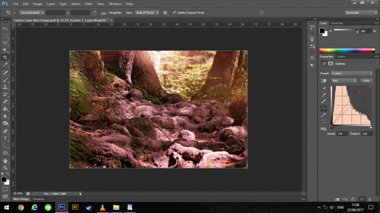
Then I will go into my Blue Channel because it is a cool color and reduce it to strengthen and add a bit of green.
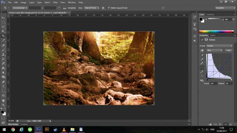
Now at first this sounds like you have to know some color theory, well no you don’t, you can trial and error away at this till your heart is content.
As long as you have a rough idea in your head as to what you would like to do with the image then you will be golden!
All you really need to be aware of is, does the image look too cold, neutral or warm.
If you are editing for a client then he may say “my images are too warm, can you cool them down a little bit?” then you will know that you will have to warm them up.
But be sure to ask him “to what percentage would you like them to be warmed up? what’s your over all finished goal for these images?”
Ok so what if you want some areas to be warm and other to be cool?
So if you look at my image well I like the sun shine bursting through but I’d like to have the roots of the tree seem cooler. (ha two birds with one stone there)
But of course, I’m talking about the visual temperature.
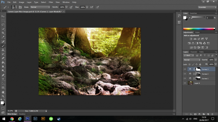
So I now go back to my Layers and click on the Curves Layer.
You will see that there is a little white box attached to the Curves Layer.
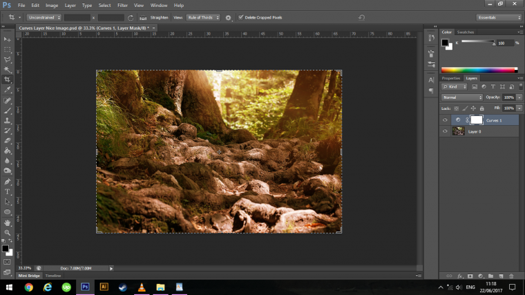
This is your Layer Mask.
So choose the Brush Tool.
Make sure you have it on a soft brush and drop the opacity to about 30% (this might be too much to work with the opacity as you go along)
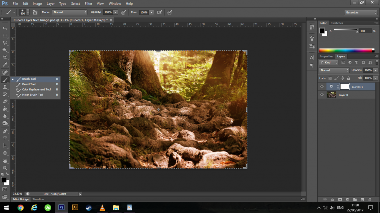
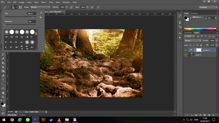

Now Paint directly on to the areas you want to cool down, this will remove the warmth.
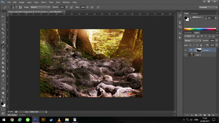
If you make any mistakes or undesirables just flip to White on your Brush and you will be able to paint back in the warmth.
While you are doing this you can adjust the size of your Brush by using the Bracket Keys on your Keyboard [ + ]
You will find these besides the letter P.
If there is more interrogate areas you need to address then you zoom in by using the Zoom Tool, you activate this by keying in (Z)
Hold Alt and move your mouse diagonally from top left to bottom right.
If you need to shift position the hold the Spacebar until you see your cursor turn into a grab hand.
Then you can click and drag the image to where you want it while still holding the Spacebar.
Another trick you can do if you feel that you’re Curves Adjustment is too strong is to simply adjust the opacity of the layer, I’m not going to as I like it where it is at 100%
Now I’m going to add another Curves Adjustment Layer only this time I’m going to be targeting Greens.
So, of course, I choose the Green channel.
I’m just going to bring it up a good bit to strengthen those Greens.
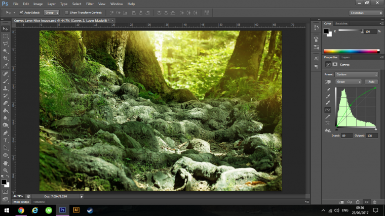
Then go back into my layers panel, make sure I’ve clicked on my mask thumbnail and key in on your keyboard (Ctrl + I)
This will invert the layer to black this time hiding your entire green layer.
So what you do now is use the Brush Tool again and instead of Black use White in the exact same process, we did previous painting out the Green areas on your image.
For this I usually start with an opacity of around 50% when I’m painting in the middle then I drop it as I move further out to the sides so as to get a decent blend and transition between the colors.
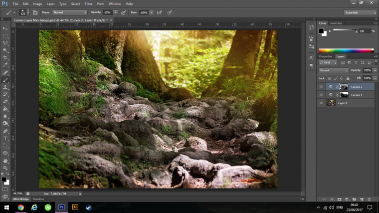

This may evolve a bit of clicking but the results are worth it, you can use the Flow Technique or (Using Flow with your Brush Tool in Photoshop) if you want to YouTube that but for now, we’ll just stick with the simple Opacity way.
If you already know about Flow in Photoshop with the Brush Tool then I will say this, for some reason I know it can be better or whatever but because I started using Opacity I’ve never changed nor had any desire to change I like for me one way to do things, that way my workflow is fast and the Tools I use are used with zero extra thought.
Next, we are going to add some contrast to our Image.
The way to do this is to increase Highlights and Shadows.
When we do this it will really make your image pop and stand out and give it a strong sense of atmosphere compared to the more standard image that the camera may produce.
The way to do this with the Curves Adjustment Layer is to create a new one.
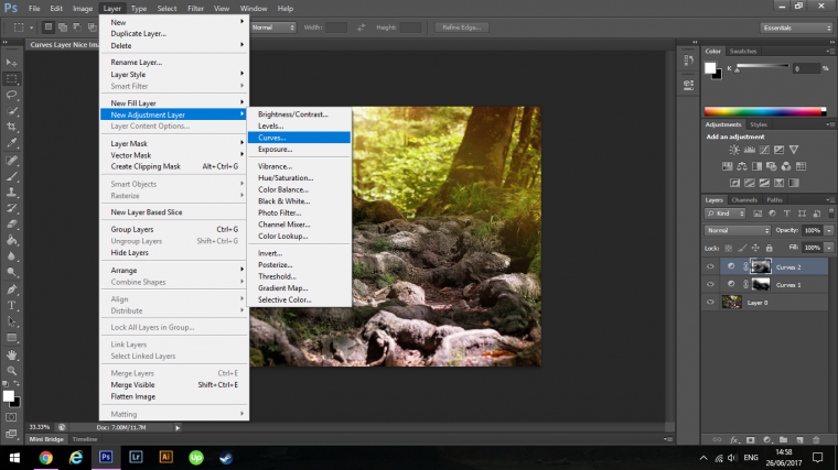
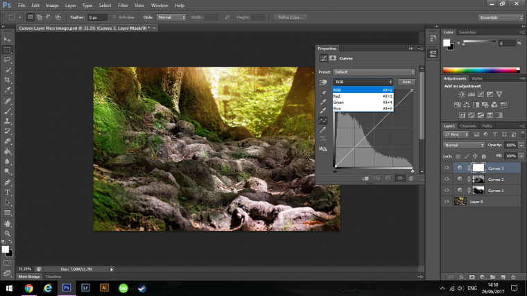
Make sure that it is set to RGB, the reason for this is so that when you make your adjustment you will be adjusting all the channels at once.
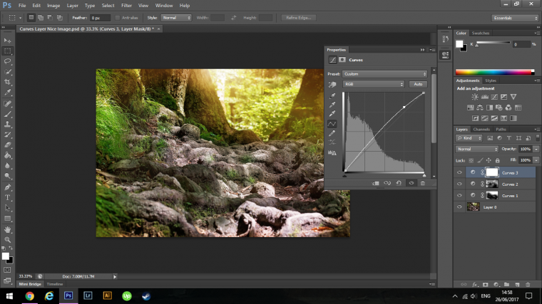
Now click on the line at the bottom left-hand corner of the top grid box in the Curves panel, click that and drag it up slightly, don’t go too far as you will end up blowing out all your highlights, just go enough so that there is still detail.
Same with the shadows, just enough so that it is darkening down the entire image but you can still see details within the shadows themselves.
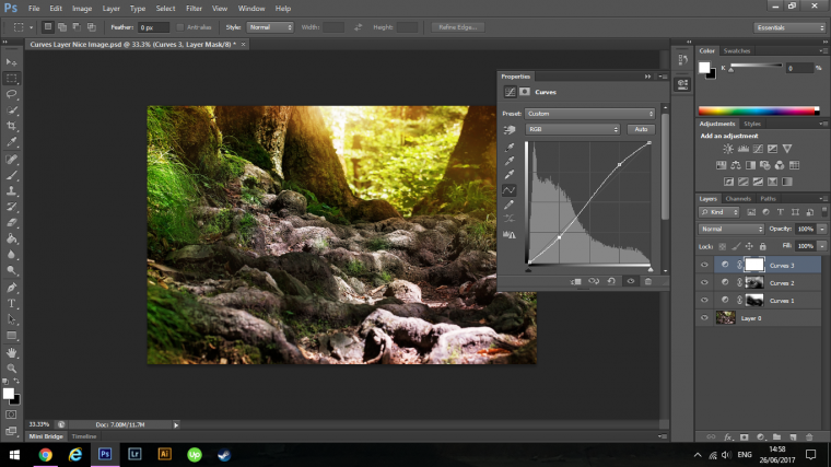
On your Curves graph, you will now see that you have made an S shaped curve which is how the Tool got its name.
So now if you click on the little eye icon beside that Curves Contrast Layer switching it on and off you will notice that there has been a significant improvement to the image.
What I’m going to decide to do with this layer is to only have the contrast effect on the roots of the trees, so I’m going to paint on to the mask beside it just like we did previously with the others.
Click on it and key in Ctrl I.
This will invert the mask and hide the contrast layer, now what you do it using a white brush is to paint over the areas you would like to have the contrast show up, in my case, it’s the roots of the tree.
Next, we are going to add some Matt effects.
What this does is it flattens your Highlights and Flattens your Shadows, so it somewhat does the opposite to what the contrast layer did.
This is easily done and is done in much the same way that you did the contrast layer.
The only difference is you grab the ends of the diagonal line.
So create a new curves layer, grab the first one, click on the dot of the diagonal line at the bottom left-hand corner, and drag it up about 3 quarters the way up the first graph square.
Then you do the same to the opposite side, clicking and dragging downward on the right-hand side so that your graph eventually looks similar to what mine looks like below.
Note that you do not have to use the 3 quarters I have used, that is just my personal preference, so do what is pleasing to your eye.

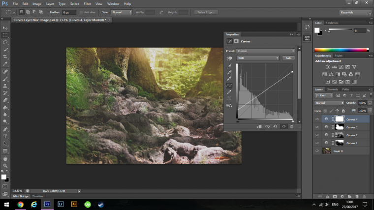
Now if you feel you have too strong an effect you can always drop the opacity on that or using the mask you can paint out the areas you don’t want the effect to be on.
I’m happy with the result as it reminds me of a hazy summers day so I’m going to keep it as is and if I change my mind in the future then I always have my Adjustment Layers so I can go back in and change it up as needs are.
You can now group the layers together so if you want to turn them on and off to see the difference you will be able to, you do this by clicking on the bottom layer, hold Shift on your keyboard and click on the top one, then key in Ctrl G.
Then you can click on the eye icon on the group to turn it on and off.
That’s it we’re done, you will now be on your way to being a master of the curves tool so put it to practice.
See you next time.
Comments (0)
There are no comments yet.