Photographs have never been permanent. Back in the days of film, negatives faded, prints faded. Sometimes, younger generations in a family simply toss out snapshots they either don’t care about or don’t understand the relevance of the people in the images. People who don’t know that prints come from negatives—no doubt, most people—trash the developed film like rusty paperclips.
Digital cameras haven’t made the medium immortal, either. It’s so easy to delete files by mistake. Or, if you’re really old, lose files to obsolescence when they’re stored on media that have no machines left to decipher them (I’m talking about floppy discs). And certainly, once you die, there’s the distinct possibility that your relatives won’t save all those tiffs you so lovingly stored in triplicate on hard drives.
So I’m here to talk about the long term saving of your work. And I do mean really long term. Like, after you die. Something that your children and other family members might actually choose to save after they’ve thrown out the hundreds of thousands of your digital pictures you’re not around to defend. (If you don’t believe me, look around you. Do you honestly think these people are going to take the time to look at all those shots? I didn’t think so.)
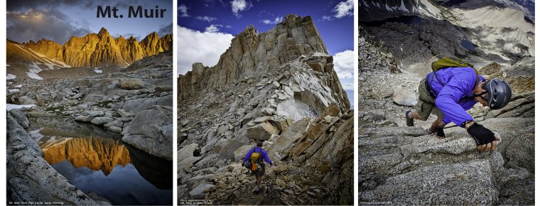
So you need to choose the images that are most important and preserve them in a way that might be interesting to future generations, or, at least, appear to be important enough to save. And by that, I mean making books of your work. Not only are the inks in the books good for decades, but the books themselves are a convenient way for those who are yet to be born to see your work and get an idea of who you and your immediate family were. For the time being, books are relatively obsolescence-proof.
This starts with a program as simple as Lightroom’s Book software. You have several templates to work with: 7×7, 8×10 (portrait and landscape), 13×11 and my favorite, 12×12. I like the large square because I can use either portrait- or landscape-oriented images and they nicely fit the pages. Also, going large shows off the photos best in my opinion.
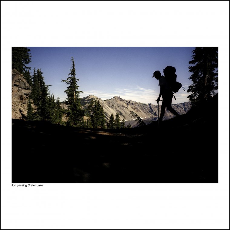
My intention here isn’t so much to give a tutorial in using the program, although I have to say it’s easy enough to figure out and gives you the kind of flexibility required to follow my advice in the next paragraph. You can easily lay out and order images, caption them and send them off to the publisher, Blurb, without being an expert designer. The point isn’t so much to wow people with the clever look of your book but to impress them with your photography.
To do that, I say stick with the simplest and oft-used layout you can—one photo per page. That’s it. Don’t get crazy. Give each image it’s due. Show those grandchildren how you loved these pictures so much, they should be appreciated one-by-one instead of competing in a collage of other pictures. Also, give them some white space all around. That’s about it.
Okay, I’ve got some other pointers, too, if you want your books to look professional and therefore worthy of treasuring.
Collect similar images in each book—The themes can be as simple as your vacation to Paris or more complicated like that project you spent 20 years photographing poppies. The point is, when there’s a common thread or story running through the book, people are more likely to keep flipping the pages until the end.
Choose only the best images—I know. You’ve heard that before. As I’ve implied, this isn’t just about pleasing yourself, but keeping future viewers intrigued enough to want to look at your pictures and even do that more than once. If you have pages of shots that all look the same and should have been culled down to one best picture, you’ll lose your audience real fast. And if that happens, they may decide the value of your book or books isn’t great enough to keep them. This not only goes for the aesthetic quality of each image but making sure the images are perfect. No sensor dust spots, processing is clean, cropping is tight or relevant to the image. All that stuff. And carefully consider what you use for the cover, choosing an image that will intrigue potential viewers and invite them to the photo party within.
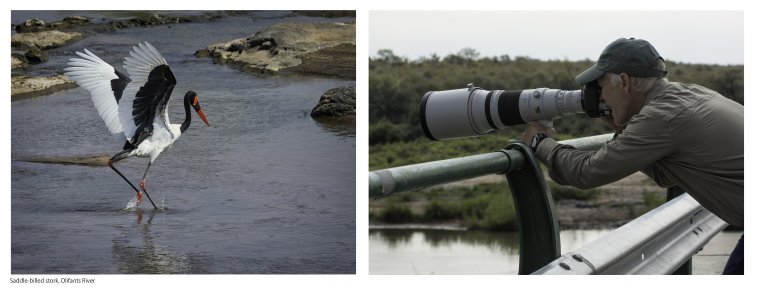
Carefully order the pictures—This might be just sticking to a chronological format. Or using interesting juxtapositions. That is photographs that pair together in some way. Look for how the images flow from page to page, especially if you’re trying to tell a story.
Keep it short—Blurb’s page limit is upwards of 240. That doesn’t mean you have to go there. It’s a little daunting for someone to pick up a book and leaf through a mountain of material. Instead, give them a bite-sized chunk of images. This blends with the previous advice of going with a theme, which tends to naturally restrict the book’s length. Again, think of your future audience. If attention spans are getting shorter, so should your book.
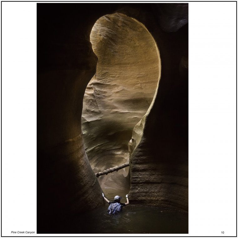
Always write captions—One of the biggest reasons, I think, that old photos are junked is because no one knows what, or who, they’re looking at. Even if your captions are prosaic (“Uncle John at the Eiffel Tower, January 20, 2011”), they will be more valuable than if viewers have to guess who that is in the hat and sunglasses. Even better is to take some time and explain the shot a little. If these are art photos, say something about the subject and why you took it. Even classier is providing a snippet of metadata. Most people won’t know what an f-stop is, but for the ones who do, you’ve just given them a little insight into your work and they will appreciate it. Also, choose a simple font style. I prefer a sans-serif type such as Arial because it’s easy to read and doesn’t draw attention to itself.
Polish and edit—Try to make the final product as tight and professional as possible. Compare it to photography books you might have and admire. Let it sit for a few days and return to it. Is there anything missing from the captions? Are the pictures redundant or the absolute best you have to offer? Be picky. And, as always, think of your future audience and if they will want to spend time with your book.
Don’t be sloppy—Proof your final work several times over the course of a few days. Have someone else take a look at it, too, after your eyes start to blur. Remember, once you publish, any mistakes are permanent.
Choose a good paper—After all, this bother, you don’t want to go cheap on the production values. I prefer premium luster for the light sheen it gives my images.
The final product won’t be inexpensive. Most of my books, which end up being about 60-80 pages, cost upwards of $100. But I have both the satisfaction of paging through my work—and showing it to others—without having to crank up the computer, and a little comfort knowing that perhaps my photography will live a few more years after I’m gone.
Comments (1)
Bill. This is a good article about creating books. You succinctly covered why, how and the considerations we should take note of. I’ve been thinking about creating a book for a project I’m working on. Your blog has convinced me I should to it.